Quantcast
Channel: Telerik Blogs
Viewing all 5333 articles
Browse latest View live

Embedding Beautiful Reporting into Your ASP.NET Web Forms Applications

$
0
0

Telerik Reporting tools in Visual Studio allow you to display powerful reports in ASP.NET Web Forms. Find out the three things you need to display reports in ASP.NET Web Forms.

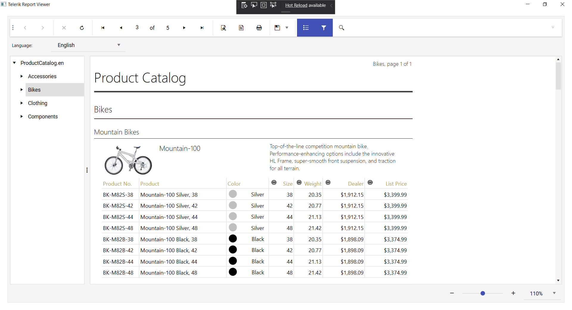
Displaying a report in a Web Form requires just three things: reports, a Report Source to provide those reports, and a Report Viewer to display them. With the Telerik Reporting tools available in Visual Studio, it’s easy to put those three things together in a Web Forms project.

You first, of course, need a report. With a Web Forms project, the easiest way to create a report is to use the Telerik Report R2 2020 wizard from within Visual Studio. The wizard not only makes it easy to generate a report, it automatically adds your report to your project as either a .cs or .vb file. Using the Report Wizard also adds a reference to the Telerik.Reporting library to your project, which supports the other tools you’ll use.

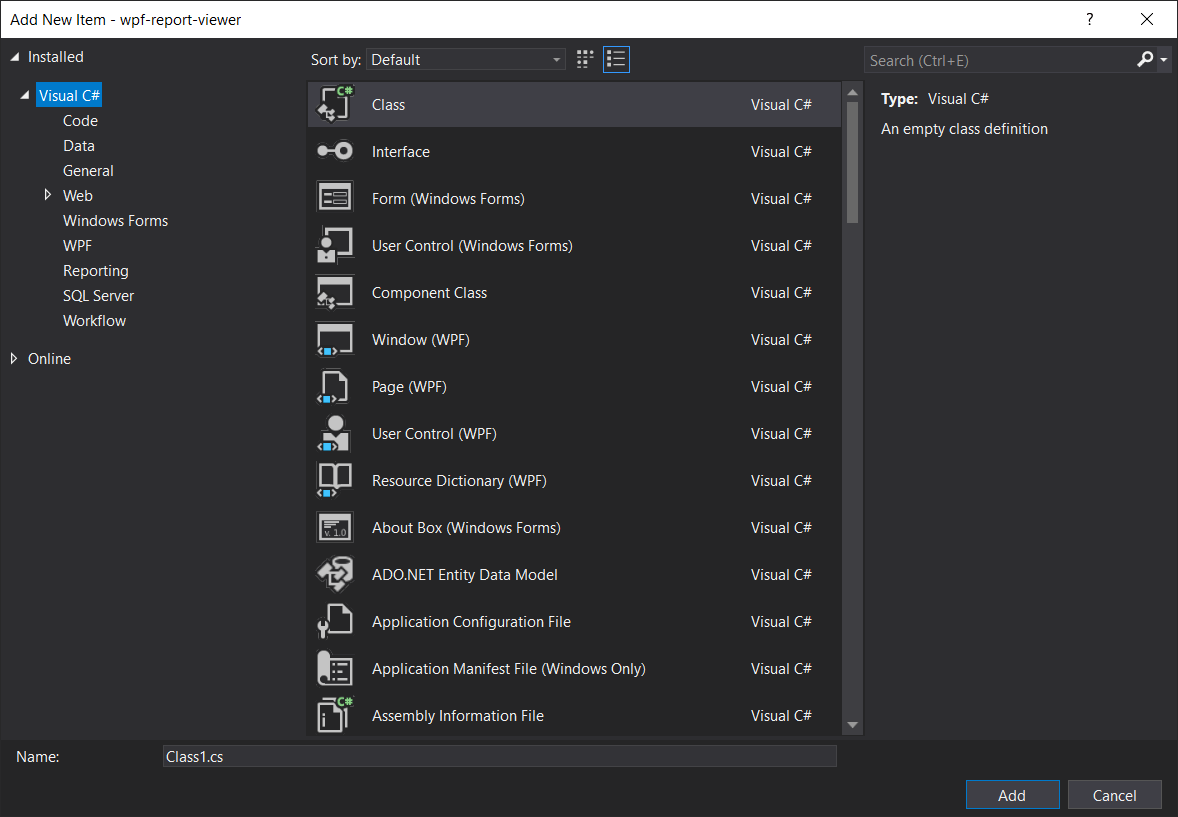
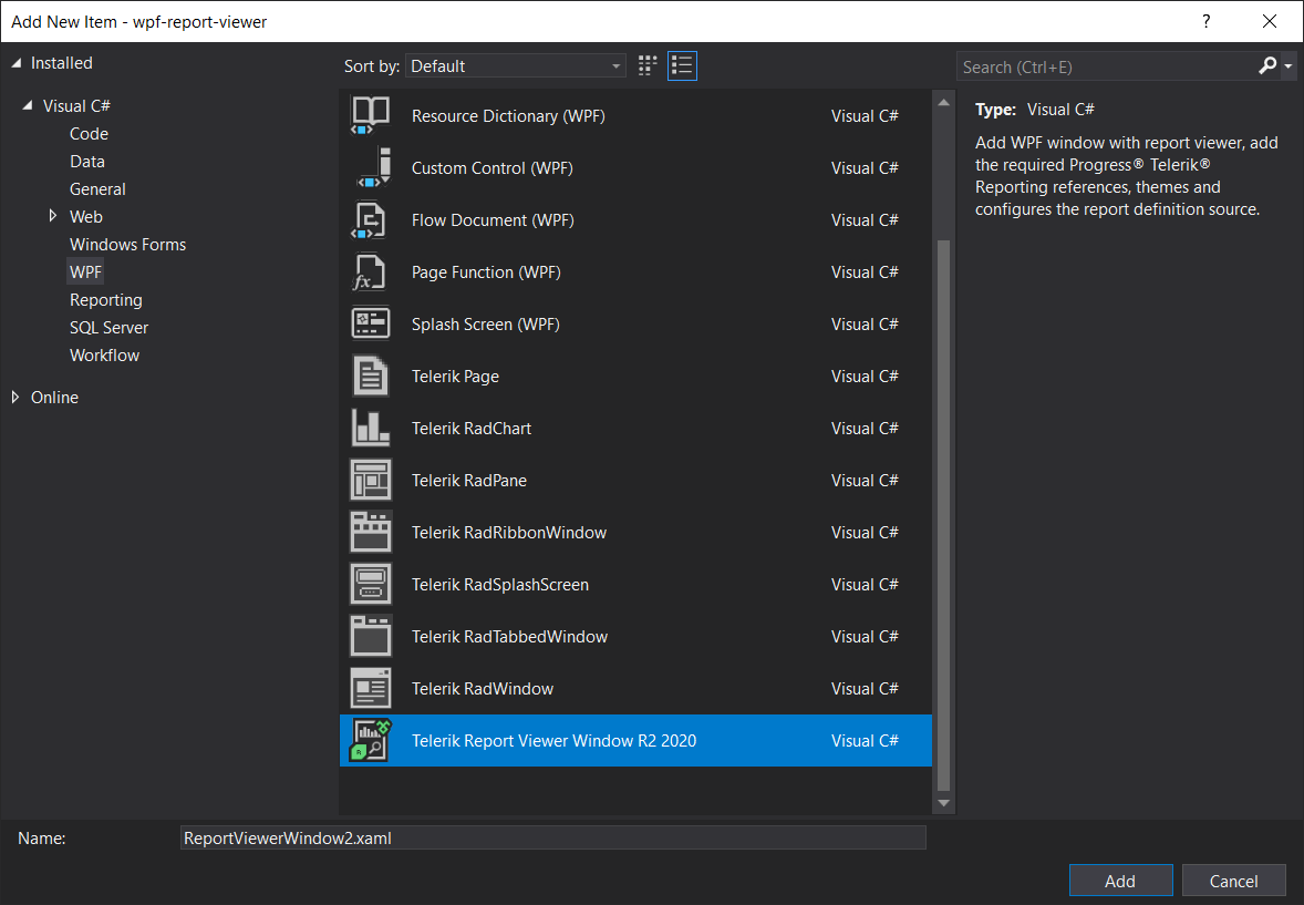
To use the report wizard, first add a folder called Reports to your project, then right click on the folder in Solution Explorer, pick Add | New Item, and select the Telerik Report R2 2020 Wizard. Strictly speaking, you don’t need to put your report in a folder called Reports, but creating that folder makes it easy for you to display, for example, reports created by the standalone Telerik Report Designer R2 2020 which are kept in .trdp file (I’ll show how to add them at the end of this post). The first time you run the wizard, you’ll be prompted to trust the wizard—just click the Trust button in the dialog box.

Depending on your project type, the wizard generates either a .cs or .vb file with the name of your report (in my case, I created a report called ContactList). While creating my report, I took the option to embed the report’s data source connection in the report. One more step: Before going on to set up a page to display your report, build your project (if you don’t, the tool you use in the next step will complain that you need to build your project… and then build your project for you).

Grab the eBook: A Quick Guide to Expert .NET Reporting Tools 

Displaying Your Report

Now that you have your report, you can start to add the Web Form that will display the report by right clicking on your project and selecting Add | New Item. Next, in Add New Item dialog, select the Telerik HTML5 Web Forms Report Viewer (you can find it under the Web | Web Forms tab on the left-hand side of the dialog). Adding a Web Form using this option opens a wizard that will walk not only you through configuring your Report Viewer but also sets your project up to serve your report to your viewer.

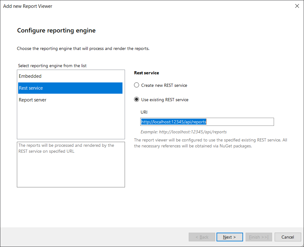
On the first page of the Wizard, you’ll be asked to pick between “Create New REST service” and “Use existing REST service.” If you’ve set up a separate project to hold your reports or have used this wizard before on this project, pick the “Use existing REST service” option and enter the URL for the project that holds your reports. If this is the first time you’ve run the wizard and want to use the current project both as a report source and to display reports, pick the “Create new REST service” choice.

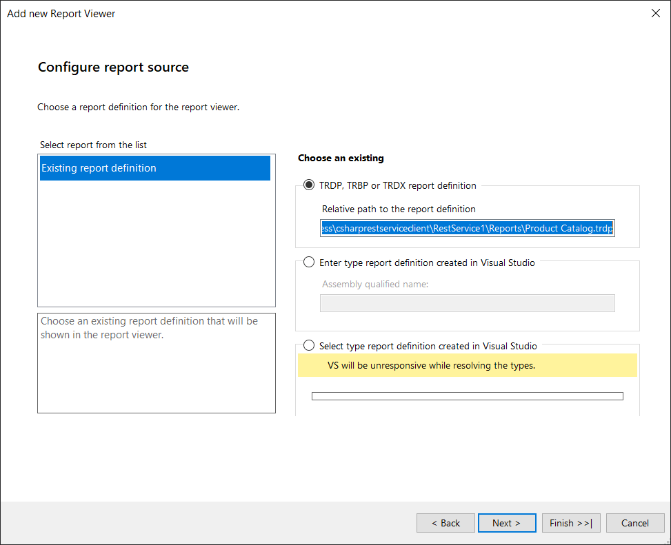
After clicking the Next button, you’ll have an opportunity to pick the report to be served up by your report source. Since I’ve already created a report, I picked “Existing report definition.” Picking this choice gives you three options on the right side of the wizard’s page:

  • TRDP, TRBP, or TRDS definition
  • Enter type report definition created in Visual Studio
  • Select type definition created in Visual Studio

If you created your report using the report wizard, as I did, then pick the “Select type definition created in Visual Studio” choice… and wait a bit. The wizard will pause to build a list from all the relevant class files in your project. When the wizard is done, find your report class in the list, select it, and click the wizard’s Finish button.

The wizard does quite a lot to your project at this point. In addition to adding the page to display your report, the wizard also adds a Web API controller class that will serve up your reports—adding that controller will trigger adding Web API support to your application. So, again, you’ll need to be patient (and also, the first time you run the wizard, click a Trust button to assure Visual Studio that nothing bad is happening).

When the wizard is done, it will display a scary error message because you’re using your project both to view reports and as your report source—you can ignore that message. You’ll find that you have a new Web Form in your project named after your report. To view your report, open that aspx file and press F5.

If you’d rather skip the wizards and do it all yourself, there is a Telerik step-by-step guide.

Save Your Seat: Reporting In-Depth—How to Streamline Reporting with Ease

Exploiting ReportViewer

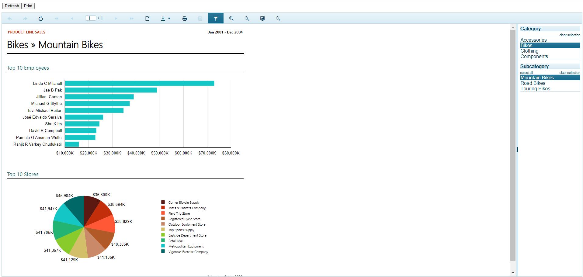
Once you’ve got your report on the screen, you can start exploiting the power of ReportViewer. Without doing anything more, your user will be able to use ReportViewer’s menu to page through the report, download it in a variety of formats (PDF, CSV, RTF, etc.), and print it. With some additional configuration, you can support users sending the report as email or providing parameters to filter the report.

By default, users can scroll through the report continuously (new pages are displayed as the user scrolls to the bottom of a page). If you want users to always page through the report, you can add the Page attribute to your ReportView component and set it to PageMode.SinglePage, like this:

<telerik:ReportViewer
                PageMode="SinglePage"

Your user can also zoom in and out on your report using the magnifying glass icons on ReportViewer’s menu bar. However, you can control the initial display’s zoom level with the ReportViewer’s ScaleMode attribute. Setting ScaleMode to FitPage will compact an entire page of the report into a single browser window, for example. Alternatively, you can set ScaleMode to Specific and add the Scale attribute to specify the zoom level on the report’s initial display, like this:

<telerik:ReportViewer
                ScaleMode="Specific"
                Scale="1.2"

Supporting New Reports

Now that you have your project set up, you can rerun the wizard to add a form for a new report. First make sure that you know your project’s URL (it will be something like https://localhost:44395/). When you run the wizard, pick “Use existing REST service” on the first page and enter your project’s URL with the additional segments /api/reports (e.g. https://localhost:44395/api/reports).

That may be overkill, though: You can just add a new Web Form to your project and then copy all the markup from your first form’s aspx file (except for the form’s Page directive) into your new form’s aspx file. If you go that route (and continue to use the Visual Studio Report Wizard to generate reports) then the only thing you need to change in the markup as you copy reports is in the element: You need to update the Identifier attribute with the name of your new report. For a report in a .cs or .vb report, you have to pass the fully qualified class name followed by the class’s namespace.

This example displays a report called VendorList in a project called ReportSite:

<ReportSource IdentifierType="TypeReportSource" Identifier="ReportSite.VendorList, ReportSite">

But you can also display reports held in the .trdp files generated by Telerik’s standalone report designer, Report Designer R2 2020. First, use Add | Existing Item to add the .trdp files produced by the designer to your project’s Reports folder. Then alter the element, but this time, in addition to updating the Identifier attribute to the name of your report file, also change the IdentifierType attribute to CustomReportSource.

This markup, for example, displays a .trdp file called EmpList.trdp:

<ReportSource IdentifierType="CustomReportSource" Identifier="EmpList.trdp">

A Single Report Page

And even that may be more work than you need to do. If you want, you can have just one Web Form display all your reports—you just have to change the ReportSource options from code.

To support this, first create a form with a set of HyperLinks that allows users to select the report they want. In each HyperLink, pass the name of the report to be displayed in the NavigateUrl’s query string. Here are two HyperLinks, one for a .trdp report called EmpList and one for a .cs/vb report called ContactList:

<asp:HyperLink ID="ContactList" runat="server"
       NavigateUrl="~/ReportDisplay.aspx?ReportName=ContactList.trdp">
  Contact List
</asp:HyperLink><br/>
<asp:HyperLink ID="EmployeeList" runat="server"
       NavigateUrl="~/ReportDisplay.aspx?ReportName=ReportSite.Emplist,ReportSite">
  Employee List
</asp:HyperLink>

In the code file for the form with your ReportViewer Web Form, you retrieve the ReportSource Identifier from the querystring when the Web Form is first loaded. You can then set the IdentifierType based on the report’s name (.trdp files require the IdentifierType to CustomReportSource).

Here’s some sample code that does that:

protected void Page_Load(object sender, EventArgs e)
{
   if (!IsPostBack)
   {
      this.reportViewer1.ReportSource.Identifier = Request.QueryString["ReportName"];
      if (Request.QueryString["ReportName"] != null &&
           Request.QueryString["ReportName"].Contains(".trdp"))      
      {
         this.reportViewer1.ReportSource.IdentifierType = IdentifierType.CustomReportSource;
      }
      else
      {
         this.reportViewer1.ReportSource.IdentifierType = IdentifierType.TypeReportSource;
      }
   }
}

And now you’re ready to deliver beautiful reports in your Web Forms application.

Tried Telerik DevCraft?

You can choose Telerik Reporting and Telerik Report Server as individual products or enjoy them as part of the great Telerik DevCraft bundles.

Try Telerik DevCraft

Telerik DevCraft is the finest software developer tools collection across .NET and JavaScript technologies, which includes modern, feature-rich and professionally designed UI components for web, desktop and mobile applications, reporting and report management solutions, document processing libraries, automated testing and mocking tools from the Telerik and Kendo UI suites. DevCraft will arm you with everything you need to deliver outstanding applications in less time and with less effort. With the backing of our legendary support team, which consists of the developers who build the products, and a ton of resources and trainings you can rest assured that you have a stable partner to rely on for your everyday challenges along your software development journey.
A View on New Vue: What to Expect in Vue 3

$
0
0

The next version of Vue brings a lot of improvements over its predecessor. It will be faster, smaller and offer new features. In this article we go through what Vue 3 will offer.

At the time of writing this article, Vue 3 is in beta, and the stable version is supposed to be released in the second half of 2020. The next version introduces new features and improvements over Vue 2. The goals for Vue 3 were to make it faster, smaller, more maintainable and easier to utilize for targeting different platforms than just web.

New Reactivity Implementation Based on Proxies

Vue’s internal implementation has been rewritten to utilize new language features which were introduced in ES2015. The next version of Vue will use proxies for its reactivity system, instead of Object.defineProperty. This change will eliminate caveats, which are currently present in the second version of the framework. For instance, Vue is not able to detect property addition and deletion.

const vm =newVue({
data:{
petName:'Roger'}})// vm.petName is reactive

vm.petAge =2// vm.petAge is not reactive

Likewise, updating items that are nested in an array also will not be detected.

const vm =newVue({
data:{
myPets:['dog','fish','cat']}})// Both are not reactive
vm.myPets[2]='rat'
vm.items.length =5

To solve these problems, Vue provides $set and $delete methods. With the introduction of proxies, these methods will not be needed anymore. Proxies are now supported in all major browsers; unfortunately, there is no way to polyfill them for older browsers like Internet Explorer. Therefore, Vue 3 will offer two versions, one with proxy-based reactivity, and one based on old reactivity implementation. This of course means that the caveats mentioned will still be present, but you can use Vue 3, even if you have to support older browsers.

Performance Improvements and VirtualDOM Rewrite

Vue 3 will be much faster and smaller than its predecessor. A compressed and minified file for Vue@2.6.10 weighs around 20kb, while Vue 3 is estimated to be half the size. This is a great improvement in size and will improve load time. The less code, the better after all.

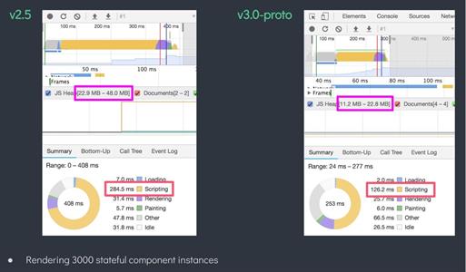
What’s more, the Vue team has made great improvements to the virtualDOM implementation which was rewritten from the ground up and provides up to 100% faster mounting and patching. The image below shows performance comparison between versions 2.5 and 3. The new version is twice as fast, and uses only half the memory.

Performance Comparison Vue 2.5 vs. Vue 3 

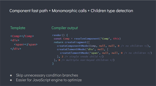
Furthermore, with new virtualDOM implementation, the runtime will receive more hints about how to deal with code and take fast paths whenever possible. The compiler will also create better optimized code and hoist static nodes, to speed up and avoid unnecessary rendering.

Fast paths

Other improvements include optimized slots generation, static props hoisting, and inline handler hoisting. You can read more about it in Evan’s presentation here.

TypeScript

Vue core team decided to move from Flow to TypeScript for development of Vue 3. Thanks to that, developers who use TypeScript for creating their application will have better type hints, and even if they don’t use TypeScript, some code editors like VS Code will also provide more information during development. Besides that, it will also be easier to use TypeScript in Vue 3. In Vue 2, most developers use the vue-class-component library, but thanks to the Composition API, Vue will be more TypeScript-friendly.

Composition API

Composition API is a new way of writing stateful logic in Vue components. So far, we could use mixins, scoped slots or higher order components, but all of these have their cons. This feature is inspired by React’s Hooks, but a bit better, as it avoids a few caveats. For instance, Vue’s hooks will not be called on every render, but instead just once, in the setup method. Thanks to that, there will be less work for the garbage collector.

In addition, they can be used conditionally, are not sensitive to call order, and avoid an issue with stale values. You can find more about the differences in Composition API’s documentation. I have already written an article dedicated to Composition API and how it can be used. You can find it here.

Decoupled Packages

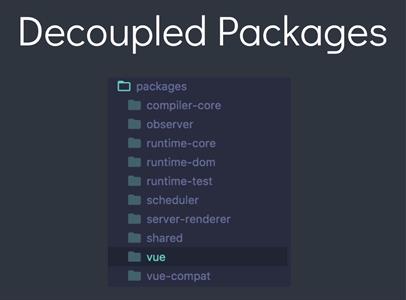
In Vue 3, internal packages are split into separate files. This will result in more modular and maintainable source code for the team working on the framework. It will also make it easier to use Vue’s renderer on different targets than just web. Good examples are Weex and NativeScript—these are frameworks that utilize Vue for creating mobile apps.

Decoupled Packages

Native Portals

Normally, elements are rendered exactly where they are defined. However, sometimes we would like to render elements somewhere else in an application. For instance, if we have a global modal component, it would be nice to be able to open it and set its content from anywhere in the application. At the moment, this is possible thanks to the portal-vue package. In Vue 3, this feature is provided out of the box, but it’s called Teleport.

// Somewhere high in your app

<div id="teleport-content"></div>

// Further down the app
<Portal target="teleport-content">I was teleported!</Portal>

Fragments

At the moment, a Vue template must always have one root element like so:

// One root element only in a template
<template>
<div>
</div>
<template>

Inspired by React’s Fragments, Vue 3 will allow multiple root nodes. This is very useful especially for list and table elements, as, for instance, a table row or a list element shouldn’t have a div as a parent.

// This works in Vue 3
<template>
<li>
</li>
<li>
</li>
</template

In Vue 2, to achieve the same outcome, a functional component would need to be used:

exportdefault{
functional:true,render(h){return[h("li",{
            domProps:{
              textContent:"first li"}}),h("li",{
            domProps:{
              textContent:"second li"}})];}}

Global Mounting

Most Vue projects start in the main.js file where the global Vue instance is created and mounted. Other libraries and plugins would also be added to this Vue instance. In Vue 3, a method called createApp will be used to create a Vue app instead. The benefit of this is the fact that third-party libraries will not be able to make changes to our app instance—for example, by using global mixins, filters or directives.

Multiple v-models

Currently, only one v-model can be used on a component.

<comp v-model="form" />

Vue 3 will allow us to use multiple v-models on a component.

// Parent component

<template>
<Form v-model:petName="petName" v-model:petAge="petAge" />
</template>
<script>
export default {
data() {
return {
petName: '',
petAge: ''
}
}
}
.6
</script>

// Form component 
<template>
  <input :value="petName" @input="update('petName', $event.target.value)" />
  <input :value="petAge" @input="update('petAge', +$event.target.value)" type="number" />
</template>

<script>
export default {
  name: "Form",
  props: {
    petName: String,
    petAge: Number
  },
  setup(props, context) {
    const { emit } = context;
    const update = (key, value) => {
      emit(`update:${key}`, value);
    };
    return {
      update
    };
  },
};
</script>

New Custom Directives API

The API for creating custom directives will be changed to better align with Vue’s lifecycle hooks.

Vue 2

const vue2directive ={bind(el, binding, vnode, prevNode){},inserted(){},update(){},componentUpdated(){},unbind(){}}


Vue 3

const vue3directive ={beforeMount(el, binding, vnode, prevVnode){},mounted(){},beforeUpdate(){},updated(){},beforeUnmount(){},unmounted(){}}

New Lifecycle Method—renderTriggered

Sometimes a component might render and we might not know why. renderTriggered is a new lifecycle hook that can be used to find that out.

const vm ={renderTriggered(e){
console.log(`${this.$options.name} was triggered`, e)}}

Suspense

Suspense is another new component added to Vue 3. Suspense component will allow displaying a fallback content while the component passed in the default slot is being loaded.

<template>
<Suspense>
<template #default>
// Component that is being loaded
</template>
<template #default>
// Fallback content displayed while other component is being loaded
</template>
</Suspense>
</template>

Conclusion

Vue 3 is much faster and smaller, and it will offer a lot of improvements over its predecessor, as well as bring new useful and exciting features that will allow us to write cleaner and more maintainable code. You can already start using Vue 3 by using vue-cli or Vite, a new build tool created by Evan You.

Empowering Developers to Create Custom UI

$
0
0

Hello! My name is Alyssa. I’m the Angular Developer Advocate for Kendo UI at Progress. I love Angular and frontend development. I’m super passionate about creating and helping others to create ✨FABULOUS✨ user interfaces. I work from home and share an office with my husband who is also a frontend, CSS-loving geek like myself.

User interface is like a joke. If you have to explain it, it's no good.

It’s a Mental Issue

Recently, during a team meeting, I overheard one of my husbands co-workers state:

“We can’t create that feature, our UI library doesn’t have that component.”

a stick figure drawing of me overhearing a ridiculous conversation

Of course, my first thought was “this person is coo-coo bananas.”  However, after talking with more and more developers, it seems they are not the only one of this mindset. Whether the task of creating something custom is just too daunting or they don’t believe they have time for something they believe will take forever, this mentality of “It’s not pre-built so I can’t do it” is not something new.

The worst that we, as current custodians of the web, can do is to allow anything to limit what's possible — Hardboiled Web Design<

I’ve seen this mentality in many under-supported, overwhelmed or even burnt-out developers. Before we can address this pivotal issue we need to have some background knowledge of CSS in order to truly understand the pain points. There seems to be two problems. One is being able to create the JavaScript and HTML that would reflect the functionality of the feature, and the other is creating the CSS that is responsible for the overall look-and-feel / UX of the whole app.

After talking with many different developers, the second problem seems to be the crux of this mental hold-back. I want to start with some CSS specific knowledge to try to level set and show that CSS isn’t as scary as we all think. This understanding will lay the groundwork for enabling yourself and other developers to truly create the impossible on the web.

Understanding Cascading CSS and Specificity

arrow pointing to the ‘C’ in ‘CSS’

It's all about that pesky and beautiful first letter in "CSS" that makes it unlike any other language developers work with. CASCADING! CSS is a way to list out styles for elements on the page.

button {
  background: rebeccapurple;
}

What happens though, when there are competing rules to style the same elements differently?

button {
  background: rebeccapurple;
  color: white;
}

button {
  background: deeppink;
}
Two things of the same value declared? The later one will win out. (Cascading)

Well, in the above case, the button would first have the background color of rebeccapurple applied and then as the browsers moved down the stylesheet, it would apply the 8th line of styles and change the button’s background to have a color of deeppink. This all happens before the user sees it, so the page would simply load as deeppink.

The cascading part only takes you so far though with your CSS, the other (and main) gotcha is ✨SPECIFICITY!✨ In our previous example, the second style rule for button background overrode the first. However, by being more specific on our first selector, we can have rebeccapurple load in as our background color, without needing to move the order of our CSS around at all.

button.submit {
  background: rebeccapurple;
  color: white;
}

button {
  background: deeppink;
}

See the Pen CSS Cascading & Specificity by Alyssa Nicoll (@alyssamichelle) on CodePen.

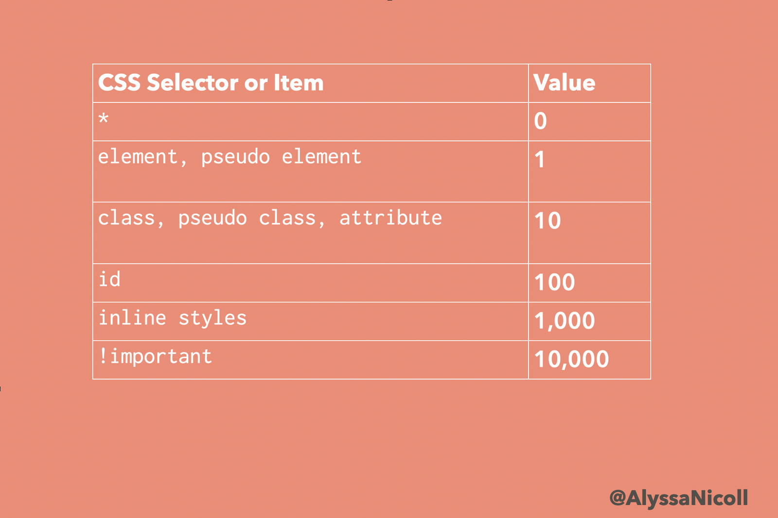
By adding the class of submit to the first button selector, it will override the later deeppink one. CSS selectors start off worth nothing or not very much (*, h1, button, button:before) and work their way up to almost impossible to override (inline, !important). Una Kravets did a short and wonderful podcast episode to explain CSS specificity. She goes into much more detail than I do and even lists out examples to walk your through it. It’s really worth a listen if you don’t have this concept fully down yet. I also created this handy-dandy chart to help us keep things straight:

a chart with the CSS selectors and their values

Important Notes with CSS Specificity

I also found these definitions to be super helpful:

Pseudo Element vs Class?

Pseudo Element: represents something physical :before Pseudo Class: represents something stateful :active

Additional things to note about CSS specificity:

  • The pseudo-class :not() adds no specificity by itself, only what’s inside it’s parentheses.
  • Chaining similar things like duplicate class names: a.list.list.list.list does in fact add up!
  • The only way an !important value can be overridden is with another !important rule declared later in the CSS.

This resource is a wonderful guide to CSS specificity. These are good tools to bookmark and share with developers who might also know the CSS struggle is real. (Check out my curated list below for all the powerful resources gathered in one location!)

arrow pointing to https://css-tricks.com/specifics-on-css-specificity/

Pain Points of CSS-ing amidst pre-existing CSS

Duplication

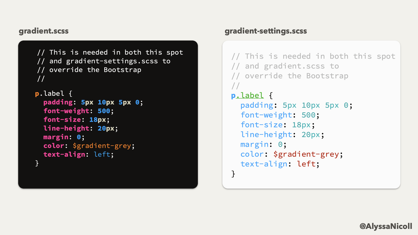
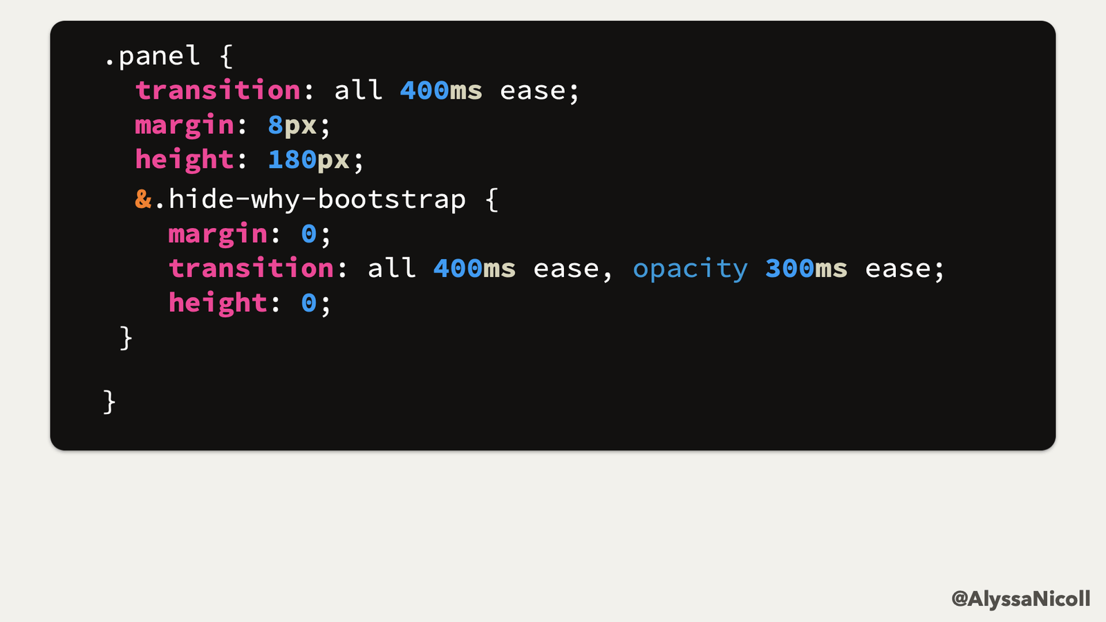
In my previous job I was tasked with creating custom UI often. The project I was working on was built with Bootstrap. So there were many times in my styles that I had to do things like this:

commented duplicate CSS in two different files, explaining it is needed to override Bootstraps specificity

I had to duplicate code in different places in order to override bootstraps styles. This is because of something I like to call specificity wars.

Specificity Wars

When styles (whether your own or from a library/framework you have included) are either too generic or too specific, they become very difficult to work with and create custom UI alongside.

Too Generic of Styles

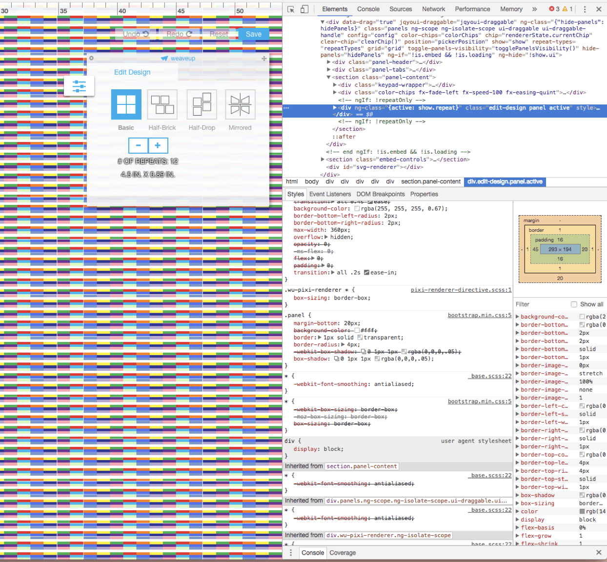
On the project I was previously working on, the one that I mentioned before, I was tasked with building out a pop-up panel for clients to custom a design that would be printed out on fabric. I started creating and styling my panel and when I thought I had finished, I loaded up the browser and saw this:

pop-up panel for customizing a pattern design on fabric

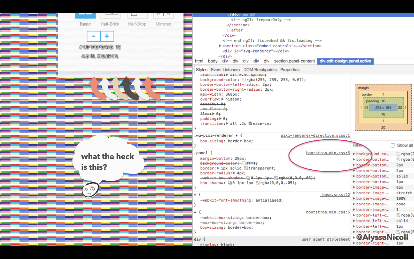
Everything looked as I expected so far, except this large gappy-gap happening on the bottom:

same image as the one above but highlighting the bootstrap css that is causing the issue

This, of course, was happening because Bootstrap had already styled anything with a class of .panel to have a margin-bottom of 20px (along with other styles).

css to override bootstrap styles that are too generic

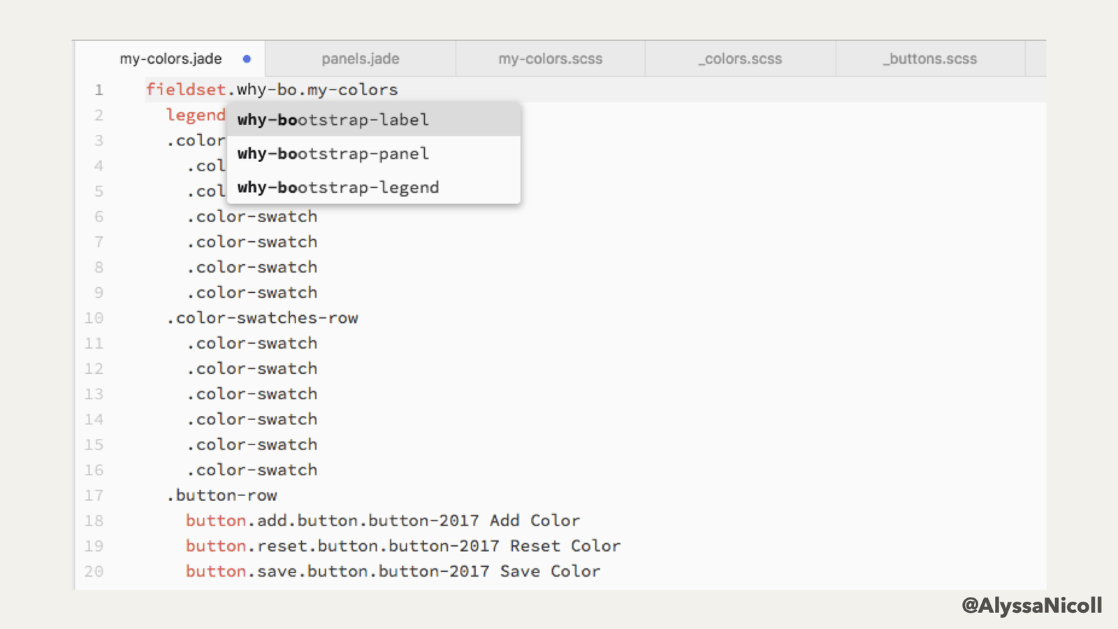
The real issue here is that Bootstrap added their styles to the very generic class of .panel. A better and more friendly way, would be to put their styles on a namespaced class like .bootstrap-panel. This might seem nit-picky, except that .panel is not the only generic class or namespace that Bootstrap claims, rather, there are many, such as .label and .legend that they claim as well:

showing multiple times that I have needed to override bootstrap generic class names

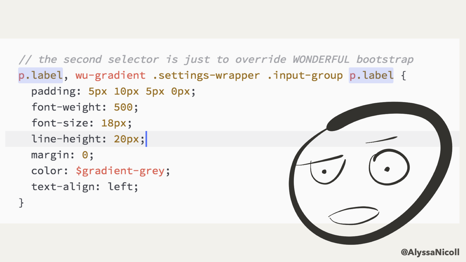
This requires you to be increasingly more specific and isolating your styles away from the application’s. I don’t believe we should drift away from the cascade that CSS employs, rather, I think we should use it wisely by only ever being as specific as we need to be.

two selectors for the same label, the second one is MUCH more specific in order to override bootstrap

Too Specific of Styles

The other side of the specificity wars is having styles that are too specific.

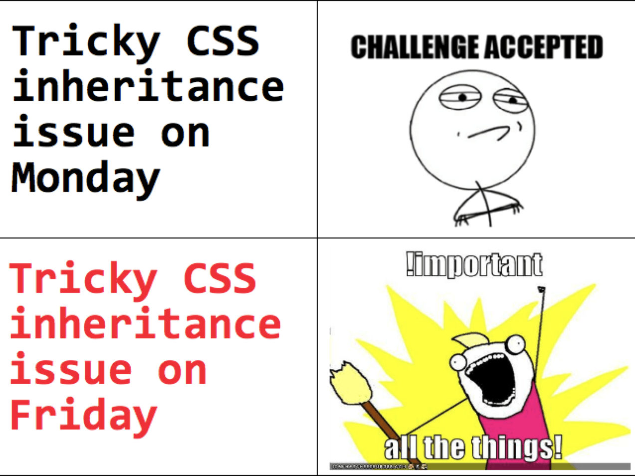
a joke about !important

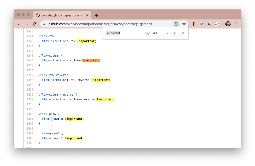
Remember how we talked about specificity above? The !important flag is the most specific and most harmful thing you can put into your styles. It is very difficult and painful to override something with the code>!important flag. The last time I checked (3/25/2020), Bootstrap has over 1,000 code>!important flags in their CSS.

me searching the github repo for the term !important and finding 1049 results

Put simply, this means that if you are using something like Bootstrap that is being very specific with their styles, it is going to be very difficult to create custom styles alongside theirs. By no means impossible, just painful.

Kendo UI Does Try to Be Kind with Specificity

 Kendo UI for Angular Kendoka

It doesn’t always need to be this painful though, having a UI library does not mean you must be as specific as possible. Kendo UI, for example, is a HUGE component library with over 70 components. When searching through the repos for Kendo UI, component by component, the closest thing to !important that I could find were comments about important things. ;) It has been so much easier, while working with Kendo UI for Angular, to create custom UI, than my experiences with Bootstrap. I know they Kendo UI does have a few important tags, but they try to be very conscious of when and where they are using them. You can have a well structured and robust UI library without becoming too specific and making customizations impossible.

Balance is Required

This doesn’t leave us with much wiggle room, I realize. On the one hand, when you are creating styles of your own, you don’t want to be too generic—which could leave you with clashing styles and unexpected results. You do, of course, want to have generic enough to create a foundation that all your other styles build upon. However, being super generic all over the place will only lead to pain.

On the other hand, you don’t want to be so super specific that you require !important flags all over the place to get anything to apply. As with many things in life, balance is required here.

Star Wars gif about balance

What Can We Do?

Awareness of What Is Possible

Often times, when looking into why my fellow developers are fearful of a CSS assignment, it is because they are unaware of the power and truly limitless nature of CSS. I believe that by simply being aware of what is possible with CSS and keeping up-to-date with what people are creating with it, can open pathways in your brain that were previously shut closed.

A great example is something that people often reach to UI libraries for, the very scary GRID!! Which, in all honesty, is not that scary at all. Here is a codepen where I have recreated a Grid layout with about 35 lines of CSS.

See the Pen CSS Grid Layout by Alyssa Nicoll (@alyssamichelle) on CodePen.

The bulk of tackling something scary like this is understanding how to create a Grid layout either using Grid or Flexbox. Check out this Codepen to see me use Flexbox and CSS Grid side-by-side for comparison. A wonderful resource that I prefer for learning and reminding myself about CSS Grid is learncssgrid.com.

So instead of pulling in a library with thousands upon thousands of lines of CSS, if all you need is a Grid, it might be best to build your own:

.row {
  display: grid;
  grid-auto-flow: column;
}

Design Systems to Guide

Another step your team can take to help with sustainability and longevity of your styles is to create a design system to guide any new UI. At FOWA 2013 in London, Mark Otto described a design system as:

Design System: everything that makes up your product

Design systems are meant to include EVERYTHING about your brand. This includes things like typography and layout all the way to things like coding conventions and full blown style guides. Design systems are a place to keep all of this information so the team can reference it, learn from it and keep the brand growing and thriving.

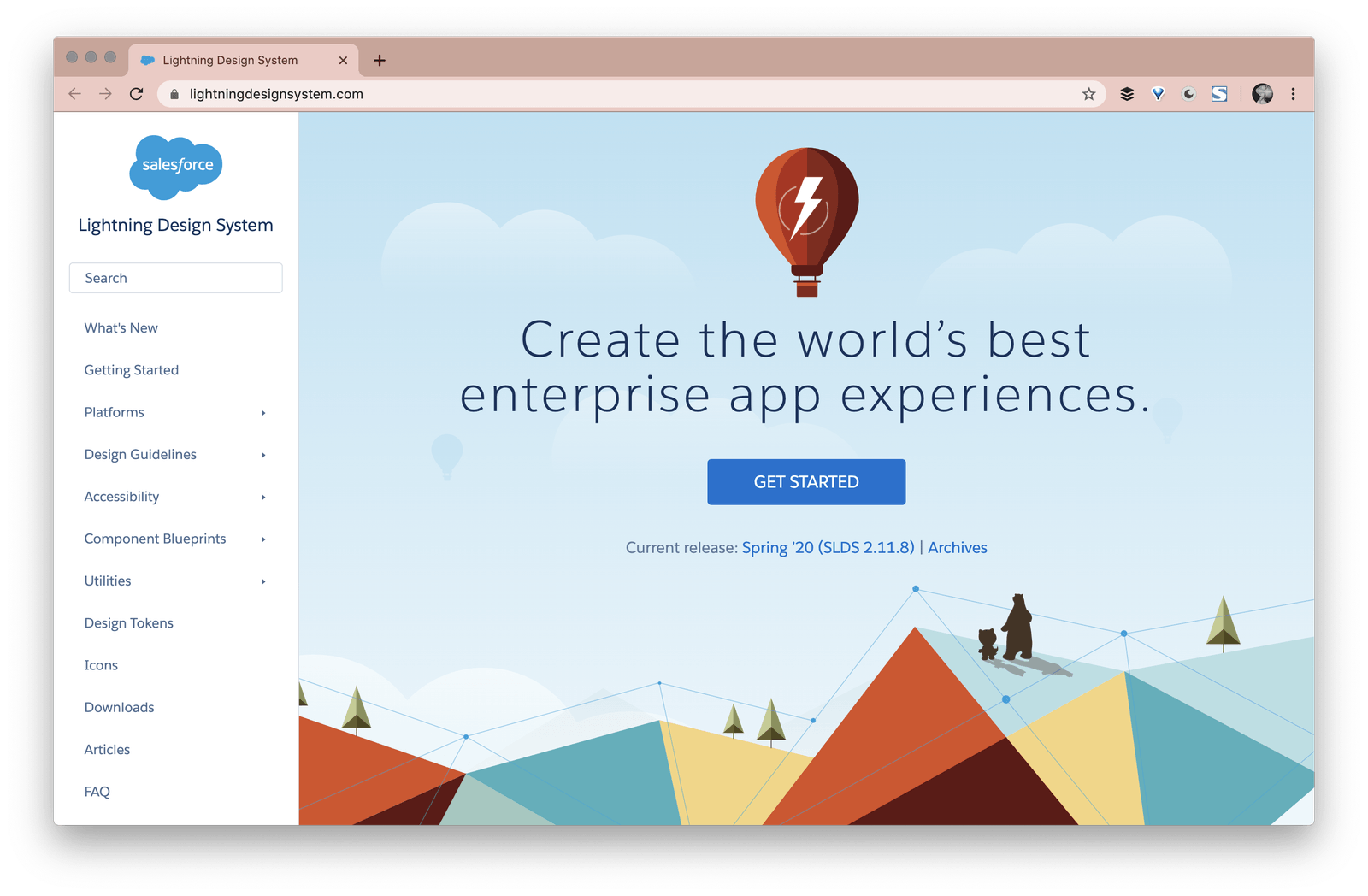
A really neat Design System to check out is by Salesforce: https://www.lightningdesignsystem.com/.

a screenshot of the opening page of salesforce design system

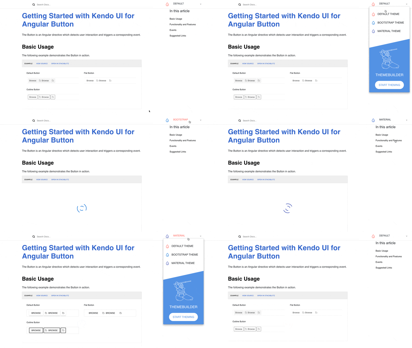
Kendo UI actually for Angular actually integrates really well with design systems and, in fact, implements its own with Themes!

 Gif toggling between the different themes offered by Kendo UI

The Default theme is technically our own Design System, Bootstrap is one we integrate with, and Material is of course tied to Material Design. I think having a design system in place can really help you elevate your components and your UI to a professional level.

Creating your own Design System, however, can be a bit daunting. This is a large task that while being incredibly useful, will take an incredible amount of energy to get it right. So why not start small and create a very helpful and relatively easy-to-get-started-with piece—A Style Guide.

Here is an example Style Guide my husband created for an internal application. This was on their internal site where other developers could go and get a quick reference for creating things like buttons and forms, to make sure any newly created UI remained consistent.

screenshot of a smaller style guide listing out colors, typography, button styles, etc

Resources to Aid

Lastly, I recommend creating a curated list of CSS and Design resources for your team. This will not only include your own style guide or design system, but also have courses, blog posts, and codepens that your developers can reference in times of great CSS peril. Here is my own list to get you started: Alyssa’s Powerful CSS Resource List

it's dangerous to go alone! Take This.” and Zelda with a sword

tl;dr

To sum up, it can be very difficult and daunting to create custom UI. There are many issues developers face, from over-specific libraries that are already included in the project, to complicated and unknown things in CSS itself. The best advice I can give to any manager of a dev team or individual developer is this:

By all means, do not rewrite the wheel, lean on the work of others. But we should never let the difficult task of creating custom UI alongside existing styles or libraries limit what we create for our clients. Create a system, a style guide, and a list of resources that your team can go to. Always encourage those around you to reach for the truly creative, keeping your users needs first, above our own fear and inconvenience.

Alyssa is the Angular Developer Advocate for Kendo UI. If you're into Angular, React, Vue or jQuery and also happen to love beautiful and highly detailed components, check out Kendo UI—and you can find the Kendo UI for Angular library here or just jump into a free 30 day trial today. Happy Coding!

Embedding Beautiful Reporting into Your HTML5 Applications

$
0
0

Here’s what you need to do to grab reports from a remote Telerik Reporting REST Service and have them display in Views or HTML pages in any web application.

It’s easy to implement client-side reporting in your applications using the Telerik HTML5 Report Viewer. In the most common scenarios, the HTML5 Report Viewer is connected to a Telerik Reporting REST Service, hosted in the same application. This service does the heavy lifting of rendering the report and delivering the pages back to the report viewer. But how can we connect the report viewer to the Telerik Reporting REST Service that operates on a Report Server instance? Here’s what you need to do to grab reports from the Telerik Report Server and have them display in Views or HTML pages in both ASP.NET and ASP.NET Core projects… or, really, any web application.

In this post, I’ll show how to use the HTML5 Report Viewer in plain old HTML pages. I’m also going to show how to use the Telerik Report Server, which is easier than creating your own REST-based Report Service (which the Telerik Reporting solution also lets you do).

Save Your Seat: Reporting In-Depth—How to Streamline Reporting with Ease

Setting up Report Server

The first step in using Report Server is to download its installation package from your Telerik.com account. Once the installation package has finished running, you can access the Report Server Manager either from your Window’s Start menu or by opening a browser and surfing to localhost:83. The first time you access the manager, you’ll be asked to specify a storage location (I just accepted the default location in my computer’s file system) and set up an admin account with password and email address. Other than loading your reports, you’re ready to start serving reports to your application.

The Report Server default installation contains a half-dozen sample reports in a category called Samples, and you can use them to build your first reporting pages. If you’ve already created reports with the Telerik Report Designer, you can upload them to the server and organize them into categories.

Alternatively, you can link your copy of Report Designer to Report Server. In Report Designer, go to the File | Open menu, select Report Servers on the left and then click on the Add Server button on the right. You’ll then need to provide the URL for your Report Manager installation (localhost:83, again) and the admin name/password you set up when you installed Report Server. You should now be able to create reports in Report Designer and save them to Report Server as you work on them. To use any of those reports from Report Server, you just need to click the Publish button in Report Designer and the report will be available for all Report Server users.

To access reports, your applications will need to log in to Report Server. As you’ll see, you can just use the admin username/password you’ve set up. Alternatively, from the Users tab on the left-hand side of Report Server Manager’s menu, you can enable the Guest account which doesn’t require an account name or password. You might even want to create a new user with tailored reporting permissions: Users can, for example, be set up with read-only permissions and be limited to accessing reports in a specific category (or even to a specific report).

For this post, I used a report I created earlier in Report Designer that includes an embedded connection string. All I had to do, once I’d connected Report Designer to Report Server, was publish my report and I was ready to use it in Report Viewer.

Grab the eBook: A Quick Guide to Expert .NET Reporting Tools 

Configuring the Report Viewer’s Web Page

If you’re working with an ASP.NET project, the easiest way to add a page or View that supports the HTML5 Report Viewer is to use Visual Studio’s Add | New Item dialog and select Telerik HTML5 Report Viewer Page (for an .html page) or HTML5 Report Viewer View (for a .cshtml view). Either of those choices starts up a wizard that lets you select the report you want in your Report Server. If you haven’t built your project successfully at this point, the wizard will make you do it now.

As you work through the wizard, you’ll need to provide the URL for Report Server and the username/password for the account you want to use (if you’ve enabled the Guest account or created a new account, you can use them). If you’ve limited the account to only reading reports, then you’ll need to type in the name of the report and its category because the user won’t be allowed to list reports and categories.

The wizard will not only add a page (or View) with the HTML and JavaScript support your Report Viewer requires but will also ensure that your project has all the necessary references. Having said that, both ASP.NET MVC projects using .NET 4.7 and ASP.NET Core projects don’t require any additional references.

If you’re working in an ASP.NET Core project (or want to add the Report Viewer to an existing page/View in an ASP.NET project), you can configure the page yourself. To do that, first, in your page’s head element, add these two script tags (if you already have the jQuery tag, make sure that the script tag for the telerikReportViewer follows it):

<script src="https://code.jquery.com/jquery-3.3.1.min.js"></script>
<script src="http://localhost:83/api/reports/resources/js/telerikReportViewer-14.1.20.618.min.js/"></script>

You’ll also need to add these two link tags to get the stylesheets you’ll need:

<link href="https://kendo.cdn.telerik.com/2020.1.114/styles/kendo.common.min.css" rel="stylesheet" />
<link href="https://kendo.cdn.telerik.com/2020.1.114/styles/kendo.blueopal.min.css" rel="stylesheet" />

Finally, you’ll need to create a style for the div element that displays your Report Viewer (this example uses a local style in the head element and assumes the div element has its id attribute set to reportViewer1):

<style>
        #reportViewer1 {
            position: absolute;
            left: 5px;
            right: 5px;
            top: 5px;
            bottom: 5px;
            overflow: hidden;
            font-family: Verdana, Arial;
        }
</style>

In ASP.NET Core projects, you’ll need to make sure that you have this line in your Startup.cs file’s Configure method:

app.UseStaticFiles();

However, the defaults for most ASP.NET Care projects will automatically include that line.

Displaying the Report

To display your page, in your page’s body element, you need a div element to hold the Report Viewer. This sample element both provides a message to display while the report is being fetched and sets the element’s id attribute (which matters both for the style applied to the element and for some upcoming JavaScript).

<div id="reportViewer1">
   Please wait, your report is loading
</div>

Now you need some JavaScript to load your report into the div element when the page is ready. The core of this code is the object literal that you pass to the telerik_ReportViewer method. In the parameters to that method, you’ll need to specify the URL for your Report Server (still localhost:83) and the name and category of the report you want to display.

A minimal implementation for an acceptable looking display looks like this:

<script type="text/javascript">
        $(document).ready(function () {
            $("#reportViewer1")
                .telerik_ReportViewer({
                    reportServer: {
        url: "http://localhost:83",
            },
                    reportSource: {
                            report: "Samples/First Server Report"
                    },
                    scaleMode: telerikReportViewer.ScaleModes.SPECIFIC,
                    scale: 1.0
                });
        });
    </script>

You can check out the Report Viewer documentation for more options.

That sample JavaScript code will only work, however, if you enabled the Guest account in Report Server’s Guest account. If you’ve set up and want to use other accounts, you’ll need include the account name and password in the ReportServer parameter. This example uses an account called PeterVogel with a password of “password”:

reportServer: {
url: "http://localhost:83",
    username: "PeterVogel",
    password: "password"
}

If you run into any problems when you test your application, check out the troubleshooting section at the end of this page. But, if your experience is like mine, you’ll probably just press F5 and, a couple of seconds later, find yourself looking at your report.

Tried Telerik DevCraft?

You can choose Telerik Reporting and Telerik Report Server as individual products or enjoy them as part of the great Telerik DevCraft bundles.

Try Telerik DevCraft

Telerik DevCraft is the finest software developer tools collection across .NET and JavaScript technologies, which includes modern, feature-rich and professionally designed UI components for web, desktop and mobile applications, reporting and report management solutions, document processing libraries, automated testing and mocking tools from the Telerik and Kendo UI suites. DevCraft will arm you with everything you need to deliver outstanding applications in less time and with less effort. With the backing of our legendary support team, which consists of the developers who build the products, and a ton of resources and trainings you can rest assured that you have a stable partner to rely on for your everyday challenges along your software development journey.
ToDo Sample Application with Xamarin.Forms, Telerik UI, MVVMFresh and Microsoft.EntityFrameworkCore

$
0
0

Introducing our Telerik ToDo App: A beautifully designed and highly performant task management application built with Telerik UI for Xamarin controls.

In our dynamic world, staying focused and organized is imperative for achieving both business and personal objectives, which is why task management mobile applications are so popular. These simple, yet powerful mobile apps are often used as demos or sample use cases to demonstrate the power of a given framework or technology, and Xamarin.Forms is no different. The team behind Telerik UI for Xamarin has crafted a powerful task management application to demonstrate how you can build a successful customer-facing application with Xamarin.Forms and deploy it on Android, iOS and Microsoft mobile devices.

Overview

The Telerik ToDo sample application aims to mimic a real-world consumer facing application. It uses a combination of various technologies and is developed in line with the latest trends in mobile development architecture. Below is a brief overview of the technologies and frameworks used to create the sample Xamairn.Forms application:

  • Entity Framework Core—a lightweight, extensible, open source and cross-platform version of the popular Entity Framework data access technology. Entity Framework is the standard technology when it comes to .NET developers working with various database implementations by using .NET objects as it removes the need of writing custom data-access layers.
  • SQLite—We have chosen SQLite to serve as a SQL database engine for the application. SQLite is the most used database engine in the world. It is built into all mobile phones and most computers and comes bundled inside countless other applications that people use every day.
  • MVVMFresh—a super-light MVVM framework created specifically for Xamarin.Forms. It's designed to be easy, simple and flexible. Some of the important features the framework provides are:
    • PageModel to PageModel Navigation
    • Automatic BindingContext wiring
    • Built-in IOC containers
    • Automatic wiring of Page events and many more.
  • Telerik UI For Xamarin—offers high-quality Xamarin Forms UI components and Visual Studio item templates to enable every developer, regardless of their experience, to build professional-looking modern mobile applications for iOS, Android and UWP.

Application Structure

The different modules of this sample Xamarin.Forms application are separated in folders with names that are descriptive and quite standard for projects of such size. Some of the more important folders we have introduced are:

  • Models: This is where the business objects live.
  • PageModels: The classes used as BindingContext for each separate Page (or view) are located here.
  • Pages: Hosts the different views/pages that the application will present.
  • DataAccess: The classes related to the database used to store the data of the application are located in this folder.
  • Controls: It contains some small additional custom controls which are used within the pages.
  • Services: The application currently contains just a single ToDoService that takes care of storing and updating the data used within the application.

MVVMFresh—A Lightweight MVVM Framework Implementation Designed for Xamarin.Forms

The MVVM pattern is a standard for applications of any scale in the Xamarin world and this is no exception. As mentioned in the overview, the project relies on the MVVMFresh framework to keep the model and pages organized so that the solution can be easily understood by all users who intend to inspect it. The framework is famous in the Xamarin community for being easy and straightforward to use which makes it a perfect fit for the purpose of our project.

In order to connect the views and their models, all you need to do is follow the convention in the naming—each Page should have a corresponding PageModel. For example, the BindingContext of the MainPage will automatically be set to be an instance of the MainPageModel class.

The navigation within the application is pretty simple as well—you can use the CoreMethods property of the FreshBasePageModel class, which is the base class for all the PageModels within the application, to navigate between models.

For more information on the different features the framework supports, you can refer to its documentation which is quite descriptive—MVVM Fresh.

Data Access

As mentioned earlier, we are using EntityFrameworkCore and its built-in ability to easily communicate with an SQLite database to power the data access capability of this Xamairn.Forms sample application. For the purpose, a couple of NuGet packages are installed:

  • Microsoft.EntityFrameworkCore
  • Microsoft.EntityFrameworkCore.SQLite

The classes needed for EF are all located in the DataAccess folder. You can note that there is a DTO folder where the Data Transfer Objects (the objects used to send data between our application and the underlying database) are located. As you can note they are almost identical to the objects within the Models folder and take care of the information we would like to keep in our database. The DomainMapper class contains some methods to convert between these identical objects.

Additionally, we have added some sample items in the database so that the users of the application can see some “to-do” tasks once the application is initially opened. The sample data creation can be viewed in the SeedData class.

The last and final class from the DataAccess layers is the TodoItemContext class which extends the Entity Framework DbContext class. As advised in the official documentation, the DbContextclass can be viewed as a session between your application and the database and can be used to query the database or update it with some new information when needed. It consists of DbSetsfor the different DTO objects we have. This DbContext is extensively used in the ToDoService class where the actual methods of querying and updating the database are implemented.

As the file systems on each mobile technology differ, we have introduced an IDbFileProvider interface which requires its implementations to set up a single method—GetLocalFilePath. А different implementation of the interface is provided by classes in each separate platform in order to create the database in the correct location. The Xamarin.Forms DependencyService approach is used to obtain the different locations according to the platform on which the application is running.

Creating the actual database can be found in the App.xaml.cs file:

public static DataAccess.TodoItemContext CreateDatabase()
{
    IDbFileProvider dbFileProvider = DependencyService.Get<IDbFileProvider>();
    if (dbFileProvider == null)
        return null;
 
    // Database
    string dblocation = dbFileProvider.GetLocalFilePath("tododb.db");
    System.Diagnostics.Debug.WriteLine($"Database location: {dblocation}");
    DataAccess.TodoItemContext ctx = DataAccess.TodoItemContext.Create(dblocation);
    return ctx;
}

Services

Going back to our earlier technology overview, the application services consist of a single ToDoService which takes care of adding, deleting, updating the "to-do" items within the application or simply to get a list of the existing items. Here are a couple of methods that the service provides: the first is used to get a specific "to-do" item from the database and the second one to add a "to-do" item:

public TodoItem GetTodoItem(int id)
{
    return context.TodoItems
        .Where(c => c.ID == id)0
        .Include(c => c.Category)
        .Include(c => c.Alert)
        .ThenInclude(c => c.Alert)
        .Include(c => c.Recurrence)
        .ThenInclude(c => c.Recurrence)
        .Include(c => c.Priority)
        .SingleOrDefault()?.ToModel(true);
}
public async Task<TodoItem> AddTodoItemAsync(TodoItem newItem)
{
    var dto = newItem.ToDTO();
    var entity = this.context.TodoItems.Add(dto);
    try
    {
        await this.context.SaveChangesAsync();
    }
    catch (Exception e)
    {
        System.Diagnostics.Debug.WriteLine(e);
        throw e;
    }
    TodoItem storedItem = GetTodoItem(entity.Entity.ID);
    MessagingCenter.Send<ITodoService, TodoItem>(this, ActionAdd, storedItem);
    return storedItem;}

Frontend Implementation: The UI Layer and Telerik Controls for Xamarin.Forms

We have integrated multiple controls from our Telerik UI for Xamarin suite in the application so we can easily achieve a modern look-and-feel crafted by our design team.

Embedding the controls was easy and straightforward—all you need to do is follow our documentation, which we are always working on so that it is kept up-to-date and contains the right information for you. Even our team members are often using it as a reference when building demo applications or providing examples to our customers.

The application consists of multiple screens so for the purpose of the blog post we will concentrate on some of the more important views and show you the setup behind them.

Introduction Page and RadSlideView

One of the first pages that the user faces is the “Welcome” screen that utilizes the RadSlideViewcontrol and its ability to directly set an ItemTemplate, which makes it a great fit for any “Splash Screen” scenario or views where a sliding content is required. The code for bootstrapping the SlideView element is small and tight:

<telerikPrimitives:RadSlideView x:Name="slideView"
                                               Grid.Row="1"
                        Margin="0,38,0,34"
        ItemsSource="{Binding Slides}"
                        ShowButtons="False" 
                        IndicatorColor="#F2F2F3" 
                        SelectedIndicatorColor="#4DA3E0">
          <telerikPrimitives:RadSlideView.ItemTemplate>
              <DataTemplate>
                  <StackLayout Orientation="Vertical"Margin="0,0,0,50" Spacing="0">
                      <Image Source="{Binding Image}"Aspect="AspectFit">
                          <Image.HorizontalOptions>
                              <OnPlatformx:TypeArguments="LayoutOptions" Default="FillAndExpand">
                                  <On Platform="UWP"Value="CenterAndExpand" />
                              </OnPlatform>
                          </Image.HorizontalOptions>
                          <Image.WidthRequest>
                              <OnPlatformx:TypeArguments="x:Double" Default="-1">
                                  <On Platform="UWP"Value="300" />
                              </OnPlatform>
                          </Image.WidthRequest>
                      </Image>
                      <Label Text="{Binding Title}"HorizontalTextAlignment="Center" TextColor="Black" FontSize="Medium"Margin="0,15,0,0" />
                      <Label Text="{Binding Description}"HorizontalTextAlignment="Center" TextColor="#5C5C68"  Margin="0,14,0,0"/>
                  </StackLayout>
              </DataTemplate>
          </telerikPrimitives:RadSlideView.ItemTemplate>
      </telerikPrimitives:RadSlideView>
 

As you can see, just setting the ItemsSource, the ItemTemplate and some additional properties of the control leads to a result which will make every mobile application better and more professional looking. Here is the actual “Welcome page” when the app is initially opened:

Splash Screen Android

Main Page and RadListView

Once the users are familiarized with the most important functionalities of the application in the introduction screen, they are brought to the main page—the actual list of items that the user has in their “to-do” plans. By default, a list in grid format that contains the categories in which the "to-do" items are grouped is shown. The view is solely achieved by including a RadListView control. As one of the more-complex and feature-rich controls in the suite, it can be highly customized so a more distinguished look is achieved. Here are some of its features that we used in this particular view:

  • Grid Layout
<telerikDataControls:RadListView.LayoutDefinition>
    <telerikListView:ListViewGridLayout HorizontalItemSpacing="0"
                            ItemLength="100"
                            SpanCount="2"
                            VerticalItemSpacing="0" />
</telerikDataControls:RadListView.LayoutDefinition>
 
  • Custom Item Styles
<telerikDataControls:RadListView Grid.Row="1"
                      ItemsSource="{Binding Categories}"
                      ItemStyle="{StaticResource UnifiedItemStyle}"
                      SelectedItemStyle="{StaticResource UnifiedItemStyle}"
                      PressedItemStyle="{StaticResource UnifiedItemStyle}"
                      SelectedItem="{Binding SelectedCategory, Mode=TwoWay}">


  • ItemTemplateSelector
<telerikDataControls:RadListView.ItemTemplateSelector>
      <templateSelectors:RadListViewItemTemplateSelector>
          <templateSelectors:RadListViewItemTemplateSelector.CategoryTemplate>
              <DataTemplate>
                  <telerikListView:ListViewTemplateCell>
                      <telerikListView:ListViewTemplateCell.View>
                          <-- Template for the existing category items -->
                      </telerikListView:ListViewTemplateCell.View>
                  </telerikListView:ListViewTemplateCell>
              </DataTemplate>
          </templateSelectors:RadListViewItemTemplateSelector.CategoryTemplate>
          <templateSelectors:RadListViewItemTemplateSelector.NewCategoryTemplate>
              <DataTemplate>
                  <telerikListView:ListViewTemplateCell>
                      <telerikListView:ListViewTemplateCell.View>
                         <-- Template for the new category item -->
                      </telerikListView:ListViewTemplateCell.View>
                  </telerikListView:ListViewTemplateCell>
              </DataTemplate>
          </templateSelectors:RadListViewItemTemplateSelector.NewCategoryTemplate>
      </templateSelectors:RadListViewItemTemplateSelector>
</telerikDataControls:RadListView.ItemTemplateSelector>


Here is how the different categories will be visualized when using such a setup:

Android ListView ToDo

You can check the full setup of the control directly in the application project, which is available to the public in a GitHub repository here.

Clicking on each separate category will open a new screen where the “to-do” items marked with this specific category will be shown. The new view is again accomplished through a RadListView component, this time in a LinearLayout mode. On this page the users have the possibility to mark an item as already done, which will cross off the item, or delete it. RadListView's swiping feature comes to the rescue to achieve these interactions:

Android ListView Swiping

Furthermore, you can navigate to the different to-do items and edit their specific properties from this screen as well by simply clicking on the item.

Alternative Look with RadTreeView

Even at this state, the application contains all the necessary actions for a user to add different items and categories as well as edit them. However, we have decided to provide an additional option for the clients when choosing how the list of items will appear in their application. Instead of using the default Grid-like view, the app provides an option to show the items in a list with categories as groups. In order to show this view, you simply need to click on the hamburger menu on the right where some additional options will appear:

Android Menu

The menu is set as the DrawerContent of a RadSideDrawer control which is used to easily show the options by clicking the button or through a swiping gesture. Clicking on “Linear View” will alter the default layout as explained and lead to the following view:

Android Treeview Expand Collapse

This time we have added a RadTreeView component to achieve the hierarchical appearance of the categories and the items. Clicking the different categories will collapse/expand the list below. When setting up the TreeView component it is important to apply the correct TreeViewDescriptors, which have the ability to apply different Item templates similar to the RadListView element:

<telerikDataControls:RadTreeView x:Name="treeView" Grid.Row="1"
                                 ItemsSource="{Binding Categories}">
    <telerikDataControls:RadTreeView.Descriptors>
        <telerikDataControls:TreeViewDescriptor TargetType="{x:Type models:Category}" DisplayMemberPath="Name" ItemsSourcePath="Items">
            <telerikDataControls:TreeViewDescriptor.ItemTemplate>
                <templateSelectors:RadTreeViewItemTemplateSelector>
                    <templateSelectors:RadTreeViewItemTemplateSelector.CategoryTemplate>
                        <DataTemplate>
                         <!--Category Item Template-->
                        </DataTemplate>
                    </templateSelectors:RadTreeViewItemTemplateSelector.CategoryTemplate>
                    <templateSelectors:RadTreeViewItemTemplateSelector.NewCategoryTemplate>
                        <DataTemplate>
                            <!--New Category Item Template-->
                        </DataTemplate>
                    </templateSelectors:RadTreeViewItemTemplateSelector.NewCategoryTemplate>
                </templateSelectors:RadTreeViewItemTemplateSelector>
            </telerikDataControls:TreeViewDescriptor.ItemTemplate>
        </telerikDataControls:TreeViewDescriptor>
        <telerikDataControls:TreeViewDescriptor TargetType="{x:Type models:TodoItem}" DisplayMemberPath="Name">
            <telerikDataControls:TreeViewDescriptor.ItemTemplate>
                <DataTemplate>
                 <!--ToDo Item template-->
                </DataTemplate>
            </telerikDataControls:TreeViewDescriptor.ItemTemplate>
        </telerikDataControls:TreeViewDescriptor>
    </telerikDataControls:RadTreeView.Descriptors>
</telerikDataControls:RadTreeView>
 

As you can see, separate descriptors are defined for the Category and ToDoItem business objects and a custom ItemTemplateSelector is set for the Category as we aim for an appearance similar to the RadListView.

Once you go through the actual project you will notice that the RadListView component is used on several occasions throughout the application as the control is very versatile and come in handy for lots of common mobile scenarios. Some other elements from the Telerik UI for Xamarin suite that are used throughout the application are the RadButton, RadBorder and RadPopup controls.

Conclusion

The Telerik ToDo sample application is a perfect example of a real-world consumer facing app that can be built with Xamarin.Forms in no time. We hope you like the approach we have chosen for creating the "To-Do" sample Xamarin.Forms app and you will find it useful when considering the overall architecture for your next Xamarin mobile development.

As this blog post aims to familiarize you with the setup and provide just an overview of the technologies, we suggest you check out the actual project which we have made publicly available. You can also review some of the other sample applications we have created as each one represents a unique scenario and uses additional frameworks and technologies.

If you would like to know more about the available controls in the Telerik UI for Xamarin suite, refer to our official documentation or check out our product page. Other useful resources are the available demos in our QSF and SDK Samples applications or the demo apps from the different platform stores—iOS, Android or Microsoft.

As always, your feedback is greatly appreciated, so if you would like to see a combination of the Telerik UI for Xamarin controls and a particular trending technology, let us know either by raising a ticket or writing in the Telerik UI for Xamarin official forum.

You want to take the Telerik ToDo app for a test? Download Telerik UI for Xamarin and head to GitHub for the Telerik ToDo source code.

Want to take a deep dive into the all Xamarin.Forms Sample Applications by Telerik? Download our whitepaper!

The Ultimate Guide to Xamarin.Forms Mobile Development with Real-World Sample Applications

Simplifying Angular Change Detection

$
0
0

Change Detection is the backbone of the Angular framework, and each component has its own change detector. This article explains change detection strategies and optimizations to help you write highly performant Angular applications.

Angular can detect when data changes in the component, and can re-render the view to display the updated data. Angular makes sure that data in the component and the view are always in sync with each other.

You must have used Angular bindings to display the data from the component or handle events raised on the view. Let us consider the next code listing:

@Component({
  selector: 'app-root',
  template: `
  <h2>{{count}}</h2>
  <button (click)='incCount()'>Increment</button>
  `
})
export class AppComponent implements OnInit {

  count: number = 10;
  incCount(): void{
    this.count = this.count +1; 
  }
  ngOnInit() {

  }

}

The above component uses interpolation and event binding to display data and call a function on the click event, respectively. Each time the button is clicked, the value of count increases by 1, and the view gets updated to display the updated data. So, here you can see that Angular can detect data changes in the component, and then automatically re-render the view to reflect the change.

The part of the Angular framework that does this is called the “change detector.” Every component has a change detector that reads the binding on the template and makes sure that the data model and view are in sync with each other. Whenever, for any reason (actually there are three reasons which we cover later in the article), data model changes, it is the change detector that projects the updated data to the view, so that the view and the data model are in sync with each other.

The syncing gets complex when the data model gets updated at runtime. Let’s take a look at the next code listing:

@Component({
  selector: 'app-root',
  template: `
  <h2>{{count}}</h2>
  `
})
export class AppComponent implements OnInit {

  count: number = 10;
  ngOnInit() {
    setInterval(() => {
      this.count = this.count + 1;
    },100)

  }
}

The above component simply updates the value of count in every 100 milliseconds. Here, the count is a data model that is getting updated at runtime, but still the Angular change detector displays the updated value of the count in every 100 milliseconds by re-rendering the view.

So, the part of the Angular framework that makes sure the view and the data model are in sync with each other is known as the change detector.

The change detector checks the component for the data change and re-renders the view to project the updated data.

When Change Detector Runs

Angular assumes that the data in the component or the whole application state changes due to the following reasons, hence it runs the change detector when either of the following happens:

  1. An event, such as click or submit, gets fired
  2. An XHR is call to work with an API
  3. An asynchronous JavaScript function, such as setTimeOut() or setInterval(), gets executed

In the last code example, the component uses a setInterval() asynchronous JavaScript method, which updates the values of the count. Since it's an asynchronous method, Angular runs the change detector to update the view with the latest value of the count.

Now the question arises: What notifies Angular of these asynchronous operations?

So, there is something called ngZone in Angular whose responsibility is to inform Angular about any asynchronous operations. We won’t get into the details of ngZone in this article, but you should know it exists.

Change Detector Tree

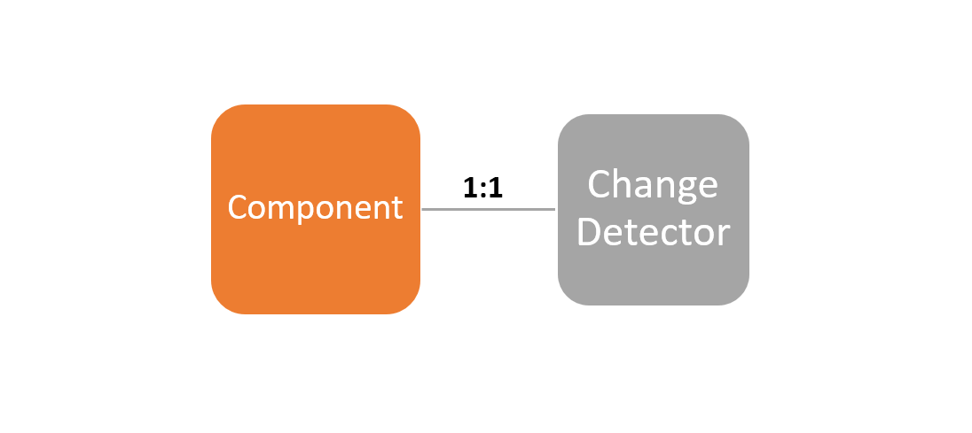
Each component in Angular has its own change detector.

component to change detector is 1:1

The change detector can be referred inside the component using the ChageDetectorRef service, and if required you can inject the ChageDetectorRef in a component by making a reference of it in the constructor as shown in next code listing:

export class AppComponent implements OnInit {

  constructor(private cd: ChangeDetectorRef) {
    console.log(this.cd);
  }

  ngOnInit() {
    console.log('init life cycle hook');
  }
}

The ChangeDetectorRef provides various APIs to work with the change detector, but before working with them effectively, you need to understand the component tree.

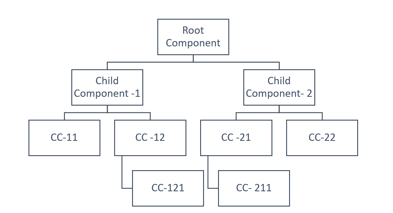
Each component in Angular has its own change detector, and you can see the whole Angular application as a component tree. A component tree is a directed graph, and Angular runs the change detector from top to bottom in the tree.

Root Component has two child components. Child Component 1 has children CC-11 and CC-12; CC-12 has CC-121. Child Component 1 has children CC-21 and CC-22; CC-21 has CC-211.

Logically you can also view the component tree as a change detector tree because each component has its own change detector.

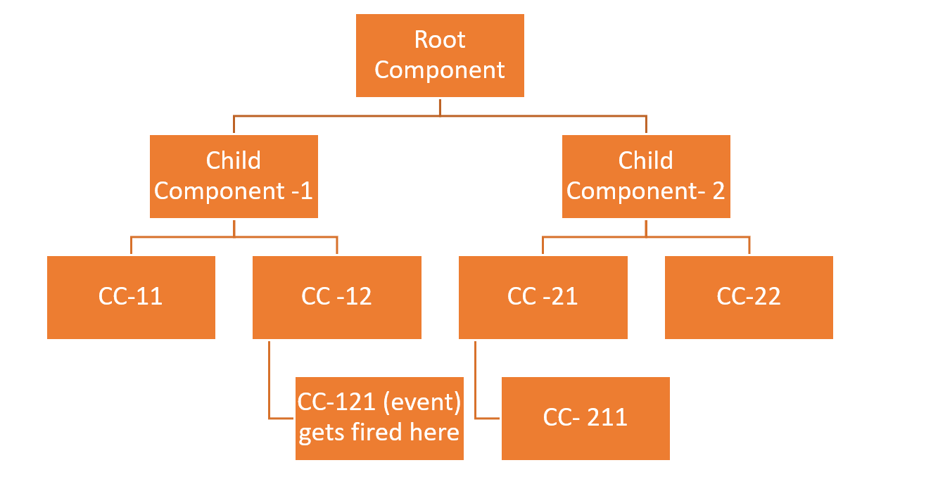
The change detector works from top to bottom in the component tree, and even if an event gets fired in any child node component, Angular always runs the change detector from the root component. For example, in the above change detector tree, if an event gets fired in the component CC-121, which is the bottom node component in the tree, Angular still runs the change detector from the root component node and for all the components.

All of the component elements are marked orange as if checked; the event occurred in CC-121

It may come to your mind that, if for a single event somewhere in the application, Angular runs the change detector for all the components, then perhaps it may have some performance issues. However, that is not true, because of the following reasons:

  1. Angular component tree is a directed graph, which means there is a unidirectional flow of the change detector from root to bottom. Angular knows in which direction the tree has to be traversed, and there is no circular or bidirectional traversing of the change detector tree.
  2. After a single pass, the change detection tree gets stable.
  3. Unlike AngularJS, in Angular, there is no generic function to update the view. Since here every component has its own change detector, JavaScript VM can optimize it for better performance.

So, in Angular, there is no generic function to perform binding, and it generates the change detector class for each component individually at runtime. The definition of the generated change detector class is very particular for a specific component; hence JavaScript VM can optimize it for better performance.

Reducing the Number of Checks

By default, Angular checks each component in the application after any events, asynchronous JavaScript functions, or XHR calls, and, as you have seen earlier, a single event raised somewhere in the tree could cause each node in the component tree to be checked. But there is a way to reduce the number of checks, and you can avoid running the change detector for the whole subtree.

To optimize the number of checks, Angular provides two change detection strategies:

  1. Default strategy
  2. onPush strategy

In the Default strategy, whenever any data to @Input() decorated properties are changed, Angular runs the change detector to update the view. In the onPush strategy, Angular runs change detector only when a new reference is passed to the @Input() decorated properties.

Let us understand by having a look at CountComponent:

import { Component, OnInit, Input } from '@angular/core';

@Component({
  selector: 'app-count',
  template :`
  <h3>Count in child = {{Counter.count}}</h3>
  `
})
export class CountComponent implements OnInit {

  @Input() Counter; 
  constructor() { }

  ngOnInit(): void {
  }
}

The CountComponent has one @Input() decorated property Counter, which accepts data from the parent component. Also, the CountComponent is used inside AppComponent, as shown in the next code listing:

@Component({
  selector: 'app-root',
  template:`
  <h2>Change Detector Demo</h2>
  <app-count [Counter]='Counter'></app-count>
  <button (click)='incCount()'>Increase Count Value</button>`
})
export class AppComponent implements OnInit {

  Counter = {
    count: 1
  }

  incCount(){

    this.Counter.count = this.Counter.count+ 1; 
  }
  ngOnInit() {
    console.log('init life cycle hook');
  }
}

AppComponent is using CountComponent as a child and increasing the value of the count on the button click. So, as soon as the click event gets fired, Angular runs the change detector for the whole component tree; hence you get an updated value of the count in the child node CountComponent.

Also, whenever @Input() decorated properties’ values change, the Angular change detector runs from the root component and traverses all child components to update the view.

So, for the default change detection strategy, you get the output as expected, but the challenge is, even for one event, Angular runs the change detector for the whole tree. If you wish, you can avoid it for a particular component and its subtree by setting ChangeDetectionStrategy to onPush.

The CountComponent is modified to use onPush strategy as shown in next code listing:

@Component({
  selector: 'app-count',
  template :`
  <h3>Count in child = {{Counter.count}}</h3>
  `,
  changeDetection:ChangeDetectionStrategy.OnPush
})
export class CountComponent implements OnInit {

  @Input() Counter; 
  constructor() { }

  ngOnInit(): void {
  }
}

The onPush change detection strategy instructs Angular to run change detector on the component and its subtree only when a new reference is passed to the @Input decorated properties.

As of now, AppComponent does not pass a new reference of the Counter object—it just changes the property values in it, so Angular would not run the change detector for the CountComponent; hence view would not show the updated value of the count.

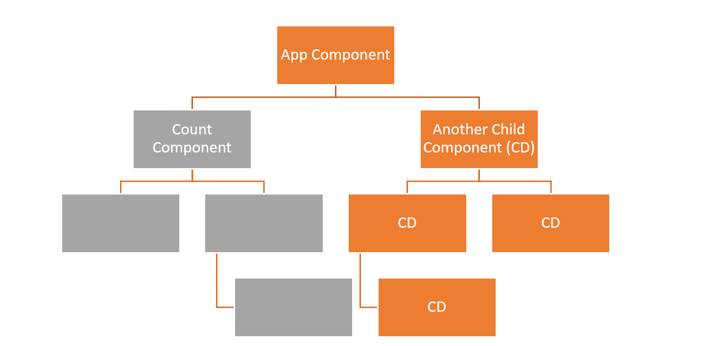
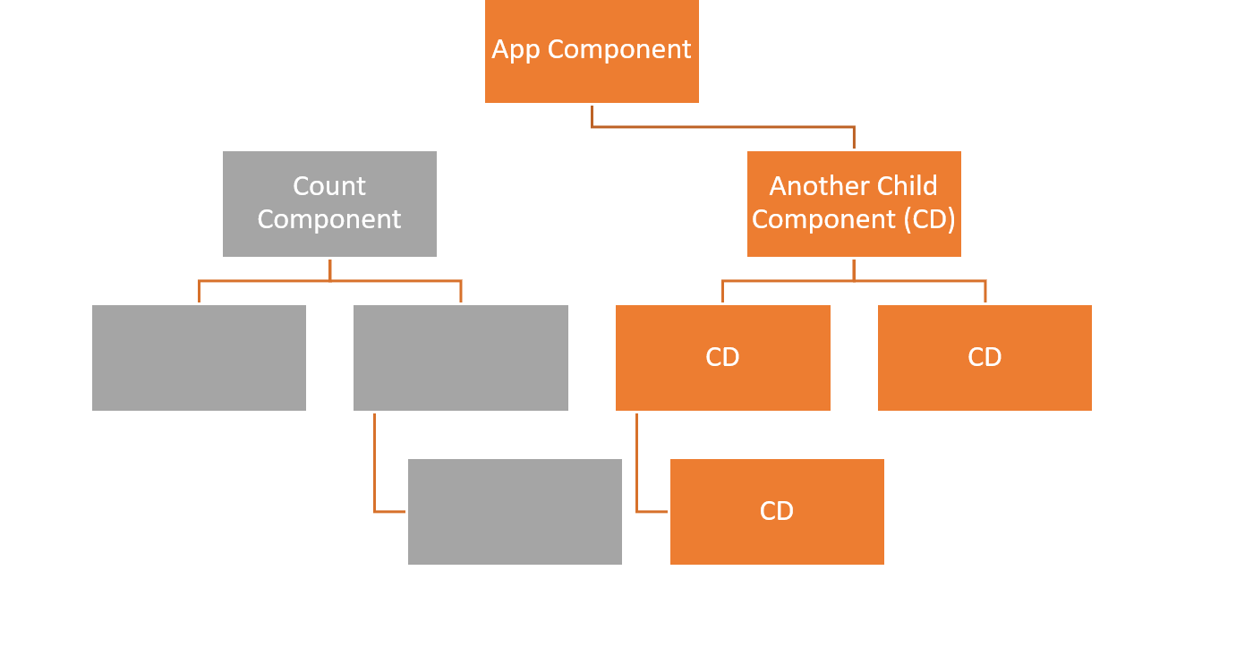
You can understand the above scenario with the below diagram:

In a tree, App Component is the top box and is orange. Count Component and its subtree are below App Component, marked in gray. Also connected to App Component is Another Child Component (CD), but this whole side of the tree is marked in orange.

The above diagram assumes that for "Another Child Component" the change detection strategy is set to Default. Hence, due to the button click in the AppComponent, Angular runs the change detector for each node of Another Child Component subtree.

However, for the CountComponent, change detection strategy is set to onPush, and AppComponent is not passing new reference for the Counter property; hence Angular does not run change detection for Count Component and its subtree.

As Angular is not checking CountComponent, the view is not getting updated. To instruct Angular to check CountComponent and run the change detector, AppComponent has to pass a new reference of count as shown in the next code listing:

incCount(){

    //this.Counter.count = this.Counter.count+ 1; 
    this.Counter =  {
      count:  this.Counter.count + 1
    }
  }

Now the characteristics of the CountComponent are as follows:

  • Its change detection strategy is set to onPush
  • Its @Input() decorated property is receiving a new reference of the data

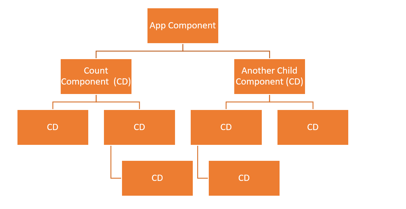
So, Angular runs the change detector for the CountComponent and its subtree, and you get updated data on the view. You can understand the above scenario with the below diagram:

In the same tree as the previous image, all boxes are orange, including the Count Component subtree.

You can opt for either the Default or onPush change detection strategy depending on your requirement. One essential thing you must keep in mind is that even if a component is set to onPush and a new reference is not being passed to it, Angular will still run change detector for it if either of the following happens:

  1. An event, such as click or submit, gets fired
  2. XHR call to work with an API
  3. An asynchronous JavaScript function, such as setTimeOut() or setInterval(), gets executed

A Quiz

Keeping these points in mind, let me give you a quiz:

  • For the CountComponent, the change detection strategy is set to onPush
  • AppComponent is not passing a new reference to the CountComponent

Now you need to make sure that Angular runs the change detector for the CountComponent and updates the view. How will you achieve this?

To achieve that, you have the either of the following options:

  1. Run change detector manually
  2. Perform one of the three operations that always cause change detection to run, such as executing an event

Very simply, you can put a button on the CountComponent to raise an event, hence run the change detector.

@Component({
  selector: ‘app-count’,
  template :`
  <h3>Count in child = {{Counter.count}}</h3>
  <button (click)=’0’>Refresh</button>
  `,
  changeDetection:ChangeDetectionStrategy.OnPush
})
export class CountComponent implements OnInit {

  @Input() Counter; 
  constructor() { }

  ngOnInit(): void {
  }
  ngDoCheck(){
    console.log(‘count component CD runs’);
  }
}

Now the CountComponent has a Refresh button. A click on the Refresh button would instruct Angular to run the change detector, and, as a result of that, the view will be updated with the latest value of the counter.

Using Observables

In the above quiz, the other option was to run the change detector manually. But the main question arises: how do you run the change detector manually?

The answer is using observables.

An observable notices a mutation in the object without creating a new reference for it. So, you can subscribe to an observable, and, whenever a change happens, manually run the change detector inside the subscribe method to update the view.

You can modify the AppComponent to pass an observable as follows:

import { Component, OnInit } from '@angular/core';
import { BehaviorSubject } from 'rxjs';

@Component({
  selector: 'app-root',
  template:`
  <h2>Change Detector Demo</h2>
  <app-count [Counter]='Counter'></app-count>
  <button (click)='incCount()'>Increase Count Value</button>`
})
export class AppComponent implements OnInit {
  _count = 1; 
  Counter: any; 
  incCount(){

   this.Counter.next({
     count: ++this._count
   })
  }
  ngOnInit() {
    this.Counter = new BehaviorSubject({
      count:0
    })
  }
}

You can subscribe to the observable in the CountComponent as shown in the next code listing:

  count : any;
  @Input() Counter : Observable<any>; 
  ngOnInit(): void {
    this.Counter.subscribe(data=>{
       this.count = data.count;
       console.log(this.count);
    })
  }

Whenever there is a change in the object, the subscribe method is called, so you should manually run the change detector inside the subscribe method to update the view.

To run the change detector manually:

  • Inject ChangeDetectorRef service in the component
  • Use markForCheck in the subscription method to instruct Angular to check the component the next time change detectors run
  • On the ngOnDestroy() life cycle hook, unsubscribe from the observable

You can modify the CountComponent to subscribe to the observable and manually run the change detector to update the view as shown in the next code listing:

import { Component, OnInit, Input, ChangeDetectionStrategy, ChangeDetectorRef } from '@angular/core';
import { Observable, Subscription } from 'rxjs';

@Component({
  selector: 'app-count',
  template: `
  <h3>Count in child = {{count}}</h3>
  `,
  changeDetection: ChangeDetectionStrategy.OnPush
})
export class CountComponent implements OnInit, OnInit {
  count: any;
  countsubscription: Subscription;
  @Input() Counter: Observable<any>;

  constructor(private cd: ChangeDetectorRef) {

  }

  ngOnInit(): void {
    this.countsubscription = this.Counter.subscribe(
      data => {
        this.count = data.count;
        this.cd.markForCheck();
      },
      err => { console.log(err) },
      () => console.log('complete')
    )
  }
  ngOnDestroy() {
    this.countsubscription.unsubscribe();
  }
}

By using the combination of onPush strategy and observables, you can avoid a greater number of checks in the component tree.

Using the async Pipe

Another alternative of the subscribe method is the Angular async pipe. By using the async pipe, you don't have to manually call the change detector, subscribe to the observable, and unsubscribe to the observable because the async pipe does all these tasks for you.

  • For onPush change detection strategy, if an observable data change occurs, the async pipe automatically marks the component for the check
  • On component destruction, the async pipe automatically unsubscribes the observable, thereby avoiding chances of any potential memory leak

You can use async pipe in the CountComponent as shown in the next code listing:

@Component({
  selector: 'app-count',
  template: `
  <div *ngIf="Counter | async; let data">
  <h3> {{data.count}} </h3>
  </div>
  `,
  changeDetection: ChangeDetectionStrategy.OnPush
})
export class CountComponent implements OnInit {
  @Input() Counter: Observable<any>;

  ngOnInit(): void {

  }
}

The async pipe is a cleaner approach, and it is recommended to use it while working with observable data and onPush change detection strategy.

Detach the Change Detector

There is one more aggressive way to reduce checks for a component and its subtree, by detaching the change detector from the component:

  constructor(private cd: ChangeDetectorRef){
    this.cd.detach();
  }

You can avoid checking the component and its subtree by detaching the change detector. For a detached change detector:

  1. Angular will not check the component or its subtree.
  2. Angular will not update the view and perform the bindings.

You can understand the above scenario with the below diagram:

In a tree, App Component is the top box. Count Component is a subtree, but disconnected from App Component and all in gray. Connected to App Component is Another Child Component (CD), and this whole side of the tree is marked in orange.

You can modify the CountComponent to detach and then reattach the change detector as shown in the next code listing:

@Component({
  selector: 'app-count',
  template :`
  <p>{{title}}</p>
  <h3>Count in child = {{Counter.count}}</h3>
  <button (click)='attachcd()'>Refresh</button>
  `,
  changeDetection:ChangeDetectionStrategy.Default
})
export class CountComponent implements OnInit {

  @Input() Counter; 
  title = "Detach component";

  constructor(private cd: ChangeDetectorRef){
    this.cd.detach();
  }

  attachcd(){
    this.cd.reattach();
  }

  ngOnInit(): void {
  }
  ngDoCheck(){
    console.log('count component CD runs');
  }
}

Angular will not run the change detector for the CountComponent because its change detector is detached. Besides that, Angular won’t perform the binding on the template, and as an output, you will not get the title and count rendered on the template. When you click on the Refresh button, the change detector is reattached, and you will find the view is updated and rendered all bindings.

You can wisely detach a change detector from a component to reduce the number of checks.

detectChanges and markForCheck

The ChangeDetectorRef has two more methods:

  1. detectChanges
  2. markForCheck

The detectChanges method runs the change detector for the current component and its children. For once, it can even run change detection on a component that has detached change detector without reattaching it.

Considering the above example, instead of reattaching the change detector, you can check the component once and update the view by using the detectChanges.

  attachcd(){
    //this.cd.reattach();
    this.cd.detectChanges();
  }

Here, Angular does not reattach the change detector and it checks the component only the one time. So essentially, the component will not be checked during following regular change detection cycles.

On the other hand, the markForCheck method enables you to check all parent components up to the root component. So, by using the markForCheck method, you can mark all components up to the root component to be checked in the next change detection cycle.

In a real scenario, you can use markForCheck in combination with the reattach method, because the reattach method does not work for a component if its parent component’s change detector is disabled. In that case, you need to use the markForCheck method to make sure Angular enables you to check for all parent components up to the root component.

You can depict the above discussions about the various method in a diagram as below:

A table lists these methods: detectChanges runs change detector for the components and its children, and runs CD once also for the component which is detached from the component tree. markForCheck marks component with its all parents up to root, and in the next cycle runs CD for marked components. Reattach will reattach the component in the change detection tree, and if parent component’s CD is detached, it won’t help so make sure to run markForCheck with reattach. Detach detached the component from the change detection tree, and bindings will not work for the component with detached CD. checkNoChanges will change the component and its children and throws an error if change is detected.

Summary

Now, you understand the Angular Change Detection mechanism and various options available with it. You should choose either a Default or onPush change detection strategy depending on the requirement. To reduce the number of checks, you may consider detaching the change detector from a component and using reattach or detectChanges as you need.

I hope you find this article useful, and that it will help you in writing more performant Angular applications.

Embedding Beautiful Reporting into Your ASP.NET MVC Applications

$
0
0

Check out our guide for embedding reports into ASP.NET MVC applications. In this step-by-step tutorial, learn how to use Telerik Report Viewer in MVC applications.

In this step-by-step tutorial, I will demonstrate how to use Telerik Report Viewer in MVC applications. This tutorial covers the following topics:

What is Telerik Report Viewer?

The Telerik Report Viewer is a pure HTML5/JavaScript/CSS3 jQuery-based widget that allows displaying Telerik reports in an HTML page. The layout or styling is based on pure HTML5 templates and CSS3 styles and is fully customizable. It supports mobile as well as desktop browsers. Report viewers, which are UI components, allow you to display the report document produced by the report engine in the application UI.

How Can it Be Integrated with an App?

To integrate the Telerik Report Viewer in an ASP.NET MVC application, you'll need to follow these prerequisites:

  • Review the HTML5 Report Viewer requirements
  • A running Telerik Reporting REST Service endpoint to use in an MVC application (find more info here)
  • You must load only one version of Telerik Kendo UI styles and scripts on the page or via CDN

Grab the eBook: A Quick Guide to Expert .NET Reporting Tools 

How to Implement the Report Viewer in ASP.NET MVC

The Telerik Report Viewer provides an HTML helper that can be used in ASP.NET MVC applications. The easiest way to add and configure Report Viewer would be to use the Item Templates that are registered in Visual Studio during the product installation.

The MVC Report Viewer View Item Template is a fully functional wizard that does all the heavy lifting for users:

  • Adds the necessary NuGet packages and references
  • Provides a sample report definition if needed
  • Even creates a new instance of Reporting REST Service when requested

That workflow is described here. If you are able, that is the recommended setup.

Otherwise, follow these steps to use this helper manually in MVC:

Step-1: Create an ASP.NET MVC application using Visual Studio.

Step-2: Add the below two references of Telerik into application and set their Copy Local properties to true in Visual Studio.

  • Telerik.Reporting
  • Telerik.ReportViewer.Mvc

Step-3: Add the previous step's added references into the web.config file in the Views folder as below:

<pages  pageBaseType="System.Web.Mvc.WebViewPage">    
    <namespaces>   
        ...   
        <add  namespace="Telerik.Reporting" />    
        <add  namespace="Telerik.ReportViewer.Mvc" />    
    </namespaces>    
</pages>

Step-4: The default viewer implementation depends externally on jQuery. Create a section named scripts and add a link to jQuery in the view:

@section scripts {    
<script  src="https://code.jquery.com/jquery-3.3.1.min.js"></script>  
}

Step-5: The Report Viewer uses the style of the desired Kendo UI theme, so please add these below references to the Less-based CSS files in the head element of _Layout.cshtml:

<!-- The required Less-based styles -->  
<link href="https://kendo.cdn.telerik.com/2020.1.114/styles/kendo.common.min.css"  rel="stylesheet"/>  
<link  href="https://kendo.cdn.telerik.com/2020.1.114/styles/kendo.blueopal.min.css"  rel="stylesheet"/>

Step-6: Add references to the HTML5 report viewer's JavaScript file in the respective view, as below:

<script  src="https://www.telerik.com~/api/reports/resources/js/telerikReportViewer"></script>

Step-7: Add the Telerik Report Viewer helper provided for MVC applications in the respective view:

@(Html.TelerikReporting().ReportViewer()
                    .Id("reportViewer1")
                    .ServiceUrl(Url.Content("http://localhost:12345/api/reports/"))
                    .ReportSource(new UriReportSource() { Uri = "OlympicMedalsByNationalTeams.trdp" })
                    .ViewMode(ViewMode.Interactive)
                    .ScaleMode(ScaleMode.Specific)
                    .Scale(1.0)
                    .PersistSession(false)
                    .PrintMode(PrintMode.AutoSelect)
                    .EnableAccessibility(false)
                    .SearchMetadataOnDemand(false)
                    .Deferred()
)
Note - For available options for this HTML helper, please check details here.

Step-8: Render the deferred initialization statement for the Report Viewer scripts:

@(Html.TelerikReporting().DeferredScripts())

Step-9:

We have implemented the Telerik Report Viewer helper in our MVC application, and pages should look like this:

_Layout.cshtml

<!DOCTYPE html>
<html>
<head>
    <title>Demo</title>
    <meta charset="utf-8" />

    <meta name="viewport" content="width=device-width, initial-scale=1, maximum-scale=1" />
    <link href="https://kendo.cdn.telerik.com/2020.1.114/styles/kendo.common.min.css" rel="stylesheet" />
    <link href="https://kendo.cdn.telerik.com/2020.1.114/styles/kendo.blueopal.min.css" rel="stylesheet" />

    @RenderSection("styles", required: false)
    @RenderSection("scripts", required: false)
</head>
<body>
    @RenderBody()
</body>
</html>

Respective Index.cshtml view

@using Telerik.Reporting
@using Telerik.ReportViewer.Mvc
@{
    ViewBag.Title = "Home Page";
}

@section styles
{
    <style>
        body {
            margin: 5px;
            font-family: Verdana, Arial, sans-serif;
        }
        #reportViewer1 {
            position: absolute;
            left: 5px;
            right: 5px;
            top: 40px;
            bottom: 5px;
            overflow: hidden;
            clear: both;
        }
    </style>
}

@section scripts
{
    <script src="https://code.jquery.com/jquery-3.3.1.min.js"></script>
    <script src="https://www.telerik.com@Url.Content("http://localhost:12345/api/reports/resources/js/telerikReportViewer/")"></script>
    @(Html.TelerikReporting().DeferredScripts())
}

@(Html.TelerikReporting().ReportViewer()
                    .Id("reportViewer1")
                    .ServiceUrl(Url.Content("http://localhost:12345/api/reports/"))
                    .ReportSource(new UriReportSource() { Uri = "OlympicMedalsByNationalTeams.trdp" })
                    .ViewMode(ViewMode.Interactive)
                    .ScaleMode(ScaleMode.Specific)
                    .Scale(1.0)
                    .PersistSession(false)
                    .PrintMode(PrintMode.AutoSelect)
                    .EnableAccessibility(false)
                    .SearchMetadataOnDemand(false)
                    .Deferred()
)

Step-10: Before running the application, please make sure the Reporting REST Service is running. Note that if the REST Service is in the same application it won’t be running until the app is started. If you're having trouble accessing the Reporting REST Service, you can check out this help article for some tips.

Step-11: Finally, run the application and navigate to the view with the ASP.NET MVC Report Viewer that we have just created. It will open in the browser and you can see the output like this: A map is shown with related bar graphs over the countries in the Pan-American Sports Organization, revealing how many of each Olympic medals the countries has received.

The Report Viewer is divided into the main two parts. The first part on top is for toolbars, and the second part below it is used for showing the data.

Report Viewer Toolbar

Let's check what tools are available for users in the Report Viewer toolbar.

Top toolbar options:

  1. Forward/Backward
  2. Refresh report
  3. Page number selector
  4. Toggle print preview
  5. Download
    • PDF
    • XLS
    • CSV
    • Text
    • TIFF
    • Web Archive
    • XPS Document
  6. Zoom - In/Out
  7. Toggle - FullPage/PageWidth
  8. Search in report contents
  9. Toggles the document map area
  10. Print report
  11. Toggle filter

Filters - The below screenshot shows the filters that on the Report Viewer's right side. Based on these filters, data will be shown in the left side.

Under Association, the Pan-American Sports Organization is selected.

You can also download this example from here.

Save Your Seat: Reporting In-Depth—How to Streamline Reporting with Ease

Conclusion

In this article, we discussed what the Telerik Report Viewer is, its prerequisites and how to use it working in an MVC application, and the Report Viewer toolbar for users. If you have any suggestions or queries regarding this article, please leave a comment.

Learn It, Share it.

Tried Telerik DevCraft?

You can choose Telerik Reporting and Telerik Report Server as individual products or enjoy them as part of the great Telerik DevCraft bundles.

Try Telerik DevCraft

Telerik DevCraft is the finest software developer tools collection across .NET and JavaScript technologies, which includes modern, feature-rich and professionally designed UI components for web, desktop and mobile applications, reporting and report management solutions, document processing libraries, automated testing and mocking tools from the Telerik and Kendo UI suites. DevCraft will arm you with everything you need to deliver outstanding applications in less time and with less effort. With the backing of our legendary support team, which consists of the developers who build the products, and a ton of resources and trainings you can rest assured that you have a stable partner to rely on for your everyday challenges along your software development journey.

Exploring the Worker Thread API in Node

$
0
0

Worker threads super charged the abilities of JavaScript(Node), as it was formerly not ideal for CPU-intensive operations. This post explores how worker threads work in Node.

From conception, JavaScript has been a single-threaded language. Single-threaded in the sense that only one set of commands can be executed at any given time in the same process. By extension, Node.js isn’t a good choice for implementing highly CPU-intensive applications. To solve this problem, an experimental concept of worker threads was introduced in Node v10.5.0 and was stabilized in v12 LTS.

The worker_threads module enables the use of threads that execute JavaScript in parallel. It can be accessed with any of the following syntax:

const worker = require('worker_threads');
// OR
import worker_threads;

How Worker Threads Work

Worker threads work in a different way than traditional multi-threading in other high-level languages. A worker’s responsibility is to execute a piece of code provided by the parent worker. It runs in isolation from other workers, but has the ability to pass information between it and the parent worker.

Each worker is connected to its parent worker via a message channel. The child worker can write to the message channel using parentPort.postMessage function, and the parent worker can write to the message channel by calling worker.postMessage() function on the worker instance.

Message Channel between the parent and the child workers

Now, one might ask how a node worker runs independently, as JavaScript doesn’t support concurrency. The answer: v8 Isolate. A v8 Isolate is an independent instance of Chrome v8 run-time, which has its own JavaScript heap and a micro-task queue. This allows each Node.js worker to run its JavaScript code in complete isolation from other workers. The downside of this is that the workers cannot directly access each other’s heaps directly. Due to this, each worker will have its own copy of libuv event loop, which is independent of other workers’ and the parent worker’s event loops.

Using Worker Threads

As earlier pointed out, the worker_thread API was introduced in v10.5.0 and stabilized in v12. If you’re using any version prior to 11.7.0, however, you need to enable it by using the --experimental-worker flag when invoking Node.js.

In our example, we are going to implement the main file, where we are going to create a worker thread and give it some data. The API is event-driven, but it’ll be wrapped into a Promise that resolves in the first message received from the worker:

// index.js
// run with node --experimental-worker index.js on Node.js 10.x
const { Worker } = require('worker_threads')

const runService = (workerData) => {
  return new Promise((resolve, reject) => {
    const worker = new Worker('./myWorker.js', { workerData });
    worker.on('message', resolve);
    worker.on('error', reject);
    worker.on('exit', (code) => {
      if (code !== 0)
        reject(new Error(`Worker stopped with exit code ${code}`));
    })
  })
}

const run = async () => {
  const result = await runService('world')
  console.log(result);
}

run().catch(err => console.error(err))

As you can see, this is as easy as passing the filename as an argument and the data we want the worker to process. Take note that this data is cloned and is not in any shared memory. Then, we wait for the Worker thread to send us a message by listening to the message event. Next, we need to implement the service.

const { workerData, parentPort } = require('worker_threads')

// You can do any heavy stuff here, in a synchronous way
// without blocking the "main thread"
parentPort.postMessage({ greetings: workerData })

Here, we need two things. First the workerData that the main app sent to us, and secondly, a way to return information to the main app. This is done with the parentPort that has a postMessage method where we will pass the result of our processing.

It’s as straightforward as that! This is a somewhat simple example, but we can build more complex things—for example, we could send multiple messages from the worker thread indicating the execution status if we need to provide feedback, or we can send partial results. Imagine that you are processing thousands of images and maybe you want to send a message per image processed, but you don’t want to wait until all of them are processed.

Getting the Best out of Worker Threads

Understanding at least the very basics of how they work indeed helps us to get the best performance using worker threads. When writing more complex applications than our example, we need to remember the following two major concerns with worker threads.

  1. Even though worker threads are more lightweight than actual processes, spawning workers involve some serious work and can be expensive if done frequently.
  2. It’s not cost-effective to use worker threads to implement parallel I/O operations because using Node.js native I/O mechanisms are way faster than starting up a worker thread from scratch just to do that.

To overcome the first concern, we need to implement "Worker Thread Pooling."

Worker Thread Pooling

A pool of Node.js worker threads is a group of running worker threads that are available to be used for incoming tasks. When a new task comes in, it can be passed to an available worker via the parent-child message channel. Once the worker completes the task, it can pass the results back to the parent worker via the same message channel.

If properly implemented, thread pooling can significantly improve the performance as it reduces the additional overhead of creating new threads. It also worth mentioning that creating a large number of threads is also not efficient, as the number of parallel threads that can be run effectively is always limited by the hardware.

Conclusion

The introduction of worker threads has super charged the abilities of JavaScript(Node), as they has effectively taken care of its biggest shortcoming of not being ideal for CPU-intensive operations. For additional information, check out the worker_threads documentation.


Review of Telerik Toolsets for ASP.NET Web Forms and Blazor: Part 1

$
0
0

Here’s Part 1 of a guide for developers to familiarize themselves quickly with the overall idea of ASP.NET Web Forms and Blazor, and what Telerik has to offer for both technologies.

(Check out Part 2 here and Part 3 here.)

This series also provides couple of fundamental steps for everyone who decided to create a new application based on Blazor or modernize their existing Web Forms App by switching to a Blazor App.

We highly recommend you check out our ebook in which Ed Charbeneau explains the fundamentals of Blazor in a quick-start guide to productivity with Blazor.

Read: A Beginner's Guide to Blazor

In addition to the ebook, we also previously published a blog post, Review of Telerik Toolsets for ASP.NET Web Forms and Core, dedicated to ASP.NET Web Forms vs. ASP.NET Core.

ASP.NET Web Forms: The Strong Presence and Mature Experience

In existence since 2002 and still actively used, the Web Forms technology has successfully passed the harsh test of time and the rigorous demands of web developers.

Some of the key features and recognizable traits of Web Forms are the ViewState and Event-driven development. In MVC and Core, these were replaced with the concept of Model-View-Controller pattern. Now, Blazor is the newest member of the ASP.NET family and brings yet another system of implementation, actually two different ways, which will be explained in the dedicated Blazor-Hosting section. One major difference is that it can also run in ASP.NET Core, whereas Web Forms cannot.

Blazor: A Bold Experiment by Microsoft Turned Out to Be a Big Success in Web Development

Microsoft’s newest web development framework Blazor is now officially released both for its server-side and client-side flavors and ready for production use. With constantly growing community, it surely has the buzz around it. But before answering what is Blazor actually, we need to clarify couple of stepping stones which lay the foundation of this new framework.

Naming

The name Blazor comes from the following equation: Browser + Razor = Blazor.

There is another strong possibility, according to the Blazor team that, “When pronounced, it is also the name of a swanky jacket worn by hipsters that have excellent taste in fashion, style, and programming languages.”

Razor Pages is a syntax mixture of HTML and C# and it is currently the recommended technology by Microsoft for building web apps. See Microsoft's Introduction to Razor Pages.

When initiating work in this syntax, you will find this reference guide helpful: Razor syntax reference for ASP.NET Core.

Blazor essentially uses Razor syntax, but it combines it with SignalR for its server hosting and WebAssembly instead of JavaScript for its client-side offering.

ASP.NET Core

ASP.NET Core

The old .NET Framework is a powerhouse. Its version 4.8 is out and announced to be its last one. This framework is now like a proud father, provided so much for the development community and now passing his turn to the upcoming generation. However, there are still many years until retirement.

The .NET Core is the grown-up kid. Officially, the baton was relayed. Microsoft advises .NET Core to be used in new apps and projects. Since its introduction, more and more functionality and API were added so that the capability gap with old .NET Framework is minimized.

Microsoft is on the path to .NET 5.0 release in November as Preview 5 is out already:

.NET schedule

New Versions of .NET Will Step on the Foundations of Core

ASP.NET Core can be deployed not only on Windows, but also on Linux and macOS. It does not support Web Forms, but it does support Blazor, which runs on Mono for its client-side flavor (WebAssembly). The same applies for the .NET Standard framework, which you will be using for the business logic in Blazor.
New Versions of .NET Will Step on the Foundations of Core

WebAssembly

Imagine running software like Visual Studio, Photoshop, AutoCAD and others of this class directly in the browser without rewriting them with thousands upon thousands lines of JavaScript code. Let me help you with the picture, see: Windows 2000 on the browser

This is the power of WebAssemblypresenting binaries and assemblies written in different languages like C# and C++ to a readable format by the browser. It is not a frontend framework on top of JavaScript, rather, it is a complete alternative to JavaScript, a worthy challenger of its monopoly.
Blazor

A reminiscence of Silverlight or Flash? Not this time. There are no plug-ins to be installed. Contrary to Silverlight and Flash, WebAssembly is not proprietary and it is open standard supported by the entire web community and companies. All have the incentive and interest in developing this new standard. And it does develop, indeed, in rapid fashion. Did I mention that it does not require installing plug-ins?

Code compiled to WebAssembly can run in any browser at native speeds. It has achieved cross-browser consensus and all modern browsers provide support for it. It is clear that change is coming to the web development world and it is coming fast. And also before I forget, since WebAssembly is supported natively, there are no plug-ins required.

In Essence

Blazor uses the power of WebAssembly to combine it with .NET libraries to transform it into a super-machine. As an alternative, you can choose to host it on the server instead using SignalR messaging system. Ultimately, Blazor is an open-source and cross-platform web UI framework for building single-page apps using .NET and C# instead of JavaScript. Plus a little bit of Razor syntax spicing.

For a full list of supported features you can check here: Blazor FAQ.

Blazor is not only inspired by existing modern frameworks like React, Angular, and Vue, but also combines their convenience with the powerful .NET capabilities.

For some specific cases, Blazor applications can still call JavaScript functions and logic through JavaScript interop APIs. This can be used to access the browser APIs that are not natively wrapped in C#, such as location, camera as well as to execute custom script code for DOM manipulations. However, Blazor is a component-based framework that minimizes the need to access the DOM directly and you should generally avoid doing that. Also, you can do it in C# now from your Blazor components.

Blazor is based on a powerful and flexible component model for building rich interactive web UI. It enables full-stack web development with .NET. While Blazor shares many commonalities with ASP.NET Web Forms, like having a reusable component model and a simple way to handle user events, it also builds on the foundations of .NET Core to provide a modern and high-performance web development experience.

The new Blazor framework uses open web standards without plugins or code transpilation. It works in all modern web browsers, including mobile browsers. It is part of the open-source .NET platform, which is free. There are no fees or licensing costs, including for commercial use.

Hosting

Although the Blazor syntax and coding standard is the same everywhere, there are two different ways of hosting the app: Blazor Server and Blazor Client/WebAssembly.

You can think of the Server hosting as a dinner in a restaurant: you have the menu (the website) and as a customer you choose a meal from it, e.g. a soup (input interaction). Then the waiter (SignalR) takes the order and delivers it to the kitchen (Server) and brings back your order once it is ready. Next time, you order the main meal, and the waiter goes again. The same happens for the dessert.

For this process to work flawlessly, you will need a constant, low-latency connection with the kitchen (the Server). And if there are many hungry visitors, the burden of the kitchen can increase. On the good side, the initial presenting of the menu (website) happens light and instantly. This makes it a reasonable choice for older browser support (not too old, mind you).

Whereas, the Client/WebAssembly hosting can resemble an all-inclusive buffet: you have all the food prepared beforehand, and whatever you choose to pick, you don’t need a waiter (info channel) and connection to the kitchen (Server).

This makes interaction with the food (input interaction) lightning-fast and frees up the kitchen even if there are many visitors, since the work is done by them (client machines). On the other hand, the initial preparation (download size and load time) is significantly higher.

To summarize, Blazor can run your web site’s Client UI on the server. User interaction events are sent to the server using SignalR channel and once execution completes, the required UI changes are sent back to the client and merged into the DOM.

Alternatively, Blazor can run your client-side C# code directly in the browser, using WebAssembly. Because it's real .NET running on WebAssembly, you can re-use code and libraries from server-side parts of your application.

Read: Part 2 of this blog series

Read: Part 3 of this blog series

Review of Telerik Toolsets for ASP.NET Web Forms and Blazor: Part 2

$
0
0

Here’s Part 2 of a guide for developers to familiarize themselves quickly with the overall idea of ASP.NET Web Forms and Blazor, and what Telerik has to offer for both technologies.

(Check out Part 1 here and Part 3 here.)

In the previous blog post we covered the ASP.NET Web Forms and Blazor web platforms, some of their pros and cons and features. Now it is time to review what Progress/Telerik offers as UI components for both technologies and whether or not there is compatibility between them.

Read: A Beginner's Guide to Blazor

Telerik UI for ASP.NET AJAX

Telerik UI for ASP.NET AJAX

Over 100 components. Everything you are looking for under one roof. Top stability and utility.

This is the product which elevated Telerik to be a first-class renowned brand around the globe, trusted and chosen by Software Developers galore: ASP.NET AJAX Controls.

You will find all the functionality you need to be already provided built-in by this suite. And even if you have a really specific scenario, there is a big chance that you will discover a possible implementation via custom code somewhere in the plethora of forums, resource base and library samples.

Many users choose this product for building enterprise-level projects and improving existing ASP.NET Web Forms applications. Having such large variety of UI components at hand, you are enabled to implement a professional, fully functional and accessibility compliant application in no time and without hassle.

Telerik UI for Blazor

An edge as sharp as it gets. The solid fore of the Telerik ship arrived with Blazor to take web development by storm.

I want to begin immediately with the facts for Telerik UI for Blazor since they speak for themselves:

  • Earliest adopters of the technology
  • In constant contact and feedback sharing with the Blazor team since the beginning
  • Mentioned in the official Microsoft Blazor page in the “UI component ecosystem” section
  • Mentioned in the Blazor WebAssembly Official Release Statement in the “Ready-made components” section
  • Regularly showcased in webinars and conferences by the Blazor team
  • First on the market to provide native components from the ground up
  • Top-notch support experts to back this up
  • Unique openness and listening to customers. Have a feature requirement? Based on demand, it is very possible that it will be implemented in one of the next two releases (happening not every four months, but every six weeks).

Telerik UI for Blazor

You can also follow our Blazor Week Events.

Anyone who has experience with Telerik controls knows that the functionality provided by the controls will be top class. For newcomers, here is just the tip of the iceberg: Built with mobile in mind, CRUD operations, templates, file upload, charts, themes, Excel exporting, and many more features demanded and enjoyed by our users. Feel free to follow our Release Blogs to catch up with what’s new: Telerik UI for Blazor: 40+ Native Components with Telerik R2 2020 Release.

We are particularly delighted by the fact that our customers appreciate the native essence of our components. They are built natively for Blazor from the bottom, which frees our users from additional dependency on frameworks or libraries, and also gives ease of mind that no drastic change will be required in the future if this kind of nativeness is implemented in the middle of the lifespan of a given toolset.

Relevance

Are these two toolsets compatible? Can there be automatic migration?

Let’s make one thing clear from the beginning—you will need to start from scratch for the UI part. Web Forms and Blazor are not only different technologies themselves, but they also target and use different .NET frameworks, which are not compatible. The easy part is that both the technologies use C# event logic massively, so you can still use the same C# code which is not related to UI controls specifically—database queries, conditional statements, authorization checks, etc.

It can be still possible to re-use your Data Layers, libraries with business logic, models and some classes if the dependencies they are using are also present in .NET Core 3.0+, especially if you can build them against .NET Standard 2.1. But a complete rewrite will be needed in the UI part.

One key point is that Web Forms is not supported by ASP.NET Core, which is the new focus of Microsoft as a complete rewrite over .NET framework: Choose between ASP.NET 4.x and ASP.NET Core.

Then, why are the Web Forms people so excited and eager to join the Blazor community? The reason is the bucket of similarities between them. Although they have quite different processing under the hood, building a Blazor app pretty much resembles Web Forms from a developer standpoint:

  • C# code
  • Very similar event-handling
  • Web User Controls in Web Forms vs Components in Blazor—both technologies leverage a heavy use of reusable piece of UI
  • MainLayout.razor resembles MasterPage.master

“Cool, but what about VB? Some people are still using this language.”

The answer is clear once again: switch to C#:

“.NET Core does support VB such that you can create and build VB based projects. VB based class libraries can of course be used from ASP.NET Core and Blazor apps as they compile to .NET IL just like any other .NET language. Razor, however, is based on C# in .NET Core. Razor is used for authoring MVC views, Razor pages, and Blazor components. The Razor SDK compiles Razor files into C# classes. This means that Razor files need to live in a C# project to get an appropriate tooling experience. Maintaining support for Razor for just C# is already a significant expense as it involves being able to parse a mixture of C# code and markup. We have no plans to add Razor support for other languages because of the added cost involved.”
—Daniel Roth, program manager on the Blazor team (source)

By default, Web Forms is based on a request-response model with full page PostBacks, which causes significant burden. This is redeemed by making avail of clever AJAX Requests and CallBacks. On the other hand, Blazor is a browser-based (client-side) framework and it handles events and user interactions in a reactive fashion, more like JavaScript front-end frameworks (Angular, React, Vue). This is particularly convenient for active elements on the page, since it automatically manages the input values back and forth due to its MVVM architecture.

As for the technical specifics in transition, these resources would be very helpful in providing the details.

Big kudos to the Microsoft’s Blazor team, who have taken the time and efforts to prepare a full-blown ebook on the matter: Blazor for ASP.NET Web Forms Developers.

And here is the dedicated section on migration: Migrating a code base from ASP.NET Web Forms to Blazor.

Read: Part 1 of this blog series

Read: Part 3 of this blog series

Review of Telerik Toolsets for ASP.NET Web Forms and Blazor: Part 3

$
0
0

Here’s Part 3 of a guide for developers to familiarize themselves quickly with the overall idea of ASP.NET Web Forms and Blazor, and what Telerik has to offer for both technologies.

(Check out Part 1 here and Part 2 here.)

After comparing the pros and cons of ASP.NET Web Forms and Blazor and the respective Telerik toolkits for both web platforms, let’s move on how to start a brand new Blazor app as well as dive in to some simple real-life examples on how to build a submit form as well as to configure the databinding of the Web Forms grid and its Blazor counterpart.

Read: A Beginner's Guide to Blazor

First Steps

Suggestions for building a new Blazor App

When starting your new ASP.NET Blazor App, we highly suggest that you check our Introduction page: Welcome to Telerik UI for Blazor.

It contains the getting started, learning resources and next steps sections, which will guide you through the process to have a running app in no time.

Now, if you have an already existing project and want to achieve the same functionality in the new app, you will need to do the migration manually. Converting a Web Forms app to a new Blazor app will require some effort, but it is still possible to achieve.

Telerik UI for Blazor comes packed with samples you can use to learn its capabilities and apply them in real-case scenarios:

Our team also prepared a detailed guide for getting started with Blazor: A quick start guide to productivity with Blazor by Ed Charbeneau.

We also thought that sharing some code in this document will benefit our readers to have a direct comparing glance at the syntax itself. The following two sections will present two different scenarios used commonly by our customers in any toolset:

  • Submit Form Sample
  • Data-Bound Grid Sample

Another common case is implementing hierarchy (detail/nested/child) grids and templates for the main grid items. Telerik Grid for Blazor provides this functionality built-in by default via the Detail Template option. This live dashboard app also uses the mentioned hierarchy feature: Sample Dashboard—Issues.

Here is another extremely easy to implement load-on-demand approach: Load data on demand in a Hierarchy Grid.

For achieving anything more specific or inquiring a POC sample, you can use the Forums or Ticketing system to contact our support experts to assist you in the process.

Submit Form Sample

Comparison example: basic form with input, button and validation

This example demonstrates basic implementation of a submit form to compare the syntax in both technologies.

basic form with input, button and validation

Web Forms Page—SubmitFormSample.aspx

<form id="form1" runat="server">
    <telerik:RadScriptManager ID="RadScriptManager1" runat="server">
        <Scripts>
            <asp:ScriptReference Assembly="Telerik.Web.UI" Name="Telerik.Web.UI.Common.Core.js" />
            <asp:ScriptReference Assembly="Telerik.Web.UI" Name="Telerik.Web.UI.Common.jQuery.js" />
            <asp:ScriptReference Assembly="Telerik.Web.UI" Name="Telerik.Web.UI.Common.jQueryInclude.js" />
        </Scripts>
    </telerik:RadScriptManager>
    <telerik:RadTextBox ID="RadTextBox1" runat="server"
        EmptyMessage="Enter Value">
    </telerik:RadTextBox>
    <asp:RequiredFieldValidator ID="RequiredFieldValidator1" runat="server"
        ErrorMessage="*This field cannot be empty" ForeColor="Crimson"
        ControlToValidate="RadTextBox1" Style="display: block; margin: 10px 0 20px 0;">
    </asp:RequiredFieldValidator>
    <telerik:RadLabel ID="RadLabel1" runat="server" Text="Output"
        Style="display: block; margin-bottom: 20px;">
    </telerik:RadLabel>
    <telerik:RadButton ID="RadButton1" runat="server" Text="Submit Form"
        Primary="true" OnClick="RadButton1_Click">
    </telerik:RadButton>
</form>


Blazor Page—SubmitFormSample.razor

@using System.ComponentModel.DataAnnotations

<EditForm Model="@validationModel" OnValidSubmit="@HandleValidSubmit">
    <DataAnnotationsValidator />

    <TelerikTextBox @bind-Value="@validationModel.Text" Label="Enter Value"></TelerikTextBox><br /><br />

    <ValidationSummary></ValidationSummary>
    <p>@SuccessMessage</p>

    <TelerikButton Primary="true">Submit Form</TelerikButton>
</EditForm>

Web Forms Code-Behind—SubmitFormSample.aspx.cs

using System;

public partial class SubmitFormSample : System.Web.UI.Page
{
    protected void RadButton1_Click(object sender, EventArgs e)
    {
        RadLabel1.Text = "Form successfully submitted" +
            "<br/>Value: " + RadTextBox1.Text;
    }
}

Blazor server code logic (same page)

@code  {
    class TextValidationModel
    {
        [Required]
        public string Text { get; set; }
    }

    TextValidationModel validationModel = new TextValidationModel();
    string SuccessMessage = "Output";

    async void HandleValidSubmit()
    {
        SuccessMessage = "Form successfully submitted Value: " + validationModel.Text;
        await Task.Delay(1000);
        StateHasChanged();
    }
}

Data-Bound Grid Sample

Comparison example: grid configuration and binding

Another common scenario for real-time applications is to contain a grid component. This example shows the basic configuration of a Web Forms grid and its Blazor counterpart.

Telerik Grid for Web Forms AJAX

Telerik Grid for Web Forms AJAX
(Click to make image larger)

Telerik Grid for Blazor

Telerik Grid for Blazor
(Click to make image larger)

Web Forms Page – RadGridSample.aspx

        <style>
            .rgFooter {
                font-weight: bold;
            }
        </style>
        <telerik:RadGrid ID="RadGrid1" runat="server" AllowPaging="True" CellSpacing="0"
            GridLines="None" Width="1500px" OnNeedDataSource="RadGrid1_NeedDataSource"
            AllowFilteringByColumn="true" AllowMultiRowSelection="true" ShowGroupPanel="true"
            Height="1000px">
            <ItemStyle Height="70px" />
            <AlternatingItemStyle Height="70px" />
            <ClientSettings AllowDragToGroup="true">
                <Scrolling AllowScroll="true" UseStaticHeaders="true" />
                <Selecting AllowRowSelect="true" />
            </ClientSettings>
            <MasterTableView AutoGenerateColumns="False" DataKeyNames="OrderID"
                EditMode="InPlace" CommandItemDisplay="Top" ShowGroupFooter="true">
                <CommandItemSettings ShowExportToExcelButton="true" ShowRefreshButton="false" />
                <Columns>
                    <telerik:GridClientSelectColumn UniqueName="SelectColumnName">
                        <HeaderStyle Width="55px" />
                    </telerik:GridClientSelectColumn>
                    <telerik:GridBoundColumn DataField="OrderID" DataType="System.Int32"
                        FilterControlAltText="Filter OrderID column" HeaderText="Order ID"
                        ReadOnly="True" SortExpression="OrderID" UniqueName="OrderID"
                        FilterControlWidth="40px" Aggregate="Count">
                        <HeaderStyle Width="100px" />
                    </telerik:GridBoundColumn>
                    <telerik:GridDateTimeColumn DataField="OrderDate" DataType="System.DateTime"
                        FilterControlAltText="Filter OrderDate column" HeaderText="Order Date"
                        SortExpression="OrderDate" UniqueName="OrderDate"
                        DataFormatString="{0:d}">
                    </telerik:GridDateTimeColumn>
                    <telerik:GridNumericColumn DataField="Freight" DataType="System.Decimal"
                        FilterControlAltText="Filter Freight column" HeaderText="Freight"
                        SortExpression="Freight" UniqueName="Freight" FilterControlWidth="140px"
                        Aggregate="Sum" FooterAggregateFormatString="Sum : {0:C}">
                    </telerik:GridNumericColumn>
                    <telerik:GridBoundColumn DataField="ShipName"
                        FilterControlAltText="Filter ShipName column" HeaderText="Ship Name"
                        SortExpression="ShipName" UniqueName="ShipName">
                    </telerik:GridBoundColumn>
                    <telerik:GridBoundColumn DataField="ShipCity"
                        FilterControlAltText="Filter ShipCity column" HeaderText="Ship City"
                        SortExpression="ShipCity" UniqueName="ShipCity">
                    </telerik:GridBoundColumn>
                    <telerik:GridTemplateColumn ReadOnly="false">
                        <ItemTemplate>
                            <telerik:RadButton ID="RadButton1" runat="server" Text="Edit" CommandName="Edit">
                                <Icon PrimaryIconCssClass="rbEdit" />
                            </telerik:RadButton>
                            <telerik:RadButton ID="RadButton2" runat="server" Text="Delete" CommandName="Delete">
                                <Icon PrimaryIconCssClass="rbRemove" />
                            </telerik:RadButton>
                        </ItemTemplate>
                        <EditItemTemplate>
                            <telerik:RadButton ID="RadButton1" runat="server" Text="Update"
                                CommandName='<%# Container is IGridInsertItem?"PerformInsert":"Update" %>'>
                                <Icon PrimaryIconCssClass="rbOk" />
                            </telerik:RadButton>
                            <telerik:RadButton ID="RadButton2" runat="server" Text="Cancel" CommandName="Cancel" CausesValidation="false">
                                <Icon PrimaryIconCssClass="rbCancel" />
                            </telerik:RadButton>
                        </EditItemTemplate>
                    </telerik:GridTemplateColumn>
                </Columns>
            </MasterTableView>
        </telerik:RadGrid>

Blazor Page—RadGridSample.razor

<style>
    .excelButton {
        float: right;
    }
</style>
<TelerikGrid Data=@GridData FilterMode="@GridFilterMode.FilterRow" Pageable=true Width="1500px"
             SelectionMode="@GridSelectionMode.Multiple" Groupable="true" EditMode="@GridEditMode.Inline"
             Height="1000px">
    <GridToolBar>
        <GridCommandButton Command="Add" Icon="add">Add Product</GridCommandButton>
        <GridCommandButton Command="ExcelExport" Icon="@IconName.FileExcel"
                           Class="excelButton">Export to Excel</GridCommandButton>
    </GridToolBar>
    <GridColumns>
        <GridCheckboxColumn SelectAll="true"></GridCheckboxColumn>
        <GridColumn Field=@nameof(Order.OrderID) Title="Order ID">
            <GroupFooterTemplate>
                <b>Count : @context.Count</b>
            </GroupFooterTemplate>
        </GridColumn>
        <GridColumn Field=@nameof(Order.OrderDate) Title="Order Date">
            <Template>
                @(string.Format("{0:d}", (context as Order).OrderDate))
            </Template>
        </GridColumn>
        <GridColumn Field=@nameof(Order.Freight)>
            <Template>
                @(string.Format("{0:C}", (context as Order).Freight))
            </Template>
            <GroupFooterTemplate>
                <b>Sum : @context.Sum</b>
            </GroupFooterTemplate>
        </GridColumn>
        <GridColumn Field=@nameof(Order.ShipName) Title="Ship Name" />
        <GridColumn Field=@nameof(Order.ShipCity) Title="Ship City" />
        <GridCommandColumn>
            <GridCommandButton Command="Edit" Icon="edit"></GridCommandButton>
            <GridCommandButton Command="Delete" Icon="delete"></GridCommandButton>
            <GridCommandButton Command="Save" Icon="save" ShowInEdit="true">Update</GridCommandButton>
            <GridCommandButton Command="Cancel" Icon="cancel" ShowInEdit="true">Cancel</GridCommandButton>
        </GridCommandColumn>
    </GridColumns>
    <GridAggregates>
        <GridAggregate Field=@nameof(Order.OrderID) Aggregate="@GridAggregateType.Count" />
        <GridAggregate Field=@nameof(Order.Freight) Aggregate="@GridAggregateType.Sum" />
    </GridAggregates>
</TelerikGrid>

Web Forms—RadGridSample.aspx.cs

using System;
using System.Data;
using Telerik.Web.UI;

public partial class RadGridSample : System.Web.UI.Page
{
    protected void RadGrid1_NeedDataSource(object sender, GridNeedDataSourceEventArgs e)
    {
        RadGrid1.DataSource = GetGridSource();
    }
    private DataTable GetGridSource()
    {
        DataTable dataTable = new DataTable();

        DataColumn column = new DataColumn();
        column.DataType = Type.GetType("System.Int32");
        column.ColumnName = "OrderID";
        dataTable.Columns.Add(column);

        column = new DataColumn();
        column.DataType = Type.GetType("System.DateTime");
        column.ColumnName = "OrderDate";
        dataTable.Columns.Add(column);

        column = new DataColumn();
        column.DataType = Type.GetType("System.Decimal");
        column.ColumnName = "Freight";
        dataTable.Columns.Add(column);

        column = new DataColumn();
        column.DataType = Type.GetType("System.String");
        column.ColumnName = "ShipName";
        dataTable.Columns.Add(column);

        column = new DataColumn();
        column.DataType = Type.GetType("System.String");
        column.ColumnName = "ShipCity";
        dataTable.Columns.Add(column);

        DataColumn[] PrimaryKeyColumns = new DataColumn[1];
        PrimaryKeyColumns[0] = dataTable.Columns["OrderID"];
        dataTable.PrimaryKey = PrimaryKeyColumns;

      
        for (int i = 0; i < 80; i++)
        {
            DataRow row = dataTable.NewRow();
            row["OrderID"] = i ;
            row["OrderDate"] = new DateTime(2016, 9, 15).AddDays(i % 7);
            row["Freight"] = i * 10;
            row["ShipName"] = "ShipName " + i;
            row["ShipCity"] = "ShipCity " + (i % 15);

            dataTable.Rows.Add(row);
        }

        return dataTable;
    }
}

Blazor Code (same page as above)

 @code {
    public class Order
    {
        public int OrderID { get; set; }
        public decimal? Freight { get; set; }
        public DateTime OrderDate { get; set; }
        public string ShipName { get; set; }
        public string ShipCity { get; set; }
    }

    public IEnumerable<Order> GridData { get; set; }

    protected override void OnInitialized()
    {
        GridData = Enumerable.Range(0, 80).Select(i => new Order()
        {
            OrderID = i,
            Freight = i * 10,
            OrderDate = new DateTime(2016, 9, 15).AddDays(i % 7),
            ShipName = "ShipName " + i,
            ShipCity = "ShipCity " + (i % 15)
        });
    }

Conclusion

Rhino vs. Dolphin

Both these animals are mammals but inhabit different environments where they excel. Similarly, both the Web Forms and Blazor are part of the ASP.NET family, but they have different advantages and strengths. When you begin working on a new app and want to decide which technology to pick, it would be a good idea to draw a picture of the expected result requirements and the resources you have at hand.

Rhino vs. DolphinRhinos are the fastest mammals weighing over a ton. They have a solid powerful build, which can cause the ground under them to tremble. Not only that, but they have a surprisingly rapid acceleration, too. Being in development since the era of ASP.NET for 18 years, Telerik UI for ASP.NET AJAX (RadControls for Web Forms) resemble this by providing a bulk of components of every kind which you can then use to build an app from the ground up in no time. You will have abundance of options, templates, forums, ready-to-go complex implementations tailored for any kind of scenario. And if you have some experienced devs on your fingertips to leverage this kind of tooling, Web Forms becomes a very strong contender.

Rhino vs. DolphinDolphins, on the other hand, are slick and nimble. They are also famous for their approachable attitude. Blazor allows people who have knowledge in server-side languages like C# to dive into the rich coral reef of Web Development. No JavaScript required (in the long run). Additionally, it follows modern trends and welcomes people familiar with reactive type of events from Angular, React or Vue. With a unique and frequent schedule of releases, it quickly catches up with other toolsets. This means that if you are anticipating a specific feature, you won’t need to wait for it couple of months. If building a functioning app in a quick and convenient way on Windows, Linux, and macOS matters to your team, definitely go on and create at least one Telerik Blazor app.

Telerik has strong presence and commitment for both these technologies and our dedicated and experienced support team is ready to assist with any migration questions that may arise.

You can also find a similar document explaining and comparing Telerik Toolsets for ASP.NET Web Forms and Core.

Read: Part 1 of this blog series

Read: Part 2 of this blog series

Fiddler Everywhere is Out of Beta!

$
0
0

Fiddler Everywhere, our web debugging proxy tool for Mac, Windows and Linux, is out of beta. Inspect and debug HTTP(S) traffic from any browser. See what's new in version 1.0.

Over the last few months, we have been working hard to revamp the beloved Fiddler debugging tool and bring the power of debugging to all operating systems. After multiple beta releases and constant feedback from our power users, we are thrilled to announce that Fiddler Everywhere has officially left beta.

Fiddler Everywhere Download Now 

Fiddler Everywhere – Everything that You Asked For

  • As from the beginning, Fiddler Everywhere will continue to natively support all operating systems, including macOS, Linux, and Windows
  • Our team will continue to focus on the user experience with a refreshed and easy to use user interface
  • With Fiddler Everywhere, you can seamlessly collaborate with your team members

What's New in v1.0?

  • Improved Traffic Inspector Fiddler Everywhere Traffic Inspector 

    Fiddler Everywhere now allows you to quickly start/stop capturing traffic using a simple toggle switch. The improved Traffic Inspector will enable you to inspect requests and responses in different formats, including Headers, Text, Raw, JSON, and XML.

  • Composer Collections

    Fiddler Everywhere Composer Collections

    You can create collections of requests to help you group all the requests and keep them organized. The Collections feature allows you to open multiple requests and execute them. Furthermore, you can share your collections with your team members.

  • Improved Auto Responder

    Fiddler Everywhere Auto Responder Rulesets

    The revamped Auto Responder UI makes it simpler to create and apply rules while inspecting your web traffic. You can view the rules without having to collapse the sessions list. Additionally, you can export and share your Auto Responder rulesets with your team.

  • Collaboration

    Fiddler Everywhere Collaboration

    Fiddler Everywhere is designed to keep your team in mind. You can now seamlessly save sessions, comment, and share them with your team without manually export them. Each saved session opens as a new tab in the Sessions view so that you can debug these sessions independently. You can also share your Composer collections, enabling your team members to test and use your APIs.

Fiddler Everywhere Pro

The previously mentioned collaboration features of Fiddler Everywhere will be available as a paid service with pricing plans starting at $12 per user/month. This plan also includes dedicated email support. Users can avail themselves of a 30-day trial period of Fiddler Everywhere Pro without requiring credit card details.

Regardless, our Traffic Inspector features will always remain free, including unlimited sessions. Free users can also use the collaboration features within some prescribed limits.

Community

To keep up with the growing product adoption, we are on an endeavor to grow an active community that would help of Fiddler Everywhere users spread globally in 90+ countries. None of what we have achieved so far would have been possible without the incredible feedback and support that we've received. If you'd like to contribute and be a part of the growing community, sign up here.

Download Fiddler Everywhere

Head over to the Fiddler Everywhere page to download the latest version and experience it yourself. Feel free to let us know your thoughts and feedback in the Fiddler Everywhere Forum. Follow us on Twitter to stay updated about Fiddler Everywhere.

Building a CRM with Xamarin.Forms and Azure, Part 1

$
0
0

In this tutorial, we'll build a CRM client app for iOS, Android and Windows 10 using Telerik UI for Xamarin and Xamarin.Forms backed by Azure App Service and Azure Bot Framework.

This is the first post in a 3-part tutorial, where I take you from “File > New Project” to fully functional cross-platform CRM application for a fictional Art Gallery company. 

Curious about what's ahead? You can jump to Part Two of the series, where we'll build the UI with Telerik UI for Xamarin, or to Part Three of the series, where we train a LUIS AI model using Telerik UI for Xamarin's Conversational UI.

The journey will take us through building the ASP.NET backend hosted using Azure App Services with SQL Server for the database, using Azure Bot Framework and a custom LUIS (Language Understanding) for the in-app help service and finally developing the client apps using Xamarin.Forms with Telerik UI for Xamarin for a beautiful and feature-rich client experience.

Let’s get started!

Part One—Azure App Service Walkthrough

First, we’ll want to create the backend. Microsoft has a recently updated the Azure App Service with Xamarin.Forms tutorial, and it will walk you through initializing the App Service and creating the database the service will use. Before getting started there, let me take you though the choices I went with so you can follow along.

Configuration and Starter Projects

After creating the service and going to the QuickStart tab, you’ll be presented with a list of client application types. Select the Xamarin.Forms item.

Azure Quickstart Blade

A new Azure blade will appear, and you’ll be shown two steps.

1 – Create the database

If you already have a SQLServer and/or SQL Database, you choose them for this. I chose to create new server and database.

Note: When creating the SQLServer, you will need to create admin credentials. You don’t need to remember them for the App Service because they’ll be stored in an environment variable, but it might be a good idea to store them in your preferred password manager or secure location.

After you make your selection for a C# backend, click the “Download” button. Azure will create an ASP.NET project for you, already set up with the right connection string to the database you’ve selected for step 1! 

2 – Select Xamarin.Forms project

This step gives you two options: “create a new app” or “connect an existing app.” If you choose the latter, you’ll be given a few code snippets and instructions.

We’re going with the former option, “create a new app.” As with the backend, when you click the download button, you’ll get a new Xamarin.Forms application that already has the required code to connect to the app service.

Here’s a screenshot of the 'Xamarin.Forms Quick start' blade:

QuickStart Xamarin.Forms Blade

When done, you’ll now have two downloaded ZIP files containing two solutions: a XamarinForms solution and an ASP.NET MVC solution. These are your starter projects.

If you've already viewed the source code for this app, you'll notice that I decided to combine all the projects into a single folder and a created a combined solution. This is not necessary. I did it to keep all the projects for this tutorial in one place for simpler source control and to help make this this tutorial easier to follow along with.

Here’s what I ended up with. The arrows are pointing to the two different downloads combined in the same solution.

Single solution with combined projects

It's time to start digging into the code! Let's start with the ASP.NET service project because we want the backend ready before we start building the UI.

Entities

In the project you’ll see a DataObjects folder. This will contain a TodoItem.cs class. We need to replace it with the data models we need for the Art Gallery.

These are the entities we need:

  • Employee
  • Customer
  • Product
  • Order

I created four classes to define the entity model and its properties. 

Entity Classes

Note: If you’re not familiar with Entity Framework, and code-first approach, you can use the existing TodoItem.cs class to help guide you before deleting it.

Each of the classes have properties related to the entity. These properties will be used to create the table fields. For example, an Employee would have OfficeLocation, while an Order may need properties like ProductId and Quantity.

Employee Entity Model

It's important that you should try to finalize the properties now, because once you initialize the database Entity Framework will create the database fields using those properties. Any changes to the model will require a special operation called an Entity Framework Code First Migration (it can get complicated quickly).

DBContext

With the entities created, we now need to update the database context class used by Entity Framework to interact with the database. Go ahead and replace the TodoItem DBSet with the four new ones:

DB Sets for entities

Database Initializer

In the AppStart folder you’ll find that the auto-generated project nested a class that seeds the database with the tables and initial records. I moved that class into its own class and replaced the TodoItem seed data with records for each of the entities:

DB Initializer Class

Table Controllers

Finally, you’ll want a controller for each of the entities to interact with the database. This is the endpoint that the client apps will use to interact with the databases and each implements the Azure Mobile Server TableController<T> interface.

I created a controller for each of the entities:

Web A P I Controllers

The content of each WebAPI controller follows the CRUD pattern you'd expect. Here's a screenshot of the EmployeeController's methods (all the controllers reuse this pattern).

Employee Controller class

As with previous steps, if you’re not familiar with ASP.NET or Web API, you can use the TodoController for guidance before deleting it.

Publish to Azure

Visual Studio 2017 has great Azure tools built-in. If you right click on the ASP.NET project, you’ll see a “Publish” option in the context menu:

Publish Context Menu Item

Selecting this will provide you with a list of options to choose from, you’ll want to select Azure App Service and then “Select Existing” because you’ve already set up the App Service.

Azure Publish Wizard

In the next few steps you’ll be able to choose the Resource and App Service from the Azure Subscription.

Note: You will need to be signed into the same account that the Azure subscription uses. If you have multiple accounts, there is a dropdown at the top right to change accounts.

Once you’ve gone through the publishing steps, Visual Studio will start the publishing process and upload the application. When it’s done, a browser tab will open and present the landing page of the running app.

Service Landing Page

The next time you use the Publish menu option, you’ll see the existing publish profile details along with several other tools:

Visual Studio Publish Overview page

With the backend published and running, we can now move on to Part 2—Xamarin.Forms and Telerik UI for Xamarin.

Read Next

Building a CRM with Xamarin.Forms and Azure, Part 2

$
0
0

This is the second installment in a tutorial series that shows you how to build a cross platform CRM application with Azure Web App, Azure Cognitive Services and Telerik UI for Xamarin.

You can find Part One of our series here, where we built the backend. In Part Two, we'll build the UI with Telerik UI for Xamarin. You can also skip ahead to Part Three of the series, where we train a LUIS AI model using Telerik UI for Xamarin's Conversational UI.

Before we get started building our beautiful UI, we’ll want to add the assembly references and NuGet packages for the tools and components we’ll want to use. Let’s start with Telerik UI for Xamarin.

Installing Telerik UI for Xamarin

There are two primary routes to add Telerik UI for Xamarin to the projects; NuGet packages or locally installed assemblies. I use the NuGet package for this demo, but let me walk you through both options:

Option 1—Telerik NuGet Server

The Telerik NuGet packages are available from the Telerik NuGet server, and you’ll need to add this server to your Package Sources list. We have easy to follow instructions in the Telerik NuGet Server documentation. Here’s a screenshot to give you a high-level look at how to add a source in Visual Studio:

Figure1

Once you’ve added the server to your package sources list, you can right click on the solution and select “Manage NuGet Packages for Solution.” This will let you install a package to multiple projects at the same time. When the NuGet Package Manager appears, do the following:

  1. Select the “Telerik” as the Package source and then
  2. Filter by “Telerik.UI.for.Xamarin
  3. Select the Xamarin.Forms projects
  4. Click install

Figure2

You’re now ready to start using the UI for Xamarin controls!

The NuGet package installation is our recommended approach. It is faster to get started and thanks the NuGet Package Manager dependency resolution, it will install the other required dependencies for UI for Xamarin (e.g. Xamarin SkiaSharp packages and required Xamarin Android Support Library packages).

Option 2 - Installed Assembly References

If you choose the assembly reference route, you can find the assemblies for each project is conveniently named folders in the Telerik UI for Xamarin installation folder. The default path is:

C:\Program Files (x86)\Progress\Telerik UI for Xamarin [version]\Binaries

Within the Binaries folder, you’ll find sub-folders to correspond to project types. Each of these folders contains the assemblies that should be added to the project.

Figure3

Pick and Choose Assembly References

If you’re only using one or two controls and don’t plan on using the Linker to remove unused assemblies from the compiled app package, you can pick and choose individual assemblies from those folders.

To know what the required assemblies are for each control, review the control’s “Required Telerik Assemblies” article. You’ll find that every control has this article underneath the “Getting Started” folder. As an example, here’s the location of the RadListView’s Required Telerik Assemblies article:

Figure4

So that you can get started building your UI as soon as possible, I recommend adding them all when first getting started so that you can be up and running quickly. Then after the project is done, you can go back and remove unused assemblies if necessary.

As I mentioned in the Option 1 section above, there are a couple dependencies. If you choose the assembly reference route, you’ll need to explicitly add these NuGet packages. Let's go through them both now.

SkiaSharp Dependency

Several of the UI for Xamarin controls have a dependency on Xamarin’s SkiaSharp libraries. Add the following packages to the projects:

  • SkiaSharp (v 1.68.0 to all projects)
  • SkiaSharp.Views (v 1.68.0 to all projects except class library)
  • SkiaSharp.Views.Forms (v 1.68.0 to all projects)

Xamarin Android Support Libraries

The native Android controls need a few Xamarin Android Support Libraries to operate properly. Go to the Required Android Support Libraries article to see the full list. You only install these to the Android project and they should be the same Android SDK version.

Figure5

Now that Telerik UI for Xamarin’s references have been added, let’s move on to the Azure Mobile Service Client SDK.

Azure Mobile Service Client SDK

One of the main reasons we started with the download starter app is because the Microsoft Azure Mobile Client SDK NuGet package is already installed and has a TodoItemManager class that uses the SDK to interact with the back-end.

Open the class library project’s Constants.cs file and notice that the service URL will already be set in the ApplicationURL property, like this:

public static class Constants
{
    // Replace strings with your Azure Mobile App endpoint.
    public static string ApplicationURL = "https://YOUR_URL.azurewebsites.net";
}

Now it’s time to start wiring up the Xamarin.Forms class library project to be able to communicate with our new backend! The first thing we need to do is get our models defined.

Data Models

Notice the TodoItem.cs data model that comes with the project. Before deleting this, you can use it as a template for the four data model classes you need to interact with the back end:

Figure6

These classes should have the same properties as the entity models in the server application, but with some extra properties that I define in a shared base class:

public class BaseDataObject : ObservableObject
{
    public BaseDataObject()
    {
        Id = Guid.NewGuid().ToString();
    }
 
    [JsonProperty(PropertyName = "id")]
    [Ignore]
    public string Id { get; set; }
 
    [JsonProperty(PropertyName = "createdAt")]
    [Ignore]
    public DateTimeOffset CreatedAt { get; set; }
 
    [UpdatedAt]
    [Ignore]
    public DateTimeOffset UpdatedAt { get; set; }
 
    [Version]
    [Ignore]
    public string AzureVersion { get; set; }
}

Service Classes

With the models defined, we now turn our attention to the TodoItemManager class. This is the workhorse that syncs data between Azure and the app, but also manages the offline database syncing if you enabled it.

For the Art Gallery CRM app, we need four “manager classes.” Instead of having multiple methods or complicated overloads, I created an interface that defines those CRUD operations:

public interface IDataStore<T>
{
    Task<bool> AddItemAsync(T item);
 
    Task<bool> UpdateItemAsync(T item);
 
    Task<bool> DeleteItemAsync(T item);
 
    Task<bool> PurgeAsync();
 
    Task<T> GetItemAsync(string id);
 
    Task<string> GetIdAsync(string name);
 
    Task<IReadOnlyList<T>> GetItemsAsync(bool forceRefresh = false);
 
    Task<bool> PullLatestAsync();
 
    Task<bool> SyncAsync();
}

We also need a way to share a single instance of the MobileServiceClient, otherwise we’d need to have separate instances of the client in each service class which would unnecessarily increase the app’s memory footprint.

One option we can use is to place the MobileServiceClient reference in the App class to make the same instance available to all the services.

Figure7

With the interface defined, and the MobileServiceClient reference available globally, we can start implementing a DataStore service class for each entity model.

As an example, here’s the Customer entity’s DataStore. In the constructor, we just set the reference for the CustomersTable and the interface-required methods can interact with that reference.

Figure8

The example above shows how straightforward it is using the MobileServiceClient to interact with the backend service. The SDK will make the call to the controller and return the items as a strongly typed list of Customer items! 

Views and ViewModels

With the data layer ready, we can now start working on the UI. The starter app has a single page with a ListView that was populated with a list of TodoItems using a code-behind approach. We’re going to need a more robust way to move around the app, as well as view and edit data.

We can either use a Tabbed style or a MasterDetail style page layout. I decided to go with MasterDetail as it makes more sense to have top-level pages in the MasterPage (the side pane) and the drill-down pages (details and edit) in the DetailPage.

The top-level pages I want are:

  • Employees
  • Customers
  • Products
  • Orders
  • Shipping
  • Help
  • About

To keep this blog post from turning in to a book, I’ll use only the Employees table to demonstrate and implement concepts, views and view models.

I’ll also skip explaining general Xamarin.Forms concepts when there is already a good tutorial in the Xamairn documentation that I can provide a link for. The Master-Detail scenario is one example of such a concept. You can find the setup in this Xamarin.Forms Master-Details tutorial.

From this point on in the article, assume the Master-Detail infrastructure is in place and we’re adding pages to that setup. You can also reference the demo’s source code on GitHub to follow along.

I used a naming convention where the list, detail and edit view models use the same name as the pages. This makes it easy to follow the responsibility of the view models:

  • EmployeesPage & EmployeesViewModel
  • EmployeeDetailsPage & EmployeeDetailViewModel
  • EmployeeEditPage & EmployeeEditViewModel

Let’s get started creating our UI!

EmployeesViewModel

I sometimes like to start with the view model so that we can make sure we have the properties we need to populate the view. This is rather straightforward, a single ObservableCollection to hold the items and a Task to load the data into the collection:

Figure10

Note: In many places throughout the app, I use an ObservableRangeCollection. This is the same as an ObservableCollection except that you can add many items but only cause one CollectionChanged notification which results in better databinding performance.

Let’s look at how the items are retrieved from Azure:

await DependencyService.Get<IDataStore<Employee>>().GetItemsAsync(forceRefresh);

This will call the method on the DataStore service class for the Employee entity. All the heavy lifting is neatly packed away either in the SDK itself or in the service class and keeps the view model very readable!

EmployeesPage

With the view model ready, we can move on to the UI and our first Telerik UI for Xamarin controls! I want not only to be able to list the employees, but also quickly filter them. We can do this with a combination of Telerik UI for Xamarin controls:

Here’s the collapsed XAML to show the high-level layout:

Figure11

RadListView and RadEntry

With the BindingContext of the page set to an instance of the EmployeesViewModel, we have an Employees property that will contain the list returned from the backend. We will use that as the ItemsSource of the RadListView:

<dataControls:RadListView ItemsSource="{Binding Employees}"

                          Style="{StaticResource BaseListViewStyle}"

                          Grid.Row="1">

Now we need to create an ItemTemplate for the RadListView to display the Employee properties we need, the name and the photo. The BindingContext of the ItemTemplate is the individual employee object in the FilteredItems collection. Therefore, we can bind a Label’s Text property to “Name” and bind an Image control’s Source property to “PhotoUri.”

Now we can move on to the filtering using RadEntry and its Text property:

<input:RadEntry x:Name="FilterEntry"

                  Text="{Binding SearchText, Mode=TwoWay}"

                  WatermarkText="Search"

                  Margin="20,10,10,0">

The Text is bound to the SearchText property from the EmployeesViewModel, where the filtering logic is implemented using the ApplyFilter method. This method executes custom filtering and then updates the Employees collection so that only filtered items are present and visualized in the RadListView:

public string SearchText

{

    get => _searchText;

    set

    {

        SetProperty(ref _searchText, value);

        this.ApplyFilter(value);

    }

}

RadBusyIndicator

Now let’s look at the RadBusyIndicator. This control offers a nice set of custom animations out of the box, but you can also create your own custom animations if you need to. Since this app is for a professional audience, I went with Animation6. See the Animations documentation article for more details, here’s a list of the built-in animations.

Figure14

If you look back at the view model code, you’ll see that we toggle the BaseViewModel’s IsBusy property when loading data:

Figure15

Therefore, we can bind IsBusy to the RadBusyIndicator’s IsVisible and IsBusy properties:

Figure16

Note: You can use the BusyIndicator in one of two ways; as an overlay like I do in this demo or use the control’s Content property. In this scenario, we want to use the overlay option because the BusyIndicator’s Content is removed the visual tree when it’s busy, which is not something you want to do with data bound controls.

Finally, we want the user to be able to select an item in the RadListView and navigate to the EmployeeDetailsPage. We accomplish this by using a ListViewUserCommand for ItemTap.

<dataControls:RadListView ItemsSource="{Binding Employees}" 
                          Style="{StaticResource BaseListViewStyle}"
                          Grid.Row="1">
            <dataControls:RadListView.Commands>
                <commands:ListViewUserCommand Id="ItemTap" 
                                              Command="{Binding ItemTapCommand}" />
            </dataControls:RadListView.Commands>
<dataControls:RadListView>

The EmployeesViewModel's ItemTapped action is passed ItemTapCommandContext, which allows us to pass the selected employee to a new instance of EmployeeDetailPage.

private async void ItemTapped(ItemTapCommandContext context)
{
    if (context.Item is Employee employee)
    {
        await this.NavigateForwardAsync(new EmployeeDetailPage(new EmployeeDetailViewModel(employee)));
    }
}

Here’s what the result looks like at runtime on iOS

Figure17

EmployeeDetailViewModel

When the view model is constructed, we have the value of the employee passed in as a constructor parameter. With this, we set the SelectedEmployee right away:

public class EmployeeDetailViewModel : PageViewModelBase
{
    public EmployeeDetailViewModel(Employee item = null)
    {
        this.SelectedEmployee = item;
        ...
    }
 
    public Employee SelectedEmployee
    {
        get => this._selectedEmployee;
        set => SetProperty(ref this._selectedEmployee, value);
    }
    ...
}

I also want to generate data about this employee to populate charts, gauges and other nice UI features. To support this, I’ve added collections to hold chart data points, and other data, along with a Task to load and calculate the data.

Figure17_2


Let’s take a closer look at LoadDataAsync, this is where I do the calculations that result in the values used for the view’s chart and gauges.

There are two collections, one for compensation and one for sales revenue. The former we can calculate using the SelectedEmployee’s values:

var bonusPercentage = (double)rand.Next(10, 20) / 100;
var benefitsPercentage = (double)rand.Next(5, 15) / 100;
var baseSalaryPercentage = 1 - bonusPercentage - benefitsPercentage;
 
CompensationData.Add(new ChartDataPoint {Title = "Base Salary", Value = SelectedEmployee.Salary * baseSalaryPercentage});
CompensationData.Add(new ChartDataPoint {Title = "Benefits", Value = SelectedEmployee.Salary * benefitsPercentage});
CompensationData.Add(new ChartDataPoint {Title = "Bonus", Value = SelectedEmployee.Salary * bonusPercentage});

The SalesHistory collection is another story, we need to actually pull items from the Orders table and find matches for this Employee’s Id:

// Gets all company orders
var orders = await DependencyService.Get<IDataStore<Order>>().GetItemsAsync(true);
 
// Set company values
CompanySalesCount = orders.Count;
CompanySalesRevenue = Math.Floor(orders.Sum(o => o.TotalPrice));
 
// Get the orders associated with the employee
var employeeSales = orders.Where(o => o.EmployeeId == SelectedEmployee.Id).OrderBy(o => o.OrderDate).ToList();
 
// Set employee values
EmployeeSalesCount = employeeSales.Count;
EmployeeSalesRevenue = Math.Floor(employeeSales.Sum(o => o.TotalPrice));
 
// Create Sales History chart data
foreach (var order in employeeSales)
{
    SalesHistory.Add(new ChartDataPoint
    {
        Value = order.TotalPrice,
        Date = order.OrderDate
    });
}

The view model logic is done, now it’s time to start building the UI.

Employee Details Page

For the details page, I wanted a “hero” style header that has the employee’s photo and other details like name and office location, while in the body we can have the charts and gauges.

Here’s a high level look at this layout:

Figure18

When the page’s OnAppearing method is called, the view model’s LoadDataAsync is called because we need to use asynchronous code. This makes the app much more responsive and snappy compared to if I did all the calculations from the page, the view model constructor, or use .Wait() on asynchronous methods. Note: You should avoid using Wait as much as possible!

Here’s the OnAppearing method:

protected override async void OnAppearing()
{
    base.OnAppearing();
 
    await vm.LoadDataAsync();
 
    SetupVacationGauge();
    SetupSalesGauge();
    SetupRevenueGauge();
    SetupChartLegend();
}

You’ll notice that I’m configuring some UI elements here as well. The chart series will automatically update when the bound ObservableCollections are populated, but for the gauges I want a little more fine-grained control.

Charts

Let’s start with the SalesHistory and Compensation charts. These are straightforward. The series ItemsSources can be bound directly to the respective view model collections:

LineChart

Figure19

PieChart
Figure20

Gauges

The Gauges are defined in the XAML, but are configured in the clearly named methods you seen in OnAppearing. Let’s look at the Vacation RadialGauge closer as an example of one of these setups.

Here’s the XAML, take note of the x:Names of the gauge components:

Figure21

Here’s the configuration method:

private void SetupVacationGauge()
{
    // Vacation Radial Gauge
    VacationGauge.StartAngle = 90;
    VacationGauge.SweepAngle = 360;
    VacationGauge.AxisRadiusFactor = 1;
 
    VacationLinearAxis.Maximum = vm.SelectedEmployee.VacationBalance;
    VacationLinearAxis.StrokeThickness = 0;
    VacationLinearAxis.ShowLabels = false;
 
    VacationRangesDefinition.StartThickness = 10;
    VacationRangesDefinition.EndThickness = 10;
 
    VacationRange.To = vm.SelectedEmployee.VacationBalance;
    VacationRange.Color = (Color)Application.Current.Resources["GrayBackgroundColor"];
 
    VacationIndicator.Value = vm.SelectedEmployee.VacationUsed;
    VacationIndicator.Fill = (Color)Application.Current.Resources["AccentColor"];
    VacationIndicator.StartThickness = 10;
    VacationIndicator.EndThickness = 10;
    VacationIndicator.StartCap = GaugeBarIndicatorCap.ConcaveOval;
    VacationIndicator.EndCap = GaugeBarIndicatorCap.Oval;
}

The same pattern is used for the other gauges as well.

Deleting an Employee

Also on the details page, we provide a way for the user to delete the item. This is done using a Delete toolbar button Command event.

However, there are implications to deleting an employee because records in the Orders table may contain orders with this employee’s ID. I need to first check if they are associated with any open orders and warn the user that deleting the employee will also delete the orders.

Here is the command’s Action in the EmployeeDetailViewModel:

private async Task DeleteEmployeeAsync()
{
    if (this.SelectedEmployee == null)
    {
        return;
    }

    var result = await App.Current.MainPage.DisplayAlert("Delete?", "Do you really want to delete this item?", "Yes", "No");

    if (!result)
    {
        return;
    }

    try
    {
        this.IsBusy = true;

        // Do Referential Integrity Check
        var orders = await DependencyService.Get<IDataStore<Order>>().GetItemsAsync();
        var matchingOrders = orders.Where(o => o.EmployeeId == this.SelectedEmployee.Id).ToList();

        if (matchingOrders.Count > 0)
        {
            var deleteAll = await App.Current.MainPage.DisplayAlert("!!! WARNING !!!", $"There are orders in the database for {_vm?.SelectedEmployee.Name}. If you delete this employee, you'll also delete all of the associated orders.\r\n\nDo you wish to delete everything?", "Delete All", "Cancel");

            // Back out if user declines to delete associated orders
            if (!deleteAll)
                return;

            // Delete each associated Order
            foreach (var order in matchingOrders)
            {
                await DependencyService.Get<IDataStore<Order>>().DeleteItemAsync(order);
            }
        }

        // Lastly, delete the employee
        await DependencyService.Get<IDataStore<Employee>>().DeleteItemAsync(this.SelectedEmployee);
    }
    catch (Exception ex)
    {
        // display error to user
    }
    finally
    {
        this.IsBusy = false;
    }

    await this.NavigateBackAsync();
}


Note: There are other ways to handle this scenario. Deleting the related orders is a rather drastic measure. In a real-world app, you’re more likely to re-set the ID or use a nullable field for EmployeeID.

Editing an Employee

Now we’re ready for some editing! I could have built this so that the edit form is built into the details page. This is a common approach, however I wanted to also provide a way to add an employee with the same edit form.

I decided that a separate EmployeeEditPage would be better so I can keep the page code more readable and keep responsibilities separated.

The same EmployeeDetailsPage toolbar that has the delete button also has buttons for Edit and New Order. They can all share the same view model Command, but invoke different operations depending on a predefined command parameter.

<ContentPage.ToolbarItems>
    <ToolbarItem Text="order"
                 IconImageSource="add_order.png"
                 Command="{Binding ToolbarCommand}"
                 CommandParameter="order" />
    <ToolbarItem Text="edit"
                 IconImageSource="edit.png"
                 Command="{Binding ToolbarCommand}"
                 CommandParameter="edit" />
    <<ToolbarItem Text="delete"
                 Icon="delete.png"
                 Command="{Binding ToolbarCommand}"
                 CommandParameter="delete" />
</ContentPage.ToolbarItems>

Here's the view model command ToolbarItemTapped Action that will navigate to the EmployeeEditPage, the OrderEditPage or delete. We pass the SelectedEmployee to the constructor of both options.

private async void ToolbarItemTapped(object obj)
{
    if (this.SelectedEmployee == null)
    {
        return;
    }

    switch (obj.ToString())
    {
        case "order":
            await this.NavigateForwardAsync(new OrderEditPage(this.SelectedEmployee));
            break;
        case "edit":
            await this.NavigateForwardAsync(new EmployeeEditPage(this.SelectedEmployee));
            break;
        case "delete":
            await this.DeleteEmployeeAsync();
            break;
    }
}

Here’s the EmployeeDetailPage at runtime on Windows 10:

Figure22

EmployeeEditViewModel

This view model’s responsibility is simple:

  1. Determine if this is an existing employee or editing an existing employee
  2. Provide a mechanism to either insert a new or update an existing database record

To do this use, I the following items in the view model:

  • SelectedEmployee property
  • IsNewEmployee property
  • UpdateDatabaseAsync method

Let’s look at a shortened version of the UpdateDatabaseAsync method, notice that depending on the value of IsNewEmployee, we choose to either update or insert SelectedEmployee:

public async Task UpdateDatabaseAsync()
{
    if (IsNewEmployee)
    {
        await DependencyService.Get<IDataStore<Employee>>().AddItemAsync(SelectedEmployee);
    }
    else
    {
        await DependencyService.Get<IDataStore<Employee>>().UpdateItemAsync(SelectedEmployee);
    }
}

Note: Some code omitted for clarity, see demo source for full method.

So, how do we make the determination as to whether this is a new or existing employee? This is done using the page’s constructor.

EmployeeEditPage

The Edit page’s XAML is very simple:

  • An Image + Button to select a photo (instead of manually typing in a URL string into the DataForm).
  • A RadDataForm to edit the fields

Here’s the high-level layout:

Figure23

As you can see the DataForm’s Source is bound to the view model’s SelectedEmployee. The button’s click handler just assigns a random photo to the SelectedEmployee’s PhotoUri.

The extra interesting part of this page lies in the Employee model’s property attributes that tell the RadDataForm how to create its Editors and how the edit page determines if we’re editing or adding an employee.

Let’s start with the Employee model’s DataForm Annotations.

Data Annotations

The RadDataForm Data Annotations are model property attributes, which are used to set a wide range of DataForm features. You can find a list of the attributes in the RadDataForm documentation under the “Data Annotations” sub folder.

Figure24

For the employee model, I need to exclude the PhotoUri property because I want the button to set that value instead of a user-entered string. To do this, I can leverage the Ignore attribute:

[Ignore]
public string PhotoUri
{
    get => photoUri;
    set => SetProperty(ref photoUri, value);
}

The Data Annotations let you set the editor display and validation options as well. On the Employee model, I also use the DisplayOptions, NonEmptyValidator and NumericalRangeValidator attributes on the Employee properties:

Figure25

Page Constructor and Configuring Editors

As I mentioned at the beginning of this section, the page needs to decide if we’re editing an employee or creating a new one. This is simply achieved by using two constructors.

If the overloaded constructor is used, that means we passed an existing employee object to edit. If the normal constructor was used, then we’re creating a new employee:

// If we're adding a new employee
public EmployeeEditPage()
{
    InitializeComponent();
    ViewModel.IsNewEmployee = true;
    ViewModel.SelectedEmployee = new Employee();
 
    ConfigureEditors();
}
 
// If we're editing an existing employee
public EmployeeEditPage(Employee employee)
{
    InitializeComponent();
    ViewModel.SelectedEmployee = employee;
 
    ConfigureEditors();
}

In the ConfigureEditors method, we set the EditorType for each property. This tells the DataForm to use a specific Editor type, see the full list in the DataForm Editors documentation

private void ConfigureEditors()
{
    DataForm.RegisterEditor(nameof(Employee.Name), EditorType.TextEditor);
    DataForm.RegisterEditor(nameof(Employee.OfficeLocation), EditorType.TextEditor);
    DataForm.RegisterEditor(nameof(Employee.HireDate), EditorType.DateEditor);
    DataForm.RegisterEditor(nameof(Employee.Salary), EditorType.DecimalEditor);
    DataForm.RegisterEditor(nameof(Employee.VacationBalance), EditorType.IntegerEditor);
    DataForm.RegisterEditor(nameof(Employee.VacationUsed), EditorType.IntegerEditor);
    DataForm.RegisterEditor(nameof(Employee.Notes), EditorType.TextEditor);
}

We're almost done, the last remaining thing to cover is how the DataForm saves the data in its editors.

Saving

The DataForm has validation considerations, so the values in the editors are not immediately committed to the bound Source. Instead, you call DataForm.CommitAll and validation is performed against the values, (according to the Data Annotations you've set).

The DataForm has a FormValidationCompleted event that will fire when values are committed to the form. This means we can use an EventToCommandBehvaior to hook up the event to a view model command.

<input:RadDataForm x:Name="DataForm"
                   Source="{Binding SelectedEmployee}"
                   Grid.Row="1"
                   Margin="10,0,10,0">
    <input:RadDataForm.Behaviors>
        <behaviors:EventToCommandBehavior EventName="FormValidationCompleted"
                                          Command="{Binding FormValidationCompleteCommand}" />
    </input:RadDataForm.Behaviors>
</input:RadDataForm>

In the command, we use the event args to hold a flag on whether or not the SelectedEmployee's changed can be saved.

private void FormValidationCompleted(object obj)
{
    if (obj is FormValidationCompletedEventArgs e)
    {
        this._isReadyToSave = e.IsValid;
    }
}

Just like the EmployeeDetailsPage, the EmployeeEditPage has a toolbar button that invokes a command. In the command's Action, we can save it and automatically navigate back to the details page when it is done.

private async void ToolbarItemTapped(object obj)
{
    switch (obj.ToString())
    {
        case "save":
            // Commit the Editor's values for validation
            this.DataFormView.CommitChanges();
            
            // If values pass validation
            if (this._isReadyToSave)
            {
                // Save the record
                if (await this.UpdateDatabaseAsync())
                {
                    await this.NavigateBackAsync();
                }
            }
            break;
    }
}

Wrapping Up

That concludes our deep dive in to the ListPage -> DetailsPage ->EditPage approach! The Art Gallery CRM app uses this pattern for all four of the entity models.

Now that you’ve got a handle on the pattern, take a look at the following special scenarios for some other ideas of what you could do:

  • RadDataGrid to easily group, sort and filter open Orders on the OrdersPage
  • RadSlideView for a great “out of the box experience” on the WelcomePage
  • RadListView with GridLayout to show beautiful product images on the ProductsPage
  • RadCalendar to show collated shipping dates on the CalendarPage
  • RadNumericInput and RadMaskedInput on the advanced OrderEditPage

In part three of this series, I’ll show how to create and hook up an Azure Bot Service leveraging a custom trained Natural Language Understanding (LUIS) with the RadConversationalUI control to create an in-app Support Bot experience.

Read Next

⬅ Part One of the series where we built the backend
➡ Part Three of the series where we train a LUIS AI model using Telerik UI for Xamarin's Conversational UI 

Building a CRM with Xamarin.Forms and Azure, Part 3

$
0
0

In part three of this blog series, we will walk through how to train a custom LUIS AI model to have natural chat conversations using Telerik UI for Xamarin's Conversational UI control.

You can find Part One of our series here, where we built the backend. In Part Two of the series, we built the UI with Telerik UI for Xamarin.

In this final installment of this blog series, we'll discuss how to build a conversational UI using RadChat and a custom trained Azure natural Language Understanding model (aka LUIS). These posts can be read independently, but if you want to catch up read part one and part two.  

Powering the Conversation

The Telerik UI for Xamarin RadChat control is intentionally designed to be platform agnostic. Although I'm using Azure for this project, you can use anything you want or currently have.

I wanted to be sure that the app had a dynamic and intelligent service communicating with the user, this is where Azure comes into the picture again. We can train a LUIS model to identify certain contexts to understand what the user is asking for. For example, are they asking about the product details or shipping information?

To get started, follow the Quickstart: create a new app in the LUIS portal tutorial. It's quick and easy to spin up a project and get started training the model with your custom intents.

At this point you might want to think about if you want to use Intents, Entities or both. The ArtGallery CRM support page is better served with using Intents. To help you choose the right approach for you app, Microsoft has a nice comparison table - Entity compared to Intent.

Intents

In the CRM app's chat page, the user is interacting with a support bot. So, we mainly to determine if the user is asking for information about a product, employee, order or customer. To achieve this, I've decided on using the following Intents:

LUIS Intents

To train the model to detect an intent, you give it a lit of things the user might say. This is called an Utterance. Let's take a look at the utterances for the Product intent.

Product utterances

One the left side, you can see the example utterances I entered. These do not need to be full sentences, just something that you would expect to be in the user's question. On the right side you see the current detection score that utterance has after the last training.

Training

Once you're done entering all the Intents and utterance for those intents, it's time to train the model. you can do this by clicking the "Train" button in the menu bar at the top of the portal:

Train button

Testing

After LUIS is trained with the current set of Intents and Utterances, it's time to see how well it performs. Select the Test button:

Test button

You'll see a fly-out, enter your test question to see a result:

Test result

In the above test, I try a search for "where is the artwork?" and the result was a 73% match for a Product intent. If you want to improve the score, add more utterances for the intent and re-train it.

Publishing

When you're satisfied with the scores you get for the Intents, it's time to publish the model. Use the Publish button:

Publish button

It will open a dialog with settings for what release slot to push the changes to. You can stage the new changes or push it to production:

Publish destination slot

API Endpoints

When the publishing is complete, you'll see a button in the notification to navigate to the Manage tab where you can see the REST URLs for your release:

See API Endpoints button

Once you navigate to the Manage tab, the Azure Resources pane will be pre-selected. In the pane, you'll see the API endpoints and other important information. 

Azure Resources tab

We'll come back here for these values later or you can temporarily store them in a secure location. Do not share your Primary Key or Example Query (it has the Primary Key in the query parameters).

We're now done with the LUIS portal, and it's time to move on to building the ASP.NET bot application that will be doing the actual communication between the user and LUIS.

Azure Bot Service

Follow the Azure Bot Quickstart tutorial on how to create a new Bot Service in your Azure portal. When you go through the configuration steps, be sure to choose the C# Bot template so that the bot’s back end will be an ASP.NET application:

CSharp template

First Use—Testing with WebChat

To make sure things are running after you've published the project to Azure, open the bot’s blade and you’ll see a “Test in Web Chat” option:

Test in Web Chat button

This will open a blade and initialize the bot. When it’s ready you can test communication. The default bot template uses an “echo” dialog (we’ll go into what this later in the article). 

Test this by sending any message, you should see your message, prefixed with a count number. Next, try sending the word “reset”. You will get a dialog prompt to reset the message count.

Explore the Code

Once you’ve confirmed the bot is responding and working, let’s look at the code by downloading a copy of the ASP.NET application:

Download template project

  1. Open the Build blade
  2. Click “Download zip file” link (this will generate the zip)
  3. Click the “Download zip file” button (this will download the zip)

At this point, you’ll have a zip file named something like “YourBot-src.” You can now unzip and open the Microsoft.Bot.Sample.SimpleEchoBot.sln in Visual Studio. Do a Rebuild to restore the NuGet packages.

Let’s start reviewing the workflow by opening the MessagesController.cs class in the Controllers folder and look at the `Post` method. The method has an Activity parameter, which is sent to the controller by the client application. We can check what type of activity this is and act on that.

[ResponseType(typeof(void))]
public virtual async Task<HttpResponseMessage> Post([FromBody] Activity activity)
{
    // If the activity type is a Message, invoke the Support dialog
    if (activity != null && activity.GetActivityType() == ActivityTypes.Message)
    {
        await Conversation.SendAsync(activity, () => new Dialogs.EchoDialog());
    }
...
}

In the case of our echo bot, this is ActivityType.Message, in which case the logic determines we respond with an instance of EchoDialog.

Now, let’s look at the EchoDialog class. This is in the Dialogs folder:

EchoDialog Class

There are a few methods in the class, but we are only currently concerned with the MessageReceivedAsync method:

public async Task MessageReceivedAsync(IDialogContext context, IAwaitable<IMessageActivity> argument)
{
    var message = await argument;
 
    if (message.Text == "reset")
    {
        // If the user sent "reset", then reply with a prompt dialog
        PromptDialog.Confirm(
            context,
            AfterResetAsync,
            "Are you sure you want to reset the count?",
            "Didn't get that!",
            promptStyle: PromptStyle.Auto);
    }
    else
    {
        // If the user sent anything else, reply back with the same message prefixed with the message count number
        await context.PostAsync($"{this.count++}: You said {message.Text}");
        context.Wait(MessageReceivedAsync);
    }
}

This is the logic that the bot was using when you were just chatting in the Web Chat! Here you can see how all the messages you sent were echoed and why it was prefixed with a message count.

Xamarin.Forms Chat Service

Now that we have a simple echo bot running, it’s time to set up the client side. To do this we’ll need a couple things:

Let's do the service class first and then move into the XAML afterwards.

Bot Service Class and the DirectLine API

In addition to the WebChat control that is embeddable, the Bot Service has a way you can directly interact with it using network requests via the DirectLine API.

Although you could manually construct and send HTTP requests, Microsoft has provided a .NET client SDK that makes it very simple and painless to connect to and interact with the Bot service via the Microsoft.Bot.Connector.DirectLine NuGet package.

With this, we could technically just use it directly in the view model (or code behind) of the Xamarin.Forms page, but I wanted to have some separation of concerns. So we'll create a service class that isn't tightly bound to that specific page. Here's the service class:

using System;
using System.Linq;
using System.Threading.Tasks;
using ArtGalleryCRM.Forms.Common;
using Microsoft.Bot.Connector.DirectLine;
using Xamarin.Forms;
 
namespace ArtGalleryCRM.Forms.Services
{
    public class ArtGallerySupportBotService
    {
        private readonly string _user;
        private Action<Activity> _onReceiveMessage;
        private readonly DirectLineClient _client;
        private Conversation _conversation;
        private string _watermark;
         
        public ArtGallerySupportBotService(string userDisplayName)
        {
// New up a DirectLineClient with your App Secret
            this._client = new DirectLineClient(ServiceConstants.DirectLineSecret);
            this._user = userDisplayName;
        }
         
        internal void AttachOnReceiveMessage(Action<Activity> onMessageReceived)
        {
            this._onReceiveMessage = onMessageReceived;
        }
 
        public async Task StartConversationAsync()
           {
            this._conversation = await _client.Conversations.StartConversationAsync();
        }
 
// Sends the message to the bot
        public async void SendMessage(string text)
        {
            var userMessage = new Activity
            {
                From = new ChannelAccount(this._user),
                Text = text,
                Type = ActivityTypes.Message
            };
             
            await this._client.Conversations.PostActivityAsync(this._conversation.ConversationId, userMessage);
 
            await this.ReadBotMessagesAsync();
        }
 
// Shows the incoming message to the user
        private async Task ReadBotMessagesAsync()
        {
            var activitySet = await this._client.Conversations.GetActivitiesAsync(this._conversation.ConversationId, _watermark);
 
            if (activitySet != null)
            {
                this._watermark = activitySet.Watermark;
 
                var activities = activitySet.Activities.Where(x => x.From.Id == ServiceConstants.BotId);
 
                Device.BeginInvokeOnMainThread(() =>
                {
                    foreach (Activity activity in activities)
                    {
                        this._onReceiveMessage?.Invoke(activity);
                    }
                });
            }
        }
    }
}

There are really only two responsibilities, send messages to the bot and show incoming bot messages to the user. In the class constructor, we instantiate a DirectLineClient object. Notice that it needs an App ID parameter, you can find this in the Azure portal for bot application's Settings page

Here's a screenshot to guide you. The ID is the "Microsoft App ID" field:

Bot service App ID Location

Alright, it's time to connect the User Interface and wire up the RadChat control to the service class.

View Model

To hold the conversation messages, we're going to use an ObservableCollection<TextMessage>. The RadChat control supports MVVM scenarios, you can learn more in the RadChat MVVM Support documentation
public ObservableCollection<TextMessage> ConversationItems { get; set; } = new ObservableCollection<TextMessage>();
The service instance can be defined as a private field that is created when the view model is initialized:
public class SupportViewModel : PageViewModelBase
{
    private ArtGallerySupportBotService botService;
 
    public async Task InitializeAsync()
    {
        this.botService = new ArtGallerySupportBotService("Lance");
        this.botService.AttachOnReceiveMessage(this.OnMessageReceived);
    }
 
...
}
When a message comes in from the bot, the service will invoke the view model's OnMessageReceived method and pass an activity parameter. with that information, you can add a message to the ConversationItems collection:
private void OnMessageReceived(Activity activity)
{
    ConversationItems.Add(new TextMessage
    {
        Author = this.SupportBot, // the author of the message
        Text = activity.Text // the message
    });
}
For the user's outgoing message, we'll use the ConversationItems's CollectionChanged event. If the message that was added is from the user, then we can give it to the service class to be pushed to the bot.
private void ConversationItems_CollectionChanged(object sender, NotifyCollectionChangedEventArgs e)
{
    if (e.Action == NotifyCollectionChangedAction.Add)
    {
        // Get the message that was just added to the collection
        var chatMessage = (TextMessage)e.NewItems[0];
 
        // Check the author of the message
        if (chatMessage.Author == this.Me)
        {
            // Debounce timer
            Device.StartTimer(TimeSpan.FromMilliseconds(500), () =>
            {
                Device.BeginInvokeOnMainThread(() =>
                {
                    // Send the user's question to the bot!
                    this.botService.SendMessage(chatMessage.Text);
                });
 
                return false;
            });
        }
    }
}

The XAML

In the view, all you need to do is bind the ConversationItems property to the RadChat's ItemsSource property. When the user enters a message in the chat area, a new TextMessage is created by the control and inserted into the ItemsSource automatically (triggering CollectionChanged).
<conversationalUi:RadChat ItemsSource="{Binding ConversationItems}"  Author="{Binding Me}"/>

Typing Indicators

You can show who is currently typing with an ObservableCollection<Author> in the view model. Whomever is in that collection will be shown by the RadChat control as current typing. 

<conversationalUi:RadChat ItemsSource="{Binding ConversationItems}" Author="{Binding Me}" >
    <conversationalUi:RadChat.TypingIndicator>
        <conversationalUi:TypingIndicator ItemsSource="{Binding TypingAuthors}"  />
    </conversationalUi:RadChat.TypingIndicator>
</conversationalUi:RadChat>

Visit the Typing Indiciators tutorial for more information. You can also check out this Knowledge Base article in which I explain how to have a real-time chat room experience with the indicators.

Message Styling

RadChat itself gives you easy out-of-the-box functionality and comes ready with styles to use as-is. However, you can also customize the items to meet your branding guidelines or create great looking effects like grouped consecutive messages. Visit the ItemTemplateSelector tutorial for more information.

Connecting the Bot to LUIS

You can run the application at this point and confirm that the bot is echoing your messages. However, now it's finally time to connect the bot server logic to LUIS so that you can return meaningful messages to the user!

To do this, we need to go back to the bot project and open the EchoDialog class. You could rename this class to better match what it does, for example the CRM demo's dialog is named "SupportDialog."

support dialog class

Going back into the MessageReceived Task we have access to what the Xamarin.Forms user typed into the RadChat control! So, the next logical thing to do is to send that to LUIS for analysis and determine how we're going to respond to the user.

Microsoft has again made it easier to use Azure services by providing .NET SDK for LUIS. Install the Microsoft.Azure.CognitiveServices.Language.LUIS.Runtime NuGet package to the bot project:

LUIS package

Once installed, you can go back to the dialog class and replace the echo logic with a LUISRuntimeClient that sends the user's message to LUIS. The detected Intents will be returned to your bot and you can then make the right chose for how to respond.

Here's an example that only takes the highest scoring intent and thanks the user:

public async Task MessageReceivedAsync(IDialogContext context, IAwaitable<IMessageActivity> argument)
{
    var userMessage = await argument;
 
    using (var luisClient = new LUISRuntimeClient(new ApiKeyServiceClientCredentials("YOUR LUIS PRIMARY KEY")))
    {
        luisClient.Endpoint = "YOUR LUIS ENDPOINT";
 
        // Create prediction client
        var prediction = new Prediction(luisClient);
 
        // Get prediction from LUIS
        var luisResult = await prediction.ResolveAsync(
            appId: "YOUR LUIS APP ID",
            query: userMessage,
            timezoneOffset: null,
            verbose: true,
            staging: false,
            spellCheck: false,
            bingSpellCheckSubscriptionKey: null,
            log: false,
            cancellationToken: CancellationToken.None);
 
        // You will get a full list of intents. For the purposes of this demo, we'll just use the highest scoring intent.
        var topScoringIntent = luisResult?.TopScoringIntent.Intent;
 
        // Respond to the user depending on the detected intent
         
        if(topScoringIntent == "Product")
        {
            // Have the Bot respond with the appropriate message
            await context.PostAsync("I'm happy you asked about products!");
        } 
    }
}

The Primary KeyEndpoint and LUIS App ID values are found in the luis.ai portal. (different than the Microsoft App ID for the bot project). Learn more here Quickstart: SDK Query Prediction Endpoint.

The code above uses a very simple check for a "Product" intent and just replies with a statement. If there was no match, there's no reply. The takeaway here is though you are in control over what gets sent back to the user, with LUIS helping you make intelligent decisions, you can provide for the user's needs better than ever.

Conclusion

I hope, though the course of this series, I was able to help show you that with the power of Telerik UI for Xamarin doing the heavy lifting in the UI category, and Azure powering intelligent backend services, you can build a enterprise ready, scalable, application with Xamarin Forms.

The Art Gallery CRM demo has a much more robust solution in place that has many intents and detects user sentiment. For example, if the user is mad or happy, the bot will comment on it in addition to answering their question!

More Resources

Missed part of the series? You can find Part One here, where we built the backend. In Part Two, we built the UI with Telerik UI for Xamarin.

Complete Source Code

Now that you're familiar with the structure of the application, I highly recommend taking a look through the ArtGallery CRM source code on GitHub as you will recognize all the parts we discussed in this series. 

Install the App

You can also install app for yourself, available in the:

Further Support

If you have any trouble with the Telerik UI for Xamarin controls, you can open a Support Ticket and get help from the Xamarin team directly (you get complete support with your trial). You can also search and post the UI for Xamarin Forums to discuss with the rest of the community.

If you have any questions about this series, leave a comment below or reach out to me on Twitter @lancewmccarthy.


Embedding Beautiful Reporting into Angular Applications

$
0
0

Here's our guide for embedding reports into Angular applications. In this step-by-step tutorial, you will learn how to embed reporting into Angular applications using the Telerik Report Viewer.

In this step-by-step tutorial, I will demonstrate how to use Telerik Report Viewer in Angular applications. This tutorial covers the following topics:

What is Telerik Report Viewer?

The Telerik Report Viewer is a pure HTML5/JavaScript/CSS3 jQuery-based widget that allows displaying Telerik reports in an HTML page. The layout or styling is based on pure HTML5 templates and CSS3 styles and is fully customizable. It supports mobile as well as desktop browsers. Report viewers, which are UI components, allow you to display the report document produced by the report engine in the application UI.

How Can it Be Integrated with an App?

To integrate the Telerik Report Viewer in an Angular application, you'll need to follow these prerequisites:

  • Angular Report Viewer requirements
  • Node
  • Angular CLI
  • A running Telerik Reporting REST Service endpoint to use in an Angular application (find more info here)

Grab the eBook: A Quick Guide to Expert .NET Reporting Tools 

How to Implement the Report Viewer in Angular

The Telerik Report Viewer provides a component that can be used in Angular applications. Following are the steps to use this component in Angular:

Step 1: Create an Angular application using the Angular CLI by running the below command:

> ng new my-app

Step 2: Install the Telerik Angular Report Viewer npm package by running the below command:

> npm install @progress/telerik-angular-report-viewer

Step 3: Next, import the TelerikReportingModule in your application root module.

import  {  TelerikReportingModule  }  from  '@progress/telerik-angular-report-viewer';

//add into the imports array
imports:  [TelerikReportingModule]

Step 4: Add the Report Viewer container style using a property of the AppComponent class:

viewerContainerStyle =  {   
    position:  'relative',   
    width:  '1000px',   
    height:  '800px', 
    left: '5px',
    right: '5px',   
    ['font-family']:  'ms sans serif'    
};

Step 5: Add the Telerik Report Viewer provided component (i.e. tr-viewer in AppComponent template):

<tr-viewer  #viewer1
[containerStyle]="viewerContainerStyle"
[serviceUrl]="'http://localhost:12345/api/reports/'"
[reportSource]="{
    report: 'Product Line Sales.trdp',
    parameters: { CultureID: 'en'}
}"
[viewMode]="'INTERACTIVE'"
[scaleMode]="'SPECIFIC'"
[scale]="1.0"
[ready]="ready"
[viewerToolTipOpening]="viewerToolTipOpening"
[enableAccessibility]="false">
</tr-viewer>

Note - For available options for this component, please check details here.

Step 6: The Report Viewer uses the style of the desired Kendo UI theme, so please add the below references to the Less-based CSS files in the head element of index.html:

<!-- The required Less-based styles -->  
<link href="https://kendo.cdn.telerik.com/2020.1.114/styles/kendo.common.min.css"  rel="stylesheet"/>  
<link  href="https://kendo.cdn.telerik.com/2020.1.114/styles/kendo.blueopal.min.css"  rel="stylesheet"/>

Step 7: Finally, we have implemented the Telerik Report Viewer component in an Angular application. Now, time to run the application by running the command below:

ng serve -o

Once that command runs, it will open the browser and Report Viewer shows the rendered report as the output like this:

A colorful report displays charts of bike sales by employees in a bar graph and stores in a pie chart

In case the report is not shown, please make sure the Reporting REST service is running, following the suggestions in this KB article.

Report Viewer Toolbar

Let's check what tools are available for users in the Report Viewer toolbar.

Top toolbar options:

  1. Forward/Backward
  2. Refresh report
  3. Page number selector
  4. Toggle print preview
  5. Download
    • PDF
    • Excel
    • Text
    • TIFF
    • Web Archive
    • XPS Document
  6. Zoom - In/Out
  7. Toggle - FullPage/PageWidth
  8. Search in report contents
  9. Toggle the document map area
  10. Print report
  11. Toggle filter

Filters—The below screenshot shows the filters on the right side of the Report Viewer. Based on these filters, data will be shown in the left side.

Under Category, Accessories is selected. Under Subcategory, Bike racks, Helmets and Hydration packs are selected

You can also download this example from here.

Save Your Seat: Reporting In-Depth—How to Streamline Reporting with Ease

Conclusion

In this article, we discussed what the Telerik Report Viewer is, its prerequisites and how to use it working in an Angular application, and the Report Viewer toolbar for users. If you have any suggestions or queries regarding this article, please contact me.

"Learn it, Share it."

Tried Telerik DevCraft?

You can choose Telerik Reporting and Telerik Report Server as individual products or enjoy them as part of the great Telerik DevCraft bundles.

Try Telerik DevCraft

Telerik DevCraft is the finest software developer tools collection across .NET and JavaScript technologies, which includes modern, feature-rich and professionally designed UI components for web, desktop and mobile applications, reporting and report management solutions, document processing libraries, automated testing and mocking tools from the Telerik and Kendo UI suites. DevCraft will arm you with everything you need to deliver outstanding applications in less time and with less effort. With the backing of our legendary support team, which consists of the developers who build the products, and a ton of resources and trainings you can rest assured that you have a stable partner to rely on for your everyday challenges along your software development journey.
Your Telerik UI for ASP.NET Core Monthly Update July 2020

$
0
0

Join us as we recap the new ASP.NET Core components so far in 2020, and preview the new controls that will be released with Telerik UI for ASP.NET Core in R3 2020.

Hey Developer Folks, it’s been a month since our last release in June, and it’s time for the Telerik UI for ASP.NET Core July update. In this blog post we will highlight some important updates from first half of 2020 and give you a sneak preview of the new components and features planned for release in September 2020 and more!

Latest Updates after our May and June 2020 Releases

We shipped several new UI for ASP.NET Core components through Feb-June 2020: TileLayout, Stepper, Wizard, Form, Pager, Textbox and many new features to popular controls such as Grid server grouping with virtualization and Scheduler Search. We additionally delivered floating labels for Input components, modern rendering for Calendar, DatePicker, TimePicker and DateTimePicker components, new Visual Studio Dashboard Project template and improved theming experience in Progress Saas Theme Builder Tool.

Compatibility with .NET 5 Preview Versions

The latest Telerik UI for ASP.NET Core release is compatible with .NET 5.0 preview 6 and we aim at staying current with all updates by Microsoft in the preview versions of .NET 5.0 until its official release in November.

Automatic NuGet Feed Setup

The Progress Control Panel now provides two options to easily set up the Telerik private NuGet feed and get access across Telerik UI components. You can use/setup and update the associated credentials from the Control Panel Login and Options screens as shown in the images below.

Telerik Control Panel Automatic NuGet Setup 

Telerik Control Panel NuGet Feed Setup

Updated ASP.NET Core Component Demos, Docs and Examples

The Telerik UI for ASP.NET Core Team is continuously working on improving and expanding not only the UI component library, but also its documentation, examples and knowledge base articles.

With R2 2020 we updated many of our component demos to give a more complex overview examples of what you can achieve in real world scenarios using UI components such as the Grid, Scheduler, Editor and more.

Telerik UI for ASP.NET Core Grid Overview Demo 


Telerik UI for ASP.NET Core Grid Overview Demo

We regularly monitor your documentation feedback and try to deliver new articles based on your needs. An example of such is handling datetimeoffset values which appeared to be a topic of high interest, so we created an article and example that illustrate how to manage it in your applications.

Keep voting on our documentation pages and providing your valuable feedback, so that we can continue improving our documentation and examples!

Online Training with Telerik UI for ASP.NET Core Trial/Purchase

For everyone new to Telerik or ASP.NET Core development, we wrapped-up a series of training videos for Telerik UI for ASP.NET Core with hands-on practice examples. This way you can speed up the onboarding process with Telerik UI for ASP.NET Core and make the learning curve shorter and enjoyable.

The online technical training is available as part of the free trial of Telerik UI for ASP.NET Core library to help you quickly evaluate and a build proof of concept of your project requirements (and it stays available throughout the span of your subscription after purchase).

What’s Coming in Telerik UI for ASP.NET Core R3 2020 Release?

The R3 2020 release for Telerik UI for ASP.NET Core is due in September and team is already working hard to deliver several new components and features. Get an insider’s look at the R3 2020 goodies below:

  • New UI for ASP.NET Core Image Editor Component that will enable to you quickly crop and resize imagesTelerik UI for ASP.NET Core Image Editor PreviewSneak Preview of Telerik UI for ASP.NET Core Image Editor

  • New UI for ASP.NET Core Loader Component that will enable you notify to application viewers that a loading operation or a process is in progress
  • New UI for ASP.NET Core Text Area Component that will allow users to input and edit larger pieces of text, while keeping the same look and feel as other UI input elements in the application


     Telerik UI for ASP.NET Core TextArea Component Preview
    Sneak Preview of Telerik UI for ASP.NET Core Text Area 
  • New UI for ASP.NET Core App Bar Component that will enable you to simplify navigation and context management within your application with easy configuration of title, menu, action items and additional options for your app pages
  • New Features in UI for ASP.NET Core Grid
    • Grid Foreign key support for remote data source 
    • Grid Sticky Columns 
  • New Features in UI for ASP.NET Core Gantt Component 
    • Gantt column configuration options 
    • Gantt column templates for custom content 
    • Planned vs Actual comparison to track task execution and delays  
    • Import and export of Microsoft Project data file (.mpp file) 
  • New Features in UI for ASP.NET Core TreeList Component
    • Reorder rows using drag and drop
    • Checkbox selection for parent/child items and specific rows
  • And More!

Keep sharing your thoughts with us on our feedback portal page, so that you have direct impact on the product roadmap and keep helping us shape the future of UI for ASP.NET Core.

Download and Install the Latest Telerik UI for ASP.NET Core

We would like to thank you for your continuous support and encourage you to download a free trial version of Telerik UI for ASP.NET Core, or if you are an active license holder you can just grab the latest and greatest from the Your Account page!

Thank You!

From the whole Telerik UI for ASP.NET Core team, thank you for your continuous support and active involvement in the Telerik UI for ASP.NET Core Community! 

Disclaimer: We operate in a dynamic environment, and the R3 2020 items described in the current blog post are subject to change. We may decide to add/edit/remove controls from the product roadmap, depending on multiple factors determining our capability to deliver products meeting our quality standards.

Embedding Beautiful Reporting into Your WPF Applications

$
0
0

Here’s what you need to do to implement the Telerik Report Viewer in WPF applications and connect it to Telerik Reporting REST service. Learn more.

In this step-by-step tutorial, I will demonstrate how to use the Telerik Report Viewer in the WPF application. This tutorial covers the following topics:

What is the Telerik Report Viewer?

The Telerik WPF Report Viewer is suitable for WPF and WinForms projects. The viewer is built with Telerik UI for WPF controls providing better look and feel, and functionality. It can operate with an embedded reporting engine or as a client of Telerik Reporting REST Service or Telerik Report Server. It allows developers to deliver reports to any rich application developed with the Windows Presentation Foundation (WPF).

The purpose of the WPF Report Viewer control is to display Telerik reports and allow the user to interact with them. Reports are processed and rendered on the client machine. The report in the viewer is rendered as standard XAML elements, like Canvas and TextBlock, through Telerik Reporting XAML for WPF rendering mechanism.

Save Your Seat: Reporting In-Depth—How to Streamline Reporting with Ease

How Can it Be Integrated with the App?

To integrate the Telerik Report Viewer in a WPF application, the following are the prerequisites to use:

System Requirement

  • Visual Studio 2010 or later
  • .NET Framework 4 or above
  • If the WPF Report Viewer will connect to a Telerik Reporting REST service, make sure the service is up and running
  • A running Telerik Reporting REST Service endpoint to use in a WPF application (find more info here)
  • Install the Telerik Report Viewer Window item template (find more info here)

How to Implement the Report Viewer in a WPF Application

The WPF ReportViewer control is a composite of Telerik UI for WPF controls, and the viewer’s functionality resides in Telerik.ReportViewer.Wpf.dll and the viewer’s UI in Telerik.ReportViewer.Wpf.xaml. Following are the steps to use this in WPF:

Step 1: Create a new WPF application project in Visual Studio.

Step 2: Next, right-click on the project and select Add, then select New Item from the menu. It will open the Add New Item window, as below screenshot:

Step 3: Select WPF from the left side menu, and then you will see a list of WPF controls or templates and select Telerik Report Viewer Window R2 2020.

Step 4: Provide the name for it, then click the Add button. It will open the Add new Report Viewer page. Select REST service from the left side and provide your reporting REST service path as below:

Step 5: Click on Next button, and it will open the next page to configure the report source. Select the first option for report definition and provide the .trdp file path as below:

Step 6: Click the Next button, and it will open the last page for Configure Report Viewer. Tick the checkbox for Enable accessibility.

Step 7: Click the Finish button. It will show the static HTML log page with a message and detailed summary as below:

It will update the App.xaml file with ResourceDictionaries as below code:

App.xaml

<Application
  x:Class="wpf_report_viewer.App" xmlns="http://schemas.microsoft.com/winfx/2006/xaml/presentation" xmlns:x="http://schemas.microsoft.com/winfx/2006/xaml" xmlns:local="clr-namespace:wpf_report_viewer"
  StartupUri="MainWindow.xaml">
  <Application.Resources>
    <ResourceDictionary>
      <ResourceDictionary.MergedDictionaries>
        <ResourceDictionary

         Source="/Telerik.ReportViewer.Wpf.Themes;component/Themes/Material/System.Windows.xaml" />
        <ResourceDictionary
          Source="/Telerik.ReportViewer.Wpf.Themes;component/Themes/Material/Telerik.Windows.Controls.xaml" />
        <ResourceDictionary
          Source="/Telerik.ReportViewer.Wpf.Themes;component/Themes/Material/Telerik.Windows.Controls.Input.xaml" />
        <ResourceDictionary
          Source="/Telerik.ReportViewer.Wpf.Themes;component/Themes/Material/Telerik.Windows.Controls.Navigation.xaml" />
        <ResourceDictionary
          Source="/Telerik.ReportViewer.Wpf.Themes;component/Themes/Material/Telerik.ReportViewer.Wpf.xaml" />
      </ResourceDictionary.MergedDictionaries>
    </ResourceDictionary>
  </Application.Resources>
</Application>

It will add the Telerik references as below:

Step 8: In the previous steps we have added one .xaml file as the code below:

newly-added.xaml

<Window x:Class="wpf_report_viewer.TelerikReportViewer"
    xmlns="http://schemas.microsoft.com/winfx/2006/xaml/presentation"
    xmlns:x="http://schemas.microsoft.com/winfx/2006/xaml"
    xmlns:local="clr-namespace:wpf_report_viewer"
    xmlns:tr="http://schemas.telerik.com/wpf"
    xmlns:telerikReporting="clr-namespace:Telerik.Reporting;assembly=Telerik.Reporting"
    Title="Report Viewer Window">
    <Grid x:Name="LayoutRoot">
        <Grid Margin="20" >
            <Grid.RowDefinitions>
                <RowDefinition Height="*" />
            </Grid.RowDefinitions>
            <tr:ReportViewer Grid.Row="0" x:Name="ReportViewer1" 
                             HorizontalAlignment="Stretch" EnableAccessibility="True"
                             ReportEngineConnection="engine=RestService;uri=http://localhost:12345/api/reports">
              <tr:ReportViewer.ReportSource>
                <telerikReporting:UriReportSource 
                    Uri="path\Reports\Product Catalog.trdp" />
              </tr:ReportViewer.ReportSource>
            </tr:ReportViewer>
        </Grid>
    </Grid>
</Window>

Design

Telerik report viewer design window

Step 9: Lastly, in the App.xaml file, we need to replace the StartupUri of the Application tag as below:

From

<Application
  x:Class="wpf_report_viewer.App" xmlns="http://schemas.microsoft.com/winfx/2006/xaml/presentation" xmlns:x="http://schemas.microsoft.com/winfx/2006/xaml" xmlns:local="clr-namespace:wpf_report_viewer"
  StartupUri="MainWindow.xaml"/>

To

<Application
  x:Class="wpf_report_viewer.App" xmlns="http://schemas.microsoft.com/winfx/2006/xaml/presentation" xmlns:x="http://schemas.microsoft.com/winfx/2006/xaml" xmlns:local="clr-namespace:wpf_report_viewer"
  StartupUri="newly-added.xaml"/>

The value we have changed is so that when the application starts it will open the recently added Telerik Report Viewer XAML file; otherwise it would show the MainWindow XAML.

Step 10: At this point, we’re all set. Start the application, and it should display the WPF window with the rendered report in it as shown below:
Product catalog of bikes

In case the report is not displayed, please make sure the Reporting REST service is running, following the suggestions in this Knowledge Base article.

The Report Viewer is divided into three main parts: the first part on top for the toolbar, the second part on the left with the toolbar for the filter, and the third part beside the filter for showing the data.

Report Viewer Toolbar

The toolbar of the WPF Report Viewer provides basic functionality for interacting with the currently loaded report:

  • Navigate back in history
  • Navigate forward in history
  • Refresh
  • Go to the first page
  • Go to the previous page
  • Go to a specific page
  • Total number of pages
  • Go to next page
  • Go to the last page
  • Print preview: switches between Logical and Physical page renderer
  • Print
  • Export: see Rendering Extensions for available export formats.
  • Show/Hide document map
  • Show/Hide parameters area
  • Zooming

Filter - In the output screenshot, we have seen the Language drop-down is there above the rest of the filters. Based on the filter selection of the language selection, the report data is shown for the catalog in that language. The default language selection is English. When we change it to another language, like French, it will show the French catalog results:

A similar catalog list of bikes, but with descriptions and details styled for French readers instead of English

You can download this example from GitHub.

Grab the eBook: A Quick Guide to Expert .NET Reporting Tools 

Conclusion

In this article, we discussed what the Telerik Report Viewer is, its prerequisites, how to use or work with it in a WPF application, and the Report Viewer toolbar for users. If you have any suggestions or queries regarding this article, please leave a comment.

“Learn It, Share it.”

Tried Telerik DevCraft?

You can choose Telerik Reporting and Telerik Report Server as individual products or enjoy them as part of the great Telerik DevCraft bundles.

Try Telerik DevCraft

Telerik DevCraft is the finest software developer tools collection across .NET and JavaScript technologies, which includes modern, feature-rich and professionally designed UI components for web, desktop and mobile applications, reporting and report management solutions, document processing libraries, automated testing and mocking tools from the Telerik and Kendo UI suites. DevCraft will arm you with everything you need to deliver outstanding applications in less time and with less effort. With the backing of our legendary support team, which consists of the developers who build the products, and a ton of resources and trainings you can rest assured that you have a stable partner to rely on for your everyday challenges along your software development journey.
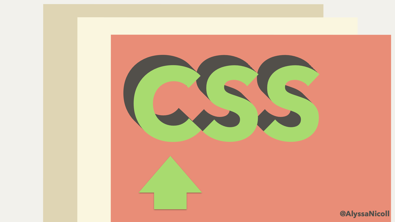
Pick a Date with Telerik Date Picker for Xamarin

$
0
0

With the R2 2020 Release of Telerik UI for Xamarin we have extended our list of picker components with three new pickers: DatePicker, TimePicker and TimeSpan Picker.

The DatePicker control for Xamarin provides the end users of your Xamarin.Forms application with the ability to easily and intuitively select a date via a customizable spinner dialog that lets them pick the month, day and year of the desired date.

You can use the date picker in a variety of different use cases when you need to select a date. For example, if you happen to be working on a booking/reservation app, your users will need to pick a date to make a reservation. Whatever the use case, our Date Picker control for Xamarin is here to help you speed up your development!

date picker for xamarin

In this blog post I will get you familiar with the Date Picker control. You can learn about all the features it has and how you can easily customize it using the control’s flexible styling API.

Spinner Format

The Date Picker for Xamarin allows you to use standard or custom date format strings through the SpinnerFormat property. Depending on what format is set, the picker visualizes spinner controls with prepopulated values to be picked.

Examples with different SpinnerFormat values:

<telerikInput:RadDatePicker SpinnerFormat="yyyy/MMM"/>
<telerikInput:RadDatePicker SpinnerFormat="yyyy/MMM//dd"/>
<telerikInput:RadDatePicker SpinnerFormat="MMM//dd"/>

datepicker spinner format

Date Range

Date Picker allows you to define a date range and choose a date in between through the MinimumDate and MaximumDate properties. For example:
<telerikInput:RadDatePicker MinimumDate="2020,01,01"
                   MaximumDate="2021,12,31"
                   DefaultHighlightedDate="2020,07,10"/>

date picker date range

DisplayString Format

This feature gives you the opportunity to define what string format the date will be displayed when a date from the picker is picked. Please keep in mind that the format set to DisplayStringFormat must be a valid date string format. For example we will use the following formats for SpinnerFormat and DisplayStringFormat:

<telerikInput:RadDatePicker SpinnerFormat="MMM//dd"
                   DisplayStringFormat="yyyy/MMMM/dd"/>

and the result is:

datepicker display string format

Flexible Styling API

We have exposed the Flexible Styling API, which allows you to design the perfect date picker for your mobile application. You can style the date picker and the dialog appearance.

styling datepicker for xamarin

For more information and sample demo please review our Styling article.

Templates

In addition, we have exposed templates that give you the ability to fully customize the look of the Date Picker component. The dates are visualized inside a popup, so we also give you the option to customize its header and footer through the HeaderTemplate and the FooterTemplate properties. For more details you can check our documentation and SDK Browser Application and Telerik Sample Examples.

Tell Us What You Think

We would love to hear what you think about the Date Picker control and how we can continue to improve it. If you have any ideas for features to add, do not hesitate to share this information with us on our Telerik UI for Xamarin Feedback portal.

Don’t forget to check out the various demos of the control in our SDK Sample Browser and the Telerik UI for Xamarin Demos application.

If you have not yet tried the Telerik UI for Xamarin suite, take it out for a spin with a 30-day free trial, offering all the functionalities and controls at your disposal at zero cost.

Happy coding with our controls and stay with us! If you are curious about TimeSpan Picker and its usage, we are excited to share more with you in an upcoming blog post. :)

Debugging with Fiddler Everywhere: Collaborative Debugging

$
0
0

If you've ever wanted to scan your website for 404, 500, or any other status codes—and especially if you've needed to collaborate on debugging network issues—Fiddler Everywhere might be just what you need!

Fiddler has been used for years (with lots of ❤️) as the go-to tool for diagnosing and debugging network issues for both web and desktop apps. Fiddler Everywhere is the vNext of Fiddler—a brand new cross-platform version that shares the same core engine, but with a modern interface and vastly improved user experience.

While on the subject of new Fiddler tooling—take a look at Fiddler Jam if you're interested in inspecting remote customer issues!

In this blog series, we are looking into a variety of real-world network debugging scenarios that can be effectively addressed with Fiddler Everywhere. Today we are going to look at something slightly different—how we might use some of the approaches we've already discussed, but in a team environment where collaborating with fellow team members is critical.

So what are those other topics?

NOTE: Fiddler Classic (the original Fiddler) isn't going anywhere! You can still download Fiddler and use it like you always have on your Windows PC.

Our Scenario: Collaborating on Network Debugging

As a developer, lets say I work within a distributed engineering team. I also work alongside a support team and a QA team—and we all collaborate on resolving customer-reported issues.

Individually we each use Fiddler Everywhere to inspect network traffic to help resolve bug reports, but there are times when we want to share recorded sessions with each other. Maybe our testing team records network logs that expose details of the bug, then they want to add context to these saved sessions, and finally send them to us for resolution.

Let's see how Fiddler Everywhere can handle this!

Fiddler Everywhere's Solution

Previously with Fiddler Classic we were able to "share" sessions via a tedious inspect -> save -> share -> load -> re-run workflow across multiple desktop installations. The problem is this process is riddled with issues:

  • Saved .saz archives have to be manually shared (e.g. via email)
  • You can't necessarily control who has access
  • You are potentially sharing private/sensitive data
  • You lose the context or narrative of the shared session

Not fun at all!

By using Fiddler Everywhere, however, we can utilize all the same request/response inspection features we've been using for years with the added bonus of securely sharing these sessions with select teammates.

How is this accomplished within the Fiddler Everywhere UI?

  1. Open Fiddler Everywhere and toggle the Live Traffic option to Capturing:

    fiddler everywhere capturing toggle

  2. Open the web or desktop app you are working with and follow whatever in-app workflow is needed to replicate the reported issue.

  3. Back in Fiddler Everywhere, toggle the Live Traffic option to Paused so as to limit new sessions coming into our view.

  4. Look for the specific sessions you want to share (you may want to use the column filters provided). Right-click on them and choose Save --> Selected Sessions.

    fiddler everywhere save session

  5. At this point, you may optionally start adding your own comments to the selected sessions by right-clicking on the appropriate sessions and choosing Comment:

    fiddler everywhere add comment to session

  6. Next, using the Share button, you can quickly and securely share the saved session with your teammates:

    fiddler everywhere email to team

  7. Finally, your teammates will receive an email alerting them to the shared session and prompting them to open it up within their own copy of Fiddler Everywhere. They can now inspect, replay, and rework the session... even comment on it so you can collaborate on the issue!

    fiddler everywhere collaborate with team

    NOTE: The team collaboration features are part of an extended "pro" feature set within Fiddler Everywhere. You can view full pricing details on our website.

Summary

Today we saw how Fiddler Everywhere can be used to quickly share recorded sessions with teammates. By leveraging this feature of Fiddler Everywhere, you enable your team to more easily collaborate on network debugging sessions—often saving numerous cycles for both your developers and support team!

But wait... something is missing from this equation...

The customer! The scenario presented today, while very common, kind of leaves out the customer and requires us to manually replicate reported issues. This is where Fiddler Jam comes in—allowing you to remotely capture, share, and report on customer issues far easier than ever before. Take a look at Fiddler Jam and join the pilot program to learn more!

Otherwise, start your journey with Fiddler Everywhere by downloading it today on macOS, Linux, or Windows.

Viewing all 5333 articles
Browse latest View live