Quantcast
Channel: Telerik Blogs
Viewing all 5335 articles
Browse latest View live

New Features in TypeScript 3.9

$
0
0

TypeScript 3.9 was recently released. Check out the highlights of the new version, which focused on performance, speed and stability.

TypeScript

TypeScript is an open-source, strongly-typed, object-oriented, compiled language developed and maintained by Microsoft. It is a superset of the very popular JavaScript used by millions of projects (over 2 million on GitHub) that was built to bring static types to modern JavaScript. The TypeScript compiler reads in TypeScript code, which has things like type declarations and type annotations and emits a clean and readable JavaScript with those constructs transformed and removed. That code runs in any ECMAScript runtime, like your favorite browsers and NodeJS.

Version 3.9

Recently, the team at Microsoft released the latest version of TypeScript and the focus was on performance, speed and stability. This means drastically reducing bugs and app crashes, and this was also done with the help of the TypeScript community. In this article we will look into an overview of these new features and fixes.

Speed Improvements

Some popular libraries and packages like styled-components and even material-ui have been seen to have really poor compilation speed. This new version tried to fix this issue by optimizing a lot of cases, like large unions, intersections, mapped types and conditional types. So for each of these optimizations, compile times are now lower by a whopping 5–10 percent each. For material-ui, this new version of TypeScript ships with a 25 percent reduction of material-ui-styles compile time, which is a 15-second reduction, according to feedback from the team at Microsoft.

Also, I think due to the Microsoft ecosystem, the team at Visual Studio Code also gave the TypeScript team feedback about tasks like renaming a file and how long it takes. The new TypeScript version changed some things internally about language service cache file lookups to further reduce this time lapse. This all translates to a faster TypeScript all-around experience.

Improvements in Inference and Promise.all

The previous versions of TypeScript, which had promise.all and promise.race functions updated, came with a bit of regressions especially as it relates to mixing in values with null or undefined.

interface Lion {
    roar(): void
}
interface Seal {
    singKissFromARose(): void
}
async function visitZoo(lionExhibit: Promise<Lion>, sealExhibit: Promise<Seal | undefined>) {
    let [lion, seal] = await Promise.all([lionExhibit, sealExhibit]);
    lion.roar(); // uh oh
//  ~~~~
// Object is possibly 'undefined'.
}

In the code block above, the fact that sealExhibit has undefined type of lion is strange. With this new version of TypeScript, the code block above does not contain errors any longer. If you are using an older version with these issues with promises, please do upgrade.

ts-expect-error Comments

If you wanted to write a TypeScript library and export a function called doSomething and then in the definition, you specified that it takes two strings like this:

function doSomething(abc: string, xyz: string) {
    assert(typeof abc === "string");
    assert(typeof xyz === "string");
    // do something
}

This way you can always get the TypeScript squiggly red lines when you do not use the function correctly and pay attention to types. To test this behavior, let’s build a test, a unit test.

expect(() => {
    doSomething(123, 456);
}).toThrow();

Unfortunately if our tests are written in TypeScript, TypeScript will give us an error!

doSomething(123, 456);
//          ~~~
// error: Type 'number' is not assignable to type 'string'.

This is why in the new version of TypeScript, you can prefix a line with the expected error comment and TypeScript will suppress the error from being reported. However, you would not be able to misuse the comment, as TypeScript will flag a warning any time you use the comment unnecessarily.

As a quick example, the following code is okay:

// @ts-expect-error
console.log(47 * "octopus");

While this code:

// @ts-expect-error
console.log(1 + 1);

results in the error:

Unused '@ts-expect-error' directive.

If you want to read more about this, you can take a look at the[ts-expect-error](https://github.com/microsoft/TypeScript/pull/36014)pull request.

Awaited Will Wait Longer

Awaited Type?

The speculations are true, the new TypeScript type operator called Awaited is not shipping with this new version of TypeScript due to some more design concerns, but will be released once the team feels confident enough. You would have gotten wind of it if you followed the TypeScript issue tracker on GitHub. This new type models the way promises are unwrapped in JavaScript.

Support for “Solution Style” tsconfig.json Files

IDEs have to find the tsconfig.json file to know what configs have been set up for any given project and apply the options accordingly. So what happens when there is more than one tsconfig file and one of them is referencing the rest of them like this below:

// tsconfig.json
{
    "files": [],
    "references": [
        { "path": "./tsconfig.shared.json" },
        { "path": "./tsconfig.frontend.json" },
        { "path": "./tsconfig.backend.json" },
    ]
}

This file can be called a solution file—its only function is to manage other project files—but in some cases the server does not pick up any of the listed tsconfig files. This is exactly what we would want the server to understand, the fact that the current file can belong to one of the mentioned files in the root. The new TypeScript version fixes this by adding support to editing scenarios for these kinds of configuration.

Quick Fixes for Missing Return Expressions

This feature probably affects almost every developer I know every once in a while. People just sometimes forget the return value of their statements in a function, especially curly brackets that go with arrow functions.

// before
let f1 = () => 42
// oops - not the same!
let f2 = () => { 42 }

With the new version of TypeScript, it can now provide a quick-fix to add missing return statements, remove curly braces, or add parentheses to arrow function bodies that look suspiciously like object literals.

CommonJS Auto-Imports in JavaScript

This is my favorite update. Before now, for every import you make in a TypeScript file, it always assumes you would love to go the ECMAScript style of import and so it provides something like this during the auto-import:

import * as fs from "fs";

However, contrary to the above assumption, not everyone is targeting ECMAScript-style modules when writing JavaScript files. A lot of users still use CommonJS-style require(...) imports like so:

const fs = require("fs");

In this version 3.9, TypeScript now automatically detects the types of imports you’re using to keep your file’s style clean and consistent.

Breaking Changes

  1. Parsing Differences in Optional Chaining and Non-Null Assertions
  2. TypeScript now hoists exported declarations to the top of the file when targeting module systems like CommonJS in ES5 and above.
  3. Exports Now Use Getters for Live Bindings
  4. TypeScript 3.9 will always emit these export * declarations, making sure that it is always retained.

You can get the new version by downloading from the official TypeScript link here.

Conclusion

This has been a quick glance through most of the new features that the recent TypeScript 3.9 ships with and the thought process behind them. We get a faster and more intuitive version overall, and the common JS auto imports are my favorite feature. What is yours?
What’s New in Next JS 9.4

$
0
0

Let's explore the new features that shipped with Next.js 9.4, including fast refresh, integrated web vitals reporting, new environment variables support and more.

Next.js

Next.js is well known as the React framework for static pages, progressive web apps, mobile web apps, SEO-friendly pages and, most especially, server-side rendering. It facilitates static exporting with just a line of command and ships with a CSS-in-JS library styled JSX. It also includes features such as code-splitting, universal rendering and hot reloading.

Let’s take a detailed look at some of the most noteworthy new features that shipped with the latest version of the framework: Next.js 9.4 — things like fast refresh, incremental static regeneration, new environment variables support, improvements in built-in fetch support, web vitals reporting and improvements in log output.

Fast Refresh

Fresh off the grill, the new version of Next.js has fast refresh enabled by default for all projects. This gives us a new hot reloading experience with instant feedback on edits that you make to your React components.

Even though hot reloading as a concept is not entirely new, before now, due to the fragility of enabling hot reloading by default in their projects, Next.js actually used to implement a coarse form of hot reloading that would always reset state of your app. The problem with the coarse form was resilience to runtime errors and compilation errors. Even if you made a typographical error while editing a CSS stylesheet for instance, your app reloaded and state would reset. This was not as efficient.

Using React Refresh, the fast refresh in Next.js integrates into React to handle predictable updates to your React component tree. This ensures that Next.js only updates code inside the file you edit and only re-renders that component without losing the component state. This includes CSS rules (whether inline, CSS-in-JS or SASS), HTML and effects.

Integrated Web Vitals Reporting

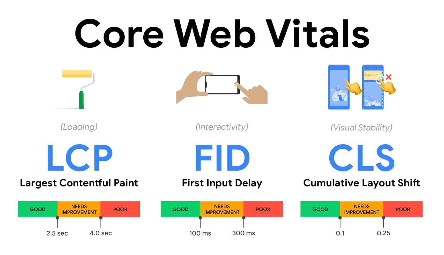
Recently Google introduced this Core Web Vitals browser extension, which is basically a car mechanic shop for your web app (if your app was a car). It shows you quality ways to ensure that you deliver a great user experience on the web, and it perfectly integrates with Lighthouse. Metrics like loading time, interactivity and stability of your app are monitored like this:

Core web vitals: largest contentful paint, first input delay, and cumulative layout shift are shown, each with a range of good, needs improvement, or poor

As Next.js is known for fast performing web applications, taking advantage of these new web vital tools to ensure you know the health status of your Next apps, the team decided to introduce in collaboration with Google a new method. It is called reportWebVitals and it is exported in your components from pages/_app.js:

    // Will be called once for every metric that has to be reported.
    export function reportWebVitals(metric) {
      // These metrics can be sent to any analytics service
      console.log(metric)
    }
    function MyApp({ Component, pageProps }) {
      return <Component {...pageProps} />
    }
    export default MyApp

If you would like to use this method together with your analytics service of choice, kindly read about sending results to analytics here in the docs, and if you want to know more about the core web vitals, refer to the homepage here.

New Environment Variables Support

Through user and customer feedback, the Next.js team found that some companies who use Next had trouble knowing exactly when an environment variable is inlined into a browser bundle and when it is just available in the Node environment. Due to this, the Next team is announcing that they’ll ship this new version of Next with two fully backward-compatible features that will help solve this problem.

The first feature is that you can now prefix the environment variable with NEXT_PUBLIC_ to expose it to the browser. When it is used, it will be inlined into the browser JavaScript bundle. This means you do not have to add a next.config.js and the env key to expose variables.

    // pages/index.js
    // The environment variable will be exposed to the browser
    console.log('My Application Version', process.env.NEXT_PUBLIC_VERSION)
    export default function HomePage() {
      return <h1>Hello World</h1>
    }

Secondly, Next.js now supports the .env loading by default, so that you can easily define dev and production environment variables. If you want to know more about the environment loading, read the docs here.

Essentially with these new improvements, using environment variables will become easier and way clearer than it was. This is because environment variables will only be available in the Node.js environment by default, and the variables prefixed with NEXT_PUBLIC_ will be exposed to the browser.

Improved Built-in Fetch Support

So in the 9.1 version of Next.js, polyfilling of the fetch API in the browser was announced, and now in this newest version, 9.4, it has been extended to the Node environment. This means that you do not have to use any type of server-side polyfill to fetch, like node-fetch — Next.js will now automatically provide fetch() in all environments.

A good example is when using getStaticProps, which gets executed using Next.js at build time:

    export async function getStaticProps() {
      // fetch no longer needs to be imported from isomorphic-unfetch
      const res = await fetch('https://.../posts')
      const posts = await res.json()
      return {
        props: {
          posts
        }
      }
    }
    function Blog({ posts }) {
      // Render posts...
    }
    export default Blog

Absolute Imports and Aliases

Depending on the directories, if your project is large, there is a chance that some of your import statements will suffer from the dots and backslashes dilemma:

    import Button from '../../../../components/button'

In cases like this, you can use absolute imports instead of using relative imports. So if the components directory is in the root folder, importing the button may just take this line:

    import Button from 'components/button'

With the new Next.js version, it gets even easier to do absolute imports for both JavaScript and TypeScript projects — just add the baseUrl configuration to the JavaScript project’s [jsconfig.json](https://code.visualstudio.com/docs/languages/jsconfig#_jsconfig-options) file or to the tsconfig.json file for TypeScript projects.

    // jsconfig.json or tsconfig.json
    {
      "compilerOptions": {
        "baseUrl": "."
      }
    }

This allows absolute imports from the root folder — it integrates well with Visual Studio Code and other editors that support code navigation. If you have already modified your webpack module alias config to have absolute imports, it would be removed as you upgrade.

Additionally, you can use the path option, as Next.js also supports its use to create custom module aliases. A good example is the code block below to use @/design-systeminstead of components/design-system:

    // tsconfig.json or jsconfig.json
    {
      "compilerOptions": {
        "baseUrl": ".",
        "paths": {
          "@/design-system/*": ["components/design-system/*"]
        }
      }
    }

The aliases can be used like this:

    // Imports 'components/design-system/button'
    import Button from '@/design-system/button'

Remember that if you use the paths option, you must specify baseUrl first. To learn more about paths, you can take a look at the TypeScript docs.

Configurable SASS Support

Built-in SASS support actually shipped in the last version Next, 9.3, and during that period the team at Next got user feedback that some users would like to configure the SASS compiler to modify things like the includePaths. In this new version of Next.js, it is now possible to do this by using the sassOptions key in next.config.js:

    const path = require('path')
    module.exports = {
      sassOptions: {
        includePaths: [path.join(__dirname, 'styles')]
      }
    }

Improved Log Output

The Next.js CLI has also been redesigned with this new version. It is now more consistent and outputs less duplicate data like the deployment link, waiting on dev server to start and other things that are usually repeated. The spacing of the texts are now also consistent, so there is no more jumping from one line to another.

Conclusion

The Next community has been showing growing use over time, as evidenced by its over 1,000 contributors, 48,000+ GitHub stars, vast number of example directories. These numbers are increasing month to month, speaking to growing ability of this community, and the Next.js team is fully committed to improving the developer experience and optimizing the Next product.

Telerik UI for Blazor 2.15.0 Includes New ButtonGroup, ToggleButton, Grid Updates and More

$
0
0

The latest release of Telerik UI for Blazor features new native components in ButtonGroup and ToggleButton, updates to the Grid, Chart, Treeview and More. Read on for all the highlights.


It is June and here comes another release of Telerik UI for Blazor that brings two new native Blazor components—Button Group and Toggle Button—multiple new features to the Grid, Chart, TreeView, Textbox and more. Let’s dive into the new 2.15.0 release and see in detail the new goodies including new Grid Custom Filtering, Grid Row-Click Events, support for dynamic ExpandoObject, and binding to DataTable, all ready to be plugged and played in your Blazor Server and WebAssembly apps!

New Blazor Components

Blazor Button Group Component

ButtonGroup Overview

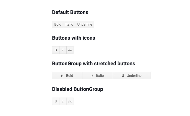
The ButtonGroup component is a UI container for buttons, which lets you select single or multiple button instances, and respond to the selection and click events. The buttons within the ButtonGroup fill up the container, match the styling according to the chosen theme and provide the common button features like images and icons, as well as other parameters and attributes.
Telerik UI for Blazor ButtonGroup Component

Telerik UI for Blazor ButtonGroup Component

To use the ButtonGroup component in your Blazor applications, you need to add the TelerikButtonGroup tag, and inside it add the corresponding <ButtonGroupToggleButton> or <ButtonGroupButton> tags that denote each button, as shown in the example below:

<TelerikButtonGroup>
<ButtonGroupButton>First button</ButtonGroupButton>
<ButtonGroupToggleButton>Second button</ButtonGroupToggleButton>
</TelerikButtonGroup>

ButtonGroup Selection

Using the SelectionMode setting of the ButtonGroup component, you can enable single or multiple selection of its ButtonGroupToggleButton instances.

ButtonGroup Customization and Styling

You can customize and style the ButtonGroup and its individual buttons using various styles, images, sprites, font icons and conditional formatting. Check out an example of how to completely transform a button group look.

ButtonGroup Events

The buttons in the ButtonGroup component provide two handy button/toggle button events:

  • OnClick fires when the user clicks or taps the button. You can use it to invoke async logic such as fetching data or calling a service.
  • SelectedChanged fires when the user changes the state of the button by clicking it (or by using Space or Enter). You can use it to call local view-model logic (applicable for a ButtonGroupToggleButton)

ButtonGroup Keyboard Navigation

The ButtonGroup component has built-in keyboard navigation allowing end users to easily navigate in Blazor applications, focus and click on buttons using their keyboard.

Blazor Toggle Button

ToggleButton Overview

The ToggleButton lets you perform a toggle actions (such as on/off) on the two states of the component.

Telerik UI for Blazor ToggleButton Component

Telerik UI for Blazor ToggleButton Component

To add a Telerik UI for Blazor ToggleButton to your Blazor app, use the <TelerikToggleButton> tag.

<TelerikToggleButton @bind-Selected="@IsSelected">
Selected: @IsSelected
</TelerikToggleButton>
@code {
boolIsSelected { get; set; }
}

ToggleButton Styling

You can use an image, sprite or font icon in the toggle button so that you customize its look and make it easier for users to interpret its purpose.

ToggleButton Events

The ToggleButton component exposes the following events to let you handle clicks and selection in Blazor apps.

  • OnClick fires when the user clicks or taps the button. You can use it to invoke async logic such as fetching data or calling a service
  • SelectedChanged fires when the user changes the state of the button by clicking it (or by using Space or Enter). You can use it to call local view-model logic

ToggleButton Keyboard Navigation

Like most of the Telerik UI for Blazor components, the ToggleButton has built-in keyboard navigation allowing end users to easily focus and click on buttons using their keyboard.

Blazor Components Enhancements

With every new version that we ship with Telerik UI for Blazor, we aim to give our love to the Grid component, and in the 2.15 release we added several features requested via our feedback portal.

Blazor Grid Component New Features

Grid Custom Filter

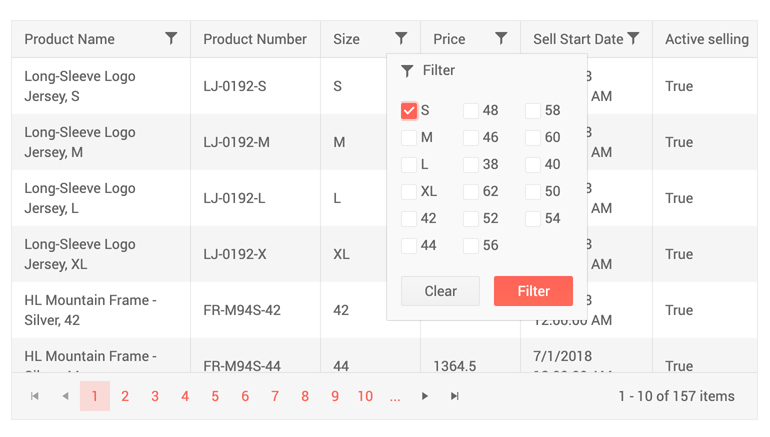
When working with data one thing is sure—it grows, and users needs to be able to quickly find their relevant records. And because filters do not always come in their simple form such as show me records for data smaller than DateTime.Now, in this release we added the flexibility to let you customize data filtering.
Telerik UI for Blazor Grid Custom Filtering - Multiple Operands

Telerik UI for Blazor Grid Custom Filter Menu—Apply Multiple Operands

You can apply as many logical operands as needed and implement any custom filtering criteria that is defined by your project requirements using the filter menu template.

Telerik UI for Blazor Grid Custom Filtering - Checkboxes

Telerik UI for Blazor Grid Custom Filter Menu—Apply Multiple Checkbox with Filter Menu Template

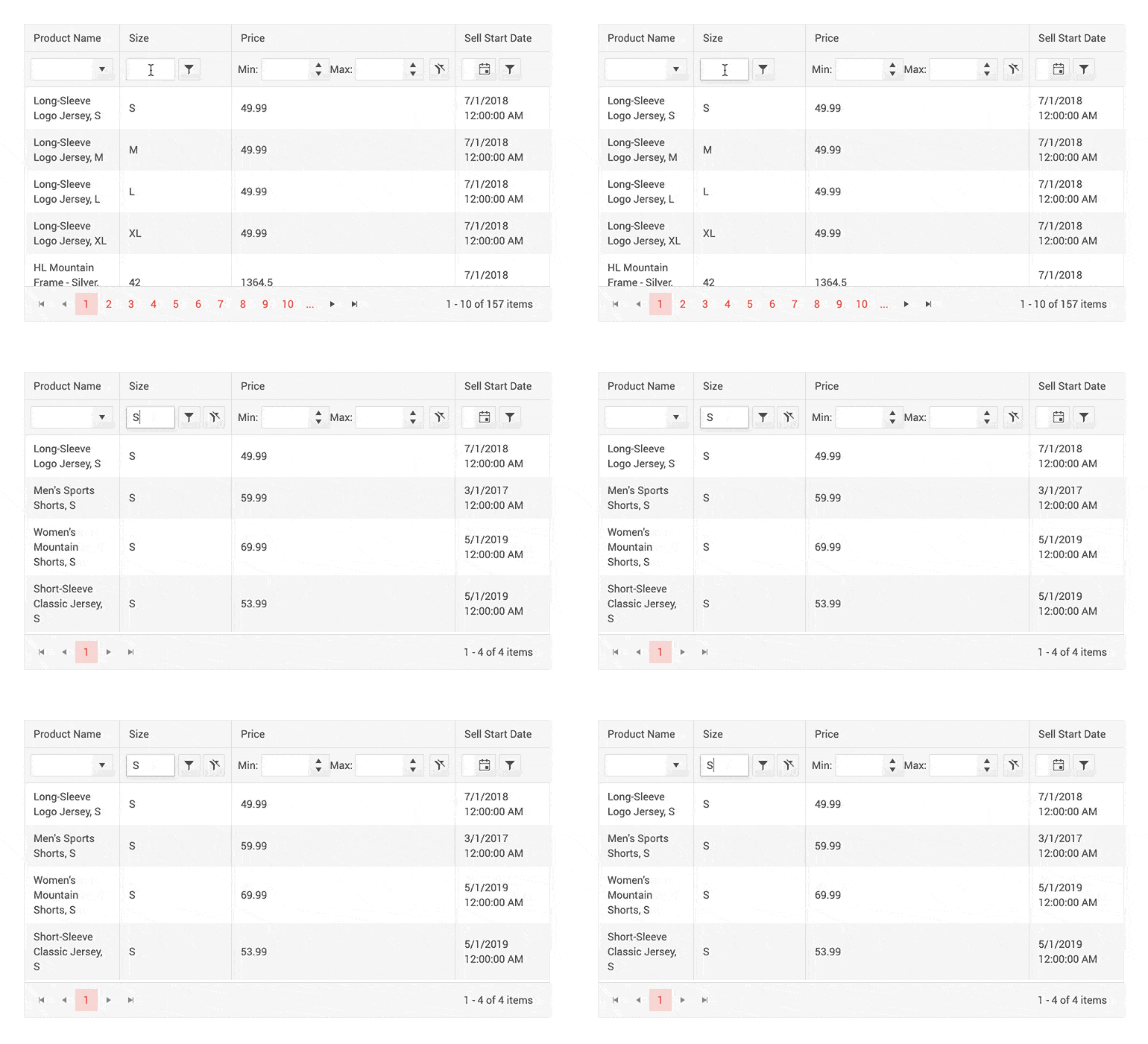
In addition to the Grid custom filter menu, you can also implement custom filtering on Grid rows using the filter cell template.
Telerik UI for Blazor Grid Custom Filter Row

Telerik UI for Blazor Grid—Custom Row Filter

Code examples on how to customize filtering using the <FilterMenuTemplate> and <FilterCellTemplate> templates can be found on our dedicated custom filtering demos for menu and rows.

Grid Row Click Events

We have exposed two new events in the Grid, so that you can implement custom business logic in your code that handles user clicks on Grid rows.

OnRowClick and OnRowDoubleClick events fire when user clicks and double-clicks a Grid row, respectively. Their event handlers receive the GridRowClickEventArgs object, providing the model of the clicked row in the Item field giving you flexibility to show details, load data on demand, display related data and perform various custom actions to the clicked rows.

Grid Support for ExpandoObject

Don’t have a strongly typed model of your data—no problem, the Telerik UI for Blazor Grid can easily accommodate dynamic data types. Checkout our sample repo on how to bind Grid to ExpandoObject in Blazor apps.

Bind Grid to DataTable

For those of you that have backend returning DataTable, you can now bind the Grid to DataTable data and have all the cool Grid built-in features with ease—sorting, paging, filtering and even editing.

Check out an example of how to bind the Grid in Blazor applications to a DataTable.

Blazor TextBox Component New Features

Textbox Additional Parameters

The latest updates to the Textbox component allow you to easily customize multiple elements of the text input, such as: AutoComplete, Placeholder, Name, Title and TabIndex.

<TelerikTextBox Name="email"PlaceHolder="john@smith.com"TabIndex="3"InputMode="email"Id="email"AutoComplete="on"Width="180px"></TelerikTextBox>

Textbox Password

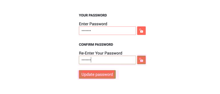
The Textbox component now has new parameter, Password, which when set to true gives you the option to mask the characters in the input and give it a proper password look.

Telerik UI for Blazor TextBox Password Property

Telerik UI for Blazor Textbox Password Property

Blazor TreeView Component New Features

TreeView Selection of Nodes

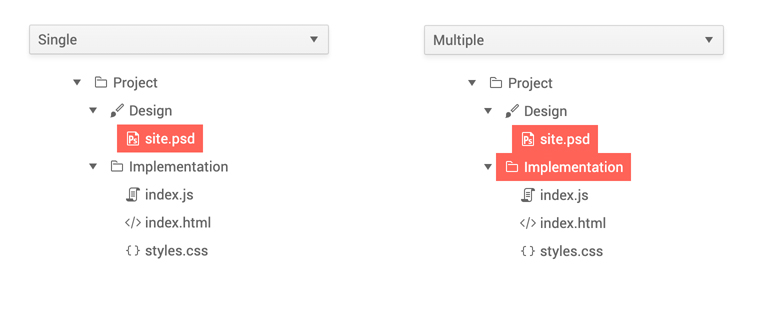
The TreeView component node selection can be configured by setting the SelectionMode parameter to a member of the TreeViewSelectionMode enum, which takes one of the three options:

  • None—disable the node selection (default)
  • Single
  • Multiple (using Ctrl or Shift key)

Telerik UI for TreeView Node Selection

Telerik UI for Blazor TreeView Selection of Nodes

TreeView Node Click Events

Two new events have been added to the component to enable flexibility when selecting and working with the TreeView nodes:

  • OnItemClick—fires when the user clicks (or presses Enter) on a node (item) of the TreeView.
  • SelectedItemsChanged—the SelectedItemsChanged event fires when the selection is enabled and the user clicks on a new item.

Blazor Chart Components New Features

Chart Tooltips

You can enrich your Blazor charts with three out-of-the box Chart tooltip-ingoptions for data points:

  1. Specific tooltip for each <ChartSeries>
  2. Common tooltip for all chart series
  3. Or a shared tooltip which provides summarized information of all data points from the hovered category

To enablespecific tooltips for the data points of each individual series, you need to include the <ChartSeriesTooltip> tag inside the <ChartSeries> tag, and set its Visible parameter to true.

To enable the same tooltip for all chart series, add the <ChartTooltip> tag inside the <TelerikChart>, and set its Visible parameter to true.
Telerik UI for Blazor Chart Tooltip - Single

Telerik UI for Blazor Chart Single Tooltip

To enable the shared tooltip in Telerik UI for Blazor Charts, add the <ChartTooltip> tag inside the <TelerikChart> tag, and set its Shared and Visible parameters to true.
Telerik UI for Blazor Chart Tooltip - Shared

Telerik UI for Blazor Chart Shared Tooltip

Telerik UI for Blazor Chart tooltips allow full customization of their appearance: background, color etc. and the content that is rendered in the tooltip via templates/ shared templates.

Both the chart tooltip Template and SharedTemplate allow you to define custom business logic, render HTML and give you access to the context parameter. In the Template it provides information about the current data point such as: CategoryIndex, SeriesIndex, SeriesName, DataItem, FormattedValue, and in the SharedTemplate it exposes Category (renders the name of the Category) and Points (a collection of data for each series data point in this category).

Click Event on a Chart Element

And to make things more interactive, the Telerik UI for Blazor Chart component exposes events that let you handle user clicks on chart series.

Check out the OnSeriesClick event with Telerik UI for Blazor charts.

Download Telerik UI for Blazor 2.15.0

To see in action all that’s mentioned in the release blog post, head over to the Telerik UI for Blazor page, download the 2.15.0 version of Telerik UI for Blazor to spice up your Blazor applications. Keep telling us what’s working well, what needs to change and what you’d like to see next in the dedicated Blazor feedback portal or in the comment section below!

Thank You!

As always, the entire team working on Telerik UI for Blazor at Progress is thankful to you for being involved and helping us grow and making Telerik UI for Blazor bigger and better.

Debugging with Fiddler Everywhere: Mocking Remote Issues

$
0
0

Is your app prepared to recover smoothly when facing a remote server error? Learn how Fiddler Everywhere can help you test and understand your app's resilience.

Many of us have been using Fiddler for years to inspect and debug HTTP/S traffic between our computer and the rest of the world. It trivializes the overly complex problems we experience when inspecting network activity both to and from both web and desktop apps. Oh, and we can also set up "auto-responding" rules and fiddle with the request and response. See what I did there?

Fiddler Everywhere is the next generation of Fiddler tooling. Fiddler Everywhere brings forward most of what you love about Fiddler to a new cross-platform tool with a revamped UX that performs identically across macOS, Linux, and Windows.

NOTE: Fiddler Classic (the original Fiddler) isn't going anywhere! You can still download Fiddler and use it like you always have on your Windows PC.

We are kicking-off a blog series in which we'll take a quick look at scenarios most of us have encountered. From remote APIs failing, to diagnosing errors in production, to finding a pesky 404 - Fiddler Everywhere is our trusted co-pilot when debugging these (and plenty of other) issues:

  • Mocking Remote Issues (hey, that's today!)
  • Scanning for 404 and 500 Status Codes (coming soon)
  • Collaborative Debugging (coming soon)
  • Resolving an Error in Production (coming soon)
  • Diagnosing a Remote API Failure (coming soon)

Today we're going to examine how we can use Fiddler Everywhere to mock a remote server error. What happens when that third party API goes down or the network connection is dropped entirely? Is your app set up to gracefully recover from these types of errors?

Our Scenario: Bulletproofing an App by Mocking Issues

As a developer, my web and desktop apps rely heavily on remote backend services. Some of them I manage myself, while others are third party APIs that I have no control over. What happens when any one of them goes down? Is my app set up to resolve these errors and notify the user in a graceful manner?

Or will I end up taking crazy pills when an API fails on me?

i feel like i'm taking crazy pills gif

Fiddler Everywhere's Solution

Fiddler Everywhere includes a feature called Auto Responder.

Auto Responder can be used in virtually any situation where you want to redirect a request, alter a status code, delay a response, and so on.

For example, you may want to:

  • Replace a remotely-loaded library/image/file with a local version;
  • Redirect a request from one URL to a completely different one;
  • (In our case) see what happens when a remote connection is dropped!

Let's try out this scenario:

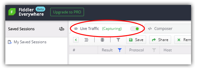
  1. Open Fiddler Everywhere and toggle the Live Traffic option to Capturing:

    fiddler everywhere capturing toggle

  2. Open the web app (or desktop app) and navigate to whatever functionality or feature will call the remote service for which you'd like to create a mock response.

  3. Back in Fiddler Everywhere, toggle the Live Traffic option to Paused so as to limit new sessions coming into our UI.

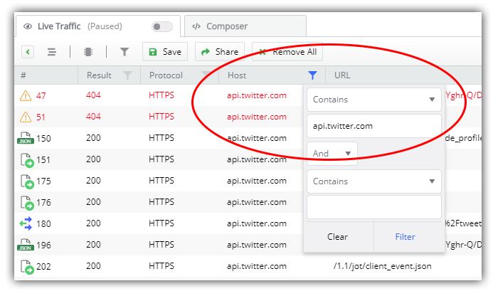
  4. Look for the specific request you want to mock. Note that you can use the filtering options to quickly discover matching sessions. For instance, you can filter by hostname, URL, status code, and so on.

    filter sessions

  5. When you've found the appropriate session, right-click it and choose Add New Rule. This will populate the Auto Responder tab with a new rule.

    add new auto responder rule

  6. Navigate to the Auto Responder tab and edit the newly-created rule. In the Action dropdown list, choose *drop, as this will mock what happens when a request to this URL is dropped.

    drop connection action

    NOTE: There are numerous other pre-defined actions you can utilize like *reset and *delay:100. Take a look at some explanations for these actions in the Fiddler docs.

  7. With your rule activated (make sure the Enable Auto Responses box is checked!), reload your app. Fingers-crossed now, hopefully your app handles this connection drop issue just fine. If not? This is an opportunity to alter your app and re-run these tests until your app performs as expected.

Summary

In this post we took a quick look at how Fiddler Everywhere's Auto Responder feature can allow you to quickly mock up a remote API failure, allowing you to adjust and improve your app before a problem occurs in production.

Start your journey with Fiddler Everywhere by downloading it today on macOS, Linux, or Windows.

Progress Control Panel Now Automatically Creates a Telerik NuGet Package Source

$
0
0

In order to ensure a fluent build experience, Progress Control Panel now provides two options to set up a Telerik NuGet package source.

As most of you know, the Telerik private NuGet feed gives access to UI components across all the Telerik products. It is a very convenient option to use in your build environment.

On the Control Panel login screen, you now have the option to set up our private feed. If you choose that option, the Telerik package source will be included in the current user NuGet.config file. The provided login credentials will be associated with that source.

Control Panel Login Page

In addition, your NuGet credentials can also now be provided in the Control Panel options dialog. There you can change your current credentials or you can also create a new package source if not available.

Control Panel Options Dialog

We hope this will improve your experience with our products. Let us know what you think everyone!

Grab Your Users' Attention with the WPF RadCallout in Action

$
0
0

Need to display meaningful information, be it alerts, hints, tips, etc? Then greet the hero of R2 2020 Release of Telerik UI for WPF—the RadCallout control.

Remember how we all thought that buttons are everywhere? Well, while developing the hero of today’s talk, I changed my mind about that. I started seeing Callouts everywhere, but there was no other like our star—one of the shiniest accents of the R2 2020 release of Telerik UI for WPF. Everybody, please welcome the brand-new RadCallout.

I’m sure that all of you have already met a callout in your lives, at least once. Some of you may not know that it’s referred to as a callout. Others might relate it to the thought or speech bubbles used in comic strips. All golden Microsoft Office fans surely still remember Clippit. The cute cartoon paperclip, seen in versions 2000 through 2003, and its helpful callouts. But what’s so special about ours? Let’s call out the RadCallout and find out.

RadCallout

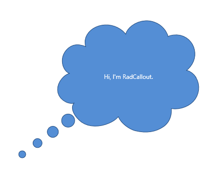
What do you see? A tiny, fluffy, cloudy text box with a small tail that you can point to different locations. Pretty simple, huh, yet so satisfying and unbelievably (at first sight) powerful. Let me guide you through its superpowers.

Unlimited Box Shapes Variety

I could not help but start exactly with this one. Since the callout control is a content control, designed to display a piece of meaningful information, be it alerts, hints, tips, etc., I believe the shape of it is the part responsible for the best representation. You can’t warn your users that if they don’t change their expiring password, they may not be able to log in ever again, in the shape of a heart for example, can you? Let’s cut the small talk and explore the shape options that the RadCallout offers.

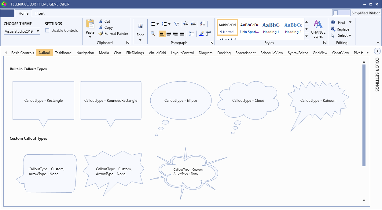
The control comes with five built-in shape types, plus one very special option. The CalloutType is an enumeration and it allows the following values—Rectangle, RoundedRectangle, Ellipse, Cloud, Kaboom (the one jazzy, glaring shape with the many lines connecting to form numerous triangular edges).

The last option is intentionally out of the list of built-in shapes—it's the Custom shape option. The one responsible for the heading of this section, the one giving you the un-limitedness. Using it, you need to provide a custom geometry. I really love it, because it allows you to get into your stride and build a very cool and unique shape for your callout.

Callout Shapes (ColorThemeGenerator)

Explore them all and play with the themes and colors in the Color Theme Generator application. Like the rest of the controls from the Telerik UI for WPF, the Callout control comes with a set of themes you can use to create a consistent and modern looking user experience.

P.S. The last one of the custom callout types is catchy, isn’t it? And since I like you, I’ll show you how it’s done:

<telerik:RadCallout
Width="250" Height="170"
Margin="10 0" CalloutType="Custom"
MeasurePathWithInfinity="False" Stretch="Fill" ArrowType="None"
Geometry="M590.7,100.7c.5-3.1,1.1-6.2,1.8-9.3a2.0,2.0,0,0,0-.7-2.4c-7.4-5.7-15.8-9.0-25.4-8.2-10.5,1-18.5,6.0-23.2,15.7-3.7,7.8-3.8,16-2,24.3a2.3,2.3,0,0,0,1.7,1.7c2.1.8,4.3,1.7,6.3,2.7a30.7,30.7,0,0,1,7.2,4.7,6.4,6.4,0,0,1-1.9-.3,86.4,86.4,0,0,0-17.4-3.3c-8.5-.6-16.8.1-24.6,3.6-9.3,4.2-15.8,11-18.3,21.1-2,7.9-.8,15.5,2.4,22.9,3.7,8.0,9.6,14.2,16.8,19.2,2,1.4,4.1,2.6,6.1,3.9,5.2-3,10-6.1,15.5-7.8a7,7,0,0,1-1.2,1.3,110.6,110.6,0,0,0-8.0,7.8c-7.5,8.8-11.2,19-10.1,30.7,1.5,16.1,13.5,30.8,29.7,36.0a47.3,47.3,0,0,0,30.4-.5,44.6,44.6,0,0,0,9.6-4.2,60,60,0,0,1-2.4-18.3,11.0,11.0,0,0,1,1,2.1c1.2,3,2.2,6.1,3.7,9.1a48.5,48.5,0,0,0,14.8,18.5c9.7,7.2,20.5,9.9,32.4,7.1,12.4-2.9,21-10.4,25-22.7a36.1,36.1,0,0,0,.5-19.4c-.7-3.1-1.9-6.1-2.9-9.2h0c.8-.5,1.3.1,1.8.6,1.6,1.7,3.2,3.4,4.8,5.3a2.9,2.9,0,0,0,2.8,1.3A71.5,71.5,0,0,0,686.7,231c10-3.7,18.2-9.8,24.1-18.9,7.5-11.7,9.4-24.6,6.6-38.2-3.4-16.1-12.3-28.2-27.0-35.8a53.1,53.1,0,0,0-23.6-5.5c-1.3,0-2.6,0-3.9,0a1.9,1.9,0,0,1,1.0-1.1c3.6-1.2,7.3-2.6,11.1-3.7,1.3-.4,2.0-.9,2.1-2.3.1-2.3.5-4.7.6-7.1.4-9.6-1.2-18.8-6.3-27.1-8.0-13.1-20-19.4-35.4-18.5-8,.4-15.2,3.3-22,7.5-8.5,5.3-15.5,12.4-21.6,20.5-.4.6-.9,1.2-1.7,2.2A13.1,13.1,0,0,1,590.7,100.7Zm-63.8,17.7L477,72.3a13.9,13.9,0,0,0-1.5-1c1.0-.5,1.6.3,2.2.8q10.5,7.7,21.0,15.4l34,25a6.3,6.3,0,0,0,2.4,1.2c-.2-.7-.4-1.4-.6-2.2-2.1-6.3-3-12.8-1.2-19.3,2.4-9,8.2-15.1,16.8-18.4,13.3-5.1,25.8-3,37.5,5.1.6.4,1.2.9,2.3,1.6,1.8-21.2,3.3-42.1,5.5-63,1.3,20.5,2.7,41.1,4.1,62.2,1-.8,1.6-1.3,2.2-1.8,8.1-7,17.4-12,28.1-13.5,15.8-2.2,29.7,1.7,40.9,13.3,7.7,8,11.2,17.9,11.5,28.9.0,3-.3,6.0-.5,9.0-.0.8-.1,1.7-.2,2.9,1.1-.4,2-.8,2.8-1.2l78.2-35.9c.9-.4,1.9-.7,2.9-1.0a30.6,30.6,0,0,1-2.6,1.9q-37.2,21.6-74.5,43.1c-.8.4-1.6,1-2.7,1.6a9.8,9.8,0,0,0,1.4.5c18.6,3.7,31.1,15,38,32.3a59.9,59.9,0,0,1,0,45.6c-5.6,14.1-15.8,24-30.1,29.3a60.4,60.4,0,0,1-17.0,3.7c-.8.0-1.6.1-2.8.3.5.7.9,1.3,1.3,1.7q21.2,25.6,42.6,51.2a10.1,10.1,0,0,1-2-1.2Q695.6,271,674,250.7l-4.8-4.4c-.7.8-.4,1.7-.4,2.5a38.8,38.8,0,0,1-4.8,19.8,39.8,39.8,0,0,1-21.0,18,44.7,44.7,0,0,1-35.7-.7,38.3,38.3,0,0,1-15.4-12.5c-.3-.4-.6-.9-1-1.3a3.9,3.9,0,0,0-.7-.4c-5.7,27.5-11.1,55.0-17.1,82.5,2.6-28.3,5.2-56.6,7.8-85.2a10.6,10.6,0,0,0-1.5.6c-11,7.2-22.7,8.2-34.9,4-16.4-5.7-28.1-16.7-34.6-33a37.3,37.3,0,0,1,0-29c.5-1.3,1.2-2.5,2-4.3l-61.9,17.3c-.0-.1-.1-.2-.1-.4l63.2-27-3.5-2a55.6,55.6,0,0,1-18.8-16.6c-13-18.6-6.8-43.2,13.3-53.6a44.4,44.4,0,0,1,21.5-4.8c.7,0,1.4,0,2.1,0,.1,0,.2-.1.6-.2C527.5,119.2,527.2,118.8,526.8,118.4Z">
    <telerik:Label Content="CalloutType - Custom, ArrowType - None" FontSize="10" Margin="0 0 0 15"/>
</telerik:RadCallout>

Customization Capabilities

Don’t be shy and always aim beyond the basic settings like spacing, background and border color. Of course, the RadCallout allows it. Adjust everything you wish to end up with the perfect callout for your app. Don’t just change text color and style, or the vertical and horizontal offsets.

Be brave, play with the properties which determine the look and feel of the connection point for the callout body—the arrow. Check out the following properties:

  • ArrowBasePoint1—the first base point of the arrow geometry
  • ArrowBasePoint2—the second base point of the arrow geometry
  • ArrowAnchorPoint—the anchor point of the arrow geometry

So far, so unclear, but let me try to explain.

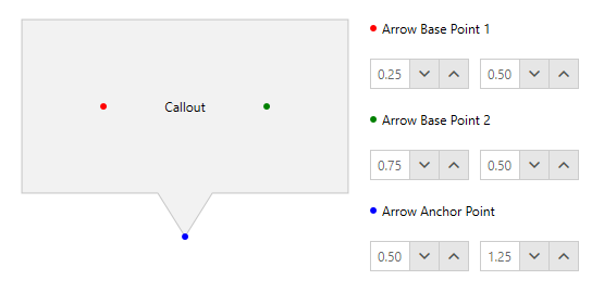
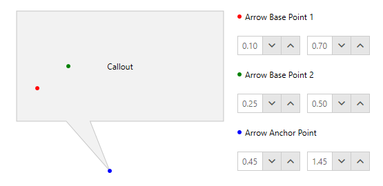
The above properties for customizing the arrow of the RadCallout’s geometry are all of type Point, representing relative coordinates (between 0 and 1). For example, X = 0 and Y = 0 means the top-left point of the callout body and X = 1, Y = 1 - the bottom-right point. In the following figures you can see the default values of the properties [0.25, 0.5], [0.75, 0.5] and [0.5, 1.25].

Important thing! The width and height of the callout applies only to the body of the geometry, without the arrow. Why? Because this makes it very easy to keep a fixed size of the main shape, while making bigger arrows which exceed the shape size. How to make those bigger arrows—simply set big Y of the ArrowAnchorPoint. To make the arrow included in the callout size, you can set MeasurePathWithInfinity property to False.

Arrow Points Defaults

Default Arrow Point Coordinates

Arrow Points Custom

Custom Arrow Point Coordinates

The Red, Green and Blue points in the figures are not part of the control. Demonstrative purpose only.

Usage Options

XAML Usage

We’ve already stepped into the possible ways of using the RadCallout in a WPF app. In the above code snippet with the custom geometry, I demonstrated the XAML declaration of the control. The choice of a parent container in this case is completely in your hands—choose the best one for displaying your content in the most relevant way.

Now, I want to dig deeper into the other possibility. Showing the callout in an animated Popup, using the CalloutPopupService class.

Popup Usage

Want to show the callout above your application content and enable interaction via actions such as clicking, hover, keyboard navigation, etc.? Sure, then the CalloutPopupService class will be of great help as it provides the needed methods and events to do so. Use it for showing the callout, closing a given callout, closing all callouts at once and disabling the popup animation. Believe me, this is just a brief intro into this wonderful option. This service class goes together with the CalloutPopupSettings class.

The CalloutPopupSettings class has a really long list of powerful properties that you could benefit from to completely configure the popup up to your liking. You can choose whether the popup will be auto centered, or auto closed, should it move with the parent placement target window, should it show in the intended placement position in case of exceeding the monitor boundaries.

Of course, I should’ve started with the Placement options, represented by the PlacementMode enumeration, allowing the following values—Absolute, Relative, Bottom, Center, Right, AbsolutePoint, RelativePoint, Mouse, MousePoint, Left, Top, Custom.

Animation configuration options are also worth mentioning as they greatly contribute to the customization capabilities of the control. I’ll even put them in a separate section, coming right up… or actually down.

Whoa, that was a long list represented quickly… (for such a tiny at first sight control).

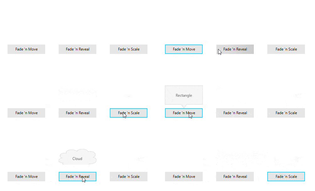
Callout Popup Animations in Action

If you are already intrigued by the popup service, make sure to play around with the animations to achieve the best experience for the end users. I will be more than glad to guide you through it.

When setting up the animation of your callout popup, you can choose from the CalloutAnimation enumeration. It allows the following values: None, Fade, Move, FadeAndMove, Reveal, FadeAndReveal, Scale, FadeAndScale.

You can specify different animation types for the callout popup by using the ShowAnimationType and CloseAnimationType properties. Also, you can be the one in control for the durations of these animations, as well as their delays.

In case you’ve missed the blog post for the R2 2020 release of Telerik UI for WPF, I’ll drop the GIF, showing the animations in action:

Callout Popup Animations

From Intro to Epilogue in a Blink

This has already started to look like a whole introduction of a book, so I think it’s time to close the curtains on this lovely blog. But… before this.

When using the RadCallout (I’m sure you will), think of it as your best helper for making it easy to highlight important information. Use it to alert customers to a special discount, highlight a testimonial or add weight to particularly important text content. Spotlight free shipping, discounts, price matching and more. Draw attention to unique selling points and important product details and benefits. Whatever you like. Just use it wisely to make your application content stand out.

Speaking of wisdom, the best thing would be to benefit from the outstanding possibility to integrate the Callout control with other UI controls from the Telerik UI for WPF such as Maps, Charts, Tooltip, Slider, etc. For some of those integrations (as well as others), make sure to check the documentation and the awesome control examples in our WPF demos application.

Share Your Feedback

We will never get tired of encouraging you to share your thoughts with us by dropping us a comment below, or using the Feedback portal about UI for WPF, because we highly value your honest feedback. It really matters!

In case you haven’t already done so, do not hesitate to try out the latest:

Try Telerik UI for WPF

Time to Boost Your HamburgerMenu! Multi-Level Items Have Arrived

$
0
0

The new version of Telerik UI for WPF's HamburgerMenu recipe is here. The RadNavigationView now supports UWP-like multi-levels! Learn how to achieve a hierarchical menu.

Remember how I deliberately let the secret about mastering the navigation within your WPF apps just slip? I did not hesitate a minute to share with you the recipe of our HamburgerMenu. But you know what—I like making my favorite recipes taste better every time. That’s why I’m so thrilled to announce the new stuffing of this one. Let me introduce you to the multi-level hierarchy support of RadNavigationView!

Since the R1 2019 Release, when the first version of the HamburgerMenu recipe was created, a lot of requests and feedback was received. I am so grateful for that. Thanks to all of you, looking for multi-level items (like in UWP), the RadNavigationView control now supports it! Let me show you how to achieve hierarchical menu visualization.

Setting Up Hierarchy

Each RadNavigationViewItem element now has an Items collection. It can be populated with numerous RadNavigationViewItem elements, thus allowing multilevel items definition. XAML lovers, check it out below:

<telerik:RadNavigationView PaneHeader="Mail"> 
<telerik:RadNavigationView.Items>
<telerik:RadNavigationViewItem Content="Accounts">
<telerik:RadNavigationViewItem.Items>
<telerik:RadNavigationViewItem Content="Viktoria Grozdancheva (vgrozdancheva@prgs.com)" />
<telerik:RadNavigationViewItem Content="John Doe (jdoe@prgs.com)" />
</telerik:RadNavigationViewItem.Items>
</telerik:RadNavigationViewItem>
<telerik:RadNavigationViewItem Content="Folders">
<telerik:RadNavigationViewItem.Items>
<telerik:RadNavigationViewItem Content="Inbox"/>
<telerik:RadNavigationViewItem Content="Drafts"/>
<telerik:RadNavigationViewItem Content="Sent Items"/>
<telerik:RadNavigationViewItem Content="Deleted Items"/>
</telerik:RadNavigationViewItem.Items>
</telerik:RadNavigationViewItem>
</telerik:RadNavigationView.Items>
</telerik:RadNavigationView>

Data Binding lovers, don’t you be worried. The HamburgerMenu can also be populated with business objects via its ItemsSource property. The DisplayMemberPath and ItemContainerStyle properties can be used to further customize the items and allow sub-items. Check the Hierarchical Data Binding article of the control for more information and examples.

So much talking and not a single preview of the menu’s multi-levels in action… Shame on me.

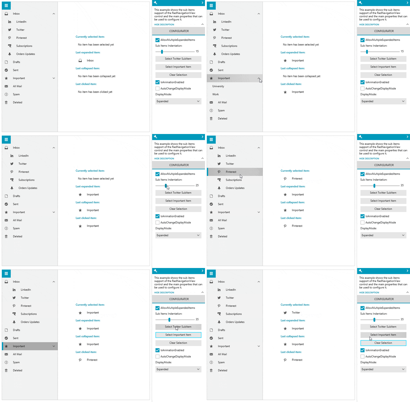
NavigationView Multi-Levels GIF

P.S. This awesome GIF is not a preview of the first code snippet, it’s from our precious Telerik UI for WPF Controls Demo application. Don’t hesitate to check it out and play with the Sub Items demo of the NavigationView control.

Oh, one thing that's worth noticing about the GIF is that when I click directly on the expand/collapse icon, the item does not get selected—this way only the expanded or collapsed state is triggered. Clicking everywhere else in the bounds of the item will trigger its selected state. Thought you might want to know it .

Customization Capabilities

The NavigationView sub-items are totally tailor-made to meet your business needs. Let’s peek at the benefits of the hierarchical hamburger menu together.

Expand/Collapse Icons

First thing that I’d like to be in control of are the expand and collapse icons, of course. For this purpose, the ExpandedIcon and CollapsedIcon properties of the RadNavigationViewItem come in handy. The default icon template of the item uses RadGlyph, so you can set the properties to a glyph string from the glyphs reference sheet. My favorite cheat-sheet.

Oh, you can also experiment with the expand/collapse animations if you dare!

Nested Items Indentation

All child items can have a different than the default horizontal offset (indent). Simply set the SubItemsIndentation property of RadNavigationView to the desired value and you’re all done. You can play with this one using the Configurator part of the Sub Items demo that I mentioned a few lines above.

Single/Multiple Expanded Items

The default behavior of the RadNavigationView allows expanding multiple RadNavigationViewItem elements with child items at once. Need to restrict that to only a single expanded item at a time? Sure, just set the AllowMultipleExpandedItems property of RadNavigationView to False.

Flying Out to NavigationView’s Flyout

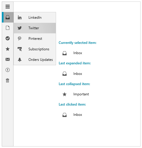
What about having a collapsed pane and the NavigationView is in its Compact or Expanded DisplayMode? Where do all nested menu items go?

Sub-Items Flyout

That’s right, they fly out to the east coast of the pane . Now, seriously, clicking on a parent item displays its children (the collapsed RadNavigationViewItems) in a flyout which has a nice animation by the way to make sure the flight is smooth.

Some of you asked for direct access to the sub-items on hovering over a main menu entry. This can be achieved by changing the default ClickMode of the parent item to Hover. Easy-peasy.

Sub-Items Events

A few words about the events that are fired when expanding and collapsing the items. These actions fire the ItemExpanded and ItemCollapsed events of RadNavigationView. Additionally, the RadNavigationViewItem exposes Expanded and Collapsed events, which are fired before the previous two.

Closing Words

You know I’m only human and might have missed something which you consider important. Therefore, don’t forget to check out the Hierarchy and Hierarchical Data Binding articles of the NavigationView as well.

Okay, that’s it, guys. Thanks for taking your time to read my blog! I hope the multi-level hierarchy support of the HamburgerMenu met your expectations and you’re eager to:

Get the Latest Telerik UI for WPF

I’m sure you’ll try it out. And when you do, I’ll be there to read your honest feedback. Don’t be shy to share it in the comment section below or head to our Feedback portal.

Happy coding and to make it even happier, explore all new controls, features and improvements of the R2 2020 release of Telerik UI for WPF.

New FREE Ebook: A Quick Guide to Expert .NET Reporting Tools

$
0
0

Visualizations have been helping people understand data for centuries. Clear and accurate reporting tools play a pivotal role in any business decision today and help companies digitize and streamline their reporting process.

Today’s data visualization tools, also called reporting tools, go beyond the standard charts and graphs used in the earlier periods. They can display data in more sophisticated ways such as infographics, dials and gauges, geographical maps, heat maps, and detailed bar, pie, and other charts. This is due to the advancement of digital information in today’s business environment.

Business processes and people are moving information at incredible speeds thanks to the adoption of digital information. This has forced businesses to adopt digital workflows to exchange information quickly. An example of this might be stock brokerage or bank transactions are done all digitally with the only bottleneck being data transfer rates.

An organization like a bank or an accounting firm or any other company which uses data for business decisions requires reporting tools that meet specific criteria to operate these high-end digital workflows. A proper reporting solution is of the utmost importance to ensure streamlined processes and accurate information is delivered.

Our guide to expert .NET reporting tools was just published and it is ready for FREE download.

In this ebook, Eric Rohler, Senior Technical Engineer at Progress, offers a six-step framework to help you choose the best reporting tool for your organization. He reviews the main functionalities of reporting solutions and shares best practices for everything you need to know to deliver beautiful, powerful, interactive and reusable reports. 

Learn how to apply the top six criteria when assessing a reporting tool:

  • Presentation
  • Powerful
  • Productive
  • Pliable
  • Performant
  • Price

Deep dive in different stages of reporting—from report creation to styling to data sources to integration to rendering and accessibility. Take advantage of expert advice on successful integration between Reporting tools and web (Blazor, ASP.NET Core, ASP.NET MVC, ASP.NET WebForms, Angular, React and more) or desktop applications (WPF, WinForms, UWP) and many practical examples and use cases.

Download FREE Reporting Ebook

If you download the ebook, we’ll soon follow up with an invitation to a dedicated reporting webinar and more materials on the topic. Stay tuned!


What's New in Angular 10

$
0
0

Angular version 10 is out and we couldn't be more excited about it. Check out what's new—and yes, Kendo UI for Angular is already good to go!

‘ng update @angular/cli @angular/core’

Angular version 10 is here! Angular version 10 was released only 4 months after version 9, an incredible turnaround for the Angular Team. This version includes updates to not only Angular the framework itself, but of course, to Angular Material and the CLI as well. This article will dive briefly into some of those features, but check out Stephen Fluin’s full post on the version release for more details (and also some incredible photography from Angular Team’s very own Minko Gechev).

Angular Material Updates

The Angular Material update for version 10 includes a new Date Range Picker (check out a demo in Stephen’s post).

A few weeks ago, I did a podcast with Jeremy Elbourn, the tech lead for the Angular Components Team. This team is responsible for Angular Material, the Angular CDK, Angular Google Maps Component (new) and the Angular Youtube Component (new).

There were some interesting tidbits about the direction the team is taking Angular Material and what is coming next.

tl;dr

Hot New Upcoming Components

  • Angular Google Maps Component
  • Angular Youtube Component

Over the last year they have been re-working their components to be built atop MDC Web. (10:58) They want to use the work that MDC Web has already done (less wasted time re-building things that have already been built) and this will give the Angular team more time to work on other things. They are hoping to work further with the MDC Web team in the future to create more component primitives and build a library/API similar to the CDK. So we have some interesting developments to look forward to with Angular Material, check out the episode of Angular Air for more details!

Angular & Angular CLI Updates

There were some notable updates to Angular & the CLI in v10, one of the largest being strict mode as an option now when creating a new project.

    ng new --strict

When you create a project in strict mode, you are enabling TypeScript’s strict mode by default, turning template type checking to Strict, reducing your bundle budget by 75% and disallowing the use of type any in the linting rules.

you have made the right choice gif

Along with being the bold choice, full on Angular strict mode will allow you to use more advanced tree-shaking, have a more maintainable project, and be the envy of all your easy mode going friends.

Another big change is the supported browsers in the configurations of new projects. New projects, by default, will not support ES5 builds. If you need to support browsers like IE or UC that require this, you will need to add the browsers you need to support in the .browserslistrc file.

Community Efforts

The Team is putting more of a focus on listening to the community and taking care of issues. Over 2k issues were touched this release cycle and they plan on ramping up those numbers even more for the next one (Angular 11 is slated to come out in the fall ).

We’ve Got Issues, You’ve Got Them Too

CommonJS & AMD Dependencies might be giving you issues—it’s OK. There’s a warning for that now. You simply need to request an ECMAScript module version from the dependency creators!

Feedback for You, Feedback for Me!

As a GDE, I see it firsthand, the Angular Team really does want and cherishes your feedback. If you are having any issues at all with v10, they want to hear about it!

a tweet about submitting feedback

Kendo UI Updates

We have updated our peer dependencies and our Kendo UI for Angular components are good to go with version 10. We release three times a year, check out what was new as of R2 2020!

gif of the pager component

For Real Though, We Love Your Feedback

As with the Angular Team, we love feedback on our Components—whether it be new ones or features on existing ones you’d like to see. So please leave us your feedback, we really do listen!

kendoka asking for feedback

Kendo UI for Angular Feedback Portal

Alyssa is the Angular Developer Advocate for Kendo UI. If you're into Angular, React, Vue or jQuery and also happen to love beautiful and highly detailed components, check out the Kendo UI library here or just jump into a free 30 day trial today. Happy Coding!

Telerik UI for Xamarin R2 2020 SP: New PdfViewer Feature, Mobile Blazor Bindings & Fixes

$
0
0

The R2 2020 Service Pack for Telerik UI for Xamarin is live, delivering multiple fixes, extended Blazor bindings and a great new feature for PdfViewer. Read on to learn more!

Manipulate PdfViewer ViewPort Via Code

The R2 2020 Service Pack comes with a brand-new feature for The Telerik UI for Xamarin PdfViewer. You can now easily manipulate the viewport through code. This can be achieved with the help of the ViewPort property and the ChangeViewport()method.

PDFViewerScrollZoom

Extend and Improve Mobile Blazor Bindings 

We continue to extend and improve our mobile Blazor bindings. In this service pack, we have introduced the RadExpander control. If you are interested in trying it out, you can find all information needed in our documentation.

In addition we upgraded the version of the reference to the MobileBlazorBindings package from v0.2.42-preview to v0.3.26-preview. At the moment of writing this is the latest version of this package and it brings yet another update which is in the version of the Xamarin.Forms package. Our mobile binding now use Xamarin.Forms 4.5.0.356.

Fixes and Enhancement of Various Telerik UI for Xamarin Controls

Let's take a look at the fixes we've shipped for the Xamarin.Forms components with this Service Pack. We managed to resolve many issues across multiple controls, and here are the highlights: 

  • PDFViewer: NullReferenceException when switching between layout modes is fixed and an InvalidCastException when loading an empty PDF is fixed.
  • Calendar: A memory leak is fixed when AppointmentTemplate is bound to an appointment. An exception is fixed when DisplayDate gets changed in AgendaView on Android. An exception is fixed when the DisplayDate gets changed during scrolling in the AgendaView on iOS. The Z-order of elements inside AgendaView is improved when orientation of android device gets changed.
  • ListView: The performance of the control is improved in scenarios utilizing the ItemTemplateSelector. Now it recreates only the containers which get updated. The TapAndHold gesture now highlights the item in Andoid just like in iOS.
  • MaskedInput: The caret no longer skips random places and an exception during automatic tests of Google PlayStore is fixed.
  • Pickers: The MinimumTime, MinimumDate, MaximumTime, MaximumDate are now coerced when are set through code.
  • TreeView: The LoadOnDemand feature is now improved and can be used in combination with ItemTemplate.
  • Button: AgrumentException is fixed on Windows 10 version 1809 or higher.
  • Border: NullReferenceException is thrown with Xamarin.Forms 4.7 on iOS
  • SpreadProcessing: Introduced support for import/export from/to XLSX format of Text Rotation XML attribute. A NullReferenceException is fixed for scenarios when the FindOptions does not contain a start cell.
  • WordsProcessing: A KeyNotFoundException is fixed when importing RTF document which has an invalid Font Family name. In addition we have introduced several improvements related to working with images.
  • PdfProcessing: An ArgumentException is fixed when importing a document containing form fields with the same fully qualified name. A StackOverflowException is fixed when cloning documents containing links to the same page.

Share Your Feedback

Feel free to drop us a comment below sharing your thoughts. Or visit our Feedback portal for Telerik UI for Xamarin and let us know if you have any suggestions or if you need any particular features/controls.

Introducing Fiddler Jam

$
0
0

Fiddler Jam is an upcoming product in the Fiddler family that helps to address the problems we have debugging remotely reported issues.

It's time we all faced a harsh reality: debugging customer issues remotely is, at best, difficult and at worst... impossible.

The vast majority of web, mobile, and desktop apps consume remote APIs and services. What happens when the end user's network fails? What if a third-party API goes down? And if your backend stops responding? I'll tell you what happens: your users complain! ️

Nowadays support teams can spend an inordinate amount of time on determining what basic issues your customers are experiencing. Then they have to collect adequate information from customers to properly convey the issues to the dev teams. Even with a well-documented story, it can still be difficult for engineering to properly replicate the issues at-hand. Not to mention the security and privacy considerations we face when sharing potentially sensitive network logs, application data, or even personal information.

We have ourselves quite the problem, don't we?

problem with reporting remote issues

Enter Fiddler Jam

For years now, Fiddler (and now Fiddler Everywhere) users have been using built-in product capabilities to effectively capture, re-create, and replay issues to help resolve these problems. And of course Fiddler works great, but doesn't truly address the pain experienced by customers and support teams. This is where a new product from the Fiddler team comes into play: Fiddler Jam.

Fiddler Jam is a troubleshooting solution for support & dev teams to help them troubleshoot issues in a fast, easy, and secure manner.

Fiddler Jam helps non-technical end users to isolate issues by capturing HTTP(S) network logs in the customer's own environment. It then enables the secure sharing of these logs between the customers and your support teams. Finally, with full Fiddler Everywhere integration, the development team can load the logs and replicate the issue locally, using tooling they are already comfortable with.

If you've heard enough already, head on over to the Fiddler Jam website to sign up for early access!

So how does Fiddler Jam work... really?

Your customers will...

  • Install a lightweight client (starting with a Chrome browser extension)
  • Start recording network requests/responses
  • Reproduce the issue at-hand
  • Save their recordings and share them via the cloud

fiddler jam customer

Your support team will then...

  • Open the customer-provided issue in a browser
  • Access the protected private space where issues are stored
  • Triage the issue, add context, and share with the development team

fiddler jam support team

Finally, your development team will...

  • Receive a notification of a new issue
  • Review any notes provided by the support team
  • Load the log files into Fiddler Everywhere for further analysis

fiddler jam development team

All leading to a seamless method of remotely debugging issues. It's a literal win-win-win for customers, support, and engineering!

What's Next?

We are still in very early stages of product development with Fiddler Jam. Going forward we are looking into even more capabilities that will provide further value for support and development teams.

In the meantime, if the above scenario intrigues you, we highly recommend you take a look at the Fiddler Jam website. Here you can learn a little more about Fiddler Jam and sign up for early access via our Fiddler Jam Pilot Program.

Happy network debugging with Fiddler!

Ensuring Data Validity in Your WinForms Application Without Writing a Single Line of Code

$
0
0

The R2 2020 release of Telerik UI for WinForms came with a brand new validation management tool—the Telerik Validation Provider. Now you can define multiple validation rules and associate them with editors without having to write a single line of code!

One of the main challenges faced by WinForms developers while building desktop applications is ensuring the proper execution of the project. Very often that execution is directly tied to the users’ input. That is why, before managing the input data and submitting it to the server, it is important to ensure that all required editor controls on the form are filled out in the correct format.

I am very delighted to announce that as of R2 2020 Telerik UI for WinForms suite offers a powerful new tool for validation management—RadValidationProvider. This small, but very powerful, component provides data validation management for editor controls. You can easily define various validation rules and associate them with any RadEditorControl that is eligible for the specified validation logic.

Although RadValidationProvider allows you to define the rules programmatically, you are not required to write any code. Our main focus, while we were working on the internal component’s implementation, was to introduce an intuitive design-time experience which will facilitate the development process.

Now. let's take a deeper dive into the validation provider capabilities.

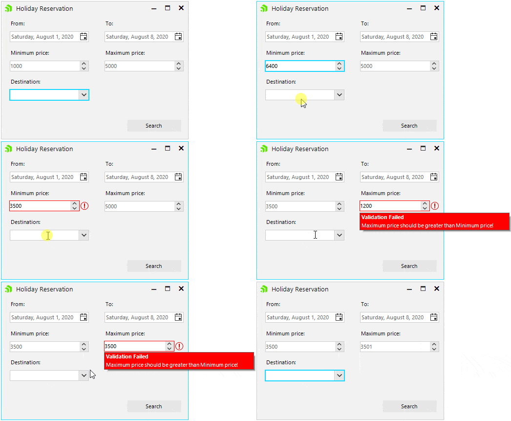
Imagine that we need to build a simple search form to book a summer holiday. Before executing the search query and find the appropriate results that the travel agency offers, we need to check the form for correctness.

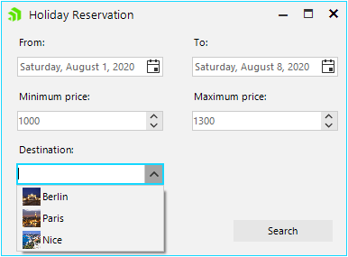
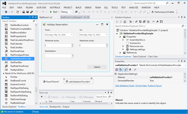
Let’s start with the following design where we have two RadDateTimePicker controls for the start/end dates of the vacation, two RadSpinEditor controls to define our price range and one RadDropDownList to pick up the destination:

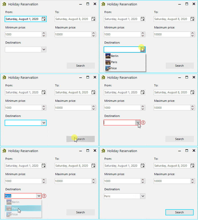
holiday reservation form

The first conditions that pop up in my mind in order to ensure that the search query will be correct are:

  • "From" date should be less than "To" date
  • "Minimum" price should be less than "Maximum" price
  • The holiday Destination shouldn’t be empty

Before proceeding further, just drag a RadValidationProvider from the toolbox and drop it onto the form:

RadValidationProvider in Form

Let’s start with defining the validation rules:

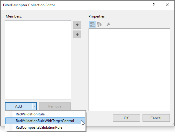
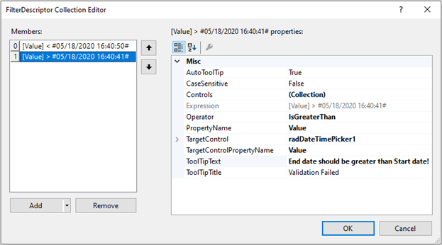
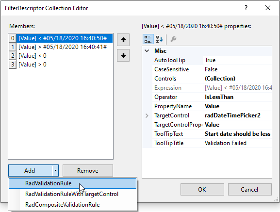
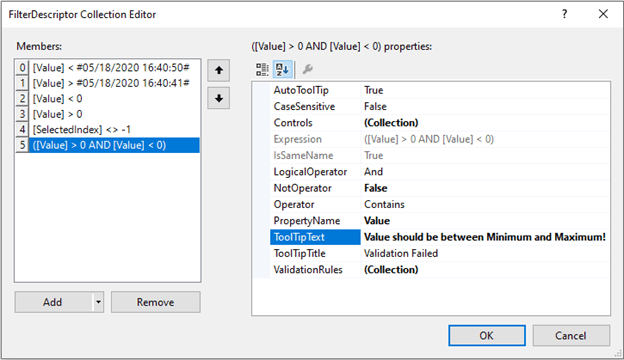
  1. Select RadValidationProvider and click the small arrow at the top right position in order to open the Smart Tag. Open the FilterDescriptor Collection Editor by clicking the Edit Validation Rules option in the Smart tag and add two RadValidationRuleWithTargetControl items:

    Adding Two RadValidationRuleWithTargetControl Items

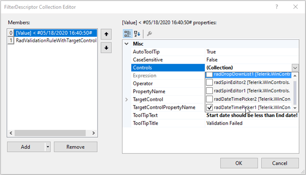
  2. Open the Controls dropdown and check radDateTimePicker1:

    Checking radDateTimePicker1

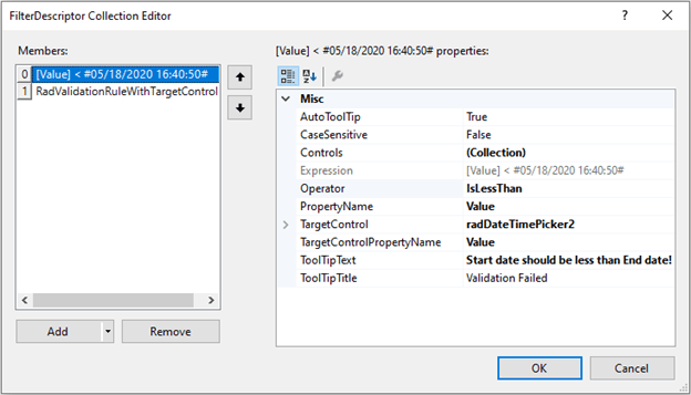
  3. Then, specify the Operator, PropertyName, TargetControl (set it to radDateTimePicker2), TargetControlPropertyName and TooltipText:

    Specifying the Values

  4. Select the second RadValidationRuleWithTargetControl. This time, we will check radDateTimePicker2 from the Controls drop down and the TargetControl will be radDateTimePicker1:

    Specifying the Values 2

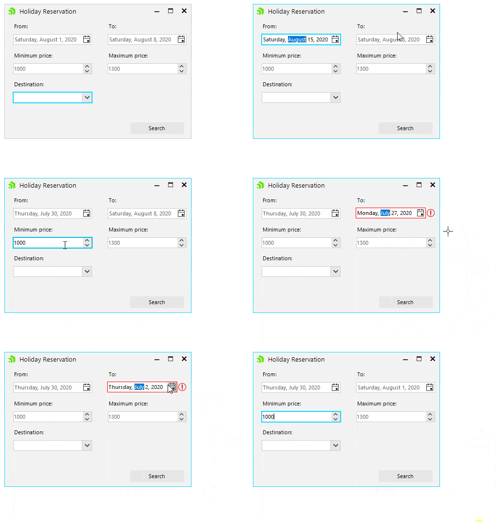
  5. Now, if you focus on the “FromRadDateTimePicker and select a date that is greater than the “ToRadDateTimePicker, you won’t be allowed to exit the control. Once you enter a valid value that meets that validation rule, you will be allowed to navigate to another control. If you focus on the “ToRadDateTimePicker and select a date that is less than the “FromRadDateTimePicker, the defined error message will pop up.

    ValidateDates

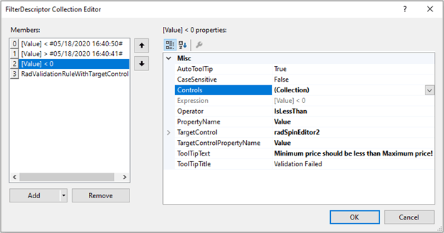
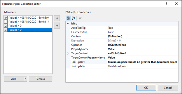
  6. In a similar way, we will define two more RadValidationRuleWithTargetControl items that validate that the “Minimum” price (radSpinEditor1) is less than the “Maximum” price (radSpinEditor2) and the “Maximum” price is greater than the “Minimum” price:

    Defining Two More RadValidationRuleWithTargetControl Items 1 Defining Two More RadValidationRuleWithTargetControl Items 2

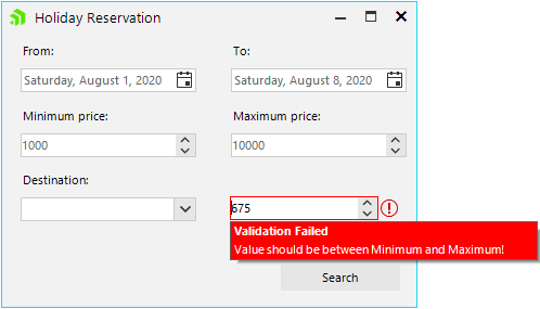
    Please ensure that the initial values in both RadSpinEditor controls meet the validation. Otherwise, you may remain blocked when you focus the "Minimum” price RadSpinEditor for the first time, e.g. if both controls have initial value = 0. No matter what value you enter in the "Minimum” price RadSpinEditor, you won’t be able to validate it and exit the control. ValidatePrice

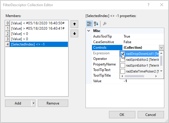
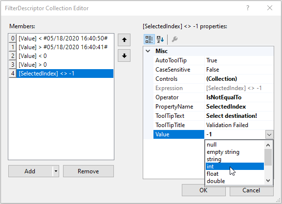
  7. The next step is to check whether the user has selected a destination. Add a RadValidationRule and toggle radDropDownList1 from the Controls drop down. Then, define validation logic to check whether the SelectedIndex is not -1:

Defining Validation Logic for Destination 1
Defining Validation Logic for Destination 2
Defining Validation Logic for Destination 3

The data type of the Value can be specified after entering a value first and then selecting the type from the dropdown. Thus, the correct expression will be serialized. 

ValidateDestination

Voilà! Without even writing a single line of code we ensured basic data validity of our search form.

Composite Rules

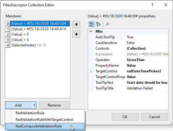
RadValidationProvider also offers a third rule type, called RadCompositeValidationRule. It allows defining more complex validation logic by adding multiple simpler RadValidationRule or RadValidationRuleWithTargetControl itemswhich are combined with a logical operator. The main purpose here is to cover the cases when a certain control’s value should meet certain requirements considering the values of multiple other controls. For example, if you need to add radSpinEditor3 which value must be greater than radSpinEditor1 and less than radSpinEditor2, the RadCompositeValidationProvider is the perfect fit:

  1. Add a RadCompositeValidationRule:  Adding a RadCompositeValidationRule
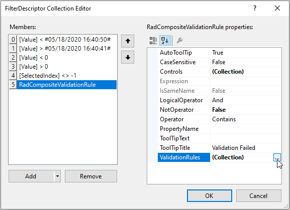
  2. Its ValidationRules collection allows you to define as many nested rules as you need:          ValidationRules collection
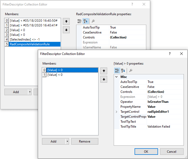
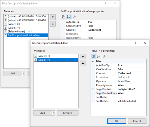
  3. Add two RadValidationRuleWithTargetControl items where radSpinEditor3 is checked in the Controls collection for both of them. The TargetControl for the first rule will be radSpinEditor1 and for the second rule will be radSpinEditor2. Define the greater than/less than logic and click OK:Defining Greater Than Logic Defining Less Than Logic
  4. Set the LogicalOperator to “And” and fill the ToolTipTextLogicalOperator and ToolTipText

Run the project and try to enter a random value: Validation in Action

Note that none of the associated controls (e.g. radSpinEditor3) of a composite rule should be added as a target in any of the nested rules! Please be careful when defining composite rules in order to get the proper validation logic. Usually, it is even possible to simplify the validation logic and define separate RadValidationRuleWithTargetControls outside a composite rule.

That’s it! No code, but a diversity of validation logic everywhere. It is quite easy, isn’t it?

Happy validating!

Try it Out and Share Your Feedback

The R2 2020 new controls and features are currently available for download in customers’ accounts. If you are new to Telerik UI for WinForms, you can learn more about it via the product page. It comes with a 30-day free trial, giving you some time to explore the toolkit and consider using it for your current or upcoming WinForms development.

10 Remote Collaboration Tools You Should Know About

$
0
0

Learn the best tools for remote collaboration and different interesting remote work activities, from project management to development and even design hand-offs.

Remote work is currently the only healthy work option for a lot of businesses, including startups. However, it's been an essential mode of business for many of us for years, and I've personally been working remotely with distributed teams in the United States, parts of Europe and even Asia for over four years. In this post, I will take you through the best tools I recommend for remote collaboration in different interesting remote work activities from project and time management to development and even design hand-offs, plus a lot more.

Project Management

Trello

Project management basically involves the creation, assignment and arrangement of tasks or deliverables of a particular project in boards and cards to the people responsible. Trello is one of the most intuitive list-making project management tools, where everyone can collaborate remotely—and it’s free. It has a very simple and intuitive user interface and comes with amazing social-media-like features. It is web-based, but is also available as a mobile app. I currently use it on an iOS device and it is amazing. Other project management products are Airtable, Basecamp and Asana.

Design Collaboration

UniteUX - Collaboration Tool

Your product designers, graphic designers, product managers and frontend developers also need to collaborate as they have always been doing at the office. There is a need for a design tool that fosters sharing of work, and ensures that the hand-off process is seamless. Unite UX is the tool to use to bridge the gap between your design team and your development team. Create responsive applications from your Sketch designs with an intuitive round-trip workflow. Unite UX is created and backed by Progress, trusted by over 140,000 application development teams worldwide.

Team Communication

Slack - Collaboration Tool

Now that everyone works from home, remote communication is no longer optional—it's essential. You and members of your team need communication tools dedicated to work and devoid of distraction to help you keep track of things and handle check-ins and other office admin business through chats. Slack is a great free solution where instant messaging can be done remotely in a work environment with channels that can be arranged as departments or groups. Slack also has an API you can consume to create bots to help automate or handle tasks like reminders, conduct voting or even schedule messages ensuring that employees stay engaged.

Documentation

Notion

For all types of journaling needs, meetings and shared documents, teams need tools like Notion. Notion is a hub for asynchronous communication where docs can be worked on by more than one person without breaking flow. Documentation can also be written with Notion, as it has over 30 media types and it prides itself as the all-in-one everyday work app. It also has an easy-to-use database system with an attractive user interface.

Video Conferencing

Zoom Video Conferencing

Sometimes you want to jump on calls with team members or employees and have meetings like stand-ups or all-hands, just like at the office, but this time remotely. Zoom is your best bet for things like video meetings, webinars and even conferences generally. Zoom is also one of the most successful video conferencing apps with up to 300 million active daily users as of April 2020.

Storage Service in the Cloud

Dropbox

How do you store files like images and spreadsheets and media and all your business-related files? There are a lot of options, one of which is Dropbox. The business section is tastefully built for teams to bring all their storage needs to one place, an all-in-one solution for cloud storage and collaboration for teams. It is very secure and you can easily access your files because as they are stored in the cloud.

Customer Support

Groove

You can be in the category of people who are still serving customers’ needs even though you are doing so from the comfort of your home. There is a need for a tool you can use to manage your customer support team, and that is where Groove comes in. With Groove you can manage your customer support team, comment on an ongoing customer support ticket or thread (that the customer can’t see), assign tickets to team members easily and get a report of the support team as a whole all in one place.

Time Zone Management

World Time Buddy

Your team members might be living in different locations geographically and so you might also have to worry about time differences from one country to another. This will require you find a way to manage the time zone differences properly and still ensure that all work is done when due and meetings happen on time. World Time Buddy is a great service that lets you manage up to four different time zones for free. The slider is such a cool feature, as you never have to miss accurate times again when scheduling meetings or deadlines.

Git and Product Development

GitHub

GitHub is one of the most powerful tools for collaboration around, especially for developers. The concept of version control matched perfectly with working together on one project is one of the magical things in software development. With GitHub you can ensure everyone is doing exactly what they are supposed to, you can create an organization and have a Kanban table. Most importantly people can contribute to project and the record of their contribution is tracked and properly recorded in a tree-branch format. You can even have the documentation as a Wiki and track progress all in one place. There is also a lot of integration possible with GitHub, from simple app deployments to continuous integration.

Code Sharing

VS Code

Contribution can also get deeper to become more involved. A part of it is called pair programming. VS Code from Microsoft, which is one of the most used integrated development environments of all time, has a feature called live share where developers can come together and do pair programming but remotely. This is such a cool thing because things like bug fixing and quality assurance sessions can now be done remotely.

Conclusion

These are a few interesting realities you need to consider, plan toward and solve for as your team members work from home.

Best Practices for Data Retrieval in Telerik Reporting

$
0
0

Every report needs data to go live. See how to configure the data sources in your report to ensure the best performance and learn some tricks that will help with report authoring.

Creating a report basically means to obtain a chunk of data, organize it according to a given set of rules and present it in a visual manner. The reports are already an integral part of the current business processes—whether it is a simple invoice or an elaborate sales chart, virtually every collection of facts and figures can be represented in a visually appealing way. But before getting to the visual part of the things, we need to make sure the basis of our reports—the data—is retrieved and retained in the best possible way.

We on the Telerik Reporting team understand the need for a reliable and easy way to access the data your report needs.That’s why I will explain below more about the different approaches for data retrieval and their variety—from database connections through collections of business objects up to JSON-formatted entities delivered from a web service.

The content below assumes you’re already familiar with Telerik Reporting, but if you’re not—please consider checking our Getting Started articles first. I will go a bit more technical and provide under-the-hood details and examples because I believe that better understanding of the way the data gets obtained and processed by the reporting engine will help you build your reports faster and use them effortlessly in various applications.

Connecting to Data

Database Connections

Telerik Reports can connect to data from various sources, but the most commonly used is the database. The component that performs the actual connection between the report and the database is named SqlDataSource. Its wizard provides a simple and intuitive interface that helps to create and test a connection to the selected database in a matter of seconds.

The SqlDataSource is database-agnostic, i.e. it does not have dedicated routines for MSSQL, Oracle or MySQL databases. Instead it relays the commands and parameters through a common interface, provided by the DbProviderFactory class. While configuring the SqlDataSource, you select a provider name, which is used by the DbProviderFactories instance to create the corresponding DbProviderFactory. The available DbProviders are listed in a configuration file—it can be the common machine.config file or just the configuration file of the .NET application. Here’s how the list with the DbProviderFactory entries in the machine.config looks:

<DbProviderFactories>
  <add name="Oracle Data Provider for .NET" invariant="Oracle.DataAccess.Client"
    description="Oracle Data Provider for .NET" type="Oracle.DataAccess.Client.OracleClientFactory, Oracle.DataAccess, Version=2.112.3.0, Culture=neutral, PublicKeyToken=89b483f429c47342" />
  <add name="Odbc Data Provider" invariant="System.Data.Odbc" description=".Net Framework Data Provider for Odbc"
    type="System.Data.Odbc.OdbcFactory, System.Data, Version=2.0.0.0, Culture=neutral, PublicKeyToken=b77a5c561934e089" />
  <add name="OleDb Data Provider" invariant="System.Data.OleDb"
    description=".Net Framework Data Provider for OleDb" type="System.Data.OleDb.OleDbFactory, System.Data, Version=2.0.0.0, Culture=neutral, PublicKeyToken=b77a5c561934e089" />
  <add name="SqlClient Data Provider" invariant="System.Data.SqlClient"
    description=".Net Framework Data Provider for SqlServer" type="System.Data.SqlClient.SqlClientFactory, System.Data, Version=2.0.0.0, Culture=neutral, PublicKeyToken=b77a5c561934e089" />
  <add name="MySQL Data Provider" invariant="MySql.Data.MySqlClient"
    description=".Net Framework Data Provider for MySQL" type="MySql.Data.MySqlClient.MySqlClientFactory, MySql.Data, Version=8.0.13.0, Culture=neutral, PublicKeyToken=c5687fc88969c44d" />
</DbProviderFactories>

Usually every database provider or driver installed on the machine adds its entry here—this way the provider is visible to applications that need to access a database in a more generic approach. So when you pick the MySQL Data Provider from the combo-box in the SqlDataSource wizard, the wizard stores the invariant name of that provider and uses it for creating the specific implementations of DbConnection, DbCommand and the rest of the classes needed to access that database.

Using such an approach allows us to connect to virtually any database that has an ODBC, OleDB or ADO.NET data provider. It is not even necessary to install it on the machine—it just needs to be registered in the <DbProviderFactories> section of the configuration file for applications that use .NET Framework. However, in .NET Standard the DbProviderFactories class does not exist and its entries need to be manually registered, as explained in this KB article.

Often different data providers to one database coexist on the same machine. You can have an ODBC driver and ADO.NET provider for MSSQL Server. There is no general rule that states which one you should prefer. For example, the System.Data.SqlClient provider is designed to provide optimal performance when connecting to SQL Server 2000 and later, but ODBC driver can work with older databases. In some cases the newer driver versions lack some functionality that is necessary for our application to function. Such is the case with the MySql.Net Connector provider that didn’t have implemented a certain method named CreateCommandBuilder, which is used by our engine to obtain the database schema. In the versions before 6.4.6 the method was present, then it got deprecated and from version 8.0 it got reintroduced.

The best advice in such a situation would be to measure the capabilities and performance of each available database provider to make sure it suits your needs. Of course, it’s always better to have options to choose from and that’s why our product ships with more than 20 ODBC drivers that can be used to connect to the most popular databases.

Telerik Reporting offers a few other components that allow connecting to a database, but they target a specific database or technology and are not as popular as the SqlDataSource. These components include:

  • CubeDataSource—used to connect to an OLAP cube data model through MDX query;

  • OpenClientDataSource—specifically designed to be used with OpenEdgeAppServer ABL procedures;

  • OpenAccessDataSource—provides data through an OpenAccess data model.

  • EntityDataSource—it’s not mandatory to have a real database as a data storage for this component—allows to connect to an existing ObjectContext or DbContext and access its data model. The current implementation works with .NET Framework and cannot be used in projects that employ EntityFrameworkCore.

Although these components meet particular business needs, they share common logic with the SqlDataSource and most of the tips and suggestions provided here are valid for them as well.

Web Service Connections

Although the scenarios where the data is obtained from a database are still the most common ones, the cases where the database is not directly accessible or is even missing are getting more and more traction. In these setups a web service accepts the requests and returns data objects, formatted as JSON, XML or text. This approach has significant benefits in terms of security and configuration, and using a standardized interface to access the data provides for easier adoption. Telerik Reporting has a dedicated component to serve that purpose—the WebServiceDataSource component.

Similarly to the other data sources, it can be configured via its wizard to connect to a web service, authenticate if needed, request the necessary data and parse the response to a set of data objects. The WebServiceDataSourceconfiguration allows you to fine-tune the URL and the request body using tokens that will be substituted at runtime with actual values from report parameters or static strings.

As a real-life example, let’s take a look at the website restcountries.eu that provides statistics for all the countries in the world via RESTful API. The endpoint that returns all the countries is https://restcountries.eu/rest/v2/all, but if our report needs to show a subset of countries by given name, the endpoint we need to use is https://restcountries.eu/rest/v2/name/{name}. In this case the WebServiceDataSource’sServiceUrl would look like this: https://restcountries.eu/rest/v2/name/@name, where the“@” character denotes a token that will be substituted. The actual token substitution is configured in the WebServiceDataSource parameters collection, and in the current case we’ll have an inline parameter that obtains its value from a report parameter:

Web Service Connections—Telerik Reporting

As you can see, it’s important to pick the right endpoint and request just the necessary info rather than fetch data for all the countries and filter it later on the clientside.

The component also provides enough authentication options to cover simple and more complicated scenarios for granting access to the web service. The type and encoding of the response are also configurable. The propertyDataSelector is very useful when the returned data needs to be filtered by specific criteria, but I’ll cover it in detail in the “Organizing the Data” section below.

Static Data Connections

In scenarios where the actual data is not available or is ineffective to be used due to slow connection or metered access, the CSVDataSource and JSONDataSource components prove to be very effective. They provide a simple interface to data that can be stored in a file (local or remote) or inline in the report definition. As the names suggest, the input of these data sources is textual data, organized in comma-separated values or in JSON format. These components are great for quick proof-of-concept report designs and even high-load testing.

Our team uses them extensively in support communication where the users send us reports that we need to test without having access to the actual database. When given the report definition and a few minutes with Excel, it can result in a mock-up data set with thousands of records. Therefore I strongly suggest using these data sources in earlier stages of report design process instead of using real data from a production database server or a web service.

Business Objects Connections

If any of the listed data access approaches do not fit the current scenario, you can always resort to creating the data set programmatically and passing it to the report through the ObjectDataSource component. It accepts a class that implements IEnumerable, IListSource or IDbDataAdapterinterfaces, or a method that returns an instance of these interfaces, making it applicable to virtually any object collection. Configuring the ObjectDataSource is easy, since it needs only two arguments—the name of the collection class and the name of the method that returns the data. The corresponding wizard takes care of guiding the user through all the necessary steps, including the configuration of the parameters of the data retrieval method, if there are any. At runtime, when a data item like Table or Graph needs to obtain its data from the ObjectDataSource, the engine will instantiate the collection class and call the data retrieval method, providing values for its parameters.

Although very powerful, this component has some requirements that need to be considered before using it in a report:

The first one concerns the dependencies that the collection class has. Ideally the business objects would be declared in a separate assembly that needs to be registered into the application configuration file under the <AssemblyReferences> section. In case the business class assembly references other assemblies that are not part of the .NET framework, these assemblies need to be copied in the application directory or registered in GAC in order to be resolved by the runtime when it loads the business object classes. These problems are not that easy to resolve, because the .NET runtime does not provide enough information about what went wrong while trying to load the assembly. The tool that we use in these scenarios is the Microsoft’s Assembly Binding Log Viewer named Fuslogvw. As its description suggests, it logs the assembly bindings from the running .NET applications. Inspecting the bind failures allows us to determine which assemblies fail to load in a particular application—i.e. our reports project.

The second thing to consider while working with the ObjectDataSource component is related to the .NET architecture. By design, assemblies targeting the .NET Framework cannot reference assemblies that target .NET Core. So if your business objects reside in a .NET Core assembly, they cannot be referenced by a reports project that targets .NET Framework. In such a scenario there are two options—to change the target framework of the reports project from .NET Framework to .NET Core or to change the target framework of the business objects assembly from .NET Core to.NET Standard 2.0. If for some reason both options are not feasible, the business objects should be extracted in another .NET Standard assembly that is referenced by both projects.

As you can see, our product offers a lot of options for connecting to a data source and fetching data from it. Choosing and configuring the report data source for your report might seem an easy task but it is an important factor that may affect the report performance and degrade the user experience of the reporting application.

Organizing the Data

Once we’ve established a connection to the database, we need to request the data and shape it in a way that will be most convenient to use in a report. The process of data organization is vital for both the report design process and report performance and can be divided in three parts.

Trimming

Regardless of how carefully we construct our database query, occasionally we may end up with a SqlDataSource that fetches a result set with 30 columns to a Table item which uses only 5 of them. The general recommendation applicable to all the data sources is “only what’s necessary,” i.e. data sources should retrieve the minimum of the data fields needed for the report, especially when the result set contains lots of records. Let’s illustrate it with an example: our report needs to show the actual price of the items we sold last year. The actual price equals the base price minus the discount. Our query might look like this:

Select base_price, discount, base_price - discount as actual_price from Sales

Assuming that Money field type in MSSQL takes 8 bytes, for one million records in our Sales table we’ll have ~8MB overhead only from a single column in our dataset. Of course, in a real-life scenario we’ll have traffic compression and other optimizations (and also 8MB is not 8 million bytes, right), but still this column is redundant. In this scenario I would use the SqlDataSource’s CalculatedFields property and write a simple expression that will subtract the prices for me.

The same considerations are valid for the other data sources. For example, the ObjectDataSource uses reflection to iterate through the business objects and find the properties used in the report by their name. If the models we use have lots of properties, their traversal would take more time, resulting in a bad performance. In this case it’s usually a good idea to have a mid-tier set of classes that contain only the properties used in the report.

Filtering

Every data item or group in the report can set rules for filtering its data before it’s processed. This is useful in a few scenarios, but usually the data can and should be filtered server-side. As explained before, the less data is fetched from the data source, the better the performance. Almost all data source components provide a way to filter their data before it’s sent to the data items. The recommended way to apply filtering to the data source is through report parameters.

The report parameters are expressions, evaluated before processing the report. Depending on their configuration, they might be displayed in the report viewer, providing an UI to select or enter a value. Regardless of their visibility, they must have a valid value prior to report processing. This value might be passed to the WHERE clause in the SqlDataSource’s query, used in theDataSelector’sJSONPath expression in WebServiceDataSource, or sent as a parameter to the ObjectDataSource’s data retrieval method. In any case they should be used to decrease the amount of data fetched from the data source when possible. In the case of WebServiceDataSource component the DataSelector is applied client-side once the data is fetched from the server. Therefore, if the web service provides an endpoint that could return only the necessary data, it’s always better to use it rather than applying a DataSelector afterwards.

A nice example of the importance of filtering is a scenario with a client who used our product to create accounting reports. His report had two modes—detailed and summary, selected through a report parameter. In “detailed” mode it printed every record from the result set—hundreds of thousands of records—which would take a reasonable amount of time. In the “summary” mode the report was expected to print only a few rows with the summary figures. Our client used the same query for both modes and, understandably, was surprised that the performance in “summary” mode was not that good for just a few lines in the resulting document. We explained to him that the second scenario would save only the time needed to render the pages, but the data retrieval, processing and grouping are the same in both cases. In such cases the recommended solution would be to modify the query executed by the SqlDataSource, moving the data grouping on the database server. This can be done either through Bindings or by creating a new report with data source and layout specifically designed for “summary” mode.

Our client went with the solution using SubReport item with different report for each mode and was happy with the performance gain.

Ordering

By “ordering”I do not mean sorting the data by its values, but customizing the layout of the columns and rows in the result set returned by the data source. In general, it should be as similar to the layout that will be used in the report as possible. But on the other hand, if the same data source will be reused by another data item, the same layout may be impractical. Consider having the following result set that represents the car sales per year:

Ordering Example 1—Telerik Reporting

Such a layout makes perfect sense if we have to show it in a table, preserving the same look—the columns represent the years, the rows—the car types. But if we want to reuse the same dataset in a Graph item and show a line chart that has the year on its X axis and sales on its Y axis, it would be a real challenge. In this case we should reorganize the query so the layout would look like this:

Ordering Example 2—Telerik Reporting

Now the data is nicely ordered and can be shown in Table and Graph items, but still doesn’t fit all the possible scenarios—for example, what if we expect to have more car types? In this scenario the most universal layout would be this one:

Ordering Example 3—Telerik Reporting

This data representation can be easily grouped and displayed in a Table or a Graph item, regardless of the car types and years. The only problem here is that the result set is now much bigger than the previous ones and would impact the performance for larger data sets. As you can see, there is no universal solution—a scenario that is well suited for one data item might be inapplicable for another. Ideally each data source should be configured specifically for its corresponding data item, but as a downside the data will not be reused between the items and this would also result in a performance drawback. Still, I’d recommend starting with a more generic data set layout and fine-tune it at a later stage if necessary.

Conclusion

On these few pages I explained at length how the database connection mechanism works and what are the correct ways to fetch the report data from various data sources. Although the report authoring is aided by wizards, live preview items and context Ribbon tabs, the initial stage that configures the data sources is the base that provides for solid performance and effortless design process. Given that the examples above are based on the problems some of our users have had while setting up the data retrieval in their reports, I hope that knowing the details about the process will help you select the option that provides the best performance in any scenario.

Get Started Today

Take our reporting tools for a spin—try out the latest version of Telerik Reporting today with a FREE trial.

Telerik Reporting is a complete, lightweight, easy-to-use and powerful .NET reporting tool for web and desktop applications that supports: ASP.NET Core, Blazor, ASP.NET MVC, ASP.NET AJAX, HTML5, Angular, React, Vue, WPF, WinForms. With our Reporting tool any developer or reporting user will be able to create, style, view and export rich, interactive and reusable reports to attractively and beautifully present any analytical and business data. The reports can be added to any web and desktop business application through report viewer controls. The ready reports can be exported to more than 15 formats.

Telerik Report Server is an end-to-end report management solution which helps transform raw data into actionable business insights and then stores and distributes these insights within the business. Report Server comes bundled as a lightweight web application that can be downloaded and run on user local web server. Once its installed, it enables the company to store all reports in a single server-side repository. It comes packed with a variety of line-of-business features like report scheduling, data alerts and e-mail notifications, user management, authentication and authorization and rebranding functionality.

Tried Telerik DevCraft?

You can choose Telerik Reporting and Telerik Report Server as individual products or enjoy them as part of the great Telerik DevCraft bundles.

Telerik DevCraft is the finest software developer tools collection across .NET and JavaScript technologies, which includes modern, feature-rich and professionally designed UI components for web, desktop and mobile applications, reporting and report management solutions, document processing libraries, automated testing and mocking tools from the Telerik and Kendo UI suites. DevCraft will arm you with everything you need to deliver outstanding applications in less time and with less effort. With the backing of our legendary support team, which consists of the developers who build the products, and a ton of resources and trainings you can rest assured that you have a stable partner to rely on for your everyday challenges along your software development journey.

MS Build 2020: Productivity and Dev Tools

$
0
0

This year's MS Build, even though online, was another good delivery from Microsoft. We saw announcements from their various product teams and, in this post, I'm going to share some updates related to productivity and dev tooling. 

MS Build is Microsoft's annual developer conference. This year's event was delivered in a slightly different approach. It is normally an in-person event held in a large center with thousands of attendees, but this year's event was held online because of the global pandemic issue. Even with it being online, it wasn't short on exciting news and releases. In a previous article I wrote about important announcements for .NET developers. In this article, I'm going to highlight releases around developer and productivity tools. These products are not only relevant to .NET developers but for everyone who either uses a Windows PC or builds on various Microsoft products.

Windows Package Manager

Microsoft announced their native Windows Package Manager, which is currently in preview and also open source. It is a software package management system that simplifies the installation of software on Windows. This would save you the effort of searching for download links for all the software you need for your PC, especially if it's new. Installing new software is as easy as running winget install <package name>, e.g. winget install powershell.

You can use the search command to query for applications that can be installed. At the time of this writing, only a few applications are available. Among them are .NET Core, .NET Framework, Visual Studio, and OneDrive. You can get the client on GitHub or join the Windows Insider program to receive updates. You can read the documentation to learn how to use this tool and submit packages/applications.

Windows Terminal 1.0!

Microsoft announced the Windows Terminal at last year's Build and this year they announced version 1.0! With the latest release, Windows Terminal utilizes the GPU to render its text in order to provide a much faster experience when using the command line. It supports displaying emoji, background images and gifs, split window panes, and you can customize it and save your settings in a profile.

To get started installing and using the Windows Terminal, check the docs.

Visual Studio

The Visual Studio team announced the release of Visual Studio 2019 version 16.6 and 16.7 (preview 1). For 16.6, there's .NET Async tool for profiling, improved snapshot debugging, and terminal with the ability to open multiple instances, customize font face and size, and automatically generate profiles.

Visual Studio Codespaces & GitHub Codespaces

Microsoft has provided Visual Studio Online for a while now. It is a hosted development environment that allows you to develop entirely in the cloud. A few months back they renamed it to Visual Studio Codespaces, and, with the current release, it supports developing .NET Core, ASP.NET Core, and C++ apps in Windows-based codespaces, as well as Linux-based codespaces. You can create multiple codespaces for different projects and delete them when you're done. This is because each codespace has its own isolated storage and dedicated compute so that your data can be quickly attached and accessible even if you’ve been away for a while.

The codespaces you create can be accessed from Visual Studio 2019, VS Code, or the browser. The browser editor supports Visual Studio Code extensions so you can create a rich editing experience to build, debug, and run your app right from the browser. To get started, you can create codespaces in the public preview from the web or from Visual Studio Code.

Visual Studio Codespaces is also supported on GitHub. This means that you will find an option to open a repository directly on GitHub, and you can compile and run the application right from the browser. This is not generally available at the moment so you'd have to sign up for early access.

Edge Browser

Microsoft gave some updates regarding the Edge browser. I tuned in for the Microsoft Edge DevTools for web developers session where Rachel Simone Weil did a deep dive on the new features as well as upcoming features. Edge is now based on the Chromium open-source browser project, so if you're used to the DevTools in Chrome, you'll find the same thing in Edge. The Edge DevTools team has made over 600 commits to the Chromium project in order to improve it and contribute features that are already in the Chromium backlog. There are improvements around accessibility, improved compatibility with screen readers and other assistive technologies.

A new feature that might be important to some people is the ability to use Edge DevTools in the language as the Edge browser. This means that if you change your browser's language to Chinese, you'll see the DevTools also in Chinese. This feature is available in Edge Canary build as of the time of writing. Part of what's to come next are:

  • 3D view which allows you to visualize the DOM and CSS z-index
  • Customize keyboard shortcut from the DevTools
  • CSS Grid tooling
  • webhint, an open-source tool to help you inspect and improve your site's accessibility and cross-browser compatibility

If you're new to DevTools and want to learn about it, go to aka.ms/devtoolsdocs to find helpful documentation.

That's a Wrap!

MS Build for me was amazing. There was a lot to tune in to, but I tried to keep up with as much as I needed to and I'm glad to share them with you. In this post, I cover as much as I know regarding tools that I think can improve your productivity. From the package manager to Edge Browser, there are exciting new things available now, and others to come in the coming months.

If you want to get a summary of exciting new things and what's to come in the future for .NET developers, check out my other post.


Pick a Time Quickly and Easily with Our New Xamarin TimePicker Control

$
0
0

Gathering user input is an important part of every application and with our Xamarin input controls you can do it in style. In our R2 2020 release we added a new TimePicker component to Telerik UI for Xamarin suite which will help in scenarios when users need to choose a time.

With our TimePicker for Xamarin you can allow your app users to easily pick a time within the range of a single day. The control is highly customizable to ensure consistency across the user experience of your Xamarin.Forms app. In this blog post I will get you familiar with the TimePicker control features in details. I am sure you will love it!

Telerik Xamarin TimePicker

Pick a Time

The sole purpose of the TimePicker control is to provide an easy and intuitive way for users to choose a time. It displays a list of time values in a popup where the individual time “elements” such as hours, minutes and seconds are visualized through spinners. What spinners are shown depends on the defined time format—we’ll look into this in the next section.

Choose the Time Format

RadTimePicker supports standard as well as custom time formats—whether you need only the hours and minutes, or 12 or 24 hours format, all could be set through the SpinnerFormat property. Depending on the format you choose, the control visualizes spinner controls with prepopulated values to be picked.

In addition, through DisplayStringFormat you can apply a different format to the selected Time value when the popup is closed.

Check a quick example below on how both properties can be applied to the TimePicker control:

<telerikInput:RadTimePickerx:Name="timePicker"
SpinnerFormat="HH:mm"
DisplayStringFormat="hh:mm tt"/>

Here is the result on an Android emulator when the TimePicker is open as a popup and after a selection is made. For the purpose of the example I've been using a sample food delivery app.

Telerik Xamarin TimePicker Time Formats

Apply Min/Max Time Values

In some cases, you may not want to show all hours of the day, for example, in the case of delivery service, it’s appropriate to show only the hours the service is available. This can be easily achieved through the MinimumTime and MaximumTime properties of the TimePicker which will allow to choose time only within the defined time range.

Let’s move on with our example and adjust min and max time values:

<telerikInput:RadTimePickerx:Name="timePicker"
SpinnerFormat="HH:mm"
DisplayStringFormat="hh:mm tt"
MinimumTime="11:00"
MaximumTime="22:00"/>

To illustrate the result better, I've created a short video that shows the popup with the available time values:

Telerik Xamarin TimePicker Min/Max Time

Choose the Time Intervals

By default, the TimePicker shows all available values for the hours, minutes, seconds, etc. According to the scenario at hand, you may need to show only certain time values. To continue our example with the delivery service, when choosing a delivery time, it’s more convenient to show only 15 minutes intervals of each hour. This can be easily configured through the MinuteStep property of the control. HourStep and SecondStep are supported as well to give more flexibility when setting up the available time values.

<telerikInput:RadTimePickerx:Name="timePicker"
SpinnerFormat="HH:mm"
DisplayStringFormat="hh:mm tt"
MinimumTime="11:00"
MaximumTime="22:00"
MinuteStep="15"/>

Check the minute spinner now inside the popup:

Telerik Xamarin TimePicker MinuteStep

Style it per Your Own Requirements

Take advantage of the flexible styling API of the TimePicker control—you can modify the appearance of the popup, the spinners, header, footer, as well as the text that is displayed when time is picked. TimePicker is designed in a way that with some tweaks it can fit to any design. For detailed information on the styling capabilities of the control please refer to our documentation.

To finish the delivery app example, let's customize the TimePicker like this:

<telerikInput:RadTimePickerx:Name="timePicker"Grid.Row="1"Grid.Column="1"
SpinnerFormat="HH:mm"
DisplayStringFormat="hh:mm tt"
MinimumTime="11:00"MaximumTime="22:00"
MinuteStep="15"
SpinnerHeaderStyle="{StaticResource spinnerHeaderStyle}"
SpinnerStyle="{StaticResource spinnerStyle}"
SelectionHighlightStyle="{StaticResource selectionHighlightStyle}">
<telerikInput:RadTimePicker.SelectorSettings>
<telerikInput:PickerPopupSelectorSettingsPopupOutsideBackgroundColor="#D9D9D9CC"
PopupViewStyle="{StaticResource popupViewStyle}"
HeaderStyle="{StaticResource headerStyle}"
HeaderLabelText="Choose Delivery Time"
HeaderLabelStyle="{StaticResource headerLabelStyle}"
FooterStyle="{StaticResource footerStyle}"
AcceptButtonStyle="{StaticResource acceptButtonStyle}"
CancelButtonStyle="{StaticResource cancelButtonStyle}"/>
</telerikInput:RadTimePicker.SelectorSettings>
</telerikInput:RadTimePicker>

Add the referenced StaticResources to the page:

<ResourceDictionary>
<StyleTargetType="Label"x:Key="spinnerHeaderStyle">
<SetterProperty="TextColor"Value="#7F7F7F"/>
<SetterProperty="FontAttributes"Value="Bold"/>
<SetterProperty="HorizontalOptions"Value="FillAndExpand"/>
<SetterProperty="VerticalOptions"Value="FillAndExpand"/>
<SetterProperty="HorizontalTextAlignment"Value="Center"/>
<SetterProperty="VerticalTextAlignment"Value="Center"/>
</Style>
<StyleTargetType="telerikDataControls:RadSpinner"x:Key="spinnerStyle">
<SetterProperty="ItemStyle">
<Setter.Value>
<StyleTargetType="telerikDataControls:SpinnerItemView">
<SetterProperty="TextColor"Value="#797979"/>
<SetterProperty="BackgroundColor"Value="#F2F2F2"/>
<SetterProperty="CornerRadius"Value="10"/>
<SetterProperty="Margin"Value="6, 4"/>
</Style>
</Setter.Value>
</Setter>
<SetterProperty="SelectedItemStyle">
<Setter.Value>
<StyleTargetType="telerikDataControls:SpinnerItemView">
<SetterProperty="TextColor"Value="#00B5DC"/>
<SetterProperty="BackgroundColor"Value="#E4F3F9"/>
<SetterProperty="CornerRadius"Value="10"/>
<SetterProperty="Margin"Value="6, 4"/>
</Style>
</Setter.Value>
</Setter>
</Style>
<StyleTargetType="telerikPrimitives:RadBorder"x:Key="selectionHighlightStyle">
<SetterProperty="BorderColor"Value="#00B5DC"/>
<SetterProperty="BorderThickness"Value="1"/>
<SetterProperty="Padding"Value="0,6,0,6"/>
<SetterProperty="HeightRequest"Value="40"/>
<SetterProperty="VerticalOptions"Value="Center"/>
</Style>
<StyleTargetType="Label"x:Key="displayLabelStyle">
<SetterProperty="TextColor"Value="Black"/>
<SetterProperty="VerticalTextAlignment"Value="Center"/>
<SetterProperty="HorizontalTextAlignment"Value="Center"/>
<SetterProperty="HeightRequest"Value="50"/>
</Style>
<StyleTargetType="Label"x:Key="placeholderLabelStyle">
<SetterProperty="TextColor"Value="#4A4949"/>
<SetterProperty="VerticalTextAlignment"Value="Center"/>
<SetterProperty="HorizontalTextAlignment"Value="Center"/>
<SetterProperty="HeightRequest"Value="50"/>
</Style>
<StyleTargetType="telerikInput:PickerPopupHeaderView"x:Key="headerStyle">
<SetterProperty="BackgroundColor"Value="#00B5DC"/>
<SetterProperty="HeightRequest"Value="60"/>
<SetterProperty="Margin"Value="0"/>
<SetterProperty="Padding"Value="0"/>
<SetterProperty="HorizontalOptions"Value="FillAndExpand"/>
<SetterProperty="VerticalOptions"Value="FillAndExpand"/>
</Style>
<StyleTargetType="Label"x:Key="headerLabelStyle">
<SetterProperty="TextColor"Value="White"/>
<SetterProperty="HorizontalOptions"Value="Center"/>
<SetterProperty="VerticalOptions"Value="Center"/>
<SetterProperty="FontSize"Value="Medium"/>
</Style>
<StyleTargetType="telerikInput:PickerPopupFooterView"x:Key="footerStyle">
<SetterProperty="BackgroundColor"Value="Transparent"/>
</Style>
<StyleTargetType="telerikInput:PickerPopupContentView"x:Key="popupViewStyle">
<SetterProperty="BackgroundColor"Value="White"/>
<SetterProperty="WidthRequest"Value="270"/>
</Style>
<StyleTargetType="Button"x:Key="acceptButtonStyle">
<SetterProperty="BackgroundColor"Value="Transparent"/>
<SetterProperty="Text"Value="OK"/>
<SetterProperty="TextColor"Value="#00B5DC"/>
</Style>
<StyleTargetType="Button"x:Key="cancelButtonStyle">
<SetterProperty="BackgroundColor"Value="Transparent"/>
<SetterProperty="Text"Value="X"/>
<SetterProperty="TextColor"Value="#00B5DC"/>
</Style>
</ResourceDictionary>

Here is the final result after completely modifying the look & feel of RadTimePicker control:

Telerik Xamarin TimePicker Styling

Let Us Know What You Think

We would love to hear what you think about the Time Picker Xamarin control and how we can improve it. If you have any ideas for features to add, do not hesitate to share this information with us on our Telerik UI for Xamarin Feedback portal.

Don’t forget to check out the various demos of the control in our SDK Sample Browser and the Telerik UI for Xamarin Demos application.

If you have not yet tried the Telerik UI for Xamarin suite, take it out for a spin with a 30-day free trial, offering all the functionalities and controls at your disposal at zero cost.

Happy coding with our controls!

Building a High-Performant ERP Application with Xamarin.Forms, MvvmCross & Telerik UI for Xamarin

$
0
0

Introducing Telerik ERP: Beautifully designed & high-performant enterprise application built with Telerik UI for Xamarin controls.

The Telerik ERP is a showcase Xamarin application designed to demonstrate a real-world mobile app scenario for enterprise resource management. The app is built entirely with the Telerik UI for Xamarin controls and provides users with a beautiful design and high-performant UI that enables its users to easily manage various customers and vendors transactions on the go, by displaying the latest updates and follow ups on orders, products, customers and much more.

The Telerik ERP demo app uses a combination of Microsoft’s Azure services and Entity Framework to host its data on the cloud, and an MVVM framework to present it on Android, iOS and UWP devices.

In this blogpost, we will walk you through the an overview of building the ERP application – from its backend and services, the MVVM layer to the Telerik UI for Xamarin controls that provide the modern and fluid user-experience.

The Backend Structure of Telerik ERP

The backend of the Telerik ERP application is hosted on Microsoft Azure Mobile Apps, which allows you to quickly cloud-enable your mobile app by storing its data online and giving you the necessary tools to access it. The framework provides everything you need right from the start.

The data of the application is split into two parts. First part contains only the business (structured) data and the second part contains the pictures (unstructured data) used in the application. Let’s start with the latter.

Hosting Unstructured Data

We are using Azure Blob storage for images, which provides us with a convenient way to servethem directly to the application, thus removing the hassle of having to save images into a database.

Hosting Business Data

On the business data side of things, we are using an ASP.NET application that connects to a SQL server database. This application is deployed to an Azure App Service to be accessible 24/7 from anywhere in the world.The code of the application can be found in the git repository.

The application uses Entity Framework’s code first approach to create the database. Inside the DataObjects folder you can find all entities that the application needs. Please note that they all derive from EntityData. This will help in data serialization\deserialization process.

As in a real-life application, the separate entities are interconnected. Our customer has a collection of addresses and a collection of orders. Having such relations can result in complications when it comes to loading the required information from the database. To avoid this, we have introduced custom TableControllers that can be found inside the Controllers folder. These controllers use a custom ActionFilterAttribute to control what additional information gets loaded when you execute a query to the database.

public class CustomerController : TableController<Customer>
    {
        protected override void Initialize(HttpControllerContext controllerContext)
        {
            base.Initialize(controllerContext);
            telerikerpContext context = new telerikerpContext();
            DomainManager = new EntityDomainManager<Customer>(context, Request);
        }


        // GET tables/Customer
        [ExpandProperty("Addresses")]
        public IQueryable<Customer> GetAllCustomers()
        {
            return Query();
        }


        // GET tables/Customer/48D68C86-6EA6-4C25-AA33-223FC9A27959
        [ExpandProperty("Addresses")]
        [ExpandProperty("Orders")]
        public SingleResult<Customer> GetCustomer(string id)
        {
            return Lookup(id);
        }
    }

Let’s take a deeper dive into the CustomerController.

You can see that the GetAllLCustomers() method has the ExpandProperty("Addresses") attribute. This will populate the addresses collection for each of the customers before returning result. The GetCustomer(string id) method will load the addresses as well as the orders of a single customer. If we didn’t have these controllers introduced, the EntityFramework would return empty collections for the addresses and orders and we would be forced to do additional roundtrips to the database to fetch them. Controllers allow us to do this in a single roundtrip.

To allow the EntityFramework to create, connect and modify the SQL database we have created a custom DbContext that can be found inside the Models folder. This context holds the separate DbSets that the application needs, the connection string to the database and configures the DbModelBuilder. Based on this context and the EntityDate objects, the EntityFramework autogenerates code which is used to create the database schema. This code is then wrapped in a migration which can be found in the Migrations folder. Executing this migration will prepare all tables in the database.

  public class telerikerpContext : DbContext
    {
        private const string connectionStringName = "Name=MS_TableConnectionString";


        public telerikerpContext() : base(connectionStringName)
        {
        } 


        public DbSet<Customer> Customers { get; set; }
        public DbSet<CustomerAddress> CustomerAddresses { get; set; }
        public DbSet<Product> Products { get; set; }
        public DbSet<Vendor> Vendors { get; set; }
        public DbSet<Order> Orders { get; set; }
        public DbSet<OrderDetail> OrderDetails { get; set; }


        protected override void OnModelCreating(DbModelBuilder modelBuilder)
        {
            modelBuilder.Conventions.Add(
                new AttributeToColumnAnnotationConvention<TableColumnAttribute, string>(
                    "ServiceTableColumn", (property, attributes) => attributes.Single().ColumnType.ToString()));
        }
    }

The final step is to populate the database with actual data. This is achieved by a custom DbMigrationsConfiguration which allows us to override the Seed() method and control what data gets populated into the separate database tables.

internal sealed class Configuration : DbMigrationsConfiguration<telerikerpService.Models.telerikerpContext>
{
    public Configuration()
    {
        AutomaticMigrationsEnabled = false;
        SetSqlGenerator("System.Data.SqlClient", new EntityTableSqlGenerator());
        ContextKey = "telerikerpService.Models.telerikerpContext";
    }
 
    protected override void Seed(telerikerpService.Models.telerikerpContext context)
    {
        //  This method will be called after migrating to the latest version.
 
        if (!context.Customers.Any())
        {
            context.Customers.AddOrUpdate(SeedData.Customers);
            context.CustomerAddresses.AddOrUpdate(SeedData.CustomerAddresses);
        }
 
        if (!context.Products.Any())
        {
            context.Products.AddOrUpdate(SeedData.Products);
        }
 
        if (!context.Vendors.Any())
        {
            context.Vendors.AddOrUpdate(SeedData.Vendors);
        }
 
        if (!context.Orders.Any())
        {
            context.Orders.AddOrUpdate(SeedData.Orders);
            context.OrderDetails.AddOrUpdate(SeedData.OrderDetails);
        }
    }
}

Note that the actual initial data is stored in a static class which can be found in the App_Start folder.

Now that you have an idea about the backend, lets continue with the structure of the application itself. Let’s go through the UI and the MVVM framework at choice.

Telerik ERP: MVVM Framework & UIs

Telerik ERP is built using the Xamarin.Forms cross-platform mobile framework and the MVVM (Model-View-ViewModel) pattern. While Xamarin.Forms itself offers some features to get you started with MVVM, there are other libraries that will help you structure and optimize the code in an even better way. One such framework is MvvmCross. It is specifically developed for Xamarin and the mobile ecosystem.

In addition to all the features provided by Xamarin.Forms, MvvmCross provides functionalities like:

  • ViewModel to ViewModel navigation – a support for passing and returning objects is provided as well.
  • Built-in dependency injection, bindings and inversion of control.
  • Extensive messaging
  • Many classes that help building the application.
  • Ability to change the native platform navigation.

When building our ERP sample application, we made sure to stick to the best programming practices by the worldwide Xamarin community – most of your will relate to building applications with  MvvmCross.

We’ve walked you through the backend, the structure of the application, so what are we missing? Ah, yes! UI! On top of the code implementation sits the beautiful and highly-performant UI of the application built with the controls provided by Telerik UI for Xamarin. Let’s take a deeper dive into this final step of the application development lifecycle.

ERP MvvmCross Implementation

Application

The starting point of the ERP application is the ErpApplication class. This class inherits from the MvxApplication– a class provided by the MvvmCross framework. The main idea behind the custom application is to add additional configuration before it starts. For the ERP application, here all services get registered:

public class ErpApplication : MvxApplication
    {
        public override void Initialize()
        {
            CreatableTypes()
                .InNamespace(typeof(Services.IErpService).Namespace)
                .EndingWith("Service")
                .AsInterfaces()
                .RegisterAsLazySingleton();
                
            RegisterCustomAppStart<AppStart>();
        }
    }

Services

The AuthenticationService is used by the LoginPageViewModel, it takes the provided username and password and validates them. If authentication is successful, the main page is visualized. Currently the service does not have a specific implementation while login is executed. It is up to you to implement the desired functionality here:

public class AuthenticationService : IAuthenticationService
    {
        public string UserName { get; private set; }
        public Task<bool> IsAuthenticated()
        {
            // TODO: Cache authentication 
            return Task.FromResult(false);
        }


        public Task<bool> Login(string username, string password)
        {
            this.UserName = username;
            // allows login with random username and password combination
            return Task.FromResult(true);
        }
    }

The ERPService then establishes the connection with the Database. Its main purpose is to execute the CRUD operations with the data provided by the database. Through its constructor an IMvxMessenger is injected.

public ErpService(IMvxMessenger messenger)
        {
            this.messenger = messenger;

This is a specific service provided by MvvmCross and its main purpose is to send messages to the ViewModels. In order to receive the messages, the ViewModel should inject the service as well, which enables you to subscribe to  messages sent by the ERPService. Each ViewModel must call one of the Subscribe methods on the IMvxMessenger and must store the returned token in order to be able to successfully receive the messages.

ViewModels

A constructor injection is used for each ViewModel – this injection is used internally within MvvmCross when the ViewModels are created. The base class of each ViewModel is the MvcViewModel class. By inheriting from it the services could be provided to each ViewModel through injection.

The ViewModels are very important for the navigation in Xamarin.Forms when MvvmCross is used because of the ViewModel First Navigation. This means that we navigate from ViewModel to ViewModel and not from View to View. It ships with its own navigation system called IMvxNavigationService to navigate between these ViewModels. Almost every ViewModel has an injected IMvxNavigationService service through its constructor.

Let's have a look in one of the ViewModels that is part of the ERP application – the DashboardPageViewModel.

public class DashboardPageViewModel : MvxViewModel
    {
        public DashboardPageViewModel(Services.IErpService service, IMvxNavigationService navigationService)
        {
            this.service = service;
            this.navigationService = navigationService;
            this.AboutCommand = new MvxCommand(ShowAboutPage);
        }

As explained above the ViewModel inherits from the MvxViewModel and through its constructor an ERPService and IMvxNavigationService are injected. Inside the constructor only some fields and properties are assigned. The fetching of the data that is going to be visualized in the View part is happening in a specific method called Prepare. That method is again part of the base MvxViewModel. This is the initial point of the ViewModel. You can use this method to receive and store parameters. It is called every time a navigation is executed to the ViewModel. Here the data is fetched:

public async override void Prepare()
        {
            base.Prepare();


            IsBusy = true;
            await this.FetchData();
            if (await this.service.SyncIfNeededAsync())
            {
                await FetchData();
            }
            IsBusy = false;
        }


From that ViewModel navigation is only executed to the AboutPage. For that purpose, the injected navigation service is used – navigation happens from one ViewModel to another:

private void ShowAboutPage()
        {
            this.navigationService.Navigate<AboutPageViewModel>();
        }

Views

MvvmCross uses ViewModel first navigation, meaning that it navigates from ViewModel to ViewModel and not from View to View. This is acheved by following a naming convention.

However, for the ERP application we used another feature provided by MvvmCross – the generic implementation of the MvxContextPage where you can specify the exact ViewModel of the page.

Each View should inherit from the MvxContextPage instead of the Xamarin.Forms content page. Here is how the DashboardPage inherits from MvxContentPage:

    public partial class DashboardPage : MvxContentPage<ViewModels.DashboardPageViewModel>, IMvxOverridePresentationAttribute

Here, the ViewModel of the page is passed using the Generic version of the MvxContentPage. There are some built-in attributes through which the developer could define how a view will be displayed. Some of the existing attributes are used to tell the page that it is a Modal or is inside a NavigationView.

The Telerik ERP application has a unique look for desktop, tablets and phones that is achieved using custom presentation attributes. By implementing the IMvxOverridePresentationAttribute the developer can set a specific custom attribute for the page. For the DashboardPage for example if the application is visualized on phone the page is wrapped inside a navigation page while if it on desktop or tablet it isn’t:

public MvxBasePresentationAttribute PresentationAttribute(MvxViewModelRequest request)
        {
            if (Device.Idiom == TargetIdiom.Phone)
            {
                return new MvxTabbedPagePresentationAttribute(TabbedPosition.Tab) { WrapInNavigationPage = true };
            }
            else
            {
                return new MvxTabbedPagePresentationAttribute(TabbedPosition.Tab) { WrapInNavigationPage = false };
            }
        }

Additionally, to the different wrapping the page itself has a different look for Desktop and Phone:

<mcf:MvxContentPage.Content>
        <OnIdiom x:TypeArguments="ContentView">
            <OnIdiom.Phone>
                <cards:PhoneView/>
            </OnIdiom.Phone>
            <OnIdiom.Tablet>
                <cards:TabletView />
            </OnIdiom.Tablet>
            <OnIdiom.Desktop>
                <cards:TabletView />
            </OnIdiom.Desktop>
        </OnIdiom>
    </mcf:MvxContentPage.Content>

Here is how the page is visualized on both iPad and iPhone:

ERP Demo iPad—Telerik UI for Xamarin                    ERP Demo iPhone—Telerik UI for Xamarin

Now let’s take a deep look into the UI implementation of the page.

Views UI

The main heroes of the DashboardPage are two Telerik UI for Xamarin controls – the Chart and DataGrid.

Xamarin Charts

Telerik UI for Xamarin provides many different types of Charts and Series that are extremely flexible - some of them are presented and visualized in the DashboardPage.

With the Chart control, you can show trends and data using line charts, area charts and spline charts, or visualize data comparisons with bar charts, and even depict proportions with pie charts. The PieChart is the main hero in the DashboardPage.

The Sales channels data is presented using PieChart. The data is provided to the PieChart using the PieSeries. The series only need to have a provided ItemsSource in order to be able to visualize the data. The exact data comes from the DashboardPageViewModel that as explained fetches its data when Prepare method is executed:

<telerikChart:RadPieChart x:Name="pieChart" Grid.Row="1" Grid.Column="0">
            <telerikChart:RadPieChart.ChartBehaviors>
                <telerikChart:ChartSelectionBehavior SeriesSelectionMode="None" DataPointSelectionMode="None"/>
            </telerikChart:RadPieChart.ChartBehaviors>
            <telerikChart:RadPieChart.Series>
                <telerikChart:PieSeries ItemsSource="{Binding SalesChannels}" ShowLabels="false" ValueBinding="Value" LegendTitleBinding="Name" LabelBinding="Name"/>
            </telerikChart:RadPieChart.Series>
        </telerikChart:RadPieChart>

The legend that is visualized on the right side of the Xamarin pie chart is a separate control. That control makes it easy for you to provide description regarding the series which are visualized within the Chart. The ChartProvider should only be set to the Chart control whose series will be described in the Legend and the Legend will visualize the items out of the box. Using the LegendTitleBinding of the series you can specify the item that will be used as a title for the legend.

<telerikChart:RadLegend Grid.Row="1" Grid.Column="1" HeightRequest="200"
                                Style="{StaticResource LegendStyle}"
                                LegendProvider="{x:Reference Name=pieChart}"/> 

The Sales Quantities is presented using another type of Xamarin Chart – the CartesianChart. Specifically here we have two LineSeries that visualize the expected and actual sales data. The visualization of several types of series is supported out of the box by the Chart control. For the CartesianChart we have specified axis as well – both horizontal and vertical. The CartesianChart plots data points in a coordinate system defined by its two axes. The axis itself provide information about the values of the points using ticks and text labels. On the right side of the chart a legend is visualized as well.

<telerikChart:RadCartesianChart x:Name="chart" Grid.Row="2" Grid.Column="0">
            <telerikChart:RadCartesianChart.ChartBehaviors>
                <telerikChart:ChartSelectionBehavior SeriesSelectionMode="None" DataPointSelectionMode="None"/>
            </telerikChart:RadCartesianChart.ChartBehaviors>
            <telerikChart:RadCartesianChart.Series>
                <telerikChart:LineSeries ItemsSource="{Binding ExpectedSalesQuantitues}" ShowLabels="false" DisplayName="Expected"> 
                    <telerikChart:LineSeries.ValueBinding>
                        <telerikChart:PropertyNameDataPointBinding PropertyName="Value"/>
                    </telerikChart:LineSeries.ValueBinding>
                    <telerikChart:LineSeries.CategoryBinding>
                        <telerikChart:PropertyNameDataPointBinding PropertyName="Name" />
                    </telerikChart:LineSeries.CategoryBinding>
                </telerikChart:LineSeries>
                <telerikChart:LineSeries ItemsSource="{Binding ActualSalesQuantitues}" ShowLabels="false" DisplayName="Actual">
                    <telerikChart:LineSeries.ValueBinding>
                        <telerikChart:PropertyNameDataPointBinding PropertyName="Value"/>
                    </telerikChart:LineSeries.ValueBinding>
                    <telerikChart:LineSeries.CategoryBinding>
                        <telerikChart:PropertyNameDataPointBinding PropertyName="Name" />
                    </telerikChart:LineSeries.CategoryBinding>
                </telerikChart:LineSeries>
            </telerikChart:RadCartesianChart.Series>
            <telerikChart:RadCartesianChart.HorizontalAxis>
                <telerikChart:CategoricalAxis LabelTextColor="Black" LabelFitMode="Rotate" />
            </telerikChart:RadCartesianChart.HorizontalAxis>
            <telerikChart:RadCartesianChart.VerticalAxis>
                <telerikChart:NumericalAxis LabelTextColor="White" Minimum="0" />
            </telerikChart:RadCartesianChart.VerticalAxis>
            <telerikChart:RadCartesianChart.Grid>
                <telerikChart:CartesianChartGrid MajorLinesVisibility="X" />
            </telerikChart:RadCartesianChart.Grid>
        </telerikChart:RadCartesianChart>

The Business Overview and Order Status data is visualized again with RadPieChart. Instead of PieSeries however a DonutSeries is used. The series visualizes the Chart in the shape of a donut. The inner empty space is set according to the InnerRadiusFactor property. Each data item is visually represented by a donut slice. There are no other differences comparing it to the PieChart visualized in the Sales Channels.

One more series is demonstrated in the page and this is the BarSeries that visualizes the New customers data.

A detailed information about the Chart control and all the series and axis it provides you find in the official documentation of the Telerik UI for Xamarin controls.

Xamarin Data Grid

The tables that are visualized on the page are implemented using another control from the suite – the Xamarin DataGrid control.

Most of the data on the Internet is stored in tables within a database. RadDataGrid for Xamarin provides the same abstraction over the data – it has Columns and Rows and the intersection of a Row and a Column - a Cell. The control supports different type of columns, selection modes, loading data on demand, a rich customization API and many more features.

In order to visualize a data using the DataGrid control its ItemsSource property should be set. By default, the control will generate columns out of the box using the provided type of data. If you want to manually declare the desired columns, the AutoGenerateColumns property should be set to false.

In the DashboardPage the DataGrid control is used to visualize the data for the latest orders, recently added products and the best vendors.

Here is how the DataGrid is declared for the best vendors part:

<telerikDataGrid:RadDataGrid Grid.Row="2" Grid.ColumnSpan="2" ItemsSource="{Binding BestVendors}"
                                     AutoGenerateColumns="false" Style="{StaticResource DataGridStyle}">
            <telerikDataGrid:RadDataGrid.Columns>
                <telerikDataGrid:DataGridTextColumn HeaderText="Name" PropertyName="Name" HeaderStyle="{StaticResource cellHeaderStyle}" />
                <telerikDataGrid:DataGridTextColumn HeaderText="Sales Amount" PropertyName="SalesAmount" CellContentFormat="{}{0:C}" HeaderStyle="{StaticResource cellHeaderStyle}" />
            </telerikDataGrid:RadDataGrid.Columns>
        </telerikDataGrid:RadDataGrid>

Some more information about the DataGrid control and all the features it provides you can find in our official documentation.

Xamarin Busy Indicator

More of the beautiful and feature-rich Xamarin controls are used by some of the other pages of the application. For example when the application loads its data a BusyIndicator is visualized to notify that currently a long-running process is executing. The BusyIndicator control supports ten different animations (by the time of writing) right out of the box and can be customized with visuals of your own. Here is what we selected for the ERP application.

Busy Indicator—Telerik UI for Xamarin

Advanced Xamarin ListView

RadListView is one of the most used Telerik UI For Xamarin controls that is used by the ERP application to visualize data. It provides the ability to bind to a data source and display templated collections of items in a nicely formatted list. Different types of layouts are supported as well, e.g. you can show the data as a vertical list or visualize the items in rows and columns using the ListViewGridLayout mode. This control supports a great variety of built-in features like grouping, sorting, filtering, reordering, item swipe, load on demand functionality (it speeds the initial loading of the page by rendering items that are visible before fetching the remaining items from the data source), a great customization APIs and many more.

Xamarin ListView 1—Telerik UI for Xamarin     Xamarin ListView 2—Telerik UI for Xamarin    Xamarin ListView 3—Telerik UI for Xamarin

The filtering functionality of the RadListView is demonstrated by the ERP application in combination with the help of another Telerik UI for Xamarin control called RadEntry.

The Telerik Entry control provides the core functionality expected by any Entry, but it gives much more as well including the option to customize the look of the border around the input using the BorderStyle property.

The Xamarin Popup control is used by the pages to visualize dialogs with additional content on top of other controls from which the user can choose. The component provides a flexible API to easily control its behavior and makes possible the implementation of complex logic for a wide range of scenarios. You can make it modal (that makes the UI behind it inactive) if you need to or to change the animation that is used when the control is visualized and gets closed.

Many other controls like RadNumericInput, RadBorder, RadButton and RadPath are used by the pages.

Other Controls 1—Telerik UI for XamarinOther Controls 2—Telerik UI for XamarinOther Controls 3—Telerik UI for Xamarin

The Telerik NumericInput for Xamarin.Forms provides the ability to set or edit a specific double number either using the input field or by using the increase and decrease buttons. The Buttons used by the Numeric are RadButtons. RadButton provides all the core features expected by a Button control, but also add on top of it adds features like content alignment, background image support, functionality to make the button circular and more. At last, but not least is the RadBorder control. Using it you can place a border with specific thickness and corner radius around each Xamarin.Forms control.

Using Xamarin.Forms in a combination with MvvmCross and the Telerik UI for Xamarin controls we were able to build a beautiful, fast and feature-rich application that enables you to manage and grow your business with ease from every corner of the planet.

Conclusion

The Telerik ERP is more than a demo application – it’s a fully-functional, feature-rich cross-platform enterprise resource management app build with Telerik’s high-performant UI controls for Xamarin, Microsoft Azure’s services & the MvvmCross framework.

The application will enable its users to quickly and easily access and manage business critical information regarding relations with customers and vendors, business transactions, and the latest updates and follow-ups on products and orders. In todays’ complex and dynamic global economy, the Telerik ERP app is a must-have for any business that requires remote access and monitoring of their business information.

You want to take the Telerik ERP app for a test? Download the Telerik UI for Xamarin and head to github for the Telerik ERP source code.

Want to take a deep dive into all Xamarin.Forms Sample Applications by Telerik? Download our whitepaper!

The Ultimate Guide to Xamarin.Forms Mobile Development with Real-World Sample Applications

Debugging with Fiddler Everywhere: Scanning for 404 and 500 Status Codes

$
0
0

Let's take a look at how to use Fiddler Everywhere to scan for 404 and 500 status codes on your web apps. What happens when your app "silently fails?" Resolve these issues before your customers spot them!

Fiddler has proven itself as a trusted Windows-based tool for diagnosing and debugging network issues for both web and desktop apps. And you may have heard about this Fiddler Everywhere thing - it's the start of a new generation of Fiddler tooling that shares the same core engine, but with a modern UI, improved user experience, and fully enabled across macOS, Windows, and Linux!

Speaking of new Fiddler tooling—take a peak at Fiddler Jam if you're interested in inspecting remote customer issues!

In this blog series, we are looking at a variety of real world scenarios that can be effectively addressed with Fiddler Everywhere. Today we are going to look into how to scan for "silent" 404 and 500 errors that may otherwise be missed during app development and testing.

What else are we covering in this series?

  • Mocking Remote Issues
  • Scanning for 404 and 500 Status Codes (today!)
  • Collaborative Debugging (coming soon)
  • Resolving an Error in Production (coming soon)
  • Diagnosing a Remote API Failure (coming soon)

NOTE: Fiddler Classic (the original Fiddler) isn't going anywhere! You can still download Fiddler and use it like you always have on your Windows PC.

Our Scenario: Scanning for 404/500 Errors

As a developer, I'm responsible for maintaining a stable of web applications for my company. One of them in particular is an ancient app a well-loved app, it's pretty massive and I'd like to scan for any potential 404 or 500 errors that may not be immediately visible when casually using the app. The "silent killer" of legacy apps! ️

Maybe a background service is throwing a 500 error that isn't immediately evident. There could be some missing images throwing 404s that don't yet interrupt my UI. Even a process running on a worker thread that silently errors out, but doesn't impact the app directly, could be a problem.

In all of these situations, and more, we can see how quickly Fiddler Everywhere can help us by quickly filtering and inspecting all of the network traffic to and from my app.

Fiddler Everywhere's Solution

Since Fiddler Everywhere intercepts literally every network request coming/going to/from your apps (over both HTTP and HTTPS), it's actually quite easy for us to track all of our network sessions and quickly sniff-out any erroneous requests.

Let's try it out:

  1. Open Fiddler Everywhere and toggle the Live Traffic option to Capturing:

    fiddler everywhere capturing toggle

  2. Open the web or desktop app you are working with—and use it as you normally would to test out all of your user scenarios.

  3. Back in Fiddler Everywhere, toggle the Live Traffic option to Paused so as to limit new sessions coming into our UI and reduce the clutter.

  4. Before we start scanning the (likely) ridiculous number of network requests we see, let's first filter our requests by URL request(s) of the app. This way you'll only see sessions that are relevant to the app we care about.

    filter sessions

    NOTE: If you are debugging a desktop app, you can also filter this view by process.

  5. We can then add another filter in the Result column to only display 404 or 500 status codes.

  6. Find any culprits? Just double-click on that particular request to view the details, fix the problem, and test again!

    view filtered results

    Easy!

Summary

Fiddler Everywhere can help us diagnose and resolve many different types of issues we commonly run into. Today we took a look at scanning for status codes that might interrupt our app's performance or usability. The capabilities of Fiddler Everywhere allow us to address numerous other scenarios, allowing us to quickly resolve them before our customers complain .

Start your journey with Fiddler Everywhere by downloading it today on macOS, Linux, or Windows.

Embedding Beautiful Reporting into Your Blazor Applications

$
0
0

It's easy to display powerful reports in your Blazor apps using Telerik Reporting and Report Viewer. Learn how in this quick tutorial.

The architecture of the Telerik Reporting solution makes it easy to add reports either to your client-side or server-side Blazor application. Since the Telerik Report Viewer retrieves reports by issuing Ajax calls to the Telerik Reporting REST Service, it really doesn’t matter to your Blazor client whether you’re running in client-side or server-side Blazor (though you do need Blazor 3.1 or later).

Some technical background (feel free to skip the next paragraph): To set up this project, I first installed Telerik Reporting from my Telerik account. I then created my project using version 2.12.0 of the Telerik controls, Visual Studio 2019 preview (version 16.6.0 Preview 6.0), and ASP.NET Core 16.6.934/Razor Language Tools 16.1.0/WebAssembly 3.2.0. I created two applications using Telerik C# Blazor Application template: one with the Blank Client App template and one with the Blank Server App template. I also downloaded the AdventureWorks database to use with my report.

Grab the eBook: A Quick Guide to Expert .NET Reporting Tools 

Setting up the Telerik Reporting Project

Before using Report Viewer in a component, you’ll have to set up a project to act as a host for the REST Service that will render the reports (that can take as much as five minutes). For this post, I’m going to assume that the project displaying reports is also the REST Service project (that way I don’t have to configure the projects for cross origin request issues).

If you’re working with server-side Blazor, you have only one project in your solution, so you’ll make all of your changes to that one project. However, if you’re working with client-side Blazor (current official name: Blazor WebAssembly), you’ll have three projects in your solution. For client-side Blazor, therefore, you’ll want to make sure that you make the Telerik Reporting changes (the changes in this section) to the project with your server-side controllers (the project whose name ends with “.Server”).

You’ll need a report to display, of course. I created my own report using the Telerik Report Designer R2 2020, running against the AdventureWorks2017 database. While creating the report, I took advantage of the opportunity to embed the connection string for my report in the report itself. I saved my report in a file called ContactList.trdp. Once you have a report, you need to add it to your server-side project: Create a folder in your server project called “Reports” and copy your report into it (in my case, that’s my ContractList.trdp file).

To host the Reporting REST Service in the server-side project, add to your server project the NuGet package Telerik.Reporting.Services.AspNetCore from the Telerik NuGet site at https://nuget.telerik.com/nuget. You’ll also need to add the NuGet Microsoft.AspNet.Core.Mvc.NewtonsoftJson package, this time from NuGet.org.

With those packages added, you need to make some changes to your server-side project’s Startup class. In the ConfigureServices method, find the services.AddRazorPages line and change it to this:

services.AddRazorPages().AddNewtonsoftJson();

Still in the ConfigureServices method, add this for a minimal Reporting REST Service implementation:

services.TryAddSingleton<IReportServiceConfiguration>(sp => new ReportServiceConfiguration
            {
                Storage = new FileStorage(),
                ReportSourceResolver = new UriReportSourceResolver(
                        System.IO.Path.Combine(sp.GetService<IWebHostEnvironment>().ContentRootPath, "Reports"))
            });

The next server-side change is to create the actual Reporting controller class. Just add a new class to your server project called ReportsController, and put this in it:

[Route("api/reports")]
public class ReportsController : ReportsControllerBase
{
   public ReportsController(IReportServiceConfiguration reportServiceConfiguration)
            : base(reportServiceConfiguration)
        {
        }        
}

For a client-side Blazor project (if you used the same template as I did to create your project and embedded the connection string to your data source in your report, also as I did), that’s all of the changes required in your server code. If you’re working on a server-side Blazor project, you’ll also need to add this line to the ConfigureServices method in your Startup class:

services.AddControllers();

From here on, adding more reports to your Reporting web application just consists of dropping the report into your server project’s Reports folder.

In the Telerik documentation there is a complete reference to setting up a Reporting REST Service instance that gives you more options, including how to store your report’s connection string in your project’s appsettings.json file.

Using the Report Viewer

With your Reporting REST service set up, you start configuring your client-side pages to display reports with ReportViewer. If you’re working with client-side Blazor, you’ll need to switch to the project with your Razor pages (the project whose name ends with “.Client”). If you’re working with server-side Blazor, then you’ll continue to work in the same project.

Once you’re sure you’re working with the right project, your first step is to add another NuGet page to it: Telerik.ReportViewer.Blazor (also from https://nuget.telerik.com/nuget).

Now you need to add the JavaScript and CSS support ReportViewer needs to your Blazor application’s host page. If you’re working in client-side Blazor, then you’ll add these to the index.html file in the wwwroot folder; if you’re working in server-side Blazor, then it’s the _Host.cshtml file in the Pages folder that you want. A minimal set of tags, added to the page’s element, would look like this (again, the Telerik documentation has a complete reference):

<script src="https://code.jquery.com/jquery-3.3.1.min.js"></script>
   <script src="/api/reports/resources/js/telerikReportViewer"></script>
   <link href="https://kendo.cdn.telerik.com/2020.1.114/styles/kendo.common.min.css" rel="stylesheet" />
   <link href="https://kendo.cdn.telerik.com/2020.1.114/styles/kendo.blueopal.min.css" rel="stylesheet" />
</head>

If you’ve already added the jQuery script element to this page, you’ll need to delete it (the jQuery script element has to precede the telerikReportViewer script element).

In the same file, just before the closing tag, add this element:

<script src="_content/telerik.reportviewer.blazor/interop.js" defer></script>
</body>

Displaying the Report

You’re now ready to add the ReportViewer component to whatever Blazor pages in your project will be displaying reports. I just changed one page: The Index.razor page that’s included in the project template. A minimal implementation looks like the following—just make sure that you change the name of the report to the name of your report file. Since my report was in a file named ContactList.trdp, that’s what I put in:

<style>
    #rv1 {
        position: relative;
        width: 1200px;
        height: 600px;
    }
</style>

<ReportViewer 
ViewerId="rv1"
              ServiceUrl="/api/reports"
              ReportSource="@(new ReportSourceOptions()
                              {
                                  Report = "ContactList.trdp"
                              })"
              ScaleMode="@ScaleMode.FitWidth" />

You’ll also need this directive at the top of your Razor file:

@using Telerik.ReportViewer.Blazor

You should now be able to press f5 (or ctrl + f5 in a server-side Blazor project) to see your report.

Save Your Seat: Reporting In-Depth—How to Streamline Your Reporting with Ease

Exploiting ReportViewer

Once you’ve got your report on the screen you can start exploiting the power of ReportViewer. Without doing anything more, your user will be able to use ReportViewer’s menu to page through the report, download it in a variety of formats (PDF, CSV, RTF, TIFF), and print it. With some additional configuration, you can support users sending the report as email or providing parameters to filter the report.

By default, users can scroll through the report continuously (new pages are displayed as the user scrolls to the bottom of a page). If you want users to always page through the report, you can add the Page attribute to your ReportView component and set it to PageMode.SinglePage, like this:

    ViewerId="rv1"
    PageMode="@PageMode.SinglePage"

Your user can also zoom in and out on your report using the magnifying glass icons on ReportViewer’s menu bar. However, you can control the initial display’s zoom level with the ReportViewer’s ScaleMode attribute. Setting ScaleMode to SaleMode.FitPage will compact an entire page of the report into a single browser window, for example. Alternatively, you can set ScaleMode to ScaleMode.Specific and add the Scale attribute to specify the zoom level on the report’s initial display, like this:

  ScaleMode="@ScaleMode.Specific"
  Scale="1.2" 
/>

The obvious step is probably to let your users pick the report they want. That’s easy to do: First, add a dropdown list of reports to your page (tied to a change method) and assign the ReportViewer to a field in your code with an @ref attribute:

<select  @onchange="(args) => changeReport(args)">
        <option value="ContactList.trdp">Contact List</option>
        <option value="VendorsList.trdp">Vendor List</option>
    </select>

    <ReportViewer ViewerId="rv1"
                                @ref="theReport"
           …

Now, adding a field declaration and three lines of code in your change method will let your user select the report they want:

ReportViewer theReport;

void changeReport(ChangeEventArgs e)
{
   ReportSourceOptions rso = new ReportSourceOptions();
   rso.Report = e.Value.ToString();
   theReport.SetReportSourceAsync(rso);
}

You’re ready to deliver beautiful reports directly into your Blazor application.

Tried Telerik DevCraft?

You can choose Telerik Reporting and Telerik Report Server as individual products or enjoy them as part of the great Telerik DevCraft bundles.

Try Telerik DevCraft

Telerik DevCraft is the finest software developer tools collection across .NET and JavaScript technologies, which includes modern, feature-rich and professionally designed UI components for web, desktop and mobile applications, reporting and report management solutions, document processing libraries, automated testing and mocking tools from the Telerik and Kendo UI suites. DevCraft will arm you with everything you need to deliver outstanding applications in less time and with less effort. With the backing of our legendary support team, which consists of the developers who build the products, and a ton of resources and trainings you can rest assured that you have a stable partner to rely on for your everyday challenges along your software development journey.

Learning about SwipeView in Xamarin Forms

$
0
0

Hidden menus make applications more aesthetic and easy to use by keeping some options hidden. This post explores how this works using the SwipeView control in Xamarin Forms.

Have you ever seen apps with cool hidden menus with a set of options that you need to slide left or right to get to them? No? Let me give an example… imagine a restaurant app in which you have a list of foods and within that list you can slide the chosen food. By doing this slide, you can see different actions that were hidden (for example, modify or delete food).

Thanks to these types of menus, we can make our applications more aesthetic and reduce space in the interface design by keeping some options hidden, making our user experience more intuitive and fun! And guess what!? In Xamarin Forms this control is named SwipeView and in this article we will be learning how to use it! Let’s see!


First of all… What Do I Need to Know?

➖ What is an Experimental Preview?

Experimental Preview

An Experimental Preview is a set of functions or libraries from preview versions of Xamarin.Forms that is available for experimental purposes. To learn more about it, you can read this article.

⚠ It’s important to know that being an Experimental Preview does not make the components less important. On the contrary, they are put in this way to improve the experiences and the operation obtained thanks to the use, implementation and feedback from the users!

As SwipeView is an Experimental Preview, you need to indicate that you want to enable it so you can use it. You must add a configuration in the following files:

Platform File name 
Android MainActivity.cs 
iOS AppDelegate.cs 

In the indicated files for each platform, add the following line of code just before calling Forms.Init():

Forms.SetFlags(“SwipeView_Experimental”);

Let’s Start!

✔ What is SwipeView?

SwipeView is a container control that is available in Xamarin.Forms 4.4 as experimental preview. It wraps around an item of content and provides context menu items that are revealed by a swipe gesture. By default, once a swipe item has been executed the swipe items are hidden and the SwipeView content is re-displayed. (This behavior can be modified.)

As it is in experimental preview, you can’t forget to apply the configuration explained above.

SwipeView Xamarin.Forms

⚠ Image obtained from Microsoft official documentation.


Knowing the Implementation

Swipeview Structure

In order to implement the SwipeView, we have to declare one of its Properties and populate it with swipe items. We show the structure graphically later, but before that, let’s see in detail what these properties are.

Properties

To make possible the movement inside the SwipeView elements, we have to declare at least one of these properties, and populate it with elements of type SwipeItem, which represents the items that can be shown when the control is swiped Left, Right, Up or Down.

 ▪Property name 
 ⬅ LeftItems
 ➡ RightItems
 ⬆  TopItems
 ⬇  BottomItems

Important to know: These properties define the place where the item will be.


Having understood the properties, now we will see the structure graphically! 

![1. Declare <SwipeView> tags 2. Select a property for your view: LeftItems, RightItems, TopItems or BottomItems   3. Declare <SwipeItems> tags  4. Declare as many items as you need, each one must declare it with the SwipeItem tag and inside you can add properties such as: Text, IconImageSource, BackgroundColor, Invoked (Or this event)  5. Close all the opened tags (Except SwipeView tag)  6. Create the layout in which will be contained the SwipeView, in this case I used the Grid.  7. Close <SwipeView> tags

Invoked event is fired when the swipe item is executed.


And now let’s code the example!

        <SwipeView.TopItems>  

                <SwipeItem Text="Delete" 

                           IconImageSource="delete.png" 

                           BackgroundColor="Red" 

                           Invoked="OnDeleteSwipeItemInvoked" /> 

            </SwipeItems> 

        </SwipeView.TopItems> 

           <!-- Layout in which will be contained the SwipeView --> 

        <Grid HeightRequest="60" 

              WidthRequest="300" 

              BackgroundColor="Gray"> 

            <Label Text="Fry Chicken" 

                   HorizontalOptions="Center" 

                   VerticalOptions="Center" /> 

        </Grid> 

    </SwipeView>

Defining the Invoked method:

     async void OnDeleteSwipeItemInvoked(object sender, EventArgs e)
            {
                // Here add the action that you want to do when you make a click in the Delete option.
            }

Some Great Features!

With the SwipeItems class, we can define Modes or Behaviors. I’ll show them one by one!

Mode: Is a property that allows us to indicate the effect of a swipe interaction.

It should be set to one of the SwipeMode enumeration members:

  • Reveal: It indicates that a swipe reveals the swipe items. (Default value)

  • Execute: Indicates that a swipe executes the swipe items.

Once executed, the swipe items are closed and the SwipeView content is re-displayed.

Code example

    <SwipeView>  
        <SwipeView.LeftItems>  
           <SwipeItems Mode="Execute">  
             <SwipeItem Text="Delete"
                        IconImageSource="delete.png"     
                        BackgroundColor="LightPink" 
                        Command="{Binding DeleteCommand}" />  
             </SwipeItems>  
       </SwipeView.LeftItems>
    </SwipeView>

Behavior: SwipeItem class has a SwipeBehaviorOnInvoked property, which indicates how a SwipeView behaves after a swipe item is invoked.

It should be set to one of the SwipeBehaviorOnInvoked enumeration members:

  • Auto: Indicates that in reveal mode the SwipeView closes after a swipe item is invoked, and in execute mode the SwipeView remains open after a swipe item is invoked. (Default value)

  • Close: Indicates that the SwipeView closes after a swipe item is invoked.

  • RemainOpen: Indicates that the SwipeView remains open after a swipe item is invoked.

Code example

    <SwipeView>
        <SwipeView.LeftItems>
            <SwipeItems SwipeBehaviorOnInvoked="RemainOpen">
                <SwipeItem Text="Favorite"
                           IconImageSource="favorite.png"
                           BackgroundColor="LightGreen"
                           Invoked="OnFavoriteSwipeItemInvoked" />
                <SwipeItem Text="Delete"
                           IconImageSource="delete.png"
                           BackgroundColor="LightPink"
                           Invoked="OnDeleteSwipeItemInvoked" />
            </SwipeItems>
        </SwipeView.LeftItems>
        <!-- Content -->
    </SwipeView>

And finally… Handling events!

You handle event with the SwipeView:

 Event name Description 
 SwipeStarted  Fired when a swipe starts
 SwipeChanging  Fired as the swipe moves
 SwipeEnded  Fired when a swipe ends
 CloseRequested  Fired when the swipe items are closed

And that’s all for today! I hope that this post will be of help to you! ☺️

Thanks for reading!

References:

https://docs.microsoft.com/en-us/xamarin/xamarin-forms/user-interface/swipeview#swipe-mode

Viewing all 5335 articles
Browse latest View live