Quantcast
Channel: Telerik Blogs
Viewing all 5333 articles
Browse latest View live

Translating Design into Code: Why is it so Hard? And How Can You Optimize it?

$
0
0

How can you bridge the gap between development and design to create the best app possible? Follow this guide for some tips to optimize the way design and development teams can collaborate.

As simple as it sounds, translating the work of a UX designer into code is not as straightforward as you think. ‍♀️

I don't even have to argue this with you. Because if you're reading this article, at one point or another, you have felt the pain that comes from the gap between nerdy developers and artsy designers. ‍‍ (I'm a developer, so I can call us nerdy.)

That's why I decided today to dig deeper into that gap and how can we rise up to the challenge to actually optimize this collaboration process. Let's translate beautiful design into awesome code!

Why Are We Making such a Fuss about Collaboration Between a Designer and a Developer?

The answer may be obvious to you, but let's review all of our assumptions and try to answer this question for the skeptics out there.

The product owner (a client for instance) is the one who sets the guidelines for a project: what the finished product should look like, what value a user gets from it, etc.

This all comes into play for the UX designer. They define the product based on the needs of its expected users while making sure the interfaces are easy to understand and to use. On the other side of the curtain comes the all-hail developer whose goal is to bring this baby into life.

Having a designer and a developer working together is a true thing of beauty ✨ because:

  • You end up with a cohesive product with a great UX, UI and aesthetics.
  • It won't be necessary to work and rework components or pages due to misalignments/miscommunication. In other words, you save everyone's time in the long run.
  • Which means the product will be shipped faster and the code base will be clean and maintainable.

And when they don't work together, you get the opposite of all these beautiful things we've mentioned. Plus, Design-to-Development (D2D) workflow inefficiencies tend to compound over time. You know it 'cause you've seen it...

The Harsh Reality...

Let's have a reality check: while working together on the same product (hell, even the same feature), we work apart.

That's because the striking MAJORITY of projects adopt an Over The Wall Design-to-Development (D2D) workflow. In which the only exchange of information that happens between a designer and a developer is when the former sends the files to the latter.

Sometimes this handoff isn't even a proper one, just two-dimensional images that don't tell you the user story, the specs, nor how the product interacts with the user.

Another case that I find utterly frustrating is when there are iterations after hand-off with new or modified components and/or layouts.

This can completely dismantle the initial logic a developer built the code base upon. Which not only makes merging the modifications tedious and time-consuming, but is in itself an error-prone process.

Bottom line, what we don't take into consideration is the fact that the designer's true client is not only the product owner or the user. It's also the developer. So it's mind-boggling that there is such a gap between them.

How Did We End up Like This?

There are obvious answers and some that are less so:

  • Focusing on very short-term goals (finishing a sprint / going through features backlog) instead of sometimes just pausing to solve the inefficiencies, not just in the code base but in the D2D process.
  • Remote teams who live cities / countries apart. Or simply a design team and a dev team that are housed in different departments or even buildings. And, well, poorly managing the D2D process.
  • Misalignment between the amount of time needed to implement the design and time left to launch. Most times, we can thank the project manager for not sharing this little detail to our friend the UX designer. So they will just take into consideration their own deadline and design some awesome custom-made UI perhaps...
  • Tools are great. Tools are made to make our life better. Some teams just don't use them. Why?! Just why wouldn't you use a tool that automates sharing UI specs?! Go figure!

For instance, Storybook is an open source tool for developing UI components in isolation for React, Vue, and Angular. It makes building stunning UIs organized and efficient. You can find an example here with the UI from Coursera.

  • Imagine making your voice heard as one single UX designer who has to work with a team of 10 developers... That is insane, but common. How can the user's voice be heard if the UX ("user experience") designer's voice isn't?

So What's the Solution?

Some would say become a jack-of-all-trades to avoid this hassle. A bogus good idea or as we say in French une fausse bonne idée mes chers.

I've entertained the idea though. But I believe that designing and coding great quality experiences in an optimal timeframe is very very very hard. As the saying goes: "Jack of all trades, master of none."

I've read many articles arguing that the best way to solve the gap between designers and developers is to learn each other's craft. The underlying idea behind this argument is that developers and designers come from two different worlds and think differently. That they are like aliens to each other, geeky nerds versus artsy hipsters. That this would help them gain perspective. But this is wrong on so many levels!

First, I don't agree with the way each party is portrayed. Many of us, designers and developers alike, come from different backgrounds and have different hobbies and interests. So, no, sorry, we're not like two different species.

Second, you could gain perspective by learning some basics from each other's craft. However, if the right workflow is not implemented to smooth the D2D process, it's useless, and it only makes for good coffee table conversation between colleagues.

On the other hand, the component paradigm that emerged with React or Vue is gaining new fans every day. Sketch also encourages you to design your interfaces using components. The combination of these tools really seems to me like a deal made in heaven. Having some skills for each of these tools (or knowing how they work) will make you so much more productive. It will help you think about interfaces and design them with the job your partner will have to do in mind.

d2d-sketch-vue

What's the Optimum D2D Workflow?

A workflow by definition, is a series of steps with tools that achieve a goal. The purpose of a D2D workflow is to get designers and developers to work in an orderly, organized, and comprehensive way in order to start, evolve, and finish a project.

It is not meant to add extra work on both sides. Quite the opposite, the steps we're going to discuss are actually meant to:

  • Help designers design for the users instead of the ego
  • Let developers get more done instead of focusing on pixel distances

Involve the Dev Team From the Start

I'm not saying that developers should be over everyone's shoulders before and during the design process. Just bringing the lead developer into the mix is usually enough. This way the designer is aware of what can be done given the stack used and the timeframe available.

If you've ever had to deal with Android apps, you know what a headache it is to stick to the original design. Someone has to remind designers to take into consideration the Android specs, to reduce design rework. Or even worse, to avoid having an app that looks and feels off compared to the original design.

Some frameworks come with prebuilt font icons with default components and different layouts and margin settings. Let's say the dev team will use Bootstrap, and you started designing your canvas without this information in mind. Which means that there will be discrepancies like margin settings in your artboard that are different from the margin set in Bootstrap.

It's important that the designer knows which framework will be used instead of having to make adjustments or compromises later on—whether in the quality of the design or of the final product.

Responsive Templating

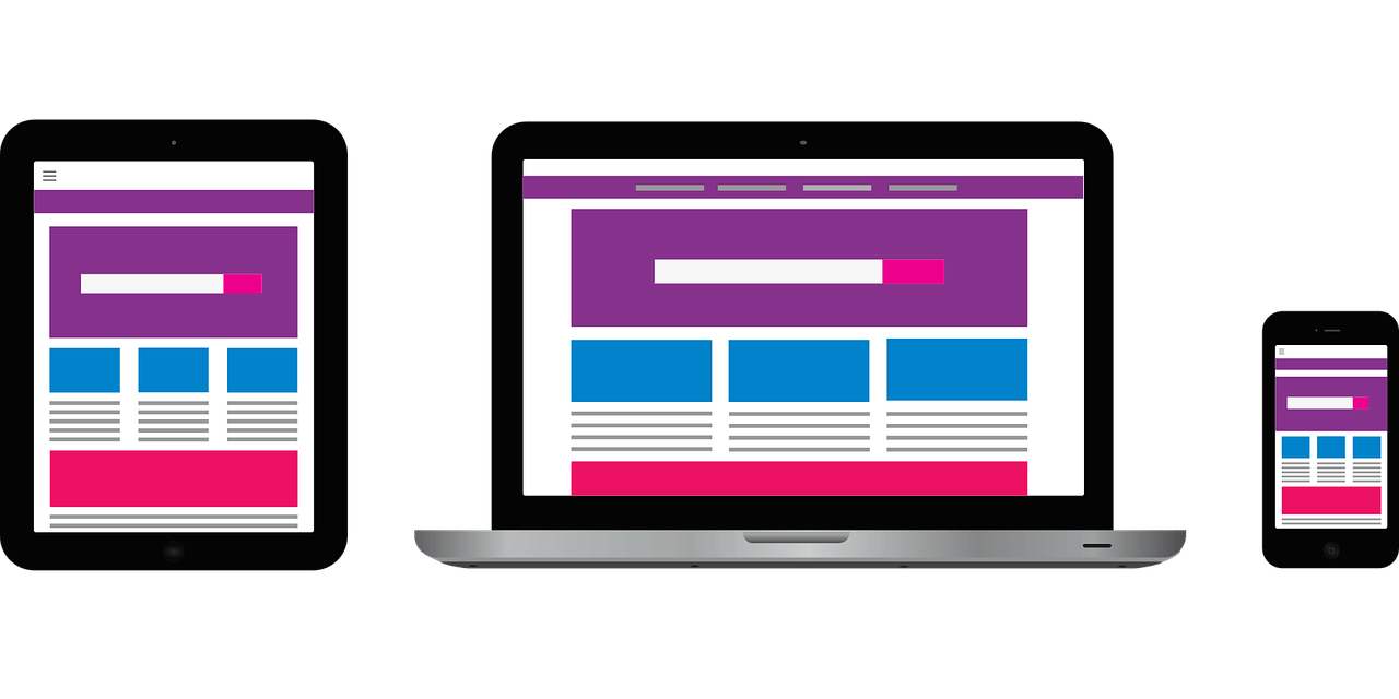
For any new project started, designers should always have three templates with different widths: mobile, tablet, laptop. And that is the MINIMUM. I've already gotten projects in which the designer only provides one screen size, and leaves you guessing everything else to get the website responsive. It makes the whole dev team lose precious time with a result that will most likely be not good.

Honestly, I prefer designs based on a grid system, because you can easily design for different screen breakpoints. At the same time, it allows you to respond to screen sizes slightly smaller and larger where your layout breaks.

But let's take it another step further... Let's all use Auto Layout! A simple Sketch plugin that will change your life as a designer: It allows you to design responsive screens for all (emphasize on ALL) screen sizes by turning pixel distances into percentages, and then lets the developer export them to HTML. Exquisite!
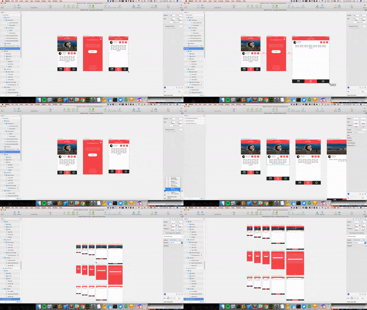
auto layout in action

Implement a Design System

Not having a design system means that your design will have a few inconsistencies at least, if not many. Which will translate into a frustrated developer, because they'll certainly have to create messy, overcomplicated components to respect that design.

It also means that we're wasting our dev team time that could be put to better use. Future dev changes will be more complicated, and you will have to maintain a heavier code base. On the other hand, having a design system will tremendously help in aligning design and devs from the start.

What's not to like about a Design System? It's a comprehensive list of the reusable components and layouts properly structured and organized, with each one serving a purpose along with its different variations, states, and specs. This makes it so much easier to make future UX and UI iterations.

In your design system pays close attention to:

  • Including a Style Guide. It's the base on which upon a design system is built. It includes the color palette, typography and iconography used, the CTAs, shadows and contrasts, and any other repeatable element in your design. Without it, it will be hard to develop a consistent design throughout the project, and don't be surprised if the dev team creates discrepancies in terms of UI styling. You can find great pieces of advice here.
  • Use Naming Conventions. Each component, layout, page, asset, and file must have a consistent label. Don't just use generic names and versioning labels. It doesn't mean anything and is pretty useless. I'd recommend going for labels that describe their function.
  • Providing all possible States. Please, don't keep us guessing! Go through all the error states, validation messages, and disabled states for inputs and buttons that a user can encounter.

Note: You can find an awesome list of more than 80+ design systems curated here. I recommend you take a look at it in case you need some inspiration.

User Flow

In truth, what you hand off to the dev team is not just design screens, but a user flow that you should be able to narrate. If you can't narrate, it means you make their work harder. If you're lost in your design, the user will be too, and the developer will also struggle to patch those designs together.

Narrating the story of your design is simply being able to tell what happens when a user clicks somewhere, why they do it, what happens when they do it, and what happens when something that shouldn't happen does happen (like with forms).

Note: User flows are usually when you can ask your marketers and growth hackers to collaborate with you. Especially regarding the product onboarding or all the important funnels your application can have.

Furthermore, a developer uses the UX story to plan their approach around how to build the features. So make sure to also link all the screens together. EVERY SINGLE ONE. Don't leave some screens out and think the developer will figure it out. No, they're usually not mind-readers. ‍♀️

You can use tools like Principle, Figma or inVision to link your screens and make a clickable prototype.

I recommend Principle. It allows you to create animated and fully interactive design prototypes in a snap. It really feels like magic. ‍♀️

Prototypes from Principle are really formidable. Because as a developer, we never get handed out the animations that go with performing an action in the design. It's quite astonishing, knowing that animations and micro-interactions are not just the cherry on top, but actually an essential part of usability.

A quick note for developers: Try to use CSS animations instead of JavaScript ones. They are much lighter and perform better.

Auto-Generate Visual Specs

I still have a hard time understanding why a designer would hand me a project without using a tool that allows you to see the exact specs for a component (margins, paddings, color codes, sizes, etc.). You can easily auto-generate this in tools like InVision or Zeplin.

It's simple and it helps the developers avoid spending their time pixel-distancing things. Yet, it's common to not use this option or to simply forget about giving them the proper access to see those specs.

Assets

There are two things that any designer should do when it comes to assets:

  • Store them all in one place (Zeplin is great for that)
  • Include SVGs every time you can

That's it.

Maintaining a Checklist

Countless times, I was reminded by my product manager of last-minute designs that I've missed. This could have been avoided by making a list of all the features and case scenarios the design deals with (if and when they are not well documented in the user flow or the design system).

So? Where Do We Go From Here? ‍

Even if you can't follow all of this (and it's okay if you can't), just start by implementing these methods one by one in your work routine. Even one more good practice will move the collaboration between a designer and a developer a step further.

One final recommendation I have is doing post-handoff meetings that include the project manager, the developers, and the design team. Usually there are meetings between the PM and the dev team, but they solely focus on meeting the deadline. Including the design team is an opportunity to not only compare each product build against the final design, but to also determine what practices could have been implemented to avoid this in the future.

You can ping me on Twitter @RifkiNada if you want to talk more about all this.

Telerik UI for WPF: Introducing Text Search Navigation in RadTreeView, RadPropertyGrid, and RadPanelBar

$
0
0

Telerik UI for WPF is now more accessible than ever. Learn about the newest Text Search Navigation functionality in RadTreeView, RadPropertyGrid, and RadPanelBar controls.

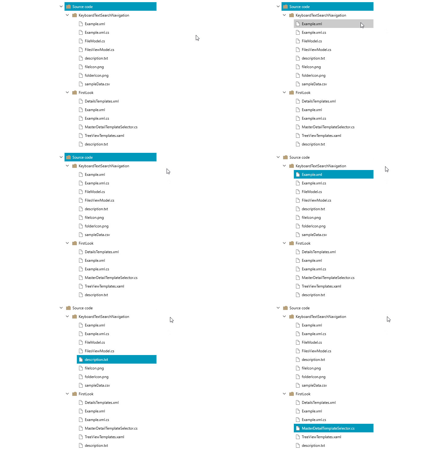
With the newest version already out, I am happy to present to you the latest accessibility improvements of our RadTreeView, RadPropertyGrid, and RadPanelBar controls from Telerik UI for WPF R2 2020. You no longer need to use the mouse to scroll to a particular item just to see if such exists! Now, you can use the keyboard to navigate to it.

Introducing Keyboard Text Search Navigation

What can it do?

The keyboard search navigation feature enables users to press a character and consequently go through each node starting with this character. Frequently pressing (slow enough for the autocomplete time to reset) the same character, used to find the first node, the navigation will move to the next node, starting with this character. This way pressing on and the same character, you can go through all items starting with it. Or you can navigate to a specific item by typing more than one of its characters. This approach can be used in a scenario where you want to type the full name of the required node. 

What are the benefits? 

A higher level of productivity and boosted accessibility, and ease of use for scenarios where keyboard navigation is the only option for interaction. 

Can the time elapse between the keystrokes be changed? 

The answer is YES! There are numerous scenarios where you can have thousands of long strings that are very similar to each other. I know, search inside large hierarchical data with similar strings can be a huge pain. That's why there needs to be enough time for the full name of the required object to be typed before it is reset. Our Keyboard Search Navigation mechanism exposes a way to change this. Changing the value of TextSearch.AutoCompleteTimeout property, you can control the time between the keystrokes.

public MainWindow()  
{   
    Telerik.Windows.Controls.TextSearch.AutoCompleteTimeout = new TimeSpan(2500);  
    InitializeComponent(); 
}

What about the text search mode? Can we change it? 

Again, the answer is YES! The default search mode will search for nodes that start with the typed key. You wouldn't be impressed by having only ONE mode, would you? Well, guess what—we've thought about that! Except for the ordinal StartsWith mode, we have added Contains, ContainsCaseSensitive, and StartsWithCaseSensitive. More modes, better user experience, right? . You can allow the user to change the mode dynamically so that you can cover as many corner cases as possible. 

Let see how this functionality can be used in the RadTreeView, RadPropertyGrid, and RadPanelBar controls separately, shall we? 

Keyboard Text Search Navigation in RadTreeView control 

To turn on the Text Search Navigation mechanism, the IsTextSearchEnabled property of the RadTreeView need to be set to true. 

<telerik:RadTreeView ItemsSource="{Binding Data}" IsTextSearchEnabled="True" />

Merely focusing the control and pressing the letter which the item starts with, the built-in mechanism will bring the node into the view (if it is out of the viewport) and select it. This is in the case of a single selection. In multiple selection mode, the navigation engine will only focus on the found node but won’t select it. The search functionality will go through all expanded items, so you don’t have to worry if the child items will be passed.  

TreeView Text Search Navigation

In the DataBinding scenario, the text search navigation functionality is not aware of which property is used to name the nodes. That is why it is up to you to point out the property which the search engine needs to use by setting the telerik:TextSearch.TextPath attached property. 

<telerik:RadTreeView ItemsSource=”{Binding Data}" IsTextSearchEnabled="True" telerik:TextSearch.TextPath="MyProperty" />

Keyboard Text Search Navigation in RadPropertyGrid control 

Before continuing to the setup, you need to keep in mind that the new gadget requires the RenderMode property of the control to be set to Flat. Otherwise the search won’t work. With this in hand, we can set the IsTextSearchEnabled property to True and voila.  

<telerik:RadPropertyGrid  IsTextSearchEnabled="True" RenderMode=”Flat”/>

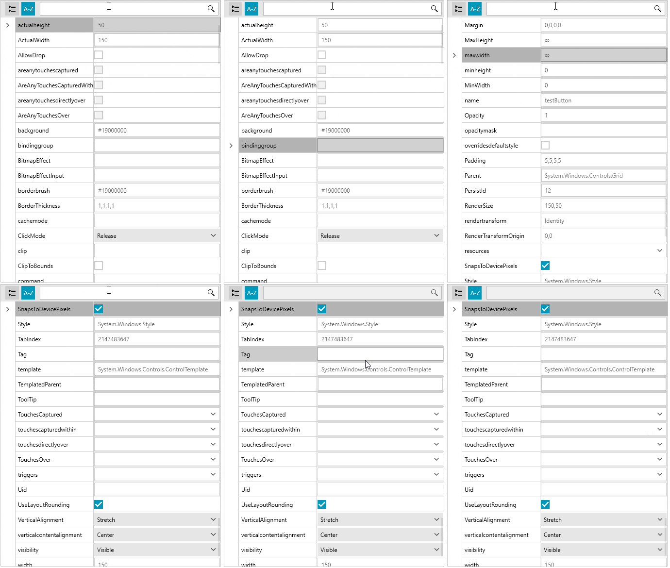
PropertyGrid Text Search Navigation

Using the new Text Search Navigation, you can directly navigate to a specific property by focusing the control and pressing the character which the property starts with. The mechanism will bring the first found property into the view and select it. 

Keyboard Text Search Navigation in RadPanelBar control

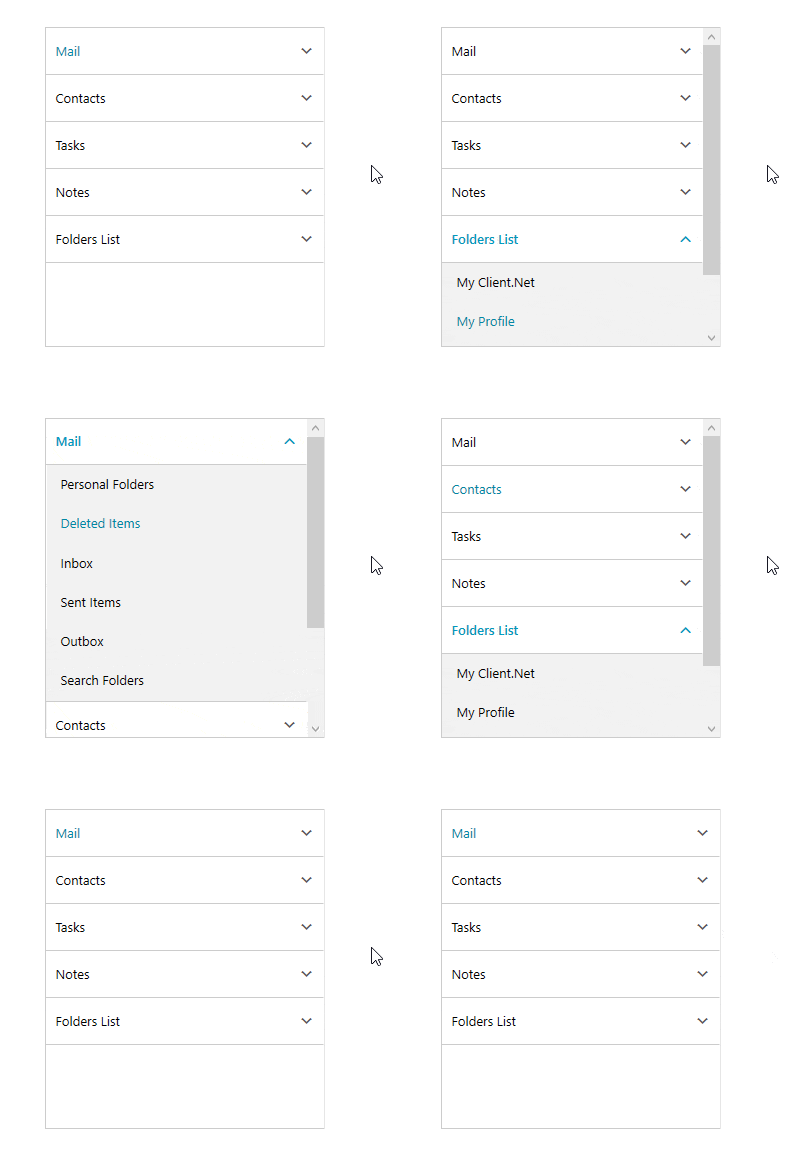
As with the other controls above, the RadPanelBar needs to be focused first and set up to turn on the Text Search Navigation. You can do that by simply setting the IsTextSearchEnabled property to True. 

<telerik:RadPanelBar ItemsSource=”{Binding Data}" IsTextSearchEnabled="True" />

PanelBar Text Search Navigation

Similar to the RadTreeView control, for DataBinding scenarios the TextSearch.TextPath attached property needs to point out to the one used by the search algorithm. 

<telerik:RadPanelBar ItemsSource=”{Binding Data}" IsTextSearchEnabled="True" telerik:TextSearch.TextPath="MyProperty" />

Share Your Feedback

Feel free to drop us a comment below sharing your thoughts. Or visit our Feedback portals about UI for WPF, Silverlight and Document Processing Libraries and let us know if you have any suggestions or if you need any particular features/controls. 

Try out the latest: 

Embedding Beautiful Reporting into Your ASP.NET Core Web Applications

$
0
0

This tutorial teaches you how to get reports from a Telerik Reporting REST Service and have them display in ASP.NET Core applications.

This blog post demonstrates how to embed the Telerik HTML5 Report Viewer (or viewer for short) and host the Telerik Reporting REST Service (or service for short) in your ASP.NET Core 3+ web application. Here are the topics I am going to cover:

What is the HTML5 Report Viewer?

The viewer's purpose is to display report documents on a web page. Under the hood, the viewer is a custom jQuery-based widget. Widgets are feature-rich, stateful plugins that have a full life cycle, along with methods and events. The layout of the viewer is stored in an HTML template that supports mobile and desktop browsers and is fully customizable. Similar to Kendo UI widgets the viewer's default HTML template supports predefined themes and custom themes.

Grab the eBook: A Quick Guide to Expert .NET Reporting Tools 

What is the Reporting REST Service?

I mentioned that the viewer displays report documents. A report document, however, is the output of the Report Engine.

Report Life Cycle

The viewer cannot do the processing and rendering work by itself and this is where the Reporting REST Service comes in. The service wraps the Report Engine and exposes its functionality over HTTP, so the viewer can access it. A common scenario for the viewer-service interaction described in a high-level of abstraction would be:

  1. The viewer requests a report document by providing the report definition's unique identifier (for example, the file name MyReport.trdx)
  2. The service searches for the requested report definition and instructs the Report Engine to process and render it to an HTML5 report document
  3. The service returns the produced result to the viewer
  4. The viewer displays the report document to the user

For convenience, the service can also provide all the required HTML5 Report Viewer widget resources - JavaScript, CSS, and HTML template files.

How to Host the Reporting REST Service in Your ASP.NET Core Web Application?

As the viewer cannot function without the service, let's review the steps to host the service first. For this post, I'll assume that the project displaying reports is also the service project. That way I don't have to configure Cross-Origin Resource Sharing (CORS). However, if you need to use separate projects in your solution, here is a very good article that explains how to enable CORS in ASP.NET Core.

If you don't have an existing ASP.NET Core web application, follow these steps to create one:

  1. Start Visual Studio 2019
  2. Open File > New > Project...
  3. Select ASP.NET Core Web Application and click Next
  4. Enter your Project name and click Create
  5. Select .NET Core and ASP.NET Core 3.1 for the framework version
  6. Select the Web Application template and click Create

To host the Reporting REST Service in this project or another existing project, add the NuGet package Telerik.Reporting.Services.AspNetCore from the Telerik NuGet feed at https://nuget.telerik.com/nuget.

The service package will add its own dependencies to the project, such as Microsoft.AspNet.Core.Mvc.NewtonsoftJson. To activate the NewtonsoftJson package dependency, open Startup.cs and change the services.AddRazorPages line in the ConfigureServices method to:

services.AddRazorPages().AddNewtonsoftJson();

Right below this line add the configuration code for a minimal Reporting REST Service implementation (add appropriate usings as well):

services.TryAddSingleton<IReportServiceConfiguration>(
    sp => new ReportServiceConfiguration
    {
        Storage = new FileStorage(),
        ReportSourceResolver = new UriReportSourceResolver(
            System.IO.Path.Combine(
                sp.GetService<IWebHostEnvironment>().ContentRootPath,
                "Reports"))
    });

The Storage configuration above specifies that the service will save its internal state objects and temp files on the file system. Other storage options are also available.

The ReportSourceResolver option instructs the service to search for report definition files inside the Reports application folder. For more ways to resolve a report identifier to a specific report definition, check the complete REST Service Report Source Resolver reference.

The Reports folder does not exist yet, but you'll create it in a moment since you'll need to add report definition files there. I grabbed my report definition (Report Catalog.trdp) from the Telerik Reporting installation folder - C:\Program Files (x86)\Progress\Telerik Reporting R2 2020\Report Designer\Examples, but you can create a new one using the Standalone Report Designer. Once you have a report definition, you need to add it to your project:

  1. Create a folder in the root of your project called Reports
  2. Copy your report definition file into it

Also inside the ConfigureServices method, make sure the application is configured for API controllers by adding:

services.AddControllers();

And map those controller endpoints by adding the following line (endpoints.MapControllers();) to the Configure method:

app.UseEndpoints(endpoints =>
{
    endpoints.MapRazorPages();
    endpoints.MapControllers();
});

The next step is to create the actual ReportsController class which is the essence of the service:

  1. Add a new Controllers folder to the root of the project
  2. Right-click the Controllers folder and select Add > Controller...
  3. Select the API Controller - Empty template and click Add
  4. Name the new controller ReportsController.cs and click Add

Change the content of the new controller to:

using Microsoft.AspNetCore.Mvc;
using Telerik.Reporting.Services;
using Telerik.Reporting.Services.AspNetCore;
 
namespace AspNetCoreReportViewerSample.Controllers
{
    [Route("api/reports")]
    public class ReportsController : ReportsControllerBase
    {
        public ReportsController(IReportServiceConfiguration reportServiceConfiguration)
            : base(reportServiceConfiguration)
        {
        }
    }
}

The string api/reports inside the Route attribute maps the URL that will be used to access this controller. The service is now ready and waiting to serve your reports.

There is a variety of other configuration options, including how to use a configuration file with connection strings, and more. To delve deeper into the topic, visit the complete reference to setting up a Reporting REST Service.

Save Your Seat: Reporting In-Depth—How to Streamline Reporting with Ease

How to Request a Report Document and Display it in the HTML5 Report Viewer?

With the Web Application project template that I chose earlier my application's landing page is Pages/Index.cshtml. This page uses a common layout stored in Pages/Shared/_Layout.cshtml. The common layout has a reference to jQuery by default. If your application does not reference jQuery yet, you can link it from the jQuery CDN.

To have a neat organization of the common layout page, add a custom section to the head element of _Layout.cshtml which you'll use later to add the viewer's Kendo UI themes:

<head>
    ...
 
    @RenderSection("Head", required: false)
</head>

Inside Pages/Index.cshtml you need a div element to hold the viewer. This element should have a unique id attribute value, which will be later used in the viewer's JavaScript. It is also required to set the div element's dimensions via CSS file or inline style, or the viewer will not be visible on the page:

<div id="reportViewer1" style="width:940px; height:1300px">
</div>

Add links to the desired Kendo UI theme in the custom Head section prepared earlier:

@section Head {
}

Finally, add a link to the viewer widget's JavaScript file inside a Scripts section and call the telerik_ReportViewer method.

The Scripts section will help insert the viewer script after the reference to jQuery inside the common layout file. The viewer will then be able to find its jQuery dependency and extend the global jQuery object instance with the telerik_ReportViewer method.

telerik_ReportViewer is a jQuery extension method that creates and configures the viewer object. In this example, the viewer object is created inside the #reportViewer1 div element. The serviceUrl matches the URL of the ReportsController route and the report option value is the file name of the report definition:

@section Scripts {
    <script src="/api/reports/resources/js/telerikReportViewer"></script>
 
    <script type="text/javascript">
        $(document).ready(function () {
            $("#reportViewer1")
                .telerik_ReportViewer({
                    serviceUrl: "api/reports",
                    reportSource: {
                        report: "Report Catalog.trdp"
                    },
                    scaleMode: telerikReportViewer.ScaleModes.SPECIFIC,
                    scale: 1.0
                });
        });
    </script>
}

Above is the minimum required configuration of the viewer object. For a full list of configuration options, methods, and events, head to the HTML5 Report Viewer documentation.

This is how the final Index.cshtml looks:

@page
@model IndexModel
@{
    ViewData["Title"] = "Home page";
}
 
@section Head {
}
 
<div class="text-center">
    <div id="reportViewer1" style="width:940px; height:1300px">
    </div>
</div>
 
@section Scripts {
    <script src="/api/reports/resources/js/telerikReportViewer"></script>
 
    <script type="text/javascript">
        $(document).ready(function () {
            $("#reportViewer1")
                .telerik_ReportViewer({
                    serviceUrl: "api/reports",
                    reportSource: {
                        report: "Report Catalog.trdp"
                    },
                    scaleMode: telerikReportViewer.ScaleModes.SPECIFIC,
                    scale: 1.0
                });
        });
    </script>
}

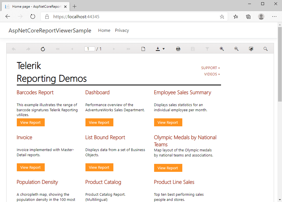
What's left is to press F5 in Visual Studio and watch how the HTML5 Report Viewer will request the Report Catalog.trdp report from the service. The service will instruct the Report Engine to render the report definition in HTML5 format and return it to the viewer as a report document. If all goes as expected, you'll find yourself looking at a similar screen:

HTML5 Report Viewer

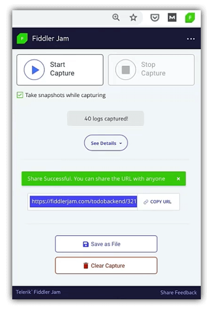
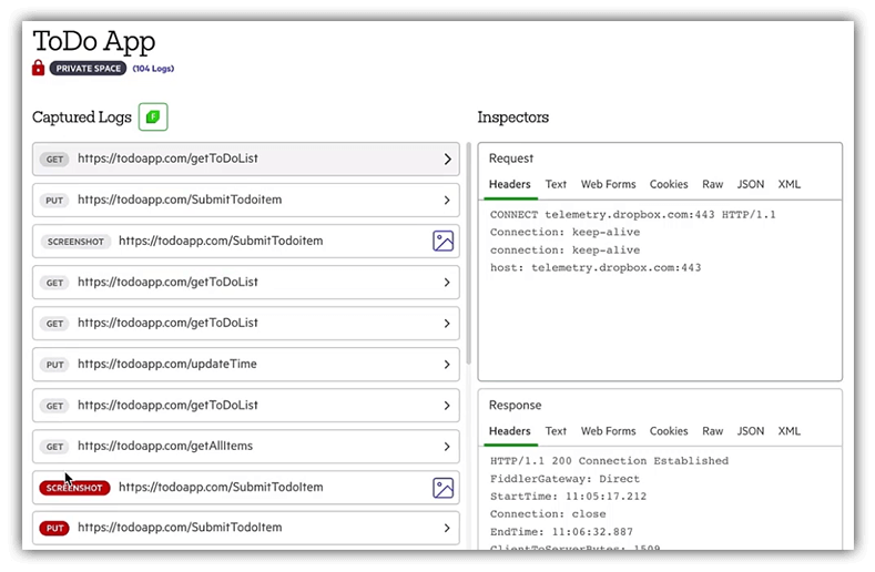
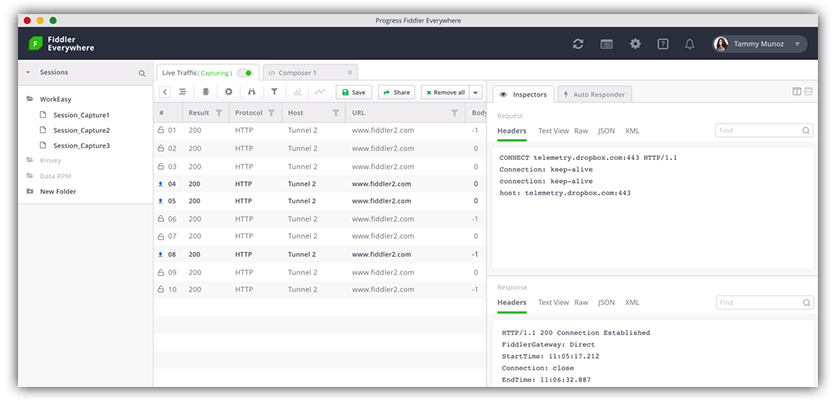
If you run into any problems, press F12 to check for errors in the browser console and log the network traffic using Fiddler. All this information will be incredibly valuable if you decide to contact our legendary support team.

You can download the sample application from the telerik/reporting-samples GitHub repository.

Tried Telerik DevCraft?

You can choose Telerik Reporting and Telerik Report Server as individual products or enjoy them as part of the great Telerik DevCraft bundles.

Try Telerik DevCraft

Telerik DevCraft is the finest software developer tools collection across .NET and JavaScript technologies, which includes modern, feature-rich and professionally designed UI components for web, desktop and mobile applications, reporting and report management solutions, document processing libraries, automated testing and mocking tools from the Telerik and Kendo UI suites. DevCraft will arm you with everything you need to deliver outstanding applications in less time and with less effort. With the backing of our legendary support team, which consists of the developers who build the products, and a ton of resources and trainings you can rest assured that you have a stable partner to rely on for your everyday challenges along your software development journey.

Telerik UI for Blazor 2.16.0—Editor, TreeList, Stock Chart, Context Menu Components and More!

$
0
0

Today we shipped a new version of Telerik UI for Blazor and we are happy to introduce four new Blazor components as well as Grid, Chart and Menu enhancements! You can now take advantage of the newly released Editor, TreeList, Stock Chart and Context Menu, as well as new exposed Grid events to give you flexibility to apply custom logic when interacting with data rows in Blazor applications!

Let’s explore the 2.16.0 release content and see in detail the new goodies you can incorporate in your Blazor Server and WebAssembly apps!

New Blazor Components

Blazor Editor Component

Editor Overview

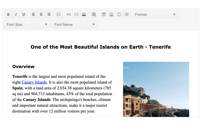
The new HTML Editor Component enables users to create rich text content and delivers out-of-the box features for text management such as creating, editing, and formatting text, paragraphs, lists, and other HTML elements. In addition to the built-in toolset it also allows you to create custom commands and easily integrate them into its Toolbar.

Telerik UI for Blazor Editor Component

Telerik UI for Blazor Editor Component

Editor Toolbar

The various Editor command buttons are organized in a Toolbar and include various text formatting options such as font family, font size and style, text alignment, creating lists, tables, inserting hyperlinks and images and more! To ease the configuration of the Toolbar you have two toolset config options to choose from:

  • Default—the default set of the most commonly used editor commands
  • All—all available editor commands

Telerik UI for Blazor Editor Toolbar

Editor Built-In Toolset

The Editor component comes with multiple built-in tools grouped into the following categories:

  • Inline Tools—add an inline HTML element such as an <a>, <img>, <strong> and <em>, or control their rendering related to formatting font family and size, and text formatting with bold, underlined or strikethrough styles.
  • Block Tools—add block HTML element such as <h1>, <h2>, <p> and <ul>, or control their rendering related to alignment, formatting, indenting, undo and redo.
  • Table Tools—add an HTML <table> element or control its rendering, such as add/remove columns and rows, merging and splitting cells.

You can invoke the built-in Editor toolset from outside the component or from custom tools, by referencing the component and calling its ExecuteAsync method.

Editor Toolset and Toolbar Customization

You can customize the predefined toolset available for the Editor by adding and removing tools, and even create your own custom tools and plug them in as an available command in the Editor Toolbar.

Telerik UI for Blazor Editor Custom Tools

Editor Modes

The Editor comes with two configuration modes that affect the way the component content is styled:

  • Iframe (the default)—the content area is an editable <iframe> element and does not inherit the CSS rules from the current page.
  • Div—the content area is an editable <div> element and the styles from the parent page are automatically applied to the content.

Editor Event

The Editor component exposes the ValueChanged event to let you easily handle Editor content in Blazor apps. The event fires after a user changes the content and the update interval has elapsed (100ms by default), and then provides you with the updated content.

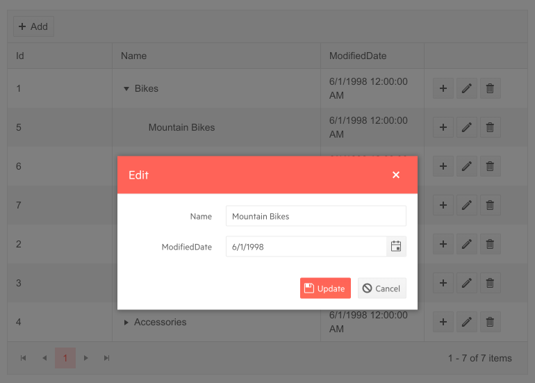
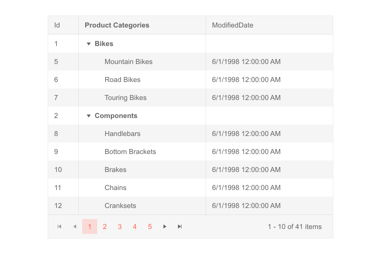
Blazor TreeList Component

TreeList Overview

The Tree List component is the perfect match for visualizing hierarchical data in a tabular fashion and is definitely one of the release highlights. It comes with many built-in functionalities like data binding, item selection, several ways for data editing, sorting, filtering, paging, multiple column options, templates toolbar, loading data on demand and more! In fact, the component is so feature-rich that it deserves a separate blog post, however in the sections below we’ll try to highlight its key capabilities.

Telerik UI for Blazor TreeList Component

TreeList Data Binding

The Blazor TreeList can be bound to flat and hierarchical data, plus you have the benefit of loading data on demand for cases when you work with large volume of data records and want to optimize performance.

TreeList Rows Selection

The TreeList supports the following modes of row selection:

  • None (default value)—Disabled row selection
  • Single Row Selection—Click on a row or use checkbox
  • Multiple Row Selection—hold down the Ctrl or Shift key to extend the selection, or use checkbox selection

The single and multiple rows selection articles provide more examples and details on using the TreeList selection features.

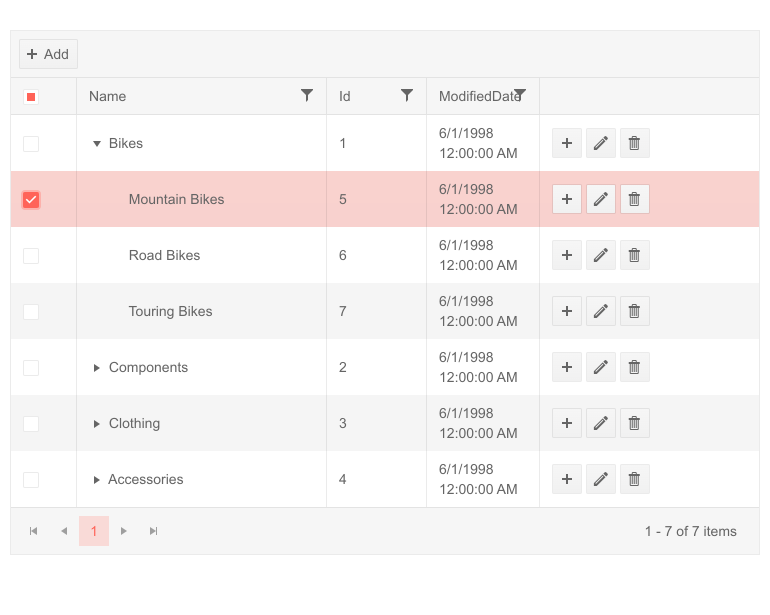
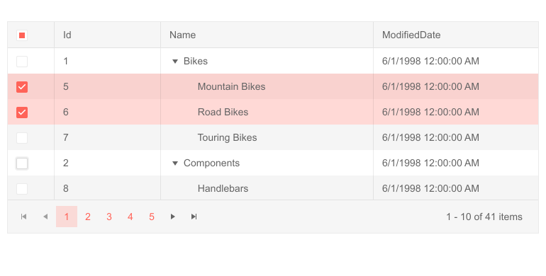
Telerik UI for Blazor TreeList Multi-Row Selection
Telerik UI for Blazor TreeList
Multiple Rows Selection

TreeList Paging and Sorting

The TreeList component offers built-in paging capability that can be enabled with a couple of property settings to enable paging and provide the number of records per page.

Similarly, tree list sorting can also easily be turned on by setting a single param to true. This would allow users to click on column headers and sort the data according to the column's data type, with an arrow indicator in the column title displaying the sorting direction or disable sorting for columns that make exception to the general rule.

TreeList Bound Column Options

The TreeList comes with a ton of properties on its data bound columns:

  • Expandable—when set to true, the column shows an expand/collapse arrow in front of the value and denotes hierarchy. Needs to be set for at least one column of your Tree List to showcase the hierarchical nature of the data.
  • Field—the name of the field in the data source that the column will render as a string (case-sensitive).
  • Title—the text that is rendered in the column header.
  • Editable—you can set this property to true or false to allow or prevent editing of this field. To edit data, you will also need a CommandColumn.
  • Filterable—enables users to filter a particular column.
  • Locked—defines whether the column is locked (frozen, pinned).
  • Sortable—enables users to sort by a particular column.
  • Reorderable—specifies whether users can drag to reorder this column.
  • Resizable—specifies whether the user can resize this column.
  • Width—defines the width of the column.

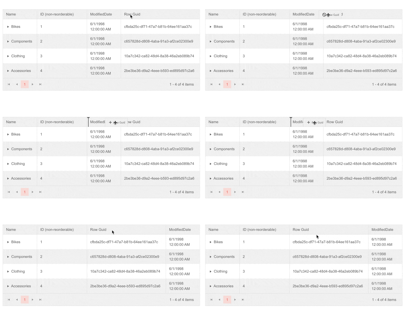
Telerik UI for Blazor TreeList Column Reorder

Telerik UI for Blazor TreeList Reorder Columns

TreeList Command Columns

The command column of a TreeList allows you to initiate inline or popup editing, or to execute your own commands. Examples on how to further add command columns for Editing, Saving, Cancelling and custom command for TreeList can be found in the documentation article.

TreeList AutoGenerated Columns

In case you need to generate a TreeList column for each public property of your data model, you can benefit greatly from using the TreeList AutoGenerated column option. This would let you directly map your model properties to columns by setting the AutoGenerateColumns parameter to true, saving you time from defining each column manually.

TreeList Column Virtualization

When working with data sets containing large number of columns in your Blazor applications, there are cases when you may want to improve the TreeList performance.

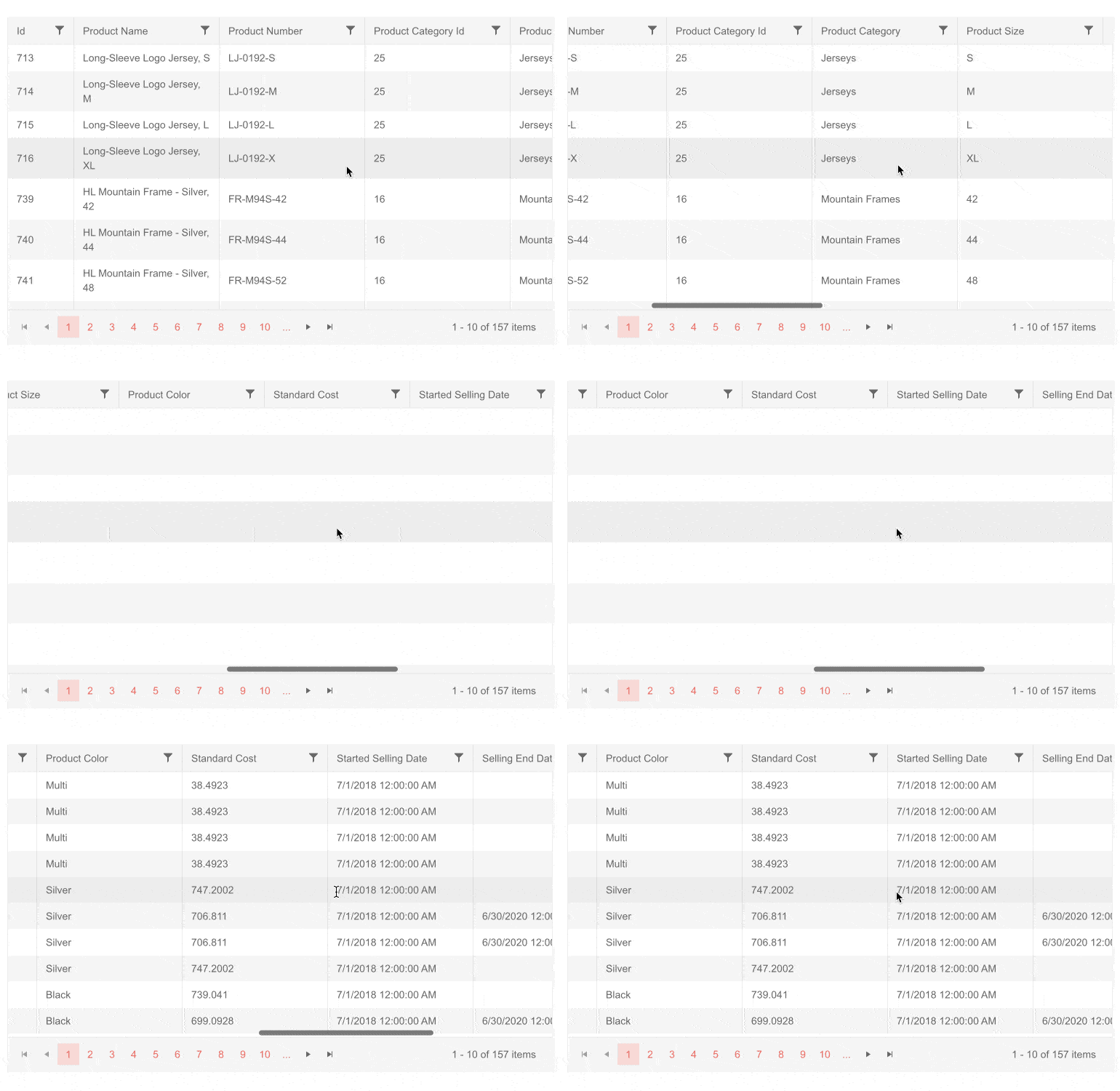
Telerik UI for Blazor TreeList Column Virtualization

Using the TreeList Column virtualization feature you can easily boost the speed and responsiveness of data interaction, since only columns and their corresponding data from the currently visible viewport will be rendered.

TreeList Filtering

The TreeList component offers two built-in options for filtering of its data:

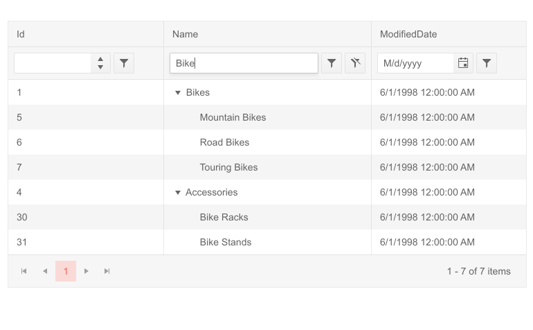
  • Filter Row—a row of filter options is rendered below the column headers

Telerik UI for Blazor TreeList Filter Row

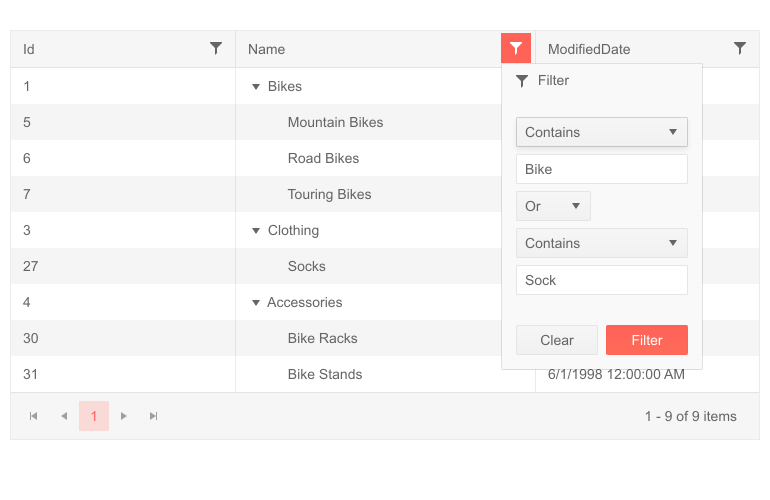
  • Filter Menu—the column headers render a button that shows a popup with filtering options

Telerik UI for Blazor TreeList Filter Menu

TreeList Editing

There are multiple ways to implement editing of data, and depending on your scenario you can pick of the available options:

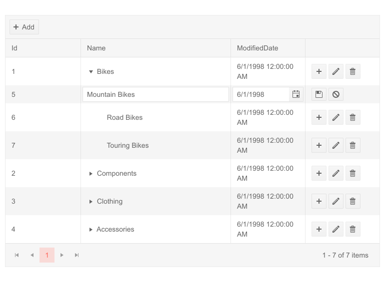
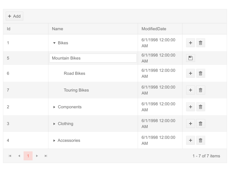
  • Inline Editingusers can edit treelist values by clicking an Edit command button on a row, and all its editable columns open up for changes. By clicking a Save command button changes are submitted to the data access layer. 

    Telerik UI for Blazor TreeList InLine Editing

    Telerik UI for Blazor TreeList Inline Editing

  • InCell Editing—users can click the treelist cell and type a new value, changes are applied to the data source when they focus is removed from the input.

    Telerik UI for Blazor TreeList InCell Editing

    Telerik UI for Blazor TreeList InCell Editing

  • Popup Editing—lets users click an Edit command button on the treelist row, and a popup shows up with all its editable columns open up for changes. By clicking a Save command button in the dialog changes are submitted to the model. 

Telerik UI for Blazor TreeList Popup Editing

Telerik UI for Blazor TreeList Popup Editing

Customizing TreeList with Templates

The TreeList can be completely customized using one of the available templates, enabling you to specify the rending of:

  • Columns (cells)—the rendering of each cell (column). You can, for example, change string formats or add your own components.
  • Editing of a cell—when a cell is in edit mode, it will render this template where you can use custom editors, components and logic.
  • Rows—the entire rendering of the <tr> element of the row, so you can fully customize the TreeList behavior and rendering. It can be convenient if you want to use templates for most or all of the columns, as it requires less markup than setting individual templates for many columns.
  • Filter Row and Filter Menu—customize the design and logic behind the built-in filters depending on the selected TreeList filtering mode: filter row or filter menu.
  • Column header—the Title of the column.

Telerik UI for Blazor TreeList Column Header Template
Telerik UI for Blazor TreeList Column and Column Header Templates

TreeList Toolbar

The Tree List component comes with a neat toolbar in its header that lets you organize in a nice layout the built-in commands (such as Add Item) and any custom commands which you can add to it as buttons. You can further add your own HTML and components to create a more complex Toolbar layout to match your business needs.

TreeList Localization and Globalization

The Tree List control has built-in localization and globalization support. Thus, it is no effort to translate UI texts into any language and automatically apply the formatting of numeric and date input fields based on a specific culture in your Blazor app.

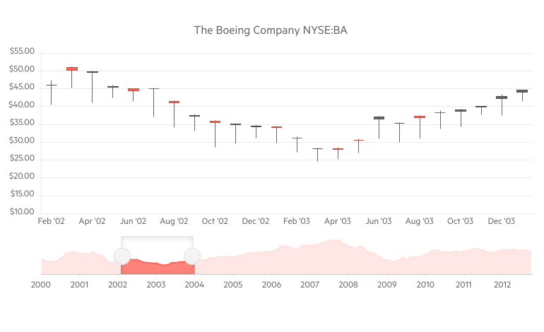
Blazor Stock Chart Component

StockChart Overview

The new Stock Chart component will let you visualize the movement of financial units such as stock/market prices for specific date and—open and close rates, the various changes that have happened to the price during the day, minimum and maximum values reached during the day, and the trends of those prices over time.

You can use a variety of chart types and control all aspects of the chart's appearance—from colors and fonts, to paddings, margins, custom tooltips and templates. In addition to that the Telerik Stock Chart provides a Navigator to widen or shorten the defined period of time and zoom in on particular part of the chart, and a crosshair feature that makes available the precise values in data-dense charts.

Telerik UI for Blazor Stock Chart Component
Telerik UI for Blazor Stock Chart

Stock Chart Data Binding

The Stock Chart is a data-bound component. All you need to do is provide a List of models, that contain both data point values and x-axis dates to the Data property of chart series, and set a few chart series properties to the corresponding model with values.

Stock Chart Series Types

The Stock Chart component supports several different chart series to cover any app scenario you may have—Area, Column, Candlestick, Line and OHLC (open-high-low-close). Code examples and usage for all of them can be found Telerik UI for Blazor documentation.

Stock Chart Navigator

The Stock Chart Navigator allows the user to scroll and zoom through data over a certain period of time. The Navigator can be used will all types of stock charts and allows customizations such as setting a specific range of the Navigation upon initialization, slider direction, label customizations and on mouse wheel rotation. You can also choose what type of series it will use to visualize the overall trend.

Telerik UI for Blazor Stock Chart Navigator

Stock Chart Crosshairs

The Stock Chart has another useful feature, the so-called Crosshairs, which represents perpendicular lines to the axes and allow app users to view the exact value of a point at the current cursor position. You can customize their color, opacity and width via the chart category axis settings.

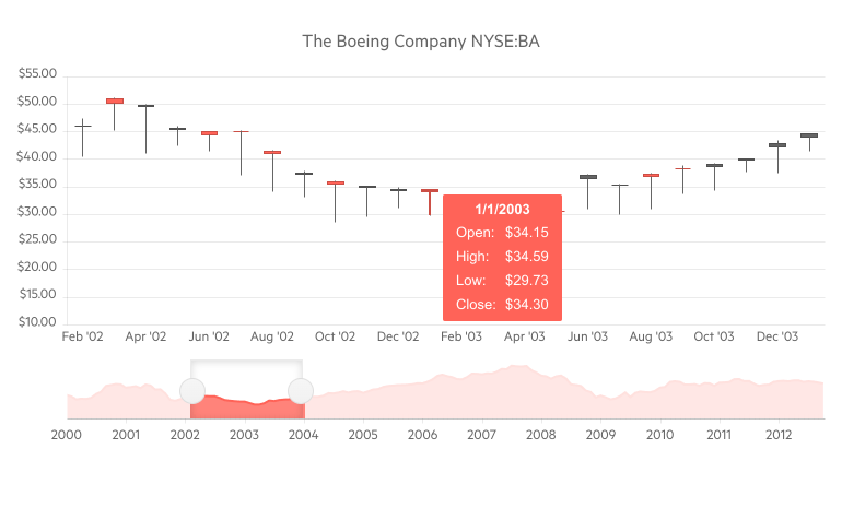
Stock Chart ToolTips

Like all other Telerik UI for Blazor Charts, the Stock chart supports three options for fully customizable tooltips:

  • Specific to each <StockChartSeries>
  • Common tooltip settings for all series
  • Shared tooltip for all categories

Telerik UI for Blazor Stock Chart Tooltip
Telerik UI for Blazor Stock Chart with Tooltip

Stock Chart Event

The OnSeriesClick click event gives you further flexibility as it exposes full details related to a chart data point and lets you implement custom logic in response to a user click.

Blazor Context Menu Component

ContextMenu Overview

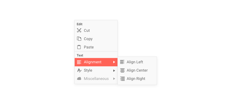
The ContextMenu component lets you provide users with an easily accessible shortcut menu of frequently used commands in Blazor applications. It comes with multiple built-in features such as data binding, styling, nesting items, customization with templates, keyboard navigation, and seamless integration with other UI components such as the Grid.

Telerik UI for Blazor ContextMenu Component                                     Telerik UI for Blazor Context Menu

ContextMenu Data Binding

The ContextMenu component can be bound to either:

  • Hierarchical data—separate collections of items and their child items
  • Flat data—a single collection of items with defined parent-child relationships

Еach context menu item property from the list: Id, ParentId, HasChildren, Items, Text, ImageURL/Icon/ImageClass, URL, Separator, Disabled can be set through the corresponding fields in their data binding.

Styling ContextMenu with Icons

You can put an image, icon class or a font icon for each item in the Context Menu to illustrate its purpose for your end users.

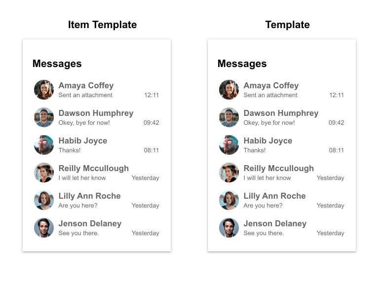
Customizing ContextMenu with Templates

You can easily customize the ContextMenu and its items appearance and behavior using one of the template options:

  • Item Template—the rendering of each individual context menu item so you can render more than the built-in text and icon fields
  • Content Template—lets you control the rendering of the entire popup

Telerik UI for Blazor Context Menu Templates
Telerik UI for Blazor ContextMenu Templates

ContextMenu Integration

One of the most common scenarios for integration of the Context menu component would be with a Telerik Blazor Grid. To do so, you will simply need to use the Grid's OnRowContextMenu event to get the current row model and show the context menu, then use the context menu's OnClick event to handle the desired operation. A code example with such an integration can be found in the official documentation.

Furthermore, the component has a simple, yet powerful parameter called Selector that makes the task of attaching the context menu to one or more targets easy. By using the ShowAsync method, you can also adjust the ContextMenu content—i.e. which menu items should be displayed/active based on which element the user clicked. Check out the code sample showing how to change ContextMenu items based on the target data.

ContextMenu Navigation

Besides being used as a shortcut for commands, the ContextMenu items can also be used for navigation between the different pages in your Blazor application. The component can generate the needed links for you through its UrlField when data binding. All you have to do is provide a collection of models that describe the pages you want the user to navigate to and populate its UrlField with the corresponding data from the model (alternatively you can provide a Url property in the model).

ContextMenu Onclick Event

The OnClick event fires when the user clicks or taps on a context menu item and it is suitable for cases when to react to user selection without using navigation to load new content automatically.

Blazor Component Enhancements

New Blazor Grid Events

With each release of Telerik UI for Blazor, we try to give love and extend the functionalities of the Grid. In the current release we worked on expanding the possibilities from a programming point of view and exposed several new events and features, so you have control over user interaction with the Grid and its custom data operations.

Blazor Grid Grouping with OnRead

When you use the Grid built-in grouping or other out-of-the box feature, it hides the complexity of the internally performed data operations from you. Still there are cases when you need to perform grouping yourself in code (and/or on the server-side service), and you can now use the OnRead event with grouping. For a detailed explanation on what you need to take into consideration, as well as some data preparation that needs to take place, check out the example on how to set up the grid to use grouping with manual data source operations, and how to use the Telerik DataSource extensions to prepare grouped data.

Blazor Grid Expand/Collapse Rows Events

  • OnRowExpand event fires as a response to the user expanding the DetailTemplate (parent-child records) of the Grid and comes in handy when you need to load Grid detailed data on demand
  • OnRowCollapse event fires as a response to the user collapsing the DetailTemplate of the Grid and provides you easy access to the model of the clicked row

Blazor Grid ContextMenu Event

The OnRowContextMenu event fires as a response to:

  • user right-clicking on a Grid row
  • clicking the Context Menu keyboard button
  • long-touch on mobile devices

The Grid OnRowContextMenu event is used to integrate the Context menu with Grid Rows. Its event handler receives a GridRowClickEventArgs object which provides the model of the clicked row and exposes an EventArgs property. You can use the event arguments to determine the keyboard key or the position of the mouse cursor when the user took an action.

Blazor Chart Series

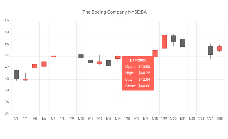
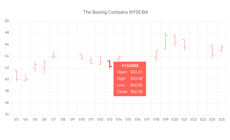
In the Telerik UI for Blazor 2.16 release we added two chart type series to facilitate financial and pricing analysis: OHLC and Candlestick.

Telerik UI for Blazor Candlestick Chart

OHLC and Candlestick are price charts that display the high, low, open, and closing prices of a security, derivative or price for a specific period. Both are widely used by financial analysts or traders and helps them easily determine if closing price was higher or lower than the opening price.

Though they the two chart types show the same amount of information, they do it in a slightly different way. While OHLC charts show the open and close via left and right facing horizontal lines, candlesticks show the open and close via a real body.

Telerik UI for Blazor OHLC Chart

Blazor Menu Enhancements

Last but not least in this release we added two addition features to the Menu component:

  • Separator—lets you define a line in the Menu component by setting it to true. This would allow you to distinguish logically grouped items between two separators.
  • Disabled—lets you disable menu items by setting it to true (these menu items are still rendered but will not be clickable).

New Telerik Blazor Release, New Demos Look!

We are excited that the Telerik UI for Blazor demos have brand new fresh look! As the number of components and related demos and code examples continuously grow, we redesigned our demos, so you can easily navigate and search specific features. Plus, we gave them brand new fancy styling.

Telerik UI for Blazor Demos Hub Page
Updated Telerik UI for Blazor Demos Hub Page

Download Telerik UI for Blazor 2.16.0

To see in action all that’s mentioned in the release blog post, head over to the Telerik UI for Blazor page, download a free trial of Telerik UI for Blazor 2.16.0, or if you are an active license holder you can grab the latest and greatest from the “Your Account” page or update your NuGet Telerik.UI.for.Blazor package reference to version 2.16.0. directly in your Blazor solutions.

Thank You! 

As always, we are thankful to you for being involved and helping us grow and making Telerik UI for Blazor bigger and better. Keep telling us what’s working well, what needs to improve and which component or feature you’d like to see next in the dedicated Blazor feedback portal or in the comment section below!

From the entire Telerik UI for Blazor team at Progress, we thank you for your continuous support ❤️

WinForms UI Test Automation with Appium

$
0
0

In this blog post we will explore how to use Appium, the Microsoft recommended open source test automation framework, with Telerik UI for WinForms.

You are probably aware that the Coded UI Test for automated UI-driven functional tests has been deprecated—in the release notes for Visual Studio 2019, Microsoft confirmed that Visual Studio 2019 will be the final version with Coded UI test features.

Currently, Microsoft recommends using Appium with WinAppDriver as a UI test tool for desktop and UWP applications. WinAppDriver is a service that supports Selenium-like UI Test Automation on Windows Applications.

By now, you are probably wondering whether it's possible to automate Telerik UI for WinForms controls with Appium? Well, it's your lucky day—in the following paragraphs we will walk you through the process of using Appium for Telerik UI for WinForms controls.

Requirements for Using Appium 

  1. WinAppDriver is supported on machines running Windows 10
  2. You need to enable Developer mode
  3. Install Windows Application Driver (required to run tests)

None mandatory but may come in use depending on your test scenarios and architecture:

  1. Appium
  2. WinAppDriver UI Recorder - allows you to record tests at runtime. Does not require installation - unzip the downloaded archive

Hints:

Here are the steps to write a WinAppDriver test:

  1. Run WinAppDriver.exe as an administrator and leave it running. Note the address the application is listening to, you will need it later.

    WinAppDriverExe

  2. Add UnitTest project to the solution of your test application or create a separate solution.

    UnitTestProject

  3. Right-click the Unit Test project in Solution Explorer and select “Manage NuGet Packages…” Install the latest stable Appium.WebDriver package.
  4. Create “TestSession class where you set the AppiumOptions as follows:
    public class TestSession
    {
        private const string WindowsApplicationDriverUrl = "http://127.0.0.1:4723";
        private const string TestApp = @"D:\WinAppDriver_WinForms_Tests\RadControlsTest\RadControlsTest\bin\Debug\RadControlsTest.exe”;
     
        protected static WindowsDriver<WindowsElement> session;
        public static WindowsDriver<WindowsElement> desktopSession;
     
        public static void Setup(TestContext context)
        {
            // Launch RadGridView test application if it is not yet launched
            if (session == null || desktopSession == null)
            {
                TearDown();
     
                // Create a new session to bring up the test application
                AppiumOptions options = new AppiumOptions();
                options.AddAdditionalCapability("app", TestApp);
                options.AddAdditionalCapability("deviceName", "WindowsPC");
                options.AddAdditionalCapability("platformName", "Windows");
     
                session = new WindowsDriver<WindowsElement>(new Uri(WindowsApplicationDriverUrl), options);
                Assert.IsNotNull(session);
                Assert.IsNotNull(session.SessionId);
     
                // Set implicit timeout to 1.5 seconds to make element search to retry every 500 ms for at most three times
                session.Manage().Timeouts().ImplicitWait = TimeSpan.FromSeconds(1.5);
     
                AppiumOptions optionsDesktop = new AppiumOptions();
                optionsDesktop.AddAdditionalCapability("app", "Root");
                optionsDesktop.AddAdditionalCapability("deviceName", "WindowsPC");
                optionsDesktop.AddAdditionalCapability("ms:experimental-webdriver", true);
                desktopSession = new WindowsDriver<WindowsElement>(new Uri(WindowsApplicationDriverUrl), optionsDesktop);
            }
        }
     
        public static void TearDown()
        {
            if (session != null)
            {
                session.Quit();
                session = null;
            }
     
            if (desktopSession != null)
            {
                desktopSession.Quit();
                desktopSession = null;
            }
        }
    }
  5. Rename the auto generated “UnitTest1” class to “RadControlsScenarios” which should inherit “TestSession.” Here is the place to mention that our sample test application consists of RadGridView, RadButton and RadDropDownButton controls.

    SampleTestApplication

  6. Next, we should create “ClassInitialize” and “ClassCleanup” methods.

    [ClassInitialize]
    public static void ClassInitialize(TestContext context)
    {
        Setup(context);
     
        radGridView = session.FindElementByAccessibilityId("radGridView1");
        radDropDownButtonThemes = session.FindElementByAccessibilityId("radDropDownButton1");
    }
     
    [ClassCleanup]
    public static void ClassCleanup()
    {
        TearDown();
    }

    There are two general ways to write tests: Using WinAppDriver UI Recorder tool to record tests at runtime and writing tests from scratch using inspect.exe tool for locating elements in your application.

  7. Launch the WinAppDriver UI Recorder and click “Record.” Hover over the “radButton1” and wait until it starts flashing blue. The Recorder’s status bar will change its text from “Active” to “XPath Ready.” Once you have recorded a sequence of steps you wish to reproduce, click “Pause” within the recorder. You can open the actions selector to make certain that all UI actions have been recorded.

    UIRecorder

    All you need to do now is to click the “Generate and copy C# code to Clipboard” button to copy the code for all recorded actions. Paste this code into the TestMethod.

    [TestMethod]
    public void ClickRadButton()
    {
        // LeftClick on Button "radButton1" at (473,17)
        Console.WriteLine("LeftClick on Button \"radButton1\" at (473,17)");
        string xpath_LeftClickButtonradButton1_473_17 = "/Pane[@ClassName=\"#32769\"][@Name=\"Desktop 1\"]/Window[@Name=\"RadForm1\"][starts-with(@AutomationId,\"RadForm\")]/Table[@Name=\"Telerik.WinControls.UI.RadGridView ; 10;12\"][starts-with(@AutomationId,\"radGridView\")]/Button[@Name=\"radButton1\"][starts-with(@AutomationId,\"radButton\")]";
        var winElem_LeftClickButtonradButton1_473_17 = desktopSession.FindElementByAbsoluteXPath(xpath_LeftClickButtonradButton1_473_17);
        if (winElem_LeftClickButtonradButton1_473_17 != null)
        {
            winElem_LeftClickButtonradButton1_473_17.Click();
        }
        else
        {
            Console.WriteLine($"Failed to find element using xpath: {xpath_LeftClickButtonradButton1_473_17}");
            return;
        }
     
        var button = desktopSession.FindElementByName("clicked");
        Assert.IsTrue(button != null);
    }
  8. Now lets write two more tests from scratch. The first scenario is deleting a row from radGridView Context Menu and verifying the radGridView rows count.

    private static WindowsElement radGridView;
    [TestMethod]
    public void DeleteGridRow()
    {
         var gridRowElements = radGridView.FindElementsByXPath(@"//*").Where(i => i.TagName == "ControlType.Custom").ToList();
         Assert.IsTrue(gridRowElements.Count == 9, "Expected rows: 9, Actual rows: " + gridRowElements.Count);
     
         radGridView.Click();
         radGridView.RightClick();
     
         desktopSession.FindElementByName("Delete Row").Click();
     
         gridRowElements = radGridView.FindElementsByXPath(@"//*").Where(i => i.TagName == "ControlType.Custom").ToList();
         Assert.IsTrue(gridRowElements.Count == 8, "Expected rows: 8, Actual rows: " + gridRowElements.Count);
    }
  9. Let’s continue with a scenario where we click a radDropDownButton, followed by radMenuItem in order to change the ApplicationThemeName.

    private static WindowsElement radDropDownButtonThemes;
    [TestMethod]
    public void SetDarkThemeFromDropDown()
    {
        radDropDownButtonThemes.Click();
        desktopSession.FindElementByName("FluentDark").Click();
        Thread.Sleep(3000);
    }
  10. Create a public static class WindowsElementExtensions.cs and define the FindElementByAbsoluteXPath method. You will need that if you use the UI Recorder tool for your tests.

    public static WindowsElement FindElementByAbsoluteXPath(this WindowsDriver<WindowsElement> desktopSession, string xPath, int nTryCount = 3)
    {
        WindowsElement uiTarget = null;
        while (nTryCount-- > 0)
        {
            try
            {
                uiTarget = desktopSession.FindElementByXPath(xPath);
            }
            catch
            {
            }
            if (uiTarget != null)
            {
                break;
            }
            else
            {
                System.Threading.Thread.Sleep(400);
            }
        }
        return uiTarget;
    }

    Additionally, here you can write helper methods such as DoubleClick, RightClick or Click with a X and Y offset in order to test different scenarios.

    public static void DoubleClick(this WindowsElement element, int offsetX = 0, int offsetY = 0
    {
        Actions actions = new Actions(element.WrappedDriver);
        actions.Build();
        actions.MoveToElement(element);
        actions.MoveByOffset(offsetX, offsetY);
        actions.DoubleClick();
        actions.Perform();
    }
     
    public static void Click(this WindowsElement element, int offsetX = 0, int offsetY = 0)
    {
        Actions actions = new Actions(element.WrappedDriver);
        actions.Build();
        actions.MoveToElement(element);
        actions.MoveByOffset(offsetX, offsetY);
        actions.Click();
        actions.Perform();
    }
     
    public static void RightClick(this WindowsElement element, int offsetX = 0, int offsetY = 0)
    {
        Actions actions = new Actions(element.WrappedDriver);
        actions.Build();
        actions.MoveToElement(element);
        actions.MoveByOffset(offsetX, offsetY);
        actions.ContextClick();
        actions.Perform();
    }
  11. Right-click the Unit Test project in Visual Studio and click “Run Tests”. The test will launch your application, repeat all recorded steps, and close the application afterwards. All test activity is logged in the WinAppDriver console.

    RunTests

I hope this walk-through was beneficial for you—if you are using Telerik UI for WinForms and have any questions regarding test automation with Appium, don't hesitate to contact us! Our team would be delighted to help.

Are you building a WinForms application? If you haven't used the Telerik UI for WinForms controls suite, start your free trial today! 

Introducing React Wednesdays

$
0
0

Learn more about React Wednesdays, our weekly React hangout on Twitch with experts from around the React world.

My favorite thing about working in software was going to events and meeting others that are passionate about working with code. So when the world fell apart, we decided we needed to do our best to bring this same experience to the digital world.

Introducing React Wednesdays, a weekly hangout with the best and brightest from the React world.

React Wednesdays with TJ VanToll and KendoReact

How does it work?

Every week at 1:00 PM US Eastern time we go live on Twitch, and, well, chat. We bring on experts on various React topics, ask them questions, and sometimes have them do a bit of coding for us.

The great thing about being on Twitch is the audience—that’s you!—can get involved too. Feel free to ask questions, or to just hang out—if nothing else we should be more fun than your Q3 planning meeting.

Can I view some past shows?

Yep, they’re all up on YouTube and also on the React Wednesday homepage. I’ll even embed the last episode right here because I’m such a nice guy.

How can I join?

Just join us on Twitch on 1:00 PM US Eastern time every Wednesday.

You don’t need a Twitch account, but if you have one, you can subscribe to the channel to get notified every time we go live.

Anything else I should know?

Twitch is a surprisingly fun place to hang out and chat, and to also learn stuff from React experts at the same time.

We’re having fun with this, and we hope you will too. Join us!

What's In Your Office?

$
0
0

As the tech industry embraces more remote work, hardware solutions and home office setup become more important for content creation or productivity.

2020 has not been fun. At least, we've lived through half of it and there is hope on the horizon. Faced with a global pandemic that drove majority of tech workers to stay at home, the software industry has had to rediscover how to conduct business and innovate to keep the needle moving. There is a lot to juggle and circumstances are not easy, even for folks who have been working remotely for years. Yet, your home office is where it all happens now. The right technical equipment, setup and precious zen are keys to productivity.

A new channel lot of technical folks have turned to, is video streaming. What was meant to be a medium for gamers to live stream gameplay with commentary and interactivity, has quickly evolved into a wonderful platform for software developers to share content. The goal is to collaborate as developers write code in real time, and learn from each other. Over time, streamers are building developer communities online and a network of collective support.

While lucrative and with plenty of pioneers to draw inspirations from, live streaming developer content is not for the fainthearted. For one, developers have to drop their egos and come prepared with a mindset of embracing struggles/failures in real time. One has to accept the norms of live streaming—it is akin to watching an expert at work, moving past roadblocks and entertaining an audience along the way. Also, the other aspects of live streaming that catch developers by surprise, are hardware, software and streaming setup. While the barrier to entry is really low, you quickly discover bottlenecks. One really has to start thinking as a content creator—for an optimal experience, every pixel and every interaction matters. Like a good show producer, one needs to have a relentless desire to make things better for the audience.

Be it for a streaming setup or remote work productivity, your home office is now more important than ever. As folks who write professionally, we're used to second/third person dialogues and story telling in the form of articles. This will be different—a uniquely personal post on my home office setup. You get to see how I work and aim for productivity.

Live streaming or an elaborate home office is sometimes seen as a rich kids' sport, needing lots of expensive setup. It really does not have to be. Everyone has different home office situations and challenges. Every streamer is unique and has specific demands on what is required for a high quality production, given the content and setup. If you wait to acquire all the needed hardware or software, you'll likely wait forever in pursuit of the perfect setup. It may be prudent to start small and upgrade in baby steps as need be. Similar to Pain Driven Development, you find bottlenecks and overcome them over time. Each creator has their own way of 'making the sausage'—I'm sharing mine, hoping it churns ideas. What you'll see here is a long list of tech gadgets and accessories in my home office, built up very slowly over years—most a testament to past struggles.

So let's go. In the words of Samuel L. Jackson: What's in your wallet .. er, office?

What: Why:

StandingDesk

I have a fairly small glass-top stationary desk, which means I can scale up but not much wide. I use the Varidesk Pro 36 on top of my desk, acquired a few years back when standing desks were all the rage. Now, the bad thing about standing desks is - you have to stand a lot. The good thing is between the sections, there is plenty of space to stow away computers and hide cables.
PresentChair  I've had the Staples Hyken mesh chair for quite some time now and still recommend it. Adjustability is great and materials hold up well. After about 8 years though, I want to try something different, hopefully with better lumbar support, as one needs with age. Also, the mesh headrest sometimes looks a little odd against green screens or virtual backgrounds.
GamingChair  I'm taking the plunge into using a gaming chair, like all the cool kids. Prices and features vary vastly, but a lot of similar chairs are arguably made by same manufacturers with different branding. I found something that is fairly cheap, but with adjustability features and decent reviews - the Devoko Pioneer Gaming chair. The diamond-shaped cross pattern stitching adds to pressure resistance and reminds me of beloved Audi sports seats.


DevMachine   
After being a Windows user for a decade, I switched to MacOS about 7 years back and have not looked back. I use a 2017 15" MacBook Pro as my primary dev machine, with specs of Intel Core i7 quad core CPU, AMD Radeon 560 GPU, 16GB RAM and 1 TB SSD. This computer is definitely aging with failing ports and a weak battery, but still handles every day development/productivity tasks graciously. MacBook Pro laptops are robust workhorses, but their thin elegance sometimes comes at the cost of thermal throttling. While my MacBook Pro handles most tasks well, streaming content demands lots of fast video encoding and audio mixing, along with running heavy applications—just a little too much to ask for from a single machine. As it is, the laptop fan runs almost all day, grudgingly carrying the load.


LaptopStand  


I use the ParcSlope laptop stand from Twelve South. This thing is versatile and has great build quality. I used to type directly on my MacBook Pro and the stand props the laptop up at a nice angle. With the ParcSlope stand sitting on my second tier Varidesk level, the top of the laptop is almost at my eye level white sitting/standing.

AppleKeyboard

Unless I'm on the road, my primary keypad is the smaller Apple Magic Keyboard—connects to the MacBook Pro over Bluetooth and easy to charge over lightning port. The keys have just the right amount of travel and are also very forgiving.


AppleTouchpad


My primary pointing device is the Apple Magic Trackpad—also connects to the Mac over Bluetooth and charges through lightning port. This trackpad is a beautiful piece of precise engineering. It provides a huge smooth glass surface for tracking, makes zero noise and supports all MacOS finger gestures.


Dongles 


As expected in the Apple ecosystem, my desk and backpack is littered with a variety of dongles for connecting peripherals. I have tried a few USB-C docking stations in the past, but some things always lost fidelity when expecting Thunderbolt speeds or pushing 4K video. I have since reverted to using only original Apple dongles—they can be cumbersome, but I can depend on them for reliability. I use dongles to USB-C connectivity through adapters for charging, Ethernet, HDMI, USB conversion, SD cards and more.


StreamingMachine 

I had started streaming content from my dev machine, often running Skype calls, Visual Studio, mobile simulators, Unity and other applications. It became painfully evident that all this load was too much for a single computer to handle, especially if you cannot offload the outgoing video encoding to a GPU. For a second computer, I wanted something small that provides easy switcheability—enter the Intel NUC. These are barebones Windows PCs sold without any peripherals and a rare occasion where Intel & AMD work together to make something nice. Specs of my NUC are Intel Core i7 quad core 8809G CPU, AMD Radeon RX Vega GPU, 32 GB RAM and 256 GB SSD. This thing is loaded with ports and has huge heat sinks for thermal management. It remains tucked in behind keyboards and has one job only—a dedicated streaming machine. Performance is solid and the GPU lights up the Ultrawide gorgeously, in addition to helping with video encoding. This tiny NUC really carries production!


WindowsKeyboard 


Yes, I do have two keyboards sitting right next to each other - one for Mac & one for PC. For Windows, I have the Arteck Universal keyboard, with rechargeable battery. This keyboard is razor thin, easy to type on, connects to the NUC over bluetooth and boasts 7 changeable backlit colors. What else can you expect from a keyboard?
WindowsMouse 


For my Windows mouse, I use an old favorite—the Microsoft Arc Touch mouse, with rechargeable batteries. This thing is precise, has touch scrolling and folds flat when not in use.
MousePad  I use the HyperX Fury Pro gaming mousepad in XL form. The fabric is super smooth and the rubberized material underneath keeps it in place. Essentially, I have both my keyboards & pointing devices on this mousepad. It works. Also, it's a mousepad.


Monitor 

Let's talk about the external monitor—this is a big part of my puzzle, quite literally. I use the ViewSonic Elite XG350R-C Ultrawide curved gaming monitor, with 35" WQHD 12:9 aspect display sporting 3440x1440 resolution. This thing has 100Hz refresh rate, AMD Radeon FreeSync, RGB lighting in the back and renders beautiful rich dark colors. The two HDMI inputs are hooked up to the respective MacOS and Windows machines, with both being able to drive it at native resolution. I can switch inputs with the flick of a button, without having to wrestle wires. Just for kicks, the Ultrawide does support a Picture-in-Picture mode, so I could see half Windows and half Mac, and easily keep an eye on things while streaming.


VideoCaptureCard 


So the moment you decide to go with a dual computer streaming setup, you essentially have to capture the video feed from dev machine into the streaming machine. I use the popular Elgato HD60S to capture my MacOS output as input into Windows. While there are 4K video capture cards out there, I think most developer content is more than fine at 1080p. The Elgato capture device is sleek and quite a fantastic solution, when it works. I did have a fair share of struggles initially, the likes of green display bars and failure to detect/maintain feed. The key for me was to not skimp and go full 60 FPS (Frames Per Second) between computers, since they are hardwired anyways. I also recommend skipping any hardware switches/adapters in between—go HDMI out straight from dev machine and direct USB 3 into streaming machine, both sides at supported resolutions.
WebCam 


My 'coding' camera is the Razer Kiyo webcam. This is a beautiful piece of hardware with a small but effective ring light, camera control software and captures video feeds at 1080p @ 30FPS / 720p @ 60FPS. The Kiyo sits on top of my Ultrawide and looks down on me. I've never really had any issues—this thing just works.

CheaperWebcam 


My 'face' camera is the Angetube 1080p HD webcam, also with an adjustable ring light. This is cheaper and likely borrows from the Kiyo design, but works decently well. This camera sits on top of the MacBook lid at exactly my eye level and only used during interview-type conversations or meetings.
Microphone 
Bad sound quality can be the death of any video/broadcast. My microphone is the popular Yeti Blue, that essentially sits on the top level of my Varidesk a few inches from my face. The audio Gain on this can be a little too sensitive at times and it takes some finagling to get it to a balanced spot. The goal is to get crisp audio capture in, before handing things off to the software filters/range gatekeepers. While old, the Yeti sure holds its ground and manages to tune out our 4 year old toddler for the most part.
FoamWindshield 


I do give the Yeti microphone a helping hand through a 'professional' Foam Windshield. This snaps on Yeti easily and cuts out more of the background noise, in particular, the harsh 'P' and 'T' sounds. It also protects the microphone from coffee/Coke Zero particles as I drink through my streams/meetings.


HandheldMic 
While on the road at tech events (in a past life without a global pandemic), I really enjoy interviewing folks who are passionate about something. My preferred microphone is the Samson Go Professional Handheld Wireless dual mic set that produces great audio. The set includes a dual-channel receiver that mounts directly to smartphones for video capture, while the wireless microphones have decent range. While I rarely use these microphones while at home, the whole setup comes with variety of wires for connectivity and I have been exploring options to capture external sounds as appropriate.

AcousticFoam 

At my desk, I am directly facing a wall at three sides, which means all those sound waves come floating back at me. I've recently gotten the Siless 12 pack Acoustic Foam Panels for better sound absorption in my office. These foam wedges have decent density, but are super easy to install anywhere with dual-sided adhesive strips. And they do elevate office decor/zen if done in alternating patterns.


Automation 
Strap on programmable LCD buttons in a shiny reliable piece of hardware, and you get nerd nirvana. Just like most other content creators, I do use the regular Elgato Streamdeck extensively. The companion software integrates seamlessly with most streaming applications/services, thus providing granular control over almost every dynamic aspect of scenes/sources/transitions. The real beauty of Streamdeck and the broad appeal, however, is because of system automation—macro actions that can be combined into a single step triggered with a tactile multi-action button press. Streamdeck supports folders for infinite depth of control and the LCD buttons can be customized with dual state custom graphics. Above all, I think Streamdeck allows content creators to show their character and add a personal touch, through the all-important emojis/GIFs and sound clips. There are times where I stream interviews from browser-based streaming software, and really miss the level of control that Streamdeck brings to the table. This piece of hardware is a clear winner.


OldGreenScreen 

Our workspaces at home can sometimes get messy, and this is where green screens help. You get to take out the background and waste no real estate in your streams. Sure there are virtual cameras using AI, but nothing quite beats the precision of having a physical green backdrop. My first foray was the Neewer chromakey green/blue 5'x7' background. This thing has reversible colors on muslin cloth and collapses flat for portability. However, I did not have a tripod/collapsible stand and the big screen most times ended up being precariously balanced behind me.

NewGreenScreen 


After months of struggles, I got a better green screen - a printed one from Vistaprint. This is the classic vinyl retractable pull-up banner, just like you what see at conferences. The vinyl green shows up a little differently, but nothing chroma key adjustments cannot match. So I end up having no or virtual backgrounds anytime my cameras are on. Life is good with some camera tweaks of angle and cropping.


Lights 
Good lighting during streams or meetings is just as important as content and video/audio quality. Even the best of cameras will fall flat if the subject and background are not lit up appropriately. If you are showing a backdrop behind your face, I believe in letting your character shine through with interesting objects and a few colors to light up the background. For me, the challenge is lightning up the green screen consistently, since that's what the software chroma keys work with on incoming feed. Sitting next to a window means natural lightning on either side of my green screen is way different, thus calling for controlled lighting while shutting out the outside world. While the Elgato/other lighting solutions are great, they are also expensive and have features I would not really need. My solution is the Emart 60 LED Portable Lighting Kit, a pair of table-top photography lights with retractable legs that sit on either side of my Ultrawide. Their only job is to provide a consistent green screen color on either side of me, while the two camera rings own the task of lighting up my struggling face.


WiFiRouter 


There are three golden rules to streaming content—network, network and network. Even at decent resolution/FPS, you are pushing up a lot of content continuously and your network upload speed needs to able to handle the load. I upgraded my internet connectivity recently and now have faux gigabit internet that is carried over copper wires rather than fiber optic cables. Now, the majority of network modems support one or two Ethernet out lines and most households have a lot of devices. So an important aspect of network connectivity is your WiFi router—even if you are not on WiFi for streaming. You are likely plugging the network modem directly into the WiFi router, and then out to any devices. If your WiFi router cannot handle the bandwidth, you will drop a lot of the network benefit, even if you are hard-wired. After a few years, it was time to upgrade my WiFi router and I chose to go with the NetGear NightHawk AX1800 Dual Band WiFi 6 Router. With a quad-core processor and 5 gigabit Ethernet ports, this router supports up to 1.8 Gbps. It handles our home WiFi needs for lots of devices fairly well—meeting the demands of a software developer, a college professor and a 4.5 year old toddler all stuck at home.


EthernetCables 

I lived in denial for a few months, thinking strong WiFi should be good enough for most streaming needs. It is not. Even the 5GHz frequency is open to interference, prioritization struggles and general difficulty of wireless networks to maintain high upload speeds over long intervals. Please take it from someone who has learnt the hard way—you must get hard wired. Now, our cable comes into the household in the living room, which is central and houses TV/entertainment devices. And my office is in a corner across the foyer. The brute force solution is a long Ethernet cable, like 50 feet Insignia CAT-6 cable. I drag an Ethernet line from the WiFi router straight to my office, providing minimal network degradation. Yes the wire turns a few corners and goes under doors, held in place with duck tape. Fine, you can judge.


EthernetSwitch 

Once I got Ethernet cable to my desk, the next problem was how to share it between the dev/streaming computers. The solution is a simple Ethernet switch to split the Ethernet between two computers. I use the TP-Link 5 Port Gigabit Ethernet Switch—a sleek Ethernet splitter with easy plug & play and traffic optimization. It is fun when technology just works.

Headphone 

While talking is a big part of my job, I prefer not to talk to anyone while on the road or when deeply engrossed in something. Developer zen is precious and a headphone is a part of the look. I have had several headphones over the years, with widely varying feature sets and depth of sound. However, I do feel that when it comes to noise cancellation, it is hard to beat a Bose. Last Christmas, I got the Bose 700 Smart Wireless Headphones, after rocking the QC-35's for some time. The technology is quite amazing. I may have mentioned we have a bored pre-school kid at home. The Bose noise cancellation comes in handy for my favored music genre—the sound of silence.
Headset 


During long streams or meetings, I often prefer the reliability of a wired headset. I use a pair of wired Sony Headphones—simple, lightweight and never fails.


CasualMachine 
With all the big electronics at my desk, the days sometime get exhausting and changing things up helps keep me going. I have had the 10" MacBook 'Adorable' for about 5 years and have been saving up for a refresh. With good value from the trade-in program, I finally pulled the trigger on my casual machine upgrade - a space gray 2020 MacBook Air. The specs include a 13.3" display with 2560x1600 native resolution, 10th generation Intel Core i3, Intel Iris Plus GPU, 8 GB RAM and 256 GB SSD. For a change, Apple really listened to all the feedback and looks to have hit a homerun with this version of Air. The new keyboard has the perfect balance of forgiveness/travel and is a delight to type on. The screen is gorgeously crisp and battery life is solid. With computers like MacBook Airs, you really have to know your workflow and why you are investing to have one. This is my lightweight continuous productivity machine, and goes everywhere from couch, bed or flights. The MacBook Air is what I use for late night creative writing or for consumption mode after midnight. T-Rex typing for the win.
WirelessHeadset 
I do use a pair of wireless earbuds for sheer convenience—the JLabs Air Icon. Each earbud connects independently over bluetooth and holds charge for 6 hours, with an additional 18+ hours in the charging case. These earbuds remain paired to my MacBook Air and are very convenient if wearing VR headsets for freedom of movement.


VRDevice


As we know, a lot of investments and innovations are happening in the AR/VR space in search for the next socially acceptable thing we can strap on to our faces. Towards that spirit, a recent acquisition has been the Oculus Quest - an all in one VR headset. The experiences this Oculus can light up are immersive and mesmerizing, with great implications for gaming and digital interactions. I am also learning Unity, the leading game engine and 3D development platform. Unity is a busy IDE for productivity, but scripting is fairly easy with C#. Coming from a traditional development background, I'm finding the new 3D canvas captivating. With the physics engine, locomotion, mesh rendering and particles—like they say, sky is the limit.

AudioAssistant 

Personal voice assistants have come a long way—they have a wealth of intelligence/knowledge and are keys to smart home automation. I have an old Amazon Tap sitting under desk. It starts my morning, provides weather updates and entertains with ambient instrumental music. I have dabbled into writing voice-based Skills for Alexa-powered devices—just a lot of fun and likely a big part of future human-computer interactions.
TowerAC 

My office is in a small corner room and our central air conditioning barely reaches me. So unfortunately, my office gets very hot in summer and very cold in winter. To counter that, I have two tower units that sit on the floor—one heater and one fan, both made by Lasko. They are definitely not air conditioning, but help a little with moving air around. They do both make monotonous noise—you can hear them if on casual meetings with me, but easy to filter out the noise for streams.


So that's it—a listing of most of the furniture and electronics I have in my office. This is a humble effort to up the production quality of content creation and to maintain productivity while working from home. Many of us encounter similar roadblocks to overcome and I had to do lots of figuring out to know what solutions work for me. Hope this list helps. Like I said, each of us has unique working conditions and varying demands on content production. I would love to learn about what hardware options you use to help be productive.

So, what's in your office?

Top Features in Angular 10

$
0
0

In this post we will look at an overview of this latest version of Angular, v 10.0.0, and all the changes and deprecations that it shipped with.

Angular, Google’s JavaScript (TypeScript) framework for building web applications mobile or desktop, has over 55,000 stars on GitHub. Maintained by the Angular Team at Google and a host of community members and organizations, Angular Version 10 was released this spring officially.

Ivy

A few months ago, just as the pandemic started, one of the most anticipated things in the Angular community happened: The Angular platform released the Ivy renderer and made it the default engine for compiling. That version of Angular, 9.0.0, was the first major release of Angular after Ivy was officially announced. It came with a lot of great things that we touched on in our "what's new" post, and at also came a time when there was so much uncertainty in the world and everyone was on lockdown.

The Ivy renderer brought really great improvement to the Angular framework, like a drastic reduction of the Angular bundle size, over 40% compared to the last version. This ensures that it is more efficient, takes less space and, at the same time, runs the fastest Angular ever has.

Version 10 Already?

It may seem surprising that Angular pushed another major release just 4 months after the Ivy release. It is smaller than a typical release, but spans the entire Angular platform, from framework to Angular Material to CLI. Plus, the team anticipates updating to 11.0.0 in the fall!

So let's take a moment to dig into the latest version of Angular, v 10.0.0.

New Date Range Picker

Angular user interfaces had a big upgrade in Angular Material, the date picker now has a great addition, making it very important. Before now, every UI library had a date picker, and now Angular Material library has a date range picker. Just like you would see on a Expedia or booking.com, the date range component has now been added to Angular Material.

Angular 10 Date Range Picker

To start using the new date range picker, you can use the mat-date-range-inputand mat-date-range-picker components in Angular Material. You can see how it works with this example on StackBlitz. You can also learn more about date range selection here.

Warnings About CommonJS Imports

For maximum efficiency and speed basically, ECMAScript bundling is advised over CommonJS. Minko Gechev in this web.dev article outlines that to ensure the bundler can successfully optimize an application, developers should avoid depending on CommonJS modules, and use ECMAScript module syntax in their entire application.

The Angular team found that when you use a dependency that is packaged with CommonJS, the apps load slower and the size is often larger. With this new version of Angular, whenever your build has a CommonJS bundle, the belief is that seeing these warnings will begin to nudge developers to the most optimal option of using an ECMAScript module (ESM) bundle. The warnings will look like this:

CommonJS or AMD dependencies can cause optimization bailouts. 

Ecosystem Updates

The JavaScript ecosystem is ever-evolving and with every single release of Angular, the team tries to ensure that it stays up to date. With the new version 10 of Angular, the following dependencies were updated and synchronized:

  • The TypeScript version was updated to TypeScript version 3.9
  • The TSLib version has also been updated to TSLib version 2.0
  • TSLint has been updated to version 6.0

Also the project layout has been updated, so with this new version there is a new tsconfig.base.json file. This added one supports how IDEs and build tooling resolve type and package configs better than the last one.

Options to Enforce Stricter Settings

So when you want to create a new Angular project, you use the ng new syntax and now you can add a strict flag to that like this:

ng new nameOfApp --strict

And the project created will have a strict project setup with a few new settings that make your project easier to maintain, make it easier to catch bugs ahead of time, and even give your Angular CLI some super powers like access to perform advanced optimizations on your Angular app. Some of these settings are:

  • Enabling strict mode for your TypeScript files
  • Turning your template type checking to Strict
  • Reducing your bundle budget by default by 75%
  • Configuring linting rules to help prevent declarations of type [any]
  • Configuring your app as side-effect free to enable more advanced tree-shaking

Angular Team Update

The Angular team has also been up and running lately, as you can see that open issues on the Angular project have reduced by over a whopping 700 issues across components, tooling and the framework. Over 2,000 issues have been touched, and this goes to show commitment to the project and most especially to the developers using the project, which I find really admirable. The team promises to keep the stride and even commit to doing more of this in the near future.

Default Browser Config

Starting from the new version 10 of Angular, browser configuration has been updated to exclude some browsers. In Angular 9 we had Chrome 80, 81, 83; Edge 81, 81; Firefox 68, 75, 76; Safari 13.2, 13.3, 13.4; UC Browser 12; Andriod 81; Baidu 7.12; all Opera Mini browsers and others.

In Angular version 10 older browsers are no longer supported by default. Only the browsers listed below are now supported:

Browers supported by Angular 10

This means that ES5 is disabled for builds by default for new projects using version 10. However, you can enable it back with the differential loading ability by adding the browsers you want to support in the .browserslistrc file.

Deprecations

From the new version 10, Angular package format no longer includes ESM5 or FESM5 bundles. This saves developers almost 120MB of download and install time when running their favorite package manager. Also after consulting with the Angular community, the support for Internet Explorer 9 & 10 and IE Mobile are now deprecated. You can read more about all the deprecations and removals here.

Updating to Version 10

To update from any Angular version to version 10, visit update.angular.io for detailed information for the specific update you need. To have the best update experience, it is recommended to always upgrade one major release at a time. This means if you are using Angular 8, upgrade to version 9 first before doing 10.

To update using the CLI run the command below:

ng update @angular/cli @angular/core

Conclusion

This is a quick overview of all the notable improvements that shipped with the new Angular version 10. There are a couple of new features, and the date range picker in Angular Material is my favorite. What is yours? Remember to stay safe and keep hacking!


Fiddler Everywhere Makes Web Debugging Fun

$
0
0

Wondering how Fiddler Everywhere can make network debugging simpler? Here are three features that can help you. 

Web development is all fun and games until an error hits you. If the bug that you are hunting down is related to network traffic, then debugging tools like Fiddler Everywhere are your only hope.

What is Fiddler Everywhere?

Fiddler Everywhere is a debugging proxy tool that sits between your computer and the internet and captures incoming and outgoing HTTP(S) traffic between the two. Using the tool, you can inspect the requests and responses and modify them if and when required.

Fiddler Everywhere is available on Windows, macOS, and Linux and supports every browser. Additionally, it can also be made to behave as a reverse proxy, thereby allowing you to inspect traffic between mobile devices and the internet.

Features

Traffic Inspector

Fiddler Everywhere Traffic Inspector

Fiddler Everywhere can inspect traffic from any application that supports a proxy. The application list is endless and includes the widely used web browsers like Chrome, Firefox, Safari, and Opera. Additionally, you can also inspect traffic coming from any system based on Windows, Mac or, Linux, as well as mobile devices.

When you load a web page in the browser, Fiddler Everywhere starts capturing the sessions. You can see the list of web sessions on the left. Upon selecting a session, you can see the details in the Inspector on the right. The request is visible in the top pane and the response in the lower pane.

You can view the request details in different formats like plain text, JSON, and XML. Similarly, you can see the headers for the response. Interestingly, you can view the response in web format, which shows how it would look in a browser.

Autoresponder

Fiddler Everywhere Auto Responder

With the Autoresponder feature, you can mock external services and inspect specific output triggered by the response. This functionality can be useful when testing and debugging live websites.

You can create a new rule with a match condition and an action to be performed. The term can be a host name, or the URL, or even the file type. If you want to target an URL specifically, you can also set the condition to require an exact match. This feature can also help set breakpoints, delay (to imitate network latency), reset the connection, and even close the connection altogether.

Collaboration

Fiddler Everywhere Collaboration

With Fiddler Everywhere, you can collaborate and debug together as a team. The tool allows you to save and share sessions over the cloud. Users can also comment and resolve issues.

Composer

Fiddler Everywhere Composer

While Fiddler Everywhere takes the sweat out of debugging, it also allows you to manipulate the application's APIs, thus giving you the flexibility to fetch the exact resources required.

In the Composer tab, you can perform operations like GET, POST, PUT, DELETE. The response will be displayed in the response pane below. All you need to do is, enter the URL with the headers and the request's body.

Get Fiddler Everywhere

Download Fiddler Everywhere

To try out Fiddler Everywhere, head over to the website and download it now.

Blazor vs Angular

$
0
0

A comparison of Blazor and Angular when it comes to modern web development—a review of the pros and cons. Does Blazor stack up?

Blazor WebAssembly has landed, and brings the possibility of writing modern web applications using C#, but how does it stack up compared to the other, more established options for building "modern" web applications, such as Angular?  

Today we'll take a good look at Blazor and see how it stacks up against Angular.

Note: Interested in how Blazor stacks up against React instead? Check out a comparison of Blazor and React here.

Specifically, we'll explore how the following aspects work (for both Blazor and Angular):

  • Getting started
  • Building the UI
  • Passing data between components
  • Handling forms
  • Routing
  • Fetching data from an API
  • Pros and cons of each

Before we dig in, it's worth noting this article focuses on Blazor WASM, which runs in the browser using WebAssembly. That said, many of the points are equally valid if you're looking at using Blazor Server instead.

Angular—The Two-Minute Overview

Angular is a JavaScript framework which enables you to run client web applications in the browser, but also create native (mobile) and desktop apps.

Broadly speaking, your Angular app will consist of lots of components, written using JavaScript (or TypeScript) and decorated with something Angular refers to as “directives” to handle things like binding your markup (HTML) to data.

The code you write with Angular cannot run directly in the browser, so you need a compiler to transform your code into something the browser can run.

Since Angular 9, the default option is to use the "Ahead-of-time compiler" to transform your code into efficient JavaScript as part of a build/publish process. The browser can then download and run this compiled JavaScript code.

Alternatively, you can use the "Just-in-time compiler" to compile your app in the browser at runtime.

When a user accesses your Angular application, the browser's JavaScript engine kicks in to execute your application's code.

How Does Blazor Compare?

Blazor is also a framework that enables you to build client web applications that run in the browser, but using C# instead of TypeScript.

When you create a new Blazor app it arrives with a few carefully selected packages (the essentials needed to make everything work) and you can install additional packages using NuGet.

From here, you build your app as a series of components, using the Razor markup language, with your UI logic written using C#.

The browser can't run C# code directly, so just like the Angular AOT approach you'll lean on the C# compiler to compile your C# and Razor code into a series of .dll files.

To publish your app, you can use dot net's built-in publish command, which bundles up your application into a number of files (HTML, CSS, JavaScript and DLLs), which can then be published to any web server that can serve static files.

When a user accesses your Blazor WASM application, a Blazor JavaScript file takes over, which downloads the .NET runtime, your application and its dependencies before running your app using WebAssembly.

Blazor then takes care of updating the DOM, rendering elements and forwarding events (such as button clicks) to your application code.

Creating a New Angular App

Angular has its own CLI for creating projects and generating application code.

You can install it using Yarn or npm.

npm install -g @angular/cli

Spinning up a new app is a case of running this command.

ng new my-app

The CLI gives you a few options at this point, specifically asking whether you want to include Angular Routing and which stylesheet format you want (CSS, SCSS etc.).

Angular CLI add component questions

Then you can run your app using this command.

ng serve

Creating a New Blazor App

For Blazor, you can use Visual Studio or the .NET Core CLI (which is included with the .NET Core SDK).

dotnet new blazorwasm
cd blazorwasm
dotnet run

You have a few other options, like the ability to include infrastructure for authenticating users, and whether to host your Blazor app in an ASP.NET web application, but the command above is the simplest option to get started.

Building Your UI with Angular

Angular adopts a component approach to building your UI.

For example, let's create a simple Hello World component which lets the user enter their name for a more personalized greeting.

You can use the Angular CLI to generate a new component.

ng generate HelloWorld

This gives you four files:

  • hello-world.component.css
  • hello-world.component.html
  • hello-world.component.spec.ts
  • hello-world.component.ts

By default Angular leans quite heavily on TypeScript, which then gets compiled to regular JavaScript to run in the browser.

We can build a simple Hello World UI...

hello-world.component.html

<label>What's your name?
  <input (keyup)="onKey($event)" placeholder="name"/>
</label>
<span>Hello {{name}}</span>

This is a mix of standard HTML and Angular syntax to handle DOM events and display data.

(keyup)="onKey($event)" directs Angular to invoke an onKey function every time the user types something into the text input.

{{name}} uses Angular's interpolation syntax {{ }} to render the current value of a name field, which is declared in the corresponding hello-world.component.ts file.

hello-world.component.ts

import { Component, OnInit } from '@angular/core';

@Component({
  selector: 'app-hello-world',
  templateUrl: './hello-world.component.html',
  styleUrls: ['./hello-world.component.css']
})
export class HelloWorldComponent implements OnInit {
  name = '';

  ngOnInit(): void {
  }

  onKey(event: any) {
    this.name = event.target.value;
  }
}

You can see there's a bit of boilerplate code here.

We have the @Component declaration which tells Angular how we'll reference this component from other components (the selector), where its UI markup (HTML) and styles (CSS) live.

Then follows a TypeScript class called HelloWorldComponent which houses our main component logic.

This class implements OnInit from the Angular core library which, in turn, requires us to implement an ngOnInit method in our class.

Finally, we have the name field we're using to store the entered name, and the onKey function that will be invoked as our users type something into the text input.

To view this component, we need to render it somewhere in our application, which we can do using the selector we defined earlier.

<h1>A brief introduction to Angular</h1>

<app-hello-world></app-hello-world>

With all that in place (and sticking to Angular's "out of the box" default styles) we get a functional, if slightly bland looking, personalized greeting!

Angular example showing how typing a name changes the greeting

In summary, an Angular UI:

  • Comprises one or more components
  • Is typically written using TypeScript or JavaScript and special Angular directives
  • Runs on the browser's JavaScript engine

Building Your UI with Blazor

Blazor adopts a very similar approach to Angular in that you build your UI using components, but you get to use Razor and C# (instead of Angular directives and JavaScript) to write your markup and UI logic.

Greeting.razor

<label>What's your name?</label>
<input type="text" @bind-value="Name" @bind-value:event="oninput" placeholder="Bob"/>
<span>Hello @Name</span>

@code {
    public string Name { get; set; }
}

This operates exactly the same way as the Angular example when you run it in the browser.

We've got roughly similar markup, but this time we have used Blazor's @bind syntax to bind our input to a property called Name.

When the user enters their name, the Name property will be updated with the value they enter.

By default Blazor would update the value of Name on blur (when we clicked out of the text input) so we've added @bind-value:event="oninput" to make it update the property as soon as we start typing.

As with Angular, you're now free to render this component wherever (and as often as) you like.

<h1>
    A brief introduction to Blazor...
</h1>

<Greeting />

Blazor example showing how typing in a name changes the greeting

In summary, a Blazor UI:

  • Comprises one or more components
  • Is written using Razor and C# (which takes your markup and data, and combines them together)
  • Runs on WebAssembly in the browser

Passing Data Around—Angular

We've already seen one way to handle state in Angular components, by storing it in a field (as with name in our Hello world example).

But another common approach is to pass values into a component.

For example, you might choose to pass in a custom headline when you declare an instance of our Hello World component...

<app-hello-world headline="Welcome, it's great to see you"></app-hello-world>

This enables us to use this same component in different places, but with different headlines for each one.

Angular makes this possible using something called Input.

We can modify our component to accept a headline by adding an @Input to the existing HelloWorldComponent class.

export class HelloWorldComponent implements OnInit {

    @Input() headline: string;

    // existing code
}

We can now pass a value or headline into our component, but it isn't rendered anywhere yet. To solve that, we can use Angular's interpolation syntax {{ }} to show the value of headline wherever we want...

hello-world.component.html

<h2>{{headline}}</h2>

<label>What's your name?
  <input (keyup)="onKey($event)" placeholder="name"/>
</label>
<span>Hello {{name}}</span>

Now when we run this in the browser, we'll see the custom headline.

Angular example showing an Input bound from a parent component

Passing Data Around—Blazor

Broadly speaking, Blazor has the same two primary options for managing state.

You can store data in the component itself using properties (as with Name in our example) or take data in via parameters.

<h2>@Headline</h2>
<label>What's your name?</label>
<input type="text" @bind-value="Name" @bind-value:event="oninput" placeholder="Bob"/>
<span>Hello @Name</span>

@code {    
    [Parameter]
    public string Headline { get; set; }

    public string Name { get; set; }
}

Here we've declared a Headline parameter in the @code section of our component.

As with the Angular example, when you render Greeting you can pass in a headline and it will be rendered accordingly.

<Greeting Headline="Welcome, it's still great to see you..."/>

Handling Forms in Angular

Handling keyup and similar events works fine to a point, but there are some limitations.

For example, in our HelloWorld component, if you change the value of name programmatically in the HelloWorldComponent class, this won't be reflected in the text input.

For this two-way binding requirement we need a different approach.

Enter the humble HTML form!

Angular has two primary options for handling forms:

  • Reactive Forms
  • Template Driven Forms

Arguably, Reactive Forms are closer to Blazor's forms, so that's what we'll focus on here.

Here's the markup for a "contact us" Reactive Form by way of example.

<section>
  <form [formGroup]="form" (ngSubmit)="onSubmit()">
    <label>
      Name:
      <input type="text" formControlName="name" required>
    </label>
    <label>
      Thoughts?:
      <input type="text" formControlName="comments">
    </label>
    <div *ngIf="name.invalid && name.errors.required && !name.pristine">
      Name is required.
    </div>
    <input type="submit" value="Submit"/>
  </form>
</section>

There's a bit to unpack here.

We've declared a FormGroup which points to a corresponding form field in our component's TypeScript.

Form Groups in Angular manage the values and validity status of fields in a form.

Each individual form control (in this case, each text input field) points to its own FormControl, which manages its own value and validity status.

We've used (ngSubmit) to point this form to an onSubmit() function which will be invoked when the form is submitted.

The TypeScript code for this form looks like this:

import {Component} from '@angular/core';
import {FormBuilder, FormGroup, Validators} from "@angular/forms";

@Component({
  selector: 'app-contact-us',
  templateUrl: './contact-us.component.html',
  styleUrls: ['./contact-us.component.css']
})
export class ContactReactiveComponent {
  form: FormGroup;

  constructor() {
    this.form = new FormGroup({
      name: new FormControl('', [Validators.required]),
      comments: new FormControl('')
    })
  }

  onSubmit() {
    console.log(`${this.form.value.name}:${this.form.value.comments}`);
  }

  get name() { return this.form.get('name') };
}

Besides the regular Angular component boilerplate, we have our form group (form).

In the constructor we've created and assigned a new form group to our form field, and declared our individual form controls for name and comments.

constructor() {
    this.form = new FormGroup({
        name: new FormControl('', [Validators.required]),
        comments: new FormControl('')
    })
}

We've flagged name as a required field using Validators.required.

onSubmit will log the form's values to the console when the form is submitted.

We also needed a way to access name from our component markup (to conditionally show or hide the validation errors) and that's handled by this line:

get name() { return this.form.get('name') };

Handling Forms with Blazor

By contrast, Blazor has a much simpler built-in mechanism for handling form data and validation, using something called EditForm.

Here's the markup for an equivalent form to our Angular example.

@using System.ComponentModel.DataAnnotations

<EditForm Model="FormModel" OnValidSubmit="HandleValidSubmit">
    <DataAnnotationsValidator />
    <label>
        Name:
        <InputText id="name" @bind-Value="FormModel.Name"/>
    </label>
    <label>
        Thoughts?:
        <InputText id="comments" @bind-Value="FormModel.Comments"/>
    </label>
    <input type="submit" value="Submit"/>
    <ValidationSummary />
</EditForm>

We're using Blazor's InputText component for our input fields.

Technically it's entirely possible to use standard HTML elements and forms with Blazor, but using the built-in controls make certain things a lot easier (validation being one, as we'll see in a moment).

@bind-Value takes care of both reading the value from a field and updating it when a user types in a new value.

The form itself is attached to a Model of our choosing (where the form values will live) and we've told it to invoke a method called HandleValidSubmit when the form is submitted (and is valid).

Note we've included a DataAnnotationsValidator and ValidationSummary; these components wire up the form to automatically respect any validation rules we set up on our model.

Here's the rest of the code:

@code {
    protected ContactUsModel FormModel { get; set; } = new ContactUsModel();

    async Task HandleValidSubmit()
    {
        // post to your API
        Console.WriteLine($"{FormModel.Name}: {FormModel.Comments}");
    }

    protected class ContactUsModel
    {
        [Required]
        public string Name { get; set; }
        public string Comments { get; set; }
    }
}

The ContactUsModel class could live anywhere in our project.

We have a FormModel property and HandleValidSubmit method.

When someone fills in the form, if they've met the validation rules (a Name has been entered), then HandleValidSubmit will be invoked.

Otherwise, the ValidationSummary will be used to show which fields have validation errors.

Blazor example of form with validation errors

Routing in Angular

In most applications you'll want to be able to handle routes.

So, for example, if someone accesses "/about" they might see your about "page" (which will actually render one or more components).

Angular handles routes via @angular/router and by default it looks for routes defined in an array in app-routing.module.ts.

import { NgModule } from '@angular/core';
import { Routes, RouterModule } from '@angular/router';
import {HelloWorldComponent} from "./hello-world/hello-world.component";

const routes: Routes = [
  { path: 'greetMe', component: HelloWorldComponent}
];

@NgModule({
  imports: [RouterModule.forRoot(routes)],
  exports: [RouterModule]
})
export class AppRoutingModule { }

In this example, any request to /greetMe will now attempt to render our HelloWorldComponent.

But this still won't show up anywhere until we give Angular a bit more direction.

Specifically, we need to include a router outlet in our application's main template, something like this in app.component.html:

<router-outlet></router-outlet>

With that in place, navigating to /greetMe will result in the HelloWorldComponent being displayed in place of our router-outlet element.

Routing in Blazor

Blazor ships routing "out of the box" and leans on ASP.NET's existing routing engine.

You can easily make any Blazor component "routable" by adding a @page declaration at the top of your component...

@page "/GreetMe"

<h1>
    Welcome!
</h1>

Now any request to http://<your-web-site-here>/GreetMe will render this component.

You can also pass data in via the route, like this:

@page "/GreetMe/{Name}"

<h1>
    Welcome @Name!
</h1>

@code {
    [Parameter]
    public string Name { get; set; }
}

With this, any request to http://<your-web-site-here>/GreetMe/Jon will render a more personalized greeting (well, if your name's Jon according to this example!).

Fetching Data from an API Using Angular

Angular advocates using services to fetch or save data in your components.

The concept is that the component itself should be unaware of the specific details of how data is fetched or saved.

You can generate a service using the Angular CLI:

ng generate service ticket

Here's an example service for fetching a list of support tickets.

ticket.service.ts

import {Injectable} from '@angular/core';
import {HttpClient} from "@angular/common/http";
import {Observable} from "rxjs";

@Injectable({
  providedIn: 'root'
})
export class TicketService {

  constructor(private http: HttpClient) {
  }

  getTickets(): Observable<Ticket[]> {
    return this.http.get<Ticket[]>('api/Tickets');
  }
}

class Ticket {
  id: number;
  name: string;
  summary: string;
}

This leans on Angular's dependency injection to bring in an instance of HttpClient.

We can then make the HTTP call, mapping the response to an Observable array of tickets.

Now we can use getTickets in our component.

ticket-list.component.ts

export class TicketListComponent implements OnInit {

  tickets:Ticket[];

  constructor(private ticketService: TicketService) { }

  ngOnInit(): void {
    this.ticketService.getTickets()
      .subscribe(tickets => this.tickets = tickets);
  }

}

We inject an instance of TicketService, subscribe to its getTickets observable and assign the resulting array to the tickets field.

Finally, we can loop over this array in our component's template, using *ngFor.

<div *ngFor="let ticket of tickets">
  {{ticket.name}}
</div>

Fetching Data from an API Using Blazor

Blazor leans on .NET's HttpClient for fetching data.

Under the hood, this defers to the native fetch API, but you can generally just ignore that and use the abstraction.

Here's an example:

@using System.Net.Http
@inject HttpClient Http

@foreach(var ticket in _tickets){
    <div>
        @ticket.Title
    </div>  
}

@code {
    private Tickets[] _tickets;

    protected override async Task OnInitializedAsync(){
        _tickets = await Http.GetFromJsonAsync<TicketSummary>("api/Tickets");
    }
}

As with Angular, you could easily move this to a separate service and inject that into your component (to avoid directly calling HttpClient).

@inject TicketService Tickets

Shared Models—Blazor's Super Power?

Blazor has a useful trick up its sleeve (compared to Angular, or any other existing frontend framework) when it comes to the interaction between your UI and API.

Because you're writing your web app in C#, you can use the same data models in your frontend and backend (API) code.

Let's say for example you need to retrieve a list of people.

Diagram showing how it works using one shared model between client and API with Blazor

The Person model lives in a shared class library.

Both your Web API and Blazor Client projects reference this shared library.

Now your API can be strongly typed, returning (and accepting) data using the Person model.

The data is still serialized and sent "over the wire" as JSON data, but your Blazor application can deserialize the JSON data using the exact same Person model that was used to serialize it in the first place.

Now if you make breaking changes to your Person model, you'll immediately see compilation errors if you've introduced any breaking changes which affect either the client or server use of the model.

Pros and Cons

So all this brings us to the obvious question, which one should you choose?

Well naturally this will depend on your own background, skills and preferences.

We've seen how there are a number of similarities between the two, but also a few key differences.

Angular

Angular gives you all the tools you need to build complex web applications, composed from lots of smaller components.

But it also requires you to learn its own highly opinionated abstractions in order to build your application "the Angular way."

For example, you will need to understand how Reactive and Template-Driven forms work (and the differences between them) to choose the best option for your particular scenario.

Native TypeScript support is really useful in catching errors that might otherwise occur at runtime (you know the sort, those errors which crop up when a "simple property name change" spirals into an afternoon of whack-a-mole!)

But TypeScript also brings its own learning curve, which, coupled with learning the nuances of Angular's vast framework, gives you a steep hill to climb, especially if you're just looking to build a small, "simple" web application to start with.

Angular Pros

  • Well-established framework
  • Everything you need is included
  • TypeScript support is baked in and offers reliable type safety
  • You can build Angular apps for web, native desktop and native mobile

Angular Cons

  • TypeScript brings its own learning curve
  • Whether you use TypeScript or not, you're essentially required to write your components using JavaScript (either a pro or a con depending on your feelings toward JavaScript!)
  • Angular itself carries a steep learning curve
  • Angular's docs, while comprehensive, are jam-packed with Angular-specific terminology and concepts which can be hard to digest and fully understand on first read
  • The component code and markup you write is generally more verbose than the Blazor equivalent

Blazor

Blazor offers a few advantages, especially if you're coming from a C# background.

You can bring your existing C# skills, experience and knowledge to the modern web application party!

You can stick to the ecosystem you already know (NuGet, the dotnet tooling, Visual Studio or VS Code).

You get to share models between client and backend API. This is a big deal and makes it much harder to inadvertently break your application.

Routing, form handling and validation are baked in, but generally use simpler abstractions than Angular's equivalents.

You can still call out to JavaScript if you need to.

Blazor Pros

  • Write modern web apps using C#
  • Built-in form handling, validation, routing and data fetching client
  • Ability to bring in third-party code via NuGet packages
  • You can use the tools you already know (Visual Studio, VS Code, Rider etc.)
  • Can be deployed as static files
  • Shared models significantly reduce the chances of accidentally breaking the client
  • You can use the same component model in the browser (using WebAssembly) or on the server (using Blazor Server)
  • Support to use the same Blazor component model on windows and for mobile development is coming

Blazor Cons

  • New framework, will take time to bed in and gain adoption
  • Sizeable initial download of .NET framework to browser on first load
  • Tooling also young and will evolve over time
  • Fewer resources available on the internet (tutorials, etc.) compared to Angular
  • Does depend on WebAssembly support in the browser (although this is now widely supported)
  • The initial download for the .NET runtime is relatively big

One thing to call out here is the initial download time.

When someone accesses your Blazor WASM app for the first time, their browser will download a version of the .NET framework as well as your application's files.

Once they have these files, they don't need to download them again, but it does mean you're likely to see a "loading..." indicator first time around.

The team at Microsoft has done a lot of work to get this initial download size down, but naturally this means Blazor is better suited to some web applications than others.

You probably wouldn't want to use it for things like product landing pages where there's little to no business logic and it's imperative that the page loads as quickly as possible.

But, for any Line of Business apps, this initial download is unlikely to pose a major issue.

Over to You!

So, are you thinking of using Blazor? Is it a contender or your next project, or will you be sticking with Angular for now?

The choice is yours!

Introducing the New Virtual Classroom, Our Video Learning Platform

$
0
0

Check out our new video training platform with exercises and tips for Telerik and Kendo UI components. We also have a new Blazor course! 

We are happy to announce our completely revamped video learning platform, Virtual Classroom! It features a new design and provides an engaging user-friendly experience to everyone who wants to master our developer tools. 

The new Virtual Classroom is hosted on https://learn.telerik.com.

Note: If you have bookmarks to courses in the old learning system (progress.exceedlms.com), please update them, as automatic redirects cannot be configured. 

Together with the new Virtual Classroom, we are also releasing a new video course for UI for Blazor! First, it will get you started with the Blazor framework itself, including hosting models, component creation, life cycle and data binding. Then, you will implement a sample application with our Blazor components step by step, and learn about features like built-in themes, internationalization, accessibility and more. 

Progress Virtual Classroom Home

The Virtual Classroom video platform provides a hands-on getting started experience with our products. The courses enable learners to write code and implement real-world scenarios together with the trainer. Each video provides links to relevant and recommended documentation articles. 

In addition to all existing courses, and the new one for Blazor, we will add a few more in the following weeks: 

  • Test Studio 
  • Kendo UI for jQuery (updated version) 

Progress Virtual Classroom Blazor

Currently, the following courses are available: 

  • Kendo UI for Angular
  • KendoReact
  • Kendo UI for Vue with TypeScript
  • Kendo UI for jQuery
  • Kendo UI for jQuery with TypeScript
  • Telerik UI for ASP.NET Core
  • Telerik UI for ASP.NET MVC
  • Telerik UI for Blazor
  • Telerik UI for ASP.NET AJAX
  • Reporting and Report Server
  • Test Studio (recording of a live webinar)
  • Telerik UI for UWP
  • Telerik UI for WinForms
  • Telerik UI for WPF
  • Telerik UI for Xamarin
  • UX Principles

The courses are accessible to all customers with an active license. If you don't have an active license, you can take a look at our purchasing options here.

Virtual Classroom provides the ability to rate videos, post comments and ask questions. We also invite you to fill the quick survey after completing a course. Your feedback matters and we will use it to improve the content and the system itself. 

Enjoy and happy coding!

What’s New in Test Studio 2020 R2—Responsive Testing, OCR & More

$
0
0

The new Responsive Testing in Telerik Test Studio allows you to validate your application’s responsive web design behavior against different form factors and browser window sizes. Combined with the amazing OCR features, it makes Test Studio the most complete and reliable web test automation tool on the market.

Responsive Testing

Responsive web design ensures that websites can be viewed from and can be fully functional on any device regardless of screen or browser size, whether it is a desktop computer, mobile phone or tablet.

Did you know that nearly 60% of all web traffic comes from mobile devices?

What about the fact that Google prioritizes mobile page load speed as a key metric when determining a website's search ranking? A slow or unresponsive mobile website results in bad SEO and significant penalties to your overall ranking across devices.

Responsive Testing

Responsive web design is crucial to the success of your applications today. Investing in test automation is an important step towards improving your overall testing quality and efficiency. Considering adding more scenarios as part of your automation process is just as important. Such a scenario might be to verify how the app under test behaves under different form factors. With the new Responsive Testing feature in Test Studio Ultimate you can easily do that using the same techniques that you are used to from creating automated web tests with Test Studio.

This release brings a brand new Responsive Testing feature to help you test your web application's behavior on mobile and desktop browsers, easily, without learning curve or coding. Choose what form factor your website will operate in and run the Recorder with Chrome or the Chromium-based Edge. Record tests to verify the responsive version of the application under test is behaving as expected. Once the tests are created, put them into a test list and run them choosing from the predefined devices or add custom screen sizes.  

The new Responsive Testing approach has several strong advantages. It makes the tedious and repetitive testing redundant. Let’s face it—switching devices and validating one and the same thing all over again is not the most fun thing to do. Moreover, you don’t need various devices at hand in order to cover different scenarios and form factors. You just let Test Studio do the heavy lifting saving you time and effort.

Automated Testing of Responsive Web Design

If you want to play with this great new feature you can download the latest Test Studio build from your account or start a trial if you are not a customer yet.

Start Your Trial

OCR (Optical Character Recognition) Features

OCR Verification and Extraction

Web functional UI QA engineers often struggle with different types of hard-to-automate elements. The Scalable Vector Graphics (SVG) elements, which are widely used for vector-type diagrams like bars, pie charts, scalable icons and logos are a great example of elements causing automation issues. The SVG is basically an image, which contains static or dynamic data that needs to be validated.

It is challenging to automate scenarios, where such elements are encompassed, with the conventional DOM-based element find logic, regardless of the tool or framework. The interaction with the DOM is a time-consuming process, which requires advanced automation skills and often leads to broken test scripts.

ConfusedNinja

With the new OCR features Test Studio offers the solution, ensuring that you will be able to cover tricky and cumbersome scenarios during web test automation. In order to ease automating the validation of such elements, Test Studio now provides three additional steps, which you can apply during test automation:

  • Verify Image

    During recording, capture any element as an image—use the entire image or select part of it and use it for comparison during execution.

    Automate verification of logos, static images, charts or any other element by visual comparison. The validation applies to the entire selected area. If you need to get further and validate only a single line of text which is inaccessible from the DOM-three, use the new Verification step with OCR.       

  • OCR Verification

    Imagine a chart containing dynamic and static data. Due to the nature of this, let’s say <canvas> element, nothing inside can be accessed separately. The full image comparison won’t work properly because the content will change each time the page is loaded. The first step is to validate the static text in the <canvas>—the title, any X, Y-axis labels, etc. Use Test Studio’s Recorder to extract the text from the image and validate it with the new OCR Verification step.

  • OCR Extraction

    Let’s take the chart from the previous example. The static text is already verified but how to compare the dynamically changing data with the actual values from the data source? This will ensure that the chart is loading the correct data and is behaving as expected. Here the new OCR Extraction step comes to hand. Apply that step during recording in order to extract text from an image and assign it to a variable. This feature can be used in various scenarios:

    • Validate data against data source. Make sure the correct set of data is being loaded.
    • Use the captured string into input fields. It is always useful to create real-world scenarios. For example, the website under test provides a personal savings calculator and users would like to use the latest stock price from the chart above. It is easy to recreate this one—use the new Extraction text step to get latest stock price from the chart, then apply the value into any field.

ninjas-10q-v3

Auto-Refresh Pause of the Recorder DOM Viewer

Many modern websites have constantly reloading elements which trigger changes of the DOM tree and thus multiple refreshes inside Test Studio’s Recorder. This prevents the QA Engineer from adding actions and verifications freely and confidently.

Test Studio now allows you to pause the DOM tree auto-refresh inside the Recorder, ensuring the desired state of the DOM is loaded. Thus, all required actions or verifications can be easily added with no hassle. Moreover, the Recorder is now equipped with a manual DOM tree refresh button allowing you to refresh on demand, based on your recording scenario.

DOM Viewer Freeze in Test Recorder

Remote Execution Machines Dialog Handler Updates

New browser versions often break the dialog handling, causing certain recorded steps to not work. Therefore, Test Studio provides a hot-fix-based system for updating the dialog handlers which deploys the fix on the go, without the need to reinstall the tool. Thanks to some important product enhancements in R2 2020, the hot-fix-based system has been extended to remote execution machines. Test Studio now allows you to update all your remote machines with the latest dialog handlers without leaving the tool, saving you time and effort.

Along with these great new additions to Test Studio’s feature set, we also shipped a lot of improvements and bug fixes. You can take a look at the full changelog here.

You can download the latest Test Studio version from your account right now. Or if you're new to Test Studio, get started with a free 30-day full-featured trial today.

Start Your Trial

Happy testing!

Telerik Mobile Blazor Bindings for Xamarin

$
0
0

Blazor is the new hot technology on the .NET scene! Already experimenting with Blazor and interested in building mobile apps using the known Razor syntax alongside Xamarin? We have some very good news for you—our Mobile Blazor Bindings for Xamarin can make this much easier.

With the Telerik Mobile Blazor Bindings for Xamarin you can easily create native mobile apps for Android and iOS using C# and .NET. The UI components and behaviors, which are based on Xamarin.Forms, are defined using the Razor syntax. With Telerik Mobile Blazor Bindings you can take full advantage of the Telerik UI for Xamarin suite in a Mobile Blazor Bindings project.

The list below shows the currently available controls added to the Telerik Mobile Blazor Bindings for Xamarin suite:

  • Border
  • Button
  • BusyIndicator
  • CheckBox
  • Expander
  • ListView
  • SideDrawer

Mobile Blazor Xamarin

Getting Started with Telerik Mobile Blazor Bindings for Xamarin

In this blog post I will get you through the steps needed to create your first Mobile Blazor app and how to add and use the Telerik UI for Xamarin Mobile Blazor Bindings controls. Also we will create a sample demo using the controls listed above.

First, visit the Get Started article in the Microsoft documentation. For a faster quick-start, visit Walkthrough: Build your First App.

Once our project is set up, we can add the Telerik UI for Xamarin Blazor suite using the Telerik NuGet server or manually adding the needed assemblies

Make sure to add all required Telerik UI for Xamarin Mobile Blazor assemblies in the project’s _Imports.razor file.

For the Demo we will use the available Telerik UI for Xamarin Mobile Blazor controls. So the  _Imports.razor file will have the following assemblies included:

@using Microsoft.MobileBlazorBindings
@using Microsoft.MobileBlazorBindings.Elements
@using Xamarin.Essentials
@using Xamarin.Forms
@using Telerik.XamarinForms.Blazor.Primitives
@using Telerik.XamarinForms.Blazor.Input
@using Telerik.XamarinForms.Blazor.Common
@using Telerik.XamarinForms.Blazor.DataControls

For navigation we will use the SideDrawer control. The control is designed to enable users to visualize a hidden view in their applications. That view can host navigation UI, common settings or any other UI of your choice. It can be visualized using a flick gesture.

Demo Structure

Add a new Razor component (lets call it SideDrawerComponent.razor) and create the control inside.The SideDrawer control has two main parts: MainContent and DrawerContent.

Inside the Main Content we will add Expander, Button, CheckBox and BusyIndicator controls. The ListView control will be placed inside the Drawer Content. Border will be used to underline the Title—Telerik UI for Xamarin Mobile Blazor Bindings!

Here is the code:

<ContentView>
    <Grid Padding="new Thickness(0,40,0,0)">
        <Layout>
            <RowDefinition GridUnitType="GridUnitType.Auto" />
            <RowDefinition GridUnitType="GridUnitType.Star" />
        </Layout>
        <Contents>
            <GridCell>
                <StackLayout Orientation="StackOrientation.Horizontal"
                             Spacing="10">
                    <RadButton BorderWidth="0"
                               CornerRadius="0"
                               HeightRequest="50"
                               WidthRequest="50"
                               BorderColor="Color.Transparent"
                               BackgroundImage="@(new FileImageSource { File="HamburgerMenu.png" })"
                               OnClick="@ChangeDrawerState" />
 
                    <RadBorder BorderColor="@Color.LightSkyBlue"
                               Padding="new Thickness(2)"
                               BorderThickness="new Thickness(0,0,0,2)">
                        <Label Text="Telerik UI for Xamarin Mobile Blazor Bindings!"
                               HorizontalTextAlignment="TextAlignment.Center"
                               VerticalTextAlignment="TextAlignment.Center"
                               FontAttributes="FontAttributes.Bold"
                               FontSize="15"/>
                    </RadBorder>
 
                </StackLayout>
            </GridCell>
            <GridCell Row="1">
                <RadSideDrawer DrawerLength="200"
                               IsOpen="@IsDrawerOpen">
                    <MainContent>
                        <Telerik.XamarinForms.Blazor.Primitives.SideDrawer.MainContent>
                            <Grid Padding="5">
                                <Layout>
                                    <RowDefinition GridUnitType="GridUnitType.Auto" />
                                    <RowDefinition GridUnitType="GridUnitType.Star" />
                                </Layout>
                                <Contents>
                                    <GridCell>
                                        <RadExpander>
                                            <ExpanderHeader>
                                                <Telerik.XamarinForms.Blazor.Primitives.Expander.ExpanderHeader.ExpanderHeader IndicatorColor="@Color.LightSkyBlue">
                                                    <StackLayout>
                                                        <Label Text="Expander control"
                                                               HeightRequest="40"
                                                               FontSize="15"
                                                               TextColor="@Color.Black"
                                                               VerticalTextAlignment="TextAlignment.Center" />
                                                    </StackLayout>
                                                </Telerik.XamarinForms.Blazor.Primitives.Expander.ExpanderHeader.ExpanderHeader>
                                            </ExpanderHeader>
                                            <ExpanderContent>
                                                <Telerik.XamarinForms.Blazor.Primitives.Expander.ExpanderContent>
                                                    <StackLayout Margin="new Thickness(10, 20, 10, 20)">
                                                        <StackLayout Orientation="StackOrientation.Horizontal"
                                                                     Spacing="10">
                                                            <RadCheckBox UncheckedColor="@Color.LightSkyBlue"
                                                                         CheckedColor="@Color.LightSkyBlue"
                                                                         CheckedSymbolColor="@Color.Black"/>
                                                            <Label Text="Mobile Blazor Bindings"
                                                                   FontSize="15"
                                                                   VerticalTextAlignment="TextAlignment.Center"
                                                                   HorizontalTextAlignment="TextAlignment.Center"
                                                                   TextColor="@Color.Black"/>
                                                        </StackLayout>
                                                        <StackLayout Orientation="StackOrientation.Horizontal"
                                                                     Spacing="10">
                                                            <RadCheckBox UncheckedColor="@Color.LightSkyBlue"
                                                                         CheckedColor="@Color.LightSkyBlue"
                                                                         CheckedSymbolColor="@Color.Black"/>
                                                            <Label Text="Telerik UI for Xamarin"
                                                                   TextColor="@Color.Black"
                                                                   FontSize="15"
                                                                   VerticalTextAlignment="TextAlignment.Center"
                                                                   HorizontalTextAlignment="TextAlignment.Center"/>
                                                        </StackLayout>
                                                    </StackLayout>
                                                </Telerik.XamarinForms.Blazor.Primitives.Expander.ExpanderContent>
                                            </ExpanderContent>
                                        </RadExpander>
                                     </GridCell>
                                     <GridCell Row="1">
                                         <Grid>
                                             <Layout>
                                                 <RowDefinition GridUnitType="GridUnitType.Auto" />
                                                 <RowDefinition GridUnitType="GridUnitType.Star" />
                                             </Layout>
                                             <Contents>
                                                 <GridCell>
                                                     <RadButton Text="Show/Hide Busy Indicator"
                                                                OnClick="@ChangeBusyState"
                                                                TextColor="@Color.Black"
                                                                BackgroundColor="@Color.LightSkyBlue"/>
                                                      
                                                 </GridCell>
                                                 <GridCell Row="1">
                                                     <RadBusyIndicator AnimationContentHeightRequest="100"
                                                                       AnimationContentWidthRequest="100"
                                                                       AnimationContentColor="@Color.LightSkyBlue"
                                                                       AnimationType="Telerik.XamarinForms.Primitives.AnimationType.Animation4"
                                                                       IsBusy="@IsBusy" />
                                                 </GridCell>
                                             </Contents>     
                                         </Grid>
                                     </GridCell>
                                </Contents>
                            </Grid>
                        </Telerik.XamarinForms.Blazor.Primitives.SideDrawer.MainContent>
                    </MainContent>
                    <DrawerContent>
                        <Telerik.XamarinForms.Blazor.Primitives.SideDrawer.DrawerContent>
                            <Grid>
                                <Layout>
                                    <RowDefinition GridUnitType="GridUnitType.Auto" />
                                    <RowDefinition GridUnitType="GridUnitType.Star" />
                                </Layout>
                                <Contents>
                                    <GridCell>
                                        <Label Text="ListView control"
                                               HorizontalTextAlignment="TextAlignment.Center"
                                               VerticalTextAlignment="TextAlignment.Center"
                                               FontAttributes="FontAttributes.Bold"
                                               FontSize="15"/>
                                    </GridCell>
                                    <GridCell Row="1">
                                        <RadListView ItemsSource="@Source">
                                            <ItemStyle>
                                                <Telerik.XamarinForms.Blazor.DataControls.ListView.ListViewItemStyle TextCellTextColor="@Color.Black"/>
                                            </ItemStyle>
                                            <SelectedItemStyle>
                                                <Telerik.XamarinForms.Blazor.DataControls.ListView.ListViewItemStyle TextCellTextColor="Color.Black"
                                                                                                                     BackgroundColor="@Color.LightSkyBlue"/>
                                            </SelectedItemStyle>
                                        </RadListView>
                                    </GridCell>
                                </Contents>
                            </Grid>
                        </Telerik.XamarinForms.Blazor.Primitives.SideDrawer.DrawerContent>
                    </DrawerContent>
                </RadSideDrawer>
            </GridCell>
        </Contents>
    </Grid>
</ContentView>
 
 
@code {
 
    protected override void OnInitialized()
    {
        base.OnInitialized();
 
        this.IsDrawerOpen = false;
        this.IsBusy = false;
 
 
        this.Source = new List<string>()
        {
            "Tokyo",
            "London",
            "Madrid",
            "Paris",
            "Mexico",
            "New York",
            "Sidney"
        };
    }
 
    public bool IsDrawerOpen { get; set; }
 
    public bool IsBusy { get; set; }
 
    public List<string> Source { get; set; }
 
    public void ChangeDrawerState()
    {
        this.IsDrawerOpen = !this.IsDrawerOpen;
    }
 
    public void ChangeBusyState()
    {
        this.IsBusy = !this.IsBusy;
    }
}

Then use the SideDrawerComponent as MainPage for the application by modifying the App.cs:

public App()
{
    var host = MobileBlazorBindingsHost.CreateDefaultBuilder()
        .ConfigureServices((hostContext, services) =>
        {
            // Register app-specific services
            //services.AddSingleton<AppState>();
        })
        .Build();
 
    MainPage = new ContentPage();
    host.AddComponent<SideDrawerComponent>(parent: MainPage);
}

Here is the result:

Blazor Mobile Bindings

We have more great news for you. We are working on expanding the list of the available controls, so more controls are coming !

Tell Us What You Think

We would love to hear what you think about the Telerik UI for Xamarin Mobile Blazor Bindings. If the idea behind the experimental bindings grabs your interest, do not hesitate to share this information with us on our Telerik UI for Xamarin Feedback portal.

If you haven't yet tinkered with our UI suite, sign up for your Telerik UI for Xamarin free trial today.

Try Telerik UI for Xamarin

Happy coding with Telerik UI for Xamarin Mobile Blazor Bindings !

Exploring the New Grid Structure in Xamarin Forms

$
0
0

Learn more about how to use the new simplified Grid Structure in Xamarin Forms.

Howdy!!! ‍♀ It’s a pleasure to have you here always learning great new things! I hope that you are still safe in your homes in this pandemic time.

In this post, I will be giving you amazing news about the Grid! Personally, it is one of my favorite layouts. It helps me to build wonderful designs on my UI apps. Remember that a Grid is a layout that allows us to locate controls in our design through rows and columns.

So now we’ll learn about the new Grid Structure in Xamarin Forms available from the Xamarin.Forms 4.7-pre1 version.

If you are reading this article you have probably found yourself in one of the following scenarios:

  • You are just starting to learn and you don’t know how to use the Grid. If you are in this group, welcome to the new structure! If you want to know in more details about the general Grid structure, you can read this article.

  • Or… You know how to use the Grid but sometimes you may think something like "The Grid is amazing but why can’t it be implemented with fewer lines?"


So, Let’s Start!

First of all, let’s see the unique Grid structure before this update:

In the image below we are creating two columns and two rows. To create each one, we need to add something like <Grid.ColumnDefinitions> or <Grid.RowDefinitions> (depending on what you need). And inside this, you have to add line by line all the rows or columns that you will be using. In this example, I have 10 lines just for building the Grid structure.

Old Grid Structure in Xamarin Forms

But you know what? From the Xamarin.Forms 4.7-pre1, we have the same structure previously shown but simplified. This simplification will be just for the structure. The functionality will not have any changes!

So, now let’s simplify the 10 lines used above!

New Grid Structure Xamarin Forms

Code Example

    <Grid RowDefinitions = "*,*"ColumnDefinitions = *,*" >
        Write your code here
    </Grid>

As you can see, with just two lines you can create the same Grid structure, helping you save lines and time!

How did I do it?

Let’s go step by step. First thing you must do is add the <Grid tag, but before closing it, add Rows and Columns:

  • Starting with the row, you just have to add RowDefinitions and inside it add as many rows as you need with their respective height, but this time you don’t have to add the Height property.

  • Continuing with the Columns add ColumnDefinitions with the same description as previously explained for the rows, but this time don’t add the Width property and close the tag line.

⚠ You can add the row or column in the order that you want—it doesn’t need a specific order.

Then write all the code that you need in the layout, and, finally, end by closing the </Grid> tag.


And done. Our Grid is completely simplified! I hope that this article will be very helpful for you!

Stay safe and see you next time!

References: https://docs.microsoft.com/en-us/xamarin/essentials/text-to-speech

Bridging the Debugging Gap Between End Users and Developers

$
0
0

Fiddler Jam is the newest member of the Fiddler family. By providing a friction-free path for customers to communicate technical issues to your support team, it's a great way to optimize your support system and create happy end users!

I'm sure many of y'all have seen the movie Office Space. And I'm guessing a subset remember the scene with Tom Smykowski, justifying his position at Initech:

The cruel irony in this scene is that while yes, his job is to literally relay information from the customers to the engineers, it's the critical aspect of communication from non-technical to technical that is omitted. It's a better joke that way in the movie, but in real life, communication between technical and non-technical people isn't as easy as we might hope.

Take tech support for example. If you're a technically-oriented end user paying for a technical product, you probably interface with support engineers via a private forum or email system. And if you're not a paying customer? Well, you likely find any and every way you can to reach out to product experts. That could be GitHub issues or my (least) favorite, DMs on Twitter:

twitter support

But I get it. End users are under duress and looking for any option for help. For us technical folks, this mostly works just fine. We are both (generally) speaking the same speak. We can translate our issues directly into actionable tasks for the people ultimately responsible for the products/features/frameworks we use.

What about non-technical end users? Or what about technical folks who want an even easier way of communicating problems? This is a problem the Fiddler team is aware of, and has been working to solve, for years now.

Let's take a quick look at what we've done in the past and how we are looking to help solve this problem in the near future.

The Past: FiddlerCap

Fiddler is widely known as a robust Windows-only tool for inspecting and debugging network requests. Have a problem with a remote endpoint? Just boot up Fiddler and analyze literally all of the traffic to/from that endpoint.

fiddler classic ui

But we can't expect end users to do the same. This is where FiddlerCap came into play. FiddlerCap is a lightweight client (but also Windows-only) that is fairly easy for non-technical users to install and run to capture logs and share with a tech support team.

fiddlercap screenshot

FiddlerCap works well for this specific Windows-only use case, but it doesn't help to solve all of today's problems:

  • ❌ FiddlerCap is Windows-only in an increasingly macOS-oriented world;
  • ❌ While easier to use than Fiddler, it's not easy enough for non-technical end users;
  • ❌ There are no built-in session sharing features with FiddlerCap. That part is all manual (and potentially not secure).

We can do better!

The Future: Fiddler Jam

Let me introduce you to the newest member of the Fiddler family: Fiddler Jam.

Fiddler Jam's primary value prop is to eliminate the friction that exists between end users, support/QA teams, and developers when dealing with remote support issues.

If you're more into videos than reading the rest of this article, check out our "Introducing Fiddler Jam" video:

Now I'm making a pretty bold claim here. The communication cycle of end users <--> support teams <--> developers is fraught with peril. Context is lost between each step. Key technical details are often missed entirely. End users are naturally frustrated as not only are they dealing with a problem, they also have to work on effectively communicating that problem while experiencing frustration. Yikes!

So how does Fiddler Jam help to alleviate these problems? Let's walk through some key steps in the process and maybe I can prove to you how Fiddler Jam (while maybe not solving the problem entirely) can reduce some of the friction.

If this sounds interesting to you at all, be sure to sign up for the Fiddler Jam pilot program!

Fiddler Jam for End Users

The tool our end users will use is the Fiddler Jam Chrome extension. This is a dead-simple browser extension that enables both technical and non-technical users to capture, save, and securely share logs associated with their web browsing experience. If you can install an extension and click on a couple of buttons, you can create log files the support team needs to do their job.

With the problem website open, the user will simply click on Start Capture to record their experience on the open browser tab. They have the additional option to capture screenshots on mouse clicks to add additional context to the captured session.

fiddler jam chrome extension

When a session is captured, users will click to Stop Capture, provide a password to encrypt the log files, and add some prose to round out the narrative.

fiddler jam password protect

With the encrypted session saved to the cloud, a URL is provided, which allows the end user to securely share the session in any manner they desire (e.g. email, forum, chat, whatever). Since sessions are securely stored in our cloud, it's up to the end user to then safely share the private password with the support team.

fiddler jam share

Fiddler Jam for Support Teams

Now when we say "support team" we could also be referring to the development team, depending on how large the organization is and who handles support. Regardless, the next step is to quickly filter, triage, and inspect issues without having to deal with any external tooling.

The first step for the support team is to open that URL provided by the end user. After entering the password, saved sessions are decrypted and displayed in a web portal.

Users of Fiddler Everywhere will recognize this UI as it provides a similar, lightweight, inspection experience. By clicking on individual sessions, they can see screenshots, comments, and inspect requests/responses.

fiddler jam web portal

This provides an opportunity for the support team to triage issues, elicit additional context from the end user, and (if needed) forward the issue on to the development team for resolution.

Fiddler Jam for Development Teams

At this point in the process, there is an issue in hand that contains the technical logs (and narrative context) supplied by the end user, with additional comments provided by the support team. In most cases, this is enough for the development team to commence resolution.

By using the same web portal, the dev team can look at high level details about any individual request/response cycle. This is also where it gets fun as the development team can now take this session and load it directly into Fiddler Everywhere:

fiddler everywhere

Fiddler Everywhere provides enhanced inspection, debugging, and request/response replication abilities to fully understand (and resolve) the issue.

How?

  • Traffic Inspector allows you to save HTTP/S traffic sessions for later play back;
  • ♻️ Auto Responder provides a means of mocking responses to individual requests;
  • API Composer lets you compose and tweak API requests and inspect results;
  • ‍‍ The built-in team collaboration tools allow dev teams to collaborate on individual sessions without leaving the Fiddler UI!

Summary

Let's be clear: the support process can be immensely difficult to optimize for every person and team involved. End users are dealing with a considerable amount of frustration and stress and this often compounds the problem for support teams.

With Fiddler Jam, we are looking to help optimize every step of the process: removing friction and improving communication from end users ➡️ support teams ➡️ development teams.

If you'd like to learn more, head on over to the Fiddler Jam website, sign up for the pilot program, and experience for yourself (relatively) stress-free support tickets .


What You Need to Know Before Designing Apps for Fintech

$
0
0

Fintech is a booming industry, but there are vastly different approaches required for different kinds of financial apps. In this post, we’re going to review some of the differences between the most popular ones.

Gone are the days where consumers and businesses rely solely on banks, investment firms, accountants or advisors to manage their money. Financial technology (fintech) solutions have virtualized a lot of this. What’s more, fintech has empowered users to take control of their money-making decisions and actions.

While it’s certainly a cool space to get involved in, there are different kinds of fintech solutions that require vastly different design approaches and strategies. If you want to build good apps for your clients, I’d advise you to narrow your focus to a sub-category of fintech rather than try to memorize how to build each and every kind of money management app.

Before we take a look at different kinds of fintech solutions, I want to quickly go over which elements every fintech app should include.

Elements That Belong in Every Fintech App

There are certain elements that every fintech designer needs to account for:

Simplistic Design

This might seem like a no-brainer. However, it’s important to remember that finance management is a very serious matter, so you can’t afford for your design to overwhelm or cause indecisiveness.

As such, your app should include only the most necessary of features and should have a calming and stable UI.

Data Visualization

Finance apps have to provide users with a ton of data, which means a good majority of the content is in numerical form. The best way to provide them with this information is to put it into dynamic graphics.

Charts and graphs are going to be especially useful, but you’ll also need to use color (red and green mostly) to translate data into easy-to-find and digestible information.

Internationalization

Unless you’re developing a region-specific banking app, it’s safe to say that it’s going to attract users from all around the world. Using a minimal design and basic color palette will help create a universally friendly app. But there’s something else to keep in mind.

While you can provide users with a country, language, and currency switcher, your UI needs to be prepared to accommodate translated content. For instance, does your chosen typeface support Cyrillic or Asian characters? And how about the space allotted within the app? Would there be enough room, for instance, to turn $2,000.00 (USD) into ¥215488.00 (JPY)?

Monetary conversions can be problematic if you don’t initially design your app with them in mind.

Security Reassurances

It doesn’t matter what kind of financial solution it is. The second people start depositing real funds into it or integrating with their bank accounts, security becomes a huge concern. While you might not be responsible for fortifying the app, you need to communicate to users that those security measures are in place.

Once a user is subscribed, there are several ways to do this. Requiring two-factor authentication is one way. Hiding passwords and other sensitive info (like account numbers) behind asterisks is another. There should also be an entire section dedicated to security settings in the app.

Customer Support

Even if financial apps are meant to be self-service, users may eventually need help. In some cases, customer support will help them deal with bugs and errors encountered in the app. In other cases, customer service should be there for users who want to upgrade and/or take advantage of professional services.

That’s why these apps need to have a variety of support options readily available. Virtual assistant chatbots, live chat, click-to-call (or email)—whatever makes the most sense for your app.

Special Design Considerations for Fintech Apps

Fintech apps serve such a wide array of purposes, requiring special design approaches and strategies. Let’s look at some of the ways in which these apps vary and how designers account for them:

Note: Although the examples below are all mobile apps, the same tips apply to web apps.

Banking and Credit Card Apps

Even though these are two different kinds of financial products, their apps tend to be similarly designed. Part of the reason for this is because many banks offer credit card solutions, and vice versa. So, it’s easier to settle on one very simple and buttoned-up design to provide consistency between the products.

As for what you have to do differently with these apps than other fintech, here are some things to keep in mind:

Home Dashboard

Upon logging in, your users should see a very high-level overview of all their accounts (if they have more than one).

For instance, this is the first screen Discover users see:

The home screen for the Discover banking and loan app.

This gives users a bird’s-eye view of what’s going on with all of their accounts. The quick-action buttons then make it easy to enter the account they want to focus on and get done what needs to be done.

Navigation

Once banking and credit card customers are inside their app, the navigation should make switching between high-priority tasks a breeze.

Here’s how Bank of America does it:

Bank of America's banking app is well-organized, prioritizing the most common activities.

In the case of this app, users can do the following from the navigation:

  • Check their accounts’ statuses
  • Transfer money within and between accounts
  • Pay their bills
  • Deposit checks

The dashboard also provides a set of quick-click links to secondary actions and settings.

A Calming UI

Checking on one’s financial status isn’t always the most relaxing of experiences, so you need to ensure that your app is designed to keep users feeling calm and in control. You can do this with smart design choices.

Let’s look at the Discover app once more:

The Discover banking app presents a calm interface with relaxing blue and grey tones, ghost buttons and lots of open space.

There are a few lessons to take away from this design:

  • The choice of blue is smart, for branding or otherwise, as it’s often associated with stability.  
  • Most of the buttons are “open.” When we design buttons that are big and bold and filled with color, they demand attention. So, these unfilled buttons put less pressure on users to take action, giving them a greater sense of control.  
  • The interface is never overwhelmed with ads or affiliate products. Discover doesn’t feel the need to fill empty spaces with promotional content.  

Budgeting Apps

A budgeting app is a way for users to see all of their expenses and income in one place. As a result, they can make smarter decisions that positively affect their cash flow.

This makes the following elements essential:

Tooltips/Walkthroughs

Setting a budget isn’t something that everyone naturally knows how to do. As such, these apps need to be configured with guided walkthroughs for users.

This is how Mint handles theirs:

Mint asks every user: what are your financial goals? The walkthrough helps them accomplish them.

Before users can actually set a budget, they need to know what they’re working toward. Mint has designed an easy onboarding process that allows them to choose their top priorities.

You might also decide that onboarding tooltips are necessary for introducing new users to the interface and app functionality.

Categories

Categorization of expenses is another important part of being able to budget correctly. But it’s easy to lose track of expenses if users have to do it all on their own.

That’s why these apps not only need to have categories pre-determined, but they also need to be able to auto-categorize incoming expenditures so users don’t stress over the task.

EveryDollar does a fantastic job of taking users through the creation of their budget categories:

EveryDollar takes users through the most common categories.

This app has thought of everything, which will encourage users to regularly use the app to track their cash flow, amend their budget and make stronger money moves.

Account Integration

The last key element needed for budgeting apps is account integration. Specifically, budgeting apps need to sync with users’ other finance apps in order to automate the collection of income and expense data.

Even if you don’t have to set up those APIs, you do need to present this in a way so users aren’t overwhelmed with connecting their banks, credit cards and other accounts to the app.

Use NerdWallet as your model for this:

Nerdwallet helps users quickly connect their budgeting and savings app to other banks.

In addition to ordering the banking logos by popularity, you can see that a security reminder is clearly present at all times on this page. This can be a nerve-wracking experience for users, so the security notice should help put their minds at ease about entering their account password details in the next step.

Cash Apps

As digital commerce grows ever more popular—for professional and personal purposes—cash apps have grown in number. There are a few standouts in the space, though, and it’s because they make users feel confident in exchanging money online with the following:

One-click Actions

One of the reasons users choose to use these apps over exchanging money in the real world or doing so through a bank is because of how much more quickly it can happen. There’s no need to exchange routing details or set a meetup spot. It all happens with a click of a button as this example from Venmo demonstrates:

Venmo simplifies the exchange of money.

This is an oversimplification of digital commerce, but it works for the purposes of this app. Anything more than what you see in this interface, and users are bound to become overwhelmed or annoyed and bail.

Oversized Numbers

Normally, you want to use no more than two or three different sizes of fonts when designing digital interfaces. However, cash apps are an exception.

With PayPal, for instance, you can see that the labels are more or less sized similarly. However, the amount of money in the account is way oversized:

The total money sitting in the PayPal account for transfer or payment is $125.41 USD>

When designing your “Money” UI, approach it the way you would a calculator. The total needs to be the primary focus on the page, which means making it much larger than the rest of the details. Don’t worry. Your users have spent enough time in apps to know where all the other stuff is that they need.

Social Integration

This is a feature that’s unique to cash apps, which makes a lot of sense. In most cases, financial apps enable users to securely and privately manage their financial data on their own. However, cash apps are used so that people can quickly exchange money with friends, family, coworkers and maybe even the Facebook stranger who’s decided to buy their old sofa.

Because of this, it’s beneficial to sync a cash app with social media or even a phone’s contacts. Cash App motivates users to integrate with social with the following button:

Cash App encourages users to “Invite Friends” and “Get $5” in return

Even if users see that button and scoff at it initially, they’ll eventually realize how beneficial it is to connect to their contacts when it comes time to send or receive money:

Cash App connects to a users phone contacts.

Once the user establishes the connection between the app and their contact list, there’s no need to track down people’s email addresses or phone numbers anymore. It’s all done for them.

Wrap-Up

Accounting apps, investment apps, crypto apps, payment processing apps—there are so many different types of financial solutions out there. So, the above list obviously isn’t exhaustive. The point I wanted to make is that these apps are all so different which can make it difficult to design for all of fintech.

My recommendation? Find a category or two that you’re particularly passionate about and commit to that. You’ll be able to design much more effective experiences for your clients and their users that way.

How to Design an Ecommerce App as Part of the Omnichannel Experience

$
0
0

Consumers don’t just choose one device or platform to shop from. They want and expect retailers and ecommerce companies to be everywhere they are. In this post, we’ll explore how the mobile app fits into that puzzle.

There are many ways consumers can shop these days. They can go to a store. They can buy stuff through a website. They can get what they need from third-party marketplaces. Heck, they can even buy stuff on social media.

With so many options available, do retailers really need ecommerce mobile apps?

They certainly do! And I’ll tell you why:

In a 2019 PYMNTS.com/LISNR survey, 77.6% of consumers said they only have five or fewer retail apps installed on their smartphones. So, obviously they’re very picky when it comes to deciding which ones those are going to be.

That said, if your app makes the cut, you can expect a big return on it. 33.6% of users use their ecommerce apps once a week, while 37.2% use them occasionally.

Keep in mind that an ecommerce app shouldn’t be a duplicate of your website, nor should it be viewed purely as an alternative to in-store shopping. There are so many channels involved in the shopping experience these days and each has a specific role to play—and with certain expectations, too.

So, your mobile app needs to be designed to fit seamlessly within that omnichannel experience.

Here are some ways to do this:

Satisfy Cross-Device Shoppers

In Yes Marketing’s “Surviving the Retail Apocalypse” report, it uncovered the following shopping preferences when it comes to devices used:

Yes Marketing found that most online shoppers prefer to make purchases on desktop - 51% of Centennials, 31% of Millennials, 47% of Gen X, and 66% of Baby Boomers agreed.

With the exception of millennials, who vastly prefer smartphones for making purchases over desktop (58% to 31%), all other shoppers preferred desktop. And these were the reasons why:

According to Yes Marketing, consumers prefer to shop on desktop because it’s faster (49%), it’s easier to comparison shop (49%), it’s more secure (36%), there’s more info (34%), it’s easier to read than on mobile (31%), and financial info is saved on desktop browsers (30%).

You can see that a lot of it has to do with the convenience of shopping on a bigger screen. But does that mean that mobile apps add no value to the shopping experience?

According to the PYMNTS.com survey, there are very specific features that make retail apps worthwhile:

PYMNTS asked consumers why they download apps. They said they’d do so for the following features: coupons or special deals (87.6%), quick checkout (85.1%), loyalty and rewards programs (79.7%), view purchase histories (56.6%), and product search features (56.7%).

You’ll notice a trend here as consumers want features related to:

  • Coupons and other special deals
  • Loyalty and rewards programs
  • Speedy checkout
  • Enhanced product search
  • Account history access

So, if you plan on designing an ecommerce mobile app and you want it to play an integral role within the shopping experience, make sure it includes these high-demand features.

Now, users will inevitably go to your website or PWA. But if you want to encourage them to use the mobile app instead of or in conjunction with the site, make sure you clearly explain the incentives behind installing it, as AliExpress does:

Visitors to the AliExpress mobile site immediately see a pop-up that says “Want more discounts” and a recommendation to install and go to the app counterpart.

The second someone steps inside the mobile site, they see this message: “Want more discounts?” Knowing what we know from the PYMNTS survey, that’s the perfect way to encourage loyal shoppers to download and use the app as well.

Just make sure the in-app experience delivers on that promise. As you can see here, AliExpress prioritizes the rewards piece in the top-half of the home page:

AliExpress home page on mobile app heavily features coupons, freebies, and flash sales.

It also encourages app users to sign up for push notifications so they can be the first to know about special offers:

AliExpress asks if users would like to enable push notifications to receive promotions and sales.

The push piece is especially valuable as it ensures that users interested in flash sales, personalized coupons, and freebies are notified right away and from the device they use most often.

Satisfy In-Store Shoppers

Even with all the devices and platforms consumers have to choose from, many of them still prefer to shop in stores rather than online.

According to Yes Marketing, 90% of shoppers go to the store at least once a month. And that’s because of the unique opportunities it affords them:

Yes Marketing survey respondents said they shop in physical stores because they like to see or try products (60%), need the product immediately (54%), don’t want to pay for shipping (49%), and it’s easier to browse (40%), among others.

Many of the top reasons why shoppers go to brick-and-mortar stores can actually be solved by BOPIS (which I’ll cover in the next point). However, for reasons like trying the product on, getting access to in-store deals, and protecting personal data, those are definitely unique to in-store shopping.

But that doesn’t mean the mobile app can’t serve as their shopping companion while they’re in store. In fact, PYMNTS found that the merchant’s mobile app was the most common thing shoppers use to enhance their in-store shopping experience:

PYMNTS respondents said they use different sources while shopping in store: merchant’s app (53%), mobile web browser (45.3%), nothing at all (24.9%), another merchant’s app (15%), third-party aggregator app (6.9%).

Of all the apps they could choose to use, more shoppers (53%) prefer to use the merchant’s mobile app.

Knowing this, you might decide that it’s best not to build an ecommerce app that allows consumers to shop online. For instance, the Family Dollar app has no ecommerce capabilities. The whole point of the app is to help shoppers find even more bargains through coupon clipping:

Family Dollar mobile app isn’t meant for ecommerce, but to accompany shoppers at retail stores and to help them save money through coupon clipping.

Clipping coupons is super easy and they can do it when they’re at home, on the go, or even in the store picking up those exact items. All they have to do is show the barcode to the associate when they checkout and they can instantly redeem their digital coupons:

Family Dollar app users show the ‘Scan at checkout’ barcode to the retail associate to cash in their digital coupons.

The app also enables shoppers to scan the barcodes of items when they’re at the store:

Family Dollar customers can use the mobile app to scan barcodes of products in the store and see if there are any deals associated with them.

That way, they don’t have to bother with typing out the product name. They simply use their camera to pull in the barcode and let the app do the work to find corresponding deals.

Of course, you can use these kinds of features to enhance an ecommerce app as well. Just make sure they’re evident, so that mobile app users realize they can improve the brick-and-mortar shopping experience as well.

Satisfy BOPIS Shoppers

BOPIS, or buy-online-pickup-in-store, is quickly growing in popularity. And it’s not just because consumers love the speed, convenience, and money saved on shipping that the option affords them. Retailers are benefitting from the trend as well.

In data provided by Doddle, 68% of U.S. shoppers have used BOPIS multiple times. What’s more, 50% of them have decided where to shop based on BOPIS availability.

And get this:

85% of shoppers have bought something else while picking up their BOPIS order in store.

Needless to say, BOPIS should be something that every retailer offers and the mobile app is a useful tool for enabling it.

For one, users can allow the app to detect their physical location and find a nearby store with the desired product in stock. Secondly, users can easily open the app at the store and show it to associates to streamline the pickup of their order.

There are other things you can make a BOPIS mobile app do as well. Let’s look at what Walgreens has done with theirs.

Users can set a preferred store:

The Walgreens mobile home screen tells customers if they have a Preferred Store set and provides information on the address as well as the option to 'Choose another store'.

As they shop for products, they can filter results based on:

  • All products
  • Online products
  • In-store products

The Walgreens app allows users to filter product searches by ‘All Products’, ‘Online”, and ‘In-store’.

If a user has set a preferred store, the app should provide them information about availability on each product page:

The Walgreens app automatically tells users if the product they’re looking at is “Out of Stock” or available at their Preferred Store.

Now, let’s say someone is in a hurry or in a desperate situation and needs to find a specific item. From the search results, they can use a handy swipe feature to find it at a nearby store:

Walgreens has a ‘Find at a Store’ swipe option for customers interested in picking up a specific item at a local store location.

Not only does the map and search results page display nearby locations, but it tells the user exactly how much of the product is left in stock at each store:

When Walgreens customers use the ‘Find at a Store’, feature, the location results tell them exactly how much of the item is in stock at each.

Another neat feature Walgreens has included in its app—which I suspect helps them retain more users—is Bluetooth connectivity:

The Walgreens app asks customers if they ‘Would Like to Use Bluetooth’ (beacons) in order to see relevant deals when they’re shopping at the store.

When the Bluetooth beacon is enabled, BOPIS shoppers who like to pick up other things when they go to the store will receive personalized offers while they’re there.

Satisfy Tech-Savvy Shoppers

There are obvious reasons why shoppers spend their money online and why some do so in person. But mobile apps actually enable us to close the gap between the two experiences with smart tech.

We’ve seen one example of this already with barcode scanning. Users are able to leverage their phone’s camera (and their mobile app’s telephony integration) to streamline their in-store shopping experience.

But what else can you do with your mobile app to improve the shopping experience wherever your users are?

One idea is to add a touchless payment option. This is a feature that Sam’s Club has implemented:

The Sam’s Club ‘Scan & Go’ feature is available to customers who want to pay for their purchases through the app instead of go through checkout.

It’s called “Scan & Go” and here’s how it works:

Shoppers scan items before physically placing them into their shopping carts. They can view their total and make adjustments before they’re ready to close out. Once they’ve paid for their items (without any need to go through the checkout line), they simply show their digital receipt to the person at the door.

Considering the kinds of changes made due to COVID-19, I expect this is something more retail and hospitality apps will need to adopt. Even before the pandemic, PYMNTS found that it was a great motivator for consumers with 45.9% willing to download a merchant app if they could use it to bypass checkout.

AR is something else that consumers find valuable. For ecommerce, specifically, you could use it to help shoppers who don’t want to go to the store to try stuff on. Not only will this lead to more confident sales, but also fewer refunded or exchanged items.

This is something Ulta Beauty offers. It’s called GLAMlab Live Try-On:

Suzanne Scacca experiments with Ulta’s AR feature: GLAMlab Live Try-On.

This feature enables customers to try on different kinds of makeup. Once they’ve found the winning combination, they can open the “Now Wearing” list and view the products:

Ulta has not only created an AR product that helps shoppers find the right products, but it’s streamlined the ordering and checkout process with GLAMlab Live Try-On.

All they have to do then is click “Add to Bag” to put those perfect-fit items into their shopping cart and check out.

Think about how much more money an ecommerce company could make by selling the right items to customers the first time around rather than having to constantly process returns or exchanges for them. If that’s a pain point for your client (or one they’re worried about), AR could solve that.

Wrap-Up

Clearly, ecommerce apps have a vital role to play in the omnichannel shopping experience for customers. Whether they’re to be used as the primary shopping channel or to enhance the experience through another, the mobile app is a multi-talented tool that retailers and ecommerce companies alike can’t afford to be without.

Blazor vs Vue

$
0
0

A comparison of Blazor and Vue when it comes to modern web development—a review of the pros and cons. Does Blazor stack up?

C# running in the browser you say?

Blazor WebAssembly has been released and brings an alternative to JavaScript for building modern, responsive web applications that run in the browser.

But how does it stack up compared to other, more established options for building "modern" web applications?

In this post we'll compare Blazor and Vue.js.

Note: Interested in how Blazor stacks up against React or Angular instead? Check out a comparison of Blazor and React here and a comparison Blazor of Angular here.

Specifically, we'll look at these key areas (for both Blazor and Vue):

  • Getting started
  • Building the UI
  • Passing data between components
  • Handling forms
  • Routing
  • Fetching data from an API
  • Pros and cons of each

Before we dig in, it's worth noting this article focuses on Blazor WASM, which runs in the browser using WebAssembly. That said, many of the points are equally valid if you're looking at using Blazor Server instead.

Explore Blazor: Free quick start guide to productivity with Blazor. Get our Beginner's Guide ebook

Vue—The Two-minute Overview

Vue is a JavaScript framework.

Vue prides itself on being "incrementally adoptable."

In its simplest mode, you can simply include the core Vue scripts in your application then set about building your components.

Beyond that, and for more complex applications, you can use Vue's own CLI to create (and ultimately publish) a Vue project.

As with most other JavaScript frameworks, Vue apps are built as a series of small components that you can then compose together to make bigger features (and ultimately entire applications).

You'll typically write your Vue applications using HTML, CSS and JavaScript (or TypeScript).

How Does Blazor Compare?

Blazor is a framework which also enables you to build client web applications that run in the browser, but using C# instead of JavaScript.

When you create a new Blazor app, it arrives with a few carefully selected packages (the essentials needed to make everything work) and you can install additional packages using NuGet.

From here, you build your app as a series of components, using the Razor markup language, with your UI logic written using C#.

To publish your app, you can use dot net's built in publish command, which bundles up your application into a number of files (HTML, CSS, JavaScript and DLLs) which can then be published to any web server that can serve static files.

When a user accesses your Blazor WASM application, a Blazor JavaScript file takes over, which downloads the .NET runtime, your application and its dependencies before running your app using WebAssembly.

Blazor then takes care of updating the DOM, rendering elements and forwarding events (such as button clicks) to your application code.

Creating a New Vue App

There are two primary ways to start using Vue.

First, you can simply reference the scripts (via a CDN) and start adding components to any HTML page in an existing app.

<!-- development version, includes helpful console warnings -->
<script src="https://cdn.jsdelivr.net/npm/vue/dist/vue.js"></script>

Alternatively, you can install the Vue CLI:

npm install -g @vue/cli

Then create and launch a new project:

vue create hello-world
cd hello-world
npm run serve

When you use vue create you'll be given various presets to choose from or you can pick and choose from options like enabling support for TypeScript, unit tests, etc.

Creating a New Blazor App

For Blazor, you can use Visual Studio or spin up a new project via the command prompt.

dotnet new blazorwasm
cd blazorwasm
dotnet run

You have a few other options, like the ability to include infrastructure for authenticating users, and whether to host your Blazor app in an ASP.NET web application, but the command above is the simplest option to get started.

Building Your UI with Vue

Vue is all about templates. Here's an example:

<div id="app">
    <label>What's your name?
        <input v-model="name" placeholder="Your name..."/>
    </label>
    <span>Hello {{ name }}</span>
</div>

<script src="https://unpkg.com/vue"></script>
<script>
    var app = new Vue({
        el: '#app',
        data: {
            name: ''
        }
    })
</script>

The template is contained within our #app div.

We then create a new Vue app and tell it to use the #app div as its target element.

v-model sets up a binding between the text input and name data property.

As a result, name will always reflect what the user enters into the text input, and if the value of name is changed programmatically this will be reflected in the text input.

We've used the {{ name }} syntax to render the current value of name so we can see it change instantly as we type new values into the text input.

Vue example showing how typing a name changes the greeting

This will get you up and running, but in practice most applications will be made up of several components, composed together to make bigger features.

To turn this greeting into a reusable component, we need a slightly different syntax.

Vue.component('greeting', {
    data: function () {
        return {
            name: ''
        }
    },
    template: `
        <div>
            <label>What's your name?
                <input v-model="name" placeholder="Your name..."/>
            </label>
            <span>Hello {{ name }}</span>
        </div>
    `
})

There are some subtle differences between a Vue component and the app we started with:

  • We've moved the markup into a template attribute
  • data in a component is expressed as a function which returns an object

With these changes we can now render this component wherever we like in our application.

<div id="app">
    <greeting/>
</div>

In summary, a Vue application:

  • Can be added to an existing HTML page
  • Comprises a Vue app and optionally one or more components
  • Is written using JavaScript and HTML
  • Runs as JavaScript in the browser

Building Your UI with Blazor

Blazor also encourages you to break your UI down into a number of smaller components.

Unlike Vue, you write your components using Razor and C#.

<label>What's your name?</label>
<input type="text" @bind-value="Name" @bind-value:event="oninput" placeholder="Bob"/>
<span>Hello @Name</span>

@code {
    public string Name { get; set; }
}

We've got roughly the same markup, but this time we have used Blazor's @bind syntax to bind our input to a property called Name.

When the user enters their name, the Name property will be updated with the value they enter.

By default Blazor would update the value of Name on blur (when we clicked out of the text input), so we've added @bind-value:event="oninput" to make it update the property as soon as we start typing.

You can now render this component wherever you like in your application...

<h1>
    A brief introduction to Blazor...
</h1>

<Greeting />

Blazor example showing how typing in a name changes the greeting

In summary, a Blazor UI:

  • Comprises one or more components
  • Is written using Razor and C# (which takes your markup and data, and combines them together)
  • Runs on WebAssembly in the browser

Passing Data Around—Vue

We've already seen one way Vue can handle data, storing name directly in our greeting component.

var app = new Vue({
    el: '#app',
    data: {
        name: ''
    }
})

The other common option is to pass data in to a component.

Say we wanted to pass a headline to our greeting component:

<greeting headline="Welcome, thanks for being here!" />

Vue enables this via something called props.

Vue.component('greeting', {
    data: function () {
        return {
            name: ''
        }
    },
    props: ['headline'],
    template: `
        <div>
            <h2>{{ headline }}</h2>
            <label>What's your name?
                <input v-model="name" placeholder="Your name..."/>
            </label>
            <span>Hello {{ name }}</span>
        </div>
    `
})

We've added a props array to the component:

props: ['headline'],

This makes our component accept a headline value which we then render using standard interpolation syntax <h2>{{ headline }}</h2>.

Props are the key to unlocking reusable components, making it possible to use the same component in lots of different scenarios, passing different values in each time.

Vue example showing a prop being rendered

While using data and props works well for many scenarios, you may run into a need for more centralized state in your applications.

One option is to roll your own data "store," whereby you have a central "store" object which is then shared between multiple components.

Alternatively, once you've set off down that road you can just keep on walking until you get to Vuex!

Vuex offers a Vue implementation of the Flux pattern for state management (you may have heard of this other Flux implementation called Redux).

Crucially, as with everything, it pays to keep to the simplest possible solution that meets the needs of your specific application, but it's good to know more advanced options are out there if you need them.

Passing Data Around—Blazor

Broadly speaking, Blazor has the same two primary options for managing state.

You can store data in the component itself using properties (as with Name in our example) or take data in via parameters (as with Headline).

<h2>@Headline</h2>
<label>What's your name?</label>
<input type="text" @bind-value="Name" @bind-value:event="oninput" placeholder="Bob"/>
<span>Hello @Name</span>

@code {    
    [Parameter]
    public string Headline { get; set; }

    public string Name { get; set; }
}

As with the Vue example, when you render Greeting you can pass in a headline and it will be rendered accordingly.

<Greeting Headline="Welcome, it's still great to see you..."/>

For more advanced scenarios, much like Vue you can roll your own centralized data store for Blazor apps or check out emerging options for using the Flux pattern with Blazor via projects such as Fluxor.

Handling Forms in Vue

We've already seen the core mechanism Vue employs for handling forms: the v-model directive.

You can use v-model to bind most form inputs to data, including text inputs, selects, checkboxes, etc.

Here's the markup for a simple contact form.

<div id="app">
    <form @submit.prevent="submit">
        <label>
            Name:
            <input type="text" v-model="name"/>
        </label>
        <label>
            Thoughts?:
            <input type="text" v-model="comments"/>
        </label>
        <input type="submit" value="Submit"/>
    </form>
</div>

v-model does the heavy lifting: keeping your component's data in sync with the values entered by the users.

We direct this form to a submit method in the Vue component using @submit and the optional prevent qualifier to prevent the default browser submit behavior.

Here's the corresponding JavaScript.

<script>
    var app = new Vue({
        el: '#app',
        data: {
            name: '',
            comments: ''
        },
        methods: {
            submit: function(e){
                // submit data to API
                console.log(`${this.name}:${this.comments}`);
            }
        }
    })
</script>

The submit method will be invoked when the user submits the form, and there we log out the values for name and comments.

For validation, you'd either need to write your own logic in the submit method, or lean on unofficial Vue libraries such as vuelidate and VeeValidate.

Handling Forms with Blazor

Blazor has built-in functionality to handle your form data and validation using something called EditForm.

Here's the markup for an equivalent contact form.

@using System.ComponentModel.DataAnnotations

<EditForm Model="FormModel" OnValidSubmit="HandleValidSubmit">
    <DataAnnotationsValidator />
    <label>
        Name:
        <InputText id="name" @bind-Value="FormModel.Name"/>
    </label>
    <label>
        Thoughts?:
        <InputText id="comments" @bind-Value="FormModel.Comments"/>
    </label>
    <input type="submit" value="Submit"/>
    <ValidationSummary />
</EditForm>

We've replaced the standard HTML input elements with Blazor's InputText component.

Technically it's entirely possible to use standard HTML elements and forms with Blazor, but using the built-in controls makes certain things a lot easier (validation being one, as we'll see in a moment).

Where Vue used v-model, we have @bind-value, which similarly takes care of both reading the value from a field and updating it when a user types in a new value.

The form itself is based on a model of our choosing (where the form values will live), and we've told it which method to invoke when the form is submitted (and is valid).

Note how we've included a DataAnnotationsValidator and ValidationSummary; these components wire up the form to automatically respect any validation rules we set up on our model.

Here's the rest of the code:

@code {
    protected ContactUsModel FormModel { get; set; } = new ContactUsModel();

    async Task HandleValidSubmit()
    {
        // post to your API
        Console.WriteLine($"{FormModel.Name}: {FormModel.Comments}");
    }

    protected class ContactUsModel
    {
        [Required]
        public string Name { get; set; }
        public string Comments { get; set; }
    }
}

The ContactUsModel class could live anywhere in our project.

We have a FormModel property and HandleValidSubmit method.

When someone fills in the form, if they've met the validation rules (a Name has been entered) then HandleValidSubmit will be invoked.

Otherwise, the ValidationSummary will be used to show which fields have validation errors.

Blazor example of form with validation errors

Overall the Vue and Blazor form implementations share a lot of similarities:

  • They both employ a two-way binding syntax for inputs
  • They both offer a means to handle form submissions via a method

Where Blazor stands apart is in its built-in validation support, using the well-established DataAnnotations library and some new Blazor helper components.

Routing in Vue

Vue offers a separate router you can plug in to your application.

You can include it in your HTML page:

<script src="https://unpkg.com/vue-router/dist/vue-router.js"></script>

You're then able to render a router-view in your markup.

<router-view></router-view>  

This is where Vue will render content as you move between routes.

You can configure routes in the JavaScript for your app.

<script>    
    const Home = { template: '<div>Home</div>' }
    const Contact = { template: '<div>Contact Us</div>' }

    const routes = [
        { path: '/home', component: Home },
        { path: '/contact', component: Contact }
    ]

    const router = new VueRouter({
        routes: routes
    })

    const app = new Vue({
        router
    }).$mount('#app');
</script>

Here we have two components (Home and Contact).

Then we've declared two routes pointing to these components.

Next, we declare a router and assign our routes to it.

Finally, we create a new Vue app, using the router.

With all this in place, you can now navigate to these two components using the # symbol.

  • <your-site-here>/index.html#/home</your-site-here>
  • <your-site-here>/index.html#/contact</your-site-here>

You will often need to pass further data along in the route. For example, if you're routing to a details page for a product, you would expect to provide a product id in the route...

  • <your-site-here>/index.html#/product/1</your-site-here>

You can configure your routes to accept a parameter:

routes: [
    { path: '/product/:id', component: User }
]

You can then retrieve this id using $route.params.

<h2>
    Displaying product details for {{ $route.params.id }}
</h2>

With a little more plumbing you could also capture these route parameters via your component's props and avoid having to use $route.params everywhere in your components.

Routing in Blazor

Blazor includes routing "out of the box". If you want to make a component "routable" you can simply add a @page directive...

@page "/GreetMe"

<h1>
    Welcome!
</h1>

Now any request to http://<your-web-site-here>/GreetMe will render this component.

You can also pass data in via the route and capture it in a parameter, like this:

@page "/GreetMe/{Name}"

<h1>
    Welcome @Name!
</h1>

@code {
    [Parameter]
    public string Name { get; set; }
}

Now any request to http://<your-web-site-here>/GreetMe/Jon will render a more personalized greeting (well, if your name's Jon according to this example!)

Fetching Data from an API Using Vue

Chances are your web application will need to fetch data from an API at some point.

Vue remains agnostic on how you approach this, leaving you free to use the native fetch API or any of the many third-party libraries, such as "Axios."

The key is knowing when to make the call, and for this Vue offers a mount lifecycle hook.

<script>
new Vue({
    el: '#app',
    data(){
        return {
            tickets: null;
        }
    },
    mounted(){
        axios
            .get('api/Tickets')
            .then(response => (this.tickets = response));    
    }
})
</script>

Now when this component is mounted:

  • a request will be made to api/Tickets
  • the returned data will be assigned to tickets

Once we have the data, we can loop over it using Vue's v-for directive and render markup for each item.

<div id="app">
    <div v-for="ticket in tickets">
        {{ ticket.title }}
    </div>
</div>

Fetching Data from an API Using Blazor

With Blazor, you can use HttpClient for all your data-fetching needs!

Under the hood, this defers to the native fetch API, but you can generally just ignore that and use the abstraction.

Here's an example:

@using System.Net.Http
@inject HttpClient Http

@foreach(var ticket in _tickets){
    <div>
        @ticket.Title
    </div>  
}

@code {
    private Tickets[] _tickets;

    protected override async Task OnInitializedAsync(){
        _tickets = await Http.GetFromJsonAsync<TicketSummary>("api/Tickets");
    }
}

OnInitializedAsync is broadly equivalent to Vue's mounted() lifecycle hook and will run when our component first loads.

Notice how we're able to use GetFromJsonAsync, passing in a Type to automatically deserialize the results of the HTTP call into an instance of TicketSummary? This is where Blazor has one significant advantage over JavaScript frameworks...

Shared Models—Blazor's Super Power?

Because you're writing your web app in C#, you can use the same data models in your frontend and backend (API) code.

Let's say for example you need to retrieve a list of people...

Diagram showing how it works using one shared model between client and API with Blazor

The Person model lives in a shared class library.

Both your Web API and Blazor Client projects reference this shared library.

Now your API can be strongly typed, returning (and accepting) data using the Person model.

The data is still serialized and sent "over the wire" as JSON data, but your Blazor application can deserialize the JSON data using the exact same Person model that was used to serialize it in the first place.

Now if you make breaking changes to your Person model, you'll immediately see compilation errors if you've introduced any breaking changes which affect either the client or server use of the model.

Pros and Cons

Now that we've seen them both in action, which one should you choose?

Naturally it's hard to make direct comparisons and which one you prefer will largely depend on your own background, skills and preferences.

Saying that, we've seen a number of similarities but also a few key differences between the two.

Vue

Vue is lauded for its light touch compared to other frameworks.

You can easily add Vue to an existing application, opening the door to incrementally improving your app without rewriting the entire thing.

The Vue CLI then comes into play if you do decide to structure your entire app around Vue, abstracting away the complexities of setting up a JavaScript build environment.

Vue Pros

  • Well-established framework with a battle-tested component model
  • The Vue CLI simplifies the JS build process
  • Lighter touch library compared to other frameworks such as Angular (the core Vue library handles the essentials with tangential features like routing available in separate libraries)
  • Can be incrementally added to enhance existing applications
  • You're free to plug in any other JS libraries you might need for your app
  • A large existing JS library ecosystem to lean on
  • Extensive documentation available

Vue Cons

  • Vue is largely unopinionated about how your application should be structured (only a con if you prefer a more opinionated, prescriptive approach)
  • JavaScript! (if you don't like it)
    • Vue does a great job of simplifying the data-binding aspects of building your web app, but in the end you're still writing JavaScript!
  • While the Vue CLI abstracts some of the details away, if you do decide to build your entire app around Vue, you'll be rubbing up against the JS ecosystem which brings its own complexity (build tools, package managers, compilation for different browsers)

Try Kendo UI for Vue—Complete UI component library for web apps. Free Trial

Blazor

Blazor has the obvious distinction that it uses C# instead of JavaScript.

This offers several advantages if you're coming from a C# background.

You can stick to the ecosystem you already know (NuGet, the dotnet tooling, Visual Studio or VS Code).

The ability to share models between client and backend API is a big deal and makes it much harder to inadvertently break your application.

Blazor Pros

  • Write modern web apps using C#
  • Built-in validation support for your forms
  • Ability to bring in third-party code via NuGet packages
  • You can use the tools you already know (Visual Studio, VS debugging, Intellisense, etc.)
  • Shared models significantly reduce the chances of accidentally breaking the client
  • You can use the same component model in the browser (using WebAssembly) or on the server (using Blazor Server)
  • Support to use the same Blazor component model on windows and for mobile development is coming

Blazor Cons

  • New framework, will take time to bed in and gain adoption
    • Tooling also young and will evolve over time
    • Fewer resources available on the internet (tutorials, etc.) compared to Vue at the time of writing
  • No obvious way to incrementally add Blazor WASM to your existing applications in a seamless fashion
  • Sizeable initial download of .NET framework to browser on first load
  • Does depend on WebAssembly support in the browser (although this is now widely supported)

One thing to call out here is the initial download time.

When someone accesses your Blazor WASM app for the first time their browser will download a version of the .NET framework as well as your application's files.

Once they have these files, they don't need to download them again, but it does mean you're likely to see a "loading..." indicator first time around.

The team at Microsoft has done a lot of work to get this initial download size down but naturally this means Blazor is better suited to some web applications than others.

You probably wouldn't want to use it for things like product landing pages where there's little to no business logic and it's imperative that the page loads as quickly as possible.

But, for any Line of Business apps, this initial download is unlikely to pose a major issue.

Try Telerik UI for Blazor—Native components for building web apps with C#. Free Trial

Over to You

Where Blazor fits into your plans will largely depend on your existing experience and how you feel about JavaScript.

If you're comfortable with JavaScript and the ecosystem, Vue is a solid framework which can easily scale up or down as your application requires.

On the other hand, if you already know and enjoy using C#, and have generally found JavaScript (the language and ecosystem) difficult to learn and live with, Blazor WASM is potentially a game changer.

So, are you thinking of using Blazor? Is it a contender or your next project, or will you be sticking with Vue for now?

The choice is yours!

Controlling the Whole DataGrid with State Events

$
0
0

The DataGrid in Telerik UI for Blazor’s OnStateInit and OnStateChanged lifecycle events give you almost complete control over every part of the grid. Learn how to use them in this tutorial.

The DataGrid in Telerik UI for Blazor’s lifecycle events makes it easy to both simplify and centralize functionality that it would otherwise require more complex code spread across multiple events to implement. Before implementing any row or button-specific functionality, you should always check to see if it would be easier to put that code in one of the grid’s lifecycle events (e.g. OnStateChanged, OnCreate, OnDelete, etc.).

The two most powerful of these lifecycle methods are the ones that let you manage your grid’s state: OnStateInit and OnStateChanged. These two methods give you the ability to both react to and change the grid’s state… which is, basically, everything about the grid: what filters are applied, what page is being displayed, which rows are selected, what groupings are in place, and more. There are two events so that you can manage the grid’s state as the grid is first loaded (OnStateInit) and as the user interacts with the grid (OnStateChanged).

Some technical background (feel free to skip this paragraph): I created the project in this post using version 2.12.0 of the Telerik controls, Visual Studio 2019 preview (version 16.6.0 Preview 6.0), and ASP.NET Core 16.6.934/Razor Language Tools 16.1.0/WebAssembly 3.2.0. The base for my project is the Telerik C# Blazor Application template, using the Blank Client App template. I added a DataGrid to the Index.razor page included in the template. I prefer to keep my code and markup in separate files, so I added an Index.razor.cs class file to my Pages folder and marked it as a partial class. All the code you see in this post is from that C# file.

Controlling the Grid’s Initial Load: Markup

To demonstrate the power of manipulating the DataGrid’s state as it loads in the OnStateInit event, consider a scenario where this component that displays a list of employees is passed a specific employee. In this scenario, as the grid initializes, I’ll have the grid display the page that includes the requested employee and make that employee the currently selected row. When the component is displayed, the requested employee will both be on the screen and ready to be modified.

My initial markup for the DataGrid ties it to a field called MyData that holds the collection of Employee objects, turns on several features (paging, selection, and filtering), sets the page size to another field (cleverly called pageSize), and sets up a field called theGrid to let me refer to the grid from my code:

<TelerikGrid Data="@MyData" Height="400px"
              Pageable="true" PageSize="@pageSize"
              SelectionMode="@GridSelectionMode.Single"
              FilterMode="Telerik.Blazor.GridFilterMode.FilterRow"
              @ref="theGrid">

The next step is to tie a method I’ve called GridInitializing to the grid’s OnStateInit event. To do that, and capture the GridStateEventArgs object generated by the event, I need to set the grid’s OnStateInit attribute to a lambda expression. That additional markup looks like this:

    @ref="theGrid"
    OnStateInit="(GridStateEventArgs<Employee> args) => GridInitializing(args)">

Controlling the Grid’s Initial Load: Code

With my markup taken care of, I can switch to my class file and write some code. First, I set up the fields that hold the data displayed by the grid (MyData), the page size (pageSize), and the field tied to my grid’s ref attribute (theGrid). I loaded some dummy data into MyData in my class’s constructor and I’ve omitted that here:

partial class Index
{
   IEnumerable<Employee> MyData;
   int pageSize = 10;
   TelerikGrid<Employee> theGrid;

With all that in place, I can start managing the grid’s initial state in my GridInitializing method. I don’t want my method to slow down the grid’s initialization process any more than necessary so I’ve declared the method as async void. The skeleton of my GridIntializing method looks like this:

void GridInitializing(GridStateEventArgs<Employee> e)
{

}

There’s a lot that you can do in the OnStateInit event (for example, the documentation for this event shows how to load your grid’s state from local storage to support offline processing). However, as the documentation points out, this method is called as the grid is initializing so there also are some things that you can’t do in the event (at least, not right now).

For example, the grid has a GetState method that returns the grid’s complete state… but calling that method in the OnStateInit method will stop your grid from displaying its data. Fortunately, though, there’s an easier way to access the grid’s state than calling the GetState method: The parameter passed to your OnStateInit method includes a GridState property that gives you access to the grid’s state (though, even reading some properties on the GridState property in OnStateInit—the Width property on a ColumnState, for example—will also stop the grid from displaying its data).

In order to have the grid display and select a specific employee, I need to do three things:

  • Find the matching employee in the collection displayed in the grid (I wrote a little helper method that returns both the matching object and its position in the collection)
  • Set the grid to display the page that the employee appears on
  • Make that row in the grid the currently selected row

And that takes just four lines of code in the OnStateInit event. First, I need to call my helper method to get the object and its position:

Employee sd;
int index = FindIndex(selectedName, out sd);

Next, I calculate the page number from the item’s position and use that to set the page to be displayed when the grid finishes initializing:

e.GridState.Page = (int) Math.Ceiling(((decimal)index / pageSize));

Finally, to make that object the currently selected employee, I add the object found by my helper method to a collection that I shove into the GridState’s SelectedItems collection:

e.GridState.SelectedItems = new List<Employee> { sd };

And I’m done: When the grid finishes initializing, the employee the user requested will be on the grid page, displayed to the user and already selected.

Responding to State Changes: Markup

While OnStateInit lets you control the grid’s initial state, OnStateChange lets you manage what happens as the user interacts with the grid. The grid takes a very broad view of what counts as a state change—it not only includes changing/adding/deleting objects in the grid but also changes to the shape of the grid (grouping) or the way the objects are displayed (sorting/filtering) and more.

While you can respond to all those changes in the OnStateChange event, in any particular application you’ll probably only care about a few of them. The issue here is that the OnStateChanged event method is called a lot so if you have too much going on in the event, it’s possible to impact the grid’s performance. You can address that issue by, first, making your event method run asynchronously and, second, by only executing any code when you need to.

As an example of what you can do in OnStateChange, when the user selects an employee in the grid (a state change), I’ll automatically filter the grid to show only the employees in the same department as the selected employee. To support that, I need to add a GridCheckboxColumn to the grid to let the user select an employee and trigger the state change (selecting an employee also adds that selected employee to the grid’s SelectedItems collection).

Here’s the markup that adds that column along with some of the other columns in the grid:

<GridColumns>
<GridCheckboxColumn SelectAll="false" Title="Select" Width="70px" />
<GridColumn Field="@(nameof(Employee.Id))" Width="120px" />
<GridColumn Field="@(nameof(Employee.Department))" Title="Team" />
…rest of the columns…

My first step is to wire up a method to the grid’s OnStateChanged event. The syntax for this is very similar to what’s required in the OnStateInit event:

@ref="theGrid"
OnStateChanged="(GridStateEventArgs<Employee> args) => GridChanging(args)" />

Controlling the Grid’s Initial Load: Code

Those similarities extend to the skeleton for the method, which accepts the same GridStateEventArgs parameter as the OnStateInit event handler. I’ve marked the method as asynchronous:

async void GridChanging(GridStateEventArgs<Employee> e)
{        

}

Next, I’ll check whether I need to do anything at all. The OnStateChanged event is raised a couple of times before the grid is fully initialized so I first see if the grid is ready to be used by checking the field referencing the grid: If the field’s not null, the grid is ready.

My second step is to check whether the state change is one that I’m interested in. The PropertyName property on the parameter passed to the method will tell you what part of the grid’s state has triggered OnStateChanged. In my case, I want to take action when PropertyName is set to “SelectedItems.”

Finally, I check for any conditions relevant to your action. In my case, the SelectedItems state will change both if an Employee object is added to the SelectedItems collection and if an Employee object is removed. I only want to do something if an Employee is present in the collection, so I check the SelectedItems count.

As a result, the first thing I do inside of my method is make sure all of those condition are met before I do anything. That code looks like this:

if (theGrid != null &&
    e.PropertyName == "SelectedItems" &&
    e.GridState.SelectedItems.Count > 0)
   {

   }

My next step is to grab the selected Employee object in the GridState’s SelectedItems collection:

{
   Employee sd = e.GridState.SelectedItems.First();

Modifying the grid’s state is pretty straightforward: I create a new GridState object, modify the parts of the state that I’m interested in, and then merge my modified GridState into the grid’s existing state using the DataGrid’s SetState method.

Here’s the code that creates a GridState object (called filteredState) and then adds a FilterDescriptor that limits the displayed rows to ones in the same department as the currently selected Employee object:

GridState<Employee> filteredState = new GridState<Employee>();
filteredState.FilterDescriptors = new List<FilterDescriptorBase>()
                        {
                            new FilterDescriptor() { Member = "Department",
                                                     Operator = FilterOperator.IsEqualTo,
                                                     Value = sd.Department,
                                                     MemberType = typeof(string)
                                                   }
                        };

To trigger filtering, I just need to merge this modified state into the grid’s state, using SetState. The SetState method is awaitable so, to make sure my grid remains responsive, I use SetState with the await keyword to have it run asynchronously, like this:

await theGrid.SetState(filteredState);

While there are additional lifecycle methods associated with the DataGrid (OnUpdate, OnCreate, etc.) with in the OnStateInit and OnStateChanged events you have the ability to go beyond the handling the data in the grid to manage virtually every other part of it.

What React 17 Means for Developers

$
0
0

See three of the more important changes—gradual updates, changes to event delegation, and stack trace updates—and see what these changes mean for the future of React as a whole.

Last week, the React team announced a release candidate of React 17 with the meme-friendly headline, “No New Features.”

But despite the “No New Features” headlines, React 17 does include a few changes that all React developers should be aware of.

In this article I’ll help you get up to speed.

Gradual Updates

The major focus of React 17 is to make it easier to upgrade React itself. From the release blog:

“React 17 enables gradual React upgrades. When you upgrade from React 15 to 16 (or, soon, from React 16 to 17), you would usually upgrade your whole app at once. This works well for many apps. But it can get increasingly challenging if the codebase was written more than a few years ago and isn’t actively maintained. And while it’s possible to use two versions of React on the page, until React 17 this has been fragile and caused problems with events.”

In the enterprise world it’s common for developers to want to use new framework features, but to have no ability to do so, as it’s hard to justify the time it takes to upgrade software without shipping any new features. This change in React 17 presents an interesting new upgrade workflow, where React developers can leave their existing code on a legacy version of React, while writing new code with the latest and greatest.

And there is precedence for this two-versions-of-a-framework-on-one-page workflow. For example, the Angular team has long allowed you to run Angular 1 and Angular 2+ simultaneously, and running a Google search of “running Angular one and two together” returns more than 38 million results—so there’s clearly demand.

That being said, the React team wants to make it very clear that this workflow should only be used when it’s absolutely necessary.

“For most apps, upgrading all at once is still the best solution. Loading two versions of React—even if one of them is loaded lazily on demand—is still not ideal.”

If you’re interested in trying out this new workflow, check out the sample app the React team shipped with the release. It’s well organized, and the folder structure makes it very clear which code is legacy, which is modern, and which is shared between the approaches.

folder-structure

Changes to Event Delegation

The second big change in React 17 affects how event delegation works within React. From the blog:

“In React 17, React will no longer attach event handlers at the document level. Instead, it will attach them to the root DOM container into which your React tree is rendered.”

This change is unlikely to affect you, as this is is an implementation detail that React didn’t expose through any APIs. But because React is now better isolated—aka the framework no longer depends on event handlers outside of its root element—that does open up some interesting possibilities.

For example, multiple React applications can now exist on the same page with little risk of conflict. For example, you could take the default Create React App application, and do something silly like this:

<div id="root"></div>
<div id="root2"></div>
<div id="root3"></div>
<div id="root4"></div>
ReactDOM.render(
  <React.StrictMode>
    <App />
  </React.StrictMode>,
  document.getElementById('root')
);

ReactDOM.render(
  <React.StrictMode>
    <App />
  </React.StrictMode>,
  document.getElementById('root2')
);

ReactDOM.render(
  <React.StrictMode>
    <App />
  </React.StrictMode>,
  document.getElementById('root3')
);

ReactDOM.render(
  <React.StrictMode>
    <App />
  </React.StrictMode>,
  document.getElementById('root4')
);

And with a bit CSS you could have a page with four identical React apps, which looks like this.

Multiple versions of React one page

Although your average app shouldn’t be rendering multiple React instances, this does open up some interesting possibilities for dashboard-like apps. For example, imagine a dashboard application with a number of widgets, and all of the widgets are mini React apps.

In a more practical sense, this change to event delegation will help React play better with other frameworks. From the blog:

“This change also makes it easier to embed React into apps built with other technologies. For example, if the outer “shell” of your app is written in jQuery, but the newer code inside of it is written with React, e.stopPropagation() inside the React code would now prevent it from reaching the jQuery code — as you would expect.”

It’s pretty common for other frameworks, especially DOM-based frameworks like jQuery, to mess with events at the document level. Now that React doesn’t use events outside of its rendering context, it’s a lot safer to introduce React into legacy apps, where you might have a bunch of older JavaScript tools you can’t easily remove.

Better Stack Traces

The final change that caught my eye affects how React renders stack traces. From the blog:

“In React 17, the component stacks are generated using a different mechanism that stitches them together from the regular native JavaScript stacks. This lets you get the fully symbolicated React component stack traces in a production environment.”

The way they accomplish this is kind of nuts.

“The way React implements this is somewhat unorthodox. Currently, the browsers don’t provide a way to get a function’s stack frame (source file and location). So when React catches an error, it will now reconstruct its component stack by throwing (and catching) a temporary error from inside each of the components above, when it is possible.”

Whoa.

But it works, and I can see this being extremely useful for production debugging. For example, suppose you use the following code to catch errors in your application.

import React from 'react';
import { ErrorBoundary } from "react-error-boundary";

function ErrorFallback({ componentStack }) {
  console.log(componentStack);

  return (
    <p style={{ color: "red" }}>Something went wrong!</p>
  )
}

function App() {
  return (
    <ErrorBoundary FallbackComponent={ErrorFallback}>
      { /* Your app */ }
    </ErrorBoundary>
  );
}

The ErrorFallback here makes use of React’s error boundaries API, and logs each error’s componentStack each time something goes wrong. With React 16, the above code outputs less-than-helpful stack traces when something goes wrong in production.

For example. here’s a not-especially-useful trace I get when trying to call toUpperCase() on null.

    in s
    in i
    in u
    in StrictMode App.js:6:10

After upgrading the app to React 17, the stack trace now includes a link to each component’s location in the source code.

s@http://localhost:8000/static/js/main.15f3e38c.chunk.js:1:470
i@http://localhost:8000/static/js/2.477a9a31.chunk.js:2:1611
u

On its own this isn’t especially helpful—unless you’re awkwardly aware of what 2.477a9a31.chunk.js:2:1611 is—but if you combine these stack traces with source maps and an error symbolicator like Sentry, you’ll have the ability to get full component stack traces of production errors.

It’s definitely a feature that’s worth playing with if you struggle debugging your production React errors at all.

The Future of React

Overall, React 17 is aimed at making React more stable and easier to upgrade, but what does that mean for the future of React? From the blog:

“We’re actively working on the new React features, but they’re not a part of this release. The React 17 release is a key part of our strategy to roll them out without leaving anyone behind.”

When you operate at the scale of React, it’s almost impossible to introduce changes without segmenting your user base.

Consider React hooks. Although hooks weren’t a breaking change, they segmented all online documentation and tutorials into two groups—those that use hooks, and those that don’t. Here at Progress we’ve felt this struggle firsthand, as some of our KendoReact users prefer to see documentation with hooks, some prefer to see documentation with class components, and some want both to be available. Obviously we want to make all users happy, but there are only so many permutations of React versions and APIs we can feasibly support.

With this context in mind, I’m reassured that the React team spent a release focusing on the experience of your average React developer, and is putting forth an effort to improve the upgrade path. Hopefully this will make future React features easier for everyone to use

Viewing all 5333 articles
Browse latest View live