Quantcast
Channel: Telerik Blogs
Viewing all 5208 articles
Browse latest View live

User Testing Made Me a Better Designer

$
0
0

User testing is a key tool to make sure your app's design actually works for the people it's supposed to - your users.

I’m an interactive designer. I work with a team of user experience (UX) professionals to define, design, and build digital products. Every design choice I make affects the way people interact with a website, app, or software suite.

I may design something I think is useful, simple, even beautiful. But what if I inadvertently get it wrong? How do I know if my work is going to help or hurt the people using it?

One of the best tools for determining if your design works is user testing. It’s secret sauce. It’s rocket fuel. And it has made me a much better designer.

UX

Watching People Use Your Design

During user tests, we invite users who fit certain criteria, defined in our Discovery process, to sit in a room with us one at a time. We ask them to complete common tasks using the product we made while we watch.

If you’ve never seen someone use something you’ve designed, I HIGHLY recommend it. It can be difficult to watch someone stumble and get confused using a site or app you’ve spent months slaving over. And believe me, they will. When a user can’t do something easily, that’s the best and most instructive feedback you could ask for. You find out exactly what’s not working and what needs to change.

Observing someone use your work will drastically change the way you think and design. Here are just a few of the things I’ve learned along the way.

What I’ve Learned from User Testing

1. People almost always ignore secondary graphics and images.

That beautiful promo you designed in the right column with the flashy image? It might as well be invisible. People have learned to ignore anything that looks or smells like an advertisement (known as “banner blindness”). Users don’t care about anything that isn’t related to their task. Everything else is an irritating distraction. Watching this happen in real time is brutal.

Takeaway: Images make promos look like advertisements. 

Placing promos in a side column, especially en masse, all but guarantees they will be ignored.

Solution: Skip the image and place content strategically. 

Consider this a design challenge. You must make this content visually interesting, but you can’t use an image. Use icons, typography, or color instead. If your promo or callout is useful content (not an ad) then it will more likely be treated as such. Placement has a big impact on this too. Keep important items in the center of the page. Users typically ignore content in left and right sidebars and it gets worse the further down the page you go.


2. Users rarely read and when they do, they don’t like to struggle.

If your text is small, long, or low contrast, forget it. If it looks small enough to require reading glasses, people will probably skip it. Bigger can be better, and not just for older users. Even users with great eyes find it hard to scan small text easily. Watching a user squint and struggle to read body copy isn’t fun. If you can make your type bigger, why not do it?

Takeaway: Gone are the days of 12-px and 14-px reading text. 

Color contrast can be a huge issue for readability (and accessibility).

Solution: Use larger text for paragraph content and watch your contrast.

Try making 16-px your base for reading text and go from there. Text on bright backgrounds, light grey text on light backgrounds, and colored text on a colored background are all issues for users, especially those with less-than-perfect eyesight. Stick with a contrast ration of 4.5:1 for smaller text. This meets WCAG 2.0 AA accessibility standards and makes text much easier to read.


3. People understand the web less than you think.

Those of us who create digital products take for granted that the web does certain things in certain ways. We’re highly familiar with them and are ready to get creative, to stretch our design muscles. But no one will appreciate design genius if they can’t complete their task or find what they are looking for. Average users have a hard-enough time just navigating back to the homepage let alone using a hamburger menu. They are far from prepared to deal with parallax scrolling, innovative site structure, or design concepts with obscure actions.

Takeaway:  Don’t think like a power user.

Think of someone in your life with average web savvy. Would they understand what you’ve done? If not, don’t do it.

Solution: Stick with common patterns. 

Don’t try to innovate at the expense of your users. My rule of thumb when trying something new is to think of my mom. She is what I would call an average user. She uses the web frequently and has for many years, but she isn’t a power user. If I know something will be difficult for her, then it’s definitely going to be hard for other users too. Of course, user testing with a variety of users is the only way to know how easy or hard something really is. But for me, Mom is a good baseline.


If your user base is strictly made up of power users (e.g. other web professionals) then go to town. Try a new navigation structure no one’s ever seen before and let them parallax scroll to their hearts content. Also, lucky you – this never happens.

4. Links should always look like links and buttons should look like buttons.

This sounds like a given, but I can’t tell you how many times I have seen users miss what I thought was an obvious link or button. They largely ignore anything that looks different from the standard and they don’t like variety. Once you establish a visual pattern, users will be confused if you break it. If you start with green links, for example, stay with green links.

Takeaway:  Users learn your site or app’s “click” rules in seconds. 

Break your own rules and users won’t know they can click. And you can’t rely on rollover states to indicate that something is clickable.

Solution:  Establish a universal style for links.

It’s best to use a single and universal style for links and buttons. When this isn’t an option – for example, maybe you have to use light text on a dark background, use a unifying style that isn’t color. Underlines, arrows, and icons are your friend.

Anything clickable MUST have an obvious and clear rollover state. If it doesn’t, your user will be confused about whether or not they can click. You can’t, however, rely on rollover states to indicate to users that something is clickable.

5. Take user feedback with a grain of salt.

If you ask a user what they think of your design, they’re probably going to have something to say. Ad hoc user feedback is extremely superficial and highly subjective. But if you read between the lines, it can reveal important information.

Takeaway: Users are bad at prescribing interface changes.

Users don’t know what they need from your design, but they know when something doesn’t work for them.

Solution: Try to understand what people are really saying.

Users will praise how clean your design is and complain that it feels empty in the same breath. You have to interpret what they’re really trying to say. If a user says something is too “designery,” for example, what they really mean is that the design gets in the way of their task. When they have little to say, that usually means your design is doing its job. Watch what users do more than you pay attention to what they say.


Don’t Just Take It From Me

I’ve done a lot of user testing in my career. I’ve learned a great deal about design from watching people try to use sites, apps, and software that I’ve helped create. I can’t tell you what your users need or what works for your project, but the lessons I’ve learned are a good starting point for fixing common user experience problems.

You may or may not believe my conclusions. But that’s the beauty of user testing. You can find out for yourself. At the end of the day, you still need to conduct your own user tests to find out what works (and what doesn’t) for your users.

Along the way, you’ll build your own professional arsenal of best practices. I guarantee you’ll also identify a boatload of things you will never, ever try again.


Want to learn more about creating a great UX? Find out some tips about making sure that your app presents an outstanding User Experience in these interviews with Dean Schuster and Bekah Rice.


Getting Started with Angular & Kendo UI

$
0
0

A quick overview to help you get started developing your apps with Angular and Kendo UI. Check out the full video series for more.

Last month, I did a video series explaining how to get started with many of our nifty Kendo UI for Angular components. This post will cover highlights from the first video, Getting Started with Angular & Kendo UI. All the source code produced in this series can be found here on Github.

To kick the series off, we're going to create our Angular application and we're also going to install and use our first Kendo UI component, which is the button. To create the application we're going to use the Angular CLI.

Install the CLI

Go ahead and open up terminal, and if you've never used this CLI before we're going need to install it:

npm install -g @angular/cli

Create a New Angular App with CLI

Next let’s create the app using the ng new command. We’ll call our app Angular-Kendo-Unite: ng new Angular-Kendo-Unite.

I started this project without scss, because I assume most projects aren’t generated off the bat with the —scss flag. So in order to use our themes, here is how to easily get scss into your project. [of course this is not required, but without scss, you won’t be able to take advantage of the css variables to custom the styles easily for you app.

Update your angular.json file:

      ...
      build: {
        ...
        options: {
          styles:{
            "src/styles.scss"
          }
        }    

We have a smattering of things to get through in this series, so in this first part, I simply want to get our app created along with our first component that will be using a Kendo UI component. Now, inside our app, we're going to open it in VS Code.

Add Kendo Angular Buttons to Our App

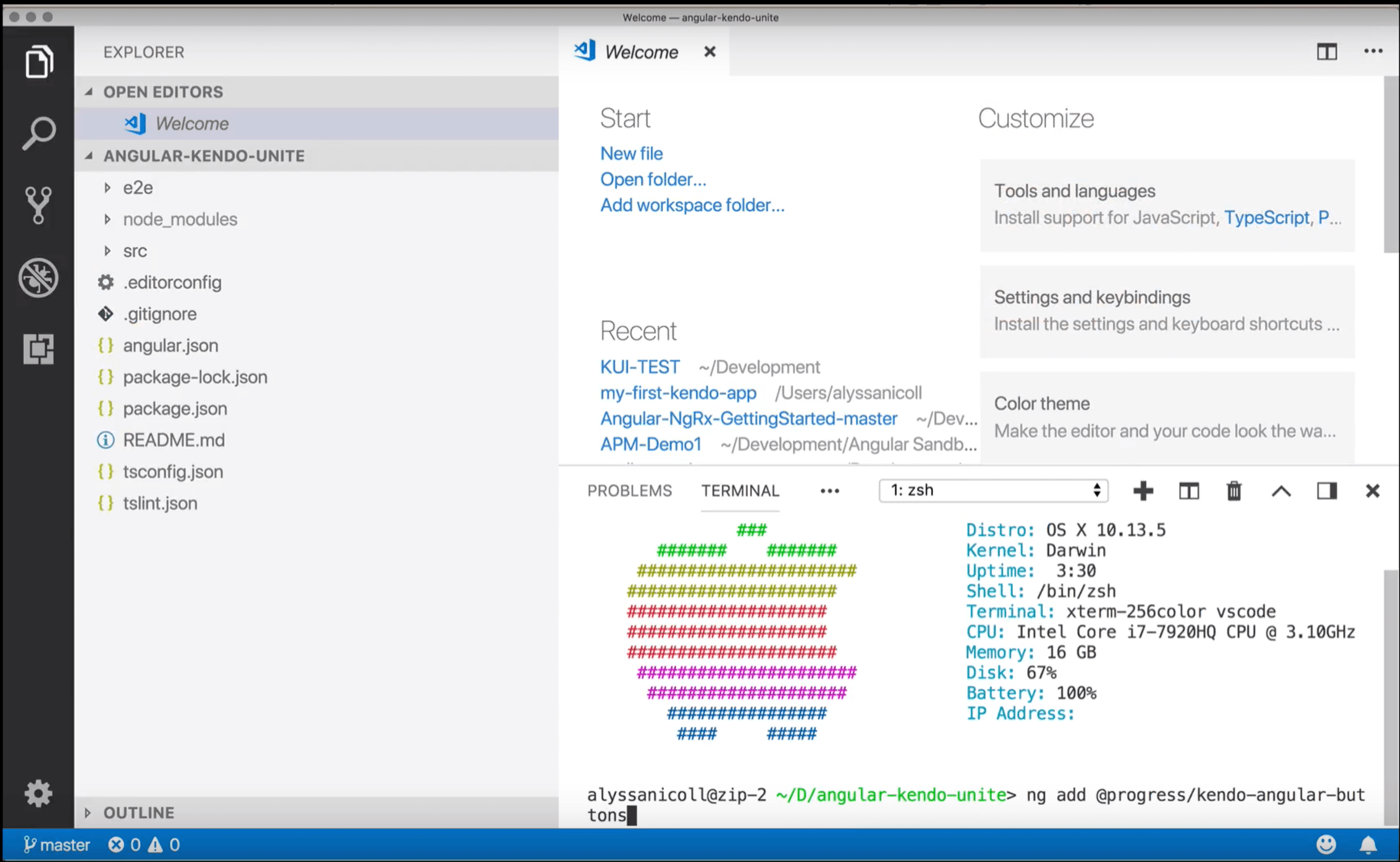
So, inside the terminal in VS Code, let’s use the ng add command to add Kendo UI to our Angular app:

ng add @progress/kendo-angular-buttons

screenshot showing using the terminal inside vscode

Generate a Component

Next we're going to generate a component to put our button, or buttons, in with the ng generate component command from the CLI. And we're going to name it button-control-panel.

ng g c button-control-panel

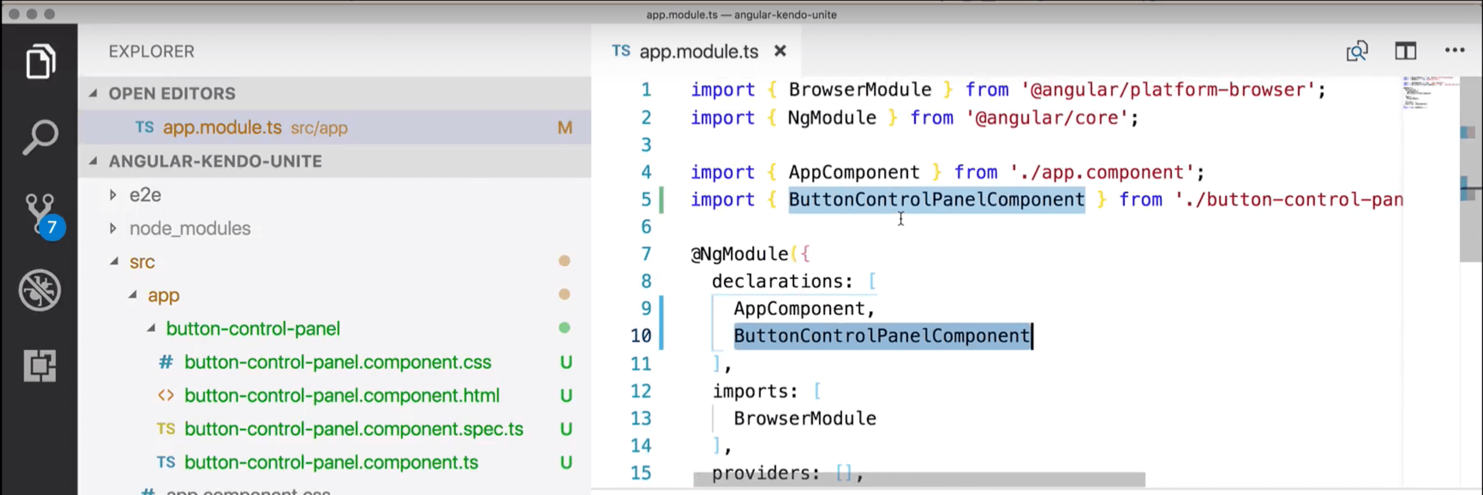
So, now, over here you can see that we've generated the button control panel which has the CSS, HTML, and TypeScript files that we will need for this sort of endeavor. And, you can also tell that the app.module.ts file has been modified because the button control panel has been added to the declarations, as well as imported at the top. Everything that we should expect at this point.

screenshot showing the component files we just generated and the ts file we just modified

Add Button to New Empty Component

So, in order to use our first button, which we just installed, I'm going to create a div wrapper and then a button inside the wrapper. In our button, we want to give it a camel-cased attribute of kendoButton, we're also going to give it a look of, and I know, it sounds super boring, but we're gonna go with default for now. We'll get fancier in a second. Then I'm just going to make it say ‘Default Button’ for us to view what that looks like.

<div class="k-block">
      <button kendoButton [look]="'default'">Default Button</button>
    </div>

Add Button Control Panel Component to View

Now we need to add our button-panel-component to our app.component.html file. (By default the selector for it was prefixed with app, however, for simplicity’s sake, I removed that.)

<button-control-panel></button-control-panel>  

Serving up Our App

With our button control panel ready to go, we are finally able to go ahead and serve up our app, and check out our button. We can serve up our application from the root of the app in terminal with ng serve and open localhost:4000 in the browser of our choice and see the button we have created!

screenshot showing default kendo ui button on page

Additional Appearance Options

We have other appearance options for our buttons (as seen here in our docs) that I will demo as well here:

<div class="k-block">
    <button kendoButton [look]="'default'">Default Button</button>
    <button kendoButton [look]="'outline'">Outline Button</button>
    <button kendoButton [look]="'bare'">Bare Button</button>
    <button kendoButton>Button</button>
  </div>

screenshot showing all the different buttons with their different appearance options

Hopefully you’ve enjoyed this first part in the Angular & Kendo UI Unite series! There are 7 more parts to come and each will build on the last, get a bit more complicated, and use ever more Kendo UI components as we build!

If you're new to Kendo UI for Angular, you can learn more here or just jump into a free 30 day trial today.

How to Create a Booking Form for Your Web App

$
0
0

I hope you've been following along with my series on how to use Kendo UI components, because a fantastic opportunity has just arisen for us to build an important new web app.

The intergalactic space council recently made wormholes available for space travel.

In response to this news, an entire industry was spawned. Many new airlines and hotels were created to provide trips to the outer edges of the universe. Seeking to capitalize on this opportunity, the team at Progress wants to build a travel site so anyone can search for and book trips online. Your mission, if you choose to accept it, is to create a booking form for guests to search for hotels in outer space. The form will need to provide a way for users to search for destinations, enter their check in and check out dates, select the number of guests, and provide a way to submit the form.

Searching Destinations 

For the search feature, we need a text field for users to enter input. We also want to provide suggestions for them when they begin typing. We will use the AutoComplete component for this feature. We could have also used the DropDownList. Since right now we only have a few destinations to choose from, we could display all of the options to the user. But in the future we know we will be adding many more hotels and space shuttle carriers from hundreds of galaxies. Therefore, an AutoComplete is our best option because we expect our users to have some idea of what to enter but we can still force them to select an option from our predefined list.

This is the boilerplate code with the search bar implemented:

<!DOCTYPE html>
<html>
  <head>
    <meta charset="utf-8">
    <title>The Intergalactic</title>
    <link rel="stylesheet"href="https://kendo.cdn.telerik.com/2018.2.620/styles/kendo.common.min.css">
    <link rel="stylesheet"href="https://kendo.cdn.telerik.com/2018.2.620/styles/kendo.bootstrap-v4.min.css">
    <script src="https://code.jquery.com/jquery-1.12.3.min.js"></script>
    <scriptsrc="https://kendo.cdn.telerik.com/2018.2.620/js/kendo.all.min.js"></script>
    <style>
      body {font-family: helvetica;}
      form {display: inline-block; background-color: #ffc107; color: #000; width: 400px;}
      h2 {text-transform: uppercase; font-weight:400;}
      label {margin-bottom: 8px;}
      .k-autocomplete, .k-datepicker {width: 100%;}
      .text-center { text-align: center;}
    </style>
  </head>
  <body>
    <div class="text-center">
      <form class="k-form">
        <h2>The Intergalactic</h2>
        <div class="k-form-field">
          <label>Destination</label>
          <input id="location">
        </div>
      </form>
    </div>
    <script>
      $(document).ready(function(){
        $('#location').kendoAutoComplete({
            placeholder: 'Enter a galaxy, space station, or coordinates',
          dataTextField: 'name',
          dataSource: [
            {id: 0, name: 'Omicron Persei 8'},
            {id: 1, name: 'Niblonia'},
            {id: 2, name: 'Namek'},
            {id: 3, name: 'Planet Vegeta'}
          ],
          template: '<span class="k-icon k-i-marker-pin"></span>#: name #',
        });
      });
    </script>
  </body>
</html>

Booking

Booking

Choosing Dates 

Next, users will need to select their check in and check out dates. We don't want the user to type in the date because we don't trust they will enter it correctly. We could set the format for the input. But our form will be used by people from all over planet Earth. Different cultures will have different expectations for formatting dates and we don't want to force anyone to know one standard. Therefore, we will be using a  DatePicker component. The DatePicker gives us a calendar that users can click on to select the date. This is the markup that will be added to the end of the form:

<div class="k-form-field">
  <label>Check in</label>
  <input id="checkin">
</div>

<div class="k-form-field">
  <label>Check out</label>
  <input id="checkout">
</div> 

The check in DatePicker needs to to be initialized with today’s date. The user also cannot select any date in the past so we will set the minimum date for the check in to today’s date as well. This is the code to initialize our check in date picker:


$('#checkin').kendoDatePicker({
  value: new Date(),
  min: new Date()
});

var checkin = $('#checkin').data('kendoDatePicker');

The default value for the check out will be one day after check in because a user has to book at least a one night stay. And the minimum date for check out is one day after check in. To calculate the check out date, we will use a helper function that returns the value of the check in date picker plus one day. Now we have this code related to the check out date picker:

$('#checkout').kendoDatePicker({
  value: getCheckout(),
  min: getCheckout()
});

var checkout = $('#checkout').data('kendoDatePicker');

function getCheckout() {
  var today = Date.parse(checkin.value());
  return new Date(today + 86400000);
}

Booking

There is one more problem we need to consider. If the user changes the check in date, the check out date does not automatically change. It would be possible to select a check in date that is after the check out date. We need to fix this so that that the minimum value of the check out date picker is at least one day more than the check in date picker. To implement this, we will add a change event handler to our check in date picker to set the value and min value of the check out date picker. This is the updated check in date picker:

$('#checkin').kendoDatePicker({
  value: new Date(),
  min: new Date(),
  change: function() {
    var checkinTime = Date.parse(checkin.value());
    var checkoutTime = Date.parse(checkout.value());
    if (checkinTime > checkoutTime) {
      var newCheckoutTime = new Date(checkinTime + 86400000);
      checkout.value(newCheckoutTime);
      checkout.min(newCheckoutTime);
    }
  }
}); 

Selecting Number of Guests 

To select the number of guests we will use the DropDownList component. Users will only be able to choose a number from one to five. This is just enough options that we can put them in a drop down. A ComboBox is not necessary because we don’t want the user to enter values other than the ones we’ve defined. For that same reason, a NumericTextBox also doesn’t fit our needs. Other ways we can use a drop down list is to let users select the number of rooms or nights they will be staying. This is the markup for the guest selection drop down list:

<div class="k-form-field">
  <label>Guests</label>
  <select id="guests"></select>
</div>  

We will keep this component simple and only customize the look of the selected item. This requires us to set the valueTemplate parameter of the component. We could also customize the template for each item in the dropdown and a header and footer template. This is the initialization code for our drop down list:

$('#guests').kendoDropDownList({
  dataSource: [1,2,3,4],
  valueTemplate: 'Adults - #: data #'
});


Booking

Putting it All Together 

Finally, we will need a button to submit our form data.

<div class="k-form-field">
  <button id="btn-submit" class="k-primary">Reach for the stars</button>
</div> 

$('#btn-submit').kendoButton({
  click: function(e) {
    e.preventDefault();
  }
}); 

This is the final project:

Booking

<!DOCTYPE html>

<html>

  <head>

    <meta charset="utf-8">

    <title>The Intergalactic</title>

    <link rel="stylesheet" href="https://kendo.cdn.telerik.com/2018.2.620/styles/kendo.common.min.css">
    <link rel="stylesheet" href="https://kendo.cdn.telerik.com/2018.2.620/styles/kendo.bootstrap-v4.min.css">
    <script src="https://code.jquery.com/jquery-1.12.3.min.js"></script>
    <script src="https://kendo.cdn.telerik.com/2018.2.620/js/kendo.all.min.js"></script>

    <style>
      body {font-family: helvetica;}
      form {display: inline-block; background-color: #ffc107; color: #000; width: 400px;}
      h2 {text-transform: uppercase; font-weight:400;}
      label {margin-bottom: 8px;}
      .k-autocomplete, .k-datepicker {width: 100%;}
      .text-center { text-align: center;}
    </style>

  </head>

  <body>

    <div class="text-center">

      <form class="k-form">

        <h2>The Intergalactic</h2>

        <div class="k-form-field">
          <label>Destination</label>
          <input id="location">
        </div>

        <div class="k-form-field">
          <label>Check in</label>
          <input id="checkin">
        </div>

        <div class="k-form-field">
         <label>Check out</label>
         <input id="checkout">
        </div>

        <div class="k-form-field">
          <label>Guests</label>
          <select id="guests"></select>
        </div>

        <div class="k-form-field">
          <button id="btn-submit" class="k-primary">Reach for the stars</button>
        </div>

      </form>

    </div>

    <script>

      $(document).ready(function(){

        $('#btn-submit').kendoButton({
            click: function(e) {
            e.preventDefault();
          }
        });

        $('#guests').kendoDropDownList({
          dataSource: [1,2,3,4],
          valueTemplate: 'Adults - #: data #'
        });

        $('#location').kendoAutoComplete({
            placeholder: 'Enter a galaxy, space station, or coordinates',
          dataTextField: 'name',
          dataSource: [
            {id: 0, name: 'Omicron Persei 8'},
            {id: 1, name: 'Niblonia'},
            {id: 2, name: 'Namek'},
            {id: 3, name: 'Planet Vegeta'}
          ],

          template: '<span class="k-icon k-i-marker-pin"></span>#: name #',
        });

        $('#checkin').kendoDatePicker({
            value: new Date(),
          min: new Date(),
          change: function() {
            var checkinTime = Date.parse(checkin.value());
            var checkoutTime = Date.parse(checkout.value());
            if (checkinTime > checkoutTime) {
                        var newCheckoutTime = new Date(checkinTime + 86400000);
            checkout.value(newCheckoutTime);
            checkout.min(newCheckoutTime);
            }
          }
        });

        var checkin = $('#checkin').data('kendoDatePicker');

        $('#checkout').kendoDatePicker({
            value: getCheckout(),
          min: getCheckout()
        });

        var checkout = $('#checkout').data('kendoDatePicker');

        function getCheckout() {
          var today = Date.parse(checkin.value());
          return new Date(today + 86400000);
        }

      });

    </script>

  </body>

</html>

Summary

We used an AutoComplete to search for destinations, a DatePicker to choose the dates, a DropDownList to select the number of nights, and a Button component to submit our form. We are well on our way to publishing our intergalactic travel site.

Still, there is more we can do if we really want to impress the boss. We could display the number of nights selected on the form. We could even add a ComboBox for users to enter the number of nights and update the check out date based on the selected value. Not to mention, we need to do something with the form once the button is clicked. The button’s click handler should get the values of each field and send the data in a request. The next step would be to create a page displaying the results. But that task will be saved for another day.

Try it Out for Yourself

Want to start taking advantage of the Kendo UI components to build a booking form, or other feature for your web app? Check out the 70+ ready-made Kendo UI components, like Grid or Scheduler. You can begin a free trial of Kendo UI today and start developing your apps faster.

Start My Kendo UI Trial

Angular, React, and Vue Versions

Looking for UI component to support specific frameworks? Check out Kendo UI for Angular, Kendo UI for React, or Kendo UI for Vue.

Resources

Offline-First Vue Apps with Hoodie & Workbox

$
0
0

Learn how to build an Offline-First application in Vue with Hoodie and Workbox. You will learn about Offline-First, Service Workers, and a few caching strategies.

Offline-First is an approach to software development where a lack of network connection is not treated as an error. You start by developing the application to work in areas with no internet connection. Then, as users enter areas with network connection or as their connection speed improves, the application is progressively enhanced to make more functionality available in the app. For this tutorial, we want to be able to add and delete data when users are either offline or online. This is where Hoodie will help out.

Hoodie is a JavaScript Backend for Offline-First web applications. It provides a frontend API to allow you to store and manage data and add user authentication. It stores data locally on the device and, when there’s a network connection, syncs data to the server and resolves any data conflicts. It uses PouchDB on the client, and CouchDB and hapi for the server. We’ll use it both for user authentication as well as storing the shopping items.

We will build the example application with Vue.js and a Service Worker, which will be generated with workbox. Here’s a preview of what we’ll be building:

shopping list app

Development Setup

To set up your environment, clone the files on https://github.com/pmbanugo/shopping-list-vue-starter. Clone and install the project dependencies by running the following commands in your command-line:

git clone https://github.com/pmbanugo/shopping-list-vue-starter.git
cd shopping-list-starter-vue/
npm install

The dependencies installed are Hoodie and Workbox CLI. The package.json file should look similar to this:

{
  "name": "shopping-list",
  "version": "1.0.0",
  "description": "",
  "scripts": {
    "test": "echo \"Error: no test specified\" && exit 1",
    "start": "hoodie"
  },
  "license": "ISC",
  "dependencies": {
    "hoodie": "28.2.2"
  },
  "devDependencies": {
    "workbox-cli": "3.6.2"
  }
}

Running npm start starts the Hoodie backend and tells you the URL to access it. By default that is http://127.0.0.1:8080. The files contained in the public directory are the pages and CSS files needed to render a nice-looking UI. All assets in the public folder, like images, CSS files, or JavaScript files, will be served by the Hoodie Backend on http://127.0.0.1:8080/<path-to-your-file.ext>.

Adding Shared Components

We’re going to have two pages – home and history.

home page

history page

These pages will share the same navigation header and authentication components. For this reason, add a file shared.js in the js folder with the following content:

Vue.component("register-dialog", {
  data: function() {
    return {
      username: "",
      password: ""
    };
  },
  props: ["toggleLoggedIn"],
  template: `<dialog id="register-dialog" class="mdl-dialog">
      <h4 class="mdl-dialog__title">Register</h4>
      <div class="mdl-dialog__content">
        <div class="mdl-grid center-items">

          <div class="mdl-textfield mdl-js-textfield">
            <input v-model="username" class="mdl-textfield__input" type="text" id="register-username">
            <label class="mdl-textfield__label" for="register-username">Username</label>
          </div>
        </div>
        <div class="mdl-grid center-items">

          <div class="mdl-textfield mdl-js-textfield">
            <input v-model="password" class="mdl-textfield__input" type="password" id="register-password">
            <label class="mdl-textfield__label" for="register-password">Password</label>
          </div>
        </div>
        <div class="mdl-grid center-items">

          <div class="mdl-textfield mdl-js-textfield">
            <span id="register-error"></span>
          </div>
        </div>
      </div>
      <div class="mdl-dialog__actions">
        <button @click="closeRegister" type="button" class="mdl-button close">Cancel</button>
        <button @click="register" type="button" class="mdl-button">Register</button>
      </div>
    </dialog>`,
  methods: {
    closeRegister: function() {
      const registerDialog = document.querySelector("#register-dialog");
      dialogPolyfill.registerDialog(registerDialog);
      registerDialog.close();
    },
    register: function() {
      let options = { username: this.username, password: this.password };

      hoodie.account
        .signUp(options)
        .then(account => {
          return hoodie.account.signIn(options);
        })
        .then(account => {
          this.toggleLoggedIn();
          this.closeRegister();
          return account;
       })
        .catch(error => {
          console.log(error);
          document.querySelector("#register-error").innerHTML =
            "Error occurred on Registration";
        });
    }
  }
});

The code above registers a register-dialog component. We have a register() function, which calls hoodie.account.signUp() to register a new user. Hoodie’s account API lets you do user authentication, such as registering new users and signing them in and out. The hoodie object is available to use because we will add a script reference to Hoodie library later on our pages.

Add the following code to the same file for a login and navigation component:

Vue.component("navigation", {
  props: ["isLoggedIn", "toggleLoggedIn"],
  template: `<div>
            <header class="mdl-layout__header">
        <div class="mdl-layout__header-row">
          <!-- Title -->
          <span class="mdl-layout-title">Shopping List</span>
          <!-- Add spacer, to align navigation to the right -->
          <div class="mdl-layout-spacer"></div>
          <!-- Navigation. We hide it in small screens. -->
          <nav class="mdl-navigation mdl-layout--large-screen-only">
            <a class="mdl-navigation__link" href="index.html">Home</a>
            <a class="mdl-navigation__link" href="history.html">History</a>
            <a v-show="!isLoggedIn" @click="showLogin" style="cursor: pointer" class="mdl-navigation__link login">Login</a>
            <a v-show="!isLoggedIn" @click="showRegister" style="cursor: pointer" class="mdl-navigation__link register">Register</a>
            <a v-show="isLoggedIn" @click="logout" style="cursor: pointer" class="mdl-navigation__link logout">Logout</a>
          </nav>
        </div>
      </header>
      <div class="mdl-layout__drawer">
        <span class="mdl-layout-title">Shopping List</span>
        <nav class="mdl-navigation">
          <a class="mdl-navigation__link" href="index.html">Home</a>
          <a class="mdl-navigation__link" href="history.html">History</a>
          <a v-show="!isLoggedIn" @click="showLogin" style="cursor: pointer" class="mdl-navigation__link login">Login</a>
          <a v-show="!isLoggedIn" @click="showRegister" style="cursor: pointer" class="mdl-navigation__link register">Register</a>
          <a v-show="isLoggedIn" @click="logout" style="cursor: pointer" class="mdl-navigation__link logout">Logout</a>
        </nav>
      </div>
            </div>`,

  methods: {
    showLogin: function() {
      const loginDialog = document.querySelector("#login-dialog");
      dialogPolyfill.registerDialog(loginDialog);
      loginDialog.showModal();
    },
    showRegister: function() {
      const registerDialog = document.querySelector("#register-dialog");
      dialogPolyfill.registerDialog(registerDialog);
      registerDialog.showModal();
    },
    logout: function() {
      hoodie.account
        .signOut()
        .then(() => {
          this.toggleLoggedIn();
          window.location.reload();
        })
        .catch(error => {
          alert("Could not logout");
        });
    }
  }
});

Vue.component("login-dialog", {
  data: function() {
    return {
      username: "",
      password: ""
    };
  },
  props: ["toggleLoggedIn"],
  template: `<dialog id="login-dialog" class="mdl-dialog">
      <h4 class="mdl-dialog__title">Login</h4>
      <div class="mdl-dialog__content">
        <div class="mdl-grid center-items">
          <!-- Simple Textfield -->
          <div class="mdl-textfield mdl-js-textfield">
            <input v-model="username" class="mdl-textfield__input" type="text" id="login-username">
            <label class="mdl-textfield__label" for="login-username">Username</label>
          </div>
        </div>
        <div class="mdl-grid center-items">
          <!-- Simple Textfield -->
          <div class="mdl-textfield mdl-js-textfield">
            <input v-model="password" class="mdl-textfield__input" type="password" id="login-password">
            <label class="mdl-textfield__label" for="login-password">Password</label>
          </div>
        </div>
        <div class="mdl-grid center-items">
          <!-- Simple Textfield -->
          <div class="mdl-textfield mdl-js-textfield">
            <span id="login-error"></span>
          </div>
        </div>
      </div>
      <div class="mdl-dialog__actions">
        <button @click="closeLogin" type="button" class="mdl-button close">Cancel</button>
        <button @click="login" type="button" class="mdl-button">Login</button>
      </div>
    </dialog>`,
  methods: {
    closeLogin: function() {
      const loginDialog = document.querySelector("#login-dialog");
      dialogPolyfill.registerDialog(loginDialog);
      loginDialog.close();
    },
    login: function(event) {
      hoodie.account
        .signIn({
          username: this.username,
          password: this.password
        })
        .then(() => {
          this.toggleLoggedIn();
          this.closeLogin();
        })
        .catch(error => {
          console.log(error);
          document.querySelector("#login-error").innerHTML = "Error logging in";
        });
    }
  }
});

Above we have the login-dialog component. It handles login and calls hoodie.account.signIn() to log users in. We also have the navigation component, which creates a navigation header with buttons to trigger the register and login components, and a logout button. The logout button calls the logout() function which handles logging users out by calling hoodie.account.signOut(). With these components in place, we now need to create the actual pages.

Adding, Removing, and Saving Shopping List

The application allows users to add shopping items to their shopping list. We will add a page that allows users to add and remove items, then save the list. Add a file named index.html with the following content:

<!DOCTYPE html>
<html lang="en">

<head>
  <meta charset="utf-8">
  <meta http-equiv="x-ua-compatible" content="ie=edge">
  <meta name="viewport" content="width=device-width, initial-scale=1.0">
  <meta name="description" content="easily make a list of your shopping items and track your shopping expense">
  <title>Shopping List</title>

  <link rel="stylesheet" href="/resources/mdl/material-icons.css">
  <link rel="stylesheet" href="/resources/mdl/material.indigo-pink.min.css" />
  <link rel="stylesheet" href="/css/style.css" />
  <script src="/resources/mdl/material.min.js"></script>
  <script src="/resources/dialog-polyfill/dialog-polyfill.js"></script>
  <link rel="stylesheet" href="/resources/dialog-polyfill/dialog-polyfill.css" />
</head>

<body>
  <div id="app">
    <div class="mdl-layout mdl-js-layout mdl-layout--fixed-header">

      <navigation v-bind:is-logged-in="isLoggedIn" v-bind:toggle-logged-in="toggleLoggedIn"></navigation>
      <main class="mdl-layout__content">
        <div class="page-content">
          <div class="center">
            <h2>List</h2>
          </div>

          <div>
            <form v-on:submit.prevent="onSubmit">
              <div class="mdl-grid center-items">
                <div class="mdl-textfield mdl-js-textfield mdl-textfield--floating-label">
                  <input class="mdl-textfield__input" type="text" id="new-item-name" v-model="name">
                  <label class="mdl-textfield__label" for="new-item-name">Item Name</label>
                </div>
                <div class="mdl-textfield mdl-js-textfield mdl-textfield--floating-label">
                  <input class="mdl-textfield__input" type="number" id="new-item-cost" v-model="cost">
                  <label class="mdl-textfield__label" for="new-item-cost">Item Cost</label>
                </div>
                <div class="mdl-textfield mdl-js-textfield mdl-textfield--floating-label">
                  <input class="mdl-textfield__input" type="number" id="new-item-quantity" v-model="quantity">
                  <label class="mdl-textfield__label" for="new-item-quantity">Quantity</label>
                </div>
            </div>

            <div class="mdl-grid center-items">
                <button id="add-item" class="mdl-button mdl-js-button mdl-button--raised mdl-button--colored">
                  Add Item
                </button>
            </div>
            </form>
          </div>

          <div class="mdl-grid center-items">
            <table id="item-table" class="mdl-data-table mdl-js-data-table mdl-shadow--2dp">
            <thead>
                <tr>
                  <th class="mdl-data-table__cell--non-numeric">Item Name</th>
                  <th class="mdl-data-table__cell--non-numeric">Cost</th>
                  <th class="mdl-data-table__cell--non-numeric">Quantity</th>
                  <th class="mdl-data-table__cell">Sub-total</th>
                  <th class="mdl-data-table__cell--non-numeric">
                    <button class="mdl-button mdl-js-button mdl-button--icon">
                      <i class="material-icons">delete</i>
                    </button>
                  </th>
                </tr>

            </thead>
            <tbody>
                <tr v-for="item in items" :key="item._id">
                  <td class="mdl-data-table__cell--non-numeric">{{ item.name}}</td>
                  <td class="mdl-data-table__cell--non-numeric">{{ item.cost}}</td>
                 <td class="mdl-data-table__cell--non-numeric">{{ item.quantity}}</td>
                  <td class="mdl-data-table__cell">{{ item.subTotal}}</td>
                  <td class="mdl-data-table__cell--non-numeric">
                    <button @click="deleteRow(item._id)" class="mdl-button mdl-js-button mdl-button--icon mdl-button--colored">
                      <i class="material-icons">remove</i>
                    </button>
                  </td>
                </tr>
            </tbody>
            </table>
          </div>

          <div class="mdl-grid center-items">
            <div class="mdl-textfield mdl-js-textfield mdl-textfield--floating-label">
            <h4>Total Cost: {{ total }}</h4>
            </div>

          </div>

          <div class="mdl-grid center-items">
            <button @click="saveList" class="mdl-button mdl-js-button mdl-button--raised mdl-button--colored">
            Save List
            </button>
          </div>

          <div class="mdl-grid center-items">
            <div id="toast" class="mdl-js-snackbar mdl-snackbar">
            <div class="mdl-snackbar__text"></div>
            <button class="mdl-snackbar__action" type="button"></button>
            </div>
          </div>

        </div>
      </main>
    </div>

    <login-dialog v-bind:toggle-logged-in="toggleLoggedIn"></login-dialog>
    <register-dialog v-bind:toggle-logged-in="toggleLoggedIn">
    </register-dialog>

  </div>

  <script src="/hoodie/client.js"></script>
  <script src="resources/vue@2.5.16.js"></script>
  <script src="js/shared.js"></script>
  <script src="js/index.js"></script>
</body>

</html>

This file contains markup for adding, removing, and saving a shopping list. At the bottom, we added a reference to Hoodie client, Vue.js, shared.js file we added earlier, and index.js we will add soon. The Hoodie client will be served by the Hoodie server once the app starts. The actual file can be found in .hoodie/client.jsin the root project directory.

Next, we add the file index.js with the content of the file as:

const vm = new Vue({
  el: "#app",
  data: {
    name: "",
    cost: "",
    quantity: "",
    items: [],
    isLoggedIn: false
  },
  computed: {
    total: function() {
      return this.items.reduce(
        (accumulator, currentValue) => accumulator + currentValue.subTotal,
        0
      );
    }
  },
  methods: {
    toggleLoggedIn: function() {
      this.isLoggedIn = !this.isLoggedIn;
    },
    onSubmit: function(event) {
      if (this.name && this.cost && this.quantity) {
        hoodie.store.withIdPrefix("item").add({
          name: this.name,
          cost: this.cost,
          quantity: this.quantity,
          subTotal: this.cost * this.quantity
        });

        this.name = "";
        this.cost = "";
        this.quantity = "";
      } else {
        const snackbarContainer = document.querySelector("#toast");
        snackbarContainer.MaterialSnackbar.showSnackbar({
          message: "All fields are required"
        });
      }
    }
  },
  created() {
    hoodie.store.withIdPrefix("item").on("add", item => vm.items.push(item));

    //retrieve items on the current list
    hoodie.store
      .withIdPrefix("item")
      .findAll()
      .then(items => (vm.items = items));

    hoodie.account.get("session").then(function(session) {
      if (!session) {
        // user is singed out
        vm.isLoggedIn = false;
      } else if (session.invalid) {
        vm.isLoggedIn = false;
      } else {
        // user is signed in
        vm.isLoggedIn = true;
      }
    });
  }
});

In the code above, we have initialized a Vue instance. It has data values to hold state values, a computed property to get the total cost on the list, the created lifecycle hook, and some functions in the methodsproperty. The onSubmit function saves the item to Hoodie by calling hoodie.store.withIdPrefix("item").add(..). This is the Hoodie store API, which provides means to store and retrieve data for each individual user. You can call hoodie.store.add() to store data, but we’ve used hoodie.store.withIdPrefix("item") as a way to store items on a separate container, and later we’ll use the same approach to store the saved shopping list data on a separate container. When Hoodie stores this data, it’ll trigger an add event, and if the user is logged in to other devices, it’ll synchronize and trigger the same event. This event is handled on line 41. Lines 44 to 47 load the data when the page loads, while lines 49 to 58 check if the user is logged in.

In order to remove saved items or save the items as a list, we’ll add functions to remove an item and another to save items as a list. Add the following code as an addition to the existing methods option of the Vue instance.

//line 38

    deleteRow: function(itemId) {
      hoodie.store.withIdPrefix("item").remove(itemId);
    },

    saveList: function() {
      hoodie.store
        .withIdPrefix("item")
        .findAll()
        .then(items => {
          //store the list
          hoodie.store.withIdPrefix("list").add({
            cost: this.total,
            items: items
          });

          //delete the items
          hoodie.store
            .withIdPrefix("item")
            .remove(items)
            .then(() => {
            //clear the table
            this.items = [];

            //notify the user
            var snackbarContainer = document.querySelector("#toast");
            snackbarContainer.MaterialSnackbar.showSnackbar({
                message: "List saved successfully"
            });
            })
            .catch(function(error) {
            //notify the user
            var snackbarContainer = document.querySelector("#toast");
            snackbarContainer.MaterialSnackbar.showSnackbar({
                message: error.message
            });
            });
        });
    }

The deleteRow function removes an item, while saveList saves the items as a list. On the created lifecycle hook method, add the following code to it:

hoodie.store
  .withIdPrefix("item")
  .on(
    "remove",
    deletedItem =>
      (vm.items = vm.items.filter(item => item._id !== deletedItem._id))
  );

This listens for the remove event and updates the state accordingly.

Let’s see what we’ve got so far! Open the command line and run npm start to start the Hoodie server. Open your browser to localhost:8080. Try adding and removing items. Also, register and log in with a user to see data synchronize across browsers/devices as you add and remove items.

hoodie-vue.gif

It also works offline! To test this:

  • Log in with the same user on different browsers
  • Stop the hoodie server (open the command line window where you ran npm start and press Ctrl + C to stop the running process)
  • Open the browsers and add or remove items
  • Start the Hoodie server and watch the data update across browsers

That is the benefit of Offline-First. The applications work even when the server is down or the user lacks connectivity.

Viewing Shopping History

From the previous section, we have code to add and remove items and save items as a list. These saved lists we want to view as the shopping history, with a list of each shopping cost and date. Add a new file history.html in the public folder with the content below:

<!DOCTYPE html>
<html lang="en">

<head>
  <meta charset="utf-8">
  <meta http-equiv="x-ua-compatible" content="ie=edge">
  <meta name="viewport" content="width=device-width, initial-scale=1.0">
  <meta name="description" content="easily make a list of your shopping items and track your shopping expense">
  <title>Shopping List</title>

  <link rel="stylesheet" href="/resources/mdl/material-icons.css">
  <link rel="stylesheet" href="/resources/mdl/material.indigo-pink.min.css" />
  <link rel="stylesheet" href="/css/style.css" />
  <script src="/resources/mdl/material.min.js"></script>
  <script src="/resources/dialog-polyfill/dialog-polyfill.js"></script>
  <link rel="stylesheet" href="/resources/dialog-polyfill/dialog-polyfill.css" />
</head>

<body>
  <div id="app">
    <div class="mdl-layout mdl-js-layout mdl-layout--fixed-header">
      <navigation v-bind:is-logged-in="isLoggedIn" v-bind:toggle-logged-in="toggleLoggedIn"></navigation>
      <main class="mdl-layout__content">
        <div class="page-content">
          <div class="center">
            <h2>History</h2>
          </div>

          <div class="mdl-grid center-items">
            <ul id="list-history" class="demo-list-icon mdl-list">
            <li v-for="item in list" :key="item._id" class="mdl-list__item">
                <span class="mdl-list__item-primary-content">
                  <span class="pad-right">{{ new Date(item.hoodie.createdAt).toDateString() }}</span>
                  <span>
                    <span class="cost-label">Cost: </span> ${{ item.cost}}</span>
                </span>
            </li>
            </ul>
          </div>

          <div class="mdl-grid center-items">
            <div id="toast" class="mdl-js-snackbar mdl-snackbar">
            <div class="mdl-snackbar__text"></div>
            <button class="mdl-snackbar__action" type="button"></button>
            </div>
          </div>

        </div>
      </main>
    </div>

    <login-dialog v-bind:toggle-logged-in="toggleLoggedIn"></login-dialog>
    <register-dialog v-bind:toggle-logged-in="toggleLoggedIn"> </register-dialog>
  </div>

  <script src="/hoodie/client.js"></script>
  <script src="resources/vue@2.5.16.js"></script>
  <script src="js/shared.js"></script>
  <script src="js/history.js"></script>
</body>

</html>

In the code above, lines 30 to 38 loop through the saved list and display the appropriate content. Add a new file history.js in the js folder.

const vm = new Vue({
  el: "#app",
  data: {
    list: [],
    isLoggedIn: false
  },
  methods: {
    toggleLoggedIn: function() {
      this.isLoggedIn = !this.isLoggedIn;
    }
  },
  created() {
    hoodie.store
      .withIdPrefix("list")
      .findAll()
      .then(savedList => (vm.list = savedList));

    hoodie.account.get("session").then(function(session) {
      if (!session) {
        // user is singed out
        vm.isLoggedIn = false;
      } else if (session.invalid) {
        vm.isLoggedIn = false;
      } else {
        // user is signed in
        vm.isLoggedIn = true;
      }
    });
  }
});

The code above gets the whole saved list from Hoodie store and sets the list state with the result. Open your browser and navigate to the history page.

history page.png

We now have the complete application storing and retrieving data even in offline scenarios! But, when we open the app or navigate to a different page while offline, the page will not load. Wouldn’t it be nice to also load pages offline? We’ll make this possible using Service Workers.

Adding Service Workers

Service Worker is a programmable network proxy that runs on a separate browser thread and allows you to intercept network requests and process them as you so choose. You can intercept and cache a response from the server, and, the next time the app makes a request for that resource, you can send the cached version. It runs regardless of whether the page is currently open or not.

We’re going to add a Service Worker script which will intercept all network requests and respond with a cached version if the resource refers to our page and its related assets. This resource will be cached using the Cache API.

The Cache API, which is part of the Service Worker specification, enables Service Workers to cache network requests so that they can provide appropriate responses even while offline.

We will generate a Service Worker script using Workbox. Workbox is a set of Service Worker libraries that makes building progressive web apps easy. We will use the Workbox CLI to generate this script so we don’t have to write it from scratch. We installed the Workbox CLI when we installed the dependencies from the starter project. We will need a configuration file to instruct the CLI what to include in the script it’ll generate. Add a new file workbox-config.js in the root directory of the project with this content:

module.exports = {
  globDirectory: "public/",
  globPatterns: ["**/*.{css,ico,html,png,js,json,woff2}"],
  swDest: "./public/sw.js",
  skipWaiting: true,
  clientsClaim: true,
  templatedUrls: {
    "/hoodie/client.js": ".hoodie/cleint.js"
  }
};

The globDirectory tells it which directory it should pick files from and globPatterns dictates the type of files to cache. The swDest option tells it where to store the generated script; templatedUrls tells it where to pick the Hoodie script to cache; then skipWaiting and clientsClaim are set to true because we want to be able to publish a new Service Worker and have it update and control a web page as soon as possible, skipping the default Service Worker lifecycle. To learn more about these configuration options, check out the docs.

Open the command line and run workbox generateSW. This should generate a file sw.js in public folder. Open shared.js and add the following code at the top of the file

if ("serviceWorker" in navigator) {
  navigator.serviceWorker
    .register("sw.js")
    .then(console.log)
    .catch(console.error);
}

This checks if the browser supports Service Workers. If it does, it registers the file as the Service Worker script, allowing it to take control of the page and to be able to intercept network requests. Start the Hoodie server and open the application. It should register the Service Worker and show something like this in the console:

Screenshot 2018-10-15 at 10.27.42.png

When you navigate to another page, it should load files from the Cache.

Screenshot 2018-10-15 at 10.28.25.png

That’s A Wrap!

We’ve built an Offline-First Vue application. We built it with Hoodie and Workbox. We used the authentication API to manage authentication for the app, and the store API to store and retrieve data. We saw how it handled the data both offline and online. With Workbox, we easily generated a Service Worker script to precache the application’s assets so it can load offline. You can find the completed application source on GitHub.


For more Vue info: Want to learn about creating great user interfaces with Vue? Check out Kendo UI for Vue with everything from grids and charts to schedulers and pickers, and don't forget to check out this other great Vue content:

Machine Learning With ML.NET

$
0
0

This time on the Eat Sleep Code podcast, we talk to Microsoft's John Alexander about exciting new Machine Learning libraries for .NET.

On this episode of Eat Sleep Code, Sr. Content Developer at Microsoft John Alexander talks about ML.NET, a set of new Machine Learning libraries for .NET. John explains the purpose of ML.NET and how it enables .NET developers to incorporate machine learning into their .NET (C# & F#) applications. ML.NET basics, extensiblity, and road maps are all discussed.

You can listen to the entire show and catch past episodes on SoundCloud. Or just click below.

John Alexander

John Alexander, Sr. Content Developer at Microsoft
John Alexander is a client-centric, UX-focused software architecture and development thought leader, and noted Microsoft Regional Director, consultant, trainer, published author and speaker.

Show Notes

Transcript

Coming soon...

All You Could Ever Want to Know about the Kendo UI Button

$
0
0

How can you create and design a beautiful custom button in Kendo UI? Learn how you can easily build the perfect button for your web apps.

Hello and welcome back to the Angular and Kendo UI Unite Video Series. If you are new to the series, I suggest checking out the first post or watching the video series these posts are based on. This is post number two, and we're going to talk all about buttons.

If you want to watch the video, you can dive in right here:

In the first post we were able to get our Angular app created, and we were able to install Kendo UI and start using our very first component, which was the button. However, we didn't have time to cover everything there is because there's so many, many more options. This article will show the black belt ways of the button, so let’s get started!

Find the code to follow along, here on my Github!

So here we have our app with the buttons we built last time in the button control panel component. We have a k-block (a Kendo block) and inside that we've got our list of buttons with different appearances:

<div class="k-block">
    <button kendoButton [look]="'default'">Default Button</button>
    <button kendoButton [look]="'outline'">Outline Button</button>
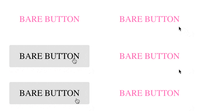
    <button kendoButton [look]="'bare'">Bare Button</button>
    <button kendoButton>Button</button>
  </div>

screenshot showing all the different buttons with their different appearance options

Next I want to show that you can actually add a couple of other things to your Kendo UI Button. Right now we are controlling the appearance with this [look] property binding, but you can actually do multiple things like disable, set a button as a primary button, make a button togglable or give it an icon. So let's get started and I'll show you those things! It’s good to know though that all of them are using property binding, which is with the square brackets. If you need a Angular binding refresher, check out this post I wrote!

Property Binding to Customize Buttons

Disabled Button [disabled]="true"
Primary Button[primary]="true"
Toggleable Button[toggleable]="true"
Icon Button[icon]=" 'check' "


As you would probably anticipate, to disable a button, we will go ahead and set disabled equal to true: [disabled]="true".

gif showing what the disabled button looks like and behaves like when clicked

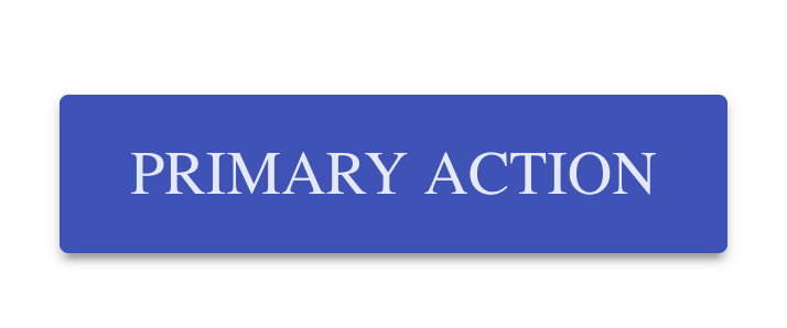
Now that final button in the list is disabled. Pretty easy peasy. Let's go ahead and create another button, but this one will be a primary button. I’m giving it the text of Primary Action, but this would really be something like the Submit button on the bottom of a form or a Checkout button on a shopping cart. The primary action button should be the primary goal of the page.

<button kendoButton [primary]="true">Primary Action</button>
gif showing what the primary kendo ui button looks like

Next up, toggleable. We are going to make the next button we create toggle, simply by setting [toggleable]="true".

<button kendoButton [toggleable]="true">Toggleable</button>
gif showing what the toggleable kendo ui button looks like

WARNING: If you are using Kendo UI Buttons older than 4.1.3, you will need to spell the toggleable attribute togglable.

So the last and final feature we're going to talk about right now is icons. You can actually set icon equal to a string with the icon name. Let's look at calendar. That one is pretty scandalous. :D

<button kendoButton [icon]="'calendar'" [toggleable]="true">Icon Button</button>

kendo ui icon button with calendar icon on the left and text on the right

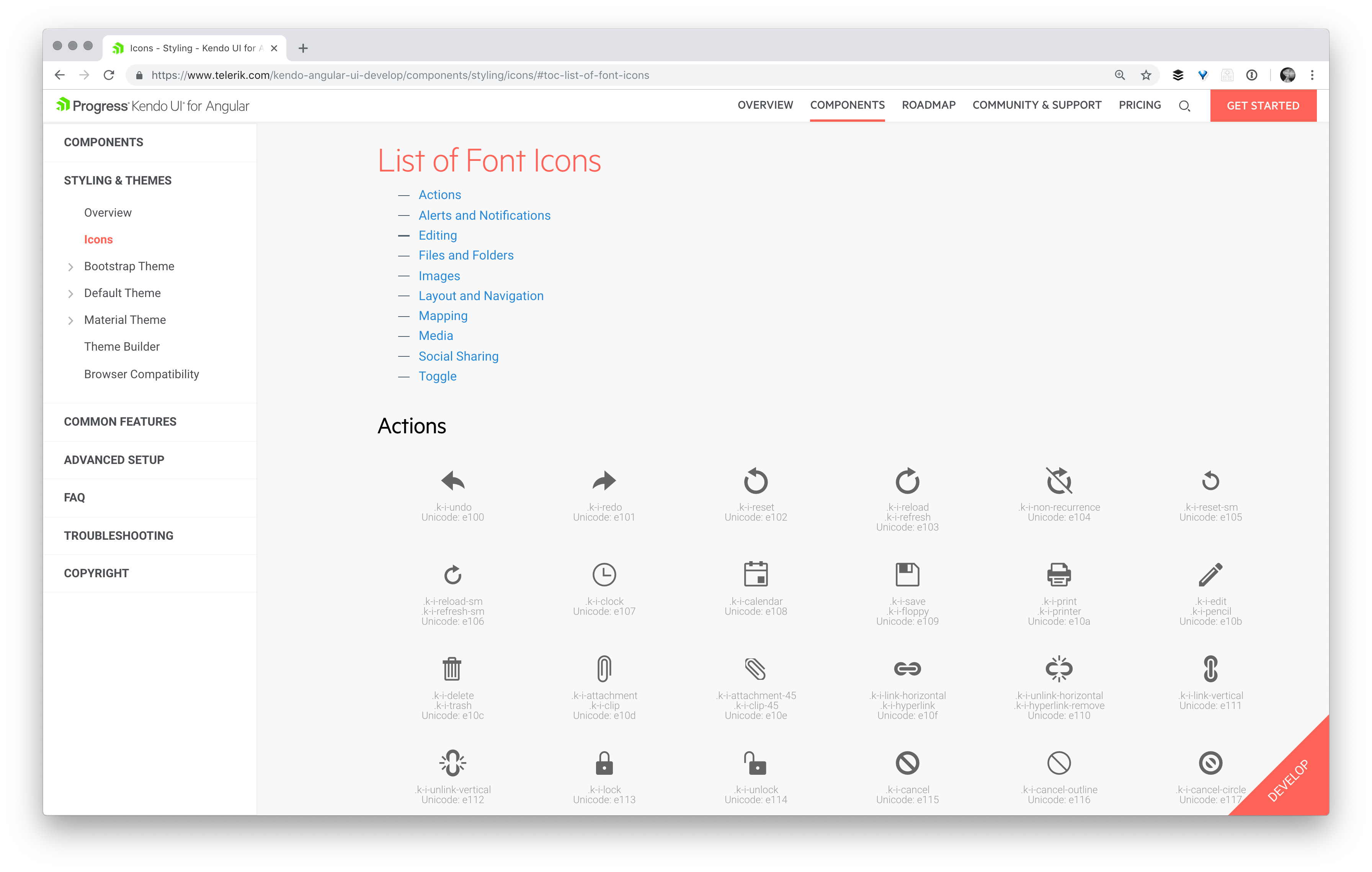
You can see we've got the icon button, super sexy, with the calendar icon. And you might be pondering to yourself, how do I know what other icons I have available to me? Well let’s explore the docs together to find more about icons. From our button icons docs you can navigate here to a full list of the built in icons we provide!

screenshot of kendo ui docs showing a list of icons available

So that is how we know which icons are available to us.

In this next section, I’m going to comment out some of our earlier buttons so we can play around more with our beautiful icon buttons.

Button Group

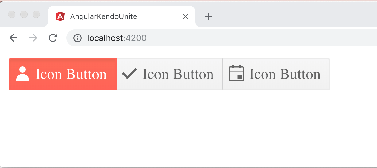
We have something called a Kendo Button Group which you can actually wrap your buttons in. It groups them nicely together, and the outer button edges have a nice rounded corner whereas the middle button is squared off, so it looks like they are one cohesive group, which is super nice. There is a neat combo of being in the kendo-buttongroup element as well as having toggleable set that gives this distinct look:

<kendo-buttongroup>
  <button kendoButton [icon]="'user'" [toggleable]="true">Icon Button</button>
  <button kendoButton [icon]="'check'" [toggleable]="true">Icon Button</button>
  <button kendoButton [icon]="'calendar'" [toggleable]="true">Icon Button</button>
</kendo-buttongroup>

image showing what a kendo ui button group looks like with 3 toggleable icon buttons in a row inside

Giving a Button Group Full Width

You can also have this Button Group responsively span the full width, by setting width to 100%.

<kendo-buttongroup [width]="100">
  <button kendoButton [icon]="'user'" [toggleable]="true">Icon Button</button>
  <button kendoButton [icon]="'check'" [toggleable]="true">Icon Button</button>
  <button kendoButton [icon]="'calendar'" [toggleable]="true">Icon Button</button>
</kendo-buttongroup>

gif showing how the full width kendo ui button group grows and shrinks with window size

Giving Button Group a Disabled or Bare Appearance

There are a couple other features I wanted to talk about. We already talked about how we can change the individual appearance of each button, and you can also do that to all the buttons within a Kendo UI Button Group quite easily as well. So inside the Kendo UI Button Group you can just say "look equals" and then things like default, outlines, etc. Let's go ahead and try outline.

<kendo-buttongroup [width]="100" look="outline">
  <button kendoButton [icon]="'user'" [toggleable]="true">Icon Button</button>
  <button kendoButton [icon]="'check'" [toggleable]="true">Icon Button</button>
  <button kendoButton [icon]="'calendar'" [toggleable]="true">Icon Button</button>
</kendo-buttongroup>
image showing the cool styles of the outline look on a kendo ui button group of icon buttons

Just as with individual buttons, you can change the disabled property or the appearance to outline, flat, or bare by setting them to true on the button group itself.

The End Product

<button kendoButton [disabled]="true">Disabled Button</button>
<button kendoButton [primary]="true">Primary Action</button>
<button kendoButton [toggleable]="true">Toggleable</button>

<kendo-buttongroup [width]="100" look="outline">
  <button kendoButton [icon]="'user'" [toggleable]="true">Icon Button</button>
  <button kendoButton [icon]="'check'" [toggleable]="true">Icon Button</button>
  <button kendoButton [icon]="'calendar'" [toggleable]="true">Icon Button</button>
</kendo-buttongroup>

I hope you've enjoyed learning more about Kendo UI buttons. There's actually two extra components, the dropdown button and the split button, that we don't have time to dive fully into in this blog series, but our docs talk all about them and we have amazing examples. Please do check those out if you're curious, they're great! I'll see you back here for the next part of Angular and Kendo UI Unite.

If you're new to Kendo UI for Angular, you can learn more here or just jump into a free 30 day trial today.

Why Choose the Telerik WPF DataGrid for Your Next Project

$
0
0

This blog post will walk you through some of the most popular features of the Telerik WPF DataGrid and why it’s a great option to consider for your current or future projects.

DataGrids, Grids, GridViews. They can be found in just about every application that presents data. And for a good reason. Data displayed in a table with rows and columns is both easy to read and meaningful. People are so used to working with Excel-like spreadsheets that they expect to find the same functionalities in everything that resembles one, which holds true to most desktop applications and line-of-business ones in particular. Precisely, for that reason, presenting data in grids can be challenging for any application and the developer behind it.

Let’s examine one scenario. Let’s say you are building a desktop application for the finance or healthcare industry. You or your dev team has created the perfect architecture for your WPF app. You are using DI, MVVM, IoC. You get the data from a web service, from the cloud or from a database, local or remote and process it in a testable and maintainable way. That’s what your developers are good at and have done many times.

But here comes the hard part: presenting that data to the user in a meaningful way, while also providing a great UI and user experience. This can be challenging and even the best can struggle. In the end, the end users of your application, honestly, don’t care what architecture you have used as long as the app can get the job done - you just need to present the data in a clear, visual and easy to understand way. So, if you are in a situation where you want to display your data in a grid, read along - you’ve come to the right place. 

The DataGrid in Progress Telerik UI for WPF is a powerful and easy-to-use grid. We're going to cover a lot of ground in this post - feel free to read from the top or to skim to the feature that captures your interest.

Table of Contents

Creating Columns

For the basis of a WPF datagrid we need rows and columns. Rows are obvious - they represent the objects in your data source. Columns on the other hand represent the properties of those objects. Most datagrids support automatic column generation. This feature allows you to show your data with minimal to no configuration. It is great for simple scenarios, or for situations in which the shape of data that will be presented is determined at runtime. Controlling the generated columns can be done using either the familiar Display attribute or the RadGridView AutoGeneratingColumn event. The latter gives you complete control over the generated columns and the generation process itself.

If you need more control over what and how your columns get presented, you can define them manually. With the Telerik WPF DataGrid solution you have several different kinds of columns at your disposal: data, expression, checkbox, combobox, image, masked input, hyperlink. You can do quite a lot using those. And if you need something more, you can always define your own cell template. You have control over the column header and footer as well, so you can put things like images in the column header or add some text to the column footer. One feature that is very useful is column aggregates. With that feature you can add aggregate functions like min, max, sum, avg to the contents of your column and display the results in the column footer.

GridViewColumns

Grouping Your Data

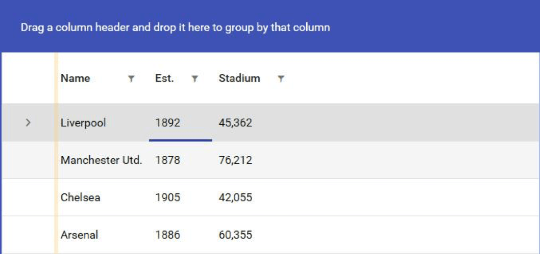
Grouping your data is a very powerful and useful feature. Making it easy and user friendly is one of the key features of the Telerik WPF DataGrid. Your users can easily group the data by simply dragging the desired column to the group panel. Multiple grouping is supported as well.

GridViewGrouping

Remember column aggregates? Well, when the data gets grouped, the aggregate functions work as well, giving you aggregate information about each group. This is built-in behavior and all you need to do to enable it is add aggregate functions to your columns and group your data.

GridViewGroupingAggregates

One more thing. Because of the complexity, grouping a large data set on more than one level can lead to some performance issues. The Telerik DataGrid knows that and has a special kind of rendering for these kinds of situations. It is called flat group rendering mode and it is controlled by the GroupRenderMode property. It simply renders rows one below the other instead of nesting them on many levels.

Let’s Not Forget Sorting

This is pretty intuitive for any scenario. Customers are used to clicking on the column header and expect to find the familiar sort direction arrow, and they take it for granted that every datagrid should do it, whether for web, desktop or mobile. Of course, Telerik grids support column sorting and it works in the usual way. But there is more. When your data is grouped you can change the sort direction of each group individually, and in addition, you can sort the data in each group by another column. This is indicated by the arrows shown in the group buttons appearing in the group panel and in the column headers, as can be seen in the screenshots I have added above. Sorting by more than one column is supported as well, so you can get that much more insight into your data.

The All-Mighty Filtering

One of my favourite built-in features is the column filtering (even though, I must admit, I am a bit biased ). The user can filter the presented data by their own criteria and this is especially useful in large and complex data sets. By default, all data bound columns have filtering enabled on them. You can opt-out of this behaviour by disabling it if you feel that filtering on this column is not necessary. The filter window itself closely resembles what can be found in pretty much any spreadsheet processing tool.

GridViewFiltering

The filter for a given column picks up all the distinct values that are present in your data set for that particular column. The user can filter by simply selecting a specific value or values using the checkboxes. Advanced filter expressions are also supported. You can do filter expressions that check if the values in your columns start with a specific string value, or is greater, equal, lesser than or between given values. The possibilities are endless here and it is all done automatically for you and out of the box. The consumer of your data, when it is presented in a Telerik datagrid, has all the filtering power they need.

Paging for Larger Datasets

Sometimes you just have too much data for the user to grasp at once. One popular solution is to use paging. Telerik UI for WPF has you covered with a special component made specifically for this purpose - the RadDataPager. It works in close cooperation with the DataGrid and it is a breeze to setup and configure, as you can see in this code snippet.

GridViewPages

Controlling the appearance and paging options starts with the DisplayMode property. It is of type PagerDisplayModes flag enumeration, and its members control what is displayed by the pager. You can also control the size of the page, which is the number of items displayed at once on the screen.

One nice thing about separating the component that does the paging from the DataGrid is that you can use the data pager with other components, like ListView, ComboBox or even charts. This can be helpful when building a dashboard, for example.

Row Details

When you have a lot of information and you can’t display it all using just columns, then maybe you can show that information in a row detail. Each WPF datagrid row is capable of presenting additional information if the form of a row detail. The advantage of this approach is that it can be configured to be displayed only when the row gets selected. This can reduce the number of columns and give your data grid a neater and more compact layout, while still providing all the information the user needs. You can also show the row details at all times, regardless if the row is selected or not, if you prefer.

GridViewRowDetails

Configuring the row detail is done through the row details template. You have complete freedom with regard to what you put in there. You can display text, put in charts or even other datagrids. The possibilities are endless.

Exporting to Various Formats

One of the benefits of using the Telerik UI for WPF toolkit is that you are stepping on the shoulders of giants. There is already an excellent document processing library that has been developed for Telerik tools, and of course it is well integrated into the Telerik WPF DataGrid. The data that is presented by the grid can be exported to many different formats for different applications, including Microsoft Excel (both xlsx and xls format are supported), and exporting to PDF and HTML is also possible. It all comes straight out of the box. You can customize it too.

One other way of exporting data is using the clipboard. The RadGridView supports both copying and pasting data from and to the clipboard and is very flexible in doing so. You have the option to copy the cells with or without the headers, footers, empty rows and columns.

Hierarchical Grid

Sometimes your data can be hierarchical with a parent - child relationship. Extending our current sample data, we can display the employees our managers are managing. The RadGridView can display such data using a nested datagrid.

GridViewNested

Note that the nested grid is a full blown RadGridView. The hierarchical support for the DataGrid handles self-referencing data sets as well. So, if your data has a ParentID relationship for example, your data is good to go. If not all of your data is forming a hierarchy you can hide or show the row expander icons by binding it directly to your data.

This feature can be useful in situations in which your data is truly hierarchical in nature and drilling down makes sense. This can also reduce the cluttering and data overflow in large data sets. When combined with lazy loading it can lead to performance improvements as well, because you will be fetching only the data you are actually showing on the screen.

Managing Data

Displaying data is great, but the Telerik grid also allows you to modify the data it is presenting. You can do insert, update and delete with validation and everything. In order to enable it you need to flip a few switches and you are good to go. Make sure to be sure your collection is not read-only and that the type of objects in your data set have a public default constructor.

GridViewEditing

This feature can be useful in some scenarios when your data set is not too complex. Another use case can be when you want to allow the user to edit values of particular cells without the hustle of opening up other views and filling up lengthy forms.

Theming

Last but definitely not least, your data is just a bunch of numbers without a beautiful and modern looking UI. There are plenty of readily available themes you can apply to the RadGridView and any Telerik component for that matter. These are two of my favorite themes, the Material and Fluent themes. In the screenshots above you can see the Windows 8 theme, another great one.

GridViewTheme1

GridViewTheme2

Applying a theme is a breeze. Just reference the theme that you desire and merge its resources in your App.xaml file. Why the merge? Because Telerik NoXaml assemblies, which are the recommended ones, have no Xaml files inside of them. In order to give your WPF DataGrid appearance, you have to reference a theme and merge the resources in your application. This separation allows for the packing of theme dependent resources in different assemblies and reduces the overall size of dependencies and your application, because you are only referencing what you actually need.

Another benefit of the NoXaml assemblies is that you can customize the built-in themes very easily. You can change absolutely anything, starting from a color to completely retemplating the whole component. When you just need to give a specific component some style you will be pleased to know that there are many different APIs for doing that. There will be a dedicated blog post on styling and theming coming soon.

Summary

DataGrids are widely popular and are often part of a project's requirements. Should you face such a decision consider the DataGrid in Telerik UI for WPF, as I have personally tested it extensively and can assure you that it is a very powerful and versatile component for visualizing data in a table-like fashion. It is a great tool for displaying your data and making decisions based on your data. Above I have outlined some of the key features that customers love and seek when they work with DataGrids. I hope you find this useful and decide for yourself whether the Telerik DataGrid is suitable for your scenario.

This is the first blog post in our new series dedicated to the DataGrid in the Telerik WPF library. Next time I am going to show you how to load your grid with data, since grids are all about data. And of course, we are going to do that in MVVM way. So, stay tuned. Also, let me know in the comments what topic about grid view you want to see. Until next time, happy coding!

Learn How to Use Vuex by Building an Online Shopping Website

$
0
0

Learn how to build an eCommerce site that uses Vue for dynamically handling products and utilizes Vuex to correctly manage the state of your shopping cart.

Some people view the use of Vuex, a state management library, as quite a big step up from using Vue on its own. The concept of state management can sound a bit scary, and, to be fair, some state management libraries can be quite difficult to fully grasp (I’m looking at you, Flux and Redux!). 

Vuex, on the other hand, makes the process a whole lot easier to manage and should really be a tool that is utilized whenever required.

Some Assumptions

If you are reading this article, it is likely that you already know how to emit events from child components and know how to update state in a regular Vue app. So if you were tasked with building a shopping cart and wanted to be able to add items to it, you would know how to do so.

If not, it might be worth reading over this article that covers how to emit in Vue. Give that a read, then feel free to come back here once you feel comfortable with emitting events, as it is a super important concept to understand!

The Setup

Today we will be creating a mini eCommerce site/app with Vue and Vuex. We will be using Vue-cli to quickly scaffold our app. For those unaware of what Vue-cli is, check out the link to the official docs here. We’ve opted to use the manual set-up option within Vue-cli, which allows us to pick Vuex as an optional add-on. This means that Vuex will automatically be added to our app by default and it will also create a store.js file for us . This file will contain our app’s state data.

Note: Adding Vuex in this way is not a requirement, and you can otherwise choose to add Vuex via npm i vuex.

Let’s show you what our default store.js file looks like:

import Vue from 'vue'
import Vuex from 'vuex'
 
Vue.use(Vuex)
 
export default new Vuex.Store({
  state: {
 
  },
  mutations: {
 
  },
  actions: {
 
  }
})

You’ll notice that just after the imports, we have Vue.use(Vuex).

This is super important, as it basically enables the ability to then give all of our child components access to our Vuex store through the use of this.$store. We complete this process by including our store inside of our Vue object, which we will see next.

So we also have a main.js file, which handles the rendering of Vue into our app. The file looks like this to begin with:

import Vue from 'vue'
import App from './App.vue'
import store from './store'
 
Vue.config.productionTip = false
 
new Vue({
  store,
  render: h => h(App)
}).$mount('#app')
 

As you can see, we import our Vuex store on line 3 and then add it inside of our new Vue object (see line 8) that gets rendered and mounted to the page. This completes the process of ‘injecting’ our store into every component.

We can go ahead and delete any bits of code that we don’t need, such as the HelloWorld.vue file, along with the Vue logo.

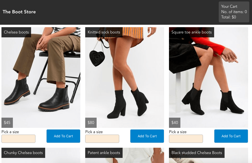
We then go about creating all of the components we are going to need. In essence, we will require an Item component, which will contain details of the item, along with a size-picker and an ‘add to cart’ button. These could have been made more modular by creating separate sub-components, but I have opted against this for brevity.

Once we’ve built all of our initial components, we have an app that looks like this:

Vue

All of our content is in place, and our items have their individual buttons - but nothing actually happens if any of the buttons are clicked. Let’s start building those parts with some super awesome Vuex state management!

Store

So our shopping cart is actually already returning information from our store which is great, as it means that the shopping cart is able to access data from our state. This isn’t something that is set up by default, though. So how is this working? Well let’s take a look at what we have set up so far.

App.vue

<template>
  <divid="app">
    <divclass="header">
      <h1>The Boot Store</h1>
 
      <shopping-cart:cart="shoppingCart"></shopping-cart>
    </div>
 
    <sectionclass="items-container">
    <itemv-for="product in products"
      :key="product.key"
      :item="product"></item>
    </section>
  </div>
</template>

If we observe the bits of code above, it looks quite similar to how we would usually set this up using just plain old Vue.

On this assumption, it would be likely that the :cart=”shoppingCart” prop is holding data on the cart. And likewise, the v-for=”product in products” is looping through all of the products. This would be a correct assumption to make.

The only thing to remember here is that this data isn’t coming from inside of our root App.vue file. It’s coming from our store.js file. So how does it get there? Let’s take a look at our computed properties from App.vue below:

computed: {
 
    shoppingCart() {
        return this.$store.state.cart
    },
    products() {
        return this.$store.state.items
    }
}

Put simply, we create two functions that return data from this.$store. We then call these two computed functions inside of the template, which we saw previously. We could have skipped the process of creating these simple return functions by doing this instead:

:cart=”$store.state.cart”

and

v-for="product in $store.state.items"

And it would have still worked, but this can get unruly. It would also avoid the use case of computed properties in general - which is that you pass them data that gets cached, and if the data changes, the computed property will re-evaluate and return the new result. So we take advantage of this when writing our computed properties. It also has the added benefit of keeping our template view a bit cleaner.

Note: I should also mention that Vuex’s documentation talks about a mapState helper, which can be used in verbose apps that would otherwise need to lean on making lots and lots of computed property functions. Because our app is not going to be leaning on this too much, we will not be making use of mapState. If, however, you are reading this article with a view to building a huge application, I’d highly recommend reading up on mapState as it can be pretty useful! You can check out the link in the docs here. Ahead of time, I’ll also note that there are map helpers for all of the core concepts that we will be looking at in this article, but none will be used for the sake of brevity.

Okay, so computed properties inside of child components are being used here to simply return data from this.$store. That’s cool, but what about when we want to use computed properties like we normally do in Vue? Well, we could just write the same code that we normally do, but this wouldn’t be fully taking advantage of Vuex’s capabilities. We also want to be writing computed properties inside of our store.js that we can use throughout our application. So can we just write computed properties inside of store.js? Well, yes we can! But they look a little bit different. Enter getters!

Getters

Getters are essentially computed properties. Like computed properties, a getter’s result is cached based on its dependencies, and will only re-evaluate when some of its dependencies have changed. A slight difference with traditional computed properties is that the functions we create inside of getters will always need to be passed state as a parameter. We will take a look at an example that we be using inside of our eCommerce app after the next paragraph. 

So with our shopping cart, we want it to contain the contents of each product that gets added to it. But each item is likely to be an object (which contains the product’s ID, name, size and price). Our shopping cart is also going to display the total price. We can write a getter function that looks at the contents of the shopping cart, grabs the price of each item, adds them together and returns the sum. 

Let’s take a look:

getters: {
    total: state => {
        if(state.cart.length > 0) {
            return state.cart.map(item => item.price).reduce((total, amount) => total + amount);
        } else {
            return 0;
        }
}

Not sure how map and reduce work? I suggest you click here.

We’ve wrapped the return inside of an if statement, so that if the cart is empty, we show the total price as 0.

We then want to pass this.$store.getters.total down to the right place in our app. You’ll also notice that we’re referencing $store.getters this time instead of $store.state which makes sense since we just made a getter function.

Now we could pass this either straight into our ShoppingCart.vue, but let’s continue the initial design decision made earlier to create computed functions inside of App.vue that simply return the data held in the store. 

So let’s go ahead and add a function that does this:

totalAmount () {
    return this.$store.getters.total
}

This leaves our computed properties section inside of App.vue currently looking like this:

computed: {
    shoppingCart() {
        return this.$store.state.cart
    },
    products() {
        return this.$store.state.items
    },
    totalAmount () {
        return this.$store.getters.total
    }
}

Finally, we pass totalAmount down as a prop to ShoppingCart.vue by passing it to the <shopping-cart> tag inside of App.vue, like so:

<shopping-cart
    :cart="shoppingCart"
    :total="totalAmount">
</shopping-cart>

We can then reference the total in our ShoppingCart.vue component by simply writing this:

<p>Total:${{total}}</p>

And, just in case you were wondering, the dollar sign is here to simply put a literal dollar sign at the start of the price. It isn’t required for any sort of Vue syntax, such as this.$state - just thought I should clear that up!

So now our app is starting to come along quite nicely, and we’ve already utilized two of Vuex’s five core concepts!

Okay so we have our shopping cart displaying some data, but how about actually making the ‘Add to Cart’ buttons work so that we can go about adding things to our cart? Let’s take a look!

Mutations

The mutations property is kind of similar to the methods property that you would have in a standard Vue app. But when we use Vuex, we cannot modify anything inside of the store’s state directly. So in order to modify state, we must write a mutation that will handle this for us.

Similar to getter properties, we will be passing state as a parameter to any function that we create. In our case, we want to write a function that adds a product to our cart. The product in question will be added whenever a user clicks the ‘Add to Cart’ button that belongs to the particular product.

So far, our function looks like this:

mutations: {
  addToCart(state) {
  }
}

Now imagine that we were writing this app without Vuex. Our addToCart() function would likely emit some data along with it, in order for our state to know what product was being added to the cart. With Vuex, functions inside of our mutations can also accept an additional parameter which acts as a payload to carry some data with it.

So let’s add that in:

mutations: {
  addToCart(state, payload) {
  }
}

If “payload” sounds like a strange word, that’s because it is. In this context, it is basically the technical term for saying that we can send something into the function, like a string, an integer, an array, an object, etc.

We can then write a bit of code that simply pushes payload into our cart, like so:

mutations: {
  addToCart(state, payload) {
      return state.cart.push(payload);
  }
},

Okay, so we’ve written the mutation. 

But we can’t just go to our child components and write something like this.$store.mutations.addToCart, because that wouldn’t work. So how do we actually just call these mutation functions? Enter store.commit!

Committing mutations

So we are going to take a slightly different approach from some of the previous examples we have encountered with calling state and getters. We won’t be adding any sort of computed property that returns the function we just created. Instead, we are going to go straight into Item.vue and we’ll create a method. 

The method will have the same name of addToCart - though you should note that this wasn’t necessary. I simply felt it was appropriate to give the commit function the same name as the mutation function so that it was easier to remember. 

The function looks like this:

methods: {
    addToCart(item) {
        this.$store.commit('addToCart', item)
    },
}

What this is doing is simply calling the mutation that we made with the same name, and is passing it the item - which, if we remember from before, is basically the entire product object.

We then attach this onto the button inside of Item.vue as such:

<button@click="addToCart(item)">Add To Cart</button>

Now whenever we click on the ‘Add To Cart’ button, it adds the product object into the cart. The beauty here is that, whenever we add an item to the cart, the ‘No. of Items’ in the cart increases by 1 and the Total updates with the current total amount! How amazing is that?!

But we’re not finished yet. 

Improving our Payload

Although our item is being added to the cart, our function currently adds the entire contents of the product into the cart (so name, price, all available sizes, image, etc). It currently pays no attention to what size boot has been selected.

This obviously isn’t good. So let’s go fix that!

Now with the size picker, I have decided that this is something that would be better being handled inside of local state (i.e. inside of Item.vue). The reason being is that this is the only place where the selected size needs to reside, and we would be unnecessarily adding a lot of overhead here when it is not required. 

So with this in mind, we have added the following v-model to our size-picker part inside of Item.vue:

<selectv-model="size">
    <optionv-for="size in this.item.sizes":key="size">{{size}}</option>
</select>

And then in the data part:

data() {
    return {
        size: ''
    }
},

This also has the added benefit of setting the default selected size to a blank string. So if we wanted, we could add some validation in to prevent a user from being able to add a pair of boots to the cart if a size has not been selected.

Now when a user picks a size, the size inside of data() will be updated. We are then going to pass this in to the payload we set up earlier.

As you may remember, the payload would automatically add the entire item object (including all of the sizes). We will edit this by manually passing in certain data, and, in doing so, will overwrite the part that takes in all of the sizes and will replace it with just the size that the user has selected. Let’s take a look:

methods: {
    addToCart(item) {
            this.$store.commit({
                type: 'addToCart',
                id: item.id,
                shoe: item.name,
                size: this.size,
                price: item.price
            })
    }
}

So this looks like quite a lot more code to set up a this.$store.commit, but essentially all we have done here is pass an object in to the commit instead. 

We set up a type, which is simply the name of the mutation. Then instead of passing the entire item, we pass in individual parts of the item. When we get to the size, we can then pass in this.size which will grab the selected size. In fact, we can add a little bit more to this to do the validation that we mentioned earlier:

methods: {
    addToCart(item) {
        if(this.size !== '') {
            this.$store.commit({
                type: 'addToCart',
                id: item.id,
                shoe: item.name,
                size: this.size,
                price: item.price
            })
        }
    }
}

So now, our code will only add an item to the cart if a size has been selected! How neat!

And What about Actions and Modules?

Actions and Modules are the two other core concepts in Vuex. Our shopping cart doesn’t really require these, so we won’t cover them in too much detail, but I’d still like to give you a brief overview of them.

Actions are similar to committing a mutation. The difference being that mutations are synchronous, so whenever we commit one, it will fire immediately. Actions are useful when we are dealing with asynchronous code. 

For example, if we needed to pull in data from an API before committing a mutation, we would look to utilize actions in conjunction with mutations. Our shopping cart application does not require this, but if yours does, I strongly recommend you read into the Vuex documentation on actions for a primer.

Modules are useful for those occasions when you are writing a complex application that has a lot of tentacles and has a ton of stuff going on. They allow you to break up your single Vuex store into smaller fragments in order to help it become more manageable and less unruly. Again, I recommend Vuex’s page on Modules for more information.

And There We Have It!

We have built an eCommerce application that use Vue for handling reactivity and, most importantly, utilizes Vuex to manage the state of the app!

If you would like to take a look at the code for this app, check out the Github repository here: https://github.com/sunil-sandhu/vuex-shopping-cart


For more info on Vue: Want to learn about creating great user interfaces with Vue? Check out Kendo UI for Vue our complete UI component library that allows you to quickly build high-quality, responsive apps. It includes all the components you’ll need, from grids and charts to schedulers and dials. 

Looking to use Vuex with Kendo UI for Vue? Check out this quick guide.
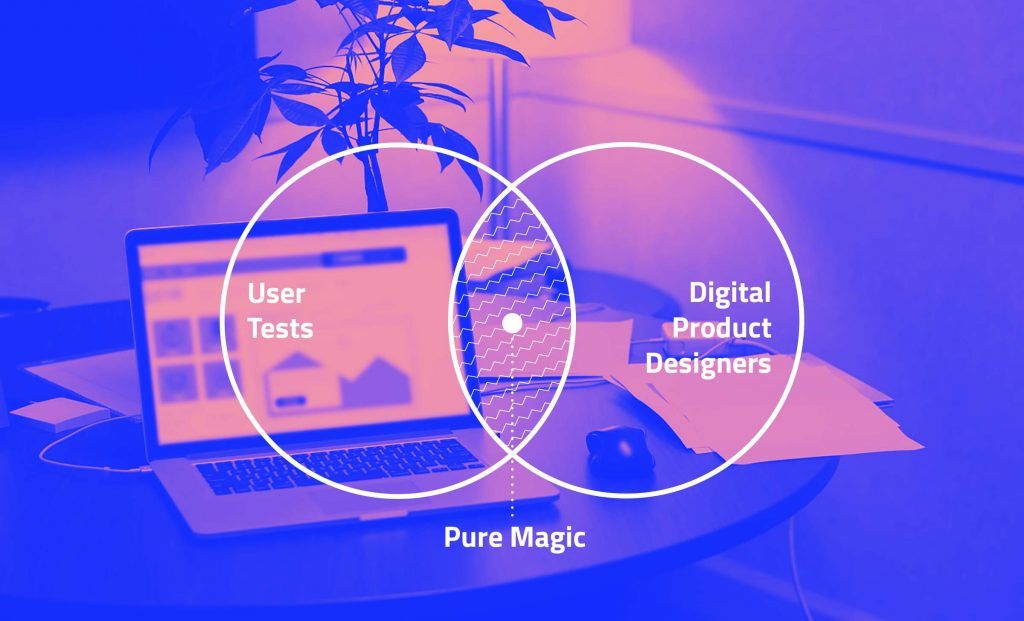

Avoiding Digital Product Shipwreck: The UX Iceberg

$
0
0

90% of an iceberg is below the surface. So is your user experience design. Neglecting UX to focus only on the UI that's visible above the surface can sink your digital product.

If you’re a natural sciences lover you probably already know that only about 10 percent of an iceberg is visible above water. The other 90 percent is below the surface and out of our landlubbing sight.

The iceberg has been used as a metaphor in many a discipline – nothing new there. Ernest Hemingway had his Iceberg Theory for fiction, Freud used the iceberg to describe the conscious and unconscious human mind, cultural theorists use The Cultural Iceberg Analogy. And now we apply the metaphor to creating digital products.

UX

The Digital Product Iceberg

An iceberg does iceberg things thanks in large part to its underwater mass: that unseen 90 percent helps with flotation, provides structure, and determines whether ships pass by easily or are surprised by a submerged underwater ice formation they thought they had cleared.

When creating a digital product, much of the important work also takes place beneath the surface. All the user research, planning, interactions, objectives, functional requirements, and user experience strategy make up the great unseen chunk that gives your product its structure and makes it do what it needs to do.

In other words, the work below the surface is what determines the success or failure of your digital product. Failing to do any part of that crucial work will impact your structure negatively.

User Interface Is the Tip of the Iceberg

For all that’s going underneath, the only part of your digital product users see is the user interface (UI). This is the proverbial tip of the iceberg, the 10 percent, the part you see and engage with on the screen when you interact with a site, app, or software suite.

Since users can’t see beneath the surface, they can’t tell when they’re about to capsize.

Like the visible part of a real-life iceberg, a user interface can be deceiving. A nice visual design can make an app appear easy to navigate or even seem like it will be a pleasure to use. Since users can’t see what’s beneath the surface, they can’t tell when they’re about to capsize on some piece of loose, floating structure. It’s not until they realize they can’t use the back button, can’t tell what’s a link and what isn’t, or can’t find the thing they’re looking for that they realize they’re literally sunk.

Sink Your Users, Sink Your Project

If your users are sunk, so is your digital product. The problem is, too many companies have things backwards. They spend 90 percent of their time thinking about the surface-level user interface and about 10 percent (we’re being generous) on the user experience planning that needs to support the whole product. These companies have skipped crucial steps necessary to guide users smoothly. They’re too tempted to jump right in and start designing the UI based on assumptions and guesses.

When companies approach making digital products this way, it doesn’t matter how pretty the interface is or how many cool interactions it has. Without intentional user experience planning and strategy, your digital product’s structure won’t be able to support its interface. This will drown your users as soon as they dive any deeper than surface level. For you, it’s a project shipwreck.

To avoid shipwrecking your users, plan your UX before even thinking about UI.

Creating a Solid User Experience Strategy

To avoid shipwrecking your users and therefore your project, your user experience planning should be solid before you ever even think about the visual interface. This means all the following steps come first:

1. Discovery

This is your information gathering phase and should include user research methods like user observationpersona creation, interviews, research, surveys, and card sorting.

2. UX Analysis

This is where you examine the data you gathered in Discovery. Specifically, focus on why users would come to your site or app. What do they need to do? What gets in their way?

3. Functionality Audit

Review features and functions early on. Bring in your developers to discuss implications and requirements. Knowing what roadblocks you may encounter means you can plan a solid user experience (and interface) for them.

4. Structural Wireframing and/or Prototyping

Carefully create structure and screen layouts that serve the real people you researched in Discovery. Sketching, wireframing or building prototypes means that you can move quickly and scrap ideas that don’t work. This is also a good time to do user testing before you move into visual design or code where changing things becomes much harder and more expensive.

5. UX Requirements

Your developers are likely familiar with technical requirements. You also need a set of user experience requirements. Include browser and device support, responsive design breakpoints, visual design and content standards, and any imperatives you uncovered previously. Connect these requirements to your wireframes or prototypes.

User Experience Runs Deep in Successful Digital Products

Like a real iceberg, the user experience part of your website, app, or software lies below the surface. It’s the biggest and most important part. It determines the success or failure of your entire digital product. Give it the time and attention it deserves.

When you put user experience first, you ensure smooth sailing for all parties.

The small part of your interactive iceberg that users can see should still be appealing, pleasant, and engaging. You’ll still spend time there, but in a successful app, that effort is done at the right time and is informed by solid underlying research, planning, and structure.

When you work this way, you ensure smooth sailing for all parties. Users will encounter an easy-to-use product that helps them do what they’ve set out to do. For you, it means a successful digital product that helps you achieve business goals and justifies your investment.


Want to learn more about creating a great UX? Find out some tips about making sure that your app presents an outstanding User Experience in these interviews with Dean Schuster and Bekah Rice.

Designing Digital Products for the Lizard Brain

$
0
0

If your digital apps and services aren't designed with users in mind, you risk the wrath of the lizard brain's fight or flight instinct. But there is hope.

When software, apps, or sites confuse or frustrate us, fight or flight responses kick in. That’s bad news for the makers of digital products and services, most of which are downright infuriating. There is hope. Understanding human behavior is a solid first step toward making things better.

UX

Interface Rage

Think of a time when you’ve tried to do something online but didn’t exactly succeed. For whatever reason, your progress was halted, and you could not achieve your goal, at least not easily or quickly.

Perhaps you were trying to pay a medical bill or recover a lost password. Maybe you were at work, forced to use a horrifically outdated, company-mandated app. You may have simply have tried to sign-up for a service or buy something for your sweetheart. Heaven help you, you may have attempted to complete the dreaded Free Application for Federal Student Aid (FAFSA). Sympathies.

Whatever came to mind, how did you react? What did you say or do when things got monumentally frustrating? Dollars to donuts you were not your typical, mild-mannered self. In fact, I predict you were decidedly less.

If you’re a lot like me, when encountering a frustrating interface, you fly right past anger and descend directly into an apoplectic fit.

If you’re a bit like me, you indulged in colorful language and inadvertently taught the kiddos a new word or two. If you’re a lot like me, you flew right past anger and descended directly into an apoplectic fit.

Interface rage is a real thing. Unfortunately, it is also a universally shared experience. Everyone understands it. You don’t have to explain it in the slightest. Kindly grandmothers are not immune.

Maybe we are all flawed. Perhaps there is something wrong with everyone. Are we all dense? untrained? unqualified? incapable? No. We’re just human.

Attack of the Lizard Brain

Humans write philosophy and delve into quantum physics, but deep down, we are largely governed by a lizard brain. We’re closer cranial relatives to the iguana or gecko than you might think.

When faced with a crisis, our lizard selves overwhelm and dominate our higher functions.

The simple reptilian brain consists of a cerebellum and a brain stem, which control fight or flight responses and automatic behavior. We’ve got a brain stem and cerebellum too. Evolutionarily speaking, these are the oldest parts of our brains. When faced with a crisis, our primitive lizard selves overwhelm and dominate our more recently developed higher functions.

We run from fire, defend our children from attackers, and instinctively offer the middle finger to impolite rush hour drivers. When our online banking app crashes in the middle of a transaction, we break our hand punching the nearest wall. We’re all lizards at the core.

Modern Technology Sparks Primitive Responses

Primitive responses are about survival. A reptile’s life is rough. We on the other hand, mostly encounter low-danger, first-world problems. We’re not facing death when using Microsoft Word. It just feels that way.

Your primordial center can’t differentiate between a coyote and an error message.

Try telling that to your inner lizard. Your deeply ingrained, primordial center can’t tell the difference between a ravaging coyote and an inexplicable error message. It just reacts. Here’s what we do when digital products cause us problems:

Fight

When using sites or apps that frustrate us, we can get angry. Irrationally angry. If we can’t find key information on a site when calm and tranquil, we certainly can’t find it when enraged. So we go on the attack. We email, chat, Facebook, or tweet – anything to forcefully vent our righteous indignation. We may try to complain to a real person. That is, if our blood pressure can survive the torturous hunt for contact info.

Flee

When confronted with a predator, the typical lizard flees. Some even leave their tails behind. We run away too. When we can’t accomplish what we want on a site or app, we simply give up and leave. We may not do this out of abject fear, but the result is the same. We extend this instinct up the brand chain. If the Über app doesn’t give us satisfactory confirmation of a scheduled ride, we don’t blame the app, we blame Über. We then avoid the service entirely.

Freeze

When we don’t know what to do on a site, we may just freeze. We stop and do nothing, paralyzed by the inability to better our situation. Some lizards freeze to thwart predators. We freeze because we have no recourse. This typically happens when we attempt to understand the hopelessly confusing service tier options for, say, Direct TV.

Fail

Failure is always an option, of course. For reptiles this means death. For us, it means an enormous waste of valuable time. All we want to do is sort out family sharing of iTunes media across multiple devices. Too much to ask? Yes.

Why Does This Happen?

It’s a simple answer. Digital products are missing something essential to make them great: a deep understanding of the people who use them.

We should put users at the heart of our process and plans.

We should pay heed to the way people think and behave. We should put users at the heart of our process and plans. We should offer complete commitment to helping them. But we don’t. Instead, we largely ignore them. In so doing, we inadvertently provoke their lizard brain responses.

Consequences

When we fail to consider the lizard lurking in everyone, our digital products suffer, sometimes openly and sometimes in ways we can’t see. Reactionary responses have serious consequences, including:

  • Lost Customers
  • Fewer Conversions and Transactions
  • Higher Support Costs
  • Wasted Development
  • Brand Erosion

Poor User Experience Abounds

Despite our considerable expertise, most digital products fall far short of excellence. Some are mediocre, others flat-out dreadful. Few of us can say the websites, intranets, apps, or software we make are everything they could be. Just ask the customers. Ask the end users. Better yet, ask the CFO. That’s where the real pain lives.

Avoid the Wrath of the Lizard Brain

When we take into account basic human behavior, our digital products will become easier to use. Then, we’ll see an uptick in the good metrics that produce significant returns on investment.


Looking for other great reading, to learn more about how user experience design can help you build better applications? Check out these blog posts too:

Theming with Style

$
0
0

Our Buttons are looking pretty good after the work we did in the last post. But what if we wanted to customize them? Where would we even begin? Find out the answers to these questions, along with how to utilize themes that come with Kendo UI in part three of Angular & Kendo UI Unite!

Hello, and howdy. My name is Alyssa Nicoll. Welcome back to segment three of Angular & Kendo UI Unite. If you are new to this series, check out the first post to get started!

You can also watch the the video this post is based on right here - otherwise, dive on into the text below.

Now that we've concluded part two of this series, right now our buttons are looking pretty good.

image-7

However, what if we wanted to customize them? Where would we even begin with something like that? And what about themes? What are themes and how can we utilize them?

Themes

Themes are styles for our Kendo UI components to make them look cohesive and snazzy. When we first used ng add to include Kendo UI Buttons in our application, that also included the default Kendo UI Theme (see package.json file). You can see what all components for the default theme look like here.

img-1

We have more than the default theme however! I want to show you inside our docs, where we have a styling overview that talks about the multiple themes that we have to offer. The first, as you know, is the default theme, that came with our button components initially. We also have a Bootstrap and a Material one.

img-2

Check out more about our Bootstrap theme here:

img-3

Check out more about our Material theme here:

img-4

Including a Different Theme

In this article we are going to be giving the Material theme a spin. We’ll begin by installing the Material theme in our app:

npm install --save @progress/kendo-theme-material

Next, we'll change any references to kendo-theme-default to kendo-theme-material in angular.json. Then, spin up the ol’ server and check out the insta-magic. Instead of the default orange button for our primary button that we had, we should see a blue one for the Material look:

img-5

In fact, all of our buttons look different now!

Default styles:

img-6

Material theme styles:

img-7

Customizing a Theme

What I'd like to talk about next is actually customizing the theme. So if we head on over to the customization page in the docs, you can see a list of SCSS variables. These variables are overridable, which means we can set them to whatever values we’d like.

img-8

In order to modify these variables, we need to go ahead and start using SCSS in our angular application. All we need to do is change the extension of the styles file to .scss. Then, in angular.json, modify any styles.css references to styles.scss.

Now that we've made those changes, we should be able to use SCSS in our application. In fact, if we go ahead and reopen the terminal and restart our app, we see that nothing has changed and all looks as it did! This is because all valid CSS is valid SCSS. So we don’t need to change our styles at all for the .scss file to just work.

The next part, which you can actually read about in our docs, is customizing themes. The links to the variables for the Default, the Bootstrap and the Material theme are all right there, super handy. But then below we also talk about using SCSS.

To start customizing, let’s go inside of our styles.scss file and modify some variables like the $primary button color. Then, let’s import the scss for the Kendo UI Material Button. So before we had a blue primary button, but now with our new $primary variable, we should be able to see a pink primary button instead!

$primary: #ff69b4;
@import "~@progress/kendo-theme-material/scss/button";

img-9

It worked! Let's go ahead and change another variable, like for instance the first one on the list, button text. So, let's go back over and change it, and we're not going to get fancy. We're just going to do the same pink:

$primary: #ff69b4;
$button-text: #ff69b4;

@import "~@progress/kendo-theme-material/scss/button";

img-10

So, as expected, any Material buttons now have pink text. However, I wanted to mention as a side note that these variables, as with any good variable, are used in multiple places. So, it's not just used on the button text, it's also smartly used to create, for instance, a background on hover:

img-11

If we go over these buttons and see their background color on hover is using a slightly more opaque color of pink as the button text color we just provided.

You can, of course, modify other things outside of the variable list and use these variables yourself as well. For instance, we have this nice pink text on our Material buttons and we’d like that same look for the Bare buttons. We can call out the k-button and k-bare classes, and then set the color to $button-text variable.

$primary: #ff69b4;
$button-text: #ff69b4;

@import "~@progress/kendo-theme-material/scss/button";

.k-button.k-bare {
  color: $button-text;
}

img-12

Now we see that the bare buttons text has been changed, however on hover, it doesn’t look so hot.

img-13

We simply need to add a call out for on :hover as well:

...
.k-button.k-bare, .k-button.k-bare:hover {
  color: $button-text;
}

So, Kendo UI theming is super flexible and we have a lot of documentation that you can check out to dive further. It's one of, honestly, my favorite parts because I've worked with other CSS libraries that just weren't as flexible. Something to watch out for, because we are a CSS library, sometimes we do have to use the important tags. It's always nice to use your inspector, to find out what is being used currently to style things and what selectors you should use to override them:

img-14

This is exactly how I knew that we would need to select .k-button.k-bare to give it the pink text color.

One last thing I wanted to mention was if we go back to our styles, as you see, we are importing just the Kendo UI Material button styles into our scss. This is a good practice instead of importing all of the styles, like this:

@import "~@progress/kendo-theme-material/scss/all";

It’s best to only import the styles you’ll be using in your application and preferably into individual files for the specific thing you’ll be styling. So if you are customizing the Kendo UI Charts in your app, best to put those in their own style sheet.

Helpful hint: We no longer need the Kendo UI theme styles listed out in our angular.json file since we are importing these inside our scss file! You can remove those if you’d like. :)

That is all I have for you today on customizing with style and themes. I hope you all are having a blast. Watch out for the next post in the series where we’ll be taking our app to the next level by building out a to-do list! Have a wonderful day and happy coding. :D

If you're new to Kendo UI for Angular, you can learn more here or just jump into a free 30 day trial today.

The New Feedback Portals for Kendo UI are Here!

$
0
0

We're excited to debut new feedback portals across all flavors of Kendo UI, making it easier for you to submit and track your feedback. Let us know what you think!

Making sure that users have their voices heard is the top priority on the Kendo UI team. Most of the new components and features that are included in a release stems from the feedback that we have received over the years. This ends up being even more important for some of the new flavors with native components being built for Angular and React.

As a part of a re-evaluation for how we work with feedback and our own internal systems we realized that there were a few drawbacks from the solution that we had implemented in the past for Kendo UI. While the system itself was fine, there were a lot of items in the background (and some use-cases coming from our users) that caused us to look elsewhere for a feedback portal solution.

This is why I wanted to introduce the brand new feedback portals for all flavors of Kendo UI, including our UI for ASP.NET MVC, UI for ASP.NET Core, UI for JSP, and UI for PHP server-side libraries!

Feedback Portal

Why a New Portal?

Without getting in to too many nitty gritty details, we realized that there were some limitations with the previous solution that we used. While not necessarily a weakness of the portal itself, there were some workflows that we weren't 100% happy with and wanted to transition over to something new.

We primarily wanted to make sure that everyone's voice was heard, and the previous portal had some quirks around voting, like people running out of votes or some stacking of votes in order to push up an item with some extra votes. Additionally, we wanted some deeper integrations with our own systems in order to better track and organize these items without duplication or awkward workflows. Beyond this we also wanted to align with the rest of the feedback portals that we offer across all UI component libraries, which since 2010 has not been the case. Now we have the same type of feedback portal across all products!

As an added bonus, this solution was built in-house here at Progress which ensures that any feedback that we get on the actual portal itself can be tweaked an updated by us! Continuous improvement everywhere!

The ultimate goal of this feedback portal is to make the communication between the Kendo UI product teams and the developers that use our UI components in their day-to-day that much more efficient. This opens up an even easier path for two-way communication which is always critical when building something that truly prospers when feedback is gathered and used to drive the road map.

How to Use the New Portal

The new portal should be fairly straightforward, but there are a couple of things to look out for.

First and foremost, you need to have a Telerik.com account. Previously we had separate accounts across our support system and the feedback portal, but now we have everything under one single account. Makes it a lot easier for you to track what you've submitted yourself, plus it's one less account for you to keep track of. It also eliminates a lot of the anonymous comments and voting that existed in the old system, ensuring that folks using (or looking to use) Kendo UI are the ones commenting and voting.

This works for both trial and licensed users by the way, so even if you're just trying out any of the Kendo UI products you can submit feedback and let us know what you think!

Once you have signed in it's super easy to submit a feature request or a bug report using the buttons on the upper right-hand side

Feedback Portal

This will take you through a process very similar to submitting a support ticket. We will try to assist you with potential documentation, forum, or demo examples of what you're trying to do just in case we might have the feature already. If you can't find it through these resources you can just continue to submit your piece of feedback using the prompts that we guide you through.

If you're interested in a piece of feedback that already exist then you can of course vote for it and/or subscribe to the piece of feedback! Subscribing to it will ensure that you get email updates whenever the status of said item is updated, or if we (the Kendo UI teams) add any comments.

Feedback Portal

We also have separate portals for all of the different flavors of Kendo UI, including the server-side UI components. This makes it a bit easier for you as a user to keep things organized, and reduces some of the noise of what is available within each of the portals.

The interface should be pretty easy to navigate through, but if anything is awkward you can always submit a new feature request on the portal itself! :wink:

A Couple of Things to Look Out For

When migrating from the old system over to the new, we did use the list of current users and map them to Telerik.com accounts, which means that if you did not have a Telerik.com account previously and had something submitted you should sign up and subscribe to said items.

As a part of this migration we could not migrate the subscriptions of items over to the new system. This was due to a little bit of a mix between privacy concerns and data available, so if there are particular items that you are interested in please take the time to go through and subscribe to them now.

Another thing we tried to eliminate is the multiple votes that were cast on certain items. We used to have 10 total votes per account that could be spread across votes of 1, 2, or 3 per item. As an attempt for us to eliminate some of this we decided to keep votes down to a single vote per item, but you can vote as often as you'd like across other items! This also means that some of the numbers may have changed, but overall the popularity of these pieces of feedback have remained the same in relation to each other (more or less).

You're probably interested in how to get access to all these portals, so here is a list of direct links to each product's feedback portal.

Let Us Know What You Think!

We are of course very excited about releasing this out in to the wild, but we also want to know what you think! If you have any feedback around these new portals, positive or negative, you can feel free to reach out either via the comment section below, or through social channels or even support tickets! Point is: feedback is always welcome, even if its on the feedback portal itself!

The State of JS Survey 2018 - the Angular Scoop

$
0
0

bitmoji of me waving in falling leaves saying ‘happy thanksgiving’

Popularity of Frameworks in 2018

screenshot of overall results for front-end frameworks in 2018

The overall results for popularity show React, Vue.js, and Angular in the lead, followed by Preact, Ember, and Polymer. If we focus just on “Used it and would use it again” category, we can see the percentages break down which puts these three frameworks firmly in the lead. I was surprised that Preact made the list of top four, so I checked out exactly what frameworks were in the survey and found this lovely list:

screenshot of all the frameworks mentioned in the JS survey for 2018

Some of the other top frameworks that didn’t make top 6, included Svelte, Aurelia, Hyperapp, and Backbone. All received under 200 mentions.

Now might be an excellent time to remind everyone:

These results are only as good as the audience they surveyed and may not accurately represent the dev community as a whole.

So while it can be fun to look at the results and hypothesize the why behind them, every result should be taken with a grain of salt.

bitmoji of me in a salt shaker

Salary for Devs of Frontend Frameworks in 2018

I think it’s remarkable, if you check out the salary for these same frameworks, the chart is almost exactly inverse from the popularity chart — Ember, Polymer, and Preact leading for highest Salaries overall and on average.

screenshot of salary breakdown between front-end framework jobs

Findings behind Salary

Why are less popular frameworks higher paying? I suspect it has something to do with supply and demand. If not many devs like programming in a certain framework, then demand (and therefore salary) should be higher for them.

Also, side note, WHO ARE THESE PEOPLE?

screenshot of the second to last row in the chart highlighting 'I work for free'

I’m surprised there are so many people working for free, even if it’s only about a 1,000 people in total. I hope with all my heart these are people working on open source projects or non-profit type work. What we do as developers is valuable and I hope even the newest of devs know this.

Company Size for Frameworks in 2018

chart showing company sizes for Vue.js, Ember, React, Preact, Angular, Polymer

Another unsurprising result is the two leading frameworks for largest company size — Polymer and Angular. This doesn’t surprise me because both of them are created, maintained, and tested by a ginormous company, Google. So it only makes sense that when other large companies/teams look to what Framework to use, they would choose one that is created/tested by an equally large company.

Angular Results

Most Liked/Disliked Aspects of Angular

It seems Angular is most liked for being full-featured & powerful and for having good documentation. Whereas, it is disliked most for being too bloated & complex with a hard learning curve. React was also disliked for it’s hard learning curve, whereas Vue.js was the only one greatly liked (voters in the thousands) for it’s easy learning curve.

screenshot of both likes and dislikes chart for Angular

Again, these findings don’t surprise me at all. I think with a larger ecosystem and full-featured framework, a harder learning curve is going to come with it. I love that good documentation was one of the other top things Angular is liked for. Good documentation is one of the best ways to combat a difficult learning curve.

Findings Overall — Conclusion

The conclusions drawn for Angular weren’t as sunny as one might hope.

screenshot of overall conclusions chart in js survey 2018

The other story of those past couple years is the fall of Angular. While it still ranks very high in terms of raw usage, it has a fairly disappointing 41% satisfaction ratio. So while it probably isn't going anywhere thanks to its large user base, it's hard to see how it will ever regain its place atop the front-end throne. - State of JS 2018

This prediction seems a bit too bleak for a couple of reasons. It’s true that Angular won’t be going anywhere because of its huge user base, however, I believe because of the steady pace Angular is trodding and the future plans they have laid out, we could be on track for a throne toppling in the upcoming years.

I also think it is unfortunate that the survey has looped AngularJS and Angular together for this year and all upcoming years in the survey.

screenshot of quote from survey site: ‘Note that from this year on, we will not be making a distinction between Angular and Angular.js.’

AngularJS is a totally different framework from Angular and I believe its users will have drastically different concerns and happiness levels. Because of this, I really don’t know how accurately we can take the Angular findings from this survey.

Developer Happiness

chart showing developer happiness with frameworks for 2016, 2017, and 2018

It seems, we as developers, are happier than we have been in the past two years, with the state of JS Frameworks. It could be that things are leveling out for us as a JS community. If you are one of the people who are still unhappy, though, the problem could be your job and not the framework you are working with.

I’ll pass on some million dollar advice I received from a friend in the industry, Sharon Dio. If you are unhappy in your job, take two weeks to analyze why. Write down everything you can think of during those two weeks that you enjoy or despise, no matter how trivial these items may seem. (For instance. checking company emails, styling UI, or even where my desk is at in the office.) Once you’ve made your lists, then the hunt begins. Start looking for companies that are doing the things on your enjoyment list. Even if they aren’t hiring at the time, send them an email with your resume and explain why you are seeking them out and how their values align with your own.

I hope this advice helps, even if it means you move away from Angular (my true love). If it means there are happier, more productive devs in our community, I’ll take it as a win. I hope you all have a wonderful week, whether or not you are celebrating Turkey Day and happy coding!

Vue for jQuery Developers

$
0
0

In this post you'll learn the fundamental components of Vue.js for developers already familiar with jQuery. Get started faster with this introduction to Vue.

Vue.js, a framework for building web applications, has a reactivity system that allows you to model and manage your application state such that when data changes, it’s reflected in the UI, without you having to query the DOM. This reactivity system makes state management simple and easy. With all the buzz around JS frameworks, you may have read about Vue and want to get into using Vue as a developer familiar with jQuery. Perhaps you just keep seeing things about Vue appear in your favorite newsletters, and you’re wondering how you can make the transition.

In this post, I’ll show you some fundamental components of Vue that you need to know to get started as a jQuery developer.

Adding Vue.js to Your App

The first thing you need to do is add a reference to Vue.js in your project. There are various ways you can do this, but I’ll focus on using a script reference. You can add the following code to your page to reference the Vue library:

<script src="https://cdn.jsdelivr.net/npm/vue@2.5.16/dist/vue.js">
</script>

Once added, you need to initialize Vue. Create an HTML file with the following content:

<html>
    <head>
        <script src="https://cdn.jsdelivr.net/npm/vue@2.5.16/dist/vue.js">
        </script>
    </head>
    <body>
        <div id="app">
        </div>
            <script>
            const app = new Vue({
                el: '#app'
            })
            </script>
    </body>
</html>

The Vue function receives an options object that tells Vue how to set up the application upon initialization. The el property tells it the DOM element that Vue will pick and define as its territory. Whatever is within this element will be controlled by Vue.

Displaying Data

In every application, we need to display data. In jQuery, it’s done by calling $(element).text(data)or $(element).html(data). With this, we need to know how to identify the DOM element. In Vue, this can be achieved using text interpolation. Below is how it can be done in Vue:

<div id="app">
    {{ message }}
</div>
<script>
    const app = new Vue({
        el: '#app',
        data: {
            message: 'Hello jQuery friends'
        }
    })
</script>

Here we added a new property when initializing Vue. The data object is added to Vue’s reactivity system, linking the data and the DOM. As mentioned earlier, Vue’s reactivity system is one of its most distinct features, and it makes state management simple and intuitive. With this reactivity system, whenever the state changes, it is automatically reflected on the page. So if you update the value of message, it’ll automatically reflect in the page. Add the following code to your script:

setTimeout(() => (app.message = "Hello Vue devs"), 3000);

vue-reactivity.gif

There are times we want to display a list of items, maybe in a <table /> or <ol />. In jQuery, this would require joining strings of text together, which is prone to error. In Vue, it is much simpler because the data and the DOM are linked. The code below shows how you’ll do it in Vue for a list of people displayed in a list item:

<ol>
<li v-for="person in people">
    {{ person.name }} is {{ person.age}} yrs old.
</li>
</ol>
const app = new Vue({
  el: "#app",
  data: {
    people: [
      { name: "Alice Wonderland", age: 25 },
      { name: "Will Smith", age: 29 }
    ]
  }
});

The v-for attribute we used is a Vue directive. Vue has a lot of other directives and they all begin with v-; this one applies Vue’s reactive behavior to the DOM, making it change as the data changes.

Handling Events

Another common aspect of web apps is handling events when users interact with your app. The v-on directive is used to attach event listeners in Vue. Below is a sample code that listens for when a button is clicked and displays an alert box:

<div id="app">
  <button v-on:click="alert">Show Alert</button>
</div>
const app = new Vue({
  el: "#app",
  methods: {
    alert: function() {
      alert("Hello World");
    }
  }
});

The v-on:click tells Vue we want to listen for the click event for that button, with alert as the event handler for it. Functions Vue should know about are contained in the methods property of the options object passed to the Vue function upon initialization. You can call the function with parameters when attaching it.

<div id="app">
  <button v-on:click="alert('Justin')">Show Alert</button>
</div>
const app = new Vue({
  el: "#app",
  methods: {
    alert: function(msg) {
      alert(`Hello ${msg}`);
    }
  }
});

Screen Shot 2018-07-11 at 07.46.13.png

The v-on directive has a shorthand, which is @. So if you were to rewrite the snippet that attached a click event handler to the button, it’ll be: 

<button @click="alert('Justin')">Show Alert</button>

Dealing with Forms

Forms are a way to collect information from users. It can contain a textbox, checkbox, and radio buttons. Vue provides the v-model directive, which creates a two-way data binding between the application state and the form elements. Let’s look at an example:

<div id="app">
    <form>
        Name:
        <input v-model="name" placeholder="">
        <br />
        <br /> Country:
        <select v-model="country">
            <option disabled value="">Select country</option>
            <option>Nigeria</option>
            <option>Ghana</option>
            <option>Rwanda</option>
        </select>
    </form>

    <p>Name: {{ name }}</p>
    <p>Country: {{ country }}</p>
</div>
const app = new Vue({
  el: "#app",
  data: {
    name: "",
    country: ""
  }
});

vue--v-model.gif

You can see with less code and no direct DOM manipulation that you can get the user’s input and also display it in a separate paragraph. With this, it’s easier to collect data and post to a server for storage. Let’s look at an example:

<form @submit.prevent="submitForm">
    Name:
    <input v-model="name" placeholder="">
    <br />
    <br /> Country:
    <select v-model="country">
        <option disabled value="">Select country</option>
        <option>Nigeria</option>
        <option>Ghana</option>
        <option>Rwanda</option>
    </select>
</form>
const app = new Vue({
  el: "#app",
  data: {
    name: "",
    country: ""
  },
  method: {
    submitData: function() {
      fetch("https://httpbin.org/post", {
        method: "POST",
        body: JSON.stringify({ name: this.name, country: this.country })
      });
    }
  }
});

To collect the data, we listen for the form’s submit event using @submit.prevent. The .prevent is an event modifier, which in this case is shorthand for calling event.preventDefault() inside the event handler function. Then to post data, you can use the Fetch API or some other HTTP library (eg, axios) to post the data to a server.

Hiding and Showing Things

Another common feature is hiding and showing things based on a Boolean state value. This can be hiding certain portions of the page based on the user’s role or toggling the display of a section of the page by the click of a button. In Vue, you can achieve this using v-if and v-show directive. Let’s look at an example:

<div id="app">
  <button @click="show = !show">
    Toggle Panel
  </button>
  <p v-if="show">Please only call me when I'm needed!</p>
</div>
const app = new Vue({
  el: "#app",
  data: {
    show: true
  }
});

vue-conditional.gif

With the code above, the content of the <p /> tag is displayed if the show state is true. This can also be achieved with v-show, but there’s a slight difference between the two. With v-if, the element will be completely unmounted while v-show will not; rather, it toggles the display CSS property of that element. Accompanying the v-if is v-else and v-else-if, and you can read more about them here.

So far, you may have noticed how with Vue you update what your users see without querying the DOM. All DOM manipulation is handled by Vue, you get to write less code, and your application is also easier to reason about. There’s a lot more to Vue than I’ve covered, of course – it has its own CLI for quickly scaffolding new projects, Vue router for handling routing in single page applications, and a lot more APIs.


For more info on Vue: Want to learn about creating great user interfaces with Vue? Check out Kendo UI for Vue our complete UI component library that allows you to quickly build high-quality, responsive apps. It includes all the components you’ll need, from grids and charts to schedulers and dials.

You can might also be interested in this related content:

A React State of Mind (State of JavaScript Survey 2018)

$
0
0

JavaScript is developing at such a rapid pace. It’s no wonder the State of JavaScript survey is something we wait for each year to see exactly what state of mind developers are in. This year is a continuation of the popularity we saw last year by React and friends. It is no surprise that React dominates the narrative again.

It’s hard to keep up with all of the different JavaScript packages and the relationships between them and the devs who use them. It’s great to have metrics to guide us each year helping us make better decisions when it comes to the vast JavaScript landscape

Every year, a few prominent library authors get together with some great web and data analysis talents and produce a truly amazing report at: StateofJS.com and have been doing so for three years. 2016, 20172018.

This report helps you do a few things. It’s a resource for very valuable information around JavaScript and as a professional it can aid in decision making or just make you happy or sad about your favorite framework.

By the way I should note that their sample base has grown significantly year over year which should give a better representation of the developer community as a whole, but there still seems to be a bias towards React which I cover at the end of this article. This year they reached over 20,000 devs in 153 different countries.

Understanding the Survey Participants

The first thing that catches my attention is the Salaries data from the survey. You can find this in the Demographics section.

It appears that the number of devs in the $200k range has actually increased somewhere near one half percent. Considering the sample size increasing, I don’t think this is enough to say it’s growing, however, it does not appear to be shrinking. I believe that this category will grow as JavaScript becomes more and more one of the most important programming languages used for app development on the web, mobile and desktop.

We see an interesting change year over year in the results for Years of Experience. In the past we have seen Stack Overflow surveys with similar results, so we know this data to be pretty good. But if you also look at the Stack Overflow data year over year, we as a JavaScript community tend to have more senior devs sticking around for a long time. The columns in this chart are years of experience and we can see the numbers for all three years of the survey.

11-22-55-1010-2020+
20162.0%10.0%29.0%30.0%23.0%5.0%
20173.0%12.0%30.0%29.0%21.0%5.0%
20182.4%9.9%27.8%28.0%24.0%7.0%

We are seeing a slight decrease in new JavaScript devs with 0-5 years experience and an increase of those much more experienced making a career for themselves in JavaScript.

I would also note a few weird things about this data, such as the fact that the 2016 numbers equal up to a total of 99%. Both 2016 and 2017 numbers are always rounded to the nearest percent. However in 2018 we see the numbers in the first few columns very exact, down to the fraction of a percent, while in the second half of the chart they are rounded and again don't add up to exactly 100%. But it still gives a pretty good idea year over year of these numbers and it's close enough to get the big picture.

The most obvious takeaway is that the majority of JavaScript devs surveyed have experience in the two to twenty year range. It also makes me wonder if our zero to two year numbers are going down due to some of the coding bootcamps tapering off in 2017 and 2018. This was a period where several large operations have closed and others may not be able to expand fast enough to take up the slack. This may correlate in less placement and fewer JavaScript devs coming from bootcamps.

Check out this article about The State of Coding Bootcamps in 2018 for some good information from a prominent industry player.

Gender Breakdown

A new data point in the demographics this year is Gender Breakdown. I’m glad we will have the opportunity to track this metric over the next few years to gauge if we actually have positive change in becoming a more diverse group.

Noting a Lost Data Point

While we're talking about changes to the survey, I wanted to note that a data point that they took out which is unfortunate is CSS (CSS 2016 + CSS 2017). In my opinion the React community is really pushing the limits of what can be done with CSS in a library like React, so I found this information useful. Overall I was happy with the questions asked this year even without the CSS data.

React Dominates the Survey Results

Let’s not be shy about it, as React developers we couldn’t be happier with our position in the hearts and minds of the JavaScript community. My favorite part of the survey and the place where it's evident to see React is on fire and a force to be reckoned with, is the Front-end Frameworks - Overview.

Front-end Frameworks Overview


React Developers are Getting Paid!

We definitely are not by average means the best paid in the industry. It pays to work in frameworks that are either not in high demand or falling off the radar so long as they were popular enough at one time to have important and large scale applications built and in need of maintenance and new features.

The highest paid JavaScript developers work (in order of highest paid) in Ember, Polymer, Preact and followed by React, then and Angular and Vue are neck and neck.

Salary Breakdown Overview

Why Developers  ❤️  React

If you asked me why I love React, I would tell you it’s because of its stability, great documentation and from what I perceive to be an easy learning curve. I will admit that I came to React after 15 years of web experience and several years using Angular and Aurelia. I was pretty familiar with most concepts around the fundamentals before starting React. Its growth and popularity are great, and deep down I know that plays more of a role than I sometimes let on to. Check out on the React - Front-end Frameworks Overview page exactly why devs are praising and criticizing React this year.


Overall developers world-wide are getting happier with React over the years.

Participating in the Survey

If you want to take part in the survey next year, you can sign up for updates to the State of JS, ensuring you get a notification when they do the next survey. At Progress we have many React, Angular and Vue devs. It’s valuable to the community to make sure that we all participate and bring attention to the survey. With a larger sample size, the results only become more representative of its world-wide community, and that’s a good thing.

Most Liked Aspects of React

Why Developers React

I think that everything on the list (which you can find on the React overview page) for why developers dislike React is being addressed somehow in the 2018 releases 16.3 to 16.7. I don’t really feel React has a steep learning curve and I know that the experience is getting better with improvements to the API and tooling around React. I have done a talk recently in Bulgaria at the DevReach 2018 conference speaking directly to the improvements we have seen in React over the course of 2018 and what I think they mean for the future of React. So it’s reassuring to see that the reasons I love React are also reasons others have said they like it too.

I also think that it makes sense that Vue has come in first for Easy Learning Curve. It’s a small library and it’s able to learn from its older siblings' mistakes. Make no mistake, Vue has its eye on the top of the chart. If the authors keep making smart decisions as it grows, considering the API, added and deprecated features, it should have no problem gaining momentum.

Breaking Down The Data layer

It’s no coincidence Redux is the leading data layer pick for devs and I’m in the group of people that have not used GraphQL and Apollo much but have them on my list of things to try in 2019.


React Notable Mentions

We are all very protective of our own favorite libraries. In fact, if you use one of the main libraries for building single page applications, it’s kind of like having a favorite sports team. But this can be dangerous. It’s one thing to think you know enough about your library and also enough of the others to gauge that you have made the right decisions for yourself or your project, but the point of this article is to get you thinking about how survey results such as these and others like the Stack Overflow survey can be tools to help you understand new technologies that should be on your radar as well as give you an idea of what’s trending.

Connections by Library

What’s Your Flavor? Tell Me What’s Your Flavor!

Slicker than your average framework and doing it all in a library cloak, I think React is partially responsible for the results behind the Overall JavaScript Flavors.

Its devs primarily rely on ES6. In the results this year and growing each year, ES6 and TypeScript are clearly in the lead. That’s good news because they are also the most popular typed JS flavors used in React today. Flow and Reason are right behind it. The results in this section clearly show a huge influence from React devs.

Overall JavaScript Flavors


A key takeaway from this data shows that it’s probably non-React devs making the most money this year. It’s not that you can’t use Elm or ClosureScript in React, it’s just that it’s not that typical. In the category for biggest ballers pulling down Benjamins and what flavors of JavaScript they like indicating they have “used it, would use again”. Elm and ClosureScript are the most chosen flavors for those getting paid the big bucks.

Salary Breakdown (Ballers in Red)

Not only do those making the most loot lean towards Elm and ClosureScript, but flip the data to “Years of Experience” and the flavors the most answered as “used it, would use again” are also in the 5-20 years of experience category. This makes a lot of sense showing our senior devs in the space prefer Elm and ClosureScript.

Years Of Experience Breakdown

Testing With Jest

Jest, which is the testing framework that comes with Create React App 2, made the top of the list for testing with 39.6% and Enzyme makes 4th on the list with 20.3% having answered: “Used it, would use again”. Check out the page dedicated to testing in the survey results.

Testing Results


JavaScript on the Desktop and Mobile

Just like people find ways to write JavaScript on the backend, they will find a way to write it on the desktop and mobile. These two categories are combined and the easiest way to write with React on the Desktop is with Electron and for the mobile world it’s React Native. Both coming in 1st and 2nd on the list.

Mobile and Desktop Overall


It’s hard to look anywhere this year and not be inundated with React being used everywhere but the backend.

From the Front to the Back, If You with Me Where You At?

React is a frontend library, but a lot of React devs are users of Express, which is number one in Back-end Frameworks for the answer “used it, would use again.”

On My Radar for 2019

Every year I notice something new through this publication. In 2016 it really was the fact that React was something that needed to be on my radar. As an Angular and C# developer, it just wasn’t on my radar much before 2016. In 2017 I would be introduced to React and by 2018 retraining myself and taking it up as my frontend framework of choice.

In 2017 I also started to learn more about Yarn for Package Management, and Jest and Enzyme were also things I learned about from the State of JS. These were a main reason I got started learning React from a test driven perspective.

Other Flavors

In 2018 I’m noticing a few new libraries that look promising in the typed JavaScript space like PureScript, and I’m amazed at CoffeeScript coming in second on the Other Libraries page. I think despite its falling out of the running in the past few years and being surpassed by Elm and ClosureScript, the fact that CoffeeScript still holds strong in the top 10 is a testament to it being a solid way of writing JavaScript and let’s be honest, paved the road for other library flavors.

Even in the conclusion by the authors, they joke that they can’t “come out with a big scoop on how React’s days are numbered” and also explain: “the front-end space is all about React and Vue.js.” This is important information to know for everyone in our industry.

React is stronger than ever and JavaScript and its sibling frontend frameworks all have positive things to take away from this year's survey results. We should be ecstatic as a community for the wonderful tools built that compliment React and add value across the JavaScript world even outside of being used with React.

At the end of the day React has a nice showing and I think we can say that four of the awards given out are related to React or have strong ties to it.

Fall of Angular or A Potentially Biased Data Set

It's hard for me to give so much React kudos without addressing the Elephant in the Room. It's always problematic to put too much weight on a survey where the data set is biased. There is no doubt React is the most popular frontend framework in 2018, however; I think Angular is getting the short end of the stick due to a potentially heavily biased sampling of the community. It also seems weird that TypeScript did so well when the framework that really embraces it the most seems by this report to be fading somewhat. I challenge those in the Angular community to talk about this study at conferences just like the React community does, point out what you think its flaws are and get more Angular developers involved for next years survey.

This is something I feel deep in my gut, but I have not done enough research to back up these points myself. For this reason I would ask you to take into consideration Jeff Delaney's research and response to the study. Although it feels good as a React developer to hear good things and reinforce what we know, it's also good to hear opinions from several sources and always be willing to listen to counter opinions.

Jeff Delaney has a point in a just released YouTube video that the data set may be heavily answered by React developers, partially due to the authors' background and the community the survey stems from. He justifies his claims with some data and research of his own. Don't let a study such as this sway your opinion too much. Always go with your gut. If you're an Angular developer there is so much to look forward to in 2019 despite what you think this survey says about Angular. Jeff points to a potential sampling bias and a flaw in the satisfaction rate for Angular as well as the statement made in the Front-end Framework Conclusion stating: "The other story of those past couple years is the fall of Angular" as proof there may be some skewing going on here

I'm wondering if it's possible for next years survey to get a better sampling of the entire developer community. And I'm not just talking about Angular developers. I mean black, white, brown, female, non-US developers and non-binary genders. I urge those who did not participate to sign up for notifications and ensure your voice is heard, especially if you feel your group, community, gender, nationality, etc does not seem to be represented here.

That's all I got folks, please let me know your opinions in our comments section!

Permission was requested and granted by the site creators to publish screenshots of this survey.

The State of Javascript 2018: The View on Vue

$
0
0

The 2018 State of JavaScript survey results have just been released and so, as we head into the end of the year, it’s a good time to take a look at Vue.js and see where things are heading.

The yearly State of JavaScript survey, conducted by Sacha Greif, Raphael Benitte, and Michael Rambeau collects input from over 20,000 web developers on trends over the past year. While that’s not the entire industry, is probably a pretty good sample and a great place to start for a look at the fortunes of Vue. So what does it say?

Let’s jump right to the good stuff – how is Vue doing? Sure, it’s not a competition, but still… let’s add in React and Angular results. And then to really answer that question, let’s also show the data from last year to see how they have trended year to year. Yes, the survey lists a few other frameworks but they are in the “noise” range compared to the big 3 so I left them out of this.

Vue statistics

Very colorful! So what does this actually tell us? For starters, it looks like all three frameworks have increased in usage over the past year. I’m not going to go into detail on React or Angular data other than to compare their trends to Vue. There is a blog covering the data around React and one covering Angular that go into more detail on these.

One thing that stands out is that pretty much everyone has heard of Vue by now. In 2017 about 5% of people said that they had never heard of Vue, and this last year it was down below 1%.

Positive usage has increased from 20% to 29% over the last year. This places it slightly higher than Angular and about half of React (not that we are comparing). However… as with all data, we need to place it in context and correlate it with other information. Vue is, arguably, the easiest to pick up and get started with so those numbers may include more people using it in small projects or for learning. That seems to be confirmed with feedback from developers that I’ve talked with over the last year. This does not at all mean that Vue is not being used on real projects, just that the 29% might include a higher number of “tire-kickers” than the other frameworks. Still, there are a lot of people using Vue and the number is growing.

Note that the totals for “heard of it, not interested” and “heard of it, would like to learn” held about even, with some minor decrease. This is consistent with ongoing adoption and over time we would expect more of the “heard of it, would like to learn” to transition to “used it” categories.

One last data point to note is that the “used it, would not use it again” is quite small and has only increased a small amount. It is lower than React and much lower than Angular (again, not that we are comparing). This is a very good sign. People are trying it, they are using it, they like it.

Who Are These People?

Note that the following data and charts are for Vue developers only, not the full survey respondents.

There is some demographic information listed for the survey as well. The first one is salary information. This is split out by framework and for Vue, 17% make $100K-$200K, and 29% make $50K-$100K. The $50K-$200K range covers normal developer salaries in the US. What is interesting, however, is that 19% listed their salary as $30K-$50K and 17% listed their salary as $10K-$30K. These might be coming from other countries with lower pay scales, or they might indicate a number of students, part-time contractors, or people in other jobs who are moving to development. These categories might indicate a group of people that are using Vue but not in a production environment.

Also – if you are one of the few people who are making over $200K a year as a Vue developer please contact me immediately and tell me how you are doing that.

Vue statistics

We are also given company size data by framework. Here we see that, for Vue, 34% listed that they are working in a company with over 100 employees , and 20% in companies with 5 or less employees so there is a pretty good spread in company size. Note that the overlap of the categories (such as between “1-5” and “1”) was not a typo on my part, that is how the results are listed.

Vue statistics

Finally, they list years experience for each framework and here we get a pretty good spread as well. 30% have 2-5 years, 30% have 5-10 years experience, and 23% have 10-20 years experience. Less than 2 years was 13% so we do see some entry level interest but not as much as the more seasoned developers.

Vue statistics

A Deeper Dive

Looking at data specific to Vue gives us a better look at who and why people are using Vue.

For starters, of the “most liked” aspects of Vue, the #1 reason was “Easy learning curve,” followed by “Elegant programming style” and “Good documentation.” In other words, it’s easy to pick up. On the other hand, “fast performance” was #5 on the list so people are using it in real applications where they care about performance. Note that this was among the people who said they had used it and would use it again.

Vue statistics

Of the people who said they had used it and would NOT use it again, and remember that this was a very small percent, the #1 reason was “clumsy programming style” by a huge margin. This seems to be at odds with the very reasons the other group liked it and suggests that Vue is like pumpkin flavored beer. Some people just love it, and some think it’s nasty. It’s a matter of style and preference. (For the record, the people who think pumpkin flavored beer is nasty are correct).

Vue statistics

The next data set that is interesting is the breakdown of where happy Vue users are located. Higher percentages are found in China, France, Indonesia, Thailand, Vietnam, Nigeria, Mexico, Peru, Brazil, and a few others. Places with less satisfaction include the US, India, and Australia.

The report, in summary (for the frameworks section) points out that React currently is the hot framework, with Vue growing steadily. The report points out that Vue has actually overtaken React for total GitHub stars. Angular maintains a sizable user base and while not everyone is happy with Angular, it seems to fit in well in certain situations and does not show any signs of fading from the landscape.

But Wait, There’s More!

The “State of JavaScript” survey gives us good information, and it does pull input from a large number of developers, but it is not the entire market. It also asks certain questions but not others. There are other surveys available that are worth looking at to compare, and one of these is the “Developer Survey Results” from Stackoverflow. Or at least it would be if they included Vue, which so far they don’t. Vue may be growing by leaps and bounds, but it is not everywhere (yet). Note that there are a ton of posts on Stackoverflow about Vue.

The 2018 Stackoverflow survey included Angular and React along with .NET and a variety of other tools, but not Vue. It is interesting to note that in the Stackoverflow survey, Angular beats out React as the most commonly used framework at 37% to 28%.  That would seem to be at odds with the State of Javascript survey results where React dominates over Angular. While this has nothing to do with Vue, it highlights the importance of really digging into survey data – exactly how were the questions asked? Who had access to the survey? Who completed the surveys? Etc. It also shows that you need to be careful about relying too heavily on one survey’s results.

I’ll add two notes about the Stackoverflow survey. First, it was conducted at the beginning of 2018 so it’s almost a year old. Second, I did not see the actual survey so I (reasonably) assumed that Vue was simply left off the list of choices since it was not in the results list at all.

Who is Hiring

There are a number of other ways we can look at the growth of Vue. We can, for example, scan job postings to see how many companies list “Vue” as a required skill for a job description. A search of the popular job site Indeed.com for “Vue” shows 2,661 jobs that include the word “Vue” in the description. Most of these are for developers. If we really wanted to get an accurate number we should spend some time and find other “Vue” results to filter out. I see one that refers to “Pearson Vue”, one about “Campus Vue,” one on “Playstation Vue” – but most are for developers and I’m more looking for a general feel for the market rather than a perfect number. “Directionally accurate.”

What is interesting is that React gives us 58,433 jobs and Angular gives 17,219 jobs. Both results look like they are mostly developers as well although the React number seems pretty high and any detailed analysis would need to spend some time looking for keywords to filter out. Also note that some of the job postings phrase it something like “Experience in technologies like React, Angular, etc. etc.” so they are not necessarily looking for a React developer.

Despite all the caveats I list, this paints a pretty clear picture of a market that is deep into React, still strong for Angular, and just getting started with Vue in production usage. With all this interest we have seen in other sources, we should expect the Vue job postings to increase over the next few years as interest translates into usage.

Who is Searching

Google is always good for some analytics and we can use Google Trends to look at the popularity of Vue over time based on searches. Here, too, we need to have a care how we structure the query. Looking at the timeline for results tells us a lot because we know when Vue came on the scene (2014) so if the results don’t start out from zero around 2014 and then climb steadily, we are probably using the wrong search terms. We can also simply Google “Vue” or other variations and see what else is ranking that we might need to filter out.

Searching for “Vue” trends gives us strong results going back to 2004, so that is obviously not good. Searching for “Vue.js” trends gives us a curve that starts in 2014 and then climbs from there so that looks good, and there is definitely no other “Vue.js” that could be adding unwanted results. On the other hand, some people might just be searching on the term ‘Vue” because it is more common to abbreviate it. Searching only on “Vue.js” will miss those people. 

Vue statistics
Google Trends Data

Also interesting on Google Trends is the “interest by region” report, which lists South Korea as #1. St. Helena is #2 and I welcome any explanation for that one. Japan is #3, and so on. I would be more concerned about the “St. Helena” results (bad data?) except that doing a trend analysis for just the US returns a very similar graph. From the results we see here, Vue is clearly still growing (and we are missing the December data for the 2018 total which will make the total even higher). People are looking for information about it. The growth in 2018 will be unlikely to match the 2017 growth but remember that the “State of Javascript” survey showed Vue with almost zero people who were not familiar with it in 2018. I’m not going to show the comparisons to React or Angular since it is difficult to get exact apples-vs-apples search terms.

Conclusion

All of these data sources are useful in painting a picture of the adoption of Vue and its use in the real world. I cannot caution you strongly enough to take each source, however, as just one data point. As I mention above, what exact questions were asked or search terms used, how the data was gathered, who had access to contribute, etc. all can skew the data one way or another. It is only by looking across multiple data sources and getting a big picture. And the big picture here is that Vue may be #3 but it is growing, it does have a strong following already, and it is well liked.

One last data point that I will add is my own personal experience having been to a number of Vue conferences over the past year. For starters, there were several new Vue conferences added in the past year that were quite well attended. The ecosystem is still growing and as adoption grows, so too will supporting activities like events and supporting tools like Kendo UI for Vue. I have talked to a number of developers at these well-attended Vue conferences and they are enthusiastic and many of them are using Vue on real production apps. Vue is here, and here to stay. At least for now, because in the web app world the only real constant is change.

Join us in Vegas: DEVintersection, #CodeParty and More

$
0
0

If you don’t have plans the first week of December, Vegas should be top on your list. Join us there for some great .NET and JavaScript events.

In early December we’ll be out in Las Vegas for DEVintersection, Microsoft Connect(); and #CodeParty – and we would love to meet up with you to talk about everything going on in the .NET and JavaScript worlds right now. Here’s a little more about where you can find us:

DEVintersection

DEVintersection takes place December 3 – 6 at the MGM Grand in Las Vegas. In its fifth year, the conference boasts an impressive lineup of speakers including Scott Guthrie, Scott Hanselman, Kathleen Dollard, Michele Bustamante, Juval Lowy and our very own Todd Anglin. Over the course of event, you have an opportunity to learn about topics like Blazor, .NET Core 3.0, ASP.NET Core, Azure, AI, Angular, React, Vue and more. We will have a booth which means you have chance to walk away with some cool swag – and maybe even win an Xbox One. Stop by for a demo, a chat and some goodies.


Microsoft Connect();

If you can’t be in Las Vegas, you don’t have to miss out. Microsoft Connect(); is an online event taking place on Tuesday, December 4. While part of the event will be streamed live from DEVintersection, you can still be part of the action by tuning in to learn the latest updates on Azure, Visual Studio, and more.


#CodeParty

#CodeParty is the post-Connect(); party that will also be streamed live from Vegas but is open to anyone. Tune in either at twitch.tv/codeparty or twitch.tv/visualstudio on Tuesday, December 4th from 5:30 – 6:30 p.m. There you’ll find Richard Campbell, Jeff Fritz, Dee Dee Walsh, me and a handful of other folks talking about all we’ve seen in Vegas that day (all that we’ve seen at the event, of course), testing your knowledge with some cool trivia and giving away prizes like a Surface Go, Amazon gift cards, an Xbox and more.

The #CodeParty events are produced by a group of geeks who love the developer community. We are proud to share the sponsorship role with some great companies including these fine folks:

Don't Make Your Users "That Guy" when Playing Videos in Web Apps

$
0
0

You know "that guy," the one who is always blasting noise from videos on their device. But it's not their fault! Chances are, the web app playing those videos didn't use Telerik media player. Learn how you can easily build a beautiful media experience for your users.

You’ve probably had to find a way to let your employees watch the latest company broadcast without interrupting their daily routine, or, if your web app has anything to do with media, show your visitors several videos at once. Pretty straightforward once you put a Teleik media player for ASP.NET AJAX on the page and you can easily throw it in a popup.

Now comes the part where you must not ruin the UX, or your users will curse you.

“But how, it’s just a video”, you ask.
“It’s easy”, I say – just let your users have the video play somewhere they can’t see it, but they will hear it.

Yeah, there’s the mute button on the tab in Chrome and Firefox, but what about mobile? Also, what it if doesn’t work (it doesn’t always work for embedded YouTube videos, at least for me).

So, don’t be that guy whose page blasts noise through the speakers on the adjacent desk or from some phone in the subway.

All you need to do is to make sure that:

  • If the popup is not visible, the video is not playing.
  • The user can’t move the popup somewhere they can’t dismiss it easily.

To do that easily, you need some rich API from the controls we use, like what you can get from RadWindow and RadMediaPlayer.

Let’s have a walkthrough of the generic approach:

  1. First, pick a video. Here’s a basic way to show one:
    <telerik:RadMediaPlayerrunat="server"ID="RadMediaPlayer1"StartTime="8"AutoPlay="false"Width="600px"Height="350px"Source="https://www.youtube.com/watch?v=UlzBZBWEXN4"Title="Kendo R3 2018 Webinar">
    </telerik:RadMediaPlayer>
  2. Now, put it in a dialog. Roughly like that:
    <telerik:RadWindowrunat="server"ID="RadWindow1"Title="Kendo UI R3 2018 Webinar"VisibleOnPageLoad="true"AutoSize="true">
        <ContentTemplate>
            <telerik:RadMediaPlayerrunat="server"ID="RadMediaPlayer1"StartTime="8"AutoPlay="false"Width="600px"Height="350px"Source="https://www.youtube.com/watch?v=UlzBZBWEXN4"Title="Kendo R3 2018 Webinar">
            </telerik:RadMediaPlayer>
        </ContentTemplate>
    </telerik:RadWindow>
  3. Here comes the part where you have to hook some events and tie those two pieces together depending on their API (full code listing with annotations is available below):
    • Use the OnClientShow event to make sure the video resumes.
    • Use the OnClientClose event to pause the video so it doesn’t play, and the user can resume where they left off.
    • Set up a few properties on the dialog so the user can’t drag it out of the viewport, for example.
    • Then there’s a bit of initialization logic and helper methods due to the control specifics that I wrote for you.

It’s easy when the controls give you all the methods and events you need. You can build on this further. For example, have the RadWindow always stay in one spot in the viewport by pinning it and removing the Pin behavior for your users to they can’t un-pin it themselves.

Most of the code here are annotations, don't look at the scrollbar:
<asp:Button Text="show me the webinar"OnClientClick="showWebinar(); return false;"ID="Button1"runat="server"/>
<telerik:RadWindow runat="server"ID="RadWindow1"Title="Kendo UI R3 2018 Webinar"Behaviors="Move, Close, Pin"
    OnClientShow="startPlayer"
    OnClientClose="pausePlayer"
    OnClientBeforeShow="raiseFlag"
    VisibleOnPageLoad="true"Left="-9999px">
    <ContentTemplate>
        <telerik:RadMediaPlayer runat="server"ID="RadMediaPlayer1"StartTime="8"AutoPlay="false"Width="600px"Height="350px"OnClientReady="OnClientReady"Source="https://www.youtube.com/watch?v=UlzBZBWEXN4"Title="Kendo R3 2018 Webinar">
        </telerik:RadMediaPlayer>
    </ContentTemplate>
</telerik:RadWindow>
 
<script>
    functionstartPlayer(sender, args) {
        //just use the control's API
        //the flag is used to provide initialization
        if(!sender.__initializationShowing) {
            getPlayer(sender.get_contentElement()).play();
        }
    }
 
    functionpausePlayer(sender, args) {
        //just like when we started the player automatically
        //we're going to pause it so the user can continue
        //where they left off, should they choose to
        //the flag is used to provide initialization
        if(!sender.__initializationShowing) {
            getPlayer(sender.get_contentElement()).pause();
        }
    }
 
    functionshowWebinar() {
        varpopup = getPopup();
        popup.show();
        popup.center();
        //for the sake of the demo, we will make it so that the RadWindow closes after a few seconds
        //as if the user closed it, either accidentally, or on purpose, hoping to get rid of the video
        //remove the .pause() call above and you'll see that nasty behavior with phantom audio
        setTimeout(function() {
            popup.close();
            console.log("now the tab is neatly quiet, as it should be");
        }, 2000);
    }
 
    functionraiseFlag(sender, args) {
        //the media player needs to be visible in order to initialize properly,
        //hence the VisibleOnPageLoad=true property, similar to audio initialization on mobile devices
        //so we're going to have the RadWindow show up when the page loads for a brief instant
        //we'll put a flag in the dialog object to ensure the rest of the logic does not fire
        //we will lower it when the media player is ready to work
        sender.__initializationShowing = true;
    }
 
    functionOnClientReady(sender, args) {
        varpopup = getPopup();
        popup.close();
        //ensures we don't raise the flag all the time, but only once
        popup.remove_beforeShow(raiseFlag);
        //have the control start autosizing to fit the player
        //if it autosizes during preloading, it will be visible
        //in the viewport, instead of at Left=-9999px
        //there are plenty more methods to configure everything in the API:
        popup.set_autoSize(true);
        popup.set_keepInScreenBounds(true);
        //lower the flag to let the play/pause work
        popup.__initializationShowing = null;
    }
 
    functiongetPlayer(container) {
        //read more on getting a reference to a control object on the client-side here:
        //here we're going to use a DOM traversal to get a reference to the media player in the popup
        //so I can show you that it can be really helpful when working with templates and nested controls
        return$telerik.$(container).find(".RadMediaPlayer").first().get(0).control;
    }
 
    functiongetPopup() {
        return$find("<%=RadWindow1.ClientID%>");
    }
</script>
 

You can apply the same approach to any other similar situation, be that playing audio, having multiple videos playing at once (just loop the dialogs and pause all of the old ones).

If you have other tips for your fellow devs so they aren’t “that guy,” post them in the comments down below.

A Snazzy To-Do App Using Kendo UI and Angular

$
0
0

What is a button without a form? What is a to-do list without to-do items? We will answer these philosophical questions, along with other form related ones in this fourth video of the Angular and Kendo UI Unite series.

We’ll start off the to-do app using our marvelous Kendo UI Buttons as individual to-do items. We then add in the Kendo UI textbox input and get our to-do app fully functioning!

Hello and howdy, everyone. My name is Alyssa Nicoll, and welcome back to Angular and Kendo UI Unite. If you are new to the series, I suggest checking out the first post or watching the video series these posts are based on! In this article we're going to be going over a to-do application that I created and fleshing it out a bit more. We're going to be using Kendo UI for Angular buttons and a Kendo UI input to simply make this to-do application, and in the next few posts we'll add on some extras to snazz it up a bit more.

Follow along with the code found here!

So I've already created the to-do component for our application. I generated with ng generate component to-do . Once inside of that, I went ahead and created a to-dos array and it has an object with items that have the name of each to-do.


import { Component, ViewEncapsulation } from '@angular/core';
@Component({
  selector: 'todo',
  encapsulation: ViewEncapsulation.None,
  templateUrl: './todo.component.html',
  styleUrls: ['./todo.component.scss'],
 
})
export class TodoComponent {
  todos = [
    {
      item: 'Take dog to vet',
    },
    {
      item: 'Get oil change',
    },
    {
      item: 'Finish super hard puzzle',
    },
    {
      item: 'Pack for Denver',
    },
    {
      item: 'Create to-do app',
    }
  ];
  …
  }

I also have done an add todo and a remove todo function.


  addTodo(input: HTMLInputElement) {
    this.todos = [{ item: input.value }, ...this.todos];
    input.value = '';
  }
  removeTodo(todo, i) {
    this.todos.splice(i, 1);
  }

I'm literally grabbing the to-do item and sticking it in a new array, as well as using the spread operator on the array to spread it out inside the new array next to the new todo item. And setting all of that equal to this.todos. this.todos = [{ item: input.value }, ...this.todos];

And then, of course, erasing the input value so that after you're done typing and you press "enter", it will add the new to-do item and clear out that input value. input.value = '';

And then remove todo will just splice that todo off of the array. So if we go back to our app component we can see here that we're not using our button control panel right now, we're just using this to-do component.

screenshot showing html for app component

I have also added some custom styles that will come into play here in a minute.

screenshot showing to do component styles

So the first thing we want to do is create a div, and that's just going to wrap things, and it will actually come very much in handy in our next video for animations. Then we're going to create an H1 with "What good shall I do today?" in it. Of course, you could just label it "To-do App" or some other boring title. ;)

<div>
  <h1>What good shall I do today?</h1>
</div>

We need an input field next and we’re going to use this one from Kendo UI. So if we go ahead and open up our terminal, we're going to use this ng add command: ng add @progress/kendo-angular-inputs.

Now we're going to create our input with a type of text. But we're also going to want to give it our kendoTextBox attribute as well as giving it a placeholder.

<div>
  <h1>What good shall I do today?</h1>
  <input kendoTextBox placeholder="Add a todo item" class="new-todo-input" />
</div>

I also have some custom styles as I mentioned before, so I’ll need to add a class of "new-todo-input" to the input. If we go ahead and go over to the SCSS, we can see that I'm giving some new to-do input styles.

.new-todo-input, .todo {
  padding: 0;
  width: 100%;
  display: block;
  font-size: 18px;
  line-height: 50px;
  text-align: center;
}
A.new-todo-input {
  margin: 25px 0;
  height: 50px;
}

Next up, we want to bind a key-up event (on enter) to the input. This is so that when someone types enter in the input, the add to-do item function gets called. That is going to look a little bit like this: (keyup.enter)="addTodo()".

addTodo() however expects the todo item to be passed to it. An easy way to accomplish this is with a template variable: #itemInput. So now our input looks like this:

<div>
  <h1>What good shall I do today?</h1>
  <input kendoTextBox #itemInput (keyup.enter)="addTodo(itemInput)" placeholder="Add a todo item" class="new-todo-input" />
  
</div>

Let's see what things look like so far in the browser. I’m going to serve up our app with ng serve.

screenshot of app with title and todo input

We've got our H1, we've got our styles with our input, it's looking so nice.

At this point, I’m dying to try out our add and remove functions. However, we need to-do items on the screen first. So for the next step, I thought it'd be fun to use Kendo UI buttons. We're going to create another div, and this one is going to use *ngIf and we'll say if there are any to-do items, make the rest of this HTML possible.

Inside of this we're going to go ahead and create a button like we've done before. And we're going to give it, of course, a kendoButton attribute and a type of button. Next, we need to create an ngFor to loop through the to-dos at this point: *ngFor="let todo of todos; index as i".

<div>
  <h1>What good shall I do today?</h1>
  <input kendoTextBox #itemInput (keyup.enter)="addTodo(itemInput)" placeholder="Add a todo item" class="new-todo-input" />

  <div *ngIf="todos">
    <button kendoButton type="button" class="todo" *ngFor="let todo of todos; index as i">
      
    </button>
  </div>

</div>

Next, some styling is in order. I used the class of todo. So if we go back over to the SCSS we can check out what custom styles I've created. I even have some special things happening on hover:

.todo {
  display: flex;
  padding: 0 20%;
  align-content: center;
  height: 50px;
  background: none;
  border: none;
  border-radius: 0;
  color: white;
  overflow: hidden;
  transition: 125ms ease background-color;
  &:hover {
    background-image: none;
    color: hsl(0, 90%, 56%);
  }
  span:hover {
    text-decoration: line-through;
  }
}

I'm telling each todo to be display flex, have a certain padding and align the content to center. I'm also setting the height to 50 pixels, taking away any background or border, or border radius that was being given. I also want the text color to be white, the todo to have overflow hidden, and a transition for the background-color.

screenshot of app with styled to do items

If you noticed the pretty cool color scheme I have going here on the to-do items, I simply did this with a bit of scss:

$todos: 45;
@for $i from 1 through $todos {
  .todo:nth-last-child(#{$i}n) {
    background-color: hsl((360deg / $todos * $i), 75%, 75%);
  }
}

Now that we have to-do items on the screen, we can show off adding items!

gif showing the add to do function working

If you notice, when hovering over the text specifically, you get this nice cross-out, which I'm doing here with on span:hovertext-decoration: line-through. This indicates to the user that if they click on a to-do item it should check it off the list.

gif showing cross out effect on to do item hover

Inside of our button now, we're going to create a way to remove to-do items by utilizing the todo we just loop through to get:

<span (click)="removeTodo(i)">{{todo.item}}

I also gave it a click event that is removing the to-do item. It will call removeTodo and pass it the index of the to-do. Let’s check out our to-do list in the browser!!

gif showing our remove to do function working

So one last thing that I actually added that was a nice touch. Whenever you finish your to-do list, there's nothing there, and so the empty to-do list looks kind of silly. I thought it would be a nice touch to go ahead and add one last div, or dib, depending on if you can type or not. With an ngIf that is checking todos.length, if it's equal to zero.


<div *ngIf="todos.length == 0" class="finished-list">Fin</div>


gif showing what the page looks like when the to do list is finished

So it's so super fun to use these Kendo UI components and then customize them, and I just love the heck out of Angular as well. It's a powerful combination. Something that I'm really passionate about is animations and using UX in motion. And so in the next post in this series, I'm actually going to add some Angular animations to what we already have in the to-do app. This will give the user some clues about what's going on and to kind of keep a spatial mental model going. So join us for that next episode, and happy coding, everyone.

If you're new to Kendo UI for Angular, you can learn more here or just jump into a free 30 day trial today.

How to Use a jQuery Upload UI Component in Your Web App

$
0
0

Learn how to easily add and utilize an Upload component in your web apps with Kendo UI.

In this part of our series, we will review the Upload component of Kendo UI. The Upload lets users select files from their filesystem to upload. It is an enhanced version of the HTML file type input which only gives you the option to allow single file or multiple file selection. With the Kendo UI Upload, you can also select directories to upload, use drag and drop to select files, and validate your files among other features. You can use this component to create a file storage app like DropBox or an email form that accepts attachments. Coming up, I will show you how to use the Upload component to select an image for an avatar.

Getting Started

For this task, we want users to click the select button triggering the file browser window to open. When the image is selected, it will immediately appear on the screen. We also want to restrict the files that can be selected to images and allow only one file to be selected. Before we implement these features, we will initialize a bare-bones component. By default, this will give us a select button allowing us to choose files from the file browser. When files are selected the file name along with a file icon will be shown in a file list beneath the button. There is also a delete button to remove the files from the list. If multiple files are selected, they will be grouped together as one block that can be deleted.

upload example 
<!DOCTYPE html><html><head><metacharset="utf-8"><title>Upload</title><linkrel="stylesheet"href="https://kendo.cdn.telerik.com/2018.3.911/styles/kendo.bootstrap-v4.min.css"><linkrel="stylesheet"href="https://kendo.cdn.telerik.com/2018.3.911/styles/kendo.mobile.all.min.css"><scriptsrc="https://code.jquery.com/jquery-1.12.3.min.js"></script><scriptsrc="https://kendo.cdn.telerik.com/2018.3.911/js/kendo.all.min.js"></script><style>body {font-family: helvetica;}</style></head><body><form><inputid="upload"type="file"name="photo"></form><script>$(document).ready(function(){$('#upload').kendoUpload();});</script></body></html>

Configuring the Component

Next, we will disable multiple file selection by setting the multiple option to false. To restrict our uploads to images, we will define the allowedExtensions in the validation option. We could also validate files based on the minimum and maximum file size. Adding validation will prevent the user from uploading files that do not meet the criteria and display an error message in the file list. This is an example of what the error looks like when we update our code:

upload example 
$('#upload').kendoUpload({
multiple:false,
validation:{
allowedExtensions:['.jpg','jpeg','png','gif']}});

The user can still, however, select restricted files from the file browser window. If you want to prevent this, you can add the accept attribute to your input and define which file types are allowed.

Previewing the Image

We will need a container element to append the selected element to our page. This element will be styled to look like a circle to give the image the appearance of a profile picture or avatar. Last, we will add a select event listener to the component. The event handler will be responsible for reading the image and appending it to the container. These are the new styles and HTML for the image preview:

#preview{height:10em;width:10em;margin:1em auto;border-radius:100%;border:1px solid #eee;overflow: hidden;}.avatar{height:10em;width:10em;}
<divid="preview"></div>

Next, we will add the select event to the component. This will allow us to display the image when it is selected. The event handler will do the following:

  1. Get the file object from the file list.

  2. Initialize a file reader object.

  3. Add an onload event listener to the file reader.

  4. Read the contents of the image.

This is the implementation for the select event handler:

$('#upload').kendoUpload({...
select: onSelect
});functiononSelect(e){var file = e.files[0].rawFile;var reader =newFileReader();
reader.onload=function(){var img =$('<img class="avatar" >');$('#preview').html(img);
img.attr('src',this.result);};
reader.readAsDataURL(file);}

Our file list is stored in an array. Since the user can only select one file, we can access the file object by retrieving the first item in the array. A file object will have the name of the file, the file extension, the size of the file in bytes, a uid, and a property named rawFile. The FileReader object lets us read the contents of the file. The readDataURL method reads the contents of the file and triggers the onload event. The onload event handler is where we will be able to get the URL of the image from the result property of the FileReader. The result is a URL to the image and it will be used to set the src attribute for the image in our preview. This is what the final result looks like:

upload example 

Summary

We created our image preview by adding the multiple option, adding validation, and a select event listener. The event listener used a FileReader object which is available in the browser’s web API. It is possible to upload files synchronously or asynchronously with the Kendo UI Upload component. Our example used the synchronous mode. In synchronous mode, files are uploaded when they are submitted with a form. In asynchronous mode, your server handles uploading and removing files. You also have more control over the upload process. Files can be paused and resumed and you can upload files in chunks. This is preferable when your users will be uploading large files like video and audio.

The Upload can also be used with other components like the ProgressBar. In the next post, you will learn how to use a ProgressBar.

Try out Kendo UI for Yourself

Want to start taking advantage of the more than 70+ ready-made Kendo UI components, like the Grid or Scheduler? You can begin a free trial of Kendo UI today and start developing your apps faster.

Start My Kendo UI Trial

Angular, React, and Vue Versions

Looking for UI component to support specific frameworks? Check out Kendo UI for Angular, Kendo UI for React, or Kendo UI for Vue.

Resources

Viewing all 5208 articles
Browse latest View live