Quantcast
Channel: Telerik Blogs
Viewing all 5208 articles
Browse latest View live

How Glastonbury 2019 Ticket Sales Broke the Ticketing Website

$
0
0

Glastonbury's festival sold out so quickly it broke the ticketing website. Fans may fight through a bad experience to get an exclusive ticket - but most business can't afford to let this happen to them. This is why load testing is so important.

The Glastonbury Festival of Performing Arts, founded in 1970, is one of the largest open-air music and performing arts festival in the world. The festival is mostly known for its contemporary music, but also features dance, comedy, theatre, circus, cabaret and many other arts.

In 2017 they sold more than 150,000 tickets, then in 2018 it took a break. This year fans were dying to get their hands on a Glastonbury 2019 ticket.

On October 7, standard tickets went on sale and the event sold out in around 37 minutes, with a record number of people trying to get a ticket. Unfortunately, many of them reported the ticketing website denying service and crashing during their attempts to make a booking.

You may say this is not such a big deal for a music festival which at the end of the day gets sold out. Maybe so, but if the website creators didn’t think of the “high load” issue in advance in this case, they may not think of it in other cases either. While Glastonbury’s fans don’t have the luxury of getting a ticket elsewhere, your customers probably do have many more options to shop, from and a website failure can have a devastating effect on your revenue.

So, how we can avoid this situation? A healthy number of automated tests that cover the main functionality of your web app is a must to provide adequate and quality service in the long term. But when it comes to downtime, most people don’t consider excessive load as its source, but it’s very possible that it is.

Load testing is a type of non-functional testing which is conducted to verify the behavior of an application, website or server when subject to both normal and extreme load conditions. So, you can start your load test with a small number of virtual users and scale up until you find the limit that your site can handle. Then work with your team to increase these limits if needed. The most important thing is that by having proper test automation in place, you are prepared for any application changes, and regression bugs or performance decreases will be detected on time.

AnalyzeLoadTest

With Test Studio you can easily and very quickly craft UI, functional, Load and Performance automated tests and integrate them in your CI/CD pipeline to find defects earlier and to ship quality applications across web, mobile and desktop. Feel free to take a look at our recent blog posts on how to customize load tests and take advantage of dynamic targets.

If you want to try it, you can start a free, fully functional 30-day trial:

Try Test Studio


Blazor Q&A with Microsoft's Daniel Roth

$
0
0

Want to know more about the past, present and future of Blazor? We sat down with Microsoft's Daniel Roth to learn his thoughts. 

The Progress Telerik team has been really excited about Blazor since it was announced as an experimental project. Ed Charbeneau has written a number of blog posts about it (you can find them here) and our product and engineering teams have been experimenting with it.

We are hearing from all of you that you are interested as well, so we thought we'd sit down (virtually) with Daniel Roth, the Senior Program Manager at Microsoft responsible for Blazor, to learn more about the past, present and future of the project.

Here is a recap of our conversation.

Sara (SF): We're really excited to hear about Blazor and to have you share your thoughts with developers. Thanks for taking the time. Why don't we start at the beginning. Tell us a little about how Blazor came to be.

Daniel Roth (DR): Of course. Thanks for the opportunity. 

There has been a long-standing desire on the .NET team to improve the client-side experience for .NET web developers, but since browsers have historically only supported JavaScript there wasn’t really anything that we could do other than add another JavaScript framework into the already crowded ecosystem. That all changed when the WebAssembly community group announced that they had achieved cross-browser consensus, which opened the door to let other platforms run in the browser. Even then, no one was really sure if it made sense to try to support .NET on WebAssembly until Steve Sanderson built the first Blazor prototype as a demo for his NDC Oslo 2017 presentation on new browser capabilities. The experience Steve showed of building client-side web apps all in .NET was so slick that it opened a lot of people’s eyes to what is now possible.

SF: Very cool. I didn't realize it had been at NDC Oslo where he showed the demo. I'll have to go back and watch that. On the topic of WebAssembly, what do you think it provides that JavaScript or TypeScript doesn’t?

DR: For most application types (mobile, desktop, server, devices, etc.) you have a rich ecosystem of languages, frameworks, and tools that you can use as a developer. The big exception is the browser. Historically, browsers only supported running JavaScript. WebAssembly really changes that to make a much broader developer ecosystem available to web developers. If you can compile your code to WebAssembly then it can run in any modern browser and at native speed.

SF: That makes a lot of sense. Who wouldn't want that kind of performance and speed? So why is it that Blazor is considered “experimental?" 

DR: Blazor started as an experimental project because we weren’t sure how well it was going to work out to run .NET in the browser on WebAssembly and we didn’t know how compelling the user experience would be. We’ve learned a lot since the start of the experiment and Blazor now supports an enthusiastic community. There are still some technical challenges to work through, like performance, debugging, and download size, but we feel confident that they can all be addressed. We’ve already decided to move forward with productizing the Blazor UI component model in .NET Core 3.0 so that it can be run server-side with ASP.NET Core. The WebAssembly support though will need a bit more time to bake.

SF: Can you explain a little more about productizing the Blazor UI component model in .NET Core 3.0? Does that move make Blazor no longer "experimental?"

DR: Blazor is really made up of two parts: a component based UI framework and a WebAssembly based .NET runtime. Running Blazor on the server means that the components execute on the server on .NET Core while the UI is managed over a SignalR connection. You get to write your code using .NET and you still get the rich interactive feel of a browser-based application. Since the server-side Blazor model has no WebAssembly dependency we’ve decided to go ahead and productize the UI framework part of Blazor in of .NET Core 3.0. We are integrating the Blazor component model into ASP.NET Core, which is what we are now calling Razor Components. At the same time, we are continuing work on the client-side WebAssembly support, which will remain experimental for a while longer. The key thing is that we are keeping the component model the same whether you’re running on the server or the in the browser. The same components can be used on the server or in the browser assuming they were implemented with the appropriate abstractions.

SF: Nice. OK. So Razor Components are stateful UI components for the web that support a flexible hosting model?

DR: Exactly. You can host Razor Components in an ASP.NET Core app (for example, as a routable page or used from a Razor Page or MVC View) or you can host them directly in the browser via WebAssembly. Again, they are the productization of the Blazor component model in ASP.NET Core.

SF: Are existing (pre-Blazor) .NET assemblies compatible with Blazor?

DR: With Blazor you run ordinary .NET assemblies in the browser. Blazor supports .NET Standard, which is a standardize API surface area for all the different flavors of .NET (desktop, core, mobile). There are some limitations to the .NET Standard support in Blazor due to the browser sandbox. For example, you can’t open arbitrary files on the file system or make arbitrary network connections, just like you can’t from JavaScript. But for the most part .NET Standard libraries should “just work.”

SF: Since Blazor runs .NET in the browser, can Edge/Chrome developer tools be used to break/debug client-side code?

DR: We have some very early support today for debugging Blazor apps directly in the browser in Chrome. The way it works is we provide a debugging proxy service that augments the Chrome debugging protocol with .NET specific context. You can then use the browser dev tools to remotely connect to the browser instance you want to debug through the debugging proxy. This requires a couple of manual steps to setup today, but in the future, we plan to provide a tooling experience that enables browser debugging for you, like when you hit F5 in Visual Studio. We haven’t implemented debugging in Edge yet, but it would be a similar setup. The nice thing about this setup is that in addition to debugging your .NET code you can also step into any JavaScript code that you might be using through JavaScript interop. There’s still quite a bit of work to be done though to make the experience really feel like a normal .NET debugging experience, but it’s something we’re working on.

Alternatively, you can host your Blazor app server-side and then normal .NET debugging works like it would for any existing .NET application. Many Blazor users tell us that they use the server-side model during development so that they can debug with the intent to later run the app client-side on WebAssembly. It’s another good example of the benefits of having a flexible hosting model.

SF: Can the Blazor framework be used to build desktop apps?

DR: Our primary focus with Blazor is building web apps, but we have tried out using Blazor with Electron to build cross-platform desktop apps. We prototyped using Blazor in a .NET Core process to drive the UI of an Electron app over an IPC channel, and it worked well. You can find a sample using this model on our Blazor community page. It’s still just a prototype though and we don’t know at this point if it’s a direction that we will pursue.

SF:  You've mentioned the Blazor community several times now. Talk to me a little more about that.

DR: The Blazor community is one of my favorite parts of working on the Blazor project. They are a passionate and helpful bunch! Lots of community projects have sprung up around Blazor to provide component libraries, helper libraries, JavaScript interop libraries, tools, and a bunch of fun sample apps. We try our best to share these projects on the Blazor community page. The Blazor Gitter chat room is also a great place to hang out if you have a Blazor related question or you just want to chat about the future of web development with .NET.

SF: What kinds of projects and apps have they created? Are there any that really stick out?

DR: The Blazor community has been enthusiastically building out a variety of fun sample apps using Blazor. They’ve built Markdown editors, to-do lists, calculators, Twitter clones, chat apps, and a whole bunch of simple games, like Asteroids, Tetris, etc. You can find these apps listed on our Blazor community page.

We also regularly get pinged by customers both internal and external to Microsoft that are experimenting with Blazor for potential production scenarios. One interesting scenario is the Try.NET site. Try.NET lets you write some .NET code in browser and then run it. Currently Try.NET compiles and executes your code on the server, but they are investigating if they can use Blazor to instead build and run your code directly in the browser.

SF: Now for a few more personal questions :-). What is your favorite thing about Blazor?

DR: My favorite thing about Blazor is that I get to write web apps using my “native” language for writing code. I get to use the tools, languages, and libraries that I am familiar with, which makes me more productive. It’s not that I don’t like JavaScript; the JavaScript community has done some phenomenal stuff. But working with .NET and C# is what I’m most comfortable and productive with. I also really like how developing with one platform lets me share and reuse code; no need to reimplement stuff twice in a completely different platform.

At the same time, I think Blazor has a lot to offer even if you’re not already familiar with .NET. Blazor gives you a simple and intuitive UI component model with great tooling all built on .NET, which is a stable and mature platform. I really like how Blazor helps me get started fast and lets me focus on building my app. When you combine Blazor with a fast and secure ASP.NET Core backend I think you’ve got a winning solution.

SF: It's really hard to argue with that. One last question... Looking into the Magic 8 Ball, what is the future of Blazor?

DR: “Outlook good”. In the relative short-term the Blazor component model, or Razor Components, will become an integral part of how you write web UI with ASP.NET Core, enabling you to write rich interactive web apps without having to write a lot of JavaScript. Further in the future I expect that .NET will join a rich developer ecosystem of languages and tools that can be used for client-side web development, making building web apps easier and more productive than it has ever been before.

SF: Thank you so much for your time and insight, Daniel. We can't wait to see what the future holds!

How to Use jQuery Date and Time Picker UI Components in Your Web App

$
0
0

The DatePicker, TimePicker, and DateTimePicker each enable your users to enter dates and times in a variety of different use cases. Let's take a look at their differences as well as where they're similar.

In this post, we will continue reviewing more features of the `DatePicker` component for Kendo UI, and introduce the `TimePicker` and the `DateTimePicker`. A `TimePicker` is a text field that lets you select a time from a dropdown list. The `DateTimePicker` is a text field that allows you to select both the date and time from a calendar and dropdown respectively.

Having these three different pickers gives you greater flexibility to handle more use cases in your apps. A date picker could be used to select birthdates or reserve a hotel date. A time picker could be used on an airline’s search form to select flight times. And a date and time picker could be used to schedule meetings or make dinner reservations. Coming up, you will learn how to implement each component.

DatePicker 

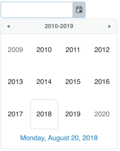
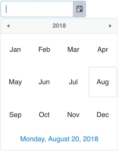
One advantage to using the `DatePicker` is the ease with which you can navigate dates. By clicking the header of the calendar you can page through the calendar a month at a time. To change the navigation depth, configure the `depth` option. If you choose to set it to year, the picker shows months in the view. If you set it to decade, it shows years. And if you set it to century, it shows decades.

Navigating by month is practical if you are using the picker for something like a hotel reservation. You might navigate by year, decade, or century if the picker is used to search for historical data over a long time span. In cases like that, it helps to set the starting view of the picker using the `start` option. This allows you to jump to a particular month, year, decade or century without having to page through the picker. In the following example, the picker's view starts with the decade. Once a selection is made, you can navigate by year.

pickers

pickers02 
```js
 
<!DOCTYPE html>
 
<html>
 
  <head>
 
    <metacharset="utf-8">
 
    <title>Date and Time Pickers</title>
 
    <scriptsrc="https://code.jquery.com/jquery-1.12.3.min.js"></script>
 
    <style>
      body {font-family: helvetica;}
    </style>
 
  </head>
 
  <body>
 
    <inputid="datePicker">
 
    <script>
 
      $(document).ready(function(){
            $('#datePicker').kendoDatePicker({
            start: 'decade',
          depth: 'year'
        });
      });
    
  </script>
  </body>
</html>
 
```
 

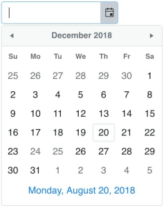
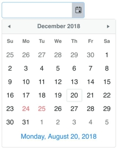
In the example of using the picker to make a hotel reservation, there might be dates that are unavailable that you do not want users to be able to choose. If you are making an appointment calendar you may want to black out dates that are holidays. To make certain dates unselectable you use the `disableDates` parameter. This can be equal to an array of dates or a function. This example will disable the dates December 24, 2018 and December 25, 2018.

picker

```js
 
$('#datePicker').kendoDatePicker({
  disableDates: [new Date(2018, 11, 24), new Date(2018, 11, 25)]
});
 
```
 

The disabled dates are shown grayed out. I would like to change the appearance of these dates so they stand out more on the calendar. To change the template of the calendar's cells, you use the `month.content` option. We want the template to show our disabled dates in red. To do this, first, we will create a helper function that will check if a date is one of the disabled dates.

```js
 
function isDisabled(date, dates) {
  for(var i = 0; i < dates.length; i++) {
    var d = dates[i];
    if (date.getFullYear() == d.getFullYear() &&
      date.getMonth() == d.getMonth() &&
      date.getDate() == d.getDate()) {
      return true;
    }
  }
  return false;
}
 
```
 

Next, we will add our disabled dates to an array and configure the template in the content option.

```js
 
var disabled = [new Date(2018, 11, 24), new Date(2018, 11, 25)];
 
$('#datePicker').kendoDatePicker({
  disableDates: disabled,
  month: {
    content: '# if (isDisabled(data.date, disabled)) { #' +
             '<divclass="disabled">#: data.value #</div>' +
             '# } else { #' +
             '#: data.value #' +
             '# } #'
  }
});
 
```

pickers

TimePicker 

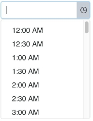
The default `TimePicker` consists of an empty text field with a control that opens a dropdown with a list of times. The list begins at 12:00 AM and ends at 11:30 PM. The values in between are listed in 30-minute intervals. Changing the length of the interval can be done by setting the `interval` parameter of the component. The following example initializes a `TimePicker`:

pickers

```html
<inputid="timePicker">
<script>
  $(document).ready(function(){
    $('#timePicker').kendoTimePicker();
  });
</script>
```

You can further customize the times by using the `min` and `max` options. These parameters allow you to restrict your list to a range of times. In the case of selecting a time for an appointment, it is practical to have a minimum time and maximum time because appointments are usually made during business hours. Using `min` and `max` coupled with the `interval` allows you to easily generate a list of options. In the case that you would need to define the exact times in the list, you can add an array of times to the `dates` parameter. This is useful when the list of times do not follow a set pattern or when you want to update the available times using the setOptions method

Times must be defined as a JavaScript Date object  which uses the following format:

```js
 
new Date(year, month, day, hours, minutes, seconds, milliseconds)
 
```

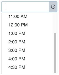
The values used for the year, month, and day do not matter because they are ignored when building the component. The seconds and milliseconds do not need to be specified unless you included them in your time format. This example allows you to choose a time from 8 AM to 4:30 PM with one hour intervals:

pickers

```js
 
$('#timePicker').kendoTimePicker({
  min: new Date(2018, 00, 01, 08, 00),
  max: new Date(2018, 00, 01, 16, 30),
  interval: 60
});
 
```

DateTimePicker 

The `DateTimePicker` is a combination of a `DatePicker` and a `TimePicker`. You have all of the same options avaiable as the `DatePicker` and `TimePicker` to configure your component. By default, you are given a text field with a control to open a calendar and a control to open a dropdown of times. This is a basic example:

pickers

```html
 
<inputid="dateTimePicker">
 
<script>
 
  $(document).ready(function(){
    $('#dateTimePicker').kendoDateTimePicker();
  });
 
</script>
 
```
 

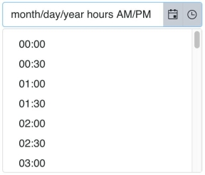
The `min` and `max` options in the `DateTimePicker` is used to set the earliest and latest date that can be selected from the calendar. The `dateInput` option allows users to enter dates and times into the field.  The default format is `M/d/yyyy h:mm tt` where `tt` is the AM or PM designation. The format of the date is changed by configuring the `format` option. The format of the dropdown values is changed by configuring the `timeFormat` option.

If the `dateInput` is set to true, then the `min` and `max` value will also determine the earliest and latest time that can be entered into the input. And unlike the `TimePicker`, the `dates` array defines dates in the calendar. These dates can then be used to customize the template for rendering the month view of the calendar. The following example adds a date input to the component and changes the format of the date and the dropdown:

pickers

pickers

```html
 
<inputid="dateTimePicker"style="width: 50%">
 
```
 
 
```js
 
$('#dateTimePicker').kendoDateTimePicker({
  dateInput: true,
  format: 'M/d/yy h tt',
  timeFormat: 'HH:mm',
});
 
```

Conclusion 

The `DatePicker`, `TimePicker` and `DateTimePicker` share many similarities making them easy to use together. For example, a date picker can be coupled with a time picker in a calendar app to filter times based on the selected date. All of the components have the same events and methods and include many of the same parameters. The `DateTimePicker` also has a toggle method to show or hide the date or the time popups. It includes all options from the `DatePicker` as well as the `TimePicker` in addition to a `timeFormat` option to distinguish between formatting the input and formatting the dropdown times.

The last picker we will take a look at is the `ColorPicker`, which is a more powerful version of the HTML5 `<input type="color">` element. Stay tuned.

Try Out Kendo UI for Yourself

Want to start taking advantage of the more than 70+ ready-made jQuery Kendo UI components, like the Grid or Scheduler? You can check out our demos and begin a free trial of Kendo UI today to start developing your apps faster.

Start My Kendo UI Trial

Angular, React, and Vue Versions

Looking for UI components to support specific frameworks? Check out Kendo UI for Angular, KendoReact, or Kendo UI for Vue.

Resources

Telerik UI for WinForms Demo App Revamped with Fluent Design & High DPI Support

$
0
0

The Demo App for Telerik UI for WinForms has just received a major update, and now features the modern Fluent design and support for high DPI. Check out the demo and try it out.

Back in May 2017 at Build, Microsoft announced the Fluent Design System. The promise was to bring a more intuitive and easy-to-use interface to be the successor of Microsoft’s Metro design, and it focuses on light, motion, material and scale elements to make interactions more coherent with the user interface. After we officially introduced the Fluent theme for the Telerik UI for WinForms suite back in R1 2018, the next logical step was to modernize our existing Demo Application. In R3 2018 we devoted a lot of effort to this, and have completely redesigned the shell of the well-known Demo App.

Metro-inspired vs. Fluent-inspired Demo App
OldvsNew

The app now has an awesome new design naturally inspired by the latest design threads around Fluent. It also supports high DPI to enable automatic resizing of the containers and their hosted controls when the application is run on higher than 100% DPI scaling. The new Demo App offers a cool “hamburger” menu for easier navigation and a dark mode as well for the fans of the “dark side.”

dark

Apart from bringing in the latest UI and UX paradigms, the Demo App can also serve the purpose of an example for achieving an auto-sizing layout. This is extremely important when your application scales under higher DPI.

DemoFluent

On the right side there is a themes panel which allows you to completely change the design of the currently opened example by applying the selected theme to it. You will probably notice the new Crystal theme at the top, which is a Mac OS-inspired theme, delivering that well-known look and feel to your application.  It is the latest addition to our themes pack. One of our commitments as a UI components vendor is to always bring new beautiful theming options for your desktop applications.  Go ahead and test it by downloading the all-new Demo Application now or inside the ThemeViewer tool.

Try It Out and Share Your Feedback

You can learn more about the Telerik UI for WinForms suite via the product page. It comes with a 30-day free trial, giving you some time to explore the toolkit and consider using it for your current or upcoming WinForms development.

Lastly, we would love to hear what you think, so should you have any questions and/or comments, please share them to our Feedback Portal or in the comment section below.

The Beginners Guide to Bad UI Design

$
0
0

A short look at several key things to avoid in order to create an effective user interface.

Creating an effective user interface is not really all that hard. Delivering a good user experience is not “rocket science.” And yet... time and time again we run into examples in the wild of bad UI. Really bad. Horrible, in fact. Here is a list of just a few examples that I have actually run into on real web sites. Avoiding these common mistakes might not make your UI fabulous, but it will certainly be a step in the right direction. More importantly, it will make me happy.

These are all things I have seen recently. I won’t call out the actual websites, but you know who you are!

Number 1: Be Consistent

I realize that large sites are developed by different teams over different time periods, but really that’s not my problem. It is annoying to use one type of component on one screen and then a different one on another. For example, if I select a date using one date picker to schedule a payment, it’s annoying to then use a different date picker later to pick a range to show transactions. Yes, I know, it’s a small thing but it’s irritating and there is no reason for it.

Please – wherever you get your components please maintain a site-wide library and stick with it. Of course, if you use a library like Kendo UI across your apps then you won’t have to worry about it. Standardization comes for along with the package. Kendo UI comes with all the components you need for any UI, and you can apply standard or custom themes to all of your components at once. Take a look at the list of components Kendo UI includes.

Number 2: Update Your Code, or Let Someone Else Do It!

The world changes. Your UI needs to change with it. Especially when you cleverly added all that checking to your UI in the first place.

Here’s a good example. My personal email is john@savix.net. Savix.net is my own domain. I’ve used it for a while and came up with it after I was too slow and missed out on Willoughby.com and johnwilloughby.com. The later is actually available right now but for a price higher than I want to pay. Imagine my delight when they opened up all those new TLDs and I was able to grab Willoughby.email. Yeah! Now I’m moving my email to john@willoughby.email.

Well, in some places at least. Because in a bunch of places when I try to enter that email address I’m told that it isn’t a valid email address because no domain is of the form xxx@yyy.email and I can’t use that. Which means that the code is pretty old and was written before they opened up all those new TLDs that are no longer just two or three characters. Having finally managed to get a domain with my actual name in it I’m more than a little miffed when I run into this. And I’ve run into this more than once. It has been several years now since the new TLDs were released, and they were in planning longer. Wake up people!

Want to find out how to do easy validation? Take a look at this example of the Kendo UI Validator.

Number 3: Don’t Present Bad Options

Here’s one that really annoyed me. Whoever did this reservation system just used two pull-downs with numbers. Pick a number between 1 and 31 for the day, 1 and 12 for the month. Oh my, where to even begin? For starters, would it really have been so hard to use names for the months instead of numbers? Second, you could pick a date that doesn’t exist like February 31. Finally, picking two numbers instead of picking from a calendar is just awkward. Just don’t.

Want to find out more about using datepickers? Check out this blog on “How to Use a jQuery DatePicker UI Component in Your Web App.”

Number 4: Don’t Be Lazy

This is a round-up of some other things that drive me crazy and most fall under the heading of not making the user do things you can do instead.

If you are going to give me a long list of choices – like my country – and 90% of people use one or two selections, then bring those up to the top of the list. If most of your customers are in the USA, don’t make me scroll down through 50 countries to find it. If it’s not one country but 3 or 4 then fine, bring those up to the top of the list. For extra credit, find out where I am logged in from and pre-select that country.

You can find out more about effectively using dropdown lists in the blog “How to Use a jQuery DropDownList UI Component in Your Web App.”

Date formats – if it’s really too much for you to use an actual date picker that lets me select from a calendar, then at least go to some effort to let me enter the date anyway I want. Nothing makes me crazier than when a computer makes me enter leading zeroes. Be flexible, do the work for me. And beyond leading zeroes, if Google can figure out that “Aug” means “August” so can you.

Want to know more about how to add autocomplete features to your forms? Check out this blog on “How to Use a jQuery Autocomplete UI Component in Your Web App”.

Lastly, don’t make me enter redundant information. I hear angels singing every time some site has me enter my zip code and the populates the city and state for me. Sure, let me change it if I want – and let me see the city and state in case I made a typo on the zip, but don’t ask me to enter city, state and zip. That’s just mean.

All Better Now?

There you have my top four pet peeves of bad user interface design, along with links to components that can help you avoid these mistakes. Remember: the app is supposed to work to make life easier for the user, not the other way around. I’ve given links to jQuery examples but remember that Kendo UI also comes in Angular, React, and Vue versions too, so you can take advantage of it in the framework of your choice.

What are your biggest UI pet peeves, or alternatively, your favorite examples of when UI was implemented the right way? Feel free to share your own thoughts in the comments.

Why XAML? Why Now?

$
0
0

XAML is dead. No wait - Long live XAML. XAML (Extensible Application Markup Language) started life as a simple thin UI markup layer, but has had a surprisingly eventful history. Developers on Microsoft's technology stack have been witnesses to XAML’s phenomenal rise as well as its teetering on the edge of life support.

Turns out, XAML may be much loved or much hated, but has clearly stood the test of time. Over years, no one team at Microsoft owned XAML - it was meant to be a descriptive markup UI language to define visual trees for apps. So, several technologies adopted XAML and gave it character and unique dialects. Today, XAML stands strong powering various app platforms, sports rich tooling support and potentially has a very bright future. This article explores what XAML can power today with an eye out for what the future holds in store.

Desktop

Windows Presentation Foundation (WPF)

The holy grail of Desktop development on Windows today is still WPF - which is where XAML started life. Over the years, XAML has always been the UI layer for WPF apps and has enjoyed rich tooling support. One might argue that much of XAML’s feature richness and ease of use stems from WPF. Both Microsoft and the developer community stepped up to make XAML/C# development a wonderful experience for developers. With code intellisense and design tools like Blend, the UI definition layer for WPF apps continues to be the gold standard for XAML development.

Universal Windows Platform

Starting from Windows 8 and after several iterations, Microsoft finally landed on UWP - the de facto way of building forward-looking apps for Windows. And sure enough, the UI layer is powered by XAML, albeit a slightly different dialect than WPF uses. XAML powering UWP apps is a big deal for developers comfortable with the markup language - primarily because of UWP’s reach. UWP can power apps on every modern Windows device, from tablets, laptops and desktops to XBoxes, Surface Hubs and the HoloLens. Developers get to define their UI in XAML and it simply works across all form factors.

While this sounds magical, the reality takes a bit of work to adjust layouts with a fluid UI for various device sizes - but it is all XAML under the covers. And UWP’s device flexibility means XAML sports rich features like responsive layouts, advanced touch support and inking capabilities.

Mobile

Xamarin.Forms

Being able to reach all Windows devices with XAML was nice, but no one lives in a platform silo. For mobile form factors, iOS/Android rule - .NET developers needed a bridge to carry their skills cross platform. Enter Xamarin.Forms. With a shared abstracted UI layer, developers can share not only business logic but UI definition as well - all towards building truly native cross-platform apps. And the choice for abstracted UI definition? Yep, XAML - a special dialect of it catered for mobile app development.

Xamarin.Forms XAML did something wonderful - relieving .NET developers from having to learn the intricacies of native platform UI. Developers get to define the UI visual tree in XAML and the runtime turns around to render corresponding native UI components on each platform. Modern Xamarin.Forms development provides rich tooling for XAML development - like Forms Previewer, Inspector and Profiler.

Uno

Is Xamarin.Forms XAML not quite your cup of tea? Turns out, a few smart folks from Montreal Canada are with you - and they love UWP XAML. Enter Uno - now an open source UI abstraction library that creates bridges to iOS and Android from XAML. Uno’s application runtime is powered by Mono and Xamarin - developers simply get to use UWP XAML, instead of the Xamarin.Forms head. This was no small effort since the corresponding native UI is being rendered on each platform. It's all worth it just for the love of UWP XAML.

NativeScript

A lot of enterprises that have traditionally had a full .NET technology stack, now power their web app frontends with SPA frameworks - like Angular, React or Vue. Most modern .NET developers aren’t shy about writing JavaScript, CSS and HTML. And if web technologies are what’s powering your apps, then JavaScript Native apps are rather enticing as a mobile strategy. Developers get to reuse web technologies to power truly native cross-platform mobile apps - and potentially share code between web and mobile.

NativeScript is an open source framework for building JS Native mobile apps. Developers get to write straight up JavaScript or TypeScript with Angular for the app’s business logic. And the abstracted UI layer is defined in XML - a JS bridge renders corresponding native UI at runtime. While officially XML, let’s take a look at standard UI definitions in NativeScript - look familiar? Yup, that’s almost XAML, and .NET developers with any XAML experience will be perfectly at home here.

Web

Microsoft Silverlight

XAML powering apps on the web browser has had a checkered past. Understandably, .NET developers who did Silverlight are still hurt - it is never a good situation when technologies die and take down investments. The web has simply moved away from the Plugins model and Silverlight saw the writing on the wall. Folks who did Silverlight development though were actually quite fond of the developer experience - XAML/C# was beautiful in the browser and the rich tooling helped. There may be some longingness to see XAML back on the web - but done with better architecture.

WebAssembly

WebAssembly

Enter WebAssembly - a low level instruction format that modern evergreen browsers can execute natively, just like JavaScript engines execute JS code. Being an open web standard, WebAssembly is enjoying support from big browser vendors, with promises of security and native execution speeds. The biggest draw of WebAssembly is the promise of compiling code written in higher level languages into stack-based instructions that browsers run natively - this opens a lot of doors.

Mono

mono

Mono has been around since the early days of the .NET Framework, as a popular port of .NET APIs to platforms outside of Windows. Over the years, Mono has matured to provide a large API surface area and .NET API mappings on other platforms like Mac/Linux, thus enabling .NET apps to step outside of Windows. Mono continues to power all of Xamarin - it is clearly the easiest way to take .NET code and run it on iOS/Android.

Turns out, folks at Mono are plenty smart and work is underway to bring Mono to the WebAssembly platform. This has the wonderful potential of compiling C# code down to WebAssembly that the browsers can execute natively, Hallelujah! This is exactly what’s powering Blazor - the experimental ASP.NET web framework promising to bring C# to the browser with Razor syntax. While the present Mono support for WebAssembly may be through Mono IL interpreter to run managed code at runtime, support for full static Ahead Of Time (AOT) compilation isn’t far away. This should lead to excellent performance of C# code on the browser.

With C# coming to browser natively, it didn’t take long for XAML afficianados to demand the UI abstraction layer back - this time, done through WebAssembly instead of using a Plugin. While experimental, it turns out both Xamarin.Forms and UWP XAML can already power web apps in the browser through WebAssembly.

Meet Ooui - a small cross-platform UI library that brings the simplicity of native UI development to the web. Ooui.Forms provides Xamarin.Forms renderers for the web with a shadow DOM powering the front-end app - it can be hosted by itself or as a part of ASP.NET Core. There are several online samples to play around with and see the fun of having XAML back in the browser. Also, Ooui.Wasm allows for packaging Xamarin.Forms apps with XAML UI markup into a WebAssembly runtime. It is nice to see a Xamarin.Forms apps, compiled statically and hosted on Amazon S3, running purely as WebAssembly on the browser.

Not to be left behind, UWP XAML also finds its way back in the browser - thanks to Uno. The experimental WebAssembly support looks polished, especially when trying things out in Uno’s WebAssembly Playground. Write, edit and see XAML running in browser natively - how magical.

Looking Ahead

MVVM Frameworks

A big part of why .NET developers are fond of XAML development is the rich tooling and ease of maintaining large codebases. Model-View-ViewModel (MVVM) is a design pattern that works really well for XAML/C# development and there is plenty of help on this front. There are rich MVVM frameworks that have evolved over the years to support WPF/UWP platform development and now they have been customized to work for Xamarin.Forms as well. The open source .NET developer community really shines through with these MVVM frameworks - a lot of effort has gone into building feature richness and Visual Studio templates for each of the frameworks. Popular ones are MVVM Light, Prism and MVVM Cross.

Xamarin.Forms Heads

An interesting set of developments for XAML developers is the increasing number of heads/backends for Xamarin.Forms - this simply increases the number of platforms supported and takes your code places. Xamarin.Forms is open source and the developer community is smart. The result is new Xamarin.Forms heads like MacOS, GTK Linux, WPF, Tizen and even the web - Xamarin.Forms apps are now starting to power so many platforms outside of just mobile. And the abstracted UI layer is your beloved XAML.

Marzipan

Apple has been having an app gap problem - most developers build for iOS, but not much for the Mac AppStore. Their remedy is an internal project codenamed ‘Marzipan’ - aimed for fruition some time in 2019. The goal is get iOS apps running on the Mac desktop through a mashup of UIKit and AppleKit - and there are several demos Apple has shown off already. Now this obviously has to be done carefully - there are implications when we take touch apps back to the desktop with mouse/keyboard.

So why should .NET/XAML developers care about Marzipan? Turns out, we’re talking iOS apps running on Mac desktop with minimal changes. And the iOS apps can be written in Xamarin.Forms or Uno - this means XAML can officially power desktop apps on the Mac. Given XAML’s richness to handle responsive layouts, one can argue that XAML developers should be able to port their iOS apps fairly easily to the Mac.

Polished UI

Another reason for loving XAML/C# development is the rich ecosystem. Most professional apps need complex performant UI and developers need not reinvent the wheel - there is a lot of help. Enter Progress Telerik - your beloved .NET tooling across web, desktop and mobile.

Telerik offers multiple UI suites catering to different platforms for XAML developers. What’s common are feature-rich UI controls, full MVVM support, consistent APIs and professional themes for styling. The engineering efforts behind each UI component shows in performance and pixel-perfect rendering - developers love complex UI that they can just drop in to light up apps. Popular controls include Grids, ListViews, various Charts/Graphs, Calendars, SideDrawers and myriads of other UI that is difficult to create by hand.

While Telerik UI for WPF provides powerful UI for desktop apps, Telerik UI for Xamarin powers mobile apps across all platforms - and yes, all with XAML as the UI stack.

While the modern web may have moved away from Plugins model, many enterprise Silverlight apps still power line of business workflows. To that end, Telerik UI for Silverlight is there to help and sees continued feature investments. Building for Windows devices? Telerik UI for UWP is there to help with polished performant UI - and entirely free and open source.

XAML Standard

As discussed, we have a few flavors of XAML now - WPF, UWP and Xamarin.Forms each talk slightly different dialects. This leads to a bit of fragmentation and some frustration for developers, mostly over annoying little differences and varying XAML namespaces. Wouldn’t it be nice if all platforms spoke the same XAML?

That’s exactly what XAML Standard aims to do - unify all XAML dialects into a common language across WPF, UWP and Xamarin.Forms. The specifications for XAML Standard are being chalked up out in the open with developer community feedback and initial efforts aim to create aliases to smooth out XAML differences across platforms. However, XAML Standard has taken on a particularly difficult problem - the XAML across various platforms is often too focused on platform specifics. The road ahead is rough for XAML Standard, to say the least.

Unified UI Stack

So clearly, XAML as the UI layer is much loved and has stood the test of time. XAML today powers several app platforms across desktop and mobile, and the experimental efforts are underway to bring XAML back to the web browser. Developers enjoy rich tooling for XAML development and a thriving community provides support.

However, one can also argue that there are mixed messages around XAML. There are multiple ways of building the XAML UI stack for mobile/desktop and true cross-platform solutions require a lot of work. Could there be a silver lining in the horizon?

Turns out, .NET Core updates have come in waves. .NET Core 1.x was all about taking the CLR cross-platform - so .NET apps could step outside of Windows. .NET Core 2.x stabilized the ship - most missing APIs were reinstated and web development tooling came of age. .NET Core 3 would be all about taking the benefits of .NET Core back to the desktop for WPF/WinForms apps. Could the .NET Core 4.0 wave see the cross-platform UI story be addressed?

Wouldn’t it be nice if there was a uniform UI layer that was consistent and worked cross-platform for web/desktop/mobile? We can conjecture about the future, but XAML is likely the most obvious candidate to pull off the heist. Fingers crossed and cheers to the future!

How to Render Vue Apps to a Server Using Nuxt

$
0
0

Learn how to easily get started rendering apps built with Vue to a server to improve your app's performance using Nuxt.js.

As one of the contemporary widely used JavaScript frameworks/libraries, Vue.js offers an awesome user experience by dynamically rendering page content without necessarily sending a request to the server each time.

However fast rendering of contents by Vue.js might be, whenever your site starts to grow, it takes a fair amount of time before the website is finally rendered, as it contains plenty of content required to construct the page.

With Nuxt.js you can easily preload content on the web server and render HTML as the response to a browser request for a page. This will ultimately improve “time to content” when loading an application.

In this post we will examine some of the basic concepts of building applications using Nuxt.js and also build a simple static site in the process.

Why Server-Side Rendering

Server-side rendering is a clever solution to improve page rendering performance in any application, especially those powered by Vue.js. It eliminates the need to send a request to server and recreate pages that don’t contain dynamic content — for example, a contact us page. A server can create this page once and cache it for future use.

This will obviously improve the speed of page rendering, no matter how subtle it might be.

Why Nuxt.js

Nuxt.js simplifies the development of Vue.js applications. One of its major focuses is the creation of universal apps — by this, I mean applications that are also rendered on the server. Nuxt.js isn’t a replacement for server-side libraries like Express; it is not a server-side framework. It just allows us to pre-render views on the fly from the server.

Another point to note is the setup of routes irrespective of the scale of your application. You can simply create a file for a page, and Nuxt.js will automatically set up the route for you to navigate and view the newly created file out of the box. We will see this later in the tutorial.

Nuxt.js builds upon Vue, and you can still write and structure your applications the same way you would while building a typical Vue.js application.

Prerequisites

A basic knowledge of JavaScript and Vue is required for this tutorial. Also ensure that you have Node.jsNPM and Vue CLI installed on your computer.

Setting up the Project

If you haven’t downloaded Vue’s CLI already, do so with this command to have it installed globally on your machine:

```bash
    $ npm install -g vue-cli
```

Next, to get started with creating a Nuxt.js app, run the following command to use the CLI to scaffold a new project named fictional-store from your terminal:

```bash
    $ vue init nuxt/starter fictional-store
```

Change directory into the newly created project and install all its dependencies:

```bash
    // change directory
    cd fictional-store
     
    // install dependencies
    npm install
```   

Running the Application

Launch the project with:

```bash
npm run dev
```

If you get this compiled error displayed in the console:

You can fix it by opening ./nuxt.config.js and replace the build{}object with:

```javaScript
    // ./nuxt.config.js
       
      module.exports = {
      ...
        build: {
          /*
          ** Run ESLint on save
          */
          extend(config, { isDev }) {
            if (isDev && process.client) {
    config.module.rules.push({
                enforce: 'pre',
                test: /\.(js|vue)$/,
                loader: 'eslint-loader',
                exclude: /(node_modules)/
    })
            }
          }
        }
      }
 
``` 

Stop the server by pressing CTRL + c and restart the server again:

```bash
    npm run dev
```
 This will run the application on the default port for a Nuxt.js app at http://localhost:3000/. Navigate to that URL, and you should see the welcome page automatically created by Nuxt.js:

Project Structure

This is going to be an introduction to using Nuxt.js. Before we proceed, let’s take a quick look at the folder structure of the static application that we want to build. We will basically create a few pages and navigate through them. Doing so, you will have an idea of how routing simply works without the need to configure this manually.

Our application will have the following pages:

  • Homepage
  • About page
  • Product page
  • Contact page

Creating Components

We will set up a reusable Navigation component for this project, but before that, let’s pull in Bootstrap to help with some default page layout.

Add Bootstrap

Open ./nuxt.config.js and include the CDN link for Bootstrap within the link object:

```javaScript
    // ./nuxt.config.js
     
    module.exports = {
      head: {
      ...
        link: [
          { rel: 'icon', type: 'image/x-icon', href: '/favicon.ico' },
          { rel: 'stylesheet', href: 'https://stackpath.bootstrapcdn.com/bootstrap/4.1.3/css/bootstrap.min.css' } // include this line
        ]
      },
    ...
    }
```

You will need to restart the server for Bootstrap to be successfully installed for this project. To do this, hit CTRL + C from the terminal to stop the server if it currently running and restart with npm run dev.

Next, locate the components folder and create a new file named Navigation.vue. Paste the code below in it:

```
    // ./components/Navigation.vue
     
      <template>
          <navclass="navbar navbar-expand-lg navbar-light bg-light">
             <aclass="navbar-brand"href="#">Navbar</a>
    <divclass="collapse navbar-collapse pull-right"id="navbarNavAltMarkup">
                <divclass="navbar-nav">
                    <nuxt-linkclass="nav-item nav-link active"to="/">Home</nuxt-link>
                    <nuxt-linkclass="nav-item nav-link"to="/about">What we do</nuxt-link>
                    <nuxt-linkclass="nav-item nav-link"to="/product">Products</nuxt-link>
                    <nuxt-linkclass="nav-item nav-link"to="/contact">Contact</nuxt-link>
                </div>
    </div>
          </nav>
      </template>
```  

Here, we created a navigation bar and set up links to the pages that we will create soon.

Modify the Default Layout

Now, open the default.vue within the layouts folder and replace the contents with:

```
    // ./layouts/default.vue
     
    <template>
      <div>
        <navbar></navbar>
        <nuxt/>
      </div>
    </template>
     
    <script>
    import Navbar from "../components/Navigation";
    export default {
      components: {
        Navbar
      }
    };
    </script>
```  

We have only imported the Navigation component and included it just above <nuxt />. This will help us create a master layout.

Adding a New Page

Once you set up a new project with Nuxt.js, a new file will automatically be generated and will set up a view for the homepage. This is what we were able to view from the browser earlier.

Update the index page by replacing the content found in ./pages/index.vue with:

```
    // ./pages/index.vue
     
      <template>
        <section>
          <divclass="container h-100">
                <divclass="row h-100 justify-content-center align-items-center">
                  <div>
                    <p>Fictional e-commerce store  </p>
                    <p><em>Home of bespoke and modern wears</em></p>
                  </div
                </div>
    </div>
        </section>
      </template>
      <script>
      import AppLogo from "~/components/AppLogo.vue";
      export default {
        components: {
          AppLogo
        }
      };
      </script>
      <style>
      .container {
        min-height: 100vh;
        display: flex;
        justify-content: center;
        align-items: center;
        text-align: center;
      }
      </style>
       
```  

If you visit the homepage at http://localhost:3000/ now you should see this page:

About Us Page

Create a another file named about.vue within the pages folder and paste the content below in it:

```
    // ./pages/about.vue
     
      <template>
          <section>
    <divclass="container h-100">
                <divclass="row h-100 justify-content-center align-items-center">
                  <div>
                    <p>
                      More Clothing & Accessories discounts - Don't miss a single chance to save.
                    </p>
                  </div
                </div>
    </div>
          </section>
      </template>
```  

Product Page

Next, create a product page within the pages folder and name it product.vue. Open the newly created file and paste in the following content:

```
    // ./pages/product.vue
     
      <template>
          <div>
    <divclass="container">
                  <divclass="row">
                      <divclass="col-md-3">
                          <divclass="card">
                              <imgclass="card-img-top"src="https://res.cloudinary.com/yemiwebby-com-ng/image/upload/v1537950595/symfony-listing/z1rtappih3vwlsjk1ada.jpg"alt="Card image cap">
                              <divclass="card-body">
                                  <h5class="card-title">Card title</h5>
                                  <pclass="card-text">This card has supporting text below as a natural lead-in to additional content.</p>
                                  <pclass="card-text"><smallclass="text-muted">Last updated 3 mins ago</small></p>
                              </div>
                          </div>
                      </div>
                      <divclass="col-md-3">
                          <divclass="card">
                              <imgclass="card-img-top"src="https://res.cloudinary.com/yemiwebby-com-ng/image/upload/v1537950461/symfony-listing/w92p99ntmbawcgjjubfh.jpg"alt="Card image cap">
                              <divclass="card-body">
                                  <h5class="card-title">Card title</h5>
                                  <pclass="card-text">This card has supporting text below as a natural lead-in to additional content.</p>
                                  <pclass="card-text"><smallclass="text-muted">Last updated 3 mins ago</small></p>
                              </div>
                          </div>
                      </div>
                      <divclass="col-md-3">
                          <divclass="card">
                              <imgclass="card-img-top"src="https://res.cloudinary.com/yemiwebby-com-ng/image/upload/v1537950595/symfony-listing/z1rtappih3vwlsjk1ada.jpg"alt="Card image cap">
                              <divclass="card-body">
                                  <h5class="card-title">Card title</h5>
                                  <pclass="card-text">This card has supporting text below as a natural lead-in to additional content.</p>
                                  <pclass="card-text"><smallclass="text-muted">Last updated 3 mins ago</small></p>
                              </div>
                          </div>
                      </div>
                  </div>
    </div>
          </div>
      </template>
```

You can find product page here http://localhost:3000/product

View Page Source

If you right-click and view the page source of this application now, you will see the exact content as depicted by the image below:

This is one of the main advantages of server-side rendering brought to Vue.js application by Nuxt.js, as well as the reason it is termed as a library for building “universal Vue.js applications.” Obviously, this is an indication that our app is rendered both on the client and the server. This is really important, as it makes it easy for search engines to index our site.

Contact Us Page

Create the contact us page as contact.vue within the pages folder as well and add the content below:

```
    // ./pages/contact.vue
     
      <template>
          <section>
    <divclass="container h-100">
                <divclass="row h-100 justify-content-center align-items-center">
                  <div>
                    <p>
                     Feel free to check out our website.
                     www.fictionalstore.sample
                    </p>
                  </div
                </div>
    </div>
          </section>
      </template>
```  

Generating Static Site

With Nuxt.js you can easily generate static site using a single command.

```bash
    npm run generate
```

Using the command above, Nuxt.js will generate the HTML for every one of the routes and pages created and save them in a file.

Moving forward, you can easily deploy your website to the live server by simply uploading the newly generated dist folder.

Test the Application

Run the application in case you haven’t done so with:

```bash
    npm run dev
```

See it working on http://localhost:3000/

Conclusion

Effective and fast page rendering without much delay is crucial to the success of any web application. As seen in this tutorial, you can greatly simplify the development and improve the performance of Vue.js applications by using Nuxt.js for server-side rendering.

To see Nuxt.js in action, we built a simple store and later compiled it into a dist folder.

I hope you found this tutorial helpful. Find the complete source code on GitHub.


For more info on Vue: Want to learn about creating great user interfaces with Vue? Check out Kendo UI for Vue our complete UI component library that allows you to quickly build high-quality, responsive apps. It includes all the components you’ll need, from grids and charts to schedulers and dials.

For more info on Nuxt.js: Feel free to check out the blog post, Getting Started with Nuxt.js, to learn more about Nuxt and how you can use it in your apps.

Let's Build a Sales Dashboard with React

$
0
0

Follow along as we mock-up, design and lay out a sales dashboard with native React components from KendoReact, complete with a responsive grid, data, charts and more.

Building line of business web apps can be challenging, even with modern frameworks like React. Fortunately, UI libraries like Kendo UI can make this easier. In this tutorial, we are going to utilize KendoReact, a library of native UI components built specifically for React. If you have ever used component libraries from Progress, you will feel right at home with KendoReact. However, if you have never heard of Kendo UI, this tutorial will demonstrate what can be done quickly with the library.

Building the Sales Dashboard in KendoReact

For this article, we'll build a sales dashboard for a fictitious company. We'll use an existing dashboard available on Github built with KendoReact: kendo-react-sales-dashboard. My goal is to show you how to build a similar dashboard from scratch.

KendoReact Dashboard

Our sales dashboard will show the top selling products for the country store each quarter of the year, broken down by month. I will introduce the data for each component as we build them.

This project covers very basic concepts in React and KendoReact using Create React App with native React components. We will also do some basic layout with HTML and CSS and hope to build off of this tutoiral in the futures with more advanced concepts.

Getting Started

We need to ensure that we have Node installed, version 7 or higher as the latest version of Create React App makes this a requirement. Having Node installed will allow us to use npm to download Yarn Package Manager. If you are new to Create React App, you can brush up on the latest with this article: (Hello, Create React App!) written to get folks up to speed with this tool for creating React applications using zero configuration.


Ensure Yarn is Installed:

Yarn is used as the default package manager in Create React App. Install it using:

$ npm install yarnpkg -g

If you have any issues installing Yarn on Windows, just download and run the msi installer here.


$ npx create-react-app kendo-react-sales-dashboard
$ cd kendo-react-sales-dashboard
$ yarn start

Once Create React App is started you can check what our app looks like in the browser:

CRA View

Now we can add packages to help create a basic layout for our dashboard. KendoReact has a Material theme that we can pull in as a package for layout. We will also need to bring in a few KendoReact buttons, which will give you an idea of how easy it is to pull the bits and pieces in to get started. Since Create React App uses yarn out of the box and to me it feels like it's a little faster for installing packages, I'm going to use all yarn commands in this tutorial:

$ yarn add @progress/kendo-theme-material
           @progress/kendo-react-layout
           @progress/kendo-react-buttons

Before we get too far, I want to share my idea of what this app will look like, I have completed a basic sketch using a tool called Balsamiq showing how the component layout will be arranged.

Balsamiq Mockup

Typically a designer and a UX specialist will develop a design prototype to give the developers a much better idea of design direction, but we are on an MVP budget, so for the purpose of our tutorial this Balsamiq mock-up will be our guide. The Material design theme we use will give us nice looking type and polished UI styles with zero effort. Customizing these components is possible, but we will stick with the default.

A follow up I like to do once I have a mock-up like this, is to outline each component and arrange those outlines into a row and column friendly representation. I will use that to understand what structure of <div> elements and classes I will need. In the layout below, we have two rows, the first containing the Heading and buttons. Everything else will go in a new row below. The second row is split up into two columns. And inside the right column will be another set of two rows, the first having three columns and the next having just one column.

Balsamiq Layout

Now that we have these sketches we can build the markup using <div> elements and assign classes indicating how many of the maximum 12 units each column will make up. In the next section, I'll introduce you to the markup structure that will house the components.

The HTML

Considering the layout we saw above, I have created a hierarchy of divs each given a className in the traditional “12 column responsive grid” fashion, and simplified that idea in a visual aid. In React we use the attribute className instead of class anytime we are defining CSS classes in JSX. For brevity, I have referenced only the xs breakpoint for each <div>, but in the Gist I have of the breakpoints required to ensure our layout doesn't shift as we resize the page.

MockupHTML

Each of the custom tags I have put in this image above are just placeholders used for visual representation, so don't copy this HTML verbatim. Again this is just to help us understand the structure we will need.

You will see many tags in the HTML that we will eventually replace with the actual component or HTML we need. Below is the actual code that I want you to copy into your App.js page to get us started.

I'm also going to give you some CSS code to past into your App.css file. Go ahead and replace the CSS in your App.cssfile with the Gist below.

Finally, add bootstrap. To keep things simple, add a link to the Bootstrap CDN to the public/index.html file. Add it just underneath the shortcut icon:

<link rel="stylesheet" href="https://maxcdn.bootstrapcdn.com/bootstrap/4.0.0/css/bootstrap.min.css" />

This contains some styles not only to help with some of the HTML that we just pasted in. Your page also looks a little crazy right now, but in reality everything is there in place for layout for us to move to the next step, which will require getting some data ready and adding our first Kendo UI components (buttons).

Adding Buttons

We already have a few buttons on the page, but we want to change those to Kendo UI buttons because it will allow us to bring in our first Kendo UI components and Kendo UI Material theme. We already have the dependencies added so let's go into our App.js page and add the Button& savePDF imports just underneath the import ReactDOM line at the top of the App.js page:

import ReactDOM from 'react-dom';
import { Button } from '@progress/kendo-react-buttons';
import { savePDF } from '@progress/kendo-react-pdf';

We can wire up the Export to PDF button. Let's install these packages with Yarn to get that done.

$ yarn add @progress/kendo-react-pdf
           @progress/kendo-drawing
           @progress/kendo-react-buttons

Now change both <button> tags (like below) to use an uppercase B:

<Button>Share</Button>
<Button>Export to PDF</Button>

Run the app using $ yarn start if not already running. You should be at least seeing the text and the buttons now.

Export to PDF

A lot of times we simply want the user to be able to print everything on the page to a PDF file. In order to do this, we can use the package just imported to do all the heavy lifting.

Add the following code to your App Component Class in App.js:

constructor(props) {
  super(props);
  this.appContainer = React.createRef();
}

handlePDFExport = () => {
  savePDF(ReactDOM.findDOMNode(this.appContainer), { paperSize: 'auto' });
}

With that code in place, we need to bind this.appContainer to an object, which is a reference to the HTML element that contains the area we want to print to PDF.

Because we want to print the entire sales dashboard, we will place an ref attribute on the outer most <div> in our JSX. You can locate it by it's className: app-container:

<div className="app-container" ref={(el) => this.appContainer = el}>

The ref attribute allows us to assign an HTMLDivElement representing the contents of the <div> element it is placed on, to a local property.

Next, we will want to ensure that we are calling the handlePDFExport() function from the onClick event. Let's also disable the other button for the time being.

<Button disabled>Share</Button>
<Button onClick={this.handlePDFExport}>Export to PDF</Button>

Let's now test our button to ensure everything is working. When the button is pressed, you should get a prompt to download a PDF file. Upon opening the PDF you should see the entire contents of our page. You can imagine what would happen if we put this attribute on another <div> in our page. At that point the button would only print the contents of the <div> element. We will revisit this idea once we get the Grid working and create a button that only prints the data grid.

One thing I want to point out before moving on is that in React, when we want to call a function inside our JSX like we did on the onClick handler, we simply assign that function name to the attribute. No need for quotes invocation parenthesis, just the name of the function like below:

onClick={this.handlePDFExport}

But wait? Our buttons look all… meh! We forgot something. We need to bring in our Kendo UI Material theme now that we are actually using some Kendo UI components on the page. Once we import the right CSS file, all of the other components we need to bring in will also benefit from this styling.

Import the Material Theme at the bottom of our imports on App.js just above the import for App.css.

import '@progress/kendo-theme-material/dist/all.css';

And let's not forget that we will need to pull in this theme using yarn in order for that import to work.

$ yarn add @progress/kendo-theme-material

Let's also bring in a class that will give our buttons some spacing. It's already defined in the styles we have added to the App.css file. On the div that surrounds our buttons, add buttons-right to the className. The buttons and their containing div should now look like this:

<div className="col-xs-3 col-sm-3 col-md-3 col-lg-3 col-xl-3">
  <Button disabled>Share</Button>
  <Button onClick={this.handlePDFExport}>Export to PDF</Button>
</div>

Now you should see your buttons taking on a Material Design style.

Material Themed Buttons

Share Dialog

Let's wire up the share button now. In a real production application this would talk to a service that could be used to send an email to someone in order to share the dashboard link, but we are just going to make it print to the console.

In the constructor for our App.js file, lets create an object to hold state. This state object is understood by React to be a special object. Under the hood, React treats this object differently.

constructor(props) {
  super(props);
  this.appContainer = React.createRef();
  this.state = {
    showDialog: false
  }
}

Let's create a function inside the App class, underneath the handlePDFExport() function. As I mentioned React state objects are special, they have an API used specifically for interacting with it. For instance, if we want to change the state in any way, we should not access the object directly and assign new values. Instead we use the setState method for updating the state. This will schedule an update to a component's state object. When state changes, the component responds by re-rendering.

handleShare = () => {
  this.setState({
    showDialog: !this.state.showDialog
  })
}

PRO TIP: To execute a function, or verify if the state updates correctly, we can pass a function as a second argument (callback) to setState(), the function will be executed once the state is updated. Find out more and explore the React docs for state.

handleShare = () => {
  this.setState({
    showDialog: !this.state.showDialog
  }, () => console.log(this.state))
}

We also need to update the button to use this function. We will further add a distinguishing feature by setting primary to true. Behind the scenes, our component takes that true value and gives the button a primary style:

<Button primary={true} onClick={this.handleShare}>Share</Button>

So this button toggles a boolean value in our state object, which is typically a good way to hide and show modals, pop ups or hidden areas of the page. But we need to create a hidden area that will reveal itself when this button is clicked. As we saw from our setState callback, each time we press the Share Button that value is flipped. This HTML block that we are going to add should be replaced by the code below:

<h4 style={{display : 'none'}}>Dialog Shown/Hidden with Logic</h4>

Replace with the following code:

{this.state.showDialog &&
  <Dialog title={"Share this report"} onClose={this.handleShare}>
    <p>Please enter the email address/es of the recipient/s.</p>
    <Input placeholder="example@progress.com" />
    <DialogActionsBar>
      <Button primary={true} onClick={this.handleShare}>Share</Button>
      <Button onClick={this.handleShare}>Cancel</Button>
    </DialogActionsBar>
  </Dialog>
}

Let's unpack what we just added: we brought in a new KendoReact component called <Dialog> which is wrapped in an expression that will hide or show the area based on the state.showDialog value being flipped. The best way to think of this is that our <Dialog> component equates to a truthy value. It's similar to saying:

{ this.state.showDialog && true }

So because it's paired up with the this.state.showDialog, if both equate to true, the Dialog displays. However, if this.state.showDialog is false, the output of the <Dialog> component is not revealed. Again this is just a way to think about this statement if for any reason it looks weird to you.

The <Dialog></Dialog> component will not work without importing it from the react-dialogs package, so let's get that added and imported:

$ yarn add @progress/kendo-react-dialogs
           @progress/kendo-react-inputs
           @progress/kendo-react-intl

And we'll also import those packages in our App.js. Our imports should now look like this:

import React, { Component } from 'react';
import ReactDOM from 'react-dom';

import { Dialog, DialogActionsBar } from '@progress/kendo-react-dialogs';
import { Input } from '@progress/kendo-react-inputs';

import { Button } from '@progress/kendo-react-buttons';
import { savePDF } from '@progress/kendo-react-pdf';

import '@progress/kendo-theme-material/dist/all.css';
import './App.css';

I noticed something missing when I clicked on our new buttons. Material Design UI I have worked with in the past utilizes a ripple effect on certain UI elements. Buttons definitely show this ripple effect and I am not seeing it on ours. This is because Kendo UI provides this as a separate package, which I think is a good idea because I may or may not want the additional code brought into the CSS and JavaScript if I don't want to use it. Let's add and import this <Ripple> as a component that will wrap our application:

$ yarn add @progress/kendo-react-ripple

With that done, you can now import Ripple into the App.js page just above the Dialog and DialogActionsBar import:

import { Ripple } from '@progress/kendo-react-ripple';

Next, we want to add a <Ripple /> container around the <div> element of the app-container so that all Button and other components will get the ripple effect applied to them as a child of <Ripple />:

class App extends Component {
  constructor(props) { /* ... */ }
  handlePDFExport = () => { /* ... */ }
  
  render() {
    return (
      <Ripple>
        <div className="app-container" ref={(elem) => this.appContainer = elem}>
          { /* ... */ }
        </div>
      </Ripple>
    );
  }
}

export default App;

Now when you click and drag outside the button hit state and release, you will experience the effect without activating the button's click event.

Ripple Effect

Mmm, Donut Charts

I'd like to start bringing in the Chart component. It has the least amount of data associated with it, so it's a logical next step and easy to implement.

Let's add the component (commented out), replacing the <h4> element placeholder. Find the line of code that reads:

<h4>Donut Chart Container</h4>

And replace it with:

{/* <DonutChartContainer /> */}

Create a Components Directory

Next, let's add a directory for all of our container components and call it components, and inside create our first container component of many named: DonutChartContainer.js. We will continue with this naming convention for each of our KendoReact components.

We also need to bring in the package for the KendoReact Charts:

$ yarn add @progress/kendo-react-charts

Next, copy the code that I have modified from the Kendo UI documentation into DonutChartContainer.js from the Gist below:

The KendoReact charts provide a vast set of features for building rich data visualizations. To learn more about them, feel free to check out the Charts API.

Create Data Directory

The first thing we want to create for the Chart is some dummy data. Like I said before, all of our components will need data. Let's create a directory named data as a sibling to our components directory. Inside that directory create a file named: appData.js.

Remember, the idea is to show what percentage of food (by category) has sold in Q4. That specific data is what we will use to populate the donut chart. We'll need some type of label and percentage value.

  • foodType category of foods sold in Q4 at all stores
  • percentSold percentage represented as a decimal sold in all stores in Q4

Copy the code below into the appData.js file:

export const donutChartData = [
  { 'foodType': 'Beverages', 'percentSold': 16.5 },
  { 'foodType': 'Condiments', 'percentSold': 24 },
  { 'foodType': 'Produce', 'percentSold': 13 },
  { 'foodType': 'Meat/Poultry', 'percentSold': 16.5 },
  { 'foodType': 'Seafood', 'percentSold': 20 },
  { 'foodType': 'Other', 'percentSold': 10 }
];

In the App.js file, we need to add an import:

import { DonutChartContainer } from './components/DonutChartContainer';

... and uncomment the {/* <DonutChartContainer /> */} in the HTML.

<DonutChartContainer />

Now our component should be working. Let's make a change so that you understand how we can format the label for the Donut Chart. Right now we are only displaying the category because we specified that in our component configuration.

Inside the DonutChartContainer.js file, Change the labelTemplate function to:

const labelTemplate = (e) => (e.category + '\n'+ e.value + '%');

enter image description here

Here is our beautiful Donut, it even looks tasty! When we use the Donut Chart, we interact with a <ChartSeriesLabels> component. The content input accepts a function that returns a string. It's that simple. It fills each section (categories in our case) with rich goodness. Using just what we know about JavaScript, we can achieve some better formatting and I think we may want to use e.percentage instead of e.value. You can get details on the fields we can tap into in our ChartSeriesLabels documenation.

I have modified the template function to achieve a more desirable display and by choosing percentage I guarantee I will always get each category representing its portion of the total. This is in case maybe we decide to use data that doesn't equal 100 as a total for all values.

const labelTemplate = (e) => (e.category + '\n'  + (e.percentage*100) +'%');

The display has not changed here, I just wanted to use percentage instead of value.

Raising the Bar Chart Component

The next logical step is to create a bar Chart which represents a monthly breakdown of the percentages from each individual month from Q4 2018. The donut Chart showed the average percentage over the entire quarter, but our bar chart will show each month of that quarter. Below is the data we need to add to our appData.js file. You will notice that our data corresponds to the Donut Chart as well, so the user can easily see the relationship.

export const barChartQ4Months =['October', 'November', 'December'];
export const barChartMonthlyPercentages = [
  { name: 'Beverages', data: [14, 16, 19.5] },
  { name: 'Condiments', data: [24, 23.5, 24.5] },
  { name: 'Produce', data: [12.5, 12.5, 14] },
  { name: 'Meat/Poultry', data: [16, 18, 17] },
  { name: 'Seafood', data: [21.5, 20, 17] },
  { name: 'Other', data: [7, 12, 11] },
];

With the data in place, we can add a new container component to our components directory. Create a file named BarChartContainer.js.

Replace the <h4> element placeholder. Find the line of code that reads:

<h4>Bar Chart Container</h4>

And replace it with:

{/* <BarChartContainer /> */}

Next, copy the code that I have modified only slightly from the Kendo UI documentation examples and put it into BarChartContainer.js from the Gist below:

Place an import in at the top of the page, just above our CSS imports in App.js:

import { BarChartContainer } from './components/BarChartContainer';

... also in App.js, uncomment {/* <BarChartContainer /> */} in the HTML.

<BarChartContainer />

Do a quick visual confirmation to ensure that your bar chart lines are using the same colors as the Donut Chart. Everything should line up because our data for each chart is in the same order. If you were building an API to serve this data, that would be something you would want to ensure does not get messed up.

That may have been the easiest one yet to setup. The container page is very straight forward as we are not dealing with any state. We still like to have that layer of abstraction in our project though.

The way I like to think about this component, is that I look at my shape of data. We have an array of months, each one of those months will translate into a category on the barchart. We also have an array of objects. Each of these object has a name field that corresponds with our categories of food. It will also have a data field. So for each month (category on the bar chart), we iterate over the first index of every data fields array. Each iteration builds a bar whose height corresponds to the index's value. Again this happens for each month.

My tip to anyone working with this chart is to take that example and become familiar with how each tag inside the <Chart> component plays into that story of how I broke the data down. We have a Legend, ChartCategoryAxis & Items, ChartSeries & Items, ChartValueAxis & Items and of course the encompassing component, the Chart itself.

The opportunity for hacking on these charts is definitely here as well. Check out this article on Data Visualizations with Kendo UI fro some really cool ideas for using the different charts, including our friend Mr. Bar Chart. Setting that to the side for now, let's proceed onward.

Adding the Grid Component

The Grid container is by far one of our most used and requested components in Kendo UI.

A list of products will serve as our data for our grid. We'll copy the gist below and paste it into appData.js. This will serve as the top 10 products of Q4, which are the heart of the data we are building the dashboard around. In a more advanced situation, the Grid could be populated by an search with autocomplete and more products could be filtered or searched, etc. The thing I love about Kendo UI is that most of the stuff I can dream up is just a few imports away and takes little wiring up.

Before doing anything, I want to show you what packages I add before using the Grid:

$ yarn add @progress/kendo-data-query
           @progress/kendo-react-dateinputs
           @progress/kendo-react-dropdowns
           @progress/kendo-react-grid
           @progress/kendo-react-inputs
           @progress/kendo-react-intl

That should cover all of the items we need for our gird component. Two of these we already have installed, but that's only because KendoReact components sometimes have dependencies that are also present in other components. There is no harm in running the install again.

Next, Let's add the data to our appData.js file:

Looking at the data, the most important fields in our data objects are the product's ID, name, category, price, in-stock and discontinued fields. I brought in a little more data than we needed. This was in hopes that I could get you to play around with displaying different fields and experimenting with the grid itself.

The main components for a KendoReact Grid are the actual <Grid> element which contains child <Column> components, each mapping to a specific field from our data object.

I want to give you a quick visual of the code for this component, so if I only wanted to display the ID, name and category from our data set, I could very easily and almost from memory build that component:

<Grid style={{height:'300px'}} data={gridData}>
  <Column field="ProductID" title="ID" />
  <Column field="ProductName" title="Name" />
  <Column field="Category.CategoryName" title="Category Name" />
</Grid>

And that would look like this rendered on the page:

Basic Grid

Next, open the App.js file and add the component by replacing the <h4> element placeholder. Find the line of code that reads:

<h4>Grid Container</h4>

And replace it with:

{/* <GridContainer /> */}

Implementing the Grid is that simple. In our project, we are going to use a few more properties and some more column sizing than you saw in the example above. Copy the entire component from the gist below and put it into a new file named GridContainer.js:

Add the import:

import { GridContainer } from './components/GridContainer';

And now uncomment the reference to the component:

<GridContainer />

Grid Container Version One

At this point, we have the Grid component working, but I am already thinking about some of the things I want to do with this GridContainer.js component, and it will involve managing state. Although I don't want to bring in anything like Redux at this point, I may have to switch from using a stateless functional component to using a class based component. But before we go there, I want to point out that so far we have used only stateless functional components to create our components. I would like to take a few moments to explain why and give you a quick primer on two ways of creating components in React.

Stateless Functional Components

Up until now we have been using stateless functional components, or in other words, components that are defined as a function. They only take a single props object argument and do not hold any of their own state - they don't have life cycles. Until now we have not required any local state for our container components. They serve only as simple containers for our Kendo UI components. The separation is good for organization, but that's it. I want to quickly show you another way of writing a functional component using the ES6 arrow function, that will allow us to omit the keywords, function and return, and the curly braces. Using this method a component could look like this:

const HelloContainer = ({ data}) => (<div>Hello, {data.name}!</div>);

Very useful if we are creating simple container components without any state, and I should note that forcing yourself to use these types of components whenever possible is something you should always strive to do.

Class Components

Class components benefit from being able to have a constructor and manage their own state. The syntax looks like this:

class HelloContainer extends React.Component {
  render() {
    return <div>{this.props.name}</div>;
  }
}

If you would like to learn more about the many ways of creating components in React, which is above and beyond this tutorial, check out this video from Michael Chan.

So far we have not done anything special with the GridContainer.js requiring us to use the class method of creating components. Let me show you where I go from knowing I can use a stateless functional component, to realizing I need a class based component that can handle state.

Embed Sparkline as Content for a Grid Column

I want to add a new <Column /> to this component, and I want to show you a cool trick that will allow us to inline a KendoReact Sparkline by customizing the the KendoReact Grid's cell content. To do this we will need to create a randomized set of data to use for the Sparkline component. We can then insert that random data array into the already existing gridData object for each item and make it a property called PriceHistory.

Let's start by converting this component into a class-based component and importing the Sparkline component. Let's swap out our component with the following gist:

Copying in that new code, we went from using export const to using export default class, or we went from stateless functional component to class based component. In doing so, we encountered an error. We need to update our import statement in App.js.

import GridContainer from './components/GridContainer';

Learn more about when to use curly braces when importing in ES6.

We added some code to modify the data and add random numbers to an array. We'll create a function, processData() for this purpose and add it to the GridContainer:

processData = (data) => {
  data.forEach((item) => {
    item.PriceHistory = Array.from({length: 40},() => Math.floor(Math.random()*100));
    return item;
  })
  return data;
}

The property, PriceHistory, is now available when the Grid is rendered. We can see this by placing a debugger; statement before the return data; line in our new function and then opening the Chrome DevTools and inspecting that data object. Now we just need a Sparkline that can use the new PriceHistory property.

We are going to build another component inside our GridContainer.js file because this new component will only be used here in this file. Just under the import statements, create a new exported class with the following code:

class SparkLineChartCell extends React.Component {
  render() {
    return (<td><Sparkline data={this.props.dataItem.PriceHistory} /></td>)
  }
}

Next, add the new column to the Grid component, just above the discontinued column:

<Column field="PriceHistory" title="Price history" cell={SparkLineChartCell} />

Just in case you have any issues I have created a gist for GridContainer.js, showing what it should look like at this point. And just like that, we have Sparkline component rendering inside of a column in each Grid row:

Grid Container Version Three

Adding PanelBar Navigation

Before getting started, we need to install a package:

$ yarn add @progress/kendo-react-layout

The data is very straightforward. Let's copy that into the appData.js file. The shape of the data is an object with two top level nodes containing arrays as values.

Let's add the PanelBarContainer component. Once it's completely implemented, we will be able to use it to affect some of the other states in the application to demonstrate some interactivity. But first we need to get the component working and we need to bring in some additional styles for the Teammate's section of the PanelBarContainer. Copy the code in this Gist and add it to the bottom of the App.css page:

Now we just need to copy the Gist below and paste into our PanelBarContainer.js component:

Once that's done being copied into PanelBarContainer.js, we need to add the import to App.js for the PanelBarContainer:

import PanelBarContainer from './components/PanelBarContainer';

And replace the <h4> element for the PanelBarContainer:

<PanelBarContainer />

We will also need to add some profile images for each team member, I have created a small zip file that has some images already sized correctly that you can use: profile_images.zip.

After you have downloaded those images, add them to a public/img directory in your project for any static files like logos, graphics, images, etc. The public directory is the right place for these.

Our new component should look like this:

Panel Bar

At this point we have done a lot of work, and the dashboard is laid out in a manner that will look decent on medium and large sized screens (960px and up). It also can do some adjusting to lower resolution screens, but the team member section in particular could use some additional media queries to help accommodate lower resolutions.

A few things that we could do to expand this demo is add some interactivity, or refactor to work with Redux, and we could also build an API to serve up our data. And I'd like to implore you to explore these options and let us know what you think about our components in the comments section. Also let us know if you would like to see this demo taken further with more advanced concepts we could build.

Try Out KendoReact

We've accomplished all this with the help of KendoReact, which we've built from the ground up with native UI components so you can build beautiful React apps quickly. Feel free to download a free 30 day trial today and explore everything KendoReact can do.

Start My KendoReact Trial
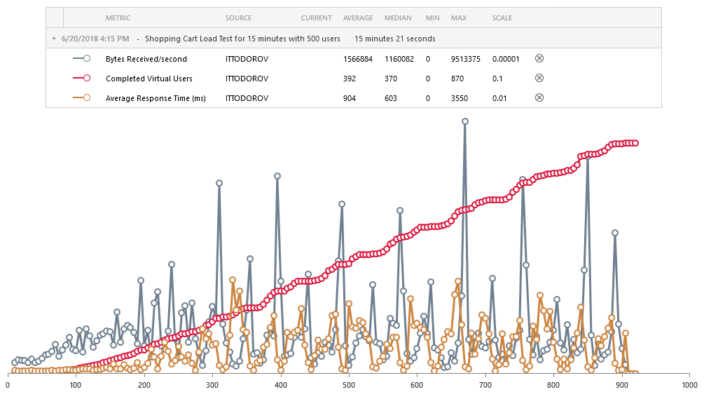

On Cross-Site Scripting and Content Security Policy

$
0
0

Have you been considering your app's security this month? This Halloween, here's some security advice to help keep you safe from hackers and avoid any spooky surprises.

October is National Cyber Security Awareness Month, so it’s a great excuse to talk about one of the most common types of attacks to web applications, Cross-Site Scripting, and how to mitigate it using a security feature present in all modern browsers called Content Security Policy.

Cross-Site Scripting

Cross-Site Scripting, or XSS for short, is one of the most common security issues in web applications these days. In XSS, an attacker manages to inject their own code into our app. This code will then be executed when users visit the page, so it can do anything from stealing their cookies to logging all their key presses.

To demo this, we’ve built a small app with a form that is vulnerable to XSS. The app works fine: we enter some text in the textarea element, press the Submit button, and our comment gets appended to the list. However, notice what happens when we enter HTML in the field, like React is <b>awesome</b>!:

React is Awesome-1

React is Awesome-2

That’s a cool feature, right? The user can style their comments however they want!

Well, let’s try entering another bit of HTML, <img src="nope.jpg" onerror="alert('Hacked!')" />:

React is Awesome Hacked-1

React is Awesome Hacked-2

Oops, we’ve been hacked! How did that happen? If we look at the HTML we entered, we’ll see that the <img> tag pointed to a non-existent image, so the onerror handler ran and executed the JavaScript code we had inlined there. If our app were storing that comment in a database and displaying it every time a user visited the page, we’d have a big problem in our hands!

(Try playing with the form yourself, see if you can find other ways to execute code through that form. If you want spoilers, look at the OWASP XSS cheat sheet.)

React tries to protect us from XSS attacks by escaping all strings we render as children of an element. If we really want to render unescaped HTML, we need to use a special prop appropriately named dangerouslySetInnerHTML:

export defaultclass ListOfComments extends React.Component {
  render() {
    const { comments } = this.props;
 
    return(
      <ul>
        {comments.map((comment) => (
          <li
            key={comment}
            dangerouslySetInnerHTML={ { __html: comment } }
          />
        ))}
      </ul>
    );
  }

While there are valid use cases for dangerouslySetInnerHTML, such as rendering sanitized HTML coming from your server, I’d try to minimize its use, because it’s really easy to do something wrong and open ourselves up for an attack.

Content Security Policy

The problem underlying an XSS attack is that the browser doesn’t know which sources of code to trust. My <script src="https://cdn.jsdelivr.net/npm/react@latest/umd/react.production.min.js"></script> tag and your injected <img src="nope.jpg" onerror="alert('Hacked!')" /> tag are both valid, so the browser will execute them all.

Content Security Policy is a security feature present in all modern browsers that allows us to list which sources are trusted by our web application, so that the browser is able to block everything else. If your name is on the guest list, you can get into the party; otherwise, you’re staying outside.

There are two ways to declare a Content Security Policy: through a Content-Security-Policy HTTP header when serving your HTML page, and through a <meta http-equiv="Content-Security-Policy"> tag.

In our sample app, we don’t have control over HTTP headers, so we’ll use a <meta> tag. Let’s add the most restrictive Content Security Policy possible, default-src 'none', which basically tells the browser to not trust any source, and see what happens:

<!DOCTYPE html>
<html>
  <head>
    <metahttp-equiv="Content-Security-Policy"
          content="default-src 'none'"/>
    <!-- ... -->
  </head>
  <body>
    <!-- ... -->
  </body>
</html>

Well, it looks like everything broke:

Content Security Policy Errors

The error messages are somewhat cryptic, but we can figure them out by looking things up in the Content Security Policy article in MDN, which describes all possible directives and values we can specify.

Let’s go one by one.

Fixing Script Errors

The first error has to do with scripts getting blocked:

Refused to evaluate a string as JavaScript because ‘unsafe-eval’ is not an allowed source of script in the following Content Security Policy directive: “default-src ‘none’”. Note that ‘script-src’ was not explicitly set, so ‘default-src’ is used as a fallback.

We didn’t provide a script-src policy, so the browser fell back to what’s specified as default-src (which is 'none') and refused to load all scripts. It looks like the folks hosting our sample app, StackBlitz, are running our code through eval, so we’ll need to allow that as a source in our script-src directive:

<metahttp-equiv="Content-Security-Policy"
      content="default-src 'none'; script-src 'unsafe-eval'"/>

(Note that you wouldn’t want to do this in a real app. Allowing any of the unsafe-* sources like unsafe-eval or unsafe-inline is a probably a really bad idea!)

Fixing Style Errors

The second error has to do with styles getting blocked:

Refused to load the stylesheet ‘https://cdn.jsdelivr.net/npm/@progress/kendo-theme-default@latest/dist/all.css’ because it violates the following Content Security Policy directive: “default-src ‘none’”. Note that ‘style-src’ was not explicitly set, so ‘default-src’ is used as a fallback.

Same thing, we didn’t provide a style-src policy, so the browser fell back to default-src and refused to load all styles. We can specify the exact path to the stylesheet, a partial path, or just the domain. We’ll specify a partial path here, so that all styles coming from @progress-scoped packages are trusted:

<metahttp-equiv="Content-Security-Policy"
      content="default-src 'none'; script-src 'unsafe-eval'; style-src https://cdn.jsdelivr.net/npm/@progress/"/>

Fixing Font Errors

The final errors have to do with fonts getting blocked:

Refused to load the font ‘data:font/ttf;base64,…’ because it violates the following Content Security Policy directive: “default-src ‘none’”. Note that ‘font-src’ was not explicitly set, so ‘default-src’ is used as a fallback.

The CSS file above seems to be inlining base64-encoded fonts using the data: protocol, so we’ll need to add a font-src directive that allows for that:

<metahttp-equiv="Content-Security-Policy"
      content="default-src 'none'; font-src data:; script-src 'unsafe-eval'; style-src https://cdn.jsdelivr.net/npm/@progress/"/>

Trial by Fire

Now the app is working again! Let’s try our original attack by injecting <img src="nope.jpg" onerror="alert('Hacked!')" /> into the page:

React is Awesome Secured

CSP blocked the attack! Here’s the error message we got:

Refused to execute inline event handler because it violates the following Content Security Policy directive: “script-src ‘unsafe-eval’”. Either the ‘unsafe-inline’ keyword, a hash (‘sha256-…’), or a nonce (‘nonce-…’) is required to enable inline execution.

We didn’t allow inline scripts as a trusted source, so the browser prevented the code from running.

Report-Only Mode

Ok, this is really cool, but there’s no way I’m going to add a Content Security Policy to my app! What if I misconfigure it and I break some important feature for my users?

Well, the people behind the CSP spec must have thought of that exact scenario. They’ve added a report-only mode that will output errors to the console, but not block execution. So if we were to add this tag to our app:

<metahttp-equiv="Content-Security-Policy-Report-Only"
      content="default-src 'none'"/>

we would see all the CSP violations happening in the app, but it would keep working just fine.

We can go one step further, and use the report-uri directive to tell the browser to send all violations to an endpoint under our control, so that we can aggregate them in a dashboard or something:

<metahttp-equiv="Content-Security-Policy-Report-Only"
      content="default-src 'none'; report-uri /api/csp "/>

Whenever the browser encounters a violation of our CSP, it will make a POST request to /api/csp with content that looks like this:

{
  "csp-report": {
    "document-uri": "https://www.example.com",
    "referrer": "",
    "violated-directive": "img-src",
    "effective-directive": "img-src",
    "original-policy": "default-src 'none'; report-uri /api/csp",
    "disposition": "report",
    "blocked-uri": "https://www.evil.com",
    "status-code": 0,
    "script-sample": ""
  }
}

Conclusion

Content Security Policy is a really powerful tool that modern browsers provide to prevent Cross-Site Scripting attacks. My advice is to start with the most restrictive policy possible, default-src 'none', and go from there. Use Content-Security-Policy-Report-Only to aggregate reports and ensure your CSP is configured correctly, so that you don’t break any functionality for your users. Once you’re sure everything is configured correctly, switch to Content-Security-Policy to enforce the policy for real, and stop the bad guys from doing their evil.

How to Use a jQuery ColorPicker UI Component in Your Web App

$
0
0

Make it easy for your users to choose between or preview colors with the Kendo UI ColorPicker. See how easy it is to implement and customize in your app.

In the last episode, we discussed three different date and time pickers. In this episode, we will discuss the Kendo UI ColorPicker component. The ColorPicker is a widget that lets you choose colors from a dropdown. The dropdown can be an HSV (hue, saturation, value) picker or a palette of predefined colors. Using a color picker is advantageous because it relieves the end user of having to know color codes or names.

Your user may need a color picker, for example, in apps where differently colored products can be previewed. This is common with clothing and cars. Another use for a color picker is as a tool in an image editor or text editor. In the following lesson, you will learn how to create a Kendo UI ColorPicker, ColorPalette, and the basics of CSS color values.

Creating a ColorPicker 

The ColorPicker by default will show the selected color in the dropdown's label and an HSV color picker in the dropdown's popup. The popup contains the color picker which is a tile of one color in all its shades that you can click on to select a color. Above the picker is a preview of the selected color and an input field to change the color using any CSS supported notation. Below the picker is a slider to change the color in the picker. The colors include red, yellow, green, cyan, blue, and magenta. And at the very bottom of the popup is an apply button to save the changes and a cancel button which reverts the changes to the last saved color.

This example creates a basic color picker using the Bootstrap theme:

colorpicker

```html
 
<!DOCTYPE html>
 
<html>
 
  <head>
 
    <metacharset="utf-8">
 
    <title>Color Picker</title>
 
    <scriptsrc="https://code.jquery.com/jquery-1.12.3.min.js"></script>
 
    <style>
      body {font-family: helvetica;}
    </style>
 
  </head>
 
  <body>
 
    <inputid="picker"type="color">
 
    <script>
 
      $(document).ready(function(){
        $('#picker').kendoColorPicker();
      });
 
    </script>
 
  </body>
 
</html>
 
```
 

The apply and cancel buttons can have their text changed by setting the messages option. The buttons can be removed altogether by setting the buttons option to false. In this case, when the user clicks anywhere off of the popup or presses the enter or Esc keys, the changes will be saved and the popup will close. You can add a button to clear the color by setting clearButton to true. This makes the selected color equal to null. The input to enter the color values and the preview can be removed from the header of the popup with preview option. This will also remove the preview color from the dropdown button label. Last, a slider for the opacity can be added to the footer of the popup with the opacity option.

Here is an example of the ColorPicker with all of its defaults changed:

colorpicker

```js
 
$('#picker').kendoColorPicker({
  clearButton: true,
  buttons: false,
  opacity: true,
  preview: false
});
 
```

Understanding CSS Color Notation 

If you want to enter colors into the color picker or define them in a palette, you will need to understand how colors are defined in CSS. Some common ways to define a color is using a name, HEX, RGB, or RGBA value. Names come from a predefined list of color names. The HEX value of a color is a hexadecimal number that has the form #rrggbb. Hexadecimal is a number system containing 16 values. The rr portion of the number represents the red value of the color, gg is the green value, and bb is the blue value. The numbers 0-9 make up the first ten values and the letters A-F make up the last six values of hexadecimal notation, so each part can take on a value between 00 and ff. The HEX value can also be written in shorthand form as #rgb with each part designated a value between 0 and f.

A color specified as an RGB value has the form rgb(red, green, blue). The value of each parameter can be from 0 to 255. A value of 0 is essentially no color and a value of 255 is the highest intensity of color. For example, rgb(255, 0, 0) is red, rgb(0, 255, 0) is green and rgb(0, 0, 255) is blue. Also rgb(0, 0, 0) is black and rgb(255, 255, 255) is white. The RGBA value has the form rgba(red, green, blue, alpha). The alpha parameter is the opacity of the color. It can be a number from 0 to 1, 0 being invisible and 1 being completely opaque. This means that the background layer the color sits on will show through when less opacity is applied.

Creating a Color Palette 

You also have the option to pick colors from a color palette. The color palette consists of square tiles of each color. You can use a built-in color palette or define a list of colors. One of the built-in color palettes is basic which consists of 20 colors. This comes in handy if you want to provide some default values that can be used to select a font color or background color. The other built-in palette is websafe which has 216 colors. Web-safe colors are colors that are guaranteed to be displayed consistently across browsers and devices. If you are building an image editing app, providing a web safe color palette is a good addition to an HSV color picker. Here is what each palette looks like:

colorpicker

```js
 
$('#picker').kendoColorPicker({
  palette: 'basic'
});
 
```

colorpicker

```js
 
$('#picker').kendoColorPicker({
  palette: 'websafe'
});
 
```

If you want to define your own color palette, you can use either the color name or a HEX value. If you would like to use a standalone color palette instead of the dropdown, you can use the ColorPalette widget. This makes the tiles visible on the page for selection. This is common in apps where users need to click on the tile and see the color update some image or other property on the page. For example, each tile can represent a swatch of fabric that updates the color of a piece of furniture. Here is an example of a standalone palette:

colorpicker

```html
 
<divid="palette"></div>
 
<script>
 
  $(document).ready(function(){
 
    $('#palette').kendoColorPalette({
      columns: 4,
      tileSize: 32,
      palette: [
        '#f9d5e5', '#eeac99', '#e06377', '#c83349',
        '#5b9aa0', '#d6d4e0', '#b8a9c9', '#622569'
        ]
    });
  });
 
</script>
 
```

Notice that we use a div element to create the palette instead of an input element. We also customized the look of the palette by setting it to four tiles wide and making each tile 32 square pixels. Alternatively, you can specify the width and the height of each tile individually.

Conclusion 

You have seen how to use the ColorPicker to create a dropdown of an HSV color picker and a color palette. You also used the ColorPalette to create a standalone palette.

One of the uses I mentioned for the ColorPicker is in a text editor. However, you do not need to create your own text editor if you use the Kendo UI Editor component. The Editor is a WYSIWYG interface that lets you create rich text content. It includes tools to format text, like a color picker to change font color, as well as custom tools you can create yourself. In the next episode, we will go over the features of the Editor component.

Try Out Kendo UI for Yourself

Want to start taking advantage of the more than 70+ ready-made Kendo UI components, like the Grid or Scheduler? You can begin a free trial of Kendo UI today and start developing your apps faster.

Start My Kendo UI Trial

Angular, React, and Vue Versions

Looking for UI components to support specific frameworks? Check out Kendo UI for Angular, Kendo UI for React, or Kendo UI for Vue.

Resources

Diving into the Kendo UI Grid with Angular

$
0
0

Curious to learn more about everything the Kendo UI Grid for Angular can do? Check out this guide to see how you can quickly put together a user-friendly and dynamic grid.

I recently recorded an 8-part video series explaining how to get started with many of our nifty Kendo UI  for Angular components. In this video, I talked about the Grid, one of our most popular components! Not everyone is a video watcher though, so here is a post detailing all of the features we covered in this episode of the Angular Video 8: Visualizing and Manipulating Data with the Kendo UI Grid!

Of course, if you are a video watcher, you can catch the video in its entirety below:

Basic Structure of THE GRID

You can find an example on our docs page giving an overview of the Grid. 

First, check out the source code (click the view source button on the grid example). I’d like to point out some parts of the basic structure or hierarchy of our Kendo UI Grid. Inside our angular component and inside of the template, here you have this outer Kendo Grid wrapper:

<kendo-grid [data]="gridData" [height]="410">
  ...
</kendo-grid>

Inside of that, you have a bunch of Kendo Grid columns:

<kendo-grid [data]="gridData" [height]="410">
  <kendo-grid-column field="ProductID" title="ID" width="40">
  </kendo-grid-column>
  <kendo-grid-column field="ProductName" title="Name" width="250">
  </kendo-grid-column>
  <kendo-grid-column field="Category.CategoryName" title="Category">
  </kendo-grid-column>
  <kendo-grid-column field="UnitPrice" title="Price" width="80">
  </kendo-grid-column>
  <kendo-grid-column field="UnitsInStock" title="In stock" width="80">
  </kendo-grid-column>
  <kendo-grid-column field="Discontinued" title="Discontinued" width="120">
    <ng-template kendogridcelltemplate="" let-dataitem="">
      ...
    </ng-template>
  </kendo-grid-column>
</kendo-grid>

The kendo-grid is where we will property bind things like data or height. The list doesn’t stop there though. As an example of just how flexible and controllable our Grid is, you could also control these things:

  • [loading]
  • [pageSize]
  • [skip]
  • [sort]
  • [sortable]
  • [pageable]
  • [scrollable]
  • (dataStateChange)

As I mentioned above, here, on the outer element, is where you're going to go ahead and bind the data. So we matched up the entire grid with the set of data we’re using (named gridData in the component): [data]="gridData".

image showing outer kendo grid wrapping element

Next, we gave each column a field that matches to a piece of data that column is to represent. You can also provide the title, which will show up at the top of the column.

 <kendo-grid-column field="ProductID" title="ID"></kendo-grid-column>

image showing titles and circling the one named 'id'

If we check out products.ts, you'll see that it's simply an array of some awesome product data.

image of code showing products array

In our component file, we'll see that each of these Kendo Grid columns is also getting a field set. And that is where you are binding, as you probably guessed, the data set that you want to be represented there.

image showing code and underlining field being set on each column

Follow along here with this StackBlitz if you’d like! Otherwise, keep looking at the docs page for The Grid.

If we go over to the preview, we’ll see that we have an ID, name, price and stock et cetera, and these match each of the fields we are passing in. We're also giving each of our Kendo Grids a title which is what is showing up at the very top of our Grid.

image pointing at the title on the kendo ui grid

Resizing

So the first feature I'd like to dive into is resizing!

two arrows pointing inward

This is the option to have a handle that will grab the edge of a column and resize it to be larger or smaller. It's actually a super simple feature to go ahead and enable. For detailed documentation, check out our docs on resizing the Grid.

In our StackBlitz example (see below), inside of the Kendo Grid tag, all you need to do is set [resizable]="true". This will enable us to have a little handle dragger to grab the edge and resize larger or smaller.

Test out the resizing columns yourself in this StackBlitz!

Data Binding Directives & Filtering

Next, let's talk about data binding directives. In order to really show off why we want to use a data binding directive, I'm going to also show our filtering feature. Thus far, inside of our Kendo Grid, we've only been using property binding to the word data and setting it equal to our Grid data that has all of our customers in it. However, we actually have a data binding directive that you can use and it is called Kendo Grid binding: [kendoGridBinding]="gridData".

So now, if we let everything load in, nothing should change on our chart. We should see it exactly how it was. But, where the real power comes in is when you try to manipulate the data in the chart somehow. Whether that is filtering, sorting, or grouping.

Let's go ahead and try filtering, so we'll set [filterable] = "true". This will provide a field at the top of each column that we can type in and filter by. So if we would like to filter by “ana”, you see that only the names that have “A-N-A” in them, show up in the names column.

image showing us filtering the names column by 'A-N-A'

Difference Between Using data and kendoGridBinding

If we tried to filter the columns with just the normal [data] property binding, nothing would happen, and none of our filters would work. We need to use the magical and wonderful kendoGridBinding when trying to manipulate data in our Grid. You can play around on this StackBlitz to see the differences between binding to data vs kendoGridBinding.

The data binding is more of a static, just slap in our data binding. It is best for when you just need to see the data but not manipulate it. Whereas the Kendo Grid binding is more useful for things that are going to be more dynamic and have filtering and sorting options.

Other cool Grid operations include paging and grouping, which we’ll talk about down below. They will be set in the same way as resizable and sorting are set on the kendo-grid with property binding.

<kendo-grid [kendogridbinding]="gridData" [resizeable]="true" [sortable]="true" [pageable]="true" [pagesize]="10" [filterable]="true" [groupable]="true" [height]="510">
  ...
</kendo-grid>

So the kendoGridBinding is super powerful! You can read more about it in our docs under our data binding directives. We also have some customizable options so you can go ahead and make your own directive. But for the rest of our demos, we're going to be using the kendoGridBinding.

Grouping

Next, let's talk about the grouping feature of the Kendo UI Grid. Underneath filterable, we're gonna go ahead and add a groupable property binding and set that equal to true.

Now, at the very top of our Grid, you should see something that says “drag a column header and drop it here to group by that column” which is literally what you have to do. So here you see me grouping by contact name by dragging and dropping the column header:

gif demo-ing grouping feature on kendo ui grid

You can also group by multiple columns. They just start nesting it underneath one another:

screenshot showing how you can group by multiple columns on the kendo ui grid

As a side note, if you wanted to, you could set a default for grouping. So, we could go ahead and set [group]="[{ field: 'City' }]". This, by default, is going to put city up at the top and group by it on load. So if there's something that's very obvious for your company or for your use case that you want your data being grouped by initially, you can go ahead and set it with [group]="".

Helpful Hint:

In our docs, we walk through steps to handle groupChange and dataStateChange events. These are needed if you are not using local data with kendoGridBinding.

To enable grouping:

  1. Set the [groupable](https://www.telerik.com/kendo-angular-ui-develop/components/grid/api/GridComponent/#toc-groupable) and [group](https://www.telerik.com/kendo-angular-ui-develop/components/grid/api/GridComponent/#toc-group) options of the Grid.
  2. Handle the [groupChange](https://www.telerik.com/kendo-angular-ui-develop/components/grid/api/GridComponent/#toc-groupchange) or the emitted [dataStateChange](https://www.telerik.com/kendo-angular-ui-develop/components/grid/api/GridComponent/#toc-datastatechange) event.
  3. Manually group the data. The Kendo UI Grid for Angular expects the grouped data to be a collection of [GroupResults](https://www.telerik.com/kendo-angular-ui-develop/components/dataquery/api/GroupResult/).

Sorting

If we’d like to be able to sort, we simply set [sortable]="true" on our kendo-grid. This will make each column clickable so you can sort ascending or descending by that column!

With the default of sortable equals true, you're only able to sort by one column. But, we have multiple options. So instead of passing a boolean into sortable, you could pass an object that let's you specify things like the ability to unsort or sorting by multiple columns! Check it out right here:

Paging and Scrolling

If you have too much data to be displayed reasonably in one table, you can use paging and scrolling to alleviate this issue. By setting [pageable]="true" and then setting the amount of data you wish to display per “page” [pageSize]="8", you can have a nifty, multi-page Grid! I suggest setting [scrollable] to none, for the sake of legibility. [scrollable]="'none'".

You can also pass in an object of configurable info into [pageable]:

[pageable]="{
  buttonCount: buttonCount,
  pageSizes: [5, 10, 20],
  ...
}"

buttonCount controls the numbered buttons down at the bottom. This is simply controlling the number of buttons we’d like to see at a time. We also are passing page sizes. We had originally set eight for a page size to determine how many things we want to show on a page at a time. However, we can also set pageSizes to an array of sizes for the user to choose from themselves!

image showing pagination at the bottom of the kendo ui grid

Well, that is all the time we have right now for covering the Grid. But I'd really encourage you to dive into our docs, we have so many more options. If you're new to Kendo UI for Angular, you can learn more here or just jump into a free 30 day trial today. I really hope you have enjoyed yourself and happy coding everyone!

Top Notch Test Automation Goes Hand in Hand with Exceptional Debugging

$
0
0

Releasing high-quality software is a two variable equation. Not only do you need automated and easily maintained testing suites, but you also need to fix the issues caught by your tests in a fast and predictable manner.

What should you do when your automated tests fail? First of all - don’t panic! Failing tests are just proof that the safety net of your tests actually work as they are designed to. They are preventing errors from leaking further and actually affecting your users. To be blunt - the more tests your app fails, the fewer errors go on to hit production. That is, as long as you fix them immediately.

So there is an easy formula to keep in mind:

Automated tests + instant bug fixing = rapid high-quality software releases.

This combination allows for rapid and high-quality software releases that will consistently and predictably deliver value to your business. It's a “Holy Grail” for every DevOps team.

Automation gives all stakeholders the freedom to concentrate their efforts on designing and producing high-quality deliverables. To ensure that kind of focus in your team, you need to invest in test automation, but you can't forget to set up a predictable and instant bug fixing process.

Test automation can be easily achieved by using Telerik Test Studio - a gold standard in test automation. Test Studio makes it easy to setup and, more importantly, maintain your automated test suites.

But what about making bug fixing a more predictable and less time-consuming process? The secret is utilizing tools that enable developers to quickly find the root cause of bugs you've got. A great deal of time is lost simply trying to reproduce an error you've already found.

RevDeBug can provide an easy to use, source code level recording of what lead to an issue. This tool eliminates the need for a costly reproduction stage.

Bulletproof Detection of Bugs with Telerik Test Studio

TS

Telerik Test Studio is an ultimate test automation solution for web, mobile and desktop applications that can be used by both developers and QAs. It can be applied for UI, Functional, Performance, Load and API testing needs and integrates with modern technologies including Angular, React, ASP.NET, WPF, MVC, Ajax, RESTful, etc. With Test Studio, both QAs and developers doing automated testing will be able to release high quality software faster.

Continuously Release Quality Software on Time

Quickly and easily craft automated tests with or without coding, integrate them in your Continuous Integration/Delivery environment following your agile workflow, find defects earlier and ship a better quality software product. Automate repetitive manual QA tasks and ensure a high level of software quality continuously. Stay on schedule without last minute surprises.

Integrate with Your Existing Systems

Easily tie in with market leading automation servers and quickly integrate with the systems you already have in place. Use the out-of-the-box integration with industry leading bug tracking, source control and CI/CD systems, or leverage Test Studio's rich and powerful API to create a custom solution that meets your requirements.

Reuse and Maintain with Minimal Effort

Enjoy the most powerful and flexible find logic for even the trickiest elements, all stored in a centralized repository. Record once and playback continuously across multiple browsers and environments. Avoid duplication and reduce maintenance by reusing elements, steps, tests and code.

As we all know, the role of a QA or a DevOps team does not end with a discovery of a bug. Fixing errors can also be a real challenge. In the second part of this article, we will introduce you to a real bug killer - RevDeBug, which is now compatible with Telerik Test Studio.

RevDeBug - a Reverse Debugger that can Aid Your Testing Automation

RevDeBug gives developers and DevOps teams the ability to quickly go back in the history of the application execution. There, they can uncover the exact reason for the failure. In the same way that test automation can cut the time spent detecting bugs, reverse debugging allows you to find the root cause of a detected bug in no time. With RevDeBug developers gain a number of benefits.

Get a Deeper Understanding of Where Bugs Come From

When the reverse debugger is active, it automatically gathers information about every line of code being executed, including every value and every exception. This information is then presented inside the software developer's IDE. Instead of trying to reproduce the exact setting and environment where the bug happened, developers can simply replay them.

revdebug

revdebug

Stop Recreating Bugs on Other Machines

Have you ever heard the phrase “It works on my machine”? Most testing engineers have heard that from software developers, but now all participants can work from the same set of data.

When a developer receives a RevDeBug recording, they may dive directly into this data. Now, we can all skip the tedious and error-prone bug reproduction step.

Communicate Better as a Team

RevDeBug is a state of the art tool for capturing and sharing information about errors in a software project. Detailed information about causes of errors and performance data can be captured from inside testing, staging and production environments. It may be used in conjunction with automated, semi-automated and manual testing.

The data is stored in easy-to-share recordings so teams may share them with just a single click. Every team member can inspect test results and their recording.

Conclusion

Telerik Test Studio and RevDeBug are the tools of choice for Dev, QA and DevOps teams who want to achieve repeatable, high-quality and frequent releases. Start using RevDeBug with Progress Test Studio today! Try them for free at:

Try Test Studio          Try RevDeBug

Does a Hamburger Menu Belong in a WinForms App?

$
0
0

The hamburger menu is now available in your WinForms apps through the Telerik UI for WinForms NavigationView mode. You can have a modern looking WinForms app built so quickly you'll hardly believe it.

User interfaces are constantly evolving in a bid to make every user of an application a power user. We build applications with lots of great features and capabilities and we want these to be readily available and easily accessible to the end user.

Is it Familiar or Intuitive?

When I use a piece of software there are usually three different kinds of UI I encounter. First are the interactions I am already familiar with from other apps, such as a menu at the top, or a ribbon bar, or a multiple document interface. Second come the new things that are very intuitive as to how they are supposed to be used. This is what we usually refer to as awesome UI/UX - it's something I’m not familiar with but at the same time something that I seem to know how to use. Once such thing for me was radial menus. Although they have not gained much traction, I immediately felt comfortable using one right from the word go. The third kind are things hidden somewhere in the application that are sometimes impossible to find without external help, e.g. a functionality that has a shortcut but no other way of accessing it.

If you ask me, today’s topic, the so-called “hamburger menu” or “navigation drawer/view” as it's known in the UWP world, does fall into either the first or second group. It is more and more adopted in a variety on Windows 10 apps, and in Window 10 itself – see Settings, the Groove app and many more. The symbol with the three horizontal lines “≡” has become synonymous with a shortcut for a menu.

The main idea of this UI paradigm is to have the menu as the top-level navigation within your app and have all the content arranged in separate tabs. You can see this method of organizing an app all the way from phones to tablets to desktop to web apps. The reason for that is the built-in adaptability of the component. On small screens it can be just a button that when clicked displays the menu as an overlay over the content and goes away when not needed. On slightly bigger screens it can be a sliver on the side that can be expanded when needed. And on big screens or when lots of changing back and forth between tabs is needed it can stay expanded all the time.

Now you can incorporate this Windows 10 navigation paradigm into your WinForms application with Telerik UI for WinForms, using the NavigationView mode of RadPageView. And complimenting your app with the recently introduced Fluent theme, you will have a modern Windows Forms application. Let’s take a closer look at the actual control and how to make the most out of it.

Meet NavigationView

If you have experience with our controls suite this will be something you have probably done before. Still, if you are just joining the family, first welcome, and second don’t be intimidated by all the names I throw around here, using the component is a breeze. I bet you will feel as if it is something you know, quite well, how to do.

Drop a RadPageView on your form and add several pages through the smart tag or the Visual Studio Properties pane. Change the text of the pages and/or add images to them to make them prettier. Set the ViewMode property of the page view to NavigationView and you are all set. To let you in on a little secret, you can change the ViewMode first and then add pages, it works either way. And that’s it! You are ready to explore the different display modes the navigation view offers. To help with that allow me to navigate you through them.

First let’s look at the Minimal display mode. Here we are looking for maximum working area and having the menu only when we need it. Also, if your users will be spending most of their time on one tab and will rarely venture to other ones, this will give them the cleanest working area UI-wise.

Minimal Collapsed     Minimal Expanded

Second is the Compact display mode where we can eat up just a little bit of the screen real estate. This will give the user a quicker way to navigate within the application but will still give the content center stage. Once the users are familiar with the tabs and their respective icons they will not need to expand the menu as often and the shortcuts on the edge of the app will be very handy.

CompactCollapsed     CompactExpanded 

The third mode is for big screens where real estate is not a scarcity and we can keep the menu open for maximum clarity. You can see that the menu doesn't overlap the chart when expanded like the other modes, and instead pushes it out so that it can remain open.

ExpandedCollapsed     ExpandedExpanded

I mentioned adaptability earlier. You can have the navigation view adapt automatically to the space the control is given. This means that you can have your application running on different screen sizes and the navigation view will choose the best display mode depending on the amount of screen size it is given.

If you’re like me and love to explore new user interface options, then go ahead and download the latest version of Telerik UI for WinForms and start tinkering with the component. We would also love to hear from you, so please feel free to leave a comment below or in our feedback portal and share your thoughts.

5 Things I Didn't Know about Create React App

$
0
0

Looking for tips for using Create React App? Here are five features you may not know about.

Create React App is a tool that makes it really easy to create React apps without having to deal with complex configurations. The recent release of Create React App v2 is a great excuse to go through their User Guide one more time, and find interesting features I didn’t know about. Here are my highlights.

1. Displaying Lint Errors in the Editor

I love linters! They help me identify potential problems as I write my code, before I even get the chance to run it. Create React App already comes with ESLint installed, and with some rules configured by default, but it only displays linting warnings and errors in the terminal:

React

What I really want is to see those warnings and errors directly in my editor, so that I can fix them immediately without having to switch contexts.

It turns out Create React App makes it as easy as adding a .eslintrc file at the root of the project with this content:

{
  "extends": "react-app"
}

If you have your editor properly configured (I use the ESLint extension for VSCode), then you’ll see the results immediately:

React

2. Formatting Code Automatically Using Prettier

Prettier is an opinionated code formatter that enforces a consistent style in all our files. I’ve started using it in all my projects because it allows me to concentrate on the code itself and forget about formatting.

You can run it from the command line (install it with npm install --global prettier, and then run prettier in your project) or from your editor (I use the Prettier extension for VSCode). But another popular way of running Prettier is via Git hooks.

If you’ve never heard of hooks, they are scripts that Git runs when certain actions happen. For example, a pre-commit hook runs every time you execute git commit, before the commit itself is created. We can invoke Prettier from a pre-commit hook to format all our staged files and ensure that everything we commit to our repo is properly formatted.

While we could write that hook by hand (take a look at your .git/hooks folder to check out some examples), there are two npm modules that help us with the process, husky and lint-staged, and they integrate perfectly fine with Create React App.

Let’s install Prettier and those two modules:

npm install --save-dev prettier husky lint-staged

Then we’ll add the following sections to the end of the package.json file in our app:

{
  // ...
  "husky": {
    "hooks": {
      "pre-commit": "lint-staged"
    }
  },
  "lint-staged": {
    "src/**/*.{js,jsx,json,css}": [
      "prettier --write",
      "git add"
    ]
  }
}

Now every time we commit, we’ll see husky invoke lint-staged, which will, in turn, invoke prettier on all the files we’re about to commit.

React

Neat, huh?

3. Developing Components in Isolation

If we are working on a complex app with many components and different states for each component, every time we make a change we have to reload the whole app and interact with it until we get it to the desired state.

A different way of working is to use tools such as Storybook and Styleguidist, which allow us to develop each component in isolation.

I’m particularly fond of Storybook, because integrating it with Create React App is such a breeze:

npm install --global @storybook/cli
getstorybook

React

After the wizard finishes doing its job, we just need to run npm run storybook and start writing stories for our components in the stories/ folder that the wizard created.

We can add a new story for our Header component like this:

import React from 'react';
import { storiesOf } from '@storybook/react';
import Header from '../Header';
 
storiesOf('Header', module)
  .add('default theme', () => <Header/>)
  .add('light theme', () => <Headertheme="light"/>)
  .add('dark theme', () => <Headertheme="dark"/>);

This will create a new section named Header in our storybook:

React

Then we can continue developing it from there!

4. Making a Progressive Web App

The only requirements for your app to be considered a PWA are:

1.    It must be served over HTTPS

2.    It must provide a manifest

3.    It must register a ServiceWorker

You’re probably already serving your app over HTTPS, so the only things left to do are the manifest and the ServiceWorker.

Luckily, Create React App already generates a manifest for us, located at public/manifest.json. You’ll just need to tweak its values.

It also generates a ServiceWorker, but doesn’t register it by default for reasons outlined in their User Guide. After reading that section and understanding their reasoning, if you want to go ahead, open src/index.js and look for the following:

// If you want your app to work offline and load faster, you can change
// unregister() to register() below. Note this comes with some pitfalls.
// Learn more about service workers: http://bit.ly/CRA-PWA
serviceWorker.unregister();

Now turn serviceWorker.unregister() into serviceWorker.register() and you’re done. You have a PWA, and Chrome will offer your users to add it to their homescreen!

React

5. Code Splitting

Code splitting is a feature of modern JavaScript bundlers that allows you to split your app into smaller chunks that can then be loaded on demand.

Create React App v2 supports code splitting via dynamic import()statements. That is, if it encounters a call to import('./someModule')when building your app, it will create a new chunk for someModule and all its dependencies, totally separate from your entry bundle.

Let’s see that with an example. Imagine we have a complex form that is only displayed when the user clicks a button. We can use code splitting to avoid downloading, parsing, and executing all that code on page load, and instead wait to load the form until the user clicks said button.

Here’s our complex form using formik and yup:

import React, { Component } from "react";
import { Formik } from "formik";
import * as Yup from "yup";
 
const formValidator = Yup.object().shape({ /* ... */ });
 
export default class Form extends Component {
  render() {
    return (
      <FormikvalidationSchema={formValidator}>
        {/* ... */}
      </Formik>
    );
  }
}

And here’s our app using dynamic import() to load the form on demand:

import React, { Component } from "react";
 
export default class App extends Component {
  constructor() {
    super();
 
    this.state = {
      Form: undefined
    };
  }
 
  render() {
    const { Form } = this.state;
 
    return (
      <divclassName="app">
        {Form ? <Form/> : <buttononClick={this.showForm}>Show form</button>}
      </div>
    );
  }
 
  showForm = async () => {
    const { default: Form } = await import("./Form");
    this.setState({ Form });
  };
}

It’s only when the user clicks the button that we incur in the cost of loading Form. Once the import() promise resolves, we call setState and force a re-render of the app with the loaded component.

React

If you look closely at the network requests being made, you’ll notice two new chunks (0.chunk.js and 1.chunk.js) being requested after we click the button. They contain Form and its dependencies formik and yup, so we managed to avoid downloading all that code on initial page load, making our app feel faster!

Wrapping Up

Create React App is a wonderful tool that makes it very easy to get started with React. It also contains a ton of features, so it pays to read its documentation in order to get all its benefits.


For more info on building apps with React: Check out our All Things React page that has a wide range of info and pointers to React information – from hot topics and up-to-date info to how to get started and creating a compelling UI.

Master Time with the Kendo UI for Angular Scheduler

$
0
0

The Scheduler for Kendo UI for Angular has arrived. Check out everything you can do with this new component today, and let us know where you'd like to see it go next.

I'm beyond excited to be able to type these words: The Kendo UI for Angular Scheduler component is finally here! I know that many of you have been waiting for this component for a while and the day has come where you can start building in scheduling abilities in to your Angular applications!

There's plenty to talk about with this component so I wanted to provide an introduction to the Scheduler that will give you an idea of exactly what is possible with the component and what we're looking to add to it in the future.

Let's jump in right away!

001-scheduler-in-action

Basic Data Binding

There are a couple of ways you can bind to the Scheduler, but at the core of everything is the SchedulerEvent class. While the Scheduler component deals with dates pretty easily, we do need more information around events than simply providing an array of JavaScript dates. This is why we created the SchedulerEvent class. Let's discuss this class just a little bit before doing more on binding.

The SchedulerEvent Class

The SchedulerEvent Class is a helper class that allows us to interface with something as advanced as the Scheduler. SchedulerEvent is simply set of fields designed to make sure the Scheduler operates correctly.

Note: For those of you that have used the Scheduler from our jQuery component library, this will seem pretty familiar as we also had a class ready for event scheduling there.

I recommend looking over the documentation for more details, but here's a quick rundown of the fields available:

Required

  • end
  • isAllDay
  • start
  • title

Not-required

  • description
  • endTimezone
  • id
  • recurrenceExceptions
  • recurrenceId
  • recurrenceRule
  • startTimezone

The names of the fields kind of give away what their purpose is, but its fairly easy to see just how to build this out for yourself when you follow along the SchedulerEvent API docs.

In a future iteration of the Scheduler we will have an option for mapping model fields within the component's configuration, but with this initial version you will have to set up your events in a more manual way.

As a quick helpful tip, if you have an existing model that you would like to use to bind to the Scheduler you can simply map from your model to an array of SchedulerEvents like this sample taken from our documentation:

import { SchedulerEvent } from '@progress/kendo-angular-scheduler';

const events = model.map(dataItem => (
  <SchedulerEvent> {
    id: dataItem.TaskID,
    start: dataItem.Start,
    end: dataItem.End,
    isAllDay: dataItem.IsAllDay,
    title: dataItem.Title,
    // Optional fields
    startTimezone: dataItem.startTimezone,
    endTimezone: dataItem.endTimezone,
    description: dataItem.Description,
    recurrenceRule: dataItem.RecurrenceRule,
    recurrenceId: dataItem.RecurrenceID,
    recurrenceException: dataItem.RecurrenceException
  }
));

Binding

Once we're familiar with how to set up individual events, let's go ahead and actually bind to the Scheduler! There are two ways right now, using the built-in directive or manual binding.

Built-in Directive

import { Component } from '@angular/core';
import { SchedulerEvent } from '@progress/kendo-angular-scheduler';

@Component({
  selector: 'my-app',
  template: `
    <kendo-scheduler [kendoSchedulerBinding]="events [selectedDate]="selectedDate" style="height: 600px;">
      <kendo-scheduler-week-view startTime="07:00">
      </kendo-scheduler-week-view>
    </kendo-scheduler>
  `
})

export class AppComponent {
  public selectedDate: Date = new Date('2018-10-22');
  public events: SchedulerEvent[] = [{
    id: 1,
    title: 'Breakfast',
    start: new Date('2018-10-22T09:00:00'),
    end: new Date('2018-10-22T09:30:00'),
    recurrenceRule: 'FREQ=DAILY;COUNT=5;'
  }];
}

This is pretty easy to set up. Once we define our array of SchedulerEvent objects, we then use the [kendoSchedulerBinding] attribute and pass in our events to this property. This approach will filter the events that are out of range for the current view, and expands the recurring series in-memory.

Manual Binding

import { Component } from '@angular/core';
import { SchedulerEvent } from '@progress/kendo-angular-scheduler';

@Component({
  selector: 'my-app',
  template: `
    <kendo-scheduler [events]="events [selectedDate]="selectedDate" style="height: 600px;">
      <kendo-scheduler-week-view startTime="07:00">
      </kendo-scheduler-week-view>
    </kendo-scheduler>
  `
})

export class AppComponent {
  public selectedDate: Date = new Date('2018-10-22');
  public events: SchedulerEvent[] = [{
    id: 1,
    title: 'Breakfast',
    start: new Date('2018-10-22T09:00:00'),
    end: new Date('2018-10-22T09:30:00'),
  }];
}

With manual binding we instead use the [events] attribute when binding to our events. As mentioned, you have to do a little bit more leg work here and the built-in recurrence engine will not be used, but it gives you some flexibility to make sure the Scheduler fits into your application.

Editing

Currently editing is done using the reactive directive, kendoSchedulerReactiveEditing. This is a Reactive Model-Driven Form, which is the only supported way to edit these items as of writing this blog post (November 2018). However, in the future we will also add in support for Template-Driven Forms. Editing is also handled by a user double-clicking on an event, as dragging/resizing an event is not available (yet). By the way, this is one of the first items we are looking to address over the next couple of weeks, so it will be added as soon as it's available in a future version of the component!

002-angular-editing

As you can see, we can edit both single events and the rules we want to set up around recurrence, which is great to see as an out-of-the-box set of features.

I recommend checking out the automatic editing documentation article to see exactly how to enable editing in your own implementation of the Scheduler.

Views

As a part of its initial release, the Angular Scheduler supports the following views.

Day and Week View

003-scheduler-views-day

Month View

004-scheduler-views-month

Timeline View

005-scheduler-views-timeline

Agenda View

006-scheduler-views-agenda

As you can see, quite a lot of different ways to represent your scheduled events!

Time Zones & Globalization

Of course, when we're dealing with scheduling we have to include support for dealing with time zones! By default, when no time zone is set, the Scheduler will pick the local time zone of the browser, which means that each user gets to see all saved events in their local time zone.

In order to ensure that a time zone is fixed across all instances of your Angular Scheduler you will have to work a bit with the Kendo UI data and math library, as described here. All you're doing is setting the timezone property once it comes to code though, so it's a quick import and you're off to the races!

As seen above, events can also have their own time zone information, which gives yet another way to deal with resources located in various time zones.

Speaking of time zones, most likely you will have a need to set up Schedulers for various internationalization and globalization scenarios due to having folks in different countries. Luckily this is pretty easy as the Angular Scheduler includes support for internationalization through the Kendo UI kendo-intl package, and also has the ability for you to create custom messages and replace any strings that may be rendered by default.

But Wait, There's More!

What I covered here gives you a general overview of what is possible with the new Kendo UI for Angular Scheduler, but there's certainly more to work with in the component! Take a look through the Scheduler documentation in order to get more code samples and API references.

The Future

As you can see across our documentation pages we consider this initial version as a beta due to not having the full feature set that we see in the jQuery equivalent. That being said, I wanted to give everyone some insight in to what we're working on for a future version of the Kendo UI for Angular Scheduler. Some of the primary features we'll be working on include:

  • Working with resources
  • Resizing and reordering for events

Our ultimate goal is to evolve the Scheduler to overlap with the feature set that we have available in the jQuery edition, so there's more to look forward to form this component!

Please let us know what you think about the component! I'm excited to finally be able to bring this huge component to the Angular developer community and I'm sure you have plenty of places where you can stick a Scheduler and use it already!

We can't wait to hear your thoughts. If you find anything missing that you'd like to see in a future version of the component you can feel free to submit your feedback to our public feedback portal, or leave a comment below. 

Of course, if you haven't tried Kendo UI for Angular yet, you can play around with the Scheduler and much more today by starting a free 30-day trial today.


DevReach for .NET Developers

$
0
0

.NET is evolving, and the DevReach conference offers .NET developers a unique look into the present and future. Join us to hear expert speakers present future-facing content and sharing the .NET love.

.NET. It's the beloved development ecosystem for millions of developers worldwide and the platform of choice for many enterprises to run their mission-critical business applications. Of late, .NET has been enjoying a renaissance - key innovations seem to set up the framework for the next decade of success. Developer excitement is palpable.

We'll be covering the latest in .NET developments at our DevReach conference next week. This post dives into what .NET developers can look forward to from DevReach, which takes place in Sofia, BG from November 13th-14th.

.NET Everywhere

One of the key changes in modern .NET has been flexibility - .NET isn't the monolithic Windows-only framework any more. .NET today powers all kinds of apps for web/desktop/mobile across various platforms, and boasts of a healthy ecosystem with rich tooling everywhere. While AR/VR and AI make .NET future-facing, modern day tooling keep developers productive.

If you are a .NET developer attending DevReach, we have a cornucopia of .NET content delivered by some of the best speakers from around the world. DevReach has a long history of delivering the best .NET sessions, and 2018, the 10 year anniversary, promises to be an event to remember. Here's a quick look at what's in store at DevReach for .NET developers:

Future of .NET

A lot is changing in .NET land - come discover the today & tomorrow from our speakers:

Future 

Sessions:

Everyday .NET

While the future may be exciting, we cannot get there unless we understand present day .NET technologies & tooling. The following speakers can help:

Everyday
 

Sessions:

.NET Ecosystem

Today's .NET powers apps in the Cloud and can be containerized for easy hosting. The open source ecosystem invites collaboration, but demands understanding of legal & etiquette nuances. Here are some speakers who can help break down the barriers:

Ecosystem
 

Sessions:

  • (Hitch) Hiker’s Guide to the Cosmos (DB) | Jeremy Likness
  • Code First in the Cloud: Serverless .NET with Azure | Jeremy Likness
  • Works on my macine – Docker for .NET Developers | Chris Klug
  • What You Need to Know About Open Source – Trust Me, I’m a Lawyer | Jeff Strauss

AR/VR with .NET

AR/VR looks poised to become the next iteration of human-computer interactions. And .NET together with Unity can power your AR/VR apps. These experts can show us the future:

ARVR
 

Sessions:

UX Considerations for AR/VR

While AR/VR may be cool, it demands a complete rethinking about UX - the best apps will fall flat if this next generation of user experience isn't well thought through. These two speakers can help:

UXinARVR
 

Sessions:

.NET on Mobile/Desktop

.NET can effortlessly power iOS and Android apps through Xamarin, with a variety of other platforms already supported. And .NET desktop apps can benefit from modernization and code sharing. Meet two of our speakers who actually build the very tools that most .NET developers use:

MobileDesktop
 

Sessions:

  • Get the Most Out of Visual Studio and Xamarin for Mobile Developers | David Ortinau
  • Enhancing WPF/WinForms applications with UWP features | Atanas Popatanasov

.NET Productivity

Developers are most productive when they understand all that their chosen framework offers under the covers. And developer sanity can be gained with testing coverage, knowing security features and using latest tools on top of .NET. Our expert speakers can shine light:

Productivity
 

Sessions:

  • The whirlwind tour of Authentication & Authorization with ASP.NET Core | Chris Klug
  • More Better Quality Coverage | Jim Holmes
  • Building and Deploying Full-Featured Reports with Telerik Reporting | Richard Zaslaw
  • Make your Web with Sitefinity Headless | Martin Gebov

See You There

We have lined up some of the best speakers for DevReach and locked in logistics. All said, .NET developers will be presented with an amazing array of content - struggling to choose sessions to go to is a good problem to have. See you in Sofia for DevReach. Cheers!

New AutoCompleteView for Xamarin.Forms

$
0
0
It’s been a while since our R3 2018 release of Telerik UI for Xamarin, which makes it the perfect time to draw your attention to a new component that many of you may just fall in love with.


RadAutoComplete is quite the popular control for various mobile applications and use cases—even more than we initially anticipated. We have been getting a lot of feature requests for the control, so we went on a journey to see how to accommodate all of our customer needs. After carefully reviewing the various feedback we got and considering the current usage of the control, we have decided that it would be best if we came up with a brand new control.

So, without further ado, meet AutoCompleteView. This new component is easier to use, more intuitive and more feature rich. In this blog post, I will introduce you to the AutoCompleteView control for Xamarin.Forms. You will also learn about the new features coming with it and how to use them.

Let's begin with how to start using the control. The snippet below shows how to add the new control to your XAML files in your project.

<telerikInput:RadAutoCompleteViewx:Name="autoCompleteView" 
                                  Watermark="Search here..."/>


Features

Some of the main features of the AutoCompleteView are:

The Remote Search and Show / Hide Suggestions were some of the most requested scenarios from our customers and are now available in the new control’s feature set. Let me guide you through those features and how to get started with them. For the rest of the features, just use the links above to get more details.

Remote Search Functionality

The Remote Search functionality of the RadAutoCompleteView control allows you to easily take the user input, trigger searching algorithm and assign the results to the ItemsSource of the control.

The control now exposes a new event that occurs when the text is changed: TextChanged event. This event receives a TextChangedEventArgs argument containing data related to the event. This is the place where your searching algorithm can be implemented to achieve the Remote Search functionality.

The image below shows the control in Remote Search state:

remote search functionality


Show / Hide Suggestions

The ShowSuggestions and HideSuggestions methods are another feature provided in the new AutoCompleteView control. Using those methods, you can easily show / hide all suggestions immediately as the user focuses on the input field. This functionality allows you to use the AutoCompleteView control as a ComboBox control.

The following example demonstrates how to use ShowSuggestions() method.
To show all suggestions, assign a handler to the focused event. For example:

this.autoCompleteView.Focused += this.AutoCompleteView_Focused;

... and call the ShowSuggestions() method inside AutoCompleteView_Focused:

privatevoidAutoCompleteView_Focused(objectsender, FocusEventArgs e)
{
     this.autoCompleteView.ShowSuggestions();
}

For more information about the show / hide suggestions, you can check our Methods article.

Creating Custom Templates

If the default templates of the control do not suit your needs, you can easily define a custom template. The available templates for customization are:

  • SuggestionItem Template
  • ShowMore Template (for Tokens Support)
  • NoResult Template
  • Loading Template (for Remote Search Functionality)

Let’s create a simple example using the ShowMore Template and NoResult Template.
For our example, we will create a business object from type City with Name property:

publicclassCity
{
    publicstringName { get; set; }
 
    publicCity(stringname)
    {
        this.Name = name;
    }
}

In our ViewModel, we can create the collection, which will hold the cities and add cities name:

publicclassViewModel
{
    publicList<City> Source { get; set; }
 
    publicViewModel()
    {
        this.Source = newObservableCollection<City>();
        this.Source.Add(newCity() { Name = "London"});
        this.Source.Add(newCity() { Name = "Madrid"});
        this.Source.Add(newCity() { Name = "Paris"});
        this.Source.Add(newCity() { Name = "Tokyo"});
        this.Source.Add(newCity() { Name = "New York"});
        this.Source.Add(newCity() { Name = "Sofia"});
        this.Source.Add(newCity() { Name = "Toronto"});
        this.Source.Add(newCity() { Name = "Budapest"});
        this.Source.Add(newCity() { Name = "Barcelona"});
        this.Source.Add(newCity() { Name = "Rome"});
    }
}

You can add as many cities as you want!

As a final step, we can add the AutoCompleteView control and the templates in our XAML file:

<telerik:RadAutoCompleteViewDisplayMode="Tokens"
                    ItemsSource="{Binding Source}"
                    TextSearchPath="Name"
                    Watermark="Search Here..."
                    BackgroundColor="White">
      <telerik:RadAutoCompleteView.BindingContext>
          <local:TokensViewModel/>
      </telerik:RadAutoCompleteView.BindingContext>
      <telerik:RadAutoCompleteView.ShowMoreTemplate>
          <DataTemplate>
              <LabelText="{Binding Path=., StringFormat='+{0} more'}"
                   VerticalTextAlignment="Center"/>
          </DataTemplate>
      </telerik:RadAutoCompleteView.ShowMoreTemplate>
      <telerik:RadAutoCompleteView.NoResultsTemplate>
          <DataTemplate>
              <LabelText="No match was found for the specific search. Please try again."/>
           </DataTemplate>
      </telerik:RadAutoCompleteView.NoResultsTemplate>
</telerik:RadAutoCompleteView>

The image below shows how the ShowMore Template looks:

AutoCompleteView ShowMore Template

... and the NoResult Template:

AutoCompleteView NoResultTemplate

In case you want to customize the SuggestionItem Template, check our help article.

Have we caught your interest with the new AutoCompleteView control and its features? You can find various demos of the new control in our SDK Samples Browser and the Telerik UI for Xamarin Demo application.

I hope that this information will get you started with the new control—any feedback on it is highly appreciated, as always. If you have any ideas for features to add to the control’s features set, do not hesitate to share this information with us on our Telerik UI for Xamarin Feedback Portal.

If this is the first time you're hearing about Telerik UI for Xamarin, you can find more information about it on our website or dive right into a free 30-day trial today.

Happy coding with our controls!

One Fiddler to Rule Them All

$
0
0

Built from scratch to run on all major platforms, with beautiful UI and a flawless user experience. And yes, it’s free. Meet Fiddler Everywhere – the future of Fiddler.

Have you tried again and again to setup Fiddler to run on Mac or Linux, only to get another error?

Do you feel frustrated that there is no good alternative out there?

Through the years, porting Fiddler to Mac and Linux has been one of the most popular feature requests. At the end of 2016, we introduced beta versions that use Mono, but the problems and limitations with this approach seemed to outweigh the benefits. We’ve tried, we’ve learned.

We're happy to introduce the next Fiddler – Fiddler Everywhere. Fiddler Everywhere is built from scratch to run on all major platforms – Windows, Mac and Linux. It’s everything you’ve asked about, and more:

  1. Cross-platform support: Built on Angular and .NET Core, it provides Mac and Linux users with the same experience and productivity as their Windows counterparts.
  2. Sleek UI: Best practices in UI have evolved significantly since Fiddler's interface was last modified. We want to bring the latest UI and UX improvements to the Fiddler community. And isn't it great that our colleagues from the Kendo UI for Angular team have our backs?
  3. Flawless user experience: Using Fiddler should be a piece of cake, no matter whether you’re building your API services or administrating your organization’s traffic.

And most importantly, it’s free.
Linux Windows Mac

The first build we ship will come with limited functionality, but we will be iteratively adding more based on the usage and the feedback you provide.

That’s great, but what about the old Fiddler – Fiddler for Windows?

We will continue to develop this version at least until the new Fiddler has feature parity with it, and probably long after that. For two major reasons. It works. And everyone loves it.

How can I try Fiddler Everywhere?

You can download Fiddler from our website. Please share your impressions about it below as a comment, in our forums or use the feedback portal to submit, discuss and vote for the things to include in the next release.

This is a new stage in the life of Fiddler – the web debugging tool that everyone on Windows loves. It’s time to go beyond. It’s time for a new beginning. And we invite YOU to be part of it.

Learn more about Fiddler Everywhere or try it out today by downloading it at the link below, and let us know what you think.

Try Fiddler Everywhere Now

Announcing the Report Server API v2 and .NET Client

$
0
0

Telerik Report Server has a new REST API version, which provides many new improvements to your workflow and your code. Read on to see what's new.

Report Server API Version 2

The Telerik Report Server REST API version 2 is now available as part of the R3 2018 release. The aim of version 2 is to improve the current models and error handling, add new endpoints, implement best practices, and make the code cleaner and easier to maintain.

New Endpoints

With the addition of a brand new execution controller it is now possible to queue a scheduled task or data alert for execution via an API call. With the power of executing all tasks and alerts through the API comes the responsibility of cleaning up. Let’s say the execution history of a task becomes too large and takes up a lot of server storage - you can perform a cleanup of all created documents for this task and free up space with a single API call.

API docs

Improved Responses

Error handling has been improved dramatically through required fields and error messages, which contain enough information about the problem and how to resolve it. As a result, you will see fewer internal server errors and 500 status codes.

bad request

Each POST request which creates a new resource will now a return 201 Created response with the created object and its location in the form of a location header. Each PUT request will also return the created object, which should minimize the need to make additional API calls in order to get the up-to-date state of a resource.

created

Revamped Scheduled Tasks and Data Alerts

The R3 2018 release came with an option to deliver a batch of reports in a single scheduled task/data alert execution. Besides the new sleek UI for this feature, we also had to introduce an API approach to add or modify a batch of reports which would be delivered to the subscribers upon execution.

Backward Compatibility

When the version is not specified explicitly the API will continue to work with the v1 behavior. This decision was made in order to prevent any breaking changes in existing applications when upgrading to a new version of Report Server. To turn on the new features add v2 to the API base URL:

https://demos.telerik.com/report-server/api/reportserver/v2

Report Server API Client

Together with the recently introduced API versioning, we are officially announcing the release of the Report Server API Client. The client is a .NET library written in C#. It comes in handy when developing .NET applications which would query the Report Server API. To gain access to the client and its methods follow the Report Server API Client.

The fast setup and reduction of redundant code in the application make the client a practical tool in the C# developer arsenal:

var settings = newSettings() { BaseAddress = "https://demos.telerik.com/report-server"};
 
using(var rsClient = newReportServerClient(settings))
{
    rsClient.Login("demouser", "demopass");
}

Some may have noticed that the version number cannot be seen anywhere in the settings, and that is because the client is configured to always use the latest and greatest Report Server API version. Once the client is configured, getting a resource from the report server is as simple as:

var category = rsClient.GetCategory("categoryId");

A full list of the client methods is available here.

api client code

New SDK Examples

Don't have enough API client examples? We’ve got you covered! The R3 2018 SP1 release comes with new Report Server SDK sample applications. The HTTP client sample app features a common Report Server API scenario of logging into the server, working with resources, and cleaning up.

report server api sdk

Try it Out and Share Feedback

We want to know what you think - you can download a free trial of Telerik Reporting or Telerik Report Server today and share your thoughts in our Feedback Portal, or right in the comments below.

Start your trial today: Reporting TrialReport Server Trial

Tried DevCraft?

You can get Reporting and Report Server with Telerik DevCraft. Make sure you’ve downloaded a trial or learn more about DevCraft bundles. DevCraft gives you access to all the toolsets, allowing you to say “no” to ugly apps for the desktop, web, or mobile.

Troubleshooting an ASP.NET Core App Running in Docker

$
0
0

My friend and colleague, Paul Ballard, shared Andrew Lock's recent article about an issue he had with a "missing connection string" error in a new ASP.NET Core application running in Docker. Andrew, the author of the new book ASP.NET Core in Action, has graciously allowed us to repost his article. In the article, not only does he cover basic background of environments in ASP.NET Core, he also describes how you would use environment-specific configuration. He describes the bug and provides his solution.

Andrew Lock us a full-time developer, working predominantly in full stack ASP.NET development in Devon, UK.

Hope you enjoy!


Why isn't my ASP.NET Core Environment-Specific Configuration Loading?

By Andrew Lock

I was recently standing up a new ASP.NET Core application running in Docker, and I was seeing some very strange behaviour. The application would start up without any problems when running locally on my Windows machine. But when I pushed it to the build server, the application would immediately fail, citing a "missing connection string" or something similar. I spent a good half an hour trying to figure out the issue, so this post is just in case someone else runs into the same problem!

In this post, I'll cover the basic background of environments in ASP.NET Core, and describe how you would typically use environment-specific configuration. Finally, I'll describe the bug that I ran into and why it was an issue.

tl;dr;IHostingEnvironment ignores the case of the current environment when you use the IsDevelopment() extension methods etc. However, if you are using environment-specific configuration files, appsettings.Development.json for example, then you must pay attention to case. Setting the enviroment to development instead of Development will result in your configuration files not loading on a case-sensitive OS like Linux.

ASP.NET Core Environments

ASP.NET Core has the concept of environments, which represent the different locations your code might be running. You can determine the current environment at runtime, and use the value to change the behaviour of your app somehow. For example, in Startup.Configure(), it's common to configure your middleware pipeline differently if you're running in Development as opposed to Production:

public void Configure(IApplicationBuilder app, IHostingEnvironment env)
{
  // only added when running in Development
  if (env.IsDevelopment())
  {
    app.UseDeveloperExceptionPage();
  }

  // only added when running in Production
  if (env.IsProduction())
  {
    app.UseExceptionHandler("/Error");
  }

  app.UseStaticFiles();
  app.UseMvc();
}

You can use IHostingEnvironment anywhere in your application where you want to check the current environment, and behave differently based on the value.

ASP.NET Core has knowledge of three environments by default, and provides extension methods for working with them:

  • Development: identified using IHostingEnvironment.IsDevelopment()
  • Staging: identified using IHostingEnvironment.IsStaging()
  • Production: identified using IHostingEnvironment.IsProduction()

You can also see the value of the current environment by reading IHostingEnvironment.EnvironmentName directly, but it's highly recommended you use one of the extension methods. The extension methods take care to make a case-insensitive comparison between the EnvironmentName and the expected string (i.e. Development).

While you can litter your code with imperative checks of the environment, a generally cleaner approach is to use environment-specific configuration, which I'll describe shortly.

ASP.NET Core Configuration Primer

The configuration system in ASP.NET Core is built up of layers of configuration values, compiled from multiple sources. You can load values from JSON files, XML files, environment variables, or you can create a custom provider to load values from pretty much anywhere.

You can build a configuration object by adding providers to an IConfigurationBuilder object. This typically happens in Program.cs, using the IWebHostBuilder.ConfigureAppConfiguration method. WebHost.CreateDefaultBuilder() calls this method behind the scenes in a typical ASP.NET Core 2.x app. Each provider added to the IConfigurationBuilder adds another layer of configuration. For example, the following code adds a JSON file (appsettings.json) and environment variables to the final configuration object:

IHostingEnvironment env;
var builder = new ConfigurationBuilder()
  .SetBasePath(env.ContentRootPath) // the path where the JSON file should be loaded from
  .AddEnvironmentVariables();

The order of the configuration providers is important here; if any environment variable has the same name as a setting in the JSON file, it will overwrite the JSON setting. The final configuration will be a "flattened" view of the settings in all of the configuration sources.

I think of the flattening of configuration providers as similar to the flattening of layers in a Photoshop image; each layer overwrites the values from the previous layers, except where it is transparent (i.e. where the layer doesn't have values).

For example, imagine you have the following appsettings.json configuration file:

{
  "Logging": {
    "LogLevel": {
      "Default": "Debug",
      "System": "Information",
      "Microsoft": "Information"
    }
  }
}

On its own, that would generate the following settings:

"Logging:LogLevel:Default" = "Debug";
"Logging:LogLevel:System" = "Information";
"Logging:LogLevel:Microsoft" = "Information";

However, if you also had an environment variable:

Logging__LogLevel__Default=Warning

And loaded it after your JSON file, the final configuration would be the following (note the change in value for the first setting):

"Logging:LogLevel:Default" = "Warning";
"Logging:LogLevel:System" = "Information";
"Logging:LogLevel:Microsoft" = "Information";

Environment-Specific Configuration

The "flattening" of configuration providers is what allows you to have environment-specific configuration. Take the common case where you want to use a different setting in local development compared to production. There are a number of ways you could achieve this, for example:

  • Overwrite default values e.g. only set an environment variable for the setting in Production.
  • Use different configuration provider settings e.g. Load settings from Azure Key Vault in production, and User Secrets for local development.
  • Load additional configuration providers e.g. load an additional environment-specific JSON file

Those last two points are essentially the same thing, but I wanted to call them out as different because they're typically used for two slightly different things, secrets vs. settings.

Secrets, such as API keys and connection strings shouldn't be stored inside your repository. For local development, sensitive values should be stored in User Secrets. In production, secrets should be retrieved from a provider such as Azure Key Vault.

In contrast, settings are not sensitive values, they just represent something you might want to configure differently between environments. For example, maybe you want to use more caching in production, or write log files to different locations.

Configuration Loading 9

The typical WebHost.CreateDefaultBuilder() method uses all three approaches: overwriting, different providers, and additional providers. The configuration method for the default builder is shown below:

Configuration Loading 10

The default builder configures up to 5 configuration providers by default:

  • A JSON file called appsettings.json
  • An environment-specific JSON file called appsettings.ENVIRONMENT.json where ENVIRONMENT is the name of the current environment
  • User Secrets, if in the Development environment
  • Environment variables
  • Command line arguments (if any arguments were passed)

For the rest of this post I'm going to focus on the environment-specific JSON file, as that's what caused the issue I encountered.

The Problem: Environment-Specific Configuration not Loading

As part of a new .NET Core app I was building, I was running a "smoke test" on the Docker container produced, as described in my last post. This involves running the Docker container on the build server, and checking that the container starts up correctly. The idea is to double check that the initial configuration that occurs on app start up is correct. One such check is that any strongly typed settings validation runs successfully.

Configuration Loading 11

When I ran the smoke test for the first time in a new app, the settings validation for a third-party API URL failed. This was very odd, as I had tested the application locally. When running smoke tests, I typically set the Hosting Environment of the app to Development, (or sometimes a testing-specific environment, Testing). Inside the appsettings.Development.json file, I could see the offending configuration value:

Configuration Loading 12

But for some reason, when the application was running in Docker for the smoke tests, the value wasn't being bound correctly. In the next section, I'll briefly describe some of the things I thought of and looked into.

Troubleshooting

I tried debugging locally, adding and removing the file, and changing the setting value. I was trying to confirm that the file was definitely being loaded correctly, and the setting wasn't coming from somewhere else when running locally. Everything was correct.

I checked that there were no unexpected environment variables overwriting the value when the app was running in Docker for the smoke test. There weren't.

I looked inside the Docker container itself, and double checked that the appsettings.Development.json file existed, and was in the right place. Everything looked OK.

Finally, I checked that I was actually running in the environment I expected - Development. Looking at the logs from the container when the smoke test ran I could see that the Hosting environment was correct according to the app:

Configuration Loading 13

At this point, I was somewhat stumped, I had run out of ideas. I made a coffee.

When I sat down and opened the smoke test script file, the answer hit me immediately…

Linux File-System Case-Sensitivity

The smoke test script I was using is very similar to the script from my last post. The command I was using to run my new app for the smoke test is shown below:

Configuration Loading 14

The problem is the statement where I set the environment variable to define the hosting environment using

Configuration Loading 15

This sets the environment to development which is not the same as Development. ASP.NET Core itself is careful to not differentiate between environments based on case - the IHostingEnvironment extension methods like IsDevelopment() are all case insensitive. As long as you use these extension methods and don't use IHostingEnvironment.EnvironmentName directly, you'll be fine.

However, the one place where it's very common to use EnvironmentName directly is in your app configuration. Earlier I described the common approach to environment-specific configuration: adding an extra appsettings.json file:

Configuration Loading 16

As you can see, we're directly using EnvironmentName to calculate the environment-specific JSON configuration file. In my smoke test script, EnvironmentName="development", so the app was looking for the appsettings.development.json file. The file was actually called appsettings.Development.json.

On Windows, this case difference doesn't matter - ASP.NET Core respects the conventions of the host OS, so it loads the file. Even if you set the environment to DeVelOpMeNt, you'd be fine. Linux, however, is case sensitive, so it won't find the file.

The simple fix was to set the environment with the standard title-casing:

Configuration Loading 17

With that small change, the app was able to start, and the smoke test succeeded.

Summary

Always be consistent with your environment names. The case may not matter if you're running on Windows, but it definitely will if your app is ever run on Linux. The ASP.NET Core framework itself is careful to ignore case when determining the current environment, but you can't trust the underlying operating system to do the same!

Editor's Note: Thanks again to Andrew Lock for allowing us to share this fix with you by republishing this post.

Viewing all 5208 articles
Browse latest View live