Quantcast
Channel: Telerik Blogs
Viewing all 5210 articles
Browse latest View live

HTTPS Decryption, Content Decoding and More in Fiddler Everywhere v0.2

$
0
0

The second release of Fiddler Everywhere is now live, and we've added the most critical and highest requested features.

November is shaping up to be a strong month for Fiddler Everywhere. Just over two weeks after the initial release, we’re releasing a new group of the most requested features. Check what’s new:

  • HTTPS decryption – allows you to capture HTTPS traffic
  • Content decoding – allows you to read encoded requests and responses
  • Allow remote connections – allows you to capture traffic from another machine/device
  • Fiddler Everywhere Documentation – read more about how to use and configure Fiddler in our new docs
  • Fixes – we fixed some of the issues reported by you

HTTPS Decryption

Fiddler now supports HTTPS decryption. Let’s be honest – today most traffic is encrypted. In fact, we had trouble finding non-encrypted websites to test Fiddler with. That’s why this feature had the highest priority in our backlog, and is the most voted in our feedback portal, too. You can find out how to enable HTTPS decryption in this help article.

capture https traffic

Content Decoding

You can now see the content of encoded requests and responses. Just click on the Decode button and Fiddler will automatically decode the sessions.

content decoding

Remote Connections

Now you can capture traffic from another machine/device. To enable this feature, go to Settings / Connections and check the box next to Allow remote computers to connect.

remote connections

Fiddler Everywhere Documentation

Fiddler version 0.2 brings you our brand new documentation website. There you can read more about how to use the tool. Check it out, and don’t forget to leave a thumbs up if you find it helpful.

Fixes

There was an issue where Fiddler wasn't working on Ubuntu 18.10, which we have addressed.

Conclusion

Since we first released Fiddler Everywhere, we’ve been working hard to deliver the things you need most. Now, the second release is here, with the most important and requested features. We’re trying to set the pace high, so stay tuned for new goodies in the upcoming weeks. In the meantime, don’t forget to vote or share your ideas in our feedback portal.


ES6 Syntax, Features and Additions: A Reference Guide

$
0
0

Learn about the new ES6 features, enhancements, and shortcuts introduced to the JavaScript programming language.

The sixth edition of ECMAScript– the scripting language specification by which JavaScript is standardized – introduced many new features, upgrades, and shortcuts to the JavaScript programming language. This version is commonly known as ECMAScript2015 or ES6.

When ES6 was first introduced, the features were not available on the vast majority of browsers, and it was necessary to use a compiler like Babel if you wanted to utilize any of the features. It is still the common convention to use a bundler like webpack to run Babel and compile ES6 down to code that older browsers can understand, but according to Can I Use, around 90% of all browsers can natively understand ES6 syntax.

It’s important to note that ES6 is not a different language, but simply the next version of ECMAScript, much like HTML5 is the next edition of HTML. You can still write all the same JavaScript code from the previous versions, but new syntax and features are now available.

In this article, we’ll go over some of the most commonly used features of ES6.

Let & Const

One of the most important new additions of ES6 are let and const statements.

Previously, there was only one way to declare a variable in JavaScript – the var statement.

var color ='blue'

Now you can also assign values with let and const.

const user ='Nick'let active =true

There are a few important differences between the new keywords and the previously existing var keyword.

Both let and const are block-scoped, meaning the variable can be scoped to any block, such as if, for, or while. A var is function-scoped, meaning only functions will introduce a new scope.

// Assign a variablevar color ='blue'let animal ='lion'if(true){    // Reassign variable in a block scope    var color ='red'    let animal ='tiger'}

console.log(color)// red
console.log(animal)// lion

As you can see in the above example, var modified the variable in the global scope, while let did not.

Additionally, neither let nor const can be redeclared once the variable is declared in a scope.

// This is validvar bird ='robin'var bird ='bluejay'// Uncaught SyntaxError: Identifier 'animal' has already been declaredlet animal ='wolf'let animal ='werewolf'

The difference between let and const is that let can be reassigned and const cannot.

// This is validlet x =1
x =2// VM159:5 Uncaught TypeError: Assignment to constant variable.const y =1
y =2

Ultimately, it depends on the situation when to use let, var, or const, but the common convention is to use const as much as possible, and let in all other instances. Most new codebases do not include var. Throughout the rest of this article, const will be used by default.

String

Template Literals

Template literals, sometimes referred to as template strings, are a new type of string syntax that allows embedded expressions and multi-line strings. Template literals use a backtick (`) instead of double or single quotes.

Instead of concatenating with the string concatenation operator (+), you can embed a variable directly in a string using ${}.

// ES5const name ='Hal'const sentence ="I'm afraid I can't do that, "+ name +'.'
console.log(sentence)// "I'm afraid I can't do that, Hal."// ES6const name ='Hal'const sentence =`I'm afraid I can't do that, ${name}.`
console.log(sentence)// "I'm afraid I can't do that, Hal."

A string can also span multiple lines.

const haiku =`Over the wintry
    forest, winds howl in rage
    with no leaves to blow.`
console.log(haiku)// Over the wintry// forest, winds howl in rage// with no leaves to blow.

Note that white space, such as with indentation, is preserved using multi-line strings.

Methods

Several new String methods were added in ES6: startsWith(), endsWith(), includes(), and repeat().

String.prototype.startsWith()

We can easily determine if something begins a string using startsWith().

const word ='Disestablishmentarianism'

word.startsWith('Disestablish')// true

String.prototype.endsWith()

We can similarly determine if something ends a string using endsWith().

const word ='Disestablishmentarianism'

word.endsWith('ism')// true

String.prototype.includes()

includes is a particularly helpful addition to the JavaScript language, and allows a very simple and straightforward way to find if a string contains a particular value at any point.

const word ='Disestablishmentarianism'

word.includes('establishment')// true

String.prototype.repeat()

The repeat() method repeats and concatenates a string.

const word ='Beetlejuice '

word.repeat(3)// "Beetlejuice Beetlejuice Beetlejuice "

Functions

Arrow Functions

An arrow function expression is a new way to create a function expression in JavaScript.

// Function expressionconstreturnsTrue=function(){returntrue}// Arrow function expressionconstreturnsTrue=()=>{returntrue}

Arrow functions do not have their own this, and cannot be used as a constructor. All arrow functions are anonymous, meaning they do not have a name.

Implicit Returns

Arrow functions also have the ability to utilize implicit returns, in which the return statement as well as the block are omitted, and only the return value follows the arrow.

constreturnsTrue=()=>true

Parameters

If an arrow function only has one parameter, the parentheses can be omitted.

constsquare= num =>{    return num * num
}square(3)// 9

However, if more than one parameter is used, parentheses are once again mandatory.

constadd=(x, y)=>{    return x + y
}add(7,20)// 27

Default Parameters

Functions can now be initialized with default parameters.

// ES5functionsum(a, b){
b = b === undefined ?2: b;// option 1
b =2|| b  // option 2return a + b
}// ES6functionsum(a, b =2){return a + b
}sum(5)// 7

Classes

JavaScript is a prototype-based language, not a class-based object-oriented system like Java or other similar languages. However, classes are a common architecture that many programmers are familiar with, and ES6 introduced a new class keyword as syntactic sugar over the already existing constructor pattern.

// ES5functionGraph(x, y){    this.x = x;    this.y = y;}

Graph.prototype.getGraphAxis=function(){    return{x: x, y: y}}// ES6classGraph{    constructor(x, y){        this.x = x;        this.y = y;    }    getGraphAxis(){        return{x, y}    }}const graph1 =newGraph('Horizontal','Vertical')

Inheritance

ES6 also introduced the new extends keyword, which is again a wrapper extending a prototype to a new function. You can also use the super() keyword to copy the constructor of the parent.

// ES5functionGraph3D(x, y, z){
    Graph.call(this, x, y);    this.z = z;}

Graph3D.prototype.constructor = Graph3D;
Graph3D.prototype = Object.create(Graph.prototype);
Graph3D.prototype.getGraph3DAxis=function(){ return{x: x, y: y, z: z}}// ES6classGraph3DextendsGraph{ constructor(x, y, z){ super(x, y) this.z = z } getGraph3DAxis(){ return{x, y, z} }}const graph2 =newGraph3D('Latitude','Longitude','Normal')

Objects

ES6 introduced a few shortcuts for object literals and methods for objects.

Property Value Shorthand

If an object property has the same name as a variable, ES6 removes the need to write it out twice. The shorthand can be mixed with other properties that are not utilizing the shorthand.

const title ='The Matrix'const releaseYear =1999const leadActor:'Keanu Reeves'
// ES5const movie ={ title: title, releaseYear: releaseYear, lead: leadActor }// ES6const movie ={ title, releaseYear, lead: leadActor }

Method Definition Shorthand

Instead of explicitly declaring a function on a property, we can use the method shorthand.

// ES5const user ={
    name:'Nick',
    getUserName:function(){        returnthis.name
    }}// ES6const user ={
    name:'Nick',    getUserName(){        returnthis.name
    }}

user.getUserName()// "Nick"

Note that arrow functions cannot be used as object methods.

Computed Property Keys

Objects now have the ability to evaluate an expression as part of an object key. We can see it in this example, as we increment each property key by one.

let count =0const x ={    [count++]:'zero',    [count++]:'one',}

console.log(x)// {0: "zero", 1: "one"}

Object.assign()

Object.assign() can be used to merge an object or shallowly clone an object. In this example, two objects are being merged.

const first ={ first:'Luke'}const last ={ last:'Skywalker'}const jedi = Object.assign(first, last)
console.log(jedi)// {first: "Luke", last: "Skywalker"}

In this example, an object is being cloned.

const jediClone = Object.assign({}, jedi)

console.log(jediClone)// {first: "Luke", last: "Skywalker"}

Arrays

ES6 added some new iteration techniques and methods to arrays.

For…of

The for...of syntax has been introduced for iterating over arrays and other iterable objects, such as strings, Maps, and Sets. This is different from for...in, which iterates over properties of an object.

const friends =['Rachel','Joey','Ross','Phoebe','Monica','Chandler']
for
(let friend of friends){ console.log(friend)}// Rachel// Joey// Ross// Phoebe// Monica// Chandler

Methods

A few methods were added to Array in ES6: find(), findIndex(), entries(), keys(), and values().

Array.prototype.find()

The find() Array method returns the first item value that satisfies a given function. In the below example, the function is looking for even numbers, so find() will return the first even number.

const numbers =[55,2,3,16]functiongetEven(number){    return number %2===0}

numbers.find(getEven)// 2

Array.prototype.findIndex()

The findIndex() Array method is similar to find(), but it will return the first index of the matching value.

const numbers =[55,2,3,16]functiongetEven(number){    return number %2===0}

numbers.findIndex(getEven)// 1

Array.prototype.entries()

The entries() Array method creates an Array iterator of key/value pairs.

const friends =['Rachel','Joey','Ross','Phoebe','Monica','Chandler']const iterator = friends.entries()// Array Iterator {}

You can use for...of to retrieve these values.

for(let friend of iterator){
    console.log(friend)}// [0, "Rachel"]// [1, "Joey"]// [2, "Ross"]// [3, "Phoebe"]// [4, "Monica"]// [5, "Chandler"]

Array.prototype.keys()

The keys() Array method will create an Array iterator of the keys of an array.

const friends =['Rachel','Joey','Ross','Phoebe','Monica','Chandler']const iterator = friends.keys()// Array Iterator {}for(let friend of iterator){
    console.log(friend)}// 0// 1// 2// 3// 4// 5

Array.prototype.values()

The values() Array method will create an Array iterator of the values of an array.

const friends =['Rachel','Joey','Ross','Phoebe','Monica','Chandler']const iterator = friends.values()// Array Iterator {}for(let friend of iterator){
    console.log(friend)}// Rachel// Joey// Ross// Phoebe// Monica// Chandler

Spread Syntax

ES6 introduces a new syntax known as spread, represented by three periods (...) as a shortcut for expanding arrays.

Copying Arrays

Spread syntax is particularly useful for copying array values into a new array. In the example below, we have an array of users, and we create a new array of users based on the original array, with a few additions.

const users =['Richard','Gilfoyle','Dinesh']const moreUsers =[...users,'Erlich','Jian Yang']

console.log(moreUsers)// ["Richard", "Gilfoyle", "Dinesh", "Erlich", "Jian Yang"]

This is particularly beneficial because we’re creating a new array, as opposed to mutating an existing array.

Function Calls

You can use the spread syntax to use the elements of an array as arguments to a function. Prior to ES6, it was necessary to use apply() to unpack the array values.

// ES5functionmultiply(a, b){    return a * b
}const numbers =[5,6]

multiply.apply(null, numbers)// 30// ES6functionmultiply(a, b){    return a * b
}const numbers =[5,6]multiply(...numbers)// 30

Rest Parameters

Previously, you could send as many arguments as you wanted to a function in JavaScript, but only the values that corresponded to a parameter would be registered. Now, you can use the rest parameter syntax (...) to put an indefinite amount of values into an array.

In the example below, only a and b are explicitly defined, so only 4 and 8 will go into their own variable. The rest of the values will be placed into an array called theRest.

functionsum(a, b,...theRest){
    console.log(a)// 4
    console.log(b)// 8
    console.log(theRest)// [15, 16, 23, 42]}sum(4,8,15,16,23,42)

Destructuring

Destructuring is a new concept introduced in ES6 that simplifies the process of taking array values or object properties and putting them into their own variables.

Object Destructuring

Creating variables from object properties is much quicker and more efficient in ES6.

const route ={
    title:'Users',
    path:'/users',
    component: UserPage,}const{ title, path, component }= route
console.log(title)// "Users"
console.log(path)// '/users'
console.log(component)// [ Function ]

Array Destructuring

Similarly, values can be pulled from an array and set to individual variables.

const beatles =['John','Paul','George','Ringo']const[john, paul, george, ringo]= beatles

console.log(john)// "John"

console.log(paul)// "Paul"

console.log(george)// "George"

console.log(ringo)// "Ringo"

Promises

Promises are a way to handle asynchronous data synchronously. Before promises were introduced, JavaScript developers needed to use callbacks to deal with a function that relies on the completion of another function. A callback is a function passed to another function as an argument. Using promises, developers can now use the then() syntax to work with data returned by an asynchronous call.

In this example, we create a Promise and simulate an asynchronous call, such as an API call to a database to obtain a user, followed by a function that uses that data. A promise comes with resolve and reject, for the successful completion of the promise, or the failure.

const getUser =newPromise(function(resolve, reject){    setTimeout(function(){        const user ='Ivan'        if(true){            resolve(user)        }else{            reject('Error!')        }    },500)})functionprintUser(data){
    console.log(data)}

The promise resolves because if (true) will always be successful, and the data in resolve() will become available to the next function after then(). Below you can see how we call the promise, the next function, and the potential error.


getUser

.then(function(data){    printUser(data)}).catch(function(error){
    console.log(error)})

If you change the code to if (false), you can see the catch() function handling the error we created with reject().

Modules

It is now possible to use JavaScript modules to import and export variables, functions, and classes between files. In the browser, you can test modules by creating a simple HTML file with an export.js and import.js script, the import being of type “module”.

<!-- index.html --><!doctype html><htmllang="en"><head><metacharset="utf-8"><title>Testing Imports and Exports</title></head><body><scriptsrc="export.js"></script><scripttype="module"src="import.js"></script></body></html>

In export.js, you can create some datatypes and a function to send.

// export.jsconst string ='Ivan'const array =[1,2,3]constsum=(a, b)=> a + b

export{ string, array, sum }

You can now receive those values in import.js.

import{ string, array, sum }from'./export.js'

console.log(string)// "Ivan"

console.log(array)// [ 1, 2, 3 ]

console.log(sum(5,6))// 11

In this example, we exported multiple items, and it was necessary to use curly brackets to export and extract them. You can also create a default export.

// export.jsconstsum=(a, b)=> a + b

exportdefault sum

// import.jsimport sum from'./export.js'

console.log(sum(5,6))// 11

Conclusion

In this article, we covered many of the new features, syntax, and upgrades from ES5 to ES6. This includes new variable types let and const, classes, template literals, new String and Array methods, new Object shorthand syntax, arrow functions, rest and spread syntax, destructuring, promises, and modules. With this reference, you should be able to read, write, and understand the syntax of the next generation of JavaScript.

Web Components 101: An Introduction to Web Components

$
0
0

Learn about what web components are and how to use them.

In 2013, Facebook introduced component-based architecture by announcing React. Soon after that, most other frameworks, such as Angular, adopted it. Component-based architecture allows developers to break down their applications into smaller sections, which are called components. Each of these sections often has a single responsibility and may have one or more child components. Just like LEGO bricks, you can orchestrate these components and build a scalable, maintainable and reliable solution.

While building an application, we often realize that many of our UI components look and behave the same. These components can be written once (as reusable components) and be used in other parts of the application.

This is great, but can still be improved. Imagine:

  • We could create a component with Angular and use it in an application that is written in Vue
  • Our component could have the same look and behavior, no matter what is changed in the global style
  • We could have a style encapsulation and still be able to customize our component

This is where web components shine. Web components provide us with all of these missing bits and pieces.

What are Web Components?

Web components are basically platform agnostic components that are written in a way that they have the actual style encapsulations. Almost all modern JavaScript frameworks support web components. You can check this website by Rob Dodson to find out if the framework you are using today supports web components or not.

Web components consist of three main technologies:

  • HTML template
  • Custom elements
  • Shadow DOM

Previously, HTML imports were also a part of it, but with ES6 modules, HTML imports became deprecated. The Polymer team is working on an HTML Module to provide the ability to load an HTML template into JavaScript code.

So let’s go through each of these three technologies together.

HTML Template

You may already be familiar with the template concept. It is mostly useful once you have a part of your HTML that needs to be repeated multiple times. Imagine you are going to make a contact list and you need to create a contact card for each of your contacts. In this case, it totally makes sense to create a template for your contact card and reuse it.

Template tags give you the possibility of creating a block of HTML and, with the help of JavaScript, add the content to it, clone it and then add it to the DOM.

The benefit of using HTML tags is that browsers are going to parse them but not render them. You need to manually clone the template and attach it to the DOM. In this way, you boost the performance, because no matter how many times you clone the template, add the content to it, and attach it to the DOM, browsers are going to parse the template once.

Let’s look at the following example:

Here is our HTML template:

<template id="contact-card-template">

<p id="name"></p>

<p id="email"></p>

</template>

Here is our JavaScript:

// Get reference to the template
const template = document.querySelector('#contact-card-template');

// Add the first name
const info = template.content.querySelector("#name");
info.textContent = "Sherry";

// Add the first email
const info = template.content.querySelector("#email");
info.textContent = "sherry@berry.com";

// Clone the new card and add it to the DOM
const imageGallery = document.querySelector("#contacts");
const clone = document.importNode(template.content, true);
imageGallery.appendChild(clone);

You can find the code on StackBlitz.

Custom Elements

With custom elements, developers gain the ability to create their own DOM elements. In other words, they can define new HTML elements. These elements can either be totally new elements, which means that they extend the HTMLElement interface, or extend one of the existing HTML elements.

It’s also possible to inherit from one of the existing elements. But normally that’s not the recommended way to create an element. If you decide to inherit from a native element, you should keep in mind that your element should support all the native APIs of the element you are inheriting from. This can be quite complicated, because just imagine how many types an <input> tag can support.

Create New HTML Elements

In order to create a totally new HTML element all you need to do is to create a class which extends HTMLElement and then define your own custom tag.

See the example below:

class FancyInputElement extends HTMLElement {
  constructor() {
    super();
    const template = document.getElementById('fancyInput');
    this.innerHTML = template.innerHTML;
  }
}

customElements.define("fancy-input", FancyInputElement);

You can find the code on Stackblitz.

Extend an Existing HTML Element

In order to extend or upgrade a native element, you need to create a class which extends the native HTML element that you need, then define your own custom element. The difference from the previous case is that you need to add a third parameter to customElements.define and specify which native element you are extending. In order to tell the browser that you want to use this new behavior you need to use the ‘is’ attribute in your HTML.

Here is a simple example of extending <a> tag.

Inside connectedCallback():

class FancyLinkElement extends HTMLAnchorElement {
  connectedCallback() {
    this.addEventListener("mouseover", e => {
      this.setAttribute("style", "color:pink; font-style: bold;");
    });

    this.addEventListener("mouseout", e => {
      this.setAttribute("style", "color:black; font-style: bold;");
    });

    this.addEventListener("click", e => {
      this.target="_blank";
    });
    
  }
}

customElements.define("fancy-link", FancyLinkElement,  { extends: "a" });

<a href="https://www.webcomponents.org/" is="fancy-link">Follow me to the other side!</a>


You can find the code on Stackblitz.

Custom Element Lifecycle

Because custom elements are extended, the HTMLElement interface comes with the following methods:

  • connectedCallback(): This method is automatically called as soon as the component is attached to the DOM. This is the best place to get hold of an element’s input attribute and define the rendering behavior
  • attributeChangedCallback(): This method is automatically called as soon as any of the input attributes of your element are changed
  • disconnectedCallback(): This method is automatically called when the custom element is disconnected from the document's DOM
  • adoptedCallback(): This method is automatically called when the custom element is moved to a new document

Shadow DOM

Shadow DOM allows you to encapsulate your component, so you make sure the component looks and behaves the same, no matter what happens in the global CSS. This means there won't be any style leak in or out of your component. 

How Do I Create a Web Component?

So let’s use all these three technologies together and create a contact card web component.

Inside the template, we defined placeholders for ‘name’ and ‘email’. 

<template id="contact-card-template">

<p id="name"></p>

<p id="email"></p>

</template>


<fancy-contact

name="Sherry List"

email="sherry@berry.com">

loading...

</fancy-contact>

Inside constructor(), we should specify that we have a ShadowRoot and the cloned template needs to be appended to the Shadow DOM instead of directly to the DOM.

  constructor() {
    super();
    const template = document.querySelector('#contact-card-template');

    // Shadow DOM
    this.attachShadow({ "mode": "open" });
    this.shadowRoot.appendChild(template.content.cloneNode(true));

Later inside connectedCallback() we need to get the reference from the template and add the attribute that is passed to our elements. Therefore, we created a _render() function and called it.

  connectedCallback() {
    this._$name = this.shadowRoot.querySelector("#name");
    this._$email = this.shadowRoot.querySelector("#email");
    this._$avatar = this.shadowRoot.querySelector("#avatar");
    this._render(this);
  }


  _render({ name, email, avatar }) {
    this._$name.textContent = name || 'N/A';
    this._$email.textContent = email || 'N/A';
  }

The last missing part is to react to any attribute input changes. That means that if, all of a sudden, the name attribute changed from ‘Sherry’ to ‘Sherry List’, we should be able to react and update the DOM. Therefore, we need to use attributeChangedCallback().

  static get observedAttributes() {
    return ["name", "email", "avatar"];
  }

  attributeChangedCallback(name, oldValue, newValue) {
    this[name] = newValue;
  }

You can find the code on Stackblitz.

Best Practices

While creating web components you should remember to follow certain guidelines to make sure that you are creating a reusable, extendable and user-friendly web component with a consistent API.

Here is a list of available guidelines and best practices:

This article is written based on the talk I gave with Ana Cidre at We are developers conference.


Are you interested in learning more about JavaScript frameworks with web components? Check out our recent analysis of the State of JavaScript 2018 Survey for React, Angular and Vue.

Integrating Telerik Reporting into any Frontend Framework

$
0
0

We know there are a lot of JavaScript frameworks out there, which is why the HTML5 Report Viewer in Telerik Reporting can be implemented in Angular, React and Vue.

Let’s play a game. Think of a word and Google it. If the result contains a JavaScript framework with that name then you win, otherwise you lose and drink.

Winning is easier than you might think in this game because the JavaScript world is a rich environment with dozens of tools, libraries, and frameworks. For most developers, it’s challenging to make a choice about which JavaScript application framework to work with, especially when they need to build single-page applications.

Front-end technologies

After the framework wars of the last decade, ‘The Big Three,’ as some call them, are leading the way to a more stable and defined future. React, Vue and Angular are by far the most prominent frameworks and libraries of JavaScript used today.

Which Framework Should You Choose for Displaying Reports?

I want to tell you a secret. It is completely up to you. In this article, I will demonstrate how the HTML5 Report Viewer in Telerik Reporting can be implemented in Angular, React and Vue applications.

Angular, Vue, React

Angular

Angular is built by the Angular Team at Google and used by YouTube, PayPal, Upwork, Lego, and more. Angular has been a top choice for enterprise implementations. That’s why Telerik Reporting provides out-of-the-box integration for Angular applications. Our Angular Report Viewer component can be used in Angular apps with both WebPack and SystemJS module loaders. Using our beautiful Kendo UI for jQuery components for its default template, the Angular component wraps the pure HTML5/JavaScript/CSS3 jQuery-based Report Viewer widget, which is our most popular report viewer for web applications. Complete step-by-step tutorials how to add and configure Angular report viewer are explained in these excellent articles:

React

Built by the Facebook team, React is a favorite among developers for building and maintaining products, whether a quick POC or large enterprise software. It’s currently used by many leading companies like Instagram, Netflix, Yahoo!, WhatsApp and many more. We have an excellent how-to knowledge base article which explains how the HTML5 Report Viewer can be used inside a React application:

Vue

Created by Evan You and adopted by organizations like Alibaba, Vue is becoming a fast favorite among those who discover it. Other top companies that have trusted Vue.js include Adobe, WizzAir, Xiaomi, Grammarly and many more. A knowledge base article which also illustrates how the HTML5 Report Viewer can be used inside a Vue.js application can be found at:

front-end technologies

Before we wrap up, I need to mention that we don’t have built-in support for React and Vue.js, but our development plans are based on users' demand. Currently, we provide wrappers for MVC, WebForms and Angular applications. But you can like/comment with your feedback in the already logged feature requests in our Feedback & Ideas portal:

Try it Out and Share Feedback

We want to know what you think—you can download a free trial of Telerik Reporting or Telerik Report Server today and share your thoughts in our Feedback Portal, or right in the comments below.

Start your trial today: Reporting TrialReport Server Trial

Tried DevCraft?

You can get Reporting and Report Server with Telerik DevCraft. Make sure you’ve downloaded a trial or learn more about DevCraft bundles. DevCraft gives you access to all the toolsets, allowing you to say “no” to ugly apps for the desktop, web, or mobile.

How to Use Basic React Hooks for State and Effects

$
0
0

With React Conf 2018 behind us, we have learned that with release 16.7 of React, an important new feature will be available: React Hooks. Join me as we go through working examples and get "hooked" on React.

We are watching React slowly become more opinionated, and with the latest features, I would dare to say it's becoming more like a framework than ever before. React has typically been known to be less of a fully featured framework and more of a library that lets you render DOM and manage its state really well. The ecosystem has a few tools that are opinionated and still widely used as standard in a lot of React apps, like Redux for instance. Now Hooks are not Redux, but they are an alternative way of doing things for those who recently found Redux, which builds on the Flux pattern as a requirement for every application to mange state.

I believe that Hooks are a bridge to Redux but also a way of managing simple state without introducing Redux. It makes total sense that Dan Abramov was the one who showed us our first working example at React Conf 2018 as he is also the creator and main contributor to Redux. I think this lends credibility in some way towards the use of Hooks and indicates they are thinking about how to bring better state management into React core, and how to also ensure that Hooks will compliment and make use with Redux a priority.

With the introduction of things like code splitting, suspense, lazy, memo and now hooks, I think that the changes we have seen in 2018 are done with the developer and performance in mind. Competition with other frameworks is also becoming a reality. This competitive environment I believe is what is forcing React to become more of a lightweight framework. And if we are going to see a more opinionated React with framework-like features, I'm really happy about how the React team is going about these latest additions to the API. I asked a few people if they thought React was becoming a framework, a few said yes, one person just sighed, and another said, until they make the router part of React, I don't consider it a framework.

Hooks for the Win

With React Conf 2018 behind us, we have learned that with release 16.7, a new feature will be available: React Hooks.

Currently you can read about the Hooks, view the RFC (Request for Comments) and play around with the new feature using: npm install react@next react-dom@next. Hooks represent a strictly additive feature to React that introduces no breaking changes, meaning it's completely opt-in. It provides an alternative to writing class based components simply to use state and access life-cycle methods.

Because Hooks will be implemented with a gradual adoption strategy (living side-by-side with existing code), it gives teams time to refactor their code or simply leave the legacy code alone as they introduce new functional components using Hooks. Hooks have already been dubbed: "The Future of React," but it is also noted that classes will be supported for the foreseeable future. Hooks bring to functional components the things we once were only able to do with classes. Like being able to work with state, effects and context specifically.

In the past, some React developers have experienced confusion around when to use and when not to use classes. @SophieBits commented in the "React Today and Tomorrow" talk that classes can be "hard for humans and machines as well." I think we will see more of this move away from classes whenever possible. It's actually the right thing to do in some cases - the stance on this goes back years with talks like: "How to Sleep at Night using React Classes," even though we must sometimes use them in the current React. But that issue is being handled now and we already see developers having strong opinions and using mostly functional components when and where they can.

Hooks give functional components the upper hand in React. Some of the additional Hooks already available in the React API (16.7.0-alpha) include: useReducer, useCallback, useMemo, useRef, useImperativeMethods, useMutationEffect, useLayoutEffect, uhh did I get them all? Just driving the point home, this is useful stuff!

So What are Hooks, How do We Use Them?

The easiest way to describe Hooks is to simply show you two examples, one being a class component that needs to have access to state and life-cycle methods and another example where we achieve the same thing with a functional component. I have read through the proposal for Hooks and for this reason I will use a similar code sample that Dan Abramov uses in the docs.

You could just read the docs, and I suggest doing so. However, I wanted to provide you with a working example that you can touch and feel and play around with. I learn best by getting my hands dirty. For this reason I wanted to provide the same examples illustrated in the docs, but with a StackBlitz demo for each stage so that you can test it out for yourself.

This GIF below shows the difference between the Class and Functional Component example we will see in the next section:

Functional vs Class

Side-by-Side Example of useState

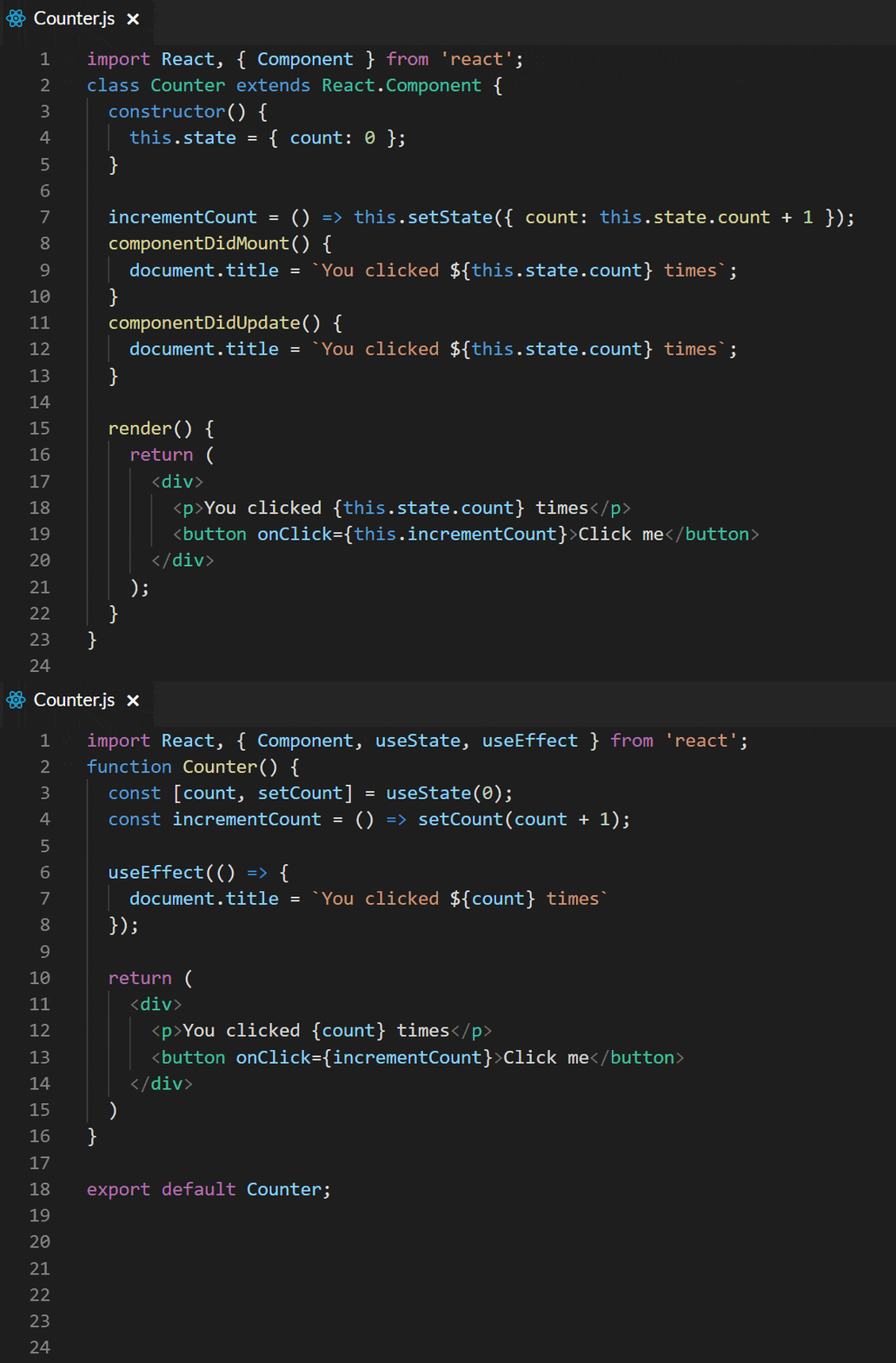
Below we follow the canonical counter example provided in the React docs. It contains a button inside of a Counter component. Once clicked, it advances the state by one and updates the state.count for rendering purposes.

First we see how to do this with a class based component using just setState :

The first thing to notice about the class-based component is that the class syntax uses a constructor that references the this keyword. Inside the constructor we have a state property. We also update the count using setState().

Now, lets see how to do the same thing with Hooks, using a functional component:

In the functional component example we have an additional import of useState. There's no more class syntax or constructor, just a const. Its assignment sets the default and provides not only the count property, but a function for modifying that state called setCount. This setCount refers to a function and can be named whatever you like.

The functional component incrementCount method is easier to read, and references our state value directly instead of referencing this.state.

Side-by-Side Example of useEffect

When updating state, we sometimes have side effects that need to happen along with each change. In our example of the counter, we may need to update the database, make a change to local storage or simply update the document title. In the docs, the React team chose the latter example to make things as simple to understand as possible. So let's do just that and update our examples to have a side effect that uses the new Hook useEffect.

Let's add this side effect to our existing counter example and again look at the old way of doing this with Classes vs working with Hooks. We will first see how to do this with a basic class-based component:

And next how to do the same thing with Hooks:

Now that we are introducing additional behavior, we start to see even more evidence of how switching to Hooks provides a cleaner way of dealing with state and side effects. What took two separate life-cycle methods in the class component we can achieve with just one call to useEffect. We do have one more import on the functional component example, but if we can get rid of the class syntax, an additional life-cycle method and make our code cleaner and more readable, it's totally worth it.

Call useState and useEffect as Much as You Want!

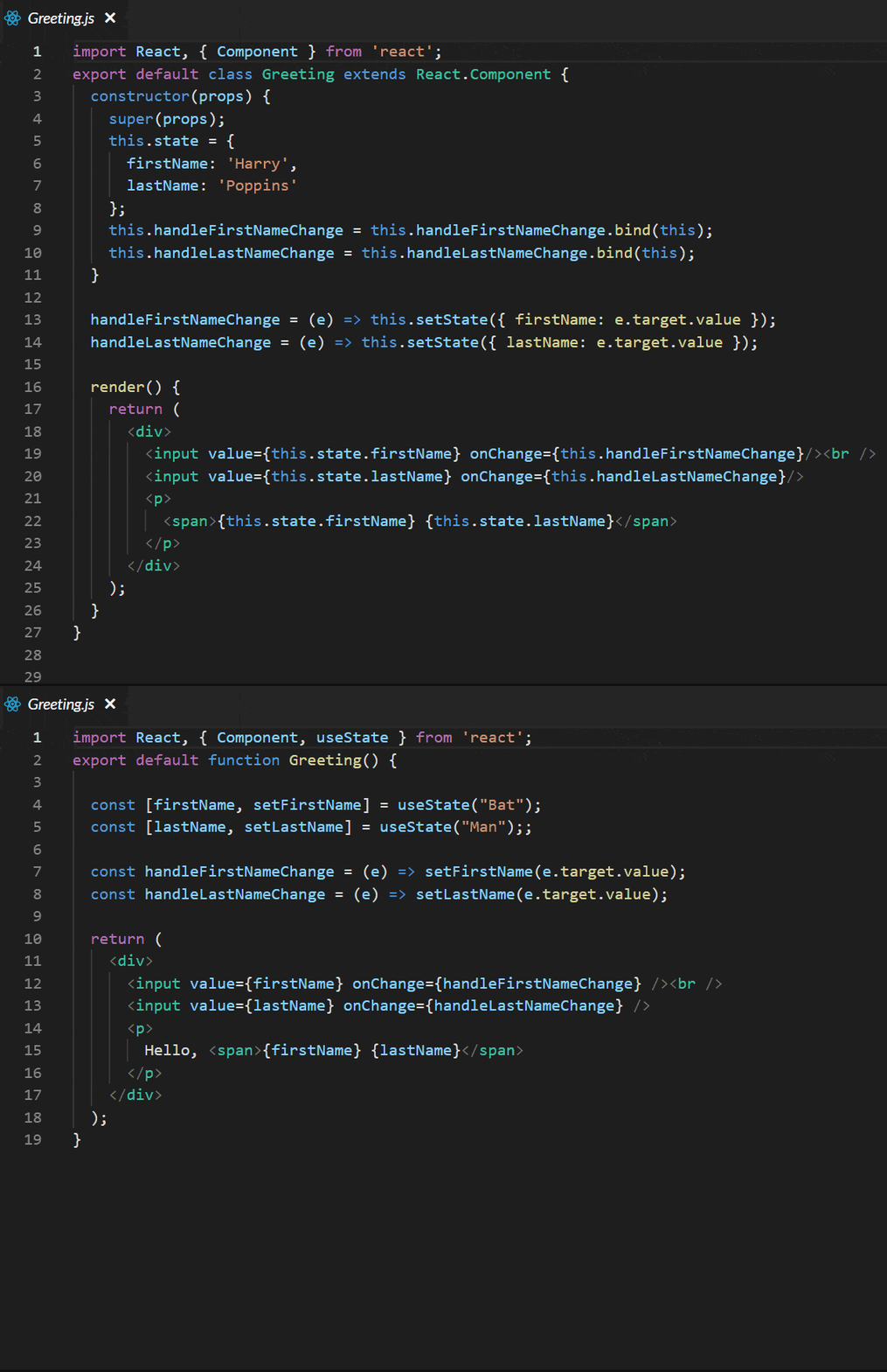
Just like with setState, you can call useState as many times as you want. Let's switch to an example that shows a slightly more involved situation where we have a name we are displaying on the page, some inputs that allow for the name to be changed, and we want control over both the first name and the last name. We can create two separate properties, each with their own update or set function, and simply call useState on each in order to set the default.

In the GIF below, you can see what this would look like - as well as what it looks like with a class-based version, which we'll dig into a little more below.

Functional vs Class

As you would expect we also have an update function for each name so that you can handle changes to them independently.

Let's see the code for the class-based component:

And now the same thing with Hooks:

I won't go over all the differences again, but I wanted you to see a slightly more complex example side-by-side. Hopefully you are starting to see the benefit of using Hooks.

Let's make one more change to this example and use useEffect to save our name to local storage so that we don't lose our state when we refresh the page.

Let's see the code for the class-based component:

And now the same thing with Hooks:

Wrap Up

I hope that these interactive examples allow you to understand the basics of setState and useEffect. I plan to release more articles on the subject of React Hooks as well how to use them with our KendoReact native React components. If you are new to React, we have more content here on the Telerik blog specifically around All Things React, which contains a plethora of information about React and its ecosystem. Please explore our articles and products and let me know if you have any questions or ideas for articles on subjects relating to React.

Thanks for taking the time to read about React Hooks - below is additional information around the topic that you can find online!

Early Documentation and Articles on Hooks:

React Docs on Hooks
Making Sense of React Hooks
Understanding Hooks in React a Deep Dive
A Simple Intor into Hooks
React 16.7 Hooks Tutorial
Hooked (Formiddable)
Flux Without Fuss: From Containers to Hooks

Video Resources on Hooks

React Conf 2018 Day One Talks
Share Complex Logic across React Components with Custom Hooks
Access and Modify a DOM Node with the React useRef and useEffect Hooks
Share Logic Across Multiple React Components with Custom Hooks
Use the useState React HookTest React Components that use React Hooks
React Hooks a Complete Introduction
TODO List with Hooks

Is That UWP, WPF or WinForms: Bring Your Desktop App to the New Millennium with XAML Islands

$
0
0

XAML Islands, announced in May at MS Build, has spurred a lot of interest and discussion in the .NET community. Read on to learn about our experience with XAML Islands, starting with an overview of its functionality and features, all the way to its practical implications for .NET application development.

XAML Islands is one of the hot topics .NET developers have been exploring following the keynote announcement of Kevin Gallo at Build 2018. Microsoft has reported that over 2.4M developers are currently building desktop apps in Visual Studio EVERY month, with a 50% increase in the last 20 months. 

XAML Islands - .NET Developers - Visual Studio Image
SourceWindows Developer Slideshare

In this series of blogs, I will cover everything you need to know about XAML Islands, starting from what it actually is and what it provides to .NET developers, all the way to how you can use it in your applications and breathe new “life” and an improved UX to your current Windows Presentation Foundation (WPF) or Windows Forms applications.

Let's start off by covering how XAML Islands was born, and what you can do with them today.

How was XAML Islands Born?

To be a .NET desktop developer nowadays is super exciting. You have a wide variety of technologies from which you can choose to build your application. In addition to already established technologies like Windows Forms and WPF, in 2015 Microsoft announced the Universal Windows Platform (UWP). UWP is not just for desktops, but is rather a cross-platform technology for building applications that could run on desktop, Xbox, IoT, Surface Hub and Hololens.

So, what does UWP actually give us that Windows Forms and WPF don't? 

UWP_Features

The first thing that comes to our mind is the modern look and feel UWP provides. That look and feel is consistent with the OS. The Fluent design that is incorporated into Windows 10 and its features are also supported and built into UWP – it comes out of the box for the UWP developed applications.

Next, the framework also provides some features that are part of Windows 10 itself out of the box as well – like Tiles and Notifications

Finally, you have improved servicing. This takes into account the Windows Store. UWP applications can easily be packaged into .appx and deployed into the store. The store provides great variety of services that you can integrate – using them you have multiple ways to deliver, manage and even make money from your app.

The question that likely pops up in your mind here is, “Is it possible to enhance my WPF/WinForms application with all the features UWP provides?” The answer is “Yes.”

What is XAML Islands and how can it Enhance My Application?

Your existing app can call and use almost every Windows 10 API.  Some of the APIs require a simple contract to be added in order to be able to use them.

Using Desktop Bridge you can easily package your existing Win32 app into an .appx. The packing also gives a notion of identity to your app and that brings some of the benefits of calling additional Windows 10 APIs that need that identity.

Enhancement Path

Achieving a look and feel consistent with the OS, however, was mission impossible until now. At Build 2018 Kevin Gallo announced a functionality called “XAML Islands.” Using the islands you can modernize your application with UWP UI and still use your current implementation as much as possible. It has officially been released with the latest version of Windows (1809).

Now let’s dive deep into XAML Islands and see how it works and how to use it.

How do XAML Islands Work?

XAML Islands Overview WPF UWP Image

Source: Windows Developer Slideshare

XAML Islands are the perfect solution for every WPF/WinForms developer that wants to improve the look and feel of their application without migrating them to UWP. All UWP controls could directly be invoked and used from within WPF/WinForms. 

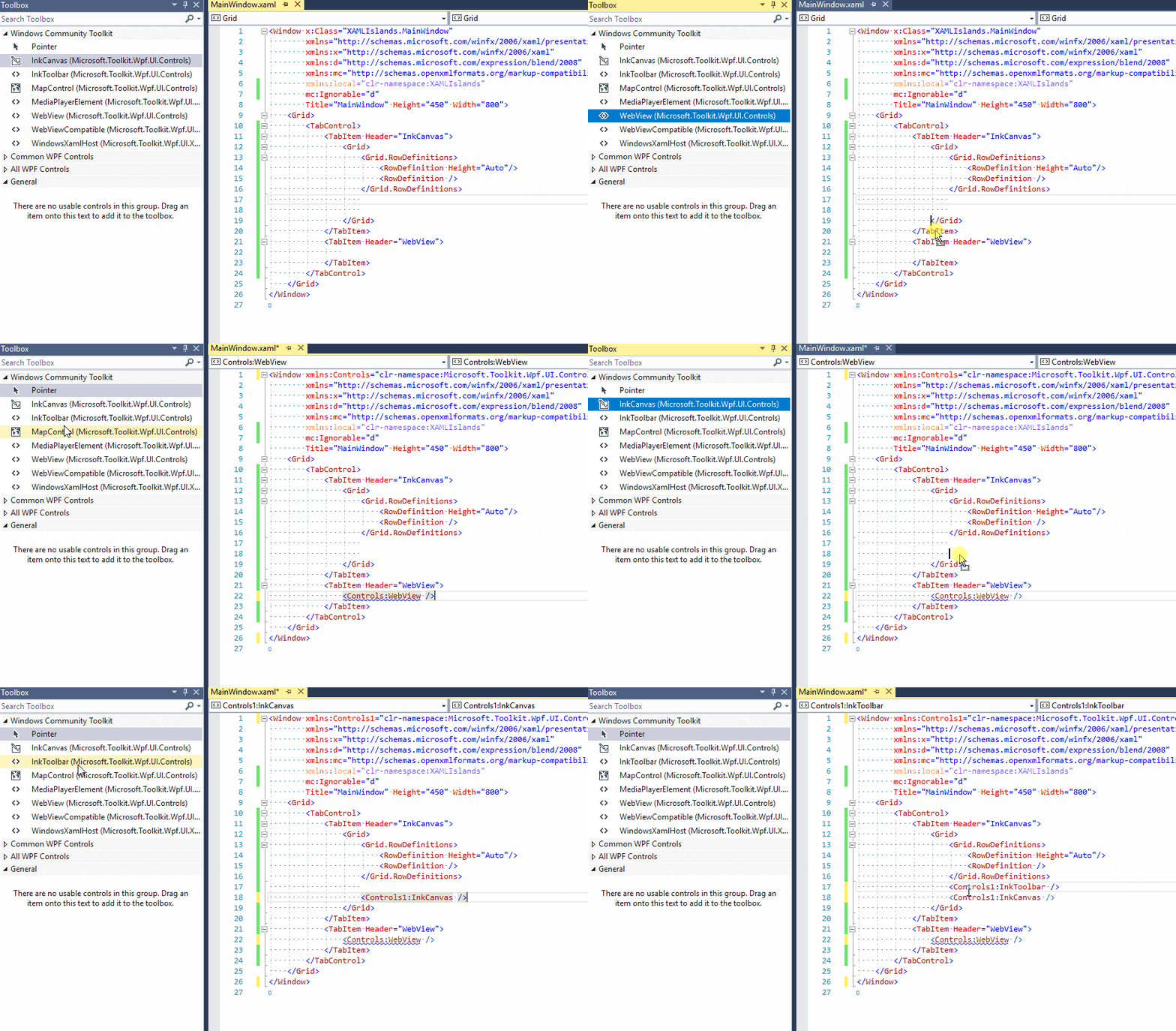
The easiest way to work with XAML Islands is to use the NuGet packages provided by the Windows Community Toolkit. The toolkit contains two control implementations. These controls (one for WPF and one for Windows Forms) wrap the WindowsXamlManager and the DesktopWindowXamlSource:

  • The WindowsXamlManager’s job is to initialize the UWP Framework inside the thread of your WPF/WinForms application. This will allow you to create UWP UI in WPF/WinForms.
  • The DesktopWindowXamlSource’s purpose is to hold the instance of your Island content. It hosts any control that derives from UWP’s Windows.UI.Xaml.UIElement in a UI element that is associated with a window handle (HWND) – it renders to and gets its input from HWND. Using it you can also get and set the focus to that element.
host-controlsNOTE: In order to be able to use these APIs, the latest version of Windows (1809) is required.

Of course you can use the WindowsXamlManager and the DesktopWindowXamlSource’s to implement your host from scratch, but my suggestion is to use the wrappers that are already provided by the toolkit. You have the following packages:

  • Microsoft.Toolkit.Wpf.UI.XamlHost– contains the wrapper of the WindowsXamlManager and the DesktopWindowXamlSource for WPF - the WindowsXamlHost.
  • Microsoft.Toolkit.Wpf.UI.Controls– contains wrappers for the InkCanvas, InkToolbar, MapControl, and MediaPlayerElement controls that can directly be used in WPF.
  • Microsoft.Toolkit.Forms.UI.XamlHost – contains the wrapper of the WindowsXamlManager and the DesktopWindowXamlSource for Windows Forms - the WindowsXamlHost.
  • Microsoft.Toolkit.Forms.UI.Controls– contains wrappers for the InkCanvas, InkToolbar, MapControl, and MediaPlayerElement controls that can directly be used in Windows Forms.

If you are a WPF or Windows Forms developer you need to simply add one of the mentioned packages and you can use all wrapper controls or the WindowsXamlHost to host any UWP control.

What can You do with XAML Islands Today?

Currently, only a few UWP controls are wrapped and ready to use out of the box - they are part of the Microst.Toolkit.Forms/WPF.UI.Controls package:

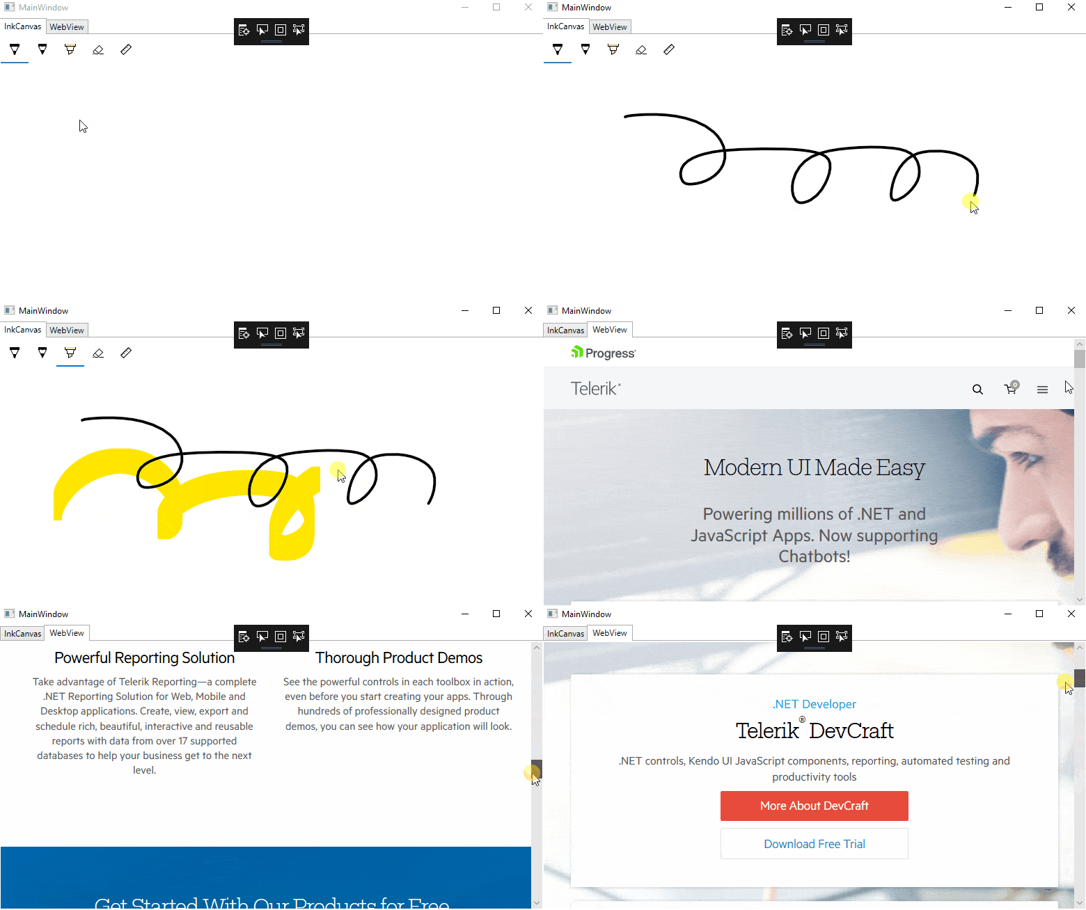
  • WebView– UWP control used to show web content using the Microsoft Edge engine. Yeah, we finally got a modern version of the WebBrowser control in our WinForms and WPF apps!
  • WebViewCompatible– a version of the WebView that could be used with other operating systems (not only Windows 10). If it is used on Windows 10 version 1803 machine the Edge engine is used. For earlier versions the Internet Explorer engine is used.
  • InkCanvas/InkToolbar– a surface for Windows Ink-base interaction.
  • MediaPlayerElement– UWP view that streams and renders media content.

What Does the Future Hold for XAML Islands?

As the XAML Islands were released only a few months ago, they are still in a development stage and are constantly improving. In the near future more and more UWP controls are expected to be wrapped and a mechanics for wrapping third party controls is expected to be provided as well. 

In our next blog post about XAML Islands we will go deep into the usage of the wrappers and how to create UWP bindings for them inside your WPF/WinForms application. In the meantime, when you have a chance go and check out XAML Islands. Happy playing with it.

And while you're here, feel free to take a look at our UI suites for WPF, WinForms and UWP applications if you're interested in developing apps on those technologies with a beautiful UI quickly.

Why Does Product Testing Have to Take So Damn Long?

$
0
0

Cian is a guest author from our partner truematter - user experience experts who help their customers achieve greater efficiency and engagement.


It can be tempting to cut product testing short to get a product out the door faster. Why should it take so long, anyway? Cian O'Connor explains why this is a corner you should never cut.

By the time you reach the final stages of creating a digital product, your hours are usually tight and your deadline is looming. You’re doing everything you can to come in on time and within budget. And still one large obstacle is in your way: You have to make sure the thing works. You have to do product testing, or what we call quality assurance (QA) testing.

At this late phase in the project, it’s tempting to cut corners to get to the finish line. You might wonder if your development team really needs as much time as they said. Would it be so bad to reduce their testing hours so you can launch already?

The short answer is: yes. If you cut testing hours, you will be sorry. I’ll tell you why.

Many years ago, I was working on a project that was seriously behind schedule. Every day the project was delayed, it cost the company more money. I’m sure you’re familiar with this situation. Maybe you tried to fix a similar problem the same way our project manager did: in an attempt to save the budget, he decided to cut QA testing.

For a brief, shining moment, this saved the project. Our project manager was a hero. But reality set in when the first user attempted to use our software. Suddenly the lack of testing was painfully obvious. The product launch was a complete and utter disaster. Not great for our users or the company.

So yes, you must test if you want quality (or even just usable) software. But saving money by cutting the time spent on testing is, quite frankly, tempting. After all, does it really need to take so long?

If your development team is competent, why does their code have so many bugs? Maybe you just need better developers who make bug-free digital products. Then you’d cut down the time and money spent testing. Right?

Wrong.

Don’t Blame Your Developers

Your development team is not the problem. A different development team would still need just as long to test thoroughly. That’s because most software problems aren’t caused by developers. They’re typically caused by:
  • Bad data
  • Buggy third-party libraries, browsers, or hardware
  • Users interacting with software in unexpected ways

Nothing your development team does can entirely prevent these problems from happening. Only a thorough QA process can uncover these problems before they turn into problems for your users and your business.

So what the heck are your developers doing with all that testing time? They’re fighting against the very real and very complex problems that come along with creating any new site, app, or software suite.

Data is Unpredictable

Software always breaks when development teams finally get to put in real data. It’s one of the iron-clad laws of development. And it doesn’t matter how well your team plans ahead of time, your developers are still going to find data that breaks established rules. They’ll find missing data when they were told that could never happen. They’ll discover unforeseen ways the data needs to be used.

Your data is a reflection of the real world and, unfortunately, the real world is a complex, messy, and unpredictable place that refuses to read your requirements.

The only way around this messy problem is to test your code thoroughly with real data. This will help you identify and fix problems before your users find them. Cutting this corner can mean failure for your project, your users, and your company. Give your developers time to fix what breaks. Buying them donuts probably wouldn’t hurt either.

You Can’t Control Third-Party Tools

Short of creating every new digital project from scratch with raw silicon and copper, you have to rely on third-party tools that have already done some of the work for you. But every piece of third-party software and hardware that your project relies on will betray you. That library that was supposed to save hours of developer time will turn out to have an obscure bug. Some weird quirk in the operating system will break every page link. And inevitably, your website will look great except when you view it in that one stubborn web browser. You can’t predict what will break or where it will break, only that something outside of your control WILL break.

These problems were created by other developers at a different company and your development team has to find workarounds for them. It’s not glamorous or exciting, but it is essential if high quality, usable products are going to make it out the door. And yes, it takes time.

Users are Unreliable

The trouble with users is, they rarely do what you want them to do. As soon as you put your product in front of a real person, they will do something you never anticipated. And if you haven’t done thorough testing, they will certainly break your site or app.

Each user will break your product differently. Some are compulsive clickers. Others have characters in their names that your database won’t accept. Some will attempt to type War & Peace into your “Comments” field causing your server to crawl up into a ball and die. There are a million ways to abuse your product. Your users will find most of them.

This is why many well-known and popular products, such as Adobe Photoshop, have long beta testing phases. With enough users interacting with the product, most of the bugs will eventually be found. But you probably don’t have the luxury of thousands of users who are willing to test your site or app for free.

Fortunately, most companies have at least one person who likes to break things. Make them your chief QA tester and let them at it. Just keep in mind that they need to time to break things and your development team needs time to fix them.

Fix Digital Problems Before They Become Business Problems

If you want people to use your digital product, it must work properly. It’s as simple as that. Broken is unusable. QA testing is about identifying unpredictable problems early before they become user experience problems and, therefore, problems for your business.

It can be a lengthy process, but it’s just as important as any other phase of creating your site, app, or software. Don’t cut QA hours thinking you’re saving yourself time or money. You’ll end up with a buggy, unusable product and you’ll still have to spend time and money fixing problems after your disastrous product launch.


Want to learn more about creating a great UX? Find out some tips about making sure that your app presents an outstanding User Experience in these interviews with Dean Schuster and Bekah Rice.

Announcing the Progress Developer Community Support Program

$
0
0

Developer communities are wonderful – a platform for developers to share, learn and improve our craft. However, nurturing a developer community takes a lot of work. Just ask anybody who runs a User Group/Meetup or one-off Developer Events. We, at Progress, have a long tradition of supporting developer communities and we're here to help. We're rebooting our Developer Community Support program - let us be your partner.

We're Here For Developers

We have always been a company for developers, by developers. We like saying we're in the business of making developers successful - it's in our genes. Modern day app development spans across many technologies, platforms and a plethora of tooling. Developers should be able to choose preferred technology stacks and have rich ecosystems waiting for them.

So what can Progress do for developers? We'll meet you whatever be your stack - .NET or JavaScript across web/desktop/mobile. While brands like Telerik, Kendo UI or NativeScript are developer mainstays, we go the additional mile with CMS, Reporting, Testing and Productivity solutions.

So why do we care about developer communities? Simple - it's a symbiotic relationship. While we have a vested interest in seeing developers and their communities thrive, we also want to share some love. Starting today, we're revamping our Community Support program to serve UGs, Meetups and Events - we're here to help communities be successful.

Developer Community Support

Developer communities vary in their needs - recurrent meetups need continued support, while one-off events could use immediate help. Any community support program needs to be flexible and be able to sustain itself over time. We've put some thought into devising a few tiered programs that should cater to various needs - here's what we can do for you.

UG Starter Program

If you are running a recurrent UG/Meetup, let's get you hooked up with our Starter package - this is all digital and available right away. Here's what we can offer:

UG Pro Program

Once we have supported you with the Starter program for 3 months, it's time to upgrade to Pro – think of it like a committed relationship. Here's what you get & we'll renew every 6 months on demand:

  • 2 Telerik UI for Xamarin licenses to raffle off
  • 2 Kendo UI licenses to raffle off
  • $50 Pizza eGift card to help with UG expenses
  • $50 Amazon eGift card to raffle/offset costs
  • Custom shirts, sticker pack, pop-sockets & other swag

Event Support Program

Running a one-off developer event, like a small Conference/Bootcamp/Hackathon with under 500 attendees? Here's what we can do to help - this is all digital as well:

Speakers

One of the most common challenges for nurturing any developer community is the continuous need for quality speakers. It is hard to fake passion - so community leaders are often looking around for speakers who genuinely care about a piece of technology and are enthusiastic to share their knowledge. We think we can help. We have big team of Progress Developer Advocates and an extended army of Developer Experts - seasoned speakers whose expertise range from .NET, JS, AI, AR/VR, Cloud and Devices across platforms. Sure we can bring in-depth knowledge on Telerik, Kendo UI or NativeScript stacks - but we can also talk generic & OSS technologies.

So, if you would like a speaker for your UG/Meetup/Event, simply check a checkbox and we'll try to get things coordinated. We can't be everywhere, but we'll try our best to help. As an added benefit if you have one our speakers out - we'll be happy to pick up the pizza check.

Sharing the Love

So, you can clearly see that we're here to help developer communities thrive. We could use some love back as well - there are some small expectations:

  • Your UG/Meetup needs to be in good standing with verifiable monthly meetings
  • We expect our Progress logo to be displayed on your website & in sponsor decks
  • Physical swag can only be shipped to UG/Meetups within US, Canada & EMEA

Additionally, we'll spin up our marketing muscle to promote your UG/Event on social media. And community leaders will be invited to a Slack channel with our DevRel presence - this is where we coordinate and get things done.

Let Us Help

That's it then - a revamped Progress Developer Community Support program is here to cater to your needs. We know fostering a developer community takes a lot of effort - we're in this together. Fill up the right forms and we'll get you hooked up. Cheers to our developer communities and thank you for all that you do!


Custom Angular Animations in Our Kendo UI To-Do App

$
0
0

So far in the Kendo UI and Angular Unite series, we've built a to-do app that is functional, but what's missing in the UX is motion! Learn how to add animations that are both snazzy and useful to our users.

Welcome back to Angular and Kendo UI Unite. If you are new to the series, I suggest checking out the first post or watching the video series these posts are based on!

At this point, the to-do app we've built is functional with the ability to add and remove to-do items to the to-do list. We are using Kendo UI buttons and a textbox input to make this UI happen & it’s looking pretty good with our custom styles easily modifying the Kendo UI components. The only thing that is missing in the UX is motion! Some animations would really snazzify our app while providing useful feedback as well as a spatial mental model to our users. Let’s do this!

This is the animations post of our series. In this article we're going to add some custom Angular Animations to the to-do app that we built last post, which I'm so super pumped about. Let's dive in!

Follow along with the code found here.

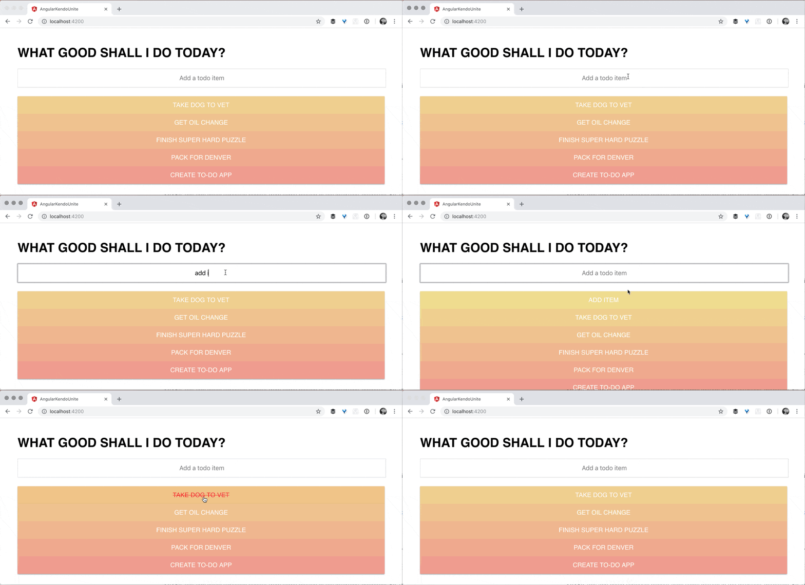
So as a reminder, what we built in the last post was just this simple to-do list. If you click an item from the list, it removes it. If you add a new item, it adds it in, as you would expect.

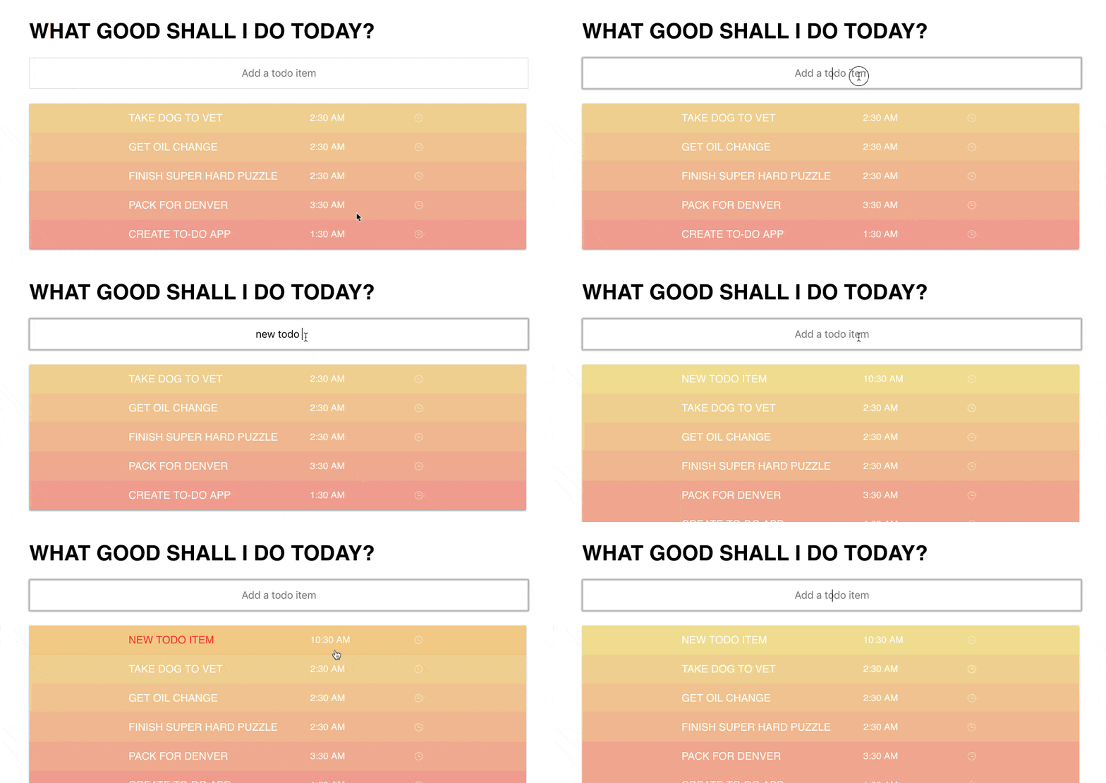
when adding a new item it pops in

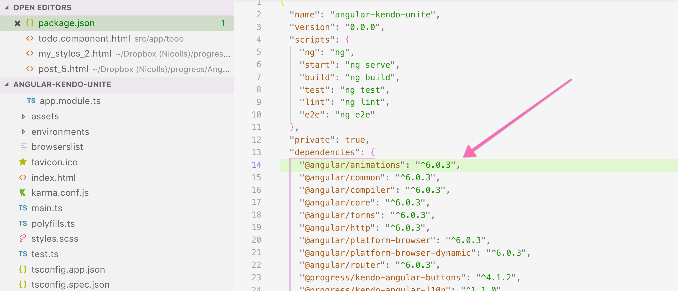
So, this app could seriously benefit from some motion in the interface. So, I'm going to dive right into adding animations to this. Now from the get go, the Angular Animations package is included in our app. And that's because Kendo UI uses Angular Animations. So we don't need to go ahead and include that, it's already there.

when removing an item, it simply disappears off screen

Now inside of our component we're going to add a metadata property, called animations, and it's going to take an array. Inside of this is where the magic happens. We're going to first start off by using some snippets that I've made. The first snippet is for to-do items:

// todo.component.ts

import { Component, ViewEncapsulation } from '@angular/core';
import { trigger, transition, animation, style, animate, keyframes } from '@angular/animations';
@Component({
  selector: 'todo',
  encapsulation: ViewEncapsulation.None,
  templateUrl: './todo.component.html',
  styleUrls: ['./todo.component.scss'],
  animations: [
    trigger('todoItem', [
      transition(':enter', [
        animate('0.5s cubic-bezier(.88,-0.19,.26,1.27)', keyframes([
          style({
            height: 0,
            opacity: 0,
            transform: 'translateX(-100%)'
          }),
          style({
            height: '50px',
          }),
          style({
            opacity: 1,
            transform: 'translateX(0)'
          })
        ]))
      ]),
      transition(':leave', [
        style({ backgroundColor: '#df3920' }),
        animate('0.5s cubic-bezier(.88,-0.19,.26,1.27)', keyframes([
          style({
            height: '50px',
            opacity: 1,
            transform: 'translateX(0)'
          }),
          style({
            opacity: 0,
            transform: 'translateX(-100%)'
          }),
          style({
            height: 0
          }),
        ])),
      ]),
    ])
})
export class TodoComponent {
…
}

Essentially an animation is composed of a trigger, and then inside of that you will see the animate tag and the style tag being used in conjunction. We got a little fancy and used two keyframes on this first one, but it's obviously not necessary to be as fancy as we're being.

In order to use this animation, we need to add a trigger to an HTML element. So what we're going to do is add a @todoItem, and that's going to attach that animation to that element (you can attach this to any element).

We are saying transition on :enter. :enter is an alias, you could use the longer version if you wished: void => default.

Alias State transition

:entervoid => default
:leavedefault => void

We're also animating over .5 seconds (you can also say 500, which would be short for milliseconds) and using an ease in, and then our key frame which will happen one step at a time. This first step here:

// todo.component.ts

style({
  height: 0,
  opacity: 0,
  transform: 'translateX(-100%)'
}),

So this first style chunk, it's starting off our styles with a height of zero, opacity of zero, and a transform translate X of -100. So if you haven't guessed it yet, this means that it's going to be off and to the left of our screen, all the way off the screen and invisible.

// todo.component.ts

style({
  height: '50px',
}),

Next up, we're going to give these a height of 50 pixels.


// todo.component.ts

style({
  opacity: 1,
  transform: 'translateX(0)' 
})

And then finally set opacity to one and transform translate X to 0. So that's moving it onto the screen. You might be wondering, well, why are we changing the height on the middle step? This is so that the list of to-do items makes room for the new to-do item, before it starts budging on over. It just makes a little bit more sense.

So this is a glorified slide in animation, very lengthy. And next we'll create another animation that does the exact opposite, as you might anticipate. This is the slide out animation, and of course we're doing it on leave:

// todo.component.ts

transition(':leave', [
  style({ backgroundColor: '#df3920' }),
  animate('0.5s cubic-bezier(.88,-0.19,.26,1.27)', keyframes([
    style({
      height: '50px',
      opacity: 1,
      transform: 'translateX(0)'
    }),
    style({
      opacity: 0,
      transform: 'translateX(-100%)'
    }),
    style({
      height: 0
    }),
  ])),
]),

If we go over now, and we click on these todo items, you should see them all sliding out quite nicely as we remove them.

gif of todo item animating (sliding) off the screen

And then if we add in a new todo item, you see that as I said, the list will actually expand down, making room for the new item before it slides over into the center of the page. Which is exactly what we wanted.

gif of todo item animating on screen

However, these slide in and slide out animations are not very reusable. What do I mean by that? Well, if we wanted to make, for instance, our header or our input or something else use one of these animations, we would just have to write all of this again.

Let's try doing this in a better way - we'll start creating our super wonderful reusable animations by creating an animations.ts file.

Inside this file is where the magic happens. This is where we’ll create a reusable animation. We'll call it slideIn, set it equal to an animation. Inside this is where we are going to put our slideIn animation that we just built out:

// animations.ts

export let slideIn = animation([
  animate('0.5s ease-in', keyframes([
    style({
      height: 0,
      opacity: 0,
      transform: 'translateX(-100%)'
    }),
    style({
      height: '50px',
    }),
    style({
      opacity: 1,
      transform: 'translateX(0)'
    })
  ]))
]);

We need to also remember to import these things from Angular Animations in the new file:

// animations.ts

import { animation, style, animate, keyframes } from "@angular/animations";

Now we can use this reusable animation here in our todo component:

// todo.component.ts

import { slideIn, moveDown, slideOut } from './../animations';
import { trigger, transition, useAnimation } from '@angular/animations';
…

    trigger('todoItem', [
      transition(':enter', [
        useAnimation(slideIn),
      ]),
     …
    ])

We can do the same thing with the slideOut animation!

// todo.component.ts

import { slideIn, moveDown, slideOut } from './../animations';
import { trigger, transition, useAnimation } from '@angular/animations';

@Component({
  selector: 'todo',
  encapsulation: ViewEncapsulation.None,
  templateUrl: './todo.component.html',
  styleUrls: ['./todo.component.scss'],
  animations: [
    trigger('todoItem', [
      transition(':enter', [
        useAnimation(slideIn),
      ]),
      transition(':leave', [
        useAnimation(slideOut)
      ]),
    ])
  ]
})

If we test these out in the browser now, we see that the todos are still sliding in and out! Now that we have Angular Animations pretty much under our belts, and reusable animations under our belts, I wanted to introduce Query.

Inside of our todo component, in the animations, I’m going to add another animation.

// todo.component.ts

import { trigger, transition, useAnimation, stagger, animateChild, query, group } from '@angular/animations';
…
    trigger(‘todoAnimations', [
      transition(':enter', [
        group([
          query('h1', [
            useAnimation(moveDown)
          ]),
          query('input', [
            useAnimation(moveDown)
          ]),
          query('@todoItem',
            stagger(100, animateChild()))
        ])
      ])
    ]),

todoAnimations is using a couple extra things that we've not imported yet. So we're going to go ahead and import, stagger, animateChild, query, and group . And I'm going to walk you through this amazingness.

We have created a trigger for to-do animations. As promised in the last post, we have a div wrapper around all of our to-do HTML that we aren't using. Well now is that little div's time to shine. We are going to put the @todoAnimations trigger on it!

screenshot showing html div wrapper around todo markup

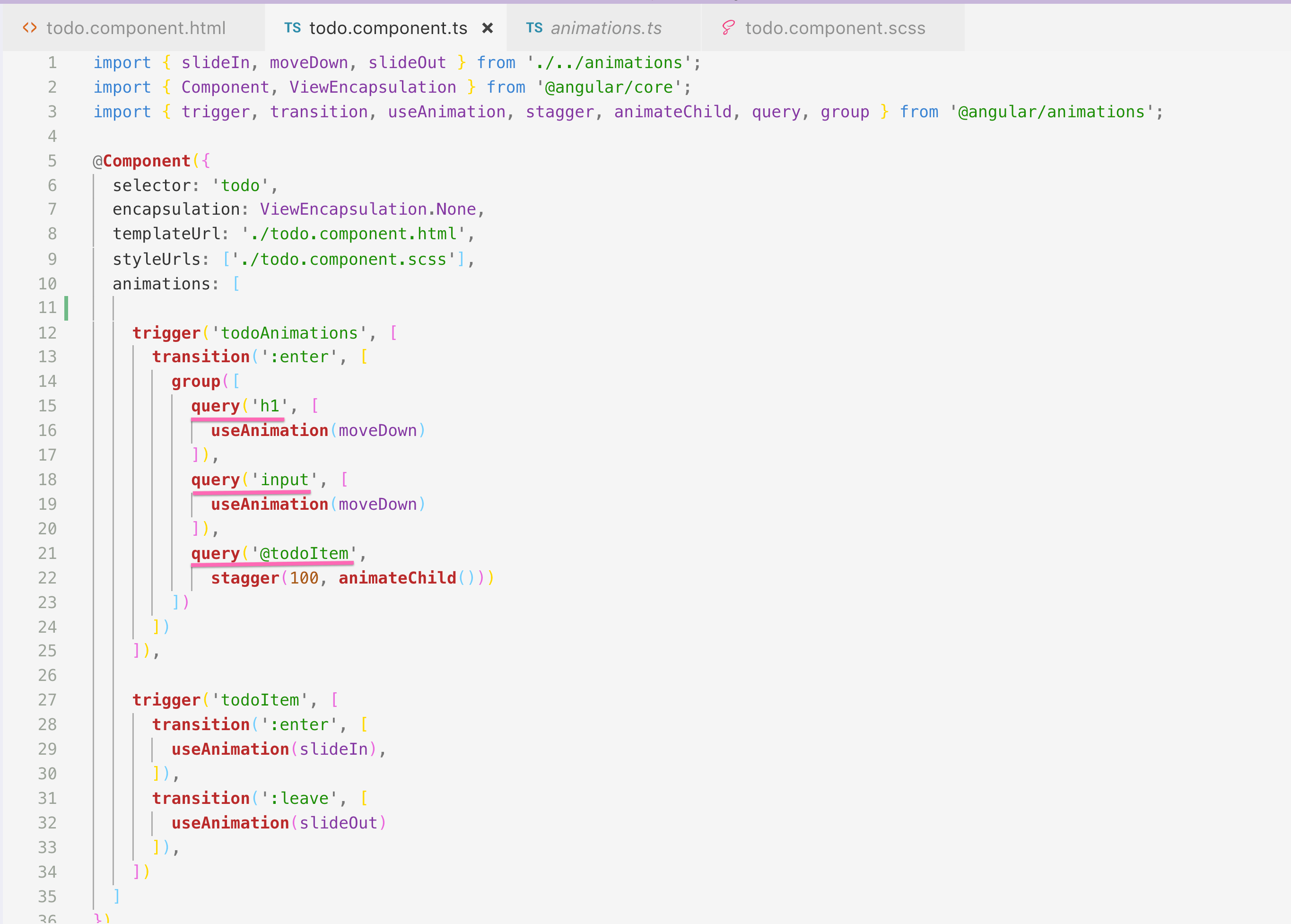
So you can create a trigger like this wrapper, for instance. And then inside of this wrapper we can query any of these elements, like h1, or input, which I actually am doing, and give them an animation.

screenshot of typescript showing query selecting multiple html tags and one animation trigger

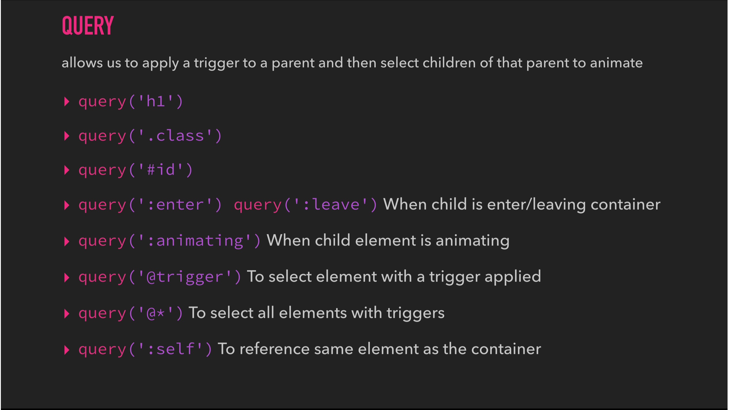
As you see in the animation, you can actually query other things outside of just HTML tags. Here is a list of optional query selectors:

Slide showing all the different selectors you can use with query. Things like aliases, triggers, ids, and html elements.

And so, on transition enter, I'm saying to this group, hey group, I want you to do a couple things on enter. The first one is I want you to move the h1 down. The second one is, I want you to move the input down. Okay? Pretty simple, pretty happy. The final one is my absolute favorite, and it is querying the to-do items which we already have on the screen (using @todoItem), and we're staggering them by 100 milliseconds. And so, instead of the todo items slamming onto the page together, they're going to come in one at a time, using stagger!

The last step to this gloriousness is that we actually need to create the moveDown animation that the H1 and Input are both using.

// animations.ts

export let moveDown = animation([
  style({ transform: 'translateY(-20px)' }),
  animate(200)
]);

We're now using move down inside of our query for the H1 and the Input. Then we're using stagger for our to do items, to stagger their animation, that's being given on :enter.

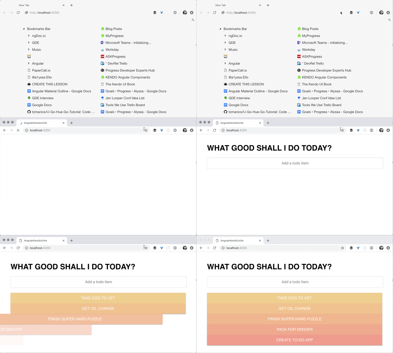
gif of on load, the h1 and input sliding down slightly and the to do items animating in one at a time

I really hope that you've enjoyed diving into Angular Animations and adding some custom ones on top of our Kendo UI and Angular To-Do app. In the next post we have some fun time picker stuff. Because what's a to-do item really, without a time due date on it? So, thank you so much for watching and I hope you're learning a lot. And happy coding to you.

If you're new to Kendo UI for Angular, you can learn more here or just jump into a free 30 day trial today.

10 More Things You Didn’t Know About Create React App

$
0
0

Editors note: Last month we published another article on "5 Things I Didn't Know about Create React App" - check that one out too for more tips and tricks with React!


Learn new tips and tricks for Create React App to make you more productive with tooling and help you build your apps faster.

Create React App is a tool developed for setting up React applications. It saves its users from time consuming-configuration and setup. Using Create React App, users can set up and run single-page React applications in minutes.

There’s a lot this ingenious tool can do for its users. Some features are quite popular, like the fact that it requires no setup, and that users can create a fully fledged application by running a single command. But this tool can do much more than even some of its most faithful users know about.

In this article, we’ll go through a list of ten things you probably don’t know about Create React App. Some of them may come as a surprise to you. If you find that you know most of the things listed here, then you should keep an eye out for the few that are new to you — they might really come in handy.

1. Service Workers Support

Create React App has out-of-the-box support for service workers. That means your application can be a Progressive Web Application that works offline and uses a cache-first strategy. In the latest installment of Create React App (version 2), service workers are opt-in only.

To make use of service workers in your production build, you have to register the service worker in your index.js file. In your src/index.js file, look for the following line:

// If you want your app to work offline and load faster, you can change  // unregister() to register() below. Note this comes with some pitfalls.  // Learn more about service workers: http://bit.ly/CRA-PWA  
serviceWorker.unregister();

Change the serviceWorker.unregister() to serviceWorker.register(). Opting in to use a service worker makes your application an offline-first Progressive Web Application with cached assets and ability to add to the home screen for mobile users.

2. CSS Autoprefixing

To ensure cross-browser support, Create React App adds vendor prefixes to an application’s CSS. This reduces the stress of manually adding vendor prefixes while styling components. An example of this will be the flex display property. The snippet below will be transformed from this:

.App{display: flex;flex-direction: row;align-items: center;}

To this after minification:

.App{display: -webkit-box;display: -ms-flexbox;display: flex;-webkit-box-orient: horizontal;-webkit-box-direction: normal;-ms-flex-direction: row;flex-direction: row;-webkit-box-align: center;-ms-flex-align: center;align-items: center;}

You can control, restrict, and target support browsers by changing the browserlist property in your package.json file using the Browserslist specification.

Read more on autoprefixing in Create React App here.

3.SASS Support

With Create React App v2, support for CSS preprocessor has been added. Finally we have nesting and mixins supported out of the box in Create React App. In previous versions of Create React App, to achieve something similar to nesting, we made use of component composition. To get started using SCSS in your project, install node-sass, then rename all css files to scss.

You can read more about getting started with SCSS in Create React App here.

4. Code Splitting Using Dynamic Imports

In the process of building our application, we can end up with bloated build files. Code splitting as a technique can help reduce the size of build files. Create React App supports the Dynamic import proposal out of the box. Using dynamic imports, bundle sizes can be reduced substantially.

Dynamic imports are asynchronous so they can be used with Async/Await. Using this technique, components are imported on demand and will be built separately from your main bundle file, thus reducing the bundle size.

The snippet below shows how to utilize the import() feature:

import React from'react'exportclassTestComponentextendsReact.Component{constructor(){super();this.onClick =this.onClick.bind(this);}asynconClick(){const component =awaitimport('../neededComponent.js');}render(){return<button onClick={this.onClick}>Lazy load me</button>}}

Read more on code splitting using dynamic imports here.

5. Proxy API Requests During Development

Usually during development we set up the server and React app on the same host and port, and then we’ll serve the frontend app on the "/" and maybe serve the API from the "/api" route. Well, with Create React app you don’t necessarily need that setup, as you can tell the Create React App server to proxy such requests to your API server.

So all you need to do to get this feature working is to add a proxy field in your package.json file.

“proxy”: ‘http://localhost:4000

This way any requests that can’t be processed by the development server will proxy to the value of the proxy field in the package.json file. So request to /api/todos will proxy to http://localhost:4000/api/todos.

This is very convenient as you don’t have to deal with CORS issues in development. Read more on proxying API requests here.

6. Support HTTPS During Development

During development, one might need the development server to serve pages over HTTPS. Maybe that OAuth application requires your app to be served over HTTPS before it authenticates or for some other reason. Whatever your reasons may be, Create React App has got you covered, as always.

It’s a very easy setup. All that’s required is setting the HTTPS environment variable to “true” before starting the server. Thus, instead of running:

npm start  

On Windows cmd you run:

set HTTPS=true&&npm start  

On Powershell run:

($env:HTTPS = $true)-and(npm start)

And finally on Linux and macOS run:

HTTPS=true npm start  

Check out the full gist on HTTPS setup during development here.

7. Support for Environment Variables

During development, you’ll have some sensitive information that shouldn’t be included in your scripts. Client keys, client secrets and the rest are best stored in environment variables, and Create React App comes to our rescue again by replacing environment variables referenced in your code base with their actual values.

All you need to do is create a .env file in the root of your project folder and define any variables your wish to use in your files in the following format:

//.env  
REACT_APP_CLIENT_SECRET=client-secret  
REACT_APP_CLIENT_KEY=client-key  

The idea here is to prefix any environment variable you wish to define with REACT_APP and Create React App will replace it with its actual value when building your files.

Check out how you can create different environment variables for production and development here.

8. Support for Latest JavaScript Standards

Create React App supports some of the latest and most used JavaScript standards. The ES6 syntax is fully supported by Create React App along with some other experimental proposals.

Experimental proposals like async / await, Object spread/rest properties are a few others that are also supported out of the box.

To use other experimental features like Symbols, Promise and others requires a polyfill. The polyfill is also provided by Create React App. They never stop helping, do they?

Read more on the currently supported standards here.

9. One Build Dependency

This is more of a fun fact than a point that’ll actually contribute to your development. Create React App makes use of webpack, Babel and the rest under the hood, but builds on top of them to provide a unified experience. That’s why we install one tool and we get a server, linting, transpilation and the rest alongside it.

10. Eject

If it comes to it and you think that there are some features you require in your project that are not supported by Create React App, you can always eject. Maybe you need static type-checking using TypeScript or the build setup doesn’t work well enough. You can always eject.

Now, ejecting simply means copying all of Create React Apps configurations to your project and handing over full control over to you. If you go this way, it’ll be hard but not impossible to go back.

Whenever you’re ready to go down this road, simply run npm eject and the deed will be done. But remember, with great power comes great responsibility.

Read more on benefits and dangers of ejecting here.

These are just ten of the many things Create React App does to aid development experience. Going through their official README, you can find a lot more interesting features offered by Create React App. I hope that some of the things listed here actually help in making your development experience easier and more forthcoming.


For more info on building apps with React: Check out our All Things React page that has a great collection of info and pointers to React information – with hot topics and up-to-date info ranging from getting started to creating a compelling UI.

Progress Shares Knowledge with the Bulgarian Tech Industry

$
0
0

In November, we engaged with our Bulgarian tech community at three major industry events: DevReach, ISTA and js.talks();

Knowledge sharing and engaging with our tech community has always been part of who we are. In November, we took part in three big industry events in Bulgaria (one of which was organized by Progress) and can’t wait to share with you how they went.

DevReach – the Premier Developer Conference in Central and Eastern Europe

This year’s DevReach was very special – the conference celebrated its 10th anniversary. With more than 800 software engineers from nearly 20 countries and 45 sessions on the latest in app development, DevReach again became the must-attend event for the international IT community. The conference, which is organized by Progress, took place on Nov. 13-14 in Sofia.

DevReach’s keynote session was about “The Perils and Promise of Artificial Intelligence.” Keynote speaker Richard Campbell, а podcast creator, speaker, author and founder of The Humanitarian Toolbox, presented the history and evolution of the technology in the years. According to him, artificial intelligence promises a world in which humanity can use its full potential and live in a more convenient and safer way, with more possibilities. At the same time, artificial intelligence can be used to restrict, confuse and control. It is essential that society realize how to control this fast-evolving power so that the world can become better.

DevReach 2018 included 45 sessions on app development, .NET, JavaScript, UX, AI and AR/VR, led by more than 40 speakers from 7 countries. This year, the conference included a pre-conference day with three practical workshops. The first one was aimed at developers who want to enhance their leadership and business skills, and the other two workshops were for women who want to learn how to create applications with Angular and Vue.js.

ISTA – the Innovations in Software Technologies and Automation Conference

It’s now a tradition for Progress to take part in ISTA every year. The 8th edition of the conference, which gathered 600+ software engineers, took place on Nov. 14-15 in Sofia and was focused on technology innovations.

We had a prominent place in the agenda. Our colleagues Georgi Atanasov, Director, Software Engineering, and Stefan Stefanov, Senior Product Manager, delivered a session on how to build virtual and augmented reality (AR and VR) with Telerik tooling. Jumping from a conventional 2D screen to an innovative 3D projection enabled through AR and VR, they demonstrated live how data visualization will look in the future.

Throughout the conference, a team of colleagues was onsite to demonstrate our VR/AR application built with Telerik tooling to the participants in the event. All attendees who stopped by our booth had the chance to participate in a raffle for a VR/AR headset.

js.talks();

About 1,000 JavaScript developers gathered at js.talks(); on Nov. 17 to share, learn and exchange knowledge on the popular technology. In a full hall, our colleague Plamen Zdravkov delivered a session, titled “Three Points of Vue.” He focused on three reasons why Vue is the best framework to choose and showed demos of how he used the platform to create his own projects.

We also had several Progressers at the event engaging with the attendees and answering their questions.

We were all very happy and proud to be part of all these industry events in Bulgaria. See you next year!

Progress Announces Support for Visual Studio 2019, .NET Core 3.0, the .NET Foundation and More

$
0
0

Microsoft just announced some exciting changes, and we're ready with our support for Visual Studio 2019, .NET Core 3.0, the .NET Foundation and more.

A lot of great information was shared during Microsoft Connect();. Whether you are a Visual Studio user (and if you aren’t, you should remedy that), interested in desktop development, a friend of .NET, interested in Azure or eager to see how .NET Core 3.0 will change your life, there was something for you in today’s announcements.

As the Telerik team at Progress works closely with our friends at Microsoft, we have some news to share around their announcements as well. Read on to learn more about our commitment to the .NET Foundation, Zero-Day support for Visual Studio 2019 and .NET Core 3.0, and one of the first pull requests made by us to the newly open-sourced WinForms project.

Progress Named .NET Foundation Corporate Sponsor

The .NET Foundation is an independent, non-profit organization, created in 2014 to foster open development and collaboration around the growing collection of open source technologies for .NET. It serves as a forum for commercial and community developers alike to strengthen the future of the .NET ecosystem by promoting openness, community participation and rapid innovation.

Microsoft announced on December 4 that the .NET Foundation will operate under an open membership model. This means that any contributor to .NET is eligible to become a member and participate and vote in the annual Board of Directors elections. Furthermore, the .NET Foundation is expanding its Technical Steering Group to a Corporate Sponsor Program. 

The Telerik team at Progress is proud to be among the first corporate sponsors of the .NET Foundation and looks forward to helping to shape the future of .NET through its participation as a technical advisor.

.NET Core 3.0 Support

Also released on December 4 was .NET Core 3.0 Preview which brings in support for WinForms and WPF applications, and in keeping with our commitment to support the developer ecosystem, the Telerik team at Progress announced 0-day support for the new framework. All Telerik UI for WinForms and WPF controls are compatible with the preview version and will be fully compatible when .NET Core 3.0 is released for general availability. Feel free to head to your Telerik accounts and download the .NET Core version of the products!

According to Scott Hunter, .NET Core 3.0 addresses three scenarios .NET Framework developers have requested including side-by-side versions of .NET that support WinForms and WPF; the ability to embed .NET directly into an application; and it allows desktop developers to truly benefit from the better high-DPI support, among other benefits .NET Core affords. To learn more about what was announced with the .NET Core 3.0 preview, visit the Microsoft .NET blog.

Telerik and Kendo UI Controls Compatible with the Latest Visual Studio 2019 Preview

Visual Studio 2019 Preview is now available and Progress is again at the forefront of the latest cutting-edge technology announcements – our major UI suites support the latest .NET and JavaScript advancements, making you even more productive in the latest version of the best IDE around.

You can use Visual Studio 2019 Preview and the Telerik .NET and Kendo UI JavaScript controls.

Download the Telerik and Kendo UI Visual Studio extensions from the marketplace: 

Telerik UI for ASP.NET Core, Telerik UI for ASP.NET MVC, Telerik Reporting, and JustMock extensions will be available with our next major release (January 2019).

Each of the toolkits provides access to more than 70 ready-to-use UI controls (some toolkits have double that amount). Grid, Dropdown and Menu, and advanced line-of-business controls such as Charts, Gantt, Diagram, Scheduler, PivotGrid and Maps are just a few of the modern controls that come standard in each suite.

Telerik Team Makes One of the First Pull Request to WinForms Repo on GitHub

Microsoft officially open sourced the Windows Forms and WPF frameworks on Tuesday, December 4 and the Telerik team at Progress executed one of the first pull request on the new repository with its contribution of a very neat functionality called NullText. The feature allows the developer to show a string watermark when the text of a control is null. Such a functionality has been a standard in UI for various platforms, as it provides great user experience, by informing the end user what is expected from them to input e.g. “Enter your name.” 

If you had asked me ten years ago if i thought Microsoft would open source anything, I would have simply laughed - it is amazing to see them go as far as open sourcing Windows Forms and Windows Presentation Foundation. This clearly shows Microsoft's dedication to open source and community driven products.

2019 is looking to be an exciting year in the Microsoft developer space. As you move to the latest version of Visual Studio or begin to build on .NET Core 3.0, we will be compatible and ready for you with the best UI controls on the market.

Microsoft’s Latest Open Source Announcements: Why Should You Care?

$
0
0

It's a new, open world for Microsoft developers. With the announcements that Microsoft has made WinForms and WPF open source, and the changes to the .NET Foundation, there is a lot of change in the air. Here's why should you care and what lies ahead.

During the Microsoft Connect(); event, Scott Hansleman announced that Progress and the Telerik team is among the first corporate sponsors of the .NET Foundation. As a developer, you may have tuned out when you heard the word “corporate” but if you did that, you might have missed something really important. Microsoft not only announced the new corporate sponsors who would have a seat on the technical advisory board, but it announced that it has adopted an entirely new open membership model. This is an important point that should not be overlooked. 

Those who have been in the Microsoft world for any length of time will remember the days when “Open Source” was a bad phrase. After Satya Nadella took the reins at Microsoft, all of that began to change. And we think it was change for the better.

Opening membership to the .NET Foundation means that the community truly will have a larger say in the direction of .NET. It also further demonstrates Microsoft's commitment to open source as this announcement comes on the heels of some similar ones – the open sourcing of Xamarin, open sourcing its patents, open sourcing Visual Studio Code, and, most recently, open sourcing WinForms and WPF.

Our commitment to the .NET Foundation underlies our commitment to the developer community as a whole. We have open sourced our UWP controls, JustAssembly and the engine of JustDecompile are open source, and we are the creators of NativeScript. By participating on a larger scale in the .NET Foundation, we will help to ensure there is a healthy open source community with resources to help ensure the worldwide .NET open source and developer base grow to their full potential. The corporate sponsorship funds contributed to the .NET Foundation will be used to provide speaker grants to the global network of Meetups and User Groups; fund in-person conferences and hackathons; and more.

In addition to the sponsorship, the Telerik team at Progress will be donating its time and expertise by serving as technical advisers to help shape the future of .NET by advocating for the needs of the .NET open source developer community.

We believe that the announcements today – the open sourcing of WinForms and WPF and the adoption of an open membership model with corporate sponsors – are just the latest stop on Microsoft’s open source journey. And while they are dedicated to open source, there are a few things left that they haven’t really talked about.

ASP.NET AJAX. Microsoft did not open source Web Forms back in 2012 because it was part of the System.Web.dll that parts of the Windows Server platform have a dependency on. We don’t think this will change, so we are betting Microsoft will leave this one as is.

Windows. A few years ago if you asked me if I thought they would open source Windows I would have just laughed. But they did open source PowerShell… so maybe there is more they could share. The biggest concern would most certainly have to be around security.

I guess time will tell. What are we missing? What do you think will be the next open source announcement that Microsoft makes?

Telerik and Kendo UI Controls Compatible with the Latest Visual Studio 2019 Preview

$
0
0

Microsoft unveiled the brand new Visual Studio 2019 today, and we've ensured our Telerik and Kendo UI development tools are already compatible.

Progress has a long-standing tradition in ensuring its Telerik development tools are able to provide zero-day support for any and all new .NET advancements. So it should come as no surprise that the moment Microsoft announced the availability of the latest Visual Studio 2019 Preview on stage at the Microsoft Connect(); event that Progress simultaneously announced the availability of its Visual Studio 2019 compatible controls for all Telerik tools.

Magically (or through the power of technology, as the case may be), when the Visual Studio 2019 Preview went live, the compatible tools became available. You can download the extensions from the Marketplace:

Telerik UI for ASP.NET CoreTelerik UI for ASP.NET MVCTelerik Reporting, and JustMock extensions will be available with our next major release (January 2019).

Each of the toolkits provides access to more than 70 ready-to-use UI controls (some toolkits have double that amount). Grid, Dropdown and Menu, and advanced line-of-business controls such as Charts, Gantt, Diagram, Scheduler, PivotGrid and Maps are just a few of the modern controls that come standard in each suite.

For those not familiar with what’s in the Visual Studio 2019 Preview, we think you’ll be impressed. Here are a few of the highlights:

Visual Studio InitelliCode Custom Repos (Public Preview). Visual Studio IntelliCode is previewing a new capability – AI-enhanced IntelliSense recommendations based on your code. You can now train IntelliCode on your own C# repos, further enhancing recommendations  based on your own patterns and your code’s specific libraries.

Visual Studio Live Share. Visual Studio Live Share is integrated in Visual Studio 2019, meaning every Visual Studio developer can take advantage of Live Share’s real-time collaboration features.

And if that’s not enough, here are a few more highlights:

  • Improved search accuracy for menus, commands, options, and installable components
  • Updated menu and title bar to increase space for code
  • One-click code cleanup command for documents, projects and solutions
  • Improved debugging
  • The ability to submit Pull Requests in the IDE
  • New project template overview
  • The ability to authenticate with GitHub
  • IntelliCode model-sharing and C++ Support
  • More refactoring options
  • Smarter debugging
  • And more…

As with most things Microsoft these days, they are extremely transparent with their roadmap. Make sure you spend some time looking around. While you are there, you can also find links to the Visual Studio release rhythm to give you a better understanding of when to expect updates; the Previews downloads page; and the Developer Community website where you can log your suggestions.

And speaking for logging your suggestions, as you start to play with Visual Studio 2019 and our compatible tools, make sure you share your feedback, thoughts, and needs with our engineering teams. The more feedback we get from you, the more likely we are to meet and exceed your needs and expectations.

Happy coding!

Update Your WPF and WinForms Apps to .NET Core 3 with Telerik UI for WPF and WinForms

$
0
0

Do you want to update existing WPF and WinForms apps to take advantage of all the features of .NET Core 3.0? Learn how to prepare your app today with Telerik UI for WPF and WinForms.

Today at the Connect(); 2018 conference Microsoft released the .NET Core 3.0 Preview version, which now supports our favorite desktop technologies - WinForms and WPF. This will allow Windows desktop apps to benefit from .NET Core features such as performance improvements, side-by-side deployment and UWP functionality. You can read more about how to enhance your existing desktop app with UWP features here.

However, the greatest thing for existing desktop apps is that, if they are converted to a .NET Core application, they can now be extended with everything new that .NET will include in the future.

What's more, I am super excited to announce that the Telerik UI for WinForms and Telerik UI for WPF controls are .NET Core 3.0 compatible!

So, are you excited about it? Do you want your app to be ready for this? Together, let’s prepare an existing Desktop app for this new adventure!

Updating an Existing Desktop App to .NET Core 3.0

For the purpose of this post I’ll use an existing WPF app – Mail Application  – created with the Telerik WPF Extensions wizard. The application includes separated view, ViewModels and Custom Styles built with Telerik UI for WPF. I will also do the same exercise with a version of this app built with Telerik UI for WinForms.

The Visual Studio extensions are fully compatible with Visual Studio 2019 so if you are excited about everything new – you can install and use them with VS 2019 right now.

WinForms

Winforms app

WPF

mailWpf

Download the Telerik Visual Studio extensions from the marketplace: 

Ready to start? Go!

Step 0: Prepare Your Environment

Of course, first we need to Install the latest .NET Core 3.0 SDK daily build.
Note that you also should Install Visual Studio 2017 Update 15.8 or higher from .https://visualstudio.microsoft.com/downloads/, and select the .NET desktop development workload with the following options: .NET Framework 4.7.2 development tools and .NET Core 2.1 development tools.

Step 1: Check to See if the App is Compatible

To do this we will run the NET Portability tool using the instructions provided by Microsoft here.

analyzeapp

report

The output shows that we are almost 100% compatible, but there are some more steps we need to do!

Step 2: Create a New .NET Core 3.0 Application with the VS Command Prompt

At the moment there is no tool or built-in option in Visual Studio that allows you to simply convert the app. The project structure is now different, so we will need to create a new one project file from scratch. How?

It’s time to create a completely new .NET Core 3.0 app project using Command Tool of Visual Studio 2017 :)

Use the command below for WPF:

dotnet new wpf -o MyWPFApp
cd MyWPFApp
dotnet run

And use this one for WinForms:

dotnet new winforms -o MyTelerikWinformsApp
cd MyTelerikWinformsApp
dotnet run

winforms

This command will create a new project in the current directory to the path that you have pointed. To check that everything is OK simply open it to the in Visual Studio and run it.

This will also create the needed solution file.

Below is what a WPF app built against .NET Core looks like!

wpf core

winforms

Step 3: Add Existing Files from Original Project as Linked Files

Link Files

After you have done this, there are some interesting things you should consider/do:

  • If you have used images with the build action Resources, change it to Embeded resource or Content

  • If you add your AssemblyInfo or App.Manifest file, be sure to add this manually to the project file - the new project style uses a different approach and generates the same assembly attributes as part of the build process

  • If you have referred to some references which are still not available in .NET Core as Windows.Composition, you should Include the Windows.Compatibility Pack

  • There is no design time support at this time, however, Microsoft is working on it and we should expect it in near future

Step 4: Change the Telerik Binaries with the Version Built Against .NET Core 3

To do this, login to your account, go to the Downloads section of the latest release and download the .zip for WPF and .zip for WinForms containing the Preview of the .NET Core 3 controls for Telerik UI for WinForms or WPF.

Now, add references to the .NET Core 3.0 alternative of the same Telerik binaries you previously used. The libraries have the same names and differ only in their versioning, They contain the 300 postfix in their versioning info.

your account

binaries

Note for WPF applications, if you use RadRichTextBox for WPF, there is one additional step. The current implementation uses MEF to load additional UI and components (like dialogs and document format providers depends), which in turn by default uses Assembly.ReflectionOnlyLoadFrom(*) method to inspect the assemblies for possible suitable parts. The method is currently not implemented for .NET Core, so as a workaround you can provide a pre-defined type catalog at the beginning of your application:

RadCompositionInitializer.Catalog = new TypeCatalog(
                // format providers
                typeof(XamlFormatProvider),
                typeof(RtfFormatProvider),
                typeof(DocxFormatProvider),
                typeof(PdfFormatProvider),
                typeof(HtmlFormatProvider),
                typeof(TxtFormatProvider),

                // mini toolbars
                typeof(SelectionMiniToolBar),
                typeof(ImageMiniToolBar),

                // context menu
                typeof(Telerik.Windows.Controls.RichTextBoxUI.ContextMenu),

                // the default English spell checking dictionary
                typeof(RadEn_USDictionary),

                // dialogs
                typeof(AddNewBibliographicSourceDialog),
                typeof(ChangeEditingPermissionsDialog),
                typeof(EditCustomDictionaryDialog),
                typeof(FindReplaceDialog),
                typeof(FloatingBlockPropertiesDialog),
                typeof(FontPropertiesDialog),
                typeof(ImageEditorDialog),
                typeof(InsertCaptionDialog),
                typeof(InsertCrossReferenceWindow),
                typeof(InsertDateTimeDialog),
                typeof(InsertTableDialog),
                typeof(InsertTableOfContentsDialog),
                typeof(ManageBibliographicSourcesDialog),
                typeof(ManageBookmarksDialog),
                typeof(ManageStylesDialog),
                typeof(NotesDialog),
                typeof(ProtectDocumentDialog),
                typeof(RadInsertHyperlinkDialog),
                typeof(RadInsertSymbolDialog),
                typeof(RadParagraphPropertiesDialog),
                typeof(SetNumberingValueDialog),
                typeof(SpellCheckingDialog),
                typeof(StyleFormattingPropertiesDialog),
                typeof(TableBordersDialog),
                typeof(TablePropertiesDialog),
                typeof(TabStopsPropertiesDialog),
                typeof(UnprotectDocumentDialog),
                typeof(WatermarkSettingsDialog)
                );

And voila -  run the project and see your new Desktop .Net Core 3 app with Telerik UI.
You can see that visually .NET Core 3.0 app (left) is the same as the original app(Right):

Now the apps are ready and you can continue to work with them. In the meantime, you can check out what else is cooking in our Telerik kitchen!. Stay tuned for the next major release of Telerik UI for Winforms and Telerik UI for WPF in early 2019.

Welcome to new era of .NET Core 3 apps and happy coding!


Finishing Our To-Do App with the Kendo UI TimePicker

$
0
0

At this point in the Kendo UI and Angular Unite series our to-do app is looking great using Kendo UI components & custom Angular animations. However, each to-do item could benefit by having a time assigned. Let's see how we can easily accomplish this with the Kendo UI TimePicker!

Hello and howdy! Welcome back to Angular and Kendo UI Unite! I'm Alyssa Nicoll the Angular Developer Advocate for Kendo UI at Progress. If you are new to this series, I highly suggest you start with the first post here, or check out the video series these posts are based on! In this post, we're actually going to add a TimePicker to our todo list, so that you can not only add in todos but you can assign a time for them to get done by.

Follow along with the code found here.

To start off, we're going to go ahead and open up our terminal, and install the Angular Kendo date inputs.

Installing Kendo UI Date Inputs

ng add @progress/kendo-angular-dateinputs

Installing these inputs will go ahead and give us access to all of the date inputs that we would ever want to use from Kendo UI. However, today, we are only going to use the TimePicker. We are actually done now with the terminal window, and can close that.

Inside of our template in the button, next to the item, the title, of the todo item, we want to add in a Kendo TimePicker. And we want to bind the value of our todos.

Add timepicker to Template

<kendo-timepicker [(value)]="todo.due"> </kendo-timepicker>

We are going to set the value to todo.due, which we still need to create.

Now, if we go into our component, we see that our todos do not have due yet. Now is the time to fix this! We need to give each item a due time: due: new Date(2019, 3, 10, 2, 30, 0).

We’ll just vary the time a bit on each one, by changing the values inside of the Date().

Update todos Array with due

  todos = [
    {
      item: 'Take dog to vet',
      due: new Date(2019, 3, 10, 2, 30, 0)
    },
    {
      item: 'Get oil change',
      due: new Date(2019, 3, 10, 2, 30, 0)
    },
    {
      item: 'Finish super hard puzzle',
      due: new Date(2019, 3, 10, 2, 30, 0)
    },
    {
      item: 'Pack for Denver',
      due: new Date(2019, 3, 10, 3, 30, 0)
    },
    {
      item: 'Create to-do app',
      due: new Date(2019, 3, 10, 1, 30, 0)
    }

So, each of the items now has a "due" which is set to new date. Now if we save this and actually head over to the CSS, we'll see that this is where justify-content: space-between; comes in handy.

Without justify-content: space-between;

todo items without justify content space between

With justify-content: space-between;

todo items with justify content space between

This time, we see our items over here on the left-hand side, then the TimePicker over there on the right-hand side. I've actually created some custom styles to make our TimePicker look a little bit better on our todo items, since we have such a custom look and feel in our todo app.

So if you scroll all the way down to the bottom of the todo.component.scss file, you'll see these TimePicker customizing styles - it's mainly me getting rid of the background.

Customize the styles of our timepicker (after showing what the default styles look like)

// time picker customizing styles

.kendo-timepicker {
  height: 30px;
}
.k-timepicker:hover, 
.k-timepicker:hover .k-select, 
.k-timepicker .k-picker-wrap, 
.k-dateinput .k-dateinput-wrap, 
.k-timepicker .k-select {
  background: none;
  border: none;
}
.k-timepicker:hover .k-select {
  background-image: none;
}
.k-dateinput-wrap .k-input,
.k-timepicker .k-select {
  color: white;
}
.k-dateinput-wrap input:focus, .k-timepicker .k-state-focused {
  box-shadow: none;
}
.k-dateinput-wrap input::selection {
  background-color: transparent;
}

I’ll uncomment them now and go back over and refresh, you'll see that it just kind of blends in a little bit better with each one.

screenshot of todos with custom styles for time picker

Yay! So we have our TimePicker showing, super simple, super easy, and now its bound to a due property. The next step is actually going to be adding an item in.

When we add a new item, it's not going to have a due time, initially. Let's go ahead and make sure it does.

The first thing we're going to do is go back over to our component, and at the top of it, top of the class here, we're going to create an initial due time, or initDueTime. We're making that of type date, and I'm setting it equal to a new date and time.

public initDueTime: Date = new Date(2019, 3, 10, 10, 30, 0);

Then we're going to go ahead and use this initial due time down here where we're creating or adding a new todo to the list.

Create initDueTime and Use when Creating New todos

public initDueTime: Date = new Date(2019, 3, 10, 10, 30, 0);
...
this.todos = [{ item: input.value, due: this.initDueTime }, ...this.todos];

Next to our item input value, we want to go ahead and create a due key, and we're going to set that equal to this.initDueTime.

Now, when we go and create a brand new item, it should have initial due time. Every time. Perfect!

gif of creating new item in the todo list with a set time on the timepicker

This was a super simple and easy way to add something like a due time to our todo list. I absolutely love this picker, I think it's super cute, and I also love that it's so customizable, as you saw with the lines of CSS that I wrote earlier to customize it. I literally was just modifying, primarily, again, the background, the border, the background image, and the color, just so that it matches what we have going on here in our UI. Most importantly, I love that no important tags were needed in the creation of this custom Kendo UI TimePicker!

I hope you have fun using more of the date inputs and I hope the TimePicker really comes in handy. Happy coding everyone!

If you're new to Kendo UI for Angular, you can learn more here or just jump into a free 30 day trial today.

Introduction to the KendoReact Grid

$
0
0

There is a lot you can do with the KendoReact Grid. Read on to get an introduction into commonly used features and get ideas about how it can be added to your projects today.

The KendoReact Data Grid (or Data Table, depends on what you're used to) is one of the most popular components from of our React UI component library. It makes a lot of sense why this is the case, many developers are tasked with displaying data within their applications and what better way to present said data than in a tabular fashion?

There's more than just displaying data in rows and columns though. This native UI component, which is a part of our native UI component library built from the ground-up for React (which means zero dependencies), has a ton of features built in to help users organize, modify, and export their data. Some highlights include:

  • Paging
  • Sorting
  • Filtering
  • CRUD Operations
  • Export to PDF and Excel
  • Reordering and Resizing of Columns
  • Virtualization

And that's not even the full list! For this blog post I wanted to take a look at some of the more popular features and how you can implement them, sticking to paging, sorting, filtering, and grouping. Overall this should give you a great foundation for how you can add the KendoReact Grid in to your applications!

Installing the KendoReact Grid

Before I get any further I should cover just how to prepare your project to start using the KendoReact Grid.

First, we should npm install all of the packages that we may need:

npm install --save @progress/kendo-react-grid @progress/kendo-data-query @progress/kendo-react-inputs @progress/kendo-react-intl @progress/kendo-react-dropdowns @progress/kendo-react-dateinputs

We're installing a few packages here, but mainly we're adding in the Grid, all of the KendoReact inputs (like drop downs and date pickers) as well as the ability to work with our internationalization and globalization packages.

Next, within our component we can import our package module:

// ES2015 module syntax import { Grid } from '@progress/kendo-react-grid';

Or use the CommonJS format:

// CommonJS format const { Grid } = require('@progress/kendo-react-grid');

Finally, we should make sure that the component is styled in some way. We have three designs (or themes) that you can use: the Default (our home-grown theme), Bootstrap (v4), and Material themes. For this particular sample we will be using Material since this is based on the guidelines coming from Material Design and one of the most popular design languages today.

To add in one of our themes all you have to do is another npm install like this one:

npm install --save @progress/kendo-theme-material

Then, to actually use this theme in our application (as in, where we need to reference our CSS) we have a couple of options. For more detail as to exactly what you can do please check out our "Styling & Themes" documentation article, but in this case I did a super simple inclusion of our theme in the header of my index.html:

<link rel="stylesheet" href="https://unpkg.com/@progress/kendo-theme-default@latest/dist/all.css" />

Not necessarily something recommended for production - we cover more real-life scenarios in the article I linked above - but certainly something that will work for this article!

It All Starts with Data

Now that things are installed and imported in our project, let's kick things off with the easiest scenario: binding to an array.

Let's say we have the following array in my state that we want to show in our KendoReact Grid:

state = { gridData: [ { "firstName" : "Clark", "lastName" : "Kent", "heroName" : "Superman" }, { "firstName" : "Bruce", "lastName" : "Wayne", "heroName" : "Batman" }, { "firstName" : "Kendra", "lastName" : "Saunders", "heroName" : "Hawkgirl" }, { "firstName" : "Diana", "lastName" : "Prince", "heroName" : "Wonder Woman" } ] };

All we really need to do is the following:

<Grid data={this.state.gridData} />

That's it! We end up with a Grid like this:

React Grid

As we can see the Grid took all of our fields, automatically created columns for them and displayed them all on a single page. However, there are some things that stick out like the header not necessarily looking that great (just taking the field name), and maybe we want to display the name of our super hero first rather than last. The way that we solve this is by defining a set of columns within the Grid to represent our data. These columns let us also take over specifics that we may want to do on a column-by-column basis (think about providing custom templates depending on our data) down the road.

That's looking much better! Notice how the order of the columns have now changed, and the headers are looking a lot better.

Adding Interactivity into the Mix

Paging

For paging there are a few paths we can take. Since we're going to be working with local data it means that we are responsible for slicing the data down to the proper size that we need for the pages we're dealing with.

What we're doing for now is fully taking over paging based on the superhero data that we mentioned above. We're taking this approach just to help step through how paging works within the KendoReact Grid on a basic level. There are many other ways, including making the Grid itself more stateful, or working with libraries like our Data Query framework and even Redux to change things. For more samples you can refer to our paging documentation section.

A couple of things that I want to point out are terms that we use in the configuration of the Grid and paging: skip, take, and total. The names kind of give it away, but lets jump in to each one.

skip aligns with how far in our data array we should go. This would be 0 for our initial page, but if we have a page size of 10 and want to jump to the second page we would now have a skip of 10 to start on the next "page" of data.

take is pretty much our page size. If we set this to 10 it means that every page will have 10 items loaded in it.

total just lets the pager know the total number of items that we are binding to. This helps around the calculation to display "X - Y of Z items" where our total is "Z."

With that in mind the way that we enable paging within the KendoReact Grid is through setting the pageable property to true, and then defining the take and skip options.

In our case we only have four data items so to make something of a sample we can make a page size of two, giving us two total pages. Nothing super exciting, but again this is to give you an idea of how paging works in the Grid. Since take and skip are dealing with our data and keeps the current state of the Grid let's add them to our component's state right away like so:

class App extends React.Component { constructor(props) { super(props); this.state = { gridData: [ { "firstName" : "Clark", "lastName": "Kent", "heroName" : "Superman" }, { "firstName": "Bruce", "lastName": "Wayne", "heroName" : "Batman"}, { "firstName": "Kendra", "lastName": "Saunders", "heroName" : "Hawkgirl"}, { "firstName": "Diana", "lastName": "Prince", "heroName" : "Wonder Woman"} ], skip: 0, take: 2 }

So, we skip 0, starting with my first item, and we're only setting up take to be 2 (grabbing just Superman and Batman from our array).

Another piece that we have to do to implement paging is to subscribe to the onPageChange event. This event is in charge of letting us know when the page changes and in which direction (if we're paging forward or backwards). This is really just accomplished through updates to skip and take, but it also gives us a chance to modify our data tied to the Grid to the appropriate page. In our case this can be handled through a simple array.slice(), but in more advanced cases we'd do a little more with our data.

Our case is super simple, all we have to do is update our state's skip and take variables to what the event gives us, which means we end up with this:

this.pageChange = (event) => { this.setState({ skip: event.page.skip, take: event.page.take }) }

Now we just have to configure our Grid to use all of what we've set up in our component.

<Grid data={this.state.gridData.slice(this.state.skip, this.state.take + this.state.skip)} pageable={true} skip={this.state.skip} take={this.state.take} total={this.state.gridData.length} onPageChange={this.pageChange} > <Column field="heroName" title="Super Hero" /> <Column field="firstName" title="First Name" /> <Column field="lastName" title="Last Name" /> </Grid>

Note what we did in the data property, as well as what we did with total. The latter is easy, we simply say that the total number of items we have is the length of our data array. What we did with data is just a workaround for us not having a "real" data connection here, rather just a local array. So, we use array.slice() and divide up the array based on the skip and take variables we have in our state.

Here's the resulting Grid, with paging and all!

Sorting

With paging added in, let's see what it takes to work with sorting.

Sorting is pretty easy to set up. First we want to add a "sort" variable to our state, just to keep track of the sorting in the Grid. While we will just sort over a single column, this should be an array since we may want to sort over multiple columns. So, just adding in sort: [] to our state.

On the actual Grid we want to set the sortable property on the Grid, which needs a GridSortSettings object that can define if we want to sort on single or multiple columns, and if we want to give the user the ability to un-sort (remove sorting). We will keep things simple here, but if you want to dive into this more here's an advanced sample. We'll just set this to true for now ending up with sortable={true} added to our declaration Grid.

Just like with paging, we have to make sure a field option is set within one of our columns so we have bound the Grid to some field in the data.

We should also define the sort property, which will give us the highlighted look of what column is currently sorted as well as the arrows that will appear next to the header text (for ascending or descending sorting). This is the field that we already defined on our state earlier, state.sort.

Finally, we need to subscribe to the onSortChange event. This is just like the paging event where it gives us the opportunity to take what the user is trying to update in terms of sorting and apply it to our data. Since we're doing this locally we can just update the sort order, but if we had another data store method we would just apply the sort manually across our data.

this.shortChange = (event) => { this.setState({ sort: event.sort }) }

To give an idea of what this sort variable might look like, a typical sort object can look like this:

sort: [ { field: "heroName", dir: "asc" } ]

The above is saying that we are sorting on the heroName field, and we're doing so in an ascending fashion. We could technically set this from the start and define a sort order from the beginning, but for now we'll just leave things blank.

To get the fundamentals of sorting, this is all we need to do. However, as organizing the sorting of data can be cumbersome, we can lean on the KendoReact Data Query framework to help here. This has a ton of helpful tools for us, one being orderBy which we'll use here to order our array by our sort order.

Note that this is being used to help deal with the local array as a data store. For more advanced scenarios (using state management etc.) we would not really need the Data Query framework.

We already added this to our project when we first did our npm install but let's import this in our component.

import { orderBy } from '@progress/kendo-data-query';

We can now use orderBy() to do something like this:

const data = [ { name: &quot;Pork&quot;, category: &quot;Food&quot;, subcategory: &quot;Meat&quot; }, { name: &quot;Pepper&quot;, category: &quot;Food&quot;, subcategory: &quot;Vegetables&quot; }, { name: &quot;Beef&quot;, category: &quot;Food&quot;, subcategory: &quot;Meat&quot; } ]; const result = orderBy(data, [{ field: &quot;name&quot;, dir: &quot;asc&quot; }]); console.log(result); /* output [ { &quot;name&quot;: &quot;Beef&quot;, &quot;category&quot;: &quot;Food&quot;, &quot;subcategory&quot;: &quot;Meat&quot; }, { &quot;name&quot;: &quot;Pepper&quot;, &quot;category&quot;: &quot;Food&quot;, &quot;subcategory&quot;: &quot;Vegetables&quot; }, { &quot;name&quot;: &quot;Pork&quot;, &quot;category&quot;: &quot;Food&quot;, &quot;subcategory&quot;: &quot;Meat&quot; } ] */

As we can see all that's needed is to pass in an array and then the sort object to this function. In our case this means that we need to call orderBy on our original set of data, and then pass in the sort object as well.

data={orderBy(this.state.gridData, this.state.sort)}

However, if we want to also have paging still we need to use array.slice again. This should be done on the result of orderBy, so we can just chain it to the end of our orderBy call.

data={orderBy(this.state.gridData, this.state.sort).slice(this.state.skip, this.state.take + this.state.skip)}

With all of that configured our Grid setup should look like this:

If we run this code we'll see that we can sort our columns simply by clicking on the header and we get that nice indicator to showcase what direction we're sorting in. We're off to the races here!

Filtering

Next up is filtering. This is pretty much the same setup as we have with sorting above. We need to set up a property that defines that we can offer filtering, we provide binding to our state to let us indicate what is currently being filtered (like the sort order indicator above), and finally work with an event when filter changes. Our filters are also set up with an object that defines the filter and properties around filtering, like what kind of filter we're applying ("contains" or "starts with" etc.).

We don't necessarily need to add a filter variable to our state, so we'll skip this for now. If we wanted to filter something ahead of time we could do so pretty easily by defining this object to whatever filter we want to apply.

On the actual Grid we first set up filterable={true} that will immediately make our filter icons and the filter row appear on top of every column. Then, we set the filter property to be equal to the state variable we defined before, so filter={this.state.filter}.

We then subscribe to our event, onFilterChange, and use this to update our state when a user filters.

this.filterChange = (event) => { this.setState({ filter: event.filter }) }

As a quick reference, the filter variable is expecting a CompositeFilterDescriptor, which really is just an array of FilterDescriptors along with a logic variable that defines if we are using "and" or an "or" filter. The actual FilterDescriptor is a bit long to go through, so I recommend looking over the documentation article I just linked to in order to see how this is built out manually.

The last part that we have to do is actually modify our data. We're at a point where filtering, sorting, and paging needs to be applied to the Grid and this can quickly become hard to track. How do we apply the sort order, filter order, and eventually even grouping on our array? Well, there's the manual way and there's the easy way: the KendoReact Data Query process function.

Quick aside: Data Query and the Process() Function

This deserves its own mini-section here as this will save us time and effort when it comes to massaging our data for this sample. As mentioned earlier this is not a requirement to use with the Grid. In fact, many of you will have your own state management already set up. This is something that is super helpful for dealing with data in local arrays or without existing state management. Perfect for this particular sample. Also, depending on where you are in your React journey this might be something that you rely on for your first project or two while working with the KendoReact Grid or some of the other data bound components.

The process() function simply takes in our initial data as its first parameter, and as the second it takes an object that contains the skip, take, sort, filter, and group (more on grouping soon) variables that come from the Grid (or are pre-defined) and applies all of these options on our data set, outputting everything in to a DataResult object, which the KendoReact Grid uses to have an idea of current page, filter, sort, and group options.

Since we're not using Redux or something similar here we'll be relying on this method throughout the rest of the sample. This ultimately saves a ton of time binding to our data bound components like the Grid with a local array, just like we're doing here.

Back to Filtering

Now that we know about the process function we can import this instead of our orderBy (from the same package though).

import { process } from '@progress/kendo-data-query';

Then, in our data prop we just do the following:

data={process(this.state.gridData, this.state)}

How easy is that? Because we already are defining all of the variables we need in our component's state we can just pass in this.state without creating a new object! The outcome is the following, which now has us filtering, sorting, and paging across all of our data!

Cleaning Things up a Bit

Before we proceed any further, you may have noticed that it is quite busy in our component right now. We've got all of these settings that have been configured on the Grid, all of the fields on our state, and all of these events that are firing. Just like we used process() to simplify our data binding, could we do the same with setting up our Grid?

Maybe I'm making it too easy to set this up, but the short answer is that yes, it's certainly possible to make things easier! Let's chat about onDataStateChange.

The onDataStateChange event fires every time the state of the Grid changes. This means that all of our calls to onPageChange, onSortChange, onFilterChange (and soon onGroupChange when we get to grouping) can get replaced with one single onDataStateChange subscription instead.

We'll want to use this event, but we may want to take a look around the rest of our code first. Right now we do a lot with setting everything right on the root of our state object. It would be a bit more structured if we define a variable to specifically hold all information relating to the Grid, so let's call this gridStateData and put our skip and take variables there.

this.state = { gridStateData: { skip: 0, take: 2 } }

With that, we can move to implementing onDataStateChange with the following:

this.dataStateChange = (event) => { this.setState({ gridStateData: event.data }); }

Next, let's make the state of the component a little bit simpler and move our data outside of the state and instead pass it in to our React component, something you'll probably be looking to do even in simpler applications. This will be outside of our component's scope and right above the ReactDOM.render function. Don't forget to add a prop and pass in the data!

const appData = [ { &quot;firstName&quot; : &quot;Clark&quot;, &quot;lastName&quot;: &quot;Kent&quot;, &quot;heroName&quot; : &quot;Superman&quot; }, { &quot;firstName&quot;: &quot;Bruce&quot;, &quot;lastName&quot;: &quot;Wayne&quot;, &quot;heroName&quot; : &quot;Batman&quot;}, { &quot;firstName&quot;: &quot;Kendra&quot;, &quot;lastName&quot;: &quot;Saunders&quot;, &quot;heroName&quot; : &quot;Hawkgirl&quot;}, { &quot;firstName&quot;: &quot;Diana&quot;, &quot;lastName&quot;: &quot;Prince&quot;, &quot;heroName&quot; : &quot;Wonder Woman&quot;} ]; ReactDOM.render( <App gridData={appData} />, document.querySelector('my-app') );

This means that we will have to update the data prop on our Grid to be the following:

data={process(this.props.gridData, this.state.gridStateData)}

Notice how we're calling this.props.gridData here since we're now passing this into the component through a prop.

Another area that we can look into, since we're using process() and onDataStateChange to update and set the state upon every sort, filter, page, and group action, is to eliminate a lot of redundant properties as well.

While we technically have to use things like sort, skip, take, etc. within the Grid - why write them on the Grid when they are readily available within our state.gridStateData? We can use JSX Spread Attributes to help us here. We just need to add {...this.state.gridStateData} to our Grid's declaration. We end up with this in the end.

<Grid data={process(this.props.gridData, this.state.gridStateData)} {...this.state.gridStateData} filterable={true} sortable={true} pageable={true} onDataStateChange={this.dataStateChange} > <Column field=&quot;heroName&quot; title=&quot;Super Hero&quot; /> <Column field=&quot;firstName&quot; title=&quot;First Name&quot; /> <Column field=&quot;lastName&quot; title=&quot;Last Name&quot; /> </Grid>

Look at how clean that is in comparison! Just as a reference, here's what we have so far in our component.

Grouping

The last piece we should cover is grouping. There are a couple more things to keep in mind when setting up a group, but starting with how the initial configuration might look ends up being similar to what we've done so far. Much like sorting and filtering, we need to set of our groupable, group, and onGroupChange configuration options. Configuring these will give us the ability to drag-and-drop a header to start grouping, or group on a field initially.

There's another part of grouping that we may not initially think of, and this is the Group Header of any group. This is what lets us provide information about our group which is initially just the value of the field we're grouping on, but what about adding in additional information like aggregates here? Also, this contains the expand and collapse icons, which should be tracked somewhere in our state and consumed by the Grid.

This is why there are two other configuration options we will need to set up: onExpandChange, which fires every time we collapse or expand a group, as well as expandField, which lets us define if an item is expanded or collapsed based on the value of this field.

With that information fresh in our heads, let's go ahead and set up some grouping! First, let's add groupable={true} on our Grid. We don't need to define onGroupChange though since we use onDataStateChange. Also, group will be defined once we group thanks to the spread we are doing with {..this.state.gridStateData}.

This just leaves the two additional configuration options to set up. Let's set expandField="expanded". the expandField prop is what will check if a data item is expanded or not (will only be added to our group header items) and it doesn't matter that we have not defined this elsewhere, even in our original. The Grid will simply add this if it's not available when we expand or collapse. We can get away with this since we are working with a local array, but other scenarios may call for keeping track of expanded items separately from our original data.

After this we will need to set up onExpandChange to make sure we capture when an item is expanded and update the state accordingly. So, we add onExpandChange={this.expandChange} to our Grid and then set up our this.expandChange function like this:

this.expandChange = (event) => { event.dataItem[event.target.props.expandField] = event.value; event.target.setState({}); }

A note to be made here is that event.target.setState({}); is purely for the sake of this demo since we're dealing with local data. The KendoReact Grid (which is the event.target) does not have an internal state, which is why we are setting all of these variables in state.gridStateData. Calling setState({}) with an empty object will refresh the Grid based on the updated information around if an item is expanded or not. In a more real-world scenario this wouldn't be our setup since we probably wouldn't be dealing with local arrays like this.

Looking at the first line in this function we're accessing our expandField variable in a safe way on our data item since this might come up as undefined otherwise. Also, it gives us flexibility in case we update the expandField that we want to track expand and collapsed state in later. We set this to event.value which will be true or false depending on if we are expanding or collapsing the group.

That should be all we need to add in grouping! What is left is to actually try it out by running our sample and dragging a column header to the area that appears once we set groupable on our Grid.

Here's the source code to the finished product, which is a Grid that can handle paging, sorting, filtering, and grouping! For fun you can always swap out the way you load data (maybe through a JSON file somewhere) and see that this will still work since we've created a fairly generic setup with this.

But Wait, There's More!

This blog post covered a lot so far, but we just went with a basic set of features. We covered this all through binding to a local array rather than something like Redux (which we can certainly bind to by the way). So, we really just scratched the surface and there's even more the KendoReact Grid can do!

Just as a small teaser sample, there's editing, hierarchy, PDF export, Excel export, cell templates, column resizing, column reordering, and way more! Beyond this there are also customizations that can be done with how we display filters, more around grouping - the list goes on and on.

Overall its impossible to cover everything the KendoReact Grid can do in one single blog post since there's so much that can be done with the component. This is really why the the KendoReact Grid documentation exists, and there's plenty of more samples to check out just what the Grid can do! What we tried to accomplish here is to give kind of a 101-level introduction to some of the the most commonly used features and give ideas about how the KendoReact Grid can be added to your projects today!

If you're new to KendoReact, you can learn more about it here or feel free to jump right into a free 30 day trial.

Getting Started with XAML Islands: Hosting a UWP Control in WPF and WinForms Apps

$
0
0

No, XAML Islands is not an exotic vacation spot, but in some ways it's even more exciting. This new functionality for .NET desktop developers from Microsoft aims to modernize classic WPF, WinForms and Win32 apps. Let's dive in.

In this blog series, we will walk you through what XAML Islands is, what it’s good for and how can you use it in your applications. In the previous article, we briefly talked about the history behind the implementation of the XAML islands, what it is, key functionalities & API, what's available for use now, as well as what you can expect in the near future.

Today's focus will be on: Hosting a UWP WebView, InkCanvas, MapControl and establishing native UWP Bindings in a WPF and Windows Forms application. Let's dive in and take a in-depth look into the available wrappers (WebView, InkCanvas and the WindowsXamlHost) and how native UWP bindings could be created from within the WPF and WinForms worlds.

WebView, InkCanvas and WindowsXamlHost Wrappers

Building a custom wrapper for a specific UWP control could be a time-consuming job. For that reason some of the most used UWP controls are wrapped for you and can be used out of the box. The currently wrapped controls are WebView, InkCanvas, InkToolBar, MediaPlayerElement and the MapControl.

NOTE: You need to have the latest version of Windows (1809) installed in order to be able to use XAML Islands.

In order to use these controls first you need to add a reference to the Microsoft.Toolkit.Wpf.UI.Controls Nuget package for WPF and to the Microsoft.Toolkit.Forms.UI.Controls for Windows Forms.

XAML_Islands_nuget

After the package is added you can head out and open the Visual Studio toolbox – the wrapped controls should be visualized there. You can simply drag and drop them inside your application and use them as any other WPF/WinForms control.

For example we can add InkCanvas and WebView:

WebView_InkCanvas_Toolbox

The properties and methods of the WebView and the InkCanvas are exposed as well and can be used directly:

<TabControl>
    <TabItem Header="InkCanvas">
        <Grid>
            <Grid.RowDefinitions>
                <RowDefinition Height="Auto"/>
                <RowDefinition Height="*"/>
            </Grid.RowDefinitions>
            <Controls1:InkToolbar TargetInkCanvas="{x:Reference Name=inkCanvas}"/>
            <Controls1:InkCanvas Grid.Row="1" x:Name="inkCanvas" />
        </Grid>
    </TabItem>
    <TabItem Header="WebView">
        <Controls:WebView Source="https://www.telerik.com"/>
    </TabItem>
</TabControl>


And the result should look like this:

WebVIew and InkCanvas

How to Wrap Other UWP Controls?

For every other control that is not wrapped out of the box, you can use the WindowsXamlHost and visualize it in WPF. 

First you need to add the following namespace in XAML in order to be able to use the WindowsXamlHost:

xmlns:XamlHost="clr-namespace:Microsoft.Toolkit.Wpf.UI.XamlHost;assembly=Microsoft.Toolkit.Wpf.UI.XamlHost"

After the namespace is added the WindowsXamlHost can be declared. Using the InitialTypeName of the host you need to specify the exact type of the control you want to initialize. For example, here is how you can show a pure native UWP Button:

<XamlHost:WindowsXamlHost InitialTypeName="Windows.UI.Xaml.Controls.Button" />
NOTE: In order to be able to reference the Windows 10 APIs in your WPF/WinForms application please, make sure you have added the needed references.

Using ChildChanged you can access the Button in code behind and play with it. The ChildChanged event guarantees the Button is completely loaded:

<XamlHost:WindowsXamlHost x:Name="xamlHost" InitialTypeName="Windows.UI.Xaml.Controls.Button" ChildChanged="WindowsXamlHost_ChildChanged"/>

And in the code-behind:

private void WindowsXamlHost_ChildChanged(object sender, System.EventArgs e)
{
    var host = (WindowsXamlHost)sender;
    var button = host.Child as Windows.UI.Xaml.Controls.Button;
    button.Content = "I am UWP Button";
}

This is just a simple example of initializing a UWP Button in WPF using the host. You can declare even more complex UI and assign them as a Child to the WindowsXamlHost:

...
global::Windows.UI.Xaml.Hosting.WindowsXamlManager.InitializeForCurrentThread();
 
var uwpGrid = new Grid();
uwpGrid.Margin = new Windows.UI.Xaml.Thickness(12, 20, 12, 14);
uwpGrid.RowDefinitions.Add(new RowDefinition());
uwpGrid.RowDefinitions.Add(new RowDefinition() { Height = Windows.UI.Xaml.GridLength.Auto });
 
var map = new MapControl();
 
var sliderGrid = new Grid();
Grid.SetRow(sliderGrid, 1);
sliderGrid.Margin = new Windows.UI.Xaml.Thickness(12);
 
var sliderPanel = new StackPanel();
vqr zoomSlider = new Slider();
zoomSlider.Minimum = 1;
zoomSlider.Maximum = 20;
zoomSlider.Header = "Zoom Level";
zoomSlider.Value = 17.5;
sliderPanel.Children.Add(zoomSlider);
 
var headingSlider = new Slider();
headingSlider.Minimum = 0;
headingSlider.Maximum = 360;
headingSlider.Header = "Heading";
headingSlider.Value = 0;
sliderPanel.Children.Add(headingSlider);
 
var desiredPitchSlider = new Slider();
desiredPitchSlider.Minimum = 0;
desiredPitchSlider.Maximum = 64;
desiredPitchSlider.Header = "Desired Pitch";
desiredPitchSlider.Value = 32;
sliderPanel.Children.Add(desiredPitchSlider);
sliderGrid.Children.Add(sliderPanel);
 
uwpGrid.Children.Add(this.map);
uwpGrid.Children.Add(sliderGrid);
this.xamlHost.Child = uwpGrid;
...

And the final result should be:

UWPMap

Host UWP Controls in Windows Forms

Similarly to WPF, you can wrap any native UWP control and visualize it in Windows Forms.

First you need to add the Microsoft.Toolkit.Forms.UI.Controls Nuget package. Like in WPF, you should be able to see the wrapped UWP controls in your Toolbox.

With a simple drag and drop the desired control can be placed and used in your application.

For example here is how a UWP Button can be created in the WinForms world:

WinForms_XamlIslands

And in code behind using the ChildChanged event you can set the desired properties to the Button:

XAMLIslands_WinForms
private void windowsXamlHost1_ChildChanged(object sender, EventArgs e)
{
    var host = (WindowsXamlHost)sender;
    var button = host.Child as Windows.UI.Xaml.Controls.Button;
    button.Content = "I am UWP Button called from Windows Forms :)";
}

The final result should look like this:

WinForms_XAMLIslands

Using Bindings with the XAML Islands

One of the most useful features of XAML is Bindings. Because the Child of the WindowsXamlHost is running on the same process and on the exact same thread, just like with WPF and Windows Forms, you can establish bindings for your native UWP control without any concerns.

For example, lets create a simple ViewModel class:

public class ViewModel : INotifyPropertyChanged
{
    private string uwpBtnContent;
 
    public ViewModel()
    {
        this.UwpBtnContent = "I am set from the ViewModel";
    }
 
    public string UwpBtnContent
    {
        get
        {
            return this.uwpBtnContent;
        }
        set
        {
            if (this.uwpBtnContent != value)
            {
                this.uwpBtnContent = value;
                this.NotifyPropertyChanged(nameof(UwpBtnContent));
            }
        }
    }
 
    public event PropertyChangedEventHandler PropertyChanged;
 
    private void NotifyPropertyChanged([CallerMemberName] string propertyName = "")
    {
        PropertyChanged?.Invoke(this, new PropertyChangedEventArgs(propertyName));
    }
}

After that inside the ChildChanged event we can create the following binding for the Content property of the Button:

private void WindowsXamlHost_ChildChanged(object sender, System.EventArgs e)
{
    var host = (WindowsXamlHost)sender;
    var button = host.Child as Windows.UI.Xaml.Controls.Button;
    button.SetBinding(
        Windows.UI.Xaml.Controls.Button.ContentProperty,
        new Windows.UI.Xaml.Data.Binding()
        {
            Path = new Windows.UI.Xaml.PropertyPath("UwpBtnContent"),
            Source = new ViewModel()
        });
}

The result should look like this:

Binding

Limitations

As the XAML Islands is still in preview it has a few limitations. Here are some of them:

  • The Wrapped controls are not properly responding to changes in DPI and scale
  • Accessibility tools do not work seamlessly across the application and hosted controls

You can find a complete list with more information about the other limitations of XAML Islands here.

Closing Words

Being a desktop developer has never been so exciting. Bringing a native look and feel to your WPF and WinForms application using XAML Islands is another great functionality introduced by Microsoft. I am excited to see how XAML Islands develops, and for all the new functionalities that I believe are coming to us as developers in the future.

Do not hesitate and give XAML Islands a try right now. Believe me you won't regret it. You might also be interested in checking out our WPF, WinForms and UWP suites, which are in lock step with everything new from XAML Islands to .NET Core 3.0.

Thanks and Happy coding.

P.S. In the 3rd and final blog of the series, we are going to focus on styling and customizations and in particular, how to create Fluent Design-inspired WPF and WinForms applications.

Recommended Articles:

Security and App Hardening: Five Things Management Wants to Know

$
0
0

Apps aren’t just eating the world — they now underpin global business success. Consider: Almost half of users download a new mobile app every month and according to comScore, 57 percent of users’ time with digital media takes place in mobile applications. The challenge? Widely-available, highly-functional apps make ideal targets for hackers; as noted by new research from Avast, mobile cyberattacks are up 40 percent over the last year.

The result? C-suite executives and managers have tough questions for infosec pros and developers: How are you helping to prevent your critical applications from becoming an attack vector? How are your apps “worth protecting” hardened and secured? What precautions are in place to prevent compromise and limit the impact of cyberattacks?

Here’s a look at the top five things your boss wants to know about app hardening.

Our Apps Are Not Easy to Tamper With

If hackers want to breach applications, they will — but if you can make the process complicated, difficult and time-consuming many attackers will look elsewhere for easier targets. That’s the idea behind app hardening: Creating software with a security-by-design mindset that puts protection at the forefront of app design.

So it’s no surprise that your boss wants to know: How easy is it for attackers to tamper with our applications? Can hackers masquerade as legitimate users? Can they bypass critical checks to access sensitive data or alter critical code without being detected? As noted by OWASP, mobile code tampering remains a top concern for companies — if hackers can compromise existing code and convince users to download their modified version of your app, the results range from consumer identity theft and fraud to business revenue loss and reputation damage.

Here’s how to satisfy your boss: Build applications with the ability to compare current app code with approved iterations and determine if anything has been added or changed. In addition, make sure to include validation checks that aren’t standalone — access checks must include callbacks to other secure services to help verify user ID before granting approval.

We’re Compliant with all Relevant Standards

App standardization isn’t just a good idea — in many cases it’s the law. The General Data Privacy Regulation (GDPR) includes mandates around software development; as of when this legislation went live on May 25th, 2018 any application that handles the data of European Union (EU) citizens and residents must use this data with explicit consent, ensure users know what type of data is being collected and allow them to access this data upon request. Non-compliance could result in substantial fines up to four percent of global annual sales.

Other critical standards include PCI DSS, which requires companies handling credit information to both assess security vulnerabilities and assign a severity ranking. In addition, the most recent version of PCI DSS demands regular compliance checks rather than fire-and-forget security. HITRUST CSF, meanwhile, mandates that all software products undergo pre-release security assessments while the OWASP Top 10 provides resilience requirements such as the ability to detect jailbroken or rooted devices.

Bottom line? Clear standards compliance goes a long way to setting your manager’s mind at ease.

Applications Aren’t Easy to Inspect or Infiltrate

Unencrypted processes and data open the doors for hackers to infiltrate apps. Combatting this issue means more organizations are relying on sophisticated encryption to protect data at rest and in transit.

But it’s not quite so simple. Data-in-use can’t be encrypted, meaning it must be processed in the clear. And as noted by RCR Wireless, hackers are now leveraging trusted, encrypted traffic to hide malicious payloads in plain sight. The result? There’s a security gap at the application layer as hackers attempt to derail and infiltrate apps-in-use. Here, assurances to the boss active measures to prevent the production version of the app from tampering or running in a debugger or emulator. For IT pros this means solutions that not only limit the use of debuggers and remote execution to prevent code infiltration but provide post-compile visibility into critical app function. For C-suite members, this means another layer of protection: Apps aren’t easy to inspect, infiltrate or modify.

Our Apps Won’t Run on Compromised Devices

Privilege escalation remains a popular way for attackers to infiltrate devices and then ramp up their level of control. As noted by Help Net Security even Unix-based text editors are now subject to these attacks — highly complex and cloud-based mobile apps, meanwhile, are potential goldmines for malicious actors.

Here, app hardening means creating an application environment which actively detects the presence of compromised devices (rooted, jailbroken or simply infected) and prevents your app from running. In practice this means triggering real-time responses which include notifications, auto-app-exit or even permanent quarantine as required. Coding this protection from the ground up is one way to improve security but for apps already in production it’s worth considering runtime controls capable of providing real-time compromise detection and prevention.
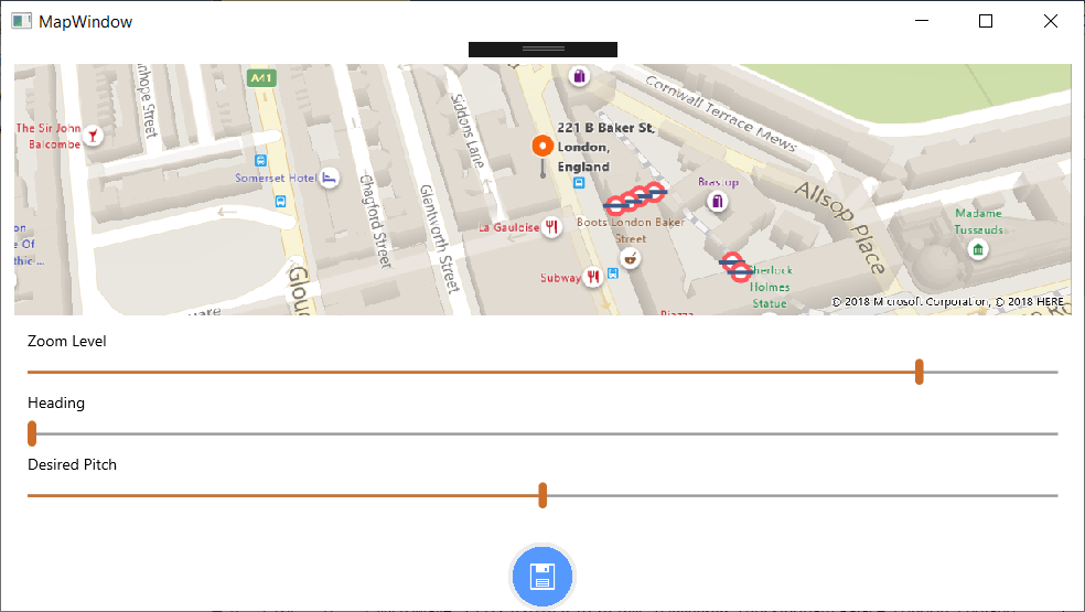
We’re Not Giving Away Vulnerabilities

All software is vulnerable. It’s the nature of code — nothing is perfect and under the right conditions, any application can be compromised. The problem? Many companies are effectively giving away their vulnerabilities on a silver platter by providing easy ways for attackers to infiltrate apps and discover serious flaws.
The big target hardening tip here? Use basic security hygiene to keep hackers at bay. This means applying security updates ASAP (or leveraging automated tools to do the job), preventing custom SQL queries, implementing multi-factor authentication, requiring strong passwords, encrypting all sensitive information, and hardening and shielding mobile applications before you ship them. Simply put? Hackers aren’t interested in resistance, just results: Make it harder than average for them to infiltrate apps and they’ll choose another target. Before deploying an application into an untrusted environment, assess your risks and manage and protect against them. 

PreEmptive Dec Post 1

The boss is worried — what are you doing to secure critical company apps? Put the C-suites’ mind at ease by creating hard targets: Make apps tamper-proof and compliant, hard to infiltrate, quick to detect compromise and difficult to break.

Plan Your Time with Telerik Calendar & Scheduling for Xamarin

$
0
0

The Calendar in our UI for Xamarin suite is now enhanced with new Scheduling capabilities, allowing you to create a detailed view of a schedule for a specific number of days.

The key to productive meetings is to plan them well beforehand. Having the proper tool to quickly display and manage appointments is an important part of the planning process. Taking this into account, we have recently enhanced the Calendar component in our Telerik UI for Xamarin suite with Scheduling capabilities, and I am eager to tell you all the details regarding the new functionality.
CalendarAll

With R3 2018 release of Telerik UI for Xamarin, RadCalendar comes with a new MultiDay view mode which enables you to create a detailed view of the schedule for a specific day or a couple of days. Even more, you will have full control over the way the appointments are visualized through various configuration options. Let’s check it out right away.

Setting up RadCalendar with MultiDay ViewMode

Currently, the ViewMode of RadCalendar can be changed only after the native Calendar control is rendered, which is why we’d need to hook to the NativeControlLoaded event and switch the view mode inside its handler:

<telerikInput:RadCalendar x:Name="calendar"NativeControlLoaded="CalendarLoaded" />

and here is the event handler:

private void CalendarLoaded(object sender, EventArgs e)
{
    (sender as RadCalendar).TrySetViewMode(CalendarViewMode.MultiDay);
}

We’re planning to improve the way this works and allow you to directly set/bind the ViewMode property of the control. So, expect more news on this in the upcoming R1 2019 release.

Adjusting the Timeline per Your Preferences

As the main function of the MultiDay view is to help users manage their appointments in a quick and intuitive way, we’ve made sure to provide a few useful configuration settings such as:

  • Day Start and End times
  • Option to show only the work week
  • Time indicator marking the current time
  • Custom time intervals inside the timeline

All of these can be easily applied through MultiDayViewSettings property of RadCalendar.

In addition, you can play with a variety of options for customizing the look & feel of the Multiday view, so that it matches the rest of your app. You can apply different background and text colors to the AllDay area, all-day appointments, regular appointments, timeline, and more. For a full list of the available settings I recommend checking out the MultiDayView topic from Calendar & Scheduling documentation.

The next snippet demonstrates how you can utilize some of the provided configuration options. Note that the styling settings are applied through the MultiDayViewStyle property of the control:

<telerikInput:RadCalendar x:Name="calendar"
                NativeControlLoaded="CalendarLoaded">
    <telerikInput:RadCalendar.MultiDayViewSettings>
        <telerikInput:MultiDayViewSettings VisibleDays="5"
                DayStartTime="9:00:00"
                DayEndTime="18:00:00"
                TimelineInterval="1:00"
                IsWeekendVisible="false"
                IsCurrentTimeIndicatorVisible="true" />
    </telerikInput:RadCalendar.MultiDayViewSettings>
    <telerikInput:RadCalendar.MultiDayViewStyle>
        <telerikInput:MultiDayViewStyle
                AllDayAreaBackgroundColor="Beige"
                AllDayAppointmentBackgroundColor="CornflowerBlue"
                AllDayAppointmentTextColor="White"
                CurrentTimeIndicatorColor="Blue"
                AppointmentFontSize="11"
                AllDayAppointmentFontSize="11" />
    </telerikInput:RadCalendar.MultiDayViewStyle>
</telerikInput:RadCalendar>

The screenshot below shows RadCalendar with the above settings applied on an iOS simulator:

XamarinCalendarTimeline

Displaying Meetings

After configuring the MultiDay view mode timeline, we are ready to add our appointments to the Calendar.

RadCalendar works with IAppointment objects, so we'll need to create an Appointment class that implements the IAppointment interface:

public class Appointment : IAppointment
{
    public DateTime StartDate { get; set; }
    public Color Color { get; set; }
    public DateTime EndDate { get; set; }
    public string Title { get; set; }
    public bool IsAllDay { get; set; }
    public string Detail { get; set; }
}

Then, we’ll create and add appointments to a collection of Appointment objects that should be assigned to the AppointmentsSource of the Calendar. Here are a few sample appointments:

var date = DateTime.Today;
calendar.AppointmentsSource = new ObservableItemCollection<Appointment>{
    new Appointment {
        Title = "Meeting with Tom",
        StartDate = date.AddHours(11),
        EndDate = date.AddHours(12),
        Color = Color.Tomato
    },
    new Appointment {
        Title = "Lunch with Sara",
        Detail = "Eddy's",
        StartDate = date.AddHours(12).AddMinutes(30),
        EndDate = date.AddHours(13).AddMinutes(30),
        Color = Color.DarkTurquoise
    },
    new Appointment {
        Title = "Birthday",
        StartDate = date.AddDays(2).AddHours(2).AddMinutes(30),
        EndDate = date.AddDays(2).AddHours(3),
        IsAllDay = true    
    }
};

And now you can see all the appointments visualized in the timeline:

XamarinCalendarAppointments

Scheduling Meetings

Most likely you will not only need to display meetings, but also provide users with the ability to schedule meetings. This can be accomplished by hooking to the TimeSlotTapped event of the Calendar and pushing a new page for adding a new appointment.  

The following XAML code example shows a basic form with a few input controls for scheduling a meeting:

<StackLayout Padding="10, 20, 10, 0" HorizontalOptions="FillAndExpand">
    <Grid Padding="10, 0, 10, 0" Margin="0, 10, 0, 0">
        <Label Text="New Event" FontSize="18"
                        HorizontalOptions="Center"
                        VerticalOptions="Center" />
        <Label Text="Save" FontSize="16"
                        HorizontalOptions="End"
                        VerticalOptions="Center">
            <Label.GestureRecognizers>
                <TapGestureRecognizer Command="{Binding AddCommand}" />
            </Label.GestureRecognizers>
        </Label>
    </Grid>
    <StackLayout Padding="10, 20, 10, 0">
        <telerikInput:RadEntry Text="{Binding AppointmentTitle}"
                        WatermarkText="Enter title"
                        Margin="0, 0, 0, 15"  />
        <telerikPrimitives:RadBorder BorderColor="#C8C7CC" BorderThickness="0, 0, 0, 1">
            <Grid Margin="0, 0, 0, 10" HeightRequest="40">
                <Label Text="All-day" FontSize="17" VerticalOptions="Center" />
                <Switch IsToggled="{Binding IsAllDay}" HorizontalOptions="End" />
            </Grid>
        </telerikPrimitives:RadBorder>
 
        <telerikPrimitives:RadBorder BorderColor="#C8C7CC" BorderThickness="0, 0, 0, 1">
            <Grid Margin="0, 0, 0, 10" HeightRequest="40">
                <Label Text="Starts" FontSize="17" VerticalOptions="Center" />
                <TimePicker Time="{Binding StartTime}"
                        HorizontalOptions="End" VerticalOptions="Center" />
            </Grid>
        </telerikPrimitives:RadBorder>
 
        <telerikPrimitives:RadBorder BorderColor="#C8C7CC" BorderThickness="0, 0, 0, 1">
            <Grid Margin="0, 0, 0, 10" HeightRequest="40">
                <Label Text="Ends" FontSize="17"  VerticalOptions="Center" />
                <TimePicker Time="{Binding EndTime}"
                        HorizontalOptions="End" 
                        VerticalOptions="Center" />
            </Grid>
        </telerikPrimitives:RadBorder>
    </StackLayout>
</StackLayout>

We’ll have to create a ViewModel class containing all the bound values and define that ViewModel as BindingContext of the page with the above form. Here is a sample AddAppointmentViewModel class:

public class AddAppointmentViewModel
{  
    private ICollection<Appointment> appointments;
    public AddAppointmentViewModel(ICollection<Appointment> appointments, DateTime startDate, DateTime endDate)
    {
        this.AddCommand = new Command(this.Add);
 
        this.appointments = appointments;
        this.StartTime = startDate.TimeOfDay;
        this.EndTime = endDate.TimeOfDay;
        this.StartDate = startDate;
        this.EndDate = endDate;
    }
    public ICommand AddCommand { get; }
    public string AppointmentTitle { get; set; }
    public bool IsAllDay { get; set; }
    public DateTime StartDate { get; set; }
    public DateTime EndDate { get; set; }
    public TimeSpan StartTime { get; set; }
    public TimeSpan EndTime { get; set; }
 
    private void Add()
    {
        var newAppointment = new Appointment
        {
            Title = this.AppointmentTitle,
            StartDate = this.StartDate.Date.AddTicks(this.StartTime.Ticks),
            EndDate = this.EndDate.Date.AddTicks(this.EndTime.Ticks),
            IsAllDay = this.IsAllDay,
            Color = Color.Green
        };
        this.appointments.Add(newAppointment);  
        App.Current.MainPage.Navigation.PopAsync();
    }
}

All that is left is to call the page containing the AddAppointment form on Calendar TimeSlot tapped action:

calendar.TimeSlotTapped += CalendarTimeSlotTapped;
 
private void CalendarTimeSlotTapped(object sender, TimeSlotTapEventArgs e)
{
    var appointments = (sender as RadCalendar).AppointmentsSource as ObservableItemCollection<Appointment>;
    var addAppointmentViewModel = new AddAppointmentViewModel(appointments, e.StartTime, e.EndTime);
    this.Navigation.PushAsync(new AddAppointmentPage(addAppointmentViewModel));
}

Once your code is complete, you can run the app and schedule new meetings.

XamarinCalendarAddMeeting

You can also find various demos showing the scheduling features of RadCalendar in the Telerik UI for Xamarin Samples Application.

What's Next

For the upcoming R1 2019 release of Telerik UI for Xamarin we’re planning to add more features to the scheduling functionality of RadCalendar such as:

  • Recurrent events support
  • Built-in UI for creating and editing appointments

As always, we'd love to hear your feedback. If you find anything missing that you'd like to see in a future version of the Calendar & Scheduling component, feel free to submit your feedback to our public feedback portal.

If this is the first time you're hearing about Telerik UI for Xamarin, you can find more information about it on our website or dive right into a free 30-day trial today.

Thanks and happy coding!

Viewing all 5210 articles
Browse latest View live