Quantcast
Channel: Telerik Blogs
Viewing all 5208 articles
Browse latest View live

What You Need to Know about Vue CLI 3

$
0
0

Learn about the new features of Vue CLI 3 and how you can benefit from upgrading today.

Vue CLI, the standard build toolchain for Vue applications, got a new major release (v3) a couple of weeks ago. In this article we will review some of the major features and why it’s so important.

This past February, during the conference keynote at Vue.js Amsterdam, Evan You talked about Vue CLI 3 and addressed the issues of the good old Vue CLI 2. He talked about the CLI’s future and how it can help improve the development experience — having in mind what developers need: performance, ease of use, and minimum configuration.

VieJS Amsterdam

So the new version was delivered to help developers work faster and solve some problems that previous versions had.

The goals were to:

  1. Reduce configuration fatigue of modern frontend tooling, especially when mixing multiple tools together
  2. Incorporate best practices in the toolchain as much as possible so it becomes the default for any Vue application

This means that with Vue CLI 3 you don’t have to worry, for example, about the webpack configuration unless you need to. Here you might think that with Vue CLI 2 templates the configuration was there and you still didn’t need to make changes. That’s right, but the configuration file was living in your source code. In the new version, the configuration is upgradable while it remains fully configurable.

Evan You published a detailed announcement explaining the reasons behind this huge update and what has changed on The Vue Point. In this article, we will review what these new features really mean and how you can take advantage of them.

Upgradable

The new CLI consists of a collection of node modules that you can update any time. This means that now Vue CLI won’t publish its files in your source code, so you won’t have the burden of keeping them up to date. 

If you’ve heard the term “eject” before, it describes the functionality of a tool that puts the configuration or other internal files in your project. The downside of this is that once you eject, you are on your own and won’t be able to upgrade to a newer version of the tool in the long run. 

It’s important to know that your new project will still be fully configurable.

For third party integrations like Babel, TypeScript, and PostCSS, Vue CLI respects the corresponding configuration files for these tools. For webpack, the user can either leverage webpack-merge to merge simple options into the final config, or precisely target and tweak existing loaders and plugins via webpack-chain. In addition, Vue CLI ships with the vue inspect command to help you inspect the internal webpack configuration. The best part though, is that you don’t need to eject just to make small tweaks  —  you can still upgrade the CLI service and plugins to receive fixes and new features. - Evan You

No Need to Config

When you create a new project with the CLI, you don’t have to configure anything. You get out-of-the-box support for Babel, TypeScript, ESLint, PostCSS, PWA, Unit Testing, and End-to-end Testing. 

You will notice that by default there is no webpack config file. This is great in many cases, but, when your application grows or requires tailored configuration, you can, of course, configure everything. This is possible through the vue.config.js file.

The easiest way to tweak the webpack configuration for example, is to provide an object to the configureWebpack option in vue.config.js.

// vue.config.js
 
module.exports = {
 
  configureWebpack: {
 
    plugins: [
 
      new MyAwesomeWebpackPlugin()
 
    ]
 
  }
 
}
  

The object will be merged into the final webpack config using webpack-merge. Take a look at the configuration guide to see how flexible the CLI projects are.

Plugin Architecture

If you were using Vue CLI 2, I am sure you remember that when you were creating a new project, you could pick the features you wanted to drop in, like ESLint, Testing libraries, etc. Though, later, if you changed your mind and decided to add something more, you had to implement it on your own. 

In Vue CLI 3, you can just run vue add and drop in a feature any time. This happens because now every one of these features is a plugin. To add ESLint support, for instance, you’d run vue add @vue/eslint.

The Vue CLI plugins also support prompts, so you can define what you want during the project creation or plugin addition process.

vue add @vue/eslint

Vue

Everyone can create a Vue CLI plugin. Right now, there are more than 200 plugins, including apollo, electron-builder, and pwa, to name a few.

If you want to learn more about plugins or ever want to create your own, take a look at the guide.

Instant Prototyping

Vue CLI 3 comes with an insane new feature. When you want to play around with a component, instead of creating a new project, you can just create a Single File Component (.vue file) and serve it in the browser by running vue serve MyAwesomeComponent.vue.

You can even build your component and deploy it if you ever want to do that.

Compatible and Futureproof

In the package.json file, you will find a browserslist file where you can specify the of browser your project is targeting. This value will be used by @babel/preset-env and autoprefixer to automatically determine the JavaScript features that need to be transpiled and the CSS vendor prefixes needed.

// package.json
 
{
 
  "browserslist": [
    "last 1 version",
    "> 1%",
    "maintained node versions",
    "not dead"
  ]
 
}
 

See here for how to specify browser ranges.

Modern Mode

The new Vue CLI also offers a "Modern Mode" so you don’t ship polyfills and transpiled code when the users are browsing your application through a modern browser. 

vue-cli-service build --modern

Vue CLI will produce two versions of your app: one modern bundle targeting modern browsers that support ES modules, and one legacy bundle targeting older browsers that do not.

The cool part, though, is that there are no special deployment requirements. The generated HTML file automatically employs the techniques discussed in Phillip Walton's excellent post:

  • The modern bundle is loaded with <script type="module">, in browsers that support it; they are also preloaded using <link rel="modulepreload"> instead
  • The legacy bundle is loaded with <script nomodule>, which is ignored by browsers that support ES modules

Graphical User Interface

This one is really awesome. Thanks to the amazing work by Guillaume CHAU, you can now manage your projects through a graphical user interface if you want to. The GUI is especially useful for newcomers, but it’s hard to not like it even you are a terminal geek.

It comes with a ton of features beyond creating projects, so I will only showcase a few here.

Create a Project

Vue

Manage the CLI plugins

Vue

Manage Project’s Dependencies

Vue

Configure the Project

Yes! Even the ESLint rules!

Vue

Run npm Scripts

Vue

Give it a Shot!

Vue CLI 3 has been around for a while now and people love it. Upgrade today if you haven’t already, and you will benefit in so many ways. Oh! Did I mention that it comes with Webpack 4? This means that you get even faster development experience and better bundle management.

Check out the docs and try it out.

Have fun!


For more info on Vue: Want to learn about creating great user interfaces with Vue? Check out Kendo UI for Vue, our complete UI component library that allows you to quickly build high-quality, responsive apps. It includes all the components you’ll need, from grids and charts to schedulers and dials.
Microsoft Joins the Open Innovation Network: What You Need to Know

$
0
0

Microsoft announced this week it is joining the Open Invention Network (OIN), a community dedicated to protecting Linux and other open source software programs from patent risks. The company will be bringing more than 60,000 issued patents to OIN. But what does that mean to you as a developer?

Before the announcement, I wasn’t aware of OIN, which is not surprising given my roots in the Microsoft space. Launched in 2005, OIN is a “shared defensive patent pool with the mission to protect Linux.” It boasts more than 2,650 members including Google, IBM, NEC, Philips, Red Hat, Sony, Toyota, SpaceX and more and it owns more than 1,300 global patents and applications. The OIN patent license and member cross-licenses are available royalty-free to any party that joins the OIN community.

While Microsoft itself says the move might be surprising to some, if you were reading the proverbial tea leaves (in this case, their Azure offerings and .NET Core) you might not be all that shocked.

In the corporate blog post announcing the move, Microsoft said it believes that developers do not want a binary choice between Windows and Linux or .NET and Java. They believe that developers want a cloud platform (in this case, Azure) that supports all technologies. .NET Core, an open source development platform maintained by Microsoft and the .NET community on GitHub, is the cross-platform framework that developers can use to build for Windows, macOS and Linux and deploy to devices, the cloud or embedded/IoT scenarios. Put the two together and it makes sense that Microsoft would want to be part of a group that practices patent non-aggression in core open source technologies by cross-licensing Linux System patents to one another on a royalty-free basis.

My understanding is that Microsoft’s 60,000+ patents - many of which are centered around the Android ecosystem - will fall under the member cross-license utilization agreement. What this means is that Microsoft is forgoing potentially massive amounts of revenue in royalties. An example that Jason Evangelho used in his article with Forbes is Samsung. Currently Samsung pays a royalty to Microsoft for every phone it ships (think about that for a second) in exchange for using Microsoft’s exFAT file system. That’s just one example, extrapolate from here and imagine the potential money involved.

As a developer, if you are creating or want to create applications to run on Linux, you suddenly have a massive amount of IP that is at your disposal, royalty-free and with an unrestricted license.

Microsoft has said it (and I’ve quoted this before) – “it’s definitely not your grandpa/grandma’s Microsoft”. They are backing up that assertion time and time again with their commitment to open source not just in words but with actions.

What are your thoughts? Was this a good move? How do you see it impacting the developer space? Share your thoughts in the comments below. And if you want to learn more about our own open source offerings, don't forget you can check them out right here.

How to Use a jQuery DatePicker UI Component in Your Web App

$
0
0

In the last episode, you saw how the NumericTextBox could be used to format different kinds of numeric input. In this episode, you will learn about the DatePicker. In a nutshell, the DatePicker is a component that allows users to select a date from a calendar or enter it into an input field.

The benefit of using a date picker is that entering dates becomes easier for the user and you can control the format of the data you receive. Date pickers can be used in apps to choose the dates for hotel reservations, flight departures, or appointments. Next, we will look at the differences between an HTML date picker and the Kendo UIDatePicker component.

HTML Date Input Type

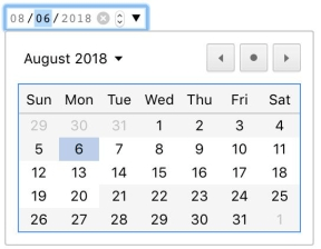
An HTML date picker is created by setting the type attribute of an input element to date. You can restrict the input by setting the value, min, and max attributes on the element. The value attribute represents the selected date. The min attribute is the earliest date that can be selected and the max attribute is the latest date that can be selected. For each attribute, the date should have the format yyyy/mm/dd. The format for entering dates in the input field is mm/dd/yyyy. This is an example of a date picker with a current and minimum value of August 6, 2018, and a maximum value of August 20, 2018:

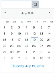
datepicker

<input type="date" value="2018-08-06" min="2018-08-06" max="2018-08-20">

The <input> has controls to increase or decrease the value of the month, day and year individually as well as a button to open the date picker. Dates outside of the range that can be selected are shown grayed out on the date picker. Sections in the input for the month and year in this example have been disabled so the user cannot enter restricted dates. One of the limitations with the HTML date input is the date picker is not available for all browsers and the format of dates cannot be changed.

Kendo UI DatePicker

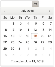
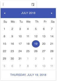
The Kendo UI DatePicker provides much more control over the appearance of dates and the behavior of the component. Unlike an HTML date picker, the Kendo UI DatePicker has a footer that displays the current date. Also, the input field of the component does not restrict the values that can be entered by default. This has to be set explicitly with the dateInput option. The following is a default date picker shown using the default theme, material theme, and bootstrap theme:

datepicke

datepicker

datepicker

<input id="date-picker"> 
<script> 
  $(document).ready(function(){ 
    $('#date-picker').kendoDatePicker(); 
  }); 
</script>

The following code sets the selected value to the current date, the minimum value to the current date, and the maximum value to July 30, 2018. Dates are set using the JavaScript Date object:

$('#date-picker').kendoDatePicker({
  value: new Date(),
  min: new Date(),
  max: new Date(2018, 06, 30)
});

When min or max are set, the dates that are out of range will be empty. However, a template can be specified to change the appearance of any of the dates as well as the footer of the date picker. You can change the format of the dates with the format option or with the culture option. Using the culture option not only changes the format of the date but updates the names of months and days to the language of the culture.

Conclusion

An HTML date picker is primarily an input field that is restricted to entering dates. The field can further restrict dates with a minimum and maximum value. The Kendo UI DatePicker also lets you set the minimum and maximum value of a date in addition to several other options to format the input and customize the appearance of the component.

A feature worth highlighting is the support for different cultures. There are many different ways to enter dates and being able to set the date based on a particular culture makes it convenient to adapt the component for global use. In upcoming episodes, we will dive deeper into the DatePicker by putting it to use in a small app that includes several other components we have reviewed.

Try Out the DatePicker for Yourself

Want to start taking advantage of the Kendo UI DatePicker, or any of the other 70+ ready-made Kendo UI components, like Grid or Scheduler? You can begin a free trial of Kendo UI today and start developing your apps faster.

Start My Kendo UI Trial

Angular, React, and Vue Versions

Looking for UI component to support specific frameworks? Check out the DatePicker for Angular, the DatePicker for React, or the DatePicker for Vue.

Resources

Navigating Easily in PDF Documents with New Bookmarks Support in RadPdfViewer for WPF

$
0
0
Our Telerik UI for WPF suite now supports visualization of PDF bookmarks. Learn more about PDF bookmarks and how the end-users of your applications will benefit by quickly identifying the desired content and navigating with ease in PDF documents.

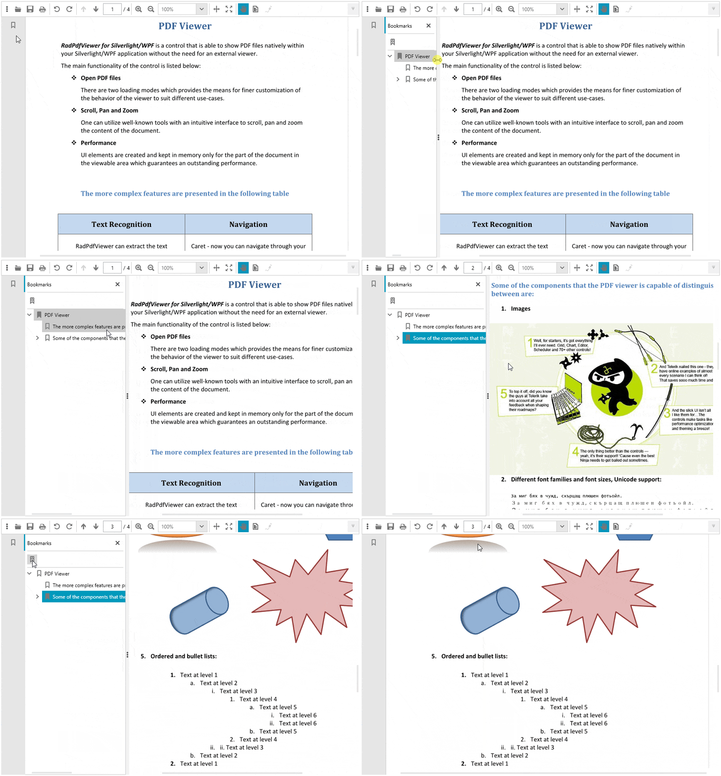
With the R3 2018 release we are happy to announce the support of PDF bookmarks in RadPdfViewer, part of the Telerik UI for WPF suite. Bookmarks are represented as a visual table-of-contents and are visualized on document load when there are any present in the document. Bookmarks provide a much better user experience navigating large PDF documents by pointing to a targeted destination on click. Also, you can use the “Find current bookmark” functionality which conveniently selects the bookmark that is currently in the view. An example can be seen below:
 
RadPdfViewer-Bookmars

 
Bookmarks UI Components

PDF bookmarks are visualized in RadPdfViewer using the RadPdfViewerNavigationPane. This is a control representing an area which can display different panels, including bookmarks. It is designed to be extended in the future and contain other document-level navigation features, such as thumbnails or attachments. The RadPdfViewerNavigationPane exposes the PaneWidth property which sets the initial value of the pane’s width. The end-users can resize the pane’s width by dragging the splitter resided on the right side of the control. 

<Grid>
    <Grid.ColumnDefinitions>
        <ColumnDefinitionWidth="Auto"/>
        <ColumnDefinition/>
    </Grid.ColumnDefinitions>
    <telerik:RadPdfViewerNavigationPaneRadPdfViewer="{Binding ElementName=pdfViewer, Mode=OneTime}"PaneWidth="300"/>
    <telerik:RadPdfViewerGrid.Column="1"x:Name="pdfViewer"DataContext="{Binding ElementName=pdfViewer, Path=CommandDescriptors}"/>
</Grid>

Commands

The following commands are available in the RadPdfViewer.CommandDescriptors property. They are executed when the end-users interact with the bookmarks panel:

  • ActivateBookmarkItemCommand – It’s executed when an end-user clicks on a bookmark item. As a result the RadPdfViewer “jumps” to the destination in the PDF document or invokes a link pointing to a web resource. 
  • SyncCurrentBookmarkItemCommand – Finds the bookmark item related to the RadPdfViewer’s current page and marks it as selected in the UI. We are proud with our sync-to-current bookmark implementation, since it resembles the behavior of one of the big vendors of the market for PDF viewers but performs more than 20 times faster for large documents. For example, documents containing 5000 bookmarks are synced with RadPdfViewer for approximately half of a second. The RadTreeView control integrated in the bookmarks panel plays a key role in the improved performance. Moreover, our sync selects the most nested bookmark item related to the current page. This nuance in the behavior is very useful when navigating in documents with deeply nested bookmark hierarchies and is not implemented by all PDF Viewers supporting the functionality, especially with this exceptional performance.

The commands can be invoked from code as follows: 

this.pdfViewer.CommandDescriptors.SyncCurrentBookmarkItemCommandDescriptor.Command.Execute(null);

PDF Document Preferences

The PDF model defines certain document preferences which determine how the bookmarks should be displayed. These preferences are included in the document, when it is created or modified, and apply each time it is rendered in the viewer. For example, a preference for the bookmarks panel can be set to be initially expanded or collapsed after the document is loaded, or a preference defining the styling of the bookmarks item text can be defined. With the support of PDF bookmarks in Telerik UI for WPF the following properties are added:

Document Page Mode

This property of the RadFixedDocument class specifies how the document should be initially displayed when opened:

  • UseNone – Specifies that the bookmarks panel should be collapsed by default.
  • UseBookmarks – Specifies that the bookmarks panel should be expanded by default.

Bookmark Text Style 

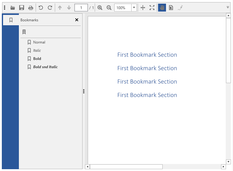
This property of the BookmarkItem class specifies the style characteristics for displaying the bookmark text. The available options are:

  • Normal 
  • Italic 
  • Bold

Bookmarks text style

Themes

The bookmarks panel is integrated with all themes provided by the Telerik UI for WPF suite. This includes the newly introduced Crystal theme which brings the Mac OS look and feel to your WPF apps. As with our other recent WPF themes, you can easily customize the theme colors to suit your taste with the Color Theme Generator for WPF.

What’s Coming Next 

We are working hard to deliver the support for bookmarks in Telerik UI for Winforms suite for the next R1 2019 release, expected at the beginning of the next year. You can find more information about what is coming in 2019 in the Telerik UI for WPF Roadmap and Telerik UI for Winforms Roadmap

If you are new to Telerik UI for WPF, or this is the first time you are hearing about the suite, you can check out the webpages for WPF, download a trial to try them out for yourself and visit the documentation to get a hang of how they work.

Profiling React Components with the User Timing API

$
0
0

Profiling your React components may be the most important thing you can do to improve performance. Learn how to do this using the browser's User Timing API. 

The most important thing we can do to improve the performance of our React apps is to profile and measure our key components and interactions. That way we'll know whether our changes are having a positive impact.

In the past, the recommended way of measuring the performance of our components was to use the react-addons-perf package, but the official documentation now points us to the browser's User Timing API instead:

As of React 16, react-addons-perf is not supported. Please use your browser's profiling tools to get insight into which components re-render.

This API allows us to set high-resolution timestamps in our code to measure whatever we want. The most important methods in this API are mark and measure. We'll use mark to set the start and end timestamps, and measure to calculate the time between the two.

Then we can get our measures using the method getEntriesByType with "measure" as the type:

window.performance.mark('myMeasureStart');
// The code we want to measure goes here.
window.performance.mark('myMeasureEnd');
window.performance.measure('myMeasure', 'myMeasureStart', 'myMeasureEnd');
window.performance.getEntriesByType('measure');
// [{
//   duration: 0.10000000149011612
//   entryType: "measure"
//   name: "myMeasure"
//   startTime: 4264378.099999999
// }]

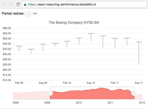
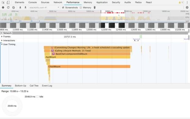
Now that we know how to measure the performance of a piece of code, we'll use these methods to measure how long it takes to render a relatively complex StockChart component from the Kendo UI framework, in a small example application:


Profile

The component we want to measure looks something like this:

class Chart extends React.Component {
  render() {
    return (
      <StockChart>
        {/* ... */}
      </StockChart>
    );
  }
}

If we want to know the time it takes for the component to mount, we'll set the first mark in the render method, and the second mark in the lifecycle method componentDidMount:

class Chart extends React.Component {
  render() {
    window.performance.mark('ChartMountStart');
    // ...
  }

  componentDidMount() {
    window.performance.mark('ChartMountEnd');
  }
}

In a similar way, we can set marks to know the time it takes for the component to update. This time we'll use the componentDidUpdate lifecycle method instead.

To prevent both marks from being set inside the render method every time the component re-renders, we can keep track of whether the component has already been mounted with an instance property that we'll call mounted. It'll start set to false in the constructor of our component, and we will set it to true when the component is mounted. Then we'll use it to set either the ChartUpdateStart or ChartMountStart marks.

class Chart extends React.Component {
  constructor() {
    super();

    this.mounted = false;
  }

  render() {
     if (this.mounted) {
       window.performance.mark('ChartUpdateStart');
     } else {
       window.performance.mark('ChartMountStart');
     }
     // ...
   }

  componentDidMount() {
    this.mounted = true;
  }
}

With all the marks set, we can call measure inside our componentDidMount and componentDidUpdate methods to know the time spent mounting and updating respectively:

class Chart extends React.Component {
  // ...

  componentDidMount() {
    this.mounted = true;
    window.performance.mark('ChartMountEnd');
    window.performance.measure('ChartMount', 'ChartMountStart', 'ChartMountEnd');
  }

  componentDidUpdate() {
    window.performance.mark('ChartUpdateEnd');
    window.performance.measure('ChartUpdate', 'ChartUpdateStart', 'ChartUpdateEnd');
  }
}

Once we have all the marks and measures set, we can call the getEntriesByType method to get the data as an array of objects.

We could then send this data to our backend, so that we aggregate it and show pretty graphs:

const measures = window.performance.getEntriesByType('measure');
fetch('https://example.com/api/measures', {
  method: 'POST',
  headers: {
    'Accept': 'application/json',
    'Content-Type': 'application/json'
  },
  body: JSON.stringify(measures)
})

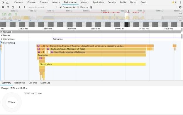
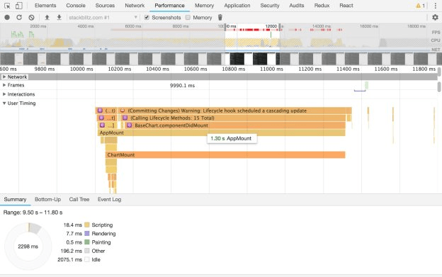
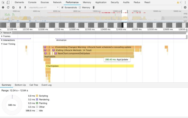
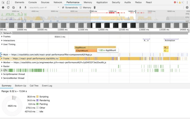
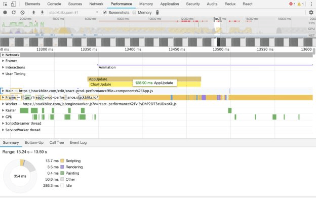
We could also just see these measures in our browser's dev tools. For example, in Chrome we would go to the Performance tab, press the button to start recording, execute some actions in our application, and stop recording. We'd then see our measures under the User Timing section:

Profile

Profile

If we are using React in development mode, we'll also see its own built-in timings (the ones with the emoji ⚛️) along with ours. However, in production mode we'd only see our own (AppMount/ChartMount and AppUpdate/ChartUpdate in the screenshots).

Now that we know how to measure the performance of our components, we can create a more generic solution that we can use on every component we want to measure, without the need to repeat the same code in each one.

We'll create a new component called MeasureRender that will be responsible for creating the marks and measures. It will only receive two props, the name of the measure, and the children it needs to render:

class MeasureRender extends React.Component {
  constructor() {
    super();
    this.mounted = false;
  }

  render() {
    const { name } = this.props;
    if (this.mounted) {
      window.performance.mark(`${name}UpdateStart`);
    } else {
      window.performance.mark(`${name}MountStart`);
    }
    return this.props.children;
  }

  componentDidMount() {
    const { name } = this.props;
    this.mounted = true;
    window.performance.mark(`${name}MountEnd`);
    window.performance.measure(`${name}Mount`, `${name}MountStart`, `${name}MountEnd`);
  }

  componentDidUpdate() {
    const { name } = this.props;
    window.performance.mark(`${name}UpdateEnd`);
    window.performance.measure(`${name}Update`, `${name}UpdateStart`, `${name}UpdateEnd`);
  }
}

Then, we'll wrap whatever component we want to measure with MeasureRender:

class Chart extends React.Component {
  render() {
    return (
      <MeasureRender name="Chart">
        <StockChart>
          {/* ... */}
        </StockChart>
      </MeasureRender>
    );
  }
}

class App extends React.Component {
  render() {
    return (
      <MeasureRender name="App">
        <Switch />
        <Chart />
      </MeasureRender>
    );
  }
}

Hopefully this will help you get a better idea of the bottlenecks in your app, and where you should be spending your time improving things.


Want to learn more about React? Check out our All Things React page that has a wide range of info and pointers to React information – from hot topics and up-to-date info to how to get started and creating a compelling UI.

Introducing the Crystal Theme for WPF and WinForms—Get Started in Minutes

$
0
0

Are you a “die-hard” Apple macOS Sierra fan? Have you ever wondered if you can build a WPF or WinForms application that has a similar look and feel? Now you can build a Mac-like user interface in minutes.

Our Mac-Inspired theme is now available as a part of the latest release of Telerik UI for WPF and WinForms. This post will walk you through how easy it is to use it in your applications, plus you'll get a sneak peek at the numerous customization opportunities that come with it.

Building WPF Applications with the Crystal Theme

As a UI components vendor, it is our goal to continuously bring you new ways to modernize the look and feel of our your applications. Therefore, I’m excited to announce that it is finally here—the new, fully Mac-Inspired, Crystal theme.

ScheduleView

This clean and simple, yet popular and trendy design is now offered to you on only one condition—using our awesome controls :). You will not only find out that our interpretation of the theme is cut from the same cloth as the original, but that it also offers a large list of customization capabilities!

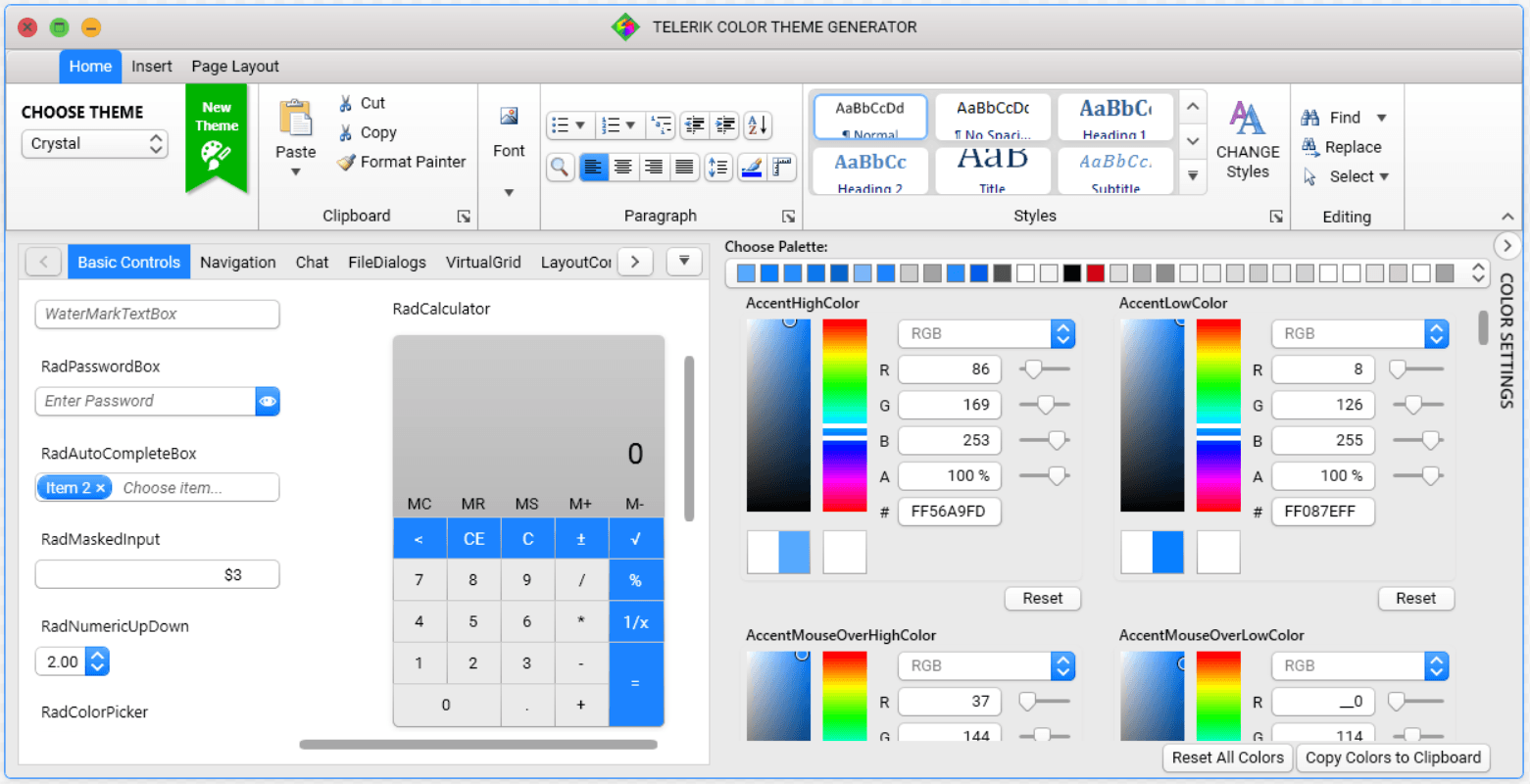
Like the previously announced themes for WPF, Crystal theme comes with options to change the default palette colors, depending on your needs—the easiest (and super handy) approach is to use our well-known Color Theme Generator.

Color Theme Generator for XAML

With this theme exposing all the properties of the MaterialAssist class, it’s a piece of cake to visually modify a control without needing to modifying its control template. I believe that there is no need to mention the support of custom CornerRadius, FocusThickness, ShadowDepth and much more. But what I certainly do need to mention is the WindowButtonsAlignment property. Yes, this one is a key feature to the theme’s design—you just write one line of code and the minimize, maximize, restore and close buttons of your windows are moved to the right:

CrystalPalette.Palette.WindowButtonsAlignment = ButtonsAlignment.Right;

Let’s move on to the real part—how to add this awesome theme to your WPF application?

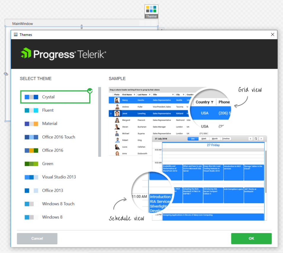
If you are a fan of using implicit styles (like me), you only need to open an application and click on any Telerik Control in Design View. Then click on the Theme element and choose the "Crystal" theme from the available choices.

Theme selector NoXaml apps

Voilà! Now you have yourself a brand new modern WPF app, that uses the brand new Crystal theme!

RadBusyIndicator

And if StyleManager is your thing! It’s a breeze do use it, as well:

publicMainWindow()
{
    StyleManager.ApplicationTheme = newCrystalTheme();
    InitializeComponent();
}


If I've managed to endear Crystal theme to your hearts, feel free to dig deeper into its features by checking out the documentation here. In the meantime, you can check out how some of the most popular controls in WPF look in "Crystal" form:

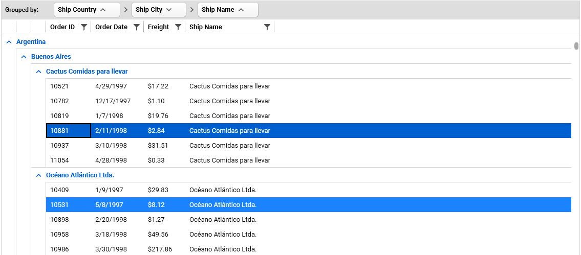
GridView with Sticky Groups

RadRibbonView

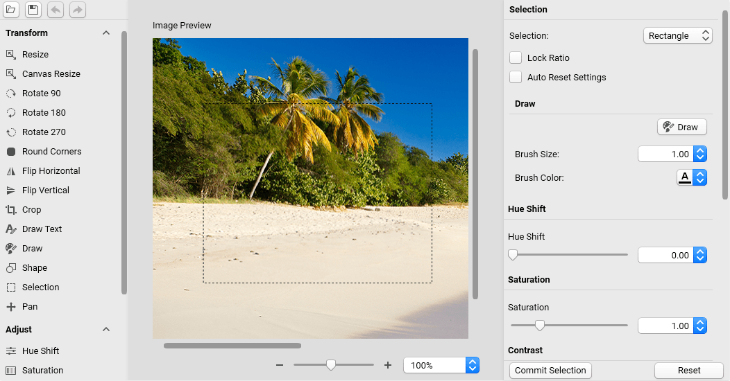
RadImageEditor

Building WinForms Applications with the Crystal Theme

As I mentioned earlier, staying fresh and modern is important, so a new theme is a logical addition to the WinForms suite as well.

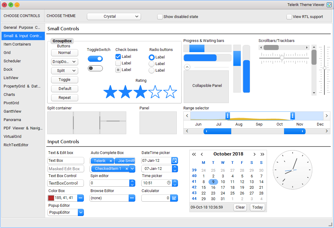
You can see the full brilliance of Crystal theme in the Theme Viewer tool or inside the WinForms demo application.

Theme viewer

To apply the Crystal theme to an existing WinForms application, just add a single line of code:

ThemeResolutionService.ApplicationThemeName = "Crystal";

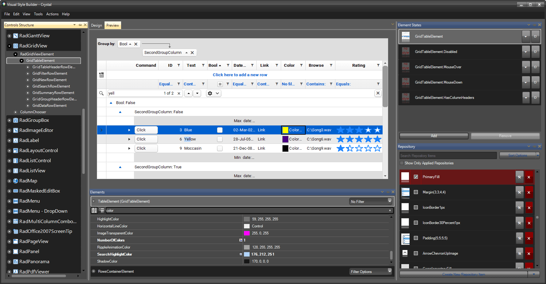
If you decide to customize the theme the best way is to use the Visual Style Builder. This tool allows you to modify any setting of an existing theme.

Visual Style Builder

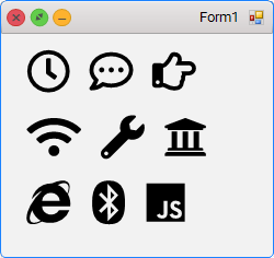
What makes this theme so different? As an addition to it, we have integrated Font Awesome. Yes, as part of our controls, you will now have access to more than 1300 free font glyphs, ready to be used just right out-of-the-box, no matter which theme you choose to use in your apps! There are three font variations included in the free version of font awesome: Solid, Regular and Brand. The following code shows how you can use Glyphs with RadLabel in your app:

this.radLabel1.LabelElement.CustomFont = "Font Awesome 5 Free Regular";
this.radLabel2.LabelElement.CustomFont = "Font Awesome 5 Free Solid";
this.radLabel3.LabelElement.CustomFont = "Font Awesome 5 Brands Regular";


The code snippet below consists of Unicode glyphs which can be copied from the Font Awesome's website:

this.radLabel1.Text = "\uF017 \uF4AD \uF0A4";
this.radLabel2.Text = "\uF1EB \uF0AD \uF19C";
this.radLabel3.Text = "\uF26B \uF293 \uF3B8";

Glyph icons

Try it Out Yourself and Share Your Feedback

Make sure to get the latest version and try out the new Crystal theme in Telerik UI for WPF and WinForms, and don’t be shy—share your feedback! You can use the comments section below or any of the Feedback Portals (WPF and WinForms).

Download a trial today: WPF WinForms

We are more than excited to hear what you think, so if you have any comments or suggestions, we are always here to answer all your questions :).

How to Create a Gist Download Chrome Extension Using React

$
0
0

A lot of tools are built to run in browsers today, as we spend most of our time there. Read on to learn how you can build a Chrome extension, the Github Gist Downloader, with React.

An extension is a software program that customizes the browsing experience. Using an extension, a user can customize browser functionalities to their needs. Extensions can be created using HTML, CSS and JavaScript.

We’ll be creating an extension for Chrome that will enable us to download code snippets we created on GitHub Gists. You can find a screenshot of the extension in action below:

Gist file downloaded on click

Prerequisites

To follow this tutorial, a basic understanding of JavaScript and React is required. Please ensure that you have at least Node version 6 installed before you begin. We’ll be using the following to create our extension:

  • Parcel: A blazing fast, zero-configuration web application bundler.
  • React: A JavaScript library for building user interfaces.

Creating Project Files and Installing Dependencies

In this step, we’ll create the project folder and install the dependencies needed for the project. Create a folder called gist-download. In the folder, create a file named package.json and copy the following code into it.

```json
    {
      "name": "Gist-downloader",
      "version": "0.1.0",
      "description": "Download code snippets on gists",
      "main": "src/js/main.js",
      "scripts": {
        "build": "parcel build src/js/main.js -d src/build/ -o main.js",
        "watch": "parcel watch src/js/main.js -d src/build/ -o main.js"
      },
      "dependencies": {
        "babel-preset-env": "^1.6.1",
        "babel-preset-react": "^6.24.1",
        "parcel-bundler": "^1.6.2",
        "prettier": "^1.14.3",
        "react": "^16.2.0",
        "react-dom": "^16.2.0"
      }
    }
```


To install the dependencies, run yarn install or npm install in a terminal in the root folder of the project.

The next step is to create a manifest.json file in the root folder of your project. All Chrome extensions are required to have a manifest file. The manifest file simply describes the package’s contents.

Copy the following code into the manifest.json file:

```json
    {
      "manifest_version": 2,
      "name": "Gist file downloader",
      "description": "An extension that can be used for downloading gist files.",
      "version": "1.0",
     
      "browser_action": {
        "default_icon": "icon.png"
      },
     
      "permissions": [
        "activeTab"
      ],
     
      "content_scripts": [
        {
          "matches": ["https://gist.github.com/*"],
          "js": ["src/build/main.js"],
          "run_at": "document_end"
        }
      ]
    }
```

Note: All static files referenced here can be found in the demo repository here.

Chrome manifests are expected to have a manifest_version of 2.

The permissions property is an array of permissions our extension needs to run. The extension will need access to the current active tab.

The content_scripts array contains an object detailing the domains (matches) the extension should run on—the main js file. And the run_at property tells Chrome when it should run the extension. You can read more about the properties that are available on the manifest file here.

The final folder structure should look like this:

```
gist-downloader/
   src/
      js/
        components/
            download-button.js
          utils/
            index.js
          main.js
```

Inside your project folder, create the src folder to hold the project files. Inside the src folder, create a js folder. Finally, create a file called main.js in the src/js folder. This file will be the main entry file for the project.

Copy the following code into the main.js file. In the main.js file, we’ll search for the .file_actions element, which resides in the header of each Gist file. We’ll then render the application, which will be a simple download button as one of the file actions.

```javascript
import React from "react";
import ReactDOM from "react-dom";
     
     
    class App extends React.Component {
      render() {
        return <h1>The App</h1>
        //TODO: Create a download button component and render here;
      }
    }
     
    window.onload = () => {
      const fileActions = [
        ...document.body.querySelectorAll(".file .file-actions .BtnGroup")
      ];
     
      fileActions.forEach(action => {
        const containerEl = document.createElement("span");
        action.prepend(containerEl);
        ReactDOM.render(<App/>, containerEl);
      });
    };
```

The extension waits until the DOM content is loaded before in renders the application in the DOM. Using the document.querySelectorAll method, we’ll get all elements with the .BtnGroup class existing within an element with a class file. This is to ensure the element selected is the one intended.

Using a forEach method, the fileActions array is looped through and within the callback function, a span element is created and prepended to the action element. Finally, the app is rendered within span element.

In the next step, we’ll create the download button and walk through the steps of creating a file and downloading it.

Creating the Download Button Component

Gists are snippets, files, parts of files, and full applications shared with other people. They are basically repositories that can be cloned or forked.

You’ll find a screenshot of a Gist below:

two


In this tutorial, we’ll be adding an extra action button to the file actions header. Create a folder named component in the src/js directory and then a file named download-button.js within the components folder.

In the download-button.js component, we’ll create a button that, when clicked, will get the contents of the Gist and then curate a file with those contents. Finally, a download will be triggered for the created file.

Open the download-button.js file and copy the following code into it:

```javascript
//src/js/components/download-button/js
     
import React, { Fragment, Component } from "react";
import { download } from "../utils";
     
    class DownloadButton extends Component {
      constructor() {
        super();
     
        this.onClick = this.onClick.bind(this);
      }
     
      onClick() {
        const fileTextArea = this.codeTextArea.querySelector('textarea');
        const fileContent = fileTextArea.value;
        const fileName = this.codeTextArea.querySelector(".gist-blob-name").innerText;
     
        download(fileName, fileContent);
      }
     
      get codeTextArea() {
        return this.button.parentElement.parentElement.parentElement
          .parentElement.parentElement;
      }
     
      render() {
        return (
          <Fragment>
            <button
    className="btn btn-sm copy-pretty tooltipped tooltipped-n BtnGroup-item"
    aria-label="Download the file"
    onClick={this.onClick}
              ref={ref => (this.button = ref)}
            >
    Download file
            </button>
          </Fragment>
        );
      }
    }
     
    export default DownloadButton;
```

In the component, the render method returns a button element. The reference to the element is obtained and a click event listener is set up. When the button is clicked, the codeTextArea getter method returns a textarea containing the textual contents of the Gist.

The chained parentElement is a crude way of ensuring that the textarea returned contains the Gist content requested for download. Next, the value of the textarea is assigned to the fileContent variable, and the name of the file is obtained from the text of an element with the class name gist-blob-name.

Finally the download function is called, with the fileName and fileContent as arguments. Next, we’ll create an utils/index.js containing the download function.

Creating the Download Function

In the src/js directory, create a folder named utils and create an index.js file within the utils folder. Open the index.js file and copy the code below into it:

```javascript
    //src/js/utils/index.js
     
    export const download = (filename, text) => {
      const element = document.createElement('a');
      element.setAttribute('href', 'data:text/plain;charset=utf-8,' + encodeURIComponent(text));
      element.setAttribute('download', filename);
      element.style.display = 'none';
      document.body.appendChild(element);
      element.click();
      document.body.removeChild(element);
    };
```

First, we create an anchor element. Then we create the href attribute, encoding the text parameter as a UTF-8 character using the encodeURIComponent function. A download attribute is then set on the anchor element. The download attribute is required on an anchor element to trigger a download.

The filename param is then set as the value of the download attribute.

The element is hidden by setting the display to none before appending it to the document body. A click event is then triggered on the element as the element is removed from the DOM.

Now that the download button component has been created, let’s go back to the main.js file and render it there. Open the main.js file and update it to include the DownloadButton element.

```javascript
    //src/js/main.js
     
    ...
     
    class App extends React.Component {
      render() {
        return <DownloadButton/>;
      }
    }
     
    ...
```

In the next step, we’ll learn how to build the extension and add it to Chrome.

Building the Extension and Loading it on the Browser

In this section, we’ll build our newly created extension and load it on the browser, seeing it in action for the first time. Open a terminal in the root folder of the project and run the following command to build the application:

```bash
    npm build
```

This command should create a build folder in the src directory with the main.js file within it.

In your Chrome browser,

  • Visit the extensions page chrome://extensions/.
  • Toggle the “Developer Mode” switch
  • Click the “Load unpacked” button and select your project folder.

3

The extension should show up in your extensions list. When you visit any Gist page you’ll see the download button show up, similar to the screenshot below:

4

Congratulations!! You’ve successfully created a Chrome extension. A click on the “download file” button should trigger a download for the named file. You can find the complete code on Github.


Want to learn more about React? Check out our All Things React page that has a wide range of info and pointers to React information—from hot topics and up-to-date info to how to get started and creating a compelling UI.

Creating Internal Digital Products Your Team Will Actually Like To Use

$
0
0

The world is full of apps and sites that ignore the needs of real people. We need to change this.

Truematter-Blog-Batman-UX

When we talk about creating better online experiences for real people, we usually focus on public-facing sites, apps, or software. But all too often, user experience thinking stops right there. And that’s a big problem.

Many, many companies—maybe yours included—use multiple, highly specific internal applications and administration systems. These are important tools for running your business smoothly. Most often they’re adopted “out-of-the-box” with minimal changes. Other times, your IT team might develop custom tools to manage similar business processes.

Most of these internal systems have something painfully in common: They are horrible for the people who are forced to use them. These tools are almost always unintuitive, archaic, and hopelessly complex. It’s obvious no one who made them even gave a passing thought to suitable user experience.

Bad Internal User Experience is Bad for Business

Ever been to a “user rant” meeting? We have. We regularly sit in meetings where clients’ internal teams voice unending frustrations about making updates using poorly designed interfaces. Driving members of your team to want to spit in your coffee is bad enough. But building internal digital products without a thought to UX leads to more than just disgruntled employees. These hard-to-use internal apps only fill a functional void. They don’t truly serve the business purposes they were created to serve. They are made quickly with little planning and at minimal cost. In this model, mediocrity is the standard and it costs companies big time.

Hard-to-use internal apps don’t serve the business purposes they were created to serve.

The Costs of Bad UX

  • Increased Training – Time is wasted training and retraining employees how to use the tools.
  • Poor Efficiency – Bad interfaces make common tasks overly cumbersome. Two-minute tasks take ten minutes to complete.
  • Rework – Hours are lost entering duplicate data because two systems that should talk to each other can’t.
  • Lack of Consistency – When each system behaves differently, users slow down.
  • Faster Obsolescence – Apps get outdated and eventually only work on one old, depreciated browser you keep on a single company machine.
  • Extra Maintenance – Extra time from IT for maintaining poorly designed systems.
  • Work-Arounds – People will avoid badly designed systems like the plague. They will spend an inordinate amount of time creating and using hacks for systems, apps, or processes they hate.
  • Opportunity Cost – Time wasted on managing frustrating interfaces could be better spent doing something productive.

Creating Something Better

If you’re experiencing these common headaches and pitfalls, it doesn’t have to be that way. Your internal systems and apps can serve your company’s business goals and processes rather than impede them.

In fact, one of the biggest secret weapons for creating successful digital products is to create great UX for internal users just as you would your public users.

Focusing on creating easy, intuitive user experiences for your internal tools is a sure way to save time and money while forwarding business processes, operations, and goals. Take it from someone who creates and uses internal interfaces every day (me) – the easier they are to use, the better life and business will be.

Creating Internal Tools People Love to Use

There’s a lot of overlap in creating easy-to-use internal systems and great user experience for public-facing sites. But there are some differences. Having created internal tools in both the why-does-this product-stink way AND the great-UX-people-are-happy way, here are some things I’ve learned:

Secret 1: Talk to and observe users

Internal users will be completely different from your public or external users. Talk to the people who maintain and update your internal apps and systems. Watch them use each system the way they normally would.

Don’t assume you know the answers just because you work with these people.

Ask your users questions that focus on tasks: What is their workflow like? What are the things they do every day? What tasks take way longer than they should? What information do they have to enter in multiple places because the systems can’t share information? Do they have any hacks for getting things done faster?

Don’t assume you know the answers to these questions just because you work with these people. You will get it wrong. Say with me, “I must interact with real users.” If you don’t do this, don’t bother trying to improve your internal digital products. It won’t happen.

Secret 2: Don’t let developers create systems for, well, developers

You have complex internal user groups with different needs and abilities. Some of your users may be much more tech-savvy than others.

I can tell you it’s tempting for us developers to design something that works for us. But there’s a huge problem: Developers are POWER users. What works for them probably won’t work for anyone else. Help them by defining the problem through an unfaltering user lens.

Help developers think through screens with users in mind. Demand they observe user tests and speak with users. You’ll find that developers can do solid UX in their everyday work. This focus takes extra time up front, but will save you cost upon cost further down the road.

Secret 3: Create a suite of apps

Internal systems and apps are often bought or created in a vacuum without any thought for how they could or should interact with each other. Don’t do that. Instead, you should take a high-level look at your internal digital products as a group.

It’s possible this will be the first time anyone in your company has looked at your apps as a whole.

Which ones should talk to each other that don’t? Which ones use the same processes? Can those be more consistent or even combined? Where are users asked to enter duplicate data? What does each one do and how does it fit in with the whole? How can color, layout, and interaction be more consistent?

It’s entirely possible this will be the first time anyone in your company has looked at your apps this way. It may even be the first time all your internal products have been included on the same list anywhere. That makes it all the more crucial you do it now.

Even while you’re looking at these apps as a group, don’t feel like you need to come up with one solution to rule them all. Create a suite of apps, where each one functions in a similar way but is also dedicated to helping users complete a specific set of tasks.

Imagine how horrible Microsoft Office would be if there were only one app that did it all – word processing, spreadsheets, presentations, AND email. A suite of apps doesn’t need to be all things to all people, it just needs to be purposeful and consistent.

Secret 4: Test your solutions

Internal apps are no different than any other development project in that you should test what you’ve built with real users. Ask people to perform real tasks (the ones you saw when you observed them working). I know it sounds crazy, but failure here is a good thing. If a user has trouble with a task, you know you need to fix your work (and there will always be something you need to fix).

Test early and often. At truematter, we create a paper or software prototype to test so we can make major fixes before we move into code. Then we test with users again after the site is up and running to see what we missed.

Secret 5: Design for multiple devices, no matter what

Only targeting desktop computers is a thing of the past. More companies are providing employees with smartphones, tablets, and touchscreen laptops. Even if your company doesn’t use mobile devices yet, designing for these screens future-proofs your digital product. There will come a day everyone gets a tablet and they will expect to be able to use it for internal admin jobs.

This sounds like a lot of work. It is. But it will save you hundreds of hours (and a ton of money) later.

Secret 6: Don’t slap on updates

When you want to add new features, use the same thoroughness you used creating the products themselves. It’s never okay to email your developer and ask them to implement a solution without going through the process of talking to users, planning, and testing again.

This sounds like a lot of work. It is. But it will save you hundreds of hours later when team members can make updates easily. It will save rework in trying to make your tools consistent again down the line. It will save maintenance time and keep your internal digital products from getting buggy and obsolete.

Secret 7: Your team members are people too

Sometimes users are far away or otherwise hard to reach. The people who maintain internal sites and apps are right next door. You have no excuse not to talk to them. They deserve a wonderfully easy-to-use app, just like your public customers. Make it your mission to make their lives as easy as possible. The company will save serious money from it in the long-term. And as an added bonus, if you stop making your coworkers’ lives miserable, they won’t want to spit in your coffee.

So Go Do It

You can probably name several of your company’s digital products that need UX help off the top of your head. Don’t wait around – it’s important to begin improving them as soon as you can. Focusing on user experience for internal users is at least as important as providing good UX for external users. They’re both crucial to business and product success. The fact that an app is internal is NOT an excuse for slapdash user experience.

Well thought out internal digital products will save you big money in areas like maintenance, efficiency, modernization, and change control.

When internal systems are easy for team members to use, they enhance your business. They’ll save you big money in areas like maintenance, efficiency, modernization, and change control. Well thought out internal digital products serve the business processes they were made to serve. They free up your team members’ time to plan and work on other mission-critical projects. And when your team members see how much better life is with great UX, they’re likely to adopt those practices as a standard moving forward, both on internal and public-facing projects.


Want to learn more? Find out some tips about making sure that your app presents a good User Experience in these interviews with Dean Schuster and Bekah Rice.


All About Angular Bindings

$
0
0

Angular provides a powerful mechanism for a wide range of bindings. You don’t have to be new to forget which binding is which. Sometimes, when reaching for the right binding, I mess up or forget the syntax. I thought an article might help clarify how and when to apply bindings in your Angular applications, for those memory moments we all sometimes have.

Below is a handy-dandy chart for quick reference (linked to each section):

BindingExample
Property Binding<input [placeholder]="placeholderValue" />
String Interpolation<input placeholder="{{placeholderValue}}" />
Attribute Binding<td [attr.colspan]="clspn">
Style Binding<input [style.borderStyle]="'dashed'" />
Class Binding<input [class.active]="true" />
Event Binding<input (keyup.enter)="onEnter()" />
Two-way Binding<input [(ngModel)]="value" />

It includes all of the types of Angular Bindings along with a line of markup showing how that binding can be used. We'll cover all the bindings in more detail in the sections below, except for attribute binding, which I found to be quite uncommon.

Property Binding

In Angular, the simplest binding is property binding. It uses `[ ]` brackets to get the job done. It is a one-way binding from the component to the template. 

<input [placeholder]="placeholderValue" />

String Interpolation vs Property Binding

You can also use string interpolation to get the same property binding done:

<input placeholder="{{placeholderValue}}" />

String interpolation is best suited for text between opening and closing elements:

<h2>{{amazingTitle}}</h2>

This same approach can be done through property binding but it's less intuitive. In the example above, we can achieve the same result through the textContent attribute:

<h2 [textContent]="amazingTitle"></h2>

Ultimately, it comes down to personal preference. Buttons in Kendo UI take advantage of different property binding types in order to give you the ability to customize the look of our buttons. For example, you can set [icon] to any number of icons (found here). You can also set the [look] of the button to outline, flat, or default! You can read more about the awesome customizable Kendo UI button here.

<button kendoButton [icon]="'folder'" [look]="'outline'">{{btnValue}}</button>

Here, we are using string interpolation to bind the value of the button. At the same time, we're using property bindings for its icon and look. It's important to mention that both binding types are one-way bindings; from the component to the template. You'll have to use discretion for which type of binding you use. Again, it comes down to personal preference.

Style Binding

Another type of property binding is style binding. We can add styles inline with logic! If we’d like to apply some inline styles to this button we can do so inside the square brackets:

<button kendoButton ... [style.backgroundColor]="'rebeccaPurple'"></button>

In the example above, we've changed the background color to rebeccaPurple, but any CSS-acceptable color value (HEX, RGB, etc) will work. Check W3Schools for a full list of DOM style properties you can bind to.

Let's now look at the same example but with some logic:

<button kendoButton ... [style.backgroundColor]="isActive ? 'rebeccaPurple' : 'white'"></button>

Here, we are binding the background color to rebeccaPurple only if the isActive variable is true. Otherwise, the background color is set to white.

So style binding is just property binding to style [style.PROPERTY] followed by the property you'd like to modify.

You can play around with style bindings in this StackBlitz!

Class Binding

The last version of property binding is class binding. This is very similar to style binding; instead of muddying up our template with inline styles, you add an active class to an element and handle the styling in an associated stylesheet. In the following example, we are applying the active class based on the state of isActive in the component:

<button kendoButton ... [class.active]="isActive"></button>
/* styles.css */

.k-button.active {
  background-color: rebeccaPurple;
  color: white;
}

The .k-button class is used for specificity and would not be needed in all cases.

Event Binding

Our button is pretty snazzy, however we need to actually be setting/unsetting the isActive variable. We can use event binding to capture a variety of user-initiated events and initiate logic in our component class. Angular supports many kinds of events. If we'd like to catch the click event on our button and bind it to a method, we can do so, using parentheses:

(click)="toggleActive()"

Here, we are binding the toggleActive method to be called on button click. The toggleActive method is just setting the active variable to !active. Then we are using the class binding to give our button an active class. The button will be rebeccaPurple when active and grey when not. We also set these changes to happen on hover when active: .k-button.active:hover.

/* styles.css */

.k-button.active, .k-button.active:hover {
  background-color: rebeccaPurple;
  color: white;
}
// app.component.ts

<button kendoButton
        [icon]="'folder'"
        [look]="'outline'"
        [class.active]="isActive"
        (click)="toggleActive()">
        {{btnValue}}
</button>

Can download from: http://cl.nicoll.co/1ac444ccc7aa

Two-way Binding

So far, we've examined the various ways to establish unidirectional or one-way bindings. Another type of binding is a bidirectional or two-way binding. Two-way bindings are used when a developer wishes to propagate changes made to an underlying value or event between a component and its template.

In Angular, we can use ngModel to create that two-way data binding. Let's use the same example we built earlier with Kendo UI. First, we have to import the FormsModule in order to have access to ngModule:

Can download from http://cl.nicoll.co/05b4e2285e16

Next, we need to include Kendo UI inputs for this example:

Can download from http://cl.nicoll.co/e1351c3f2ab5

Now, we are ready to establish a two-way binding:

import { Component } from '@angular/core';

@Component({
  selector: 'my-app',
  template: `<input kendoTextBox [value]="email" (keyup.enter)="onEnter()" />`
})

export class AppComponent {
  email = "bob@gmail.com";
  // ...
  onEnter() {
    alert(this.email);
  }
}

Here, we are using the property binding to bind the value of this kendoTextBox to email. The keyup.enter event is bound to the onEnter() method that displays the email entered by the user. Unfortunately, when we change the <input> element and hit enter, the alert is not updated. What is going on?

Download link: http://cl.nicoll.co/8b0e3d615e75

In this example, the property binding, which as you recall, is a one-way binding (only FROM the component TO the template). We need to use a two-way binding! This is where the formsModule comes in. We'll use the ngModel for two-way binding, which comes from the formsModule:

<input kendoTextBox [(ngModel)]="email" (keyup.enter)="onEnter()" />

Now, instead of a one-way binding, we are two-way binding with [(ngModel)]. For this we are going to need to use both the square brackets and parentheses [()]. The email value now changes in the displayed alert. It works! It works!

Download from http://cl.nicoll.co/c7d427cead95

Recap the Bindings

To recap, one-way bindings use the [] square brackets for property, style, and class bindings. For event bindings, we need to use parentheses () and for two-way binding, we use both [()] square brackets and parentheses!

BindingExample
Property Binding<input [placeholder]="placeholderValue" />
String Interpolation<input placeholder="{{placeholderValue}}" />
Attribute Binding<td [attr.colspan]="clspn">
Style Binding<input [style.borderStyle]="'dashed'" />
Class Binding<input [class.active]="" />
Event Binding<input (keyup.enter)="onEnter()" />
Two-way Binding<input [(ngModel)]="value" />


I hope you've enjoyed this binding party and never get them mixed up again! Here are some extra links to docs about the components used above. Happy coding!

Resources

Check Out What's New: Telerik UI for WPF, WinForms and UWP R3 2018 SP

$
0
0

The R3 2018 Service Pack is now live, bringing you a wide range of improvements and cool features in the Telerik desktop product line – Telerik UI for WPF, WinForms and UWP.

To dive into the various improvements we made, feel free to start by checking out the release notes of the products:

Below, I wanted to introduce you to some of the highlights in this release.

Crystal Theme for WPF: Dark Variation

With the R3 2018 release of Telerik UI for WPF, just a month ago, we introduced a new, sleek looking, Mac OS inspired theme which we named Crystal (make sure to review this blog post all about the new theme for more info). Since the theme looks so awesome, today, we are adding dark variation of it so you have even more options to style your app. All you need to do is apply the theme and load the dark colors is just a single line of code:

//dark color variation
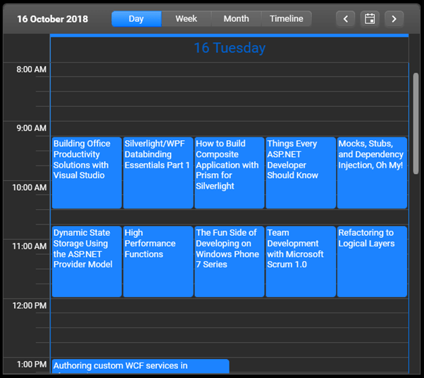
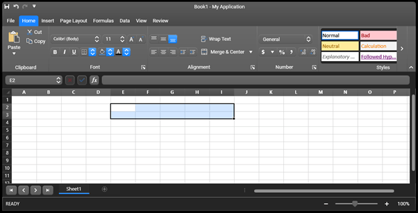
CrystalPalette.LoadPreset(CrystalPalette.ColorVariation.Dark);

Check out the look of some of the controls below:

Telerik Controls Dark Crystal Theme 1

Telerik Controls Dark Crystal Theme 2

Telerik Controls Dark Crystal Theme 3

We have included the new variation in the ColorThemeGenerator (as a reminder this is the tool we provide for viewing, creating and editing themes) for WPF as well, so you can check all other controls there and play around with the colors.

HeatMap for WPF: Custom Map Source

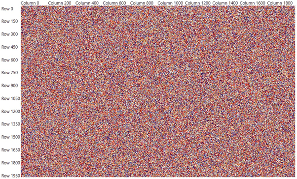
This new feature will allow you to customize the data fetching mechanism of the control in order significantly improve the performance when dealing with a huge amount of data (for example when you need to render millions of items). This can be achieved by overriding some newly exposed methods and implementing an interface. The following image demonstrates a HeatMap with 2000 rows and 2000 columns (4 million items) rendered. For more info check this help article.

Heatmap for Telerik UI for WPF

PdfViewer for WinForms: Bookmarks

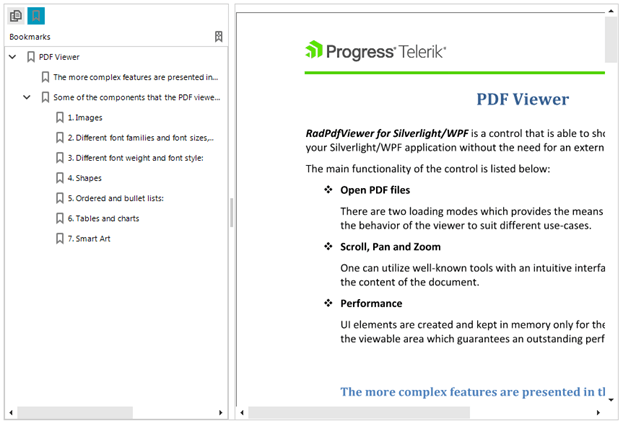
Now, let’s switch gears to Telerik UI for WinForms. After introducing Bookmarks support in PdfViewer for WPF last month, it was only natural for us to make it available in RadPdfViewer for WinForms as well. Bookmarks or Outlines are a tree-structured hierarchy that the control presents as a visual table of contents separated from the actual content as a side panel. The Bookmark items allow users, by interacting with them, to navigate through parts of the document and/or invoke different actions. The control also exposes a convenient API for navigating and manipulating the bookmarks, detailed information is available in our documentation.

PdfViewer for Telerik UI for WinForms

UI for UWP

What I am very excited about when it comes to Telerik UI for UWP is the fact that we have made the necessary improvements to make it fully compatible with Windows 10 version 1809.

Share Your Feedback

Make sure to download and try the latest versions of Telerik UI for WPF, Winforms, UWP and explore all the new features and themes. They are already available for download in your account.

Or download a trial right here:

UI for WPFUI for Silverlight
UI for WinformsUI for UWP

We would love to hear what you think, so please drop a comment below sharing your thoughts. You can also visit our Feedback Portals about UI for WPF and Winforms and let us know if you have any suggestions or if you need any particular features/controls. As for the open source Telerik UI for UWP - feel free to check out the source code in our GitHub repo and make a contribution! :)

In case you missed our latest official release (R3 2018), you can find some of the major updates for WPF in my blog post, for UWP here and for Winforms in this blog post.

Integrating Vue CLI 3 with Kendo UI

$
0
0

Walk through the integration process of the new Vue CLI 3 with Kendo UI, and start developing eye-catching Vue.js applications with zero hassle!

Kendo UI is an awesome UI component library made by Progress. It can be used with multiple frameworks/tools (jQuery, React, Angular), but let's talk about using it with Vue.js.

We will go through the integration process explaining it step by step and solving a few issues that may occur while integrating Kendo UI with Vue CLI 3. For this, we're going to use our "Vuetiful" Rick & Morty app (https://ricknmortyvue.surge.sh) as an example.

For those who haven't updated to Vue CLI 3 yet, you can check out this blog post on what you need to know, and I recommend reading the official documentation to learn the proper usage of this awesome tool.

Assuming we have previously installed Vue CLI 3 let's create our project and enter its root folder:

vue create ricknmorty-vue
cd /ricknmorty-vue

Install Kendo UI Using npm

Installing:

npm install --save @progress/kendo-ui
npm install --save @progress/kendo-theme-default

For our app, we used the default theme, but among the many possibilities to get your apps rocking and looking like a million bucks, you can build your own theme, or use the default, bootstrap or material theme. (Check out the Theme Builder!)

For example, for our Vuetiful Rick & Morty we used buttons:

npm install --save @progress/kendo-buttons-vue-wrapper

You can head over to the Kendo UI for Vue site for more details on themes and components.

Once we have installed all necessary packages, we shall proceed with the integration:

  1. Open main.js
  2. Let's import our magic adding the following to our code:
import '@progress/kendo-ui'
import '@progress/kendo-theme-default/dist/all.css'


Add the minimum base pack to our project and, for this particular case, adding buttons:  

import { ButtonsInstaller } from '@progress/kendo-buttons-vue-wrapper'
 
Vue.use (ButtonsInstaller)

So now we can create our component using Kendo UI's buttons!

In our component:

import { Button } from '@progress/kendo-buttons-vue-wrapper'

Let's add it to our component list:

components: {
  Button
}

And we can now use: <kendo-button></kendo-button>. For example:

<kendo-buttonclass="button"icon="arrow-right"@click="position++"></kendo-button>

You can get more information about buttons here.

Once we have finished our development, let's go to our terminal and use npm to run our project, just as shown in the Vue CLI 3 documentation:

To run our project type:

npm run serve

And this will trigger the following warning:

[Vue warn]: You are using the runtime-only build of Vue where the template compiler is not available. Either pre-compile the templates into render functions, or use the compiler-included build.

What just happened?!

Don't sweat it! This can happen often with some Vue.js components and it can be fixed by adding a simple line of code inside of: webpack.config.js

- But wait a minute!... Where is webpack.config.js in the new CLI?

- Now it's inside of node_modules

- But thou shall not ever modify node_modules!!!

- That's actually true, because if you update your project, all the changes you make in node_modules will be lost.

- Sooo??? I am lost!. How do I sort this out?

In the new Vue CLI 3, any new configs for webpack.config.js are applied in a single file we can create in our project root and it should be called vue.config.js.

Once we create the file, just add the following code:

const path = require('path');
 
function resolve (dir) {
  return path.join(__dirname, dir)
}
 
module.exports = {
  lintOnSave: true,
  chainWebpack: (config) => {
    config.resolve.alias.set('vue$', 'vue/dist/vue.esm.js')
  }
}

And voila!!!! It's all running smoothly!!

Vue

Special thanks to Giselle Perez (@giselleperez91) and Gonzalo Nandez (@infogon) for their magic!


For more Vue info: Want to learn about creating great user interfaces with Vue? Check out Kendo UI for Vue with everything from grids and charts to schedulers and pickers.

Null Values in Chart and Entry Selection in Telerik UI for Xamarin R3 2018 SP1

$
0
0

Check out all the latest updates in this Service Pack update to Telerik UI for Xamarin—null values in charts, selection in Entry and lots of improvements are here for Calendar, ListView and more.

Last month we published R3 2018 release of our Telerik UI for Xamarin suite with tons of goodies like scheduling capabilities in RadCalendar, financial and donut charts, expander, accordion, border, checkbox and new autocomplete control. Now, a month later the Service Pack is out featuring null values support in RadChart, selection in RadEntry and a ton of improvements across the suite.

Chart Null Value Support

With this service release, we have added null values support to our charting control. Now if the data source contains entries with null values, the chart will respect this and will not render anything, allowing the series to continue once valid values are available:

RadChart with null values

RadEntry Gets Selection Capabilities

We have also added an API to pre-select text within RadEntry. Use the CursorPosition and SelectionLength properties to control this.

this.radEntry1.CursorPosition = 13;
this.radEntry1.SelectionLenght = 8;

RadEntrySelection

These same APIs, can be conveniently utilized when you want to understand what the current selection is in the control.

In addition, based on your feedback we have made plenty of improvements to controls across the suite like Calendar, Chart, AutoCompleteView, DataGrid, DataForm, ListView, TreeView, MaskedInput, BusyIndicator.

Watch the R3 2018 Release Webinar

Did you watch the R3 2018 Release Webinar? Make sure not to miss all the updates, presented by our developer advocates Sam Basu (@samidip) and Ed Charbeneau (@EdCharbeneau).

Share Your Feedback

If you have not downloaded the release yet head our to your Telerik account or download a free trial to grab the bits and give them a try.

Start My Trial

We'd love to hear how this all works for you, so please let us know your thoughts by visiting our Feedback portal or by leaving a comment below.

New Crystal WPF Report Viewer Theme in Telerik Reporting and Report Server R3 2018 SP1

$
0
0

The Service Pack updates for the 2018 R3 release of Telerik Reporting and Telerik Report Server are live. They deliver the shiny new Crystal theme to the WPF report viewer, important design-time improvements and more.

WPF Report Viewer

After the Crystal theme was recently released by our friends on the Telerik UI for WPF team, we are catching up by introducing it in the Telerik Reporting product as well. As with the other UI themes, it is easy to apply it and modify it as desired. To be clear, we're currently introducing the light flavor of the Crystal them - the dark one is yet to come, as it only debuted this week with the SP release of the WPF suite.

Crystal Theme

Report Designer & DPI

Report Designer, either standalone or integrated into Visual Studio, is the tool you use most of the time while shaping your reports. Hi-res monitors are the devices of choice for more and more developers and designers, so we focused on improving the experience with high resolution devices.

The most valuable difference is apparent when using a pixel as a unit of measure for a report item and for the design-time grid and ruler. These pixel units are correctly interpreted as device-independent pixels (DIPs) later, when the reports get generated, just like web browsers treat them, but was incorrectly represented as physical pixels on the designer surface. The effect of the incorrect design behavior can be easily demoed instead of explained with the following screenshots:

Before (on 144 DPI)
Before DPI improvement

Now (on the same 144 DPI)
After the DPI improvement

To overcome this, we had to apply significant changes to the Unit structure, and while we were there we also refined the API reference so that it is clear which conversion and factory methods work with DIPs vs. physical (or device-dependent) pixels.

Other improvements on hi-res monitors arose from this change. The Table row and column handles got appropriate sizing, as did the Graph inner handles. Item overlapping detection got more precise because of the report generation precision, which is 0.01 mm. While on the Unit improvements, we changed its serialization, so that it does not emit too many digits after the decimal point. These excessive digits were not meaningful anyway, having in mind the runtime precision mentioned above.

Another designer improvement is a more suitable user warning and experience when searching for report types in the Visual Studio Report Designer and in the new report viewers item template wizards, so that users don’t get confused:

Build needed warning

Angular Report Viewer

We applied an important fix in the Angular report viewer dependencies. Because of the functionality introduced in R3 2018 of direct email for the end-user, we had to depend on the whole Kendo UI suite, which led to a big download footprint when utilizing the Angular viewer. Now, (thanks Kendo UI team!), the viewer has a significantly smaller subset of Kendo UI code as a dependency it carries.

Report Server

Revamped Scheduled Documents and Data Alerts were introduced in R3 2018 along with a new version of the REST APIs for managing the Report Server assets programmatically. The SP release further evolves the APIs, introducing endpoints for managing the report documents that the Scheduled Tasks & Data Alerts generate, so that, for example, you can delete older unnecessary ones.

Fixes

Multiple issues got addressed as well. For the full list of all these, please visit the respective release notes for Telerik Reporting and Telerik Report Server.

Try it Out and Share Feedback

We want to know what you think—you can download a free trial of Telerik Reporting or Telerik Report Server today and share your thoughts in our Feedback Portal, or right in the comments below.

Start your trial today: Reporting Trial Report Server Trial

Tried DevCraft?

You can get Reporting and Report Server with Telerik DevCraft. Make sure you’ve downloaded a trial or learn more about DevCraft bundles. DevCraft gives you access to all our toolsets, allowing you to say “no” to ugly apps for the desktop, web or mobile.

Top 5 Performance Tips for React Developers

$
0
0

Do your React apps need a performance boost? Check out these top five things you can do today to increase the performance of your apps.

React does a great job out-of-the-box in terms of performance, but, if you have a complex app, you may start to see issues with certain components. You can still do something to improve its performance. Here are five tips that can help you delight your users with a highly-performant app.

1. Measure Render Times

We can’t improve what we can’t measure, so the first thing we would need to do in order to improve the performance of our React app is to measure the time it takes to render our key components.

In the past, the recommended way of measuring the performance of our components was to use the react-addons-perf package, but the official documentation now points us to the browser’s User Timing API instead.

I’ve written a short article on how to do that here: Profiling React Components.

2. Use the Production Build

There are two main reasons why using React’s production builds improves the performance of our app.

The first reason is that the file size for production builds of react and react-dom are much smaller. That means that our user’s browser has to download, parse and execute less stuff, so our page loads faster.

For example, for React 16.5.1 these are the sizes I got:

  • 652K react-dom.development.js
  • 92K react-dom.production.min.js
  • 85K react.development.js
  • 9.5K react.production.min.js

That’s a significant difference!

The second reason is that production builds contain less code to run. Things like warnings and profiling information are removed from these builds, so React will be faster.

Here’s an example app running React in development mode, with a component being mounted and updated:

tips

tips

And here’s the same example app running React in production mode:

tips

tips

Mount and update times are consistently lower in production mode. That’s why shipping the production build of React to our users is really important!

The React documentation explains how to configure your project to use production builds, with detailed instructions for different tools such as Browserify, Brunch, Rollup, webpack, and Create React App.

3. Virtualize Long Lists

The more elements we put on the page, the longer it will take for the browser to render it, and the worse the user experience will be. What do we do if we need to show a really long list of items then? A popular solution is to render just the items that fit on screen, listen to scroll events, and show previous and next items as appropriate. This idea is called “windowing” or “virtualizing.”

You can use libraries such as react-window or react-virtualized to implement your own virtualized lists. If you are using Kendo UI’s Grid component, it has virtualized scrolling built in, so there’s nothing else for you to do.

Here’s a small app that uses a virtualized list:

tips

Notice how the DOM shows there are only 20 <tr> nodes inside that tbody, even though the table contains 50,000 elements. Imagine trying to render those 50,000 elements upfront on a low-end device!

4. Avoid Reconciliation with PureComponent

React builds an internal representation of the UI of our app based on what we return in each of our component’s render methods. This is often called the virtual DOM. Every time a component’s props or state change, React will re-render that component and its children, compare the new version of this virtual DOM with the old one, and update the real DOM when they are not equal. This is called reconciliation.

We can see how often our components re-render by opening the React Dev Tools and selecting the Highlight Updates checkbox:

tips

Now, every time a component re-renders, we’ll see a colored border around it.

Rendering a component and running this reconciliation algorithm is usually very fast, but it’s not free. If we want to make our app perform great, we’ll need to avoid unnecessary re-renders and reconciliations.

One way of avoiding unnecessary re-renders in a component is by having it inherit from React.PureComponent instead of React.Component. PureComponent does a shallow comparison of current and next props and state, and avoids re-rendering if they are all the same.

In this example app using PureComponent, we’ve added a console.log to each component’s render method:

class App extends React.Component {
  render() {
    console.log('App rendered');
    return (
      <React.Fragment>
        <Buttons />
        <Count />
      </React.Fragment>
    );
  }
}

class Buttons extends React.PureComponent {
  render() {
    console.log('Buttons rendered');
    return /* ... */;
  }
}

class Count extends React.Component {
  render() {
    console.log('Count rendered');
    return /* ... */;
  }
}

When we interact with the buttons, we can see that App and Count get re-rendered, but Buttons doesn’t, because it inherits from PureComponent and neither its props nor its state are changing:

tips

It’s probably not wise to use PureComponent everywhere, though, because there’s a cost associated to that shallow comparison for props and state on every re-render. When in doubt, measure!

5. Avoid Reconciliation with shouldComponentUpdate

One caveat when using PureComponent is that it will not work as expected if you are mutating data structures in your props or state, because it’s only doing a shallow comparison! For example, if we want to add a new element to an array, we have to ensure that the original array is not being modified, so we’d have to create a copy of it instead:

// Bad
const prevPuppies = this.props.puppies;
const newPuppies = prevPuppies;
newPuppies.push('');
console.log(prevPuppies === newPuppies); // true - uh oh...

// Good
const prevPuppies = this.props.puppies;
const newPuppies = prevPuppies.concat('');
console.log(prevPuppies === newPuppies); // false - nice!

(Avoiding mutation is probably a good idea anyways, but, hey, maybe it makes sense in your case.)

Another caveat is that, if your component inheriting from PureComponent receives children as props, these children will be different objects every time the component re-renders, even if we are not changing anything about them, so we’ll end up re-rendering regardless.

What PureComponent is doing under the hood is implementing shouldComponentUpdate to return true only when current and next props and state are equal. So if we need more control over our component lifecycle, we can implement this method ourselves!

In this example app using shouldComponentUpdate, we’ve forced Buttons to never re-render:

class Buttons extends React.Component {
  shouldComponentUpdate() {
    return false;
  }
 
  render() {
    console.log('Buttons rendered');
    return /* ... */;
  }
}

The effect is the same as before, where Buttons doesn’t re-render unnecessarily, but we don’t incur in the cost of doing a shallow comparison of props and state:

tips

The downside is that implementing shouldComponentUpdate by hand is error-prone and could introduce difficult-to-detect bugs in your app, so tread with care.

Conclusion

Even though React’s use of a virtual DOM means that the real DOM only gets updated when strictly necessary, there are plenty of things you can do to help React do less work, so that your app performs faster. Hopefully these tips will help you give your app that extra boost it needs!


For more info on building apps with React: Check out our All Things React page that has a wide range of info and pointers to React information – from hot topics and up-to-date info to how to get started and creating a compelling UI.

What's New in Angular 7

$
0
0

Angular 7 is here and it’s not spooky at all! This post highlights the latest features and improvements in Angular 7, including CLI updates, better performance and fake news to watch out for. We'll also explain how it all relates to Kendo UI.

Along with cooler weather, fall has also blown in Angular version 7.0.0! This release has been long awaited, and my co-workers on the Kendo UI team and I are so excited to welcome it. As Stephen said in the official post:
"This is a major release spanning the entire platform, including the core framework, Angular Material, and the CLI with synchronized major versions."

If Stephen Fluin has said it once, he’s said it a hundred times, “managing developer expectations.” This version release is no different. Speed and reliability will be the name of the game as we look at some of these upcoming features.

You too can be on Version 7 TODAY

As with all things post-v6, inside the Angular app of your choosing, simply run the following command:

ng update @angular/cli @angular/core

Having updated a few apps myself, I must say, it is a quick and painless update.  

CLI Prompt of AWESOMENESS

There are so many times that I forget a flag for CLI commands (for instance, how to create a new project using SASS). The new CLI prompt is simply wonderful for commands like ng new or ng add. You can install the latest version of the CLI globally:

`npm install -g @angular/cli@latest`

After doing that, try creating a new app by simply typing ng new + enter.

image_1

Along with the prompt, Angular.io now includes documentation for the CLI!

Angular Elements

A small, but exciting change:

“Angular Elements now supports content projection using web standards for custom elements.”

— Stephen Fluin

Angular Material Gets Minor Updates

Angular Material got fancy this year with many new updates, including the new homepage for material, material.io. Here you can get design guidance, development components, tooling, and stay up-to-date with the latest news.

image_2

If you are an Angular Material user, as of v7 you should notice some little visual differences as the library aligns itself with the updated spec of Material Design.

Better Accessibility for Selects

Angular Material also improved accessibility for selects . You can now use the native select inside mat-form-field. Since it is a native element, it has more accessibility and better performance than the mat-select does. You can now choose either select or mat-select to use. Both are now available!

CDK—Now with Virtual Scrolling and Drag and Drop

Virtual Scrolling

The CDK now has virtual scrolling capabilities that you can use by importing the `ScrollingModule`! Virtual scrolling is the loading/unloading of DOM elements based on where the user is at in a list of items. This means that your huge scrollable lists just got a lot faster!

<cdk-virtual-scroll-viewport itemSize="20"> 
    <div *cdkVirtualFor="let dog of dogsArray">{{dog}}</div>

</cdk-virtual-scroll-viewport>

Here is Angular Material’s StackBlitz they created to play around with virtual scrolling. You can see the elements being changed in the DOM as we scroll!

image_3

Drag & Drop

The CDK also now supports Drag & Drop, which includes these nifty features:
  • Automatic rendering as a user moves items
  • Helper methods for reordering/transfering items in lists: moveItemInArray and transferArrayItem

image_4

Improving Application Performance

Setting Budgets for New Apps

I really like safeguards that save us from ourselves. This next feature does just that by warning new application creators when they are going over the budget with their bundle size! The defaults are a warning at 2MB and an error at 5MB. But don’t be spooked ! These defaults can be easily changed in your angular.json file. You just need to add in a bit about budgets along with your preferred warning and error sizes:

"budgets": [
  {
    "type": "initial",
    "maximumWarning": "2mb",
    "maximumError": "5mb"
  }
]

Checking your own app bundle size

If you are curious about checking out your bundle size, all you need to do is run ng serve on your Angular application:

image_5

Stripping out the reflect-metadata Polyfill in Production

Speaking of safeguards, in trying to improve performance, the Angular team discovered that many devs (not naming any names  ) were using a reflect-metadata polyfill, meant for development, in production. They are stripping this out of the polyfill file in production builds by default. 

Ivy

For some clarification, the Angular Ivy renderer (that we wrote about earlier) has NOT been released. The current version of it is out right now so people can try it out early, but it is not being used officially by Angular yet.

I was on a podcast a few weeks back that with Uri Shaked and many other cool Angular peeps you might recognize, and we talked in detail about the Ivy renderer and it’s powers. Check out the show here.

In the show, Uri talked about how you can try Ivy out early for yourself. So while Ivy is not in the current Angular version yet, I am so super excited for when it will make its debut.

Rumors & Fake News ⚠️

Back in April, there was an article released with some fake news about what is coming up in Angular 7 as an April fools joke. Unfortunately, not everyone got the joke and these “features” started popping up in other articles months later. Here are some of the fake features, so please know that if you see them in the future, they are not real. Spread the word!

⚠️NOT REAL FEATURES ⚠️ 

  • New ng-compiler.
  • @angular/core splitting.
  • @aiStore. This is an artificial intelligence-based storage that is backwards compatible with the previously-created created ngrx code base.
  • @angular/mine. Last but not least, angular/mine.  Another npm package, with the help of which you can mine bitcoin during your app performance!  

Will this Affect Kendo UI?

I started testing ALL THE THINGS with Kendo UI for Angular once the final RC was released. I have only run into a few particular issues so far:

  • Outdated versions of v1.4.2 of kendo-intl don’t work, but that’s OK, simply update to the latest and you will be good to go!
  • Notifications aren’t working with v7 yet. Have no fear though, we are on the case 
  • You will find some warnings about peer dependencies requiring a lower version of Angular. These are fine, they just mean that we haven’t tested v7 with each package yet and therefore haven’t updated the peer dependencies on npm.

image_6Me testing out our components in Angular v7
We here on the Kendo UI Angular team could not be more pleased with this exciting v7 release! We have a couple things to work out (see above) but all in all are excited with how many of our components simply work out of the box with v7. We thank the Angular team for all their hard work and look forward to this bright Ivy future that is ahead. Check out our stellar Kendo UI components for Angular here and happy coding everyone!


5 Data Reporting Pains Solved - Webinar Recap

$
0
0

Why should you consider a Reporting solution, and then how can you select the best one? We answered these questions and more in our latest Telerik Reporting webinar. Check out a recap and catch the recording below.

Whether you participated in, or missed, our recent Progress Telerik Reporting webinar, we hope that you will find this blog post helpful. We’ve provided a brief recap of the highlights along with on demand access to the recording below.

Senior Sales Engineer Richard Zaslaw hosted the 5 Data Reporting Pains Solved with Telerik Report Serverwebinar with a live Q & A session at the end. You can watch it below, and we’ve also posted the recording on the our YouTube channel, so you can watch it at your convenience.

Presentation Highlights

  • Why Consider a Reporting Solution?
    • Reporting as an economical alternative to BI platforms
  • Criteria for Choosing a Reporting Solution
  • Build Versus Buy: Developer Pain Points involved with implementing a custom solution
    • Developing a Report Designer to enable richly-styled, fully interactive report authoring
    • Empowering non-technical users to add/edit and publish reports with minimal developer intervention
    • Storing and managing reports and providing carefully controlled viewing access
    • Implementing a scheduling and delivery service for reports in requested export formats
    • Monitoring data changes and re-sending current, updated reports to concerned subscribers
  • Progress Telerik Reporting Solution
    • Telerik Reporting (Developer SDK)
    • Telerik Report Server

    See our related blog post: Telerik DevCraft Ultimate: A Flexible Solution for Reporting

  • Designing Telerik Reports
  • Accessing Telerik Reports
  • Telerik Report Server as a customizable, turn-key solution to solve key Developer Pain Points
  • Comprehensive 20+ minute functional demo of Report Server configuration and features
  • Telerik Report Server licensing model

Webinar Questions and Answers

We hosted a live Q & A during the final segment of the webinar. Here is a brief recap of some key questions that were covered:

Q: Does Report Server support multi-tenancy?
A: Multi-tenancy is on our long-term roadmap for inclusion in the Report Server. We can’t commit to an availability date at this time, but we’re working hard to bring this feature to you as soon as we can.

Q: How is testing and staging handled with the Report Server?
A: The Report Server license allows you to define your own staging needs. While the license includes only a single production deployment, you may setup development, QA, and pre-deployment instances, as needed, using that license.

Q: Do I need a Client Access License (CAL) for each user that views a Report?
A: You’ll need CAL for each user accessing the Report Server’s interface directly to view or edit Reports. If you also license Telerik Reporting (Developer SDK) and implement a ReportViewer in your integrated application that is connected to the Report Server as a back-end, those viewing reports within your app are considered anonymous users will not need a CAL.

Q: Is it faster to store Report Server data on the file system or in a database?
A: Due to baked-in optimization and indexing, storing the Report Server data in a database is usually faster.

Q: Do you have a roadmap for new features in Report Server?
A: Telerik Report Server - Roadmap

If you have an additional question that was not covered, feel free to tweet us using the hashtag, #HeyTelerik.

Thank You

As always, THANK YOU to everyone who joined us for the webinar, in person or via the recording.

Try it Out and Share Feedback

We want to know what you think. You can download a free trial of Telerik Reporting or Telerik Report Server today and share your thoughts in our Feedback Portal, or directly in the comments area below.

Start your trial today: Reporting TrialReport Server Trial

Tried DevCraft?

You can get Reporting and Report Server with Telerik DevCraft. Make sure you’ve downloaded a trial, or feel free to learn more about DevCraft bundles. DevCraft gives you access to all our toolsets, allowing you to say “no” to ugly apps for the desktop, web, or mobile.

Creating an Angular 7 App with ASP.NET Core: A Step-by-Step Guide

$
0
0

Angular 7 has just arrived. Neel Bhat provides a step-by-step guide to creating an Angular 7 app using ASP.NET Core SPA templates in Visual Studio 2017.

Finally, we have a new major version of Angular, which is version 7. The reason I use the word “finally” is not just because people were waiting for the latest major release of Angular, but also because there were quite a few rumors about the features Angular 7 would offer. Especially since the April Fool’s article published with the title "Top 4 Changes Coming In Angular 7.0."

The Angular team officially announced Angular 7 just a few days back, and Angular 7 has introduced some pretty awesome features, like improvements in Angular Material, Performance improvements, and CLI improvements to name a few.

In this article:

  • We will see how to create Angular 7 applications with ASP.NET Core SPA template
  • We will also see the features introduced with this major release
  • I will demo some of the Angular Material features introduced with Angular 7

Angular 7 With SPA Template

Let’s first see how to create an Angular 7 application with ASP.NET Core SPA templates using Visual Studio 2017. There are more ways than one to create an Angular 7application with .NET Core, but let’s look at this one.

Make sure you have installed Visual Studio 2017 and the latest .NET Core SDK, as well as the latest version of Node.

In this approach, we will use the Angular template with ASP .NET Core.

Before starting, let us first update our Angular CLI to version 7. For this, open command prompt and run the command:

npm i -g @angular/cli

Once done, your CLI will be updated to version 7:

Angular CLI

Create the Angular Application Using .NET Core 2.1 Template in VS 2017

Once you have all these installed, open your Visual Studio 2017 -> Create New Project -> Select Core Web application:

ASPNET Core Web App

Click on “Ok,” and, in the next window, select Angular as shown below:

Visual Studio Angular

Visual Studio will create a well-structured application for you, which is currently in Angular 5.

Angular 7

If you open the package.json file in the ClientApp folder, you will notice the Angular version is 5.2, but we want to create an Angular 7 application.

So go to File Explorer and delete the ClientApp folder.

Once the folder is deleted, open the Command prompt and navigate to the project and run the command:

ng new ClientApp

This command will create a brand new Angular application with the latest version (7):

New Angular 7 App

That’s it. We have just created an Angular 7 application.

Run the application using the command ng serve:

Run the Angular App

Angular 7 Major Features

Let’s examine some of the major features released with Angular 7.

The CLI is More Talkative

From Angular 7 onwards, the CLI will prompt users when we run the commands like ng new or ng add to help the user to choose features like routing, SCSS support, etc.:

Talkative Angular CLI

As you can see above, you can reply either in yes/no or by selecting the option using up/down arrow keys.

Angular Material Improvements

The Component Dev Kit (CDK) has been improved, and now we can use functionalities like virtual scrolling and drag and drop. Let’s see how to do it using Angular 7.

Install Angular Material

Let us first install Angular Material using the below command:

npm install --save @angular/material @angular/cdk @angular/animations
 
Once thisis done, add the BrowserAnimationsModule inapp.component.ts:
 
import {BrowserAnimationsModule} from '@angular/platform-browser/animations';
@NgModule({
...
imports: [BrowserAnimationsModule],
...
})

That’s it – we are now ready to use Angular Material with Angular 7.

Drag and Drop Feature

I remember some StackOverflow questions about this, and, personally, I wished this would be part of Material. From Angular 7 onwards, we will be able to drag and drop using Material. We can now drag items horizontally, vertically, from one list to another list, reordering the list, opening draggable items, etc.

For this, we first need to add the DragDropModule into app.component.ts as below:

import { DragDropModule } from '@angular/cdk/drag-drop';
@NgModule({
...
imports: [DragDropModule],
...
})

Let’s create a horizontal drag and drop. For this, add below code in app.coponent.html:

<div cdkDropList cdkDropListOrientation="horizontal"class="example-list"(cdkDropListDropped)="drop($event)">
<div class="example-box"*ngFor="let timePeriod of timePeriods"cdkDrag>{{timePeriod}}</div>
</div>

Next, we will need the timePeriods. For this, add below code in app.component.ts:

timePeriods = [
'Bronze age',
'Iron age',
'Middle ages',
'Early modern period',
'Long nineteenth century'
];
drop(event: CdkDragDrop<string[]>) {
moveItemInArray(this.timePeriods, event.previousIndex, event.currentIndex);
}

We’re all set. Now, run the application using ng serve:

Running the Application

You can find more details here.

Virtual Scrolling

We can do virtual scrolling using Angular Material with version 7. With this, we can load and unload the DOM elements based on the display size. It will create a very fast experience for the user even if the scrolling list is huge.

For this, we first need to add the ScrollDispatchModule into app.component.ts as below:

import { ScrollDispatchModule } from '@angular/cdk/scrolling';
@NgModule({
...
imports: [ScrollDispatchModule],
...
})

Let’s add virtual scrolling in our Angular 7 app. For this, add the below code in app.coponent.html:

<cdk-virtual-scroll-viewport itemSize="50"class="example-viewport">
<div *cdkVirtualFor="let item of items"class="example-item">{{item}}</div>
</cdk-virtual-scroll-viewport>

Next, we will need the items. For this, add below code in app.component.ts:

items = Array.from({ length: 100000 }).map((_, i) => `Item#${i}`);

That’s it. Now, run the application using ng serve:

Virtual Scrolling

More details can be found here.

Ability to use Native Select in Angular Material

From Angular 7 onwards, Angular material will allow using native <select> inside a <mat-form-field>. We know that native select is powerful and, as it is a native element, native <select> has some performance, accessibility, and usability advantages over mat-select. So it would be nice to use native <select>.

Performance Improvement for Production

The Angular team noticed a common mistake where the developers were adding reflect-metadata polyfill in production, although it is only required in development.

So from Angular 7 onwards, this will be automatically removed from polyfills.ts. You can add it as a build step while running in development mode.

Bundle Budget Feature

With this, if your bundle is more than 2 MB -> you will be warned by the application, and if the bundle is more than 5 MB -> you will get an error by the application. But it is configurable, so you can change the settings from the angular.json file:

"budgets": [{
"type": "initial",
"maximumWarning": "2mb",
"maximumError": "5mb"
}]

This way, we will get used to creating the applications with as low a bundle size as possible.

These are some of the major features of Angular 7. Let’s quickly mention a few more features that shipped with Angular 7 which Stephen Fluin mentions in hisblog:

  • Angular Console— A downloadable console for starting and running Angular projects on your local machine
  • @angular/fire— AngularFire has a new home on npm, and has its first stable release for Angular
  • NativeScript— It’s now possible to have a single project that builds for both web and installed mobile with NativeScript
  • StackBlitz— StackBlitz 2.0 has been released and now includes the Angular Language Service, and more features like tabbed editing

Lastly, if you want to upgrade your existing Angular application to Angular 7, the Angular team has made this step easier. Just run below command:

ng update @angular/cli @angular/core

This is a really fast way to upgrade.

You can take a look here to check more details regarding upgrading if you have a big application:

https://update.angular.io/

You can find the source code of the application I created with Angular 7 here. Hope it helps!


Looking for more info on everything that's new in Angular 7? You can learn more about what's new in Angular 7 here, and if you're looking for beautiful UI components designed for Angular to speed up your development, don't forget to check out Kendo UI for Angular.

Introducing MultiColumnComboBox in Telerik UI for WPF

$
0
0

I'd like to introduce you to the new MultiColumnComboBox in Telerik UI for WPF. This powerful control helps you show your users more information and can easily be sorted and filtered.

The newest addition to Telerik UI for WPF, the MultiColumnComboBox is a combination of the RadComboBox and RadGridView. It was designed to let you display more information to your users than a standard ComboBox, and comes with out-of-the-box filtering and sorting so that users can easily select the desired items.

Let’s say, for example, that you want to choose the best employee to handle a certain order that must be processed. You can easily bind the control to any IEnumerable by providing it with an implementation of the abstract ItemsSourceProvider class.

MultiColumnComboBox Overview

User-defined Columns

By using the GridViewItemsSourceProvider in addition to specifying the Columns collection, you can also apply a number of customizations such as enabling footers and defining custom styles for the grid’s rows.

<telerik:RadMultiColumnComboBoxDisplayMemberPath="LastName"
                                NullText="Select employee to handle the order..."
                                Width="300"
                                DropDownWidth="530"
                                DropDownHeight="255">
    <telerik:RadMultiColumnComboBox.ItemsSourceProvider>
        <telerik:GridViewItemsSourceProviderAutoGenerateColumns="False"ItemsSource="{Binding Employees}">
            <telerik:GridViewItemsSourceProvider.Columns>
                <telerik:GridViewDataColumnHeader="First Name"DataMemberBinding="{Binding FirstName}"/>
                <telerik:GridViewDataColumnHeader="Last Name"DataMemberBinding="{Binding LastName}"/>
                <telerik:GridViewDataColumnDataMemberBinding="{Binding City}"/>
                <telerik:GridViewDataColumnHeader="Hire Date"DataMemberBinding="{Binding HireDate}"/>
                <telerik:GridViewDataColumnHeader="Orders Count"DataMemberBinding="{Binding Orders.Count}"/>
            </telerik:GridViewItemsSourceProvider.Columns>
        </telerik:GridViewItemsSourceProvider>
    </telerik:RadMultiColumnComboBox.ItemsSourceProvider>
</telerik:RadMultiColumnComboBox>

The following figure illustrates the result from the code snippet above.

User-defined columns

You can use any of the column types you would use in an ordinary RadGridView control as well as define custom cell templates for them. This makes the number of possibilities for displaying your data practically infinite.

Just as with the other controls in our Telerik UI for WPF suite, the RadMultiColumnComboBox is highly customizable. It offers options for setting its watermark text, choosing which property of the bound objects should be displayed when items are selected, as well as the possibility of sizing its dropdown, to name a few.

Filtering

Now that you’ve displayed the data that is relevant for your users, they will also have the ability to filter the items based on their custom criteria. For the purpose of this blog post, let’s assume you want to display only the employees who have marked London as their city of residence. RadGridView’s familiar filtering control makes this filtering as easy as clicking on a checkbox.

Filtering the MultiColumnComboBox

Sorting

What if you want to choose the London employee who has the least amount of current orders to handle the order? A simple click on the “Orders Count” column sorts the RadGridView by the underlying integer property so that you can do just that.

Sorting the MultiColumnComboBox

Multiple Selection

And what happens if the order that needs to be handled requires multiple employees to work in collaboration? Luckily, the RadMultiColumnComboBox supports multiple selection. You only need to set its SelectionMode to Multiple.

Multiple Selection in the MultiColumnComboBox

Autocomplete

Last but not least, the control comes with 4 different autocomplete modes so that your users can easily find the data they’re looking for. Even if there are thousands of employees in your database, with only a few keystrokes you can find just the one you’re looking for.

Autocomplete in the MultiColumnComboBox

The image above demonstrates the default SuggestAppend mode. With it, when typing in a value the RadGridView will be filtered to display only items containing the searched value in one of the columns. The comparison is made using the StartsWith operator. In addition, if there is only one matching item, the text in the input box will be autocompleted to the matching value.

The Suggest and Append modes, in turn, offer only filtering of the items or autocompletion, respectively.

The Search mode, on the other hand, filters and highlights the data. There are two differences between this mode and the SuggestAppend mode. The first one is that the matched text is not appended to the input. Additionally, the Contains operator is used for the comparison of string properties while the IsEqualTo operator is used for comparing all other types as opposed to the StartsWith operator used in all other three autocomplete modes.

Search autocomplete mode in the MultiColumnComboBox

Share Your Feedback

To sum up, the RadMultiColumnComboBox makes selecting items from a large data source an easy task. Even though the control is in a beta version, you can already start using it to improve your users’ experience. If you have any questions or suggestions, don’t hesitate to contact us. You can post on our forum, propose improvements in our feedback portal, or just reach out in the comments below.

Feel free to check out our documentation to learn more about what the control can do. If you're new to Telerik UI for WPF, you can check out the suite here or jump right into a free 30 day trial today.

Calling All Women Interested in IT - Come and Learn to Code at DevReach 2018

$
0
0

Women are an important and growing part of the IT world. Progress is committed to supporting women who wish to learn more about tech - come join us at a pair of women-only coding workshops at DevReach 2018.

Computer programming and coding skills continue to be in high demand in the job market, and as the tech industry booms, more and more women are entering this field. According to many statistics women make up just 20% of the IT workforce today, but this number is slowly starting to increase.

Progress is committed to helping all women who are interested in learning to code and entering the industry. Two free programming workshops designed for women will be held during the upcoming DevReach 2018 conference.

Both workshops, run by ngGirls and Vue Vixens, are taking place as part of Central and Eastern Europe’s premier conference for developers, DevReach, which is organized by Progress.

  • When: November 12th 2018
  • Where: At the Progress office, 54B Tsarigradsko shose Blvd, Sofia, Bulgaria (opposite The Mall)
  • For whom: Women with little or no experience in programming, who are interested in learning how to create websites and mobile applications
  • Requirements: The only requirements for participants are to be motivated about programming and to bring a laptop!

The Workshops

The ngGirls workshop runs from 9 am to 12 pm. It is targeted towards women who want to learn how to develop using Angular, a Google technology for developing applications. Progress experts Jen Peleva, Stanimira Vlaeva and Vasil Chimev will be speakers at the workshop. Mentors will be also helping the participants at ngGirls. Register here.

The Vue Vixens workshop will be held between 1 pm and 4 pm. It is aimed at women interested in learning how to create websites and mobile applications with Vue.js, the popular JavaScript technology. The speaker at the event will be Jen Looper, senior developer advocate at Progress, a speaker at many international tech events and founder of Vue Vixens. Mentors will be helping all participants during the training. Register here.

Join us at DevReach

In addition to these workshops, you can also enjoy great women-led sessions throughout our conference on the 13th and 14th of November. Come and meet Laura Carvajal, Cortney Christian, Simona Cotin, Jo Frangchetti, and many more.

Feeling inspired and want to come join us? Get all details and register right here, or register directly through the link below. See you at DevReach 2018 in Sofia - come celebrate with us!

Register for DevReach Today

New Financial and Donut Series in Xamarin.Forms Charts

$
0
0

We have just added a number of new series to the charts available to you with Telerik UI for Xamarin, making it even easier to present financial and other data visually.

In this blog post I will introduce you to the recently released Donut and Financial series for the Pie and Cartesian Charts in Xamarin.Forms. Those of you who were impatient for the features to be included in the Xamarin.Forms offering are probably aware that up until the recent release you could have added such series directly in the native controls. However, each platform had its specific implementation details and unifying the API in Forms was a natural step in expanding the reach of Telerik UI for Xamarin.

Donut Series

First, let’s have a look at the Donut series and how they can be included in the Pie chart. They're actually pretty similar to the already available Pie Series, with the only difference being the element used for the visualization. The Donut series basically add an additional empty space inside the chart which can be controlled through the InnerRadiusFactor property. The image below shows the two series side by side for better comparison:

donut_pie_comparison

There is nothing new in the way you include the series to the Pie Chart as well – simply add them to the dedicated collection of the control:

<telerikChart:RadPieChart>
    <telerikChart:RadPieChart.BindingContext>
        <local:ViewModel/>
    </telerikChart:RadPieChart.BindingContext>
    <telerikChart:RadPieChart.Series>
        <telerikChart:DonutSeriesShowLabels="True"
                      InnerRadiusFactor="0.4"
                      ValueBinding="Value"
                      ItemsSource="{Binding Data}"/>
    </telerikChart:RadPieChart.Series>
</telerikChart:RadPieChart>

Based on your demand, we have included a couple of new series types within the Telerik UI for Xamarin Cartesian Chart as well – Candlestick and OHLC series. Furthermore, we have added some of the most popular financial indicators which you can use separately or in combination with the financial series. Below you can find some more information on the functionality these new elements grant you.

Financial Series

The financial series are specifically designed to provide information regarding a particular financial instrument such as stocks and the open, high, low and close values that it has at a specific time. Thus, the OHLC and Candlestick series require a collection of data points which have such values. Like any categorical series, both financial series need a category binding as well. The series are mainly used in a scenario with a numerical vertical axis and a horizontal date time axis in order to show the different values of the stock at a specific time.

As the saying goes “a picture is worth a thousand words” and in the financial world probably more than that :). Let’s visualize a scenario – suppose you would like to add information regarding the movement of Apple’s stock over a period of time - in this case we are going to show the data for less than a month. We are going to need a collection of points with the respective data for the different days:

publicclassOhlcDataPoint
{
publicdoubleOpen { get; set; }
publicdoubleHigh { get; set; }
publicdoubleLow { get; set; }
publicdoubleClose{ get; set; }
publicDateTime Category{ get; set; }
}

You can eventually create the collection which will hold the points and add the needed values. For example:

this.SeriesData = newObservableCollection<OhlcDataPoint>();
this.SeriesData.Add(newOhlcDataPoint() { High = 10, Open = 5, Low = 2, Close = 8, Category = newDateTime(1990,1,1)});
. . .

Add as many points as you want.

Here is how the CartesianChart is created:

<telerikChart:RadCartesianChartPaletteName="Light"
                  SelectionPaletteName="LightSelected"
                  BackgroundColor="White">
     <telerikChart:RadCartesianChart.BindingContext>
         <local:ViewModel/>
     </telerikChart:RadCartesianChart.BindingContext>
     <telerikChart:RadCartesianChart.HorizontalAxis>
         <telerikChart:DateTimeContinuousAxisLineColor="#A9A9A9"
                              LabelFitMode="Rotate"
                              LabelFormat="dd/MM"
                              PlotMode="BetweenTicks"
                              MajorStep="2"
                              MajorStepUnit="Day"/>
     </telerikChart:RadCartesianChart.HorizontalAxis>
     <telerikChart:RadCartesianChart.VerticalAxis>
         <telerikChart:NumericalAxisLineColor="#A9A9A9"
                         Minimum="320"
                         Maximum="350"
                         MajorTickBackgroundColor="#A9A9A9"/>
     </telerikChart:RadCartesianChart.VerticalAxis>
     <telerikChart:RadCartesianChart.Series>
         <telerikChart:OhlcSeriesCategoryBinding="Category"
                       DisplayName="AppleStocks-OHLC"
                       OpenBinding="Open"
                       HighBinding="High"
                       LowBinding="Low"
                       CloseBinding="Close"
                       ItemsSource="{Binding SeriesData}"/>
     </telerikChart:RadCartesianChart.Series>
</telerikChart:RadCartesianChart>

Those of you who have used the CartesianChart will notice that there is nothing special about the setup – just the type of series and data it uses is different.

And finally, the promised picture. Actually, let’s make it two – the first one shows the candlestick series on Android and the second shows the OHLC series on iOS.

ohlc_candlestick_blog
Let’s dissect the different visual elements:

financial_blog_2

On Android, the candlestick unit will be filled if the close value is higher than the open value - that is, if the stock went up. In iOS, the red color indicates that the stock went down.

Financial Indicators

The financial (or stock) indicators are mainly used for keeping track of stock prices and patterns of price changes over time. You can find more information about what indicators there are and what they are used for at this link.

In terms of using the indicators in RadCartesianChart, you will need to add them as you would add any other Cartesian series. Every indicator has a related formula by which it calculates the expected result. All you have to do is provide the needed data. Here is a snippet that shows a scenario of OHLC series and a couple of Exponential Moving Average indicators:

<telerikChart:RadCartesianChart.Series>
<telerikChart:OhlcSeries  CategoryBinding="Category"
                DisplayName="AppleStocks-OHLC"
                OpenBinding="Open"
                HighBinding="High"
                LowBinding="Low"
                CloseBinding="Close"
                ItemsSource="{Binding SeriesData}"/>
 
<telerikChart:ExponentialMovingAverageIndicator 
                              
CategoryBinding="Category"
       DisplayName="EMA 7days"
       ValueBinding="Close"
       Period="7"
       StrokeThickness="1"
       Stroke="DarkGreen"
       ItemsSource="{Binding SeriesData}"/>
 
<telerikChart:ExponentialMovingAverageIndicator
                          
CategoryBinding="Category"
   DisplayName="EMA 14days"
   
ValueBinding="Close"
   Period="14"
   StrokeThickness="1"
   Stroke="DarkOrange"
   ItemsSource="{Binding SeriesData}"/>
 
</telerikChart:RadCartesianChart.Series>

There are two types of indicators in terms of setting their properties and getting them ready for displaying your stock data:

Indicators that have a category and a value (usually the close one) bindings as well as one or more periods. Here are the available indicators:

  • OscillatorIndicator
  • RateOfChangeIndicator
  • RelativeStrengthIndexIndicator
  • TrixIndicator
  • WeightedMovingAverageIndicator
  • ExponentialMovingAverageIndicator
  • AdaptiveMovingAverageKaufmanIndicator
  • BollingerBandsIndicator
  • RelativeMomentumIndexIndicator
  • MacdIndicator

Indicators that have a category and high/low/close value bindings as well as one or more periods:

  • AverageTrueRangeIndicator
  • CommodityChannelIndexIndicator
  • StochasticFastIndicator
  • StochasticSlowIndicator
  • TrueRangeIndicator
  • UltimateOscillatorIndicator

The image below shows a simple scenario where a couple of Exponential Moving Average (EMA) indicators with different periods are added.

financial_series_blog

Have we caught your interest? Check out the available examples in the SDK Samples Browser and QSF applications where you can find various demos of the series and the financial indicators. 

Well, the above information should be sufficient to get you started with the financial and donut series. Of course, the world of finance and data visualization is quite a vast topic, so any feedback on the new additions is highly appreciated. If you would like us to add other indicators, expose behaviors which you believe will be helpful or have any other ideas, do not hesitate to share this information with us on our Telerik UI for Xamarin Feedback Portal.

Lastly, if you're new to Telerik UI for Xamarin, you can learn more about it here or dive right into a free 30 day trial today.
Viewing all 5208 articles
Browse latest View live