Quantcast
Channel: Telerik Blogs
Viewing all 5208 articles
Browse latest View live

Goodbye JavaScript, Hello WebAssembly

$
0
0

A new form of web development is starting to emerge that promises to provide an alternative to JavaScript: WebAssembly.

Web development has always been synonymous with JavaScript development. That is, until now. A new form of web development is starting to emerge that promises to provide an alternative to JavaScript. As a software developer with 15 years of experience in web development, this new direction has captured my interest.

WebAssembly (Wasm) is a binary instruction format for web browsers that is designed to provide a compilation target for high-level languages like C#. Recently, Microsoft began experimenting with WebAssembly to bring .NET to the browser using the Mono run-time. Mono provides the plumbing for .NET libraries (.dll’s) to run on WebAssembly. Running on top of Mono is Blazor, a single-page web app framework built on .NET that runs in the browser with Mono’s WebAssembly run-time. The WebAssembly-Mono-Blazor stack has potential to enable web developers with a full stack .NET application platform that doesn’t require JavaScript or browser plugins.

WA

Introducing this new concept immediately brings questions, and rightfully so.

What Does WebAssembly Provide That JavaScript or TypeScript Doesn’t?

My answer comes with a great amount of bias and opinion, and I feel it should as not all developers, projects, and tools are the same. For me the answer is clear and the short answer is “choice.” Opening up web development beyond JavaScript means choice and the freedom to choose not only JavaScript, or .NET, but an even wider array of options. More precisely and personally, I have the choice to develop a web application using tools and languages that I’m already using elsewhere.

npm and WebPack

One of the benefits of opening up the web to .NET in particular is that we now have alternatives to npm and WebPack. As a long time .NET developer, I’m greeting NuGet (package manager) and MSBuild with excitement. For me, these technologies are less problematic, more familiar, and far more productive. While nothing is ever perfect, my relationship with NuGet and MSBuild has been mostly positive.

npm

At first this may come with the impression that npm and Webpack are somehow bad, and that I’m advocating to abandon those tools, but the opposite holds true. npm and WebPack are great tools and they will likely be around for quite some time. If your JavaScript tools work well for you and the apps you create then this is a wonderful thing. Having a long history of experience with the web, I have an understanding of why npm and WebPack exist and appreciation for what they have and will accomplish.

Reduced Learning Curve

One thing that shocked me about Blazor is how genuinely simple it feels to use. In an attempt to be unbiased, I’ll admit that it’s not feature complete and it’s yet to be tested at scale. Blazor combines the ease of Razor (UI) with other .NET Core concepts like: dependency injection, configuration, and routing. It has borrowed the best patterns from popular JavaScript frameworks like Angular and React while leveraging Razor templates, and provided parity with other .NET conventions. This combination of features allows for the reuse of skills in a way that was unavailable before. The same could be said for Node developers who use one language and familiar concepts in full stack JavaScript apps.

You Still Need JavaScript

Using WebAssembly doesn’t mean that JavaScript can be avoided. WebAssembly must currently be loaded and compiled by JavaScript. (Yes, I can hear the record-scratch.) While there are future plans to allow WebAssembly modules to be loaded just like ES6 modules, JavaScript is there to bootstrap WebAssembly. The necessity for JavaScript doesn’t stop there either. WebAssembly doesn’t have access to any platform APIs. In order to access platform APIs JavaScript is required.

Blazor Interop

WebAssembly applications can make calls to JavaScript, providing a migration path for APIs that are beyond the reach of pure WebAssembly. This feature is used in the Blazor framework as well. Because Blazor is new and experimental, the Blazor interop allows developers to fall back on JavaScript when there are shortcomings of WebAssembly itself, or because the Blazor framework is not yet mature. In addition, the interop is an abstraction layer that many developers will work with in C#, and they will not need to worry that underlying technology is still executing JavaScript code. Over time the need for abstractions will decrease as WebAssembly matures.

blazor-block-diagram

Goodbye Isn’t Forever

Progress has huge investments in JavaScript with Angular, React, Vue, and jQuery. One of the most exciting open source frameworks under the Progress umbrella is NativeScript. NativeScript is a framework for creating native mobile applications for iOS and Android using JavaScript. NativeScript reminds me of WebAssembly in the way that it creates choices for developers. With NativeScript JavaScript developers can reuse their existing skills to enter the mobile development space, thus making them more valuable in the workforce. NativeScript’s goal is to empower developers, not diminish the value of Swift, Objective-C, or Java.

I feel that WebAssembly shares a similar goal. In fact, that goal is stated on the official WebAssembly documentation.

Is WebAssembly trying to replace JavaScript?
No! WebAssembly is designed to be a complement to, not replacement of, JavaScript. While WebAssembly will, over time, allow many languages to be compiled to the Web, JavaScript has an incredible amount of momentum and will remain the single, privileged (as described above) dynamic language of the Web. Furthermore, it is expected that JavaScript and WebAssembly will be used together in a number of configurations…

Moving Forward

If developing for the web using JavaScript alternatives interests you then WebAssembly and frameworks like ASP.NET Core’s Blazor are worth investing some time in. These are still early days for WebAssembly and WebAssembly based technologies, but the promise of a widening ecosystem has gotten my attention. As a huge fan of web development I want to see it move forward and expand ideas of how apps are written for the platform. The prospect of leaning on years of .NET experience to build apps in a way that makes me more productive is exciting to say the least. In addition, I have built a solid foundation of JavaScript skills as well, that I continue to grow each day. With this variety skills comes perspective and unique ways to solve problems as an engineer.

Is WebAssembly something that interests you? Do you plan on testing out Blazor? Or are you a developer from a background like Ruby or Python that would like to use WebAssembly in your pipeline? Share you thoughts in the comments below.

If you're interested in learning more about our UI tools for .NET and JavaScript, don't forget to tune in for our release webinars, where we talk about everything in our brand new releases for Telerik (on 10/2) and Kendo UI (tomorrow, 9/27).


User Experience and the World's Worst Screwdriver

$
0
0

What would the world (and screwdrivers) be like without thoughtful user experience and user-driven design? Let’s experiment.

The screwdriver is a really great tool.

Sure, it works for the thing it needs to do (drive screws), but more to the point, the UX design thinking behind this thing is fantastic.

Why is the Screwdriver so Great?

  • The handle is designed to fit into a human palm, giving the wrist plenty of dexterity
  • It’s straight and easy to aim at the screw
  • The whole thing is balanced with a hefty grip and a light point so it doesn’t feel heavy in your hand
  • If you’re lucky, the point is even magnetized to keep a better hold on the screw

The best part? You don’t think about any of this as you’re using it. A great tool lets the user think about their task, not the thing they’re using to get it done. And no one has to think about how to use a screwdriver. That’s good user experience.

“A great tool lets the user think about their task, not the thing they’re using to get it done.”

But what would the world (and screwdrivers) be like without thoughtful user experience? Without intentional user-driven design? Let’s do an experiment where we completely ignore UX while creating our own screwdriver and see what results we get.

This REALLY doesn’t come to us naturally, but we’ll do it for science.

Method

Using our assumptions and imagination, but without any help from our user experience expertise, we’ll make a new kind of screwdriver. It must work, meaning it has to drive screws. That’s the only requirement.

Prediction & Hypothesis

This is going to go poorly. But! Our screwdriver will technically work. Even @ExperienceDean will be able to build Ikea furniture with it. Possibly.

Redesigning the Screwdriver

STEP 1: Re-Imagine the Handle

Okay, the handle. We should give this thing some surface area. Let’s make it nice and round.

screwdrive

We lost some torque here, but look how fancy! Torque is a small price to pay. Plus, the screwdriver still technically works. Moving on.

STEP 2: Embolden the Point

This is the workhorse end of the screwdriver. We assume it would need heft to get the job done. Let’s make it big and heavy.

screwdriver

That’s more like it. It will screw a screw, we just need to strengthen our arm muscles and ignore the fact that we can’t actually see the screw. Bonus: We can now also use our screwdriver as a medieval torture device.

STEP 3: Reinvent the Shaft

You know, there’s probably a really good cutting-edge flexible alloy we could use. Who wants the boredom of a predictably straight, humdrum design? Usability be damned! This is experimentation at its finest.

screwdriver

Tada! We’ve done it. We’ve created a tool that fulfills the requirements and technically works—it drives screws. But it’s obvious to anyone that it’s a monumentally terrible screwdriver. That’s because it ignores the person who must actually use it to get tasks done. We just focused on basic requirements and put our assumptions into action. You can see how that turned out.

So What’s the Point?

Functionality is NOT Enough

It’s clearly not enough that something works. Making a thing function is only one part of the process. To make it usable for real people, we have to think about them. We can’t leave out user experience.

But, you might ask, can’t we just add some user experience magic to this inefficient tool now and fix it? Let’s find out.

How Will Real People Use Our Screwdriver?

  • The bulbous handle will be difficult for them to hold.
  • Their wrist mobility will be limited because human wrists turn a certain way. A way this screwdriver doesn’t allow for at all.
  • The screwdriver will feel heavy because it doesn’t conform to the human hand. Our real users won’t be able to hold it for long.
  • The balance will be off because of the heavy, large point.
  • The floppiness of whole thing will make it difficult for real people to aim at the screw.
  • People using this screwdriver are going to give up and go drink the vodka-orange juice kind of screwdriver instead.

UX Can’t Fix the Unfixable

These are big issues. So no, the answer is we can’t fix the screwdriver now. You can’t address large problems by “adding” user experience or graphic design to a tool once it is already built. UX pixie dust can’t magically give a flawed screwdriver balance and make it feel lightweight and precise. We also can’t fix it by covering it with glitter and making it pretty. Looking at this ghastly screwdriver, we’d have to start over from the beginning to make it a usable and efficient tool. Even small improvements (a workable handle, for instance) would require collaboration of user experience design and engineering professionals.

“You can’t address large problems by “adding” user experience or graphic design to a tool once it is already built.”

The Digital World is no Different

If your tool is a website or mobile app, the same rules apply. Ignoring UX will lead to a tool people may hate using, even if it technically works. Making UX a core part of your digital product (from the beginning) will give you a solid tool that people can use without thinking, the digital equivalent of the perfect screwdriver.

Experiment over. Hypothesis proven: The world (and your software) may technically work without integrated user experience. But a world without UX would be a dark, scary, frustrating place where we would all have to drink a lot more vodka.

screwdriver

Want to learn more? Find out some tips about making sure that your app presents a good User Experience in these interviews with Dean Schuster and Bekah Rice.

How to use a jQuery MaskedTextBox UI Component in Your Web App

$
0
0

How can you make it easier for your users to know they're submitting the right information, and make your own data validation needs simpler? See how a MaskedTextBox can improve your app.

In my last post you learned about the AutoComplete component, which is a text box that shows a filtered list of suggestions based on user input. In this episode, we will review the MaskedTextBox component.

A MaskedTextBox is a text input that lets you specify an input mask to control the data that can be entered into it. You would use a MaskedTextBox when your data has a fixed format and you want to ensure users enter values that are accurate and complete. For example, zip codes, credit card numbers and telephone numbers have a standard format and make good candidates for using a MaskedTextBox. In this tutorial, you will learn what an input mask is and how to use one with the MaskedTextBox component for Kendo UI.

Overview of the HTML Text Input

To review, there are several input types you can use to accept data. These input types include the radio and checkbox and newer types like email and number. All of these restrict what kind of data the user can submit. However, with the text input type, a user can enter practically anything they want, including malicious code. That is why there is a need to validate the data and restrict what the user can enter. Doing this ensures the user gives us the correct data. Say you wanted to get social security numbers in the form of `###-##-####`. With plain HTML, you would need to use a text input and specify the format with the pattern attribute. A pattern is a regular expression. Here is how you could implement this using HTML alone:

maskedtextbox

```html
 
<form>
 
  <input type="text"pattern="\d{3}[-]\d{2}[-]\d{4}"title="Social Security Number">
 
  <input type="submit">
 
</form>
 
```
 

In this example, the user can enter any values they want. The data is validated after the submit button is clicked. If the input does not match the regular expression pattern, an error message is shown. If the correct values are entered, the form will submit normally.

Validating the input this way has some drawbacks. While the input will only be accepted if it fits the format we’ve specified, the user can still enter invalid data. Plus, the user only knows the data is invalid after they have submitted it. We would prefer that the data be validated as the user enters it and that the form only allows the user to enter valid data. An input mask solves this problem.

Kendo UI MaskedTextBox

An input mask is a template that defines the format of valid input values. It contains the mask characters, which are characters that represent what kind of input can go in its place. And it contains literal characters which will be displayed as is. To add an input mask to a textbox using the Kendo UI MaskedTextBox component you only need to create a text input element and define the input mask in the mask property of the API. This is an example using social security numbers:

maskedtextbox

```html
 
<!DOCTYPE html>
 
<html>
 
<head>
 
  <meta charset="utf-8">
 
  <title>MaskedTextBox</title>


<body>
 
  <input id="textbox">
 
  <script>
 
    $(document).ready(function(){
 
            $('#textbox').kendoMaskedTextBox({
 
            mask: '000-00-0000'
 
      });
 
    });
 
  </script>
 
</body>
 
</html>
 
```
 

When the user is focused in the text field, they will see placeholders for the input. By default, an underscore is used. The hyphens that we included in the format are literal characters and appear in the position we defined them to be. In our mask, a 0 means any digit between zero and nine is accepted. The user will not be able to enter any other characters and if they try to the field will be decorated with an error class. There are several other predefined rules for the mask. For example, L means letters can be used and A means letters and digits are accepted. If any of the predefined rules do not fit your needs, you can define custom validation rules in the rules property.

It is also worth mentioning how the mask behaves when editing the input. If you try to change a character after it has already been entered, the mask does not replace the character with the new input. Instead it moves all of the characters that come after it to the right. If the social security number 123-45-6789 has been entered into our masked text box and you later try to change the 1 to 0, the text box will show 012-34-5678.

Summary

Use input masks when your data has a fixed length and standard format. Each character of the input mask is a placeholder for user input. And each character the user enters will be validated client-side to ensure it matches the rules of the mask. This does not eliminate the need to do server-side validation. Rather, forcing the user to give you the input in a correct format makes you better equipped to process the data because you know what you are expecting.

The Kendo UI MaskedTextBox component lets you add input masks to any text input. Additionally, you can use regular expressions to create custom rules for each mask character. However, if your data varies in length and doesn’t follow a single format (i.e. email addresses), you are better off using a text input and defining a regular expression pattern to validate the input. In the next post, you will look at the NumericTextBox which allows you to format data that is strictly numerical.

Try Out the MaskedTextBox for Yourself

Want to start taking advantage of the Kendo UI jQuery MaskedTextBox, or any of the other 70+ ready-made Kendo UI components, like Grid or Scheduler? You can begin a free trial of Kendo UI today and start developing your apps faster.

Start My Kendo UI Trial

Angular, React, and Vue Versions

Looking for a MaskedTextBox to support specific frameworks? Check out the MaskedTextBox for Angular, the MaskedTextBox for React, or the MaskedTextBox for Vue.

Resources

Present Schedules at a Glance with the New WinForms Scheduler Agenda View

$
0
0

In this post, learn more about the Scheduler control in Telerik UI for WinForms and how to use the new Agenda view that was added in the latest R3’18 release.

RadScheduler in Telerik UI for WinForms is a highly customizable component for presenting a variety of schedules with appointments in different views such as Day, Week, Month and more. With the new Agenda view the appointments are displayed in a table, structured like a simple list for a specific period of time.

new_AgendaView

Note that each Appointment represents a separate row. Unlike the other available views in the RadScheduler, the Agenda View doesn’t have empty rows/cells representing time slots since days with no appointments are not shown. This makes it quite easy to glance at a certain schedule in a very concise fashion.

Of course, all CRUD operations are supported out of the box - for example inserting and editing, and you can delete simply by pressing the Delete key when a certain appointment is selected.

Set the Agenda View

To use the new Agenda View, simply set the ActiveViewType property to SchedulerViewType.Agenda. That's it, a single property and the control will take care of the rest and display all the appointments respectively.

this.radScheduler1.ActiveViewType = Telerik.WinControls.UI.SchedulerViewType.Agenda;

Specify How Many Days Are Visible in the Agenda

The specific period of time is defined by the DayCount property of the SchedulerAgendaView

SchedulerAgendaView agendaView = this.radScheduler1.GetAgendaView(); 
agendaView.DayCount = 2;

Group by Resources

SchedulerAgendaView internally uses a RadGridView to display the available records. It can be accessed through the SchedulerAgendaViewElement.Grid property. Feel free to use the whole API that RadGridView offers to achieve any custom requirements that you have. You can add/remove resources using the RadScheduler’s Resources collection. The resources are represented by the Resource class and you can assign it text, color and image values. Since SchedulerAgendaView uses a RadGridView, it supports grouping by different columns. You can drag any of the grid's header cells and drop it onto the group panel. Alternatively, you can use the following code snippet:

GroupDescriptor descriptor = newGroupDescriptor();
descriptor.GroupNames.Add("Resource", ListSortDirection.Ascending);
agendaViewElement.Grid.GroupDescriptors.Add(descriptor);

grouped_Agenda

Format Appointments with the Resource’s Color

By default, only the resource’s group row is formatted with the Resource.Color property. However, you can handle the SchedulerAgendaViewElement.Grid.CellFormatting event and customize the cells:

grouped_Agenda_Formatted

SchedulerAgendaViewElement agendaViewElement = this.radScheduler1.SchedulerElement.ViewElement asSchedulerAgendaViewElement;
agendaViewElement.Grid.CellFormatting += Grid_CellFormatting;

privatevoidGrid_CellFormatting(objectsender, Telerik.WinControls.UI.CellFormattingEventArgs e)
{
    if(e.Row isGridViewDataRowInfo)
    {
        AgendaAppointmentWrapper wrapper = e.Row.DataBoundItem asAgendaAppointmentWrapper;
        if(wrapper != null&& wrapper.Resource != string.Empty)
        {
            e.CellElement.BackColor = GetColorByResources(wrapper.Resource);
            e.CellElement.DrawFill = true;
            e.CellElement.GradientStyle = GradientStyles.Solid;
        }
        else
        {
            e.CellElement.ResetValue(LightVisualElement.BackColorProperty, ValueResetFlags.Local);
            e.CellElement.ResetValue(LightVisualElement.DrawFillProperty, ValueResetFlags.Local);
            e.CellElement.ResetValue(LightVisualElement.GradientStyleProperty, ValueResetFlags.Local);
        }
    }
    else
    {
        e.CellElement.ResetValue(LightVisualElement.BackColorProperty, ValueResetFlags.Local);
        e.CellElement.ResetValue(LightVisualElement.DrawFillProperty, ValueResetFlags.Local);
        e.CellElement.ResetValue(LightVisualElement.GradientStyleProperty, ValueResetFlags.Local);
    }
}

Try It Out and Share Your Feedback

RadScheduler is a part of the Telerik UI for WinForms suite. You can learn more about it via the product page, and comes with a 30-day free trial to give you time to explore the toolkit and consider using it for your current or upcoming WinForms development.

Lastly, we would love to hear what you think, so should you have any questions and/or comments, please share them in our Feedback Portal or in the comment section below.

News from Microsoft Ignite: Bot Framework, AI, Azure and more

$
0
0

Let's examine the key developer announcements from Ignite: Microsoft Bot Framework v4, AI for Humanitarian Action, Azure SignalR Service, Microsoft Quantum Update and more.

Microsoft Ignite is Microsoft’s flagship technology conference and it was held this week in Orlando, FL. While it is not dedicated entirely to developers (you will want to attend Build for that) they still do have plenty of content and sessions for devs. During the event, they made some interesting announcements for developers.

Here’s a snapshot of some of the news that was most interesting to me. Did you hear something else that you found noteworthy? Share your thoughts with me in the comments below.

Microsoft Bot Framework v4

Launched for public preview at Build in May of this year, Microsoft announced that the Microsoft Bot Framework v4 SDK is now generally available. It contains rich, multilanguage tools for building and connecting intelligent bots using C#, Java, Python and JavaScript. The latest version simplifies your first bot experience, with a modular, extensible architecture that allows you to pick components and services you need and leverage a rich ecosystem of pluggable extensions. Remember, our Conversational UI controls work well with the Microsoft Bot Framework – give them both a try.

Azure Cognitive Services Update – Speech Service General Availability

Microsoft announced its new Speech Service, which was released to preview in May at Build, is now generally available. The solution bundle combines several AI speech capabilities into a single service and provides improved models for speech recognition, capabilities for speech translation and the ability to customize models to create a unique voice.  Along the same lines, Microsoft also made available a preview of Human Parity Text to Speech. This uses Natural Text to Speech to make the machines sound more natural.

New Azure Machine Learning Capabilities – Automated AI Development 

Microsoft announced major updates to the Azure Machine Learning service to include automated machine learning to identify the most efficient algorithms and optimize model performance, additional hardware-accelerated models for FPGAs, and a Python SDK that makes Azure Machine Learning services accessible from popular IDEs and notebooks. Read more about it in John Roach’s blog post.

AI for Humanitarian Action 

Microsoft is launching AI for Humanitarian Action, a new $40 million, five-year program that will harness the power of artificial intelligence for disaster recovery, helping children, protecting refugees and displaced people, and promoting respect for human rights. The company will partner with nongovernmental organizations through grants and investments of technology and expertise. AI for Humanitarian Action is part of Microsoft’s AI for Good initiative, a $115 million commitment to empowering people and organizations to solve global challenges with access to game-changing AI technology and educational opportunities, launched in July 2017. You can learn more about the AI for Humanitarian Action program here.

Azure SignalR Service General Availability 

As we have seen with other announcements, the Azure SignalR Service that was release in preview at Build is now generally available. The service enables developers to build apps that support real-time experiences such as chat, stock tickers and live dashboards without worrying about capacity provisioning, scaling or persistent connections. With about 3 million downloads to date, SignalR is a popular ASP.NET library that makes it simple to add real-time functionality to web applications. John Montgomery summarizes what is available today in his blog post. It’s probably worth mentioning that our ASP.NET Core controls support SignalR. Take a look Telerik UI for ASP.NET Core.

Azure Functions 2.0 runtime availability and other updates 

Microsoft announced the general availability of Azure Functions 2.0 runtime. Runtime allows you to now use your crossplatform .NET Core assets within your Functions apps. Updates also include support for Python development and a consumption plan for Functions built on top of Linux OS. Azure Functions also now shows HTTP dependencies on the Application Insights App Map, enabling support for Function triggers and any HTTP connections for richer monitoring experience. Eduardo Laureano shares on the details in his blog post.

Microsoft Quantum to add chemical simulation library for tackling real-world challenges 

Well, because quantum computing is just cool, I wanted to throw this one in here as well. Microsoft announced that later this year they will release an update to the Microsoft Quantum Development Kit that adds a new chemical simulation library in collaboration with computational chemistry leader Pacific Northwest National Laboratory. The library will enable developers and organizations to create quantum-inspired solutions that can be simulated on classical computers today and quantum computers in the future — helping them tackle big chemistry challenges in such fields as agriculture and climate. Learn more about it here.

As I mentioned, there was more that came out of Ignite than these seven announcements. Let me know what piqued your interest, what you thought you might hear about but didn't, and what you think might be coming next for Microsoft developers! 

Happy coding!

Getting Familiar with Vue Devtools

$
0
0

An introduction to Vue Devtools: Your master guide to debugging Vue apps. Learn how to use them through a sample app.

Devtools is a set of utility tools that help a developer in developing applications. For web developers, we have Chrome DevTools (which you can learn more about here). For Vue developers, we have Vue Devtools, which helps you debug your application. I'll show you how to use Vue Devtools by inspecting a sample application.
Set up Devtools & Sample Project

Let's get started by installing it in our browser. I'll be using Chrome but it also works in Firefox. The version used for this guide is 4.1.5 beta. Follow one of the links below to add it to Chrome or Firefox:

  1. Chrome extensions
  2. Firefox extensions

Once downloaded, it is ready to be used.

We'll be working with a sample Vue application, which you can find on GitHub. Follow the instructions on that page to download and get it working locally. Start the application by running `npm start` and navigating to http://localhost:8080/. Open Chrome DevTools and you should find a tab for Vue.

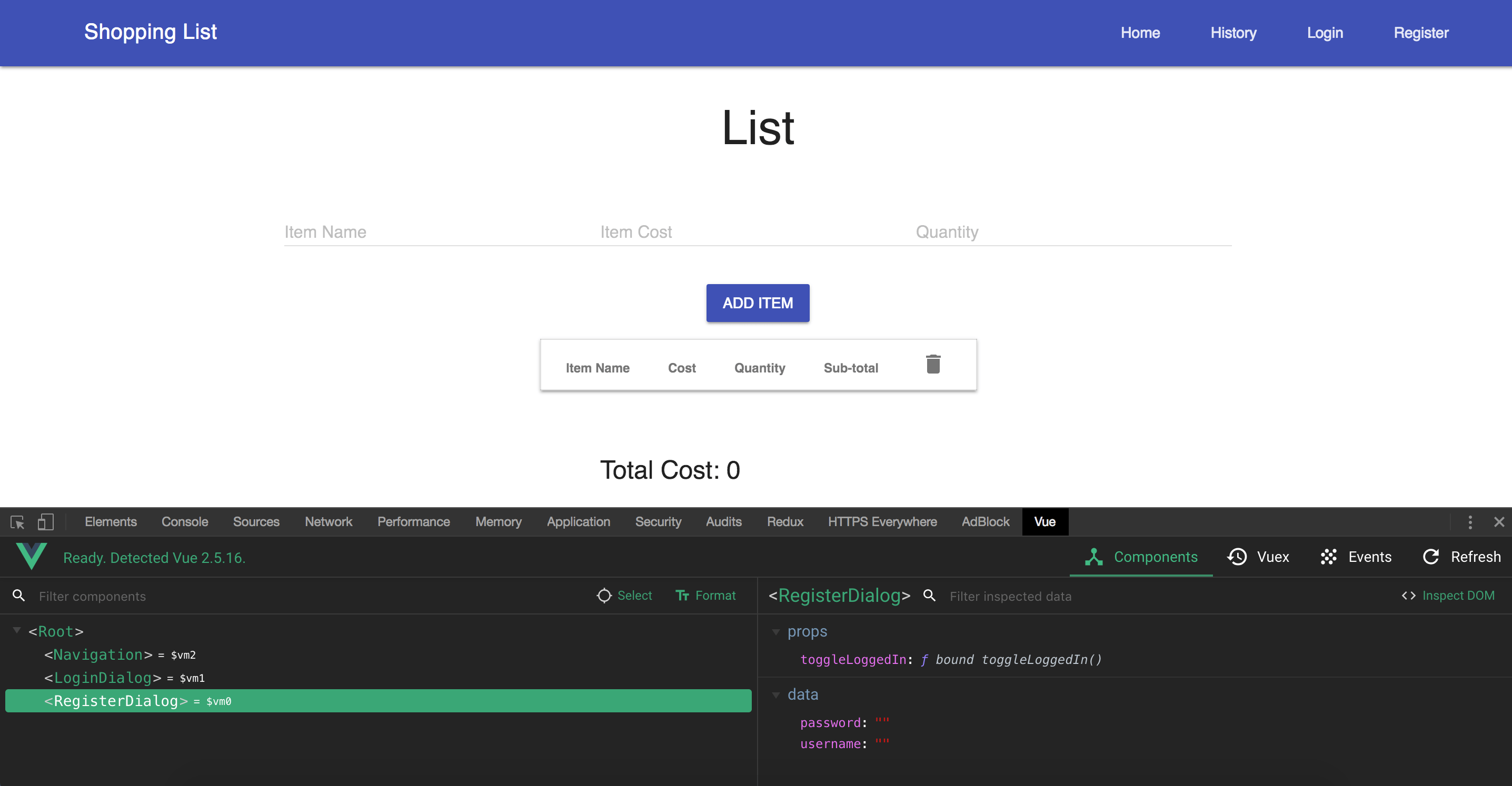
dt01

In Vue Devtools, you have to be using the development build of Vue.js for the inspection to work. The sample app is using a development build, that's why we're able to inspect it.

What Can I do with It?

Vue Devtools can be used to inspect your components, events, and state. Each of these has its own tab, and we'll take a look at what we can do for each.

Components Tab

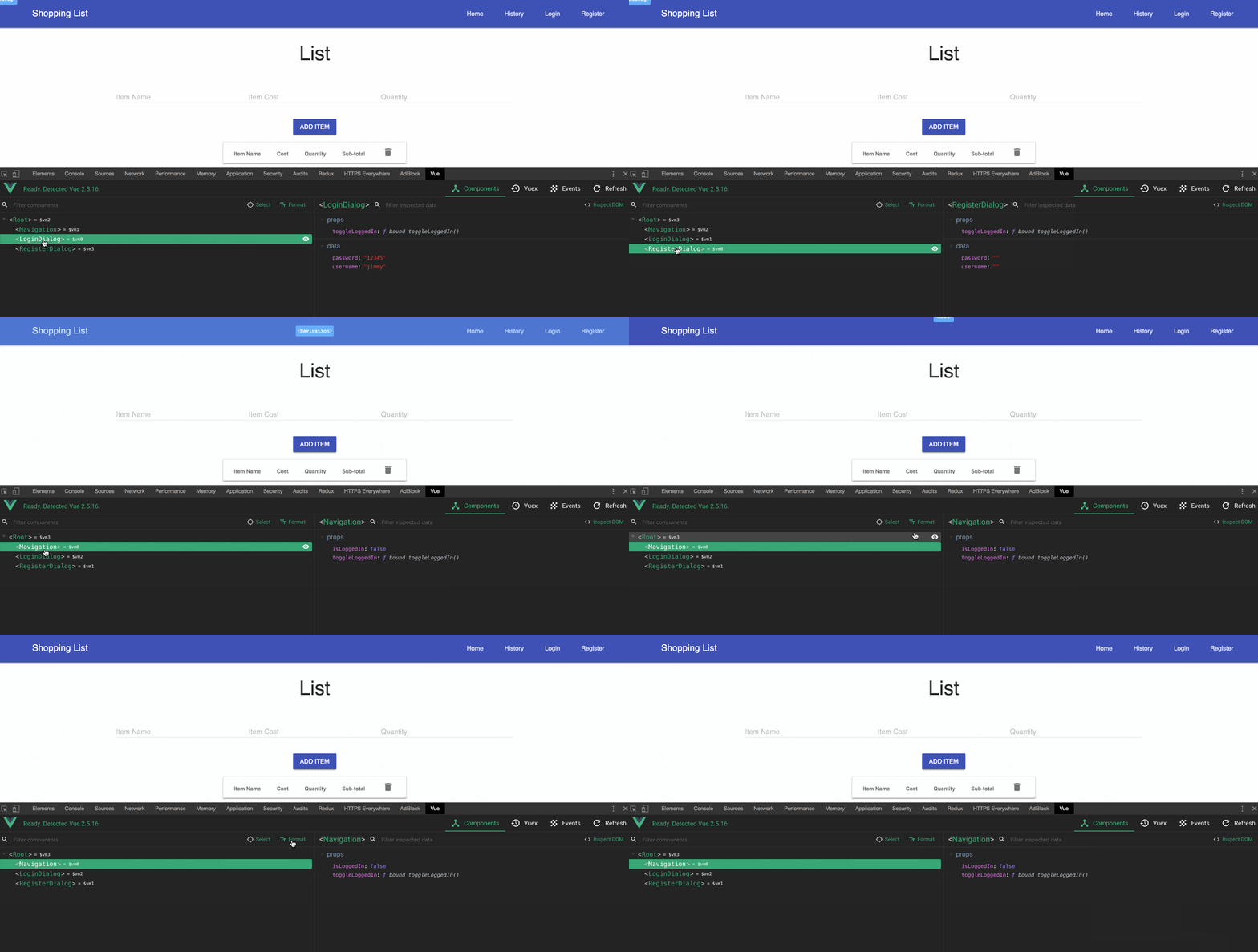
The Components tab shows the components used on a page, along with the `data` properties and `prop` values. On the left side, you find the components listed according to their hierarchy on the page. The component name is shown in PascalCase by default. You can toggle it to show the original component name by clicking the **Format** button at the top. Selecting one of them should show information such as the `data,` `props` and `computed` properties for that component.

dt02

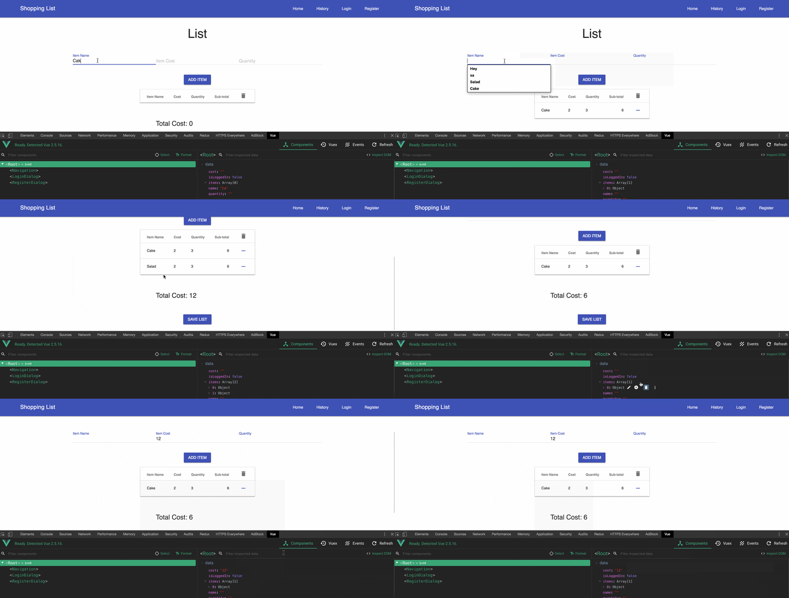
On the right, you see the `data` properties for a component. When the component receives input and those values change, you can see them reflected there. You can also edit those values and see them reflected on the page.

dt03

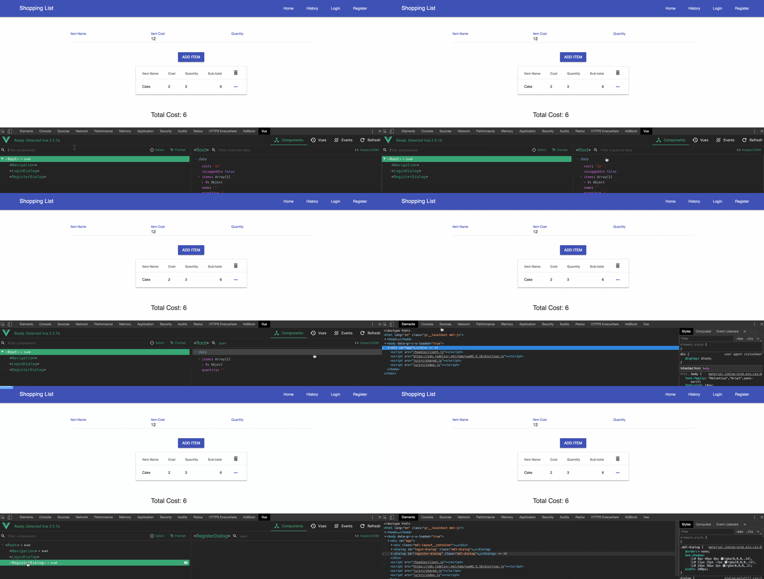
You can also filter to find a component or one of its properties on the right side. Also on the right side, you find the **Inspect DOM** button, which, when clicked, will take you to where that component is rendered in the DOM, shown in the Elements tab.

dt04

Events Tab

The Events tab shows the events captured on the left side. Selecting an event displays the event info on the right side. You can filter the events and also pause it to stop capturing events by clicking the **Recording** button - a toggle button to switch between capturing and not capturing events in your application. The sample application doesn't use any event, so you won't find anything on this tab. Here's a video that should give you a sense of how it works.

Vuex Tab

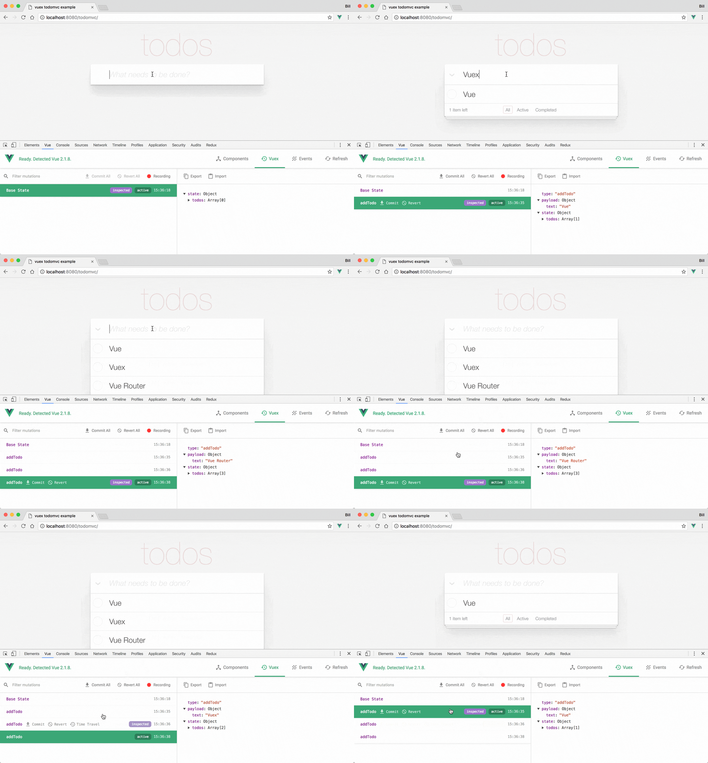
The Vuex tab is used for inspecting Vuex mutations. On the left side, it lists the mutations that have happened, and you can filter them. Selecting one will display the information on the right side with information about that mutation. When one is selected, you'll see an option **Time Travel,** which will revert the state to when that action happened. This is useful for time travel debugging. The sample app you downloaded doesn't use Vuex, so you will see an empty tab. Below is an image of it working for a different application

dt05

That's A Wrap

We've looked at the three tabs available in Vue Devtools. From time travel debugging for Vuex to component inspection on the **Components** tab, using this tool becomes valuable and makes developing Vue.js applications a breeze. I showed how to use this in the browser, but you can also get the standalone electron app right here.


For more Vue info: Want to learn about creating great user interfaces with Vue? Check out Kendo UI for Vue with everything from grids and charts to schedulers and pickers.

Introducing New Telerik UI for Xamarin Visual Studio Item Templates

$
0
0

We introduce two new Telerik UI for Xamarin Visual Studio Item Templates. Powerful and easy to use, these templates allow you to quickly add beautiful feedback and login UI to your Xamarin.Forms application.

The Telerik UI for Xamarin Visual Studio Item Templates are powerful, easy to use, predefined item templates for Visual Studio included in our UI for Xamarin suite. These templates jump start and simplify development for commonly used application UI.

Today, I’m excited to announce several new templates in the latest 2018 R3 update, available in the Feedback Screen and Login Screen template types. Let’s take a quick look at some of the previously available templates and then explore the new ones.

Item Templates

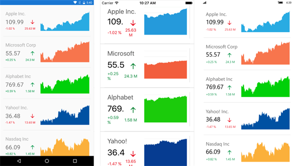
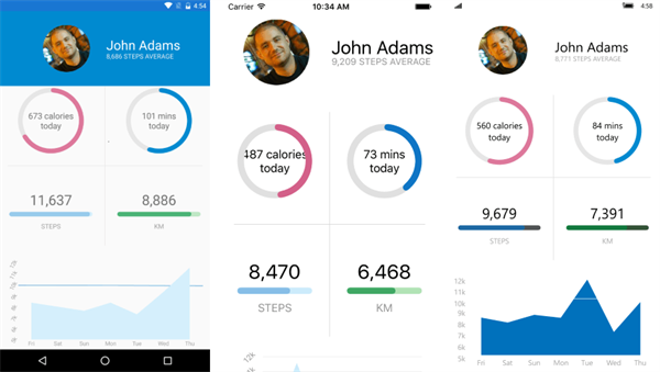
Telerik UI for Xamarin already had a number of Visual Studio Item Templates, like Stocks View and Activity View, that can be quickly added to your Xamarin.Forms project to boost your productivity and deliver a top-notch application.

Stocks View

Stocks View

Activity View

Activity View

Introducing Feedback and Login Screens

With the release of Telerik UI for Xamarin R3 2018, the Feedback Screen and Login Screen types join the list of our Xamarin.Forms Item Templates.

These new screens allow you to focus your efforts on your business logic and let us handle the heavy lifting for feedback and login user interfaces. Let’s take a closer look at each new template type.

Feedback Screen

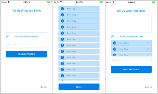
This screen allows you to add a ‘Contact Us’ type of page to your application with almost no effort. It contains the following:

  • Data entry fields to enter a feedback message and email address
  • An integrated file picker UI
  • Operational buttons wired up to view model commands

Feedback Screen

Selecting the ‘attach screenshot and logs’ button opens the custom file picker overlay. The file loading logic uses the app's 'Local Folder' option using Microsoft's Xamarin.Essentials, however you can customize this to fit your needs.

Login Screen

This screen has several features to choose from, à la carte style. The views have been efficiently implemented on top of a single ContentPage. This approach means that you don’t need to rearrange any of your app navigation to accommodate additional pages for each view.

Let me take you though the available Login Screen options.

Login Screen Simple

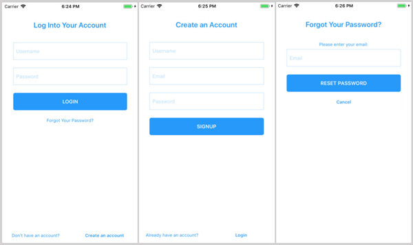
This is the base setup for all the Login Screen options, it has three views; Login, Create an Account and Forgot Password

Login Screen Simple

Login Screen with PIN

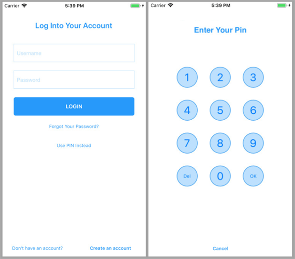
This option adds an additional view for the user to enter a PIN code.

Login Screen With PIN

Login Screen with Social

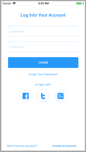
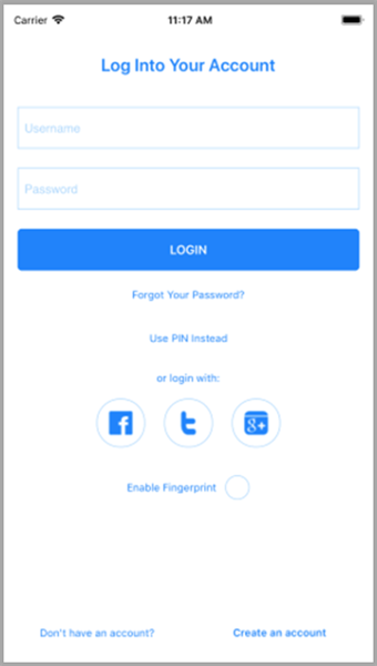
This option adds three social network buttons for your app to provide additional login choices to the user:

Login Screen With Social

Login Screen with Fingerprint

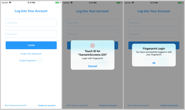
This option adds biometric capabilities, using the Plugin.Fingerprint, which provides an easy to use API to determine successful or failed authentication.

If the user chooses to enable it, they’ll be able to use their biometrics on iOS, Android and Windows 10 (e.g. Face ID and Windows Hello) to authenticate themselves in your application.

Login Screen With Fingerprint

Login Screen Complete

In the situation where you want a specific combination of the features, we’ve provided the LoginScreenComplete option. 

Login Screen Complete

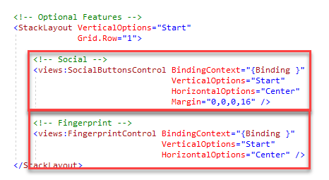
In this special case, the extra features like the biometrics checkbox and social network buttons, are modular ContentViews that can be easily removed from the view.

Modular Views

Now that you've seen the options, how easy it to add these to your project? It's literally two clicks away. Let's take a look at an example of adding a Login Screen Simple.

Using an Item Template

Using an Item Template is very simple and can be done in one of two ways:

  • Visual Studio -> File -> New Item -> select a template
  • Telerik menu -> UI for Xamarin -> select a template

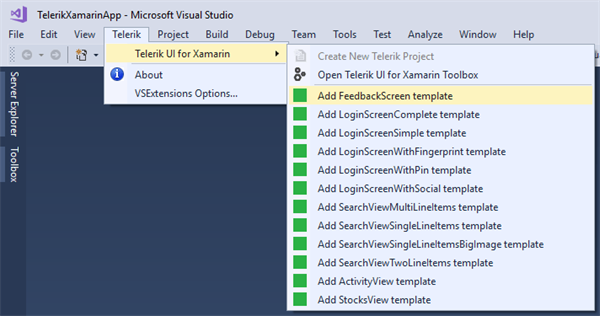
Here’s a screenshot of the Telerik menu listing the available Item Templates.

Item Templates List

You can get to the Telerik menu by right clicking on the Xamarin.Forms project in the Solution Explorer.

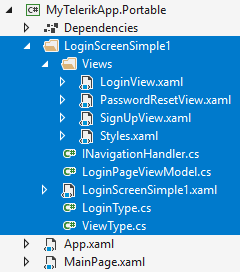
After you make a choice, you’ll have an opportunity to name it and then you’ll see a folder added to your project using that name. For example, here's a LoginScreenSimple template added with the "LoginScreenSimple1."

Added Template Result

That folder will contain one ContentPage and a subfolder with the different views. The subfolder also contains a Styles.xaml file, which contains the styles and color resources for all the screens. This way, you can easily find and modify things like theme colors to meet your application’s design guidelines.

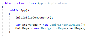
Lastly, as I mentioned earlier, there is no complicated NavigationPage setup. The ContentViews are neatly swapped out in the same ContentPage using the navigation handler. The only thing you need to do is put the ContentPage where it makes sense for your application.

For example, as the first page:

App Start Page

Wrapping Up

These are available for you to download now. Just install Telerik UI for Xamarin and you can get started with the new templates today. 

Our mission is to provide you with world class tools and components so that you can be a developer superhero. These Item Templates are just one of the tools at your disposal when using Telerik UI for Xamarin in your projects.

If you have any questions, you can get help from the amazing support team by submitting a support ticket, posting in the UI for Xamarin forums or contacting me directly on Twitter.

Introducing Eric Bishard (Developer Advocate, Kendo UI for React)

$
0
0

Hello, my name is Eric. I've recently joined the Developer Relations team for Kendo UI for React. This is a story about my journey to Progress.

A Fascination with Digital Arts

From as early as I can remember I was intrigued by graphic design. Most of my early inspiration was from club flyers, brochures and magazine ads. I had grown up in Clearwater, Florida loving skateboarding, music and graffiti, in that order. I was working really hard as a telemarketer but knew that I wanted to do something more creative. I was not your normal kid - on Saturday nights you could catch me at clubs I was way too young to get into, DJing for people twice my age, sometimes with my parents and family hanging out wondering how the hell they ended up there, but admitting I was doing something cool and not like most other kids.I was definitely trying to find ways to express myself creatively and graffiti was against the law, so I only had music and skateboarding, which was not going to be something I could do forever.

Through DJing at 15 years of age, I had started to get involved with creating flyers and CD covers using Photoshop and various other tools on the computer. I was soon introduced to motion graphics and Flash design and I knew that in some way I wanted to work in a digital medium and make beautiful designs myself. A teacher in my senior year of high school (CHS, go Tornadoes) took me aside and showed me a school that was only a few hours away in Orlando called Full Sail. She knew about my interests and that I had a technical side, plus the fact that I was practicing my graffiti on our school books, desks and other places we'll not talk about - so she figured I should start focusing less on vandalizing the school and more on applying my arts through education. A year later I had toured and decided on enrolling in their digital media program.

Early Years as a Digital Media Student

In 1999 a lot of people were finding their way to programming through digital arts and so was I. Through my education I was introduced to various applications for creating media of all kinds. Intrigued by user interface design, I started learning my first object oriented programming language, Action Script, alongside building static web applications using HTML, CSS, JavaScript and Flash. This first taste of OOP made it so that when I began working with other languages later on like C#, TypeScript and ES6, I would feel like I already had a good foundation of knowledge to build on.

Within a few short years, I had graduated with an AS degree and promptly started building a web design and hosting business out of a converted garage with my new boss and good friend Steve. I was fresh out of school and he was learning web design and how to deal with servers, but back then that didn't stop us from building an extensive portfolio of web applications, print design, Flash design and hosting all of our clients applications on our own servers in a data center a few miles away.

We were learning on the go and getting new business through word of mouth and online by people finding sites we had created. After building a few applications for real estate appraisers to automate ordering appraisals, I took a brief hiatus from web development to become a real estate appraiser. Within a few years I became state certified and started my own appraisal business just as the bubble burst in 2008. I realized this was much harder in this new climate and started to think real estate was not my calling. I only stuck with it long enough to get myself trained up in web development understanding some of the new trends and technologies. I then proceeded to teach myself what I thought would be great skills to help me get a job. This involved more advanced programming techniques, learning responsive design, backend technologies, jQuery, C#, SQL and API design. Once I had the basics I let my real estate license lapse in an effort to force myself to start a new career.

Goodbye Real Estate, Hello Responsive Web!

After riding out a pretty insane few years from 2008 to 2012, I was growing bored of my job and with a new baby born, I knew I needed to reignite my career as a developer and become a self-taught software engineer. I needed to teach myself as much as possible about full stack development and computer science, as well learn responsive design techniques as the demand for HTML 5 applications was rapidly growing. I also got married during this time to my beautiful wife Gina and with our kids rapidly growing (they tend to do that), it was time to get to work!

Eric and Family

I already knew my way around the web and I just started taking as many difficult freelance jobs as possible. I was learning on the side and applying that knowledge directly to my freelance projects. I mentioned something before that I should note, a driving force that brought me back to web development and fueled my learning from 2012, which was Responsive Design. A year earlier, a well known developer, Ethan Marcotte, published a book on this subject as well as an earlier article that sparked interest in building web applications that could respond to different browser widths and device sizes among other characteristics as well. If I had been burnt out from web development back in the browser war days, this was a period of enlightenment for me.

Post "Responsive Design" Enlightenment

Having my interests piqued by responsive design, I took many online courses like Code School's JavaScript, HTML & CSS path to cover the basics as I had started to forget some of this stuff. I also took courses in ASP.NET learning to build APIs on Pluralsight as well as several other areas of interest like SQL and MSSQL. After two years I had built several responsive full stack web applications using MVC and SQL Server, and started using frameworks such as Foundation (a competitor to Bootstrap) to help me build these responsive sites more rapidly. I met a good friend and now colleague Ed Charbeneau because of his work on an Nuget package for using Foundation 4 in ASP.NET MVC. He is also the person who referred me to my current position with Progress. Thanks Ed!

Although a big fan of the ease of working in ASP.NET, I really needed to step outside of my comfort zone in order to build my next project, this job that tasked me with building and entire program for a local school that was very similar to Full Sail and in all actuality, a competitor, located less than 10 miles away. I was hired to develop an eleven month accredited web development program that still exists today. I needed to pick subjects and courses that would not be stale in 5 to 10 years. I came up with a program that would take students from zero to full stack JavaScript developers and also teach desktop publishing and print & graphic design along with an intro to computers.

By the time I had completed this program, I was also asked to become the instructor and teach, but with hold ups due to the extremely long process for accreditation, I had to move on. A few months later, I had landed a new job and would be moving my family to California to work with a Solar Energy company SolarCity (now Tesla).

Accelerating the Transition to Sustainable Energy

In September of 2015 I was offered a position with a company that I knew was changing the way we think about energy production and they had a bold mission to "accelerate the world's transition to sustainable energy." They focused on deploying rooftop solar and their sister company (Tesla) built home batteries for backup power and storage. Tesla was also interesting as it was paving the way for modern electric vehicle production. They were making electric cars cool. Tesla and SolarCity had synergies, and for this reason, the two companies merged in 2017. With this change, I was noticed by someone and became a full time software engineer focusing on frontend technologies and moved over to the automotive side of the business. This brought a welcome change to my career. I was originally hired as a frontend engineer at SolarCity, but had instead only worked on full stack web applications, so I was happy to do frontend engineering full time and in the process I was part of a team that built a new greenfield application for their Service Centers.

I didn't realize at first but everything I learned on the back end in my previous job at SolarCity, like patterns and best practices, were suddenly transferable to the frontend as I started working primarily in Angular 2+ with TypeScript. I also got a lot of exposure to React from interacting with other teams and building reusable component libraries which forced me to learn about patterns like Flux and Redux. Over the past year I have spent more time with React and finally decided to take the plunge and focus primarily on React. I still love Angular and its amazing community, but I feel that my style of programming lent itself to working in React. I learned a lot from the Angular community though, like how to treat others with respect and be more inclusive of developers of all walks of life and at all levels of experience and I want to make sure I don't forget any of that as I start working with the React community.

Front-End Fremont Meetup

One of the most amazing things I got to do at Tesla was a meetup that I started with a colleague of mine to promote learning frontend development using JavaScript technologies. We had a lot of success and brought in great frontend engineers from the Angular and React communities to talk about topics such as state management and component design. You can read more about my meetup in an article that I published on the Angular Blog. I really think that activities like this opened the door to evangelism and made me think I would not only have fun, but be great at the job of being a developer advocate.

I also hosted hikes with my Tesla colleagues up to Mission Peak in the East Bay where we would get as many people together on Saturdays and hike for a few hours up to the top to take in the beautiful spring hills and magnificent views of the San Francisco Bay Area.

Hiking with my colleagues at Tesla

A Career Progresses

During the summer of 2018 I applied for a position with Progress after being recommended by a friend and fell in love with the idea of becoming a Developer Advocate working with Kendo UI for React. I feel that I will be able to explore more in this new position and again will need to move outside of my comfort zone, but I think that is what keeps us all on our toes and learning more.

This brings us to the present, my first week with Progress is just wrapping up and I can't be more happy about joining this wonderful team of exceptional developers and engineers. They build, maintain and support one of the most mature and fully featured user interface component offerings on the market. My goal here is simple: make it easier for developers to work with Kendo UI.

Finally, I want to encourage anyone in the React community to reach out to me and let me know what you think about Kendo UI for React, and how it could fit into your React applications. I also want to help to bring the right content and information to the community in order to ensure that it's easy to install our components and get to work with less effort while generating beautiful JavaScript applications and solid user experiences through UI. Our React components are new and will bring a different group of developers to Kendo UI. We aim to satisfy that need and provide amazing support to all JavaScript developers.

Here are some resources to get started working with Kendo UI and React!

Finally, you can get in touch with me through Twitter (@httpJunkie) and ask me any questions regarding Kendo UI and let me know how I can better serve the React community!


Kendo UI R3 2018 Webinar Recap

$
0
0

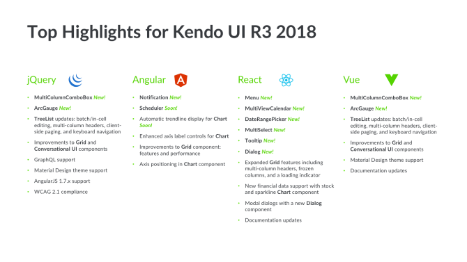
The R3 2018 release of Kendo UI is packed with exciting new features and improvements. Please download the latest changes if you haven’t done so already. You’ll love what we’ve built! In case you missed it, here’s a summary of the top highlights that we covered during the webinar:

As always, you can read an overview of the latest changes in the article, What’s New for Kendo UI.

Kendo UI R3 2018 Release Webinar

The webinar was hosted by Alyssa Nicoll, Carl Bergenhem, and me. Don’t worry if you didn’t get a chance to watch it live. We’ve posted it to our YouTube channel. In fact, you can watch it now!

Webinar Prize Winner

During the webinar, we asked attendees to ask questions and offered the Bose QuietComfort 35 II as a prize for the best one. The winner is Beau Tschirhart. Congratulations and thanks for your great questions!

Webinar Questions and Answers

We answered a number of questions during the webinar as well as on Twitter through the hashtag, #HeyKendoUI. Here’s a sampling of the questions we received along with their answers:

We’re using the (older) RadGrid controls. Is there anything that Kendo UI can’t do compared to these components that would prevent us from updating?
The RadGrid for ASP.NET AJAX is pretty mature, so it depends on which Grid from Kendo UI you’re reviewing. Most of the pre-existing functionality is available in Kendo UI. However, there could be a feature (here or there) that isn’t available yet. If you want to chat about this potential migration, please feel free to reach out to Carl Bergenhem (PM for Kendo UI) directly: carl.bergenhem@progress.com.

Do the different controls – Telerik UI for ASP.NET AJAX, Kendo UI for jQuery, Kendo UI for Angular, Kendo UI for React, Kendo UI for Vue – play well together if used together on the same page?
Yes, they do! Kendo UI for jQuery, Angular, React, and Vue all share a common rendering with our Sass-based themes; you wouldn’t even have to do too much to make them blend together. Telerik UI for ASP.NET AJAX has “similar-ish” themes but would require some design work for these controls to blend a bit better with those in Kendo UI. Technology-wise, it wouldn’t be a problem though!

Can we plug the new Kendo UI stuff in beside our (old) Rad stuff without breaking anything?
There won’t be any namespace conflicts or anything like that. You could add them in without any errors being thrown.

Do the performance improvements target IE11?
Yup! All browsers can take advantage of it.

Why I am not getting the updated Angular contents in the site?
Are you talking about on your personal site or on our docs page?

It would be helpful if the docs included the version number the feature or function was released in.
Great idea! Please submit your feedback: kendoui-feedback.telerik.com. Thanks!

Does the notification component in Kendo UI for Angular support custom designs?
Yes, you can add custom markup and Kendo UI components in the Notification component. Please refer to the section entitled, Render a Component, for more information about how to do this.

Do you have plans for an infinite scroller in Kendo UI for Angular?
If you need this outside of the virtualization that we offer in the Grid component – such as a generic, infinite scroller – please submit this idea to our feedback portal: Kendo UI for Angular Feedback.

Kendo UI for Angular seems to be rolling out slowly. Some important components are still missing like Map, PivotGrid, etc. The roadmap for next release doesn’t have new additions. Could you please share your plans for Angular components?
We’re keeping the Kendo UI for Angular roadmap up-to-date as we make progress. Components like the Map, PivotGrid, and others take some time to build. We’re building Kendo UI for Angular from the ground up. As such, it takes some time to get these components implemented. We’re in a good spot right now, especially with the Scheduler component just around the corner. However, it will take some time to implement the rest of the bigger components.

Can filters (contains, eq, neq…) be uniquely set for every column in the MultiColumnComboBox?
Currently, this is set across the entire component, but you define which fields should be included. So, if you set a contains filter, you could limit it to 2/5 columns.

When will the MultiColumnComboBox be available for React?
We are trying to build out the library as quickly as possible! If you’d like to see this component in React before some others definitely let us know on our feedback portal: Kendo UI for React Feedback.

Is it possible to wrap the MultiColumnComboBox as a React component?
Yes, it could take some work, but we could share some of the source code for our other React wrappers (they do exist!) that can be helpful when setting this up.

What are the licensing terms for the components? Do you need to purchase a licence once you deploy your app?
You can find this information on the Kendo UI website.

Is the MultiColumnComboBox specific to desktop web? Or, does it also support the mobile web?
It’s “supported-ish” if I can be honest. It’s challenging to figure out how to render a Grid component in a DropDownList in a small viewport. It can be interacted with on a mobile device, but there would need to be some updates from our side to make it ready for responsive web apps.

What about Kendo UI and AngularJS? any updates?
We officially support AngularJS 1.7.x! These are based on the jQuery components so everything we mentioned in jQuery should be available in AngularJS 1.7.x

Can we use these React components for SharePoint Online projects?
We have a website dedicated to providing information about building apps for SharePoint with Kendo UI: Office 365 and SharePoint. Please keep in mind that it targets jQuery but the same principles can apply to React.

How does one migrate Kendo UI for jQuery to Kendo UI for Angular?
That’s a very loaded question. Answer can vary a lot! I recommend approaching this challenge on a component-by-component basis. For example, create a view in Angular then add one of our components and try to match the feature set. It will require some work, but this is the best way to go. Plus, this approach lets you architect your app and work with our components in a manner that suits Angular.

Is there any known differences in the scrolling performance of the Grid between jQuery, Angular, React, and Vue?
It depends a little bit on the framework, but the overall performance should be the same. We’d be inclined to give the edge to Angular and React due to the frameworks themselves being better for partial updates.

Have there been any improvements to exporting large sets of data from the Grid component to Excel?
Yes, but there are still some limitations depending on the size of the dataset being exported. It might be worth offloading this to the server (since client-side exporting requires all data to be loaded on the client) using something like our Document Processing Library.

Is there a plan to integrate Material Design Components (MDC) Web into Kendo UI?
Rather than integrate MDC into Kendo UI, we’re taking the approach of augmenting your UI stack with Kendo UI. MDC and Kendo UI both follow Material Design, so you can use both side-by-side while having a common look-and-feel.

Is it possible to convert the Kendo UI JavaScript source code into ES modules?
This is possible with Angular and React. However, it’s a bit tricky to convert on the jQuery side. We’re still looking to see what we can do here though and will let you know if we are able to make this happen.

I’d like to enhance every Kendo UI components’ Sass source code to output single RTL or LTR CSS compiled file, rather than to output both of them (RTL and LTR) in the same component’s css compiled file.
I’ll take this note back to the engineering team to consider. Good idea!

Is Kendo UI for Angular ever going to have parity with the Kendo UI for jQuery?
The ultimate goal is to have feature parity, but it takes a while to build something from the ground up to match such a mature component set. Don’t forget: Kendo UI for jQuery has been around since 2011. That stated, if you are missing any components that you want to use let us know on the feedback portal: Kendo UI for Angular Feedback.

Does Kendo UI for Vue use jQuery?
Currently, yes. We wanted to launch this as something for Vue users to get in their hands today, but we want to move over to native in the future. Can’t say when the switch will happen, but we want to serve the Vue community just as well as we serve the communities for jQuery, Angular, and React! We did this for React and now we have the set of native components.

Are you watching the progress on the Ivy renderer coming out soon for Angular?
Yes, we totally are! Luckily, there’s a lot of information being shared by the Angular team to help us prep. In fact, we were one of the first vendors to blog about it: First Look: Angular Ivy.

How can we get a hold of the new Angular bits? Are they available on npm yet?
Yes. For example, the following command to add the Notification component to your Angular project: ng add @progress/kendo-angular-notification. You can find more information about Notification component online: Notification Overview.

Why is Vue getting more steam on features than Angular?
Two reasons why this seems to be the case: 1) it’s based on the jQuery components which makes us get a 2-for-1 kind of package there and 2) the Scheduler is a pretty big component so it takes time to get the underlying engine written!

The Notification component is alright, but it feels limited that the only anchor is the viewport.
We’ll definitely continue to add features, so if we could add in something that makes it more usable let us know either via a support ticket or on the feedback portal: Kendo UI for Angular Feedback.

Will you be migrating all demos from the Kendo UI Dojo and Plunkr over to StackBlitz?
We’re currently using the Kendo UI Dojo for the demos targeting Kendo UI for jQuery. However, StackBlitz has been serving us very well for the demos we’ve built for Angular and React.

Can you use Kendo UI to debug React issues?
I’m not sure how that would work. However, Kendo UI for React works perfectly fine with the React tooling in Chrome DevTools, for example.

Are the Angular and React implementations are based on the jQuery code base? Or, are they entirely new code?
Hopefully, you heard my answer live, but just in case: Angular and React implementations are 100% native and have zero dependencies.

When we export around 50K records to Excel, we get an error in Chrome. Why is that? Is there another way to export such as larger volume of data in Chrome?
Large amounts of data can be difficult to accommodate on the client-side. It might be better to offload this work to the server-side. The tricky part with exporting this amount of data is that you have to load all of these items on the client and then create the Excel file. I would recommend checking out our Document Processing Library to see if that could help.

What is your YouTube channel?
Kendo UI on YouTube

Thank You

As always, a big-time THANK YOU to everyone who joined us for the webinar, and for all the great feedback. We hope all you’ll love the new features and improvements we’ve made to Kendo UI in the R3 2018 release. In the meantime, please feel free to leave your thoughts at our Feedback Portal or in the comments below.

Unit Testing your Web App with Structure

$
0
0

Testing is occasionally an overlooked topic when it comes to web app development. We are going to take a look at how to structure unit test so they can not only help test code but act as living documentation as well.

Applying the Arrange-Act-Assert pattern to create maintainable unit tests.

Testing is often overlooked when it comes to web applications. When you think about testing frontend code, it is often associated with browser tests and manual QA teams going over regression scenarios. While that is a large chunk of frontend testing varieties, there is a variety of test that has a lower dev cost and much higher return: the Unit Test.

Sadly, though, tests are often the first casualty of code delivery. From a business perspective, it doesn't make sense to write tests if you are going to slip on the date. I would argue that there is no point in delivering on the deadline if the code doesn't work. An additional benefit of testing besides knowing that your code works is the unit test will act as living documentation.

Testing

While there is a spectrum of test types, we are going to focus on writing good unit tests. Unit tests are the closest to code and the developer, which allows the developer to be in control. Within the realm of unit tests, there are more than a few great frameworks and tools for writing tests, but we are going to focus on the structure of the unit tests along with how to think about the tests.

Before we jump into the example, I want to align our assumptions around the goal of a unit test. The goal of a unit test is to test the smallest unit of work. In most scenarios, the smallest unit of work is going to consist of a function. With that being said, let's jump into some code.

For the purposes of our tests, we are going to test a CalculatorService — creating a new instance of a calculator service and verifying the results of each of the methods. Our CalculatorService is a straightforward example in which we are verifying the results and the history statement generated. 

// Calculator Service         
  
classCalculator {
            constructor() {
                        this._history = [];
               }                      
  
            add(param1, param2) {
                        this._history.push({op: ‘ADD’, params: [param1, param2]});
                        returnparam1 + params;
          }
  
  
multiply(param1, param2) {
                        this._history.push({op: ‘MULTIPLY’, params: [param1, param2]});
                        returnparam1 * params;
           }
  
            getLastOperation() {
                        returnthis._history[this._history.length - 1];
                        }
            }
  
 
// Unit Test 1 - Test add method
  
var calculator = newCalculatorService();
  
var result = calculator.add(2, 2);
  
expect(calculator.getLastOperation()).to.be.equal({ op: ‘ADD’, params: [2, 2]});
  
expect(result).to.be.(4);
  
// Unit Test 2 - Test multiply method
  
var calculator = newCalculatorService();
  
var result = calculator.multiply(2, 2);
  
expect(calculator.getLastOperation()).to.be.equal({ op: ‘MULTIPLY’, params: [2, 2]});
  
expect(result).to.be.(4);

As we run the test, we see that all the tests pass and life is good. Before we walk away from the Calculator Service, we get an update to the ticket that says we want our calculator history to be more user-friendly. That is an easy change, so we change the history array to store strings instead of objects like so:

...
this._history.push(`adding ${param1} and ${param2}`);
...
...
this._history.push(`multiplying ${param1} by ${param2}`);
...

While this is an easy change, you’ll notice that we break both the add and multiply tests that are completely unrelated to this change. The add and multiply tests were initially designed to test the results, not the internal implementation of history. But, due to the way we wrote the tests, we have blended the use case of the tests. The solution to the problem is to introduce a concept of Arrange-Act-Assert pattern.

The Arrange-Act-Assert pattern gives us a pattern for splitting our test into three blocks of code:

  • An Arrange block is where we set up the scenario we want to test. The Arrange block can contain as many lines of code as necessary to set up the rest of the test.
  • The Act block should be a single code statement that we are testing.
  • And, finally, an Assert block where we are testing a single output.

One of the great benefits to using this pattern consistently is the ease of debugging when a test is broken.

If we were to apply this pattern to our existing test, we would end up doubling our test. The reason they would double is we break up the two asserts so that each test has a single assertion value.

If we were to rewrite the tests above, they would look like the following:

// Unit Test 1 - Test add method
   
//Arrange
var calculator = newCalculatorService();
  
//Act
var result = calculator.add(2, 2);
  
//Assert
expect(result).to.be.(4);
  
// Unit Test 2 - Test add method history
  
//Arrange
var calculator = newCalculatorService();
  
//Act
var result = calculator.add(2, 2);
  
//Assert
expect(calculator.getLastOperation()).to.be.equal(‘adding 2 and 2’);
  
// Unit Test 3 - Test multiply method
  
//Arrange
var calculator = newCalculatorService();
  
//Act
var result = calculator.multiply(2, 2);
  
//Assert
expect(result).to.be.(4);
  
// Unit Test 4 - Test multiply method history
  
//Arrange
var calculator = newCalculatorService();
  
//Act
var result = calculator.multiply(2, 2);
  
//Assert
expect(calculator.getLastOperation()).to.be.equal(‘multiplying 2 by 2’);

The above code may start to throw DRY (Don't Repeat Yourself) warnings in your mind, but there is a reason that the code is more than okay: It's NOT production code, it is test code. Test code doesn’t need to be efficient; it needs to be straightforward and maintainable. After you write your code and tests, another developer should be able to step in and take over by just reading your tests and understand all the scenarios that you were trying to cover. 

While using the Arrange-Act-Assert pattern, the Act and Assert blocks should each be a single line of code. If you find yourself with more than one line of code for Act or Assert, take a step back and ask yourself what is really being tested. The answer may involve breaking your test into multiple tests. A great rule of thumb that I use is, when a test breaks, there should be a single line of code that is responsible. If your tests have more than one assert statement, what are you really testing?

One topic that we haven't talked about is naming tests. There are a few patterns and formulas for naming tests, but I’m only going to talk about the BDD (Behavior Driven Design) style because I think it’s most informative for future developers. BDD style names tests around the scenarios that are being tested. I’m going to use our existing unit tests and name.

// Should calculate add correctly for 2 + 2
  
//Arrange
var calculator = newCalculatorService();
  
//Act
var result = calculator.add(2, 2);
  
//Assert
expect(result).to.be.(4);
  
// Should return expected history for the add method
  
//Arrange
var calculator = newCalculatorService();
  
//Act
var result = calculator.add(2, 2);
  
//Assert
expect(calculator.getLastOperation()).to.be.equal(‘adding 2 and 2’);
  
// Should calculate multiply correctly for 2 * 2
  
//Arrange
var calculator = newCalculatorService();
  
//Act
var result = calculator.multiply(2, 2);
  
//Assert
expect(result).to.be.(4);
  
// Should return expected history for the multiply method
  
//Arrange
var calculator = newCalculatorService();
  
//Act
var result = calculator.multiply(2, 2);
  
//Assert
expect(calculator.getLastOperation()).to.be.equal(‘multiplying 2 by 2’);

One of the things you may have noticed about the naming for the test is they all start with “Should.”  The reason that we use “should” is because of the contractual obligation that is implied by the English language when using that word. Should requires that a certain action take place, which is great since we are writing tests with assertions.

Over time, the code you write will need to change to adapt to different scenarios that you didn't think about. One of the ways to future-proof your code is not to write code for every possible scenario, but to write code and tests for the scenarios that you understand. By testing the scenarios that you are aware of, you can speed up future developers’ time by having them understand your code around your specific scenarios. Because what good is code that doesn't work, and what better way to prove your works than writing tests!?


For more information about testing solutions from Progress, take a look at Telerik Test Studio

If you want to learn more about Test Studio, you can download a free trial and dive deeper into the solution. And stay tuned about the forthcoming features in the October release this year. If you have a special issue or need a targeted demo for your specific case, you can contact us.


Test Studio R3 2018 Adds Test Execution and Failure Analysis Productivity Features

$
0
0

The latest Telerik Test Studio release is out, and all the new features are driven by our mission – to turn QAs into superheroes. Read on to learn the latest updates in testing automation, verification and more.

The team's focus for this release is to make test execution even more stable and test failure analysis even easier.

Let’s not lose any more time - let's dive into all the new features.

Automatic Re-Run of Failed Tests

We all have seen situations where tests fail for random reasons – synchronization issues, temporary machine slowness, an unexpected dialog or error that has nothing to do with our application under test, etc. All these situations usually produce false-negative results. First of all, these failures interrupt our nightly run, and then we lose time identifying whether the failure is due to an application bug or script issue. In most of these cases if you just re-run the failed test case it will pass. But doing this manually would consume time and your overall automation suite result remains failing.

We have solved that problem with the automatic re-run of failed tests inside a test list. Once the option is enabled, all the tests that fail during a test list run will be automatically re-run, and that info will be displayed in the generated result.

Rerun Tests in Test Studio

If all reruns pass, the overall test list status is “Pass.” Just to be sure that no issue is missed, there is an indication that there were initially failing tests though.

Video Recording of Test List Execution

Analyzing the reason a test failed can sometimes be very time consuming, even when the failing issue is easy to spot. Both running the scenario manually or re-running the automated test can take time, especially if we have a long test with many steps. So, even if the issue is easily discoverable you may need to wait for some time to reproduce it, which is boring and unproductive.

For these cases we added the screen recording feature. When enabled it will record, depending on what you prefer, either all the execution or only failing tests. Once the result is ready you can open the video and see what led to the failure and what really happened.

You can see this in action in the video below.

Test Studio Execution Client to Keep the User Session on a Remote Machine

We’ve heard from many automation engineers that keeping the user session on a machine is a challenge. When you want to validate real actions or desktop commands on your application’s UI, you need to have an active UI session on the machine. And this active session usually gets disconnected due to some machine/domain settings or other rules.

We added an option to the Execution client to keep the active session so that all UI tests run unattended and seamlessly. You just need to open Test Studio Test Runner and enable the option.

active_session

JavaScript Error Verification Step

There is a new verification step that checks if and what JS errors there are on your website. If there are any expected errors, you can exclude them from the verification, so it does not fail because of them.

jserrors

Dialog Handler Live Updater

Browsers are constantly evolving. They come with multiple official releases per year and even more updates. Some of these updates change the UI structure of the whole browser. This impacts how Test Studio handles dialog and notification windows. As a result, after breaking changes like these are introduced by the browsers, Test Studio should be updated accordingly.

The good news is that for such cases we don’t need to put a whole release out and the user doesn’t need to upgrade to this newer version of the Test Studio application anymore. From Test Studio R3 2018 onwards, anyone with the latest major release will be able to download a very lightweight patch directly inside Test Studio’s UI whenever a browser releases a breaking change. This patch is a minor one that does not upgrade the whole application, nor your projects. It holds no risk for your project, tests and Test Studio stability.

For a full list of everything new in Test Studio, feel free to check out the updated release notes.

To explore the features of Test Studio R3 2018, download the free, full-featured trial (no credit card required).

Try Test Studio

How to Use a jQuery NumericTextBox UI Component in Your Web App

$
0
0

When you want to control just how a user enters numeric input, you need to use a numeric textbox. Kendo UI makes it easy to precisely control the input you'll allow, as well as the detailed look and feel.

In the previous episode, you learned how the MaskedTextBox is used to format user input. In this episode, you will learn how the NumericTextBox is used to format numeric input.

The NumericTextBox is a form field that restricts input to numbers and has a button to increment and decrement its values. The purpose of this component is to provide more control over formatting the data so you can achieve greater accuracy. For example, currencies come in different denominations and this affects how many significant digits the input should have and how to round. Coming up, you will see a comparison of the HTML number input type and the Kendo UI NumericTextBox.

HTML Number Input 

To create a numeric textbox using plain HTML, you create an input element and set the type attribute to number. By default, the input will increment and decrement values by one. If a number other than an integer is entered, the values will round to the nearest integer. You can further restrict the input by adding attributes to the element. The max attribute sets the maximum value for the field. The min attribute sets the minimum value for the field. And the step attribute sets the intervals of increase and decrease. The following example can accept numbers between 0 and 100 and will increase and decrease the values by 10.

numerictextbox

```html
 
<input id="textbox"type="number"min="0"max="100"step="10">
 
```

The step also affects how rounding is calculated and the number of decimal places used. For example, if you use a step of .1 the input entered will be rounded to the nearest tenths place. If you use a step of .01 the input will be rounded to the nearest hundredths place. But what if you don't want the step to correspond to the number of decimal places? Using our money example, if the input field accepts US dollars we may allow the user to enter a number with up to two decimal places. However, we may want the step to be one dollar because it is not useful for the interval to be one cent. For this level of control, we need the NumericTextBox.

Kendo UI NumericTextBox 

Using the same code from above, we can transform our input field into a Kendo UI NumericTextBox with the following:

numerictextbox

```html
 
<!DOCTYPE html>
 
<html>
 
  <head>
 
    <meta charset="utf-8">
 
    <title>MaskedTextBox</title>


    <script src="https://code.jquery.com/jquery-1.12.3.min.js"></script>
 
 
  </head>
 
  <body>
 
    <input id="textbox"type="number"min="0"max="100"step="10">
 
    <script>
 
      $(document).ready(function(){
 
        $('#textbox').kendoNumericTextBox();
 
      });
 
    </script>
 
  </body>
 
</html>
 
````
  

The min, max, and step can be set in the attributes of the input as we did in the previous examples or they can be set in the component’s API. This is how we would configure these properties inside the code:

```html
 
<input id="textbox">
 
<script>
 
  $(document).ready(function(){
 
    $('#textbox').kendoNumericTextBox({
 
      min: 0,
 
      max: 100,
 
      step: 10
 
    });
 
  });
 
</script>
 
```

To change the format of the input, you set the format option. The format is what the widget displays when it is not focused. After entering a number, the format will appear when the mouse loses focus on the input field. Possible values for the format are n (number), c (currency), p (percentage), and e (exponent). The number of decimals can be also set in the format field by adding a digit to the end of the format.

For example, to format a number with zero decimals is n0. To format a currency with three decimals is c3. The decimals property can be used to configure what the widget shows when it is focused. If the format is n2 and decimals is 3, the widget will use a precision of two decimals when the field loses focus. However, when the field is in focus, it will use a precision of three decimals.

Conclusion 

Both the HTML number input and the Kendo UI NumericTextBox allow you to restrict data with minimum and maximum values and control the step. However, the NumericTextBox also lets you define the precision of the numbers and format other number types. Furthermore, if there is a format you would like to use that doesn’t conform to one of the predefined types, you can create a custom format. This is useful when you want to use symbols to represent other kinds of data like weight or volume. It is also useful when you want to customize the number of digits in the input. If the value of the input is a binary number you could make sure the input is a certain length by padding the beginning with zeros. In the next lesson, we will continue our exploration of inputs with the DatePicker component.

Try Out the NumericTextBox for Yourself

Want to start taking advantage of the Kendo UI jQuery NumericTextBox, or any of the other 70+ ready-made Kendo UI components, like Grid or Scheduler? You can begin a free trial of Kendo UI today and start developing your apps faster.

Start My Kendo UI Trial

Angular, React, and Vue Versions

Looking for a NumericTextBox to support specific frameworks? Check out the NumericTextBox for Angular, the NumericTextBox for React, or the NumericTextBox for Vue.

Resources

Hello, Create React App 2.0!

$
0
0

Create React App provides an environment for learning React with zero configuration, developed by the React team at Facebook Open Source to help you jump-start your application. Create React App (CRA) has opinions on what to use for your tests and test runner, what production minifier and bundler to use and how to set up a modular JavaScript codebase. These are decisions that you won't have to make to get your app up and running quickly, relieving you from a good deal of JavaScript fatigue when all you want to do is get straight to building your app and components.

Don't worry, you will still be able to make plenty of decisions on your own around state management, data retrieval, etc. CRA does not go as far as to make decisions like those for you. What it does do is create an out of the box frontend build pipeline that you can use with any backend API or data retrieval options that you want.

A Requirement for Using Create React App v2.0

CRA 2.0 no longer works with Node 6. You must have Node 7 or greater installed in order to work with the latest bits. Before you get started you will need to ensure that Node is updated. You can check easily by running the following command:

node -v

I have updated my Node as of the first day of the CRA 2 release and I have the following version of Node installed and everything is working just fine:

$ node -v
v8.12.0

Are You New to Create React App?

If not, skip to the What Has Changed section. If you are, I would like to go over in detail how to use the CRA with a very basic Hello World walkthrough.

The first time I used the tool, I was confused about why I was not seeing Webpack, Babel and Jest in my package.json, but it turns out that's because CRA has a dependency called react-scripts that hides these and other dependencies and configurations from you. It's OK, though. Once you get moving and are comfortable with your application you can always eject from the CRA exposing those dependencies and their configurations.

Starting From Scratch?

If you want to try CRA 2.0, here are the basic commands - and just like the 1.x version, there are just a few very simple scripts to become familiar with.

Create React App is a CLI, however it does not do things that other CLIs like the Angular CLI does. For instance, it does not generate components or add features to your app.

When you run the following command, CRA will use the 2.0 template by default:

Create React App 2.0: create-react-app

If you had installed CRA before October 1, 2018 and you have not used it in a while, you do not need to reinstall globally as the CRA will by default use the latest template. This does not mean you cannot use the old 1.x template. If you want to do that, you can add the argument, --scripts-version as follows:

create-react-app my-app-name --scripts-version=react-scripts@1.x

After CRA finishes generating your application, you will have a directory with the following structure:

Create React App 2.0: create-react-app tree

Here, I have expanded the important folders and files that you should be aware of, mainly the public and src directories are where you will be making changes and adding your first components and test files. As you can see, CRA has a few components and tests already setup for you.

After running the create-react-app command, change directories and run npm start or yarn start to build and run the app:

$ cd my-app-name
$ npm start

This will use the Webpack Dev Server on localhost:3000. Navigating to this page in your browser will bring you to the home page with the React logo:

CRA doesn't support Hot Module Replacement because it "hides" Webpack from you. For example, if a change is made to App.js, the entire app is reloaded in the browser.

Note: If you wish to use Hot Module Replacement when using Create React App, please refer to Brian Han's (excellent) article entitled, Hot reloading with create-react-app without ejecting... and without react-app-rewired.

Let's terminate our current dev server and try running our tests using the npm test or yarn test command:

$ npm test

The following options will be displayed:

Create React App 2.0: npm test

Let's run all tests by pressing a:

Create React App 2.0: Results of npm test

As you can see, the tests listed in src/App.test.js passed.

If we wish to ship this beautiful spinning React logo app as it sits, we can execute the npm run build or yarn build, which will create a directory inside the project called build:

Create React App 2.0: npm run build

Here, an optimized production build has been created. Once the operation has completed, the build script details exactly what happened and how you can deploy the generated output. To find out more about deployment, you can go here.

Finally, as part of this test drive, we will eject our application from our CRA. I would encourage doing this with a test application so that you understand what the command does and how it is irreversible.

Before we begin, let's examine package.json:

Create React App 2.0: package.json

The only dependencies listed are react, react-dom, and react-scripts. react-scripts are where all the hidden dependencies live when using CRA.

Also, let's note the structure of the application directory:

Create React App 2.0: ls

Let's now eject our application:

Create React App 2.0: eject

Please take note of the warning before performing the eject operation on your app.

Create React App 2.0: Ejecting

Committing this operation will modify project.json and the directory structure of the app:

Create React App 2.0: Ejecting

You now have control over all of the previously hidden dependencies, we now also have a scripts and config directory. At this point we are no longer using the CRA, however; you can still run all of the same commands as before: start, test and build. Obviously, the eject script no longer exists. The new directory structure looks something like this:

Create React App 2.0: Tree Structure After eject Operation

One last thing I wish to mention is that it does not matter if you use npm or yarn in any of these steps. Both will provide the exact same output in each case. I do find that using yarn does on average take less time that npm to perform each command, but also requires that you have yarn installed.

What's Changed and Why Should I Care?

Some reasons for updating include taking advantage of the updates to the major dependencies like Babel 7, Webpack 4, and Jest 23, which have gone through major changes this year.

Aside from some of the freebies we get from having Babel, Webpack and Jest updated to their latest versions, and as someone who is fairly new to React and the more advanced concepts, I wanted to cover some of the basics that are going to make my life better as a React developer. Here are what I believe are some of the most important changes that are also easy to understand from a beginner or intermediate standpoint.

SASS/CSS Modules Out of the Box

This is one of my favorite features. Previously I had several starter projects on my GitHub which I would clone in order to get to a good starting point with different CSS configurations as CRA 1.x didn't provide the greatest CSS options right out of the box. It also was not trivial for me to set this stuff up, hence the modified starter projects I had to create in order to make working with CSS easy from the start of my project.

SVG as a Component in JSX

We have support for working with SVGs, enabling us to import them as a React component in our JSX.

Smaller CSS Bundles

We can now take advantage of better CSS bundling by simply targeting modern browsers.

Better Syntax for React Fragments

As someone who has run into the issue of Babel not supporting the shorthand for React Fragments, it's nice to know that with the Babel update, Create React App now supports this abbreviated tag syntax right out of the box.

Opt-In for Using Service Workers and Supporting Old Browsers

Offline-first Progressive Apps are faster and more reliable than traditional ones, and they provide an engaging mobile experience as well. But, they can make debugging deployments more challenging, and for this reason, in Create React App 2 service workers are opt-in.

What Has Changed in the App Files and Their Structure?

After getting up and running with the new template, you will notice that the home page for the CRA is slightly different from before. I actually like the new design as a starting point much better. If you are unsure which version you are running this change makes it simple to know which version you are on. Below we see the old 1.x version to the left and the newer 2.x version to the right.

Version 1x vs 2x template

The file structure in CRA 2.x is nearly identical to that of the structure in 1.x, but one of the first things you will notice when opening up your project is that the old registerServiceWorker.js has been renamed to serviceWorker.js. If you go into that file, the only change is the addition of a config object that can be passed to the registerValidSW() function enabling onOffline and onError callbacks to the Service Worker. This is useful to display user messages when in offline mode and to log errors on serviceWorker if registration fails. More info can be found here if you want to explore this change.

If you go into your index.js file, you will notice why registerServiceWorker.js has been renamed to serviceWorker.js. It's because by default we are not registering the service worker anymore. By simply changing the line in index.js that reads: serviceWorker.unregister(); to serviceWorker.register(); you will then be able to take advantage of offline caching (opting in). I think the name change for this file makes sense because of the opt-in change. To learn more about Progressive Web Apps in CRA, go here.

NPM Scripts Remain the Same

We still have the four (4) basic commands used to start, build, test and eject the application:

  1. npm start or yarn start will host the app locally with Webpack Dev Server
  2. npm test or yarn test will execute the test runner using Jest tests (more info)
  3. npm run build or yarn build will package a production build for deployment (more info)
  4. npm run eject or yarn eject will remove the react-scripts from your dependencies and copy all config files and transitive dependencies into your project as well as update your package.json

If you would like to compare the two package.json files for each version of the ejected apps (1.x vs 2.x), I have put them up on a diff checker here.

Below is a snapshot taken from both a 1.x app and a 2.x app that have been ejected. As you can see we have a lot more transitive dependencies in the new version of CRA 2 and only a few packages that were removed from the old version.

1x vs 2x comparison after ejection

Breaking Changes to be Aware Of

  • As I mentioned, Node 6 is no longer supported, you must be running Node 7 or greater
  • Older browsers (such as IE 9 to IE 11) support is opt-in and this could break your app
  • Code-splitting with import() now behaves closer to specification
  • Jest environment includes jsdom out of the box
  • Support for specifying an object as proxy setting replaced with support for a custom proxy module
  • Support for .mjs extension removed
  • PropTypes definitions now get stripped out of the production builds

The 2.0.3 release notes do go into further detail about breaking changes, so I would check that document out if you need more clarity.

Early Resources for Create React App v2.0

I have compiled a list of all of the content that I have found around the topic of Create React App 2. This should get you up to speed and started using some of the new features, which I assume even those of you that have React figured out will enjoy learning. For instance, Kent C Dodds created a YouTube video showing how to use the custom Babel macros, which is now supported in version 2. He will get you up to speed on using and creating your own macros in a short period of time.

You can check out the Github Repo, and for additional information not covered here, the React team has also done a blog post on the release and breaking changes.

Telerik R3 2018 Release Webinar Recap

$
0
0

Did you miss the live Telerik R3 2018 webinar? Never fear. We’ve not only recorded it so you can watch it on demand, but we’ve also shared a recap here.

The R3 2018 release of our Telerik UI tools is packed with exciting new features and improvements. Please take a couple of minutes to download the latest bits or a trial if you haven’t had the opportunity yet. You won’t be sorry!

We’ve added 20+ new controls and two new themes across the suiteand we have implemented the latest WCAG 2.1 accessibility standards, so your apps are both modern and accessible by default.

Sam Basu and Ed Charbeneau hosted the release webinar to highlight some of the new features and functionalities in the Telerik suite. This was hosted live at TechBash in Pocono Manor, PA. If you weren’t able to join us live, fear not. We’ve posted it to YouTube and you can watch it at your convenience.

Here are a few highlights that Sam and Ed covered:

Web

  • MultiColumnComboBox component and new TreeList features for ASP.NET MVC, ASP.NET Core
  • ArcGauge and a new Chat feature for ASP.NET MVC, ASP.NET Core
  • Material-inspired theme for ASP.NET MVC and ASP.NET Core
  • Feature enhancements for HTML Charts, Drawing, Gantt, PDF Export and Spreadsheet for ASP.NET AJAX 

Desktop

  • The highly requested MultiColumnComboBox control is available for Telerik UI for WPF.
  • A new NavigationView mode (a.k.a. Hamburger Menu) in the PageView and AgendaView to the Scheduler in Telerik UI for WinForms

Mobile

  • A new and improved AutoComplete control in Telerik UI for Xamarin - The AutoCompleteView
  • Brand New Accordion and Expander navigation controls
  • Built-in login, authentication and app feedback screens
  • Financial and Donut Charts for the Charting component
  • MultiDayView for the Calendar
  • Load On Demand functionality to the TreeView
  • Border and Checkbox as well as scheduling features for the Calendar control
  • Nested Properties Support in the DataGrid

Conversational UI

  • Performance and look-and-feel improvements to add an additional layer of polish to our Conversational UI components.

You can read an overview of all the latest changes in the article, Telerik & Kendo UI R3 2018 Release: Themes, Components & Industry-First WCAG 2.1 Compliance.

Webinar Questions and Answers

Historically, we’ve answered questions on Twitter using the hashtag, #HeyTelerik. This time around, we decided to answer most of them during the webinar. That’s why it’s a good idea to watch the recording. We got through a lot of them in a short period of time!

Thank You

As always, THANK YOU to everyone who joined us for the webinar, and for all the great feedback. Your feedback drives our product direction. Because of this, we are certain you will love the new features and improvements we’ve made in Telerik in the R3 2018 release. They were changes you requested. Please continue to share your thoughts at our Feedback Portal or in the comments below.

The World’s Simplest UX Reading List

$
0
0

How do you learn more about UX, whether you're a beginner or a leader? Start with this simple reading list.

How does the busy executive begin learning about user experience and how to practice it? How does anyone do it? Most UX reading lists are ridiculously long and esoteric. Trying to use them is like diving into the deep end of a very deep pool. (Seriously, 100 books you should read about user experience? It’s overwhelming.) Much like learning to swim by diving right in, that approach will probably work eventually, but you could have saved yourself a lot of splashing around trying not to drown.

To the rescue, our non-overwhelming, not-likely-to-cause-drowning UX basics reading list. Hand-picked for where you are in the UX learning process, there’s something here for the super UX novice all the way to the eager UX leader trying to spread user experience gospel to their organization. Read the one that resonates with you, then rinse and repeat as you move from novice to beginner or intermediate to leader.

For the Super UX Novice

“What the heck is UX anyway?”
The Design of Everyday Things

Don Norman

UX

A quick, basic introduction to user experience from the man who coined the term. Norman makes the esoteric elements of user experience totally friendly and simple using familiar objects. You’ll never look at anything (including digital products) the same way again. Bonus: It has a stellar Goodreads rating so chances are good you’ll even enjoy it. Double bonus: You get major bohemian pretention points when colleagues see this on your shelf.

For the UX Beginner

“How do I make my user experience good (or at least not bad)?”
Don’t Make Me Think

Steve Krug

UX

Wonderfully short and easy to read, Krug’s seminal work is full of diagrams and infographics that explain how to create UX that’s second nature to real people. If you are getting started in digital products, this is essential reading. Executives who read this will become instantly smarter than most people in the room.

For the UX Intermediate

“I’ve mastered the UX basics and I want more!”
Designing the Obvious

Robert Hoekman Jr.

UX

A straightforward, in-depth look at UX specifics that shows how to approach user experience from a mobile application and web design standpoint. If you read this, we know you’re getting serious about making excellent apps, sites, and software. Why don’t more leaders and development teams devour this treasure? We have no idea.

For the UX Leader

“How do I spread the gospel of good UX throughout my organization?”
The Paradox of Choice: Why More Is Less

Barry Schwartz

UX

It’s a common misconception that more is more in software. Well, it’s more than common; it’s an epidemic problem. This book explains why extra bells and whistles make things (including digital products) more difficult to use and how to avoid this. If you or your digital product teams adapt the concepts found here, you’ll soon say goodbye to user confusion and frustration. Bonus: The Paradox of Choice is just dripping with executive book-club credibility. When you demand your teams create easier-to-use digital products, do so while slapping this book on their desks. It’s a legitimate start. We’re serious.

Learning By Doing

There’s a deep sea of UX knowledge out there for you to explore (just ask one of those hundred-book reading lists). But don’t forget that experience is the best teacher. Keep reading after you’ve exhausted this list, but also start applying your book smarts to real-world projects. You can do this whether you’re new to the field or a leader who wants to up their game. The challenges, problems, and surprises that come with each individual product will hone your skills better than anything, no matter how many books you read.


Want to learn more about creating a great UX? Find out some tips about making sure that your app presents an outstanding User Experience in these interviews with Dean Schuster and Bekah Rice.


Impressions from Basta! Fall 2018

$
0
0

Progress was a Gold Sponsor at the Basta! Fall Conference 2018. Basta! has been a leading independent conference for Microsoft technologies and JavaScript in Germany for over 20 years and this year was no different. Below you can find our impressions from the event.

Last week, Progress took part in the Basta! Fall Conference 2018, in Mainz, Germany. Together with a bunch of folks from Telerik & Kendo UI product, engineering and sales teams, we had a great time meeting a lot of .NET and JavaScript (among others) developers on the conference floor to talk tech and app development, as well as give some demos of our Kendo UI for Angular and Telerik UI for WPF, WinForms and Xamarin suites.

Our Keynote: The State of Mobile Development for .NET Developers

Our very own developer expert and Microsoft MVP Sam Basu delivered a keynote session on "The State of Mobile Development for .NET Developers," where he went over the some of the key things to take into account when building native .NET based mobile applications and what developers should have in mind going down that road.

IMG_4606

Both sessions will be available soon on the Basta! Conf YouTube Channel, but you can also get a preview of the keynote at the Progress Telerik Facebook profile.

Basta! Conf Fall 2018 in Pictures

If you didn't get a chance to visit Mainz this September, check out the pictures below:

IMG_4585

IMG_4587

IMG_4595

IMG_4598

IMG_4612

Wrapping Up

We had a great time at Basta! Conf Fall 2018 and we hope that you did as well. We are already looking forward to the Spring edition and hope to see you there.

Faster Frontends in ASP.NET Core

$
0
0

Performance may not be the first thing on your mind when building applications. Often the priorities are building what the customer needs and meeting deadlines - performance tuning tends to take a backseat. However, when it comes time to ship apps, development teams end up hustling, trying to get performance to usable levels. Such last-minute performance tuning kills forward momentum and results in long hours with lots of stress for developers. We can do better.

If performance is made a priority during development cycles, issues can be resolved in chunks, thus preventing the death march and a bunch of stress. Performance is also money - it’s well-documented that even small changes in performance can result in driving up user engagement and surprisingly large changes in conversion rates. Major websites have realized how important performance tuning is to the overall user experience. Time is Money drives this point home.

Besides user engagement and developer sanity, app performance is also important for SEO purposes - Google has made site performance one of their criteria in search engine rankings. Performance is equally a concern for internal enterprise apps, as slows apps are a drag on user productivity, which costs money.

Building for Performance

So you get the point: Performance should be a focus right from the start. But performance can be a complex beast. Based on web technology stack and app pipeline layer, there are various performance concerns to deal with. Thankfully, there is some help from application platforms - let’s talk about frontend concerns when building apps with ASP.NET Core.

Frontend performance usually consists of two things. The first thing is reducing the size and number of requests going over the wire between server/browser - there are several ways to cut down on web traffic including bundling, compression, and caching strategies. The second thing is reducing the time the user has to wait around for things to happen. This is often achieved by making use of asynchronous code and preventing blocking actions from blocking the user. ASP.NET Core has built-in features that help developers achieve both of these performance goals.

Measuring Speed

While it’s easy to tell if an application is slow, it’s a lot harder to get usable measurements of performance. There are dozens of different metrics and data flows you can measure that contribute to overall performance. Additionally, variables like network traffic render exact measurements difficult. This doesn’t mean measuring performance is hopeless. As long as you can recognize the variability and limitations of benchmarks, you can still make progress.

When gauging performance, there are two different types of measurements you can take. The first is individual measurements - this is you working your way through an application flow and figuring out how long stuff takes. While you can do this with a stopwatch, there are lots of tools you can use to get more granular measurements.

One popular tool is Miniprofiler - created by the fine folks at Stack Exchange to measure performance on sites like Stack Overflow. It comes as a NuGet Package you can simply install in your application. It measures performance and displays the results in a small overlay on your browser. Miniprofiler looks at the whole stack and makes it easy to spot bottlenecks, duplicate SQL queries, and excessive requests. Here’s a glimpse of Miniprofiler in action:

Miniprofiler

Chrome DevTools are also popular to examine individual requests in web apps. Besides network request monitoring, Chrome DevTools also come with several built-in performance profilers and audit tools. One of the newer audit tools is on the Audits panel in Chrome DevTools. You can run a battery of different performance tests against your site and Google will give you helpful hints on how you can improve performance.

Audits in Chrome DevTools

And of course, there is Fiddler - the de-facto tool to monitor your web app’s network layer. In addition to monitoring network traffic, Fiddler will generate statistics that help you find bottlenecks in your application. It also allows for web session manipulation, HTTP/HTTPS traffic recording and web content debugging from any device. Bottom line: Fiddler is here to help, why not use it?

Telerik Fiddler

While measuring individual performance is important, you also need to measure aggregate performance. There are classes of performance issues that only appear while the application is under load. The best way to get data about how your whole application running is to use an Application Performance Monitoring (APM) tool. There are many different APM tools on the market - popular ones include New Relic and Application Insights. Application Insights, being a Microsoft product integrated in the stack, is especially useful for ASP.NET applications.

Because you can always make your applications faster, there is a risk of getting sucked into a rabbit hole with performance tuning. Performance needs to be balanced with other development goals and app features. A good goal for any application is to never make the user wait for more than a second for any action. Optimizations of less than a second seem imperceptible to users, while anything over ten seconds should be immediately remediated. If you can’t get a specific action under a second, one thing to consider is making it asynchronous - give the user back control of the app and notify them when the task is finished.

Performance Tips

Bundling and Minification

In modern web apps, the amount of CSS and JavaScript required to make a webpage functional can be astounding. An easy way to reduce that burden is to minify and bundle all CSS/JavaScript/other static assets. Minification works on normal human readable code files to remove all whitespace and shorten variable names - thus resulting in a much smaller file size. Bundling combines several files into a single resource - thus reducing the overhead of simultaneous connections between server-browser to send lots of files over the wire. Combined, these two tactics vastly enhance client-server communications and speed up web apps.

In ASP.NET web applications, client-side architectures tend to come in two flavors. The first involves doing more server-side and pushing Razor views to the client. You may be using some libraries to provide client-side validations or some Ajax functionality, but JavaScript is the icing on the cake - not the main driver. The second approach is where you use a SPA framework like React, Angular, or Vue to do much more computing on the client side. ASP.NET is happy to step back and allow Web API to serve up data from the server side - you let the SPA frameworks do the heavy lifting with JavaScript in the client browser.

Both of these architectural styles are valid and there are different tools for handling each of them. If you are using a SPA framework or have lots of files to deliver client-side, you should be looking to use a client-side bundling tool like Webpack to package your CSS and JavaScript.

Webpack is a tool that takes a variety of different static assets and bundles them for you. Webpack has many loaders that can process different types of files, and also has advanced features that can help you optimize your assets. One example is tree shaking - Webpack can look through your JavaScript files and remove functions that you aren’t using in your code, resulting in a much smaller bundle.

While Webpack is an amazing tool, it can be a bit of a pain to setup. Each type of client-side asset requires a specific loader and there’s usually several similar looking ones to choose from. To shorten your path to success, using a CLI tool or template may be recommended. Most modern JavaScript frameworks come with CLI tools that can scaffold a basic template - which either abstracts away your Webpack setup (like Angular CLI) or does it for you (like the newly updated Create React App). Regardless, you’ll have a working app with proper bundling in a short amount of time, that includes the best practices for your particular framework.

Microsoft also has some fantastic SPA templates you can use for a simple applications. If you aren’t building a SPA and only have a few JavaScript files, your best bet is to use the BuildBundlerMinifier tool. This tool is a NuGet package you can install and it will bundle your assets at build time. It’s relatively easy to setup - you create a json config file that points to your asset folders and you define the output destination for those assets. Here’s what a sample bundle config file may look like:

Sample configuration in Visual Studio

CSS Preprocessing

CSS is what styles your web apps. While plain CSS can be powerful, you should consider using a preprocessor like LESS or SASS - it does give you superpowers, while maintaining compatibility. And once you start using a bundling tool, you can use it to make your own custom bundles of CSS. In addition to making it easier to build larger stylesheets, you can use these preprocessors to reduce your CSS package size. Most serious CSS developers end up using a frontend library like Bootstrap, Foundation, or Material Design. You are, however, likely not using all the features and controls in those libraries. If you’re using a preprocessor, you can build your own custom distribution and comment out all the stuff you aren’t using. This reduces your bundle size while allowing you to easily include those controls if you want to use them later.

Compression

While minifying your JavaScript and CSS files will reduce the amount of data going over the wire, that’s not the only place you can save time. Most browsers support GZIP compression, which lets you compress your files before transporting them between server and client. ASP.NET Core will automatically compress certain file types, but not everything - for example, the content of JSON results isn’t compressed. If you’re building a SPA web application, use the Response Compression middleware to get additional compression to save on significant bandwidth.

Caching

Regardless of how small individual network requests get, nothing is faster than not using the network at all and grabbing content out of the cache. Caching is an essential part of the performance enhancement for most web apps, and done well, can lead to a wonderfully optimized user experience. ASP.NET has several different types of caching, depending on what part of the stack you’re trying to optimize and how you want to store your data.

Caching in ASP.NET Core can be divided into two categories. The first category is data caching - mostly used for backend processing. This is where we cache data in memory or a distributed cache, like a Redis or SQL Server instance. This type of caching is appropriate for saving the results of frequently accessed database queries or storing complex calculations.

The second type of cache is the response cache - mostly used client side. Response caching controls the way HTTP network requests are cached by the client’s browser. This type of caching is useful for files that don’t regularly change like JavaScript, images, and CSS. ASP.NET includes middleware and Controller Action attributes that allow you to customize the response cache headers. While response caching can help with certain files, you don’t want to use it everywhere. Requests that require fresh data and requests that rely on user identity are not good candidates for response caching.

Another way to employ response caching is to use a Content Delivery Network (CDN). Powered by cloud infrastructure providers, CDNs specialize in fast delivery of static assets - through distributed nodes across the world. You are essentially delivering content from as close to the user as possible, thus cutting down on network latency.

Many web apps built with ASP.NET rely on third party libraries - and turns out, most of these libraries are already available from popular CDNs. There’s a high likelihood that your user has already downloaded that library from a nearby CDN for another site they’ve visited - why not reuse? This is especially true for common libraries like jQuery or Bootstrap, or Node module dependencies for SPA frameworks. When using a CDN version of third party libraries, you should, however, keep a fallback version in case the CDN location no longer works or you need a fresh copy. You can do this using the script TagHelper in ASP.NET Core - here are some example script tags for common JavaScript libraries:

<script src="https://ajax.aspnetcdn.com/ajax/jquery/jquery-2.2.0.min.js"
        asp-fallback-src="~/lib/jquery/dist/jquery.min.js"
        asp-fallback-test="window.jQuery"
        crossorigin="anonymous"
        integrity="sha384-K+ctZQ+LL8q6tP7I94W+qzQs... />
</script>
<script src="https://ajax.aspnetcdn.com/ajax/bootstrap/3.3.7/bootstrap.min.js"
        asp-fallback-src="~/lib/bootstrap/dist/js/bootstrap.min.js"
        asp-fallback-test="window.jQuery && window.jQuery.fn && window.jQuery.fn.modal"
        crossorigin="anonymous"
        integrity="sha384-TcIQib027qvyjSMfHjOMaLkf... />
</script>
<script src="~/js/site.min.js" asp-append-version="true"></script>

You can also host your own CDNs. Microsoft Azure, for example, has CDN service that is easy to set up - one you can pair with your web application or Azure storage bucket. AWS and other cloud providers have similar CDN services as well. Bottom line, use CDNs to reduce network latencies and meet the user closer to their geographic locations, thus speeding up your web apps.

Make Your Apps Faster Today

Performance can be a complex beast - modern web applications have dozens of moving parts that can create performance bottlenecks. ASP.NET Core has many tools to help you though. From measurement tools like Miniprofiler to middleware and helpful TagHelpers, there’s no shortage of tricks you can use to make your applications go faster.

If you don’t know where to start, begin with measurement. Get Miniprofiler or Application Insights running on your application and start hunting for bottlenecks. From there, let the data guide you. Find the biggest bottleneck you can fix and get to work. Cheers to faster web apps that delight users.

Getting Started with Nuxt.js

$
0
0

Nuxt.js is a universal framework created for the sole purpose of building world-class Vue.js applications that can scale. What makes Nuxt special, how do you install it, and how can you use it in your next project?

Nuxt.js is a universal framework built on Vue.js, Vue Router, Vuex, Vue Server Renderer and vue-meta plugins in other to provide a rich toolset that can build any type of web application.

It is called a universal framework because it was built to be flexible enough that you can use it for any project ranging from Static Sites to Single Page Applications.

Its main focus is on the UI Rendering aspect of development while trying to abstract away the client/server distribution. 

What Makes Nuxt.js Special?

  1. Vue Powered: Nuxt.js is built on Vue.js, hence allows you to write Vue apps at its core, which means all the added advantages of Vue exist here. As a matter of fact, Nuxt.js was built to enable you to write your best version of Vue.js code.
  2. Automatic Route Handling: Nuxt.js uses Vue-router to handle routes but automatically generates the configuration/routes needed based off the Vue file structures in the pages folder. This means you don’t have to ever bother about setting up Vue-router configuration because Nuxt will do that for you.
  3. Server-Side Rendering: Nuxt.js uses the Vue Server Renderer plugin to handle server-side rendering but, as usual, encapsulates all that hard work and handles this automatically while also providing properties that can be used to easily modify meta tags for individual, all or even dynamic pages. 
  4. Static Sites: Nuxt.js has a nuxt generate command, that generates the HTML static version of your application for each page in your routes and stores them in a file, which you can host on any static hosting platform. 
  5. Webpack Powered: Nuxt.js under the hood uses webpack with vue-loader and babel-loader to bundle, minify, transpile ES6/ES7 and code-split your code. Nuxt.js has got you covered all around. 
  6. HTTP/2: Nuxt.js provides us with a property that can activate HTTP/2 push headers in our application. HTTP/2 Push is a feature that lets a server push resources to the client without a corresponding request (i.e. no immediate request for that resource).
  7. Hot Module Replacement in Development: Thanks to webpack and the vue-loader, Nuxt.js updates the view for changes made to the code while the application is running, without requiring a full page reload. 

Installing Nuxt.js 

Nuxt.js team created a project starter template for the Vue CLI 3, which they say is the starter project template without the distraction of a complicated development environment that enables you use the Vue CLI to build start a Nuxt.js Project.

The template is built for the Vue CLI, so you have to install that first if you don’t already have it installed. 

To install the Vue CLI, fire up your terminal and run the below:

npm install -g @vue/cli @vue/cli-init

Next, install the template and use that to generate a new project:

vue init nuxt-community/starter-template <project-name>

Once the installation is done and the project has been created, change directory into the new project folder created and install all the dependencies.

cd <project-name> // Change Directory
 
npm install // Install dependencies

Finally, when that is done, we launch the project with npm run dev. The application should successfully be running at http://localhost:3000.

Folder Structure

If we take a look at our new project, we notice some folders/files have been created already; they are intended to provide us with a great starting point for our applications. 

Let’s do a quick dive into what each folder is for and what is meant to be inside.

Assets: This is where all our asset files, such as images, stylesheet and any other asset that our application might need, would exist.

Components: Contains reusable components that would be used in our application (e.g. Buttons, Inputs, sidebars, etc.).

Layouts: This folder will house our application layouts which will be reused across the board in our application. Note: This folder cannot and should not be renamed.  

Middleware: Like the name implies, it contains our application’s middleware. Middleware is functions that you require to run before a component is rendered (e.g. check if a user is signed in before displaying a page).

Pages: This folder contains our application’s views and routes since Nuxt.js reads all the files inside this folder and automatically creates our application routes based off this view files.

This folder also can’t be renamed.

Plugins: This houses all our JavaScript plugins that need to run before our root Vue.js Application is instantiated.

Static: It’s very similar to the Assets folder, only the Assets folder is meant for files that need to be parsed by webpack (i.e. files that need some kind of compilation [SASS → CSS] or processing), while the Static folder is for files or assets that have already been processed or are in their final state. 

Adding Assets

Thanks to webpack, vue-loader, file-loader and url-loader, Nuxt.js has simplified the way we link to assets in our project folder.

To link to files that are in the assets folder, you would need to add ~/ before the Assets folder name as below:

<imgsrc="~/assets/image.png">

But if you want to link to files that are in the Static folder, you will just link to them as if these files exist in the root directory by using the /.

<imgsrc="/image.png">

You might be wondering why. 

Well, files in the Assets folder require the special character ~ mainly because by default the Vue-loader plugin in webpack would resolve the files as module dependencies, and the ~ is just an alias telling Vue-loader where the Assets folder is. 

One of the cool parts about parsing assets with the Vue-loader is that it also helps with handling versioning of assets for better caching, while at the same time, if any of the assets are less than 1KB in size, they get inlined as base-64 data to reduce the number of HTTP requests for these smaller files.

The Static folder on the other hand is automatically served by Nuxt, and it’s moved into the project’s root when building for production. 

<!-- Image in the static folder -->
 
<imgsrc="/image.png"/>
  
<!-- Image in the assets Folder -->
 
<imgsrc="~/assets/image-2.png"/>
 

Components

Components are reusable Vue instances with a name. When we create a page in Nuxt, we create a component, and each of these components has functions that make it work. 

Nuxt.js introduces some extra functions, attributes or methods, as the case may be, to provide more features to help suit development of said components.

What are these extra attributes?

asyncData: The asyncData hook allows you to fetch data needed for a page to be rendered on the server just before it’s actually rendered on the client. 

This enables your page to always have content when, say, the Google indexer is trying to index your page — the asyncData hook provides it with data. 

fetch: This method handles interaction with the store. It allows you the liberty of providing data to the Vuex store even before the component is rendered on the view.

This is perfect for when another component needs data from say another component before said component is rendered. 

loading: Nuxt.js provides a loading state in the app, and this method allows you to interrupt the loading state and manually control it.

layout: This sets which layout from the layouts directory should be used in a component.

transition: Allows you to set specific transitions for the page component. 

scrollToTop: This method allows you to specify if you would like the page to automatically scroll to the top before rendering the page. 

validate: The validate hook allows you create a validator method that checks what kind of parameter is passed in a dynamic routes slug. 

This is useful for when you would want to ensure it’s a number that is passed into the slug not a string, or vice versa.

middleware: Allows you specify the middleware for that component. 

Routing

Routing in Nuxt.js is very interesting. It looks at the file structure in your Pages folder and automatically decides on the route configurations based off that structure. 

All you have to do is structure your Pages folders the way you would want the URLs to be, and Nuxt.js does all the magic under the hood.

It makes use of the Vue Router plugin to generate routes; hence, the configuration generated is the same as the one you already know if you use Vue Router in your Vue.js applications.

There’s a little twist though: Instead of using <router-link>  like you would normally do, you would use <nuxt-link>.

Nuxt.js would also handle a 404 page request error, like when a page or route isn’t available and the user navigates to it. Nuxt has a default 404 page but also provides you with ways to customize or use your own 404 page design.

Now, let’s dive into some examples, as I am sure you’re already wondering how you would handle things like Dynamic Routes, etc.

Basic Routes

A basic folder structure would be one that has a folder and then other view files inside, like below: 

pages/
 
--| work/
 
-----| index.vue
 
-----| progress.vue
 
-----| telerik.vue
 
--| index.vue

Nuxt would generate the below for the basic folder structure above:

router: {
 
  routes: [
 
    {
 
      name: 'index',
 
      path: '/',
 
      component: 'pages/index.vue'
 
    },
 
    {
 
      name: 'work',
 
      path: '/work',
 
      component: 'pages/user/index.vue'
 
    },
 
    {
 
      name: 'work-progress',
 
      path: '/work/progress',
 
      component: 'pages/work/progress.vue'
 
    },
 
    {
 
      name: 'work-telerik',
 
      path: '/work/telerik',
 
      component: 'pages/work/telerik.vue'
 
    }
 
  ]
 
}
  

Dynamic Routes

Dynamic routes are routes that take in dynamic parameters in their URLs. To do this, we would have to prefix the name of our .vue file or folder with an underscore.

pages/
 
--| _slug/
 
-----| comments.vue
 
-----| index.vue
 
--| users/
 
-----| _id.vue
 
--| index.vue

The above becomes:

router: {
 
  routes: [
 
    {
 
      name: 'index',
 
      path: '/',
 
      component: 'pages/index.vue'
 
    },
 
    {
 
      name: 'users-id',
 
      path: '/users/:id?',
 
      component: 'pages/users/_id.vue'
 
    },
 
    {
 
      name: 'slug',
 
      path: '/:slug',
 
      component: 'pages/_slug/index.vue'
 
    },
 
    {
 
      name: 'slug-comments',
 
      path: '/:slug/comments',
 
      component: 'pages/_slug/comments.vue'
 
    }
 
  ]
 
}
  

Nested Routes

pages/
 
--| work/
 
-----| _id.vue
 
-----| index.vue
 
--| work.vue

The above would generate:

router: {
 
  routes: [
 
    {
 
      path: '/work',
 
      component: 'pages/work.vue',
 
      children: [
 
        {
 
          path: '',
 
          component: 'pages/work/index.vue',
 
          name: 'work'
 
        },
 
        {
 
          path: ':id',
 
          component: 'pages/work/_id.vue',
 
          name: 'work-id'
 
        }
 
      ]
 
    }
 
  ]
 
}

Setting Page Meta Tags

Nuxt.js provides us with properties that enable us update the headers, meta and HTML attributes of a page. It uses vue-meta behind the scenes to do all this great work. 

To set the head elements, such as meta and link, in a page’s components you would have to use the head attribute provided by nuxt.js in the page’s component.

<template>
 
    <sectionclass="container">
 
        <div>
 
            <h1class="title">Nuxt.js Page</h1>
 
        </div>
 
    </section>
 
</template>
 
<script>
 
export default {
 
    head: {
 
        meta: [
 
            { charset: 'utf-8' },
 
            { name: 'viewport', content: 'width=device-width, initial-scale=1' }
 
        ],
 
        link: [
 
            { rel: 'stylesheet', href: 'https://fonts.googleapis.com/css?family=Open+Sans' }
 
        ]
 
    },
 
    data() {
 
        return {
 
        }
 
    }
 
}
 
</script>

Customizing the Error Page

Nuxt.js by default has its own error page configured, but it also allows you to specify your own custom error page. 

All you need to do is go into the layouts folder and create a vue component called error.vue and, boom: anytime there’s a 404 or 500 error, Nuxt presents the new error page to the client.

Deploying Nuxt.js Apps

Depending on what you’re trying to build, there are three different modes that can be used to prepare our application for production.

Server Rendered 

To build your application, all you have to do is run the code below;

npm run build

This command essentially dives into our code, analyzes, generates the routes, compiles the files that need compiling, and then creates a folder named .nuxt and moves over all these production-prepared files. 

Now we should have a fully server side rendered Vue.js Application. Yeah, it’s a Vue.js app.

Static Site Generated

To generate our application into static files, we would have to run the command below:

npm run generate

This command compiles our code, generates the routes and inlines all the URLs in each of the static pages generated and stores them in a dist folder. 

Single Page Application 

Generating a single page application with nuxt.js can be done in two ways.

  1. Add mode: 'spa' to the nuxt.config.js.
  2. Add the --spa flag to your scripts in  package.json like this:
"scripts": {
 
    "dev": "nuxt --spa",
 
    "build": "nuxt build --spa",
 
    "start": "nuxt start",
 
    "generate": "nuxt generate",
 
    "lint": "eslint --ext .js,.vue --ignore-path .gitignore .",
 
    "precommit": "npm run lint"
 
  },

And, there you have it! You’re good to go.


For more Vue info: Want to learn about creating great user interfaces with Vue? Check out Kendo UI for Vue with everything from grids and charts to schedulers and pickers.

Nested Forms in Angular 6

$
0
0

A step-by-step guide to use nested forms within the latest version of Angular. 

Recently, I was working on a portal that needed to use an array within an array. For that, I decided to use the nested form structure, and it worked very well for me. I thought this might be helpful for a lot of other people too, so I decided to share about nested forms because they can be used in any scenario.

What is a Nested Form?

In simple words, nested forms are forms within a form. Using nested forms, we can create an array of objects within a single field and we can have an array of these fields.

Hence, the nested form helps us manage large form groups and divides it into small groups.

For example:

  • A company decides to issue a form to collect data from users.
  • The users should add all the cities in which they have lived, so the users should be able to create a text box dynamically for each city they add.
  • Within the Cities, the users may have multiple address lines, so the users should also be able to add new text boxes for the address lines dynamically.
  • Here Cities itself is a form array, and, within that form array, the address is nested form array.

Let’s see how we can achieve this scenario using Angular 6.

We’ll go step by step and start writing the code in parallel to achieve our goal.

Demo Application

For the demo application, we will create nested forms by which we will be able to add new Cities and, within those cities, new address lines.

So basically, we are going to build this:

nested

As you can see here, after this assignment, we will be able to dynamically add Cities and the address lines within a city. So, let us start.

Form Creation and the Default Data

First of all, we will decide the structure of our nested array, and once the structure is ready, we will try to set the default data in the form.

Our array structure looks like this:

data = {
       cities: [
             {
                   city: "",
                   addressLines: [
                   {
                          addressLine: "",
                    }
                    ]
       }
  ]
}
 

Here, the city is an array and the addressLines is the array within the Cities array.

Our form group would look like below:

this.myForm = this.fb.group({
name: [''],
cities: this.fb.array([])
})
 

We are using the Form builder(fb) to build our form. Here the Cities array will be filled with the City name and the AddressLine array.

Now, if we try to set the default data then our methods would look like below:

Set the Cities

setCities() {
let control = <FormArray>this.myForm.controls.cities;
this.data.cities.forEach(x =>{
control.push(this.fb.group({
city: x.city,
addressLines: this.setAddressLines(x) }))
})
}
  

Here:

  • We are fetching the Cities control and we are pushing the City name and the array of Address Lines.
  • setAddressLines function is called to fill the data of the Address lines.
  • The above code will set the cities.

Set the Address Lines

setAddressLines(x) {
let arr =new FormArray([])
x.addressLines.forEach(y => {
arr.push(this.fb.group({
addressLine: y.addressLine
}))
})
return arr;
}
  

Here:

  • We have the instance of the parent City, so we are pushing new Address Lines within that parent City.
  • The above code will set the Address lines.

The HTML for the Default Data

Once our default data is pushed, let us see how our HTML looks. We have pushed the data into the Form arrays in the component, so in HTML we will iterate through this array to show the Address Lines and the Cities.

For the AddressLines Array

<divformArrayName="addressLines">
                <divstyle="margin-top:5px; margin-bottom:5px;"*ngFor="let lines of city.get('addressLines').controls; let j=index">
                  <div[formGroupName]="j">
                    <divclass="form-group">
                    <labelstyle="margin-right:5px;"  class="col-form-label"for="emailId">Address Line {{j + 1}}</label>
                    <inputformControlName="addressLine"
                           class="form-control"
                           style="margin-right:5px;"
                           type="email"
                           placeholder="Adress lines"
                           id="address"
                           name="address"
                            />
                    </div>
                  </div>
                </div>
            </div>
 

Here, we are looping through the addressLines array so that new AddressLines would be generated as you can see below:

nested

For the Cities Array

Once we have written the HTML for the address lines, let us add the HTML for the Cities array.

<divformArrayName="addressLines">
                <divstyle="margin-top:5px; margin-bottom:5px;"*ngFor="let lines of city.get('addressLines').controls; let j=index">
                  <div[formGroupName]="j">
                    <divclass="form-group">
                    <labelstyle="margin-right:5px;"  class="col-form-label"for="emailId">Address Line {{j + 1}}</label>
                    <inputformControlName="addressLine"
                           class="form-control"
                           style="margin-right:5px;"
                           type="email"
                           placeholder="Adress lines"
                           id="address"
                           name="address"
                            />
                    </div>
                  </div>
                </div>
            </div>
  

Here:

  • We are looping through the Cities array.
  • The Address Lines array is part of the Cities array.

The result looks the like below:

nested

Add Cities and the Address Lines Dynamically

Our basic nested form is ready, but a very important part is missing – adding the values in the array dynamically.

Add New City Dynamically

Let us add a button on whose click event we will push new Cities array.

HTML

<buttonstyle="margin-top:5px; margin-bottom:5px;"type="button"class="btn btn-primary btn-sm"(click)="addNewCity()">
<spanclass="glyphicon glyphicon-plus"aria-hidden="true"></span> Add New City
</button>

Component

addNewCity() {
let control =<FormArray>this.myForm.controls.cities;
control.push(
this.fb.group({
city: [''],
addressLines: this.fb.array([])
})
)
}
  

Here:

  • On button click, addNewCity() would be called.
  • New Cities array control would be pushed to the existing City array.
  • We are not pushing anything in the Address lines on the creation of the Cities, but we will add a button to add new address lines later.

Now, we can add new cities as you can see below:

nested

Add New Address Lines

As I just mentioned above, we will add a button within the City that will allow us to add the address lines within the cities.

Here, we will have to make sure that the address lines are added for the correct cities. For example, if you click on AddressLine button under City 2, then that address line should be added under City 2. For this, we will have to give the reference of the city array.

HTML

<buttonstyle="margin-right:5px;"type="button"class="btn btn-success btn-sm"(click)="addNewAddressLine(city.controls.addressLines)">
<spanclass="glyphicon glyphicon-plus"aria-hidden="true"></span> Add New Address Line
</button>
  

As you can see, I am passing the city.controls.addressLines, which will make sure that the address lines are added under the expected city

Component

addNewAddressLine(control) {
control.push(
this.fb.group({
addressLine: ['']
}))
}
  

Here:

  • On button click, addNewAddressLine would be called along with the parent city control reference.
  • AddressLines would be pushed within the parent city.

Now, we can add new Address lines, as you can see below:

nested

Remove Cities and the Address Lines

At this point, we can add new cities and the address lines within the cities.

The next step is to be able to remove the dynamically created city or the address line.

Remove the City

To remove the city, we need to pass the index of the cities array to the method.

HTML

<buttonstyle="margin-left:35px;"type="button"class="btn btn-danger"(click)="deleteCity(i)">
<spanclass="glyphicon glyphicon-minus"aria-hidden="true"></span> Remove City
</button>

Component:

deleteCity(index) {
let control =<FormArray>this.myForm.controls.cities;
control.removeAt(index)
}
  

Here:

  • deleteCity will be called on the button click along with the index.
  • Specific array element will be removed from the FormArray of the cities.

Now, we can remove the city from the Cities array dynamically:

nested

Remove the Address Lines

The next step is to remove the address lines from the specific cities.

As we have used the parent(city) control reference while adding a new address line within a city, we will again use the parent’s control to remove the address line from the specific city.

HTML

<buttonstyle="margin-right:5px;"type="button"class="btn btn-danger btn-sm"(click)="deleteAddressLine(city.controls.addressLines, j)">
<spanclass="glyphicon glyphicon-minus"aria-hidden="true">Remove Address Line</span>
</button>
  

Here, we are passing the parent city's reference of the address lines along with the current index.

Component

deleteAddressLine(control, index) {
control.removeAt(index)
}
  

Here:

  • deleteAddressLine would be called on the button click along with the current control and the current index.
  • The Address line would be removed from specific parent city.

Now, we can remove the address line from a city:

nested

That is it. Our nested form is ready.

The Complete Array

Let us see how our array will look once the text boxes are filled.

For example, we have filled in the details as below:

nested

The array will look like the below:

"cities": [
    {
      "city": "Pune",
      "addressLines": [
        {
          "addressLine": "A-123, Building 1"
        },
        {
          "addressLine": "Near Airport"
        },
        {
          "addressLine": "Pune, India"
        }
      ]
    },
    {
      "city": "Mumbai",
      "addressLines": [
        {
          "addressLine": "B-104, Mumbai, India"
        }
      ]
    },
    {
      "city": "Delhi",
      "addressLines": [
        {
          "addressLine": "Delhi 1, India"
        }
      ]
    }
  ]
  

The demo application is here and the code for the same is here.

Hope this helps! How are you using nested forms in your projects? Feel free to share in the comments below.


Want to learn more about Angular? Check out our All Things Angular page that has a wide range of info and pointers to Angular information – from hot topics and up-to-date info to how to get started and creating a compelling UI.

Telerik Reporting and PDF/A: The Favorite Document Format of Future Archaeologists

$
0
0

Telerik Reporting now supports PDF/A-3, the latest version of the advanced archival file format, to make it easier for you to safely archive all your reports.

The current archaeologist must bother with palm leaves, papyruses, parchments, clay tablets and of course everyone’s favorite, stone tablets. Up until recently our civilization generated huge piles of paper documents, microfilms and microfiches for archival purposes. All those documents must then be classified, managed and stored by trained personnel in storage facilities with climate-control for undetermined periods of time.

It seems like we’re finally moving away from that archival craziness to more planet-friendly, convenient and cost-effective digital archival formats. Initially this was TIFF raster image format, and now the more advanced PDF/A.

The PDF/A ISO standard started development in 2002 by a committee of industry associations, public authorities, library specialists and businesses around the world. The result is a self-containing document format for electronic documents in a manner that keeps their visual appearance and viewer compatibility over long periods of time (centuries).

The first version PDF/A-1, was introduced on October 2005, with the (lengthy) official designation of "ISO 19005-1:2005. Document management – Electronic document file format for longterm preservation – Part 1: Use of PDF 1.4 (PDF/A-1)." In the years that followed two new PDF/A formats were introduced: PDF/A-2 in 2011 and PDF/A-3 in 2012.

What makes PDF/A better then plain old PDF for document archival purposes? In general PDF/A forbids PDF functions that impede effective long-term archiving. Here is a list of some of the prohibited PDF features:

  • Document encryption with passwords
  • Embedded video and audio
  • JavaScript and some actions that may alter the documents

In addition, the format adds some requirements to guarantee reliable reproduction:

  • All required fonts or at least the glyphs must be embedded in the document
  • The color information must be in a platform-independent format with ICC color profiles
  • XMP metadata

Given its usefulness and growing popularity, we added PDF/A support to the Telerik Reporting PDF rendering extension in the R3 2018 release. Telerik Reporting now supports PDF/A-1b, PDF/A-2b and PDF/A-3b. The archival format is enabled with a single device setting called ComplianceLevel that accepts the desired format as string value. This is shown in the following application configuration example:

Telerik Reporting ComplianceLevel Configuration

It’s that easy to start rendering the Telerik Reporting PDF documents with PDF/A compliance level. Thus, future generations can marvel at our tax declarations.

Try it Out and Share Feedback

We want to know what you think—you can download a free trial of Telerik Reporting or Telerik Report Server today and share your thoughts in our Feedback Portal, or right in the comments below.

Start your trial today: Reporting TrialReport Server Trial

Tried DevCraft?

You can get Reporting and Report Server with Telerik DevCraft. Make sure you’ve downloaded a trial or learn more about DevCraft bundles. DevCraft gives you access to all our toolsets, allowing you to say “no” to ugly apps for the desktop, web, or mobile.

Viewing all 5208 articles
Browse latest View live