Quantcast
Channel: Telerik Blogs
Viewing all 5322 articles
Browse latest View live

Hello, Create React App 2.0!

$
0
0
NOTE: Since this article was written, a new version of Create React App has been released. Although the article is still very applicable to understanding CRA, before you read through you should consult the "Breaking Changes" section of the CRA 3 documentation, which outlines an updated Jest package to v 24, Hooks Support and TypeScript linting changes that may cause problems in your build (hence the bump in the version number).


Table of Contents

Create React App provides an environment for learning React with zero configuration, developed by the React team at Facebook Open Source to help you jump-start your application. As the go to CLI tool for React developers (since it's V1 release in 2016), Create React App (CRA) has had opinions on what to use for your tests and test runner, what production minifier and bundler to use and how to set up a modular JavaScript codebase. These are decisions that you won't have to make to get your app up and running quickly, relieving you from a good deal of JavaScript fatigue when all you want to do is get straight to building your app and components.

Don't worry, you will still be able to make plenty of decisions on your own around state management, data retrieval, etc. CRA does not go as far as to make decisions like those for you. What it does do is create an out of the box front-end build pipeline that you can use with any back-end API or data retrieval options that you want.

A Requirement for Using Create React App v2.0

CRA 2.0 no longer works with Node 6. You must have Node 7 or greater installed in order to work with the latest bits. Before you get started you will need to ensure that Node is updated. You can check easily by running the following command:

node -v

I have updated my Node as of the first day of the CRA 2 release and I have the following version of Node installed and everything is working just fine:

$ node -v
v8.12.0

Are You New to Create React App?

If not, skip to the section, What's Changed and Why Should I Care?. If you are, I would like to go over in detail how to use the CRA with a very basic Hello World walkthrough.

The first time I used the tool, I was confused about why I was not seeing Webpack, Babel and Jest in my package.json, but it turns out that's because CRA has a dependency called react-scripts that hides these and other dependencies and configurations from you. It's OK, though. Once you get moving and are comfortable with your application you can always eject from the CRA exposing those dependencies and their configurations.

Starting From Scratch?

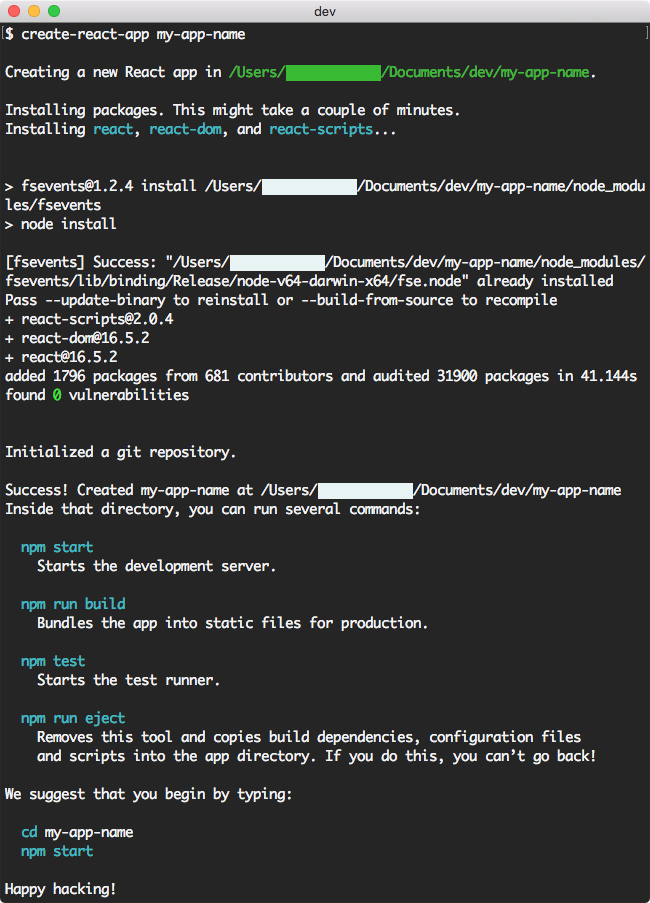
If you want to try CRA 2.0, here are the basic commands - and just like the 1.x version, there are just a few very simple scripts to become familiar with.

Create React App is a CLI, however it is not as feature rich as other CLIs like Angular CLI. For instance, it does not generate components or add features to your app, but this is OK and it does make working with React a lot easier.

When you run the following command, CRA will use the 2.0 template by default:

Create React App 2.0: create-react-app

If you had installed CRA before October 1, 2018 and you have not used it in a while, you do not need to reinstall globally as the CRA will by default use the latest template. This does not mean you cannot use the old 1.x template. If you want to do that, you can add the argument, --scripts-version as follows:

$ create-react-app my-app-name --scripts-version=react-scripts@1.x

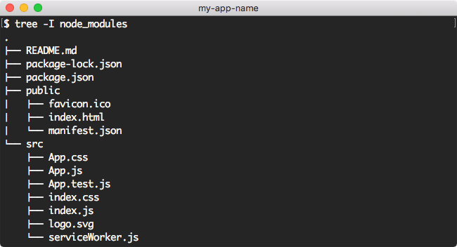
After CRA finishes generating your application, you will have a directory with the following structure:

Create React App 2.0: create-react-app tree

Here, I have expanded the important folders and files that you should be aware of, mainly the public and src directories are where you will be making changes and adding your first components and test files. As you can see, CRA has a few components and tests already setup for you.

Note: It is possible to use the create-react-app command in a current directory using:


$ create-react-app .

This command, followed by a dot indicates to the CLI that we want to setup CRA in the current working directory. However, you should ensure there are no conflicting files present, like package.json. As this will keep the initialization from running.

After running the create-react-app command, change directories and run npm start or yarn start to build and run the app:

$ cd my-app-name
$ npm start

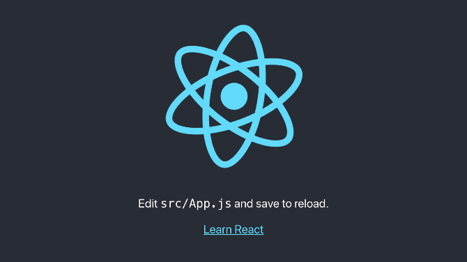
This will use the Webpack Dev Server on localhost:3000. Navigating to this page in your browser will bring you to the home page with the React logo:

CRA doesn't support Hot Module Replacement because it "hides" Webpack from you. For example, if a change is made to App.js, the entire app is reloaded in the browser.

Note: If you wish to use Hot Module Replacement when using Create React App, please refer to Brian Han's (excellent) article entitled, Hot reloading with create-react-app without ejecting... and without react-app-rewired.

Let's terminate our current dev server and try running our tests using the npm test or yarn test command:

$ npm test

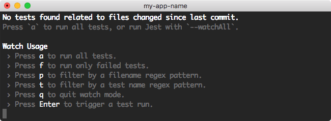
The following options will be displayed:

Create React App 2.0: npm test

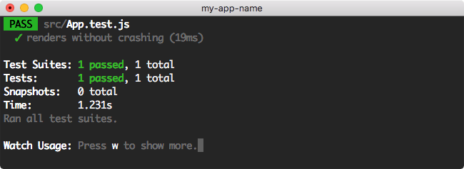
Let's run all tests by pressing a:

Create React App 2.0: Results of npm test

As you can see, the tests listed in src/App.test.js passed.

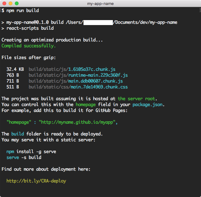
If we wish to ship this beautiful spinning React logo app as it sits, we can execute the npm run build or yarn build, which will create a directory inside the project called build:

Create React App 2.0: npm run build

Here, an optimized production build has been created. Once the operation has completed, the build script details exactly what happened and how you can deploy the generated output. To find out more about deployment, you can go here.

Finally, as part of this test drive, we will eject our application from our CRA. I would encourage doing this with a test application so that you understand what the command does and how it is irreversible.

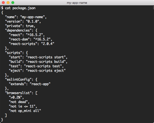
Before we begin, let's examine package.json:

Create React App 2.0: package.json

The only dependencies listed are react, react-dom, and react-scripts. react-scripts are where all the hidden dependencies live when using CRA.

Also, let's note the structure of the application directory:

Create React App 2.0: ls

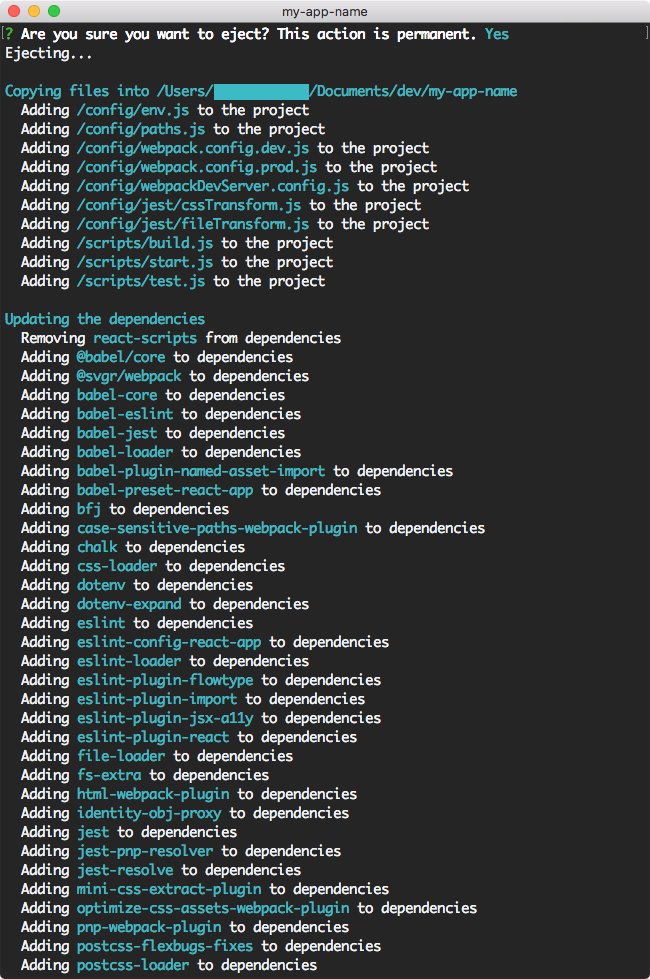
Let's now eject our application:

Create React App 2.0: eject

Please take note of the warning before performing the eject operation on your app.

Create React App 2.0: Ejecting

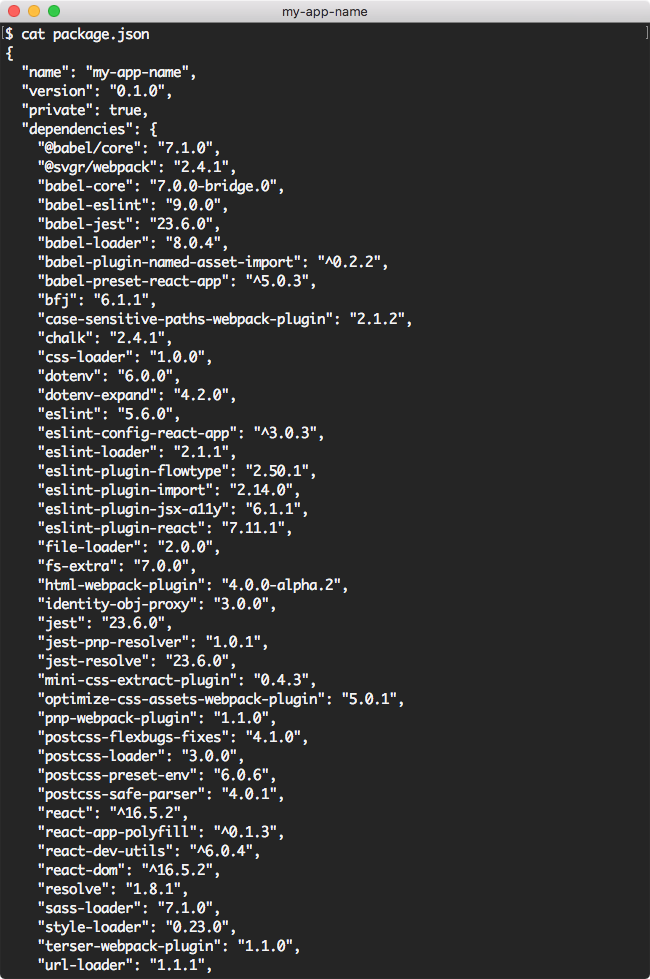
Committing this operation will modify project.json and the directory structure of the app:

Create React App 2.0: Ejecting

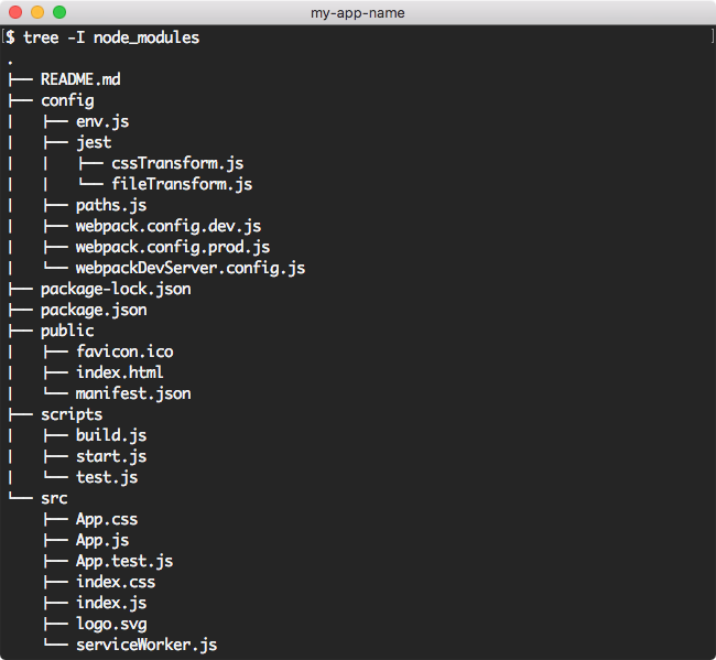
You now have control over all of the previously hidden dependencies, we now also have a scripts and config directory. At this point we are no longer using the CRA, however; you can still run all of the same commands as before: start, test and build. Obviously, the eject script no longer exists. The new directory structure looks something like this:

Create React App 2.0: Tree Structure After eject Operation

One last thing I wish to mention is that it does not matter if you use npm or yarn in any of these steps. Both will provide the exact same output in each case. I do find that using yarn does on average take less time that npm to perform each command, but also requires that you have yarn installed.

What's Changed and Why Should I Care?

Some reasons for updating include taking advantage of the updates to the major dependencies like Babel 7, Webpack 4, and Jest 23, which have gone through major changes this year.

Aside from some of the freebies we get from having Babel, Webpack and Jest updated to their latest versions, and as someone who is fairly new to React and the more advanced concepts, I wanted to cover some of the basics that are going to make my life better as a React developer. Here are what I believe are some of the most important changes that are also easy to understand from a beginner or intermediate standpoint.

Sass/CSS Modules Out of the Box

This is one of my favorite features. Previously I had several starter projects on my GitHub which I would clone in order to get to a good starting point with different CSS configurations as CRA 1.x didn't provide the greatest CSS options right out of the box. It also was not trivial for me to set this stuff up, hence the modified starter projects I had to create in order to make working with CSS easy from the start of my project.

SVG as a Component in JSX

We have support for working with SVGs, enabling us to import them as a React component in our JSX.

Smaller CSS Bundles

We can now take advantage of better CSS bundling by simply targeting modern browsers.

Better Syntax for React Fragments

As someone who has run into the issue of Babel not supporting the shorthand for React Fragments, it's nice to know that with the Babel update, Create React App now supports this abbreviated tag syntax right out of the box.

Opt-In for Using Service Workers and Supporting Old Browsers

Offline-first Progressive Apps are faster and more reliable than traditional ones, and they provide an engaging mobile experience as well. But, they can make debugging deployments more challenging, and for this reason, in Create React App 2 service workers are opt-in.

What Has Changed in the App Files and Their Structure?

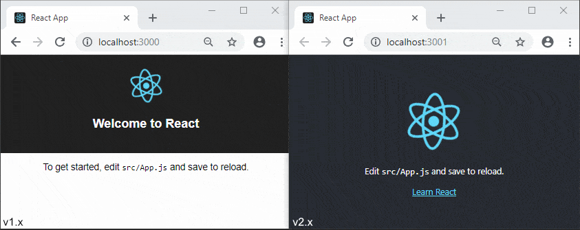
After getting up and running with the new template, you will notice that the home page for the CRA is slightly different from before. I actually like the new design as a starting point much better. If you are unsure which version you are running this change makes it simple to know which version you are on. Below we see the old 1.x version to the left and the newer 2.x version to the right.

Version 1x vs 2x template

The file structure in CRA 2.x is nearly identical to that of the structure in 1.x, but one of the first things you will notice when opening up your project is that the old registerServiceWorker.js has been renamed to serviceWorker.js. If you go into that file, the only change is the addition of a config object that can be passed to the registerValidSW() function enabling onOffline and onError callbacks to the Service Worker. This is useful to display user messages when in offline mode and to log errors on serviceWorker if registration fails. More info can be found here if you want to explore this change.

If you go into your index.js file, you will notice why registerServiceWorker.js has been renamed to serviceWorker.js. It's because by default we are not registering the service worker anymore. By simply changing the line in index.js that reads: serviceWorker.unregister(); to serviceWorker.register(); you will then be able to take advantage of offline caching (opting in). I think the name change for this file makes sense because of the opt-in change. To learn more about Progressive Web Apps in CRA, go here.

NPM Scripts Remain the Same

We still have the four (4) basic commands used to start, build, test and eject the application:

  1. npm start or yarn start will host the app locally with Webpack Dev Server
  2. npm test or yarn test will execute the test runner using Jest tests (more info)
  3. npm run build or yarn build will package a production build for deployment (more info)
  4. npm run eject or yarn eject will remove the react-scripts from your dependencies and copy all config files and transitive dependencies into your project as well as update your package.json

If you would like to compare the two package.json files for each version of the ejected apps (1.x vs 2.x), I have put them up on a diff checker here.

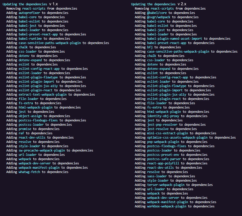
Below is a snapshot taken from both a 1.x app and a 2.x app that have been ejected. As you can see we have a lot more transitive dependencies in the new version of CRA 2 and only a few packages that were removed from the old version.

1x vs 2x comparison after ejection

Breaking Changes to be Aware Of

  • As I mentioned, Node 6 is no longer supported, you must be running Node 7 or greater
  • Older browsers (such as IE9 to IE11) support is opt-in and this could break your app
  • Code-splitting with import() now behaves closer to specification
  • Jest environment includes jsdom out of the box
  • Support for specifying an object as proxy setting replaced with support for a custom proxy module
  • Support for .mjs extension removed
  • PropTypes definitions now get stripped out of the production builds

The 2.0.3 release notes do go into further detail about breaking changes, so I would check that document out if you need more clarity.

Resources for Create React App v2.0

I have compiled a list of all of the content that I have found around the topic of Create React App 2. This should get you up to speed and started using some of the new features, which I assume even those of you that have React figured out will enjoy learning. For instance, Kent C Dodds created a YouTube video showing how to use the custom Babel macros, which is now supported in version 2. He will get you up to speed on using and creating your own macros in a short period of time.

You can check out the Github Repo, and for additional information not covered here, the React team has also done a blog post on the release and breaking changes.


Dealing with CORS in Create React App

$
0
0

If you've ever built a web app that had to request data from a different domain, you've probably had to wrap your head around the browser's same-origin policy and CORS.

In this article we'll learn how to get around CORS issues using Create React App's proxying capabilities.

The Problem

If our app is hosted under a certain domain (e.g. domain1.com), and it tries to make a request to an API that lives under a different domain (e.g. domain2.com), then the browser's same-origin policy kicks in and blocks the request.

CORS is a feature that allows domain2.com to tell the browser that it's cool for domain1.com to make requests to it, by sending certain HTTP headers.

However, CORS can be tricky to get right, so sometimes people avoid it altogether by serving their frontend and backend under the same domain in production.

Create React App allows us to replicate this setup in development, so that we don't have to deal with CORS there either. It provides two options to do so: one that's very straightforward but is not very flexible, and one that requires a bit more work but is very flexible.

Automatic Proxying

We can tell Create React App to intercept requests to unknown routes and send them to a different domain, using the proxy option in package.json. It looks something like this:

{
  "name": "flickr-client",
  "version": "0.1.0",
  "private": true,
  "dependencies": {
    "react": "^16.8.6",
    "react-dom": "^16.8.6",
    "react-scripts": "^2.1.8"
  },
  "scripts": {
    "start": "react-scripts start",
    "build": "react-scripts build",
    "test": "react-scripts test",
    "eject": "react-scripts eject"
  },
  "proxy": "http://localhost:4000"
}

When we start our app, it will be served under http://localhost:3000. If we request the root path /, then Create React App will respond with the corresponding HTML for our app. But if we were to request a different path like /api, Create React App would transparently forward it to http://localhost:4000/api.

If we look at the network requests in your browser dev tools, we'll see that the request was made to http://localhost:3000/api, but it was in fact served by http://localhost:4000/api without the browser knowing.

It can't get easier than this!

Manual Proxying

If we need more control over how these cross-domain requests get made, we have another option, which is to create a file src/setupProxy.js that looks like this:

module.exports = function(app) {
  // ...
};

That function receives app, an instance of an Express app, so we can do whatever we want with it.

For example, we can use a middleware like http-proxy-middleware to proxy requests just like we did with the proxy option:

const proxy = require("http-proxy-middleware");

module.exports = app => {
  app.use(
    "/api",
    proxy({
      target: "http://localhost:4000",
      changeOrigin: true
    })
  );
};

But we can go further, and use http-proxy-middleware's options like pathRewrite to change the path of the request:

const proxy = require("http-proxy-middleware");

module.exports = app => {
  app.use(
    "/api",
    proxy({
      target: "http://localhost:4000",
      changeOrigin: true,
      pathRewrite: {
        "^/api": "/api/v1"
      }
    })
  );
};

With this configuration, a request made to http://localhost:3000/api/foo will be forwarded to http://localhost:4000/api/v1/foo.

We could also add a logger like morgan while we're at it:

const proxy = require("http-proxy-middleware");
const morgan = require("morgan");

module.exports = app => {
  app.use(
    "/api",
    proxy({
      target: "http://localhost:4000",
      changeOrigin: true,
      pathRewrite: {
        "^/api": "/api/v1"
      }
    })
  );

  app.use(morgan('combined'));
};

So now every time a request gets made to our proxy, it will get logged to the console.

The possibilities are truly endless.

Conclusion

If your web app needs to request data from a different domain, and you want your development environment to mimic a production configuration where frontend and backend are served from the same domain, make sure to take a look at the proxy and src/setupProxy.js options of Create React App. They'll make development of your app much easier!

Further Reading

Looking to learn more about developing apps for React with Create React App? Check out the posts below, and don't forget to visit our All Things React post for a wide range of info and pointers on everything React.

Constraining Generics in C#

$
0
0

When working with generic classes or methods, it can be useful to constrain the types that can be used with them. There are many constraints we can apply. Learn what they are and how to use them.

Generics make it possible to design classes and methods that defer the specification of one or more types until the class or method is declared and instantiated by client code. When the compiler encounters a constructor for the class or a function call for the method, it generates code to handle the specific data type. Generic classes can be constrained to be used only on certain data types. This increases the number of allowable operations and method calls to those supported by the constraining type and all types in its inheritance hierarchy. I’ll introduce you to the various ways you can constrain generic types in C#.

Constrain by Value Type

You can constrain a generic type to a value type by setting the constraint of the type as follows.

class ConstrainByValueType<T> where T : struct { }

Here the struct keyword is used to constrain T to a value type. The object can then be instantiated like new ConstrainByValueType<double>, and you can specify any value type as you want. Be aware that you can’t use a nullable value type, so this will fail, new ConstrainByValueType<double?>.

Constraint to Allow Only Reference Types

You can also constrain the type to allow only reference types. Similar to how you would do it for value types, you would use the class keyword to constrain the type to a reference type.

class ConstrainByReferenceType<T> where T : class { }

Interface Type Constraint

You can constrain the generic type by interface, thereby allowing only classes that implement that interface or classes that inherit from classes that implement the interface as the type parameter. The code below constrains a class to an interface.

interface IAnimal { }
class Snake : IAnimal { }
interface IMammal : IAnimal { }
class Lion : IMammal { }
class CuteLion : Lion { }

class ConstrainByInterface<T> where T : IMammal { }

The type T above is constrained to the IMammal interface, which allows only classes that implements this interface (or classes that inherit from a class that implements the interface) to access the generic type. Even if the IMammal inherits from the IAnimal interface, you can’t use Snake as the type for T. You can only use Lion or CuteLion type.

Constrain by Class

We can restrict a generic type to only allow type parameters of a specific class, or classes that inherit from that specific base class. Following the example of the previous section, let’s create a generic class which is restricted to the Lion class.

class ConstrainByClass<T> where T : Lion { }

In this scenario, only the Lion class or a class that inherits from Lion can be used to instantiate this generic type.

Another constraint we can apply is to ensure that the class that’ll be used as the type parameter has a public, parameterless constructor. We do this by using the keyword new() as the constraint for the generic type.

class ConstrainByParameterlessCtor<T> where T : new() { }

With the constraint above, the ConstrainByParameterlessCtor class is restricted to use classes which have a public parameterless constructor.

Using Enum as Constraint

Beginning in C# 7.3, you can specify the System.Enum type as a constraint. The code below is an example of how to use enums as constraint for generics.

class Program
{
  class ConstrainByEnum<T> where T : System.Enum
  {
    public void PrintValues()
    {
      var values = Enum.GetValues(typeof(T));
      foreach (int item in values)
        Console.WriteLine(Enum.GetName(typeof(T), item));
    }
  }

  enum Rainbow
  {
    Red,
    Orange,
    Yellow,
    Green,
    Blue,
    Indigo,
    Violet
  }

  static void Main(string[] args)
  {
    var enumGeneric = new ConstrainByEnum<Rainbow>();
    enumGeneric.PrintValues();
    Console.Read();
  }
}

The type T as you see is restricted to enums, and the class has a PrintValues method prints the enum type values to the console. Running the code should print out the following:

Red
Orange
Yellow
Green
Blue
Indigo
Violet

Microsoft Documentation also shows an example that used to make use of reflection, but with this feature allowed, it no longer uses reflection and has improved performance.

Beginning with C# 7.3, we can use the unmanaged constraint to specify that the type parameter must be an unmanaged type, and System.Delegate or System.MulticastDelegate as a base class constraint. The documentation provide an example and details on using the unmanaged constraint and delegate constraint.

Combining Constraints

You’ve seen how we can apply a single constraint to generic types. While that is valuable, we can also use these constraints in combination.

class Program
{
  interface IMammal { }

  class CuteLion : IMammal
  {
    private CuteLion() { }
  }

  class RainbowLion : IMammal { }

  class ConstrainByCombination<T> where T : IMammal, new() { }

  static void Main(string[] args)
  {
    new ConstrainByCombination<RainbowLion>(); // Valid
    new ConstrainByCombination<CuteLion>(); // Invalid
    Console.Read();
  }
}

In the example you see above, we’re constraining T to use IMammal interface and must have a public parameterless constructor. We have two classes which implement the IMammal interface. The CuteLion class implements this interface but has a private parameterless constructor, and this doesn’t satisfy the condition to use it the type for the generic class. The RainbowLion class satisfies this condition, therefore, can be used as the type parameter for the generic class.

Conclusion

When working with generic classes or methods, it’s sometimes useful to constrain the types that can be used with them. There’s a number of constraints that we can apply and this article sums up those constraints and how we can use them. We also looked at new constraints that are allowed starting from C# 7.3 and how to combine multiple constraints to enforce stronger rules on generics.

Decongest Your Codebase with Logpoints in Chrome DevTools

$
0
0

Learn how you can leverage a new Chrome DevTools feature to clean up your codebase and get rid of many console.log() calls.

As developers, we always have the need to log certain parts of our code to the console. The reasons for which we log are endless; hence, it is a process we can’t get rid of easily. Therefore, if we must log, we’ll have to find a better way to do it. In this post, we’ll explain and demonstrate how you can leverage a new Chrome DevTools feature to clean up your codebase by getting rid of many console.log() calls.

What Are Logpoints?

Simply put, Logpoints is a new feature in Chrome DevTools that helps you log messages to the console without congesting your code with numerous console.log() calls. Logpoint doesn’t replace console.log(), it is just a new smarter way to log messages to the console.

How It Works

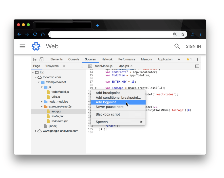
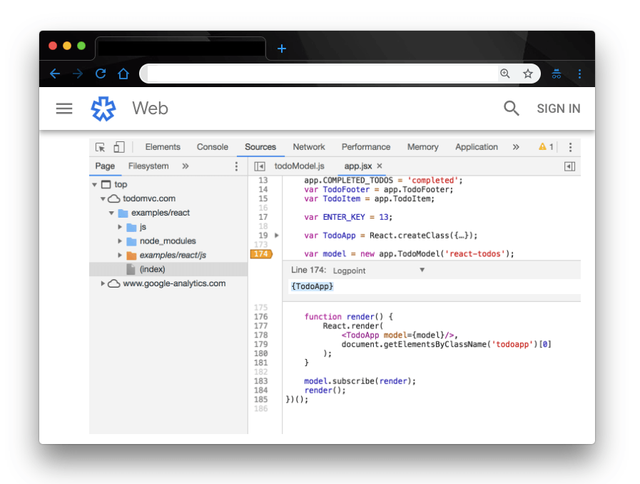
To log something to the console using the Logpoint feature, you right-click on the line number where you want to log the message.

add a logpoint

Here we right-clicked or control-clicked on line number 174 and the following options are displayed for selection. Click the highlighted Add Logpoint option to load up the breakpoint editor.

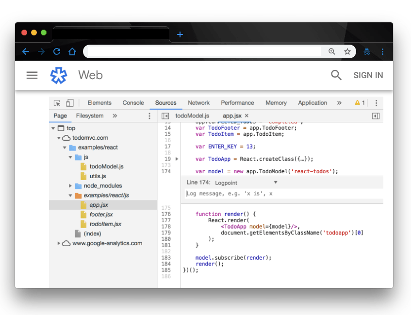
define log message

In the breakpoint editor, you define your log message. The log editor takes in data of any type so you’re not limited to logging string and integers. You can log objects and arrays and basically everything you log with the console.log() pattern.

log todo app

Here, we are logging all the entire TodoApp variable. You may have noticed we wrapped the variable in curly braces as an object, that way, we can log out its name and value in the Console. You can check out Log Objects and Object Property Value Shorthand to learn more about this syntax.

Click Enter on your keyboard to save the Logpoint.

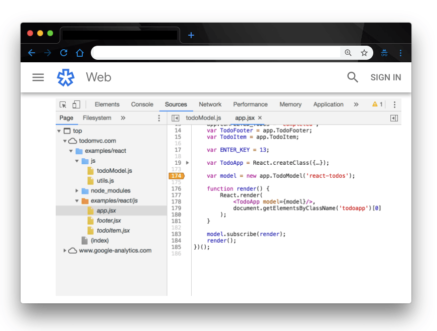
logpoint badge

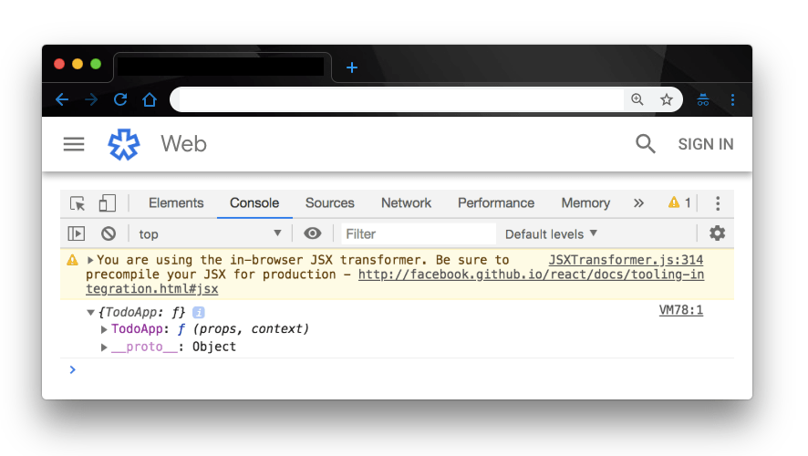
Here the orange color badge on line 74 represents a Logpoint. That way, when next the line executes, DevTools will log the result of the expression to the console. Here’s the output:

output

Conclusion

In this post, we have demonstrated how you can decongest your code by replacing all the console.log() calls with Logpoints on the browser. This makes your code a lot cleaner and reduces the tasks involved in logging data for your application. This article was inspired by the recent Google developers announcement on Logpoint. Feel free to read up the documentation for more information.

Customizing Your Console Logs Further

Interested in other ways you can improve the way you use logs in DevTools? Read these posts next:


For More Info on Building Great Web apps

Want to learn more about creating great user interfaces? Check out Kendo UI - our complete UI component library that allows you to quickly build high-quality, responsive apps. It includes all the components you’ll need, from grids and charts to schedulers and dials.

Why Blazor Grid Templates Will Make You Question Everything

$
0
0

With native components, the Telerik UI for Blazor Grid templates can fully utilize the best features of Blazor to highly customize the user experience.

Using a template in an application implies that you're creating a custom experience for your user by leveraging a component or framework you're working with. Because the Telerik UI for Blazor components are native, built from the ground up using the Blazor framework, it can tap directly in to Blazor's best features. Grid component templates can fully utilize the HTML, Razor, and components to completely customize the user experience.

In this article we'll see an overview of what templates are available and simple use cases. We'll use these as building blocks to see just how dynamic a Blazor grid can be when using templates for advanced ideas like custom editors and master-detail views.

Template Types

There are currently three types of templates available for the Blazor grid: column Template, Editor Template, and Row Template. Each has very specific uses and are powerful tools for adapting the grid to your specific needs. Let's start with a quick introduction to each template type.

Column Template

By default, the grid renders the value of the field in the column exactly as it's provided from the data source. We can override this behavior by using a column Template which allows us to take control over the rendering of the object within the column. The Template provides the entire object currently bound to the row in which the column exists, and this object is the template's context. Through the Template we can apply custom formatting, insert additional HTML and images, and display Razor Components using any value from the context.

<TelerikGridColumn Field="@(nameof(SampleData.Name))" Title="Employee Name">
    <Template>
       Employee name is: @((context as SampleData).Name)
    </Template>
</TelerikGridColumn>

The column Template is visible when the current row is not in edit mode. To customize the grid's editing experience we'll use the EditorTemplate.

Editor Template

The EditorTemplate is a template that bound to the editing context. The EditorTemplate defines the inline template or component that will be rendered when the user is editing the field. Although the EditorTemplate acts much like the column Template, it is only shown when the given row is in edit mode.

<TelerikGridColumn Field=@nameof(Employee.VacationDays) Title="Position">
    <EditorTemplate>
        @{
            var employeeToUpdate = context as Employee;
<KendoNumericTextBox Decimals="1" Format="#.0 days" Max="15" Min="0" Step="0.5m" Value="@employeeToUpdate.VacationDays" />
        }
    </EditorTemplate>
</TelerikGridColumn>

The column and editor templates give excellent control over column rendering in the grid. For even more control we can choose to use a row template and completely customize the grid.

Row Template

Unlike the previously mentioned templates, the RowTemplate spans the entire grid for all columns. The row template allows you to define custom rendering for the entire <tr> element for each record. It can be convenient if you want to use templates for most or all of the columns, as it requires less markup than setting individual templates for many columns.

Since the template isn't bound to a specific column, it can use the Context attribute of the RowTemplate to set the name of the context variable. Its type is the model type to which the grid is bound.

<RowTemplate Context="employee">
    <td>
        <span>@employee.Id</span>
    </td>
    <td>
        Hired on: @(String.Format("{0:dd MMM yyyy}", employee.HireDate))
    </td>
</RowTemplate>
<TelerikGridColumns>
    <TelerikGridColumn Field=@nameof(SampleData.Name) Title="Employee Name" />
    <TelerikGridColumn Field=@nameof(SampleData.HireDate) Title="Hire Date" />
</TelerikGridColumns>

Using the three template types we can tackle a wide variety of requirements. Let's look at how flexible the Telerik UI for Blazor Grid can be - what we can accomplish might just surprise you.

Image Template

We'll begin with a simple yet common scenario, embedding an image in a grid column. Let's assume we have a list of users that we need to manage a broad range of details for. It be nice to associate a face with a name, and with a column template we can do just that. Using a column template we can use one or many values from the currently bound item's properties to generate an image element and display an image directly in the column. In this example we'll assume that our product's images are stored on the server with a relative path of /images/, and each image file name corresponds to the productId.

Let's begin without a template to see how the grid is structured without customization.

<TelerikGrid Data=@GridData Height="500">
    <TelerikGridColumns>
        <TelerikGridColumn Field=@nameof(Product.ProductName) Title="Product Name"/>
        <TelerikGridColumn Field=@nameof(Product.UnitPrice) Title="Unit Price"/>
    </TelerikGridColumns>
</TelerikGrid> 


@functions {
    public IEnumerable<Product> GridData { get; set; }
    
    protected override void OnInit() => GridData = ... //fetch data;
}

grid-plain

Here we have a basic two column grid with just a text display of each Product Name and Unit Price. Using a template we can transform the Product Name column to display an image alongside the product name.

To access the template, the Product Name column needs to have a TelerikGridColumn component with matching begin/end tags. Inside the component we'll add a Template component which will define our custom rendering. Inside of the template we have access to the context object, this is the current Product in scope. A simple cast of context as Product will give us access to the proper type.

<TelerikGridColumn Field=@nameof(Product.ProductName) Title="Product Name">
    <Template>
        @{
            var product = context as Product;
        }
    </Template>
</TelerikGridColumn>

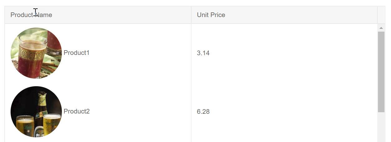
Now that we have our current Product we can render it how we see fit within the column. Let's add an HTML <img tag and create a path from the ProductId property. We can apply CSS to the image using standard HTML markup class="rounded-circle". Also, since this is Razor, C# string literals are a valid way of formating the path src="@($"/images/{product.ProductId}.jpg")". We'll also display the Product Name property along side the image using simple markup.

<TelerikGrid Data=@GridData Height="500">
    <TelerikGridColumns>
        <TelerikGridColumn Field=@nameof(Product.ProductName) Title="Product Name">
            <Template>
                @{
                    var product = context as Product;
                    <img class="rounded-circle" src="@($"/images/{product.ProductId}.jpg")" />
                    <span>@product.ProductName</span>
                }
            </Template>
        </TelerikGridColumn>
        <TelerikGridColumn Field=@nameof(Product.UnitPrice) Title="Unit Price"/>
    </TelerikGridColumns>
</TelerikGrid> 

@functions ...

image-template

Because the underlying Razor Components framework supports templates and the Telerik UI for Blazor Grid is built using the framework's native architecture, the grid is a fully capable solution to many problems.

Custom Form

With templates we can fully utilize Blazor's framework features. Inside the template we can add components, logic, and even trigger events. In addition, templates aren't just scoped to the component they're contained in - we can access events and values outside of the template as well. This opens up new possibilities for creating a custom experience.

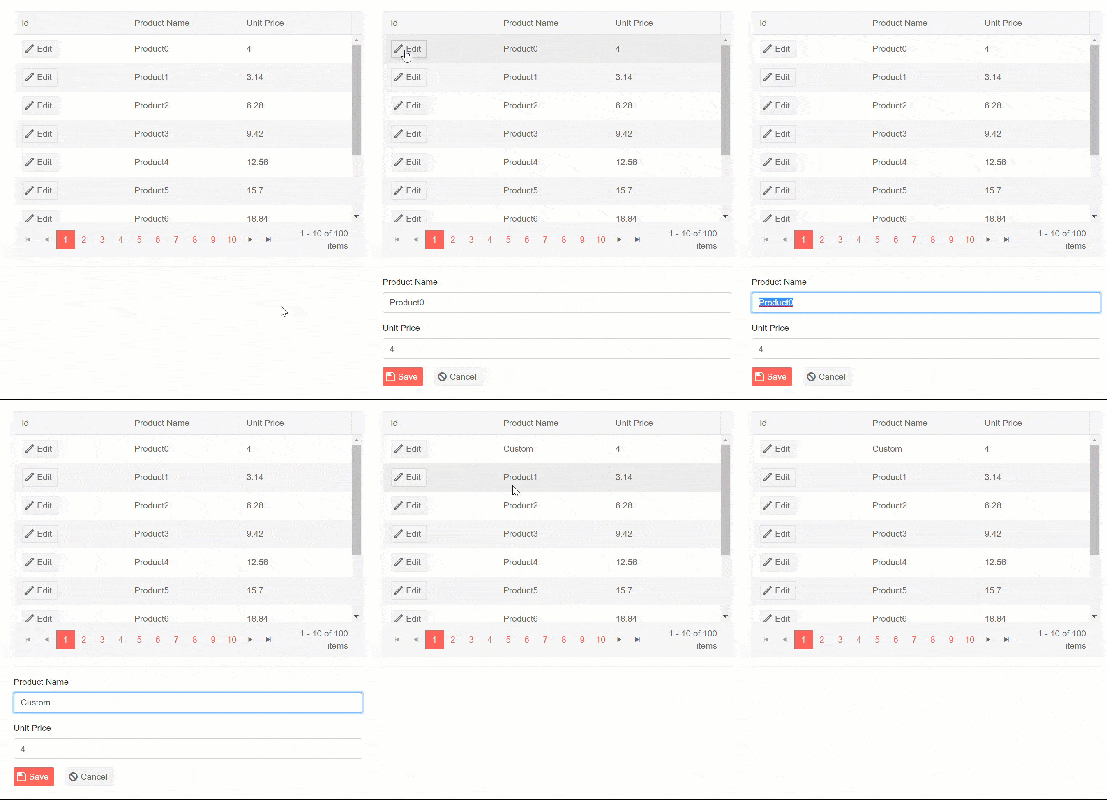
Let's assume we want to create a custom edit experience versus using one of the built in grid editors. This will give us full control over every aspect of the form. The challenge is getting the form to interact with the grid. To make a custom editor we'll need to select an item, place its properties on a form, and save/cancel changes. On the surface this might seem like a complex task, however the framework has extremely flexible data binding mechanics.

Identifying the currently selected object would provide most of what we need to accomplish the task since we can bind its properties directly to form elements. The grid's template gives us access to items that are bound to a grid row, all we'll need is a method of selecting the value and creating a reference to the object. Let's start by creating a placeholder for our object reference using a field named selectedProduct. To create an easy way of selecting a product, a column template with a button will suffice. When the button is clicked, we'll invoke an in-line function to set selectedProduct to the current context.

<TelerikGridColumn Field=@nameof(Product.ProductId) Title="Id">
    <Template>
        <TelerikButton Icon="edit" OnClick="@(_=> selectedProduct = (Product)context)">Edit</TelerikButton>
    </Template>
</TelerikGridColumn>

With the data referenced we can now add a form to display the information and provide save and cancel actions. The form will exist outside of the grid, since the object reference is now scoped to the page we can place the form anywhere outside the grid. The form can be hidden or shown based on if an item is selected using a standard Razor @if block.

@if (selectedProduct != null) {
...form
}

Saving and canceling the edit are also straightforward tasks now. We just need to create buttons with corresponding OnClick events. To cancel the edit, the selectedProduct reference is simply reset to null.

<TelerikGrid Data=@GridData Height=@Height Pageable="true" PageSize=@PageSize>
    <TelerikGridColumns>
        <TelerikGridColumn Field=@nameof(Product.ProductId) Title="Id">
            <Template>
                <TelerikButton Icon="edit" OnClick="@(_=> selectedProduct = (Product)context)">Edit</TelerikButton>
            </Template>
        </TelerikGridColumn>
        <TelerikGridColumn Field=@nameof(Product.ProductName) Title="Product Name" />
        <TelerikGridColumn Field=@nameof(Product.UnitPrice) Title="Unit Price" />
    </TelerikGridColumns>
</TelerikGrid>
<hr />
@if (selectedProduct != null)
{
    <div class="form-group ">
        <label class="control-label" for="productName">
            Product Name
        </label>
        <input class="form-control" bind="@selectedProduct.ProductName" id="name" name="name" type="text" />
    </div>
    <div class="form-group ">
        <label class="control-label" for="unitPrice">
            Unit Price
        </label>
        <input class="form-control" bind="@selectedProduct.UnitPrice" id="unitPrice" name="unitPrice" type="number" />
    </div>
    <div class="form-group">
        <div>
            <TelerikButton Icon="save" Class="k-primary" OnClick="@Save">Save</TelerikButton>
            <TelerikButton Icon="cancel" OnClick="@(_=> selectedProduct = null)">Cancel</TelerikButton>
        </div>
    </div>
}
@functions {
    ...
    Product selectedProduct;

    void Save()
    {
// save logic
        selectedProduct = null;
    }
}

CustomEditor

With the ability to share state with other components on the page, the opportunities for template driven experiences are unlimited.

Master-Detail View

Using templates we can completely transform an entire grid row with custom HTML, Razor, and even components. In this next example we'll look at just how advanced we can get with templates by adding a Master-Detail view to a grid.

A likely scenario for any application is one where a data point has many properties with varying importance. Some of those properties should always be front and center, while others might be helpful to have just within reach. This is where a master-detail view can be quite handy. This type of view helps keep extended data out of view until it is requested by the user, while keeping critical data up front all of the time.

Using the RowTemplate we can define two different states for our row which can easily be toggled by a simple button click. We'll start with the default state which only displays two columns of data. This view is nicely tucked away in a custom component called ProductMasterTemplate and takes a parameter of Product to be displayed in a two column format.

<ProductMasterTemplate Product="@product" />

In addition, we'll use a more complex view to reveal all of the data for a given product in a list view. Once again, we'll encapsulate the view in custom component called ProductDetailTemplate.

<ProductDetailTemplate Product="@product"/>

Within each of these custom components are table data cells <td> that contain Razor code for displaying the properties of a given Product. The contents of the row template must be <td> elements and their number (or total colspan) must match the number of columns defined in the grid. Internally both templates contain markup similar to the following example.

<td>@Product.property</td>
<td colspan="2">
... some view logic
</td>

With the two states clearly defined as components we can focus on switching between the two. Let's begin by defining which item is selected by creating a variable where we can hold a reference to the selected product. As such, we'll name it SelectedProduct. To enable the user to toggle between views, we'll need a set of buttons to display for the user. To show the details we'll simply check the SelectedProduct to see if it matches the current item in the row. Since we're using Blazor, we can easily set the state of SelectedProduct directly in the event handler with an in-line function, OnClick="@(_=> SelectedProduct = ...)".

<RowTemplate Context="product">
        @if (SelectedProduct != product)
        {
            <td>
                <TelerikButton Icon="@IconName.Window" OnClick="@(_=> SelectedProduct = product)">Details</TelerikButton>
            </td>
            <ProductMasterTemplate Product="@product" />
        }
        else
        {
            <td>
                <TelerikButton  Icon="@IconName.Close" OnClick="@(_=> SelectedProduct = null)">Close</TelerikButton>
            </td>
            <ProductDetailTemplate Product="@product"/>
        }
    </RowTemplate>

The completed code below is actually quite simple due to the combination of template and component architecture.

<TelerikGrid Data=@GridData Height="@Height">
    <RowTemplate Context="product">
        @if (SelectedProduct != product)
        {
            <td>
                <TelerikButton Icon="@IconName.Window" OnClick="@(_=> SelectedProduct = product)">Details</TelerikButton>
            </td>
            <ProductMasterTemplate Product="@product" />
        }
        else
        {
            <td>
                <TelerikButton  Icon="@IconName.Close" OnClick="@(_=> SelectedProduct = null)">Close</TelerikButton>
            </td>
            <ProductDetailTemplate Product="@product"/>
        }
    </RowTemplate>
    <TelerikGridColumns>
        <TelerikGridColumn Width="100" Field=@nameof(Product.ProductName) Title="Product" />
        <TelerikGridColumn Field=@nameof(Product.ProductName) Title="Product Name" />
        <TelerikGridColumn Field=@nameof(Product.UnitsInStock) Title="Unit Price" />
    </TelerikGridColumns>
</TelerikGrid>

@functions {
    Product SelectedProduct;
}

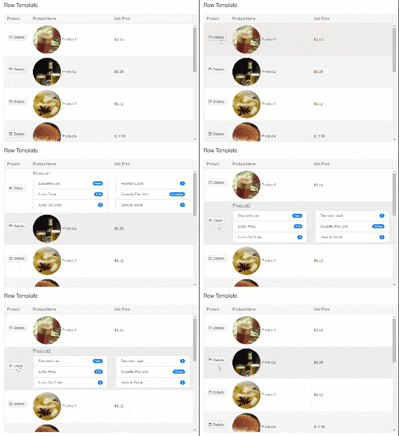
Clicking the Details button gives us a slick UI that allows us to drill into grid data.

MasterDetail

Conclusion

Because the Telerik UI for Blazor components are native, built from the ground up using the Blazor framework, it can tap directly in to Blazor's best features. Grid component templates can fully utilize the HTML, Razor, and components to completely customize the user experience. Simple templates are useful for formatting or displaying images, while more extensive templates can transform the user interface completely adding entirely new functionality to the grid.

In this post we focused on the grid, however other components like the DropDownList already feature template fields as well. Make sure you download the latest release and try the templates for yourself using our demo repository on GitHub.

Try Telerik UI for Blazor

A Look Back at React Amsterdam 2019

$
0
0

React Amsterdam took place last week in Amsterdam Noord at De Kromhouthal and was organized by GitNation, an amazing group of folks who run developer conferences like JS Nation (Netherlands-based JS community) and React Day Berlin, a first-of-its-kind full-day conference in Berlin, Germany. This year's React Amsterdam conference was attended by more than 1,500 React devs. I attended, volunteered for workshops and ran a booth for Progress that showcased our suite of KendoReact UI components.

An Amazing Conference Location

The Kromhouthal used to be a major marine engine manufacturing plant. I showed up the day before the conference and got to see the hall before most of the conference setup was complete. Alone, it's a cold, dark hall—a scene that in the past would have been a labor-intense atmosphere with massive machines. Today, it's used for major events and can hold thousands of people with its long hall and massively tall ceilings. Once the venue is setup, the hall is transformed into a very warm and inviting conference hall. Check out these well-produced videos from the organizers to get an idea of the venue, atmosphere and mood from React Amsterdam past events.

The venue is easily accessible using the ferry from Central Station through the IJplein terminal but I also could have come from the Noordpark Metro station. Either route is a short 5-minute walk through a bustling creative area with a mix of local resident housing and a soon-to-be hotel and packing district. This area will continue to be a great location, especially with plans to extend a bridge from the city center over the IJ (river).

Amazing Workshops

The workshops are a really good way to level up your developer skills at this conference. Hands down, the best React workshops I've heard of at a React conference—you get to interact with some of the best instructors in our React and JavaScript space and you'll learn valuable fundamentals, principles and patterns.

One location for the workshops was nearby in the shadow of A'DAM Lookout at the Tolhuistuin, a restaurant fronting the IJ River with amazing views for the workshop attendees. I volunteered for two days and had a great opportunity to work with the workshop instructors and attendees. I figured that if I'm in Amsterdam for the conference, I can only do so much sightseeing, so I like to work with the conference and meet as many people as possible and provide some type of value hopefully. There are many other volunteers and organizers like Olena, Daria, Sara, Ravi, Nicholas, Maksym, and Aleksandra that had given up their time in this amazing city to serve the community and I want to thank them for being so awesome. You may not know these people but I want you to know that the success of this conference is greatly improved by their hard work.

Speakers like Kent C. Dodds did two workshops (Advanced React& Testing React), one each day, and he also spoke at the conference. His workshops add so much value and allows attendees to bring back some real fundamental skills from the conference, I wish I could have attended, and maybe it's something I will do online because I really love the volunteering aspect, I hear that you can visit his site and get similar training to the workshops. Other amazing workshop instructors were Andrey Okonetchnikov & Artem Sapegin who hosted a workshop on Design Systems for React Developers showing how to design systems offer a systematic approach to the process of product creation. Their view of the IJ River form their room was amazing, which you unfortunately can't see in my horrible pictures of that workshop.

React Amsterdam workshop

But I do have a picture of the river... Here we go!

React Amsterdam workshop river view

I'm hoping that the photographer hired by the organizers caught this amazing view from the cafe. I saw at least two different professional photographers throughout the event, so I cannot wait to see those images!

In this same venue, we had Michel Weststrate's TypeScript for React Devs and React Native Workshop by Alex Lobera & Horacio Herrera, all of these workshops in three different rooms at the Tolhuistuin.

Across the river closer to the Amsterdam City Center, there was another set of workshops at the Royal Industrieele Groote Club, which I walked past several times while admiring it without realizing we had workshops going on there. Such a beautiful building like so many others in Amsterdam. At that location, there were talks from Kitze on two different days (GraphQL Workshop and Advanced React). They also had another interesting fundamentals workshop on Max Stoiber Modern React.

I could not be in two places at once, but I am very interested in the differences between Kitze's workshop and Kent's workshop. Would love if these workshops were recorded and released after like the talks are done. I know that it would have gaps where the class is working, but the instructors could get clever during this time and maybe live code the exercise on the broadcast. I don't know many ways to make this conference experience more immersive, but this sounds like something they should explore—maybe they already are!

Conference Kickoff

React Amsterdam Registration

Helping at the registration was so much fun. I loved getting to meet everyone, even if it was just for a minute to get them a badge and some swag! As an attendee, I got to walk away with a bag and I love my new coffee mug!

There were a lot of people to process and I felt we did a good job of getting those people who showed up at the beginning into the event on time for the kickoff (although it was hectic, with 1,500+ people pouring through the doors over a period of a couple of hours). It felt like a success and the conference got underway.

I headed to my booth to check in with my team, where I switched hats one last time at React Amsterdam. Working our booth, I got to meet people who were interested in installing our components and playing with KendoReact. I love talking about the library and getting others excited about it.

KendoReact Booth

Conference Talk Highlights

There were so many great presentations and lightning talks, I want to take some time to highlight what I think were the most valuable ones that I attended. Being someone who works with a lot of UI, layout and presentation in React, I am a big proponent of the fundamentals and general knowledge. I start to get lost when it comes to the advanced and deep dive topics outside of UI and basic React, and what's great about this conference is that they have something for everybody. Let's look at some of those talks and review them here:

Requisite React (Kent C. Dodds)

The conference started off strong with Kent C. Dodds on the main stage with a talk called "Requisite React." In his own words, this talk is about: "Taking a few steps back and thinking about the usefulness of the fundamentals." We learned how to fix a droopy faucet (with pics), and more importantly, how to understand abstractions and how they can help us to be more effective when using them, not only in real life but in our code as well. This means being mindful of our abstractions and understanding that each one ultimately has some type of cost. My favorite abstraction that he dives into is that of JSX. I won't ruin the talk, but getting a look at how we can easily convert our Babel into raw JS, we are able to see under the hood and understand this abstraction better. His talks are excellent for helping to level us up as React developers and if you were a boss or manager who sent several of your devs to React Amsterdam, this is exactly the type of talk you want right out of the gate!

Refactoring React (Siddarth Kshetrapal)

No time is wasted getting into another very valuable fundamentals-based talk around refactoring in React. Again, we are definitely getting our value right out of the gate with many helpful tips, this time from Siddarth Kshetrapel—an independent developer from India. He does an amazing job refactoring a login and authentication form.

Starting with class components and constructors with a fair amount of prop drilling involved, we refactor this code quickly into something more manageable and future proof. Some of the techniques that he talks about are spreading props, using methods passed down in props the proper way and how to ensure that we are not overriding prop values for methods or applying them due to not managing our props correctly. He touches on principles like "Single Responsibility" and "Separation of Concerns." I really liked the parts where he talks about understanding about the mixing of controlled vs. uncontrolled state and how to avoid this. Pick one—he likes uncontrolled components, and this gives us the chance to get into higher order components or better yet, React Hooks. useSmartness() FTW!

So those talks were very code heavy and I was already in the mood for some straight up slide talk! My favorite kind of talks! I don't have to strain my eyes and I still learn some new stuff I didn't know before.

A Common Design Language (Andrey Okonetchnikov)

Andrey, who also did an amazing workshop on the same topic of Design Systems for React Developers, puts all the pertinent info into a very clean and easy to understand talk on building a common design language and reducing the choices of options between typography, spacing and color to create a design language system. Using a common design language systems allows for reusability of design choices across multiple products and logos. This can be something as simple as the design of the German government logos vs. Austrian government logos. One has a clear design system and language, the other (although still very creative) lacks distinguishable characteristics that would show a clear alignment of all of its properties through a common design language.

Andrey's presentation had many strong visuals like above that helped to show us how a design system language can help not only your developers and designers talk, but also help your organization speak to clients and customers clearly and with great meaning and commonality. The presentation leads into design languages for digital products and this is where we tie in the component-oriented capabilities of React that make it easy to define a common language with your UI, achieving similar results as discussed before but now within digital products. Truly amazing talk and I really suggest taking the time to watch. I also want to note that React Amsterdam has an amazing design language and have continued year over year to capitalize on this using a similar set of logos, typography and design.

Designing with React (Mark Dalgleish)

Following the previous design language presentation, we nicely transition into a talk from Mark Dalgleish on designing in React. Using design systems paired with React, Mark is able to design in the final medium. Because React is so component oriented, it allows us to build our own domain-specific language. At companies I've worked at before, I have seen them firsthand capitalize on the ability to do this in React and other web technologies.

Mark has some other examples of this idea spreading throughout our industry as many companies build their own design systems. Mark's major points back up the ability to capture the design intent from our design systems and applying them to the web and native apps. Seek style-guide is something that Mark's company has created and is a great resource and example of a design system for React executed remarkably.

Another amazing resource that Mark shows off is the React Sketch.app, which renders React components to Sketch and helps to design with real data in React with real component code and manage your design system implemented in React. Watch the video for information on an amazing npm package they created called html-sketchapp. I will let you discover that amazing gem on your own.

Server-Side Rendering Talks

At this point in the conference, I'm four talks in, I have watched the majority of the talks running back to our booth each break to interact with the attendees and talking shop and then getting to each talk a few seconds after it started, trying to find a good seat. For someone like me who likes to be totally immersed in technology and geeking out, this event allows for that experience. Most of the talks at the conference was around fundamentals, bleeding edge features and hot topic categories like GraphQL and Server Side Rendering bringing us to our next set of talks. The conference did an amzing job structuring the content and making sure there was a flow and that similar talks were right next to each other.

The next four talks are all on Server Side Rendering (SSR) using frameworks like Next JS for pre-rendering, Crystalize for the backend to create lightning-fast scalable SSR React apps, the upsides and downsides of creating apps that use SSR, topics like rehydration, time to interactive and other things related to how our larger e-commerce sites render. In the e-commerce world, shaving milliseconds or maybe even full seconds off of load time can be very valuable. These 4 talks take you on a journey through the benefits and gotchas of SSR.

Lightning Round... One .. Start! (Read Rapidly and Fast)

OK, really fast, let me tell you about the amazing lightning round talks, read this section really fast to get an idea of what lightning rounds are like. There were four amazing lightning talks, I caught two of them in person and watched the other two from home today and I have to say that I walked away from all of them with golden nuggets from each topic that I could use to explore that topic more on my own. below are the talks and a link to them on YouTube.

I'm a huge fan of the library showcased in that last talk called Git-history and after being reminded of its awesomeness as React Amsterdam, I will be playing with this package and using it in some of my upcoming talks and demos to show the change when refactoring class based components to functional components with Hooks, I think this will provide a great visual aid in teaching on this subject. It's easy to use, I can show you right here.

Take any file in any repo of your on GitHub. Like for instance, the article I am writing that you are reading now, it's in Git so we could use that:

https://github.com/httpJunkie/telerik-blogs/blob/master/react-amsterdam-a-look-back.md

Before pasting that link in the browser, replace: 

http://github.com

with

http://github.githistory.xyz

resulting in the following URL you can copy and paste into the browser:

https://github.githistory.xyz/httpJunkie/telerik-blogs/blob/master/react-amsterdam-a-look-back.md

Here is a look at what Git History has done with my file from my repo:

Git History Example

If you are not instantly in love with this, you don't exist. I showed my son and he was mesmerized, we noted that if I were to have saved more often, I would have a much more granular step through. This is my nomination for the next years GitNation Open Source Awards (which means nothing, because I'm in no way affiliated with GitNation lol). I just think it is people like Rodrigo who will be highlighted for their contributions to open source. Truly amazing, have I said that enough?

Tech Regrets at Spectrum (Max Stoiber)

I admit that the SSR talks were a little bit over my head, but next up was Max Stoiber to talk about his Tech Regrets at Spectrum which was acquired by GitHub. Another great talk and I don't want to spoil the regrets that Max goes over and I suggest taking a listen to this talk on your own to get the value of lessons learned from hindsight and his experience building a real-world product and shipping it to users.

Scaling Applications with Micro Frontends (Max Gallo)

Every once in a while there are talks at a conference where I think the guys on stage are on another level than me. To be honest I have never built any micro frontends and if I did, I would have no idea how to scale them. When he asked for us to raise our hands if we had even heard of them, I was under strict contract to keep my hand down as I had never even heard of this concept. Once he started explaining the idea, I understood from a very high level. I like how his talk sets up three main tracks for understanding this "micro frontends" thing. Why do we need them? What is it? and how do they work under the hood? I was going to need all the hand holding I could get for this talk.

Micro frontends are like a mix between microservices and the actual frontend single page application. Micro frontends are a way of splitting up the codebase of the frontend over many teams, obviously using some type of design system to keep them all similar in style and branding, we have already heard how to do this with extra benefit from React.

Women of React Amsterdam

There was no better way to end the General React Track and the conference than to have three amazing talks by pioneering women in the React space. My absolute favorite talk from React Amsterdam was from Elizabet Oliveira. As well, I was truly inspired by both Peggy and Ashi because I'm slowly getting into GraphQL and to see WebGL and Hooks used together painting pixels has to be one of my runners up for second most inspiring talks at React Amsterdam.

An SVG's Tale (Elizabet Oliveira)

An SVG's Tale like I said before, this was my favorite talk. Elizabet is a senior UX designer at Optum in Ireland and you get a sense for her style through her slides, delivery and attention to detail. If I could give an award for the most inspiring talk at React Amsterdam, I would choose this talk specifically. I have always been a huge fan of SVG, but after her talk, I have so many ideas of how I can use SVG's properly and dynamically in my React applications using inline methods or with JSX and components. It's possible with React JS to create animations and styling that under the React hood may be complex but can allow developers not as well versed in SVG to easily use them through your components. Beyond SVG and React, Elizabet showcases a few of her side projects over the years. One of them is an app that you can record your own vocals over dank hip-hop beats which Elizabet demo's for us with her amazing lyrical skills another side project of hers is React Kawaii a library of cute SVG illustrations (react components) which I think is great from the point of looking at how the project is setup and getting ideas for my own SVG components. This speaker definitely blew my mind and I wish I could have spotted her after the talk to give her a big thank you. Truly amazing presentation, she had everyone out of their seat cheering including myself and at other times fighting back tears because her (fictional) story was so amazing and warm and her performance was pure dope!

The GraphQL Developer Experience (Peggy Rayzis)

Peggy Rayzis has to be the most compelling speaker on the topic of GraphQL especially for beginners like myself. It was one of the talks I was most amped up to hear and as happens in most conferences I got sidetracked and missed it. Listening back today I was not surprised at all when Peggy told us that she lived in Amsterdam for a month last year and that it was her favorite city in the world. I think most of us who came out for our first time to Amsterdam has the same feeling. I cannot think of a better backdrop for this event. It was my introduction to Europe proper! I enjoyed taking in all of the knowledge that Peggy brings to us on the subject of GraphQL and she has a great perspective as an employee for Apollo where she works as an Engineering Manager. This company builds the most amazing implementation of GraphQL. Apollo helps us bridge the gap between application and API and I don't want to spoil her talk so I simply suggest checking this one out if you are interested in learning about GraphQL.

Painting Pixels With WebGL And Hooks (Ashi Krishnan)

Ashi Krishnan is a seasoned speaker on so many different topics beyond React. She has been on my radar because of amazing talks like Deep Learning in React and Learning from machines. She works with GitHub in the UK and at React Amsterdam she closes out the General React track at React Amsterdam taking us on a journey into WebGL and how to leverage this journey with Hooks. This talk reminds me of the many things we can do in React that challenge the way we think about what a React application is and what it can do. I first started realizing all the amazing things we could do with React and rendering from Ken Wheeler's talk on building a drum machine or rendering web pages with canvas. Ashi continues to challenge our thinking about React with an amazing live demo using WebGL to paint pixels in React. If I was able to select one talk that I believed mostly encompassed creativity and thinking outside of the box it would be this one. Without giving too much away, she runs through many demos truly artistic in nature that achieve different styles and approaches to painting the screen using WebGL in React.

The React Native Track

Although I have "et, slept and breth'd" the General track at React Amsterdam I was not able to get over to the React Native track that often. But I did make a conscious effort to watch some of it. I have never used React Native but I have heard so many great things about it and did catch a few bits and pieces while I was at React Amsterdam. If I could point to one talk specifically that I think helped me understand React native better it would be the presentation given by the React Native core team member Parashuram which just so happens to also be the first talk of this React native track: Building React Native.

The React Native track can be viewed in its entirety on YouTube. Below is a complete list of all of the talks you might want to hear! If you're more of a web developer and less of a native developer, I would suggest also checking out Native Web Apps by Florian Rival.

On the React native track, we saw strong talks on Practical Perfomrance by Anna Doubková and Making React Applications Accessible by Ankita Kulkarni and Demystifying The Complex Animations Creation Process with Vladimir Novick. All were talks I was able to easily follow along not being a React Native developer.

Open Source Awards

Since React Amsterdam at heart is a JavaScript conference, a love for open source is at the heart of every conference run by GitNation, they really do a great job of highlighting and recognizing great open source projects. This year they had several categories and you can watch the awards ceremony for more context.

Breakthrough of The Year

Taken home by Michel Weststrate a Nederlander and main contributor of Immer the popular open source library used to create the next mutatable state by mutating the current state. I have just barely scraped the surface of what this library can help with, but I have used it to make returning state from my reducers in React used to mutate (while keeping immutable) my local component state. I'm sure there are many other great uses for this library and I think it was well deserving of the award. Nominees for this award were Linaria, Formik and React-navigation.

Most Exciting Technology

This award was given to the VX open source library that makes it easy to combine D3 charts into React to build amazing visual components. A demo can be seen on vx-demo.now.sh and shows how easy it is to make both your own reusable chart library or your own slick custom one-off charts. A representative was not available to take t his award home, but many props go out to the VX team for making such an amazing contribution to JS open source.

Fun Side Project of The Year

The title of the award says it all, this is just an open source contribution that GitNation believed to be fun, light-hearted and amazing in its own right. The nominees for this category were React95 (a play on Windows 95) is a React component library with Windows95 style UI. This would have also been my pick although I think both projects are absolutely fantastic. The next nominee was React-insta-stories A React component for Instagram like stories. The component responds to actions like a tap on the right side for the next story, on left for previous and tap and hold for pause. The custom time duration for each story can be provided. The winner for this award was React95. Gabriel Daltoso and Alysson Dos Santos (São Paulo - Brazil) both came up on stage to accept this very well deserved award!

Most Impactful Contribution to The Community

The winner of this award was React-testing-library. Other nominees for this award were Detox and React-navigation, and Downshift and are all very impactful in our JS community. It should be and is noted by the announcers on stage that two of these libraries have the main contributor in common with Kent C Dodds. And if he wasn't given an award himself for most impactful and influential person to React Amsterdam, he should as well with a few other speakers who did both workshops and speaking at the conference, it just so happens that kent was able to pull off a trifecta in also winning an open source award, but there were many people wearing many hats speaking, volunteering, teaching workshops and overall just living and breathing this conference.

Productivity Booster

The final award category is all about being productive as a developer. The winner is near and dear to my heart as someone who loves to write in Markdown, I'm writing this article now in markdown using VS Code and I use Git to record my progress and iterations of each and every article I write for this blog. As well, I write many presentations and slide decks and love using markdown for those as well. As you can guess, the winner of this award went to MDX Deck and was accepted by Time Neutkens and delivered to Brent jackson. Other nominees for this category were Formik, React-cosmos, and React-table.

React is Amsterdam

Talk about how Amsterdam is a perfect city for JavaScript and more importantly React developers. Some of the sponsors at the vents were based in or had offices in Amsterdam or Netherlands. The city offers so much in historical, artistic, tech and shopping, so it's obviously a great place to bring the React community and is very relaxed yet highly invigorated at the same time. Given enough time and the ability to travel throughout the city and learn the Metro, Dutch national rail company NS (Nederlandse Spoorwegen) and the various other ferry and tram systems, you can easily move around to the areas that you want to visit and crank up the energy or turn it down by traveling just out of the city's center.

I stayed in the Wilbautstraat area just 4 stops off the metro from Central Station at a wonderful hotel that I talk about more in my Developers Guide to React Amsterdam.

React 2020

If you are planning on attending the React Amsterdam 2020 event, mark your calendars now, it will be April 16th and 17th. I know I'm missing other amazing things that happened, but hopefully, this can serve as a guide if you were not able to attend or maybe a tool you can use to convince your boss to go next year. If you do, stop by our booth and talk to me, I will definitely be going back in April of next year!
Meet Telerik UI for WPF's New Family Member—HyperlinkButton

$
0
0

Buttons are everywhere and represent the most fundamental part of any WPF application, serving a variety of use cases. Let's learn all about the new hyperlink button control in Telerik UI for WPF.

The Telerik UI for WPF suite provides a variety of buttons for developers to use in building their desktop applications, yet something was missing - a way to easily add a hyperlink to a button. The good news is, the RadButtons family just got a new member – the HyperlinkButton. No, it's not the stork that is responsible - it's the Telerik UI for WPF R1 2019 Release that brought this finishing touch to your WPF apps.

Buttons Everywhere!

Where is the Hyperlink Button in WPF?

In short - there is no such control in the WPF framework.

If you are one of those people, searching for this "missing link", well I recently did some digging into that myself and followed the below research process:

  • Sources: the best-known communities for computer programmers
  • Topic: where is the link button in WPF
  • Answers Found: a tremendous volume and variety!

There were tons of people looking for such a small, yet it turns out essential, part to put the finishing touches on their WPF applications. They wondered what the control's name was, how to style the existing Button to display it as a hyperlink, and so on.

One commenter even wrote something like Did you try googling it? You would have gotten thousands of hits. P.S. to make his point, “gotten” was written with a larger font size and bolded!

It may sound funny, but the problem exists. There isn’t a straightforward, quick and easy way to have a hyperlink button in your WPF application.

Well, there wasn’t.

Discover the Brand New RadHyperlinkButton

RadButtons - a well-known part of Telerik UI for WPF - define a set of fully customizable button controls, which are feature rich and modern. Most of all, they are a strong weapon that helps in building complex and flawless user interfaces.

RadButtons Family

Cheers to that! No more need to lookup custom control templates for Button’s style, or to create a custom one, then use a bunch of other controls, plus complex bindings and triggers to get to the desired point.

WPF’s Hyperlink element (defined in System.Windows.Documents namespace) is an inline-level content element that is used to add a hyperlink to FlowDocument content. Until now, you were able to add hyperlink support to any Inline element.

If you want to have the awesome RadButton functionality and extend it with Hyperlink capabilities, well you hit the jackpot.

There are several things that you need to know about the brand new link button.

Hosting & Getting Started

One of the main advantages of HyperlinkButton is that it inherits from RadButton class, which simply means that it:

  • Supports all features of RadButton
  • Can be hosted in any UI element depending on your needs and imagination
  • Can become a part of your app in a single line of XAML code

    <telerik:RadHyperlinkButtonContent="Link"NavigateUri="http://www.telerik.com"TargetName="_blank"/>

Navigation

One of the most common properties for utilizing the control is the NavigateUri property, which is intended to be used for navigating to the needed Uri when the control is clicked.

One thing that is worth noticing is that the RadHyperlinkButton saves you the trouble of handling navigation yourself, while navigation can only occur for Hyperlink if either its direct or indirect parent is a navigation host.

Content

Another essential part of the control is the Content property, which sets the content that will be visualized by the control. The sky is the limit here. Literally.

The Content can be set to an Image, for example. In such a setup the link will be opened when the user clicks on the Image. It can be set to Glyph as well, by setting the ContentTemplate property of the control to, for example:

<DataTemplatex:Key="hbContentTemplate">
<telerik:RadGlyphGlyph="&#xe300;"FontSize="32"Margin="5"/>
</DataTemplate>

... and then you can swap it with another glyph when the link is visited, like so:

<DataTemplatex:Key="hbVisitedContentTemplate">
<telerik:RadGlyphGlyph="&#xe301;"FontSize="32"Margin="5"Foreground="White"/>
</DataTemplate>

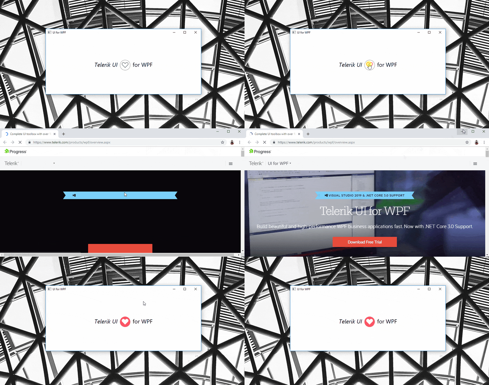
And the result is:

Telerik UI for WPF GIF

Visual States

The RadHyperlinkButton comes with the full variety of Telerik UI for WPF’s themes (and all their different color variations) which you can apply to your application.

When Hovered or Visited, the control will be underlined, and when disabled – it will have the theme’s specific opacity value to deliver a consistent look and feel for your WPF app.

HyperlinButton Visual States

A great advantage here is that the control implements a VisitedForeground property with the help of which you are in total control of the foreground that the control will have when the link is visited. Information on whether the link is visited is also available through its IsVisited Boolean property, which might be useful.

Try the Latest Telerik UI for WPF Yourself

If you are looking for great flexibility and flawless theme-aware UI, you may want to take advantage of the latest awesome additions to the more than 130+ ready-made Telerik UI for WPF components, like RadNavigationView.

Get yourself a free trial of Telerik UI for WPF today and start developing your apps easier, better, faster.

Check Out Telerik UI for WPF

Share Your Feedback

Let’s continue to build the future of Telerik UI for WPF together, a.k.a. don’t forget to share your thoughts as a comment below or let us know if you have any suggestions and/or need any features/controls by visiting our revamped Feedback portals about UI for WPF/Silverlight and Document Processing Libraries.

How to Use a Vue Button UI Component in Your Web App

$
0
0

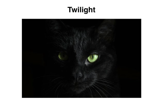
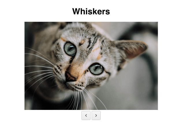
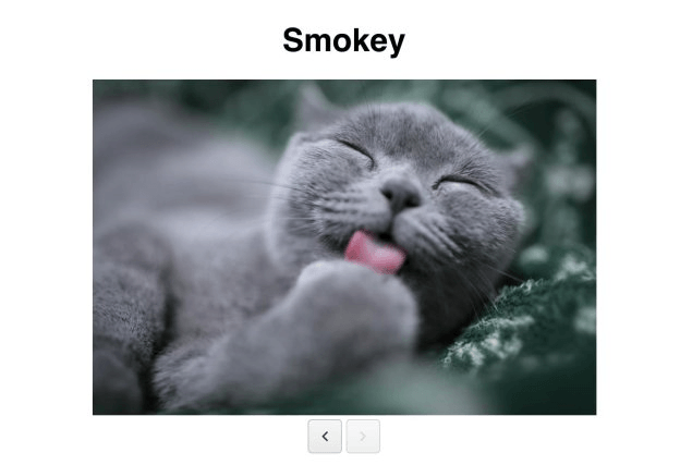
In this article, you will learn how to use the Kendo UI Button component with Vue. To illustrate how the button works, we will be building pagination for a list of cat pictures. Each page will have a title and an image as well as a next and previous button. Clicking the buttons will move you forward and backward through the pages respectively. When you reach the end of the posts, the next button will become disabled. When you reach the beginning post, the previous button will be disabled.

First, we will initialize our project with the data for our pages. Then we will add the buttons and implement their click handlers.

Getting Started

We will install Vue by adding a link to the CDN to the head of our HTML file. Because we are using the Vue CDN, we will need to link to the Kendo UI CDN for Vue. Kendo UI Vue Components are packaged together in different files. The following is the link to the file we will use to load the button component.

<scriptsrc="https://unpkg.com/@progress/kendo-buttons-vue-wrapper/dist/cdn/kendo-buttons-vue-wrapper.js"></script>

In the body of our page, we will create an element to mount the Vue instance on. Inside this element is a header for the title and an image element that will be bound with data from our Vue instance. The data will be an array of post objects that have a title and src attribute. To get started, we will create a Vue instance that points to the ID of our root element, initializes the data with post data and has an index to keep track of the current post selected. Then, we will add the computed property post to retrieve a post from the list. The following code shows the first post.

Vue

<!DOCTYPE html><html><head><metacharset="utf-8"><title>Button Vue</title><linkrel="stylesheet"href="https://kendo.cdn.telerik.com/2018.3.1017/styles/kendo.common.min.css"><linkrel="stylesheet"href="https://kendo.cdn.telerik.com/2018.3.1017/styles/kendo.default.min.css"><scriptsrc="https://code.jquery.com/jquery-1.12.3.min.js"></script><scriptsrc="https://kendo.cdn.telerik.com/2018.3.1017/js/kendo.all.min.js"></script><scriptsrc="https://cdn.jsdelivr.net/npm/vue@2.5.17/dist/vue.js"></script><scriptsrc="https://unpkg.com/@progress/kendo-buttons-vue-wrapper/dist/cdn/kendo-buttons-vue-wrapper.js"></script><style>#app{margin-top:10%;font-family: helvetica;}img {width:75%;}.text-center{text-align: center;}</style></head><body><divid="app"class="text-center"><div><h1>{{ post.title }}</h1><img:src="post.src"alt="cats"/></div></div><script>var posts =[{
        title:'Twilight', 
        src:'https://images.unsplash.com/photo-1503431128871-cd250803fa41?ixlib=rb-1.2.1&ixid=eyJhcHBfaWQiOjEyMDd9&auto=format&fit=crop&w=1500&q=80'},{
        title:'Whiskers', 
        src:'https://images.unsplash.com/photo-1448222993383-a2fff2914d27?ixlib=rb-1.2.1&ixid=eyJhcHBfaWQiOjEyMDd9&auto=format&fit=crop&w=1510&q=80'},{
        title:'Smokey', 
        src:'https://images.unsplash.com/photo-1511275539165-cc46b1ee89bf?ixlib=rb-1.2.1&auto=format&fit=crop&w=1650&q=80'}];newVue({
        el:'#app',
        data:{
          posts: posts,
          index:0},
        computed:{
          post:function(){returnthis.posts[this.index];}}});</script></body></html>

Adding the Buttons

To toggle the disabling and enabling of the buttons, they are given a disabled attribute that will be equal to a boolean property in our Vue instance. For the previous button, we will add the property hasPrevious to our data and initialize it to false. Since the index is initialized to zero, the previous button needs to be disabled. For the next button, the hasNext property will be added to the data and initialized to true. The next button will be disabled when the last element is selected. This is the updated code:

<divid="app"class="text-center">
  ...
  <kendo-button:disabled="!hasPrevious"@click="onPrevious"icon="arrow-chevron-left"></kendo-button><kendo-button:disabled="!hasNext"@click="onNext"icon="arrow-chevron-right"></kendo-button></div>
newVue({...
  data:{
    posts: posts,
    index:0,
    hasPrevious:false,
    hasNext:true},});

Next, we will walk through the implementation for both buttons’ click handlers. The onPrevious method decrements the index property. The hasNext property is set to true because if the next button were disabled, it should now be enabled. Then we will check if the current index is zero. If it is, the hasPrevious property will be set to false to disable the previous button. The following code creates the onPrevious method:

methods:{
  onPrevious:function(){this.index -=1;this.hasNext =true;if(this.index ==0){this.hasPrevious =false;}}}

The onNext method increments the index and sets the hasPrevious property to true. IfhasPreviouswerefalse, clicking the next button should make it true and enable the previous button. Then we will check if the current index is two, the last index of our post data. If it is,hasNext` will be set to false, disabling the next button. This is the additional code and what the final project looks like:

methods:{...
  onNext:function(){this.index +=1;this.hasPrevious =true;if(this.index ==2){this.hasNext =false;}}}

vue


vue


vue

You can see the code for the final project here: https://dojo.telerik.com/oBEqItIZ

Summary

We created pagination for our cat pictures with a previous and next button to page through the posts. You saw how to disable the buttons and attach event listeners. You also learned the basics of how to create a Vue app, including creating a Vue instance and specifying the el and data properties at a minimum. We used the computed property to get the selected post. And we used the methods property to define our click handlers. In the next post, we will create a mini app using the Kendo UI ButtonGroup Vue component.

Try out Kendo UI for Yourself

Want to start taking advantage of the 70+ ready-made Kendo UI components, like the Grid or Scheduler? You can begin a free trial of Kendo UI for Vue today and start developing your apps faster.

Start My Kendo UI Trial

Angular, React and jQuery Versions

Looking for UI components to support specific frameworks? Check out Kendo UI for Angular, Kendo UI for React or Kendo UI for jQuery.

Resources


Top 5 JavaScript Online IDEs to Use in 2019

$
0
0

Using online JavaScript editors can help you edit and compile your code directly into your browser. Here, we look at the top 5 IDEs to help you achieve this fit.

The lack of mobility and other features in our local integrated development environments (IDE) has given rise to a number of other online development environments. Also as a result of these limitations, programming on the go has proven to be tough, especially for JavaScript since it is built for the web.

To this effect and to bridge this mobility gap, the web in return has provided JavaScript with amazing online editors that you can use to program on the go. Using online JavaScript editors can help you edit and compile your code directly into your browser. The code editors also offer you a LIVE preview, as it is all on the web! In this post, we’ll look at five of these online IDEs.

Codenvy

Codenvy is a cloud-based development environment for web developers and for distributed development teams. The strength of the Codenvy’s IDE lies in its ability to manage development teams and develop code with portable Docker runtimes.

Codenvy

Codenvy has three major packages specifically designed for Developers, Teams and Enterprises. This way, Codenvy supports any of your needs, whether you’re a developer, a team manager or an enterprise.

Developer

As a developer, Codenvy helps you overcome the stress involved with setting up local code editors to support different languages across all the systems you work with. With Codenvy, you take your work anywhere and set up on any computer without having to install and configure your editor.

Teams

Distributed teams leverage the collaborative power of Codenvy to work together on common projects to better manage project workflows. Codenvy offers more team focused features like custom runtimes, user permissions and of course consistent collaboration. The team features of Codenvy makes it possible for team members to collaborate dev-to-dev and equally interact with stakeholders before committing code.

Enterprise

When it comes to developing on the fly, enterprises need it all in one place — one-click developer environments, team onboarding and collaboration, and a secured DevOps workspace platform. As a result, Codenvy provides all these and more for enterprises as it integrates seamlessly with issue management, version control, and CI tools to generate ready-to-code workspaces with the right branch and runtime.

Codeanywhere

Codeanywhere is a cloud-based cross-platform development environment for web developers. It can connect with FTP and SFTP. What’s more, it offers connections to other cloud storage services like Dropbox, Google Drive, etc.

codeanywhere

Custom Dev Environment and Language Support
Codeanywhere gives you the flexibility to customize your development environment with your personal preferences as you set it up for your project. It supports over 70 different programming languages including JavaScript, Python, and HTML.

Console Support
Codeanywhere ships with a built-in terminal console that allows developers to run bash commands on their server and containers. The built-in console makes it possible for developers to SSH directly from their browser to a different server. As a result, you can compile your code without leaving the comfort of your browser.

Collaboration
With Codeanywhere, you can share and collaborate on projects with colleagues in different locations. Security-wise, Codeanywhere lets you share individual bits of your project if you wish; you can share files, folders, or an entire project, and each share comes with its own set of permissions. This is only a handful of its features. You can have a look at the documentation page for more.

Koding

Koding is a cloud-based platform that lets you (or your team) create and share fully automated development environments on any infrastructure for modern distributed applications, micro-services, and containers.

koding

Elaborate UI and Open Source
Koding has an intuitive and elaborate user interface that is welcoming and easy to navigate for all experience levels. And what’s best? It is open source and free.

What is Koding
Koding is not a typical online development environment. It is a bit more than just that, as is described in this short introductory video to further familiarize you with Koding.

Integration
Besides Koding’s amazing collaborations and sharing features, it has an amazing configuration manager that can integrate any service with a few lines of code. Whether you use Heroku with MongoDB and Node.js, or AWS with Ruby and MySQL, Koding will handle all the required integrations such that all you’ll need to do is add the service you need to Koding’s stack script, and that’s it! Find out more about Koding here.

SourceLair

SourceLair is a cloud-based platform that instantly provisions an isolated development environment for every project you create. Each provisioned environment is tailored around the needs of the project’s stack and ships it with all the tools needed to develop your project pre-installed.

sourcelair

Powerful IDE
SourceLair provides users a powerful in-browser IDE with all the basic features of your normal local development environment. With SourceLair, you’ll get features like realtime error reporting, auto completion, text key bindings, etc.

Github Integration
With SourceLair, you can clone a project repository with a single click. Writing more code, committing written work, pushing to a remote repository and pulling external changes into your repo can all be done within your SourceLair seamlessly.

Cross-Platform
One added advantage to using SourceLair is its cross-platform support. You can use a computer, a Chromebook, or even an iPad to work on SourceLair. This is a unique feature that only a handful of editors offer. With SourceLair, all you need is internet access and a web browser. Learn more about SourceLair’s super powers on its docs page.

Pricing
Basically there are two pricing plans in SourceLair, the basic plan and the pro plan.

sourelair-pricing

The basic plan offers 1 project for a fee of $5 per month, while the pro plan offers as many as 5 projects for a fee of $8 per month. That is not all — there are so many add-ons and extra features that are entitled to each plan, as you will find on their pricing page.

Cloud9

Cloud9 is a cloud-based development environment that provides developers all the equivalence of local IDEs on the browser. With Cloud9, you have the ability to write code, run the written code, and debug it all in the comfort of your browser.

cloud9

Cloud9 comes equipped with a dedicated code editor, a robust debugger, and a terminal console to help you run application commands and aid your debugging process. More so, it comes pre-loaded with all the essential tools needed for the supported languages, including JavaScript, Python, PHP, etc. This way, you don’t need to install any external packages or configure the dev environment when starting new projects.

Smart Editor
Coupled with the fact that Cloud9 is entirely based on the browser, giving you the flexibility to write your code on any machine anywhere and any time, the editor comes with smart features that help in development. It has an integrated debugger and other helpful, time-saving features such as code hinting, code completion, and step-through debugging.

Collaboration
Just like many other IDEs we’ve already discussed, Cloud9 has a pair programming feature that allows you to share your development environment with your colleagues and work together on the same codebase. What’s more? It happens in real time, such that you can see what everyone on your team is doing when they are doing it.

AWS Terminal Access
The Cloud9 terminal has sudo privileges to the managed Amazon EC2 instance that is hosting your development environment, and a pre-authenticated AWS Command Line Interface.

Conclusion

In this post we have discussed five top online JavaScript IDEs you can use in 2019. Each development environment has its unique abilities, so it’s difficult to choose a “best” one amongst them. We can, however, choose the one whose features best solve our needs.

Disclaimer: The five online IDEs discussed here are entirely my choice based on my own experience with them. There are other amazing online IDEs we haven’t discussed here. If you have other ones in mind, please do share them with us in the comments below. Hopefully this post helps you pick the most suitable one for your needs.

For More Info on Building Great Web Apps

Want to learn more about creating great web apps? It all starts out with Kendo UI  - the complete UI component library that allows you to quickly build high-quality, responsive apps. It includes everything you need, from grids and charts to dropdowns and gauges.

Learn More about Kendo UI

Get a Free Trial of Kendo UI

DIY IoT for Azure

$
0
0

Learn how to build and program a custom Internet of Things (IoT) sensor device for an Azure IoT Hub, and how to consume and visualize this data in an ASP.NET Core MVC application.

For software developers, working with the Internet of things (IoT) usually means focusing exclusively on the server side. Typical questions and problems are first and foremost the selection of cloud providers or methods for efficient data storage and analysis. However, taking a closer look at the actual "things" - building and programming them - is just as fascinating.

An IoT End-to-End Scenario in Three Acts

In this blog post, we create a basic IoT scenario and look at it from an end-to-end perspective. With just a little bit of tinkering and programming, we can even build a custom IoT sensor device that posts data into an Azure IoT Hub. That data will later be consumed and visualized in an ASP.NET Core MVC application. This whole end-to-end scenario is structured into three acts.

  • Act 1: preparation and configuration of the Azure IoT Hub
  • Act 2: building and programming an IoT sensor device that provides data for the Azure IoT Hub
  • Act 3: processing and visualizing data from Azure IoT Hub in an ASP.NET Core MVC application

Act 1: Preparations

Before we can start building and programming an actual IoT device, a couple of preparation steps need to be made inside the Microsoft Azure Portal.

Creating an IoT Hub

  • First of all, an Azure IoT Hub must be created by selecting Create a resource - Internet of Things - IoT Hub.

Create a new IoT Hub

In the next step, a few mandatory settings have to be configured:

  • Subscription: in case multiple subscriptions are available, one must be picked that is associated with the IoT Hub
  • Resource Group: if no resource group exists, a new one must be created here
  • Region: the geographic location where the IoT Hub will be hosted
  • IoT Hub Name: this can be chosen arbitrarily as long as it is still available

Basic configuration of the IoT Hub

Then, size and scale of the IoT hub must be configured. For a demo purpose like this, Free Tier should definitely be enough.

Determining size and scale of the IoT Hub

Now that the IoT Hub has successfully been created, an actual IoT device (our later sensor) must be registered with it.

Registering an IoT Device

On the newly created IoT hub, select IoT devices and then click Add to register a new device.

Register a new IoT device

In the following step, this new device must be given a name (here: DIY_IoT_Sensor), and after clicking Save it will be registered and associated with the IoT Hub.

Configure the new IoT device

By selecting the device, its property page opens, which provides the information (among others) about this device's connection string. This connection string will be required later for associating an actual physical device with it. So now is a good time to copy this connecting string and save it for later use.

The device's connection string will be needed later

Download the Source Code

As a last preparation step, we will clone the sample application for the whole end-to-end scenario.

$ git clone https://github.com/z1c0/diy-iot-sample.git

This repository consists of two folders/projects:

  • sensor: An Arduino project that contains the code for programming a NodeMCU microcontroller, which acts as a Microsoft Azure IoT sensor.
  • webapp: An ASP.NET Core MVC application, which will consume and visualize the IoT sensor data.

Act 2: The IoT Sensor

Now that everything is in place and all preparation steps have been finished successfully, we can start developing and programming the actual IoT sensor.

Sensor Hardware

Creating a physical sensor device usually requires wiring up pieces of hardware. In this case, the following components have been used:

  • NodeMCU Microcontroller: The NodeMCU is a very popular choice among microcontrollers, since it comes with built-in WIFI, has a Micro-USB connector and can be programmed using the Arduino platform. It's also really cheap with prices starting as low as $3.
  • DHT11 Temperature and Humidity Sensor: This sensor is also frequently used in hobbyist and demo projects. It provides decent accuracy and is available for less then $1.

The following schematic shows how the sensor and the microcontroller need to be wired up.

Schematic of the DHT temperature and humidity sensor connected to the NodeMCU

This is the actual circuit wired up on a breadboard.

Schematic of the DHT temperature and humidity sensor connected to the NodeMCU

Sensor Software

The NodeMCU microcontroller can be programmed using the Arduino IDE. This is a free development environment that can be downloaded from the Arduino website and supports a whole variety of different boards and microcontrollers in a standardized way.

The Arduino IDE

Since the NodeMCU microcontroller is not supported out of the box, an additional software package has to be installed first. For that, the Preferences dialog must be opened through the Tools menu, and this URL http://arduino.esp8266.com/stable/package_esp8266com_index.json must be added to the textbox labelled Additional Boards Manager URLs.

Include support for additional hardware

To download the actual addon package, open Tools - Board: - Board Manager, enter "esp8266" (ESP8266 is the chip used for NodeMCU and other microcontrollers) into the search box and install version 2.4.2 of that package.

Download support for ESP8266 boards

Note: The current latest version of the esp8266 package is 2.5.0. However, this version has compatibility problems with the Microsoft Azure IoT Arduino SDK, so we use version 2.4.2.

Now, the NodeMCU board should be available under the Tools - Board: menu and must be selected there.

NodeMCU support is now available

The last thing to do before we can successfully compile the code from the previously cloned repository, is to install a couple of libraries needed in the sample code.

Arduino libraries can be downloaded opening the Libary Manager through Sketch - Include Library - Manage Libraries….

Installation of new libraries in the Arduino IDE

Those are the libraries which are required in order to use the Microsoft Azure IoT Arduino SDK and collect data from the temperature and humidity sensor:

  • AzureIoTHub
  • AzureIoTUtility
  • AzureIoTProtocol_HTTP
  • DHT sensor library
  • Adafruit Unified Sensor

Now if we open the Arduino sketch sensor/Azure_IoT_Sensor/Azure_IoT_Sensor.ino from the diy-iot-sample repository, it should compile without errors.

Before finally uploading the sketch to the device, a last configuration step is required. Since the NodeMCU has no user interface and the sketch does not provide any interaction mechanism, connection settings for WIFI and the Azure IoT connection string (which we copied for later use in Act 1) are hard-coded.

// TODO: set these values before uploading the sketch
#define IOT_CONFIG_WIFI_SSID ""
#define IOT_CONFIG_WIFI_PASSWORD ""
#define IOT_CONFIG_CONNECTION_STRING ""
Note: For reasons of simplicity, these settings are managed as code constants. Make sure you don’t accidentally commit those into GitHub or any public source control system!

After having configured those settings, the sketch is ready to upload and our brand-new DIY IoT device should already be publishing data into the Azure IoT hub.

Sensor Test

A quick way to check whether the sensor is actually working correctly and publishing data is using a tool called Azure IoT Device Explorer. This is a small (Windows) test application that can be downloaded here and provides quick troubleshooting inside into Azure IoT Hub.

Azure IoT Device Explorer

In case a different operating system than Windows is used, we can still verify whether our sensor works correctly by using the Azure CLI (az command).

After installing and download the Azure CLI, we have to log in initially:

$ az login

Then, we can connect to our IoT Hub by simply specifying its name and monitor incoming events.

$ az iot hub monitor-events --hub-name <IOT_HUB_NAME>

If everything was set up correctly, the command's output should look similar to this:

Starting event monitor, use ctrl-c to stop...
{
  "event": {
    "origin": "DIY_IoT_Sensor",
    "payload": "{ 'humidity': 24.00,'temperature':22.00 }"
  }
}
{
  "event": {
    "origin": "DIY_IoT_Sensor",
    "payload": "{ 'humidity': 32.00,'temperature':22.00 }"
  }
}

Act 3: Visualizing the IoT Sensor Data

Now that we know our custom-developed sensor is actually providing IoT data, we want to visualize this data using an ASP.NET Core MVC application. The source code for this application can be found in the webapp folder of the previously cloned diy-iot-sample repository.

The application uses:

  • The Microsoft.Azure.EventHubsNuGet package to connect to the Azure IoT Hub.
  • ASP NET CoreSignalR is used to provide the collected sensor data to the web browser.
  • Chart.js is used for rendering the actual sensor visualization data on the web page.

Before the web application can be run, a couple of constants need to be set to be able to successfully connect to the IoT Hub:

// Event Hub-compatible endpoint
private const string EventHubsCompatibleEndpoint = "...";

// Event Hub-compatible name
private const string EventHubsCompatiblePath = "...";

// SharedAccessKeyName
private const string IotHubSasKey = "...";

The easiest way to retrieve the correct values for these constants is using the Azure CLI (az command) again.

EventHubsCompatibleEndpoint:

$ az iot hub show \
  --query properties.eventHubEndpoints.events.endpoint \
  --name <IOT_HUB_NAME>

EventHubsCompatiblePath:

$ az iot hub show \
  --query properties.eventHubEndpoints.events.path \
  --name <IOT_HUB_NAME>

IotHubSasKey:

$ az iot hub policy show \
  --name iothubowner \
  --query primaryKey \
  --hub-name <IOT_HUB_NAME>
Note: For reasons of simplicity, these settings are managed as code constants. Make sure you don’t accidentally commit those into GitHub or any public source control system!

Ideally, use ASP.NET Core's built-in mechanisms for properly handling secrets.

After that the application should start up, connect to our IoT Hub and display charts for the incoming sensor device data.

The IoT data visualized in an ASP.NET MVC application

IoT for Everyone!

IoT is an exciting topic since it can be approached from more than one direction. Personal focus and interest may lie on the client side, building hardware and sensor devices. Or it can be processing incoming IoT data inside an IoT Hub, applying machine learning and AI techniques to it. It may also be on the visualization side of things, where the challenge is to condense all that data into easily understandable graphs and charts. Wherever your main area of interest lies, there's probably at least one IoT scenario waiting exactly for your skill set and problem solving capabilities.

Telerik UI for Blazor 0.5.0 Released

$
0
0

Telerik UI for Blazor 0.5.0 has just been released, offering support for ASP.NET Core 3 Preview 4 and new components.

Things are moving fast with the Blazor and ASP.NET Core 3.0 frameworks, which means that things are moving equally fast for Telerik UI for Blazor! I’m excited to let you know that Telerik UI for Blazor 0.5.0 is officially here.

Support for ASP.NET Core 3 Preview 4

One of the biggest items that we took care of with 0.5.0 is official support for ASP.NET Core 3.0 Preview 4. This was just announced last week, but we wanted to jump on this quickly and make sure that we could provide official support for Preview 4. That’s a pretty quick turnaround with only the weekend stopping us from getting support out earlier, even with some big changes between Preview 3 and 4 that we needed to account for.

New Component: DatePicker

Beyond support for the latest version of ASP.NET Core 3.0, we also have a new component with this release: the DatePicker!

The DatePicker provides a slick way to allow users to select a date and can either be used as a standalone component, as a part of a form, or integrated in to the UI for Blazor Grid to help edit dates.

Telerik UI for Blazor DatePicker component selecting a date from a popup calendar

Like all of our other input components the DatePicker has built-in support for the Blazor validation framework.

Demo App News

Many of you have already started to explore our online demos for Blazor. If you haven’t you should definitely head over there! This demo page is the easiest way to see what our components are capable of and see examples of how to implement our components in your own applications.

For those of you that have already seen the page from the day we launched it, one thing that you may have noticed is that we’ve spruced up the demo a bit, including making the loading page a little prettier.

Another thing to bring up here is that currently the demo page is a fully client-side Blazor project, so it takes a bit to load the entire thing. I wanted to make a quick note that we are actively working on getting this up and running with a full server-side implementation! This isn’t quite ready yet, but something to look forward to in the upcoming weeks.

Get the Bits - Give us Feedback!

That’s it for the 0.5.0 release! If you haven’t already tried out the components I recommend heading over to the Telerik UI for Blazor overview page and sign up for the preview bits - it’s as easy as a single button click!

For the rest of you that have already tried out the bits (and some may even be using 0.5.0 already!) we want to continue to hear your feedback! If there are features you are missing, or components you need, please do not hesitate to reach out! We have the official Telerik UI for Blazor feedback portal for this exact reason. Submit your ideas for new components and features, or vote and comment on existing feature requests to have a direct impact on our roadmap!

Manipulating Colors with Color Picker in Chrome DevTools

$
0
0

Get to know Chrome DevTools and its quick-start process. We'll cover the features of the color picker tool and how they help manipulate colors in web pages.

Chrome DevTools is a set of web developer tools built directly into the Google Chrome browser. DevTools can help you edit pages on the fly and diagnose problems quickly, which ultimately helps you build better websites, faster. With DevTools you can view and change any page on your browser just by inspecting its elements and changing HTML and CSS values.

In this post, we’ll look at a few way we can manipulate colors from different websites using color picker in Chrome DevTools. First, let’s start by showing a few ways we can open Chrome DevTools from the Chrome homepage.

Open DevTools

There is more than one way to open DevTools. If you don’t know any, there’s no need to worry — we’ll walk through it all in this section. Let’s start with the first:

  1. Inspect element: In Chrome, when navigating through a website, you can easily right-click on any element on the page (image, text, video, etc.) and select Inspect from the list. This will open the Elements panel in DevTools, where you can inspect the DOM or the website’s CSS files. Let’s demonstrate this on the Google homepage:

Clicking Inspect will open the DevTools to the Elements panel, where you can manipulate the elements properties:

  1. Keyboard shortcuts: Some people like to use the shortcuts instead. It’s a good thing Chrome offers keyboard shortcuts on all operating systems for opening the DevTools from any browser window. For macOS, simply press Command+Option+C. Or Control+Shift+C works for Windows, Linux, and Chrome OS.
  2. Finally, you can also take the long route if you like clicking around and using the Chrome main menu, like so:

Wonderful. Now that we’ve seen how to open up the DevTools panel in Chrome, let’s get down to business and see how we can manipulate colors with DevTools color picker.

To access the color picker, inspect an element, go to the styles tab and click on any color square. It’ll load up the color picker where you can change the existing color to any color of your choice. To demonstrate this, let’s change the background color of Google homepage to a shade of red like this:

We have seen how to perform a basic color-changing operation with the color picker. To better understand how the color picker works, let’s take a peek at some of its features.

Color Mode Conversion

With the color picker, you can easily convert between color modes. The color picker gives you the ability to convert from HEX, RGBA and HSLA.

This comes in handy when you’re working with a particular color mode in your application and your specifications come in a different mode. Color picker gives you the ability to select a particular color in one mode and copy its value in the other modes:

Built-in Material Design Palette

The color picker has the option to select between different color palettes. By default, it’ll show all the colors in your web page. However, it gives you the option to either select a custom palette and create your own colors or choose the Material palette, which gives you a list of colors according to Google’s Material Design specifications

Hue and Opacity Effects

The color picker has the ability to adjust any selected color’s hue and opacity effects till a desired value is achieved. While you’re adjusting the effect bars, the values of your color selection is changing accordingly to provide you with the accurate color value that matches your design.

This feature is especially helpful when you design with visual impairment considerations. Most times, people with visual impairments require elevated or lowered hue and opacity values to properly see your website and use it effectively. Here’s how you tweak these effects with color picker:

Eye Dropper

The color picker tool also lets you pick colors from web pages and utilize it in your app. This feature comes very handy when you are replicating a UI feature from another web page or simply want to rebuild a certain feature. The eye dropper tool makes it very easy to pick up colors and set them on your own color properties. Let’s demonstrate how it works:

Conclusion

In this post we have demonstrated how to manipulate colors with color picker in Chrome. There’s so much more information about the the Chrome DevTools and all the things you can do with it to enhance your development and design experience. Feel free to check out the official documentation for more information.

Learn More about DevTools

Interested in other tips and tricks about using Chrome DevTools? Take a look at other posts in this series, or start here:

For More Info on Building Great Web Apps

Want to learn more about creating great user interfaces? Check out Kendo UI - our complete UI component library that allows you to quickly build high-quality, responsive apps. It includes all the components you’ll need, from grids and charts to schedulers and dials.

How to Use a jQuery Vue Button Group UI Component in Your Web App

$
0
0

A button group helps you easily display a selection of options for your users. Learn how to easily use a ButtonGroup component in your web apps.

In my last post, we made a button using Kendo UI for Vue. In this post, we will create an app using the ButtonGroup component.

The button group will have three buttons each representing a cryptocurrency. When a button is selected, a card will show displaying the open, close, high and low prices for the currency. To get started, we will initialize our project using the Vue CLI. We are using the CLI because it gives us boilerplate code to work with and has other features to make development easier. We will add the button group component to our main template. Then, create a custom card component to display the currency’s information. Last, set the data for the currency’s card by fetching its API.

Getting Started

First, let’s create a new Vue project from the command line use the webpack-simple template. The following commands will install the Vue CLI, create a project named button-group, and start the app.

$ npminstall -g @vue/cli
$ vue init webpack-simple button-group
$ cd button-group
$ npminstall
$ npm run dev

Next, we will install the Kendo UI npm packages needed for the project.

npminstall --save @progress/kendo-ui
npminstall --save @progress/kendo-theme-default
npminstall --save @progress/kendo-buttons-vue-wrapper

Now, we can import these packages in our src/main.js file. The kendo-buttons-vue-wrapper package contains wrappers for the Button, ButtonGroup, and ToolBarcomponents. We will import the components for the ButtonGroup and the ButtonsInstaller. A button group uses two components: a ButtonGroup which is a container and one or more ButtonGroupButton components which are the individual buttons. We will register our components globally using the ButtonsInstaller and the ButtonGroup and ButtonGroupButton will be added to the component list:

The following is the updated src/main.js file.

import Vue from'vue'import App from'./App.vue'import'@progress/kendo-ui'import'@progress/kendo-theme-default/dist/all.css'import{ ButtonGroup,
        ButtonGroupButton,
        ButtonsInstaller }from'@progress/kendo-buttons-vue-wrapper'

Vue.use(ButtonsInstaller)newVue({
  el:'#app',
  components:{
    ButtonGroup,
    ButtonGroupButton,},
  render: h =>h(App)})

Adding the Components

Next, we will render our component by adding it to the template located in the src/App.vue file. First, we will remove all markup within the #app element and paste the following code:

<kendo-buttongroup:index="0"><kendo-buttongroup-button>Bitcoin</kendo-buttongroup-button><kendo-buttongroup-button>Ethereum</kendo-buttongroup-button><kendo-buttongroup-button>Dash</kendo-buttongroup-button></kendo-buttongroup>

The first button is preselected by setting the index property to 0. Also, the msg data in the component’s configuration was removed and the styles were deleted since they will not be used. Now we will create the card component. To do this we will create a new file named Card.vue and add a template, script, and styles for the component.

This is the contents of the file:

<template><divclass="card"><h2>{{ label }}</h2><p>Open: {{ open }}</p><p>Close: {{ close }}</p><p>High: {{ high }}</p><p>Low: {{ low }}</p></div></template><script>exportdefault{
  name:'Card',
    props:{
      label: String,
      open: Number,
      close: Number,
      high: Number,
      low: Number
    }}</script><stylescoped>.card{border:1px solid #ffab00;background-color:#ffab00;border-radius:4px;width:286px;padding:1em;margin-top:1em;text-align: center;}</style>

In App.vue we will import the file in the script and add the card component to the list of components.

<script>import Card from'./Card.vue'exportdefault{
  name:'app',
  components:{
    Card
  },data(){return{}}}</script>

Adding Data for Card Component

The card component is declared in the app template beneath the ButtonGroup component. Its properties will be dynamically set using the info data. This is the card in use:

<Card :label="info.Label" :open="info.Open" :close="info.Close" :high="info.High" :low="info.Low" />

We will also add three more properties to the data, btc, eth and dash, to store the data for Bitcoin, Ethereum, and Dash. The data we will be using comes from the Cryptopia API. These are the endpoints we need:

https://www.cryptopia.co.nz/api/GetMarket/BTC_USDT
https://www.cryptopia.co.nz/api/GetMarket/ETH_USDT
https://www.cryptopia.co.nz/api/GetMarket/DASH_USDT

Inside the mounted lifecycle hook we will use axios to get the data from each endpoint and store the results to our data. Axios will need to be installed from the command line.

We will only use one card to show the data. Depending on which button is selected, the data displayed on the card will change. To achieve this, we will need to add an onSelect event to the button group and add its handler to the method list. The handler will get the index of the button that was selected and assign to info the results of either btc, eth, or dash. Last we will add a few custom styles to the app.

This is the updated App.vue file and the final project:

<template>
  <div id="app">
    <kendo-buttongroup :index="0" @select="onSelect">
      <kendo-buttongroup-button>Bitcoin</kendo-buttongroup-button>
      <kendo-buttongroup-button>Ethereum</kendo-buttongroup-button>
      <kendo-buttongroup-button>Dash</kendo-buttongroup-button>
    </kendo-buttongroup>
    <Card :label="info.Label" :open="info.Open" :close="info.Close" :high="info.High" :low="info.Low" />
  </div>
</template>

<script>
import axios from 'axios'
import Card from './Card.vue'

export default {
  name: 'app',
  components: {
    Card
  },
  data () {
    return {
      info: null,
      btc: null,
      eth: null,
      dash: null
    }
  },
  mounted() {
    axios.all([
      axios.get('https://www.cryptopia.co.nz/api/GetMarket/BTC_USDT'),
      axios.get('https://www.cryptopia.co.nz/api/GetMarket/ETH_USDT'),
      axios.get('https://www.cryptopia.co.nz/api/GetMarket/DASH_USDT')
    ])
      .then(axios.spread((btc, eth, dash) => {
        this.btc = this.info = btc.data.Data;
        this.eth = eth.data.Data;
        this.dash = dash.data.Data;
      }));
  },
  methods: {
      onSelect: function (e) {
          if (e.indices == 0) {
            this.info = this.btc
          } else if (e.indices == 1) {
            this.info = this.eth
          } else {
            this.info = this.dash
          }
      }
  }
}
</script>

<style>
  #app {
    font-family: 'helvetica';
  }
</style>

vue

Vue

Vue

Link to project: https://github.com/albertaw/kendoui-buttongroup

Summary

In this tutorial, we saw how to use the Kendo UI ButtonGroup component for Vue. We had to import the Kendo UI packages and register the ButtonGroup and ButtonGroupButton components globally to our app. We then created a single file component for the Card and included it into the app component. We added new data properties and made a request to an API inside the mounted lifecycle hook to initialize the data. And an onSelect method was added that was bound to the select event in the ButtonGroup component.

In the next tutorial, we will use the ListView component for Vue. This will give us an opportunity to learn how to use the Kendo UI DataSource component which we will rely on in future posts. 

Try out Kendo UI for Yourself

Want to start taking advantage of the 70+ ready-made Kendo UI components, like the Grid or Scheduler? You can begin a free trial of Kendo UI for Vue today and start developing your apps faster.

Start My Kendo UI Trial

Angular, React and jQuery Versions

Looking for UI components to support specific frameworks? Check out Kendo UI for AngularKendo UI for React or Kendo UI for jQuery.

Resources

Design Principles for Cloud Native Apps in ASP.NET

$
0
0
Let's explore the basics of Cloud Native apps and how to architect .NET apps for a future in the cloud.

As an ever-increasing number of software companies start running their apps in the cloud, you might be wondering what you can do to ease the transition for your apps. Even if you are not planning on making the jump any time soon, designing your apps to be cloud native doesn’t require a substantial investment and it will make your life easier. In this article, you’ll learn a handful of patterns and practices you can follow to make your applications more cloud compatible.

What does 'Cloud Native' mean?

A term we’ve started to hear increasingly is cloud native. Doing a web search on cloud native apps often yields a bunch of vague explanations. The best definition comes from the Cloud Native Computing Foundation - a consortium of organizations promoting the cloud native architectural style. We quote from the CNCF Charter:

Cloud native technologies empower organizations to build and run scalable applications in modern, dynamic environments such as public, private, and hybrid clouds. Containers, service meshes, microservices, immutable infrastructure, and declarative APIs exemplify this approach. These techniques enable loosely coupled systems that are resilient, manageable, and observable. Combined with robust automation, they allow engineers to make high-impact changes frequently and predictably with minimal toil.

The Cloud Native Computing Foundation seeks to drive adoption of this paradigm by fostering and sustaining an ecosystem of open source, vendor-neutral projects. We democratize state-of-the-art patterns to make these innovations accessible for everyone.

The short version is that cloud native applications are a collection of stateless services that run in a containerized environment. Realistically speaking, this most likely means Docker containers running in Kubernetes. While cloud native usually means hosting apps in containers, the techniques in this article also apply to apps in PAAS services and on-prem cloud solutions.

Another term you might run into when researching cloud native applications is the concept of a '12 factor app'. This is an application methodology created by the folks at Heroku to describe how to make applications more compatible with cloud services like Heroku. Many of the design principles in this article are based on 12 factor concepts; but where the 12 factor framework is platform independent, we’ll focus on the .NET implementation of those principles.

Why Bother?

The big advantage of cloud native development is that you are no longer dependent on a specific hosting provider. If you’re working in a large corporation, you don’t need to wait two months for an internal infrastructure team to click some buttons for you. If you’re already using a public cloud and you don’t like it, you can easily switch to another one. Your application is portable, scalable, and easy to manage. By following these principles, you can get the infrastructure of your application out of your way, so you can focus on building features for customers.

Additionally, following the principles below will make your application easier to deploy. Even if you don’t go to the cloud, you still win. Easier deployments mean you can go faster, which means you can go home sooner. More features in less time are good for everyone.

Design Principles

Automate Your Builds & Releases

If you are doing manual builds and releases for your software, take some time to automate them - you won't regret the effort. Tools like Azure DevOps make it easy to put together automated builds. No project that hits production should be without an automated build and release process. Even small projects should be automated. Automation is critical, especially as you scale your application. Additionally, make sure your automated builds run your tests. Automated testing allows you to deploy faster while maintaining code quality.

Use .NET Core

.NET Core has many advantages over the full .NET Framework. It’s leaner, faster, easier to use and it runs cross-platform. Each new version of .NET Core supports more full .NET Framework APIs and features. If you’re building a web application, .NET Core should be your default choice going forward.

For cloud applications, running cross-platform is a huge advantage. While you can run full .NET framework apps in PAAS services like Azure Web Apps, most container hosting platforms cater to Linux based containers. Even Azure Kubernetes Service only runs Linux containers (as of April 2019, Windows support is on the way). So it is in the best interests of the devloper to go platform agnostic - .NET Core allows just that.

Don’t Store Configuration in Your Application

Most applications have configurable settings that vary from environment to environment. These include database connection strings, encryption keys and feature toggles. It is usually a really bad idea to host any configuration settings within your application itself. Storing secrets in your application is often considered an open invitation for hackers.

There are two related application patterns - one is worse than the other. In some legacy applications, app secrets like encryption keys are hardcoded into the app as a constant. This practice is highly insecure. Anyone who can find your source code or decompile your binaries can easily see these fields and exploit them.

Another common practice is using a clear text config file to store application configuration and secrets. Lots of people do this, and while it’s better than storing configuration settings as hardcoded constants, it’s not an ideal configuration solution. This is especially true if you have publicly available source control. There are automated scripts that scan GitHub looking for API keys and other app secrets. Check in the wrong configuration setting, and your application is now a cryptocurrency miner.

Instead, developers should use environment variables to store app configurations. Developers could then use build tools to inject those settings into environments when deploying applications. One of the great things about .NET Core is that there’s no difference between accessing config settings that are injected from the environment or from a config file. For local applications, .NET Core has a user secrets file that can store local configuration settings. Develoeprs can use the secrets file for local development and build tools to set environment variables during deployments.

Build Stateless Services

Most cloud-based applications are distributed across a group of servers. Developers should treat these servers as cheap commodities that can go down at any moment. If you’re running in Kubernetes, it will build and destroy running processes as it sees fit. Developers should design applications accordingly. One way to prevent issues, is to avoid storing state in your application process. Even if one of your application processes gets terminated, another one can pick up where the dead one left off. Never assume a group of user requests is going to be handled by the same process.

In .NET, this means avoid using server specific features like Session State and In Memory Cache. Both features store state data in your process. Also, developers should avoid storing files on the server application process runs on. It is advisable to use an external storage mechanism, preferably one hidden behind an abstraction.

Abstract Infrastructure Dependencies Using Dependency Injection

When building any application, you should abstract dependencies using interfaces and then inject concrete implementations into your application using dependency injection. Not only does this practice make your application easier to unit test, but it also makes it easier to swap out infrastructure dependencies with cloud versions down the road.

High priorities for abstraction include databases, file stores, cache mechanisms, and any other state storage. Developers should abstract non-infrastructure code to make unit testing more manageable; but if you’re looking for cloud compatibility, abstract your infrastructure dependencies.

Avoid Machine-Based Dependencies

Developers should not store application libraries using machine-based mechanisms like the Global Application Cache (GAC). Instead, use NuGet packages to distribute shared libraries. In general, developers should avoid any machine-based setup, whenever possible. If your application requires a giant PowerShell script to build a folder structure and GAC libraries to run locally, that’s a signal that you have some refactoring to do.

Working Towards a Cloud Native Future

The patterns in this article should help developers build applications that are easy to transition to the cloud. Even if you aren’t going to the cloud, most of these practices encourage the creation of stateless services that are easy to build, maintain, and deploy. If you’re developing a new greenfield application, keep these principles in mind as you develop your architecture. Avoid creating technical debt that will slow you down later. If you’re working on an existing application, take some time to refactor it to use these principles. Together, off to the cloud we go!

A First Look at the Vue CLI

$
0
0

The first time I heard people and articles talking about a CLI for Vue, I felt very overwhelmed by the mere concept of it. Let's dive in together on a step-by-step tutorial to getting the CLI ready and installed on your computer. Then we'll get you set up with your first Vue CLI 3 application and a quick exploration of its structure.

I’ve recently completed a beginners tutorial series for Vue.JS (shameless self-promotion, sorry ), in which we went over all the basics of how Vue works.

However, we only looked at Vue from the perspective of adding a <script> tag to a static HTML file and setting it up directly on the page’s JS.

It’s time to graduate to the big girl tools, and to look at one of the most pleasurable aspects of working with Vue - the CLI (Command Line Interface).

Fear not, it’s super easy!

Sadly, for this tutorial I’m going to have to assume that you have a little knowledge of how to navigate inside the terminal with basic cd commands, because this is way out of scope of what Vue CLI is or does. The cd command is super basic though, and you can easily Google for a video or quick tutorial if you need a refresher.

Getting Set Up

There’s a couple of things that we need to get set up in your computer before we begin. Feel free to skip over some of these if you already have them, but be super careful that you’re not skipping over something vital.

NodeJS

In order to get the CLI working on our system, we’re going to need to install Node first, particularly at the time in writing this we need to have at least version 8.9 but 8.11+ is recommended.

If you’ve installed Node before, but are unsure of which version you’re using, open up your terminal and run the command node -v. You should get an output like v11.9.0. If you get an error then you probably don’t have Node installed on your machine.

Head over to the official page for Node https://nodejs.org/en/ and on the homepage you’ll see two green buttons for downloading. Go ahead and click on the version that says LTS (Long Term Support) unless you know what you’re doing and want the latest version.

You will get a download for your current operating system. Double-click it and go through the installation wizard. Once you’re done, fire up the terminal once again and try running node -v once more to check that everything is working.

One more thing. When installing Node, you also get npm (Node Package Manager) installed on your computer for free! We’re going to be using this later, so just keep that in mind in case you wonder where this came from.

Yarn (Optional)

Some people prefer to use yarn over npm as their choice of package manager. Personally I don’t have a preference and will use both depending on the project and the team’s requirements - but if you want to take it for a go, just head over to https://yarnpkg.com/en/ and click on the Install Yarn button.

Once again, download the file and follow the install wizard. Once it’s done, you can check that yarn was correctly added to your machine by running yarn -v on your terminal.

Installing the CLI

Sweet! Now that we have all that we need, we can actually go ahead and install the Vue CLI on our computer.

Open up your terminal, and run the following command. (Note that I’m going to be showing both NPM and Yarn commands. You don’t have to run both - pick the one that you want to use and that you have installed from the previous section.)

npminstall -g @vue/cli

yarn global add @vue/cli

When you run this command in your terminal, it’s going to execute a handful of scripts and you’re going to get some very cryptic output. Don’t worry about this. Go get yourself some coffee and wait until it’s done installing everything.

Note the -g and global flags on both of these commands. What this means is that you’re installing this package globally on your computer. In short, this means that you will be able to use the commands from anywhere inside your filesystem, without having to navigate to a specific folder.

Once more, let’s check that everything was installed properly by running vue --version on the terminal, you should get output back with the version number of the CLI.

Creating our First Project

It’s time to get our hands dirty and actually use this thing. Fire up your terminal if you haven’t already and navigate to the folder in which you want to create your project.

The command you want to run now is vue create <name>, where <name> is the name of your project - and also the folder that will be created.

Let’s create our first project then by running:

vue create avocados

Fitting, right?

You’re going to get hit with a bunch of questions that will help you configure your project, but don’t panic - they’re all very self explanatory.

The first screen will allow you to either select a default configuration (which is ok for beginner use), or to handpick your options through the manual configuration option.

Don’t worry if you didn’t select an option such as, say, Vuex, on your project setup - there’s always a chance to reinstall all of these at any later point in time on top of your project.

If you picked a manual setup, you’re going to go through a wizard of options that will configure the options for your project. You can navigate this with your arrow keys, select and unselect options with the spacebar, and skip to the next screen with the enter key.

In here, you can make choices like adding TypeScript support, Router base configuration, or even Vuex for global state management.

Once you’re done, the CLI will do its thing, and after a few seconds your shiny new project will be ready. Go ahead and cd into it - and let’s check out the folder structure together.

The Folder Structure

Alright! I’m going to open this new project inside VS Code, and I’m using the Material Icon Theme to make the icons pretty, in case you were wondering.

structure

Quick rundown!

  • node_modules: Holds your dependencies code, the ones that you can install or remove using npm and yarn
  • public: This folder will hold the index.html that your webserver will load up when you navigate to the app’s URL. All the files that it will need will be auto-injected by Vue, so you don’t really need to worry much about what happens here.
  • src: This is where you will put all your code, components, assets, etc.
  • root files: On your project root you will see a bunch of configuration files like .eslintrc.js for your ES Lint configuration, .gitignore for GIT, your package.json and package-lock.json or yarn.lock files for package management, and others depending on your previous choices.

So ok yeah, now what?

A good rule of thumb is that when you have a new project and you want to see your available scripts, you should check out the package.json file. Go ahead and open it and you’ll see an entry in the JSON that is called scripts.

"scripts":{"serve":"vue-cli-service serve","build":"vue-cli-service build","lint":"vue-cli-service lint"},

On the left side, you’ll get the name of the script, and on the right side of the key:value pair you’ll get what that script actually does for you.

How do I use them? Well, it’s actually very simple.

If you’re using npm, you would type into your terminal npm run <scriptname>, for example npm run serve. If you’re using Yarn, then you would type yarn serve.

Serve and Build

There are two main scripts that you will be working with when using the Vue CLI. One is serve and the one other one is build.

Go ahead and run npm run serve or yarn serve on your terminal (you need to be on the project directory), and give it a few seconds to perform its magic. It will compile and bundle all your current assets, and finally spit out this legend.

complete

A couple of things are now happening.

  1. This command fired up a server for you, which won’t “quit” until you hit control + c on your terminal window.
  2. The server will be on the lookout for changes you do on your code, and, when you save them, it will rebundle your assets immediately (and yell at you if you have errors).
  3. It gives you this localhost URL that you can copy and paste or command/control click into your browser and will allow you to serve and view your project.
  4. It has a hot reload function that will dynamically reload parts of your app from within your browser when something changes. So for example if you change a bit of CSS, the browser will auto-magically get updated after the CLI finishes recompiling.

So, bottom line, if you’re working on your project, you want this running in the background all the time.

On the other hand, you have the build command.

Go ahead and run npm run build or yarn build and give it a few seconds to compile your assets.

You will get a new folder in your root called dist which will have inside a copy of your index.html, but this time it’s minified and it will have the embedded scripts and styles that it needs to load.

Inside this folder you will also get css and js folders that hold your compiled project.

In short, this is the folder that you would eventually want to put into your web server to deploy your application.

Bonus

Vue CLI actually has a GUI.

Head over to your project root in the terminal and run the command vue ui and prepare to be amazed. You will get a full web-app GUI that will allow you to view/remove/install plugins, check out your dependencies, play around with your project’s configuration, and even execute the scripts you learned earlier!

Conclusion

Knowing and using the Vue CLI is a must for any developer who wants to use Vue to make SPAs. I know the terminal can be a dark and scary new world for first timers, but I promise once you go through these steps a couple of times, it’ll become less and less daunting to use. (And if everything else fails, you have the web UI to back you up!)

Keep Reading

To learn more about how you can use the Vue CLI in your projects, check out these blog posts next:

For More Info on Building Great Web Apps

Want to learn more about creating great web apps? It all starts out with Kendo UI  - the complete UI component library that allows you to quickly build high-quality, responsive apps. It includes everything you need to build in Vue, from grids and charts to dropdowns and gauges.

Learn more about Kendo UI

Get a free trial of Kendo UI


Throwing Standard Exception Types in .NET

$
0
0

Application code must differentiate between exceptions caused by null/non-null arguments. This post shows you how to raise such exceptions.

Exceptions can be thrown either by the runtime or the application code. This can be caused by bad code, or by bad user input that has not been accounted for in the application's code. When any of these errors occur, the system catches the error and raises an exception.

The process of generating and signaling the error is referred to as throwing an exception. This is done using the throw keyword followed by a new instance of a class derived from System.Exception. There are standard exception types provided by the .NET framework that you can use rather than creating a custom exception.

In this post, I'll show you how to use the ArgumentNullException and ArgumentOutOfRangeException types, which are some of the standard exceptions in the framework.

Throwing ArgumentOutOfRangeException

The ArgumentOutOfRangeException exception can be thrown when the argument passed to a method is not null and contains a value that is not within the set of expected values. This exception type has the properties ParamName and ActualValue, which help us understand the cause of the exception. The ParamName property identifies the parameter name of the invalid argument, and the ActualValue property identifies the invalid value if a value is present.

The ArgumentOutOfRangeException exception would normally result from developer error, and if the value of the argument is returned by a method call or input from the user before being passed to the method that throws the exception, you should validate arguments before passing them to the method.

Let's look at an example.

namespace MyApp
{
  using System;

  class Program
  {
    static void Main(string[] args)
    {
      try
      {
        Console.WriteLine("Enter account name");
        var name = Console.ReadLine();

        Console.WriteLine("Enter opening balance");
        var balance = Convert.ToInt32(Console.ReadLine());

        Console.WriteLine("Opening account for {0}... \n", name);
        var account = new Account(name, balance);

        Console.WriteLine("Account opened for {0}", account.Name);
      }
      catch (ArgumentOutOfRangeException ex)
      {
        Console.WriteLine(ex);
      }
    }
  }

  class Account
  {
    public Account(string name, int balance)
    {
      if (balance < 500)
        throw new ArgumentOutOfRangeException(
          nameof(balance),
          balance,
          "The account balance can't be less than 500");

      Name = name;
      Balance = balance;
    }

    public string Name { get; private set; }
    public int Balance { get; private set; }
  }
}

In the code above, we have an Account class with properties Name and Balance, and a constructor that accepts name and balance as parameters. When this constructor gets a balance less than 500, it'll throw an ArgumentOutOfRangeException exception with the parameter name that caused the exception, the value of the argument, and message explaining the cause of the error. In the static Main method, we collect the name and balance from the user, then create an Account object with that information.

If we run the application and enter a value less than 500 for the balance, we will get an exception. The information below is what we get when we run the code with 300 as the balance.

Enter account name
Jumbo
Enter opening balance
300
Opening account for Jumbo...
System.ArgumentOutOfRangeException: The account balance can't be less than 500
Parameter name: balance
Actual value was 300.

Throwing ArgumentNullException

It is useful to differentiate between exceptions caused by null arguments and exceptions caused by arguments that are not null. The ArgumentNullException exception type derives from the ArgumentException class and is used to identify exceptions caused by null arguments. This exception is thrown when a null value is passed to a method argument and null is not allowed for that argument.

The code below is an example of how to use this exception type.

using System;

namespace MyApp
{
  class Program
  {
    static void Main(string[] args)
    {
      try
      {
        var user = new User(null, 23);
      }
      catch (ArgumentNullException ex)
      {
        Console.WriteLine(ex);
      }
    }
  }

  class User
  {
    public User(string userName, int age)
    {
      if (userName == null)
        throw new ArgumentNullException(
          nameof(userName),
          "username is invalid");

      UserName = userName;
      Age = age;
    }

    public string UserName { get; private set; }
    public int Age { get; private set; }
  }
}

Here we declared a User class with properties UserName and Age. In the class constructor, we accept two parameters and assign them to the appropriate properties. Before the assignment, we check if userName is null. If it is, we throw an ArgumentNullException. We called the constructor of ArgumentNullException that accepts the parameter name that caused the exception and a second parameter representing the exception message. You might have noticed we used the nameof operator to get the string name of the parameter that caused the exception. Using the nameof operator helps keep your code valid when renaming definitions.

If you run the code, it should throw an exception because userName is null and also specify the parameter name to easily identify which parameter caused the exception.

Conclusion

An exception is thrown when an error is encountered in a running application. This could be a result of bad code or bad user input that has not been accounted for in the application's code.

In this post we looked at two standard exception types from the .NET framework, the ArgumentNullException and ArgumentOutOfRangeException types. The ArgumentOutOfRangeException exception is thrown when the value of an argument is outside the expected range of values as defined by the invoked method. The ArgumentOutOfRangeException exception normally results from developer error, so when dealing with this kind of error, be sure to read the value of the properties Message, ParamName, and ActualValue. The ArgumentNullException is thrown when a null value is passed to a method that does not accept null values as valid input. They're provided so that application code can differentiate between exceptions caused by null arguments and exceptions caused by arguments that are not null.

What is Angular Console and Why You Should Care

$
0
0

Angular Console is a very helpful open source tool that can be used by all Angular developers. Learn why in this step-by-step guide for using Angular console.

Nowadays, there is suddenly a new term being discussed among Angular developers — Angular Console. You might have a friend asking you about have you heard about Angular Console.

In this post, we will see what Angular Console is and how it can be helpful for Angular developers.

Though it was introduced in August 2018, there are still some developers who do not know about this awesome tool, which is free and open source. The intention is to introduce this tool to as many Angular developers as we can.

Note that this tool is not only for newbies, but for all levels of Angular developers including the experts.

It is different than Angular CLI

If we go by the name, we might think that Angular Console is nothing but the Angular CLI. But this is not the case. In simple words, it is the UI for the Angular CLI.

What is Angular Console?

Now coming back around to answer the main question: Angular Console is a desktop product which has been developed by Nrwl, which is a graphical UI for our Angular CLI.

So, it:

  • Is a free cross-platform desktop application
  • Helps developers to work with Angular CLI work spaces
  • Takes all the power of CLI and puts it into graphical interface
  • Helps us spend less time in remembering the CLI commands and more time being productive
  • Keeps all major commands like ng, build, start, serve just a click away

In my day-to-day development life, I know the pain of remembering the CLI commands. Also some people do not like looking at a black console screen all the time. So Angular Console is the best solution for all these problems.

How to Install Angular Console

So far, you might have gotten a basic understanding of Angular Console, but we learn more when we practice, so let’s see how we can install the Angular Console.

You may either install the Angular Console extension for Visual Studio code directly from Microsoft's marketplace, or download for Windows, Mac or Unix direct from https://angularconsole.com/.

During download, it may ask for consent to allow access as shown below:

windows-firewall

How to Use Angular Console

It is very easy to use Angular Console, especially if you have spent a lot of time using Angular CLI. I think you will find Console simpler.

As soon as you complete the download, the screen below will appear, which shows two ways to begin — either create a new workspace from scratch or open existing projects.

get-started

Create Workspace

Let’s create a new workspace. Once you start creating a newwork space, it will show a form where you need to provide the information for your new project:

create-a-workspace

Step 4 is optional, where you can set some configurations like if you want to use IVY (an Opt-in IVY preview is going to be available with Angular 8), if you want to skip “npm install,” if you want to skip initializing git, etc. By default, it sets the value to false.

default-is-false

Without Angular Console, we need to provide this information in the form of CLI commands.

When you click on Create, it will start creating the workspace including installing the dependencies from package.json by running “npm install.”

Till now we have written 0 commands and our application is already created with all required stuffs. Really awesome.

This is how it looks when the workspace is created:

workspace-created

Common Operations, Just a Click Away

If you are an Angular developer, then you might be aware of the number of times we use “ng build” or “ng serve” in a day, and doing this every time from a black console might be bore some.

Here is a better solution with Angular Console: just click on buttons and you are done.

The beauty of Angular Console is that it takes care of very minor things and makes them configurable. For example, I clicked on “Build” button and it asks which environment we want to use, whether want to use “Ahead of Time”(AOT) compiler, etc.:

configure

If I choose, it will select the configuration as production, just like Angular 6+.

Generate, Tasks, Extensions

Using Angular Console, you can generate code, execute tasks, and use extensions, which are main vertical buttons.

Generate-Tasks-Extensions

Generate Code

Again, whenever we want to add any new component or class or anything with CLI, we have to remember a few commands. But using Angular Console we can do it so easily.

Below are the items among list of those you can generate using Console:

generate

Once selected, you need to provide few details which are generally categorized in “Important” and “Optional” fields. After few clicks, new code will be added to the application without using any IDE or CLI.

Execute Tasks

You can execute almost all important tasks like ng, start, build, test etc. with just single click:

execute-tasks

A few of them are package.json scripts, while others are project-related scripts.
Apart from this, it also has some nice graphics for all events. For example, I ran the test command, which opened the browser to:

task-test

Install Extensions

With Angular Console, you can also install extensions with just one click.

Below are a few examples of default extensions:

extensions

Here, you can see our Progress Kendo UI extension as well.

For example, if you want to add the kendo-angular-popup extension, then just click on the extension, and in the next window click on “Add,” which will add the Kendo UI extension into your application:

add-Progress-Telerik-extension

Note that it will come under a trial version if you do not have a Kendo UI license as mentioned here: https://www.npmjs.com/package/@progress/kendo-angular-popup

You can find all Progress npm packages here: https://www.npmjs.com/~progress

Executed Task Logs

One more awesome feature of Angular Console is that it shows all recently executed tasks in almost all windows on the bottom as you can see below:

recently-executed-tasks

From this window, you can re-run the task or you can delete as well. You can also see the full log with any particular tasks.

restart-successful-task

It Will be Part of Angular Soon

Now coming back to the question, why an Angular developer should care about this tool.

Though this tool is currently not developed by the actual Angular team, it will soon be part of Angular tools, as the Nrwl team is working closely with the Angular team to transfer the Angular Console responsibilities to the Angular team. So we are sure that Angular Console is going to stay for very long time.

Also, it is an open source project so you may contribute to this awesome project right here: https://github.com/nrwl/angular-console.

Hope it helps!

For More Info on Building Great Web Apps

Want to learn more about creating great web apps? It all starts out with Kendo UI  - the complete UI component library that allows you to quickly build high-quality, responsive apps. It includes everything you need, from grids and charts to dropdowns and gauges.

Learn More about Kendo UI

Get a Free Trial of Kendo UI

Discovering React Hooks with KendoReact

$
0
0

With the release of Hooks, building applications in React and managing the local state of its components is now easier, more straightforward and concise. There is a lot to know about Hooks from a conceptual standpoint, and we have many articles here on the Progress Telerik blog to help you get acquainted with them - I've highlighted a few of them below. In this post, we'll learn about Hooks and how to apply them using KendoReact components.

Building React applications has not always been a breeze - before Hooks there was a lot you had to know about several patterns and practices in React just to do everyday things like state management, separating logic within your components, ensuring that you could share lifecycle methods and such across components, etc. It required understanding about several different techniques like Mixins, Higher Order Components, and or Render Props, something typically only done with classes.

Before Hooks React developers, when faced with ever growing state concerns, would reach for Redux or MobX to manage their data and communication state. This was a natural use for Redux, but there are other forms of application state that using Redux might not be as good of a choice for, like the state inside of class-based components that would use this.state and setState. setState is a method provided in React allowing the user to define and change state over time. This capability used to only be available in class components, until Hooks.

Below are some articles on our blog explaining Hooks in more detail:

The ReactJS.org documentation on Hooks is also a great resource that you should know about.

As I stated before, Hooks are great for dealing with certain types of application state. A few examples are control state, local component state and session state. I'd like to leverage Hooks when working with our KendoReact components, but I want to start simple. Let's refactor one of the StackBlitz demos from a demo that uses classes and switch it to using functional components instead.

We will look for instances where the demo is using this.state and this.setState, because when we convert the component to functional we will not have to use the this keyword anymore, and we will not need to use a constructor or call setState. When we work with Hooks, we do things slightly differently. So let's get into refactoring the KendoReact demo that shows how to work with our KendoReact Dialog. I have forked the original StackBlitz demo from the Dialog Overview page, that will be our starting point.

If you look at this demo's main.jsx page which I have shown below, there are several target areas we can identify that will change when using a functional component and React Hooks. The code and lines highlighted in GREEN will need modification, and the lines highlighted in RED will be able to be removed completely.

refactor_highlights

  1. On line 6 we have a class definition, we need to convert this to a functional component.
  2. On line 7 we have a constructor, on line 8 a call to super() and on line 10 we have some binding. None of these are needed in our functional component using Hooks.
  3. On line 9 we create an instance of our state and give it a default value of true this will instead be a call to the useState hook.
  4. On line 13 we need to rename the toggleDialog function and switch it to the ES6 Arrow Function style syntax, lines 14 through 16 will simply call an update method provided by our useState() assignment called setVisible and the value it will be referencing will be visible instead of this.state.visible.
  5. On line 19 we have a call to render() which will not be necessary in our functional component
  6. On line 22, 23, 26 and 27 we have references to this. and this.state that will need to be to reference visible and toggleVisible instead of toggleDialog and I will explain later on why I want to rename that function.

Let's get started. The first thing we need to do is to convert the class to a functional component, remove the constructor and call to super(), the binding of the toggleDialog() function. There are multiple syntax options we could use here - I prefer the ES6 Arrow Function style:

const multiply = (x, y) => { return x * y };  

In our component line 5 would now look like this:

const DialogWrapper = () => {

Let's go ahead and set up our hook that will take the place of the state object. Instead of creating an object named state, we will set up a call to useState() and destructure its return value into a variable that will hold our state and an update/set method to update that piece of state. Our name of our state will be visible and its update method will be called setVisible. We will basically remove the entire constructor and replace it with this one line:

const [visible, setVisible] = useState(true);

Since we are using the useState() basic hook, we also need to import it. Our React import will now look like:

import React, { useState } from 'react';

Next, we need a function inside this component that will deal with calling setVisible for the purposes of toggling its value. We decided that we would name it toggleVisible instead of toggleDialog and since we are in a functional component, the syntax that was used before will not work. For this reason, I will update it to the ES6 Arrow Function style.

This function will simply set the visible state to the opposite of its current state at the time. Behind the scenes React is managing this visible variable in a similar way as it would if you were calling setState in a class component. That management is just being abstracted by something behind the scenes called useReducer but we are not going to get into exactly how all of that works in this simple example. Our new code looks like the following:

const DialogWrapper = () => {;
  const [visible, setVisible] = useState(true);
  const toggleVisible = () => setVisible(!visible);

Now we need to get rid of the render() block and its two curly braces. Also, we need to remove all references to this this.toggleDialog and this.state.visible and change them to toggleVisible and visible accordingly. Now inside of our return() we will have the following changes:

return (
  <div>
  <Button className="k-button" onClick={toggleVisible}>Open Dialog</Button>
  {visible && <Dialog title={"Please confirm"} onClose={toggleVisible}>
    <p style={{ margin: "25px", textAlign: "center" }}>Are you sure you want to continue?</p>
    <DialogActionsBar>
    <Button className="k-button" onClick={toggleVisible}>No</Button>
    <Button className="k-button" onClick={toggleVisible}>Yes</Button>
    </DialogActionsBar>
  </Dialog>}
  </div>
);

Again we have just updated our code in the return() to not reference the this keyword and to use our new function name toggleVisible.

These are all the changes that need to be made. We have successfully converted our KendoReact demo to use a functional component and the basic useState hook. Let's take a look at what our overall changes looked like using and awesome tool called GitHistory:

What I have done here is downloaded the original StackBlitz class based demo into its own Git repo. The class-based version would be the initial commit and then I made a second commit after refactoring to the functional hook style that we made. GitHistory gives me the ability to scrub through those commits and see in an animated way how our main.jsx file has changed over those two commits. I think it's a powerful visual for someone learning how to use Hooks and seeing the change from the old class-based approach to the function based approach.

I have also pushed this repo to my GitHub account where you can view it with GitHistory on your own. GitHistory (created by Rodrigo Pombo) is a very cool plugin that allows you to diff any file in your repo and scrub through the commits and see how over time the file has changed in a very visual way.

This is a great place to stop. We learned what it takes to convert a class component with a simple state object into a functional component using a hook. In the next part of this blog series, we will take a deeper dive into setting up several KendoReact components which have more basic Hooks, plus some advanced Hooks like useReducer, and take our Hooks skills a little further.

Introducing Telerik UI for Blazor 1.0.0

$
0
0

I am happy to be able to announce Telerik UI for Blazor is officially out of the preview and experimental stage and now enters a new era: official RTM! Telerik UI for Blazor 1.0.0 is here!

It’s crazy to think about how Telerik UI for Blazor was in its initial preview just a few months ago. Now, after several releases, lots of feedback from Blazor fans, and huge steps for the Blazor framework itself, we are finally here to chat about this new official product in the Telerik family of UI component suites.

Wait, What is this Blazor Thing?

Blazor is an exciting new framework coming from Microsoft that takes advantage of WebAssembly in order to allow developers to use C# to target web applications instead of using JavaScript.

That’s right, you heard me, you can now develop rich web applications using C# where you normally would use JavaScript! Obviously this is huge for many .NET developers out there.

This blog post isn’t necessarily meant to give everyone a full 101 intro to Blazor, but keep the above in mind as you go through the rest of this blog post. If you’re interested in knowing more about Blazor itself head over to the official Blazor page that I linked in the beginning of this section.

How Telerik Approaches Blazor UI Components

One thing I’d like to note about Telerik UI for Blazor is that we have decided to build these components from the ground up, making them completely native to the Blazor framework.

During our initial research into how we should approach a set of UI components for Blazor, we had two paths we could take: wrap existing JavaScript components (Kendo UI specifically) or build up a new set of components from scratch. While wrapping would give us a quick win, essentially offering over 70 UI components from the get-go, we realized that we could quickly run into issues integrating with the Blazor framework itself, like working with validation, templates, and other items.

Our philosophy while building these components is to keep the JavaScript interops to a minimum. The strength of Blazor is to use C# rather than JavaScript after all. There will still be some interops needed here and there, but as I mentioned these will be kept to a minimum going forward.

So, What’s in 1.0.0?

With the initial release of Telerik UI for Blazor we have the following UI components ready for you right out of the box.

  • Button
  • Calendar
  • Chart
  • Date Input
  • Date Picker
  • DropDownList
  • Grid
  • Numeric Textbox
  • TabStrip
  • TextBox
  • Window
  • Animation Container

That’s a huge amount of components! With this list you can clearly already start developing pretty advanced applications using Blazor.

All of the input components can take advantage of Blazor’s validation framework and there’s full support for templates across the board.

One of the heavier hitters here is obviously the native Grid component. Just as a quick highlight, here are the initial features we have managed to squeeze in to the Grid (with more to come of course).

  • Paging
  • Sorting
  • Filtering
  • Show/Hide Columns
  • Cell Templates
  • In-cell Editing
  • Inline editing
  • Popup Editing
  • Custom form for editing
  • Custom editor (editor templates)

There’s just so much to showcase in the components that I can’t put it all in a blog post, so instead I recommend heading over to the demo site for Telerik UI for Blazor. Quick note: this is actually a full Blazor app!

If you’ve already been using Telerik UI for Blazor in its earlier iterations I recommend heading over to our What’s New in Telerik UI for Blazor 1.0.0 page.

ThemeBuilder Support

Just like we have with all of our other web-based components, we have added Telerik UI for Blazor into the ThemeBuilder tool. This makes customizing any of the available themes extremely easy through just a couple of clicks. Any changes you make to the look-and-feel will automatically be updated in the list of components rendered on the page, which gives you immediate feedback around what your changes are doing to the components.

Blazor Sample Application

With this first release we have also created a sample application showcasing the power of the Blazor framework - with Telerik UI for Blazor in charge of the UI components for said application. Since we have Grids, Charts, and Form elements as a part of 1.0.0, it makes a ton of sense to showcase these in a dashboard application. So, if you’re interested in seeing a Blazor app in action head on over to the Telerik UI for Blazor Dashboard Sample application.

Where Can I Find Out More?

To find out more or share your thoughts about Telerik UI for Blazor, I can recommend a few places to go:

All of these pages are great to keep bookmarked and handy for learning more about Telerik UI for Blazor. Of course, the demos and docs will be something that you should definitely bookmark since that’s where you can learn the most about the components, how to use them, and their API.

Sign Up for A Trial

I’m incredibly excited that Telerik UI for Blazor 1.0.0 is here, and I’m sure you are too! If you’re interested in tinkering around with Blazor, or if you’re already actively working with Blazor to develop applications I encourage you to check out Telerik UI for Blazor.

In order to get ahold of the bits you will need to sign up for a trial, which gives you access to the components as well as our support ticketing system. Head on over to the Telerik UI for Blazor overview page or click the button below and sign up for a trial today!

Try Telerik UI for Blazor

Of course, this is just the beginning of the Telerik UI for Blazor journey, so stay tuned for more updates, new components, and tons of new features coming out later this year!
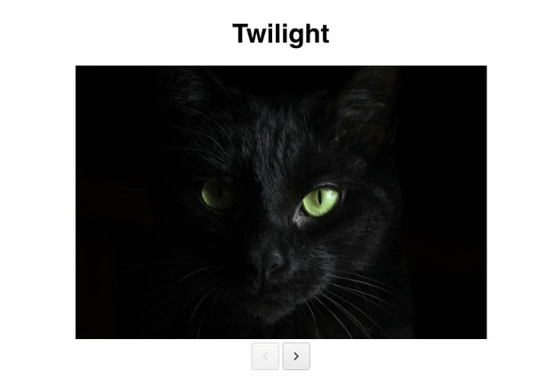
The Missing Ingredient to Your Spreadsheets—Charts

$
0
0

Telerik UI for WPF recently introduced a major feature for the RadSpreadsheet and RadSpreadProcessing components - adding charts to your spreadsheet documents to visualize data and more. Learn how you can use it in your spreadsheets today.

I bet most of you love charts. Those sets of elements that combined together can make a lovely graphical representation of your data. Bar charts, line charts, pie charts, area charts - so many charts! - and if used properly, they make your data come to life. I am happy to announce that this essential ingredient is now part of the RadSpreadsheet control and RadSpreadProcessing library in Telerik UI for WPF.

With only few steps you can now transform your data into a beautiful chart.

How to Add Charts in Your Spreadsheet

It is pretty easy actually. Once you have your spreadsheet ready and all the data typed in the cells, go to the “Insert” menu tab item and click the “All Charts” button. You can then choose among the chart types you would like to use. This approach should be automatically available for you if you are using Telerik UI for WPF R1 2019 version or higher.

Telerik UI for WPF - Spreadsheet - Charts

Another way to create charts is to work directly with the Charts API.

Supported Chart Types

Let me briefly introduce what kind of charts can be used at this time with RadSpeadsheet and RadSpreadProcessing, and what they are best for.

  • Line: Best for showing values change over time. They work very well for a high number of values increasing or decreasing continuously.
  • Column: Display values as sets of columns grouped by category. Great choice for showing columns that grow from smallest on the left to largest on the right on the horizontal axis. Used to compare values of each category. Good for showing ordinal data.
  • Bar: Analogical to the Column chart type. The main difference is the orientation of the bars. Good in situations when you have long category labels. Good for showing nominal data (ranges).
  • Pie and Doughnut: Easily understood they display percentage of proportional data where each slice represents percentage of the whole. Doughnut charts extend the Pie charts further by being able to show more than one set of data.
  • Area: Used in scenarios to plot change over time and draw attention to the total value across a trend. As opposed to Line charts, Area charts are able to show volume.
  • Scatter [coming in R2 2019]: Used when you want to show the relationship between two variables. Good for comparing large number of data points. Both axes of Scatter chart are Value axes.
  • Bubble [coming in R2 2019]: A bubble chart is a variation of a scatter chart in which the data points are replaced with bubbles. In addition to the Scatter chart, Bubble plots X values, Y values and Z values (size).

charts

Create an Empty Chart and Set its Values Manually

You can create a simple DocumentChart object, which is empty, and can then set the desired values. This object represents the chart itself and contains the following properties:

  • SeriesGroup: Represents a collection of the groups in which the series of the chart are organized.
  • PrimaryAxes: Represents the primary group of axes of the chart.
  • SecondaryAxes: Represents the secondary group of axes of the chart. It is used when there is more than one group of series (combo chart).
  • Title: Represents the title of the chart.
  • Legend: Represents the legend of the chart.

Create a Chart through FloatingChartShape and Add it to a Worksheet

And how do you bind the data and the chart? Let’s assume you have your data already populated in a document within the following range of cells:

Now let’s execute the code below:

FloatingChartShape chartShape = newFloatingChartShape(this.radSpreadsheet.ActiveWorksheet, newCellIndex(2, 7), newCellRange(0, 0, 4, 3), ChartType.Column)
{
Width = 480,
Height = 288,
};
chartShape.Chart.Legend = newLegend() { Position = LegendPosition.Right };
chartShape.Chart.Title = newTextTitle( “Sold Top Products (Monthly)");
this.radSpreadsheet.ActiveWorksheet.Shapes.Add(chartShape);

In a blink of an eye we now have the following column chart:

charts_sold_top_products

The charts are wrapped in shapes. FloatingChartShape class is the wrapper allowing you to add a chart to a document. It exposes the following constructors, which parse the data in the chartDataRange parameter and create a chart with all data already filled:

FloatingChartShape(Worksheet worksheet, CellIndex cellIndex, CellRange
chartDataRange,
paramsChartType[] chartTypes)
FloatingChartShape(Worksheet worksheet, CellIndex cellIndex, CellRange chartDataRange, SeriesRangesOrientation seriesRangesOrientation, paramsChartType[] chartTypes)

Legend and Title

You probably noticed that running the code above adds a legend to the chart. Adding the legend is a piece of cake. It can be added or edited through the Legend property of the DocumentChart object and can be positioned through the LegendPosition enumeration with members for Top, Bottom, Left and Right.

The same is also true for chart’s title.You can access and set it by using the Title property of the DocumentChart.

Insert Chart Dialog

Wait! What if you don’t have a document containing your data, and you would like to create everything from scratch? Using the RadSpreadsheet control, just fill in your data and simply select the cells. Then insert a chart via the "All Charts" button located under the "Insert" menu item.

CreateChartViaInsertChartDialog

Hitting the "All Charts" button brings us to the "Insert Charts" dialog. And a question comes to my mind. What if you are not sure what type of chart would best fit your scenario, or you simply want to see how your data would look like in a Bar chart instead of a Column chart (just in case if you are not sure that your labels are short enough)?

Working with RadSpreadsheet’s UI gives you the ability to choose between all available chart types supported by RadSpreadsheet through the “Insert Charts” dialog. We are working on providing more and more chart types which will automatically be added to the dialog, so stay tuned for more.

Update Chart Data

So far, so good. It looks great, doesn’t it? But what if you want to make changes to the data? That ability is only a few keystrokes away. Select and update the cell values and all the changes will be automatically applied to the bound chart. Do this by editing the document via RadSpreadsheet’s UI or using the Charts API.

update_chart

Exporting Charts

And that’s not all. An essential part of RadSpreadsheet’s model is the ability to export a document to another file format. Charts can easily be exported to PDF and Excel though XlsxFormatProvider and PdfFormatProvider.

What’s Next

We are planning on supporting more of the most commonly used chart types and we will keep you posted. Please share your thoughts and feedback about what other chart types would you expect or what could be improved. Help us make Telerik UI for WPF even better!
For those of you who are hearing about Telerik UI for WPF for the first time and want to learn more, head over to the product page or download a free trial today to get started.

Viewing all 5322 articles
Browse latest View live