Telerik UI for Blazor 0.5.0 has just been released, offering support for ASP.NET Core 3 Preview 4 and new components.
Things are moving fast with the Blazor and ASP.NET Core 3.0 frameworks, which means that things are moving equally fast for Telerik UI for Blazor! I’m excited to let you know that Telerik UI for Blazor 0.5.0 is officially here.
Support for ASP.NET Core 3 Preview 4
One of the biggest items that we took care of with 0.5.0 is official support for ASP.NET Core 3.0 Preview 4. This was just announced last week, but we wanted to jump on this quickly and make sure that we could provide official support for Preview 4. That’s a pretty quick turnaround with only the weekend stopping us from getting support out earlier, even with some big changes between Preview 3 and 4 that we needed to account for.
New Component: DatePicker
Beyond support for the latest version of ASP.NET Core 3.0, we also have a new component with this release: the DatePicker!
The DatePicker provides a slick way to allow users to select a date and can either be used as a standalone component, as a part of a form, or integrated in to the UI for Blazor Grid to help edit dates.
Like all of our other input components the DatePicker has built-in support for the Blazor validation framework.
Demo App News
Many of you have already started to explore our online demos for Blazor. If you haven’t you should definitely head over there! This demo page is the easiest way to see what our components are capable of and see examples of how to implement our components in your own applications.
For those of you that have already seen the page from the day we launched it, one thing that you may have noticed is that we’ve spruced up the demo a bit, including making the loading page a little prettier.
Another thing to bring up here is that currently the demo page is a fully client-side Blazor project, so it takes a bit to load the entire thing. I wanted to make a quick note that we are actively working on getting this up and running with a full server-side implementation! This isn’t quite ready yet, but something to look forward to in the upcoming weeks.
Get the Bits - Give us Feedback!
That’s it for the 0.5.0 release! If you haven’t already tried out the components I recommend heading over to the Telerik UI for Blazor overview page and sign up for the preview bits - it’s as easy as a single button click!
For the rest of you that have already tried out the bits (and some may even be using 0.5.0 already!) we want to continue to hear your feedback! If there are features you are missing, or components you need, please do not hesitate to reach out! We have the official Telerik UI for Blazor feedback portal for this exact reason. Submit your ideas for new components and features, or vote and comment on existing feature requests to have a direct impact on our roadmap!
Get to know Chrome DevTools and its quick-start process. We'll cover the features of the color picker tool and how they help manipulate colors in web pages.
Chrome DevTools is a set of web developer tools built directly into the Google Chrome browser. DevTools can help you edit pages on the fly and diagnose problems quickly, which ultimately helps you build better websites, faster. With DevTools you can view and change any page on your browser just by inspecting its elements and changing HTML and CSS values.
In this post, we’ll look at a few way we can manipulate colors from different websites using color picker in Chrome DevTools. First, let’s start by showing a few ways we can open Chrome DevTools from the Chrome homepage.
Open DevTools
There is more than one way to open DevTools. If you don’t know any, there’s no need to worry — we’ll walk through it all in this section. Let’s start with the first:
Inspect element: In Chrome, when navigating through a website, you can easily right-click on any element on the page (image, text, video, etc.) and select Inspect from the list. This will open the Elements panel in DevTools, where you can inspect the DOM or the website’s CSS files. Let’s demonstrate this on the Google homepage:
Clicking Inspect will open the DevTools to the Elements panel, where you can manipulate the elements properties:
Keyboard shortcuts: Some people like to use the shortcuts instead. It’s a good thing Chrome offers keyboard shortcuts on all operating systems for opening the DevTools from any browser window. For macOS, simply press Command+Option+C. Or Control+Shift+C works for Windows, Linux, and Chrome OS.
Finally, you can also take the long route if you like clicking around and using the Chrome main menu, like so:
Wonderful. Now that we’ve seen how to open up the DevTools panel in Chrome, let’s get down to business and see how we can manipulate colors with DevTools color picker.
To access the color picker, inspect an element, go to the styles tab and click on any color square. It’ll load up the color picker where you can change the existing color to any color of your choice. To demonstrate this, let’s change the background color of Google homepage to a shade of red like this:
We have seen how to perform a basic color-changing operation with the color picker. To better understand how the color picker works, let’s take a peek at some of its features.
Color Mode Conversion
With the color picker, you can easily convert between color modes. The color picker gives you the ability to convert from HEX, RGBA and HSLA.
This comes in handy when you’re working with a particular color mode in your application and your specifications come in a different mode. Color picker gives you the ability to select a particular color in one mode and copy its value in the other modes:
Built-in Material Design Palette
The color picker has the option to select between different color palettes. By default, it’ll show all the colors in your web page. However, it gives you the option to either select a custom palette and create your own colors or choose the Material palette, which gives you a list of colors according to Google’s Material Design specifications
Hue and Opacity Effects
The color picker has the ability to adjust any selected color’s hue and opacity effects till a desired value is achieved. While you’re adjusting the effect bars, the values of your color selection is changing accordingly to provide you with the accurate color value that matches your design.
This feature is especially helpful when you design with visual impairment considerations. Most times, people with visual impairments require elevated or lowered hue and opacity values to properly see your website and use it effectively. Here’s how you tweak these effects with color picker:
Eye Dropper
The color picker tool also lets you pick colors from web pages and utilize it in your app. This feature comes very handy when you are replicating a UI feature from another web page or simply want to rebuild a certain feature. The eye dropper tool makes it very easy to pick up colors and set them on your own color properties. Let’s demonstrate how it works:
Conclusion
In this post we have demonstrated how to manipulate colors with color picker in Chrome. There’s so much more information about the the Chrome DevTools and all the things you can do with it to enhance your development and design experience. Feel free to check out the official documentation for more information.
Learn More about DevTools
Interested in other tips and tricks about using Chrome DevTools? Take a look at other posts in this series, or start here:
Want to learn more about creating great user interfaces? Check out Kendo UI - our complete UI component library that allows you to quickly build high-quality, responsive apps. It includes all the components you’ll need, from grids and charts to schedulers and dials.
A common scenario for a treeview control is to populate it with lots of nodes. Adding a few thousand nodes initially is not a good idea though. Think of all the rendered HTML. Even rendering a few thousand strings (without any extra markup) will result in a few megabytes of HTML. That's where load on demand comes into play. RadTreeView supports three different types of load on demand: web service, server side callback and server side postback. From those the server-side postback mode is least efficient in terms of performance because it postbacks and updates the whole page. Here is how the output looks like (total size 28775 bytes):
As you can see the complete page is rendered and loaded again.
Server-side callback relies on the ASP.NET 2.0 built-in callbacks. It is significantly faster than the server-side postback mode because it renders only the nodes loaded on demand as well as some event validation data. Here is a typical output rendered by a server-side callback (total size is 1631 bytes):
Still the server-side callback mode is not the fastest load on demand mode supported by RadTreeView. Any callback request submits the page ViewState back to the server and causes the page lifecycle to execute. Indeed the lifecycle is not full but still it consumes some server time and the developer should avoid to perform any other tasks apart from populating the treeview. The IsCallback property comes in handy in such cases and helps the developer avoid hitting the database for no reason during load on demand requests.
When you want to squeeze the last bit of performance from RadTreeView you should opt for web-service load on demand. Here is how a typical web service load on demand request looks like (total size is 1745 bytes):
As you can see only JSON is transmitted in this case - no HTML or ViewState. On top of it the page lifecycle is not executed at all. Now the best part - I will tell you how to decrease that output even more!
By default the web service method returns objects of type RadTreeNodeData which contain the most commonly used properties of a RadTreeNode object. However you may not need all of them. So why transmit empty values in the JSON output? The solution is simple - create a custom class containing only the properties you need to use - e.g. Text, Value and ExpandMode:
publicclassNodeData
{
publicstring Value { get; set; }
publicstring Text { get; set; }
publicTreeNodeExpandMode ExpandMode { get; set; }
}
Now use that class in your web service method instead of RadTreeNodeData. Here is how the output looks like now (total size is 500 bytes):
As you can see only the relevant properties are transmitted back from the server. However there is still one thing bothering me - that "__type":"ProductCategories+NodeData" string does not seem to be relevant in this scenario. Fortunately the fix is quite simple - change the return type of the WebService method from RadTreeNodeData[] to IEnumerable. Here is the output after this change (total size is 310 bytes) Not bad! If you don't plan to use server-side postback events (such as NodeDrop and NodeClick) you can improve the total performance even more by setting the PersistLoadOnDemandNodes property to false. By default this property is set to true which means that RadTreeView logs (in JSON format) all nodes created on demand so they are later available after postback (required for server-side events). However this operation may become time consuming in case there are lots of load on demand nodes. If you don't need postback events just set that property to false to enable logging and persistence. Even if you need postback events you can "fake" them using RadAjaxManager. You can check the attached example for a sample implementation.
You may wonder why on earth our web-service example is so inefficient. The answer is easy - for simplicity. The RadTreeNodeData class is provided so the user can instantly start development. Optimizing the performance can be done at a later stage. Nevertheless a new example will be added in our online examples utilizing all of the aforementioned optimizations.
One of the features I really enjoy in WebAii v2.0 is the RecycleBrowser option. It changes the behavior of your tests, i.e. they keep running in the same browser instance (when set to ‘true’) instead of opening a new browser for each test. The default value is ‘false’ for consistency with the previous framework versions behavior. You can programmatically update that setting via the Settings class or using the Application’s config file.
However, there are some details you should have in mind when using that option.
We do use the RecycleBrowser option in the WebAii Testing Framework Sample Tests projects (AJAX and Silverlight) from the very beginning. Those projects are based on the WebAii VSTS support.
If you install the framework and load any of those projects in VS 2008, you will notice the settings initialization in our base test class. The important initialization method looks like this (note our base test class extends the ArtOfTest.WebAii.TestTemplates.BaseTest template):
    [TestClass]
    publicclass RadControlsBaseTest : BaseTest
    {

        // Use TestInitialize to run code before running each test
        [TestInitialize()]
        publicvoid MyTestInitialize()
        {
            #region WebAii Initialization

            // Initialize(this.TestContext.TestLogsDir, new TestContextWriteLine(this.TestContext.WriteLine));

            Settings settings = GetSettings();
            settings.DefaultBrowser = BrowserType.InternetExplorer;
            settings.RecycleBrowser = true;
            settings.BaseUrl = "http://demos.telerik.com/aspnet-ajax";
            settings.ClientReadyTimeout = 60000;
            settings.ExecuteCommandTimeout = 60000;
            settings.AnnotateExecution = true;
            settings.AnnotationMode = AnnotationMode.All;

            // Now call Initialize again with your updated settings object
            Initialize(settings, new TestContextWriteLine(this.TestContext.WriteLine));

            // Set the current test method. This is needed for WebAii to discover // its custom TestAttributes set on methods and classes.// This method should always exist in [TestInitialize()] method.
            SetTestMethod(this, (string)TestContext.Properties["TestName"]);

            #endregion//// Place any additional initialization here//

        }
And if you end up with this code only, you will notice the browser launches only once (as expected) even though you call
Manager.LaunchNewBrowser();
in each of your tests. Since the browser does not get closed at the end of the test though, it is kept open at the end of the entire group of tests’ execution. You can use the BaseTest.ShutDown()to close the browser. The method needs to be called in routine marked with the ClassCleanup attribute for each of the test classes* that inherit from our base test. This way you end up with closed browser no matter which tests you select to execute.
Sample code follows:
    [TestClass]
    publicclass GridPagingTests : RadControlsBaseTest
    {
        //Use ClassCleanup to run code after all tests in a class have run.
        [ClassCleanup()]
        publicstaticvoid GridPagingClassCleanup()
        {
            ShutDown();
        }

        [TestMethod]
        publicvoid PagingAjaxTest()
        {
            Manager.LaunchNewBrowser();
            ActiveBrowser.NavigateTo("/grid/examples/programming/webmail/defaultcs.aspx");

            GridPager pager = Find.ById<RadGrid>("RadGrid1").Pager;
            pager.LoadNextPage();

            Wait.For<GridPager>(myPager => myPager.CurrentPageIndex == 1, pager, 5000);
            Assert.AreEqual(1, pager.CurrentPageIndex);
        }
    }
I hope this explanation helps!
In the next posts I will try to cover some more features of the new WebUI Test Studio v2.0 and the testing framework.
-Konstantin
* Unfortunately due to an issue in VSTS Test (an old one I originally found mentioned here) concerning inherited tests you cannot implement the ClassCleanup method in the base class only – it doesn’t get called if it’s not a part of the inheriting classes.
Now that the early bits of WinRT– the new Windows 8 development platform are out, we (at Telerik) are eager to explore this whole new world that awaits us - the opportunities it offers and the challenges to be faced. I would like to elaborate a bit more on how we feel about this new world. We are strong believers that a programming language is only a tool used for solving software problems and challenges. The software industry is evolving and so are all the related tools – including programing languages and IDEs. The more the tools become the better the chances will be for good applications to appear. Some software problems are best solved in a certain language while others in another programming language. Therefore, being a polyglot programmer enables you to find the most accurate and efficient solution when you are given certain requirements. If a brand new language was introduced with WnRT we would not be scared – on the contrary, we would embrace it knowing that it will enhance our knowledge and proficiency. This is not the case anyway. C# and XAML are in the core of WinRT and this fact implies that the overall learning curve should not be expensive – I know, that’s just in theory. But what about existing technologies/tools? Are they really "dead" (whatever this means) or this is just a hysteria spread by scared people who see their current expertise not applicable? Vassil Terziev has an excellent post explaining our vision for Silverlight and .NET and the all-new Metro/WinRT world.
Back to our challenge - entering the new WinRT environment. There is no argument that the best way to explore a new platform is to create a fresh and new project and start digging into the platform’s internals. But how about existing projects? What is the actual cost of porting them to WinRT? Is everything from Silverlight and WPF covered? If not, what are the options? The best candidate for such a test, out of a broad range of XAML products, is RadChart for Windows Phone. As I outlined in this blog post, the chart is divided into two almost completely independent layers and the connection between them is only a very thin interface. The logical layer is completely UI-agnostic and all it needs to compile is C# and mscorlib.dll. The UI layer is also very thin and uses only basic Silverlight visuals such as Canvas, Line, Polyline, Path, Border, Rectangle, etc.
We chose a project and took a shot. As expected, the entire process finished in about two days and almost without a hitch, except for some annoying issues that were most probably due to the early version of the framework. I will write series of blog posts that provide step-by-step details about the migration and what we were mostly fighting with.
Yes, there are some differences compared to Silverlight and WPF but hey, it is C# and XAML and all our expertise in these can be easily spread over WinRT. And no doubt we will be there for you, Metro-ready, providing the same high quality tools and components when you start building your immersive applications.
Raise your hand if something similar to this has ever happened to you: You write a functional test that uses your system’s UI to create a user. You automate navigating to the proper screen, you get all the right values filled in, the Submit button gets clicked, and you do a check for the “User created!” message. You run the test a couple times to make sure everything’s working smoothly. Things look good, so you check it in to source control, where it gets wrapped in to your regular automation runs.
Shortly after a new bug gets filed stating newly created users aren’t showing up elsewhere in the system. Investigation into the bug finds the act of saving the new user to the database was buggy—that particular routine was failing without any proper error handling. The failures were ignored and the “User created!” message was being displayed regardless of the actual database action.
Whoops.
For a true end-to-end test, you shouldn’t be relying on feedback at the UI to validate the test passes; instead, you should be taking the extra step of validating down through the system’s internals.
Bringing Oracles Into Your Tests
The term “test oracles” describes a method, action, or step which helps you take this extra step. Oracles take many different forms depending on what you’re testing. You may need to check a record in the database, validate a configuration file’s status, or determine if an e-mail has been sent in the proper format.
The following test is an example of a file existence oracle. The test is part of our demonstration app hosted on GitHub. If you’re interested you can grab the latest download, or simply clone the entire repository.
This test opens logs on to the application and exports the current list of users to a PDF file.
Implementing a File-Based Oracle
Here’s what the test itself looks like:
The test executes an initialize step, logs on to the system and navigates to the home page, clicks the “Export to PDF” button, saves the file to a specific location, then validates that file actually exists.
Let’s walk through that in more detail.
The Initialize step is a simple coded step setting an extract variable pointing to the location we’ll be saving the file to:
string downloadPath = @"d:\temp\contacts.pdf";
SetExtractedValue("downloadPath", downloadPath );
if (System.IO.File.Exists(downloadPath)) {
System.IO.File.Delete(downloadPath);
}
We also delete the file if one’s there from an earlier run. [1]
The next step uses Test Studio’s Test As Step feature to execute another entire test as one step. That other test logs us on to the system and brings us to the main grid.
Step three clicks the Export to PDF button, while step four handles the download dialog box. Note that it’s data driven and pulls in the downloadPath extracted value variable.
Once the download is complete step four, another coded step, checks for the existence of the actual file in the download path we set in step one.
Note we have to explicitly call ToString() on the return value of GetExtractedValue – that’s because GetExtractedValue returns a plain object, not a string.
There you have it: we’ve run through our test and taken the extra step to ensure the file is actually written. Note we’ve not confirmed the file is properly formed, contains the right information, etc. That’s a bit longer than I want to run in to in this article!
Closing Up
Taking the time to write oracles into your tests ensure you’re getting a much better test to check your system’s proper validity. Test Studio’s coded step feature lets you write great oracles right within the Test Studio UI. You can also open up Visual Studio and take advantage of that environment to write extremely powerful oracles using any software engineering steps needed.
[1] The initial value for the downloadPath is a hardwired string. This is actually a bad practice, since it locks in your configuration and will very likely cause you massive grief when you run these tests on a different system. I strongly encourage you to push this off to some sort of a settings file which you can keep clean and unique for each environment you’re running your tests in. I’ll be covering that in a future post.
About the author
Jim Holmes
Jim Holmes has around 25 years IT experience. He is co-author of "Windows Developer Power Tools" and Chief Cat Herder of the CodeMash Conference. He's a blogger and evangelist for Telerik’s Test Studio, an awesome set of tools to help teams deliver better software. Find him as @aJimHolmes on Twitter.
Originally posted by Doug Seven / 10-22-12/ Icenium.com
Today is a day that my team and I have been looking forward to for a long time. Today I am happy to announce that Icenium, an Integrated Cloud Environment (ICE) for hybrid mobile app development, is now available to everyone!
The Story Begins
Back in July 2011, I left Microsoft and joined Telerik to take on an ambitious idea. In my time at Microsoft I had spoken with hundreds of developers and was able to witness first-hand the frustration that many of them felt working with Integrated Development Environments (IDEs) – they were big, bloated and most were designed with only one platform, or one platform vendor in mind (e.g. Visual Studio, xCode, etc.). For developers that targeted multiple platforms, using these IDEs meant downloading, installing and managing multiple platform SDKs and two or more separate development environments. For example, targeting the most relevant platforms in the world today – iOS and Android– meant using xCode with Objective C and Eclipse with Java, along with all the SDKs and tools that go along with them. Nearly 3 GB of downloads to install and maintain (not to mention, you have to have a Mac OS X environment, automatically excluding Windows-based developers). I was no different from the developers I talked to. I used these tools all the time. They took up a lot of my time to download and configure, they took up a lot of hard drive space, and they required a powerful development machine. I also observed that while I was writing code, I was also listening to music from Pandora, saving documents in DropBox, and keeping notes in Evernote. Nearly everything I used daily was not only cloud-connected, but the cloud played a significant role in enabling the technology; that is, the technology wouldn't have functioned without the cloud. Everything except my development tools (OK, maybe I'd deploy an app to the cloud, but the cloud didn't aide me in my development efforts).
An ICE Age Is Coming
The idea that a development environment required all of the SDKs and platform dependencies to be installed locally on a development machine with massive RAM and a big hard drive felt so antiquated compared to the other apps I used which were light-weight and used the cloud in a meaningful way. This made me want to redefine what a development environment was. I wanted to build something that enabled developers to build across a variety of platforms, and now that cloud connectivity was ubiquitous for developers, it was possible. I left Microsoft in pursuit of a company that would allow me to chase my crazy idea, and Telerik is just that crazy (talking to you Forte ). I didn’t want to build just another IDE. I wanted to build something different; I wanted to build an ICE – an Integrated Cloud Environment. I believed that we could improve cross-platform development by decoupling the gestures of writing code from the platform dependencies required when building apps. Specifically I wanted to decouple coding from the big, bloated SDKs that limited the development experience to one where the coding environment and the target environment required affinity. The primary objective in building an ICE was to enable developers to build apps that targeted any relevant platform from any development. My theory was that we could extract the SDKs from the local coding environment and turn them into cloud-based services that could still function as part of an integrated workflow for developing apps. In other words, it still had to be an integrated development experience, and the cloud – not your OS and RAM – would become the enabling technology. The experience had to be functional, capable and simple. The age of having to master multiple complex development environments and SDKs was coming to an end. The new ICE age will usher in a new type of development tools, and the dinosaur IDEs will die off soon enough.
Welcome Icenium
Icenium™ is the realization of that vision. Icenium combines the convenience of a modern coding environment with the power and flexibility of the cloud to manage platform dependencies. Icenium enables you to build applications without being limited by the development environment having to be compatible with the run-time environment (e.g. Mac OS X to iOS). It enables you to focus on the content of your application without the headache of managing multiple SDKs and development environments. With Icenium you can use Windows, Mac OS X, Linux, or even device operating systems, like iOS on an iPad, to build hybrid applications that are distributable through the app stores, and run natively on iOS and Android devices. I believe web developers are looking for ways to move from mobile-optimized web sites to building apps that run on devices, so we built Icenium with web developers in mind. We leverage Apache Cordova (aka PhoneGap ) to enable you to use HTML, CSS and JavaScript to build your application. When your project is compiled, we build the iOS and Android native bits in the cloud, which means you don’t have to think about SDKs, Objective C or Java. Just focus on your app and leave the platform dependencies to us. We also tailored the development experience to web developers. Most web developers (me included) prefer to work with capable, text-based code editors (and not WYSIWYG tools that modify your code without your consent), a browser and some debugging tools, such as WebKit Inspector, so we designed Icenium to work the same way. The Icenium coding environment is a simple text-based code editor, packed with advanced capabilities including syntax coloring and formatting, real-time error detection, refactoring, code navigation, and more. Each development client (Icenium Graphite for Windows and Icenium Mist in the browser) include a device simulator that enables you to test your application much like you would test a web app in a browser. The device simulators include options for simulating iPhone, iPad, Android phone and Android tablet, including a geolocation simulator and the ability to rotate and flip the device. The device simulators expose the ability to use WebKit Inspector-based debugging tools – the tools you already know. We have tried to replicate the working style you already use for web apps, making the transition to mobile application development simple and intuitive.
Icenium Graphite™
Icenium Graphite is an installable development tool for Windows operating systems. It is a WPF app that provides you with the ability to build a cross-platform mobile application, test it in a device simulator, build the app (in the cloud of course) and deploy it to multiple devices at one. When you are ready, you can switch to a “release” build setting, add your icons and splash screens and package your app for publishing to the Apple AppStore or Google Play.
Icenium LiveSync™
Icenium LiveSync is one of the truly magical features of Graphite. With LiveSync you can build and deploy your app to one or more iOS and Android with nothing more than the click of a button. Your app is built in the cloud, and then delivered back to Graphite where it is pushed over USB to all connected devices. I usually have 10 or 11 connected at once, including iPhone 4S, iPhone 5, iPad 1, iPad 3, Google Nexus, Google Nexus 7, Galaxy S2 Skyrocket, Galaxy S3, Galaxy Tab 8.9”, Galaxy Note 10”, HTC One X, and the Kindle Fire. After the app is one the devices you can test it out and see how it works on different screen sizes and pixel densities (e.g. Retina display), not to mention different form factors (phone and tablets). If you want to make a change, simply add, edit or remove the HTML, CSS or JavaScript in your project a click “Save.” When you do, the changes are saved (in the cloud of course) and immediately pushed down to the running app on all connected devices. That means you can work is rapid iterations and see your changes on the devices in real-time, as you make them.
Icenium Mist™
Icenium Mist is the browser-based sister of Graphite. Mist provides nearly all of the same functionality as Graphite, and works on a variety of platforms. I use Mist on my MacBook Air, and even on my iPad, when I am away from my office. Mist also includes the modern conveniences of Graphite, such as syntax coloring, statement completion, and version control integration, as well as a browser-based device simulator that can render your app on an iPhone, iPad, Android phone and Android tablet. Since Mist is browser-based, it doesn't have access to deploy apps to devices via USB. Instead, you can build your app and deploy it to a device by downloading the app and pushing it to your devices manually, or simply scan the on-screen QR code and the app will be downloaded to your device.
LiveSync On-Demand
Whether using Graphite or Mist, we've included the option to use LiveSync in an “on-demand” way. If your app is on a device and either you've disconnected it from USB (when using Graphite) or your deployed the app manually or with a QR code, you can request an app update easily and the content of the app will be refreshed based on your latest saved changes in either Graphite or Mist. If it’s an iOS device, simply press three fingers to the screen for a couple seconds and you will see the download begin. If it’s an Android device, simply press the context menu and the download will begin. LiveSync on demand means you can see your changes on any device, anytime, anywhere.
Icenium Ion™
If you’re familiar with Apple’s iOS development model, you know that in order to deploy an app onto an iOS device you need to first provision that device through the Apple Developer Center. Icenium fully supports working with provisioned devices – in fact Icenium can aid you in creating the Certificate Signing Request required when requesting a device provision. However, if you want to try out your app without provisioning your phone, or you want a stakeholder or beta tester to try out your app and give you feedback, then Icenium Ion is the tool you need. Ion is a development and testing utility (downloadable for free from the AppStore) that enables you to load your app onto any iOS device regardless of whether or not it has been provisioned. Simply scan a QR code provided by Icenium and the app will download and launch inside Ion. Of course, LiveSync on demand works perfectly with Ion too.
Version Control
Of course a development tool wouldn't be complete without integrated version control, and a cloud-based tool better integrate with popular cloud-based version control systems, so we did just that. By default all Icenium projects are connected to an integrated Git repository in the cloud, and you can optionally configure your project to use any URL-based Git repository, including GitHub and BitBucket. Both public and private projects are supported, enabling you to collaborate and version your code safely.
Kick the Wheels (for a while)
As I mentioned, today we have released Icenium for everyone to use. In fact, I don’t want there to be any barrier in your way to trying out Icenium, so I decided to make it free for the next 6-months. We won’t begin charging anyone for Icenium until May 1, 2013. So go to Icenium.com, create an account and start building cross-platform mobile apps today. I’ll bet you can build an app faster than it takes to download xCode
In my previous post, I discussed the recent enhancements to Fiddler’s ImageView extension that expose metadata about image files under inspection. My initial goal in exposing metadata was to help you optimize the size of images in order to build faster websites. However, in some cases the privacy implications of such metadata can be of far greater concern.
EXIF GPSInfo
As I started exploring the metadata found in real-world images, I found a surprising number of photos contain the GPS coordinates of the camera, stored within a GPSInfo structure in the EXIF metadata within the JPEG. Most of the images with metadata were captured using Apple iPhones, along with a handful of Windows and Android phones.
Because GPS information isn’t exposed by most browsers or viewers, there’s good reason to expect that many users are unaware that their location is being broadcast along with the image. In one recent high-profile incident, for instance, several people noticed that a journalist’s interview with a high-profile individual “in hiding” included a photo taken by an iPhone. Unknown to the photographer or the subject, the EXIF data included in the published photo included the exact location where the photo was taken.
The original photo from that case can be found in an article that Sophos security wrote on the topic. If you view the photo in Fiddler v2.4.2.5 and later, the GPSInfo is extracted and displayed and the Find on Map… link appears. When clicked, the location is mapped using Bing Maps.
If you prefer to use Google Maps, you can simply set a preference to use that service. In the QuickExec box under Fiddler’s Web Sessions list, type:
prefs set fiddler.inspectors.images.MapURI http://maps.google.com/?q={0}
…and hit Enter. If you ever change your mind, you can enter about:config to view and change all of Fiddler’s preferences.
Inspecting Local Photos
If you want to see whether a picture on your own computer includes EXIF data like the GPS Info, you can simply drag/drop the image from the desktop to Fiddler’s Web Sessions list. When you drop the image, Fiddler will generate a “dummy” Web Session for the local file, and you can use the ImageView inspector to examine its metadata.
Other Privacy-Impacting EXIF data
Dire as it is, the GPS location of the image isn’t the only source of privacy concern. Most high-end cameras include an EXIF structure known as a MakerNote which includes a great deal of metadata about the camera, including, in some cases, a unique serial number and the owner’s name. Because the formatting of data within a MakerNote is not standardized, Fiddler does not parse it and simply indicates its presence and size:
Stripping and Lying
Most image optimization tools can easily strip out all EXIF metadata to optimize the size of an image. Other tools enable the user to alter the content of the EXIF structures, so you could take a photo in one place but alter the metadata to make it appear as if it were taken elsewhere.
The three biggest conferences of the year are happening this summer and they are all happening in the same place: Google I/O, Microsoft BUILD and Apple WWDC are all taking place at the Moscone Center in San Francisco and Telerik will have been at all three!
Myself, Brandon Satrom and Todd Anglin, had the pleasure of attending Google I/O for the second year in a row. If you were trying to get tickets and you came up short, don't feel bad. Before we got an invite from Google, we tried to buy tickets as well with no success.
Fortunately for me, Google invited Kendo UI back for a second year to the Google I/O sandbox. The sandbox is a designated spot right in the middle of the main floor at I/O where Google invites certain companies to come in and demonstrate the neat things that they are doing. Kendo UI was present last year for 1 day in the sandbox and this year, we were invited for two full days which was quite exciting. We shared the sandbox with The Financial Times, JetBrains, LEAP Motion, AngularJS, Adobe and many others. You can see a full list of sandbox exhibitors from this year on the I/O site.
The Conference
Google I/O kicked off with a keynote on day 1. There were over 5 thousand attendees from all over the world. Last year they did 2 keynotes over two days, but this year there was a 3 hour keynote on the first day alone.
I summed up much of what was in the keynote in my previous post from Google I/O. There was a lot of interesting information about Android, Chrome and Google Maps. Among the announcements was a new IDE for native Android Development, a completely revamped Google Maps (sign up for the preview here), and a completely new Google Voice Search (which has landed in Chrome stable).
The keynote ended with a very informal Q/A with Google CEO and founder, Larry Paige. There were many questions about Google Glass (as you can imagine), but strangely not much of any answers on Glass. Additionally, none of the presenters during the keynote were wearing Glass. There was a Glass booth though and many of the attendees had donned the new wearable computing device.
There were sessions for three straight days covering virtually any and all areas of Google's products and technologies. From Android to Angular and Web Components to Chrome Packaged Apps, it was all there. In fact, you can watch any of the sessions for free on the I/O site. Some of my personal favorites were..
It was fascinating to see how prolific Kendo UI has become in the past year. Last year, we had just launched Kendo UI and had 1 Q release. Needless to say, Kendo UI was new to pretty much everyone. This year, virtually everyone had heard of Kendo UI. On top of that, we talked to quite a few people who were actively building with Kendo UI on all different types of platforms, including Rails, PHP, Node and Java.
We talked to many developers over the course of two days. It felt like we talked to virtually everyone at the conference. The Google I/O sandbox has extremely heavy traffic from 9 AM until ?. Officially it closes at 6 PM, but you find yourself there long after talking shop with developers.
This year we also tried to really let people know we were in town by having some mobile billboards outside of the Moscone center. There were three of these that were constantly on the move throughout the day during the conference.
Exciting Projects
One of the most exciting things is getting to hear about what other developers are working on. There were some really exciting projects, including Runnable - a platform similar to JSBin and JSFiddle, but allowing you to actually run server code that you write in the browser. Another one is SoundWave. This is a project that aggregates all of your listening activity across platforms like iTunes, Rdio, Pandora, SoundCloud and more so that you can share all of your online musical adventures with others.
Post I/O
We're all back now and gearing up for our fast approaching Q2 release. We have a LOT of great stuff to coming in this next keynote as we always do. The team has been very hard at work on some really fascinating projects that we just can't wait to share with you.
(This is a guest post by Stefan Tsokev - a Telerik Senior Enterprise Support Officer.)
Many users have asked us how to make their app recognize a certain url scheme and react on it. Of course opening a mobile application from another mobile application is a valid scenario and as we did not find straight-forward information on the net how to accomplish this (especially when it comes to Android platform), we decided to make a post about it.
Handling URL requests in iOS
For an iOS app, you can add a URL Scheme handler in your app's Info.plist (see Edit Configuration Files) so that your app launches when another iOS app (like Mobile Safari) launches a URL with your custom scheme.
Register your custom scheme in your app's Info.plist: the instructions are here. The required markup comes down to this:
Thanks to the Apache Cordova team, you are able to add a global handleOpenURL function in your JavaScript which just takes one parameter – a string containing the URL that was launched. Add your code to parse and handle the URL inside that global function. This function is always called if your app was launched from the custom scheme.
 function handleOpenURL(url) {
     // TODO: parse the url, and do something
 }
Handling URL requests in Android
For an Android app, you can add an intent filter in your app's AndroidManifest.xml (see Edit Configuration Files) so that your app launches when another app (like Chrome browser) launches a URL with your custom scheme.
Register your custom scheme in your app's AndroidManifest.xml: the instructions are here. The required markup comes down to this:
Download and add the WebIntent Cordova plugin to your project. The plugin is not plugman compatible at its current state and cannot be used directly in Icenium project. We have made the necessary modifications to it, so it would work in Icenium project targeting Cordova 2.7 (you can download the modified plugin from the sample app). You can find the required modifications in these help articles:
This is how the plugin structure and plugin.xml should look at the end:
We use the getUri method of the window.plugins.webintent object which takes a single parameter – a string containing the URL that was launched. Add your code to parse and handle the URL in the callback passed to getUri.
 function handleURLAndroid() {
     window.plugins.webintent.getUri(function(url) {
         // TODO: parse the url, and do something
     });
 }
How about a query string in the url schema
Sure, that wouldn't be any different than any other url we have worked with. Let's say the app would be launched by the following hyperlink:
where views/navigate.html is a view to which we would like to navigate upon starting the app. The url we receive as a parameter isn't directly useful, so we would need to get the path in which the app is executed, the querystring and then use these to put together a correct url. Here is an example
if (url !== "") {
    var appPath = window.location.href;
    var path = appPath.substr(0, appPath.lastIndexOf("/") + 1);
    var queryString = url.substr(url.lastIndexOf("//") + 1, url.length);
    var activeurl = path + queryString;
    window.location.href = activeurl;
}
Sample Code
If you'd like to see this in action, feel free to clone the sample-custom-url-scheme app from github or from Graphite/Mist samples (Clone -> Sample Projects). Remember that this app would launch only when another app launches a URL with the custom scheme.
Push notifications are useful for keeping users informed with timely and relevant contents. Push notifications can be sent regardless whether the app is running, inactive or in the background. Notifications can display an alert; play a distinctive sound or update badge on your app icon.
In this post, I will walk through the process of enabling push notification for an app in Apple developer portal, upload the generated certificate to Everlive and finally register my device in Everlive to receive push notifications.
Before you begin, note that you cannot test push notifications in iOS simulator. You need an iOS device as well as an Apple developer account. You also need to sign up for Everlive in order to send push notifications using its service.
Create the SSL certificate
At this point you will be creating the SSL certificate that is to be associated with the IOS app in Apple developer portal.
You will first launch the Keychain Access application in your mac. Next go to Menu-> Keychain Access -> Certificate Assistant - > Request a Certificate From a Certificate Authority
This will bring up the following wizard:
Here you will select “Saved to disk” option and once completed it will prompt you to save the .certSigningRequest file in your mac.
Create the App ID
In this step you will create the App ID in Apple Developer portal. App ID is basically the unique identifier of the iOS app generally represented by a reversed address (ex. com.telerik.EverliveApp). Here to note that this identifier should not contain any wildcard (*) characters.
Steps for creating an App ID are listed below:
Navigate to “Apple Developer Member Center” and select “Certificates, Identifiers & Profilers”
Select “Identifiers” from the menu on the left.
Select Identifiers -> App ID then on top right then click the “+” button to create a new one.
Complete the form with “App ID Description” and “Explicit App ID” which is the bundle identifier of your app that is located in info.plist file of your app.
On same page, select the services that you want to enable. In this case, I have selected “Push Notifications”.
Press, “Continue” to save.
Configure the App ID
Configuring the App ID includes creating the development certificate to receive push notifications.
Select “identifiers” from previous step and select the App ID that is newly created.This will bring the following screen:
Click “Edit” and scroll down to Push Notifications section.
Press “Create Certificate” under "Development SSL Certificate" that will bring up a wizard to upload the .certSigningRequest file that you saved in your mac earlier.
Download and install the generated SSL certificate into your keychain.
In Keychain Access it will be installed under “My Certificates”. The certificate should be called “Apple Development iOS Push Services”. Right-click on it and select “Apple Development iOS Push Services ...” and export it as a .p12 file.
Create Provisioning profile
Once the App ID is created and configured, the next step is to create a provisioning profile based on it in order to deploy the app in a device.
Steps for configuring a provisioning profile are:Go to “Certificates, Identities and Profiles” from “Apple Developer Member Center”.
Go to “Certificates, Identities and Profiles” from “Apple Developer Member Center”.
Select Provisioning Profiles -> Development and click the “+” icon on top right corner. This will take you to create new wizard.
Select Development -> iOS App Development and choose the App ID created in previous step from the dropdown.
Select the development certificate that is associated with the developer account (ex. iOS Development)
Select the device that is previously added to the portal (Using Xcode).
Name the provisioning profile and click “Generate”. In Xcode 5 you can download this profile from preferences menu or in earlier version you can do the same using organizer.
Configure Everlive
Now the .p12 file that is created in previous step should be uploaded to Everlive portal. This will be used by Everlive to send notifications to a registered device through Apple Push Notification Service (APNS).
In order to do so select the app which you want to configure. Go to Settings-> Push Notifications and upload your .p12 file under iOS-> Development.
Register the device
In order to receive notifications in an iOS device, you have to call [application registerForRemoteNotificationTypes:] method in appDelegate’s [application didFinishedLaunchingWithOptions:] method. This will prompt the user (first time the application is run) if he wants to allow push notifications for the app and once he confirms,
the following method will be called:
Here I am storing the device token in client library singleton that will be used later to register the device in Everlive.
As the registerForRemoteNotificationTypes is called, it will validate the App ID and profile that is used to deploy the app. In case of any errors, it will call the following method in app delegate:
When a push notification is received while the app is not in foreground, it is handled by iOS notification center. However, when the app is active it is developer’s job to handle the notification in the method mentioned above. Here, I just called the [Everlive handlePush:userInfo] method that creates an UIAlertView dialog to show the notification.
It is also possible to unregister a device from Everlive. You can do this in the following way:
Here to note that [Everlive sharedInstance] contains your default API key that you initialized either in [application didFinishedLaunchingWithOptions:] or info.plist file. Please refer to the getting started with Everlive iOS SDK section for more.
In addition, it is also possible to set custom parameters while registering the device. This will be useful in filtering a range of devices for sending push notifications.
Before you deploy the app in a device and start receiving push notifications. You have to the set the provisioning profile containing the App ID created previously in Build Settings -> Code Signing -> Provisioning Profile property.
Once done, you can send notifications to your device using the following command:
However, it is also possible to send notifications from Everlive admin portal. Navigate to App -> Push Notifications -> Add New Push Notification where you can further filter devices based on custom parameters:
Summary
In this post I have created a provisioning profile from an App ID with push notification enabled. I then walked through the process of registering the device in Everlive and sent a notification using curl. Everlive and equivalent providers simplify the process of sending push notifications to your device. Apple Push Notification service transports and routes a notification from a given provider to a given device.
It is possible to write your own provider, however in that case you have to manually configure the payload dictionary, validate device and deal with security. Moreover, each platform handles push notifications differently like Android uses Google cloud. In that case, you have to manually implement providers for each platform. Everlive on the other hand will take care of the platform specific details and relay your notifications to all associated devices without requiring you to go under the hood.
Finally, I have skipped the configuration of Everlive SDK in Xcode, which is beyond the scope of this article. Please refer to the original SDK documentation @http://docs.everlive.comto dig further.
In the 2014 Q2 release, we introduced two features that will greatly speed up your end-users’ working process with the data grid—a search functionality and a check-all checkbox in the column header.
Build-in search functionality
Thanks to the friendly UI, the search functionality of the grid allows end-users to quickly navigate to cells that interest them. Searching through tens of thousands of cells takes time and using the main thread for time consuming tasks is never advisable, so this is why we implemented the search in a separate thread. This leaves the UI responsive and at the same time increases the speed of the search. In addition, there is a public API which gives access to the search mechanism, so you can utilize the functionality with or without showing the search row in the grid UI.
A valid alternative solution would be to filter the rows according to certain criteria. However, one filter criteria concerns just one column, while the search looks up all columns at once. Moreover, you may not want to hide and then show different rows upon changing the filter criteria, but instead always have all the rows visible.
Let’s now take a look at the options available to your end-users and how you can control their search behavior.
End-user features
The end-user controls the search operation via the so called search row. In order to allow users to use the search row, you have to execute this single line of code:
this.radGridView1.AllowSearchRow = true;
In the search row, the users can find controls to enter their search criteria, toggle case sensitivity and navigate back and forth through the search results. When a user starts typing in the search box the results are immediately highlighted inside the cells. Once the user finishes typing, he can use either the previous\next buttons or the Enter and Shift+Enter key combination to navigate back and forth through the results. If at any point he moves the selection away from the currently highlighted results, the next time he moves back or forth, the result that will be highlighted will be relative to the current selection.
Now let’s see how you can control the behavior of the search functionality so that it fits your specific needs.
Intuitive and flexible API
First of all, you can access the logical search row through the MasterView of RadGridView:
For your convenience, there are a number of options available at RadGridView level by which you can fine tune the search mechanism.
CaseSensitive - Defines whether searching will be case sensitive or case insensitive. The same option that end-users have with the button on the search row element.
Culture - Defines which CompareInfo object will be used for searches when CaseSensitive is set to false.
CompareOptions – A CompareOptions value that defines how strings will be compared when CaseSensitive is set to false.
HighlightResults – Determines whether results will be highlighted within cells.
AutomaticallySelectFirstResult – Determines if the first result found by the search mechanism will be selected and brought into view immediately after it is found.
The SelectNextSearchResult and SelectPreviousSearchResult methods can be used for navigation through the search results.
This is fine if you are,for example, providing an alternative search UI and do not need the actual results. If you do want the results, though, you have to subscribe to the SearchProgressChanged event.
Multi-threading enhancements and considerations
Before we get to the event handler of the event let’s look at some more internal mechanics of the search mechanism. The search is executed on another thread so it would not hamper the responsiveness of the UI. One interesting thing we found during the development is that if you have many search results and you notify the UI thread of every “finding” immediately, you end up making so many invokes that the main thread is blocked handling them anyway. So we have a property called InitialSearchResultsTreshold. This is an integer number defining a number of search results that will be returned one by one. This way the search will very quickly display the initial results. The user would probably not care about the 100th and up result right after he inputs something, so after this number is reached search results are returned in groups. The size of the groups is controlled through the SearchResultsGroupSize property. The default values for these properties are 100 and 111 respectively. You may wonder why 111? It’s actually a simple trick to hide the grouping from the users. When you get lots of search results the label inside the search box updates with the new number very quickly, it becomes pretty much unreadable. If your group size is 100 the last two digits in this label will freeze until the last result group is return and only if its size is not 100. When the group size is 111 all digits “spin” all the time and it just looks better.
Now let’s get back to the event handler for the SearchProgressChanged event. You can have up to three cases here:
The initial moment when results are returned one by one. In this case the event arguments have the Cell property which will be assigned with the new found cell. The SearchFinished property will be false.
After the initial threshold is reached the results will be in groups and will be available through the Cells property of the event arguments. The SearchFinished property will be false.
When the search is finished both Cell and Cells will be null and the SearchFinished will be true.
Coming from the above facts we can extract a couple of tips. Therefore, if you want all the results displayed one by one you should set the initial threshold to a big value. If you want the results all at once you should set it to 0 and the group size to a big value.
Now, if your end-users happen to lose something, they should not worry – the Search functionality have them covered.
“Check all” check box in GridViewCheckBoxColumn
We noticed a very high interest in a KB article of ours regarding “check all” functionality in RadGridView and with the Service pack of Q2 2014 we added this functionality (GridViewCheckBoxColumn) to RadGridView to save you the time of embedding it. Now, you just need to set a single property and your column will show a check box in the header cell. This functionality applies to a template level, so you can use it in hierarchy too:
I hope you found this to be a good read that will enable you to easily implement our features in your project. Stay tuned for more blog posts reviewing the following additions to the suite:
A refactored version of RadScheduler
Document Processing libraries
Multi-line support in RadPageView
Freely typed dates in RadMaskedEditBox/RadDateTimePicker
The latest release of Telerik Platform is here. All the time-saving tools and services you've been using to create hybrid apps, now also optimized for native app development.
As the fastest growing Telerik product in history, you've come to expect a lot from the Telerik Platform. When our journey started a few years ago, we released a cloud-based toolset that focused on the up-and-coming hybrid app development model. Back then our mantra was, "Use your web skills to create hybrid mobile apps." And guess what, that's still our message, because you can now use your web skills to create native mobile apps as well!
Today we're pleased to announce the latest release from the Telerik Platform. This major update focuses on the growing need to create engaging mobile experiences by leveraging native device functionality without compromising app performance. Imagine all of the time-saving Telerik Platform tools and services you've been using to create hybrid apps, but now also optimized for native app development.
Upcoming Webinar
Before we start, you should know that we have a free webinar coming up on April 27th! In this presentation we'll be providing a lot more in-depth content about this Telerik Platform release, along with more information about NativeScript (not to mention, some huge raffle prizes for attendees!).
Telerik Platform and NativeScript
You may already know that we've been developing an open source framework called NativeScript which lets you create truly native mobile apps using JavaScript and CSS. While we've had support for NativeScript in the Telerik Platform for some time now, the experience wasn't quite as mature as the hybrid one. And up until now, NativeScript developers were limited to using the NativeScript CLI to build and emulate apps.
This all changes today, as we bring NativeScript development up to speed and also introduce numerous code-free tooling and service options to boost your native mobile app development process.
Want to impress your co-workers by leveling up on your native app development skills? By using Telerik Platform you'll be doing just that.
Writing code is where you probably expect to find the most improvements from our tools, and we won't disappoint. When developing NativeScript apps, you can take advantage of the new auto-completion features in all of our clients:
You can also drop TypeScript definition files into your project and automagically take advantage of auto-completion for a variety of JavaScript libraries and frameworks!
We are also introducing support for NativeScript 1.7. You can read all about the improvements, but suffice it to say there is some pretty amazing stuff there (including a preview of Windows support and an alpha release of the Angular 2 integration!).
What about debugging? Native app debugging used to be a bit of an arduous process, but today with NativeScript and the Telerik Platform, you can set breakpoints and debug your apps on any connected iOS or Android device:
NativeScript UI Controls
Ask any .NET developer out there today and most of them will know Telerik for our wide array of UI controls. That's why we feel strongly that leading with a strong UI offering is critical for the success of NativeScript. We recently released a new product we call Telerik UI for NativeScript, which contains four time-saving controls (with more on the way):
And today you can leverage the free version of UI for NativeScript (yes, free!) with the Telerik Platform via our Package Manager npm integration! You may also be interested in the other paid Telerik UI for NativeScript options.
Brand New Companion Apps
One of our most popular features is the Telerik Platform Companion App. Available for iOS, Android and Windows Phone, the Companion App lets you test your app on any device without having to deal with the mess of provisioning, certificate management, and app deployment.
When it came to NativeScript development, we used to have a separate NativeScript Companion App. Today we have ONE Telerik Platform Companion App and two separate "player" apps for Cordova and NativeScript apps. We set it up this way to provide the most flexibility and new features to improve your experience, such as the ability to:
Log in with your Telerik Platform account to access all of your apps (without having to scan QR codes!)
View the console.log output to assist with debugging
Run apps that leverage a variety of Cordova and NativeScript plugins
Download the new Companion Apps today for iOS and Android.
Universal Desktop Client Steps Forward
Last time around we announced the public beta of our new cross-platform Universal Desktop Client (available today for Mac and Windows). We've made some big steps on our way to the 1.0 release, most notably:
Offline mode
Ability to run your app in multiple simulators at once
The "Views" module of Telerik Platform (formerly known as Screen Builder) is often the first stop when creating a new app. Using this code-free visual development tool lets you pick and choose (and customize) a variety of pre-wired view templates. Views is getting a big boost this time around because not only is it compatible with NativeScript (yes, that means you can scaffold the majority of your native app before you start coding!) but we're also introducing a variety of new and improved features:
Custom view templates for our enterprise customers, which provide easy template re-use throughout your apps
The ability to customize the colors of your hybrid app theme
Major improvements to the "Authentication" and "Master Detail" view types (including redesigned configuration for easier navigation of properties)
And No, We Haven't Forgotten About Cordova!
While this release obviously focused on bringing NativeScript up to speed, we have an unwavering commitment to Cordova and hybrid app development. Updates such as our revamped Companion Apps apply equally to both hybrid and native app models—we've also provided the latest (stable) Cordova v5 bits. Looking forward, we will fully support both hybrid and native development in the Telerik Platform.
And remember, the future of the Telerik Platform depends on you and your feedback! Sound off on our feedback portal if there is something you feel like we are missing or something we could do better.
Thanks so much and don't forget about the upcoming Telerik Platform webinar where we will dive much deeper (and give out some amazing prizes!).
A GIF-guided journey through creating PWAs using Kendo UI components for maximum speed. Start with the handy PWA template from the Vue CLI, recruit Service Workers on the way and see what you’ll end up building!
Progressive Web Apps (PWAs) help us create more accessible and engaging web applications. We have a few great posts to help you learn more about PWAs: this series from Raymond Camden or or this great Vue.js specific post from Brandon Satrom. Today, we can jump into creating a PWA using the handy PWA template from the Vue CLI. We'll first create an application using the Kendo UI components which will help us quickly build out a responsive and accessible web application.
How great is version control, amirite?! For this project you check out all of the code at this repo. There will also be a handy octopus emoji () at the end of each section that will link you to a git commit showing all the code changes for that section. Ok, it's coding time!
Time to Create
The Vue CLI has a great PWA template to get us started with a PWA Vue app skeleton. The first step we take is to globally install the Vue CLI using i for install and the -g flag for global.
npm i vue-cli -g
With the CLI tool we can use it to create a project using the vue init command. Since we are creating a PWA we'll pass in pwa for the template and our project name.
vue init <template><project name>
Once the project is created, you'll see that it prompts us to change into the project directory and install the dependencies by running npm install or just npm i for short. Guess what we're going to do next. Follow directions of course! What kind of rebels do you think we are?
cd gif-guide_pwa-kendoui-vue
npm i
Now that we have everything we need to run the skeleton project we can run it and take a look using npm run dev.
A project is born ! Knowing that we have a nice, running project will give us a good jump off point to break things, um, I mean, customize things. Let's quickly add some fun functionality using Kendo UI components.
Hello? This is code Click the Octopus for the first commit.
UI Components For You & Me!
The app we create today will give us the first steps in letting users log what emotions they are feeling each day. For now, we'll make a place for the user to set a date, choose from a small list of emojis and see a graph of the logged emotions. Here is the list of components we'll use today:
As with most of the Kendo UI components, the first step we take is to install the component libraries. For the Vue library, we'll also want to install the Kendo UI library. I also want some styling, UX and accessibility. Thankfully, all of this (and more ) comes with installing one of the Kendo UI themes. For this project we'll use the Material theme that is currently in beta.
This can all be installed in one lovely npm install command:
npm i @progress/kendo-buttons-vue-wrapper
      @progress/kendo-charts-vue-wrapper
      @progress/kendo-dateinputs-vue-wrapper
      @progress/kendo-dropdowns-vue-wrapper
      @progress/kendo-theme-material
      @progress/kendo-ui
Moar code!
My Main!
We've got libraries! In the main.js file we can import just the components that we'll be using for this project from each of the libraries installed.
Now we use all that we've imported,the including the component installers which we'll pass to Vue.use().
This is what the complete file looks like now:
// src/main.js

import Vue from 'vue'
import App from './App'
import {
  Button, ButtonsInstaller
} from '@progress/kendo-buttons-vue-wrapper'
import {
  Chart, ChartInstaller
} from '@progress/kendo-charts-vue-wrapper'
import {
  DatePicker, DateinputsInstaller
} from '@progress/kendo-dateinputs-vue-wrapper'
import {
  DropDownList, DropdownsInstaller
} from '@progress/kendo-dropdowns-vue-wrapper'
import '@progress/kendo-theme-material/dist/all.css'
import '@progress/kendo-ui'

Vue.config.productionTip = false
Vue.use(ButtonsInstaller)
Vue.use(ChartInstaller)
Vue.use(DateinputsInstaller)
Vue.use(DropdownsInstaller)

/* eslint-disable no-new */
new Vue({
  el: '#app',
  template: '<App/>',
  components: {
    App,
    Button,
    Chart,
    DatePicker,
    DropDownList
  }
})
The main.js changes commit.
The .vue Files
To actually put these components in the game, we have to edit the App.vue and Hello.vue files. With the App.vue file we'll mostly be deleting things, adding a few headers and the new component we'll make.
We'll actually just be editing and changing the name of the Hello.vue to make it a little easier. Inside, we'll delete the existing code.
Then we can add each component that will be rendered on the page. Inside of a <div> we'll call emotion-logging we add the place to pick a date and an emotion. First up, will be the DatePicker component. Here is what we're setting for the DatePicker:
v-model: Vue's two-way binding to keep the date updated whenever it's changed
min: for the furthest away date the user can choose
max: the most recent date the user can choose
value: what's placed in the text box, we'll use the v-model for this
format: how the date will be displayed
The next component is the dropdownlist. We'll populate it with a few emojis for users to pick from. The configurations we'll change here are:
v-model: to keep track of which value the user picks
data-source: the array of choices we'll be passing to the list
index: the index of the default, so 0 would be the first thing in our array
Finally, we'll add the button to submit the new emotion and make a new <div> to add a chart component to visualize the added emotions. For the Kendo UI button we just need to add a click event listener with @click. When that event is triggered we want it to call the addEmotion method that will update the tally of the chosen emotion. The chart component will have more configurations:
series-default-type: this is the type of graph, e.g. pie, donut, etc.
chart-area-background: the default is a white background, here we don't want a background so we make it blank
series: the data to display in graph form
tooltip: setting if the tooltip is visible and what information it shows
Voila, the top half (template section) of the EmotionInput component file:
We now need to give values to all these different configurations we made. What better place to start than with the data we pass to our component. Here we return the variables that we've used inside out component like emotionDate, minDate, maxDate, emotionArray, emotionSelected, and tooltip. We'll also add a few variables that will be used inside of the method for incrementing the frequency of each emotion chosen: happyFeels, sadFeels, funnyFeels, and angryFeels. These are also what is used in the series data for the chart.
The method that we add here is the one assigned to the click event on our button. Basically, it gets passed the this.emotionSelected which is, thanks to v-model, updated when a user picks an emotion from the dropdown. Based on which emotion is selected, it increments the count for that emotion.
Finally, in order to always have the data for the chart component up-to-date, we use computed properties. Inside computed we create series which we had assigned to the series configuration of our chart. This way, when the addEmotion updates one of the emotions the data array is also updated. This means the graph will update with each added emotion.
Now the bottom half, or script section of the EmotionInput.vue file will look like this:
If you still have your app running in the background or run npm start you can see the working app.
The commit for the fun script section we added!
Looking Good: Additional Styling
Real quickly to make our application even more lovely we're going to add some styling. To style the overall application we'll first add some styling to the App.vue file.
Then for specific component styling we edit the EmotionInput.vue file .
Take a look at the style sections of each of these files now:
Running our app with npm start will let us take a look at what we have now!
Stylin' code changes.
Getting Fancy with the App Manifest
The App Manifest is a great place to start jumping into PWAs because it is a simple JSON file that lets you add some awesome features. You can find this file in the static directory. If you look inside dist/index.html after you've built your project you can search for manifest to see how it gets loaded in. On other projects you can add it by just linking to it like this, <link rel="manifest" href="/manifest.webmanifest"> in the <head> of you document.
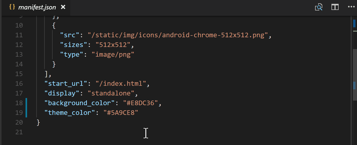
These are the values we'll be assigning in our manifest:
name: This is described as the human-readable name on MDN, it can be used when your app is listed but the short_name will be used instead if this name is too long to display.
short_name: Well, speak of the devil This is the name that will usually get displayed in places like a user's homescreen where there is not sufficient space for the name. PLUS, IT SUPPORTS EMOJI!! ✨
icons: The icons are an array consisting of image objects with src, sizes, and type values. This determines what icons represent your app on different platforms like when a user adds your app to their homescreen.
start_url: When a user launches your application this is the url it will load. This url has to be relative to the site origin.
display: This nifty setting let's you choose to have a fullscreen app by using standalone || fullscreen and removing the browser chrome, keep it and setting it to browser, OR keep it minimal with minimal-ui.
background_color: A little self-explanatory, this sets the background color of your application. The main advantage of using this is to give your user a smooth transition from opening the app and when the app is loaded by showing a color change so they know something is happening.
theme_color: The theme color of the application can affect how the app is displayed dependent on the OS. For instance, with Android when you look at the app in the app tray it will have this color as the app's border color.
As you can see in this GIF, there are a lot of icon options that can be added to the manifest.json file. I usually just take one image and resize and save it to the correct file name. Here I've just chosen a thinking face Emoji PNG and resized it for each existing icon image.
Now that we have all of the icons and the App Manifest set up we can head to our app and see the changes. If you open up Dev Tools (here we're using Chrome), and click on the Application tab you'll see a Manifest tab on the left. In here you can see where the Manifest file lives along with all of the values we've assigned. It also gives you a glimpse of what your icons look like as well.
In the end, the App Manifest file will look like this. Remember, you can go back and add more!
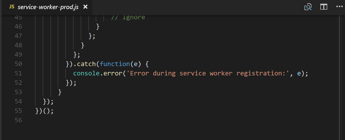
We now have the ability to make our application fullscreen, give it fancy emojis and icons for user's home screens, what next? With Service Workers there are a lot of great advancements that can be added to your application. The Service Worker file is a script that runs, separate from your app, in the background between your app and your network. To start us out though the vue CLI actually sets us up with a Service Worker that caches some of our resources for offline functionality. Take a look!
Service Workers can be a bit daunting but it's good to remember they are just JavaScript files. If you look through it's mostly using promises and if statements to listen to events. It's also progressive. If you noticed, there is a line in the file that checks to see if serviceWorker is supported.
Let's see this Service Worker we have in action! To start we want to build our app by running npm run build.
Deploy, Deploy!
The app is built! Which means that we have everything we need to deploy our application living in the dist directory. There are many great ways to deploy an application, and today we'll use the Firebase CLI. To use it you first install it globally with npm.
npm install -g firebase-tools
Then from your project's directory run firebase init. It will walk you through a few steps. First, we just check Hosting, pick a project (I had already made one in my Firebase Console), then assign the dist directory since the files we want hosted are located inside. There are more options for making your app an SPA (single page app) and re-writing the index.html but I just said no to all of that for now.
After the setup is complete all you need to do is run firebase deploy any time you want to re-deploy your application.
Deployment complete! We can take a look at our hosted application. To see what is going on with the Service Worker, head back to the Application tab in the Dev Tools. Where the Manifest tab was on the left side, there is also a Service Workers tab. Clicking that you can see the information of our Service Worker and that it is registered. By default, the 'Update on reload' is checked so that we make sure we are keeping things up-to-date. This is a great place to debug your Service Workers.
To take a look at the caching in action, we'll click the offline checkbox to disconnect from the network. It is worth remembering to try completely disconnecting from your own Wi-Fi or network to see how your app serves truly offline. If you notice when we reload, the background image is no longer there because we were grabbing that from another site (my google photos) that can't be reached without a network. Beyond that, everything is working as it's supposed to. Thanks, Service Worker
There are a lot of caveats with caching, so it's worth doing some research before having your user cache your whole site . Here a few posts I recommend:
We haz a Progressive Web App in Vue !! There are a lot of steps we can continue to take to make our applications more PWA-y. For instance, we can use the Push API to create a service worker that sends push notifications to let a user know to log their emotion for the day. Nifty, right? Here are a bunch of fun resources to help you build a more robust application with some more components and more PWA-y with more PWA info:
It's official! The Telerik UI for WinForms R2 2018 release is now live. Learn about the new Conversational UI and Image Editor controls and some of the top new features in the control.
Hey there desktop developers! I am excited to share that the latest release of Telerik UI for WinForms brings tons of great new features and controls to help you build WinForms applications with modern UI. You can explore all the great new features we just shipped, including Conversational UI, a new Image Editor control and various improvements to the other controls, by either upgrading to the latest version or downloading a fresh trial. In the meantime, let me start with something that will blow your socks off...
The New Conversational UI Control
The new Chat control provides a UI for creating modern applications where the user can communicate either with a Chatbot or someone else. It can be easily integrated with any of the chatbot frameworks out there (Microsoft Bot, Google API.AI, Amazon Lex, Facebook wit.ai) and also features variety of ways to present or enter information including different card types (for product, weather, flight plan), message types and overlays (calendar, time picker). You can also use the Suggested Actions to add predefined responses for the user to choose from as well as compliment the chart with common options using the built-in toolbar. Of course, all of these elements are highly customizable and creation of custom ones is also taken care of.
The modern look and feel and the supported messages make it easy to create a natural and engaging conversation flow. You can learn more about our Conversational UI here.
Cloud Integration
We have introduced series of articles that show how one can integrate popular cloud services in a .NET application. The articles cover the most widely-used cloud providers (Amazon, Microsoft, Google) and services that are suitable for desktop applications. Feel free to go ahead and explore this opportunity, you will certainly find some interesting examples along with functionality that is used in standard business applications. Learn more about Cloud Integration here.
New Control: ImageEditor
The new ImageEditor allows you to perform various operation on images directly in your application or document. The control supports many features like drawing, resizing, adjusting the image, and adding effects (blur, sharpen). This is very useful when you need to edit an image on the fly, for example when editing a document in RadRichTextEditor. The control can be used as a standalone tool as well since you can directly open or save images from it and easily reverse any changes.
Holidays Support in Scheduler Control
You can now import your national holidays or easily mark specific days in the RadScheduler, as well as block the creation of appointments during holidays. The standard Outlook holidays files (.hol) are supported, and this way you can easily import existing holidays into your application or just allow your end-users to use this feature.
Adding the Format Painter Functionality to the RichTextEditor
The format painter allows your end-users to easily transfer the formatting from one document part to another in a easy, fast and intuitive way. This was a highly demanded feature which is now available out-of-the-box.
Easy Access to the Documentation from Visual Studio
Now when you press F1 in the Visual Studio designer and a Telerik control is selected, you will be redirected to our documentation. This way you can easily go to the documentation of a specific control while you are designing your form:
Fit Spreadsheet Contents when Printing
There is a new feature in the printing functionality of RadSpreadsheet. You can fit the existing columns or rows on a single page. This functionality allows you to easily print small documents and place the entire content on a single page:
Last, but not least, we have provided numerous improvements to the suite based on your feedback. You can view a complete list in the release history.
Try it Out and Share Your Feedback
Make sure to download and try the latest version of Telerik UI for WinForms to explore all the new features and themes. If you are a client, download directly from your account, otherwise you can download a free trial at the link below.
We'd love to hear how this all works for you, so please let us know your thoughts by visiting our Feedback portal or by leaving a comment below.
Watch the Webinar
As you're exploring the new features, don't forget to check out the Telerik R2 2018 Release webinar where we cover all the features and updates to the WinForms suite as well as the other .NET products in our portfolio.
The R1 2019 Service Pack for Telerik UI for WPF and Telerik UI for Silverlight includes over 80 improvements and cool new features, as well as support for Visual Studio 2019 Preview 3. Dive in and check out some of the top highlights coming to the suites.
Fluent Theme: New ScrollBarMode property
Using the ScrollBarMode property of the FluentPallete youcan now modify the appearance of the scrollbars of all controls that are using ScrollViewer in the ControlTemplate. By design the scrollbars in the theme appear over the content, they are really narrow (compact), and get bigger on mouse over. However, in specific scenarios this behaviour might not be convenient and this is where the new property comes in handy – you can have the ScrollBars always compact, always with their full size or as it is by default in the theme. See the differences between the different modes below and make sure to read the Fluent theme article for more details:
SpreadProcessing: New Chart Customization Options
With this version, we added several properties enabling you to customize the look of a chart and its axes. Now you are able to change the outline and fill of the chart shape as well as the outline and major gridlines of the axes. Here is a bit of a code showing the new properties exposed:
FloatingChartShape chartShape = new FloatingChartShape(workbook.ActiveWorksheet, new CellIndex(2, 7), new CellRange(0, 0, 4, 3), ChartType.Column)

{
    Width = 480,
    Height = 288,

};


chartShape.Chart.Legend = new Legend() { Position = LegendPosition.Right };

chartShape.Chart.Title = new TextTitle("Test Category Chart");


chartShape.Outline.Fill = new SolidFill(new ThemableColor(Colors.SlateGray));

chartShape.Outline.Width = 5;

chartShape.Fill = new SolidFill(new ThemableColor(Colors.Cornsilk));


chartShape.Chart.PrimaryAxes.ValueAxis.Outline.Fill = new SolidFill(new ThemableColor(Colors.Blue));

chartShape.Chart.PrimaryAxes.ValueAxis.Outline.Width = 5;


chartShape.Chart.PrimaryAxes.ValueAxis.MajorGridlines.Outline.Fill = new SolidFill(new ThemableColor(Colors.LightGreen));

chartShape.Chart.PrimaryAxes.ValueAxis.MajorGridlines.Outline.Width = 2;


workbook.ActiveWorksheet.Shapes.Add(chartShape);
And here is how the code would change the chart:
MultiColumnComboBox: New DropDownElementStyle and IsReadOnly Properties
We added two new properties to the MultiColumnComboBox control:
DropDownElementStyle– this allows you to set a custom style for the control in the drop down (GridView by default) and apply all the needed properties. For more info check out this article.
IsReadOnly– this is a property of the GridViewItemsSourceProvider, and by using it you can control the IsReadOnly property of the GridView in the drop down. Check out the GridViewItemsSourceProvider article here.
GridView: New MouseOverBackground Property and SpreadsheetStreamingExport Enhancements
GridView gets a new MouseOverBackground that allows you to easily customize the background color of the GridView Cell. You can set this property per cell or per GridView.
SpreadsheetStreamingExport gets many improvements as well as a new ExportOptions.ColumnWidth property, which allows you to specify a concrete width for the columns when exporting.
TabControl: Access Text Support
The Header of the TabItem now allows you to set access text as a direct string. For example:
And when the Alt key on the keyboard is pressed the access keys are displayed in the TabItem Header as shown below:
GanttView: Shift and Tab Navigation
The user can now navigate backwards when editing cells in the grid part of the control by pressing the Shift and Tab keys on the keyboard.
.NET Core 3 Preview 2
The second preview of the latest .NET Core version was recently introduced by Microsoft and I'm happy to share that the Telerik UI for WPF .NET Core 3 binaries are now built against it! Make sure to play around with them and please share any feedback that you have.
VisualStudio 2019 Preview 3
I have good news for all of tech enthusiasts already on VisualStudio 2019 – UI for WPF is compatible to the latest update of latest preview version of VisualStudio 2019. As always, we are providing immediate support for the newest VisualStudio versions, making sure you can always able to benefit from all the cool new features of the IDE.
Check Out the Detailed Release Notes
To get an overview of all the latest features and improvements we’ve made, check out the release notes for the products below:
Feel free to drop us a comment below sharing your thoughts. Or visit our Feedback portals about Telerik UI for WPF, Silverlight and Document Processing Libraries and let us know if you have any suggestions or if you need any particular features/controls.
And if you haven’t already had a chance to try our UI toolkits, simply download a trial from the links below:
Did you know we use FiddlerCore inside Test Studio? See how FiddlerCore helps us deliver API, performance, load, web, mobile test automation and testing.
Fiddler is a free web debugging proxy with over three million yearly users. Many of you are quite familiar with it, but what a lot of people don’t know is that Fiddler is the superset of “FiddlerCore,” “FiddlerScript, “Fiddler Extensions” and “Fiddler Inspectors.” In this post I want to talk about “FiddlerCore” and how we use it inside Test Studio.
FiddlerCore is described in detail on our website, so take a look if you are interested in the details. What I’ll tell you is the short version – Fiddler Core is a Web Proxy. Of course it can do more than that, but at its most basic, it is a proxy engine and you can use it to build your own application on top of it. This is what we’ve done in Test Studio, our automated testing solution. We use it in multiple features to:
Capture Traffic for Load test sessions
Capture Traffic for API tests
Examine Traffic for Performance Tests
Automate Mobile browsers
In the first two cases the usage is straightforward. Test Studio, with the help of FiddlerCore, captures the user’s session, then strips down some of the “garbage” that is not needed. From there the user can further alter the requests – add or change headers, cookies, body content, etc. You may say this is something that any web proxy can do. I suppose this is true, but FiddlerCore does much more and this is why we chose it, especially for the other two cases.
Performance Testing
In Test Studio there is a special type of run where the tool captures all relevant network traffic plus the performance counters of the server machine. The results looks like this:
When the performance counters are added the detailed view looks like this:
What this report shows is not only how much time the request took but also what is the strain on the machine. FiddlerCore saved us a lot of development time for this feature and gave us more detailed reports.
Mobile Web Testing
The story here is even more interesting. What we had a requirement at the time that went like this: “As a QA I want to be able to record and playback web content on any device.” The main problem here is that in general the mobile versions of the most common browsers – Safari and Chrome – do not support extensions. One of the first ideas we had was to force the developers to “instrument” their web apps with a “testing extension.” This idea was quickly dropped because in most cases nobody wants “testing” code in their production environment, and sometimes the development process is black-boxed, and QAs do not have direct access to the code-base.
The solution was FiddlerCore. All the device’s traffic will be rerouted via FiddlerCore's proxy which was fine-tuned to inject the extension in particular requests. This approach turned the browser into a viable automation agent. It proved to be very useful, in fact any device or browser that is rerouted via the FiddlerCore can be automated.
Building great software is not an easy task, but with the right tools at your disposal things happen a bit more smoothly. FiddlerCore gave us the solid foundation to build great Test Studio features. Thank you, Fiddler!
Learn More
Click the links below to learn more about Fiddler, FiddlerCore and Test Studio.
Indexers allow instances of a class to be indexed just like arrays, and are declared similarly to methods. They can be useful when working with your own collection class. Let's learn how to define and work with indexers.
You may encounter a situation where you want to access data in your custom types like an array, using the index operator, []. This feature can be useful when creating custom generic classes. An indexer allows an object to be indexed, such as an array, and the indexed value can be set or retrieved without explicitly specifying a type or instance member.
To declare an indexer for a class, you add a slightly different property with the this[] keyword and arguments of any type between the brackets. Properties return or set a specific data member, whereas indexers return or set a particular value from the object instance.
Let's take a look at an example to see how to implement an indexer.
class User
{
  public string Name { get; set; }
  public string Email { get; set; }
}

class UserCollection
{
  ArrayList users = new ArrayList();

  public User this[int index]
  {
    get => (User) users[index];
    set => users.Insert(index, value);
  }

  public int Count => users.Count;
}
Above we defined an indexer whose argument is an int type. We have used the ArrayList class to hold a collection of User objects and made use of its indexer to retrieve and store users based on the passed value. Here's how to use the indexer:
var users = new UserCollection();

// add objects using indexer
users[0] = new User("Julie Lerman", "joelin@indo.com");
users[1] = new User("Mark Lettuce", "mark@lettuce.com");
users[2] = new User("Peter Mbanugo", "p.mbanugo@yahoo.com");

// obtain and display each item using indexer
for (int i = 0; i < users.Count; i++)
{
  Console.WriteLine("User number: {0}", i);
  Console.WriteLine("Name: {0}", users[i].Name);
  Console.WriteLine("Email: {0}", users[i].Email);
  Console.WriteLine();
}

// output
// User number: 0
// Name: Julie Lerman
// Email: joelin@indo.com
// User number: 1
// Name: Mark Lettuce
// Email: mark@lettuce.com
// User number: 2
// Name: Peter Mbanugo
// Email: p.mbanugo@yahoo.com
As you can see from the example above, using the indexer is similar to how you've already been using indexers in .NET.
Indexing Using String
We used integers for indexing in the previous example, but you can also use any other type as argument for the indexer. Let's update the implementation of UserCollection to use a string argument type for the indexer method.
class UserCollection
{
  Dictionary<string, User> users = new Dictionary<string, User>();

  public User this[string name]
  {
    get => (User) users[name];
    set => users[name] = value;
  }
}

// using the indexer
static void Main(string[] args)
{
  var users = new UserCollection();

  // add objects using indexer
  users["julie"] = new User("Julie Lerman", "joelin@indo.com");
  users["mark"] = new User("Mark Lettuce", "mark@lettuce.com");
  users["peter"] = new User("Peter Mbanugo", "p.mbanugo@yahoo.com");

  // obtain and display Mark's data
  Console.WriteLine($"Marks Email: {users["mark"].Email}");
  Console.Read();
}
The implementation now uses a dictionary to hold the list of users because it allows us to store data with keys of any type. With that, you can add and retrieve user objects with a string value when using the indexer. When you run the code, it should output Mark's Email: mark@lettuce.com to the console.
Overloading Indexers
Indexer methods can also be overloaded. If you find yourself in a situation where you'd like to access items using a numerical value or string value, you can define multiple indexer methods for that type, thereby having overloaded indexers. Following on with our example from the previous section, let's update the UserCollection to include a numerical indexer and another that accepts string value type:
class UserCollection
{
  Dictionary<string, User> users = new Dictionary<string, User>();

  public User this[string name]
  {
    get => (User) users[name];
    set => users[name] = value;
  }

  public User this[int key]
  {
    get => (User) users[key.ToString()];
    set => users[key.ToString()] = value;
  }

  public int Count => users.Count;
}
The indexer methods for the UserCollection has two overloads: one that takes integer and another that takes a string value. You can have as many overloads as you'd like, just like you would for methods you define in your classes. The code below shows an example usage of both indexers defined in UserCollection.
var users = new UserCollection();

// add objects using indexer
users["julie"] = new User("Julie Lerman", "joelin@indo.com");
users["mark"] = new User("Mark Lettuce", "mark@lettuce.com");
users[3] = new User("Peter Mbanugo", "p.mbanugo@yahoo.com");
users[3] = new User("Peter Liko", "liko@jordan.com");

Console.WriteLine($"{users[3].Name} - {users[3].Email}");
Console.Read();

// output
// Peter Liko - liko@jordan.com
You should notice from the code above that you can use either string or integer as parameter types to the indexer methods. It showed two assignments using the integer value, 3. The second assignment replaces the initial assignment, and calling the get accessor will return the last value set for users[3], which should be Peter Liko - liko@jordan.com.
That's a Wrap!
Indexers are similar to properties, but are accessed via an index argument rather than a property name. You define them similarly to how you would define properties but using this[] syntax. I showed you how to declare it with examples of how to have overloaded indexer methods and how to use them.
WebSockets or Server-Sent Events? Let's compare the two technologies to showcase their strengths and weaknesses in powering client-server communications.
WebSockets and Server-Sent Events are two different technologies that define how browsers and clients communicate with each other. In this post, we’ll look at the individual features of these technologies and showcase both their similarities and differences. Before we get into it, it is worth noting that they’re not competing technologies and neither is explicitly better than the other.
WebSockets
WebSockets is an advanced technology that allows real-time interactive bidirectional communication between the client browser and a server. In simple terms, WebSockets make it possible for data to be transferred from the client to the server and vice versa in real time. With WebSockets API, you can send messages to a server and receive event-driven responses without having to poll the server for a reply.
With WebSockets, the client and server sides of an application can talk to each other without interruptions since the connection remains open after a server response.
Server-Sent Events
Server-Sent Events (SSE) is a technology that enables a browser (client) to receive automatic updates like text-based event data from a server via HTTP connection.
The logic behind SSE is to create a seamless avenue for the browser to automatically receive data from the server without explicitly asking for it. This construct makes working with real-time data very efficient, as it uses just one long-lived HTTP connection.
Similarities
I’m certain you’ve noticed certain similarities in the explanation of the two technologies thus far. If you have, you’re wrong — they both share the same functionality as you will see in detail now.
Apart from the fact that these two technologies operate through HTTP connections, the most noticeable similarity is that they function exactly the same way. They both push data from the client to server, a process also known as server push.
Differences
Obviously, the major difference between WebSockets and Server-Sent Events is that WebSockets are bidirectional (allowing communication between the client and the server) while SSEs are mono-directional (only allowing the client to receive data from the server).
As a result, if you are only interested in implementing server push functionalities in your application, they are both good choices to consider. However, if you’re more interested in a bi-directional communication system, WebSockets will serve your needs better.
Unique Features
They are both equipped with unique features that make them specifically qualified for the kinds of tasks they handle. For instance, SSEs come with automatic reconnection, event IDs and the ability to send arbitrary events. WebSockets have the ability to detect a dropped client connection, unlike in SSEs where messages will have to be sent first before detecting the same issue.
Browser Support
Another notable difference is the browser compatibility of the two technologies. In this regard, WebSockets have received more attention (and appreciation) than SSEs. More browsers support WebSockets natively than SSEs. However, there are available polyfills that simulate the SSE functionality to solve this issue.
Transmission data types
WebSockets can transmit both binary data and UTF-8, whereas SSEs are limited to UTF-8.
Connection Size
It´s good to know that SSEs suffer from a limitation to the maximum number of open connections, which can be especially painful when opening various tabs, as the limit is per browser is six.
Extensibility
Compared to SSEs, WebSockets are a lot more complex and task-demanding to set up. This has its pitfalls, as it requires a lot of upfront work. Be that as it may, it also makes for a very stable and extensible application setting. SSE is a simpler and faster solution, but it isn’t extensible. If, for instance, your web application requirements were to change, it would need to be refactored using WebSockets, which are more versatile with the ability to handle complex projects.
Use Cases
WebSockets
Like we mentioned earlier, WebSockets provide bidirectional client-server communication between clients and servers. This kind of functionality is vastly applied and appreciated in technologies like real-time polling applications, chat applications, media players and the like.
Server-Sent Events
SSEs, on the other hand, do not provide bidirectional communication. However, there are so many applications where there’s no need to send data from the client. Cases like this are updating statuses, push notifications, newsletters and news feeds. In scenarios like this, SSEs are most appreciated.
Conclusion
In this post, we have compared these two similar yet different technologies to expose their individual strengths and weaknesses to offer you a better chance at understanding them and making the right choice for usage. Like we mentioned earlier, no one is better than the other — whether you should be using WebSockets or SSEs depends on your own specific use case.
For More Info on Building Great Web Apps Faster
Want to learn more about creating great web apps? It all starts out with Kendo UI - the complete UI component library that allows you to quickly build high-quality, responsive apps. It includes everything you need, from grids and charts to schedulers and dials.


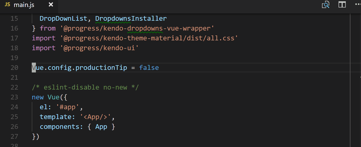
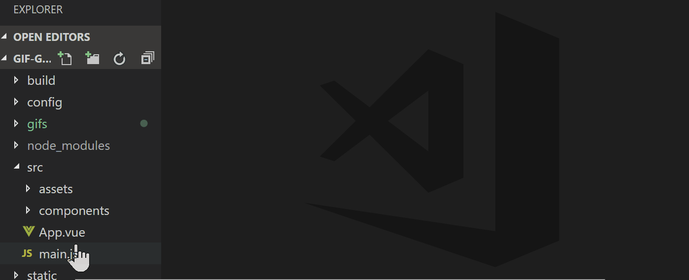
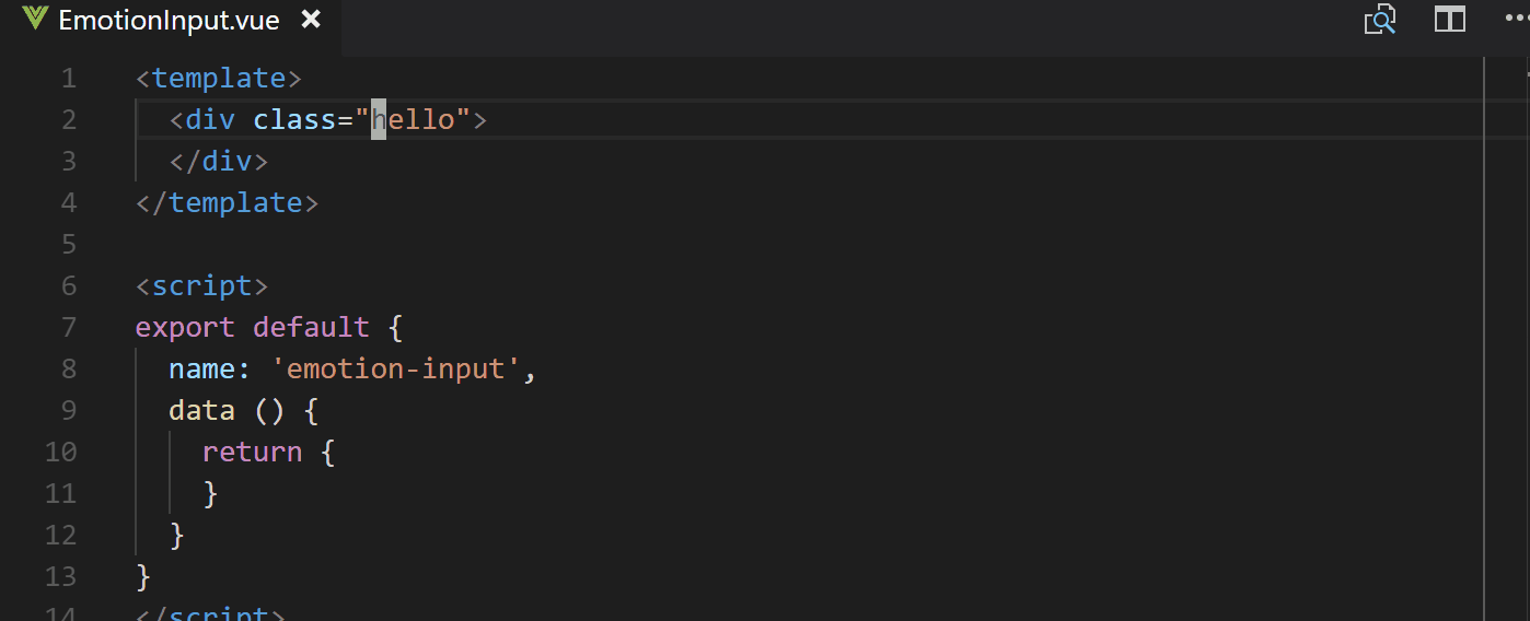
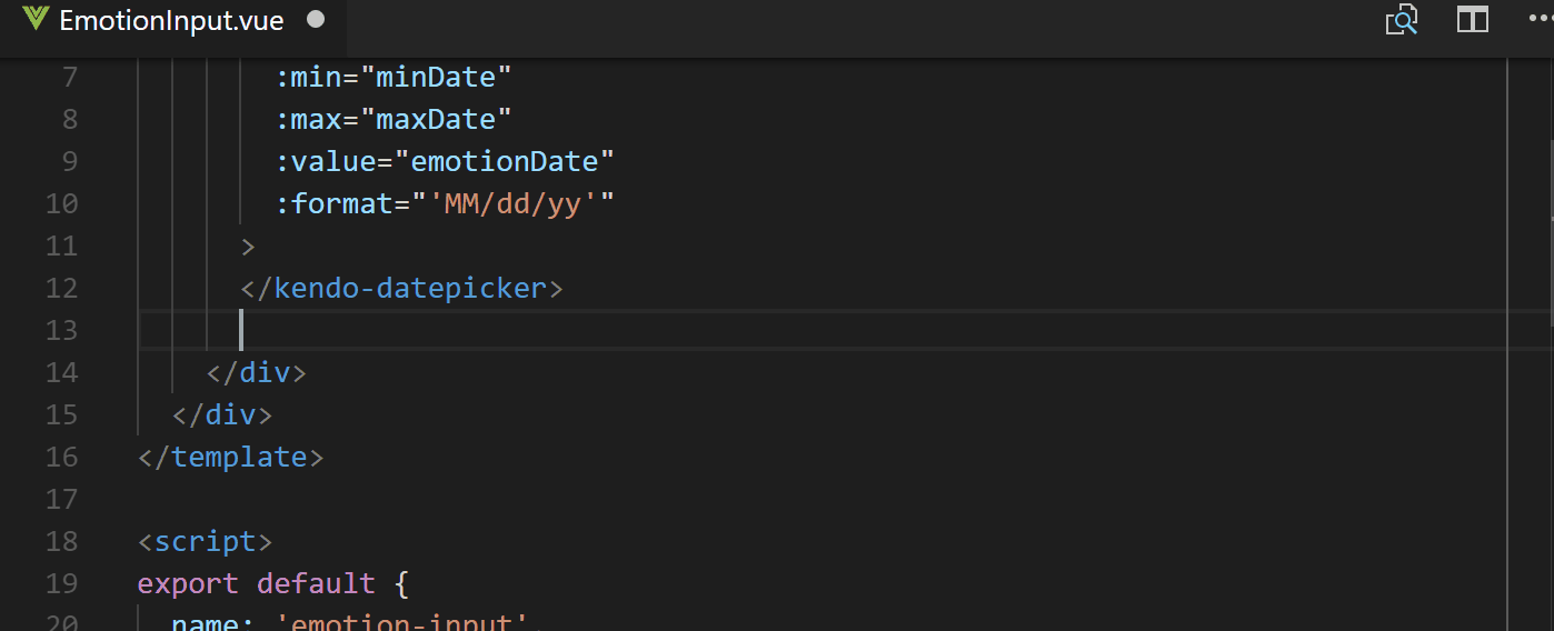
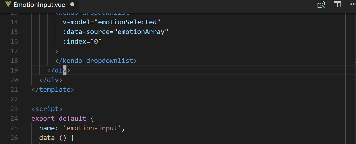
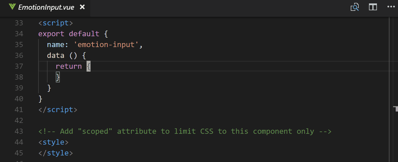
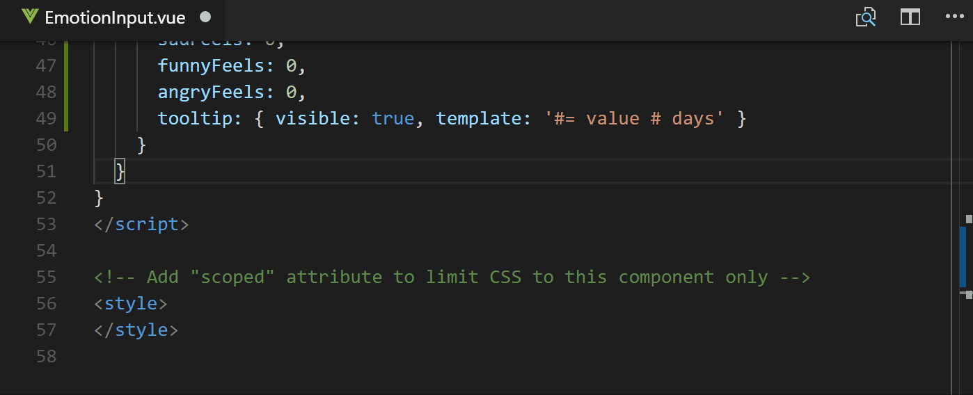
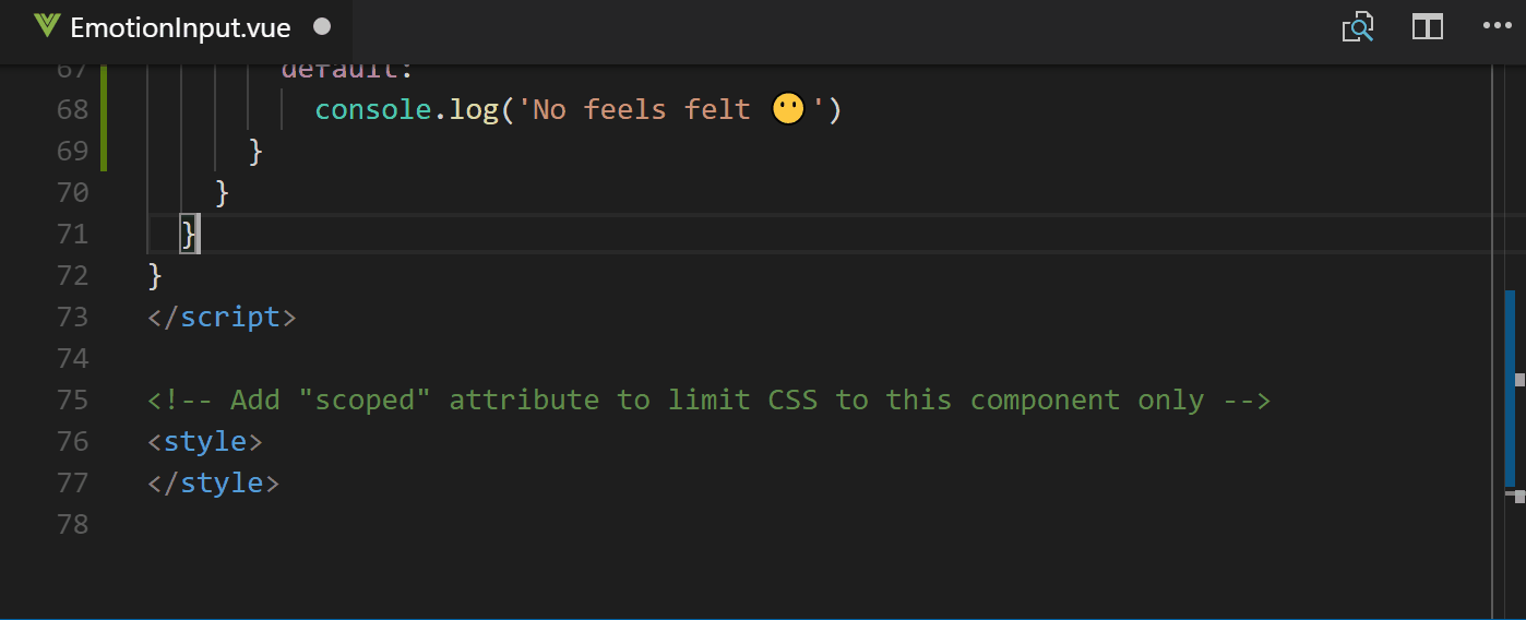
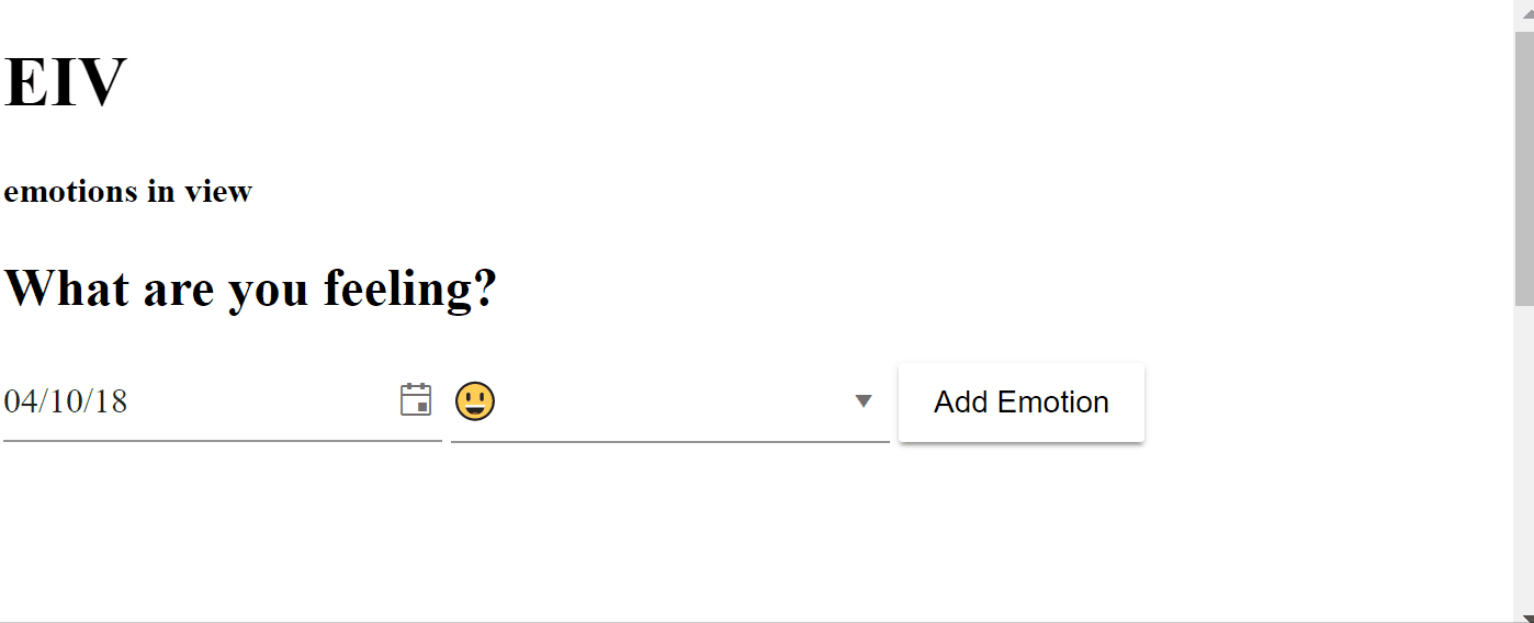
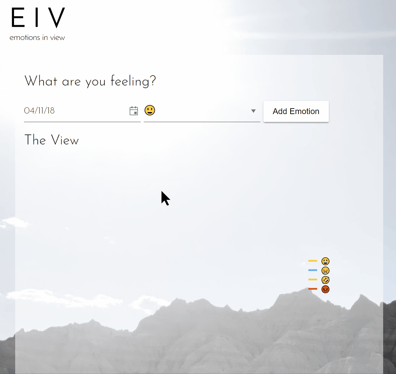
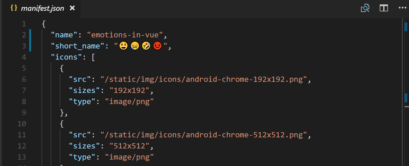