Quantcast
Channel: Telerik Blogs
Viewing all 5211 articles
Browse latest View live

How to use a jQuery Sortable UI Component in Your Web App

$
0
0

Learn how to easily integrate a sortable component into your web app. Sortable is ideal for editing playlists, or anywhere else you want to drag and drop an existing list.

In the last episode, we talked about the Kendo UI Slider component, which lets users select values from a range of values. In this episode, we will learn about the Sortable component. The Sortable component allows users to reorder a list of elements by making each item draggable and droppable. This functionality can be used to edit a playlist or rearrange the rows and columns of a spreadsheet. Because the Sortable component works on an existing list, it is ideal to use with other Kendo UI components that are lists like the ListView and TabStrip components. Coming up, you will see how to use the Sortable component to reorder records in a table and how to integrate it with the Grid component.

Making a Table Sortable

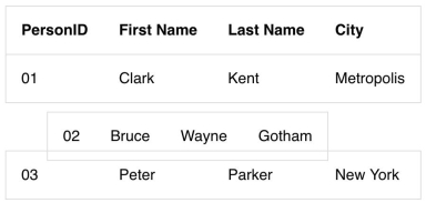
First, we will create a table element with four fields in the header and three records in the body. The records will only be draggable so we will initialize the Sortable widget on the tbody element. By default, when you click on a row and drag it, the placeholder will be empty and the hint will be a copy of the row you are moving. The placeholder is what is seen in the location the item is to be dropped into. The hint is what is dragged along with the cursor. This is an example of a table that has been made sortable:

Sortable

Sortable

<!DOCTYPE html><html><head><metacharset="utf-8"><title>Sortable</title><linkrel="stylesheet"href="https://kendo.cdn.telerik.com/2018.2.620/styles/kendo.bootstrap-v4.min.css"><scriptsrc="https://code.jquery.com/jquery-1.12.3.min.js"></script><scriptsrc="https://kendo.cdn.telerik.com/2018.2.620/js/kendo.all.min.js"></script><style>body {font-family: helvetica;}table, tr {border:1px solid #ddd;border-collapse: collapse;}td, th {padding:1em;text-align: left;}</style></head><body><tableid="grid"><thead><tr><th>PersonID</th><th>First Name</th><th>Last Name</th><th>City</th></tr></thead><tbody><tr><td>01</td><td>Clark</td><td>Kent</td><td>Metropolis</td></tr><tr><td>02</td><td>Bruce</td><td>Wayne</td><td>Gotham</td></tr><tr><td>03</td><td>Peter</td><td>Parker</td><td>New York</td></tr></tbody></table><script>$(document).ready(function(){$('tbody').kendoSortable();});</script></body></html>

Right now, it doesn’t look so nice having an empty space left behind when we move a row. Also, there is nothing indicating to the user that they are dragging the item because the cursor remains an arrow. We will see how to customize these features in the component’s API next.

Customizing the Sortable Table

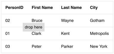
In the previous example, we used the tbody element to initialize the component. In the next example, we will use the table element as the container which we gave the id grid. Using the id of the root element for the sortable component is preferable when your list has been created with another Kendo UI component. In this case, the same element used to initialize the component would be used to make the component sortable. In this example, we will change our cursor to use a move icon. Then we will make the placeholder show the table row that we are dragging. Last, our hint will be changed to show a message that says “drop here.” Here is the updated code:

Sortable

$('#grid').kendoSortable({
  cursor:'move',
  cursorOffset:{top:10, left:30},
  container:'#grid tbody',
  filter:'>tbody >tr',
  placeholder:function(element){return element.clone()},
  hint:'<span class="hint">drop here</span>'});

Since the direct descendants of the table element, the thead and tbody, are not the elements we want to sort, we have to specify what the sortable items are. This is defined in the filter option. For the placeholder option, a function is used so we can get access to the draggable element’s jQuery object. For the hint, we used a string. Finally, the container option is used to set the boundaries where the hint can move around. By default, the hint will be able to move anywhere the cursor can move.

Making a Grid Sortable

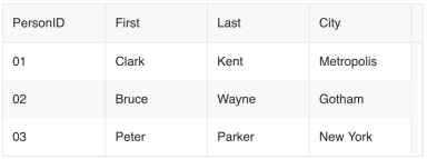
Last, we will look at how to integrate the Kendo UI Grid component with the Sortable component. First, we will make our table into a grid. We could use the same markup from our previous examples to initialize the grid. However, I will demonstrate another way to make a grid. We will abstract the data from the table’s HTML and put it into the grid’s dataSource. Then, we will define the header fields in the columns parameter. This is the new code for the grid:

<divid="grid"></div><script>$(document).ready(function(){var grid =$('#grid').kendoGrid({
    columns:[{ field:'PersonID'},{ field:'First'},{ field:'Last'},{ field:'City'}],
    dataSource:[{
        PersonID:'01', 
        First:'Clark', 
        Last:'Kent', 
        City:'Metropolis'},{
        PersonID:'02', 
        First:'Bruce', 
        Last:'Wayne', 
        City:'Gotham'},{
        PersonID:'03', 
        First:'Peter', 
        Last:'Parker', 
        City:'New York'}]}).data('kendoGrid');});</script>

We can reuse the same parameters from our sortable component like so:

grid.table.kendoSortable({
  container:'#grid tbody',
  filter:'>tbody >tr',
  hint:function(element){return$('<span class="hint">drop here</span>')},
  cursor:'move',
  cursorOffset:{top:10, left:30},
  placeholder:function(element){return element.clone()},});

Sortable

Summary

In this lesson, you saw how to take a table and make it sortable, how to make the table into a grid, and how to make the grid sortable. There are other ways you can use the Sortable component like dragging and dropping items into other lists. This is possible by specifying the other container in the connectWith option.

In the next episode, we will explore this feature in depth by building a Trello clone. Our Trello clone will be a UI built with the Sortable component and other Kendo UI components.

Try out Kendo UI for Yourself

Want to start taking advantage of the more than 70+ ready-made Kendo UI components, like the Grid or Scheduler? You can begin a free trial of Kendo UI today and start developing your apps faster.

Start My Kendo UI Trial

Angular, React, and Vue Versions

Looking for UI component to support specific frameworks? Check out Kendo UI for Angular, KendoReact, or Kendo UI for Vue.

Resources


Serverless and Blazor: Talking Next Gen Apps with Jeremy Likness

$
0
0

On this episode of Eat Sleep Code, we talk about building next generation serverless web apps with Blazor.

Join us as we talk with Jeremy Likness about creating next gen web applications using Blazor & Serverless with Azure. Jeremy shares his interest in Blazor. We also discuss how to implement serverless using the Azure serverless platform that includes Azure Functions, Logic Apps, and Event Grid.

You can listen to the entire show and catch past episodes on SoundCloud. Or just click below.

Jeremy Likness

Jeremy Likness

Jeremy is a Cloud Developer Advocate for Azure at Microsoft. Jeremy wrote his first program in 1982, was recognized in the "who's who in Quake" list for programming the first implementation of "Midnight Capture the Flag" in Quake C and has been developing enterprise applications for 25 years with a primary focus on web-based delivery of line of business applications. Jeremy is the author of four technology books, a former 8-year Microsoft MVP for Developer Tools and Technologies, an international and keynote speaker and writes regularly on cloud and container development. Jeremy follows a plant-based diet and spends most of his free time running, hiking and camping, and playing 9-ball and one pocket.

Show Notes

Vue.js - How to Build Your First Package & Publish It on NPM

$
0
0

We'll learn how to make our own plugin for Vue.js, and distribute it on NPM for everyone to use.

Plugins are what makes our lives as developers so much more productive. Most of our projects depend on them as they allow us to ship new features with great speed.

As stated in the Official Vue.js documentation, there is no strictly defined scope for a plugin. It simply adds global-level functionality to your project. But they typically fall into these five categories based on the things we are trying to achieve with them:

  1. Add some global methods or properties (e.g. this is what Vuex or vue-router does).
  2. Add one or more global assets (e.g. something like a stylesheet with/or a JavaScript library).
  3. Add some component options by global mixin (e.g. this is what vue-html-to-paper does).
  4. Add some Vue instance methods by attaching them to Vue.prototype (e.g. this is what vue-axios does).
  5. A library that provides an API of its own, while at the same time injecting some combination of the above.

Now that you understand how handy plugins can be and what needs they can fulfill, let’s see how to add one to your project. Then, we’ll learn how to make our own and distribute it on NPM for everyone to use (yes, it’s going to be super fun!).

How to Add a Vue.js Plugin to Your Project.

To use your plugin after you’ve installed it with npm install (or yarn add), you need to go to your main.js file. This is the entry point that drives our Vue application. Import it and call the Vue.use() global method. One word of caution though: All plugins must instantiated before you start your app with new Vue().

import Vue from"vue";import YourPlugin from"yourplugin";

Vue.use(YourPlugin);newVue({// [...]})

There is also another way to add a new plugin when the package author allows it: dropping the CDN link in your header’s script tag.

<script src="https://cdn.jsdelivr.net/npm/yourplugin@latest/dist/yourplugin.min.js"></script>

Sometimes, you would like to customize how a plugin behaves. You can easily do so by passing some options to it when calling Vue.use(). Here is how it works:

Vue.use(YourPlugin,{
 someOption:false,
 anotherOption:false})

For instance with vue-chartist, you can choose the text to display when no data is available to properly draw the chart as follows:

Vue.use(VueChartist,{
 messageNoData:"You have not enough data"});

Now let’s get back to the main event — building your first Vue.js plugin together.

How to Build Your Own Vue.js Plugin from Scratch

If you are reading this, you are probably a frontend developer like me. And like any other frontend developer, you probably love having nice handsome buttons for your interfaces! So that’s what we’ll be building: a bunch of nice handsome buttons that we’ll be able to reuse. This will save us a lot of time for future projects! You’ll also have the knowledge to package all your remaining base components and why not release your own design system?

Step 1: Initializing the Plugin Structure

Let’s create an empty folder for our package and initialize NPM. This will generate a new package.json file. We’ll deal with it later.

$ mkdir nice-handsome-button &&cd nice-handsome-button
$ npm init
# The command above will create a new package.json# Press enter to answer all the following questions

Add a new folder called src at the root, in which you create a new file NiceHandsomeButton.vue. You can rapidly prototype with just a single *.vue file with the vue serve and vue buildcommands, but they require an additional global addon to be installed first:

npminstall -g @vue/cli
npminstall -g @vue/cli-service-global

Now if you run:

$ vue serve NiceHandsomeButton.vue

Visit http://localhost:8080/. A blank page should appear in your browser. Let’s work on our button component from now on! ‍‍

You can read more about @vue/cli-service-global in the official documentation. This addon is that it is quite useful for working on a single .vue file without scaffolding an entire project with vue create my-new-project.

Step 2: Working on Our Handsome Button Component

Template

As this tutorial is not about learning how to write Vue components, I expect you to be familiar with the basics. The full code of our nice handsome button is available below (the template, the JavaScript logic and the style). Copy it, open NiceHandsomeButton.vue and paste the content inside.

<template><button@click="onClick"@dblclick="onDoubleClick":class="[
   'nice-handsome-button',
   'nice-handsome-button--' + color,
   'nice-handsome-button--' + size,
   {
    'nice-handsome-button--rounded': rounded
   }
  ]"><slot></slot></button></template>

We have kept things simple, but here are a few things to note:

  • I am using BEM. If you are not familiar with it, please read this now: MindBEMding — getting your head 'round BEM syntax.
  • I added the props color, size and rounded. As their names indicate, they will allow us to control the color, the size and whether or not our button should be rounded.
  • I’m also using a slot for the content so that we can use it like a normal button <nice-handsome-button>My Button Label</nice-handsome-button>.

JavaScript

Let’s define the props our component can accept as well as the two methods that will emit an event when we click/double-click on it.

<script>exportdefault{
 props:{
  color:{
   type: String,default:"blue",validator(x){return["blue","green","red"].indexOf(x)!==-1;}},
  rounded:{
   type: Boolean,default:true},
  size:{
   type: String,default:"default",validator(x){return["small","default","large"].indexOf(x)!==-1;}},},

 methods:{onClick(event){this.$emit("click", event);},onDoubleClick(event){this.$emit("dblclick", event);},}};</script>

Style

Last but not least, let’s style our component. ‍

<style>
.nice-handsome-button {display: inline-block;outline:0;border:1px solid rgba(0, 0, 0, 0.1);color:#ffffff;font-weight:500;font-family:"Helvetica Neue", Helvetica, Arial, sans-serif;user-select: none;cursor: pointer;}/* --> COLORS <-- */.nice-handsome-button--blue {background-color:#0194ef;}.nice-handsome-button--green {background-color:#1bb934;}.nice-handsome-button--red {background-color:#e1112c;}/* --> SIZES <-- */.nice-handsome-button--small {padding:8px 10px;border-radius:4px;font-size:12px;line-height:12px;}.nice-handsome-button--default {padding:12px 14px;border-radius:6px;font-size:14px;line-height:16px;}.nice-handsome-button--large {padding:16px 18px;border-radius:8px;font-size:16px;line-height:20px;}/* --> BOOLEANS <-- */.nice-handsome-button--rounded {border-radius:60px;}</style>

Our component is now ready to use and can be used like this:

<nice-handsome-button:rounded="true"color="red"size="large">My Button</nice-handsome-button>

Let’s package it now.

Step 3: Write the Install Method

Before we start this section, let’s create an index.js file in your src folder.

Remember that Vue.use() global we talked about earlier? Well… what this function does is call the install() method that we will define now.

This function takes two parameters: the Vue constructor and the options object that a user can set. You can skip the last argument if you don’t need it as it is optional. But if you want to make your plugin customizable, this is where you will catch the different parameters:

Vue.use({
 param:"something"})`.// Then in your install method options.param will equal to "something"

In index.js, let’s import our component and define our install method.

import NiceHandsomeButton from"./NiceHandsomeButton.vue";exportdefault{install(Vue, options){// Let's register our component globally// https://vuejs.org/v2/guide/components-registration.html
  Vue.component("nice-handsome-button", NiceHandsomeButton);}};

Congratulations, you almost made it!

Step 4: Reworking package.json

Open your package.json file that you created when running npm init.

{"private":false,"name":"nice-handsome-button","version":"0.0.1","description":"A nice handsome button you will love","author":"Nada Rifki","license":"MIT","main":"./dist/index.cjs.js","scripts":{"dev":"vue serve NiceHandsomeButton.vue","build":"bili --name index --plugin vue --vue.css false"},"files":["dist/*"]}

A few notes:

  • private is set to false. This means your package is public (i.e. everyone is able to see and install it).
  • Choose a name for your package. You have to make sure that it’s not already taken.
  • The version number is set to 0.0.1. You will have to increment this number every time you publish an update for your package. If you are not familiar with semantic versioning, I highly recommend you read this.
  • Choose a description that describes your package in a few words. This will help other developers understand what pain your plugin solves.
  • The main is the primary entry point to your program. That is, if your package is named foo, and a user installs it, and then does require("foo"), then your main module’s exports object will be returned.
  • The scripts property is a dictionary containing script commands that you can easily run with npm run.
  • The files property specifies which files should be published on NPM. It is usually a bad idea to publish everything. We’ll be using bili, so all files in dist folder should be included.

You can read more about all these properties in the official NPM documentation.

Bundling Your Library

In case you don’t know, bundling is the process of grouping all your code from all your files in your project into one single file. The reason behind is simply to increase performance. This will also minify the code and do some other cool things.

To do so, we’ll use Bili, a fast and zero-config library bundler that uses Rollup.js under the hood.

Let’s install it.

$ npminstall --save-dev bili

# We'll need these two packages to transpile .vue files# https://bili.egoist.moe/#/recipes/vue-component
$ npminstall --save-dev rollup-plugin-vue
$ npminstall --save-dev vue-template-compiler

Now, create our bili.config.js file in the root folder and add our bundling settings:

module.exports ={
  banner:true,
  output:{
    extractCSS:false,},
  plugins:{
    vue:{
      css:true}}};

All you have left to do is run the command below on your terminal and your package is bundled — it’s as easy as 1-2-3!

$ npx bili

You should obtain a new dist folder with a index.cjs.js file.

By default <style> tag in Vue SFC will be extracted to the same location where the JS is generated but with .css extension. That’s why we added --vue.css false in the command above.

To learn more about Bili and how to customize it, I recommend you take a look at the documentation.

Sharing Your Wonder on NPM

Now that your package is ready, the only thing left for you is to publish your package on NPM.

Start by creating an account on NPM (you can also run npm adduser if you prefer using the command lines). Then go to your terminal and run npm login. You will have to input your username, password and email.

You can check that you are logged in by typing npm whoami. This should display your username.

There is now only one terminal command that stands between you and publishing your package:

$ npm publish

And voilà!

To update your package, just increment the version number in your package.json and rerun npm publish.

How to Use Your Newly Published Library

You can install it like any other package:

$ npminstall --save nice-handsome-button

In your main.js, or a similar entry point for your app:

import NiceHandsomeButton from"nice-handsome-button";import Vue from"vue";

Vue.use(NiceHandsomeButton);

Now, the nice handsome button should be able in any of your .vue files.

<nice-handsome-button:rounded="true"color="red"size="large">My Button</nice-handsome-button>

Where to Go from There?

There is a lot you can do now and that’s awesome! You learned how to package your first component and publish it on NPM for everyone to use. But don’t stop now! Here are a few ideas that may inspire you:

  • Improving this button component by allowing people to set an icon on the left, managing other events like mouseenter or mouseout and so on.
  • Adding new components to this one and releasing a design system.
  • Building a different plugin like a directive or a mixin.

Easy peasy! Finally, we’re done. You can find the plugin’s final code on my GitHub. Feel free to give me your feedback or to reach me on Twitter @RifkiNada if you need help. Enjoy and have a good day!

An Overview of Telerik Fiddler

$
0
0

Telerik Fiddler is a web debugging proxy that's incredibly useful for developers. This post provides an overview of Telerik Fiddler.

Telerik Fiddler (or Fiddler) is a special-purpose proxy server for debugging web traffic from applications like browsers. It’s used to capture and record this web traffic and then forward it onto a web server. The server’s responses are then returned to Fiddler and then returned back to the client.

The recorded web traffic is presented through a session list in the Fiddler UI:

Nearly all programs that use web protocols support proxy servers. As a result, Fiddler can be used with most applications without need for further configuration. When Fiddler starts to capture traffic, it registers itself with the Windows Internet (WinINet) networking component and requests that all applications begin directing their requests to Fiddler.

A small set of applications do not automatically respect the Windows networking configuration and may require manual configuration in order for Fiddler to capture their traffic. Fiddler can be configured to work in these scenarios, including server-to-server (e.g. web services) and device-to-server traffic (e.g. mobile device clients). By default, Fiddler is designed to automatically chain to any upstream proxy server that was configured before it began capturing - this allows Fiddler to work in network environments where a proxy server is already in use.

Because Fiddler captures traffic from all locally-running processes, it supports a wide range of filters. These enable you to hide traffict that is not of interest to you, as well as highlighting traffic you deem interesting (using colors or font choice). Filters can be applied based on the source of the traffic (e.g. the specific client process) or based on some characteristic of the traffic itself (e.g. what hostname the traffic is bound for, or what type of content the server returned).

Fiddler supports a rich extensibility model which ranges from simple FiddlerScript (C# or JScript 10.0) to powerful extensions which can be developed using any .NET language. Fiddler also supports several special-purpose extension types. The most popular are inspectors, which enable you to inspect requests/responses. Inspectors can be built to display all response types (e.g. the HexView inspector) or tailored to support a type-specific format (e.g. the JSON inspector). If you’re a developer, you can build Fiddler’s core proxy engine into your applications using a class library named FiddlerCore.

Fiddler can decrypt HTTPS traffic and display and modify the requests that would otherwise be inscrutable to observers on the network using a man-in-the-middle decryption technique. To permit seamless debugging without security warnings, Fiddler’s root certificate may be installed in the Trusted Certificates store of the system or web browser.

A web session represents a single transaction between a client and a server. Each session appears as a single entry in the Web Sessions List in the Fiddler interface. Each session object has a request and a response, representing what the client sent to the server and what the server returned to the client. The session object also maintains a set of flags that record metadata about the session, and a timers object that stores timestamps logged in the course of processing the session.

Proxy servers are not limited to simply viewing network traffic; Fiddler got its name from its ability to “fiddle” with outbound requests and inbound responses. Manual tampering of traffic may be performed by setting a request or response breakpoint. When a breakpoint is set, Fiddler will pause the processing of the session and permit manual alteration of the request and the response.

Traffic rewriting may also be performed automatically by script or extensions running inside of Fiddler. By default, Fiddler operates in buffering mode, whereby the server’s response is completely collected before any part of it is sent to the client. If the streaming mode is instead enabled, the server’s response will be immediately returned to the client as it is downloaded. In streaming mode, response tampering is not possible.

Captured sessions can be saved in a Session Archive Zip (SAZ) file for later viewing. This compressed file format contains the full request and response, as well as flags, timers, and other metadata. A lightweight capture-only tool known as FiddlerCap may be used by non-technical users to collect a SAZ file for analysis by experts. Fiddler supports Exporter extensions that allow storing captured sessions in myriad other formats for interoperability with other tools. Similarly, Fiddler supports Importer extensions that enable Fiddler to load traffic stored in other formats, including the HTTP Archive (HAR) format used by many browsers’ developer tools.

Usage Scenarios

Some of the most common questions are of the form: “Can I use Fiddler to accomplish [x]?” While there are a huge number of scenarios for which Fiddler is useful, and a number of scenarios for which Fiddler isn’t suitable, the most common tasks fall into a few buckets. Here’s a rough guide to what you can and cannot do with Fiddler:

An Incomplete List of Things Fiddler Can Do

  • View web traffic from nearly any browser, client application, or service.
  • Modify any request or response, either manually or automatically.
  • Decrypt HTTPS traffic to enable viewing and modification.
  • Store captured traffic to an archive and reload it later, even from a different computer.
  • Playback previously-captured responses to a client application, even if the server is offline.
  • Debug web traffic from most PCs and devices, including macOS/Linux systems and mobile devices.
  • Chain to upstream proxy servers, including the Tor network.
  • Run as a reverse proxy on a server to capture traffic without reconfiguring the client computer or device.
  • Grow more powerful with new features added by FiddlerScript or the .NET-based extensibility model.

An Incomplete List of Things Fiddler Cannot Do

While Fiddler is a very flexible tool, there are some things it cannot presently do. That list includes:

  • Debug non-web protocol traffic.
    • Fiddler works with HTTP, HTTPS, and FTP traffic and related protocols like HTML5 WebSockets and ICY streams.
    • Fiddler cannot “see” or alter traffic that runs on other protocols like SMTP, POP3, Telnet, IRC, etc.
    • Handle huge requests or responses.
  • Fiddler cannot handle requests larger than 2 GB in size.
    • Fiddler has limited ability to handle responses larger than 2 GB.
    • Fiddler uses system memory and the pagefile to hold session data. Storing large numbers of sessions or huge requests or responses can result in slow performance.
  • “Magically” remove bugs in a website for you.
    • While Fiddler will identify networking problems on your behalf, it generally cannot fix them without your help. I can’t tell you how many times I’ve gotten emails asking: “What gives? I installed Fiddler but my website still has bugs!”

The above text is a modified excerpt from the book, “Debugging with Fiddler, Second Edition” by Eric Lawrence. Options for purchasing this book can be found at fiddlerbook.com.

Copying and Cloning Arrays in C#

$
0
0

Learn how to copy elements from one array to another using the provided functions in System.Array class.

An array in C# is a collection of data items, all of the same type and accessed using a numeral index. The Array class provides methods for creating, manipulating, searching, and sorting arrays in .NET. There will be situations where you want to work with a new array but copy items from an existing array to it, or copy items from one array into another array. I’ll show you how to do this using some available methods in the Array class.

Array.CopyTo

Array.CopyTo copies all the elements of the current array to the specified destination array. This method should be called from the source array and it takes two parameters. The first being the array you want to copy to, and the second parameter tells it what index of the destination array it should start copying into. Let’s take a look at an example.

var source = new[] { "Ally", "Bishop", "Billy" };
var target = new string[4];

source.CopyTo(target, 1);
foreach (var item in target)
{
  Console.WriteLine(item);
}

// output:

// Ally
// Bishop
// Billy

The code above copies all items in the source array to the target array. It copies elements from the source to the target array object starting at index 1; therefore, index 0 of the target array is null.

Array.ConstrainedCopy

Array.ConstrainedCopy is similar to Array.CopyTo. The difference is that Array.ConstrainedCopy guarantees that all changes are undone if the copy operation does not succeed completely because of some exception. Here’s an example of how Array.CopyTo behaves when it encounters an exception.

var source = new object[] { "Ally", "Bishop", 1 };
var target = new string[3];

try
{
  source.CopyTo(target, 0);
}
catch (InvalidCastException)
{
  foreach (var element in target)
  {
    Console.WriteLine(element);
  }
}

Console.Read();

// output:

// Ally
// Bishop

Above, we have a source array that has elements of string and object type. We copy the content from the source array into a target array, which is a string type. When this code runs, it’ll encounter an InvalidCastException when it tries to copy the last element, which does not match the type of the target array. The copy operation fails at that point, but the target array already has some of the element from the source array from what we see printed in the console. Let’s try a similar example with ConstrainedCopy:

var source = new object[] { "Ally", "Bishop", 1 };
var target = new string[3];

try
{
  Array.ConstrainedCopy(source, 0, target, 0, 3);
}
catch (ArrayTypeMismatchException)
{
  Console.WriteLine(target[0]);
  Console.WriteLine(target[1]);
}

Console.Read();

Array.ConstrainedCopy takes five (5) parameters: the source array and its starting index, the target array and its starting index, and an integer representing the number of elements to copy. When the code above runs, it encounters an exception, and, when you check the content of the target array, you’ll notice it has nothing in it, unlike Array.CopyTo.

Array.ConvertAll

Array.ConvertAll is used to convert an array of one type to an array of a different type. The method takes the source array as the first parameter, and then a second parameter of Converter<TInput,TOutput> delegate. This delegate represents a conversion function to convert from one type to another.

Assume the following class:

class Person
{
  public Person(string name)
  {
    Name = name;
  }
  public string Name { get; private set; }
}

Here is an example of Array.ConvertAll being used with this type:

var source = new[] { "Ally", "Bishop", "Billy" };
var target = Array.ConvertAll(source, x => new Person(x));

foreach (var item in target)
{
  Console.WriteLine(item.Name);
}
Console.Read();

// output:

// Ally
// Bishop
// Billy

Here we are taking an array of string and making a new array of Person out of it. This comes in handy when we want to make a new array that copies data from another array.

Array.Clone Method

Array.Clone does a shallow copy of all the elements in the source array and returns an object containing those elements. Here’s an example of how you can use this method:

static void Main(string[] args)
{
  var source = new[] { "Ally", "Bishop", "Billy" };
  var target = (string[])source.Clone();
  foreach (var element in target)
  {
    Console.WriteLine(element);
  }

  Console.Read();
}

// output:

// Ally
// Bishop
// Billy

Array.Clone returns an object that we have to cast to an array of strings. This differs from Array.CopyTo because it doesn’t require a target/destination array to be available when calling the function, whereas Array.CopyTo requires a destination array and an index.

Conclusion

The Array class in C# is very useful when working with a collection of data. It provides methods for creating, manipulating, searching, and sorting arrays. In this post, I showed you how to copy data from one array object to another. You saw the various methods available from the Array class. They are Clone, CopyTo, ConstrainedCopy, and ConvertAll methods. The various examples showed you how to use these methods, and I believe this should leave you with additional knowledge on working with arrays in C#.

Feel free to leave a comment if you have any questions. Happy coding!

Health Checks in ASP.NET Core

$
0
0

Learn how to configure and develop health checks in ASP.NET Core to confirm the health of your application.

Health checks are a new middleware available in ASP.NET Core 2.2. It provides a way to expose the health of your application through an HTTP endpoint.

The health of your application can mean many things. It's up to you to configure what is considered healthy or unhealthy.

Maybe your application is reliant on the ability to connect to a database. If your application cannot connect to the database, then the health check endpoint would respond as unhealthy.

Other scenarios could include confirming the environment that is hosting the application is in a healthy state. For example, memory usage, disk space, etc.
If you have used a load balancer you've probably used at least a basic health check. Likewise, if you've used docker, you may be familiar with its HEALTHCHECK.

In a load balancing scenario, this means that the load balancer periodically makes an HTTP request to your health check endpoint. If it receives a HTTP 200 OK status, then it adds the application to the load balancer pool and live HTTP traffic will be routed to that instance.

If it responds with an unhealthy status (usually anything other than HTTP 200 OK), it will not add or remove it from the load balancer pool.

Basics

The bare minimum to get health checks added to your application are to modify the Startup.cs file by adding health checks to the ConfigureServices and Configure methods appropriately.

using Microsoft.AspNetCore.Builder;
using Microsoft.AspNetCore.Hosting;
using Microsoft.AspNetCore.Mvc;
using Microsoft.Extensions.Configuration;
using Microsoft.Extensions.DependencyInjection;

namespace AspNetCore.HealthCheck.Demo
{
  public class Startup
  {
    public Startup(IConfiguration configuration)
    {
      Configuration = configuration;
    }

    public IConfiguration Configuration { get; }

    public void ConfigureServices(IServiceCollection services)
    {
      services.AddHealthChecks();
      services.AddDbContext<MyDbContext>();
      services.AddMvc().SetCompatibilityVersion(CompatibilityVersion.Version_2_2);
    }


    public void Configure(IApplicationBuilder app, IHostingEnvironment env)
    {
      app.UseHealthChecks("/health");
      app.UseStaticFiles();
      app.UseMvc();
    }
  }
}

When you browse to the /health route, you will receive an HTTP 200 OK with the content body of Healthy.

Custom Health Check

One common health check might be to verify that we can connect to our database. In this example, I have an Entity Framework Core DbContext called MyDbContext, which is registered in ConfigureServices().

In order to test our database connection, we can create a custom health check. To do so, we need to implement IHealthCheck. The CheckhealthAsync requires us to return a HealthCheckStatus. If we are able to connect to the database, we will return Healthy; otherwise, we will return Unhealthy.

You will also notice that we are using dependency injection through the constructor. Anything registered in ConfigureServices() is available for us to inject in the constructor of our health check.

using System.Threading;
using System.Threading.Tasks;
using Microsoft.Extensions.Diagnostics.HealthChecks;

namespace AspNetCore.HealthCheck.Demo
{
  public class DbContextHealthCheck : IHealthCheck
  {
    private readonly MyDbContext _dbContext;


    public DbContextHealthCheck(MyDbContext dbContext)
    {
      _dbContext = dbContext;
    }

    public async Task<HealthCheckResult> CheckHealthAsync(HealthCheckContext context,
      CancellationToken cancellationToken = new CancellationToken())
    {
      return await _dbContext.Database.CanConnectAsync(cancellationToken)
              ? HealthCheckResult.Healthy()
              : HealthCheckResult.Unhealthy();
    }
  }
}

Now, in order to use add new health check, we can use Addcheck() to AddHealthChecks() in ConfigureServices():

using Microsoft.AspNetCore.Builder;
using Microsoft.AspNetCore.Hosting;
using Microsoft.AspNetCore.Mvc;
using Microsoft.Extensions.Configuration;
using Microsoft.Extensions.DependencyInjection;

namespace AspNetCore.HealthCheck.Demo
{
  public class Startup
  {
    public Startup(IConfiguration configuration)
    {
      Configuration = configuration;
    }

    public IConfiguration Configuration { get; }

    public void ConfigureServices(IServiceCollection services)
    {
      services.AddDbContext<MyDbContext>();

      services.AddHealthChecks()
              .AddCheck<MyDbContextHealthCheck>("DbContextHealthCheck");

      services.AddMvc().SetCompatibilityVersion(CompatibilityVersion.Version_2_2);
    }


    public void Configure(IApplicationBuilder app, IHostingEnvironment env)
    {
      app.UseHealthChecks("/health");           
      app.UseStaticFiles();
      app.UseMvc();
    }
  }
}

Built-in EF Core Check

Luckily, we don't actually need to create an EF Core DbContext check as Microsoft has already done so in the Microsoft.Extensions.Diagnostics.HealthChecks.EntityFrameworkCore NuGet Package. We can simply use this package and then change our check to the following:

services.AddHealthChecks()
        .AddDbContextCheck<MyDbContext>("DbContextHealthCheck");

Community Packages

There are a bunch of health check packages on NuGet for SQL Server, MySQL, MongoDB, Redis, RabbitMQ, Elasticsearch, Azure Storage, Amazon S3, and many more.

You can find all of these on AspNetCore.Diagnostics.HealthChecks repository on GitHub that reference each NuGet package.

Here's a couple examples of how easily they are to add to your Startup's ConfigureServices():

AspNetCore.HealthChecks.SqlServer

public void ConfigureServices(IServiceCollection services)
{
  services.AddHealthChecks()
          .AddSqlServer(Configuration["Data:ConnectionStrings:Sql"])
}

AspNetCore.HealthChecks.Redis

public void ConfigureServices(IServiceCollection services)
{
  services.AddHealthChecks()
          .AddRedis(Configuration["Data:ConnectionStrings:Redis"])
}

Options

There are a few different options for configuring how the health check middleware behaves.

Status Codes

In our own DbContextHealthCheck, we returned a Healthy status if our application can connect to our database. Otherwise, we returned an Unhealthy status.

This results in the /health endpoint returning different HTTP status codes depending on our HealthStatus. By default, healthy will return a HTTP Status of 200 OK. Unhealthy will return a 503 Service Unavailable. We can modify this default behavior by using HealthCheckOptions to create our mappings between HealthStatus and StatusCodes.

app.UseHealthChecks("/health", new HealthCheckOptions
{
  ResultStatusCodes =
  {
    [HealthStatus.Healthy] = StatusCodes.Status200OK,
    [HealthStatus.Degraded] = StatusCodes.Status200OK,
    [HealthStatus.Unhealthy] = StatusCodes.Status503ServiceUnavailable,
  }
});

There is a third status code: Degraded. By default, this will also return a 200 OK status.

Response

By default, the Content-Type of the response will be text/plain and the response body will be Healthy or Unhealthy.

Another option you may want to configure is the actual response body of the endpoint. You can control the output by configuring the ResponseWriter in the HealthCheckOptions.

Instead of returning plain text, I'll serialize the HealthReport to JSON:

app.UseHealthChecks("/health", new HealthCheckOptions
{
  ResponseWriter = async (context, report) =>
  {
    context.Response.ContentType = "application/json; charset=utf-8";
    var bytes = Encoding.UTF8.GetBytes(JsonConvert.SerializeObject(report));
    await context.Response.Body.WriteAsync(bytes);
  }
});

This results in our /health endpoint returning:

Content-Type: application/json; charset=utf-8
Server: Kestrel
Cache-Control: no-store, no-cache
Pragma:no-cache
Transfer-Encoding: chunked
Expires: Thu, 01 Jan 1970 00:00:00 GMT
{
  "Entries": {
    "DbContextHealthCheck": {
      "Data": {},
      "Description": null,
      "Duration": "00:00:00.0265244",
      "Exception": null,
      "Status": 2
    }
  },
  "Status": 2,
  "TotalDuration": "00:00:00.0302606"
}

Timeouts

One thing to consider when creating health checks is timeouts. For example, maybe you've created a health check is testing a database connection or perhaps you are using HttpClient to verify you can make an external HTTP connection.

Often, these clients (DbConnection or HttpClient) have default timeout lengths that can be fairly high. HttpClient has a default of 100 seconds.

If you are using the health check endpoint for a load balancer to determine the health of your application, you want to have it return its health status as quickly as possible. If you have a internet connection issue, you may not want to wait 100 seconds to return a 503 Service Unavailable. This will delay your load balancer from removing your application from the pool.

Web UI

There is another excellent package, AspNetCore.HealthChecks.UI that adds a web UI to your app. This allows you to visualize the health checks you have configured and their status.

Once the package is installed, you need to call AddHealthChecksUI() to ConfigureServices() as well as call UseHealthChecksUI() from Configure() in your Startup.

You also need to configure the ResponseWrite to use the UIResponseWriter.WriteHealthCheckUIResponse. This essentially does what we have above by serializing the HealthReport to JSON. This is required by the HealthCheck-UI in order for it to get detailed information about your configured health checks.

public class Startup
{
  public Startup(IConfiguration configuration)
  {
    Configuration = configuration;
  }

  public IConfiguration Configuration { get; }

  public void ConfigureServices(IServiceCollection services)
  {
    services.AddDbContext<MyDbContext>();


    services.AddHealthChecks()
            .AddCheck<MyDbContextHealthCheck>("DbContextHealthCheck");
    
    services.AddHealthChecksUI();
    
    services.AddMvc().SetCompatibilityVersion(CompatibilityVersion.Version_2_2);
  }

  public void Configure(IApplicationBuilder app, IHostingEnvironment env)
  {
    app.UseHealthChecks("/health", new HealthCheckOptions()
    {
      Predicate = _ => true,
      ResponseWriter = UIResponseWriter.WriteHealthCheckUIResponse
    });
    
    app.UseHealthChecksUI();
    
    app.UseStaticFiles();
    app.UseMvc();
  }
}

This will add a new route to your application at /healthchecks-ui.

You also need to add some configuration to appsettings.json (or whatever configuration you are pulling from).

This tells the HealthChecks-UI where to poll for the detailed health check information. Because of this, you could add as many different URLs for various other ASP.NET Core applications that are returning health check data.

For our example, we will just add our local endpoint we have running at /health:

"HealthChecks-UI": {
  "HealthChecks": [
    {
      "Name": "Local",
      "Uri": "http://localhost:5000/health"
    }
  ],
  "EvaluationTimeOnSeconds": 10,
  "MinimumSecondsBetweenFailureNotifications": 60
}

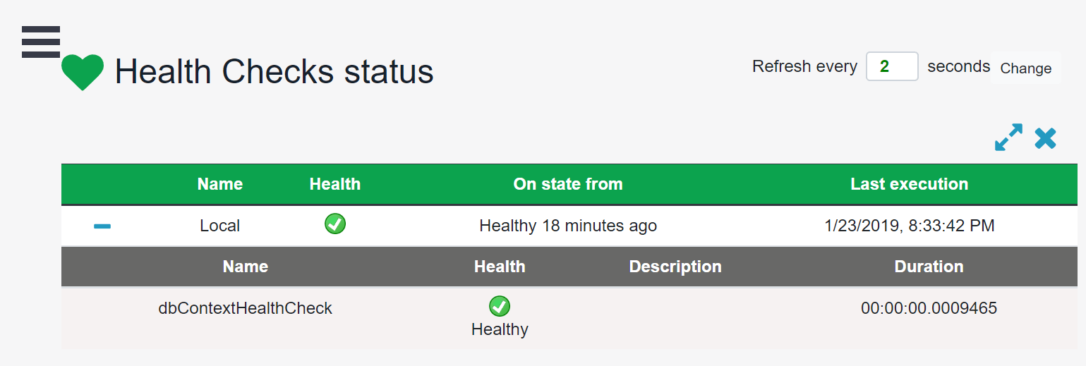
Now when you browse to /healtchecks-ui, you will see the UI with a listing of our health checks:

Health Check UI

Summary

The health check middleware is a great new addition to ASP.NET Core. It is configurable and very easy to add your own new health checks. The community is already releasing many different packages for various external services, and I can only assume they will increase in the future.

For More on Developing with ASP.NET Core

Want to learn about creating great user interfaces with ASP.NET Core? Check out Telerik UI for ASP.NET Core, with everything from grids and charts to schedulers and pickers.

10 Tips to Increase your Productivity when Coding in Vue.js

$
0
0

Check out the top 10 tips that helped increase my productivity when developing apps with Vue.js. Share your own favorite tip in the comments.

Vue.js is a fast-growing JavaScript framework backed up by a strong community since 2014. Along the years, good practices and shortcuts have emerged to ship faster and maintain a better codebase. Today, I’m sharing with you 10 tips that helped increase my productivity and that I’m sure will do the same for you.

Tip #1: Use Comments to Separate Each Section in Your Single File Components

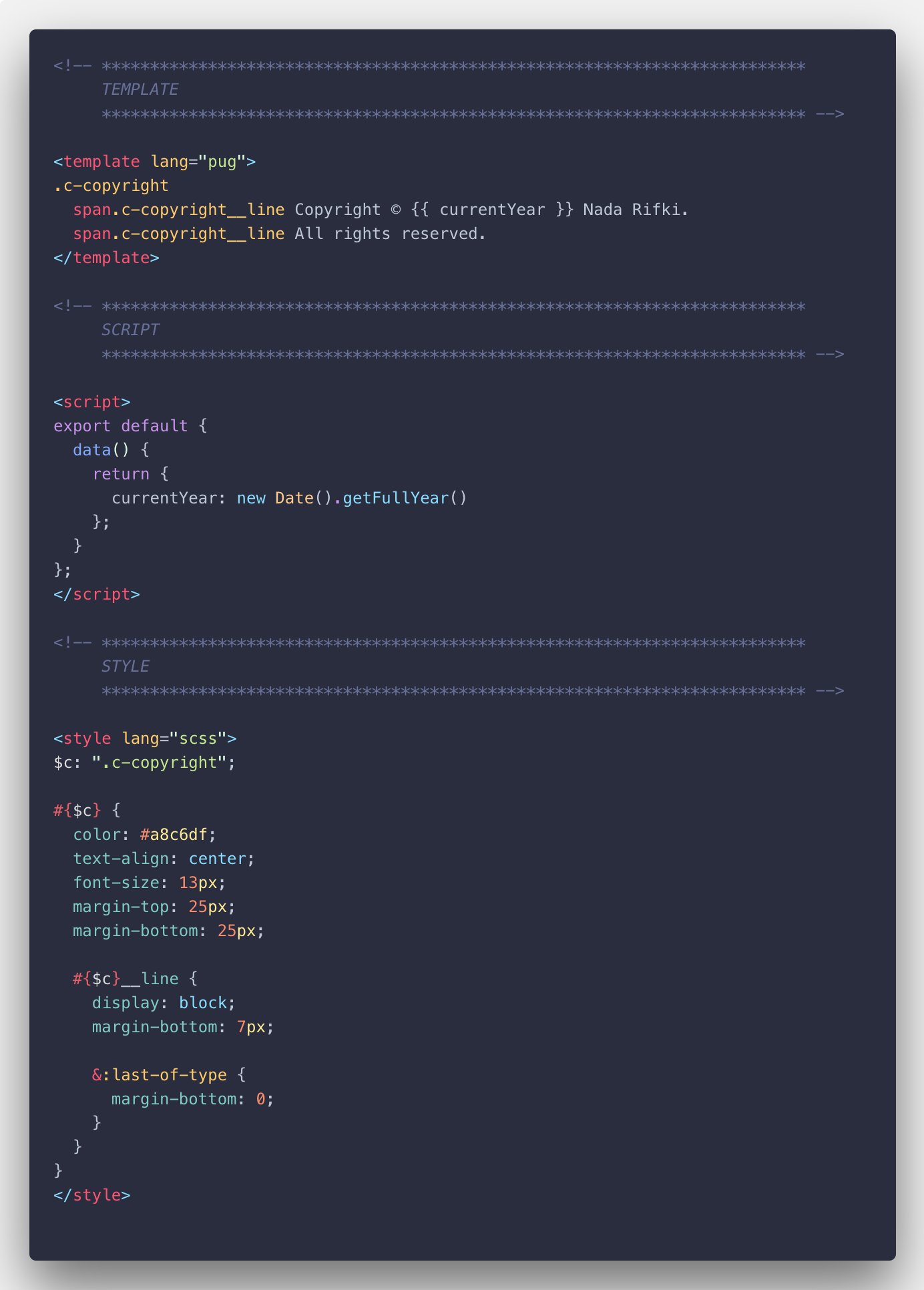
I found that adding a comment before my <template>, <script> and <style> sections helps me go from section to section in my vue.js file faster, instead of trying to find that <style> section every time I want to style an element. Here is how I do it:

Add comments to separate code sections in your vue.js file

The seconds I gain from this simple hack add up to a lot when I’m working on a project. Just the fact that I’m not breaking my flow of thought/code is a plus for me in terms of focus and productivity.

<!-- *************************************************************************
TEMPLATE
************************************************************************* --><template></template><!-- *************************************************************************
SCRIPT
************************************************************************* --><script></script><!-- *************************************************************************
STYLE
************************************************************************* --><style></style>

Tip #2: Break the main.js File into Several Files

Our main.js file is what runs EVERYTHING — it’s the file where you import and initialize vue.js to use it in your project. We call it the entry file of your application.

It’s also where we import the plugins, API, filters, directives, global configurations, and other global settings that we need to run our project with.

So, you guessed it, this file can easily get cluttered and reach in a middle-sized project easily more than 300 lines.

It becomes not just a headache to find what you need to edit when you need it, but also to maintain in the long run. Because let’s face it: you don’t touch a file for a month, and you forget what it is made of.

That’s why the best way to structure your main.js file is by creating a folder in /src (we called it here bootstrap but you can choose a different name) where you’ll divide it into different files (like plugins.js or config.js for instance).

Here is how you can import them in your main.js file:

/**************************************************************************
* IMPORTS
***************************************************************************/// NPM: MAINimport Vue from"vue";// PROJECT: MAINimport App from"@/App.vue";import router from"@/router";import store from"@/store";// PROJECT: OTHERimport"@/bootstrap/api";import"@/bootstrap/config";import"@/bootstrap/directives";import"@/bootstrap/filters";import"@/bootstrap/globals";import"@/bootstrap/plugins";/**************************************************************************
* VUE INSTANCE
 ***************************************************************************/newVue({
  router,
  store,
  render: h =>h(App)}).$mount("#app");

Now, if we want to see all the plugins our app is using, we just have to open bootstrap/plugins.js. Better right?

Tip #3: Import Your External Stylesheets in App.vue

At some point in your programming life, you’ve found some slick animation and you just copied the code into your assets and used it in your code.

That’s okay if it’s just one bit of code or if you’re planning to add/modify a library’s features.

However, if you’re going to use intensively, let’s say, an animation library throughout your project, PLEASE avoid copying the stylesheets in your assets folder instead of installing the library.

Why? Simply because if a new feature is added or if a bug is resolved, this code won’t be updated. You’ll basically have an obsolete library sitting in your code.

So next time you’ll be using a library, don’t just copy what you need — install it and import the stylesheet from its node module folder into your App.vue file so node can update it as it’s supposed to.

Tip #4: Avoid Mixing the Imports Coming From npm and the Ones From Your Project

The reason is quite simple: when someone else takes over your code (or just you when you get back to your code months later), what’s related to the project and what’s coming from external libraries should be spotted with one glance.

So be clever and do it the right way, this way:

<!-- *************************************************************************

SCRIPT

************************************************************************* --><script>// NPMimport{ mapState }from"vuex";// PROJECTimport  AuthFormJoin  from"@/components/auth/AuthFormJoin";import  AuthFormLogin  from"@/components/auth/AuthFormLogin";</script><!-- *************************************************************************
     STYLE
************************************************************************* --><stylelang="scss">
// NPM
@import"../node_modules/normalize.css/normalize.css";@import"../node_modules/vue2-animate/dist/vue2-animate.min.css";

// PROJECT
@import"./assets/utilities/utilities.colors";</style>

Tip #5: Use CSSComb to Organize Properties in the Right Order

Um… No, I’m not done talking about clear code. I know that each one of us has our own way of writing CSS code, but doing so will leave you steps behind when working with somebody else or a team on a project.

That’s why I use CSS Comb. I installed the extension on VSCode and every time I start a new project I set a .csscomb.json file in its root.

This .csscomb.json file includes a configuration that transforms your CSS code and your teammate’s into one single format whenever you run the extension.

You can use my CSS Comb configuration below, or configure your own just by choosing the way you want your CSS code to look.

Tip #6: Avoid Importing Colors and Other Global SASS Mixins in Every File

Importing all your SASS assets in one file and being able to use them throughout your project is, of course, way less clutter and just better than having to figure out which assets to import in every single one of your files.

In a pure Vue.js project, it’s possible and all you have to do is go to your vue.config.js and do you like I did here:

module.exports ={
css:{
loaderOptions:{
sass:{
data:[// Global variables, site-wide settings, config switches, etc"@/assets/settings/_settings.colors.scss",// Site-wide mixins and functions"@/assets/tools/_tools.mq.scss"],}}}}

Tip #7: Make All Your Base Components Global to Avoid Having to Import Them Over and Over Again

Very often we find ourselves writing the import code for frequently used components in most of our files. What I suggest instead of having to write this every time is:

import BaseButton from'./BaseButton.vue'import BaseIcon from'./BaseIcon.vue'import BaseInput from'./BaseInput.vue'exportdefault{
components:{
BaseButton,
BaseIcon,
BaseInput
}}

You could globally register only those very common base components with a few lines of code (that you copy and paste into your src/main.js file from here below) so you can use those base components in your vue.js files without having to import them every time.

import Vue from'vue'import upperFirst from'lodash/upperFirst'import camelCase from'lodash/camelCase'const requireComponent = require.context(// The relative path of the components folder  './components',// Whether or not to look in subfolders  false,// The regular expression used to match base component filenames /Base[A-Z]\w+\.(vue|js)$/) 

requireComponent.keys().forEach(fileName =>{// Get component config  const componentConfig =requireComponent(fileName)// Get PascalCase name of component  const componentName =upperFirst(camelCase(// Strip the leading `./` and extension from the filename 
fileName.replace(/^\.\/(.*)\.\w+$/,'$1')))// Register component globally 
Vue.component( 
componentName,// Look for the component options on `.default`, which will  // exist if the component was exported with `export default`,  // otherwise fall back to module's root. 
componentConfig.default|| componentConfig 
)})

Tip #8: In Your HTML Tags, Use the Vue.js Shorthands

If you’ve been using Vue.js, you’re probably familiar with v-bind: and v-on:— in every single vue.js file you’ve got those. So if you’re writing them a lot you must be using the @ and : shorthands. If not, start doing so right NOW:

<!-- V-BIND  --><!-- full syntax --><av-bind:href="url"> ... </a><!-- shorthand --><a:href="url"> ... </a><!-- V-ON  --><!-- full syntax --><av-on:click="doSomething"> ... </a><!-- shorthand --><a@click="doSomething"> ... </a>

Tip #9: Switch to Pug for Better Readability

I don’t know why I don’t see this more often in people’s codebase, but I really think that Pug (formerly Jade) is a gift that came from programmers’ heaven.

It’s just that I find the way that HTML tags are written to be cluttery and making the structure hard to visualize and distinguish when you have a long file, without mentioning the extra seconds you lose (which really pile up) opening and closing those tags and which simply break your flow.

So, you can imagine the joy and serenity I felt when I discovered and started using Pug. My code transformed from this:

<headerclass="c-the-header"><divclass="c-the-header__information"><dm-iconclass="c-the-header__icon"name="info">
First time here?
</dm-icon><spanclass="c-the-header__link"@click="onOpenCrisp">
Tell us what you think. 
</span></div><transition-groupenter-active-class="u-animated u-fade-in u-ms250"leave-active-class="u-animated u-fade-out u-ms250"><auth-form-joinv-show="showJoin && !isLoggedIn"@exit="onAuthFormExit('showJoin')"@logoClick="onAuthFormExit('showJoin')"@success="showJoin = false":isPopup="true"key="join"></auth-form-join></transition-group></header>

Into this: 

header.c-the-header.c-the-header__informationdm-icon(name="info"class="c-the-header__icon")| First time here?

span.c-the-header__link(
@click="onOpenCrisp")Tell us what you think.|transition-group(enter-active-class="u-animated u-fade-in u-ms250"leave-active-class="u-animated u-fade-out u-ms250")auth-form-join(
v-show="showJoin &&!isLoggedIn"
@exit="onAuthFormExit('showJoin')"
@logoClick="onAuthFormExit('showJoin')"
@success="showJoin = false"
:isPopup="true"
key="join"
)

All you have to do is install it using $ npm install -D pug pug-plain-loader and add it like this to your template in your vue.js file <template lang="pug"></template>.

You can also use this online convertor to switch your code from HTML to Pug.

Tip #10: Use Prettier and Formatting Toggle on VS Code to Reindent Your Code

We’ve talked about CSS Comb and how you need in a team to have a homogeneous code.

But let’s go a step further and give you and your teammates a way to reach a common code style throughout your project without having to get emotional about how one writes code and how the other criticizes it.

What I do is use Prettier. It’s an opinionated code formatter that supports the main languages and frameworks we use as web developers. It’s simple to install — all you have to do is npm install --global prettier in your terminal and voilà.

What happens after that is that whenever you save your code, it automatically formats its style. So, for instance, if you had:

foo(reallyLongArg(),omgSoManyParameters(),IShouldRefactorThis(),isThereSeriouslyAnotherOne());

It will become:

foo(reallyLongArg(),omgSoManyParameters(),IShouldRefactorThis(),isThereSeriouslyAnotherOne());

I also use formatting on VS Code so if I want to switch Prettier off with one click I can.

Use formatting toggle to switch prettier on and off with one click.

BONUS: Avoid Reinventing the Wheel and Wasting Your Time — Keep an Eye on New Packages Released by the Community

Be it a junior developer or an experienced one, we all need and use open-source packages. Our lives as developers would be so exhausting without them and just fueled by coffee more than they already are.

Lucky for us, Vue.js has a growing community that comes up every day with awesome new packages. That’s why I keep an eye on what’s new on Vue.js Examples and Made With Vue.js.

Also don’t forget that Telerik provides you with Kendo UI, a very comprehensive UI component library for PWAs that allows you to build quality Vue.js apps way faster than average.

For More Info on Vue:

Want to learn about creating great user interfaces with Vue? Check out Kendo UI for Vue, our complete UI component library that allows you to quickly build high-quality, responsive apps. It includes all the components you’ll need, from grids and charts to schedulers and dials.

Forcing Myself to Write Unit Tests

$
0
0

Unit tests have a ton of benefits. But first you have to write them. Here's how I forced myself to do it and improved my React development.

"Tests are like vegetables. They’re really good for other people."

I know that unit tests have a ton of benefits. They act as a safety net so that you can make changes to your codebase and be confident that you are not breaking existing functionality. They force you to think about the design of your modules and how they’re going to be used. They document how your system is supposed to work.

But, still, I find myself procrastinating and not writing those unit tests. EVERY. TIME.

So, for my last few projects, I’ve started configuring things so that I can’t procrastinate any more. In this article, I’ll explain how I’ve set up my projects to enforce code coverage thresholds, produce useful reports, and run unit tests before committing and pushing to a remote.

Unit Testing with Jest and Create React App

When creating new projects with Create React App, everything will already be set up to use Jest as our testing library. Try this:

npx create-react-app my-app
cd my-app
npm test

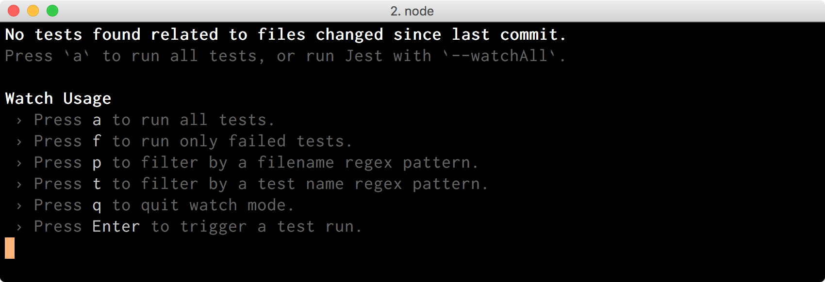
You’ll see something like this:

tests

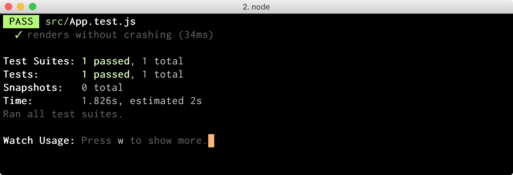
By default, Jest will only run tests for files that have changed since the last commit. We just created the project, so nothing has changed yet, and that’s why Jest didn’t run anything. We can press the key a to force Jest to run all unit tests:

tests

We can also force this behavior by passing the --watchAll flag:

npm test -- --watchAll

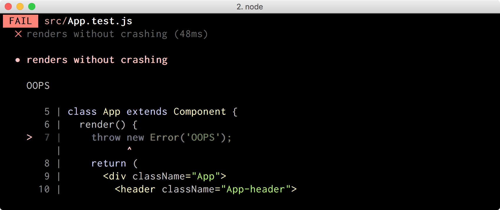
If we now introduce a breaking change like this one:

classAppextendsComponent{render(){thrownewError('OOPS');// ...}}

Jest will immediately rerun the test and alert us:

tests

Cool, we have our basic testing flow all working!

Enabling Test Coverage in Our Project

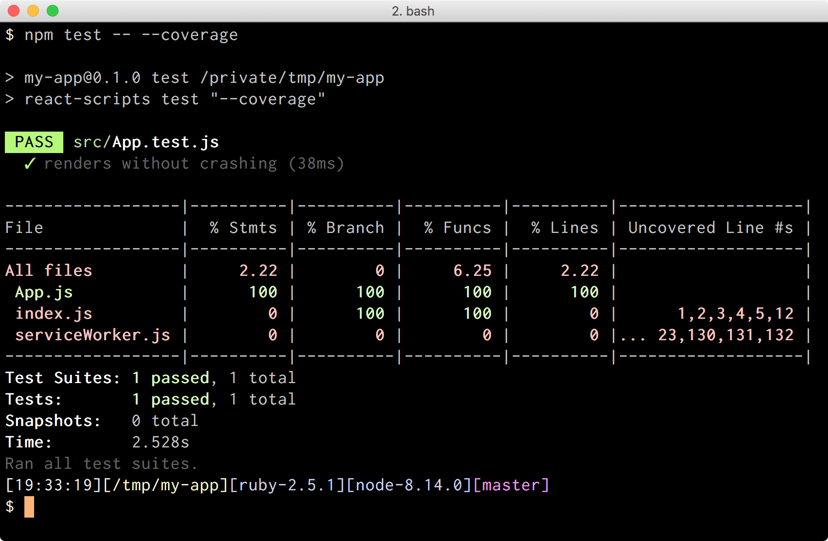
The amount of code that is exercised by our unit tests is called test coverage. It’s very useful to know which parts of our code are not covered by unit tests. We can tell Jest to capture and output this information by passing the --coverage flag:

npm test -- --coverage

tests

Jest is telling us that our App.js component is fully covered by unit tests, but index.js and serviceWorker.js are not, which is great information to have!

It’s also worth noting that Jest didn’t start in watch mode when we passed the --coverage flag. I don’t know why though. ‍

I tend to modify the scripts section of my package.json to read like this:

{// ..."scripts":{"start":"react-scripts start","build":"react-scripts build","watch":"react-scripts test --coverage --watch","test":"react-scripts test --coverage","eject":"react-scripts eject"}}

That way I can do npm test if I want to run my tests once, and npm run watch if I want to rerun them every time I make a change, but I get code coverage information in both cases.

Ok, let’s modify that App component to conditionally show the React logo based on the props that were passed to it:

classAppextendsComponent{render(){const{ showLogo }=this.props;return(<div className="App"><header className="App-header">{showLogo ?(<img src={logo} className="App-logo" alt="logo"/>):(<h1>Learn React</h1>)}</header></div>);}}

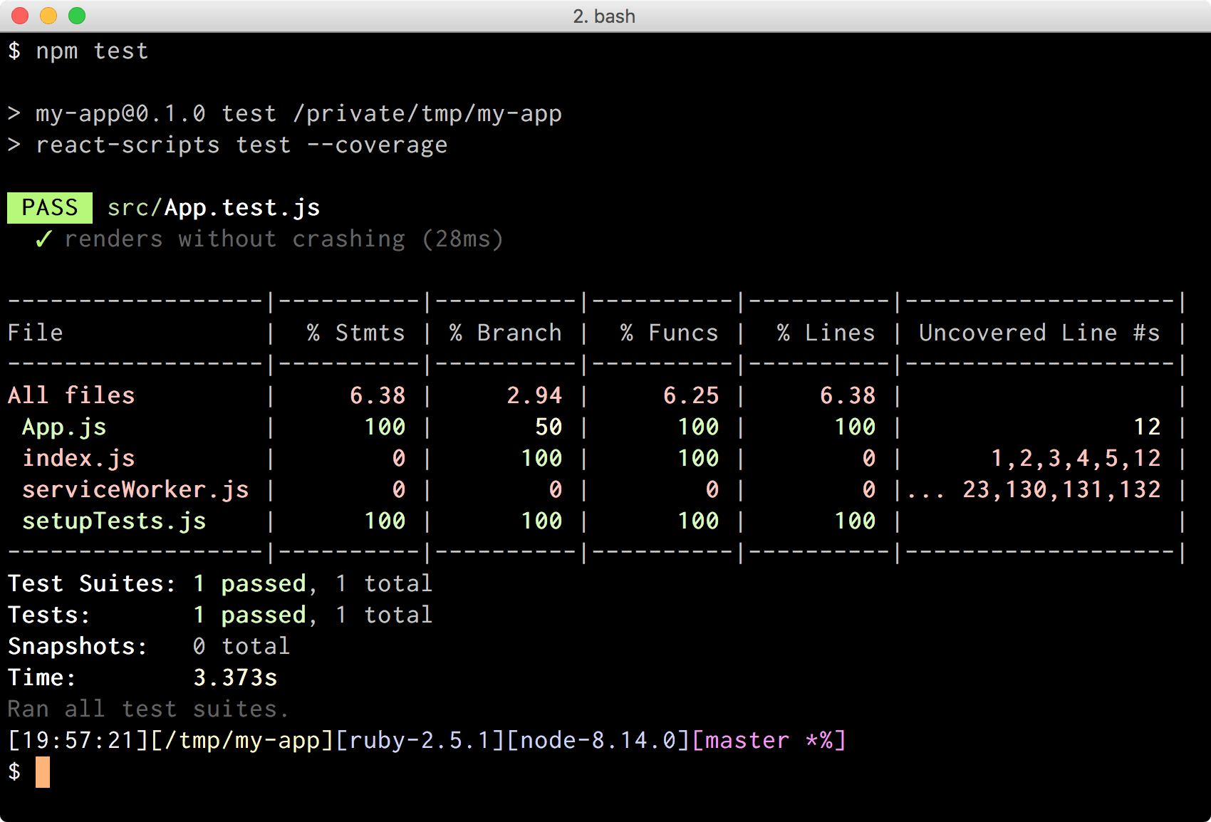
If we rerun our tests with npm test, some numbers will change:

tests

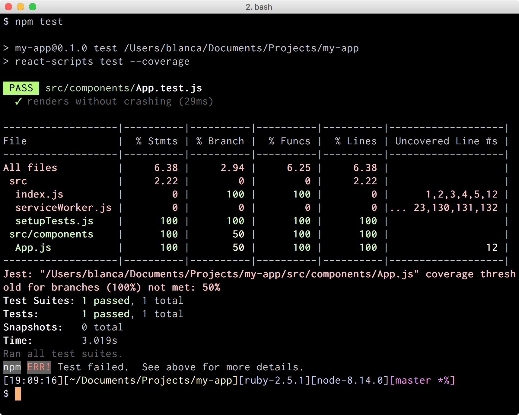
Did you see how % Branch went down to 50% for App.js? It’s because our existing unit test is only covering one branch of the ternary statement that we introduced, but not the other one. The Uncovered Line #s column points us to the lines that aren’t fully covered.

There’s a better way to view what’s covered and what’s not, however.

Showing Test Coverage as HTML

Jest relies on a project called Istanbul to generate its code coverage reports. By default, Jest outputs reports in a bunch of formats (json, lcov, text, clover), but we can configure it to use any valid Istanbul reporter through the coverageReporters option. We just need to add a new section “jest” to our package.json with the list of reporters:

{// ..."jest":{"coverageReporters":["text","html"]}}

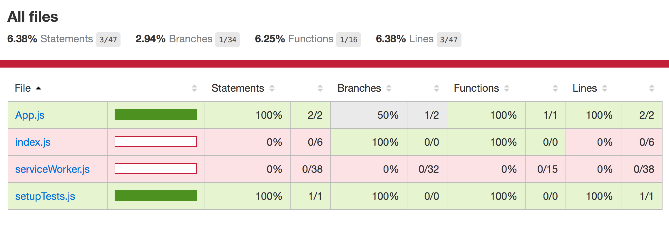
Now Jest is configured to produce code coverage reports as text and html. The former is the one that prints results to the console, while the latter generates an index.html file in a folder called coverage/ at the root of our project. If we open it in a browser we’ll see a summary of all files and their coverage values. We can click on each of those files, and see our code annotated in areas that weren’t fully covered. It makes it much easier to identify where we need to improve our testing.

Let’s try this by running our tests with npm test, and opening the file coverage/index.html:

test

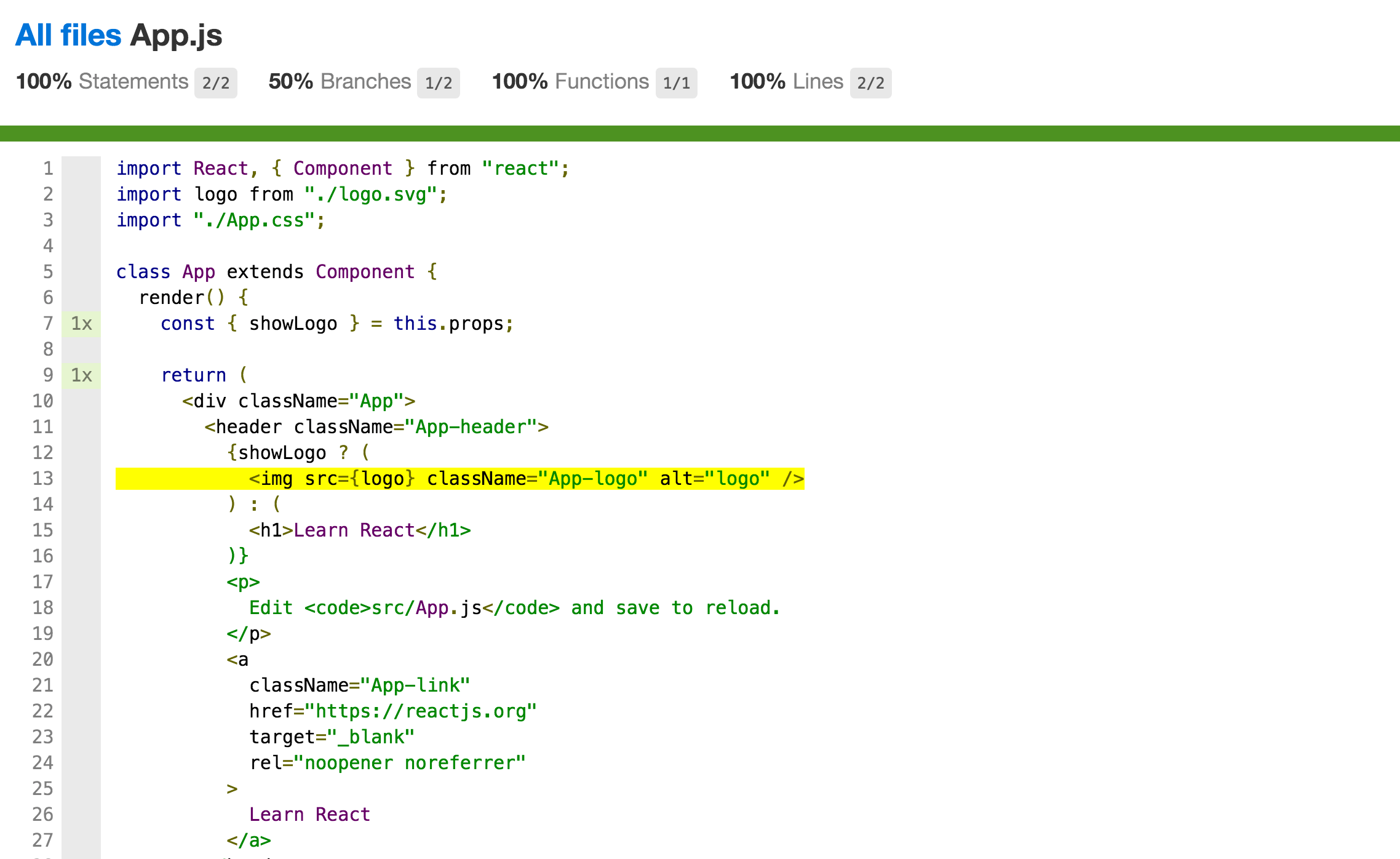
If we click App.js, we’ll see the file with coverage annotations:

tests

That yellow line is the one that isn’t getting exercised by our unit tests.

The npm test task finished successfully though, because 100% test coverage is not required for our unit tests to pass. But what if I wanted to force myself to achieve 100% test coverage in certain areas?

Ensuring Full Test Coverage

We can configure Jest to fail our tests if they don’t meet a certain coverage threshold through the coverageThreshold option. Thresholds can be specified as “global” if we want them to be applied to every file in our project, or as a path or glob if we only want to apply them to certain files.

For example, with the following configuration, Jest will fail if there is less than 100% branch, function, line, and statement coverage, but only for files living inside a folder called components/:

{// ..."jest":{"coverageReporters":["text","html"],"coverageThreshold":{"src/components/**":{"branches":100,"functions":100,"lines":100,"statements":100}}}}

If we move our App.js component under a components/ folder, and then run npm test, we’ll get this:

test

The task failed, and Jest explained why:

Jest: "my-app/src/components/App.js" coverage threshold for branches (100%) not met: 50%

Nice, now I’m forced to fix this!

Achieving Full Test Coverage

We’ll have to modify the existing unit test to achieve full code coverage. I’m more used to writing tests with enzyme, so let’s install it real quick before doing anything else:

npm install --save-dev enzyme enzyme-adapter-react-16

We’ll also have to create a setupTests.js file under src/ with the following contents:

import Enzyme from"enzyme";import Adapter from"enzyme-adapter-react-16";

Enzyme.configure({ adapter:newAdapter()});

Ok, we’re good to go. Let’s replace the existing unit test with something like this:

import React from"react";import{ shallow }from"enzyme";import App from"./App";describe("App",()=>{let wrapper;describe("when `showLogo` is true",()=>{beforeEach(()=>{
      wrapper =shallow(<App showLogo={true}/>);});it("renders an image",()=>{expect(wrapper.find("img")).toHaveLength(1);});});describe("when `showLogo` is false",()=>{beforeEach(()=>{
      wrapper =shallow(<App showLogo={false}/>);});it('renders a header',()=>{expect(wrapper.find("h1").text()).toEqual("Learn React");});});});

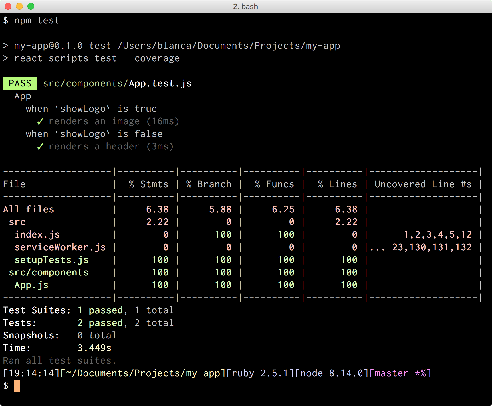
If we rerun our tests with npm test we’ll see something like:

test

Hey, % Branch is back at 100%, and tests are passing! ✅

Preventing Untested Code from Being committed Using Husky

Now that we know how to ensure full test coverage in areas of our project, I want to go further and prevent myself from committing or pushing to my repository if tests aren’t passing, or if coverage thresholds aren’t met.

The way to do this is through Git hooks, which tie together Git actions, such as committing or pushing, with the execution of custom tasks (in our case, npm test). There’s a project called Husky that makes configuring hooks very easy.

First we’ll have to install the package:

npm install --save-dev husky

Then we’ll configure the hooks we want to use in our project. We’ll add a section called “husky” in our package.json, and describe in there how we’ll map hooks to tasks.

In our example app, we are going to use the hooks pre-commit and pre-push to ensure all our test are executed before committing and pushing code respectively:

{// ..."husky":{"hooks":{"pre-commit":"npm test","pre-push":"npm test"}}}

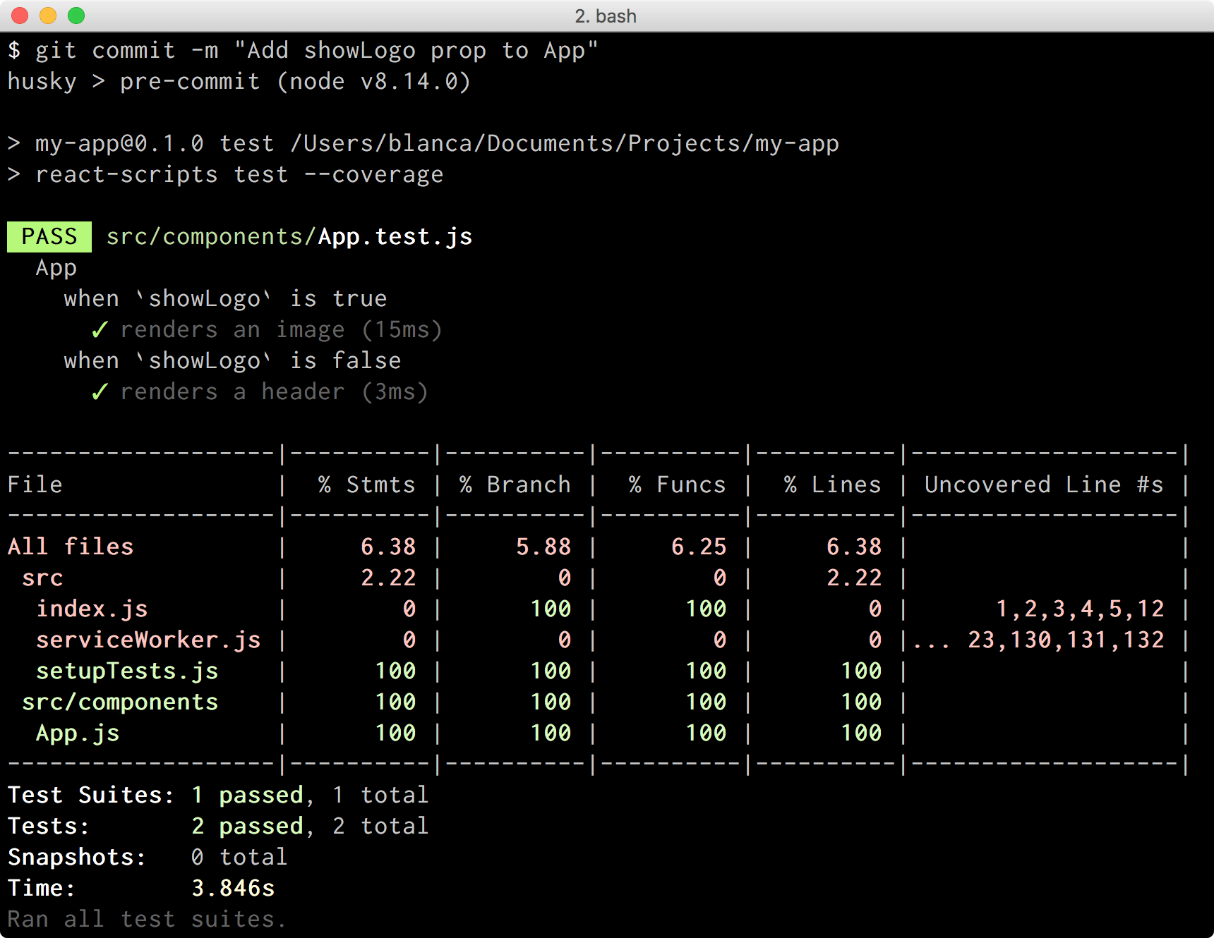
If we try committing now by doing git commit -m “Add showLogo prop to App”, we’ll see Husky running our tests before the commit gets created. If the tests were to fail, the commit wouldn’t get created. In this case, they passed, so we were able to commit fine:

test

Awesome job Husky!

Conclusion

Testing our code is one of the best things we can do to ensure we don’t introduce regressions every time we make a change. With the tools and tips described here, we can enforce full test coverage in areas of our project, view code coverage reports in multiple formats, and use hooks to ensure everything is looking fine before committing and pushing any code to our repository. Now I’ll have no option but to eat my veggies!


Speed up Filtering with the Latest Editor Types in Telerik Report Viewers

$
0
0

Learn about a new feature in Telerik Reporting that lets you change the default parameters editors types for visible parameters in the HTML5 Viewer's Parameters Area.

The Telerik Reporting team works hard to satisfy your needs and wishes. With every release we are trying to improve our products and to offer you helpful new additions. In our latest release, the Telerik HTML5 Report Viewer provides an option for changing the parameter editors type. All newly added editors are  Kendo UI widgets since the HTML5 Report Viewer is built on top of the Kendo UI product.

Defining the Parameters

The UI editor can be changed for parameters both accepting single or multiple values. The parameter needs to have predefined AvailableValues in its report definitions. To specify that the parameter should accept multiple values turn on the MultiValue property.

Defining the parameters

Defining the Editors Type

Both parameters have two optional editor types– ListView and ComboBox. The listview is the default editor type. To use it there are no additional settings to be configured. As for the other editor type, a simple setting must be applied to the HTML5 Report Viewer:

First, this feature requires the latest official release. So please consider updating to R2 2019+.

Second, after we are all on the same page, for your convenience here is an example for all HTML5 Report Viewer wrappers:

HTML5 jQuery Report Viewer

$("#reportViewer1").telerik_ReportViewer({
 …
parameters: {
 editors: {
 singleSelect: telerikReportViewer.ParameterEditorTypes.COMBO_BOX,
 multiSelect: telerikReportViewer.ParameterEditorTypes.COMBO_BOX
 }
  }
});

HTML5 ASP.NET MVC Report Viewer

@(Html.TelerikReporting().ReportViewer()
 …
.Parameters(new Parameters {
 Editors = new Editors {
  SingleSelect = EditorTypes.ComboBox,
       MultiSelect = EditorTypes.ComboBox
 }
})
)

HTML5 ASP.NET Web Forms Report Viewer

<telerik:ReportViewer  EnableAccessibility="false" ID="reportViewer1" runat="server">
    …
  <Parameters>
   <Editors SingleSelect="ComboBox" MultiSelect="ComboBox"></Editors>
  </Parameters>
</telerik:ReportViewer>

HTML5 Angular Report Viewer

<tr-viewer #viewer1="" [parameters]="{
  editors: {
   singleSelect: 'COMBO_BOX',
   multiSelect: 'COMBO_BOX',
  }
}"></tr-viewer>

As you can see, it is not rocket science, but it does give you a lot of user usability. The editor types as a Kendo UI widget supports built-in filtering, saves quite a bit of space in the Parameters area and allows users to quickly select the right value even if there are a hundred choices. Try it now and let us know how it works for you!

Try it Out and Share Feedback

We want to know what you think—you can download a free trial of Telerik Reporting or Telerik Report Server today and share your thoughts in our Feedback Portal, or right in the comments below.

Start your trial today: Reporting Trial Report Server Trial

Tried DevCraft?

You can get Reporting and Report Server with Telerik DevCraft. Make sure you’ve downloaded a trial or learn more about DevCraft bundles. DevCraft gives you access to all our toolsets, allowing you to say “no” to ugly apps for the desktop, web or mobile.

Xamarin.Forms + SkiaSharp: Create Awesome Cross-Platform Animations in Your Mobile App

$
0
0

SkiaSharp is an open source .NET wrapper library over Google's Skia, developed and maintained by Xamarin engineers. Read on to learn how to create awesome animations in your mobile app using Xamarin.Forms and SkiaSharp.

It gives me great pleasure to share with you about some of my favorite topics in software development: computer graphics and mobile applications. I’ve been in love with graphics since I was a kid — I loved drawing on paper, and, when my parents got me my first home computer, an amazing ZX Spectrum, I became completely fascinated by computer graphics.

SkiaSharp is a .NET open-source wrapper library of the Skia graphics engine, and in combination with Xamarin.Forms, which is a great cross-platform open-source mobile app development framework, you can give your mobile apps new life.

Skia, the Star Performer

Skia is a high performance and open-source 2D graphics engine written in C++. It’s owned and backed by Google. As a proof of its solid performance, it’s been used in several mainstream products, such as Google Chrome, Chrome OS, Android or Mozilla FireFox, just to name a few. The Skia repository can be found here: https://github.com/google/skia

Skia has native library versions for Android, iOS, Mac, Windows, and ChromeOS.

As you’d expect from a 2D graphics engine, Skia has API to draw graphics primitives such as text, geometries and images. It has an immediate rendering mode API, so for every call you do with the Skia API, it’s going to be quickly drawn on the screen.

A Sharp Skia

SkiaSharp is a .NET wrapper library over Google’s Skia, developed and maintained by Xamarin engineers and, of course, it’s completely open source under the MIT license. You can check out its source code repository on Github: https://github.com/mono/SkiaSharp

On non-Windows platforms, SkiaSharp runs on top of Xamarin, and, as with any .NET library, the easiest way to add SkiaSharp to your projects is by NuGet: https://www.nuget.org/packages/SkiaSharp

SkiaSharp Canvas View

In order to actually see on the screen what you draw with SkiaSharp API, SkiaSharp provides a canvas control on every platform it supports. This is done by SkiaSharp.Views, an extension library sitting on top of SkiaSharp: https://www.nuget.org/packages/SkiaSharp.Views.Forms.

Here are few examples of the canvas native control, which SkiaSharp provides on some platforms:

// Xamarin.iOSpublicclassSKCanvasView: UIView, IComponent
{publicevent EventHandler<SKPaintSurfaceEventArgs> PaintSurface;}// Xamarin.AndroidpublicclassSKSurfaceView: SurfaceView, ISurfaceHolderCallback
{publicevent EventHandler<SKPaintSurfaceEventArgs> PaintSurface;}// MacpublicclassSKCanvasView: NSView
{publicevent EventHandler<SKPaintSurfaceEventArgs> PaintSurface;}// UWPpublicpartialclassSKXamlCanvas: Canvas
{publicevent EventHandler<SKPaintSurfaceEventArgs> PaintSurface;}// WPFpublicclassSKElement: FrameworkElement
{publicevent EventHandler<SKPaintSurfaceEventArgs> PaintSurface;}

As you know, Xamarin.Forms has its own cross-platform API and controls wrapping the native APIs and controls. Therefore, for Xamarin.Forms apps, SkiaSharp has a dedicated library called SkiaSharp.Views.Forms: https://www.nuget.org/packages/SkiaSharp.Views.Forms

SkiaSharp.Views.Forms provides a Xamarin.Forms control for the canvas, the SkCanvasView:

// Xamarin.FormspublicclassSKCanvasView: View, ISKCanvasViewController
{publicevent EventHandler<SKPaintSurfaceEventArgs> PaintSurface;}

Under the hood, the Xamarin.Forms renderers for SKCanvasView use the same native views which share same implementation as in SkiaSharp.Views

Drawing on the SkiaSharp Canvas View

As you can see above, on all platforms, the SkiCanvasView has a PaintSurface event. It fires the event when canvas needs to be painted, either because the view was resized or because you called InvalidateSurface() method on it:

_skCanvasView.InvalidateSurface();

On the event handler, you get an instance of SkiCanvas, which you can use to draw with the SkiaSharp API:

...
_skCanvasView.PaintSurface += SkCanvasViewRequiredPainting;...voidSkCanvasViewRequiredPainting(object sender, SKPaintSurfaceEventArgs e){
SKSurface skSurface = e.Surface;
SKCanvas skCanvas = skSurface.Canvas;
skCanvas.Clear();var paint =newSKPaint(){
Style = SKPaintStyle.Stroke,
Color = Color.Blue.ToSKColor(),
StrokeWidth =10};// Draw on the skCanvas instance using SkiaSharp API
skCanvas.DrawRect(x, y, width, height, paint);}

I think it’s impressive to see how the combination of Xamarin, Xamarin.Forms and SkiaSharp brings .NET and Skia together on so many different platforms and provides a cross-platform .NET API for mobile app development and Skia!

This article talks about using Xamarin.Forms and SkiaSharp, so what you will read about next uses the SkCanvasView from the SkiaSharp.Views.Forms library.

Implementing an Animated Highlight in a Mobile App with Xamarin.Forms and SkiaSharp

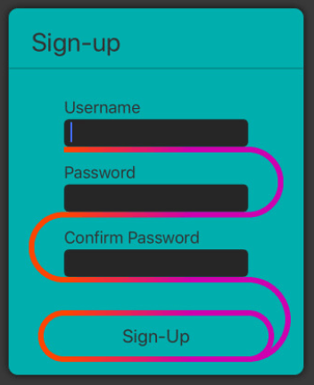
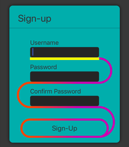
As an example, I’m going to show how to build a highlight that moves between inputs and a button on a sign-up form, creating a captivating animation effect. The app is built with Xamarin.Forms, Skia.Sharp and C#, which runs seamlessly on Android and iOS. Here’s a screen capture of the final application running in the iOS simulator: https://www.youtube.com/watch?v=BBZWcWjJO_g

You can check out the complete source code of the app in my repository on GitHub: https://github.com/andreinitescu/AnimatedHighlightApp

The implementation is in C# and it’s 100% shared across the platforms — there’s no custom platform-specific code involved, no Xamarin.Forms renderers and no effects were used. I haven’t tested it on other platforms supported by Xamarin.Forms and SkiaSharp, but I’m sure the code runs very well on those too.

Credit goes to the following sources and their authors for the animation design idea:

Implementing the Highlight

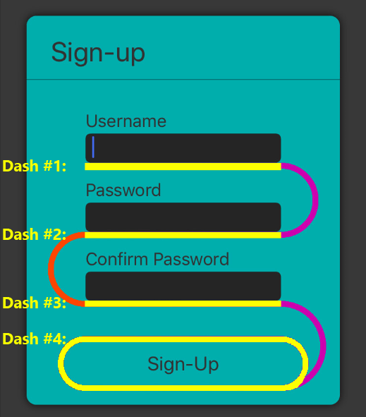
The highlight effect is created by a combination of drawing a geometric path with SkiaSharp API and animating the visible part of the path using the Xamarin.Forms animation API. Here are the main steps I followed in my implementation:

  1. Create the sign-up form layout

  2. Build and draw SkPath on SkCanvasView based on the position of form elements in the container layout

  3. Making a certain part of SkPath visible using dash effect

  4. Animating the highlight between elements

Create the Sign-Up Form Layout

The sign-up form has three Entry elements to enter username, password and confirm password, and a Button to submit. I’m using a StackLayout as the container for the form elements, but any other container would work:

<StackLayoutx:Name="_formLayout"...><LabelText="Username"
Style="{StaticResource FormLabelStyle}"/><Entry Style="{StaticResource FormEntryStyle}"Focused="EntryFocused"/><LabelText="Password"Margin="0, 15, 0, 0"
Style="{StaticResource FormLabelStyle}"/><EntryIsPassword="True"
Style="{StaticResource FormEntryStyle}"Focused="EntryFocused"/><LabelText="Confirm Password"Margin="0, 15, 0, 0"
Style="{StaticResource FormLabelStyle}"/><EntryIsPassword="True"
Style="{StaticResource FormEntryStyle}"Focused="EntryFocused"/><ButtonText="Sign-Up"Margin="0, 40, 0, 0"
Style="{StaticResource FormSubmitBtnStyle}"Clicked="ButtonClicked"/></StackLayout>

Build and Draw SkPath on SkCanvasView Based on the Position of Form Elements in the Container Layout

The actual highlight line is a geometric path drawn using SkiaSharp API. Using the position of every Xamarin.Forms element on the form layout, I’m creating a SkPath connecting all the form elements and then drawing the created SkPath on the SKCanvasView view. Here’s how the complete SkPath looks like:

COMPLE~1

To make the implementation easier, it’s important that the SKCanvasView has the same top-left screen coordinates as the StackLayout form layout. This makes it easier to compute the translation between the position of the Xamarin.Forms element within the StackLayout to the SkiaSharp position used to draw the SkPath on the SKCanvasView. Here’s the XAML, which shows the SkCanvasView and the form layout wrapped in a Grid:

<Grid><Grid.ColumnDefinitions><ColumnDefinitionWidth="Auto"/></Grid.ColumnDefinitions><skiaSharp:SKCanvasViewx:Name="_skCanvasView"PaintSurface="SkCanvasViewRequiredPainting"SizeChanged="SkCanvasViewSizeChanged"/><StackLayoutx:Name="_formLayout"...>
...
</StackLayout></Grid>

The creation of the SkPath based on the position of Xamarin.Forms elements is implemented in the CreatePathHighlightInfo method here.

Making Certain Part of SkPath Visible Using Dash Path Effect

When an element receives focus, I make visible only the part of the SkPath which is meant to represent the focused element highlight:

DASH_P~1

This is accomplished by creating a dash path effect (SkPathEffect) and painting with it the SkPath:

paint.PathEffect = SKPathEffect.CreateDash(intervals: strokeDash.Interval, phase: strokeDash.Phase);
skCanvas.DrawPath(skPath, paint);

As you can see, the CreatesDash API takes an interval array and a phase.

The intervals is an array of float values that indicate the length of the “on” interval and the length of “off” interval. For example, an intervals array with elements 10, 5 set on a line path, creates the effect of seeing 10 pixels followed by a gap of 5 pixels (assuming the stroke width is 1 pixel), and this succession repeats along the path:

DASH_I~1

The rule for this intervals array is that the array must contain least two values and it must be of an even number of values, and the values are interpreted as a succession of “on” and “off” intervals.

The phase value represents the offset used to draw the beginning of the dash. For example, if we have an interval of 10, 5 and phase is 5, we will see something like the following:

DASH_I~2

To highlight the first Entry for example, the “on” interval is the width of the Entry, the “off” interval is the remaining length of the path, and the phase is zero.

There’s more to know about how the stroke width and cap influence the path, which you can read about in the excellent Xamarin documentation for Skia.Sharp here.

As part of creating the path for the highlight, beside building the actual SkPath, I also build an array of dashes representing the dash path intervals corresponding to highlighting every Entry and Button element:

DASH_F~1

classHighlightPath{readonly Dictionary<int, StrokeDash> _strokeDashList =newDictionary<int, StrokeDash>();...}classStrokeDash{publicfloat[] Intervals {get;set;}publicfloat Phase {get;set;}...}

I’m using the position of the element on the form layout as a key to know how get the dash based on the focused element.

In my form, I have three Entry elements and one Button. The dash list will contain four entries representing the dash values which makes the path visible when every element has focus. Here is a screenshot with the dash values from debugger:

DASH_F~2

Animating the Highlight Between Elements

In order to make the highlight appear like it’s moving between the form elements, I animate the dash values (intervals and phase), from current dash values to the precalculated dash values corresponding to the element that must show highlight.

I started with creating my own StrokeDashAnimation class, which encapsulates animating the stroke dash intervals and phase values:

classStrokeDashAnimation{
StrokeDash _currStrokeDash;public StrokeDash From {get;}public StrokeDash To {get;}public TimeSpan Duration {get;}public Easing Easing {get;}publicStrokeDashAnimation(StrokeDash from, StrokeDash to, TimeSpan duration){
From =from;
To = to;
Duration = duration;}...}

I’m using StrokeDash class to encapsulate current dash value, which has the intervals and phase properties updated separately by every animation.

If you haven’t worked with animations in Xamarin.Forms, the framework has a very simple but very powerful support for creating animations based on animating a double value.

The way the Animation works is very simple: you give it a start double value, a double end value and an easing type. Animation uses easing to compute the interpolated value between the start and the end values. Once started using the Commit method, an Animation instance will call your callback for every computed value, starting with the given start value until end value is reached.

Animation can hold other Animation instances, and when you start the parent animation it starts its child animations.

You can read more about Xamarin.Forms animation and its capabilities here: https://docs.microsoft.com/en-us/xamarin/xamarin-forms/user-interface/animation/

In my implementation, I create an animation holding three inner animations for every stroke dash property: interval “on”, interval “off” and phase:

classStrokeDashAnimation{
StrokeDash _currStrokeDash;public StrokeDash From {get;}public StrokeDash To {get;}public TimeSpan Duration {get;}public Easing Easing {get;}publicStrokeDashAnimation(StrokeDash from, StrokeDash to, TimeSpan duration){
From =from;
To = to;
Duration = duration;}publicvoidStart(Action<StrokeDash> onValueCallback){
_currStrokeDash = From;var anim =newAnimation((v)=>onValueCallback(_currStrokeDash));
anim.Add(0,1,newAnimation(
callback: v => _currStrokeDash.Phase =(float)v,
start: From.Phase,
end: To.Phase,
easing: Easing));
anim.Add(0,1,newAnimation(
callback: v => _currStrokeDash.Intervals[0]=(float)v,
start: From.Intervals[0],
end: To.Intervals[0],
easing: Easing));
anim.Add(0,1,newAnimation(
callback: v => _currStrokeDash.Intervals[1]=(float)v,
start: From.Intervals[1],
end: To.Intervals[1],
easing: Easing));
anim.Commit(
owner: Application.Current.MainPage,
name:"highlightAnimation",
length:(uint)Duration.TotalMilliseconds);}}

When the focus changes to an Entry or Button is clicked, I start the animation by animating from the current dash values to the precalculated dash values:

voidDrawDash(SKCanvasView skCanvasView, StrokeDash fromDash, StrokeDash toDash){if(fromDash !=null){var anim =newStrokeDashAnimation(from: fromDash,
to: toDash,
duration: _highlightSettings.AnimationDuration);
anim.Start((strokeDashToDraw)=>RequestDraw(skCanvasView, strokeDashToDraw));}elseRequestDraw(skCanvasView, toDash);}voidRequestDraw(SKCanvasView skCanvasView, StrokeDash strokeDashToDraw){
_highlightState.StrokeDash = strokeDashToDraw;
skCanvasView.InvalidateSurface();}

For every new computed stroke dash value, I invalidate the SkCanvasView surface in order to make it fire its PaintSurface event. On the paint event handler, I draw the path with the new dash values kept by _highlightState.StrokeDash:

publicvoidDraw(SKCanvasView skCanvasView, SKCanvas skCanvas){
skCanvas.Clear();if(_highlightState ==null)return;if(_skPaint ==null)
_skPaint =CreateHighlightSkPaint(skCanvasView, _highlightSettings, _highlightState.HighlightPath);
StrokeDash strokeDash = _highlightState.StrokeDash;// Comment the next line to see whole path without dash effect
_skPaint.PathEffect = SKPathEffect.CreateDash(strokeDash.Intervals, strokeDash.Phase);
skCanvas.DrawPath(_highlightState.HighlightPath.Path, _skPaint);}

Closing Words

I hope you can see the potential of combining the two awesome cross-platform APIs, Xamarin.Forms and SkiaSharp. Both frameworks have easy-to-use but powerful cross-platform APIs and would not exist without the giant on whose shoulders they are standing: Xamarin.

I hope you enjoyed reading this article. If you have any questions or feedback, feel free to reach out to me on Twitter or on my blog.

For More on Developing with Xamarin

Want to learn about creating great user interfaces with Xamarin? Check out Telerik UI for Xamarin, with everything from grids and charts to calendars and gauges.
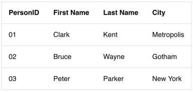
Progress Influencers Party at MVP Summit 2019

$
0
0

You're invited—come join us at the Progress Influencers Party at Microsoft MVP Summit.

The 2019 Microsoft MVP Summit is almost upon us. There will be much to learn, network with peers and soak up fun in the heart of Microsoft campus. We know you'll all be busy during the Summit, but we at Progress really appreciate every Microsoft MVP, Regional Director, Insider and Community Influencer. We know you are fond of our Telerik/Kendo UI products suites and want to thank you for spreading the love. So, come hang out with Progress during this year's MVP Summit. Yes, this is a post to announce a party!

What: Progress Influencers Party
Where: Lucky Strike Bowling | 700 Bellevue Way NE | Bellevue WA 98004
When: Sunday | March 17 2019 | 6-9 PM

If you're already sold, stop reading and sign up for our party.

Come Hang Out

For many of us, the biggest value of MVP Summit is the networking opportunity. We get to hang out with some of the brightest minds in the industry and broaden our horizons. So start your MVP Summit experience right - hang out with your peers at the Progress Influencers Party. Expect MVPs/RDs/Insiders across wide array of technologies, and plenty of blue badge folks as well.

We're looking forward to playing host for the evening. Using Telerik tools, Kendo UI, Test Studio or NativeScript for your projects? Good or bad - we're all ears for your feedback. You'll find us in custom retro-themed bowling shirts!

BowlingShirts 

Get Some Swag

Hand-crafted drinks? Check. Yummy appetizers? Done. Let's sweeten the deal for you.

We developers are known to trade our souls for laptop stickers - come find some in swanky Telerik Ninja or Kendoka glory!

Sticker1 .     Sticker2

Also, everyone who walks in, gets our custom-made Tshirt - complete with some Irish flair for St. Patrick's Day. You're welcome!

TShirts 

Roll to Fame

Yes, we'll be at a fancy bowling alley and it is your opportunity to earn some street credibility. Strikes, spares, splits, gutter balls - bring them all. Tricks shots and scenic routes encouraged. 

LuckyStrike
 

Go ahead. Challenge your friends to a game. Show us the leaderboard. Your next Cup-O-Joe is on us!

StarbucksCard 


Have Fun & Soak It Up

All right then - you're invited come hang out with us at the Progress Influencers Party. Bring a friend and make some new ones, all the while talking up technologies you love. It will be the first night of the MVP Summit - time to take a deep breath and buckle up for the week. We hope you'll join us at the Progress Influencers Party and start your MVP Summit right. See you there!

Get Lazy With React

$
0
0

As your React app grows, so does your bundle size. Splitting your bundle can help you lazy-load only the things the user absolutely needs. This can reduce the code needed for an initial load, delaying other loading of components or modules until the user asks for it.

React has been adding many amazing features over the past year that make working with components in React a breeze. Back in October of 2018, React released its lazy loading feature in React 16.6.

I knew that React had a pretty decent component based Router system that I could use and I had learned about this new feature coming to React called Suspense. In Suspense would be a function I could use called lazy that would allow me to achieve the lazy loading capabilities that I was looking for. But I was more amazed at how much simpler it seemed to be. And that has been my experience most of the time in React. I find that if React has an opinion about something and they help you to do it, it's going to be pretty easy and straightforward.

I started my learning in the React blog with an article highlighting the release of this feature: React v16.6.0: lazy, memo and contextType. This document links to many other documentation resources to help you understand code splitting and how it is part of the React Suspense and Lazy features.

A few must-see videos on the subject are Jared Palmer and Dan Abramov's React Conf 2018 talk on suspense as well as Andrew Clark's "React Suspense" talk at ZEIT day in San Francisco.

What Does This Mean for Developers

The added asynchronous rendering capabilities means that we can optimize the initial page load, increasing the performance of our application and helping to provide a better user experience by loading chunks of our application delayed.

We want to defer non-critical resources and load them on demand as needed using code splitting. This will help us to manage the loading of images, data, or anything we want to bundle up separately. We can get really creative with these features.

A good practice in building your web application will be to segregate these resources as critical and non-critical. We want to load the critical stuff first as well as any data that is needed to serve the initial page load. Then less critical resources can get loaded as we move to a new page, roll over an image, whatever.

Basic Approach to Code Splitting

The best way to use code splitting in your application is through the use of the dynamic import syntax. Create React App and Next.js both support this syntax in their latest versions. An example of that might look like this:

import("./math").then(math => {
  math.sum(1, 2, 3);
});

Code Splitting With Lazy in React

In React, we have a function as of React 16.6 that we can use letting us render a dynamic import as a component. This makes splitting and loading React components a breeze. We can do this instead of just importing a component from another file and rendering it immediately.

Let's say that we have an ArtistComponent that has a list of events that we can load from an Events component, and we only want to load the Events component if the ArtistComponent gets loaded. We could do the following:

const Events = React.lazy(() => import('./Events'));

function ArtistComponent() {
  return (
    <div className="event-list">
      <Events />
    </div>
  );
}

With React.lazy, we achieve automatic loading of a bundle containing the Events component when our ArtistComponent renders. But what happens when the module containing the Events component is not yet loaded by the time the ArtistComponent renders? If we bring the Suspense component into the mix, we can provide a fallback to display until the Events component is loaded.

Notice below that the only change in order to provide a loading indicator is the addition of the Suspense component and a prop named fallback, in which we pass a basic loading div.

const Events = React.lazy(() => import('./Events'));

function ArtistComponent() {
  return (
    <div className="event-list">
      <Suspense fallback={<div>Loading...</div>}>
        <Events />
      </Suspense>
    </div>
  );
}

React.lazy() takes in a function that returns a promise which is the result of an import statement.

What if I want more than one component loading at the same time? That's fine, we can wrap many lazy loaded components inside the Suspense component and everything will work exactly the same:

const Events = React.lazy(() => import('./Events'));
const Events = React.lazy(() => import('./Gallery'));

function ArtistComponent() {
  return (
    <div className="event-list">
      <Suspense fallback={<div>Loading...</div>}>
        <Events />
        <Gallery />
      </Suspense>
    </div>
  );
}

All of this provides a better user experience. Again, this is nothing new that we couldn't do in React before. Previously however, you had to import other dependencies and libraries to do it, and a library like react-loadable would be used. But now with Suspense and Lazy, we can do it inside of React core without adding additional dependencies.

We should also look at one more example of how to do this with React Router.

import { BrowserRouter as Router, Route, Switch } from 'react-router-dom';
import React, { Suspense, lazy } from 'react';

const Events = lazy(() => import('./routes/Events'));
const Gallery = lazy(() => import('./routes/Gallery'));

const App = () => (
  <Router>
    <Suspense fallback={<div>Loading...</div>}>
      <Switch>
        <Route path="/events" component={Events}/>
        <Route path="/gallery" component={Gallery}/>
      </Switch>
    </Suspense>
  </Router>
);

A Simple Demo Application

Now that we have a pretty basic idea of how to use Suspense just by walking through the canonical code samples above, let's create a simple working app in StackBlitz. We just need to show some very basic stuff.

First we will need a navigation and some routing to simulate an application that has a home page that loads immediately and then an additional page that gets loaded on demand by the user actually navigating to the page. The idea is that we don't load the second page until the user clicks on the navigation link for it.

The demo has a info.js page that will provide some basic information to our users upon the site loadinging initially. We have not setup any dynamic loading on the info.js file and we set its route to be a forward slash.

Next we have a page called Repos. This page calls out to an API and generates a list of popular JavaScript repos from GitHub. But this page could be anything. This second page is only sometimes clicked on and for this reason we don't want to eagerly load it for every user. Let's take a look at what this might look like. First we have the dynamic import:

const Repos = lazy(() => import('./components/Repo'));

Next we have our JSX using all of the tricks we learned in the code samples above:

<Router>
  <>
    <ul>
      <li><Link to="/">Info</Link></li>
      <li><Link to="/repos">Repos</Link></li>
    </ul>
    <hr />
    <Suspense fallback={<div>Loading...</div>}>
      <Route exact path="/" component={Info} />
      <Route exact path="/repos" component={Repos} />
    </Suspense>
  </>
</Router>

You can see all of this in action in the following StackBlitz demo:

I have actually commented out the normal dynamic import that you would use, and wrapped it with a promise instead. I return the dynamic import, but I want to specify some time before it loads that component in order to simulate a real loading issue that would result in using the Suspense fallback.

// const Repos = lazy(() => import('./components/Repos'));
const Repos = lazy(() => new Promise(resolve => {
  setTimeout(() => resolve(import('./components/Repos')), 1500);
}));

We are just scraping the surface here, but we are doing things in a much easier way than if we had to handle a lot of the issues that React takes care for us behind the scenes with error boundaries and loading. There is much more to learn about using React's new Suspense features, like how to create a better UX experience among other things, but I hope that this simple tutorial gives you a good idea of how to easily get started and dip your toes in by using lazy loading in React. For more information on Suspense and React's Lazy feature, try visiting the ReactJS.org documentation and watching all of the great videos I linked to from above!

Thanks for reading, I hope you enjoy each of our React Learning Series articles and while you're here and learning about components, why not stop by the KendoReact page and check out our live StackBlitz demos for our components built from the ground up for React!

How to Style console.log Contents in Chrome DevTools

$
0
0

Learn how the console.log output can be styled in DevTools using the CSS format specifier. We'll also touch on manipulating console.log output colors and fonts.

The console is a very useful part of every development process. We use it to log items for various reasons, to view data, to keep certain data for later use, and so on. As a result, it is only right that we find a way to give it an appealing look and feel, given how constantly we interact with it directly and indirectly.

In this post, we’ll be demonstrating how to apply styles when logging items to the console. We hope that by the end of this article, you would have learned all you need to know to style your console contents. Without further ado, let’s start by logging a simple “Hello World!” and applying styles to it.

Format Specifier

Before we dive into it, let’s take a moment to understand exactly how it works. Format specifiers contain the % symbol, followed by a letter that specifies the kind of formatting that should apply to the value.

We can pass in properties as the second parameter to effect changes on the String (console message) in respective order or to insert values into the output String.

This is a list of CSS format specifiers and their respective outputs.

SpecifierOutput 
 %s Formats the value as a string
 %i or %d Formats the value as an integer
 %f Formats the value as a floating point value
 %o Formats the value as an expandable DOM element. As seen in the Elements panel 
 %O Formats the value as an expandable JavaScript object
 %c Applies CSS style rules to the output string as specified by the second parameter

Syntax

To add CSS styling to the console output, we use the CSS format specifier %c. Then we start the console message, which is usually a String with the specifier followed by the message we intend to log, and, finally, the styles we want to apply to the message:

console.log("%cThis is a green text","color:green");

Here, we have used the %c format specifier to declare that we’ll be applying CSS styles to the console output, we have written a String we’d like to print to the console, and finally we have defined the CSS effect we’d like to apply to the String. If we check the console now, we should get the String printed with green color.

Adding Colors to Console Contents

By default, some console methods like console.warn() and console.error() log contents with certain color differences to draw attention to important messages for the user. Let’s find out how we can replicate this feature in our usual console.log() messages. As we have shown in the Syntax example, we can add colors to texts in the console by using the %c specifier like so:

console.log("%cThis is a green text","color:green");

console.log("%cThis is a blue text","color:blue");

console.log("%cThis is a yellow text","color:yellow");

console.log("%cThis is a red text","color:red");

This will print all the texts we have written to the console in their specified color styles like this:

Changing Console Output Fonts

The same way we applied the text color styles to the console output, we can more or less apply all CSS styles to the output. In development and maybe for debugging purposes, we might need to print out similar contents to the console but need a way to tell them apart. In the earlier example, we changed up the text colors; here, let’s see how we can change the fonts.

console.log("%cThis is a default font style","color: blue; font-size: 20px");

console.log("%cThis is a custom font style","color: blue; font-family:serif; font-size: 20px");

console.log("%cThis is a custom font style","color: blue; font-family:monospace; font-size: 20px");

console.log("%cThis is a custom font style","color: blue; font-family:sans-serif; font-size: 20px");

If we paste this code in the console and run it, we will get this output:

Now we have four lines of text with same color but different font styles. This goes to show that we can apply as much style as we want to our console output to produce any desired effect. Some people go as far as applying animations to the console. While that’s beyond the scope of this article, it’s good to know we can do a lot within the console.

Extended Console Styling

Given that we can extend our console styling beyond changing fonts and colors, it is only natural that we show you how to take your styling up a notch. Here we’ll show you how to make a rainbow-like text in the console by combining colors and using CSS styles like font-weight, font-size, text-shadow, colors, etc. to produce the code:

console.log('%c JavaScript!!','font-weight: bold; font-size: 50px;color: red; text-shadow: 3px 3px 0 rgb(217,31,38) , 6px 6px 0 rgb(226,91,14) , 9px 9px 0 rgb(245,221,8) , 12px 12px 0 rgb(5,148,68) , 15px 15px 0 rgb(2,135,206) , 18px 18px 0 rgb(4,77,145) , 21px 21px 0 rgb(42,21,113)');

This way, when we check the code in the console, we should be able to get this output:

Conclusion

In this post, we have demonstrated how to style console contents using the %c content specifier. We have also gone through the process of styling the console contents with colors and contents, and even gone further to demonstrate more extended styling to show more of the things we can do with the console. To learn more about the console and how many styles you can apply to it, feel free to check the official documentation.

Using Parcel.js in an ASP.NET Core Application

$
0
0

Parcel.js is a “Blazing fast, zero configuration web application bundler.” In this post, we’re going to take an ASP.NET Core website template that uses Bootstrap 4 and set it up to use Parcel-generated bundles instead.

ASP.NET Core supports bundling and minifying static assets at design-time using the community supported BuildBundlerMinifier package that can be configured in a bundleconfig.json file. However it’s not well suited for scenarios that would benefit from a deploy-time bundling strategy, i.e. assets are built during deployment and output files are not checked in.

This is where Parcel.js comes in. Parcel is a “Blazing fast, zero configuration web application bundler.” The zero-configuration bit is its major selling point because it allows you to get started with minimal effort.

In this post, we’re going to take an ASP.NET website template that uses Bootstrap 4 and set it up to use Parcel-generated bundles instead.

Create & Set Up a New ASP.NET Project

  1. Create a web project that uses Razor Pages. To do this on the command line, run:
    dotnet new webapp --name AspNetParcelExp cd AspNetParcelExp
  2. Delete the folders under wwwroot. (You may delete this later on, if you want it for reference — our goal is to generate these files using Parcel and use those instead.)
    Install npm Dependencies
  3. Add a package.json file to the project root like the following:
  4. {"name":"aspnet-parcel-exp","private":true,"version":"0.1.0"}
  1. Add parcel-bundler as a dev dependency:
  2. javascriptnpm install --save-dev parcel-bundler@1
  1. Install the libraries we deleted using npm:
  2. npm install jquery@3
    npm install popper.js@1
    npm install bootstrap@4
    npm install jquery-validation@1
    npm install jquery-validation-unobtrusive@3

    If everything went right, your package.json should look something like this:

    {"name":"aspnet-parcel-exp","private":true,"version":"0.1.0","devDependencies":{"parcel-bundler":"^1.11.0"},"dependencies":{"bootstrap":"^4.2.1","jquery":"^3.3.1","jquery-validation":"^1.19.0","jquery-validation-unobtrusive":"^3.2.11","popper.js":"^1.14.7"}}

Set Up an Asset Bundle Using Parcel.js

  1. Under the project root, create files with the following structure:
  2.  /AspNetParcelExp/ # project root
      - .sassrc       # sass configuration
      - assets/       # front end assets root
        - scss/       # Place for all styles
          - site.scss
        - js/         # Place for all scripts
          - site.js
        - bundle.js   # Entry point for our output bundle
    
  1. The bundle.js file acts as an entry point for parcel-bundler to start from. Add the following code to bundle.js:
  2. // Import styles  
    import './scss/site.scss'  
    
    // Setup jquery
    import $ from 'jquery'
    window.$ = window.jQuery = $
    
    // Import other scripts
    import 'bootstrap'  
    import 'jquery-validation'  
    import 'jquery-validation-unobtrusive'  
    
    import './js/site'
    

    We import everything we depend on. ‘bootstrap’ for example refers to the …/node_modules/bootstrap/ folder. If you want to import a specific file from a package only, you may do that too. The above code should be straightforward, except for maybe jQuery, which I’ll explain in a bit.

  1. Add the following to .sassrc:
  2.  {
      "includePaths": [
        "./node_modules/"
      ]
    }
    

    This will allow referencing package folders without a full path to it. See parcel-bundler/parcel#39 for more information.

  1. Add the following code to site.scss:
  2.  @import "~bootstrap/scss/bootstrap";
    

    You may also just include the bootstrap SCSS files that you actually need to keep the output size down. Since we’re trying to replicate the template, we could also paste the code in the original template’s site.css here after the line.

  1. Since we have no global scripts, we leave the site.js file empty for now.

  2. Add a scripts block to the package.json file right before the devDependencies: { line:

  3.  "scripts": {
      "build": "parcel build assets/bundle.js --out-dir wwwroot/dist/",
      "watch": "parcel watch assets/bundle.js --out-dir wwwroot/dist/"
    },

    This adds scripts that can be invoked as npm run build to build, for example. It passes the bundle.js entry point to Parcel, and instructs it to generate output files in the wwwroot/dist/ using the --out-dir option.

  1. Now we build our bundle:
  2. npm run build

    You should now see a bundle.css, bundle.js and a bundle.map file in the wwwroot/dist directory (the directory we specified for the build script above). It’s a good idea to ignore the wwwroot/dist from version control.

  1. We need to update all references to the old files with the new ones instead. Remove all script tags in _Layout.cshtml and _ValidationScriptsPartial and add the following instead to _Layout.cshtml:
  2. <scriptsrc="~/dist/bundle.js"asp-append-version="true"></script>
     And replace the stylesheet <link> tags with:
     <linkrel="stylesheet"href="~/dist/bundle.css"asp-append-version="true"/>

That’s it. If you did everything right, running the program should display the same output as with the old files.

If it feels like a lot of work, it’s probably because you aren’t familiar with the npm, SCSS, etc., so take your time.

Watching Changes

Rather than running npm run build each time you make changes, you can use HMR (Hot Module Replacement), which will detect pages and reload for you, so that you don’t have to do it.

Open a new terminal instance and run npm run watch. Keep this running while performing any dev changes — it’ll speed you up.

Add a Pre-Publish Task

Add the following to the AspNetParcelExp.csproj file right before the closing

</Project> tag:
<Target Name="ParcelBeforePublish" 
        BeforeTargets="PrepareForPublish">
  <Exec Command="npm run build" />
</Target>

Now, every time you create a publish package, it will run the npm build script. This is particularly important in Continuous Delivery scenarios, because the wwwroot/dist is (usually) not under version control, and the build environment needs to build the files before deploying. You may test this step using dotnet publish: you’ll see output from parcel-bundler.

If you want the task to be run every time is the project is built, change PrepareForPublish to BeforeBuild.

A Note on CommonJS Modules

The parcel-bundler generates a CommonJS module, which means it doesn’t pollute the global window object. Now this can be a problem sometimes, because some libraries — particularly the old ones — have always been polluting window.

Take jQuery for instance. Libraries that require jQuery perform a test on the window object to check if it’s got a jQuery or a $ property. Since CommonJS libraries don’t pollute window, these checks will fail. So we’ll need to manually pollute the window object ourselves. We did that for jquery in bundle.js using:

import $ from 'jquery'
window.$ = window.jQuery = $

This is one thing you need to remember when using Parcel.js or other similar bundlers.

A few pointers and ideas

  • You do not have to use SCSS. LESS or even plain CSS is completely fine.
  • Parcel.js doesn’t have a config file of its own, unlike Grunt or webpack. You may, however, have config files for each tool, and parcel-bundler will honor them. E.g. tsconfig.json for typescript, .sassrc for SCSS, etc.
  • Parce.js has built-in support for PostCSS. For example, to automatically add CSS prefixes to the generated output using the autoprefixer-postcss plugin, add the following to .postcssrc at the project root:
     { 
      "plugins": { 
        "autoprefixer": true 
      } 
    }
    
  • You can also configure the browsers you wish to support by adding a .browserslistrc file.
  • You can create multiple bundles if you want. In our example, we put all the scripts in one file, but you could configure to put the validation scripts in a separate file instead.

Understanding Telerik Fiddler as a Proxy

$
0
0

Understanding how Fiddler operates as a web debugging proxy will enable you to see what’s transmitted on the network.

Given the ubiquitous nature of the Internet, many applications are built to assume network connectivity. That’s because a connection to the web can greatly expand the capabilities of an application through the integration of remote data and services. However, this integration is often error-prone; services can become unavailable and data can take a long time to transfer over slow networks. In fact, many bugs can be attributed to conditions relating to the underlying network. In these situations, it’s useful to have a utility that’s able to help you debug the problem; a utility to monitor the network traffic (HTTP or HTTPS) that occurs between your application and the services it relies upon.

Enter Telerik Fiddler.

What is Telerik Fiddler?

Telerik Fiddler (or Fiddler) is a special-purpose proxy server for debugging web traffic from applications like browsers. It’s used to capture and record this web traffic and then forward it onto a web server. The server’s responses are then returned to Fiddler and then returned back to the client. The recorded web traffic is presented through a session list in the Fiddler UI:

Nearly all programs that use web protocols support proxy servers. As a result, Fiddler can be used with most applications without need for further configuration. When Fiddler starts to capture traffic, it registers itself with the Windows Internet (WinINet) networking component and requests that all applications begin directing their requests to Fiddler.

“What is a proxy?”

If you had asked me this question back in the early 1990s, I would have likely replied, “It’s that thing that kills your Internet connection, right?” Back in the day, if I found myself with a proxy configured on my machine then I’d sometimes see broken images on webpages. This would be followed by some cursing and many presses of the F5 key. Obviously, things have improved since then. However, the question remains a good one to ask, especially for developers writing applications that will support them.

Section 2.3 of the HTTP specification defines a proxy as:

a message-forwarding agent that is selected by the client, usually via local configuration rules, to receive requests for some type(s) of absolute URI and attempt to satisfy those requests via translation through the HTTP interface

The phrase, “selected by the client” in the description (above) is a key characteristic; a proxy is designated by a user agent (UA) to convey messages to “origin server” (i.e. google.com). It’s also specialised because it may perform actions on messages that are received. (More on this later.)

Consider this classic (and very funny) scene from the American sitcom, I Love Lucy:

In this scene, when a chocolate travels down the conveyor belt, it’s observed, picked up, wrapped, and then placed back. This is a good way of thinking about how a proxy works. Here, the assembly workers (Lucy and Ethel) represents proxies, a chocolate represents a message, and the conveyor belt represents the network. It’s a brilliant scene because the concepts of network latency and reliability are also personified.

This scene doesn’t represent a network in all its aspects. For example, it only represents outbound traffic. Let’s not forget that HTTP is a request-response protocol. What about inbound traffic? For this, we would have to imagine chocolates simultaneously travelling in the opposite direction. The assembly worker would modify and forward the chocolates in the same manner as before. When this occurs with a network, a proxy is defined as a “reverse proxy” or “gateway.” In other words, an origin server for outbound messages; it translates requests and forwards them inbound.

Telerik Fiddler as a Proxy

Fiddler is a web debugging proxy. That means it acts as an intermediary and can troubleshoot the traffic that’s sent between a user agent (i.e. Google Chrome) and the network.

As mentioned above, nearly all programs that use web protocols support integration with a proxy, and Fiddler can be used with most applications without the need for further configuration.

In the most common scenario where Fiddler is the only proxy that’s configured to operate on the network, the architecture becomes a little simpler:

Many web developers will use Fiddler in this manner; to record web traffic that’s generated by a browser to see what was transmitted. Since Fiddler is a proxy, it may process this web traffic before forwarding it upstream. This includes responding to messages on behalf of the origin server. The HTTP specification enables proxies to do this. In fact, Fiddler can be configured to respond to messages that match criteria you define through the AutoResponder. The feature may be configured to serve local files (acting as a cache) or perform actions for messages it receives:

The AutoResponder supports a useful development scenario when resources and/or services may be unavailable. It may be used to mock API responses from a service. The AutoResponder may also be configured with a latency setting to simulate a more realistic response time.

The HTTP specification enables proxies to transform messages and their payloads (see section 5.7.2). In the example I cited (above), this is represented by Lucy and Ethel wrapping the individual chocolates as they travel along the conveyor belt. Fiddler is capable of transforming messages as they are intercepted. For example, I can add/remove HTTP headers and modify message payloads.

The transformation of messages is made possible through custom rules written in FiddlerScript. FiddlerScript is one of the most powerful features in Fiddler; it can be used to enhance Fiddler’s UI, add new features, and modify messages. It can even change various characteristics of the network or client as messages are transmitted. For example, I can write FiddlerScript to simulate conditions of the browser (i.e. no cookies) or reroute traffic.

Eric Lawrence has written a great article, Understanding FiddlerScript, where he describes its available functions. He’s also published a list of FiddlerScript “recipes”: Fiddler Web Debugger - Script Samples.

The More You Know

Understanding how Fiddler operates as a web debugging proxy will enable you to target scenarios where you’re interested in seeing what’s transmitted on the network. Once you have Fiddler configured correctly, you’ll be able to use its large set of features. To get started, why not download Fiddler and kick the tires for yourself? And if you’re interested in seeing the future, check out Fiddler Everywhere, which runs across Windows, macOS, and Linux.


Tree-Shaking Basics for React Applications

$
0
0

Tree-shaking is an important way to reduce the size of your bundle and improve performance. See how you can do it in your React apps.

Tree-shaking is a concept in frontend development that involves the elimination of dead code or unused code. It depends on the static syntax of import and export modules in ES6 (ES2015). By taking tree-shaking concepts into consideration when writing code, we can significantly scale down the bundle size by getting rid of unused JavaScript, thereby optimizing the application and increasing its performance.

Tree-Shaking with JavaScript Modules (CommonJS Modules and ES6 Modules)

Tree-shaking has become quite popular in modern web development due to the rise of ES6 import and export statements, which help with static analysis of JavaScript files. This basically means that, at compile time, the compiler can determine imports and exports and programmatically decide which code should be executed, as opposed to Common JS and AMD modules, which are both analyzed dynamically. Examples of both ES6 imports and CommonJS imports are shown below where the size bundle of ES6 imports is drastically reduced as opposed to using CommonJS modules for importing packages.

// CommonJS example of importing a package. The entire package is importedconst lodash =require('lodash');70.7K(gzipped:24.7k)// ES2015(ES6) Sample of importing a specific dependency with tree shakingimport isArray from'lodash/isArray'1K(gzipped:505)

Taking a more in-depth look at the example above, CommonJS Modules does not support tree-shaking as a result of it being analyzed dynamically. However, the advantages of tree-shaking here are clear. By utilizing the ES6 technique of importing dependencies just like the lodash package, the size of the dependency is comparatively massive. On the other hand, using the tree-shaking technique of importing a dependency by importing what’s required from the global package reduces the size of the imported dependencies.

Why do We Need Tree-Shaking?

The concept of tree-shaking is really important when it comes to building an optimized codebase because it can significantly reduce the bundle size of the application that is being developed. The dependencies we installed in our application can result in a laggy performance for our applications. The reason is because most of the packages we install really don’t need all of their dependencies and this results in importing large bundles where we end up needing just a small part of the bundle. A typical example is the lodash package like the example above, where you only need to import one of its dependencies, and then, instead of having to install the entire lodash package, we only import a fraction of it.

Tree-Shaking in React with Different Bundlers: webpack and Rollup

Having to implement tree-shaking with React will require you to have a module bundler that will bundle the entire codebase. A useful example for achieving this task is using either webpack or Rollup for bundling your application.

webpack

webpack is a JavaScript module bundler and its main purpose is to bundle JavaScript files for usage in the browser. webpack supports tree-shaking, but a bit of concern with this support is that webpack uses the babel-preset-env package, which bundles your files and transforms the files back to CommonJS module. Because CommonJS is not statically typed, that means tree-shaking the bundles will become difficult.

In order to achieve tree-shaking while bundling the application, there are some configurations that will be required to enable tree-shaking with webpack, shown below.

// webpack.config.jsconst HtmlWebPackPlugin =require('html-webpack-plugin');


module.exports ={
  module:{
    rules:[{
        test:/\.(js|jsx)$/,
        exclude:/node_modules/,
        use:{
          loader: babel-loader,/* This configuration aids babel-preset-env to disable transpiling of import or export modules to commonJS */
          options:{
            presets:[['es2015',{ modules:false}]]}}}]},
  plugin:[newHtmlWebPackPlugin({ 
    template:'./src/index.html',
    fileName:'./index.html'});}

Another concept to consider before we can shake trees with webpack is configuring the side effects. Side effects occur when a function or expression modifies state outside its own context. Some examples of side effects include making a call to an API, manipulating the DOM, and writing to a database. In order to exclude such files or make webpack aware of the state of the files it’ll be transpiling, we can go ahead and configure this in either the package.json file or within the webpack.config.json file like so:

// package.json{"name":"Tree Shaking Project","side-effects":false,// And for when you want to notify webpack of files with side-effects."side-effects":[ 
    "name-of-file.js
  ]}

The same can be configured within webpack configuration file, which can be found here in the docs.

// webpack.config.json
module.exports ={
  modules:{
    rules:[{
        test:/\.(js|jsx)$/,
        exclude:/node_modules/,
        use:{
          loader: babel-loader,          
          side-effects:false}}]}}

Therefore, in order to take advantage of tree-shaking with webpack, we need to adhere the following principles:

•Configure webpack option to ignore transpiling modules to commonJS.
•Use ES2015 module syntax (i.e. import and export).
•Configure side effects property option in package.json file of the project.

Rollup

Rollup is a module bundler for JavaScript that compiles small pieces of code into something larger and more complex, such as a library or application. Rollup also statically analyzes the code you are importing and will exclude anything that isn’t actually used. This allows you to build on top of existing tools and modules without adding extra dependencies or bloating the size of your project.

By default, using Rollup as a module bundler for your application already has the tree-shaking feature enabled without the need of configuring any additional files or installing an automated minifier to detect unused dependencies in the compiled output code. This is because its approach is based on only the import and export statements.

Conclusion

Building applications with several libraries without implementing tree-shaking will drastically affect the performance of the application. Therefore, it is an ultimate rule to always include good tree-shaking practices in order to improve web performance.

For More on Building Apps with React: 

Check out our All Things React page that has a great collection of info and pointers to React information – with hot topics and up-to-date info ranging from getting started to creating a compelling UI.

How to Use Chrome as an IDE

$
0
0

Chrome DevTools has come a long way, and over time it's developed the capabilities of a full fledged integrated development environment (IDE). See how you can start using it as a convenient IDE.

Over the years, Chrome DevTools has advanced from simply inspecting the DOM, CSS and JavaScript files to becoming an integrated development environment with write access to local project files. In this post, we’ll demonstrate how you can easily get started with Chrome as an IDE. We’ll create local project files, add them to Chrome Workspace and edit our project files to effect local changes from the browser.

Setting up Project Files

For the purpose of this demonstration, let’s create a project folder with a HTML file, a CSS file and a JavaScript file. For this purpose, you can create the project directory and files by running these commands:

// create folder in the Desktop
$ mkdir Chrome-Dev-IDE 

// change into the created folder
$ cd Chrome-Dev-IDE 

// create another folder 'src'
$ mkdir src 

// create another folder 'img'for images
$ mkdir img 

// change into the 'src' folder
$ cd src 

// Create three project files
$ touch index.js
$ touch index.html
$ touch index.css

We’ll use VSCode to locally host our project files; however, we’ll be interacting with it through Chrome. Now when we open the project folder in VSCode, it’ll have this structure:

For demonstration purposes, let’s update these files with some demo code snippets. Open the index.html file and update it with this code below:

<!DOCTYPE html><html><head><metaname="viewport"content="width=device-width, initial-scale=1"><linkrel="stylesheet"href="index.css"></head><body><br><divclass="row"><divclass="column"><divclass="card"><imgsrc="./img/janedoe.png"alt="Jane" style="width:100%"><divclass="container"><h2>Jane Doe</h2><pclass="title">CEO & Founder</p><p>Some text that describes me lorem ipsum ipsum lorem.</p><p>example@example.com</p><p><buttonid="jane"class="button"onclick="contactJane()">Contact</button></p></div></div></div><divclass="column"><divclass="card"><imgsrc="./img/lucasdoe.png"alt="Mike" style="width:100%"><divclass="container"><h2>Mike Ross</h2><pclass="title">Art Director</p><p>Some text that describes me lorem ipsum ipsum lorem.</p><p>example@example.com</p><p><buttonid="mike"class="button"onclick="contactMike()">Contact</button></p></div></div></div><divclass="column"><divclass="card"><imgsrc="./img/johndoe.png"alt="John" style="width:100%"><divclass="container"><h2>John Doe</h2><pclass="title">Designer</p><p>Some text that describes me lorem ipsum ipsum lorem.</p><p>example@example.com</p><p><buttonid="john"class="button"onclick="contactJohn()">Contact</button></p></div></div></div></div><scriptsrc="index.js"></script></body></html>

Next, let’s add some styling to the the HTML file, open our index.css file and update it like so:

html {box-sizing: border-box;}*, *:before, *:after{box-sizing: inherit;}.column{float: left;width:33.3%;margin-bottom:16px;padding:08px;}@media screen and (max-width: 650px){.column{width:100%;display: block;}}.card{box-shadow:04px 8px 0rgba(0, 0, 0, 0.2);}.container{padding:016px;}.container::after, .row::after{content:"";clear: both;display: table;}.title{color: grey;}.button{border: none;outline:0;display: inline-block;padding:8px;color: white;background-color:#000;text-align: center;cursor: pointer;width:100%;}.button:hover{background-color:#555;}
Finally, let’s hook up our buttons with the index.js file. Open the index.js file and add this code to it:
    function contactJane() {
        document.getElementById("jane").innerHTML = "Contact Made, wait for response";}function contactMike() {
        document.getElementById("mike").innerHTML = "Contact Made, wait for response";}function contactJohn() {
        document.getElementById("john").innerHTML = "Contact Made, wait for response";}

If you open the index.html file in your browser now, you should have this beautiful output:

Setting up the Project on Chrome

Wonderful. Now that we have created a basic HTML, CSS and JavaScript project, let’s now see how we can leverage Chrome’s IDE features to effect changes to our project’s local files directly from the browser. To get started, let’s open our project folder in Chrome DevTools.

There are a few ways we can do this, but I’ll go for the most convenient way, which is to drag and drop my folder from the Desktop directly to my Chrome Workspace. If you can’t do this, don’t worry — I’ll walk you through it.

Open Google Chrome browser and open your Chrome Dev Tools. (In case you don’t already know, you can use the shortcut Command + Options + J on Mac or Control+Shift+J on Windows to open the console).

Now switch over to the Sources tab:

Like the instruction onscreen suggests, we can drag and drop our project folder on the visible workspace window. Once you drag the folder into the workspace, you will get a prompt:

Click Allow and your project folder will be properly setup in the Filesystem tab below your Navigator. Now when you click the Filesystem tab, you should be able to see your project files:

Now that our project is correctly set up on Chrome, we can go ahead and start making changes to our project files directly from Chrome. First, to keep things simple, let’s just play around with the names of our team members.

Working with Project Files

Now we have seen how simple it is to update our project files directly from the browser. In the earlier versions of Chrome, if we went back to our local project files, the recent changes we just made on the browser would not have taken effect. It would have only exerted the changes on the browser, and, if we wanted to grant the browser write access to our local project files, we would’ve needed to right-click any of the project files and select map to file system resources. This would then allow Chrome to update our local project files.

However, in the recent versions of Chrome, this option is allowed by default when you click that Allow button that was prompted when you dragged your project folder into the Chrome Workspace.

Let’s do another demonstration to show you how Chrome updates your local project files:

Wonderful. Now let’s interact with our CSS file. For this demonstration, I’ll change the CSS button hover property, which is currently kind of gray, to a shade of red like this:

Finally let’s interact with our JavaScript file. At the moment when we click the Contact button, the text changes to "Contact Made, wait for response.” Let’s change that and update the text to “You’ve contacted [name].” We’ll update our JavaScript file index.js from the browser and see how it updates our sample app:

Limitations

Now that we’ve seen all the amazing things we can do with Chrome, let’s take a look at its limitations.

  • As of the latest version of Chrome (65), DevTools still doesn’t save changes made in the DOM Tree of the Elements panel. Edit HTML in the Sources panel instead.
  • If you edit CSS in the Styles pane, and the source of that CSS is an HTML file, DevTools won’t save the change. Edit the HTML file in the Sources panel instead.

Conclusion

In this post we have demonstrated how to use the Chrome DevTools as an IDE to build small projects. This is just a drop in the bucket with respect to all the other amazing things you can do with Chrome Dev Tools. To deepen your knowledge and better understand all the good features it offers, feel free to check out the official documentation.

Using Polly for .NET Resilience and Transient-Fault-Handling with .NET Core

$
0
0

Learn how the Polly Project, an open source .NET framework that provides patterns and building blocks for fault tolerance and resilience in applications, can be used with .NET Core.

Error handling and resuming reliably in case of an error are the Achilles’ heel of many software projects. Applications that were running smoothly all along suddenly turn into chaotic nightmares as soon as network connectivity stutters or disk space depletes. Professional software stands out by dealing with exactly those edge cases (at a certain adoption rate, those “edge cases” even become normality), expecting them and handling them gracefully. Being able to rely on an existing and battle-hardened framework for such scenarios makes things even easier.

Enter Polly

This is where The Polly Project comes into play. Polly is an open source .NET framework that provides patterns and building blocks for fault tolerance and resilience in applications.

the-polly-project

The Polly Project Website

Polly is fully open source, available for different flavors of .NET starting with .NET 4.0 and .NET Standard 1.1 and can easily be added to any project via the Polly NuGet package. For .NET Core applications this can be done from the command line using the dotnet CLI command.

dotnet add package Polly

Or by adding a PackageReference to the .csproj file (at the time of writing, the latest version was 6.1.2).

<PackageReference Include="Polly" Version="6.1.2" />

When using Visual Studio, “Manage NuGet Packages…” is the quickest way to go.

polly-nuget-vs

Adding the Polly NuGet Reference in Visual Studio

Now that Polly has been added to the project, the question arises: How and in which scenarios can it be used? As is so often the case, this is best explained using actual code and a practical example.

To keep things relatively simple, let’s assume we have an application that persists data or settings continuously in the background by writing them to disk. This happens in a method called PersistApplicationData.

private void PersistApplicationData()

Since this method is accessing the file system, it’s more or less bound to fail from time to time. The disk could be full, files could be locked unexpectedly by indexing services or anti-virus software, access rights might have been revoked... basically anything could happen here. File system access should always be treated as an external dependency that’s out of an application’s control. Therefore, as a basic minimum, a try catch block is required.

The next obvious question is what kinds of exceptions should be caught in the catch block? Going for the Exception base class covers all possible cases, but it also might be too generic. Exceptions like NullReferenceException or AccessViolationException usually imply severe problems in the application’s logic and should probably not be handled gracefully. So catching specific exceptions like IOException or InvalidOperationException might be the better option here. Hence, we end up with two catch blocks for this example.

Since we don’t want to completely ignore those exceptions, at least some logging code needs to be put in place. So we need to duplicate a call to some logging method in the catch blocks.

As a next step, we have to to think about whether or how the application should continue in case an actual exception has occurred. If we assume that we want to implement a retry pattern, an additional loop outside the try catch block is required to be able to repeat the call to PersistApplicationData. This can either be an infinite loop or a loop that terminates after a specific number of retries. In any case, we manually need to make sure that the loop is exited in case of a successful call.

Last but not least we should also consider that the likelihood of failure is really high if a subsequent call to PersistApplicationData happens again immediately. Some kind of throttling mechanism is probably required. The most basic way to do that would be a call to Thread.Sleep using a hard-coded number of milliseconds. Or we could use an incremental approach by factoring in the current loop count.

Putting all these considerations in place, a simple method call quickly turned into a 20+ line construct like this.

private void GuardPersistApplicationData()
{
  const int RETRY_ATTEMPTS = 5;
  for (var i = 0; i < RETRY_ATTEMPTS; i++) {
    try
    {
      Thread.Sleep(i * 100);
      // Here comes the call, we *actually* care about.
      PersistApplicationData(); 
      // Successful call => exit loop.
      break;
    }
    catch (IOException e)
    {
      Log(e);
    }
    catch (UnauthorizedAccessException e)
    {
      Log(e);
    }
  }
}

This simple example illustrates the core problem when it comes to fault-tolerant and resilient code: It’s often not pretty to look at and even hard to read because it obscures the actual application logic.

Resilient and fault-tolerant code is necessary... but not always “pretty” to look at.

The obvious solution to that problem are generically reusable blocks of code that handle those identified concerns. Instead of reinventing the wheel and writing these blocks of codes again and again, a library like Polly should be our natural weapon of choice.

Polly provides building blocks for exactly those use cases (and many more) we identified before in the form of policies. So let’s take a look at these policies in more detail and how they can be used for the example above.

Retry Forever

The most basic Policy that Polly provides is RetryForever, which does exactly what its name suggests. A specific piece of code (here: PersistApplicationData) is executed over and over again until it succeeds (i.e. it does not throw an exception). The policy is created and applied by defining the expected exceptions first via a call to Policy.Handle. Then RetryForever specifies the actual policy used and Execute expects the code which will be guarded by the policy.

Policy.Handle<Exception>()
  .RetryForever()
  .Execute(PersistApplicationData);

Again, we don’t want to generically handle all possible exceptions but rather specific types. This can be done by providing the according type arguments and combining them using the Or method.

Policy.Handle<IOException>().Or<UnauthorizedAccessException>()
  .RetryForever()
  .Execute(PersistApplicationData);

Consequently, catching those exceptions silently is really bad practice, so we can use an overload of RetryForever that expects an expression which gets called in case of an exception.

Policy.Handle<IOException>().Or<UnauthorizedAccessException>()
  .RetryForever(e => Log(e.Message))
  .Execute(PersistApplicationData);

Retry n Times

The RetryForever policy already covered a part of the requirements we identified initially, but the concept of a potentially infinite number of calls to PersistApplicationData is not what we had in mind. So we could opt for the Retry policy instead. Retry behaves very similar to RetryForever with the key difference that it expects a numeric argument which specifies the actual number of retry attempts before it gives up.

Policy.Handle<Exception>()
  .Retry(10)
  .Execute(PersistApplicationData);

Similarly, there is also an overload of Retry that allows the caller to handle an eventual exception and additionally receives an int argument specifying how many times the call has already been attempted.

Policy.Handle<Exception>()
  .Retry(10, (e, i) => Log($"Error '{e.Message}' at retry #{i}"))
  .Execute(PersistApplicationData);

Wait and Retry

The last requirement that is still unfulfilled from the initial example is the possibility to throttle the execution of the retry mechanism, hoping that the flaky resource which originally caused this issue might have recovered by now.

Again, Polly provides a specific policy for that use case called WaitAndRetry. The simplest overload of WaitAndRetry expects a collection of Timespan instances and the size of this collection implicitly dictates the number of retries. Consequently, the individual Timespan instances specify the waiting time before each Execute call.

Policy.Handle<Exception>()
  .WaitAndRetry(new [] { TimeSpan.FromMilliseconds(100), TimeSpan.FromMilliseconds(200) })
  .Execute(PersistApplicationData);

If we wanted to calculate those wait times dynamically, another overload of WaitAndRetry is available.

Policy.Handle<Exception>()
  .WaitAndRetry(5, count => TimeSpan.FromSeconds(count))
  .Execute(PersistApplicationData);

An infinite amount of retries using a dynamic wait time is also possible by using WaitAndRetryForever.

Policy.Handle<Exception>()
  .WaitAndRetryForever(count => TimeSpan.FromSeconds(count))
  .Execute(PersistApplicationData);

Circuit Breaker

The last policy we want to take a look at is slightly different from those we got to know so far. CircuitBreaker acts like its real-world prototype, which interrupts the flow of electricity. The software counterpart of fault current or short circuits are exceptions, and this policy can be configured in a way that a certain amount of exceptions “break” the application’s flow. This has the effect that the “protected” code (PersistApplicationData) simply will not get called any more, as soon as a given threshold of exceptions has been reached. Additionally, an interval can be specified, after which the CircuitBreaker recovers and the application flow is restored again.

Because of that pattern, this policy is usually used by setting it up initially and storing the actual Policy instance in a variable. This instance keeps track of failed calls and the recovery interval and is used to perform the Execute call in a different place.

  .Handle<IOException>().Or<UnauthorizedAccessException>()
  .CircuitBreaker(5, TimeSpan.FromMinutes(2));
  // ...
  policy.Execute(PersistApplicationData);

But Wait, There’s More!

The policies demonstrated above offer only a small peek into the versatile functionality that Polly provides. Each of these policies is e.g. also available in an Async flavor (RetryForeverAsync, RetryAsync, WaitAndRetryAsync, CircuitBreakerAsync) while still providing that same ease of use as the synchronous counterpart.

Just the CircuitBreaker policy alone offers multiple additional ways of configuration which are documented in detail on the GitHub repository. In general, this repository, its documentation and the samples are a great starting point for learning about the policies provided by Polly and the core concepts of resilience and transient-fault-handling. Hopefully, it serves as an inspiration to get rid of custom, hand-crafted error handling code, or even better, it helps to avoid writing that kind of code in future projects and use the powers of Polly instead.

View PDF Documents with PdfViewer for Xamarin.Forms

$
0
0

Viewing PDF documents in your mobile app without the need to install a third-party solution has never been easier. Now you can use the Telerik UI for Xamarin PdfViewer control within your application. PdfViewer control comes with a number of features for viewing and manipulating PDF files. 

We have received many requests from our customers to create a component that will provide them with the best user experience when working with PDF documents, and we were happy to introduce a control for this in the official R1 2019 release of Telerik UI for Xamarin. Since that time we have focused on improving it further based on the feedback received from our users. A new set of features was introduced in February with the release of the Service Pack

In this blog post you will learn more about the PdfViewer control for Xamarin.Forms. You will also learn about the new features coming with it and how to use them.


PdfViewer Overview

Features

  • Visualize pdf documents - Display PDF documents with text, images, shapes (geometrics), different colors (solid, linear and radial gradients), ordered and bullet lists, and more
  • Various document source options - You could load the PDF document from a stream, from a file added as embedded resource or a file located on the device, etc.
  • Zooming Functionality with min and max zoom lever support
  • Single Page and Continuous Scrolling Support  for displaying one page at a time or displaying all pages continuously in the viewer
  • Commands Support for Zooming, Navigating from page to page, FitToWidth or Toggling the Layout mode
  • Toolbar Support with pre-defined UI toolbar items including all PdfViewer commands

Let’s get a deeper insight into the features listed above.

Various Document Source Options

PdfViewer enables you to visualize PDF documents through its Source property. The documents could be loaded from various document sources like:

  • FileDocument
  • Uri
  • ByteArray
  • Stream
  • FixedDocument

For example, lets take a look at the FileDocumetSource, FixedDocumentSource and UriDocumentSource:

The FileDocumentSouce has become part of the PdfViewer features set with the Telerik UI for Xamarin R1 2019 Service Pack. It allows you to load a PDF document from a file stored on the device. For example:

<telerikpdfviewer:radpdfviewer x:name="pdfViewer" source="{Binding FilePath}"></telerikpdfviewer:radpdfviewer>

where FilePath is a string property in the ViewModel:

string FilePath {get;}

When using the FileDocumentSource, please make sure that you have granted the app all the permissions needed before the resources are used. Otherwise, an exception will be raised.

Load a PDF document as embedded resources using FixedDocumentSource:

<telerikpdfviewer:radpdfviewer x:name="pdfViewer"></telerikpdfviewer:radpdfviewer>
Telerik.Windows.Documents.Fixed.FormatProviders.Pdf.PdfFormatProvider provider = new Telerik.Windows.Documents.Fixed.FormatProviders.Pdf.PdfFormatProvider();
Assembly assembly = typeof(KeyFeatures).Assembly;
string fileName = assembly.GetManifestResourceNames().FirstOrDefault(n => n.Contains("pdfName.pdf"));
using (Stream stream = assembly.GetManifestResourceStream(fileName))
{
   RadFixedDocument document = provider.Import(stream);
   this.pdfViewer.Source = new FixedDocumentSource(document);
}
Visualizing PDF documents from Uri:
Uri uri = new Uri("https://....../pdfName.pdf");
this.pdfViewer.Source = uri;

Commands Support

PdfViewer exposes the following commands

  • ZoomInCommand
  • ZoomOutCommand
  • FitToWidthCommand
  • NavigateToNextPageCommand
  • NavigateToPreviousPageCommand
  • NavigateToPageCommand
  • ToggleLayoutModeCommand

For more information how to use them check our help article.

When a new document is loaded, it is automatically adjusted to fit the current width for the best viewing experience. It means that the FitToWidth command is executed when the document is loaded. 

PdfToolbar Support with Built-In Commands Operations

All the commands that PdfViewer provides are included in the PdfToolbar. This feature allows you and the end user of the application to use the commands much more easily with the predefined UI. You only need to decide which ones you need in the application depending on the requirements you have.

All you need to do is to choose the commands and include them as a PdfViewerToolbar items. For example:

<Grid>
    <Grid.RowDefinitions>
        <RowDefinition Height="Auto"/>
        <RowDefinition />
    </Grid.RowDefinitions>
    <telerikPdfViewer:RadPdfViewerToolbar PdfViewer="{Binding Source={x:Reference pdfViewer}}">
        <telerikPdfViewer:ZoomInToolbarItem />
        <telerikPdfViewer:ZoomOutToolbarItem />
        <telerikPdfViewer:NavigateToNextPageToolbarItem/>
        <telerikPdfViewer:NavigateToPreviousPageToolbarItem/>
        <telerikPdfViewer:NavigateToPageToolbarItem/>
        <telerikPdfViewer:FitToWidthToolbarItem/>
        <telerikPdfViewer:ToggleLayoutModeToolbarItem/>
    </telerikPdfViewer:RadPdfViewerToolbar>
    <telerikPdfViewer:RadPdfViewer x:Name="pdfViewer" Grid.Row="1"/>
</Grid>

The image below shows what the PdfViewer Toolbar looks like:

PdfToolbar

Have we caught your interest with the new PdfViewer control and its features? You can find various demos of the new control in ourSDK Samples Browser and a First Look example with  PdfToolbar in the Telerik UI for Xamarin Demo application.

The control is still in beta and we are actively working on adding new features and making it official for the upcoming Telerik UI for Xamarin R2 2019 Official Release. So, any feedback on it is highly appreciated, as always. If you have any ideas for features to add to the control’s features set, do not hesitate to share this information with us on our Telerik UI for Xamarin Feedback portal.

If this is the first time you're hearing about Telerik UI for Xamarin, you can find more information about it on our website or dive right into a free 30-day trial today.

Up and Running with VuePress

$
0
0

Learn how to use VuePress, a static site generator, to build a documentation site.

A static site generator takes source files and generates an entire static website. Static site generators require fewer server resources, are scalable, and can handle high volumes of traffic. Today, there are many static site generators available and used for all sorts of purposes. Some are used solely for documentation sites, for a website with a blog, or for both documentation websites and blogs. I’ve used Gitbook for documentation sites in the past, and I decided to try VuePress.

VuePress is a static site generator built on Vue.js. It was built to support the documentation needs for Vue.js related projects. VuePress makes it easy to add documentation to existing projects, and content can be written in Markdown. The default theme it uses is optimized for technical documentation sites. I’ll show you how to get started with VuePress by building a minimal technical documentation site.

Project Setup

VuePress requires Node.js version 8 or higher. Also, you’ll need Vue CLI installed to follow along (I’m using Vue CLI 3). Open the command line and follow the instructions below to set up the project.

  1. Run vue create vuepress-doc. This should ask you to select a preset. Select default and press Enter.
  2. Run cd vuepress-doc to change directory to the directory of the Vue project.
  3. Add VuePress dependency to the project by running the command npm install -D vuepress.
  4. Run mkdir docs to create a new directory named docs. This will contain files for the VuePress docs.
  5. Switch to the docs directory (cd docs), and create a new directory by running mkdir .vuepress.

The above instructions should leave you with a Vue project that will power the documentation website we will build using VuePress. The docs folder will contain files for the website, and the .vuepress folder will specifically contain files to set VuePress configuration, components, styles, etc. Open package.json and add the following scripts:

"docs:dev":"vuepress dev docs","docs:build":"vuepress build docs"

The command vuepress dev docs will start the local development server for VuePress, with docs as the name of the directory to pick content from. The vuepress build command will generate static assets which can be deployed to any hosting environment.

Adding The Home Page

Now that the project is set up, we’ll need to add a home page, which will be displayed by the / route. Add a new file .vuepress/config.js with the content below.

module.exports ={
  title:"VuePress",
  description:"My VuePress powered docs"};

This file is essential for configuring VuePress. The title property will be set as the title for the site. This will be the prefix for all page titles, and it will be displayed in the navbar in the default theme. The description is the description for the site. This will be rendered as a tag in the page HTML.

In the docs folder, add a new file README.md. Open it and add the content below to it.

---
home: true
heroImage: https://vuepress.vuejs.org/hero.png
actionText: Get Started →
actionLink: /guide/
features:
  - title: Simplicity First

    details: Minimal setup with markdown-centered project structure helps you focus on writing.
  - title: Vue-Powered

    details: Enjoy the dev experience of Vue + webpack, use Vue components in markdown, and develop custom themes with Vue.
  - title: Performant

    details: VuePress generates pre-rendered static HTML for each page, and runs as an SPA once a page is loaded.
footer: Copyright © 2019 - Peter Mbanugo
---

### As Easy as 1, 2, 3

```bash
# install
yarn global add vuepress
# OR npm install -g vuepress

# create a markdown file
echo '# Hello VuePress' > README.md

# start writing
vuepress dev

# build to static files
vuepress build
```

We’re using the default theme that comes with VuePress. It provides a default home page layout, which we can customize by specifying some predefined variables in the YAML front matter of the file. Setting the home variable to true tells it to style the page using the default home page style. What this default style renders is a hero image with text and a features section. The text is gotten from the title and description you set in .vuepress/config.js. Anything after the YAML front matter will be parsed as normal Markdown and rendered after the features section. Let’s see how what we have so far looks like in the browser. Open the command line and run npm run docs:dev. This should start the local dev server and you can access the website at localhost:8080 by default.

home-page

What this gives us is a nice-looking home page with a navbar. The navbar by default has the website’s title and a search box.

Adding A Navbar

Let’s add a navbar that allows navigating to other sections of the website. We will do this by setting themeConfig property in .vuepress/config.js. Open that file and add the following properties to the exported object.

themeConfig:{
  nav:[{ text:"Guide", link:"/guide/"},{ text:"Author", link:"https://pmbanugo.me"}];}

This gives us two links on the navbar. If you click the Guide link, it’ll redirect to a 404 page. That’s because there is no file to resolve this route. The default route setting will resolve / to README.md on the root directory, /guide/ will resolve to /guide/README.md, and /guide/setup.html will resolve to /guide/setup.md.

Go ahead and create a new folder guide and a file README.md with the following content.

# Introduction

VuePress is composed of two parts: a minimalistic static site generator with a Vue-powered theming system, and a default theme optimized for writing technical documentation. It was created to support the documentation needs of Vue's own sub-projects.

Each page generated by VuePress has its own pre-rendered static HTML, providing great loading performance and is SEO-friendly. Once the page is loaded, however, Vue takes over the static content and turns it into a full Single-Page Application (SPA). Additional pages are fetched on demand as the user navigates around the site.

## How It Works

A VuePress site is in fact a SPA powered by [Vue](http://vuejs.org/), [Vue Router](https://github.com/vuejs/vue-router) and [webpack](http://webpack.js.org/). If you've used Vue before, you will notice the familiar development experience when you are writing or developing custom themes (you can even use Vue DevTools to debug your custom theme!).

During the build, we create a server-rendered version of the app and render the corresponding HTML by virtually visiting each route. This approach is inspired by [Nuxt](https://nuxtjs.org/)'s `nuxt generate` command and other projects like [Gatsby](https://www.gatsbyjs.org/).

Each Markdown file is compiled into HTML with [markdown-it](https://github.com/markdown-it/markdown-it) and then processed as the template of a Vue component. This allows you to directly use Vue inside your Markdown files and is great when you need to embed dynamic content.

## Features

- [Built-in Markdown extensions](./markdown.md) optimized for technical documentation
- [Ability to leverage Vue inside Markdown files](./using-vue.md)
- [Vue-powered custom theme system](./custom-themes.md)
- [Automatic Service Worker generation](../config/README.md#serviceworker)
- [Google Analytics Integration](../config/README.md#ga)
- ["Last Updated" based on Git](../default-theme-config/README.md#last-updated)
- [Multi-language support](./i18n.md)
- A default theme with:
  - Responsive layout
  - [Optional Homepage](../default-theme-config/README.md#homepage)
  - [Simple out-of-the-box header-based search](../default-theme-config/README.md#built-in-search)
  - [Algolia Search](../default-theme-config/README.md#algolia-search)
  - Customizable [navbar](../default-theme-config/README.md#navbar) and [sidebar](../default-theme-config/README.md#sidebar)
  - [Auto-generated GitHub link and page edit links](../default-theme-config/README.md#git-repo-and-edit-links)

## To-Do

VuePress is still a work in progress. There are a few things that it currently does not support but are planned:

- Plugin support
- Blogging support

Contributions are welcome!

## Why Not ...?

### Nuxt

Nuxt is capable of doing what VuePress does, but it is designed for building applications. VuePress is focused on content-centric static sites and provides features tailored for technical documentation out of the box.

### Docsify / Docute

Both are great projects and also Vue-powered. Except they are both completely runtime-driven and therefore not SEO-friendly. If you don't care about SEO and don't want to mess with installing dependencies, these are still great choices.

### Hexo

Hexo has been serving the Vue docs well - in fact, we are probably still a long way to go from migrating away from it for our main site. The biggest problem is that its theming system is very static and string-based - we really want to leverage Vue for both the layout and the interactivity. Also, Hexo's Markdown rendering isn't the most flexible to configure.

### GitBook

We've been using GitBook for most of our sub-project docs. The primary problem with GitBook is that its development reload performance is intolerable with a large amount of files. The default theme also has a pretty limiting navigation structure, and the theming system is, again, not Vue-based. The team behind GitBook is also more focused on turning it into a commercial product rather than an open-source tool.

Now when the Guide link is clicked, it redirects to the proper page. There are more things you can do on the navbar, but for the sake of brevity, we’re going to have just those two links in the navbar. Check the docs to learn more on how to disable navbar for a particular page or how to add dropdown menu.

Adding A Sidebar

VuePress also provides an easy way to configure sidebar navigation. In the most basic form, you can set the themeConfig.sidebar property to an array of links to display on the sidebar. We’re going to use the most basic form for this walkthrough application, but if you want to learn about the other ways to set up the sidebar, the docs is your best resource.

Add a new file getting-started.md to the guide directory. Open it and add the content in it.

# Getting Started

::: warning COMPATIBILITY NOTE
VuePress requires Node.js >= 8.
:::

## Global Installation

If you just want to play around with VuePress, you can install it globally:

```bash
# install globally
yarn global add vuepress # OR npm install -g vuepress

# create a markdown file
echo '# Hello VuePress' > README.md

# start writing
vuepress dev

# build
vuepress build
```

## Inside an Existing Project

If you have an existing project and would like to keep documentation inside the project, you should install VuePress as a local dependency. This setup also allows you to use CI or services like Netlify for automatic deployment on push.

```bash
# install as a local dependency
yarn add -D vuepress # OR npm install -D vuepress

# create a docs directory
mkdir docs
# create a markdown file
echo '# Hello VuePress' > docs/README.md
```

::: warning
It is currently recommended to use [Yarn](https://yarnpkg.com/en/) instead of npm when installing VuePress into an existing project that has webpack 3.x as a dependency. Npm fails to generate the correct dependency tree in this case.
:::

Then, add some scripts to `package.json`:

```json
{
  "scripts": {
    "docs:dev": "vuepress dev docs",
    "docs:build": "vuepress build docs"
  }
}
```

You can now start writing with:

```bash
yarn docs:dev # OR npm run docs:dev
```

To generate static assets, run:

```bash
yarn docs:build # Or npm run docs:build
```

By default the built files will be in `.vuepress/dist`, which can be configured via the `dest` field in `.vuepress/config.js`. The built files can be deployed to any static file server. See [Deployment Guide](./deploy.md) for guides on deploying to popular services.

Add sidebar: ["/guide/", "/guide/getting-started"] to the themeConfig property in config.js. When you save this file, the app should reload in the browser, now displaying a sidebar for the /guide route.

side-bar

The text for the sidebar links are automatically inferred from the first header in the page. You can optionally set this in the title property of the YAML front matter for the page, or use an Array in form of [link, text].

Searching The Docs

VuePress has a built-in search functionality which builds its index from the h1, h2 and h3 headers.

search

You can disable the search box with themeConfig.search: false, or customize how many suggestions will be shown with themeConfig.searchMaxSuggestions. You can extend this to use full-text search with Algolia. See the docs for info on setting this up.

That’s A Wrap

VuePress makes it easy to build a technical documentation site. Through the course of this blog, we’ve built a simple documentation site that has search functionality, a navbar, and sidebar. There are a lot more options that can be configured (e.g Service Worker and custom layout page). To learn more, visit vuepress.vuejs.org.


For More Info on Building Great Web Apps

Want to learn more about creating great user interfaces? Check out Kendo UI - our complete UI component library that allows you to quickly build high-quality, responsive apps. It includes all the components you’ll need, from grids and charts to schedulers and dials, and includes a library built just for Vue.
Viewing all 5211 articles
Browse latest View live