Quantcast
Channel: Telerik Blogs
Viewing all 5211 articles
Browse latest View live

SOLID Principles of UX, Part 5: Not all Habits are Bad

$
0
0

It is human nature to form and fall into habits. As developers, we can take advantage of this characteristic by creating a UI that is habituating. In her fifth and final installment of the SOLID UX Principles blog series, Jessica Engstrom addresses the need for consistency and repetition.

If you missed my previous posts, you can catch up right here: Part 1: Make Software UnderstandablePart 2: Ergonomics & Beauty and Part 3: Responsiveness & Efficiency, Part 4: Data. Otherwise, let's dive into the final part below.

Get Used to It

As humans we can’t help but form habits - it’s hardwired into us. We can take advantage of this in our user interfaces.

A UI is habituating when, over time, the user does things automatically. When a UI is habituating it will lead to efficiency and understanding.

Duplication

Having one single clear way to perform a certain task is key for forming habits. If we have too many choices of completing a task it will slow us down ever so slightly. If a user is presented with multiple choices it will take a longer time to decide on what method to use, than if there is one or fewer ways of doing it.

For example: how to start an IM on Facebook. You can do in many different ways and it will require a decision every time.

Sometimes having two ways of doing the same thing can be good, but we need to make sure that the result is identical. In Visual Studio we can right click on a folder in the solution window and get a menu where we can “add new item” but we can do the same thing in the project menu - > “add new item” on top. Both menus allow you to do the exact same thing so there is no confusion or harm if we don’t know one of the ways of adding a new item.

Imagine if we had extra options in one of the places though? Then the user not only need to remember both ways of adding a new item but also which of the places has what menu items.

Be Consistent

Consistency is key for building habits. A UI is consistent with expectations when aspects of the user’s way to perform actions do not change depending on the context. The same goes for elements that keep wandering around depending on where you are in the app or what software you are using.

If we look at mail or office services, we have the “waffle” icon on the top left when we are using Office 365 but on the right side when we are using Google.

1SUX5
Google has their “waffle” icon to the right.

2SUX5 
Office 365 has their “waffle” icon to the left.

This means that our users will have to look for the waffle every time, which of course is not habituating. Always try to use standard placement for as much as possible.

To create new items, there are a lot of different icons and symbols you could use.

Outlook uses a pen to create an email, Twitter uses a plus sign and a quill, some use a document and a star and so onwhich means we have an inconsistent appearance.

3SUX5

Standard components so the user finds them easy to use, standards placements so the user knows where to look for them, and standard interaction patterns so the user doesn’t have to relearn everything is key.

Look at others that have done the same thing, how do they do it?

With that said disruption can be a good thing if that is in our business plan. Look at Tinder and Über, if they had just created regular dating and taxi apps that industry wouldn’t have been disrupted and evolved.

Just make sure that what you are doing is different enough from the nearest “competitor” that the user doesn’t expect it to work “the old way.”

If you missed it, check out the previous post in this series on data loss/sharing. Or for more, feel free to check out the webinar we recently hosted on the topic right here.


Razor Components First Official Preview

$
0
0

The Blazor world has been bustling with activity lately! This blog walks you through the recent release of Razor Components and also offers an overview of the 0.8.0 Blazor release.

It’s been an exciting and busy time recently in the Blazor world. We’ve had the first official preview of Razor Components (formally known as server-side Blazor). Then, only a week later, we also received version 0.8.0 of Blazor! In this post, I’m going to walk you through this first release of Razor Components, and I’ll also give a brief overview of what the 0.8.0 release of Blazor was all about.

Razor Components

They’re here and they’re official! So, of course, you want to know how you can get your hands on them?

As you may expect, you are going to need to get a couple of preview bits installed to be able to get playing with Razor Components. The first thing you will need is the latest preview of Visual Studio 2019 (currently Preview 2.2). While that is downloading/installing, you also need the latest preview release of the .NET Core SDK.

Once they are both installed, you are ready to go.

Creating Your First Project

With everything installed, you can get on with creating your first Razor Components project. Things are a little different with Visual Studio 2019—when it first starts up, you are presented with a new modal screen.

VisualStudio2019-Startup-Modal

From here, select “Create a new project”. You will then move to the project template screen.

vs2019-project-selection

On this screen, select the “ASP.NET Core Web Application” template and click "Next". On the next screen, you can give your project a name as well as select where you want to save it.

vs2019-projectname

Once you have given your project a name, click "Create" to finish and you will be presented with a new modal to allow you to select the type of your new ASP.NET Core Web project.

razor-components-fnp

Here is where you can make the choice for Razor Components. You can then click "OK" and your solution will be generated for you. When it’s finished, you will end up with something like this.

rc-solution

Congratulations! You have just created your first Razor Components application.

Project Changes

Anyone who has tested out an earlier version of Razor Components (back when it was called server-side Blazor) might notice a slight change in the generated projects. The root folder is now part of the server project and no longer part of the app project. And that’s because the app project is no longer a web project—it’s now a library project.

The reason for this is that the long-term plan is to have only one project. But currently there is a tooling issue—Razor Components have a .cshtml extension that is the same as Razor Pages and Razor Views. The issue is that Razor Components need to be compiled differently than the other two. If they are all in the same project, then there is no way to tell how to compile a .cshtml file.

This is going to be addressed in a future release by introducing the new file extension for Razor Components, .razor. If I’m honest, I’m not totally sold on the extension—I think it could be a bit confusing for developers, but naming things is hard and I have no idea what a good alternative would be. Anyway, with this new extension, it will be possible to host everything in a single project and there will be no need for the .app project anymore.

Component Libraries

Unfortunately, a component library project template didn’t make it into this release. However, you can still create them, you just need to use the Blazor templates and the dotnet CLI.

dotnet new -i Microsoft.AspNetCore.Blazor.Templates::0.8.0-preview-19104-04

Once you have the templates installed, you can then use the following command to create a project

dotnet new blazorlib

The big issue to watch out for in this first preview is that component libraries with static assets aren’t supported in Razor Components. So, for example, if you have a component library that has some JavaScript in it and you reference it from a Razor Components project, those JavaScript files will not get added when you run the project. This is a pretty large limitation, but the team will be addressing this in a future preview.

MVC & Razor Pages Integration

Now, this is really quite exciting if you have existing MVC or Razor Page apps and are interested in using Razor Components. The long-term plan is to be able to mix and match Razor Components with either MVC or Razor Pages. And not just whole pages, but parts of a page. I think this is a really impressive plan and should offer an extremely smooth migration path to Razor Components.

In this first preview, you can add a Razor Component into an MVC view or Razor page. The catch? They’re not interactive… yet.

This is achieved by using a new HTML helper, RenderComponentAsync. For example, if we wanted to render a component called BlazorLabel into an MVC page that took a parameter for the text, it should display named LabelText. We could do so using the following code.

@(await Html.RenderComponentAsync<BlazorLabel>(new { LabelText = "Cool Label" }))

However, this syntax is only temporary. Longer term, the team wants developers to just be able to use the normal element and attribute syntax so the above would become this:

<BlazorLabel LabelText="Cool Label"></BlazorLabel>

There is certainly a long way to go, but I think what this promises is pretty awesome. It is worth pointing out that this relationship will be one-way, meaning MVC views and Razor Pages can host Razor Components but not the other way around.

That wraps things up for the first preview of Razor Components. I think this is a solid first preview, and while we didn’t get many new features, we put a lot of groundwork in to enable things for the future.

Before we wrap things up, let’s take a quick look at what’s in Blazor’s 0.8.0 release.

Blazor 0.8.0

This release isn’t about adding new features to Blazor—it’s far more of a maintenance release. The primary goal of 0.8.0 is to update Blazor to use Razor Components in .NET Core 3 as well as get out some bug fixes.

Getting Set Up

If you’ve followed the steps to get up and running with Razor Components, then you are pretty much ready to play with Blazor as well. The only additional thing you need to do is install the Blazor Language Services from the Visual Studio Marketplace. All this does is provide you with the Blazor standalone and Blazor Hosted templates. Once you have the extension installed, you then get the option to select a Blazor project type.

blazor-components-fnp

Performance & IL Linker Improvements

One nice addition in this release is an updated version of the Mono WASM (WebAssembly) runtime. This newer version carries a speed increase of around 25% for Blazor apps running on Chrome, which is nothing to sniff at.

Another improvement is with the IL linker. If you’ve not heard about this before, the IL linker is responsible for reducing the size of Blazor apps. It does this by removing code and libraries which no code paths hit. It’s a very similar concept to tree-shaking in the JavaScript world.

Up till now, the IL linker has been a bit too aggressive, and some popular libraries (most notably Json.NET) couldn’t be used with Blazor out of the box. But with this new release, that’s no longer the case, and many more libraries are now available to be used in Blazor applications.

Blazor Hosted Template Bug

Currently, there’s a bug with the Blazor Hosted template which can be seen by trying to load the Fetch Data page. This is due to the template not having a reference to Json.NET (this has been removed in .NET Core 3). You can solve it really easily by installing Json.NET and then updating the server projects Startup.ConfigureServices method like so:

publicvoidConfigureServices(IServiceCollection services){
    services.AddMvc().AddNewtonsoftJson();
    services.AddResponseCompression();}

Wrapping Up

Overall, I think it’s been a decent couple of releases, especially when you take into account the number of changes that have happened. The Blazor team is creating some really solid foundations that they can build upon going forward.

The biggest issues at the moment seem to be with the tooling. Most of the people I’ve spoken with are hitting quite a few issues with Visual Studio 2019, which can be frustrating. But let’s remember this is all bleeding-edge tech and things are being improved every day.

If you haven’t dipped your toe in the world of Razor Components and Blazor, I urge you to give it a go. It really is an amazing framework and you can already achieve so much.

Telerik UI for Blazor: Grid Component Basics

$
0
0

The Telerik UI for Blazor data grid features functionality like paging, sorting, templates, and themes out of the box. Learn how to get started with the grid's basic features today.

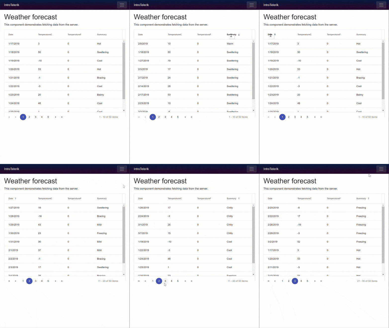
Telerik UI for Blazor is a brand new library of UI components for the Razor Components and Blazor frameworks. Even though Telerik UI for Blazor is in an "Early Preview" stage it ships with one of the most popular and versatile UI components, the data grid. The data grid features out-of-the-box functionality like paging, sorting, templates, and themes. In this article we will focus how to get started with the grid's basic features.

Grid animated showing paging and sorting

Prerequisites

Since the ASP.NET Preview's are moving at a rapid place, it's best to update your bits. Make sure you're on the current version of Razor Components (server-side) and Blazor (client-side) since we'll be working with both. Detailed installation instructions for both frameworks can be found on the Blazor getting started page.

Also be sure that you have enabled the Telerik UI for Blazor free early preview. Even if you have previously enrolled in the preview you may need to revisit this page for the latest version to appear in your feed. With this free account you'll be able to add the Telerik NuGet Package Source.

Before we begin, you may wonder why the Kendo namespace appears when using Telerik UI for Blazor. That's because the Telerik UI for Blazor shares web resources (HTML & CSS) with our Kendo UI brand of components.

Installation

Installing Telerik UI for Blazor requires just a few simple steps. First we'll need to install the package binaries. We'll be using the Telerik NuGet Package Source to install the package. If you don't have the Telerik Package Source already please see the Prerequisites section above.

If you have multiple solutions in your project, install the package to the project which contains the "Pages" folder. These are the views for your application.

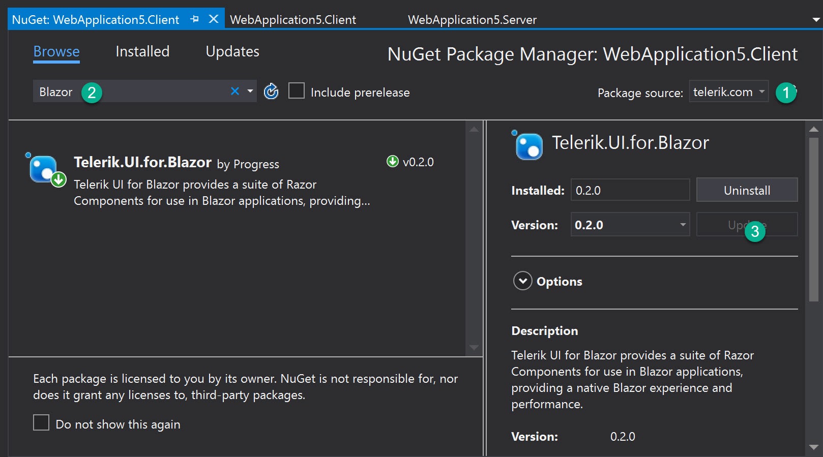
We can use the Package Manager dialog, command line, or directly edit the .csproj file of the application.

NuGet

Telerik UI for Blazor Nuget

Command line

$ dotnet add package Telerik.UI.for.Blazor

Edit .csproj

<PackageReference Include="Telerik.UI.for.Blazor" Version="0.2.0" />

Once the Telerik UI for Blazor package has been installed, we'll need to make a reference to the components in the package. This will act as a global using statement for our application. Open the root _ViewImports file and add the @addTagHelper *, Kendo.Blazor directive.

_ViewImports.cshtml

@addTagHelper *,Kendo.Blazor

We also need to register the the library with dependency injection. This will resolve any dependencies needed by the components. In the same solution, open the Startup class and register the AddKendoBlazor service.

services.AddKendoBlazor();

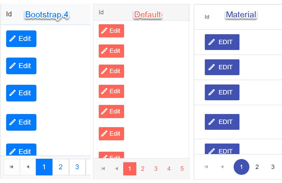
Next we'll need to add the CSS theme files to the application. At the time of writing Telerik UI for Blazor supports three of the Kendo UI themes: Default, Bootstrap 4, and Material Design.

Grid themes

If you have multiple solutions in your project, find the project which contains the "wwwroot" folder. These are the static resources for your application. In the root of the project, add a file named libman.json. LibMan is a client-side library manager built into Visual Stuido (with CLI support) that will fetch static resources and save them to your project.

Add the following configuration to your libman.json file. Save the file and all three component themes will be copied to your wwwroot folder.

{
  "version": "1.0",
  "defaultProvider": "unpkg",
  "libraries": [
    {
      "library": "@progress/kendo-theme-default@3.0.0",
      "destination": "wwwroot/css/kendo-themes/default",
      "files": [
        "dist/all.css"
      ]
    },
    {
      "library": "@progress/kendo-theme-bootstrap@3.0.0",
      "destination": "wwwroot/css/kendo-themes/bootstrap",
      "files": [
        "dist/all.css"
      ]
    },
    {
      "library": "@progress/kendo-theme-material@2.0.0",
      "destination": "wwwroot/css/kendo-themes/material",
      "files": [
        "dist/all.css"
      ]
    }
  ]
}

With the themes installed, reference the desired theme from your application's index.html file.

wwwroot/Index.html

<head>
    ...
    <!-- <link rel="stylesheet" href="/css/kendo-themes/material/dist/all.css" />
    <link rel="stylesheet" href="/css/kendo-themes/default/dist/all.css" /> -->
    <link rel="stylesheet" href="/css/kendo-themes/bootstrap/dist/all.css" />
</head>

That's it! Now we're ready to begin building Razor Components or Blazor applications using Telerik UI for Blazor.

The Grid Component

The The Telerik UI for Blazor KendoGrid (Grid) is a data grid component that is compatible with both Razor Components and client-side Blazor. Thanks to these new breakthrough frameworks, the Grid does not require any JavaScript. The grid component is simple to implement, yet has a robust set of features like data binding, paging, sorting and templates. In addition, Razor Components and Blazor offer unique capabilities for bringing data into the grid. Depending on the mode of operation the data source can pull directly from Entity Framework (Razor Components), or via remote HTTP request (Blazor).

The basic Grid is made up of a few components that define the grid and its columns. The grid itself and its columns have parameters which are used to enable/disable functionality.

<KendoGrid parameters...>
    <RowTemplate/>
    <KendoGridColumns>
       <KendoGridColumn parameters.../>
    </KendoGridColumns>
</KendoGrid>

Let's start with the basic properties and then we'll learn about the different data sources we can use.

Properties

Height

When the height of the Grid is set, it calculates the appropriate height of its scrollable data area, so that the sum of the header rows, filter row, data, footer, and pager is equal to the expected height of the component. If the height of the Grid is changed through code after it's created the Grid it recalculates the height of its data area.

In some special scenarios it is possible to set a height style to the scrollable data area of the Grid by external CSS, which is a div.k-grid-content element.

<KendoGrid Height=@Height ... >

Data

The Grid's data plays a central role in practically all web applications built with Telerik UI for Blazor. The Data parameter accepts any data source that implements the IEnumerable interface. The data may be supplied from sources such as Entity Framework, local arrays and lists, and remote sources like HTTP requests via HttpClient.

@inject WeatherForecastService ForecastService
<KendoGrid Data=@GridData ... >
    <KendoGridColumns>
    ...
    </KendoGridColumns>
</KendoGrid>

@functions {
    public IEnumerable<WeatherForecast> GridData { get; set; }
    protected override async Task OnInitAsync()
    {
        GridData = await ForecastService.GetForecastAsync(DateTime.Now);
    }
}

Columns

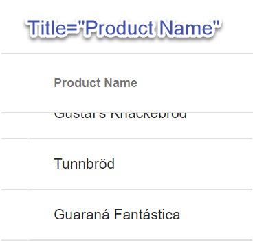
The KendoGridColumns component is the root level configuration of the grid columns. Nested beneath KendoGridColumns are individual KendoGridColumn components. These components are interpreted as column configurations where the Field parameter is a string to which the column is bound. The column will use the property name as the column header by default, but this can be explicitly set using the Title parameter. In the example below, the nameof operator is used to get the string representation of the ProductName property. Since we're dealing with C#, the nameof operator provides better tooling support for refactoring.

<KendoGrid parameters...>
     <KendoGridColumns>
       <KendoGridColumn Field=@nameof(Product.ProductName) Title="Product Name"/>

Title-set

Sortable

To enable sorting on all Grid columns, simply set the Sortable parameter. When the Sortable parameter is set to true, users can easily click the column headers to change how the data is sorted in the Grid.

<KendoGrid Sortable=bool parameters...>

Paging

With the Grid we have full control over the Pager. The pager can be enabled/disabled through the Pageable parameter. We can also define a PageSize and set the initial Page value.

<KendoGrid Pageable=bool PageSize=int Page=int parameters...>`

pager

Templates

When we would like more flexibility in how our data is displayed, we can tap into the template features of the Grid. Within any column we can simply open a Template component and access an object reference to the current item bound to a given row. The Template content can contain HTML markup, Razor code, or even other Components.

<KendoGrid Data=@GridData>
    <KendoGridColumns>
        <KendoGridColumn Field=@nameof(Product.ProductId) Title="Id"/>
        <KendoGridColumn Field=@nameof(Product.ProductName) Title="Product Name"/>
        <KendoGridColumn Field=@nameof(Product.UnitPrice) Title="Unit Price">
            <Template>
                @(String.Format("{0:C2}", (context as Product).UnitPrice))
            </Template>
        </KendoGridColumn>
    </KendoGridColumns>
</KendoGrid>

@functions {
    public IEnumerable<Product> GridData { get; set; }

    protected override async Task OnInitAsync()
    {
        GridData = await nwContext.Products.ToListAsync();
    }
}

Getting Data

Because the Grid uses the IEnumerable interface for its data source, it has very flexible data binding. Depending on what context your application runs in, either Razor Components (server-side) or Blazor (client-side), you may have different requirements for connecting to data. Let's look at how dependency injection helps connect our Grid to a data source.

Razor Components (server-side operation)

Since Razor Components run in the context of the server, we can connect to directly to data through Entity Framework. One of the benefits to working with Razor Components is that our application doesn't need to create an HTTP request to connect to data.

We'll be using dependency injection to reference an instance of our database context, so we will need to register our service on startup. In the ConfigureServices method of the Startup class:

public void ConfigureServices(IServiceCollection services)
{
    var connection = "my-connection-string";
    var options = new DbContextOptionsBuilder<NorthwindContext>()
                        .UseSqlServer(connection)
                        .Options;
    services.AddSingleton(new NorthwindContext(options));
    ...
}

With our DbContext registered with dependency injection we can now inject the context on our page using the @inject directive. Inject will resolve a reference to an instance of the NorthwindContext and assign it to the nwContext variable. When the page initializes we call ToListAsync on the Products data set and update the GridData property with the results. Since the GridData property is bound to the Grid it will update when OnInitAsync completes.

@using TelerikBlazor.App.Models // Product is defined here
@inject NorthwindContext nwContext


<KendoGrid Data=@GridData>
    <KendoGridColumns>
        <KendoGridColumn Field=@nameof(Product.ProductId) Title="Id"/>
        <KendoGridColumn Field=@nameof(Product.ProductName) Title="Product Name"/>
        <KendoGridColumn Field=@nameof(Product.UnitPrice) Title="Unit Price">
            <Template>
                @(String.Format("{0:C2}", (context as Product).UnitPrice))
            </Template>
        </KendoGridColumn>
    </KendoGridColumns>
</KendoGrid>

@functions {
    public IEnumerable<Product> GridData { get; set; }
    int PageSize = 10;
    bool Pageable = false;
    bool Sortable = false;
    decimal Height = 400;

    protected override async Task OnInitAsync()
    {
        GridData = await nwContext.Products.ToListAsync();
    }
}

Now that we've seen how server-side operation works, let's take a look at using the Grid with Blazor.

Blazor (client-side operation)

Telerik UI for Blazor is compatible on the client, but currently has a known issue which requires disabling the Blazor IL Linker. Without digging into IL Linking too deep, the result of disabling it only results in a larger payload size. This is a temporary situation that will be resolved in later versions of the framework.

To disable IL Linker, open the .csproj file and add <BlazorLinkOnBuild>false</BlazorLinkOnBuild> to the top most property group.

<PropertyGroup>
    ...
    <LangVersion>7.3</LangVersion>
    <!-- add the line below to disable IL Linker -->
    <BlazorLinkOnBuild>false</BlazorLinkOnBuild>
  </PropertyGroup>

Similar to server-side operation, we'll be using the @inject directive. On the client our app is disconnected from the database and we'll need to make an HTTP request for data. Instead of injecting our DbContext we will instead resolve an instance of HttpClient. When the page initializes we'll make an HTTP request using GetJsonAsync and update the GridData property with the results. Since the GridData property is bound to the Grid it will update when OnInitAsync completes.

@using WebApplication6.Shared // WeatherForecast is defined here
@inject HttpClient Http

<KendoGrid Data=@forecasts>
    <KendoGridColumns>
        <KendoGridColumn Field="@nameof(WeatherForecast.TemperatureC)" Title="Temp. ℃"/>
        <KendoGridColumn Field="@nameof(WeatherForecast.Summary)"/>
    </KendoGridColumns>
</KendoGrid>


@functions {
    WeatherForecast[] forecasts;

    protected override async Task OnInitAsync()
    {
        forecasts = await Http.GetJsonAsync<WeatherForecast[]>("api/SampleData/WeatherForecasts");
    }
}

The Grid works with both Razor Components and Blazor using the same markup. The only aspect of the code that changes is how the data is retrieved.

Wrapping Up

The Telerik UI for Blazor Early Preview kicked off with one of the most popular and powerful components, the Grid. We saw how the Grid can quickly make use of paging, sorting, templates, and themes. Leveraging the Razor Components or Blazor frameworks, we can fetch data directly from our database or HTTP and easily bind the data source.

We covered just the basic features of the Grid, but there's much more we can do with templates. In an upcoming article we'll take a closer look at row and column templates to see what is possible.

GitHub-examples

If you're ready to try Razor Components and Blazor then create an account for the Telerik UI for Blazor free early preview. Once you've signed up feel free to explore our extensive examples on GitHub, and happy coding.

Telerik UI for WPF R1'19 SP: VS19 Preview 3 Support & 80+ Improvements

$
0
0

The R1 2019 Service Pack for Telerik UI for WPF and Telerik UI for Silverlight includes over 80 improvements and cool new features, as well as support for Visual Studio 2019 Preview 3. Dive in and check out some of the top highlights coming to the suites.

Fluent Theme: New ScrollBarMode property

Using the ScrollBarMode property of the FluentPallete youcan now modify the appearance of the scrollbars of all controls that are using ScrollViewer in the ControlTemplate. By design the scrollbars in the theme appear over the content, they are really narrow (compact), and get bigger on mouse over. However, in specific scenarios this behaviour might not be convenient and this is where the new property comes in handy – you can have the ScrollBars always compact, always with their full size or as it is by default in the theme. See the differences between the different modes below and make sure to read the Fluent theme article for more details:

Fluent-ScrollBarMode

SpreadProcessing: New Chart Customization Options

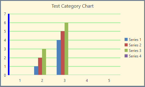
With this version, we added several properties enabling you to customize the look of a chart and its axes. Now you are able to change the outline and fill of the chart shape as well as the outline and major gridlines of the axes. Here is a bit of a code showing the new properties exposed:

FloatingChartShape chartShape = new FloatingChartShape(workbook.ActiveWorksheet, new CellIndex(2, 7), new CellRange(0, 0, 4, 3), ChartType.Column)
{
    Width = 480,
    Height = 288,
};
  
chartShape.Chart.Legend = new Legend() { Position = LegendPosition.Right };
chartShape.Chart.Title = new TextTitle("Test Category Chart");
  
chartShape.Outline.Fill = new SolidFill(new ThemableColor(Colors.SlateGray));
chartShape.Outline.Width = 5;
chartShape.Fill = new SolidFill(new ThemableColor(Colors.Cornsilk));
  
chartShape.Chart.PrimaryAxes.ValueAxis.Outline.Fill = new SolidFill(new ThemableColor(Colors.Blue));
chartShape.Chart.PrimaryAxes.ValueAxis.Outline.Width = 5;
  
chartShape.Chart.PrimaryAxes.ValueAxis.MajorGridlines.Outline.Fill = new SolidFill(new ThemableColor(Colors.LightGreen));
chartShape.Chart.PrimaryAxes.ValueAxis.MajorGridlines.Outline.Width = 2;
  
workbook.ActiveWorksheet.Shapes.Add(chartShape);

And here is how the code would change the chart:

Spread-Charts

MultiColumnComboBox: New DropDownElementStyle and IsReadOnly Properties

We added two new properties to the MultiColumnComboBox control:

  • DropDownElementStyle– this allows you to set a custom style for the control in the drop down (GridView by default) and apply all the needed properties. For more info check out this article.
  • IsReadOnly– this is a property of the GridViewItemsSourceProvider, and by using it you can control the IsReadOnly property of the GridView in the drop down. Check out the GridViewItemsSourceProvider article here.

GridView: New MouseOverBackground Property and SpreadsheetStreamingExport Enhancements

  • GridView gets a new MouseOverBackground that allows you to easily customize the background color of the GridView Cell. You can set this property per cell or per GridView.
  • SpreadsheetStreamingExport gets many improvements as well as a new ExportOptions.ColumnWidth property, which allows you to specify a concrete width for the columns when exporting.

TabControl: Access Text Support

The Header of the TabItem now allows you to set access text as a direct string. For example:

<telerik:RadTabControl>
  <telerik:RadTabItem Header="_File" />
  <telerik:RadTabItem Header="_Edit" />
  <telerik:RadTabItem Header="_View" />
</telerik:RadTabControl>

And when the Alt key on the keyboard is pressed the access keys are displayed in the TabItem Header as shown below:

TabControl-AccessText

GanttView: Shift and Tab Navigation

The user can now navigate backwards when editing cells in the grid part of the control by pressing the Shift and Tab keys on the keyboard.

.NET Core 3 Preview 2

The second preview of the latest .NET Core version was recently introduced by Microsoft and I'm happy to share that the Telerik UI for WPF .NET Core 3 binaries are now built against it! Make sure to play around with them and please share any feedback that you have.

VisualStudio 2019 Preview 3

I have good news for all of tech enthusiasts already on VisualStudio 2019 – UI for WPF is compatible to the latest update of latest preview version of VisualStudio 2019. As always, we are providing immediate support for the newest VisualStudio versions, making sure you can always able to benefit from all the cool new features of the IDE.

Check Out the Detailed Release Notes

To get an overview of all the latest features and improvements we’ve made, check out the release notes for the products below:

Share Your Feedback.

Feel free to drop us a comment below sharing your thoughts. Or visit our Feedback portals about Telerik UI for WPF, Silverlight and Document Processing Libraries and let us know if you have any suggestions or if you need any particular features/controls.

And if you haven’t already had a chance to try our UI toolkits, simply download a trial from the links below:

Telerik UI for WPF  Telerik UI for Silverlight

In case you missed it, here are some of the updates from our last release.

Telerik UI WinForms R1'19 SP: Support for Visual Studio 2019 (Preview 3) & Many Improvements

$
0
0

The Telerik UI for WinForms R1'19 service pack brings Visual Studio 2019 Preview 3 Support and a variety of new features and improvements.

As usual we focused on fixes and improvements in the suite for the service pack release of Telerik UI for WinForms. We are happy that we managed to introduced new features as well as important bug fixes in various controls. We also tested it against the latest Visual Studio 2019 (preview 3) and we can confirm that the entire suite is fully compatible.

We managed to deliver 37 fixes and features. Below are some of the improvements that are part of the service pack release:

GridView

AutoFilterDelay

A property defined on the base column affecting how the filtering is executed. Up until now, every key stroke in the filter cell resulted in updating the applied filter. This can lead to a delay in grids having many records. As a result the cursor in the filter can start lagging while typing. The AutoFilterDelay property sets a value in milliseconds that indicates the delay between the last key press and the filtering operation.

filtering

Header Checkbox Performance

The performance has been improved many times over, and toggling the header checkbox in a grid with 100,000 rows now takes less than 2 seconds.

LayoutControl

AllowHide

Now the LayoutItemControlBase class has the AllowHide property, determining whether the item can be hidden by the end-user from the Customize dialog.

layout-control

PdfViewer

Editing Fields Navigation

The text fields can now be navigated forwards and backwards using the Tab and Shift + Tab keys.

Visual Studio 2019

We tested the controls with Visual Studio 2019 (preview 3) and we are happy to confirm that they are fully compatible.

Try It Out and Share Your Feedback

You can learn more about the Telerik UI for WinForms suite via the product page. It comes with a 30-day free trial, giving you some time to explore the toolkit and consider how it can help you with your current or upcoming WinForms development.

We would love to hear what you think, so should you have any questions and/or comments, please share them to our Feedback Portal or in the comment section below.

Telerik UI for Xamarin R1'19 SP: PDFViewer, VS2019 Preview 3 Support and Many Fixes

$
0
0

With the R1'19 Service Pack release of Telerik UI for Xamarin, we've added a few new features to our PDF Viewer, Visual Studio 2019 Preview 3 support and a variety of improvements across the suite.

With the first major release of the year of Telerik UI for Xamarin, we released the PdfViewer - a component to display PDF documents right within your app. With the service pack release, we built on top of it and have included some more nifty features:

  • FileDocumentSource - you can now point RadPdfViewer to a file on your device. Moreover, it is smart enough to allow you to provide it through a string:
    <telerikPdfViewer:RadPdfViewer x:Name="pdfViewer"  Source="{Binding FilePath}" />
    Where FilePath is a string property in your viewmodel:
    string FilePath {get;}
  • RadPdfViewer.Document property is now public, so you can easily track when the document is loaded/changed
  • When a new document is loaded, it is automatically adjusted to fit the current width for best viewing experience
  • ByteArrayDocumentSource.IsImportAsync is now true by default and available for configuration

VisualStudio 2019 Preview 3

I have good news for all of tech enthusiasts already on VisualStudio 2019 – Telerik UI for Xamarin is compatible with the latest version of VisualStudio 2019 (Preview 3). You can take advantage of the convenient project template which creates a project ready to accommodate all Telerik controls...

Telerik Project Template in VS 2019

... or any of the ItemTemplates that allow you head start in complex screen creation.

Telerik Xamarin Item Template in VS 2019

Of course, all the controls are available and ready to use in the Telerik UI for Xamarin Toolbox in your Visual Studio 2019.

Telerik UI for Xamarin controls in VS 2019 Toolbox


We have introduced a number of improvements to the rest of the Xamarin controls in the suite too:

Calendar:

  • AppointmentTapped and TimeSlotTapped events are not fired when one clicks on All-day appointment
  • Start and End Time is shown for all-day appointment in the default Scheduling screens
  • DaysOfMonth collection is cleared when changing the repeat rule
  • Fixed a wrong date shown when clicking on a recurring appointment
  • MultiDayView now respects the device settings for time format

Chart:

  • Fixed an exception when values have decimal point and the CultureInfo is one which uses comma as decimal separator (e.g. Russian) on Android
  • Fixed incorrectly applied colors in PieChart with custom palette on Android

Chat:

  • Entry is now shifted up correctly when software keyboard is used on iOS
  • Fixed an exception, thrown when ItemsSource is set to null

Checkbox:

  • Fixed state not updated correctly when in ListView on iOS
  • Fixed transparent check rectangle when IsTransparent is set to false

 NuGet:

  • Fixed a compilation error when using lite NuGet package
  • Fixed a problem with DataGrid nuget package, requiring an obsoleted dependency

Entry:

  • Fixed NullReferenceException when WatermarkText is set to null

ListView:

  • Fixed an exception thrown when setting BindingContext to null after navigating back from a page (Prism-style navigation) on iOS
  • ScrollIntoView now works correctly when control is in NavgationPage

NumericInput:

  • Fixed an exception when two buttons are pressed at a time on UWP

Popup:

  • Fixed cannot type in Entry when it is in a modal popup

SideDrawer:

  • Fixed inconsistently updated IsOpen property when an animation is interrupted

SlideView:

  • Fixed SelectedIndex incorrectly updated when swiping left in specific scenarios on iOS
  • Fixed SelectedIndex not updated on first time swipe on iOS
  • Fixed SlideView's ContentOptions overriding the LayoutOptions of the Views inside the control

TreeView:

  • Fixed a NullReferenceException when collapsing items

Share Your Feedback

Feel free to drop us a comment below sharing your thoughts. Or visit our Feedback portal for Telerik UI for Xamarin and let us know if you have any suggestions or if you need any particular features/controls.

And if you haven’t already had a chance to try the Xamarin UI toolkit, go straight to the product page to learn more and download a fresh trial

Learn More

In case you missed it, here are some of the updates from our last release.

Up and Running with React Form Validation

$
0
0

Join me as we walk through the easiest way I know how to add custom form validation in React in the fewest steps. Get up to speed creating your own custom form validation in your React components.

This article will get you up and running with basic React form validation using controlled state inside of components. We use classes and plan to have a follow up article on doing the same thing with Hooks.

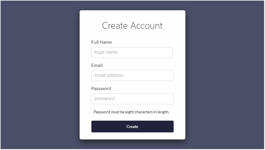
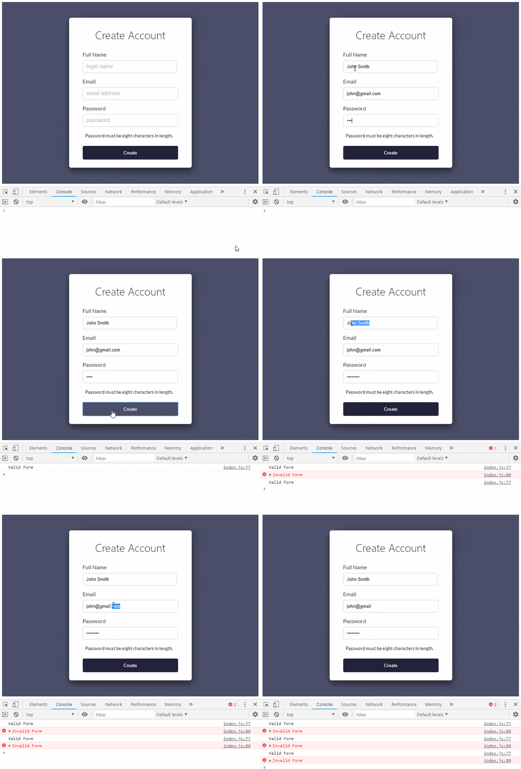
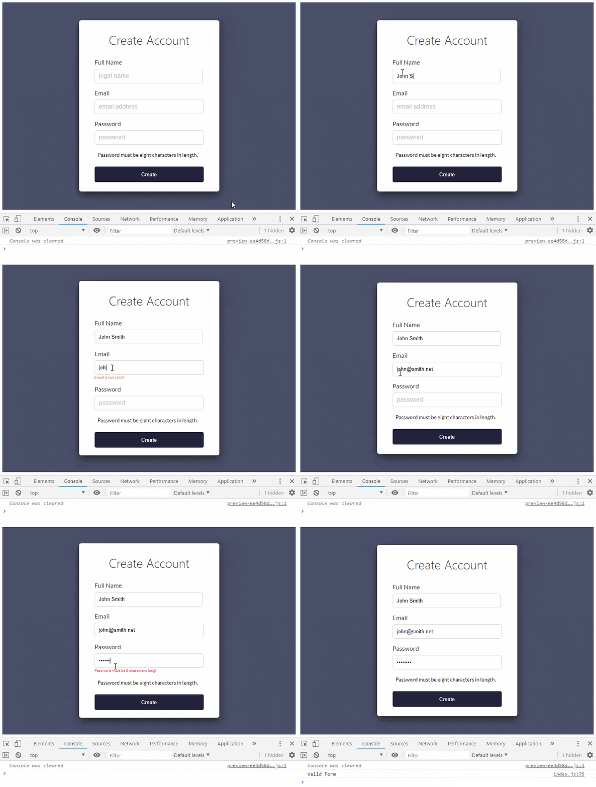
Our starting point will be a StackBlitz demo which only has form elements and basic styling setup. A Register form is the concept of what we are trying to build, it has a full name, email and password:

Initial Form

It's a simple and canonical example. I'd like to not only show how to use basic logic, but also show how I could use a regular expressions that many of my React Components could use.

We will keep everything in one file for simplicity sake, but I have split the Register feature into its own component. I have added some CSS and HTML in the StackBlitz starter demo but zero JavaScript logic outside of basic component composition.

The <dialog> modal was considered but not used in this tutorial. You can find information on how to use it in all browsers with a polyfill here. We don't use it because it does not have support outside of Chrome.

If you thought you were here to learn validation using KendoReact, that's another, much easier topic, you can find it here: Getting Started with KendoReact Form validation 

Instead we are going to learn about building your own implementation using HTML forms, React and JavaScript to validate our form. It's a great topic to cover teaching the inner workings of React UI components, which is what my React Learning Series is all about.

This tutorial should be great for beginner to intermediate level React developers, if you are familiar with HTML, CSS and basic React stuff. We will start with this StackBlitz demo:

*Open This StackBlitz demo and fork it to follow along!

One of the things to notice in the form I have setup for you is that we have specified three different types of inputs. We have a fullName, email and password input. It's very important to use the right type on each input as the behavior it provides is what users expect with a professional form. It will assist their form fillers and allow for an obfuscated password which is also pretty standard.

On the Form tag and on the individual inputs I have placed noValidate (noValidate in jsx turns into novalidate in html). Adding this doesn't disable form validation. It only prevents the browser from interfering when an invalid form is submitted so that we can “interfere” ourselves.

We are going to build our form validation from this point and do all of the JavaScript logic ourselves. Currently the form does not submit or work in anyway, it has only been styled.

The first thing we want to add is a constructor to our Register component:

constructor(props) {
  super(props);
  this.state = {
    fullName: null,
    email: null,
    password: null,
    errors: {
      fullName: '',
      email: '',
      password: '',
    }
  };
}

Our state will contain a property for each input as well as have an object (error) which will hold the text for our error messages. Each form input is represented in this error object as well. If we detect the input is invalid, this string will have a value, otherwise the value will be empty or zero. If it's not zero, we will create logic to display the message to the user.

Next we will add the handleChange() function. This will fire every time we enter a character into one of the inputs on our form. Inside that function, a switch statement will handle each input respectfully, constantly checking to see if we have for instance reached a minimum character limit or a found a RegEx match. Each time a character is entered, an event will be passed to this function getting destructured. Destructuring assignment plucks our values out of the event.target and assigns them to local variables (name and value) inside of our function.

In destructuring, the line of code below:

const { name, value } = event.target;

is equivalent to:

let name = event.target.name;
let value = event.target.value;

Let's add the handleChange() function. It should come right before the render method of our Register class:

handleChange = (event) => {
  event.preventDefault();
  const { name, value } = event.target;
  let errors = this.state.errors;

  switch (name) {
    case 'fullName': 
      errors.fullName = 
        value.length < 5
          ? 'Full Name must be 5 characters long!'
          : '';
      break;
    case 'email': 
      errors.email = 
        validEmailRegex.test(value)
          ? ''
          : 'Email is not valid!';
      break;
    case 'password': 
      errors.password = 
        value.length < 8
          ? 'Password must be 8 characters long!'
          : '';
      break;
    default:
      break;
  }

  this.setState({errors, [name]: value}, ()=> {
      console.log(errors)
  })
}

The code above will enter into the correct switch case depending on which input you are typing in. It will check that you have entered the correct length for that input or in the case of the email, it will check a RegEx that we still need to create and ensure that it matches the regular expression that checks for a proper email format.

We will not get into Regular Expressions, however; I got my expression from a StackOverflow answer which showcases a few decent RegEx solutions for validating emails.

Just above our Register class we can add a const that holds this RegEx and then we can call .test() on that RegEx string to see if our input matches and returns true, otherwise we will add an error message to our local copy of our error state.

const validEmailRegex = 
  RegExp(/^(([^<>()\[\]\.,;:\s@\"]+(\.[^<>()\[\]\.,;:\s@\"]+)*)|(\".+\"))@(([^<>()[\]\.,;:\s@\"]+\.)+[^<>()[\]\.,;:\s@\"]{2,})$/i);

The RegEx is nearly impossible to read, but rest assured it covers most cases that we want to check including accepting unicode characters. Understand that this is just a test we perform on the frontend and in a real application you should test the email on the server-side with legit validation depending on your requirements.

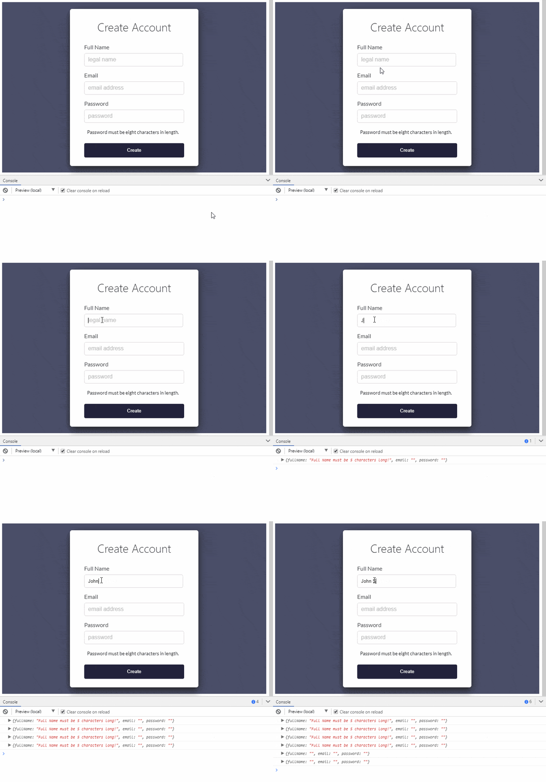
This is a great spot to stop and check our work, in fact most of our validation is already working, if we go into our console for this page we can see what error messages are being created up until we satisfy each inputs validation:

Validate Full Name

As you can see, as soon as we enter our first character in the fullName input, we get an error message. The fullName input requires that we enter at least 5 characters. We see that in our console up until we meet the criteria, then the error message disappears. Although we will not continue logging these errors in the console, we will pay attention in future code to the fact that we either have an error message or not. If so, we will display that error message to the user directly underneath the input.

This StackBlitz demo is a saved version of our current progress - we still have a few more things to plug in though.

Our next order of business is to handle a form submission and provide a function that, upon form submission, can check to see if we have any error messages present to show the user.

Considering our handleChange() function is already updating our local component state with errors, we should already be able to check for validity upon form submission with handleSubmit(). First I want to remove the console.log statement inside the setState call. Let's update that line at the bottom of the handleChange() function to read:

this.setState({errors, [name]: value});

Now, we will create the new handleSubmit() function and for the time being, we will console log a success or fail message based on the validity of the entire form. Add the following code just below the handleChange() function.

handleSubmit = (event) => {
  event.preventDefault();
  if(validateForm(this.state.errors)) {
    console.info('Valid Form')
  }else{
    console.error('Invalid Form')
  }
}

In our handler for the submit event, we need to stop the event from bubbling up and trying to submit the form to another page which causes a refresh and then posts all of our data appended to the web address. The line of code that does this is event.preventDefault() and if you have not used it before, you can read up on it here: React Forms: Controlled Components. This is one of the better resources that explains why it's needed in React forms.

As you can see from the code above, we also need to add a function called validateForm which we call out to in order to check validity. We then display a console message of valid or invalid. We will add this function just below the RegEx we created:

const validateForm = (errors) => {
  let valid = true;
  Object.values(errors).forEach(
    // if we have an error string set valid to false
    (val) => val.length > 0 && (valid = false)
  );
  return valid;
}

At this point we should be able to fill out the entire form and check validity.

Validate Form

We are getting close to the home stretch, we have a form that submits and determines if we have met the criteria for each input and we have the ability to return a valid or invalid state. This is good!

Inside of our Register component's render and before the return, we need to destructure our this.state.errors object to make it easier to work with.

const {errors} = this.state;

This will allow us to write some pretty simple logic below each input field that will check if the error message for that field contains a message, if so we will display it! Let's write our first one underneath the fullName input.

{errors.fullName.length > 0 && 
  <span className='error'>{errors.fullName}</span>}

Now lets do the same underneath the next two inputs, first the email input:

{errors.email.length > 0 && 
  <span className='error'>{errors.email}</span>}

And next we will do the password input:

{errors.password.length > 0 && 
  <span className='error'>{errors.password}</span>}

And just like that we should have our entire form working and alerting the user to any errors so long as we have touched the individual inputs. The current logic should keep from showing our error messages until we start typing in the input as well, if we back out of an input and remove all text that we have typed, the error messages will remain as they have been touched and are now invalid. Let's take a look at the form in action:

Final Form

There are a few things you could do above and beyond what we have done here. One is that, instead of adding a span underneath the input when the form becomes invalid, we could have the span always there and just display it using a CSS class if it's invalid. What's the difference? Well it would help to get rid of the jump when the error message arrives and disappears.

Also we could just have a large section at the bottom that displays all known errors only upon hitting the submit button. These are all great ideas and things you should explore on your own now that you have a better understanding of how to validate a form.

Finally, I want to link below to the final version of our form in StackBlitz. So much more is possible, but this is a good stopping point to sit back look it over and decide exactly how we want things to work before moving forward. Thanks for taking the time to learn here with me and remember that we have KendoReact components that make form validation a breeze. Try them out here!

How to Use a jQuery Slider UI Component in Your Web App

$
0
0

Learn how to easily integrate a slider component into your web app. This component is ideal for volume and brightness adjustment, or anywhere else you want to make immediate changes.

In the last episode, you learned about the ProgressBar component. A progress bar indicates how long a process takes or an undetermined wait time. In this episode, you will learn about the Slider component. A slider allows users to choose from a range of values by moving a thumb along a track. The track is a bar that represents all the possibles values that can be chosen and the thumb is a draggable handle. A slider is ideal to use to adjust values that will be updated immediately. Changing the volume, seeking to a position in a media player, or adjusting brightness settings are all cases you can use a slider. Next, you will see how to create a slider with Kendo UI and make a volume control.

Basic Kendo UI Slider

When you initialize the Slider it will have a track for you to select values from 0-10. Possible selections are marked by tick marks. However, tick marks can be removed by setting the tickPlacement option to none. Each tick mark represents a value of 1. You can customize the change in value of each tick mark with the smallStep option. There are buttons on either side of the slider to increase or decrease the value of the slider. These can be removed by making the showButtons parameter false. The following is an example of a slider using the default, Material and Bootstrap themes:

Slider
slider
slider

<!DOCTYPE html><html><head><metacharset="utf-8"><title>Slider</title><linkrel="stylesheet"href="https://kendo.cdn.telerik.com/2018.3.911/styles/kendo.common-material.min.css"><linkrel="stylesheet"href="https://kendo.cdn.telerik.com/2018.2.620/styles/kendo.material.min.css"><scriptsrc="https://code.jquery.com/jquery-1.12.3.min.js"></script><scriptsrc="https://kendo.cdn.telerik.com/2018.2.620/js/kendo.all.min.js"></script><style>body {font-family: helvetica;}</style></head><body><divid="slider"></div><script>$(document).ready(function(){$('#slider').kendoSlider();});</script></body></html>

There are several ways to select a value on the slider. Besides using the buttons, you can click on the drag handle and drag it to a new position or jump to a new position by clicking on the track. You can also step through the slider by clicking on the drag handle and using the keyboard arrows to move forward and backward. You can jump by several ticks in the slider by clicking the drag handle then pressing the page up or page down keys. By default, the slider will allow you to make large jumps five steps at a time. This can also be changed using the largeStep option.

Create a Volume Slider

Our volume slider will have the values 0-15 and include a single button on the left-hand side to toggle muting the volume. When the slider has a value of zero, the icon will change to reflect that the volume is off. If the mute button is clicked when the volume is on, the slider’s value will become zero. If the slider is already zero, clicking the mute button will jump the slider to its last known value. First, you will see how to update the appearance of the mute button based on the slider’s value. This is the HTML and CSS needed to create the slider:

<div>
  <span id="volume" class="k-icon k-i-volume-up"></span>
  <div id="slider"></div>
</div>

#volume {
  vertical-align: super; 
  margin-right: 1em; 
  cursor: pointer;
}

To detect when the value of the slider is zero, we will need to implement a handler for the slider’s change event. This is the initialization code for the slider:

var slider =$('#slider').kendoSlider({
  min:0,
  max:15,
  value:5,
  showButtons:false,
  tickPlacement:'none',
  change: onChange
}).data('kendoSlider');

Our onChange function will need to know what the value of the slider is in order to mute and unmute the volume control. It is also responsible for updating the last known value we saved. We will use the slider’s value method to save this value. This is the additional code needed to implement the change event handler:

var lastValue = slider.value();functiononChange(){
  lastValue = slider.value();if(lastValue ===0){mute();}else{unmute();}}

The mute and unmute functions used here will change the icon for our button. In practice, you could include the behavior needed to actually adjust the volume. These are the implementations for both functions:

functionmute(){$('#volume').removeClass('k-i-volume-up');$('#volume').addClass('k-i-volume-off');}functionunmute(){$('#volume').addClass('k-i-volume-up');$('#volume').removeClass('k-i-volume-off');}

Now, when you drag the handle all the way to the left, the button will change to a volume off icon. The last part is to add an event handler to update the slider when the mute button is clicked. If the slider’s value isn’t zero, it will be forced to zero and the volume muted. If the volume is already muted, clicking the button will move the slider to the last known value. However, if the slider’s last value was zero, unmuting will make the slider equal to one. This is the click handler for our volume control:

$('#volume').click(function(){if(slider.value()!==0){mute();
    slider.value(0);}else{unmute();
    value = lastValue >0? lastValue :1  
    slider.value(value);}});

slider

Summary

We reviewed most of the parameters available to customize for the Slider component. The code example for the volume slider demonstrated here can be easily adapted to other uses. The mute button can be changed to a previous button that will rewind an audio player to the beginning of a track. Or it can be used to turn off any setting. In the next episode, you will see the Sortable component. The Sortable lets you rearrange the order of a list by making the items draggable and droppable.

Try Kendo UI for Yourself

Want to start taking advantage of the more than 70+ ready-made Kendo UI components, like the Grid or Scheduler? You can begin a free trial of Kendo UI today and start developing your apps faster.

Start My Kendo UI Trial

Angular, React, and Vue Versions

Looking for UI component to support specific frameworks? Check out Kendo UI for Angular, Kendo UI for React, or Kendo UI for Vue.

Resources


Build Better React Forms with Formik

$
0
0

Formik is an alternative and more efficient way of building React forms, keeping your React form logic organized and making testing, refactoring, and overall reasoning a breeze. We demonstrate how to leverage the features of Formik to build better React forms.

React provides us with all we need to build really good forms. However, it is up to us to build off the logic of our React forms. At the time of writing, while working with React forms, it’s up to us as the developers to build out production logic features in our forms. Things like validation, error handling, form submission and so on are expected to be explicitly taken care of by the developer. These tasks are time consuming and, most of the time, repetitive.

In this post, we’ll look at how we can build better React forms with Formik. Formik is a small library that helps you with the three major React form issues:

  1. Handling values in form state
  2. Validation and error messages
  3. Managing form submission

By fixing all of the above, Formik keeps things organized, thereby making testing, refactoring and reasoning about your forms a breeze. We’ll look at how Formik helps developers build better React forms while handling those three issues.

Installation

You can install Formik with NPM, Yarn or a good ol’ <script> via unpkg.com.

NPM

    $ npminstall formik --save

YARN

    yarn add formik

Formik is compatible with React v15+ and works with ReactDOM and React Native.
You can also try before you buy with this demo of Formik on CodeSandbox.io

CDN

If you’re not using a module bundler or package manager, Formik also has a global (“UMD”) build hosted on the unpkg.com CDN. Simply add the following <script> tag to the bottom of your HTML file:

<script src="https://unpkg.com/formik/dist/formik.umd.production.js"></script>

Handling Values in Form State

Let’s look at how Formik handles one of the major React form issues of passing values around in React forms.

Consider an example where we have two input fields for email and password. We want to log the values of these fields to the console when the form is submitted. With the usual React form, we can create this form like so:

import React,{ Component }from'react';classAppextendsComponent{constructor(){super()this.state ={
        email:'',
        password:''}this.handleEmailInput =this.handleEmailInput.bind(this)this.handlePasswordInput =this.handlePasswordInput.bind(this)this.logValues =this.logValues.bind(this)}logValues(){
        console.log(this.state.email);
        console.log(this.state.password);};handleEmailInput(e){this.setState({ email: e.target.value });};handlePasswordInput(e){this.setState({ password: e.target.value });};render(){return(<form onSubmit={this.logValues}><input type="email" onChange={this.handleEmailInput}
value={this.state.email}
placeholder="Email"/><input type="password" onChange={this.handlePasswordInput}
value={this.state.password}
placeholder="Password"/><button onClick={this.logValues}> Log Values </button></form>);}}exportdefault App;

Here, you’ll notice that we have a state object that manages the state of the form. We’ve also defined handlers to manage the state of the input fields, the values, the changes and so on. This is the conventional way of creating forms in React, so let’s skip all the explanations and get to the Formik part.

With Formik, this could be better, even neater and, oh, done with less code. Now let’s try recreating this exact functionality with Formik:

import React from'react'import{ withFormik, Form, Field }from'formik'constApp=({
        values,
        handleSubmit,})=>(<Form><Field type="email" name="email" placeholder="Email"/><Field type="password" name="password" placeholder="Password"/><button>Submit</button></Form>)const FormikApp =withFormik({mapPropsToValues({ email, password}){return{
            email: email ||'',
            password: password ||'',}},handleSubmit(values){
        console.log(values)}})(App)exportdefault FormikApp;

Did you notice how clean and simple it was to recreate the form with Formik? Yeah, you did. Now, let’s walk you through it. Here, we used withFormik() to create the FormikApp component. WithFormik takes in an option, which, according to Formik docs, is a list of objects that we can pass into the withFormik() method to define its behavior.

In this case, we have passed in the mapPropsToValues({ }) option as a function which itself takes in the values of the input fields and passes them as props to our App component. In the App component we can access the values of all the input fields simply by destructuring it and passing in the Formik props called values, which is just an object with a bunch of key/value pairs.

With Formik, we don’t have to define an onChange handler or even an onSubmit on the form, it all comes built-in. All we have to do is import the Form prop from Formik and destructure it in the App component. With that done, we can use it to create our form fields.

Finally, with Formik, we don’t have to define a value in the input field. We simply import the Field prop provided by Formik and it saves us the stress of all those boilerplate codes.

Validation and Error Messages

In React, there is no simple way to handle validation in forms as at this time. Don’t get me wrong, there are good ways — just not as simple as Formik makes it. If you have created a sign-up form before in React, you’ll understand that you had to write your own validation logic to make sure users comply to your standards. You probably had to write a lot of code to validate the email input field, password, number, date and even your own error messages.

With Formik, we can use Yup to handle all that. It is so simple that you can implement standard validation in your input fields in less than 10 lines of code. That’s not all. It also allows you to define your custom error messages for every field condition you check.

Continuing from our last Formik form example, let’s validate the email and password fields with Yup:

import React from"react";import{ withFormik, Form, Field }from"formik";import Yup from"yup";constApp=({ values, handleSubmit, errors, touched })=>(<Form><div>{touched.email && errors.email &&<p>{errors.email}</p>}<Field type="email" name="email" placeholder="Email"/></div><div>{touched.password && errors.password &&<p>{errors.password}</p>}<Field type="password" name="password" placeholder="Password"/></div><button>Submit</button></Form>);const FormikApp =withFormik({mapPropsToValues({ email, password }){return{
          email: email ||"",
          password: password ||""};},
      validationSchema: Yup.object().shape({
        email: Yup.string().email().required(),
        password: Yup.string().min(6).required()}),handleSubmit(values){
        console.log(values);}})(App);exportdefault FormikApp;

Here we have implemented validation and error reporting for both the email and password fields with the addition of about seven lines of code. How is this possible, you might ask? Well, let’s tell you how. In the FormikApp component, we passed in another option, validationSchema to withFormik({ }), which automatically handles all the validations for us.

With the errors prop we just destructured in the App component props, we now have access to the validationSchema errors. As a result, we can define a text field above the input fields to show the validation error messages to the users.

Finally, to be certain that the error messages appear only during submission (not when the user is typing), we used the touched prop. That way, we can conditionally check if a certain field has been touched. If it has, check if there are any errors; if there are, show the text when the field is submitted.

So far, if you run this App and try submitting false values, this is the output you’ll get:

That is all well and good, but what if we wanted to provide a custom error message for the individual validation checks? With Formik, we can do this by specifying the messages inside the validationSchema methods like this:

      validationSchema: Yup.object().shape({
        email: Yup.string().email("Invalid Email !!").required("Email is required"),
        password: Yup.string().min(6,"Password must be above 6 characters").required("Password is required")}),

At this point, the error messages will update appropriately with the contents that we have defined:

Managing Form Submission

Formik gives us the functionality to make asynchronous requests even on submission of the form. Sometimes we’ll want to check if the submitted email address already exists in the database, and if it does we report it to the user.

Also, while the asynchronous request is running, we may want to dynamically disable the submit button until the execution completes. Formik provides us all this functionality and more. To further demonstrate this, let’s simulate a scene where, if an email address already exists, we’ll report an error to the user after the asynchronous request, which we have replaced with a timeout of two seconds. Then if the supplied email address doesn’t exist yet, we reset the form.

To do this, we’ll pass in the necessary Formik props as the second argument to the handleSubmit handler in our FormikApp component like this:

handleSubmit(values,{resetForm, setErrors, setSubmitting}){setTimeout(()=>{if(values.email ==="john@doe.com"){setErrors({ email:'Email already exists'})}else{resetForm()}},2000)}

Wonderful, now we can perform dynamic asynchronous operations while submitting forms. You may have noticed that we still have an unused argument setSubmitting, and you’re probably wondering why we have it there if we are not going to use it. Well, we are.

We’ll use it to conditionally disable our submit button when a submission operation is running. All we need to do is access a prop that is passed to our App component called isSubmitting. As the name suggests, it is a Boolean. If we are submitting, the value is true so we can do something, and if we are not, it’s false, and we can do something else.

constApp=({ values, handleSubmit, errors, touched, isSubmitting })=>(<Form><div>{touched.email && errors.email &&<p>{errors.email}</p>}<Field type="email" name="email" placeholder="Email"/></div><div>{touched.password && errors.password &&<p>{errors.password}</p>}<Field type="password" name="password" placeholder="Password"/></div><button disabled={isSubmitting}>Submit</button></Form>);

Then in the handleSubmit handler, we just set setSubmitting to false:

handleSubmit(values,{resetForm, setErrors, setSubmitting}){setTimeout(()=>{if(values.email ==="john@doe.com"){setErrors({ email:'Email already exists'})}else{resetForm()}setSubmitting(false)},2000)}

Now whenever a submit operation is running, the submit button is conditionally disabled until the asynchronous operation is done executing.

Conclusion

This is Formik at the barest minimum. There are a ton of things you can do with Formik that we didn’t touch in this post. You can go ahead and find out more yourself in the documentation and see how you can optimize the React forms in your existing application or how to implement these amazing features in your subsequent React apps. Compared to the conventional way of creating forms in React, Formik is a must have.

For More on Building Apps with React

Want to learn more about creating great user interfaces with React? Check out KendoReact, our complete UI component library for React that allows you to quickly build high-quality, responsive apps. It includes all the components you’ll need, from grids and charts to schedulers and dials.

React Component Performance Comparison

$
0
0

Are memoized functional components in React worth migrating to today? How much of a performance gain do they bring? We test and find out.

Facebook recently announced some new features like React.memo, React.lazy, and a few other features. React.memo caught my eye in particular because it adds another way to construct a component. Memo is a feature design to cache the rendering of a functional component to keep it from re-rendering with the same props. This is another tool that should be in your toolbelt as you build out your web app, but it made me wonder how much of an improvement are memoized functional components. This led to a bigger question: Is it worth spending the time to migrate components now or can I wait? 

The only way to make that decision would be to base it on data, and there is a distinct lack of quantitative data on the subject. The React team does a great job of providing profiling tools to profile your individual code, but there is a lack of generalized performance numbers when it comes to new features. It's understandable why general numbers are missing, since each component is customized and it’s hard to determine how it’ll work for each web app. But I wanted those numbers for some guidance, so I set down the path to get some performance numbers on the different ways of building components to make informed decisions about migrating code potentially.

As of React 16.6.0, there are four ways of building out a component: a class that extends the component, a class that extends PureComponent, a functional component, and now a memoized functional component. Theoretically, there is an order of performance (less performant to most performant):

  1. Class-extending Component
  2. Class-extending PureComponent
    1. Implements shouldComponentUpdate method by doing shallow prop and state comparison before rerendering
  3. Functional Component
    1. Faster because it doesn't instantiate props and has no lifecycle events
  4. Memoized Functional Component
    1. Potentially even faster because of all the benefits of functional components, plus it doesn’t re-render if props are same as a previous rendering

Since I wanted to put some numbers on the performance, I thought that getting render times for the same component using different implementations would be a good way of controlling the variables. 

After deciding what I was going to test, I needed to find a way to perform the test. Sadly, it’s a little more complicated since React has deprecated react-addons-perf, which used to allow us to do timing on React components. Luckily, I found someone with the same goal as me that built react-component-benchmark, which is a great little library for running performance tests on components. Also, it gave me the ability to test mount, update, and unmount times, which gave me some additional insight.

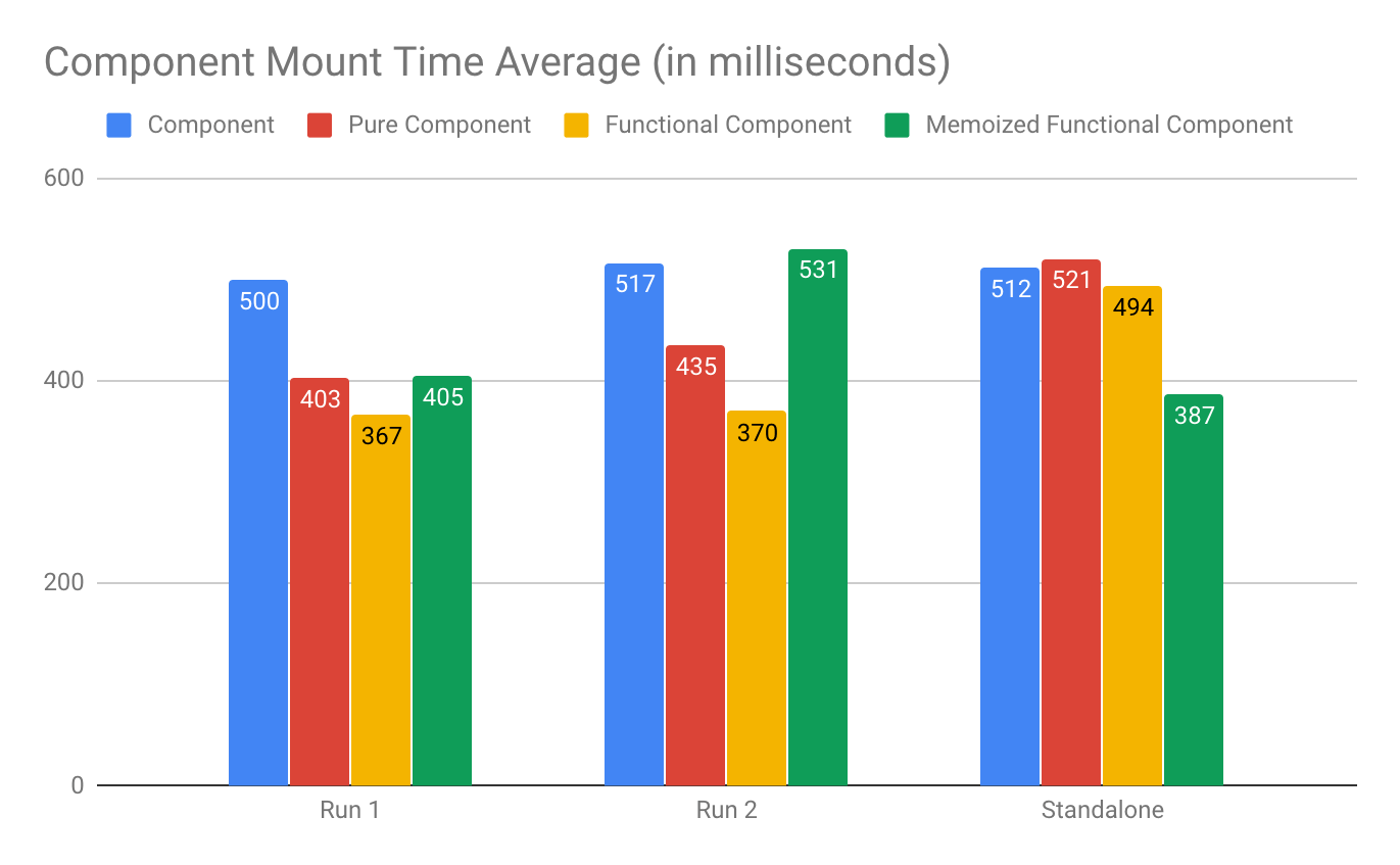
I wanted to set up a simple component so that I could test the actual infrastructure for rendering, so the render method is just a simple hello world. I set them up as a simple jest test so that each test would run the component and print out the results. Also, it made it really easy to get all the results by just running yarn test. I ran the benchmark three times with 20 samples each run. Run 1 and Run 2 had all the tests run in the same batch, and a third run was done by isolating each set of components for the test run to rule out any caching. I have my sample project linked below so you can view all the code.

Component Code:

return (<div>Hello World!</div>);

Going into the test, I thought the numbers would back up the theoretical performance ranking that I listed above. I was more than a little surprised at the difference in performance.

Mount

Runs 1 and 2 showed that PureComponents were about 15%-19% quicker to load than Component, which was a little unexpected since Component and PureComponent should have the same implementation. Functional Components were even quicker to load on than Component by 26%-28%. Memoized Functional Components were on par with PureComponents or faster, with the exception of the blip on Run 2.

The standalone run showed that Memoized Functional Components had significantly better mounting times than the others.

Side Note: I wanted to include Run 2 precisely because of the blip that resulted in the Memoized Component outlier to clarify that these are rough numbers with some room for improvement on accuracy. Part of the inaccuracy is due to React’s lack of a way to rigorously test components (multiple rendering times with averages).

React

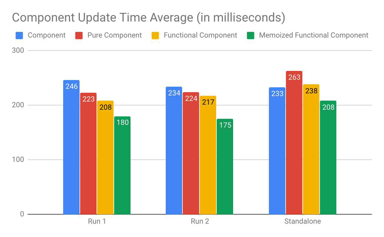
Update

Since our updates had no change to the actual DOM, these numbers were a little more in line with what I was expecting. 

For Run 1 and Run 2, PureComponent implementation is slightly faster (4%-9% faster) than Component. Functional Components are 7%-15% faster than Component. Memoized Components are around 25% faster than Component.

The standalone numbers don’t show the same performance gain during the update, but the Memoized Functional Component does perform consistently better across all tests when compared to Component.

React

Unmount

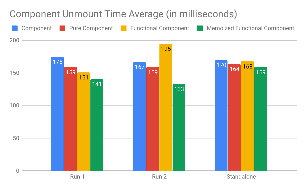
There are no clear winners in the unmount timings other than Memoized Functional Components performed faster than the others across all runs. I would argue that the unmount time is not as critical since there is no clear winner. An interesting observation is that Memoized Functional Components performed better than Functional Components.

React

Based on the numbers, there is a significant performance increase when moving from Simple Component to PureComponent or Functional Component. If you need lifecycle events, migrate to PureComponent. And if your component doesn’t need lifecycle events, then migrate to Memoized Functional Component. Since these are generalized numbers, your component may benefit in different ways when tuning for performance. After seeing these numbers, I’m going to be moving towards Functional Components wherever possible. 

Check out the repo for full code and results.

The Journey of JavaScript: from Downloading Scripts to Execution - Part I

$
0
0

This article will help you understand the internals of JavaScript - even the weird parts. Every line of code that you write in JavaScript will make complete sense once you know how it has been interpreted by the underlying engine. You'll learn multiple ways of downloading scripts based on the use case, and how the parser generates an Abstract Syntax Tree and its heuristics while parsing the code. Let's dive deep into the internals of JavaScript engines - starting from downloading scripts.

JavaScript is one of the most popular languages today. Gone are the days when people would use JavaScript merely for handling DOM event listeners and for a few undemanding tasks. Today, you can build an entire application from the ground up using JavaScript. JavaScript has taken over the winds, lands and the seas. With Node.js invading the gamut of server-side technologies and the advent of rich and powerful client-side libraries and frameworks like React, Angular and Vue, JavaScript has conquered the web. Applications are shipping a lot of JavaScript over the wires. Almost all of the complicated tasks of an application are now implemented using JavaScript.

While this is all great, it is disheartening to see that most of these applications lack even the minimal user experience. We keep adding functionalities to our application without taking into effect its performance implications. It is important that we follow proper techniques to deliver optimized code.

In this series of tutorials, we’ll first understand what is wrong with the conventional techniques and then we’ll dig deeper to learn some of the techniques that’ll help us write optimized code. We’ll also understand how our code gets parsed, interpreted and compiled by the underlying JavaScript engine and what works best for our engines. While the syntax of JavaScript is pretty easy to grasp, understanding its internals is a more daunting task. We’ll start from the very basics and eventually take over the beast. Let’s get going.

Understanding the Script Tag

Let’s consider a simple HTML file:

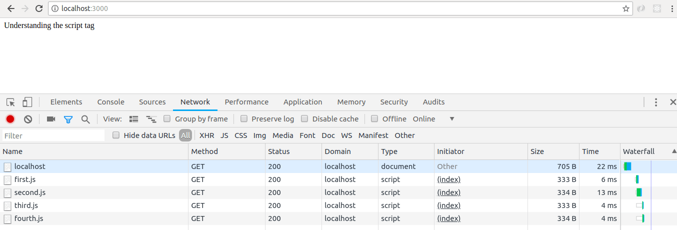
<!DOCTYPE html><html><head><scriptsrc='./js/first.js'></script><scriptsrc='./js/second.js'></script><scriptsrc='./js/third.js'></script><scriptsrc='./js/fourth.js'></script></head><body><div>Understanding the script tag</div></body></html>

first.js includes the following code:

console.log('first.js file')

second.js includes the following code:

console.log('second.js file')

I’ve set up an express server for demonstrating the concepts explained in the article. If you want to experiment along the way, please feel free to clone my GitHub repository.

Let’s see what happens when we open this HTML file in the browser:

loading-scripts 

The browser starts parsing the HTML code. When it comes across a script tag in the head section, the HTML parsing is paused. An HTTP request is sent to the server to fetch the script. The browser waits until the entire script is downloaded. It then does the work of parsing, interpreting and executing the downloaded script (we’ll get into the details of the entire process later in the article). This happens for each of the four scripts.

Once this is done, the browser resumes its work of parsing HTML and creating DOM nodes. The user, who is patiently staring at the screen waiting for something to load, doesn’t know most of his time is spent executing JavaScript code (even the code that may not be required during the startup). Script tags are blocking in nature. They block the rendering of the DOM. Your high school teacher might have told you, “Always put the script tags below body.” Now that you know script tags block rendering of the DOM, it makes sense to put them below the HTML. It is better to show non-interactive content (for a few milliseconds until the JavaScript code gets ready) than nothing at all.

Imagine you have a very big chain of DOM nodes — tens of thousands of them. According to what we’ve learned so far, in this case, the user would see a lot of content but he won’t be able to interact even with the tiniest piece. I’m sure you have visited websites that show you the entire content almost instantly but don’t let you scroll down or even click on any element. The page doesn’t seem to move for a few seconds. Isn’t that frustrating? The next obvious question is: when should we load the scripts — at the start before parsing of HTML or at the end after the HTML? Let’s analyze the problem a bit more.

Our end goal is clear — to load assets instantly during the startup. Our first approach of parsing scripts first and then the HTML renders a good user experience, but it eats up a lot of the user’s time by showing him blank screen while the content is getting executed. The problem with this approach is that it gets worse with an increase in the number of scripts since waiting time (load time) is directly proportional to the number of scripts. For every script, we make a ride to the server and wait until it gets downloaded.

Can we dump all of the JavaScript code in one file? This would reduce the number of rides we make to the server. That would mean dumping tens of thousands of lines of JavaScript into one file. I’m definitely not going for this. This would mean compromising with my code ethics.

Heard of Gulp, webpack? They are nothing but module bundlers in simple terms. Module bundlers, eh? You write your JavaScript code in any number of files (as many modules as you wish). Module bundlers bundle all of your JavaScript files and static assets in one big chunk, and you can simply add this one big file in your HTML.

Certainly, we reduced the number of HTTP requests to the server. Are we not still downloading, parsing and executing the entire content? Can we do something about it? There’s something called as code splitting. With webpack, you can split your code into different bundles. Dump all the common code in one bundle (like Vendor.js, which has all the common libraries to be used across the project) and others that are specific to modules.

For example, let’s say you are building an eCommerce website. You have different modules for Store, Transactions History and Payment. It doesn’t make sense to load your payment-specific code on the store-specific page. Bundlers have solved our problem by making fewer HTTP requests to the server.

Now, let’s consider one use case here. I’ve added Google Analytics to gain insights into how users are interacting with my eCommerce website. Google Analytics script is not required during the startup. We may want to load the app-specific stuff first and then other secondary scripts.

Downloading Scripts Asynchronously

When you add the async keyword in your script tag, the browser downloads that script asynchronously. The browser doesn’t pause the parsing of DOM when it comes across a script tag with async keyword. The script is downloaded in another thread without disturbing the main thread, and, once it is downloaded, the browser pauses the parsing of HTML and gets busy in parsing this script code. Once the parsing of this JavaScript code is completed, it is executed in another thread and the browser resumes its work of parsing HTML. We’ve saved the waiting time of the browser while the script is getting downloaded.

Let’s say we want to download two of our scripts asynchronously:

<!DOCTYPE html><html><head><scriptasyncsrc='./js/first.js'></script><scriptasyncsrc='./js/second.js'></script><scriptsrc='./js/third.js'></script><scriptsrc='./js/fourth.js'></script></head><body><div>Understanding the script tag</div></body></html>

Deferring the Execution of Scripts

When you add defer keyword in your script tag, the browser doesn’t execute that script until the HTML parsing is completed. Defer simply means the execution of the file is deferred or delayed. The script is downloaded in another thread and is executed only after the HTML parsing is completed.

<!DOCTYPE html><html><head><scriptdefersrc='./js/first.js'></script><scriptdefersrc='./js/second.js'></script><scriptsrc='./js/third.js'></script><scriptsrc='./js/fourth.js'></script></head><body><div>Understanding the script tag</div></body></html>

defer-scripts

As we can see in the above screenshot, third.js and fourth.js were executed before first.js and second.js.

Here’s a brief overview of the three techniques of adding scripts:

comparison

Until now, we’ve understood how scripts are downloaded and what the most effective ways of downloading scripts are. Let’s understand what happens after a script is downloaded. (We’re considering Chrome browser, although almost all of the popular browsers follow similar steps.)

Chrome uses V8 as the underlying JavaScript Engine. It consists of the following components.

js-engine

  1. Parser - JavaScript is fed into a Parser, which generates an Abstract Syntax Tree
  2. Interpreter - Abstract Syntax Tree is the input for the V8 Ignition Interpreter, which generates the ByteCode
  3. Compiler - The Turbofan Compiler of the V8 Engine takes in the ByteCode and generates machine code
  4. Optimizing Compiler - It takes ByteCode and some profiling data as the input and generates optimized machine code

We’ll get into the details of each of these components.

Parsing JavaScript Code

The JavaScript source code is first converted to tokens. Tokens represent the alphabet of a language. Every unit in the source code is identified by the grammar of the language that you’re using.

So, something like var a = 1 is a valid JavaScript statement. It can be broken down to tokens (‘var’, ‘a’, ‘=’, ‘1’) that match with the language grammar. However, something like variable a = 2 is not a valid JavaScript statement because its grammar doesn’t specify anything related to the variable keyword. Now, with the help of these tokens, the parser generates an Abstract Syntax Tree (AST) and scopes. AST, in simple terms, is a data structure that is used for representing the source code. Scopes are also data structures, used for identifying the scope of variables in their defined blocks. For example, a local variable would be accessible in the local scope and not in global scope. These constraints are defined in these scopes data structures.

Consider this simple JavaScript code snippet -

var a = 2

I refer AST Explorer to check the AST generated for my code. The AST for the above code would look something like this:

{"type":"Program","start":0,"end":9,"body":[{"type":"VariableDeclaration","start":0,"end":9,"declarations":[{"type":"VariableDeclarator","start":4,"end":9,"id":{"type":"Identifier","start":4,"end":5,"name":"a"},"init":{"type":"Literal","start":8,"end":9,"value":2,"raw":"2"}}],"kind":"var"}],"sourceType":"module"}

Let’s try to make sense of the above AST. It’s a JavaScript object with properties as type, start, end, body and sourceType. start is the index of the first character, and end is the length of your code, which is var a = 2 in this case. body contains the definition of the code. It’s an array with a single object since there is only one statement of the type VariableDeclaration in our program. Inside VariableDeclaration, it specifies the identifier a and its initial value as 2. Check id and init objects. The kind of declaration is var. It can also be let or const.

Let’s consider one more example to get better understanding of ASTs:

functionfoo(){let bar =2return bar
}

And its AST is as follows -

{"type":"Program","start":0,"end":50,"body":[{"type":"FunctionDeclaration","start":0,"end":50,"id":{"type":"Identifier","start":9,"end":12,"name":"foo"},"expression":false,"generator":false,"params":[],"body":{"type":"BlockStatement","start":16,"end":50,"body":[{"type":"VariableDeclaration","start":22,"end":33,"declarations":[{"type":"VariableDeclarator","start":26,"end":33,"id":{"type":"Identifier","start":26,"end":29,"name":"bar"},"init":{"type":"Literal","start":32,"end":33,"value":2,"raw":"2"}}],"kind":"let"},{"type":"ReturnStatement","start":38,"end":48,"argument":{"type":"Identifier","start":45,"end":48,"name":"bar"}}]}}],"sourceType":"module"}

Again, it has properties — type, start, end, body and sourceType. start is 0, which means the first character is at position 0, and end is 50, which means the length of the code is 50. body is an array with one object of the type FunctionDeclaration. The name of the function foo is specified in the id object. This function doesn’t take any arguments hence params is an empty array. The body of the FunctionDeclaration is of type BlockStatement. BlockStatement identifies the scope of the function. The body of the BlockStatement has two objects for VariableDeclaration and ReturnStatement. VariableDeclaration is same as we saw in the previous example. ReturnStatement contains an argument with name bar, as bar is being returned by the function foo.

This is it. This is how ASTs are generated. When I heard of ASTs the first time, I thought of them as big scary trees with complicated nodes. But now that we’ve got a good hold on what ASTs are, don’t you think they are just a group of nicely designed nodes representing the semantics of a program?

Parser also takes care of Scopes.

let globalVar =2functionfoo(){let globalVar =3
    console.log('globalVar', globalVar)}

Function foo would print 3 and not 2 because the value of globalVar in its scope is 3. While parsing the JavaScript code, the parser generates its corresponding scopes as well.

When a globalVar is referred in function foo, we first look for globalVar in the functional scope. If that variable is not found in the functional scope, we look up to its parent, which in this case is the global object. Let’s consider one more example:

let globalVar =2functionfoo(){let localVar =3
    console.log('localVar', localVar)
    console.log('globalVar', globalVar)}
console.log('localVar', localVar)
console.log('globalVar', globalVar)

The console statements inside function foo would print 3 and 2 while the console statements outside function foo would print undefined and 3. This is because localVar is not accessible outside function foo. It is defined in the scope of function foo and so a lookup for localVar outside of it results in undefined.

Parsing in V8

V8 uses two parsers for parsing JavaScript code, called as Parser and Pre-Parser. To understand the need of two parsers, let’s consider the code below:

functionfoo(){
    console.log('I\'m inside function foo')}functionbar(){
    console.log('I\'m inside function bar')}/* Calling function foo */foo()

When the above code gets parsed, the parser would generate an AST representing the function foo and function bar. However, the function bar is not called anywhere in the program. We’re spending time in parsing and compiling functions that are not used, at least during the startup. bar may be called at a later stage, maybe on click of a button. But it is clearly not needed during the startup. Can we save this time by not compiling function bar during the startup? Yes, we can!

Parser is what we’re doing till now. It parses all of your code, builds ASTs, scopes and finds all the syntax errors. The Pre-Parser is like a fast parser. It only compiles what is needed and skips over the functions that are not called. It builds scopes but doesn’t build an AST. It finds only a restricted set of errors and is approximately twice as fast as the Parser. V8 employs a heuristic approach to determine the parsing technique at runtime.

Let’s consider one example to understand how V8 parses JavaScript code:

(functionfoo(){
    console.log('I\'m an IIFE function')functionbar(){
        console.log('I\'m an inner function inside IIFE')}})()

When the parser comes across the opening parenthesis, it understands that this is an IIFE and it would be called immediately, so it parses the foo function using full parser or eager parser. Inside foo, when it comes across the function bar, it lazily parses or pre-parses the function bar because, based on its heuristics, it knows that the function bar won’t be called immediately. As the function foo is fully parsed, V8 builds its AST as well as scopes while it doesn’t build an AST for function bar. It builds only scopes for function bar.

Have you encountered this situation ever while writing JavaScript code:

parser-error

The code throws an error only when you call the function fnClickListener. This is because V8 doesn’t parse this function on the first load. It parses the function fnClickListener only when you call it.

Let’s consider a few more examples to better understand the heuristics followed by V8.

functiontoBeCalled(){}toBeCalled()

The function toBeCalled is lazily parsed by the V8 engine. When it encounters the call to function toBeCalled, it now uses a full parser to parse it completely. The time spent in lazily parsing the function toBeCalled is actually wasted time. While V8 is lazily parsing function toBeCalled, it doesn’t know that the immediate statement would be a call to this function. To avoid this, you can tell V8 which functions are to be eagerly-parsed (fully-parsed).

(functiontoBeCalled(){})toBeCalled()

Wrapping a function in parentheses is an indicator to V8 that this function is to be eagerly-parsed. You can also add an exclamation mark before the function declaration to tell V8 to eagerly-parse that function.

!functiontoBeCalled(){}toBeCalled()

Parsing of Inner Functions

functionouter(){functioninner(){}}

In this case, V8 lazily parses both the functions, outer and inner. When we call outer, the outer function is eagerly/fully-parsed and inner function is again lazily parsed. This means inner function is lazily parsed twice. It gets even worse when functions are heavily nested.

functionouter(){functioninner(){functioninsideInner(){}}return inner
}

Initially, all the three functions outer, inner and insideInner are lazily parsed.

let innerFn =outer()innerFn()

When we call function outer, it is fully-parsed and functions inner and insideInner are lazily parsed. Now, when we call inner, inner is fully parsed and insideInner is lazily parsed. That makes insideInner get parsed thrice. Don’t use nested functions when they are not required. Use nested functions appropriately!

Parsing of Closures

(functionouter(){let a =2let b =3functioninner(){return a
    }return inner
})

In the above code snippet, since the function outer is wrapped in parentheses, it is eagerly parsed. Function inner is lazily parsed. inner returns variable a, which is in the scope of its outer function. This is a valid case for closure.

let innerFn =outer()innerFn()

innerFn very well returns a value of 2 since it has access to variable a of its parent scope. While parsing the function inner, when V8 comes across the variable a, it looks up for variable a in the context of inner function. Since a is not present in the scope of inner, it checks it in the scope of function outer. V8 understands that the variable a is to be saved in the function context and is to be preserved even after outer function has completed its execution. So, variable a is stored in the function context of outer and is preserved until its dependent function inner has completed execution. Please note, variable b is not preserved in this case as it is not used in any of the inner functions.

When we call function innerFn, the value of a is not found in the call stack, we then look up for its value in the function context. Lookups in function context are costly as compared to lookups in the call stack.

Let’s check the parsed code generated by V8.

functionfnCalled(){
    console.log('Inside fnCalled')}functionfnNotCalled(){
    console.log('Inside fnNotCalled')}fnCalled()

As per our understanding, both of these functions will be lazily parsed and when we make a function call to fnCalled, it would be fully parsed and print Inside fnCalled. Let’s see this in action. Run the file containing the above code as node --trace_parse parse.js. If you’ve cloned my GitHub repository, you’ll find this file under public/js folder. parse.js is the name of the file, and --trace_parse serves as an indicator to the runtime of nodejs to print the parsed output. This command would generate a dump of parsing logs. I’ll save the output of this command in a file parsedOutput.txt. For now, all that makes sense is the below screenshot of the dump.

parsed-output

Function fnCalled is parsed, but function fnNotCalled is not parsed. Try searching for fnNotCalled in the dump.

Script Streaming

Now that we know how parsing works in V8, let’s understand one concept related to Script Streaming. Script Streaming is effective from Chrome version 41.

From what we’ve learned till now, we know it’s the main thread that parses the JavaScript code (even with async and defer keywords). With Script Streaming in place, now the parsing can happen in another thread. While the script is still getting downloaded by the main thread, the parser thread can start parsing the script. This means that the parsing would be completed in line with the download. This technique proves very helpful for large scripts and slow network connections. Check out the below image to understand how the browser operates with Script Streaming and without Script Streaming.

streaming

In this tutorial, we learned multiple ways of downloading scripts based on the use case. We learned how the parser generates an Abstract Syntax Tree and its heuristics while parsing the code. Later in the article, we learned about Script Streaming. In the next article, we’ll learn how parsing code gets compiled by the V8 compiler.

For More on Building Apps with jQuery:

Want to learn more about creating great user interfaces with jQuery? Check out Kendo UI for jQuery - our complete UI component library that allows you to quickly build high-quality, responsive apps. It includes all the components you’ll need, from grids and charts to schedulers and dials.

Custom Exceptions in C#

$
0
0

Learn how to implement custom exceptions in C# and why they're useful.

An exception is a runtime error in a program that violates a system or application constraint, or a condition that is not expected to occur during normal execution of the program. Possible causes of exceptions include attempting to connect to a database that no longer exists, when a program tries to divide a number by zero, or opening a corrupted XML file. When these occur, the system catches the error and raises an exception.

Exception Classes in .NET

In .NET, an exception is represented by an object instance with properties to indicate where in the code the exception was encountered and a brief description of what caused the exception. We have different exception classes representing different types of errors and they all inherit from the System.Exception base class. The SystemException class inherits from the Exception base class. The OutOfMemoryException, StackOverflowException, and ArgumentException classes inherit from SystemException. The ArgumentException class has two other classes which derive from it: the ArgumentNullException and ArgumentOutOfRangeException classes. The ArithmeticException class derives from the Exception base class. The OverflowException and DivideByZero exceptions then inherit from the ArithmeticException class. We also have the ApplicationException class, which is derived from Exception base class.

Additionally, we can define our own exception classes and they can derive from the Exception base class. The exceptions we define in our projects are called user-defined or custom exceptions. A use case for creating our own exception class is when you’re interfacing with some external service that returns error codes to indicate errors. You can then have a way to translate the error codes into custom exceptions using something like the Gateway or Facade design patterns.

Defining Custom Exception

When creating custom exception classes, they should inherit from the System.Exception class (or any of your other custom exception classes from the previous section). The class name should end with the word Exception, and it should implement at least the three common constructors of exception types.

Let’s look at an example application that should raise an exception when an account balance is less than the transaction amount. Create a new console application project. Add a file InsufficientFuncException.cs with the following class definition:

[System.Serializable]publicclassInsufficientFuncException: System.Exception
{privatestaticreadonlystring DefaultMessage ="Account balance is insufficient for the transaction.";publicstring AccountName {get;set;}publicint AccountBalance {get;set;}publicint TransactionAmount {get;set;}publicInsufficientFuncException():base(DefaultMessage){}publicInsufficientFuncException(string message):base(message){}publicInsufficientFuncException(string message, System.Exception innerException):base(message, innerException){}publicInsufficientFuncException(string accountName,int accountBalance,int transactionAmount):base(DefaultMessage){
        AccountName = accountName;
        AccountBalance = accountBalance;
        TransactionAmount = transactionAmount;}publicInsufficientFuncException(string accountName,int accountBalance,int transactionAmount, System.Exception innerException):base(DefaultMessage, innerException){
        AccountName = accountName;
        AccountBalance = accountBalance;
        TransactionAmount = transactionAmount;}protectedInsufficientFuncException(
        System.Runtime.Serialization.SerializationInfo info,
        System.Runtime.Serialization.StreamingContext context):base(info, context){}}

We defined an exception class named InsufficientFuncException which derives from the System.Exception base class. It contains the properties TransactionAmount, AccountBalance and AccountName, which will help provide more info about the error. We also have a default message variable which will be set as the Message property when no message argument is supplied from the constructor. The first three public constructors are the three standard constructors for exception types. The other constructors accept arguments accountName to indicate the owner of the account, accountBalance to indicate the current account balance, and transactionAmount so we know how much was requested for the transaction. We also marked the class as serializable so it can be used across app domains.

Using Custom Exception

Custom exceptions are thrown and caught the same way as built-in exception types in .NET. To use the custom exception we defined, add a new file Account.cs with the following content:

classAccount{publicAccount(string name,int balance){
        Name = name;
        Balance = balance;}publicstring Name {get;privateset;}publicint Balance {get;privateset;}publicvoidDebit(int amount){if(Balance < amount)thrownewInsufficientFuncException(Name, Balance, amount);
        Balance = Balance - amount;}publicvoidCredit(int amount)=> Balance = amount + Balance;}

This class holds the account details with methods to add and subtract from the balance. The InsufficientFuncException exception is thrown when the Debit() method is called with a transaction amount lower than the account balance.

We will now use this class and perform a debit transaction and see this exception class being utilized. Update Program.cs with the code below.

using System;namespace MyApp
{classProgram{staticvoidMain(string[] args){
            Console.WriteLine("Hello World Bank!");var account =newAccount("James Beach",150);try{
                account.Debit(200);}catch(InsufficientFuncException ex){
                Console.WriteLine("Encountered exception \nException Message: "+ ex.Message);
                Console.WriteLine("Account Balance: "+ ex.AccountBalance);
                Console.WriteLine("Transaction Amount: "+ ex.TransactionAmount);}

            Console.Read();}}}

The code above creates an Account object with a balance of 150. Then it calls the Debit() method with an amount of 200, which is higher than the balance. This should throw an exception, and we’ll log that information to the console. When you run the program, you should get the following in the console.

Hello World Bank!
Encountered exception
Exception Message: Account balance is insufficient for the transaction.
Account Balance: 150
Transaction Amount: 200

You should notice that it catches the exception, and the properties of the exception type we defined makes it easy to tell which account had this error, the account balance, and the requested transaction amount.

That’s A Wrap!

Custom exceptions are exception types you define in your project. They’re useful when the built-in exception types don’t meet your needs. For example, if you’re building a library or framework, and you want consumers of that library to react to exceptions from the library differently than they would for built-in exception types. These user-defined exception classes should inherit from the System.Exception base class and implement the three common constructors found in exception types.

12 Tips and Tricks to Improve Your Vue Projects

$
0
0

Take advantage of these powerful tips to make the most of your Vue apps and projects. Many of these you can't find in the Vue documentation.

When starting with a new framework it might be hard to get to know all the things about it. Vue.js is an amazing framework that is powerful and easy to learn. Today I want to share with you a few tips and tricks that can be useful for your Vue projects.

1. $createElement

It is not documented in Vue documentation, but each Vue instance has access to $createElement method, which can create and return virtual nodes. You could, for example, use it if you would like to prepare Markup in your methods and then pass it to ‘v-html’ directive. You also have access to this method in functional components, which receive it as the first parameter in the render function.

2. Watch/Immediate

Imagine you have a news application and you have a component to display an article. This component could fetch an article for a route like "www.news.com/article/:articleId". Usually, you would initialize an API call in “created” life-cycle hook to fetch article details.

01

You also have next and previous article functionality, which will let users go to other articles. When a user changes an article, nothing would happen, so that’s why we need a watcher to fetch data for a new article.

02

However, in this case we are calling ‘fetchArticle’ method in both “created” hook and watcher. Fortunately, we can change that by using ‘immediate’ property for the watcher.

03

This will result in the handler being invoked immediately when the component is created. Be aware, though, that immediate watcher handlers will be run just after anything in the ‘created’ hook. So, if for any reason you need to fetch data before something else happens in the created hook, then you will need to have it twice and resign from the ‘immediate’ prop.

3. Reusing Component for the Same Route

In some instances, you might have a few different routes that are using the same component. However, by default if you change between those routes, the component will not be re-rendered. This is a normal thing as Vue is reusing the already existing component for performance reasons. However, if you want the component to be re-created, you can provide “:key” prop to the “<router-view>” component.

04

4. $on(‘hook:’)

This is another nicety which I think is still is not documented yet. Often if you are using a third-party plugin or need to add a custom event listener, you first define it in created or mounted hook and then remove it in “beforeDestroy” hook. It is a very important to clear out event listeners, so your code doesn’t cause memory leaks. Sometimes plugins might have a ‘destroy’ method.

05

With use of $on(‘hook:) you can avoid a definition of another life-cycle hook.

06

5. Custom v-model

By default, v-model is the syntactic sugar feature over “@input” event listener and “:value” prop. Did you know that you can actually specify what event and value prop should be used? You can easily do that by specifying ‘model’ property in your Vue component.

07

6. Prop Validation

Most of the time you might be fine with validating your props by providing String, Object, etc. However, props can also be validated with use of custom validators. For instance, if you expect to get a string that should match any string from a list of string, then you can do something like that:

08

7. Delimiters

Vue is using double curly brackets “{{ }}” for expressions in HTML files and templates. Unfortunately, it can collide with other engines — for example if you are using Jinja templates, which also do use double curly braces. Fortunately, Vue offers a way to change delimiters used in your templates, so you could use double brackets “[[ ]]” instead.

09

8. Functional Components

This is not really a tip, but something you should be using in your projects. Usually, if you have a component that is only accepting props, rendering markup and not using anything from Vue instance like life-cycle hooks, computed properties, methods, or data model, then you can provide the “functional” option and set it to true to indicate that this component should not have Vue instance. You can also do it by providing ‘functional’ prop on the template.

10

The benefit of functional components is they are much cheaper to re-render than stateful components. However, be careful when you wrap stateful components with functional components, as functional components are always re-rendered and will cause stateful components to be re-rendered as well.

9. JSX

Something for React lovers. Since release of Vue CLI 3, JSX is supported by default in Vue, and if your project is on an earlier version of Vue CLI, then you can use babel-plugin-transform-vue-jsx plugin. I often use it, especially in functional components since writing pure render functions can be quite tedious.

10. Snippets

Snippets can be a real time saver as you can write code quickly. For instance, in Visual Studio Code with these two snippets configured, I can create base code for stateful and functional components by typing “vtemp” or “vfcomp”.

11

11. Vetur

Not sure about other code editors, but if you are using Visual Studio Code, then you should certainly check out Vetur plugin. It provides quite useful features out of the box, like syntax-highlighting, linting and error checking, formatting, emmet, etc.

12. Automatic Registration of Base Components

Most of the time there are components in a project which are used over and over and importing them in almost every component is quite tedious. Therefore, as they are used almost everywhere, they could be imported and registered just once, globally. You can think of them as ‘Base’ components of your application. This script can register all base components automatically.

12

Next, import this method in your main.js files and initialize it.

13

What's Your Favorite Tip?

These are just a few tips and tricks that I hope you will find useful. Don’t forget to share with others any tips you have! Feel free to leave your own favorites in the comments below.

For More Info on Vue Development

Want to learn about creating great user interfaces with Vue? Check out Kendo UI for Vue, our complete UI component library that allows you to quickly build high-quality, responsive apps. It includes all the components you’ll need, from grids and charts to schedulers and dials.

An Early Look at Angular 8: Get Ready for Opt-In IVY Preview

$
0
0

With the Angular team announcing Angular 8.0 earlier this month, we wanted to give a quick overview of the features coming with the next big version of Angular as well as provide some basic understanding of IVY.

With Angular 8.0 slated to ship sometime in Q2 of this year, let’s have a look at some major features included with the release.

IVY Opt-In Preview

IVY has been the talk of the town among Angular developers since it was announced and explained during Google I/O 2018 by Kara Erickson, who is currently leading the future of Angular.

IVY in Simple Words

Many people are talking about IVY, but there are many developers who don’t know what IVY is. This should serve as a basic overview of Angular IVY and help people understand why it is so important.

IVY is an initiative to build a next-generation rendering pipeline for Angular, and, for this, the Angular team is currently rewriting the code that translates the Angular template to whatever we rendered in the browser. It uses the incremental DOM.

Incremental DOM means every component is compiled with a series of instructions that creates the DOM tree and updates them when data changes.


Angular

Source: ngConf-2018 keynote

Google uses incremental DOM nicely, and, if you are interested to know more, have a look here and here.

Once IVY is fully ready, it should make Angular applications smaller, faster and simpler, all without any change in your existing application. The Angular team is currently testing the IVY changes with Google’s 600+ Angular applications.

There Are Mainly Two Key Concepts for IVY

  • Tree Shakable: Remove unused code so the application only pays attention to the code it’s using, hence a smaller bundle and faster run time
  • Local: Only recompile the components that we are changing, resulting in faster compilation

The Advantages of Angular IVY (Per the Angular team)

  • Generated code that is easier to read and debug at run time
  • Smaller builds
  • Shipment of pre-compiled code
  • Faster re-build time
  • Improved payload size
  • Improved template type checking
  • Great backwards compatibility
  • Rise of meta programming in Angular (new changes with no breaking changes)
  • No need of metadata.json

Quick Results

The "Hello, World" Angular application bundle size without IVY is 36 KB, and with IVY is 2.7 KB. That is a huge improvement—a 93% reduction (hence, smaller).

"Hello, World" load time without IVY is 4 seconds, and with IVY is 2.2 seconds. That's yet another huge reduction—a 45% reduction overall (hence, faster).

Now we know why IVY is such an important project for the Angular team and the good news is that we will be able to preview IVY with Angular 8 and provide feedback so the end result will be very nice.

Opt-In Preview

With Angular 8, we will be able to switch between IVY and the regular View engine build. Currently, we do not have straightforward ways to do so, but shortly there will be more details given by the Angular team for this. I would request you all give IVY a try and, if you encounter any issues, please reach out to the Angular team so that they can improve the final version of IVY.

Backwards Compatibility

With Angular 8, the upgrade for large applications will be simpler. It will be easier to move to Angular by allowing lazy loading of parts of AngularJS apps using $route APIs.

Differential Serving for Modern JavaScript

From Angular 8 onward, there will be separate bundles for legacy bundles (ES5) and modern JavaScript bundles (ES2015+), which will result in faster load time and Time To Interactive (TTI) for modern browsers.

This project originally belonged to ngx-build-modern

Some of the features are:

  • Creating optimized bundles for modern browsers
  • Creating legacy bundles for older browsers
  • Making the browser load the right set of bundles
  • Automating this all by providing an CLI extension

Opt-In Usage Sharing

From Angular 8.0 onward, there will be an opt-in telemetry in CLI and Angular will begin collecting anonymous information about things like the commands used and the build speed (if you allow them to do so). The Angular team will then use this data to create some more awesome features.

Apart from this, there are other features like:

  • Dependency update on the tools, like Typescript, RxJs, Node, etc.
  • Improved web worker building, which will increase the speed and parallelism ability of your application.

Angular 8.0 will be released somewhere in April/May 2019 and full IVY will be released with Angular 9.0.

For More on Building Apps with Angular

Check out our All Things Angular page, which has a wide range of info and pointers to Angular information—everything from hot topics and up-to-date info to how to get started and creating a compelling UI.

How to: Modify Requests with Fiddler

$
0
0

In part one of this Fiddler series, we focused the basic Composer functionality. Now it's time to focus on how it makes your life better.

Ever tried to test your API or a website with the UI? You click again and again, only to miss the breakpoint on the desired method or selected the wrong option. Fiddler makes this easier, allowing you to modify and execute existing request the same way your application would.

Modifying Existing Requests

Modifying an existing request and executing it again is pretty straightforward:

  1. Drag the session from the sessions list and drop it on the Composer tab
  2. Change the desired values
  3. Click the Execute button in order to execute the request

modfiy-1

In the sessions list, you can find the newly executed request and the response from the server.

Options

The Options tab exposes options that allow you to customize the behavior of the Composer.

  • Inspect Session - selects the new session and activates the Inspectors tab when the request is issued.
  • Fix Content-Length Header - adjusts the value of the Content-Length request header (if present) to match the size of the request body.
  • Follow Redirects - causes a HTTP/3xx redirect to trigger a new request, if possible. The Composer will follow up to fiddler.composer.followredirects.max default redirections.
  • Automatically Authenticate - causes Fiddler to automatically respond to HTTP/401 and HTTP/407 challenges that use NTLM or Negotiate protocols using the current user's Windows credentials.

Conclusion

The Composer tab in Telerik Fiddler can help you build your REST API with ease, while focusing on the responses rather than how to simulate it.

Don’t hesitate to drop a line or two below, If you have any questions or comments. Your feedback is highly appreciated.

P.S. You can follow us on Twitter, where you can find the latest news, tips & tricks, highlights and more. 


6 Snippets to Keep in Your Chrome DevTools

$
0
0

This post suggests the top 6 snippets you need to keep in your Chrome DevTools to help you experiment and build better apps.

According to Kayce Basques, a technical writer at Chrome DevTools, Snippets are small scripts that you can write and execute within the Sources panel of Chrome DevTools. You can access and run them from any page.

When you run a snippet, it executes from the context of the currently open page. Most times, we have small utility scripts that we use on multiple pages, it makes sense to write them as a snippet and reuse when necessary. This equally applies to debugging scripts and generally all the functionalities of a usual bookmarklet.

In this post, we’ll take a look at a few already-existing snippets to keep handy in your Chrome DevTools to help you experiment and build better apps. But first, let’s start by showing you how to create and run your own snippet in Chrome.

Create a New Snippet

To create a snippet, follow these simple steps:

  1. Open Chrome DevTools. You can do this by running one of the following commands:
  • command + control + c on macOs
  • control + shift + c on Windows and Linux
  • Right-click anywhere on the browser and click inspect
  • Once you’re in the DevTools environment:
    1. Open the Sources panel
    2. Click on the Snippets tab
    3. Right-click within the Navigator
    4. Select “New” to create and name a new Snippet

    Run the Snippet

    When you have created a new snippet, enter your code in the provided editor, save the code and run the snippet by right-clicking on the snippet and clicking run like so:

    Now, we have understood how the snippet tab works by creating a new snippet, adding a sample code and running the snippet. Let’s now move on to the business of the day and show you the snippets you, as a developer, should keep in your DevTools.

    1. AllColors

    AllColors is a chunk of JavaScript code that prints out all the computed styles used in all the elements on the page. The snippet uses styled console.log calls to print out all the colors used on the page for easy visualization and implementation.

    This is a very useful snippet to have in your DevTools as it not only shows you the CSS styles used on your current webpage, but also logs them to the console for you to use as you please. You can find the allcolor.js source code on this Github repository.

    2. DataUrl

    DataUrl is a snippet that allows you to convert all images and canvases on a web page into data URLs. It works by logging all the converted data URLs in the console, making it easy for you to copy and reuse where necessary. Let’s open a Getty images site and see it in action:

    It is worth noting that this snippet only works for images that are on the same domains as the current page. You can find the source code for the dataurl.js file on this Github repository.

    3. FormControls

    FormControls is a snippet developed by Stefan Kienzle to help you get more out of a form in your webpage. It shows all the HTML form elements with their values and types in a nice table. Let’s see how it works when we run the snippet in the Slack sign-up page:

    That’s not all — the snippet also adds a new table for each form on the page. Say, for instance, we have a multi-field form for name, username, email, etc. It’ll create a table with values and types for all of them.

    You can get the source code for the formcontrols.js file on this Github repository.

    4. ShowHeaders

    This is another cool snippet you should definitely keep in your DevTools. When you run it, it prints out all the HTTP headers for the current page in your console. This is also a good way to manually test your API request and response headers in development. Let’s demonstrate how it functions in the same Slack workspace sign-up page:

    The snippet logs all the headers to the console using console.table. Get the source code for the showHeaders.js snippet on this Github repository and keep it in your DevTools for experimentation and use.

    HashLink is a snippet that finds the closest linkable element on a page and logs it to the console. It works like this: you first run the snippet, then, on the page, you click on any element you want and it’ll log the closest link to that element in the console for you. Here’s a demonstration on the Docker documentation page:

    With the link the snippet logged in the console, we were able to get to the same element on another browser tab. This comes in handy when you’re scrolling through a long page and need a way to quickly come back to a particular section of the page. You can get the source code for the hashlink.js file on this Github repository.

    6. InsertCSS

    This is another snippet that will do you a lot of good to keep in your DevTools. InsertCSS helps you eject your own CSS styles on an existing web page and preview the effects. First you run the script, then call the snippet in the console with your preferred styles, then it will take effect on the web page. Let’s demonstration this on the Google Chrome Github page:

    Have you ever visited a website and wondered what it would like if it was styled differently? What if this element had a different color, what if the padding was smaller, etc.? Now you can change all that yourself and preview your imagined outcome with this snippet. Feel free to get it from this Github repository.

    Conclusion

    In this post we have introduced the DevTools snippets feature to you. We started by telling you what snippets are and equally demonstrated how to create and run them in Chrome. We have also given you a list of already made snippets you can keep in your DevTools for various use cases. If you want to get a hold of all the currently available snippets, Brian Grinstead has already done a great job of compiling all of them for you here.

    Converting Visual Basic to C#

    $
    0
    0

    Follow John Browne on a brief history of Visual Basic and learn how to convert VB code to C# easily.

    BASIC as a programming language dates back to 1964 when Dartmouth professors John Kemeny and Thomas Kurtz decided to create a very, well, “basic” programming language to teach students how to program. At the time, the existing languages were either extremely low-level or, like COBOL, too ugly to look at.

    In 2014 Dartmouth celebrated the 50th anniversary of the creation of BASIC:

    • If BASIC were a human, its kids would be middle-aged.
    • If BASIC were a US President, it would be in Lyndon Johnson’s grave.
    • If BASIC were a pop song, it would be “I want to hold your hand.”

    BASIC is OLD

    But it was popular. All those cute little home computers, like the Apple II and the Commodore 64—and even the original IBM PC—came with BASIC. And lo and behold, the masses took to BASIC like my Border Collie takes to leftovers. And after all those minions learned to program by writing silly games, many turned their attention to serious business problems and wrote more code.

    Then in the 80s along came Microsoft Windows with a GUI and mouse events and bitmapped graphics. But writing Windows code was really really hard. It was like assembly language but more mean-spirited. Everything was a pointer, you had a message pump (whatever the heck that was), you had to manage your memory, and the documentation read like Sanskrit. So when Visual Basic arrived on the scene in 1991, all those BASIC developers jumped on it like my Border Collie on medium rare prime rib.

    No more line numbers, no more PRINT statements to debug, easy form design... it was heaven. The boxes flew off the shelves. A huge ecosystem of libraries and tools sprung up. People who had never written a program turned in to software developers overnight.

    And we all know what happened next. With the release of .NET, Microsoft turned the beloved VB into VB.NET, which looked alarmingly like a “real” programming language—in fact, it suspiciously resembled the C# language that had been created for the sole purpose of writing apps for .NET.

    Goodbye Visual Basic. Hello VB.NET.

    The thing is, the two languages (VB.NET and C#) are NOT interchangeable. They both have access to the entire .NET framework, and they both use the same compiler and IL, but there are syntactic differences that persist. Enough people think VB.NET is still more approachable and “human readable” than C# to keep it alive. But the times, they are a-changin’.

    Microsoft has laid out the roadmap for all their .NET languages, and C# got in the driver’s seat and VB.NET is in the back seat. C# will forever be a first-class language and VB will be the runt of the litter. Improvements will happen first in C# and later—if at all—incorporated into VB. As Microsoft turns its focus from the .NET framework to .NET Core, VB will get implemented after C# support is rolled out. And so on.

    VB.NET or C#? You choose.

    Which brings me to this cool tool from my buds on the Telerik team. You can paste your VB.NET code in and boom! It’s converted to C#. (Ok, you can go the other direction, too, but really who would do that?) I think this could be pretty helpful for folks who are used to VB and want to see how different the same function or sub procedure would look in C# (hint: it won’t be a sub…end sub anymore).

    A quick check on my part shows this little snippet here (C#):

    int i =0;
    fgOrders.RowsCount = modConnection.rs.RecordCount +1;if(fgOrders.RowsCount ==1){
    fgOrders.FixedRows =0;}else{
    fgOrders.FixedRows =1;}
    i =1;while(!modConnection.rs.EOF){int tempForEndVar = modConnection.rs.FieldsMetadata.Count -1;for(int j =0; j <= tempForEndVar; j++){if(modConnection.rs.GetField(j)!=null){
    fgOrders[i, j].Value = Convert.ToString(modConnection.rs[j]);}}
    modConnection.rs.MoveNext();
    i++;}

    When pasted into their converter, yields this (VB.NET):

    Dim i AsInteger=0
            fgOrders.RowsCount = modConnection.rs.RecordCount +1If fgOrders.RowsCount =1Then
                fgOrders.FixedRows =0Else
                fgOrders.FixedRows =1EndIf
    
            i =1WhileNot modConnection.rs.EOF
                Dim tempForEndVar AsInteger= modConnection.rs.FieldsMetadata.Count -1For j AsInteger=0To tempForEndVar
    
                    If modConnection.rs.GetField(j)IsNotNothingThen
                        fgOrders(i, j).Value = Convert.ToString(modConnection.rs(j))EndIfNext
    
                modConnection.rs.MoveNext()
                i +=1EndWhile

    Other than converting (blessed and deeply loved) tabs into (hated and horrid) spaces, this conversion seems pretty solid. Admittedly this isn’t a particularly difficult example to test with.

    What about VB6?

    It does, however, leave open the issue of dealing with the mother of VB.NET: VB6. Or, as some people call it, Real Visual Basic. VB6 is NOT VB.NET —different syntax, different runtime library, and different forms package. VB6 is out of support—has been for years now—and it’s getting harder and harder to find people who can or will work on VB6 applications. And believe it or not, there are still millions of lines of VB6 code running in the real world, in many cases as mission-critical applications inside the enterprise.

    Fortunately, when VB.NET was released, Microsoft hired Mobilize.Net to build a migration tool to convert VB6 code to .NET code. That tool—which used to be included with Visual Studio but alas, isn’t anymore—has, over the subsequent years, been improved until it is the most widely-used conversion tool for VB6 to .NET. It quickly and easily converts VB6 code, forms, and runtime to C# or VB.NET using the .NET Framework and Windows Forms. It will even let VB6 developers convert their app into a modern Angular-based web application with ASP.NET Core on the back end, using a follow-on tool called WebMAP from the same company. And you can try it out on your own code for free.

    If you’re still in the Visual Basic world—whether VB6 or VB.NET—consider moving to C#. Among other reasons, new stuff like Blazor—which Telerik has a cool new UI toolset for—are C#-based, not VB.NET. Frankly, if you’ve already learned VB.NET, C# will be an easy transition. And if you’re still on VB6, you might as well jump to C# and say adios to Visual Basic.

    10 Chrome Developer Tool Features You May Have Missed

    $
    0
    0

    Want to become an expert at Google Chrome developer tools? Take a look at these useful features you may have missed.

    Google Chrome is a popular browser among frontend developers, and with its robust developer tools, it’s not hard to see why. But with such a broad selection of features, it’s easy for developers to gravitate to familiar favorites and miss out on lesser-known tools that make debugging faster and easier. While working on a recent project, I realized that I was in this position and spent some time digging into the Chrome DevTools. Here are a few of the most useful tips and features I found to help you make the most of this powerful tool.

    1. Open Chrome DevTools with Control+Shift+I, and Other Helpful Shortcuts

    There are a few ways to access the DevTools. The first is opening the Chrome menu in the browser window, then clicking on “More Tools” and then “Developer Tools”. A faster way is right-clicking anywhere on the page (or Command-clicking on a Mac) and then selecting “Inspect”, which will bring up the element you clicked on in the Elements tab in the DevTools. The fastest way, however, is through a keyboard shortcut: Control+Shift+I on a PC, and Command+Option+I on a Mac. There are also several other helpful shortcuts to know:

    table

    For a full list of shortcuts, see the official documentation.

    2. Add Reverse Breakpoints in the Elements Tab

    If you’re debugging a page and suspect that a specific element is the cause, your first instinct may be to go to the Sources tab. But it’s also possible to create a breakpoint in reverse, by selecting the element rather than the line of code. This can be especially useful if an element is disappearing or appearing when you don’t expect it, and your code modifies multiple parts of the DOM, making it hard to see where exactly something is going wrong. A DOM breakpoint lets you get to the source of the problem directly.

    To create a DOM breakpoint, use the element inspector (the arrow icon in the top-left corner of the DevTools) to click on, or inspect, a part of the page. Then right-click (or Command-click on a Mac) on the highlighted line of code and select “Break on…”. You’ll see three options.

    • Subtree modifications will trigger when a child of the selected element is removed or added, or when a child’s content is changed.
    • Attribute modifications will trigger when an attribute of the selected element is removed or added, or when its value is changed.
    • Node removal will trigger when the selected element is removed.

    3. Open a Color Picker or Change the Color Format in the Elements Styles Tab

    If you’ve selected an element that has a color attribute, that color will be visible in the bar on the right side of the elements tab. You can toggle styles for your inspect element on or off using the checkboxes, or edit them by double-clicking on them. For a color attribute, it’s also possible to open a color picker by double-clicking on the colored square next to the attribute. If you’d like to use a color from the page’s existing color palette, Chrome makes it easy; just click on the arrows to the left of the color palette and use colors from the Page Colors palette. Finally, if you’d like to see the color in a different format, by switching between hex and RGBA, for example, you can do so by Shift-clicking on the color square.

    chrome

    4. Access an Inspect Element in the Console Using the Temporary Variable $0

    If you want to select an element in your console tab, you can avoid getting messy with document.getElementByID. Use the element inspector in the Elements tab to select the node, then click over to the Console tab and use the temporary element $0. You can also select the parent element using $1, and its parent using $2, etc.

    chrome

    5. Monitor Events on a Specific Element Using monitorEvents() in the Console

    To monitor events on one node or element, you can use your console. The monitorEvents() function takes an HTML ID, and can also take specific kinds of events. For example, to monitor all events that happen to the document body, you could use monitorEvents(document.body), or to monitor only clicks on the body, use monitorEvents(document.body, ‘click’); the console will log the event object, so you can see its properties. You can also combine this with the last trick by first selecting an element using the element inspector, then typing monitorEvents($0). Use unmonitorEvents(document.body) to stop.

    6. Set a Breakpoint at the Start of a Function Using the Console

    If you’re interested in debugging a specific function, it’s possible to do so in the console itself. This can save time if you’re in a rush and don’t want to hunt down a specific function in your Sources panel, or when you don’t have the source files (for example, if you created the function in the console in the first place). Use the debug() function, passing your selected function’s name to debug() as an argument, like this: debug(myFunctionName). To remove the breakpoint, use undebug(myFunctionName).

    7. In the Network Tab, See a Request’s Initiators and Dependencies By Holding Shift

    To see the initiators and dependencies of a specific request, you can use the Network tab. In the tab, click on a request in the request table and hold Shift; initiators are highlighted green, and dependencies are highlighted red. You can read more in the official documentation.

    8. Add Conditional Breakpoints Using Right-Click

    It’s possible to create conditional breakpoints, which only fire when a certain condition is met. This can be very useful in debugging situations in which you have multiple breakpoints but are only interested in stepping into a function under some conditions, such as when a certain variable is true. To do this, create the breakpoint as you would normally, by clicking on the line number you’d like to break on in your Sources panel. Then right-click (or Command-click on a Mac) on the breakpoint and select ‘Edit breakpoint.’ Write a condition in the box that pops up, such as myVar == true; the breakpoint will only fire when that condition is met.

    9. Add a Breakpoint Midline by Entering the Line

    Sometimes it’s useful to break on a certain part of a line, rather than on the line itself. This can save time that would be spent stepping into each part of the code on that line, or, more importantly, break on one-line callback functions, such as on doSomething in the following function: setTimeout(() => { doSomething(a, b); }, 1000).

    To create a midline breakpoint, go to your chosen line of code in the Sources panel. Click on the part of the line you’d like to break on, as though you want to edit the text. Then, click on the line number to create a breakpoint. You’ll see several smaller, gray breakpoint arrows appear, each at a different part of the line. Click on the one at the point in the line where you’d like to break to establish your midline breakpoint.

    10. Evaluate Expressions and Variables When the Page is Paused

    This tip is one of the most useful I’ve encountered for debugging. When your page is stuck on a breakpoint, you can see the current value of any expression or variable on the page by hovering over it. For combined expressions, select the whole or partial expression first, then hover over it.

    This is especially useful when one of your variables isn’t returning the way that it should, because you can track, at each step of a function or line of code, what the value of the variable is and when it changes. While this tip may be the simplest to use, it’s possibly the most useful for frustrating debugging scenarios.

    These tips are far from the only features that Chrome DevTools has to offer. If you’re interested in learning more about the developer tools and what they can do, I encourage you to read Google’s official Chrome documentation, or checkout Jon Kuperman’s Mastering Chrome Developer Tools workshop on Frontend Masters. Of course, the best way to get familiar with these tricks, and the many others out there, is to use them as you develop and debug. I encourage you to try out these tips and see which of them make your programming experience easier and more efficient.

    For more info on building great web apps:

    Want to learn more about creating great user interfaces? Check out Kendo UI - our complete UI component library that allows you to quickly build high-quality, responsive apps. It includes all the components you’ll need, from grids and charts to schedulers and dials.

    TypeScript and React, BFF

    $
    0
    0

    TypeScript and React are an increasingly common pair. Learn how to get up and running with TypeScript for your next React project.

    TypeScript is more and more becoming a common choice to make when starting a new React project. It’s already being used on some high profile projects, such as MobX, Apollo Client, and even VS Code itself, which has amazing TypeScript support. That makes sense since both TypeScript and VS Code are made by Microsoft! Luckily it’s very easy to use now on a new create-react-app, Gatsby, or Next.js project.

    In this article we’ll see how to get up and running with TS on the aforementioned projects, as well as dive in to some of the most common scenarios you’ll run into when using TS for your React project. All three examples can be found here.

    TS and create-react-app

    With version 2.1.0 and above, create-react-app provides TypeScript integration almost right out of the box. After generating a new app (create-react-app app-name), you’ll need to add a few libraries which will enable TypeScript to work and will also provide the types used by React, ReactDOM, and Jest.

    yarn add typescript @types/node @types/react @types/react-dom @types/jest
    

    You can now rename your component files ending in js or jsx to the TypeScript extension tsx. Upon starting your app, the first time it detects a tsx file it will automatically generate you a tsconfig.json file, which is used to configure all aspects of TypeScript.

    We’ll cover what this config file is a little further down, so don’t worry about the specifics now. The tsconfig.json file that is generated by create-react-app looks like:

    {"compilerOptions":{"target":"es5","allowJs":true,"skipLibCheck":false,"esModuleInterop":true,"allowSyntheticDefaultImports":true,"strict":true,"forceConsistentCasingInFileNames":true,"module":"esnext","moduleResolution":"node","resolveJsonModule":true,"isolatedModules":true,"noEmit":true,"jsx":"preserve"},"include":["src"]}

    Funny enough, the App.js file, renamed to App.tsx works without requiring a single change. Because we don’t have any user defined variables, functions, or even props that are being received, no more information needs to be provided for TypeScript to work on this component.

    TS and Next.js

    With your Next.js app already set up, add the @zeit/next-typescript package with the command yarn add @zeit/next-typescript.

    After that, we can create a next.config.js file in the root of our project which is primarily responsible for modifying aspects of the build process of Next.js, specifically modifying the webpack configuration. Note that this file can’t have a .ts extension and doesn’t run through babel itself, so you can only use language features found in your node environment.

    const withTypeScript =require("@zeit/next-typescript");
    module.exports =withTypeScript();

    Create a .babelrc file (in root of project):

    {"presets":["next/babel","@zeit/next-typescript/babel"]}

    Create a tsconfig.json file (in root of project):

    {"compilerOptions":{"allowJs":true,"allowSyntheticDefaultImports":true,"baseUrl":".","jsx":"preserve","lib":["dom","es2017"],"module":"esnext","moduleResolution":"node","noEmit":true,"noUnusedLocals":true,"noUnusedParameters":true,"preserveConstEnums":true,"removeComments":false,"skipLibCheck":true,"sourceMap":true,"strict":true,"target":"esnext"}}

    I would recommend then adding yarn add @types/react @types/react-dom @types/next as well so that our app has access to the types provided by those libraries. Now we can rename our index.js page to be index.tsx. We’re now ready to continue app development using TypeScript.
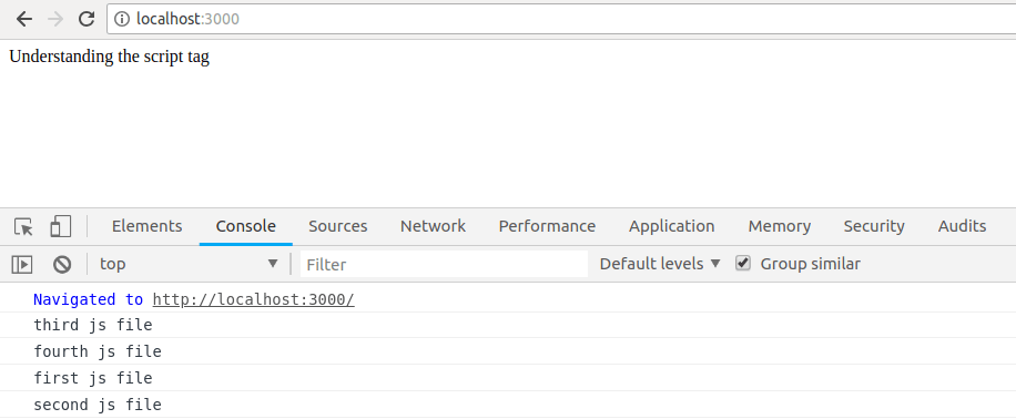
    TS and Gatsby

    We’ll start by creating a new Gatsby app gatsby new app-name. After that finishes, it’s time to install a plugin which handles TypeScript for you: yarn add gatsby-plugin-typescript

    Although it doesn’t seem to be required, let’s create a tsconfig.json. We’ll take it from the Gatsby TypeScript example.

    {"include":["./src/**/*"],"compilerOptions":{"target":"esnext","module":"commonjs","lib":["dom","es2017"],"jsx":"react","strict":true,"esModuleInterop":true,"experimentalDecorators":true,"emitDecoratorMetadata":true,"noEmit":true,"skipLibCheck":true}}

    Now we can rename src/pages/index.js to be index.tsx, and we have TypeScript working on our Gatsby project… or at least we almost do! Because a default Gatsby project comes with a few other components such as Header, Image, and Layout, these need to be converted into .tsx files as well, which leads to a few other issues around how to deal with props in TS, or other external packages which might not come with TS support out of the box.

    We’ll quickly cover a few settings in the tsconfig.json file that are especially important and then dive into how we can move beyond the TS setup by actually using and defining types on our React projects.

    What is tsconfig.json

    We’ve already seen the tsconfig.json file a few times, but what is it? As the name suggests, it allows you to configure TypeScript compiler options. Here are the default TypeScript compiler options which will be used if no tsconfig.json file is provided.

    The jsx setting when being used on a React app whose target is the web will have one of two values: You’ll either choose react if this is the final stage of compilation, meaning it will be in charge of converting JSX into JS, or preserve if you want babel to do the conversion of JSX into JS.

    strict is typically best set to true (even though its default is false), especially on new projects, to help enforce best TS practices and use.

    Most other options are up to you and I typically wouldn’t stray too far from the recommended setup that comes defined by the framework you’re using unless you have a real reason to.

    The Basics of TS

    If you have never worked with TS before, I would first recommend doing their TypeScript in 5 minutes tutorial. Let’s look at some of the basic types, without diving into too much detail.

    let aNumber: number =5;let aString: string ="Hello";let aBool: boolean =true;// We can say that ages will be an array of `number` values, by adding `[]` to the end of our number type.let ages: number[]=[1,2,3];

    You’ll notice that it basically looks like JavaScript, but after the variable name there is : sometype, where sometype is one of the available types provided by TS or, as you’ll see below, created ourselves.

    With functions, we’re tasked with providing the types of both the argument(s), and also the type that will be returned from a function.

    // receives 2 number arguments, returns a numberlet add =(num1: number, num2: number): number => num1 + num2;let response =add(5,6);
    console.log(response);

    The beauty of TypeScript is that often it can figure out the type of a variable on its own. In VS Code if you hover over the response variable it will display let response: number, because it knows the value will be a number based on the declaration of the add function, which returns a number.

    In JS it’s common to receive JSON responses or to work with objects that have a certain shape to them. Interfaces are the tool for the job here, allowing us to define what the data looks like:

    interfacePerson{
      name: string;
      age?: number;}constregister=(person: Person)=>{
      console.log(`${person.name} has been registered`);};register({ name:"Marian"});register({ name:"Leigh", age:76});

    Here we are saying that a Person can have two properties: name, which is a string, and optionally age, which, when present, is a number. The ?: dictates that this property may not be present on a Person. When you hover over the age property you’ll see VS Code tell you that it is (property) Person.age?: number | undefined. Here the number | undefined part lets us know that it is either a number or it will be undefined due to the fact that it may not be present.

    React’s Types

    React comes with a number of predefined types that represent all of the functions, components, etc. that are declared by React. To have access to these types, we’ll want to add two packages to our project: yarn add @types/react @types/react-dom.

    Let’s say we have the JSX:

    <div><ahref="https://www.google.com">Google</a><phref="https://www.google.com">Google</p></div>

    It’s a little hard to catch the mistake right off the bat, but the p tag has an href prop that is invalid in HTML. Here’s where TS can help us a ton! In VS Code, the whole href="https://www.google.com" prop is underlined in red as invalid, and when I hover it I see:

    [ts] Property 'href' does not exist on type 'DetailedHTMLProps<HTMLAttributes<HTMLParagraphElement>, HTMLParagraphElement>'. [2339]
    

    If I hover over href on the a tag, I’ll see (JSX attribute) React.AnchorHTMLAttributes<HTMLAnchorElement>.href?: string | undefined. This means that href is an optional attribute on an anchor element (HTMLAnchorElement). Because it’s optional ?:, it can either be a string or undefined.

    All of these type definitions come from the @types/react package, which is a massive type declaration file. For the anchor tag example above, its interface looks like the following, which declares a number of optional properties specific to this type of tag:

    interfaceAnchorHTMLAttributes<T>extendsHTMLAttributes<T>{
      download?: any;
      href?: string;
      hrefLang?: string;
      media?: string;
      rel?: string;
      target?: string;
      type?: string;}

    Say Goodbye to PropTypes

    React’s PropTypes provided a runtime way to declare which props (and their types) would be received by a component. With TypeScript, these aren’t required any more as we can bake that right into our TS code and catch these issues as we’re typing the code rather than executing it.

    Props to Functional Components

    From the default Gatsby build, we got a Header component that looks like this (I have removed the styles to make it smaller):

    import React from"react";import{ Link }from"gatsby";constHeader=({ siteTitle })=>(<div><h1><Linkto="/">{siteTitle}</Link></h1></div>);exportdefault Header;

    We can see that it receives a siteTitle, which looks to be a required string. Using TS we can declare using an interface what props it receives. Let’s also make it a bit fancier by adding functionality for it to display a subTitle if provided.

    interfaceProps{
      siteTitle: string
      subTitle?: string
    }constHeader=({ siteTitle, subTitle }: Props)=>(<div><h1><Linkto="/">{siteTitle}</Link></h1>{subTitle &&<h2>{subTitle}</h2>}</div>)

    We’ve declared a Props interface that states we will receive a siteTitle as a string, and optionally receive a subTitle, which, when defined, will be a string. We can then in our component know to check for it with {subTitle && <h2>{subTitle}</h2>}, based on the fact that it won’t always be there.

    Props to Class Components

    Let’s look at the same example above but with a class-based component. The main difference here is that we tell the component which props it will be receiving at the end of the class declaration: React.Component<Props>.

    interfaceProps{
      siteTitle: string
      subTitle?: string
    }exportdefaultclassHeaderextendsReact.Component<Props>{render(){const{ siteTitle, subTitle }=this.props
    
        return(<div><h1><Link to="/">{siteTitle}</Link></h1>{subTitle &&<h2>{subTitle}</h2>}</div>)}}

    We have two more things left to do to fix up our default Gatsby install. The first is that, if you look at the Layout component, you’ll see an error on this line: import Helmet from 'react-helmet'. Thankfully it is easy to fix, because react-helmet provides type declarations by adding yarn add @types/react-helmet to our package. One down, one more to go!

    The last issue is what to make of the line const Layout = ({ children }) =>. What type will children be? Children, if you aren’t fully sure, are when you have a React component that receives “child” component(s) to render inside itself. For example:

    <div><p>Beautiful paragraph</p></div>

    Here we have the <p> component being passed as a child to the <div> component. OK, back to typing! The type of a child in React is ReactNode, which you can import from the react project.

    // Import ReactNodeimport React,{ ReactNode }from"react";// ... other packages// Define Props interfaceinterfaceProps{
      children: ReactNode;}// Provide our Layout functional component the typing it needs (Props)constLayout=({ children }: Props)=><div>{children}</div>;exportdefault Layout;

    As a bonus, you can now remove the PropTypes code which comes with Gatsby by default, as we’re now doing our own type checking by way of using TypeScript.

    Events and Types

    Now let’s take a look at some specific types involved in Forms, Refs, and Events. The Component below declares a form which has an onSubmit event that should alert the name entered into the input field, accessed using the nameRef as declared at the top of the Component. I’ll add comments inline to explain what is going on, as that was a bit of a mouthful!

    import React from"react";exportdefaultclassNameFormextendsReact.Component{// Declare a new Ref which will be a RefObject of type HTMLInputElement
      nameRef: React.RefObject<HTMLInputElement>= React.createRef();// The onSubmit event provides us with an event argument// The event will be a FormEvent of type HTMLFormElement
      handleSubmit =(event: React.FormEvent<HTMLFormElement>)=>{
        event.preventDefault();// this.nameRef begins as null (until it is assigned as a ref to the input)// Because current begins as null, the type looks like `HTMLInputElement | null`// We must specifically check to ensure that this.nameRef has a current propertyif(this.nameRef.current){alert(this.nameRef.current.value);}};render(){return(<formonSubmit={this.handleSubmit}><inputtype="text"ref={this.nameRef}/><button>Submit</button></form>);}}

    Conclusion

    In this article we explored the world of TypeScript in React. We saw how three of the major frameworks (or starter files) in create-react-app, Gatsby, and Next.js all provide an easy way to use TypeScript within each project. We then took a quick look at tsconfig.json and explored some of the basics of TypeScript. Finally, we looked at some real-world examples of how to replace PropTypes with TypeScript’s type system, and how to handle a typical scenario with Refs and a Form Event.

    Personally, I have found TypeScript to both be easy to get started with, but at the same time incredibly frustrating when you run into some strange error that isn’t obvious how to solve. That said, don’t give up! TypeScript provides you with further confidence that your code is valid and working as expected.

    For More on Building Apps with React: 

    Check out our All Things React page that has a great collection of info and pointers to React information – with hot topics and up-to-date info ranging from getting started to creating a compelling UI.

    New Features & Fixes in Telerik Reporting & Report Server R1'19 SP

    $
    0
    0

    With the R1'19 Service Pack release, we've added support for Font discovery under Linux and macOS, a brand new Crystal Dark theme for our WPF Report Viewer and a variety of improvements and fixes across the products.

    As usual, we focused on fixes and improvements in the suite for the service pack release of Telerik Reporting and Telerik Report Server. We are happy to share that we've introduced new features as well as important bug fixes. We also tested against the latest Visual Studio 2019 (preview 3) and we can confirm that the Telerik Reporting components are fully compatible.

    Below are some of the improvements that are part of our brand-new service pack release:

    Font Discovery Support

    Introducing a new Telerik Reporting setting called fontLibrary will help the rendering engine to search for a specific font. In other words, the reporting engine will be able to skip searching the default font folders and declares a folder to be used for font resolving. 

    This element is respected only when the PDF rendering extension is used in .NET Core applications under Linux or macOS.  It is defined in the application's configuration file.

    The XML-based configuration would look like:

    <?xml version="1.0"?>
    <configuration>
       ...
      <Telerik.Reporting>
        <fontLibrary useDefaultLocations="false">
          <fontLocations>
            <add path="/usr/customFonts/trueType" searchSubfolders="true"></add>
          </fontLocations>
        </fontLibrary>   
      </Telerik.Reporting>
       ...
    </configuration>

    And the JSON-based configuration file:

    "telerikReporting": {
      "fontLibrary": {
        "useDefaultLocations": "false",
        "fontLocations": [
          {
            "path": "/usr/customFonts/trueType",
            "searchSubfolders": "true"
          }
        ]
      }
    }
     

    WPF Report Viewer Crystal Dark Theme

    Have you heard the phrase "don't judge a book by its cover"? Yet the reality is that apps are firstly judged by their appearance. That's why with the SP release we'd like to give you more theming options and introduce you to a new Crystal Dark theme for the WPF suite.

    Crystal Dark Theme

    Enhanced Support for Database Providers in .NET Core Projects

    In .NET Framework projects we rely on a special class named DbProviderFactories to instantiate a provider that will manage a database connection. Since this class is not available in .NET Standard 2.0, initially we had limited the supported database providers to MSSQL Server only. Things have improved with our SP release which extends the range of supported databases with some of the most prominent database engines: Oracle, MySQL, PostgreSQL, and SQLite. We expect the DbProviderFactories class to be added in .NET Standard 2.1, allowing you to use virtually any .NET Core data provider with Telerik Reporting.

    Visual Studio 2019

    We tested the suite with Visual Studio 2019 (preview 3) and we are happy to confirm that they are fully compatible.

    Report Server

    From now on, the administrator can unlock a report previously locked by another user. Furthermore, there are numerous UI enhancements introduced in Report Server Manager as well.

    Other Important Fixes

    • The ability to Render multiple viewers on a single page was introduced in an earlier release. The SP release further improves the user experience by fixing report area issues.

    Multiple Viewers

    • Starting with Telerik Reporting R1 2018 SP3 (12.0.18.416), the report rendering operation is performed asynchronously in a dedicated worker thread. To access the current user context you had to use the Telerik.Reporting.Processing.UserIdentity.Current static property. However, from now on all calls of the ReportResolver (either built-in resolvers or custom report resolver) will be performed in the service request thread. This means that the calls will have access to eventual dependencies coming from the ReportsControlleras well as to the built-in dependencies like HttpContext.Current.

    Multiple issues got addressed as well. For the full list, please refer to the respective release notes for Telerik Reporting and Telerik Report Server.

    Try it Out and Share Feedback

    We want to know what you think—you can download a free trial of Telerik Reporting or Telerik Report Server today and share your thoughts in ourFeedback Portal, or right in the comments below.

    Start your trial today: Reporting TrialReport Server Trial

    Tried DevCraft?

    You can get Reporting and Report Server with Telerik DevCraft. Make sure you’ve downloaded a trial or learn more about DevCraft bundles. DevCraft gives you access to all our toolsets, allowing you to say “no” to ugly apps for the desktop, web or mobile.


    Viewing all 5211 articles
    Browse latest View live