Companies can’t just change their identity or branding willy-nilly—there’s going to be a price to pay when you mess with digital branding that customers have grown used to. In this post, we’ll look at four recent digital rebranding fails, the reasons why they were failures and what lessons designers can learn from them.
When I was in high school, I decided to do an experiment for an article I was writing for the newspaper. I wanted to see what would happen if I changed my appearance for a day. It would be like if this version of Tina Fey showed up to school every day:

But then this hot mess appeared out of nowhere:

I figured my friends might comment on my changed look since it was too drastic not to notice. But it went way beyond that. Teachers and students behaved differently with me—and not in a good way.
It was clear that my personal rebranding had upset some balance. When I didn’t show up to school looking how everyone expected me to, they acted like I had betrayed them because I deviated from a persona they’d all become comfortable with.
I’m not the only person who’s messed around with brand identity and felt swift backlash as a result.
There are many well-known brands that tampered with their branding and it didn’t go so well for them afterward. And that’s exactly what I want to look at today. I want to look at what they changed, what went wrong, and the lessons designers and developers can take from these mistakes so they don’t make them in their own rebranding work.
What Causes Some Rebrandings to Fail?
Ultimately, I think there are a few reasons why major rebranding projects fail, at least in terms of public reception:
No User Research or Feedback
I get that some rebrandings need to happen as a company pivots. When what they do no longer aligns with their original identity, then their look and style should change.
However, I’m willing to bet that companies decide to change their offering because of customer input and demand. If that’s the case, why not get user feedback on other parts of the restructuring?
Branding doesn’t just change the way a website or app looks. It changes how people perceive the company and its product. And users’ feedback can help companies avoid disastrous branding changes that affect the user experience.
Doing It for the Wrong Reason
There are a number of reasons that could be the wrong reason. Chasing a branding fad. Trying to erase a company’s origin story. Changing a logo because you’ve seemingly had it too long.
I think some business owners and marketers forget how useful nostalgia and authenticity are in branding. And when they ditch what makes their brands so special and beloved, of course there’s going to be backlash.
They Skip the MVP
Minimum viable products aren’t just valuable for the first time you build a website or app. An MVP gives you the chance to test out the most basic version of your product, a new landing page and even a branding overhaul before going full steam ahead.
When you look at how much some of these companies spent on their rebrandings, you realize there was no incremental build-up to the final rebranded product. It’s just “We need a new look,” here’s your fat check and voila! Brand new million-dollar logo.
Then when their audience revolts, they’re left with two choices. Double-down on the rebranding and hope the users grow used to it or revert back to the old look. Either way, it’s going to cost them.
Famous Digital Rebranding Fails and the Lessons We Should Learn from Them
Let’s look at some recent examples of rebranding fails:
1. Twitter
What changed?
Leslie Berland, the Chief Marketing Officer of Twitter, explained in a tweet what prompted the 2021 rebrand:
Every year our marketing team takes a step back from our brand, creative work, public expression and activations. We look in the mirror and ask ourselves if what we see creatively, reflects what Twitter is.
— Leslie Berland (@leslieberland) January 27, 2021
As she explains later in her thread:
“The conversations on Twitter are messy and complex, intense and inspiring, hilarious and ridiculous, weird and ugly, shocking and beautiful, disturbing and moving. They’re raw and they’re real.”
As such, they wanted the company’s branding to reflect that.
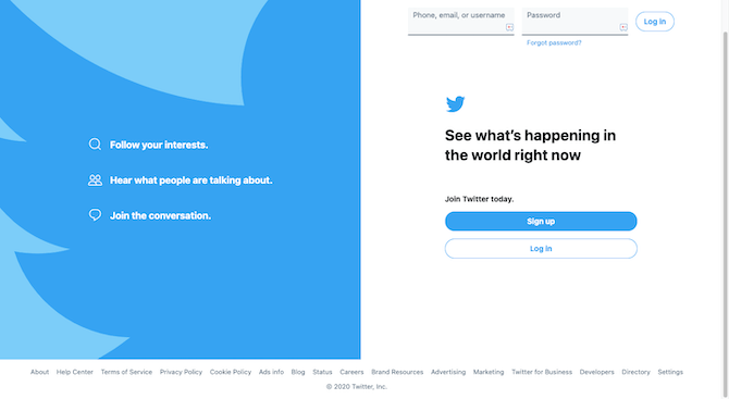
Here’s what the Twitter login page looked like at the end of 2020:
And here’s what it looks like in 2021:
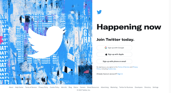
The 2021 Twitter rebrand left some of the social media company’s branding untouched. Like the Twitter bird icon and blue color palette.
The rest, though, took on a louder, edgier and grungier look. This includes the new font it developed called “Chirp.”
What went wrong?
If you look at the responses to the announcement, most of it was positive at the time. However, around August 2021 we began to hear user complaints related to the font.
While Twitter released a number of accessibility fixes pertaining to things like color contrast and button design, it appears that the font itself may be the real problem.
Users are complaining about eye strain:
Please fix the font. It's impossible to focus on with my astigmatism. While I can force the desktop site to use a different font with a browser add-on, trying to read Twitter through the mobile app is causing eye strain.
— Mae 美妍 (@AtFruitBat) August 12, 2021
Headaches:
Ok but is anyone else getting a slight headache from the Twitter font change or just me
— Max @ Meat Meditation (@tuxedomakscos) August 11, 2021
And legibility issues:
yo it sucks. this font looks unfinished. hope you didn't pay them for a job well done cuz this aint even satisfactory. Not even close. I feel like i'm playing a retro video game from late 80's era. this isn't "easier" to read. who was your test focus group for this anyways???
— Birdthulu (@Kaddiss_Telelia) August 11, 2021
What should designers take away from this?
Sometimes when people complain about a rebranding, it’s easy to write it off as trivial simply because they don’t like how it looks. But this is different.
Twitter’s new Chirp font is an accessibility nightmare. It makes you wonder what sort of user testing was actually done before they committed to designing and pushing out this new font.
So, that’s going to be the big takeaway here: Never push out any new branding to your products until you’ve conducted user research and testing. If you’re creating digital products you want them to use or buy from, they need to be usable and accessible.
2. Calendly
What changed?
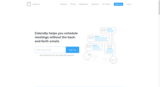
Calendly’s brand and website got an overhaul in 2021. It went from looking like this in January 2021:
To this in September 2021:
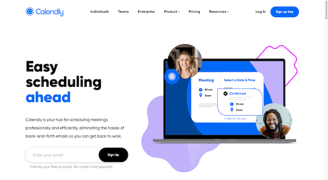
Truth be told, I think the redesign was much needed. I’ve been using this product to manage my appointment scheduling for years now and always thought it was too understated of a design.
What went wrong?
Okay, so I’m a fan of the new site design. It makes Calendly look like a true contender in the appointment scheduling space (which it is). What I’m not a fan of is the logo that came with it. And I’m not the only one.
The logo supposedly cost Calendly $1.5 million. Even if it cost them $1,500, I don’t know if it was worth what came next. This tweet right here sums it up:
Can we talk about how the new Calendly logo looks like something you'd poop in? pic.twitter.com/19G8zZrInU
— Alex Cohen (@anothercohen) May 26, 2021
It’s exactly what I see, too. It looks like a toilet bowl filled with water.
While I think their previous logo was a little amateurish in terms of design, this one isn’t any better. In fact, I’d argue that this is worse. At least the last one was visually related to the app. This one … ugh.
Here’s the description that Pentagram, the designer, gave for the new logo:
“The mark is a hollow letter “C” that acts as a connector to be activated with other elements—a visual metaphor for finding overlaps in schedules, creatively coming together to make something new, and “capturing” opportunities. The symbol can contain an endless variety of colorful shapes and forms to suggest different situations. It is always changing and never looks the same way twice—just like the day.”
As an active user of Calendly, I don’t buy this interpretation and I think it completely misses the mark in terms of what the app’s real value is.
What should designers take away from this?
User research. User testing. MVP iteration. Any of these things could’ve helped the designer avoid this issue with the logo. Even if everyone doesn’t see the toilet, does it matter? The ones who do will never look at the brand the same way again.
Plus, knowing how much it cost them only makes it worse.
So, I guess the biggest lesson here is to get outside input and feedback before you approve any new branding. You guys know this. When you’re staring at something day in and day out, you don’t always see toilet bowls full of water. You just see the new vision for the revamped brand or website.
3. Instagram
What changed?
We all remember Instagram’s big rebrand that got rid of the skeuomorphic app icon and brought in the bright, flat gradients. That’s not the rebrand we’re focused on today.
The one I’m referring to took place in 2020 and it was more of a redesign than a complete rebrand.
Here’s what Instagram did:
- Moved the “+” icon for creating new content to the top-right part of the app
- Moved the “heart” button for tracking likes, follows, etc. to the top-right part of the app as well
- Added new bottom navigation tabs for Reels and Shop
Instagram shared with us the three new navigational structures it was testing out on Twitter:
*Testing, testing* different versions of the home screen. ✨
— Instagram (@instagram) September 9, 2020
Open Instagram and you’ll soon see a Reels and Shop tab in one of these layouts.
These updates represent how people are using the app and giving extra love to creators, videos and shopping. pic.twitter.com/Rnyf37ddQb
While it’s nice that they gave us a preview of what was going on, they weren’t really looking for input. And even if they were, without the context of what they were doing and why, it would be hard to make a judgment at that moment.
What went wrong?
Scroll down below Instagram’s announcement and you’ll see exactly why it experienced such intense backlash from its users:
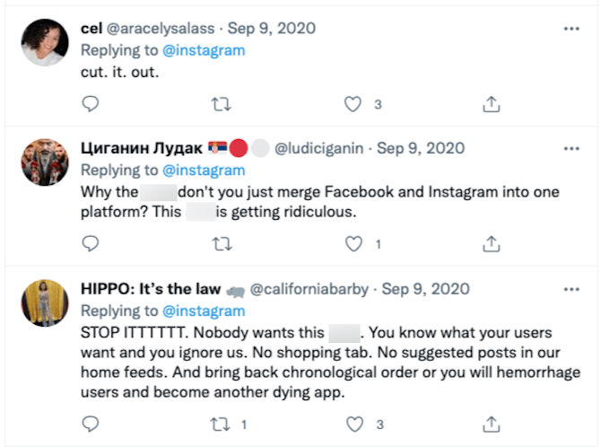
Basically what Instagram did with its redesign was to prioritize its more profitable features over its useful ones. While some Instagram users may enjoy the TikTok-like Reels section and data certainly suggests that people are shopping on Instagram, those are not the primary purposes of the app. And the user feedback above confirms that.
Like @ludiciganin says above, we already have an app that makes it difficult to use the basic features it was designed with. We don’t need that with Instagram, too.
What should designers take away from this?
While Instagram remains one of the most popular social media apps, its power and influence has been waning since 2019 and I suspect this redesign has only accelerated that. W3 Lab has a great analysis on why Instagram is declining and, yup, you guessed it, it’s because it’s becoming a Facebook clone.
The focus of the post is on why it’s become so difficult for businesses to use it to reach their audience:
“If you are wondering why, the answer is simple: both Facebook and Instagram don’t want you to build and reach an audience organically. Instead, they want you to pay them to achieve this.”
However, as we’ve seen above, Instagram users aren’t happy about this profit-first design either.
So, the big lesson for this one is this: Don’t put a company’s profits over the user experience. The two are inextricably tied and if you sacrifice the UX, you’re going to eventually lose money, too.
4. TGI Fridays (UK)
What changed?
For those of you in the UK, you may already be aware of what TGI Fridays did to its branding and website in 2021. But here’s what happened for those of you who missed it:
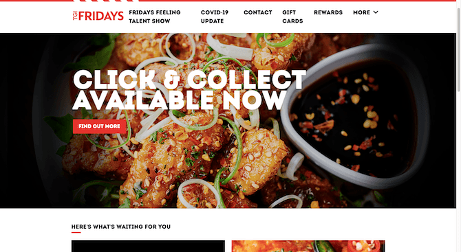
This was what the TGI Fridays UK site looked like at the end of 2020:
This is what it looks like almost a year later:
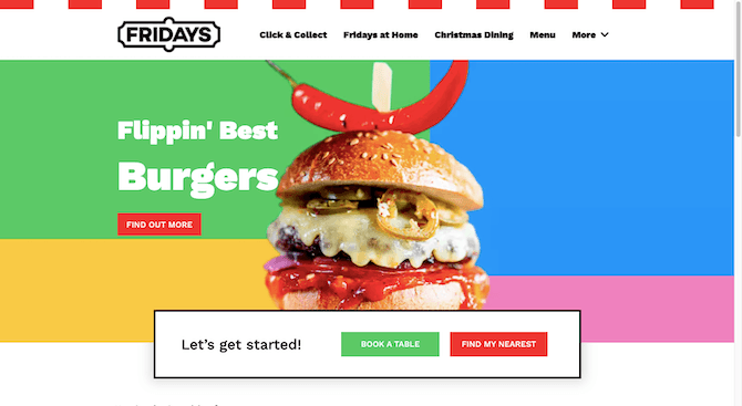
One of the biggest changes is that it ditched the “TGI” part of “TGI Fridays”. Its brand identity also got a perky redesign, abandoning the mostly black-and-red look it’s had for decades (and which the US counterpart still retains). It also simplified the website’s navigation as well as the restaurant chain’s menu.
What went wrong?
Reading through the Twitter announcement’s responses, it looks like customers’ biggest gripe with the rebranding was the menu simplification. That is, the actual restaurant menu and not the one we use on the website.
New logo, new menu, new look! You may notice a few more changes happening – stay tuned to find out what else is coming
— Fridays UK (@TGIFridaysUK) June 23, 2020
Find out more: https://t.co/M7Zu0zECJh pic.twitter.com/xGNPRQZ7au
I think one of the main reasons why the redesigned website and logo didn’t get as much hate is because people probably aren’t using the site that much. TGI Fridays has always been one of those restaurants you just know about. It’s in the busier part of town and it’s a reliable mainstay you can hit up when you want cheap drinks and tasty food. So, the website isn’t as much of an asset as the restaurant itself.
That said, I think the removal of the “Thank Goodness It’s” part of the logo was a big mistake. The word “Fridays” and the basic logo font used to style it is lacking in excitement. Also, the bright colors and bubbly font in the hero image are way off brand. I thought I was on the wrong site when I first got there.
What should designers take away from this?
Always factor in nostalgia and customer loyalty when you’re doing a rebrand for older companies. Unless you’re bringing back an old design the way Burger King recently did, removing what made a restaurant like TGI Fridays different is just a bad move.
Customers are definitely going to question where your priorities are since they’re clearly not one of them. They’re also going to have to reestablish a connection with the company since the branding looks like a totally different business.
Bottom line: Unless a long-standing and much-loved brand is going in a wildly different direction, rebranding is a very risky move. And it’s a good idea to tread carefully as far as how much you change.
Wrap-up
As I spent time looking through rebranding fails this week, I realized that the backlash many of these companies faced was pretty similar to what I felt during my short-lived experiment. And it makes sense.
My experimental rebranding was based on no data and was completely out of whack with my identity. Considering the public’s response to these fails, I’m going to guess someone dropped the ball somewhere behind the scenes when working on the rebranding. Which is mind-boggling when you think about how much it cost them in terms of the upfront investment, the backlash and public relations cleanup, as well as the lost business.
So the biggest lesson we can take away from all these fails is this:
If you have a winning formula, do not mess with it. The only exceptions to that are if you get buy-in from your users first or if you’ve been struggling to get users in the first place and you know it’s due to poor branding and UX.