Today we will cover the differences between CSS Grid and Flexbox and which use cases are best fit to each layout system.
The modern web has come to a point where we have two layout systems: Flexbox and CSS Grid. Both layout systems are important and widely used. When should you use one over the other? Let’s get into that!
But first, let’s learn a little bit about what problems they came to solve.
Web Design in a Table
Have you ever heard the name David Siegel? You may not know him, but he has played a very important part in the web and how we structure and style modern applications.
David Siegel, for those who don’t know, introduced table-based layouts. Yes, developers in the ’90s and early 2000s were designing websites using tables. The idea of designing a website today using a table sounds wacky, and it is. But back in that time, it was a good option for implementing multi-dimensional, nested grids.
We can say that David Siegel ruined the web for a few years, and back then he would agree to that too. We can say, too, that he changed the web forever—introducing his ideas of separating concerns and making the design more effective.
Displaying content today is essential to every application. The way you put the information in your web application makes a huge difference in how your application is going to look for your users. Displaying your content the right way can put your company ahead of the competition. It can make your users happy, which can land your web application more clicks, which leads to more sales, etc.
Every company that has a web application wants their users to have a good experience while using their application. Every company wants their users to be able to get or do whatever they want as easy as possible. It is what we call user experience.
User experience is the process of creating meaningful and relevant experiences to users. What does it have to do with layout on the web? Everything!
So we may no longer use tables to build our webpages. But the idea of structuring them with horizontal and/or vertical rows and columns is still very much in use today.
The modern web has come to a point where we have two layout systems: Flexbox and CSS Grid. Just check out the State of CSS 2021 survey if you have doubts. Both layout systems are very important and can be used for building meaningful and relevant experiences. Most important, both layout systems share some differences, and we’re going to cover in this article what is the use case for each one.
First, we’re going to cover what Flexbox is and how it works.
What Is Flexbox?
Flexbox is a one-dimensional layout system. It helps to organize and arrange elements either in rows or columns. It’s a modern way of aligning and distributing items in a container. A direction-agnostic layout system, Flexbox is used for creating complex applications that require orientation changing, resizing, stretching, shrinking, etc. It can alter the width or height of parent elements to best fill the available space.
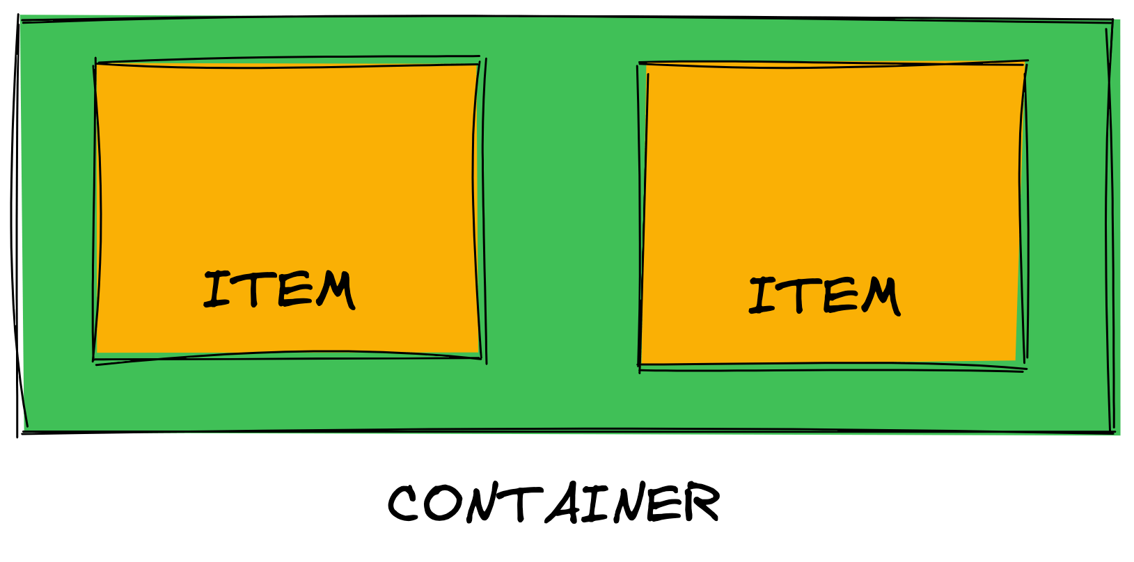
When using Flexbox, the parent element is called a flex container. For creating a flex container, we use the display property and pass a flex value.

After creating a flex container, each item inside the container will become a flex item. The standard order of a flex container is a row.
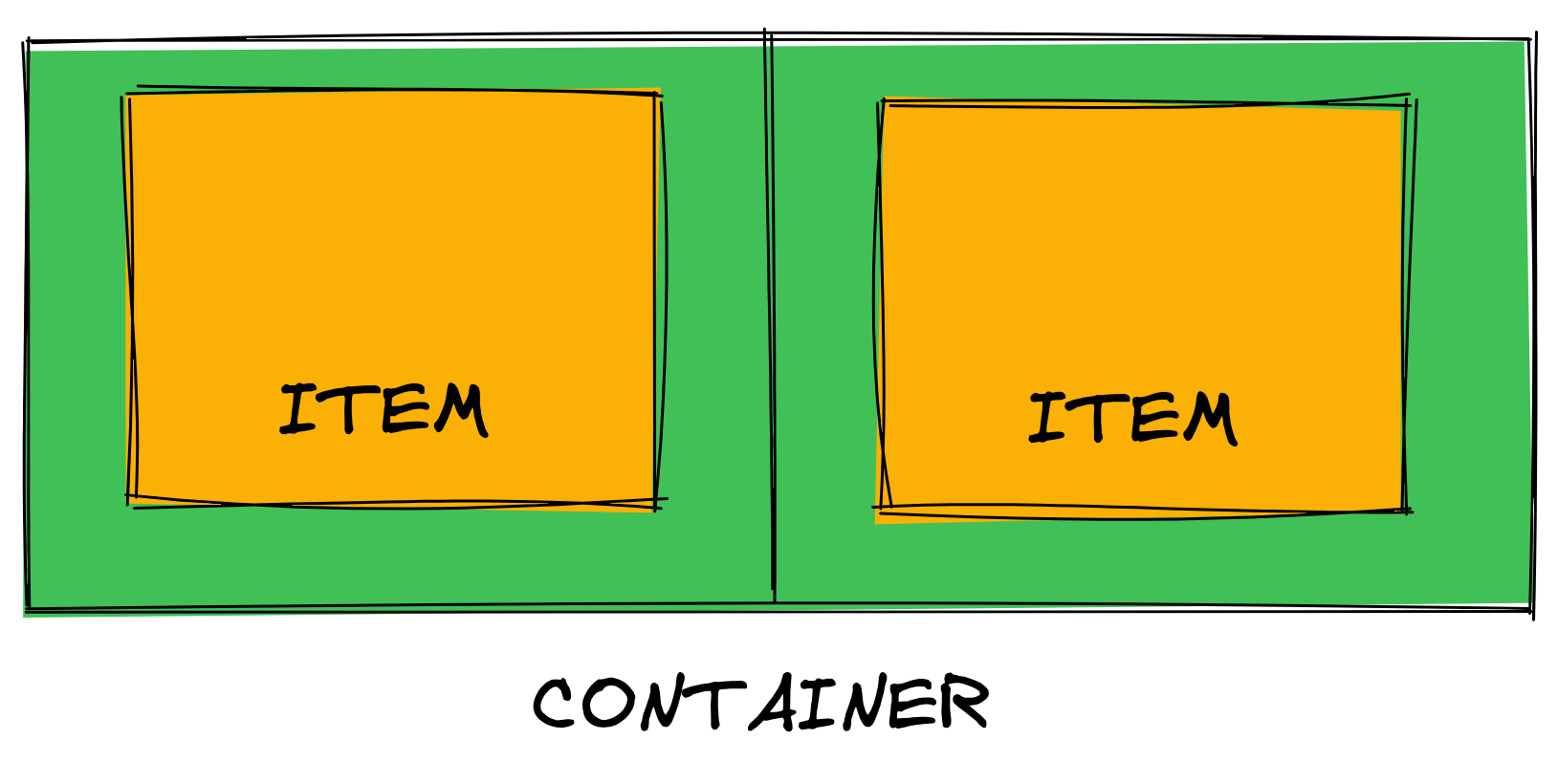
A simple line can align our elements equally, giving them the same width and height, making each one of them equal-sized columns. If you want to align your elements in a row, just turning the parent element into a flex container is simple enough.

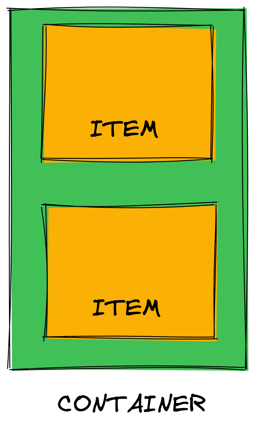
The direction of how the child elements are shown inside the flex container can be changed using the flex-direction property. We can specify row or column as values.

This is a simple explanation of how the Flexbox layout system works. There are many more things we can do with Flexbox, such as reverse the order of elements, flex (expand) and shrink items, control space inside flex items, etc.
We’re now going to see what the CSS Grid layout system is.
What Is CSS Grid?
A one-dimensional layout system can be really powerful. We can use it to align and arrange our elements in rows or columns. So just imagine what we could do with a two-dimensional layout system!
CSS Grid is a two-dimensional layout system that makes it easier to align and arrange elements on a web page. We can work with rows and columns together, determining how many rows and columns we want our parent element to have. CSS Grid opens a whole range of possibilities for creating complex and organized web applications. We don’t have to rely on “hacky ways.”
Like Flexbox, we can use CSS Grid by passing to the display property the value grid. It will turn the parent element into a grid container and each child element inside a grid item.

By turning an element into a grid container, you won’t notice any difference at first. As you haven’t defined how many rows and columns your grid container should have, you will have enough rows generated to hold all your child elements in a single column.
The grid-template-columns and grid-template-rows are responsible for setting how many rows and columns we want our grid container to have. These properties accept a track list value. Here’s a valid track list value for creating two columns inside our grid container:
grid-template-columns: 100px 100px;
Our grid container now has two columns of 100px each. We can specify as many values as we want and use different units such as px, rem, fr, percentage, etc.
CSS Grid also brought a new unit for a flexible unit which is the fr unit. It stands for a fractional unit. It represents a fraction of the available space in the grid container. Imagine that we want to create three equal-width columns. This is how we can do using the fr unit:
grid-template-columns: 1fr 1fr 1fr;
Now, this is a short explanation of how both layout systems work. Both layout systems share some similarities and have differences on how to align and arrange elements on a web page, but what problems exactly do they solve?
Layout vs. Alignment
Flexbox is an older layout system than CSS Grid. It was released many years ago and became one of the best options for arranging and aligning elements in a web page.
CSS Grid is much newer. When it was finally released, with all the major browsers supporting it, the usage of Flexbox was huge.
The debate between CSS Grid vs. Flexbox can be considered a hot topic in the web development community. Many Twitter threads were created, articles from CSS experts trying to argue which one was better, documentation, etc.
At the end of the day, we can sum up everything in one vs. two dimensions. This is the best way of looking into the question of which layout system is better for a use case.
Flexbox is a one-dimensional layout system. It lays out items along either the horizontal or the vertical axis, so you have to decide whether you want a row-based or a column-based layout.
We can say with some safety that Flexbox was not made for most of the things that we are using today. It is a great layout system that can be useful for aligning items in a one-dimensional direction.
You should consider using Flexbox when:
- You have a small design to implement—it is ideal to use it when we have fewer rows and columns.
- You need to align elements—it is ideal for aligning elements in a one-dimensional direction.
- You need a content-first design—it is ideal when you want everything just to fit in.
CSS Grid is a two-dimensional layout system. It allows working along two axes: horizontal and vertical. We can precisely say how many rows and columns we want, specify the size of each one and define our elements inside it. CSS Grid opens up a lot more possibilities for us.
Consider using CSS Grid when:
- You have a complex design to implement—complex designs most of the time require many rows and columns.
- You need to have a gap between block elements—it has a handy property called
grid-gapthat can define a gap between grid items. - You need to overlap elements—overlapping elements using CSS Grid is very easy, you just need to use the
grid-columnandgrid-rowproperties.
Conclusion
Layout systems are the way we can align and arrange elements in a webpage. Choosing the right layout system for your webpage can make a difference in how you’re going to structure your elements, how to style them, etc. We learned the differences between CSS Grid and Flexbox and which cases are the best to use each layout system.