This post introduces the new Texts in Shapes feature in WPF RadRichTextBox and describes how you can add text to shapes.
In R2 2021 we introduced support for shapes, which was one of the most-demanded features in the RadRichTextBox. You can find more information about this in the following blog post: Shapes and DrawingML Are Now Supported in RadRichTextBox.
Now, with R3 2021, the end user can add text to the shapes and apply different styling options to it.
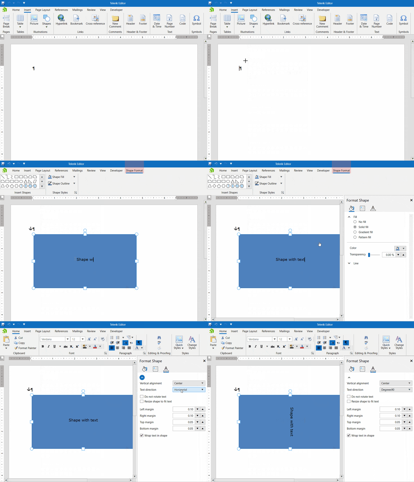
Adding Text to Shapes
Adding text to an existing shape is easy and straightforward. You can start typing directly or use the context menu.
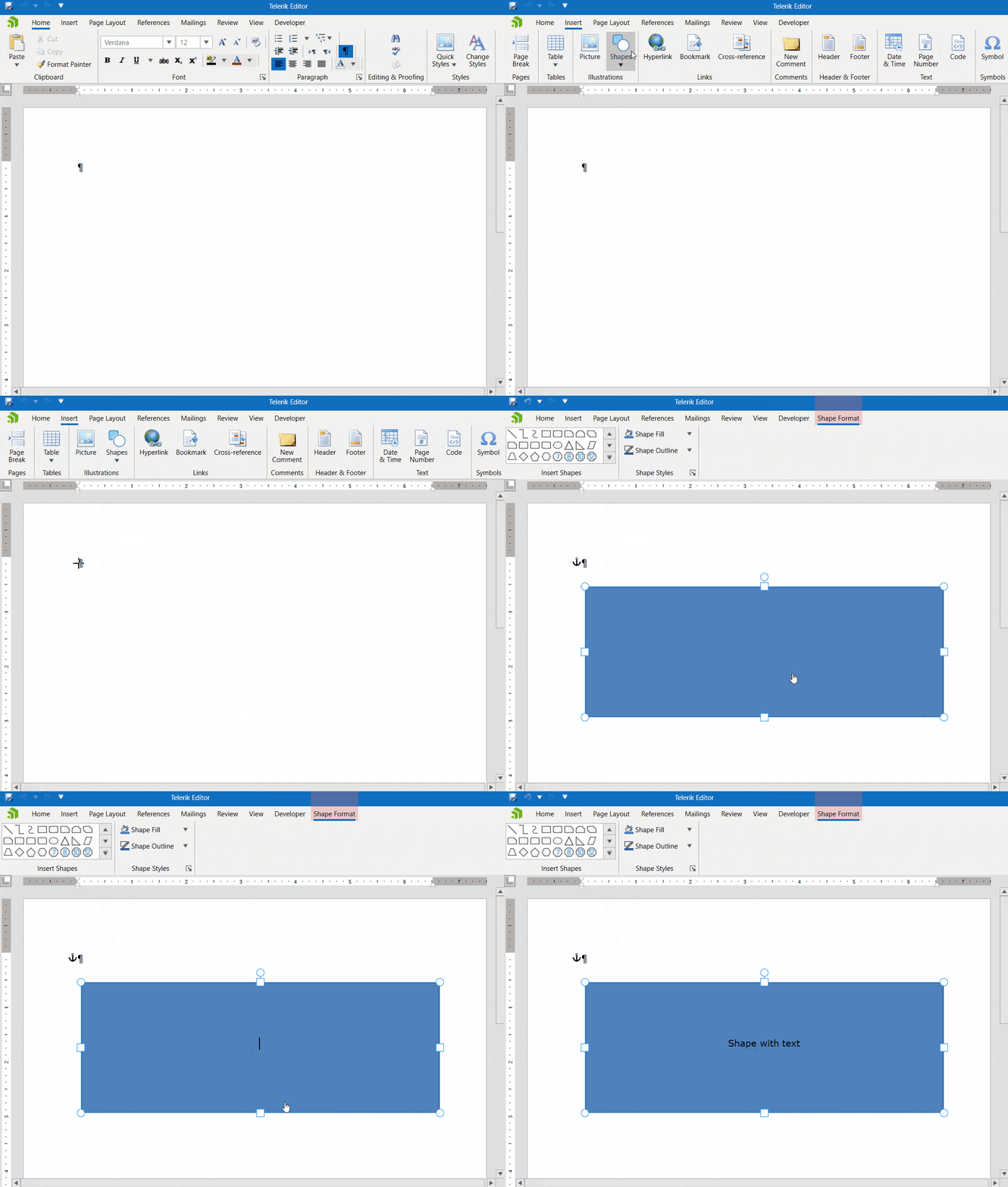
Features in the Format Shape Pane
- Vertical alignment: The supported values are Top, Center and Bottom.
- Text direction: The supported values are Horizontal, Degrees90 and Degrees270.
- Do not rotate text: This feature allows you to rotate the shape while text remains in the same position or to rotate the text along with the shape.
- Resize text with shape: Default value is false, and the shape height is stretched to fit the text inside it.
- Margins: You can set the top, right, left and bottom margins separately in the Format Shape pane.
- Wrap text in shape: Default value is true, and the text is split in lines to fit the shape horizontally. If set to false, the shape width is adjusted to the widest line of text.
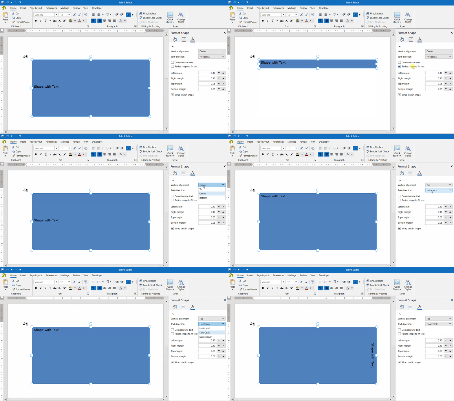
Setting Text Fill and Outline
The second tab allows you to set the shape fill and outline properties. You can choose from various solid and gradient lines and fills.
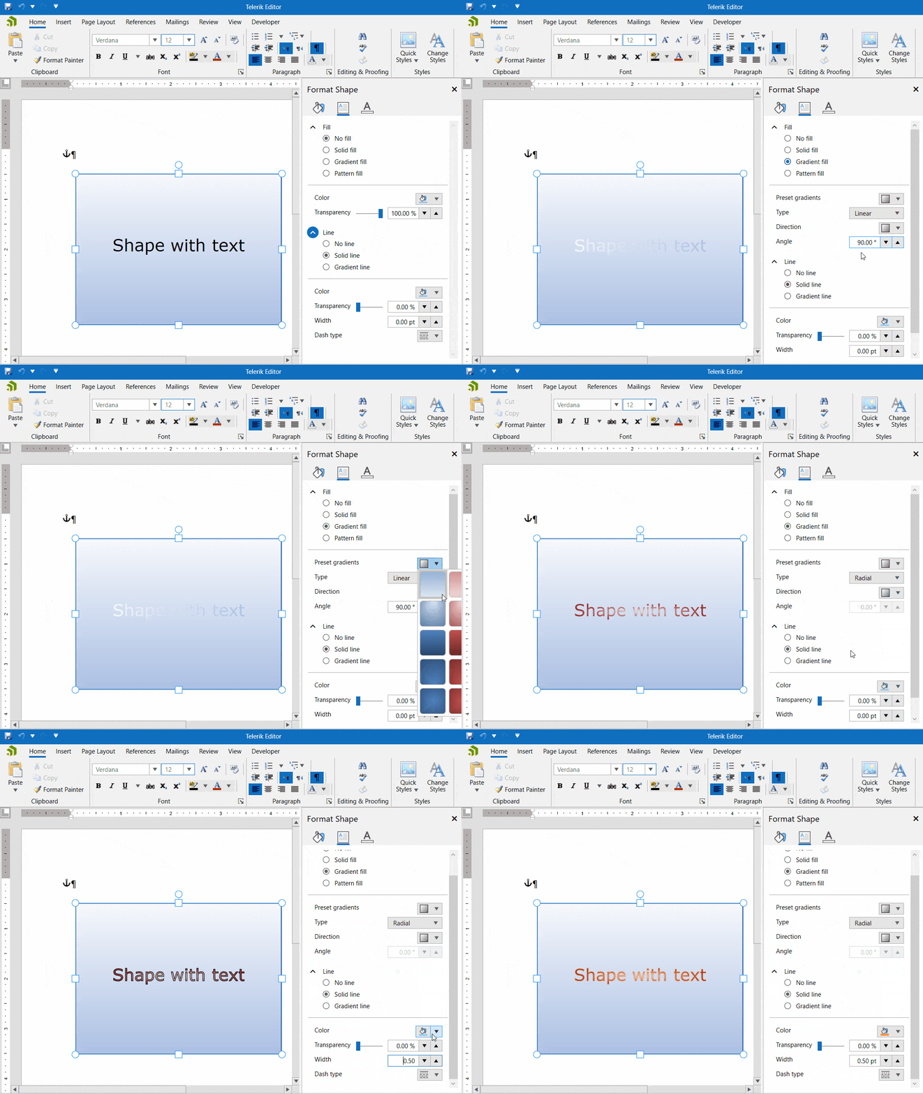
Setting Other Text Properties
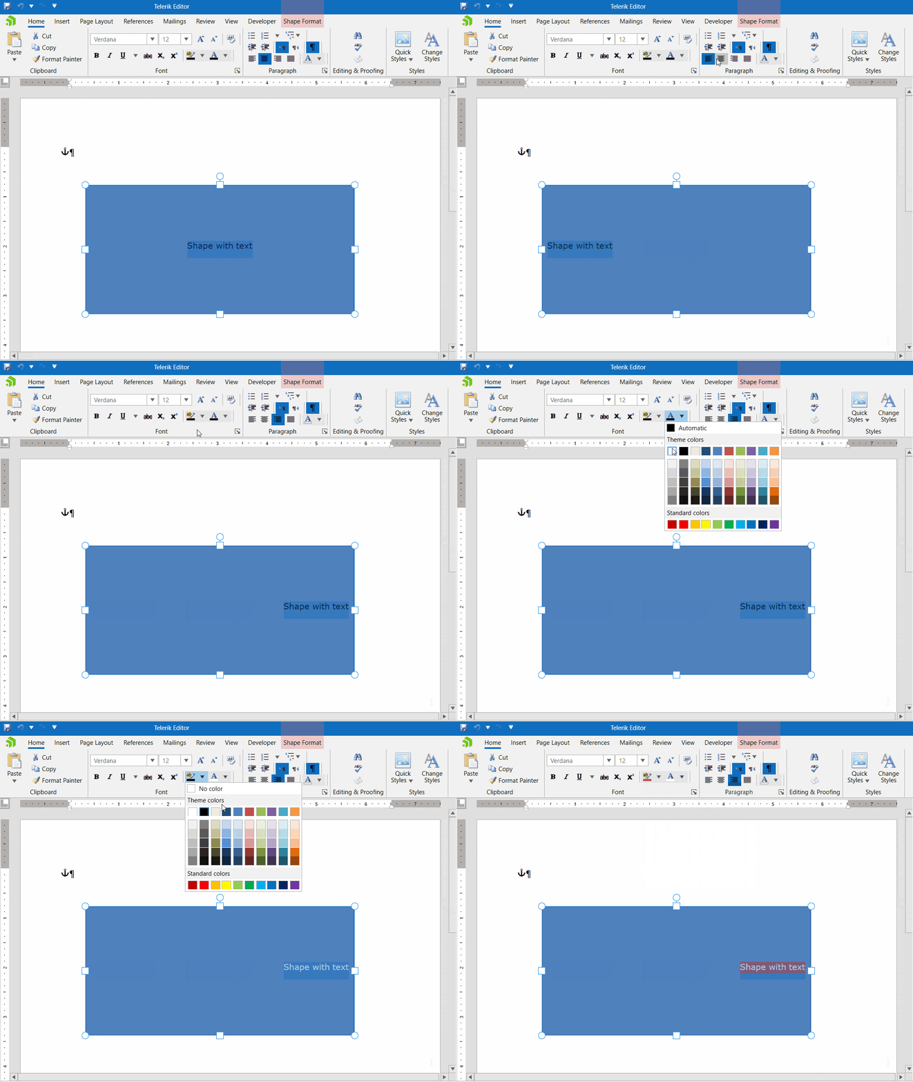
You can set other properties by selecting the text in the shape (the caret must be in the shape as well) and then going to the Home tab and setting properties there.
You can set properties like alignment, background color, fore color, font family, font size and others. Essentially, the shape contains another RadRichTextBox inside it which allows you to style text as in a normal RadRichTextBox and add extra elements.
Try It and Share Your Feedback
In case you still haven’t tried Telerik UI for WPF and RadRichTextBox, use the button below to obtain a trial version and explore all the features and possibilities of the libraries.
If you are already familiar with the package, don’t forget that we are eager to hear your feedback and would be very happy to hear any ideas and recommendations you might have. Feel free to drop us a comment below sharing your thoughts. Or visit the Telerik UI for WPF, and Document Processing Libraries dedicated Feedback Portals and let us know if you have any suggestions or if you need any specific features and controls.