The R3 2021 release is the largest release of Kendo UI for Vue—ever!
This release is massive, with 20 new native components, or really 34 new components, including the various charts and data visualizations. There’s so much to cover here, so let’s not waste time and just get right to it.
Bootstrap 5 Support
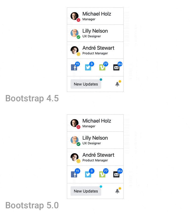
One big item to tackle right away is that, with R3 2021, Kendo UI for Vue officially supports Bootstrap 5! This can automatically be taken advantage of by updating to the latest and greatest packages related to Kendo UI for Vue (specifically the Bootstrap theme package).
To see what this looks like across the Vue UI components, select Bootstrap in the theme picker over on the Kendo UI for Vue docs & demos.
Updated Theme Pickers in Docs & Demos
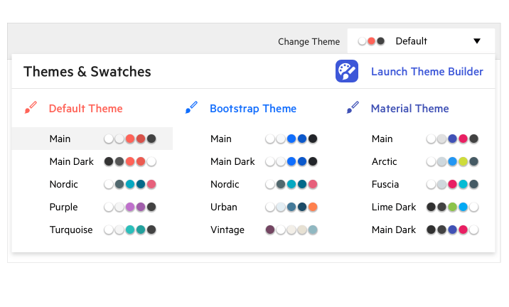
Related to the above, the Kendo UI for Vue team also expanded the available themes to pick within the demo theme picker across all samples on the Kendo UI for Vue documentation site.
In actuality we still provide the same themes (Default, Bootstrap and Material) but this update showcases color variations of each theme curated by the Kendo UI for Vue frontend engineers. Now developers can quickly see how the Vue UI components will look with tweaks to colors without having to do the customization on your own.
Any of the samples in the Kendo UI for Vue docs & demos can show off these swatches by using the theme picker drop down at the top right of each sample.
Kendo UI Kit for Figma
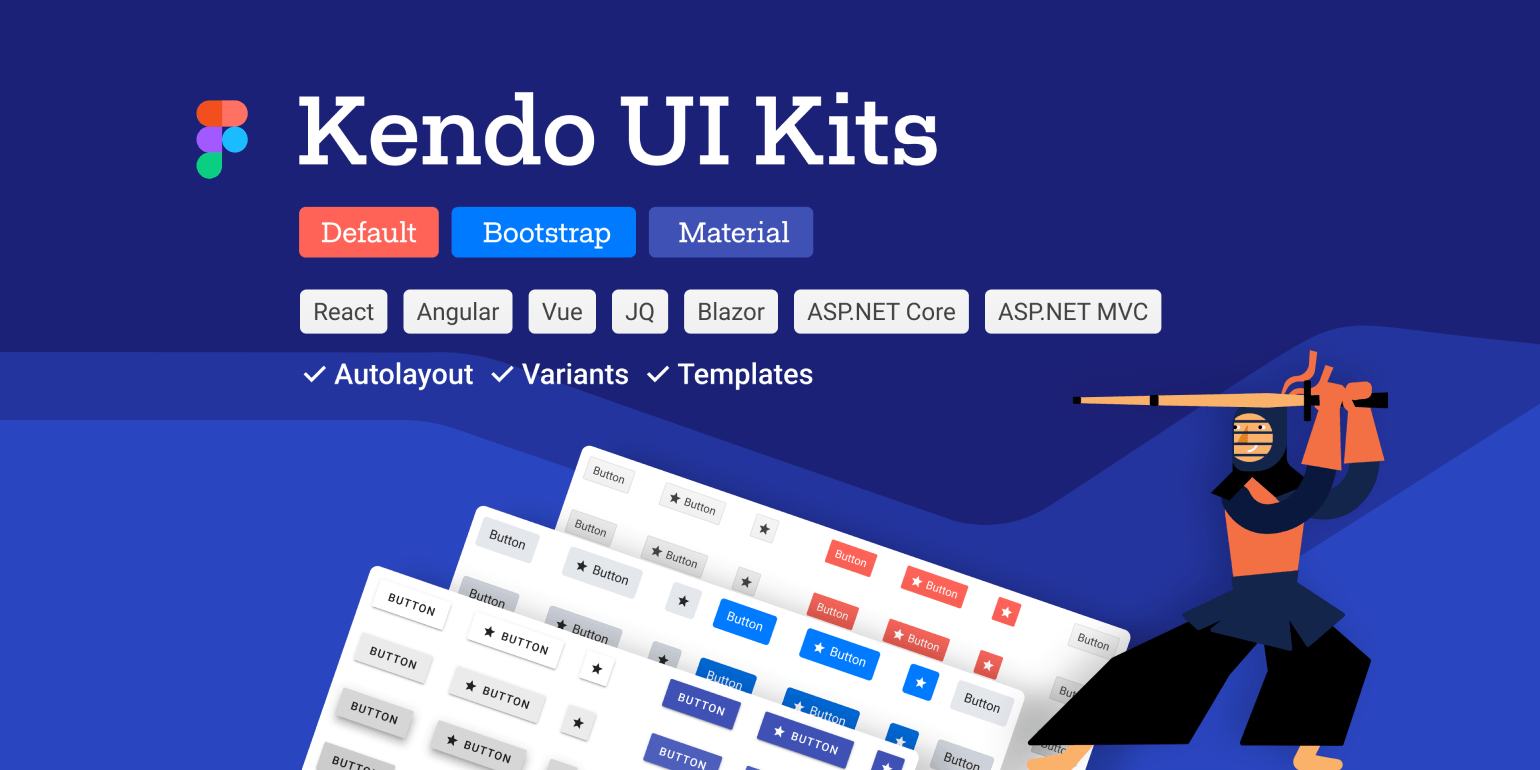
To continue the streak around the look-and-feel and design around the Kendo UI for Vue components, with R3 2021 we are releasing the Kendo UI Kit for Figma. This Figma UI Kit contains over 30 of the Kendo UI for Vue components as assets that designers can use in their Figma designs.
For more information, please head on over to the Kendo UI Kit for Figma page.
New Vue Components
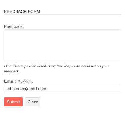
New Components: Chart, StockChart and SparkLine
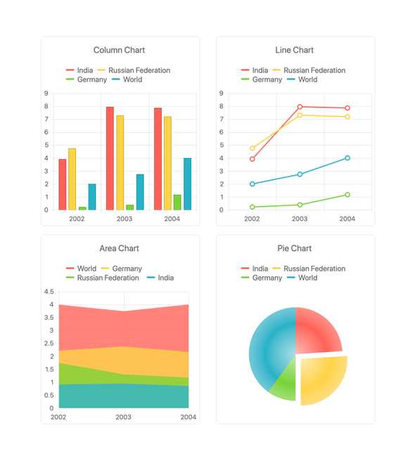
Previously only available as a part of the wrappers for Vue, with R3 2021 I’m excited to announce the new native Vue Charts library! This is a huge addition to Kendo UI for Vue as it brings 16 different chart types including Bar, Column, Area, Line, Scatter, StockChart and many more.
Additionally, the Kendo UI for Vue team was able to add the SparkLine component to this release as well, providing a sleek UI element to add in-line chart elements to paragraph content or cells within a data grid.
There’s a ton to unpack here, so the best thing to do is review all of the available documentation around these components for yourself. Head on over to the Kendo UI for Vue Chart Getting Started article for more information.
New Components: Drawing, PDF Generator, Data Query, Date Math and File Saver
With R3 2021, Kendo UI for Vue added helper libraries that work on their own but also are featured within the Vue components themselves. These include:
- Vue Drawing: A cross-browser library for interactive vector graphics.
- PDF Generator: A library that enables developers to export a selection, or the entire content, of any web page.
- Data Query: A package to help perform in-memory data operations like sorting, filtering, grouping and aggregation.
- Date Math: A package for JavaScript Date manipulations.
- File Saver: A component that assists with saving files on the client machine.
New Component: TabStrip
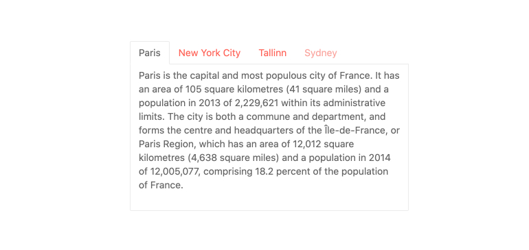
The new native Kendo UI for Vue TabStrip component displays a collection of tabs with associated content. The end user can easily switch between the different views by clicking on the tab to load the related content. Previously only available as a wrapper, this is now a component built from the ground up specifically for Vue.
For more information, head on over to the Vue TabStrip Overview demo.
New Component: Pager

The new native Vue Pager extracts the paging interface found in data-bound components like the Vue Data Grid to its own dedicated UI component. Using the Kendo UI for Vue Pager, end users can easily split up and navigate through content in more manageable chunks.
Here’s a direct link to the Vue Pager Overview demo for more details.
New Components: Form, Hint and Error
Forms are everywhere on the web. Whether it’s a form to edit and manipulate data items in a data grid, or a sign-up form letting users create an account on your website—forms are the backbone of most applications.
With R3 2021, the Kendo UI for Vue team spent time investigating the best way to build forms in Vue and decided to create a component dedicated to building forms, bringing the new Vue Form component to life.
The native Vue Form component is a small and fast package for form state management with zero dependencies. The Vue Form works well with Kendo UI for Vue components as well as any third-party UI elements, so even if you are not using Kendo UI for Vue components you can take advantage of this efficient form library.
Along with the Form, we have introduced the Vue Hint component and Vue Error component, which can be attached to elements within the form to provide users with helpful hints or errors depending on the current state of the Vue Form.
To get a deeper dive into this exciting new component, head on over to the Kendo UI for Vue Form Getting Started page.
New Component: Avatar
![]()
With R3 2021, Kendo UI for Vue also added the native Avatar component, helping developers display images, icons or initials representing people or other entities. The image above and the name of the component pretty much says it all.
Here’s a direct link to the Vue Avatar Overview demo for more information.
New Component: Card

Expanding on the number of layout components offered within Kendo UI for Vue, with R3 2021 we also added the native Vue Card component. This component is super useful when representing content with associated actions about a single subject. Found in many modern web application designs, the Card component features several building blocks that can be customized to ensure the Card can fit any design.
For further details, please refer to the Vue Card docs & demos.
New Component: Checkbox

Related to the Vue Form component, with R3 2021 Kendo UI for Vue also added the Vue Checkbox component. With this new UI component, developers can take advantage of the design provided by the Kendo UI themes and drive consistency across their entire application—even for checkboxes.
The Vue Checkbox supports checked, unchecked and indeterminate states.
Please refer to the Vue Checkbox demos to see how you can add the component to your Vue apps today.
New Components: RadioButton & RadioGroup

Related to the Vue Checkbox, we also added the Vue RadioButton and Vue RadioGroup components with R3 2021. Just like with the Checkbox, these components help drive consistency in design across your entire Vue application.
The Kendo UI for Vue RadioButton component represents a single RadioButton element, while the RadioGroup builds upon this to help control a group of RadioButtons.
Check out the Vue RadioButton demos and Vue RadioGroup demos for additional details.
New Component: Label & FloatingLabel

With R3 2021, Kendo UI for Vue also added the Vue Label and FloatingLabel components, ensuring that any and all form elements across Vue applications using Kendo UI for Vue are appropriately labeled.
The Vue Label component supports labeling both form elements as well as custom focusable elements. The component can also be associated with another UI element on the page by wrapping around any Kendo UI for Vue input element like the DropDownList and NumericTextBox, or HTML elements like input.
The FloatingLabel component enables developers to augment any Vue input element by providing a label that “floats” outside of the original container when the user focuses the element. Of course, there are integrations with existing native Kendo UI for Vue Input components like the DropDownList or NumericTextBox.
Here’s a direct link to the Kendo UI for Vue Label Component, and for the folks interested you can find information about the Vue FloatingLabel Component right here.
Expanded Component Features
Grid: Improved Keyboard Navigation
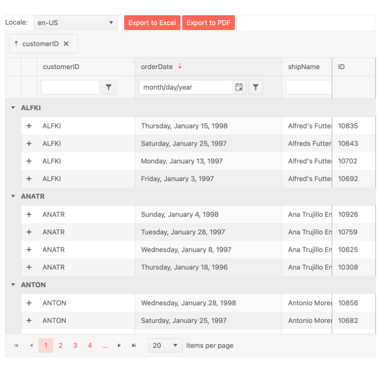
While the Kendo UI for Vue Data Grid has had keyboard navigation for a couple of releases now, it was always up to the developer to implement what should happen when the end user interacts with the Grid through their keyboard. While powerful, this did require extra legwork around implementing keyboard navigation, which was not ideal.
With R3 2021 the native Vue Data Grid offers the ability to enable a more opinionated approach to keyboard navigation, providing a sane set of defaults that should allow developers to pass requirements around keyboard navigation through setting a few configuration options. Rather than multiple lines of custom code, developers can now set these options and be off to the races.
Here’s a direct link to the Vue Grid Keyboard Navigation documentation article that dives into this topic further.
Got Feedback?
Kendo UI for Vue continues to run forward and add tons of new components and features with every release. However, we may not have added the component or feature that you need, so here’s where I have a favor to ask. Head on over to the Kendo UI for Vue Feedback Portal to submit your ideas or vote for existing ideas to ensure that we add the components and features that you and your team needs!
With your feedback, we can continue down the path toward our goal of delivering the most advanced set of UI components for Vue developers.
Webinars and Livestreams
Want to see everything I mentioned above live and in action? On Wednesday, September 28, at 11:00 am ET we are hosting the Kendo UI R3 2021 release webinar. This session will cover everything that is new with R3 2021 in Vue, jQuery, Angular and React.
On top of this, we will also have a Twitch livestream diving deeper into Kendo UI for Angular on Friday, September 24, at 10:00 am ET, and we are also covering KendoReact on Twitch on Thursday, September 23, at 10:00 am ET.
Tons of fun will be had, so head on over to the Kendo UI R3 2021 webinar registration page to reserve your seat and join in on the festivities!
