The R3 2021 release for Kendo UI for Angular is here! This is a huge release, containing new components like the Gantt Chart and a large set of features added to existing components. There’s plenty in this release for any Angular developer, so let’s jump straight in and see what’s new in R3 2021 in Kendo UI for Angular.
Bootstrap 5 Support
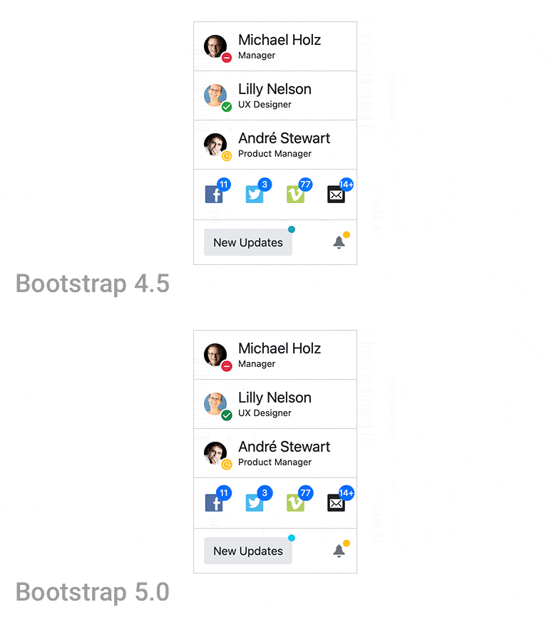
One big announcement that we can kick off with is that with R3 2021 Kendo UI for Angular officially supports Bootstrap v5! While we have had this support for some time, it still happened during the R3 release cycle, so I wanted to highlight it here as well.
Developers can actually support both Bootstrap v4 and Bootstrap v5 with the current version of the Kendo UI Bootstrap theme, so the folks who need some time to transition can still take advantage of the Bootstrap theme.
Check out any of our Kendo UI for Angular demos and select Bootstrap as your theme to see what this updated theme looks like!
Updated Theme Pickers in Docs & Demos
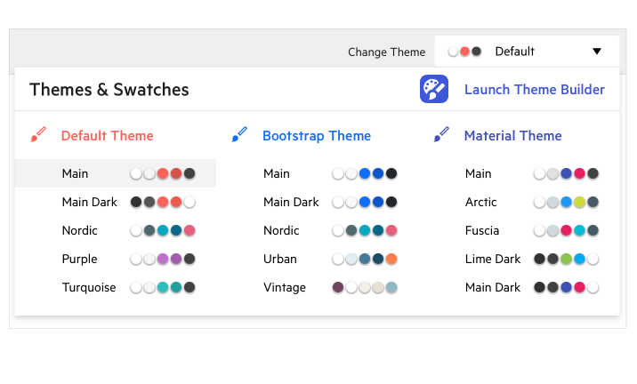
Something all Kendo UI for Angular devs may notice with this release is that there are way more themes to choose from in the Theme Picker dropdown in the docs and demos! Well, technically it’s still the same three themes that we’ve had for a while (Default, Bootstrap and Material Design), but we are now also showcasing several of our “swatches,” which are pre-designed color variations of these themes.
Our hope is that this will let developers see what is possible for Kendo UI for Angular with just a few Sass variable updates, and it also serves as a great way to show other teams what color schemes you can apply to your existing Angular apps.
Play around with the updated theme picker by opening any demo from the Kendo UI for Angular docs & demos.
Kendo UI Kit for Figma
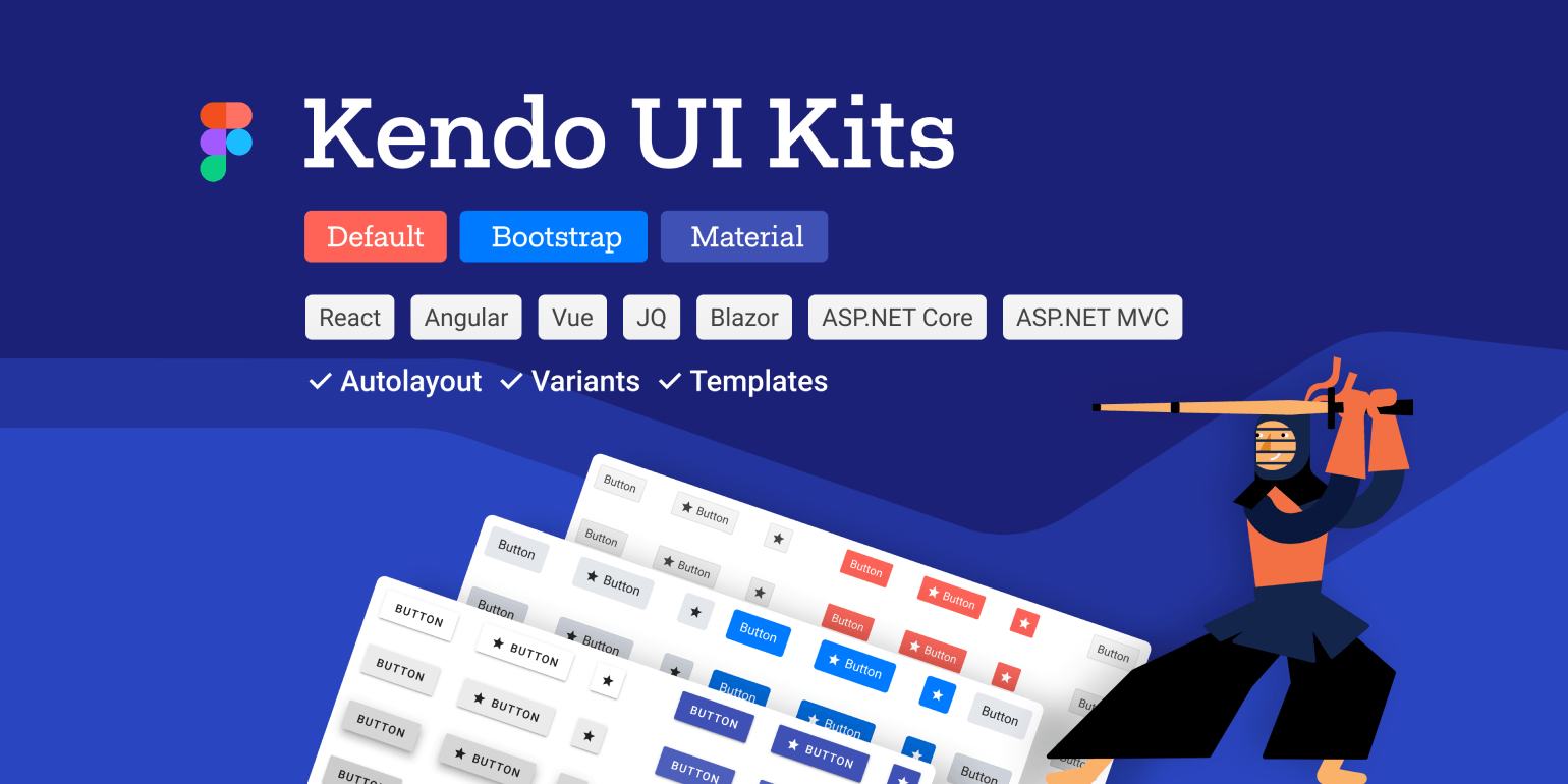
Another exciting update to mention before we even start looking at the new UI components and features is the new Kendo UI Kit for Figma! Containing over 30 of the Kendo UI for Angular components (the list is growing as we speak), this kit allows any designer working with Figma to add Kendo UI for Angular components to their designs. This should help bring designers and developers together when building apps with Kendo UI for Angular.
To learn more, check out the Kendo UI Kits for Figma page.
New Angular Components
New Component: Gantt Chart
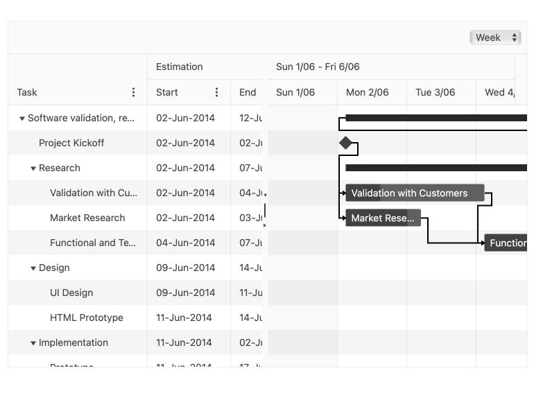
One of the most-anticipated UI components with the R3 2021 release is the new Angular Gantt Chart. In case you’re not familiar with what a Gantt chart is, here’s a quick summary:
The Gantt is a type of a bar chart that illustrates a project schedule. It allows users to see various tasks, how they are related and how long each task should take to complete. Tasks have a visual bar to indicate the start and end of a task, how far along a particular task is, whether the task is on time or late, and much more.
There’s a lot to uncover in this component already, way too much to cover in this blog post, so head on over to the Kendo UI for Angular Gantt documentation section to see the component in action.
New Component: Heatmap
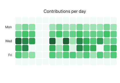
Another big component added with R3 2021 is the new Angular Heatmap component. Heatmap charts, otherwise known as a “cluster heat map,” are suitable for visualizing the magnitude of a value over two dimensions. The best example of a heatmap is the contribution graph that you see on GitHub.
The Kendo UI for Angular Heatmap is a part of our Angular Data Visualization library, which means the content is rendered as a set of SVG elements.
Check out the Angular Heatmap docs & demos for more information.
New Component: Typography
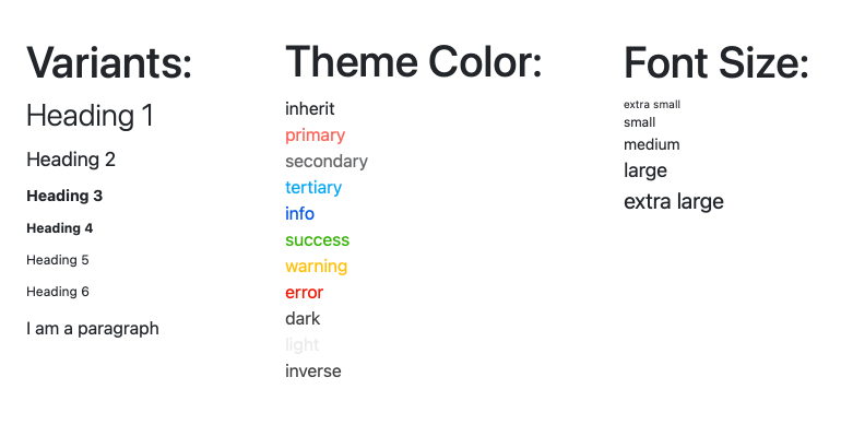
A piece of constant feedback that we get from Kendo UI for Angular users is a desire to push standardization or consistency across applications. As a part of this, we went ahead and created the new Angular Typography directive.
The Kendo UI for Angular Typography directive allows developers to improve the appearance of any UI element by using the available Kendo UI theme classes. Rather than writing classes on their own, developers can just pick up ready-to-use classes from the themes they are already using!
For more information about this component, head over to the Kendo UI for Angular Typography component documentation section.
Expanded Component Features
Grid: Pager Position & Keyboard Navigation
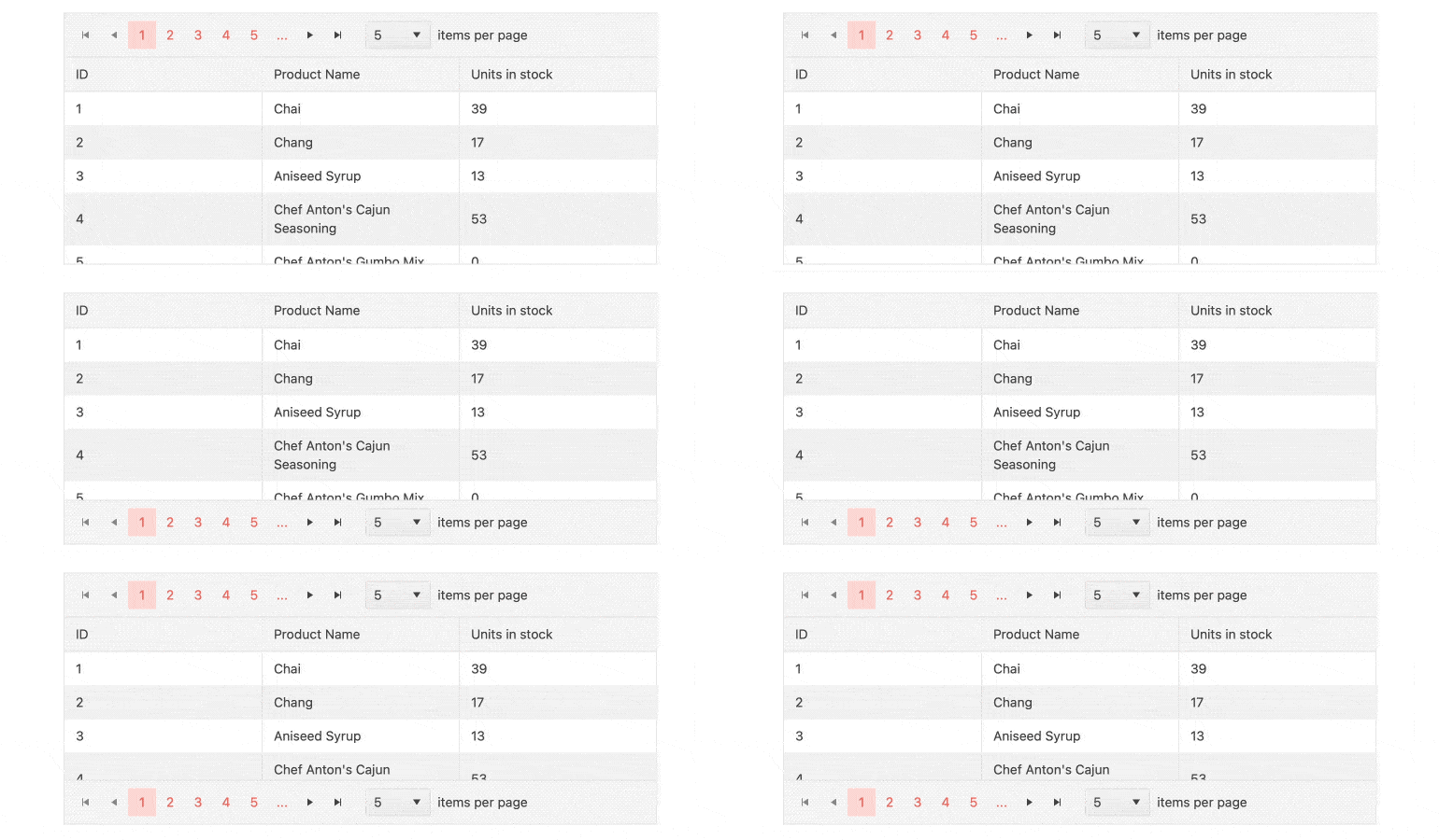
A quality-of-life improvement that was added to the Angular Data Grid with R3 2021 is the ability to control the pager position of the built-in pager of the Grid. With this feature, a developer can control if the pager should be displayed at the top, the bottom, or both at the top and the bottom of a specific Angular Data Grid.
Additionally, with R3 2021 the Kendo UI for Angular team also focused on accessibility improvements within the Data Grid’s pager, which now has built-in support for keyboard navigation thanks to these efforts.
For more information, you can visit the Angular Data Grid Paging demos.
Grid: Placeholders During Virtualization
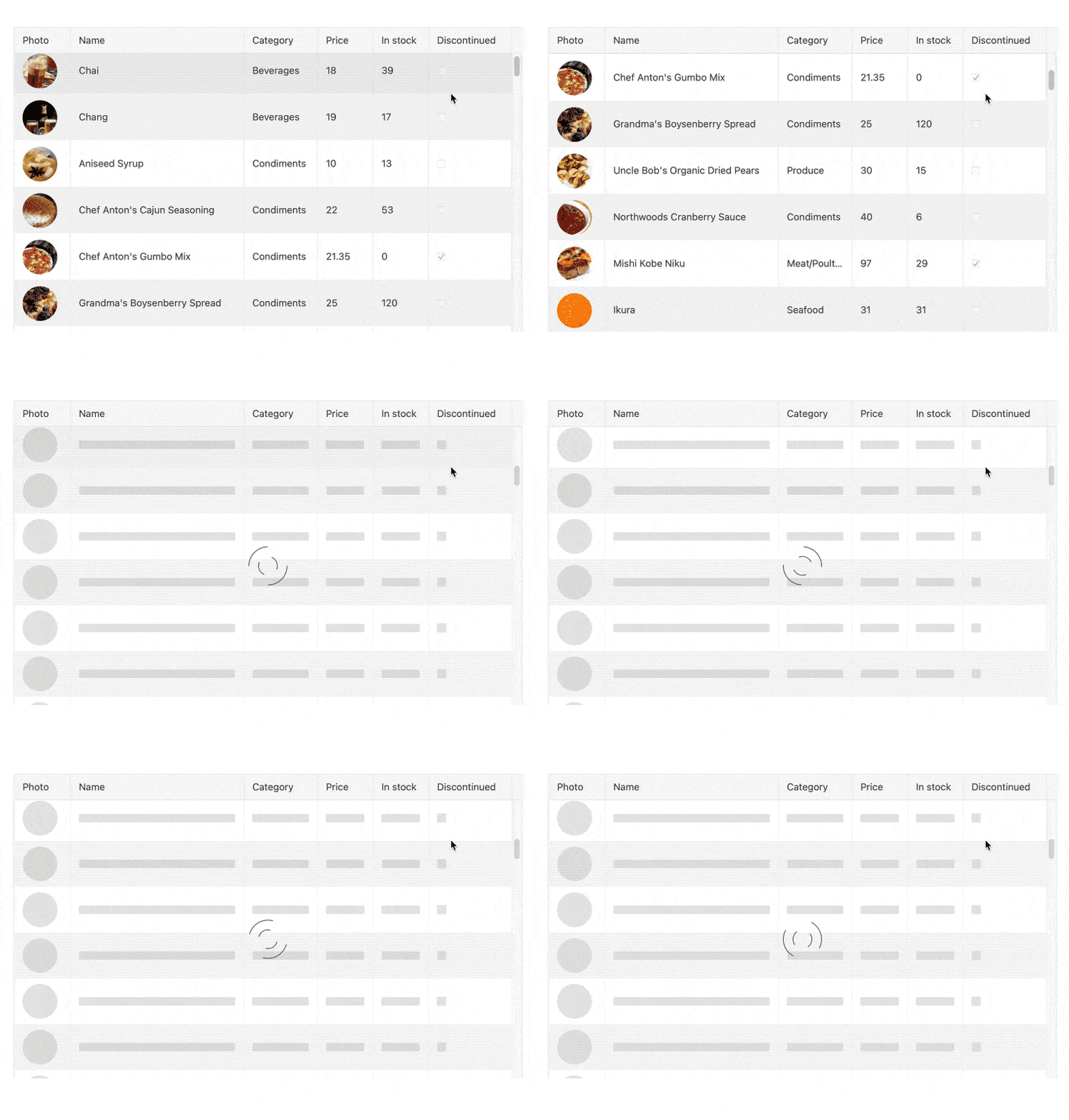
The Angular Data Grid has supported virtualization, both in rows and columns, for a long time, but with R3 2021 we made an already great thing even better! With this release, we have added built-in skeleton placeholders during virtual scrolling scenarios.
During virtualization scenarios, the Grid will request additional data as users scroll. This request will either deal with local data on the client (fast) or will cause server requests for more data (slow).
Previously, when data was not available, users would just see blank rows, which can seem a little odd for a user’s experience since the users do not know if more data is being loaded or if something has gone wrong. With this placeholder feature, users can see that there is something happening with the component and they will intuitively know that data is indeed coming.
This is more of a perceived performance gain for the end users of the Grid, but even perceived performance will come across as a performance boost! Plus, it looks great.
Please refer to the Kendo UI for Angular Grid Virtualization documentation for more information.
Grid: Sample for Drag & Drop Between Grids
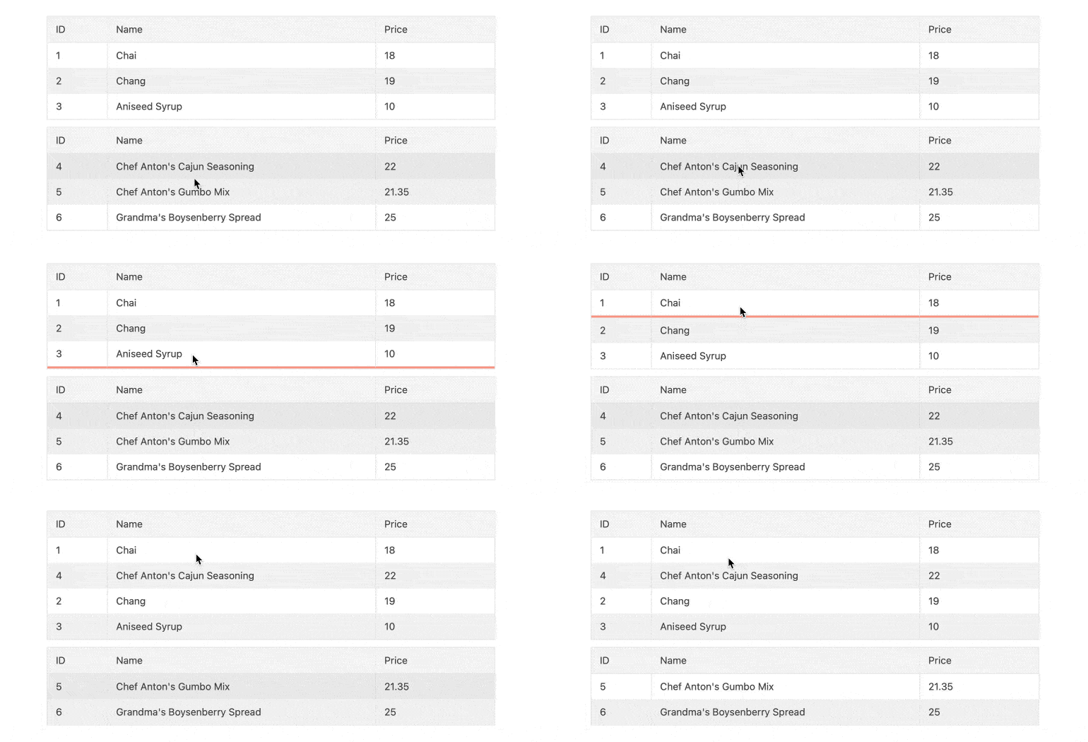
A popular question from Kendo UI for Angular developers is how to enable dragging and dropping between two data grids. With this release, we created a new demo which showcases exactly how this can be done, which will be easy to discover and have on hand whenever multiple grids need to be on a single page.
To see the code behind the sample, you can click here to head over to the Kendo UI for Angular knowledge base repository.
TreeList: Sample for Drag & Drop Between TreeLists
Similar to the Grid sample above, the Kendo UI for Angular team created a sample showcasing how to drag and drop items between two Angular TreeLists.
For more information and a full run-down with sample code check out the TreeList Knowledgebase Article repository right here..
TabStrip: Closable Tabs
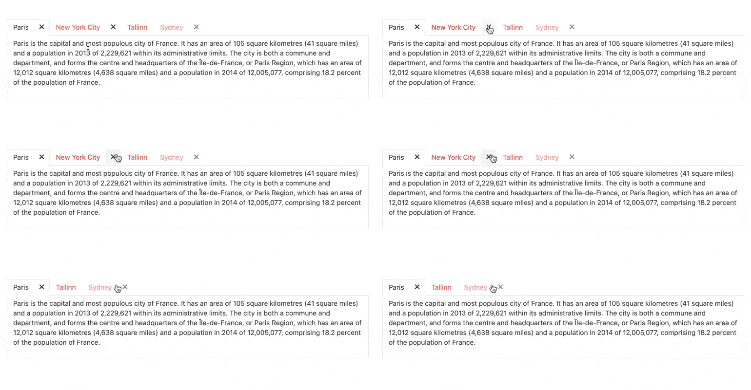
A quality-of-life improvement added to the Kendo UI for Angular TabStrip component with R3 2021 is the new Closable Tabs feature. As the name suggests, this allows users to click on an icon (by default an X symbol) to remove the tab in question from the list of available tabs. Developers simply have to set the closable option in order to take advantage of this, so there’s a lot of bang for your buck in a single configuration option.
Here’s the Kendo UI for Angular TabStrip Closable Tabs demo for more information.
TabStrip: Scrollable Tabs

Another quality-of-life improvement that was added to the Kendo UI for Angular TabStrip component is the ability to scroll through tabs. For a TabStrip that has more tabs than can be displayed in the available width of the TabStrip element, users can now scroll left or right through the collection of tabs to find the specific tab they need to click on.
Here’s a demo showcasing Scrollable Tabs in the Kendo UI for Angular TabStrip.
TreeView: Auto-Scroll During Drag & Drop
With R3 2021, the TreeView can now automatically scroll when users are dragging and dropping nodes within the TreeView. This becomes a huge improvement to using the TreeView when dealing with large lists of nodes that users may want to rearrange.
To see the auto-scroll in action, here’s the Kendo UI for Angular Auto-Scrolling demo.
TreeView: Auto-Expand Nodes on Filter

An additional improvement to the Angular TreeView with R3 2021 is the ability to auto-expand nodes when users are filtering down data within the component. If a node is discovered through filtering all of the nodes, leading up to the root will be expanded to help highlight the node(s) in question.
There are some configuration options to keep in mind for this, so please refer to the Angular TreeView Auto-Expanding Nodes While Filtering demo to see what needs to be done to implement this feature in your applications today.
MultiSelectTree: Client-side Filtering
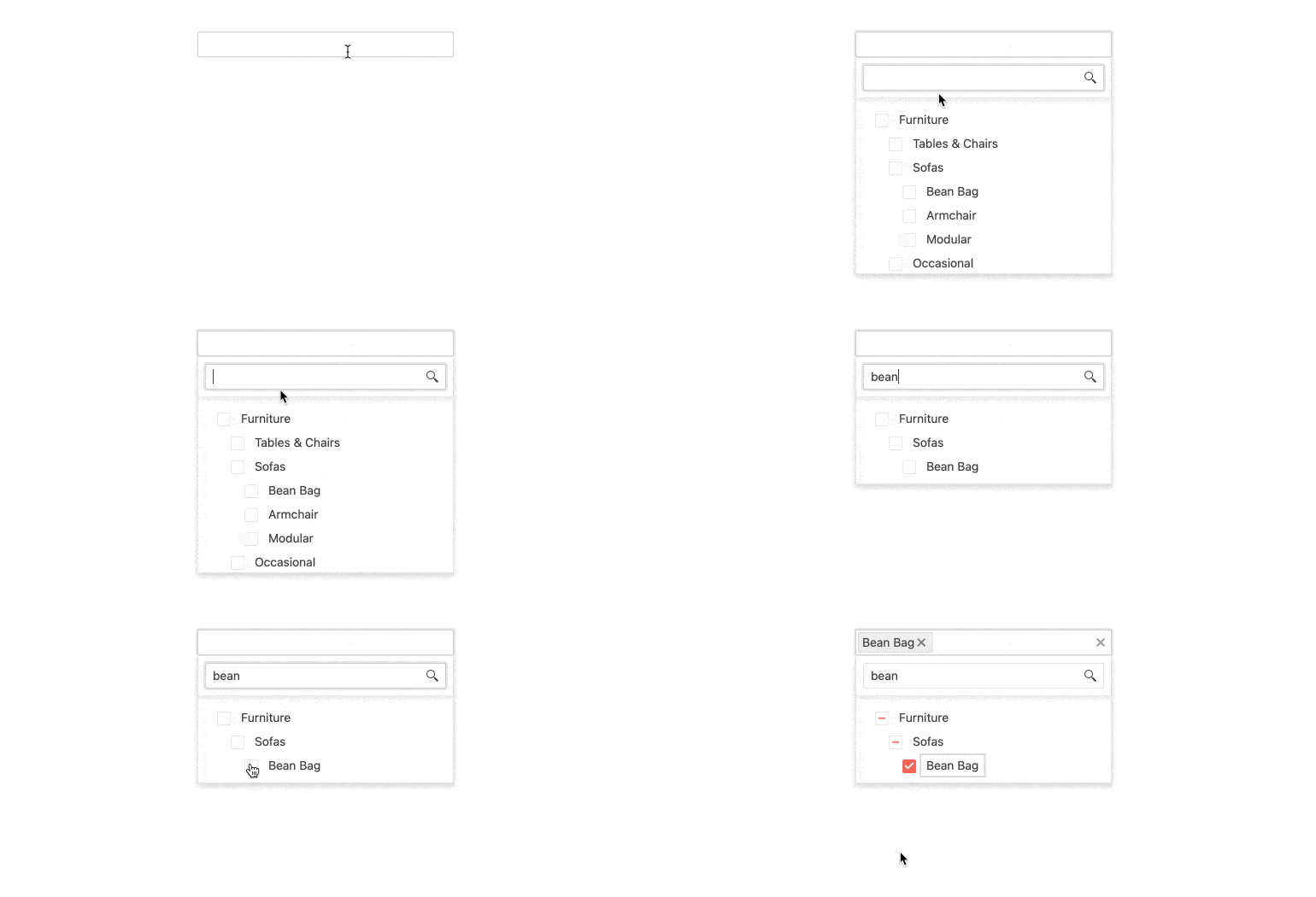
The Kendo UI for Angular MultiSelectTree component is ideal when users need to be presented by a hierarchical list, normally found in a TreeView, but display the selected value(s) in a simple input. With R3 2021, the Kendo UI for Angular team implemented the ability to filter the available nodes displayed completely on the client. If all of the TreeView data is available on the client-side, then this filtering mechanism will quickly reduce the list of available nodes without ever hitting the server.
For more information, please refer to the Kendo UI for Angular MultiSelectTree filtering demo.
Editor: Preserve Whitespace Option and Focus & Blur Events
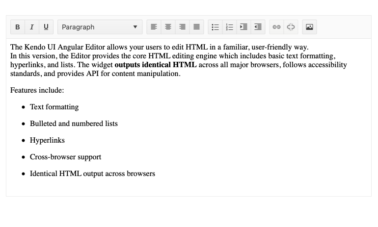
The Kendo UI for Angular Editor also received some love with R3 2021. Specifically, with this release the Angular team added the Preserve Whitespace option which, as the name gives away, ensures that white space within the Editor content is preserved and not stripped.
Additionally, with R3 2021 the Angular Editor also added Focus and Blur events.
Head on over to the Kendo UI for Angular demo section to see how you can use these new features today.
ScrollView: Dark & Light Pager Options
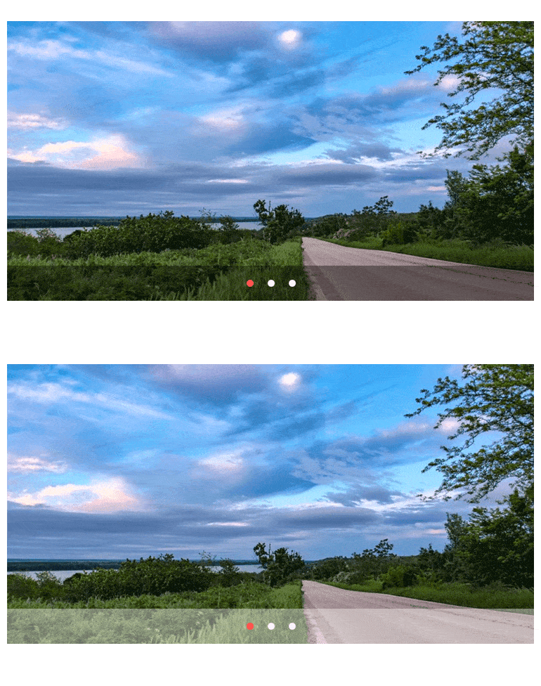
With R3 2021, the ScrollView has an option to display the pager at the bottom in either in a Dark or Light format. The gif above shows the difference and it should be as clear as night and day.
Check out the ScrollView paging demo to find out more.
ColorPicker & ColorGradient: Keyboard Navigation and Localization
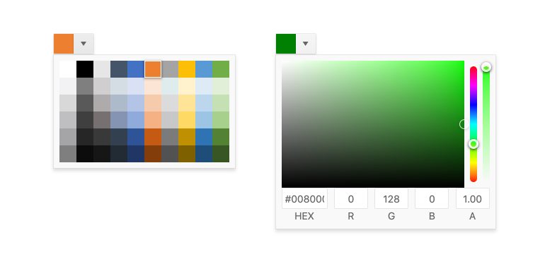
The Angular ColorPicker and ColorGradient components also received some attention with R3 2021. Specifically, both components now come with built-in Keyboard Navigation and Localization features.
For those interested, here is a direct link to the Angular ColorPicker component documentation, and here is a link to the Angular ColorGradient component documentation.
FloatingLabel: Custom CSS Support & positionChange Event

The Angular FloatingLabel component now officially supports custom CSS, allowing developers to customize the look and feel of the FloatingLabels. Additionally, the positionChange event has been added as well.
Here’s a quick link to the Angular FloatingLabel component.
SplitButton: Change the Type of the Main Button

Last but not least, with R3 2021 the Angular SplitButton added the ability for developers to change the type of the main button.
For those interested, here is a link to the Angular SplitButton component documentation.
Got Feedback?
That is one jam-packed release! However, we may not have added a specific feature or component that you were looking for, so now is the chance for you to make your voice heard and let us know what you are missing from Kendo UI for Angular!
Head over to the Kendo UI for Angular Feedback Portal and vote for your favorite feedback item or submit your own! Kendo UI for Angular has grown to the size that it is today thanks to the continuous feedback of our customers, and we want to continue to provide the best possible library for you and your teams. We use the feedback we hear from you to drive all of our releases!
Webinars and Live Streams
Want to see everything I mentioned above live and in action? On Wednesday, September 28, at 11:00 am ET we are hosting the Kendo UI R3 2021 release webinar. This session will cover everything that is new with R3 2021 in Angular, jQuery, React and Vue.
On top of this, we will also have a Twitch livestream diving in deeper into Kendo UI for Angular on Friday, September 24, at 10:00 am ET. We are also covering KendoReact on Twitch on Thursday, September 23, at 10:00 am ET.
Tons of fun will be had, so head on over to the Kendo UI R3 2021 webinar registration page to reserve your seat and join in on the festivities!