The R3 2021 release for Telerik UI for ASP.NET Core is here and brings so much new UI goodness! Four new UI components: OrgChart, Captcha, Heatmap and Popover; new Admin dashboard project template and demo application using Razor Pages and TAG helpers; Design Kits for Figma, compatibility with .NET 6 Release Candidate 1 and more!
TL;DR Telerik UI for ASP.NET Core R3 2021
Below is a summary of the third major release for 2021 release content:
- New Components: OrgChart, Captcha, Heatmap, Popover
- New Form Features: Support for Hidden Fields, TAG Helper Implementation, Adding TextBox and TextArea as built-in components
- New Grid Features: Alignment of Cell Values
- Improved Pager Accessibility
- New MultiSelect Feature: Addition of a DropDown Arrow
- New features and improvements in PDFProcessing, SpreadProcessing, SpreadSheetProcessing and WordsProcessing
- Improved themes and swatches picker in component demos
- Support for Bootstrap 5
- Design Kits for Figma: 30+ components for top three themes that come with the products—Default, Bootstrap, and Material
- Compatibility with .NET 6 Release Candidate 1
- New Visual Studio Project Configuration Wizard for ASP.NET Core—easy setup of themes, RTL, global resources and more
- Convert Project Wizards Updates—support for Razor Pages and .NET 5/6
- New Admin Dashboard Template in Visual Studio
- New Admin Dashboard Demo Application using TAG Helpers and Razor Pages
Deep Dive into R3 2021 Release of UI for ASP.NET Core
Read ahead to learn more about the latest additions of UI components, features to existing components, design kits and Visual Studio extension improvements.
Compatibility with .NET 6 Release Candidate 1
We are happy to announce that Telerik UI for ASP.NET Core R3 2021 release is compatible with .NET 6.0 Release Candidate 1! Our goal is to make sure you can take immediate advantage of the latest and greatest updates in .NET 6 and will ensure full support for its official release later this year in November shortly after it is announced by Microsoft. Meanwhile, everyone staying on previous ASP.NET Core versions (.NET 5 and earlier) can rest assured we will continue to support them as well.
New UI for ASP.NET Core Organizational Chart Component
The UI for ASP.NET Core OrgChart component visualizes hierarchical data and allows users to seamlessly interact with organizational structures. The component comes with multiple built-in features such as expand and collapse of org nodes, grouping, remote data binding, editing, loading data on demand, custom content rendering through templates, accessibility and keyboard navigation, RTL, options for HTML or TAG helpers and more.
Telerik UI for ASP.NET Core Organizational Chart Component
New UI for ASP.NET Core Captcha Component
The UI for ASP.NET Core Captcha component lets you add a layer of security validation to your application inputs and is especially applicable in cases where you need to ensure that non-human requests or form submissions are ignored. The component displays an image with symbols (combination of letters and numbers), and prompts users to rewrite it in a dedicated input. As part of the Captcha component, an audio button is rendered to ensure the component is accessible and can be used by any user. In addition to reading out loud the visualized symbols, it also lets you adjust the speaker volume. To see the full list of features, use cases and events, check out the Captcha documentation page.

Telerik UI for ASP.NET Core Captcha Component
New UI for ASP.NET Core Heatmap Component
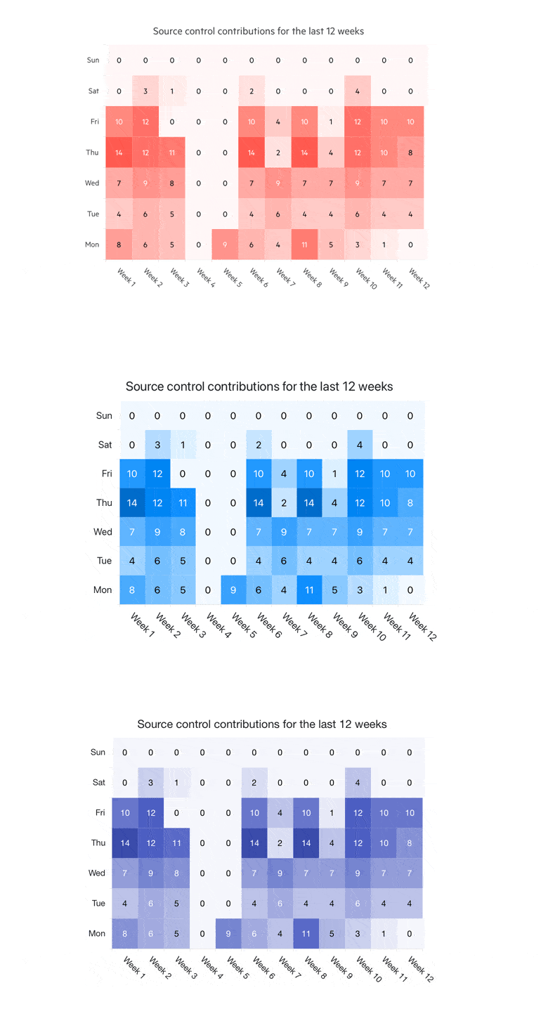
The UI for ASP.NET Core HeatMap Chart component visualizes graphical representation of numerical data, where individual data points contained in the data set are represented using different colors. It has a grid-like structure which has cells associated with an X-axis and a Y-axis. The value of every cell determines what color the cell should be filled in, with the range of colors ranging from white to a completely filled-in color and everything in between as a gradient.
Heatmaps simplify complex numerical data into visualizations, which can be understood at a glance (such as the example below with source control distribution and density in the last 12 weeks).
Telerik UI for ASP.NET Core HeatMap Component
Within the UI for ASP.NET Core offering, the HeatMap Chart features crosshairs, different shapes, color scales, PDF export, panning and zooming, category binding, tooltips and various theming options.
New UI for ASP.NET Core Popover Component
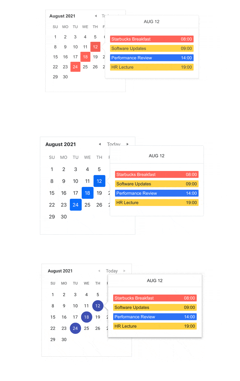
The UI for ASP.NET Core Popover component comes handy when you need to display content on top of an anchor (for example, when you need to show detailed content when users hover certain UI elements). The popover component comes with support for templates, which let you render custom content such as images, styled text and more. Just like the rest of the Telerik UI for ASP.NET Core components, it comes in two flavors—HTML and TAG helpers—and includes multiple events and 20+ theming options.
Telerik UI for ASP.NET Core Popover Component
New Features in Existing UI for ASP.NET Core Components
New UI for ASP.NET Core Form Features
The Form UI component received a lot of love in this release and got expanded with:
- Support for hidden fields for better programmatic control
- TAG Helper Implementation
- TextBox and TextArea were added to the Form built-in controls
New Data Grid Features: Alignment of Cell Values
The Data Grid for ASP.NET Core component allows you to specify horizontal alignment of the content (Left, Right or Center) using the HtmlAttributes(). The column headers and footers can be aligned as well, using the HeaderHtmlAttributes() and FooterHtmlAttributes() methods, respectively.
Improved Pager Accessibility
The Pager component for ASP.NET Core can now be navigated by using the arrows, Home and End keyboard buttons, Tab, Enter, Escape and Shift (in addition to the existing option of using PageUp and PageDown buttons). Check out the Pager keyboard navigation demo.
New MultiSelect Feature: Addition of a DropDown Arrow
We added the option for dropdown arrow in the MultiSelect component (just like in the DropDownList component) and completed yet another Feedback Portal request.
New Features in Telerik Document Processing
In R3 2021 release we have something new for those of you who are using Telerik Document Processing within your ASP.NET Core apps! In the latest distribution package, you will find several of the most-wanted items from our Feedback Portal, such as:
- PdfProcessing: Handle import of documents with invalid cross-reference table offsets
- Spreadsheet and SpreadProcessing: Support for XLSM
- WordsProcessing: Introduce a way to replace text with other document elements
- And more!
Theming Improvements & Design Assets
Improved Themes & Swatches Picker in Component Demos
The Default, Material and Bootstrap themes now shine with different coloring options, which you can apply in Telerik component demos by selecting one of the many new available swatches:
- Default theme swatches—Main, Main Dark, Nordic, Purple, Turquoise
- Bootstrap theme swatches—Main, Main Dark, Nordic, Urban, Vintage
- Material theme swatches—Main, Arctic, Fuchsia, Lime Dark, Main Dark
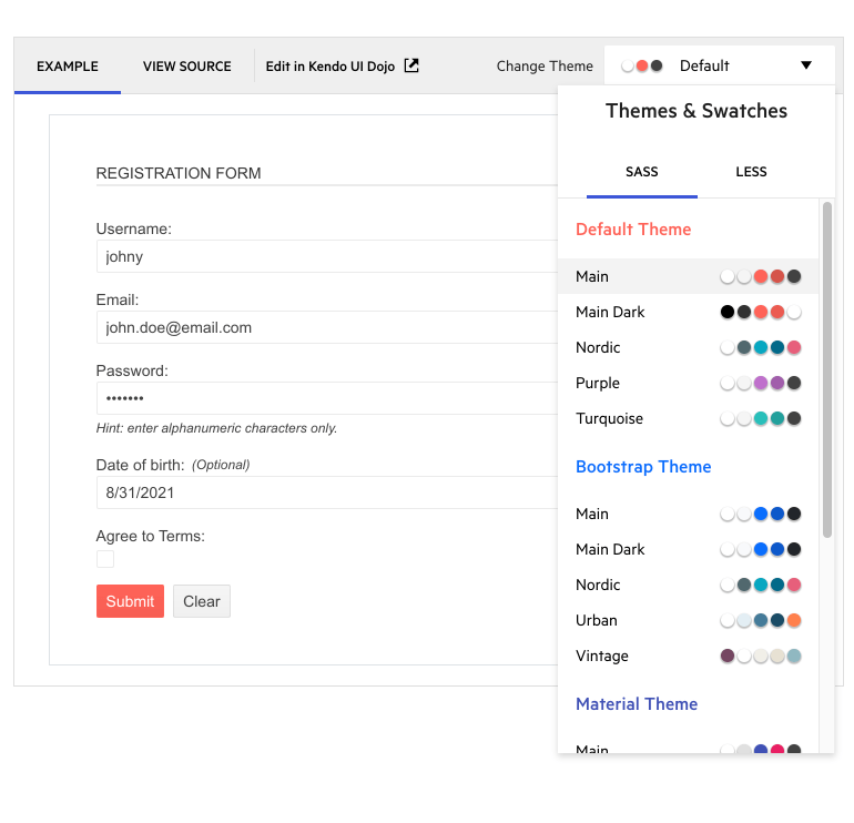
Themes & Swatches in Telerik Demos
Support for Bootstrap 5
Following the announcement of Bootstrap 5 earlier this summer, we worked to ensure that we can accommodate various preferences for its version support. If you would like to take advantage of the latest v5 updates, make sure to use the bootstrap-main swatch. In case you wish to continue using the previous versions, you can reference Bootstrap-3 and Bootstrap-4.
Design Kits for Figma
To achieve efficient collaboration between designers and developers on your team, we have created three Telerik UI Design Kits for Figma: Material, Bootstrap and Default (one for each of the top three themes we ship with Telerik UI for ASP.NET Core).
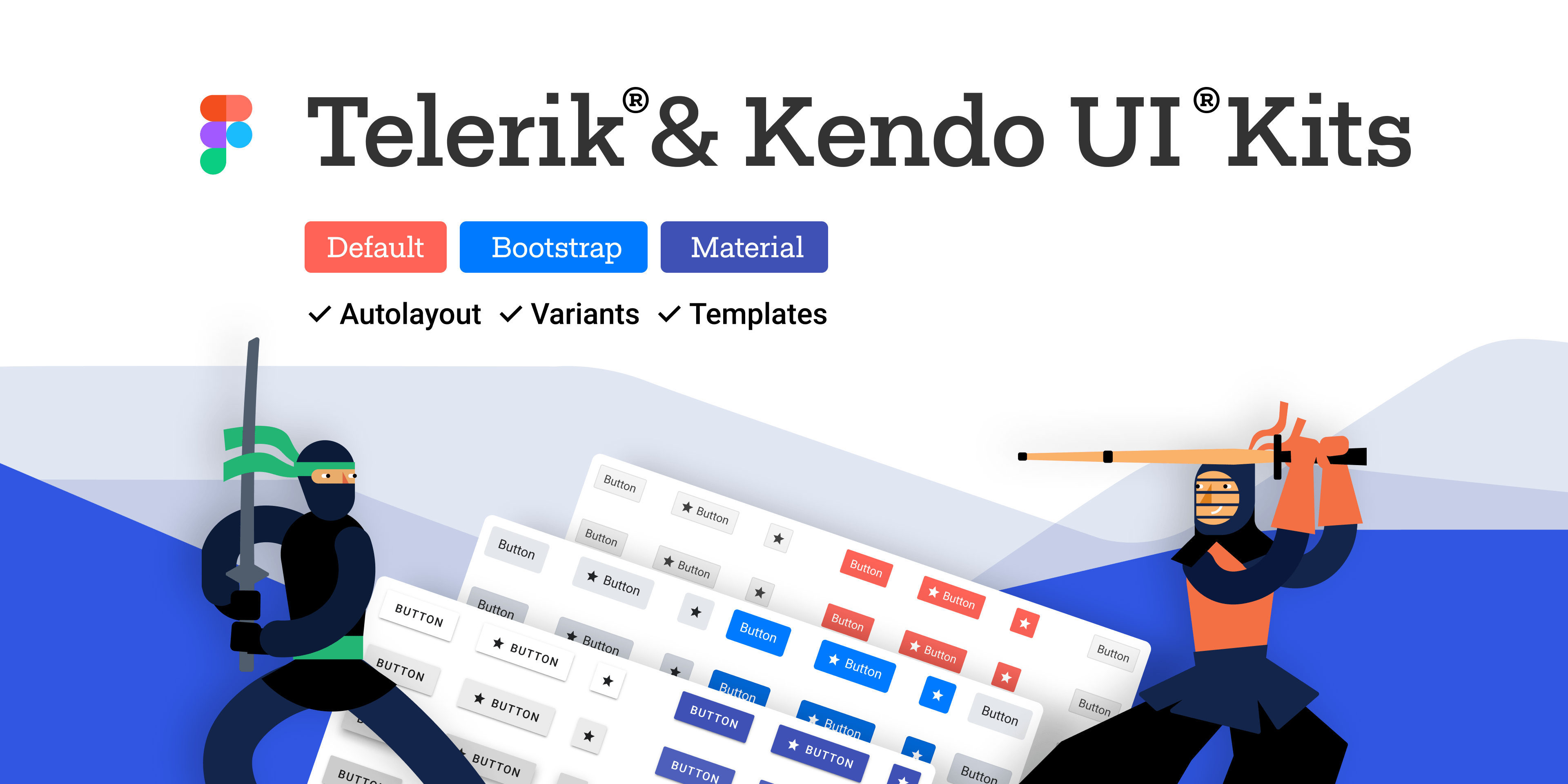
Telerik & Kendo UI Design Kits for Figma
The design files include 30+ of the most widely used UI for ASP.NET Core components such as Grid, Scheduler, Dropdowns and Inputs, with their detailed anatomical structures, colors, indicators and icons. The included building blocks and elements enable smooth collaboration between designers and developers, and our goal is to continuously grow the number of included components and ensure full coverage.
New Admin Dashboard Template & Demo App
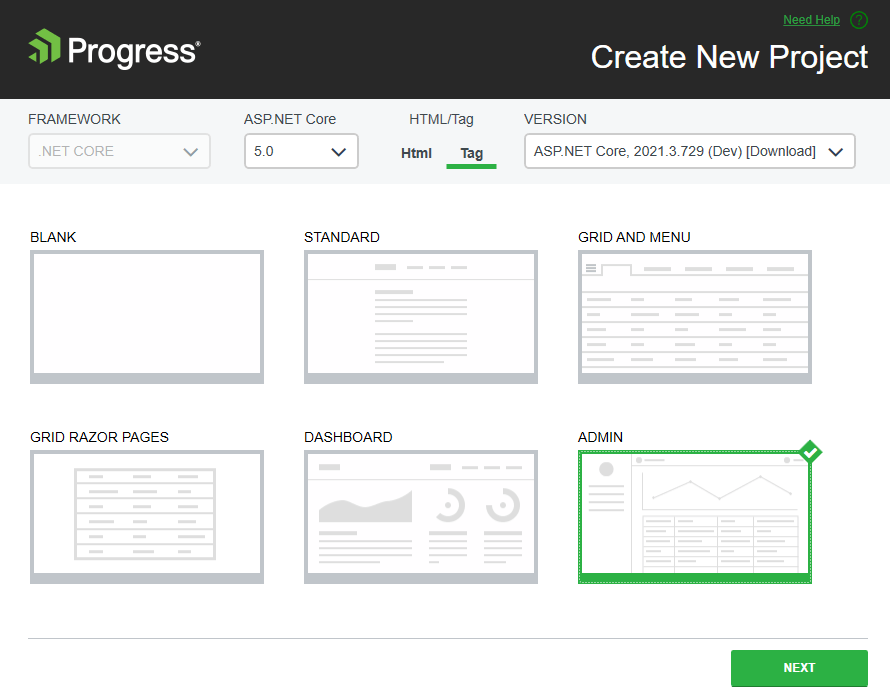
Based on your feedback and requests for more Razor Pages examples, we created two “admin dashboard-like” resources—the new Admin Dashboard demo application and Visual Studio project template for ASP.NET Core. Both provide the same use case showcasing the usage of Telerik components in a Razor Pages scenario and TagHelper flavor, and include many UI components in action including Grid, Tile Layout, Drawer, Calendar, Form, various Chart types, Card and more.
Using the Admin Dashboard project template, you can easily jump-start a project with the pre-built layout and functionality—rearrange the layout as it fits your needs, and simply plug in your data and bind it to the components.
New Telerik UI for ASP.NET Core Demo Application with Razor Pages
New Visual Studio Extensions & Features
The new Visual Studio Project Configuration Wizard for ASP.NET Core simplifies the projects configurations and includes options to set up the application theme, RTL (right-to-left) settings, global resources and more. To take advantage of the Project Configuration Wizard, open Visual Studio select from the toolbar menu Extensions >Telerik > Telerik UI for ASP.NET Core > Configure Project.

Configure Project Wizard for UI for ASP.NET Core
The Convert Project Wizard received several updates as well and now includes support for Razor Pages and .NET 5/.NET 6.
Download Telerik UI for ASP.NET Core
Download and try a trial version of Telerik UI for ASP.NET Core, or if you are an active license holder, you can just grab the latest and greatest from the Your Account page! Share your thoughts with us on our Feedback Portal and help us shape the future of UI for ASP.NET Core.
Download UI for ASP.NET Core Now
Special Twitch Sessions & Webinar
Be sure to sign up for the Telerik R3 2021 release webinar and live Twitch sessions to see the newly released components and features in action:
- Twitch Session Monday, September 20, 10:00 am ET for web products
- Twitch Session Tuesday, September 21, 10:00 am ET for desktop products
- Telerik R3 2021 Webinar Wednesday, September 29 I 11:00 am – 1:00 pm ET
Thank you for your continuous support and happy ASP.NET Core coding!
