Consumers have high expectations for financial services and fintech solutions they have to pay for. To ensure your mobile app meets those expectations, you’ll want to build out these seven essential features.
When designing a freemium or premium fintech app, you have to build so that users don’t even think about the app as a technology and instead just see it as the go-to solution for their financial needs.
To do this, you’ll have to gain their trust the very moment they install the app and then provide them with a seamless experience every time they use it. There are seven must-have features that’ll help you pull this off.
In return, you’ll see higher install, engagement and retention rates.
1. Biometric Sign-in
It was just five years ago when a study by Mail.com found that U.S. consumers were not ready for biometric authentication.
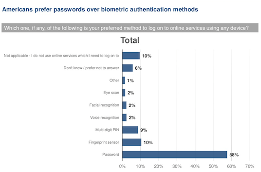
58% of respondents preferred using a password over any of the biometric options, like eye scan, facial recognition, voice recognition or fingerprint sensor. Even a PIN wasn’t a very popular option then.
But in 2021, that has changed. A survey done by VISA found that 65% of U.S. consumers are familiar with biometric technologies.
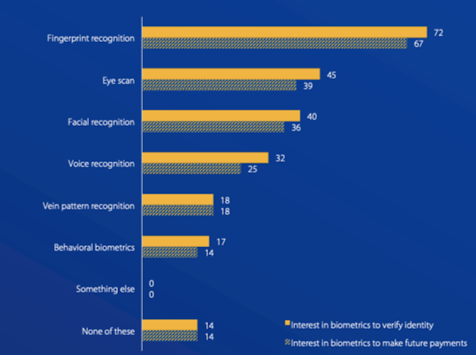
The study compared users’ interest in biometrics for identity verification as well as making payments. There’s now a ton of interest in using biometric authentications like fingerprint recognition, eye scan, facial recognition and voice recognition to verify one’s identity. And only about 14% of consumers have no interest in biometrics at all.
So, why such a strong preference for this now? Well, according to VISA’s findings, biometrics are much easier to use and allow for faster execution. Plus, they’re generally more secure than passwords. And security is an important matter for fintech customers.
Here’s how Discover customers encounter biometrics at the login screen:
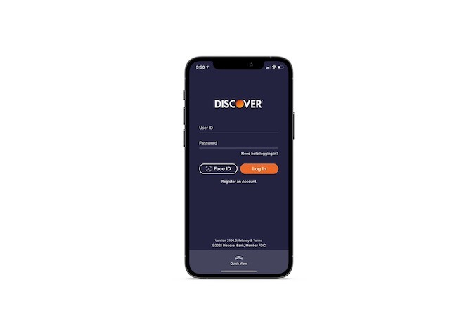
If you want to start things off on the right foot with your fintech users, a biometric authentication option is a must. Users can still use the login form if they prefer. However, the faster, easier and more secure biometric login may encourage more users to sign up and use the app regularly.
2. Streamlined Onboarding
Statista recently aggregated data on the average mobile app retention rates across a variety of industries.
After just the first day of installation, fintech apps lose this percentage of users:
- Traditional banking: 69.4%
- Digital banking: 70%
- Investing: 74.4%
- Financial services: 78.2%
- All financial service apps: 77.3%
One reason your fintech app might be losing users so quickly after install is the onboarding process.
Now, I’ve talked here before about what a good onboarding process looks like. A helpful splash screen/intro is good. So is a streamlined sign-up page. But here’s another thing to think about:
A fintech app that offers a new solution to money management would do well to offer guidance once the user enters the app. Goodbudget does this:
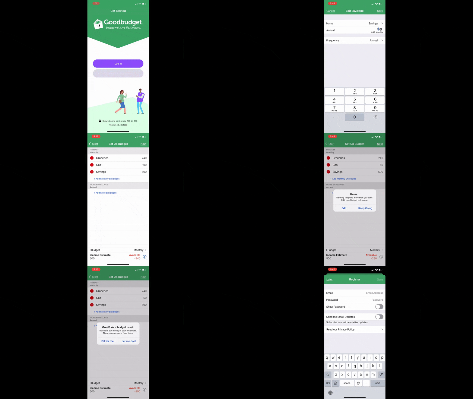
This GIF goes a little fast, but I think you can see how Goodbudget helps users quickly build their first budget. Categories and totals are already in the app waiting for them. Once they’ve been edited and finalized, Goodbudget then moves the data over to the user’s “envelopes,” saving them even more time.
Just a little extra guidance at the start can really help users experience the value of the app on Day 1 and give them a reason not to uninstall it.
3. User-First Navigation
The navigation bar is a critical component of every app. And, really, it should always be designed with the user above anything else.
HoneyDue has the perfect example of what to do:
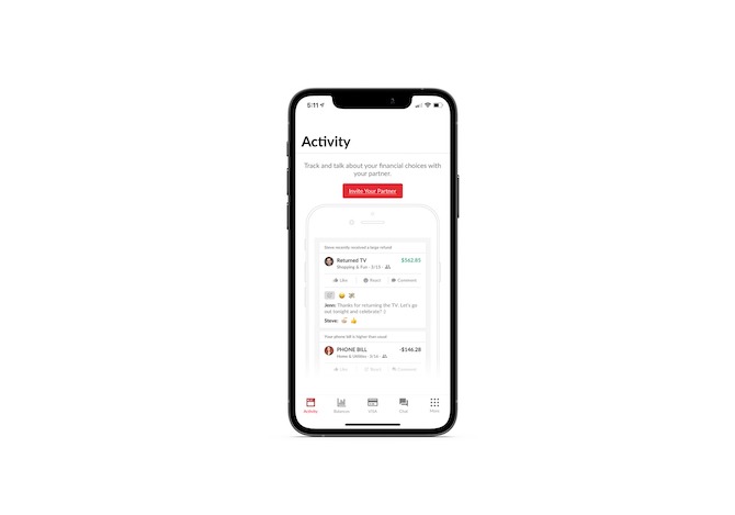
First-time users will find a navigation that includes tabs for:
- Activity
- Balances
- VISA (credit card)
- Chat
- More
The “More” tab will open up a secondary navigation of actions and settings:
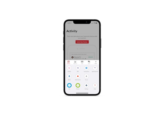
When the user goes to explore the “Settings” area of the app, they may be surprised to learn that they can customize the layout of their navigation bar from there:
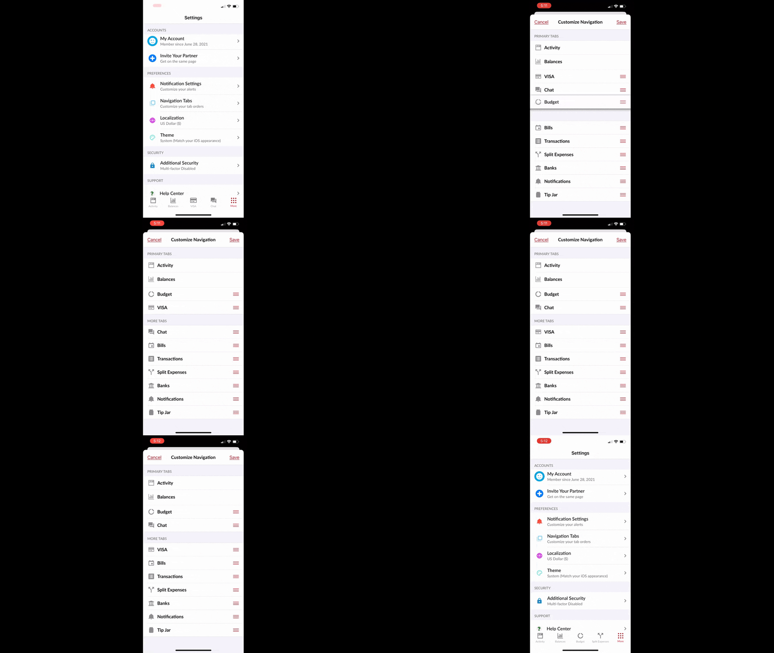
For some users, the “VISA” tab may be irrelevant or not commonly used. The same goes for “Chat.” While it may have made sense to the designers to put those tabs front and center, it’s pretty great that users can make that determination for themselves and customize as they see fit.
You don’t often see this feature in mobile apps, in general. However, if you’re building a fintech app with many different types of actions your users might take, this is a good way to build out this feature and it will add a ton of value to their experience.
4. Personalized UI and Settings
Designing a fintech app using a minimal design is a must. However, similar to what I said about the navigation, what you find to be minimal or attractive might not be the case for your users.
Now, I’m not saying you need to give them complete control over personalizing the UI or the features of the app. That’ll only distract them from what they need to do and may also compromise your branding.
However, customization controls that enhance the in-app experience can improve usability as well as accessibility.
Here’s an example of how Buddy’s customization controls make the app better:
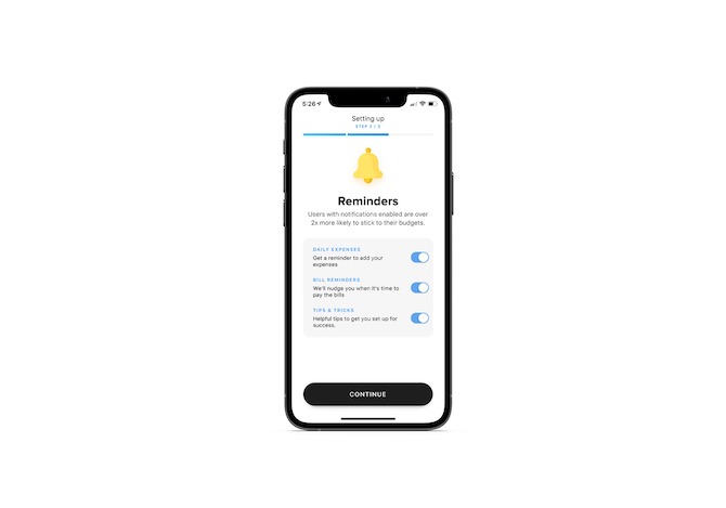
During the app’s onboarding process, users are asked if they want to set push notification reminders. Notice how it’s not the usual ugly pop-up that asks users to give them permission to send them any kind of messages. With Buddy, they get to select which of the reminders they receive (if any).
Users also get to customize their budget categories:
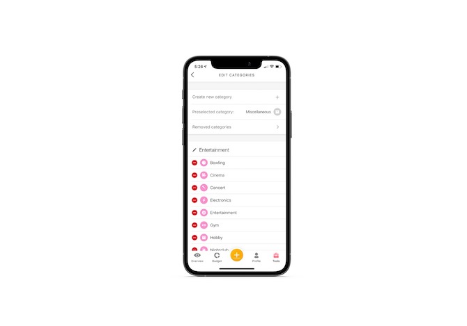
If you’ve ever tried to manage your cash flow and categorize expenses, you know what a pain it can be when there are dozens of categories to choose from. But Buddy users can remove any categories that are unnecessary and add custom ones, too.
In addition, users have the option of customizing the app’s appearance:
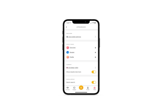
From this page, they can configure the following:
- Dark or light mode
- Theme colors
- Currency
- Quick search bar
- Language
By allowing users to adjust something as simple as language or currency, you could instantly transform this app into something that everyone—and not just English-speaking, U.S.-based users—can get the most value out of.
5. Friction-Free Forms
Poor form design is one of the most common mistakes made in mobile apps. You really can’t afford to put form over function here—especially if a sign-up form is one of the first things a user has to deal with after they install the app.
Possible’s signup app is a great one to mimic:
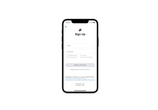
At first glance, you can see a number of good design choices here:
- Enclosed fields
- Big clickable areas
- Clear labels
- Password rules
- Grayed-out button
It gets even better once the user fills out the form:
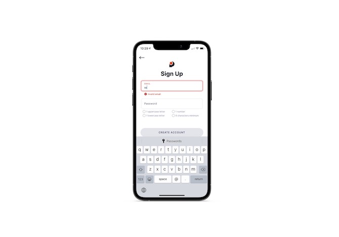
When the user begins typing, a number of things happen:
- The field’s label moves up and out of the way.
- The keyboard appears and includes the “@” and “.” symbols to make entering the email address easier to do.
- The field is highlighted so the user can easily focus on it.
- An error message appears with a companion icon in case the user can’t see the color red or doesn’t otherwise notice it.
- The error message goes away once a correctly formatted entry is filled in.
Ideally, the error message wouldn’t appear until after the field has been filled in. The reason it’s here, I suspect, is because the keyboard doesn’t have any up/down tabbing arrows. If you put them in your own form, then the error message can appear later.
The other noteworthy feature is how the Password field operates:
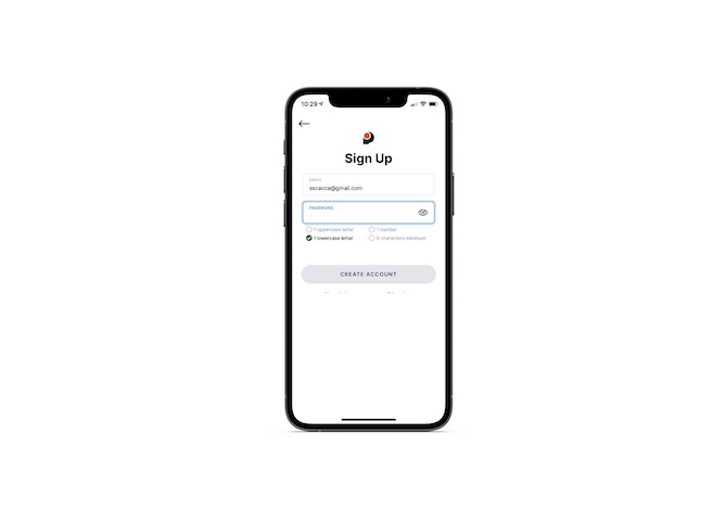
There are four rules given:
- 1 uppercase letter
- 1 lowercase letter
- 1 number
- 8 characters minimum
It’s not until these rules are met (and turn green) that the user will see the “Create Account” button become active.
6. Interactive Data Visualization
Analytics are a pretty standard feature regardless of what type of fintech mobile app you’re developing. Because of this, your data needs to be easy to read and understand on a smartphone screen.
Here are some tips on how to design better data visualization.
One thing I think is especially important when designing data is considering how you’re going to display a lot of information in that small of a space. Ideally, your mobile app users shouldn’t have to scroll to discover it.
Instead, interactive data visualizations—like the Mint example here—allow your users to stay put:
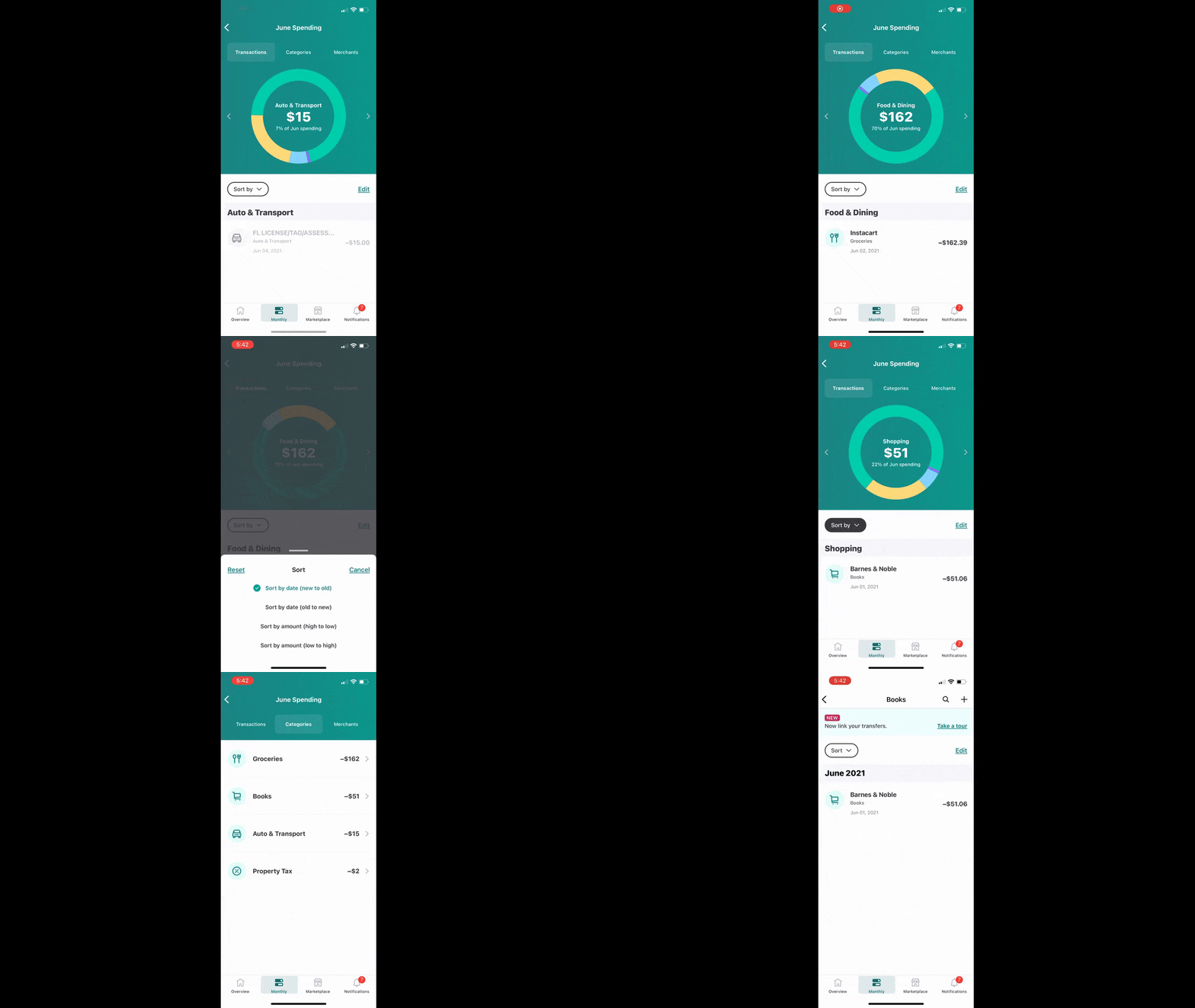
As they click on the different color bars in the pie chart, the relevant data appears within it, as well as directly beneath it. Not only does this present the data more conveniently, but it makes the experience of reviewing one’s analytics much more engaging.
7. Easy API Integration
Most premium fintech apps will need to integrate with other apps in order to be of real value to users. But let’s face it: If you were to ask users to retrieve an API key in order to connect the two platforms, many of them might be rethinking their decision to use the app in the first place.
Rather than burden your users with the technology, just simplify integration.
This example from Zelle is a good way to handle it:
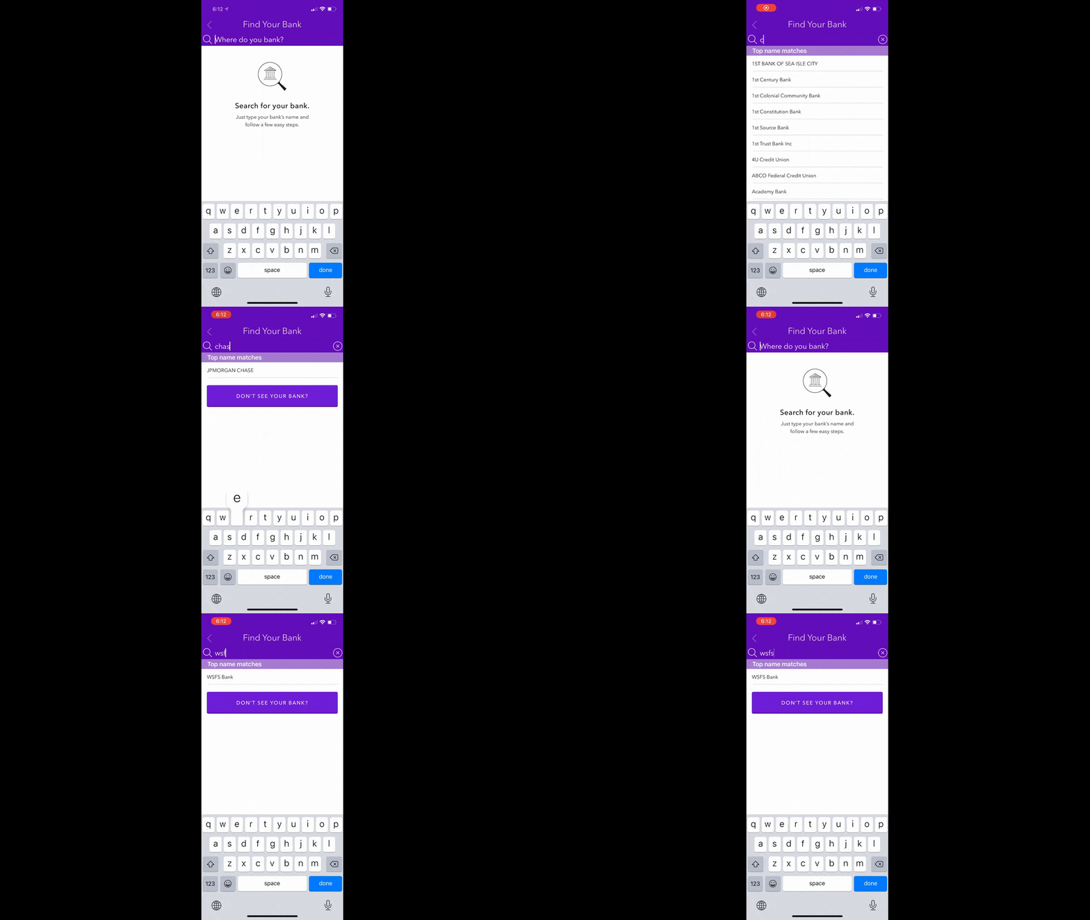
This smart search bar helps customers easily find their bank from what’s certainly a lengthy list.
After selecting their bank, Zelle asks them to go to their banking app. This way, they won’t have to retype their credentials (so long as the app is installed on their device) in order to set up the integration. All they need to do is open the app and approve the connection.
Bottom line: Simpler is always better when it comes to high-tech solutions. So if you can pair smart features with user-friendly directions, you’ll remove the intimidation factor from your API integration process and the app as a whole.
Wrap-up
When someone knowingly signs up for an app they’re going to have to spend money on (eventually, anyway), they’re expecting a top-of-the-line experience. By incorporating these seven features and designing them with the user in mind, you’ll be able to capture more installs and retain more of those users over the long run.