The Telerik Blazor Scheduler makes it easy for you to not only add a calendar to your app’s UI but also to direct the user’s focus to what matters.
With its Scheduler component, Telerik UI for Blazor makes it easy for you to add a calendar to your Blazor app’s UI to support entering or reporting both appointments and events (the Telerik team uses the terms “scheduler” and “appointments” when discussing time-related data). Part of that comes from leveraging the Scheduler’s built-in views. However, a good UI also directs users to where to enter or find the data they need within the UI. To put it another way, a good UI directs the user’s focus, and the Scheduler gives you tools to manage that, also.
Here’s a quick review of how to set up a “Scheduler-compatible” project.
Highlighting the Right Times
The good news here is that each of the views offers you multiple options to facilitate managing the user’s focus. All of the views (except for the month view), for example, include WorkDayStart and WorkDayEnd attributes that let you specify a highlighted time range in the calendar.
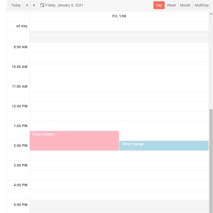
This example causes the view to highlight the times between 9:00 am and 5:00 pm, for example:
<SchedulerDayView
    WorkDayStart=
       "@(new DateTime(DateTime.Now.Year, DateTime.Now.Month, DateTime.Now.Day, 9,0,0))"
    WorkDayEnd=
      "@(new DateTime(DateTime.Now.Year, DateTime.Now.Month, DateTime.Now.Day, 17,0,0))" />
As the user pages through days, these two attributes ignore the year, month and day in the date passed to them and use the only time component of the date to control which time range is highlighted.
If you’re providing multiple views, you’ll probably want to make sure that these settings are the same for all of the views, so centralizing these using fields makes sense by using a field. This version of the day and multiday views use two fields named StartDateTime and EndDateTime to highlight the “correct” time range:
<SchedulerDayView WorkDayStart="@StartDateTime"  WorkDayEnd=”@EndDateTime” />
<SchedulerMultiDayView WorkDayStart="@StartDateTime"  WorkDayEnd=”@EndDateTime” />
Here’s the code that would support that markup:
@code {
    DateTime StartDateTime =
           new DateTime(DateTime.Now.Year, DateTime.Now.Month, DateTime.Now.Day, 9,0,0);
    DateTime EndDateTime =
           new DateTime(DateTime.Now.Year, DateTime.Now.Month, DateTime.Now.Day, 17, 0, 0);
With the WorkDayStart and WorkDayEnd set, you end up with a UI like this in Day view:

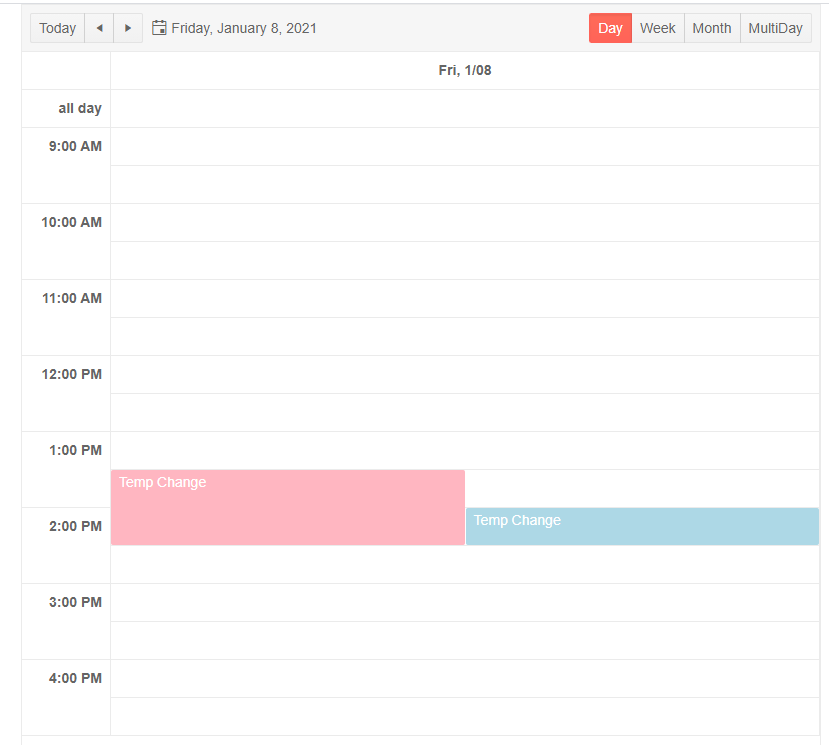
While highlighting in the UI guides the user to the right part of the interface, if areas outside of a specific time range are forbidden then the right practice is to prevent the user from accessing those times. If you set the view’s StartTime and EndTime attributes, you limit the user to the acceptable time range in every view (again, except for the month view). As with the WorkDayEnd/Start, while you have to provide a date when setting these values, only the time restrictions matter as the user moves from day to day.
This code limits the user to a 9-to-5 workday, centralizing the settings so they’re the same across all of the views:
<TelerikScheduler Data="@Events" Date="@StartDateTime">
   <SchedulerViews>
        <SchedulerDayView StartTime="@StartDateTime"
                                             EndTime="@EndDateTime" />
        <SchedulerWeekView StartTime="@StartDateTime"
                                                EndTime="@EndDateTime" />
        <SchedulerMultiDayView StartTime="@StartDateTime"
                                                       EndTime="@EndDateTime"   />
        <SchedulerMonthView />
   </SchedulerViews>
</TelerikScheduler>
The code to support that markup would look something like this:
@code {
    DateTime StartDateTime =
       new DateTime(DateTime.Now.Year, DateTime.Now.Month, DateTime.Now.Day, 9,0,0);
    DateTime EndDateTime =
       new DateTime(DateTime.Now.Year, DateTime.Now.Month, DateTime.Now.Day, 17, 0, 0);

Controlling the Level of Detail
You can also control the increments that events or appointments can be recorded in using SlotDuration and SlotDivision attributes. SlotDuration lets you specify how big each slot is, in minutes (60 minutes is probably typical for a day view, for example); SlotDivision lets you control how many appointments can occur in a slot. So, a SlotDuration of 60 minutes with a SlotDivision of 6 will cause the UI to show the time in one-hour increments with potential appointments at 10-minute intervals. You’ll need to decide how “chunky” or “granular” your user needs the UI to be (I suspect, for example, that 10 minutes is too granular for most scenarios).
These settings create a more typical set of 15-minute slots:
<SchedulerDayView SlotDuration="60" SlotDivisions="4" />
SlotDivision and SlotDuration can be used in all the views (except, as usual, for the month view) but having the same slot settings for all the views may not make sense.
Generally speaking, users use the week and multiday views in “bucket” mode (“how busy am I” / “where do I have free time”): Very granular buckets may not make sense in these scenarios and a chunkier view may be more helpful in supporting the user’s scenarios. The day view is used, typically, in “next” mode (“what should I be doing now” / “what am I doing next”), where more granular divisions may make more sense.
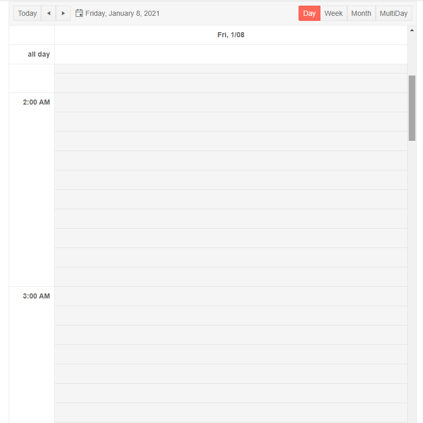
Here’s a UI that supports very granular appointments at 10-minute intervals:

The SchedulerDay/Week/MultiDayViews have a similar set of attributes. The MultiDayView, however, includes one additional attribute, which controls the number of days shown side by side in the view. The default is five (i.e. a typical work week) but, depending on your users’ personas and settings, you may want to give the user a longer or shorter time horizon.
As with all UX decisions, this choice depends on understanding your users’ personas and scenarios: Does the user find five days “too much information”? Is the user’s environment so volatile that looking more than three days out a waste of time? Does the typical scenario require two weeks of information? Answering these questions will let you choose the right number.
All these attributes give you a declarative way to create a UI that makes sense to your users. However, the Telerik Blazor Scheduler also lets you take complete control of the UI by leveraging the ItemTemplate. That feature deserves a post of its own, though—stay tuned for that one in the days to come.