Check out the latest features in Telerik UI for Blazor, including new native components, Grid features and much more. And don't forget to grab your free Blazor ebook!
The Telerik UI for Blazor2.10.0 release is here and brings three new native, Blazor production-ready components, new Grid features and multiple improvements! Our UI for Blazor library now includes new ListView, Pager and Checkbox components, Blazor Grid Frozen Columns, WebAssembly 3.2.0 Preview 3 Compatibility, a free Blazor ebook and more!
Let’s dive into the 2.10.0 release and review in detail all enhancements you can bring to your Blazor apps.
Telerik UI for Blazor Supports Both Server-Side and WebAssembly 3.2.0 Preview 3
The preview 3 of Blazor WebAssembly is out and it brings the long-anticipated debugging of Blazor WebAssembly apps directly in Visual Studio and Visual Studio Code! This means we can now F5 our Blazor Apps– just F5 and nothing else!
As always Telerik UI for Blazor releases go hand in hand with the preview versions released by Microsoft. We are happy to announce that the latest Telerik UI for Blazor 2.10.0 release is compatible with the latest preview 3 version of Blazor WebAssembly 3.2.0.
Will there be more Blazor WebAssembly preview versions before the official release in May? The answer is yes, as Microsoft has announced that in April there will be Preview 4, Preview 5 and the Release Candidate release of Blazor WebAssembly. Stay tuned for more exciting announcements for both the Blazor framework and the Telerik UI for Blazor suite!
Blazor ListView Component
Blazor ListView Component Overview
The new ListView component allows you to display items from a data source in a fully customizable templated list. Whether you are looking for ways to visualize a simple list of items or a more sophisticated product catalog in your Blazor apps, the ListView component offers all you need!
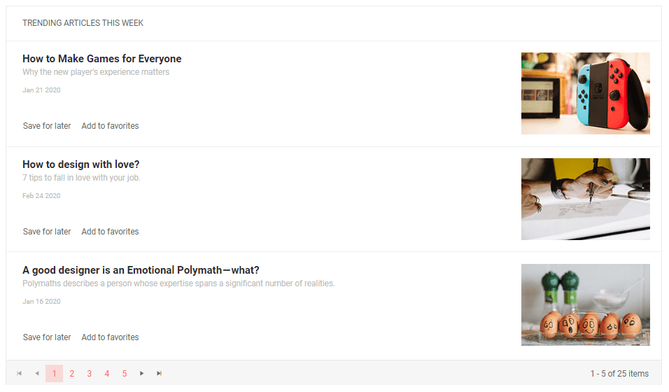
Telerik UI for Blazor ListView with Templates and Paging
Using the ListView component in Blazor apps takes a few steps:
- Add the
TelerikListViewtag - Populate its
Dataproperty with the collection of items you want to display - Define the
Templatefor the items and add the relevant styles to your Blazor app
<TelerikListViewData="@ListViewData"><Template><div><h4>@context.Name</h4><h5>@context.Team</h5></div></Template></TelerikListView>Blazor ListView Paging
Additionally, you can enable paging and set dimensions to the ListView.
<TelerikListViewData="@ListViewData"Width="700px"Pageable="true"PageSize="15">To enable ListView paging, set the Pageable parameter of the component to true, and the PageSize (number of rendered items) parameter to a particular number (defaults to 10).
Customizing Blazor ListView using Templates
The Template is the main building block of the ListView component. For each item in the control you define the layout through its Template, and you can use the context which is the model from the data source in order to get the information for the item.

Telerik UI for Blazor ListView Component
You can fully customize the ListView appearance through the various templates it offers:
- Template – defines how all items are displayed (mandatory)
- Edit Template - the rendering of an item in edit or insert mode (see next blog section)
- Header Template - your own content above the list of items
- Footer Template - your own content after the list of items and before the pager
Blazor ListView Editing
The ListView component can easily handle data create, update and delete (CUD) operations in your Blazor apps thought its EditTemplate and using CommandButtons.
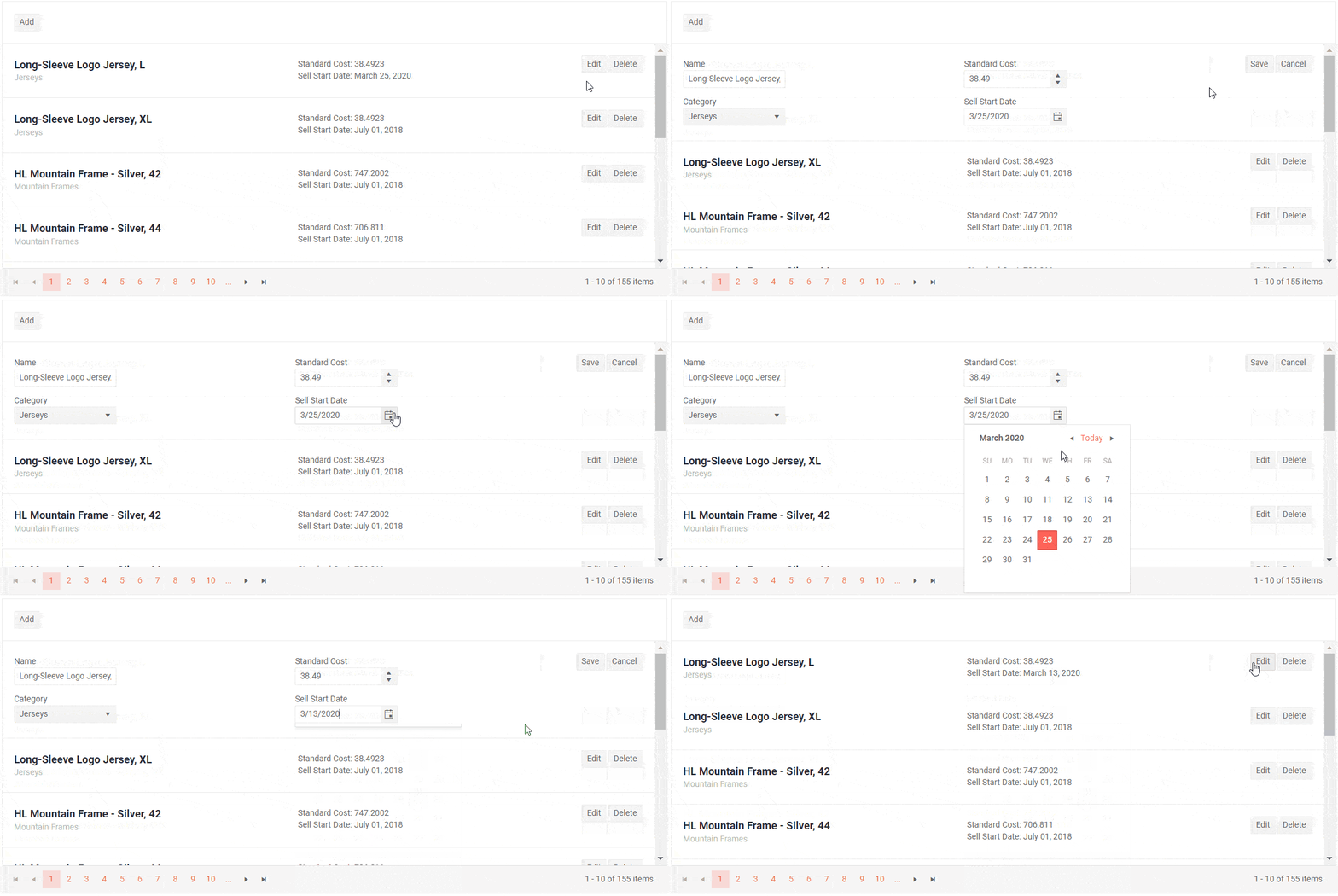
Telerik UI for Blazor ListView Editing
To invoke the commands, use the ListViewCommandButton component and choose among the following built-in command values: Add, Edit, Save, Delete, Cancel.
The command buttons expose the standard button features such as icons, text, primary state and an OnClick event handler that you can use to implement custom commands, although you can use any button or DOM event handler for that.
Blazor ListView Events
The ListView component exposes multiple events to let you handle data in Blazor apps. Below is a summary of the available events and their triggers:
- OnRead– fires when data is fetched
- OnUpdate - fires when an existing item is saved
- OnEdit - fires when the user clicks the Edit command
- OnCreate - fires when a new item is saved
- OnDelete - fires when an item is deleted
- OnCancel - fires when the Cancel button is clicked
- PageChanged - fires when the user pages though the ListView
Blazor ListView Custom Operations
The ListView component provides options for implementing your custom data source operations. Just add a button (or other UI component) and invoke the corresponding action – whether it is calculation, loading data on demand or any other update to the data source. Checkout the examples for Blazor ListView filtering and sorting.
Blazor Pager Component
Pager Component Overview
The Telerik UI for Blazor Pager is a standalone UI component that gives you the capability to split content and visualize it beautifully into pages.
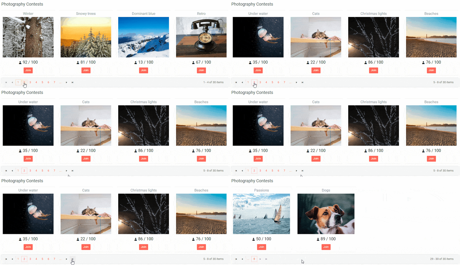
Telerik UI for Blazor Pager component
To add paging to your Blazor apps, you need to add the TelerikPager tag, set the Total param to the number of items in the data source, and PageSize the number of items to be presented on a page. Using the values of PageSize and Page parameters you can extract and render the desired subset of data.
<TelerikPagerTotal="@Games.Count"PageSize="@PageSize"@bind-Page="@Page"></TelerikPager>Additionally, you can set the maximum number of visible page buttons using the ButtonCount. To take effect the ButtonCount must be smaller than the pages count (ButtonCount < Total / PageSize).
Pager Component Two-Way Binding
You can use two-way binding for the Page parameter, so it can respond to changes from other element, and also to update other elements.
Below you can see an example of how the Pager component behaves when the page is selected from an outside input.
<divclass="mb-3"><labelclass="text-info">Select a page:<TelerikNumericTextBox@bind-Value="@Page"/></label></div><TelerikPagerTotal="30"PageSize="@PageSize"@bind-Page="@Page"/>@code {public int PageSize { get; set; } = 3;public int Page { get; set; } = 1;}
Telerik Pager with outside input
Pager Load Data on Demand
For cases when you don’t want to load all data at once, you can use the PageChanged event of the Pager component. The PageChanged event fires when a new page is selected, and it allows you to fetch new subset of data for each page, as users browse through the content. Checkout an example of how to implement paging with load data on demand.
Pager Component Integration
We use the Pager component in our own Blazor components from the Telerik suite (like the Grid and the newly released ListView), and now you can use it with your data and templates too!
Pager Component Built-In Localization
The Pager Component has built-in localization support, which makes it easy to translate texts to any language that your Blazor app may require.
Pager Component Built-In Keyboard Navigation and Accessibility
Like all other Telerik UI for Blazor components, the Pager component supports out of the box Keyboard Navigation and web accessibility standards implementation. This enables easy navigation through pages using just keyboard, as well as access to component content through assistive technologies.
Blazor Checkbox Component
Blazor Checkbox Component Overview
The new Checkbox component will let you add styled and customized Checkboxes to your Blazor apps. App users can select one, many or all of the listed options.
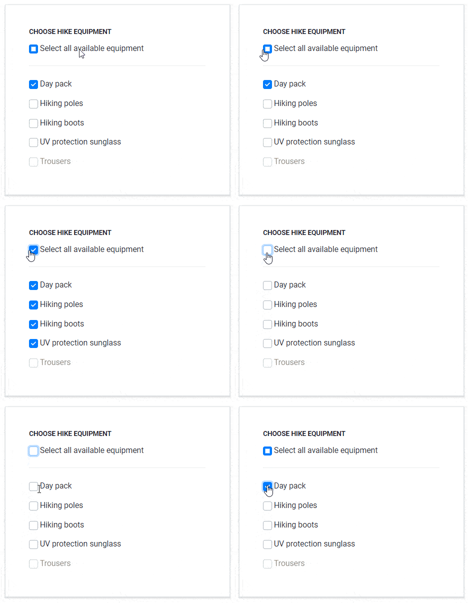
Telerik UI for Blazor Checkbox Component
To add a Checkbox component to your Blazor app add the TelerikCheckbox tag and bind it to a value. Add a label with a caption for the Checkbox and you are ready to go!
<TelerikCheckBoxId="myCheckbox "@bind-Value="@isChecked"/><labelfor="myCheckbox ">@( isSelected ? "Checked" : "Not Checked" )</label>@code{private bool isChecked { get; set; }}The Telerik Checkbox component provides the basic checked and unchecked states, along with a third state - Indeterminate (something in between - neither checked, nor unchecked). You can use the indeterminate state for “Check All”/ “Select All” top level Checkboxes that include sub-options with different states, or when you need to present a third ‘undefined’ option such as Yes/No/Maybe.
Need to go out of the ordinary and add a fancy Checkbox to your Blazor app? You can add customstyle, icons and change the default checkmark – check out the dedicated KB article.
Checkbox ValueChanged and OnChange Events
The Telerik Blazor Checkbox component exposes three events:
- ValueChanged - fires every time the Value parameter changes. The event is an EventCallback and it can be synchronous (return void), or it can also be asynchronous and return async Task.
- OnChange - fires every time the Value parameter changes. The key difference with ValueChanged is that OnChange does not prevent two-way data binding (using the @bind-Value syntax).
- IndeterminateChanged - fires every time the Indeterminate parameter changes (this happens when the checkbox was indeterminate, and the user clicks it to toggle it to a checked/unchecked state)
Data Grid New Features
Blazor Grid Frozen Columns
With the Telerik UI for Blazor 2.10.0 release we continue our focus on expanding the data Grid component, and implemented Frozen Columns (requested and voted via the UI for Blazor Feedback portal).
The new feature will allow the users to fix important columns in the grid and have them visible while performing horizontal scroll.
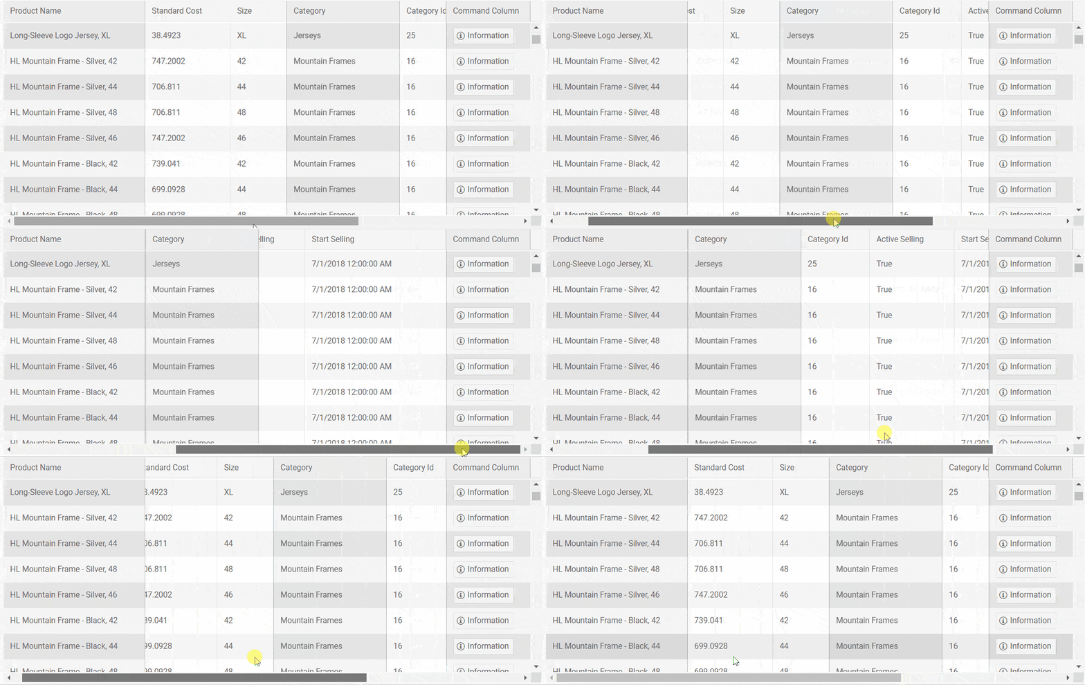 Telerik Blazor Grid Frozen Columns
To enable Grid column freezing in your Blazor apps, all you have to do is set the grid column Locked parameter to true.
In the example below is shown how to freeze the first and last columns of the Blazor Data Grid, however if needed you can also freeze columns in the middle of the Grid.
<TelerikGridData="@GridData"Width="850px"Height="400px"><GridColumns><GridColumnField=@nameof(Product.ProductName) Title="Product Name"Width="150px"Locked="true"/><GridColumnField=@nameof(Product.UnitPrice) Title="Unit Price"Width="150px"/><GridColumnField=@nameof(Product.UnitsInStock) Title="Units in stock"Width="150px"/><GridColumnField=@nameof(Product.CreatedAt) Title="Date created"Width="250px"/><GridColumnField=@nameof(Product.Discontinued) Title="Discontinued"Width="150px"/><GridCommandColumnWidth="250px"Locked="true"><GridCommandButtonCommand="CustomCommand"Icon="information"OnClick="@((GridCommandEventArgs e) => Result = $" click from {(e.Item as Product).ProductName}" )">Information</GridCommandButton></GridCommandColumn></GridColumns></TelerikGrid>Blazor Grid Multiple Rows Selection
To give additional flexibility when selecting multiple data rows via a Checkbox column in the Grid, we added a new parameter SelectAllMode. You can now configure whether all grid data should be selected, or only the currently loaded rows in the Grid. The SelectAllMode param accepts two values:
- Current – selects the currently visible data rows (that includes paged data, filtered data or partially loaded data using virtualization)
- All – selects all loaded data rows
Here's an example of how to use the SelectAllMode parameter within the Grid:
<pre language-html"=""><code language-html"=""><GridCheckboxColumn SelectAll="true" SelectAllMode="GridSelectAllMode.Current"></GridCheckboxColumn>Initiate Insert or Edit of Grid Items from Code
We introduced Blazor Grid State in our previous release blog post, and in this edition let's look at initiating insertion or editing of grid items through your own code, without requiring users to click Command buttons.
Saving the Grid state enables you to store the currently edited by users’ items – both their original version from the model that is being edited and the newly inserted one. For cases when you want to save edited values on every keystroke, you can use a custom editor template and update the EditItem / InsertedItem fields of the state object, then save the state into your service.
Additionally, you can use the state fields: EditItem, OriginalEditItem and InsertItem to put the Grid in edit/insert mode through your own application code, instead of needing the user to initiate this through a command button.
Check out the official documentation article with example on how to initiate inserting/ editing of items from code in Telerik UI for Blazor Grid.
Blazor Free E-Book

Between the 2.9.0 and 2.10.0 releases, our colleague Ed Charbeneau, MVP and Blazor guru packed up great Blazor topics and tons of code examples in his new book “Blazor, A Beginner Guide”.The book is free for download, dedicated to the .NET community and aims to get you productive with Blazor in no time.
Get Blazor: A Beginner's Guide
Download Telerik UI for Blazor 2.10.0
Head over to the Telerik UI for Blazor page and download the 2.10.0 version of Telerik UI for Blazor Native Components. Keep telling us what’s working well, what needs to change and what you’d like to see nextin the dedicated Blazor feedback portal or in the comment section below!
Try the Latest in Telerik UI for Blazor
Thank You!
Thank you for being involved and helping us grow and making Telerik UI for Blazor bigger and better.