The R1 2020 release of the Kendo UI jQuery components is here and brings the new file manager, badge, and bread crumb components along with grid column virtualization and editor improvements.
The start of the year is here, and that means R1 2020 is also upon us! This release comes with a ton of new components, and some of the top-requested features in existing components, so let’s jump straight in and see what’s new for Kendo UI for jQuery in R1 2020!New Components
New Component: Breadcrumb

The new Kendo UI jQuery Breadcrumb component gives developers a simple and intuitive interface for moving through various levels of hierarchy of navigation. Often a heavy-hitter in documentation pages, a Breadcrumb can used in just about any website to help users navigate in a hierarchy of web pages.
See the Breadcrumb component in action by heading over to the Kendo UI Breadcrumb demo page.
New Component: Badge

Popularized by icons on mobile devices to indicate unread messages or notifications, the badge component has found several usages in the general web world. With the new Kendo UI Badge widget developers can add badges to existing Kendo UI components, their own UI elements, and even display the badge by itself to provide some additional contextual information to something on the page.
For samples and a bit of a deeper dive, jump on over to the Kendo UI Badge demo page!
New Component: File Manager
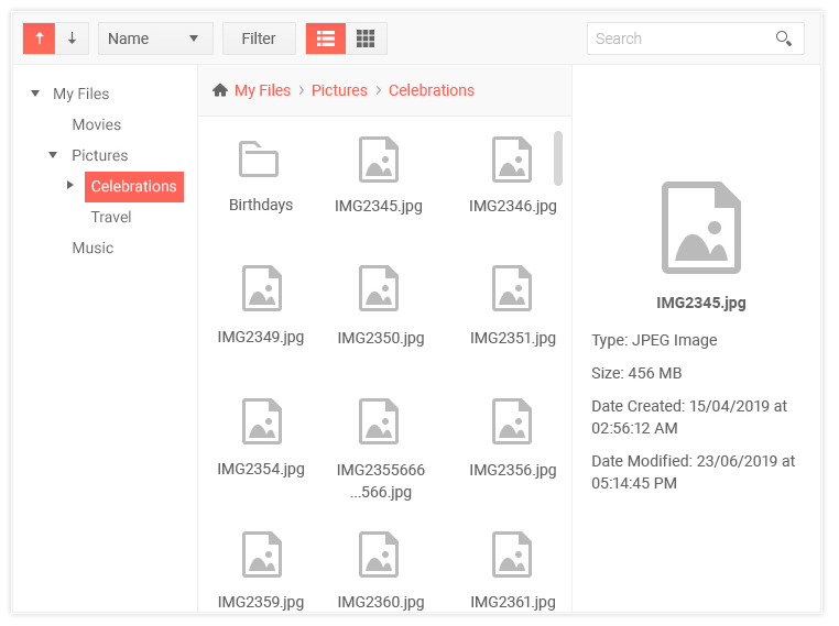
One of the most highly-requested components throughout the years, the new Kendo UI File Manager component lets end-users navigate through folders and files, similar to features found within Windows Explorer, to help manage file storage within their web applications. This can be used in conjunction with components like the Editor to select images or used as a standalone component to help users upload, download, and organizes files or folders.
There's a lot that goes in to this component so for a deeper look in to how this all works you can refer to the Kendo UI File Manager demo page.
Expanded Component Features
Checkbox & Radio Button Updates


While we have styles available for checkboxes and radio buttons for quite some time, our approach has been a bit opinionated and not extremely flexible. This mainly comes from needing to support styling in older browsers and ensure cross-browser compatibility. However, since then many of these older browsers have phased out of use. Therefore, with R1 2020 we decided to re-evaluate how we style these two input elements and have now introduced a more modern approach to styling these components.
This doesn’t just apply to how they look, it also applies to how you can implement them. Traditionally we required an <input> tag immediately followed by a <label> tag:
<! -- Kendo UI Checkbox -->

<input type="checkbox" id="checkbox" class="k-checkbox">

<label class="k-checkbox-label" for="checkbox"></label>

<!-- Kendo UI Radio button -->

<input type="radio" id="radiobutton" class="k-radio">

<label class="k-radio-label" for="radiobutton"></label>
With the new styling the order does not matter (label can come before the input), you can wrap the entire checkbox in a label, and you can even ignore the label altogether if your requirements call for it! For more information head on over to this documentation article to see the checkboxes and radio buttons in action.
Grid - Column Virtualization
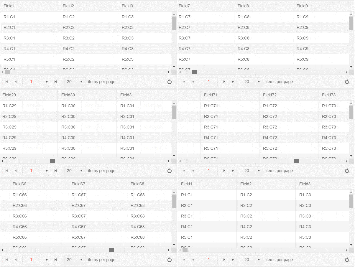
The new Column Virtualization feature of the Kendo UI jQuery Grid lets users smoothly scroll through data sets with many columns without seeing a performance impact on rendering a large amount of extra HTML, which was the case previously. Thanks to recycling HTML elements and the cells of the Grid, users can now scroll horizontally throughout the entire column collection without any performance hiccups.
While an animated GIF can certainly help show the awesome performance improvements this can provide, a demo is worth a thousand words (that's a common saying, right?). Check out the column virtualization demos, and links to more documentation, right here.
Tree List - Search Panel
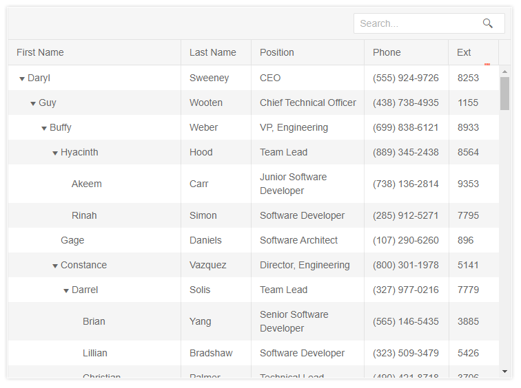
The new Search Panel feature in the Kendo UI TreeList provides a quick way for users to filter the content of the TreeList with a single text input in the top toolbar of the TreeList. How this filters, and which fields across the data end up being filters, can be configured with just a quick set of configuration options – ensuring that any search fits the requirements of your users.
Head on over to the TreeList Search Panel demo to see just how easy it is to implement this in your TreeList today!
Editor - Merge Table Tool
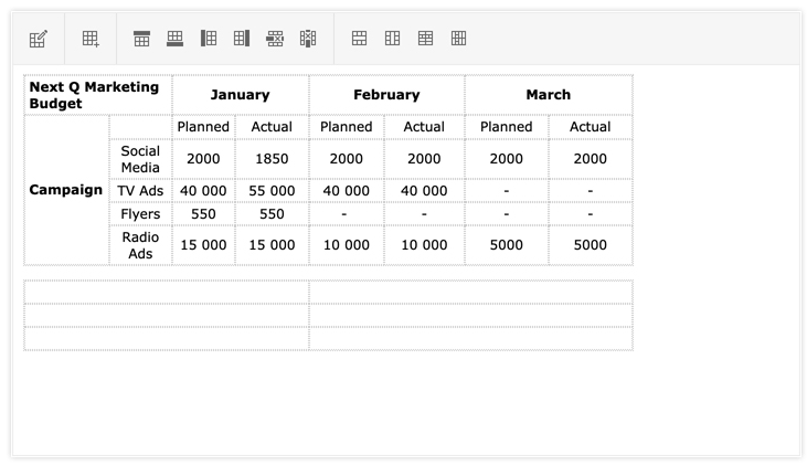
Thanks to the new Merge Table Tool for the Kendo UI Editor end-users can easily create and update the layout of any table element in the Editor’s content. This allows for interactions like merging two cells next to each other in a row, or even merging them in cells within a column – all through a single toolbar interface.
A demo of the new Merge Table tool can be found right here.
Editor - Format Painter Tool
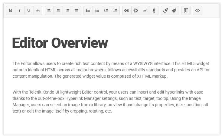
The Format Painter is a standard tool within many rich text editors. This feature allows users to select a section of text to copy formatting (font, size, color, etc.) and apply it to another section within the content. With R1 2020 the Kendo UI jQuery Editor now has built-in support for this feature exposed in its collection of default tool options.
To play around with the Format Painter tool head on over to this demo.
Scheduler - Auto-Sizing & Adaptive Height of Events
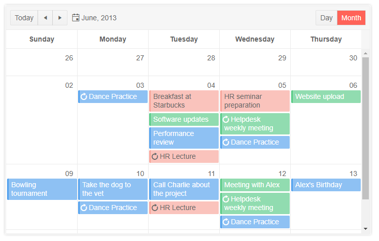
The new auto-sizing of events feature in the Kendo UI Scheduler allows for variable heights to be displayed across various events and days. This means that days with many events, and events containing additional information, end up being sized differently than days with no events displayed.
In a similar vein, the Scheduler's new Adaptive Slot Height feature lets the slots of the month view of the Scheduler automatically adapt to the number of events that needs to be displayed in a particular day.
Filter - Custom Filter Function
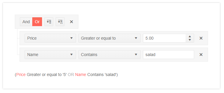
The Kendo UI filter component has received a whole slew of new features, including the ability to create custom filter functions. This enables developers to create their own custom filter operation (say, all products with even number of units in stock) outside of what the Filter component has as a default – giving a deep level of customization to this already powerful component.
Filter - Custom Operators Per Field
By default the Kendo UI Filter component offers all filter operators (equal, not equal, contains, etc.) on every field. With the new Custom Operators feature developers can now pre-define an explicit list of available operators. This gives another level of customization to the Filter component as every field can now have a unique set of operators that make sense just for that field.
Filter - Format Expression Preview
With the Format Expression Preview feature, the Kendo UI Filter component now lets users configure a format string to be used on any filter expression generated by the Filter component. This is especially important around strings like dates which can be formatted in a multitude of ways. Now, creating a format for each field is as simple as defining the format configuration option.
Timeline - Shared DataSource Support
The Kendo UI Timeline component is now able to share a DataSource with any other data-bound Kendo UI component without any odd workarounds or additional requests happening. Perfect for scenarios where a Timeline is bound to common data set with a Kendo UI Grid, or any other component that represents the underlying data set.
Have Some Feedback?
Did you love something that we released with R1 2020? Missing any features or components that you’ve been waiting for? Feel free to comment in the comment section below, or head on over to our public feedback portal and add your ideas there! Many of the items we added with R1 2020 came directly from items brought up in our feedback portal so it’s a great way to ensure that we add a component that you need!
Join Us For a Live Webinar!
Want to see all of the components and features mentioned above (and more) live and in action? Join myself and my colleagues on the Kendo UI team during our live webinar on Thursday, January 23rd at 11:00 AM ET! We’ll be covering all of Kendo UI throughout the day, but the jQuery-specific section will kick things off right at 12:00 PM ET! Seats are limited, so head on over to the webinar page to sign up today and reserve your seat!