The R1 2020 release of KendoReact is here and it brings new React UI components including the Drawer, Checkbox, Card, Avatar, and Form components. Additionally, the TreeList and Scheduler received a whole slew of updates.
The KendoReact team has been very busy the last couple of months, and the fruit of all these labors can be seen with the latest release: R1 2020! Let’s just jump straight in to see what is new in the top UI library for React development!
New Components
New Component: Drawer
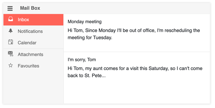
The new KendoReact Drawer widget provides a standard drawer with expand and collapse functionality for the ultimate navigation experience. The component lets users define icons and text for each navigation item and comes with features like a mini mode to display only the icons for each item to help minimize real estate occupied by the component.
To see the new React Drawer component in action, head on over to the KendoReact Drawer documentation page.
New Component: Form
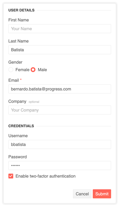
The KendoReact Form component is a small and fast package for form state management with zero dependencies. Built from the ground up, this component was created based on customer feedback and best practices around building forms. Initially built to help support more advanced components like the Scheduler, with R1 2020 we wanted to deliver this as a standalone component for all React developers to be able to use, even if they end up never using other KendoReact components.
For more examples and insights you can jump on over to the KendoReact Form documentation section.
New Component: Checkbox

So far styling a checkbox has been possible by just applying a CSS class found within the KendoReact themes to an HTML input element. While this has worked OK so far, we realized that there are some drawbacks with this approach, and it missed some deeper integrations with React. This is why we decided to create a new, standalone, checkbox component for React!
This will help provide a uniform look-and-feel across all UI elements in a React app written with KendoReact, and of course be used internally in our own components. Beyond being integrated with various design languages, the Checkbox component provides support for checked, unchecked, indeterminate, and disabled states, as well as built-in properties to handle items like accompanying label. Of course, the component is fully accessible and is compliant with WCAG 2.1 and WAI-ARIA standards.
Click here to get to the Checkbox documentation section for more samples and code!
New Component: Card

The KendoReact Card widget is an additional layout element to help developers set up beautiful and modern application designs. Popularized with Bootstrap and Material Design, this layout component can be used by itself or as a part of a template for other components such as the ListView to create a compelling user experience.
For more demos and samples showcasing the Card component, head on over to the KendoReact Card component docs!
New Component: Avatar
![]()
Avatars represent many things in applications today; profile pictures in social media, chat heads in messaging platforms – even icons. With the KendoReact Avatar component developers can easily add a sleek way to represent people or entities in your application by setting an image, icons, or using initials (e.g. “CB” using my initials). The shape of these items can be set as square, circle, or a general rounded shape via a quick configuration option.
To see more examples of the React Avatar component in action head on over to the KendoReact Avatar documentation page.
New Component: Filter
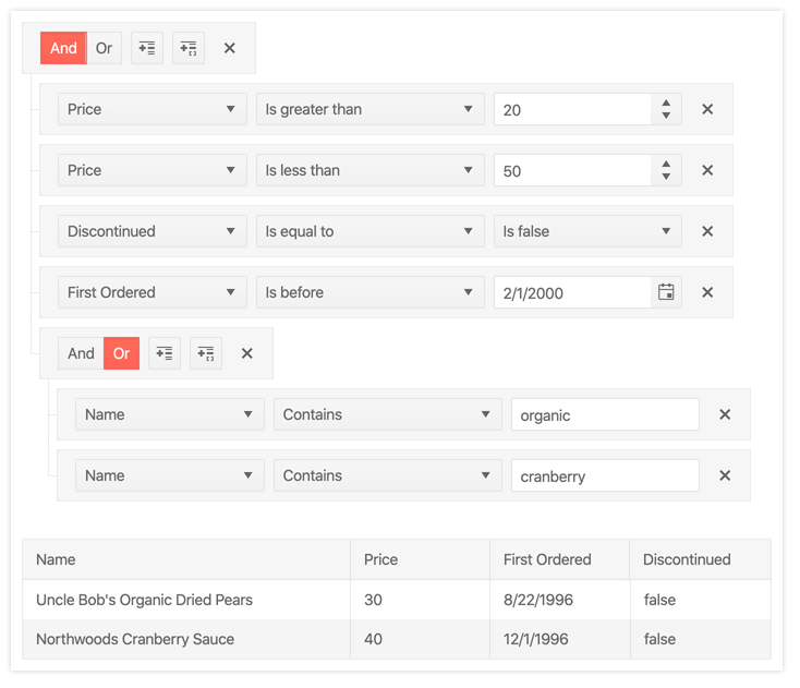
Creating filter expressions can be so much more than a simple starts with and contains tied to a single checkbox. While this may work in some scenarios, often users need to work with multiple filters and combining them in various ways (“unit price above $18 and products in stock,” as an example). This means that filtering can quickly become quite complex. This is where the KendoReact Filter component comes in, providing an intuitive user experience for building filter expressions ranging from simple to very complex filters. These can then be used with other KendoReact components, like the Data Grid, or be used to filter any data collection.
To play around with the React Filter component check out the KendoReact Filter documentation section.
Data Tools Package Updates
Initially introduced with the inclusion of the KendoReact Pager component, the Data Tools package continues to expand by including other helpful libraries and UI components to help manage data collections – including the new React Filter component.
Expanded Component Features
NumericTextBox - Refresh
The NumericTextBox was the first KendoReact component ever written and throughout the years we have seen several requirements and scenarios beyond our initial scope of the component. That’s why we spent time on reworking the NumericTextBox to ensure that it can accommodate all the user experience scenarios that we have discovered for the component.
Scheduler - Custom Rendering
The KendoReact Scheduler provides a default design across events and other elements of the component, which changes depending on which design language is implemented along with the component. With the new Custom Rendering feature our React Scheduler allows for easy control over the look-and-feel of events, giving users the ability to completely customize the rendering of the Scheduler.
Scheduler - Keyboard Navigation
With the new Keyboard Navigation feature, the KendoReact Scheduler has full support for navigating and interacting with its various elements by only using the keyboard as input. This provides a potential for a higher level of productivity and helps in accessibility scenarios where keyboard navigation is the only option for interaction with a web application.
Scheduler - Accessibility
Continuing with a strong commitment to accessibility, the KendoReact Scheduler is now compliant with accessibility standards like WCAG 2.1 and WAI-ARIA. This is provided out-of-the-box with the component, ensuring that any React developer can increase their application’s level of accessibility just by including the latest version of this React Scheduler.
TreeList - Column Virtualization
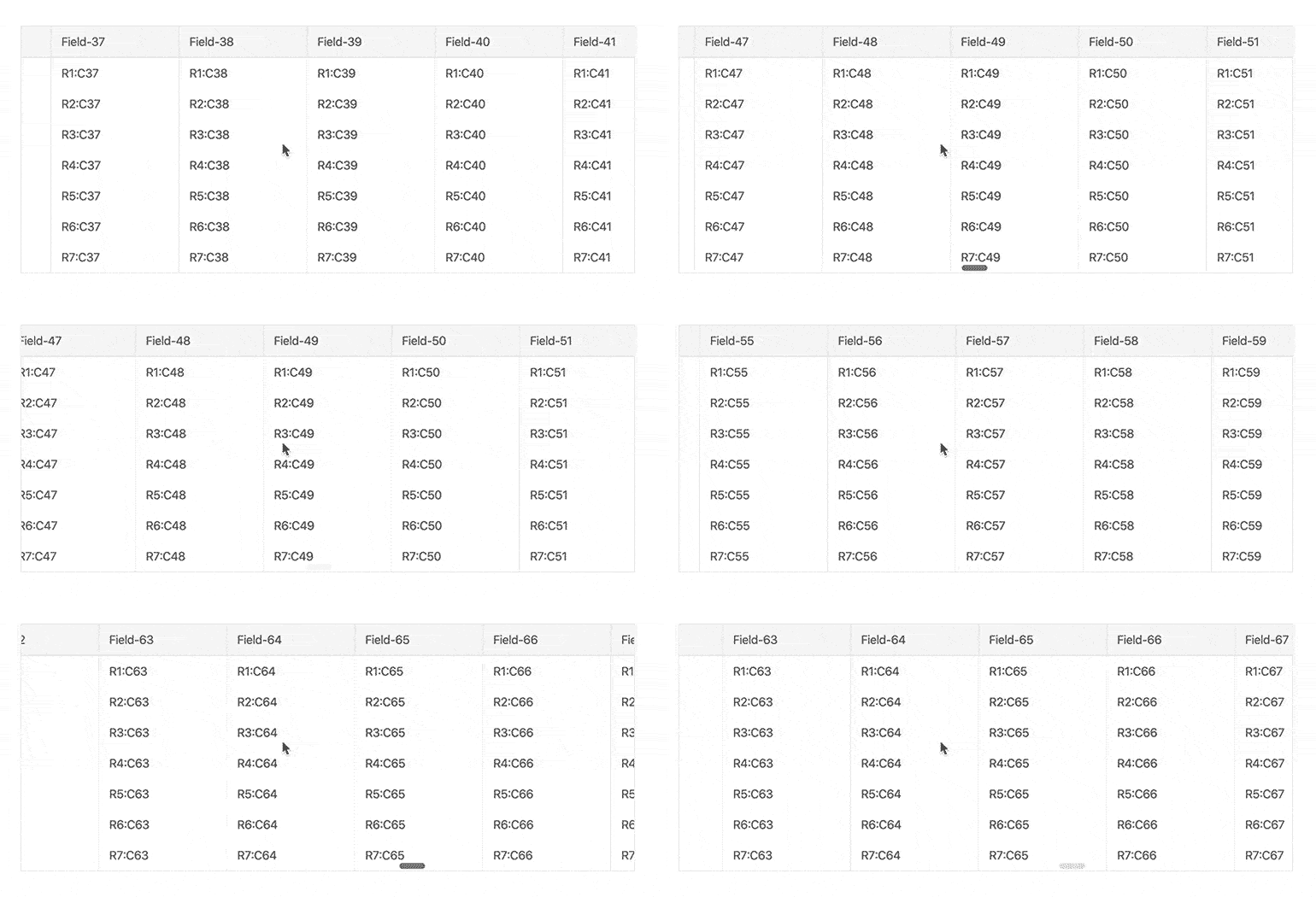
Thanks to the new column virtualization feature, the TreeList component can handle data with large sets of columns across its data set. Virtualization works by loading data as is needed and recycling UI elements on the page as users scroll across columns. This leaves the impression of the full data set without the performance penalty of loading all that HTML to the page.
Here's a quick link to the column virtualization demo that highlights how to implement this today.
TreeList - Frozen Columns
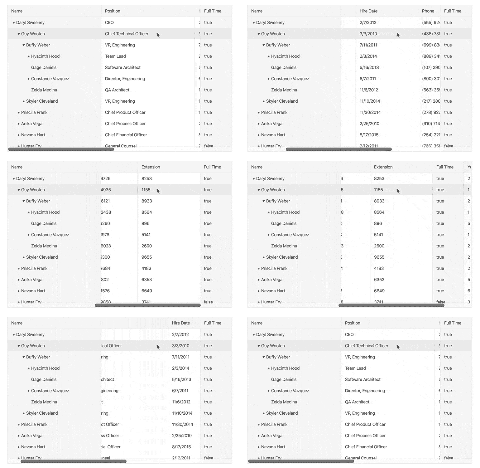
Displaying data in a column structure is crucial for the TreeList, and certain columns may need to be displayed permanently as users scroll horizontally. With the new frozen columns (alternatively: locked columns) feature, the KendoReact TreeList can easily freeze/lock a column on the left or right-hand side of the component upon initial rendering, or as it is scrolled past by the end-user.
For code samples of how to implement frozen or locked columns, head on over to this documentation article.
TreeList - Resize & Reorder Columns
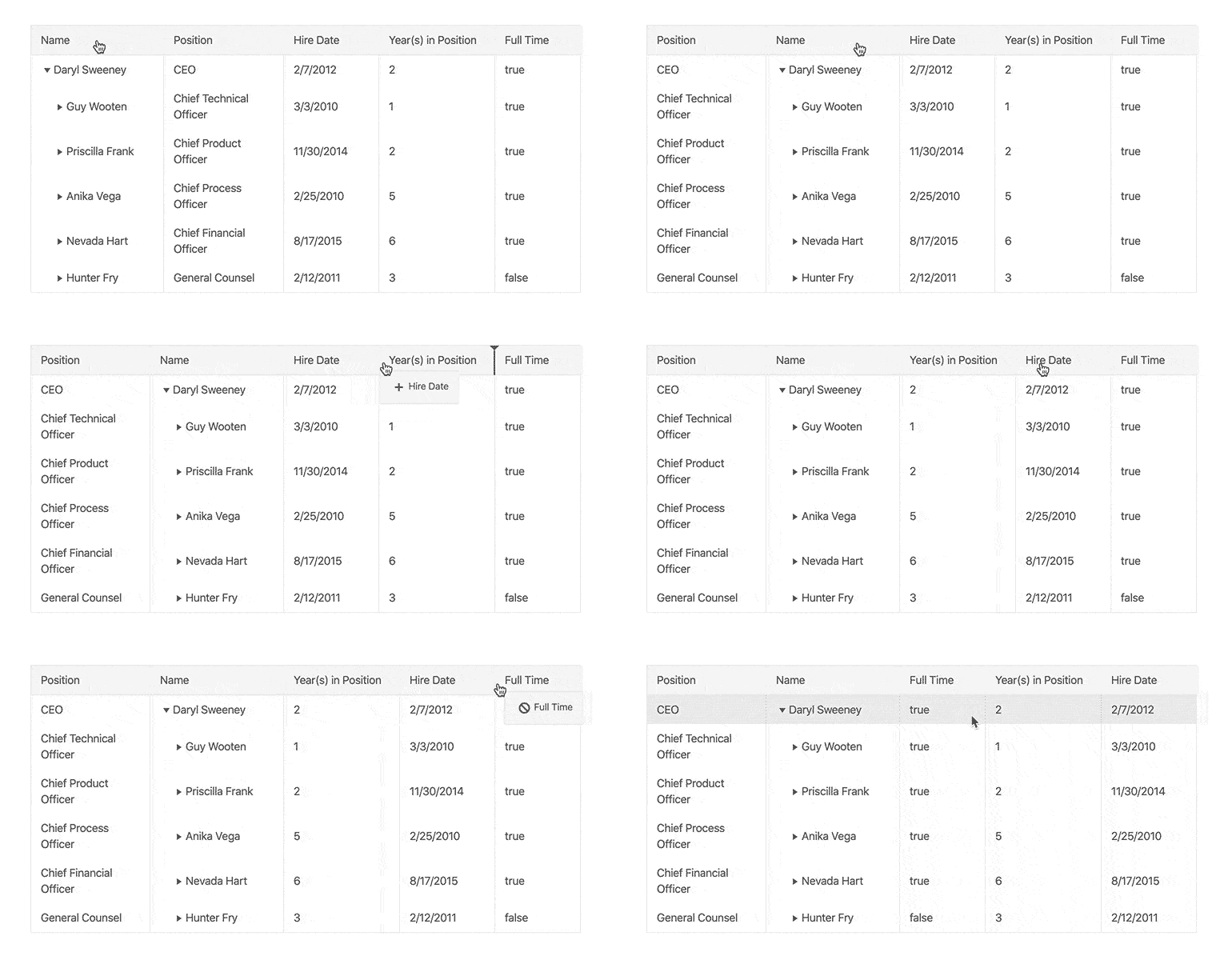
Expanding on the available column features of the React TreeList this new release provides the ability for end-users to resize the width of the columns by dragging a resize indicator, or even reorder the sequence in which columns are displayed. This ensures that any view of their data can be customized and tweaked to fit their screen and needs.
As a quick reference, clicking here will bring you to the TreeList column resizing demos, and this link will bring you to the TreeList column reordering demos.
TreeList - Multi-Column Headers
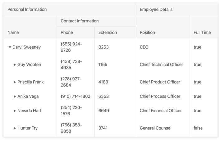
Often a column may need more context than simply its field name in the header – especially if columns are related in some way. Thanks to the KendoReact TreeList’s Multi-Column Header feature, developers can add parent headers that span across multiple column headers. These can also be reordered and resized, representing the entire group of child columns that they encompass.
New Stock Portfolio Dashboard Sample App
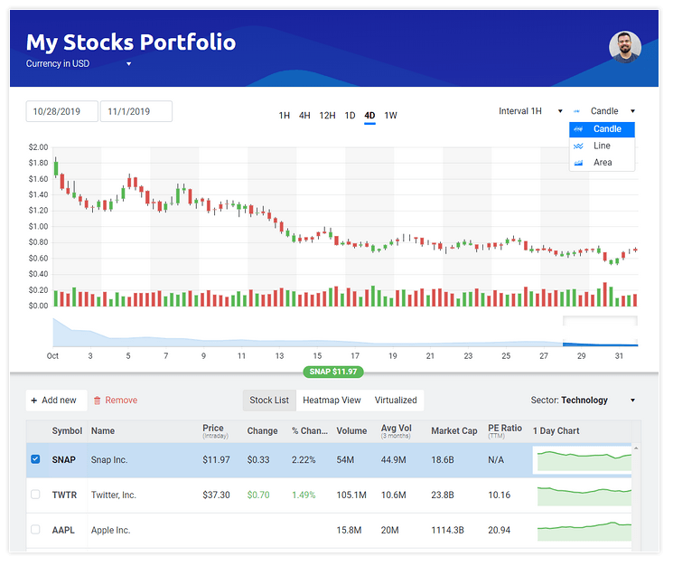
As a part of or constant ongoing effort to help KendoReact developers be more productive, we wanted to take the time to put together a sample application that highlights our most popular components in a highly requested scenario: a financial dashboard. This is why we created the Stock Portfolio sample app that provides a slick interface for showcasing live updating data and interacting with our components to look over the history of certain stocks. For those interested in the source code for the Stock Portfolio application, head on over to the GitHub repository page.
This sample includes the KendoReact Data Grid, Data Visualizations (Stock Chart is highly visible) and various Form elements to help create a pleasant UX for highlighting financial data. This is also a great way to learn the KendoReact components and how they can be used to build line of business applications.
Got Feedback?
Did we miss your favorite component or feature with this release? Have you had a chance to try out a new component and want to provide some feedback on what we can add? Feel free to comment in the comment section below, or head on over to our public feedback portal and add your ideas there! Many of the items we added with R1 2020 came directly from items brought up in our feedback portal so it’s a great way to ensure that we add a component that you need!
Join Us For a Live Webinar!
Want to check out the features I just mentioned above live and in action? Join myself and my colleagues on the Kendo UI for KendoReact team during our live webinar on Thursday, January 23rd at 11:00 AM ET! We’ll be covering all of Kendo UI throughout the day, but the KendoReact-specific section will kick things off at 11:30 AM! Seats are limited, so head on over to the webinar page to sign up today and reserve your seat!