In this post I'll go through four ways to design your subscription elements and notices to encourage more users to move past the free trial.
There are a number of ways to monetize a mobile app. Some apps, of course, require users to purchase before being able to install them, but a paywall without any brand-name recognition isn’t likely to work. Instead, you’re more likely to use monetization strategies like banner and interstitial ads, in-app purchases and upgrades and sponsored content.
There’s also the freemium subscription model to consider. Apps that use this monetization strategy advertise themselves as “free” in the app store, but, once installed, it becomes clear that the really good stuff is hidden behind a paywall. A subscription could be something as simple as making the app an ad-free experience or could offer users a wide range of exclusive benefits and add-ons.
With consumers flocking more and more to the convenience and cost-effectiveness of subscription services, this is a prime opportunity for app developers and owners to take advantage of.
That said, this isn’t always the easiest of monetization models to design for. After all, you don’t necessarily want the free features of the app to be so good that users see no reason to upgrade. Conversely, you don’t want there to be too few free features, or else users won’t be able to get a true sense for the app’s value. It’s a tricky balancing act for sure.
So, what can you do about this as a designer? This post will explore some things you can do to encourage more users to take the leap.
How Do You Get More Mobile App Users to Subscribe?
Although you won’t be able to convert 100% of the users who’ve downloaded your app, you want to ensure that your app turns as many of its happy users into subscribers as possible. Here are some ways you can do that:
1. Delay Gated Content
One of the problems with “free” news apps like the New York Times or Medium is that they’re not really free at all. Users get to read three articles for free before they’re forced to subscribe or get out (at least until that number resets the following month).
Of course, the app store isn’t going to force apps like these to change from free to paid. Either way, the app stores get paid (they get a percentage of all app sales or in-app subscriptions).
But how do you think app users feel about this sort of bait-and-switch?
Unless you’re building an app for a well-recognized brand like the NYT, you can’t afford to gate off your app’s content right away. Users should be able to explore most of what your app has to offer at their leisure. And once they see the real value in it, they’ll naturally make the decision to upgrade.
One app that does this well is Calm.
The very first thing new users see is this question: “What brings you to Calm?”
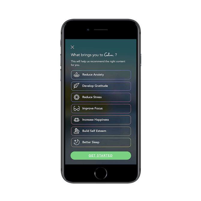
It’s clear right from the start that Calm is going to be a safe, warm, and welcoming space for users. That said, Calm isn’t really meant to be used as a free app, which is why it’s important to show this next screen to users early on:
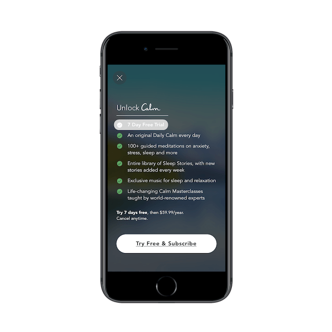
This sets the stage for what’s to come. “Yes, you can use our app for free, but do know that there’s a lot more you can do with it if you subscribe.”
Now, although Calm offers subscriptions, it’s not forced in any way. There’s no limit on how long a user can use an app or how much content they can consume before they’re given the choice to ante up or leave.
Instead, users can use the free features of the app as much as they like:
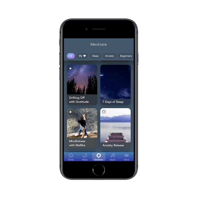
Whether users want to meditate, listen to music, or use a sleep story, Calm makes all areas of the app available to users. The only catch is that content marked with a lock is gated off and only available to subscribers. But that’s fair.
If you take a look around the app, you’ll notice that most of the free content is centered around introducing users to meditation and wellness. This is a smart marketing tactic, as it gets users invested in establishing a routine and mastering the basics. The subscription upgrade then becomes the logical choice when they decide to level up.
The only thing I will say about this app is that I wish the content were better organized. I get why they mix the free and gated content up. They want users to get so excited about everything available that they forget to check for the lock symbol. But that can add friction to the experience when there’s no need for any. Instead, what I’d recommend is sorting each page of content so that the free stuff flows to the top and the paid content appears below it.
2. Be Explicit About Premium Content
Dark patterns are never a good idea in design. Sure, it might lead to some conversions when users accidentally stumble upon your subscription page, but most of them are going to be frustrated with the bait-and-switch.
It’s best to be honest with your users.
Take MyFitnessPal, for instance.
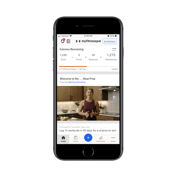
For the most part, users could get away with using MyFitnessPal as a free app. And I think that’s why the app designer kept any references to the subscription out of the way. Aside from this splash screen that’s displayed before they enter the app, there’s really no pressure on users to subscribe:
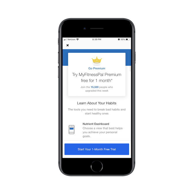
Once this interstitial is dismissed, users won’t see it again unless they click on “Go Premium” in the top-right corner of the screen or decide to “Explore Premium” from the menu:
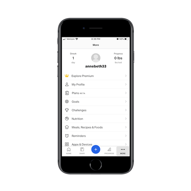
Notice how the premium offering isn’t hidden under a hard-to-recognize symbol, nor is it placed in parts of the app where users might unintentionally click on it. It’s always called out for what it is: access to a premium subscription.
This is the kind of design/copy choice that would certainly help a subscription app get more subscribers.
3. Keep Subscription Requests to a Minimum
On a related note, it’s a good idea to keep subscription requests to a minimum. In general, it’s a good practice not to overwhelm users with any monetization tactics. You want them to feel like the app was built to serve them, not solely to pull in money from as many advertisers, sponsors, or users as possible.
An app that does this really well is Instacart.
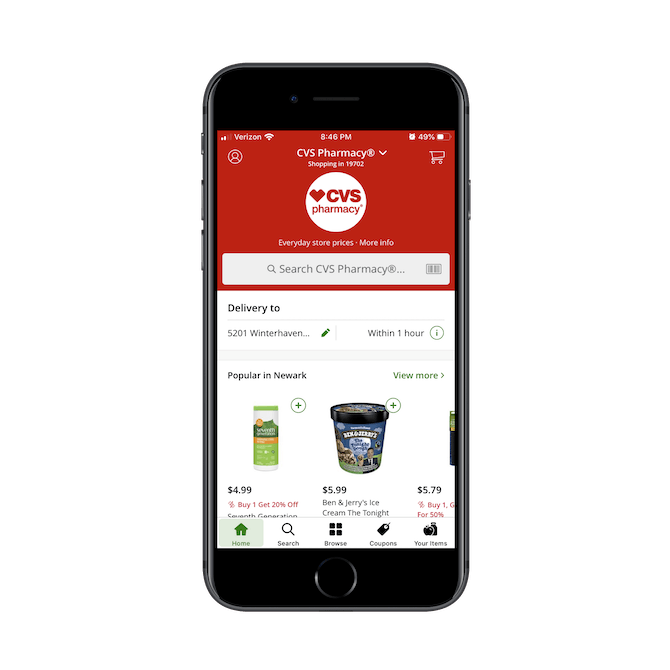
Ads are non-existent in this app, and the subscription service gets barely a mention. This allows users to sign in and immediately get to shopping.
The first time they’re likely to encounter mention of the subscription is in their settings menu:
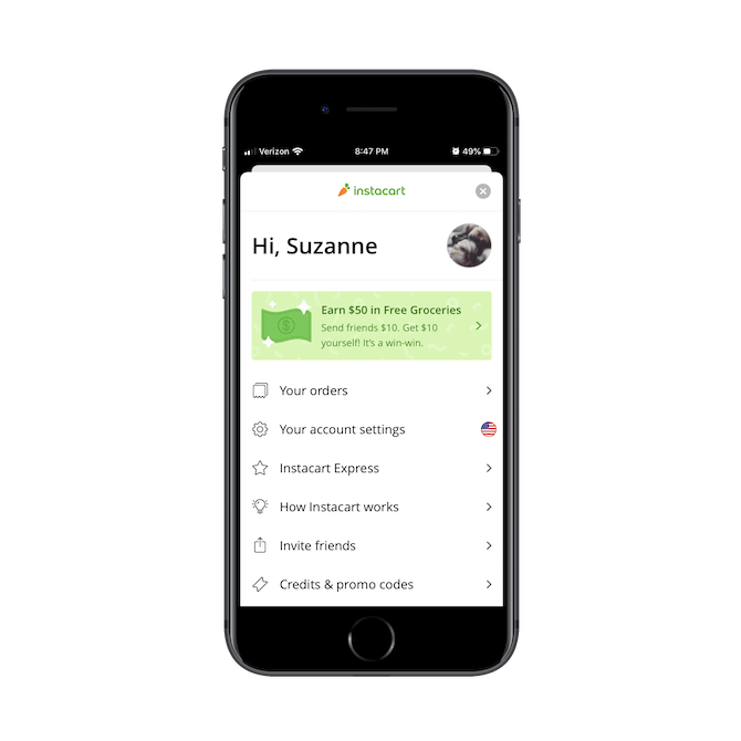
Instacart Express is Instacart’s premium offering and promises the following benefits to subscribers:
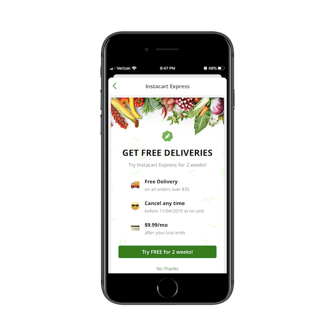
As you can see, Instacart Express makes a simple promise: get free deliveries. That might not seem like that valuable of an incentive to subscribe, but consider it from the perspective of people who order groceries through the app regularly. Those delivery fees add up.
Another time users will see mention of this subscription is at checkout:
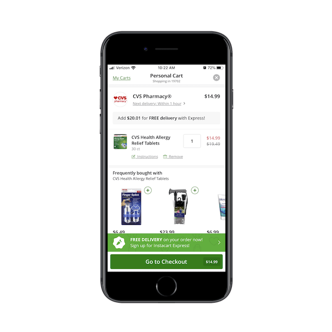
The light green banner above the “Go to Checkout” button is well-positioned and well-timed. If a user has gotten to this point in the app, then they’re ready to open their wallets. And the offer of free delivery is certainly something they’re going to think about at this stage.
So, as you design your own subscription reminders, think not just about frequency of those reminders, but placement, too. All you might need to do is place a small note or suggestion at just the right moment to increase your conversion rate.
4. Make the App Feel More Social
This last tip has less to do with adding social components as a feature of a subscription and more about encouraging your users to share in the experience with people they know right from the get-go. Think about it like this:
Jennifer installs your app. She’s enjoying the free features of the app so much and is excited to see that she can interact with her friends and family through it. So, she connects it to her Facebook account and starts sharing the experience with them.
Now, Jennifer hadn’t even thought about exploring the subscription or its features. Why? The free app is great! However, her brother Dan upgraded recently and he loves the extra features, says it’s worth the monthly cost. So, Jennifer decides to give it a try, too.
When an app becomes a place to interact with others, there’s definitely a greater investment in it — logging in every day, making use of all its features, and maybe even upgrading.
So, as you look for a way to entice free users to subscribe, think about how you might use the social element to do so.
Pandora, for example, has both free and premium social components. The free one is under the user’s profile tab:
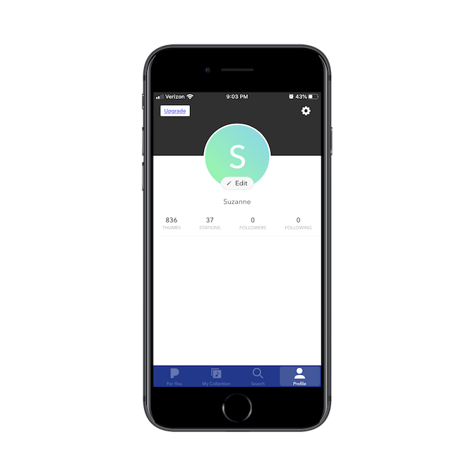
You can see that the user’s profile not only tracks how many songs and soundtracks the user has liked and followed, but it also tracks the people they’re connected to. This fosters a sense of community instead of reinforcing the idea that music listening is a solo activity.
For users that enjoy this aspect of Pandora, they can get more of it when they upgrade:
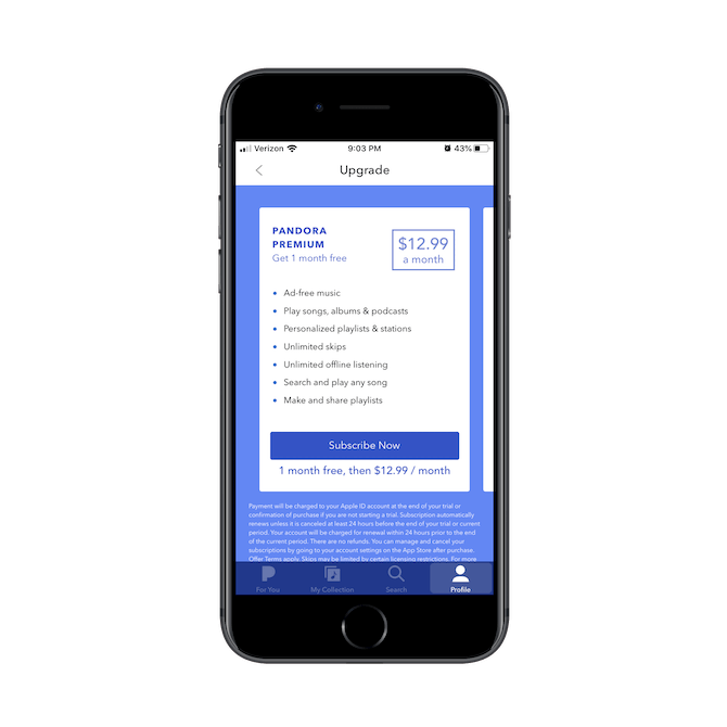
For Pandora users who enjoy creating playlists and sharing them with others, the subscription upgrade allows for that.
Another app that does a good job of integrating the social component is Duolingo.
When a user goes to their “Achievements” page (which the app will occasionally prompt them to do), they’ll also be reminded that there’s a “Friends” tab there, too:
.png?sfvrsn=92e77bae_0)
Rather than make Duolingo something where users work on accomplishing various achievements on their own, it encourages them to add friends to compete with. For users who need the incentive of others learning a new language alongside them, this is a fantastic feature to take advantage of.
Also, notice the message in the middle of the page that says, “Get free Duolingo Plus!” This isn’t some shallow advertisement to increase subscriptions. Duolingo connects the social component to it. For every new friend the user invites and who joins, they receive a free week of the premium app.
If your app has a strong accountability or community component to it, think about using social features to increase user retention and boost your subscription rates.
Wrap-Up
Consumers are no strangers to subscription services these days. Digital workout subscriptions. Meal kit subscriptions. Productivity software subscriptions. So, it shouldn’t be too hard to sell them on your in-app subscription… right?
Well, if your app is new and doesn’t have a big brand name to leverage for trust-building, it could be a tough thing to do straight out of the gate. So, what you need to do is focus on building a really great free experience and then placing your subscription elements and invitations in front of your users at the right time.