The KendoReact team has been very busy over the last few months, delivering some heavy-hitters like the Scheduler and TreeList components, as well as delivering frequently-requested features for existing components. Let’s jump straight in and see what is new with the R3 2019 release!
New React Components
New Component: Scheduler
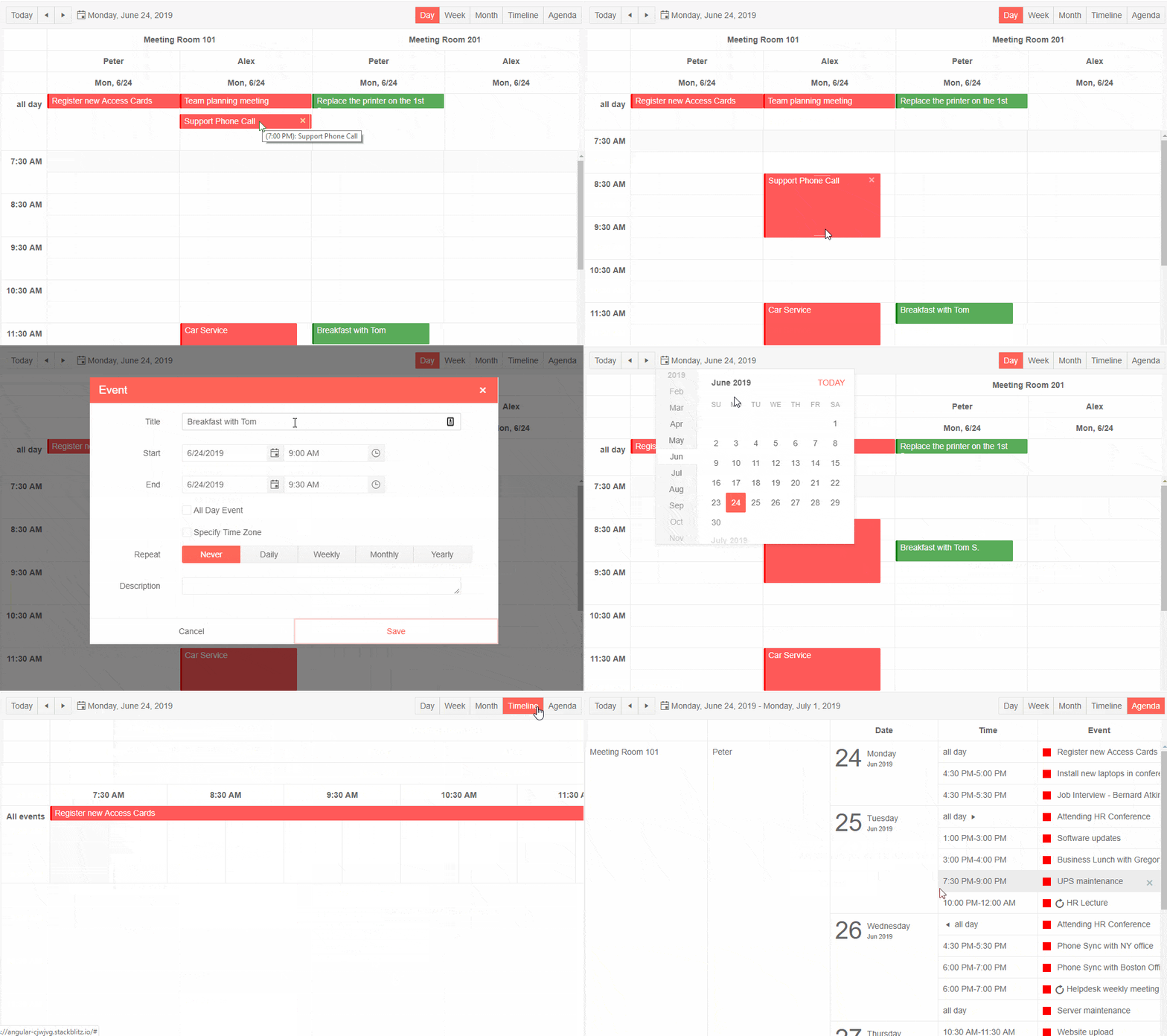
One of the biggest React UI components that we have been able to deliver with the R3 2019 release is the new React Scheduler.
This is a standalone component that provides calendar and scheduling capabilities similar to that of Google Calendar or the calendar found in Outlook.
From this initial version we have a huge list of features already available, including popular features like:
- Creating, updating, and deleting events
- Moving events around the calendar with drag and drop
- Editing the length of the events by resizing events
- Editing events by clicking on the event for more details
- Built-in support for recurrence
- The ability to define resources to differentiate between events (think about people, rooms, or equipment that may need to be color coded)
The KendoReact Scheduler does expect certain fields to be available in order to handle the type of data it needs to display, which is why we have a documentation article highlighting the data fields the Scheduler expects, but overall data binding with this component to your existing data and backend is very easy.
There’s so much available in this component already that it would be tough to cover in an already long blog post so we recommend heading over to our KendoReact Scheduler documentation section to see exactly what this component can do!
New Component: TreeList
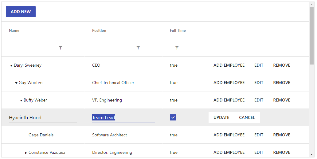
The KendoReact Data Grid provides the ability to work with hierarchical data already. However, with homogeneous data, where all of the fields will be the same across all data items while structured in a parent-child relationship, a TreeList is more applicable. This is why we have spent time to officially roll out the new KendoReact TreeList component!
This component provides the hierarchical structure of a TreeView with the column structure of a data grid / data table. With this initial release we already cover many of the features that you may already be using within the KendoReact Grid, including:
- Filtering
- Sorting
- Row selection
- Editing (in-line, in-cell, or form)
As you can see, there are already a ton of features available out-of-the-box with this component, but this is just the beginning! Head on over to the TreeList component page to see the component in action. There are more features to come, so keep an eye out on our road map to see what is coming out in the future.
New Component: ColorPicker
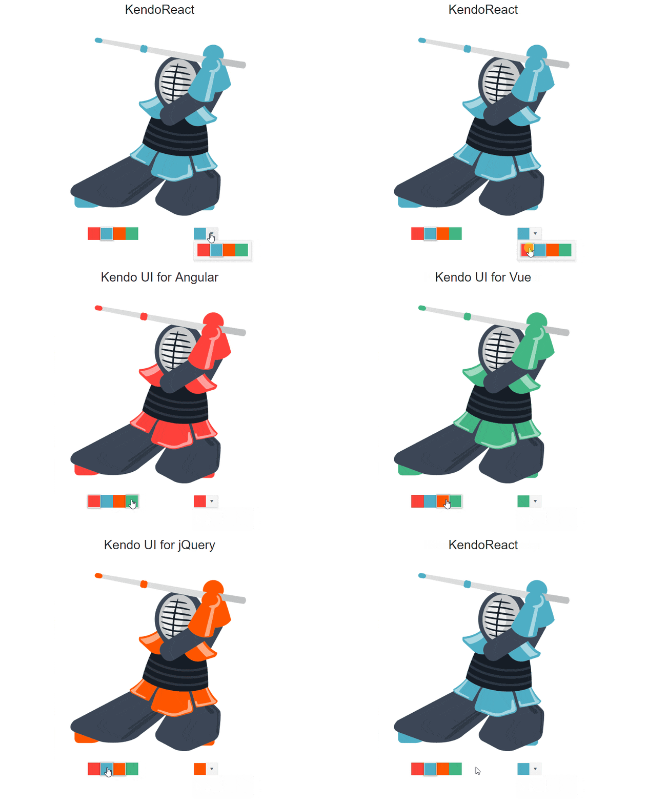
With the new KendoReact ColorPicker component React developers can provide an intuitive user experience for allowing end-users to select a color within a drop down. The colors can be selected from a predefined palette of colors, or with a gradient selector that gives more power to the user for granular control over the desired color.
New Component: ColorGradient
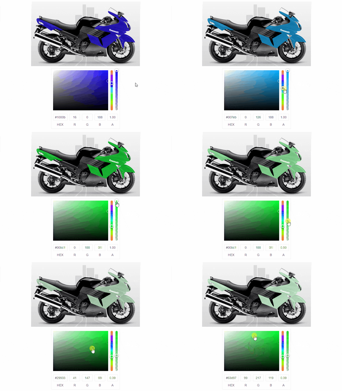
The new React ColorGradient component provides the ColorPicker’s gradient option for selecting colors but in a standalone component without the need of a drop down to select the color.
New Component: ColorPalette

A part of the above-mentioned ColorPicker component, the new React ColorPalette component gives users an intuitive way to select from a predefined palette of colors without the need of a drop down to hide the selection process.
New Component: Pager
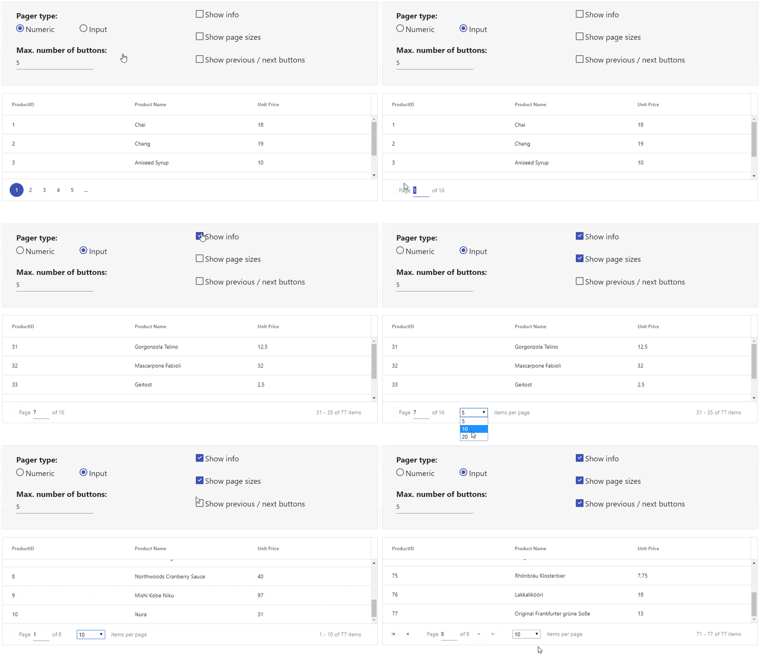
The Pager component has been built-in to the KendoReact Grid for some time now. It makes a ton of sense to include within the component as you often times want to page through your data. It seems like there are several of you KendoReact users that want to use this component for their own paging mechanism as well, as a request for a standalone widget has come through a couple of times now. This is why we decided to extract the pager and offer it as a standalone component!
Check out the Pager component’s documentation page to see just how to add paging functionality to your React applications.
Enhancements to Existing React UI Components
Grid - Footer Row

A popular feature of any data table is to be able to provide additional information about the displayed data in a unique row at bottom of all of the data. Ensuring that the KendoReact data grid continues to be the most feature-rich data table for React, we went ahead and added a new footer row for the KendoReact Grid. This can be customized on a column-by-column basis and gives access to aggregate information to help with any calculations that you may want to do across the column’s data.
Grid - Expanded Samples
The Grid component also received a ton of new samples to help with picking up the component and implement it in various scenarios. Some highlights include working with columns in various responsive scenarios and displaying the KendoReact loading indicator to help with larger data sets or longer communication cycles with the backend and give users something pretty to look at while updates are occurring.
All Components - Remove Deprecated React Lifecycle Methods
The KendoReact team has spent the last couple of months removing any deprecated lifecycle methods found within our various packages to ensure that no warnings get displayed when working with the latest version of React, and this helps to future-proof the KendoReact library as well.
Got Feedback?
We always want to make sure that our road map aligns with you and your teams needs and now is the time to make sure any new components or features that you need can be added to future releases! Pop on over to the KendoReact public feedback portal or comment in the comment section below and submit your ideas to ensure that the KendoReact road map can align with your needs.
Register for our Live R3 2019 Webinar!
The KendoReact team is doing a live webinar on October 8th that will cover everything we just mentioned in this blog post - all live! The KendoReact UI components will be covered on October 8, 12:00 - 12:30 pm ET and you can register to reserve your seat right here - seats are limited so snag a seat while they’re still available!