In this guide, Chris Sainty helps you learn how to build a reusable modal without using any JavaScript for your Blazor and Razor applications.
Modals are a common feature of today’s web applications. You will find them in most UI frameworks, and they range from simple confirmation boxes to full-blown forms. In this post, I’m going to walk you through building a JavaScript-free, reusable modal for your Blazor/Razor Components applications. To make things even more interesting, we’re going to build the modal in such a way that we can pass it components to display instead of just plain text or markup strings.
For anyone new to Blazor, let me give you a quick overview. Blazor is a SPA-like framework developed by Microsoft. There is a client-side model, which runs via a WebAssembly-based .NET runtime. There’s also a server-side model (Razor Components), which runs on the standard .NET Core runtime. You can find out more at Blazor.net.
Getting Set Up
If you’re new to Blazor development, then you will need to make sure you have the latest version of the .NET Core SDK installed. You will also need to install the Blazor Language services, as well as the Blazor templates via the dotnet CLI.
dotnet new -i Microsoft.AspNetCore.Blazor.Templates
Creating a Blazor Library
We want to be able to use our modal in whatever projects we see fit. The best way to achieve this is by using the Blazor Library project included in the CLI templates we installed above. This project type works in a similar way to a class library and allows us to share components and their assets (images, CSS, etc.) between Blazor applications.
As this project type is currently only available using the dotnet CLI, we can run the following commands to create a new directory as well as the Blazor Library project.
mkdir BlazorModal
cd BlazorModal
dotnet new blazorlib
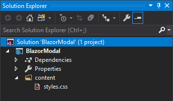
Now we have a new Blazor library project we can open in Visual Studio. Before we do anything else, let’s remove some of the default items that come with the template. The only thing we want to keep is the styles.css, so the project should look like this.

Modal Service
The first thing we are going to build is the ModalService. This is going to be the glue which will join our modal component with any other components that wish to use it. In the root of the project, add a new class called ModalService.cs with the following code.
using Microsoft.AspNetCore.Blazor;using Microsoft.AspNetCore.Blazor.Components;using System;namespace BlazorModal.Services
{publicclassModalService{publicevent Action<string, RenderFragment> OnShow;publicevent Action OnClose;publicvoidShow(string title, Type contentType){if(contentType.BaseType !=typeof(BlazorComponent)){thrownewArgumentException($"{contentType.FullName} must be a Blazor Component");}var content =newRenderFragment(x =>{ x.OpenComponent(1, contentType); x.CloseComponent();});
OnShow?.Invoke(title, content);}publicvoidClose(){
OnClose?.Invoke();}}}
So what’s going on here?
The class exposes two methods, Show() and Close(), as well as a couple of events. The Show method is the interesting one, though. After checking that the type passed in via the contentType argument is a Blazor component, it creates a new RenderFragment using said type. This is then passed into the OnShow event so it can be used by an event handler. We’ll get to that in a bit.
Now before we go any further, I know what some of you are thinking… What’s a RenderFragment??
In simple terms, a RenderFragment represents a piece of UI. Blazor uses these RenderFragments to output the final HTML in the browser. In the code above, if we passed in a type of Foo, the resulting HTML would look like this.
<Foo></Foo>There are many interesting uses for RenderFragment especially when dealing with dynamic component generation, but that is a topic for another time. Let’s crack on.
IServiceCollection Extension
When creating a library, I always find it a good idea to provide an extension method which can handle registering services with the DI container. It makes sure that everything gets registered with the correct scope, plus consumers only have to add a single line to their apps. Add a new class to the root of the project called ServiceCollectionExtension.cs with the following code.
using BlazorModal.Services;using Microsoft.Extensions.DependencyInjection;namespace BlazorModal
{publicstaticclassServiceCollectionExtensions{publicstatic IServiceCollection AddBlazorModal(this IServiceCollection services){return services.AddScoped<ModalService>();}}}
Modal Component
Now that the service is in place, we can build the modal component. I always like to separate the logic and the markup of my components. This is achieved by creating a base class with all the logic that the component will inherit, leaving the component with just markup.
First add a new Razor View named Modal.cshtml, then add a new class called Modal.cshtml.cs. The reason for this naming is so that Visual Studio will nest the base class under the Razor View. You don’t have to follow this convention, but it does keep the solution window nice and tidy. Also be sure it’s a Razor View you select and not a Razor Page — Razor Pages won’t work.
Let’s look at the base class logic first.
Oh! One other thing. You will need to change the name of the base class. As you can see in the code below, I’ve stuck Base on the end. Again, you can call it what you want. Model is another popular choice. But this is to stop a name clash with the code generated by Modal.cshtml.
Component Logic
using BlazorModal.Services;using Microsoft.AspNetCore.Blazor;using Microsoft.AspNetCore.Blazor.Components;using System;namespace BlazorModal
{publicclassModalBase: BlazorComponent, IDisposable
{[Inject] ModalService ModalService {get;set;}protectedbool IsVisible {get;set;}protectedstring Title {get;set;}protected RenderFragment Content {get;set;}protectedoverridevoidOnInit(){
ModalService.OnShow += ShowModal;
ModalService.OnClose += CloseModal;}publicvoidShowModal(string title, RenderFragment content){
Title = title;
Content = content;
IsVisible =true;StateHasChanged();}publicvoidCloseModal(){
IsVisible =false;
Title ="";
Content =null;StateHasChanged();}publicvoidDispose(){
ModalService.OnShow -= ShowModal;
ModalService.OnClose -= CloseModal;}}}
Working from the top, we inject an instance of the modal service. Then we’re declaring a few parameters that we’ll be using in the markup side of the component. We’re overriding one of Blazor’s lifecycle methods, OnInit, so we can attach the ShowModal and CloseModal methods to the respective OnShow and OnClose events from the modal service.
The ShowModal and CloseModal methods are pretty self-explanatory. The only part that is probably worth pointing out is the call to StateHasChanged. We need to call StateHasChanged due to the fact that these methods are invoked from outside of the component. And all this method does is tell the component that something has changed so it needs to re-render itself.
Finally, the component implements the IDisposable interface so we can unregister the event handlers when the component is destroyed.
Now let’s look at the markup side.
Component Markup
@inherits ModalBase
<div class="bm-container @(IsVisible ? "bm-active" : string.Empty)">
<divclass="bm-overlay"onclick="@CloseModal"></div><divclass="blazor-modal"><divclass="bm-header"><h3class="bm-title">@Title</h3><buttontype="button"class="bm-close"onclick="@CloseModal"><span>×</span></button></div><divclass="bm-content">
@Content
</div></div></div>The first line is a directive stating the component is inheriting from ModalBase. Next we have a container div with a bit of Razor syntax which uses the IsVisible property to toggle the bm-active class. This is what’s responsible for showing or hiding the component.
The next div is for creating a darkened overlay that the modal will sit on. This also has a onclick handler which closes the modal if a user clicks anywhere on the overlay.
Then we come to the modal itself. It has a header which displays the title along with a button that can be used to close the modal. The @Content marker is where the RenderFragment we talked about earlier will be displayed.
Adding a Bit of Style
No component would be complete without a bit of styling. There is nothing special or clever her — I’m by no means a CSS guru. But the following classes should give everything a nice clean look and feel with the modal being centered both horizontally and vertically on the page. All thanks to the wonders of Flexbox!
.bm-container{display: none;align-items: center;justify-content: center;position: fixed;width:100%;height:100%;z-index:2;}.bm-overlay{display: block;position: fixed;width:100%;height:100%;z-index:3;background-color:rgba(0,0,0,0.5);}.bm-active{display: flex;}.blazor-modal{display: flex;flex-direction: column;width:50rem;background-color:#fff;border-radius:4px;border:1px solid #fff;padding:1.5rem;z-index:4;}.bm-header{display: flex;align-items: flex-start;justify-content: space-between;padding:002rem 0;}.bm-title{margin-bottom:0;}.bm-close{padding:1rem;margin: -1rem -1rem -1rem auto;background-color: transparent;border:0;-webkit-appearance: none;cursor: pointer;}Testing it Out
We have now built our modal, but it would be good to see it all in action. Let’s add a standalone Blazor app to the solution so we can try it out. This will work just as well with a server-side project if you prefer.
Right-click on the solution and Add > New Project. Then select ASP.NET Core Web Application and give it a name. I’m going to call it BlazorTest. Finally, select Blazor as the project type from the dialogue.
If you prefer, you could use the CLI with the following command.
dotnet new blazor -n BlazorTest
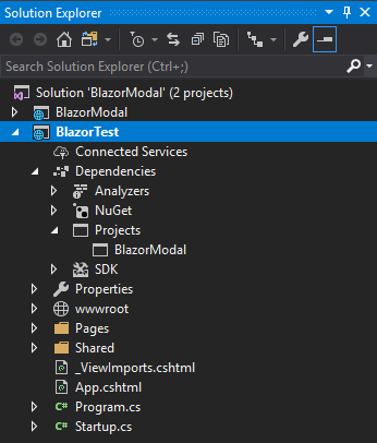
We also need to add a project reference from the BlazorTest (or whatever you’ve called it) to the BlazorModal project. Your solution should now look like this.

Setting Up the Test Project
Now that we have a test project, we need to do three things to register our modal for use.
First, we need to add the following lines into the _ViewImports.cshtml.
@using BlazorModal
@using BlazorModal.Services

@addTagHelper *, BlazorModal
The using statements will save us having to use fully qualified names when using the ModalService. The addTagHelper will import all components from the specified namespace.
Second, we need to add our ModalService to the DI container. Due to our earlier work creating the service collection extension method, we just need to add the following to the ConfigureServices method in Startup.cs.
using BlazorModal;// Other code omitted for brevitypublicvoidConfigureServices(IServiceCollection services){
services.AddBlazorModal();}
The third and final task is to add the modal component to the MainLayout.cshtml.
@inherits BlazorLayoutComponent

<Modal/><divclass="sidebar"><NavMenu/></div><!—Remainingcodeomittedforbrevity-->
We have now setup the test project to use our modal component.
Creating a Test Component
In order to test our modal we are going to create a simple form component that we will display in our modal. In the Pages folder, add a new Razor View called SimpleForm.cshtml and add the following code.
@if (ShowForm)
{
<divclass="simple-form"><divclass="form-group"><labelfor="first-name">First Name</label><inputbind="@FirstName"type="text"class="form-control"id="first-name"placeholder="Enter email"/></div><divclass="form-group"><labelfor="last-name">Last Name</label><inputbind="@LastName"type="text"class="form-control"id="last-name"placeholder="Enter email"/></div><buttononclick="@SubmitForm"class="btn btn-primary">Submit</button></div>
}
else
{
<divclass="alert alert-success"role="alert">
Thanks @FirstName @LastName for submitting the form.
</div>
}

@functions {
bool ShowForm { get; set; } = true;
string FirstName { get; set; }
string LastName { get; set; }

void SubmitForm()
{
ShowForm = false;
}
}
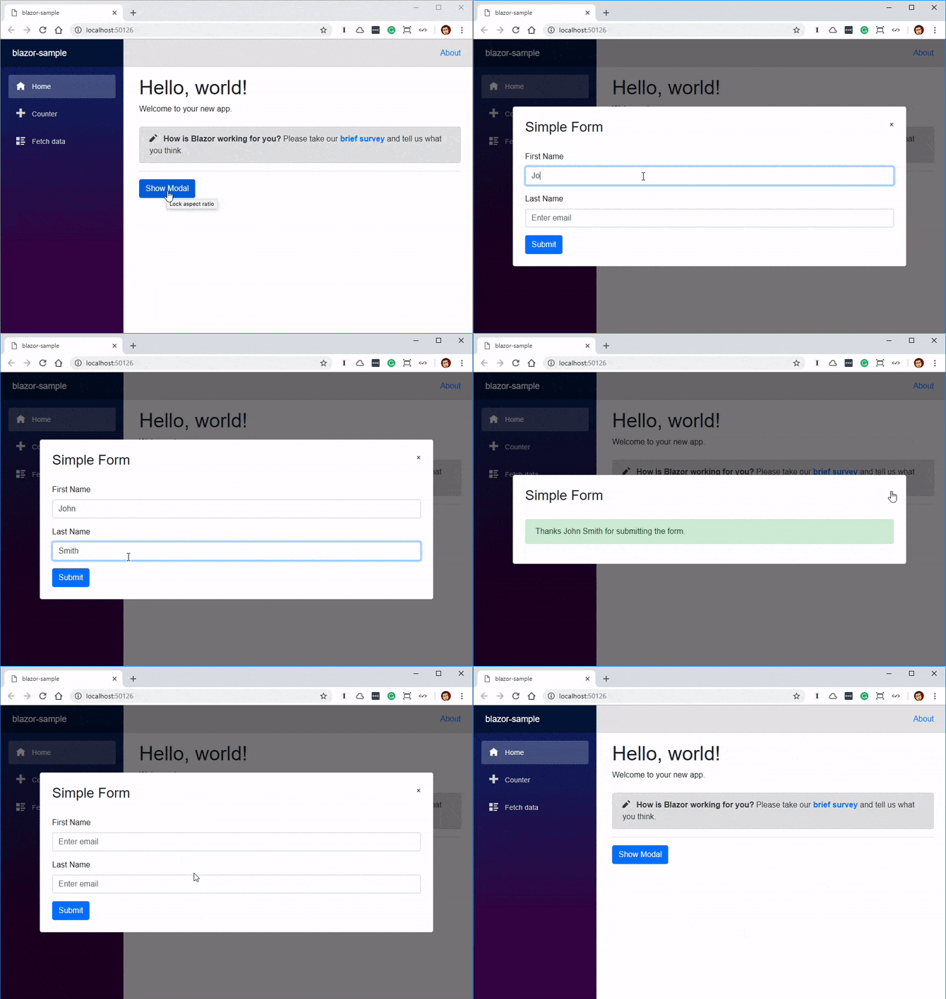
The component takes the user’s first and last names and then shows them a personalized message after they click submit.
All that’s left is to call it. Let’s make some additions to the Index component to call our modal with the simple form we’ve just created.
@page "/"
@inject ModalService ModalService

<h1>Hello, world!</h1>
Welcome to your new app.

<SurveyPromptTitle="How is Blazor working for you?"/><hr/><buttononclick="@ShowModal">Show Modal</button>

@functions {
private void ShowModal()
{
ModalService.Show("Simple Form", typeof(SimpleForm));
}
}
And we’re done! This is what the finished Index component looks like.
Running Our Test App
We can now run our test app and if all has gone to plan it should work something like this.

Wrapping Up
In this post, we’ve built a reusable modal without using any JavaScript. We’ve also built it in such a way that we can display other components which I think is a really nice feature and fits nicely with Blazor’s component model.
All the code for this post is available on my GitHub.
Related News
Looking for more news and info on Blazor? Check out these recommended resources:
- Blazor – A New Framework for Browser-based .NET Apps (DevReach 2018)
- What’s Coming in .NET Core 3.0
- Blazor Q&A with Microsoft’s Daniel Roth
- Goodbye JavaScript, Hello WebAssembly
- A Breakdown of Blazor Project Types
- Razor Components for a JavaScript-Free Front-end in 2019
- Introducing the Telerik UI for Blazor Early Preview