Have you ever been in a situation where you wanted to show more data inside your mobile app? Perhaps the issue was insufficient screen size on your mobile device, which makes it difficult to fit all the information you want to share. This is not an issue anymore! Telerik UI for Xamarin solves that for you.
There are two new controls that you can find with the UI toolkit, which first shipped in the R3 2018 release. These controls solve the limited real estate problem on a mobile device while delivering a very elegant UI. Let me introduce you the Expander and Accordion controls of Telerik UI for Xamarin.
This blog post will get you familiar with these two controls and all the features and customization capabilities they provide. Both controls can expand or collapse their content and hold various components in their content panel. 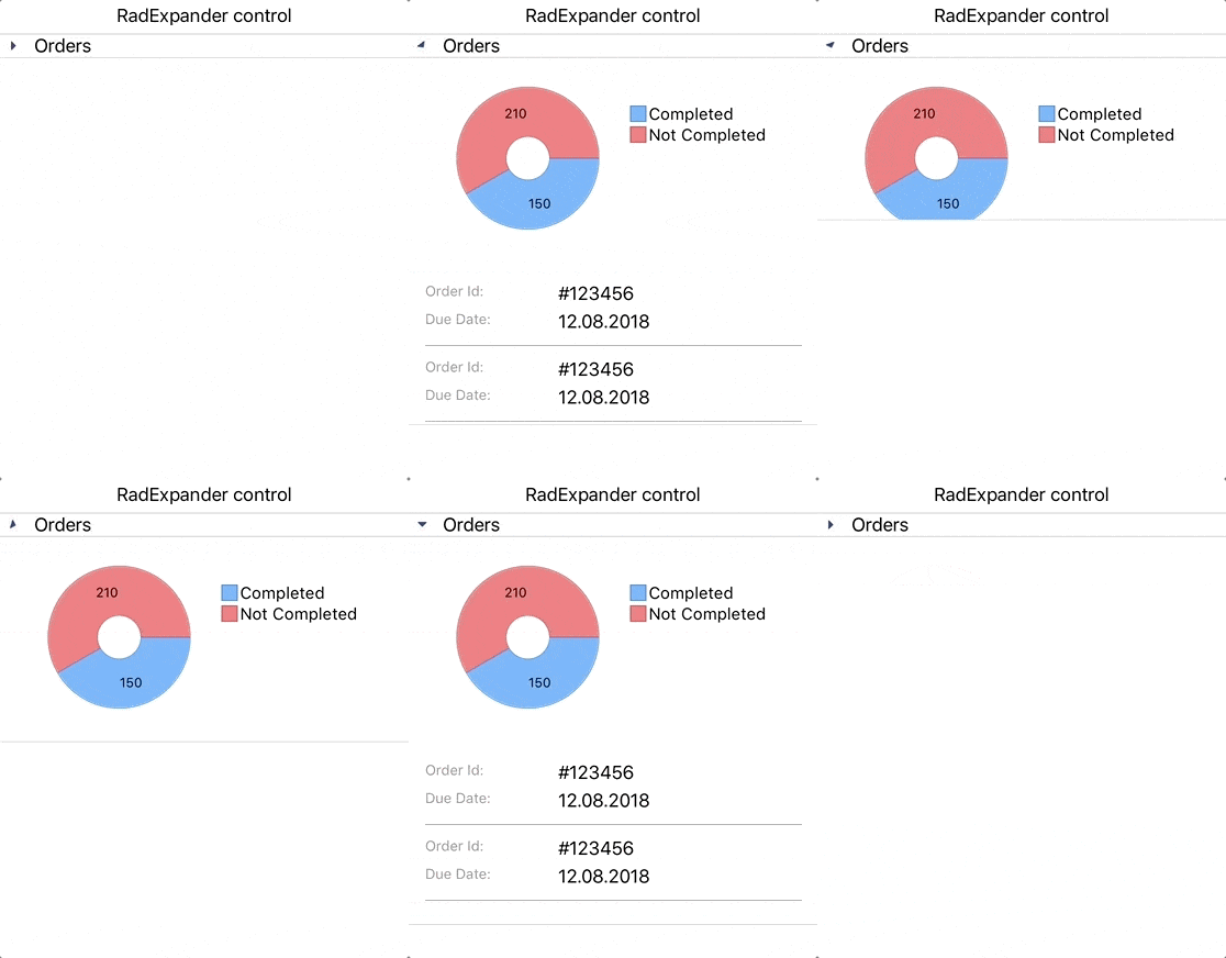
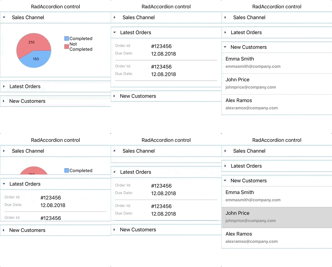
As you can see both controls have a similar UI, but at the same time they serve different purposes. You can use the Expander to display the content of a single item, but if you want to have multiple items and only one of them to have the ability to expand at a time, you should go for the Accordion control.
Expander
RadExpander control has two main parts:
- ExpanderHeader
- Content
The snippet below shows how to define RadExpander in XAML:
<telerikPrimitives:RadExpander x:Name="expander" HeaderText="More Options"> <telerikPrimitives:RadExpander.Content> <StackLayout Margin="10, 20, 10, 20"> <StackLayout Orientation="Horizontal" Spacing="10"> <telerikPrimitives:RadCheckBox/> <Label Text="Make my profile private"/> </StackLayout> <StackLayout Orientation="Horizontal" Spacing="10"> <telerikPrimitives:RadCheckBox /> <Label Text="Only show my posts to people who follow me" /> </StackLayout> </StackLayout> </telerikPrimitives:RadExpander.Content></telerikPrimitives:RadExpander>Features
Here are some of the features the Expander control ships with:
- Collapsed and Expanded States
- Animation
- Customization Options
- Theming support
Collapsed and Expanded States
The control hosts the content in an expandable container that can be easily expanded/collapsed by tapping on its header. The current state of the control can be switched by the IsExpanded property.
The image below shows what the control looks like in its expanded/collapsed states:

Animation
The RadExpander control provides a property which allows you to enable or disable the animation when the content is collapsed / expanded. If you want to enable/disable the animation you need to use the IsAnimationEnabled property. By default, the Animation is enabled.
Customization Options
The visual appearance of the control can be customized in a variety of ways, like:
- Animation duration and easing can be set through the AnimationDuration and AnimationEasing properties.
- Border Styling. You can change the color and thickness of the border surrounding the component.
- Header location.The Expander Header can be placed at the top or at the bottom of the expandable container.
- Header Customization.If the default Expander Header control doesn't suit your needs, you can use ExpanderHeader content control. This content control provides various of properties to customize the indicator’s text, location, color, rotation animation, font family and size. If you want to customize the ExpanderHeader, check our help article.
The image below shows what the RadExpander control looks like after customization:

Accordion
The RadAccordion control contains a set of collapsible content panels. Each panel (AccordionItem) consists of a Header (AccordionItemHeader) and Content. The Accordion control expands only one of its items at a time within the available space.
The snippet below shows how the RadAccordion can be defined in XAML:
<telerikPrimitives:RadAccordion x:Name="accordion"> <telerikPrimitives:AccordionItem HeaderText="Attachments"IsExpanded="True"> <telerikPrimitives:AccordionItem.Content> <telerikInput:RadButton Text="Attach files" Margin="70, 20, 70, 20" BorderColor="Blue" BorderThickness="2"/> </telerikPrimitives:AccordionItem.Content> </telerikPrimitives:AccordionItem> <telerikPrimitives:AccordionItem HeaderText="Settings"> <telerikPrimitives:AccordionItem.Content> <StackLayout Margin="10, 20, 10, 20"> <StackLayout Orientation="Horizontal" Spacing="10"> <telerikPrimitives:RadCheckBox /> <Label Text="Make my profile private" /> </StackLayout> <StackLayout Orientation="Horizontal" Spacing="10"> <telerikPrimitives:RadCheckBox /> <Label Text="Only show my posts to people who follow me" /> </StackLayout> </StackLayout> </telerikPrimitives:AccordionItem.Content> </telerikPrimitives:AccordionItem> <telerikPrimitives:AccordionItem HeaderText="Rating"> <telerikPrimitives:AccordionItem.Content> <telerikInput:RadShapeRating x:Name="rating" Margin="20"/> </telerikPrimitives:AccordionItem.Content> </telerikPrimitives:AccordionItem></telerikPrimitives:RadAccordion>Features
Here are some of the features the Accordion control ships with:
- Collapsed and Expanded States
- Animation
- Customization Options
- Theming support
Collapsed and Expanded States
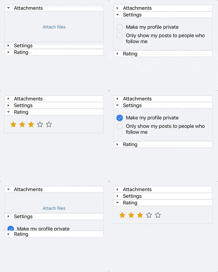
The RadAccordion control is designed in such a way that opening one AccordionItem automatically closes the previous displayed content.
The image below shows this functionality:
Animation While Expanding/Collapsing
The Animation that RadAccordion control provides while expanding/collapsing its content can be enabled/disabled through the IsAnimationEnabled property.
Customization Options
The Accordion control's header provides the following options for customization:
- Animation duration and easing can be set through the AnimationDuration and AnimationEasing properties.
- Border Styling. You can change the way the Border around the control looks with the BorderColor and BorderThickness properties of the AccordionItem.
- Header Customization.If the default AccordionItemHeader does not suit your needs, you can use AccordionItemHeader content control. This content control provides various properties to customize the indicator’s text, location, color, rotation animation, font family and size. If you want to customize the AccordionItemHeader, check our help article.
Here's what the RadAccordion control looks like after customization:

Both RadAccordion and RadExpander come with built-in Theming Support. Using a predefined theme provides your application with a consistent look and feel across all platforms.
We would love to hear what you think about Expander and Accordion controls and how we can continue to improve them. If you have any ideas for features to add, do not hesitate to share this information with us on our Telerik UI for Xamarin Feedback portal.
Don’t forget to check out the various demos of the controls in our SDK Sample Browser and the Telerik UI for Xamarin Demos application.
If you have not yet tried the Telerik UI for Xamarin suite, take it out for a spin with a 30-day free trial, offering all the functionalities and controls at your disposal at zero cost.
Happy coding with our controls!