Learn how to easily add and utilize an Upload component in your web apps with Kendo UI.
In this part of our series, we will review the Upload component of Kendo UI. The Upload lets users select files from their filesystem to upload. It is an enhanced version of the HTML file type input which only gives you the option to allow single file or multiple file selection. With the Kendo UI Upload, you can also select directories to upload, use drag and drop to select files, and validate your files among other features. You can use this component to create a file storage app like DropBox or an email form that accepts attachments. Coming up, I will show you how to use the Upload component to select an image for an avatar.
Getting Started
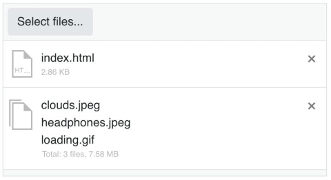
For this task, we want users to click the select button triggering the file browser window to open. When the image is selected, it will immediately appear on the screen. We also want to restrict the files that can be selected to images and allow only one file to be selected. Before we implement these features, we will initialize a bare-bones component. By default, this will give us a select button allowing us to choose files from the file browser. When files are selected the file name along with a file icon will be shown in a file list beneath the button. There is also a delete button to remove the files from the list. If multiple files are selected, they will be grouped together as one block that can be deleted.

<!DOCTYPE html><html><head><metacharset="utf-8"><title>Upload</title><linkrel="stylesheet"href="https://kendo.cdn.telerik.com/2018.3.911/styles/kendo.bootstrap-v4.min.css"><linkrel="stylesheet"href="https://kendo.cdn.telerik.com/2018.3.911/styles/kendo.mobile.all.min.css"><scriptsrc="https://code.jquery.com/jquery-1.12.3.min.js"></script><scriptsrc="https://kendo.cdn.telerik.com/2018.3.911/js/kendo.all.min.js"></script><style>body {font-family: helvetica;}</style></head><body><form><inputid="upload"type="file"name="photo"></form><script>$(document).ready(function(){$('#upload').kendoUpload();});</script></body></html>Configuring the Component
Next, we will disable multiple file selection by setting the multiple option to false. To restrict our uploads to images, we will define the allowedExtensions in the validation option. We could also validate files based on the minimum and maximum file size. Adding validation will prevent the user from uploading files that do not meet the criteria and display an error message in the file list. This is an example of what the error looks like when we update our code:

$('#upload').kendoUpload({
multiple:false,
validation:{
allowedExtensions:['.jpg','jpeg','png','gif']}});
The user can still, however, select restricted files from the file browser window. If you want to prevent this, you can add the accept attribute to your input and define which file types are allowed.
Previewing the Image
We will need a container element to append the selected element to our page. This element will be styled to look like a circle to give the image the appearance of a profile picture or avatar. Last, we will add a select event listener to the component. The event handler will be responsible for reading the image and appending it to the container. These are the new styles and HTML for the image preview:
#preview{height:10em;width:10em;margin:1em auto;border-radius:100%;border:1px solid #eee;overflow: hidden;}.avatar{height:10em;width:10em;}<divid="preview"></div>Next, we will add the select event to the component. This will allow us to display the image when it is selected. The event handler will do the following:
Get the file object from the file list.
Initialize a file reader object.
Add an onload event listener to the file reader.
Read the contents of the image.
This is the implementation for the select event handler:
$('#upload').kendoUpload({...
select: onSelect
});functiononSelect(e){var file = e.files[0].rawFile;var reader =newFileReader();
reader.onload=function(){var img =$('<img class="avatar" >');$('#preview').html(img);
img.attr('src',this.result);};
reader.readAsDataURL(file);}
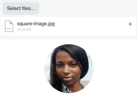
Our file list is stored in an array. Since the user can only select one file, we can access the file object by retrieving the first item in the array. A file object will have the name of the file, the file extension, the size of the file in bytes, a uid, and a property named rawFile. The FileReader object lets us read the contents of the file. The readDataURL method reads the contents of the file and triggers the onload event. The onload event handler is where we will be able to get the URL of the image from the result property of the FileReader. The result is a URL to the image and it will be used to set the src attribute for the image in our preview. This is what the final result looks like:

Summary
We created our image preview by adding the multiple option, adding validation, and a select event listener. The event listener used a FileReader object which is available in the browser’s web API. It is possible to upload files synchronously or asynchronously with the Kendo UI Upload component. Our example used the synchronous mode. In synchronous mode, files are uploaded when they are submitted with a form. In asynchronous mode, your server handles uploading and removing files. You also have more control over the upload process. Files can be paused and resumed and you can upload files in chunks. This is preferable when your users will be uploading large files like video and audio.
The Upload can also be used with other components like the ProgressBar. In the next post, you will learn how to use a ProgressBar.
Try out Kendo UI for Yourself
Want to start taking advantage of the more than 70+ ready-made Kendo UI components, like the Grid or Scheduler? You can begin a free trial of Kendo UI today and start developing your apps faster.
Angular, React, and Vue Versions
Looking for UI component to support specific frameworks? Check out Kendo UI for Angular, Kendo UI for React, or Kendo UI for Vue.