Looking to get started with Telerik UI for UWP? Take a deep dive into building apps with our free and open-source UI controls for Universal Windows Platform.
Have you heard of Telerik UI for UWP? It's a suite of UI controls for Universal Windows Platform (UWP). You can find the source code (Apache License v2.0) and the documentation on GitHub. What's more, we're now accepting pull requests and issues for bugs/feedback!
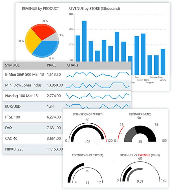
The suite contains controls that address common UI requirements in line-of-business (LOB) applications. These include data management (DataForm), scheduling (Calendar), navigation (RadialMenu), data visualization (Chart), and more. Actually, the list itself is rather long. Have a look:
- RadAutoCompleteBox
- RadBulletGraph
- RadBusyIndicator
- RadCalendar
- RadChart
- RadDataBoundListBox
- RadDataForm
- RadDataGrid
- RadDatePicker and RadTimePicker
- RadExpander
- RadGauge
- RadHexView
- RadHubTile
- RadListView
- RadLoopingList
- RadMap
- RadNumericBox
- RadPagination
- RadRadialMenu
- RadRangeSlider
- RadRating
- RadSideDrawer
Not bad, eh?
In this article, I'll walk you through the source code and show you how to build an application using the Grid and Chart controls as an example.
Understanding the Repository Structure

The source code for Telerik UI for UWP is published on GitHub and is structured as follows:
BuildTools: contains scripts and configs for building Telerik UI for UWP as a local NuGet packageControls: contains source files for Telerik UI for UWPDrawing.UWP/DrawingUWP: Direct2D/C++ project used by the map component for rendering shapesSDKExamples.UWP: contains over 190 examples of the Telerik UI for UWP control suiteUnitTests/UAP.Tests: contains unit tests for controls like the Chart and Grid
The repository has two solution files, UWPControls.sln and UWPMap.sln. These contain the source files of the control suite and map component. There's also a project file, SDKExamples.UWP.csproj that contains the SDK examples. I'd recommend walking through the XAML and C# source files. They contain many examples to help you understand how the controls operate.
Building from Source
Before you start getting your hands dirty with Telerik UI for UWP, it's important that you have the required software installed to build UWP applications. If you don't, Visual Studio will get angry and take the ball home (so-to-speak). Please note that both Visual Studio 2015 and Visual Studio 2017 are supported. That stated, I'd recommend using Visual Studio 2017 due to the recent improvements that have been added to the IDE. It's always best more fun on the latest and greatest anyway.
The easiest way to build the source of Telerik UI for UWP is to open the file, UWPControls.sln in Visual Studio and compile the solution from there. Under its default configuration, Visual Studio will restore the NuGet packages that are used by Telerik UI for UWP during this process. The same procedure should be followed for building the map component. This is located in the solution, UWPMap.sln. In both cases, assemblies (along with PDBs and compiled resource files) will be created in a folder labelled, Binaries after the build process completes.
A Note on Building the Source Code
You may encounter an error when attempting to build the source with Visual Studio:
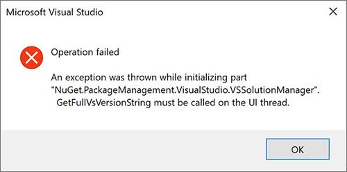
The following workaround will resolve this behaviour:
- Before opening a solution/project, open the NuGet Package Manager Settings
- Wait for the settings dialog to appear and click OK
- Open your solution/project and build it (NuGet will work until the next time Visual Studio is restarted)
Credit to Hrvoje Matić for discovering this workaround, which was posted to the NuGet issues list back in September 2016.
Using the Public NuGet Package
Telerik UI for UWP is available as a package on NuGet and can be incorporated into a new or existing product through Visual Studio:
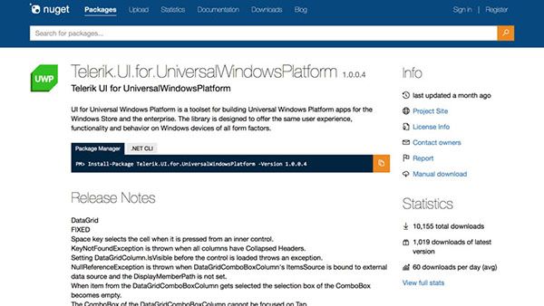
You can add this package to a project through the Package Manager Console or the Solution Explorer:
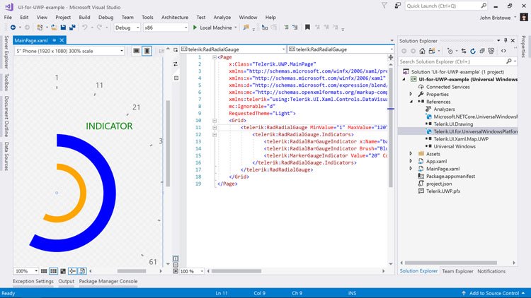
Once added, controls can be added and qualified in XAML pages through prefixes and namespaces. Here's an example using the RadialGauge control:
<Page xmlns:telerik="using:Telerik.UI.Xaml.Controls.DataVisualization">
  ...
  <telerik:RadRadialGauge>
    ...
  </telerik:RadRadialGauge>
</Page>
Adding Telerik UI for UWP to Visual Studio Toolbox
At the time of this writing, we don't have an installer to place the Telerik UI for UWP controls into the Visual Studio Toolbox. However, you can do this yourself by following these steps:
- Add the
Telerik.UI.for.UniversalWindowsPlatformNuGet package to your application - Open any XAML page and navigate to the Toolbox window of Visual Studio (Ctrl+Alt+X)
- Right-click in a blank area and select, "Add Tab"
- Specify the tab to something meaningful (i.e. "Telerik UI for UWP")
- Right-click in this tab and select, "Choose Items…"
- Click the Browse button in the Choose Toolbox Items dialog and navigate to the following folder on your machine:
C:\Users\%USERNAME%\.nuget\packages\telerik.ui.for.universalwindowsplatform
Choose the folder name matching the version you have installed (i.e. 1.0.0.4), navigate to the lib\uap10.0 sub-folder and select the following files:
Telerik.UI.Xaml.Chart.UWP.dllTelerik.UI.Xaml.Grid.UWP.dllTelerik.UI.Xaml.Input.UWP.dllTelerik.UI.Xaml.Primitives.UWP.dllTelerik.UI.Xaml.Map.UWP.dll(located in thex86/x64sub-folder)
Once added, these controls will be able in the Toolbox window of Visual Studio. This will allow you to drag & drag them onto the visual design surface of the XAML pages in your UWP application.
Let's Build an Application
Now, the fun begins: building an application that uses the Chart and Grid controls. These controls are well understood by developers so this is a good place to start.
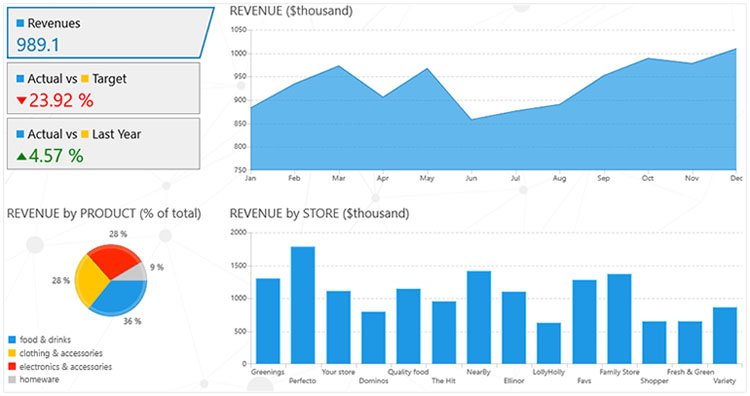
The Chart control is versatile charting component that you can use to visualize data in many different ways. Here, I'm going to build an application that uses it to represent a set of arbitrary data.
I'll start by creating a new UWP application in Visual Studio and add the Telerik UI for UWP NuGet package to the solution:
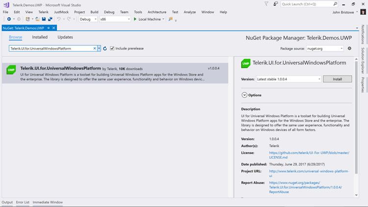
From here, I'll open up MainPage.xaml and add a RadCartesianChart element to the page:
<Page
  x:Class="Telerik.Demos.UWP.MainPage"
  xmlns="http://schemas.microsoft.com/winfx/2006/xaml/presentation"
  xmlns:x="http://schemas.microsoft.com/winfx/2006/xaml"
  xmlns:d="http://schemas.microsoft.com/expression/blend/2008"
  xmlns:mc="http://schemas.openxmlformats.org/markup-compatibility/2006"
  xmlns:telerik="using:Telerik.UI.Xaml.Controls.Chart"
  mc:Ignorable="d">
    <Grid Background="{ThemeResource ApplicationPageBackgroundThemeBrush}">
      <telerik:RadCartesianChart PaletteName="DefaultLight">
      </telerik:RadCartesianChart>
    </Grid>
</Page>
Running this application will display the chart with the following messages:
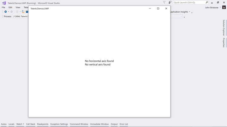
These messages are displayed by the Chart control if you don't define its horizontal and vertical axis. They are required (along with a series definition) to render the data that's associated with the chart at runtime.
The next task is to bind some underlying data and define the horizontal and vertical axis that will be used to display it. I'll define a model that will generate a collection of random values for Australian city names to which I can bind the chart:
public class City
{
  public string Name { get; set; }
  public double Value { get; set; }
}

public class CityManager
{
  private static Random random = new Random();
  private static string[] cityNames = new string[] { "Melbourne", "Sydney", "Brisbane", "Adelaide", "Perth" };

  public static List<City> GetCities()
  {
    List<City> cities = new List<City>();
    for (int i = 0; i < cityNames.Length; i++)
    {
      cities.Add(new City() { Name = cityNames[i], Value = random.Next(50, 100) });
    }
    return cities;
  }
}
Next, I'll add to the chart declaration to include the axis and a line series:
<Page
  x:Class="Telerik.Demos.UWP.MainPage"
    xmlns="http://schemas.microsoft.com/winfx/2006/xaml/presentation"
  xmlns:x="http://schemas.microsoft.com/winfx/2006/xaml"
  xmlns:d="http://schemas.microsoft.com/expression/blend/2008"
  xmlns:mc="http://schemas.openxmlformats.org/markup-compatibility/2006"
  xmlns:telerik="using:Telerik.UI.Xaml.Controls.Chart"
  mc:Ignorable="d">
    <Grid Background="{ThemeResource ApplicationPageBackgroundThemeBrush}">
      <telerik:RadCartesianChart PaletteName="DefaultLight">
        <telerik:RadCartesianChart.HorizontalAxis>
          <telerik:CategoricalAxis />
        </telerik:RadCartesianChart.HorizontalAxis>
        <telerik:RadCartesianChart.VerticalAxis>
          <telerik:LinearAxis />
        </telerik:RadCartesianChart.VerticalAxis>
        <telerik:LineSeries ItemsSource="{Binding}">
          <telerik:LineSeries.ValueBinding>
            <telerik:PropertyNameDataPointBinding PropertyName="Value"/>
          </telerik:LineSeries.ValueBinding>
          <telerik:LineSeries.CategoryBinding>
            <telerik:PropertyNameDataPointBinding PropertyName="Name"/>
          </telerik:LineSeries.CategoryBinding>
        </telerik:LineSeries>
      </telerik:RadCartesianChart>
    </Grid>
</Page>
In the XAML (above), I've defined a CategoricalAxis for the horizontal axis. This displays a range of categories whose values are displayed in the order defined by the underlying collection that's bound to the chart. The vertical axis uses a LinearAxis which represents a sequential list of numerical values. Other axis types for date/time values and logarithmic sequences are also supported. I've also indicated that I've like to generate a line chart based on the LineSeries that's declared. Notice that I've bound the value and category values to properties found on the City class I defined earlier. Other options to binding data are available, such as specifying the data points in the XAML directly:
<telerik:RadCartesianChart PaletteName="DefaultLight">
  <telerik:RadCartesianChart.Series>
    <telerik:LineSeries>
      <telerik:LineSeries.DataPoints>
        <telerik:CategoricalDataPoint Category="Melbourne" Value="55" />
        <telerik:CategoricalDataPoint Category="Sydney" Value="65" />
        <telerik:CategoricalDataPoint Category="Brisbane" Value="93" />
        <telerik:CategoricalDataPoint Category="Adelaide" Value="89" />
        <telerik:CategoricalDataPoint Category="Perth" Value="77" />
      </telerik:LineSeries.DataPoints>
    </telerik:LineSeries>
  </telerik:RadCartesianChart.Series>
  <!-- markup removed for brevity -->
</telerik:RadCartesianChart>
The final step is to bind the chart to the data that's generated by the CityManager class in the constructor of the page:
public sealed partial class MainPage : Page
{
  public MainPage()
  {
    this.InitializeComponent();
    this.DataContext = CityManager.GetCities();
  }
}
Running this application will display the chart of the data that's randomly generated:
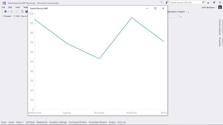
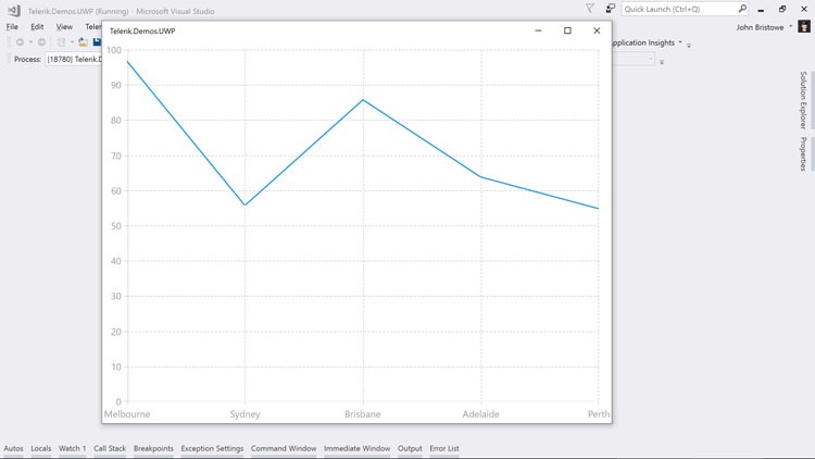
It's important to note that the Chart control is highly customizable. There are a number of properties that I can target that will modify the chart that's generated. For example, I can add the following XAML to my chart declaration to draw lines for the major axis points:
<telerik:RadCartesianChart PaletteName="DefaultLight">
  <telerik:RadCartesianChart.Grid>
    <telerik:CartesianChartGrid MajorLinesVisibility="XY"/>
  </telerik:RadCartesianChart.Grid>
  <!-- markup removed for brevity -->
</telerik:RadCartesianChart>
This change will display the chart with the X and Y-axis major lines drawn:
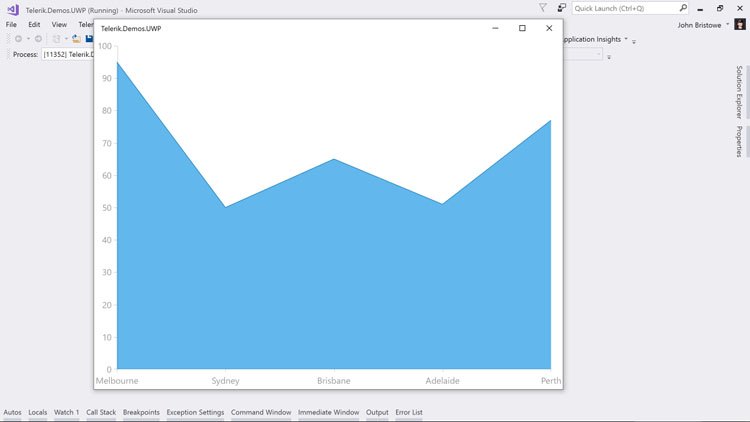
From here, you can modify the XAML used to generate a chart to display an area chart:
<telerik:RadCartesianChart PaletteName="DefaultLight">
  <telerik:AreaSeries ItemsSource="{Binding}">
    <telerik:AreaSeries.ValueBinding>
      <telerik:PropertyNameDataPointBinding PropertyName="Value"/>
    </telerik:AreaSeries.ValueBinding>
    <telerik:AreaSeries.CategoryBinding>
      <telerik:PropertyNameDataPointBinding PropertyName="Name"/>
    </telerik:AreaSeries.CategoryBinding>
  </telerik:AreaSeries>
  <!-- markup removed for brevity -->
</telerik:RadCartesianChart>
Running the application with this change will generate an area chart a different set of random data:
As you delve into the specifics of the Chart control from Telerik UI for UWP, you'll discover that it has many built-in features. You can read more about these features on the for the Chart control in our documentation.
Now, let's see an example of the Grid in Telerik UI for UWP using the same underlying data.
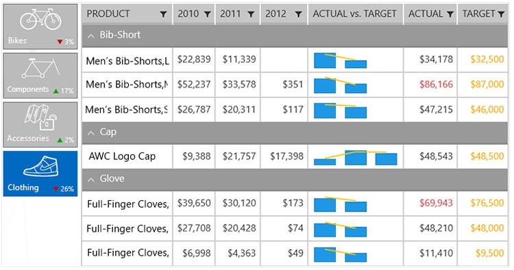
The Grid control enables you to display and manipulate vast amounts of data in a control that's fast, fluid, and responsive. It's also highly customizable for operations like filtering, paging, sorting, and grouping. Let's see how to get a Grid control up and running in my existing UWP application.
I'll start by making a few modifications to the XAML I defined earlier:
<Page
  x:Class="Telerik.Demos.UWP.MainPage"
  xmlns="http://schemas.microsoft.com/winfx/2006/xaml/presentation"
  xmlns:x="http://schemas.microsoft.com/winfx/2006/xaml"
  xmlns:d="http://schemas.microsoft.com/expression/blend/2008"
  xmlns:mc="http://schemas.openxmlformats.org/markup-compatibility/2006"
  xmlns:telerikChart="using:Telerik.UI.Xaml.Controls.Chart"
  mc:Ignorable="d">
    <Grid Background="{ThemeResource ApplicationPageBackgroundThemeBrush}">
      <!-- added: column definitions for layout -->
      <Grid.RowDefinitions>
        <RowDefinition />
        <RowDefinition />
      </Grid.RowDefinitions>
      <!-- I'll add the grid here -->
      <!-- added: specified column location -->
      <telerikChart:RadCartesianChart Grid.Row="1" PaletteName="DefaultLight">
        <telerikChart:RadCartesianChart.HorizontalAxis>
          <telerikChart:CategoricalAxis />
        </telerikChart:RadCartesianChart.HorizontalAxis>
        <telerikChart:RadCartesianChart.VerticalAxis>
          <telerikChart:LinearAxis />
        </telerikChart:RadCartesianChart.VerticalAxis>
        <telerikChart:AreaSeries ItemsSource="{Binding}">
          <telerikChart:AreaSeries.ValueBinding>
            <telerikChart:PropertyNameDataPointBinding PropertyName="Value"/>
          </telerikChart:AreaSeries.ValueBinding>
          <telerikChart:AreaSeries.CategoryBinding>
            <telerikChart:PropertyNameDataPointBinding PropertyName="Name"/>
          </telerikChart:AreaSeries.CategoryBinding>
        </telerikChart:AreaSeries>
      </telerikChart:RadCartesianChart>
    </Grid>
</Page>
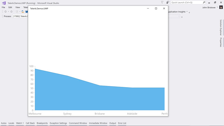
In the XAML (above), I've made a couple of changes. First, I've changed the namespace prefix, telerik to telerikChart. I'll soon add another namespace for the Grid control and I want a better naming convention to identify my controls. And second, I've specified the layout of the grid used to contain my controls to include a couple of row definitions. Essentially, I want the Grid control to sit above the existing Chart control on my page.
Running this code displays our application with a modified layout:
Now let's add the Grid control.
As it turns out, this is a pretty simple task:
<telerikGrid:RadDataGrid Grid.Row="0" ItemsSource="{Binding}">
</telerikGrid:RadDataGrid>
This is all that's required to add to our existing markup in order to have a Grid control added to our existing application. Here's how the page looks with this change:
<Page
  x:Class="Telerik.Demos.UWP.MainPage"
  xmlns="http://schemas.microsoft.com/winfx/2006/xaml/presentation"
  xmlns:x="http://schemas.microsoft.com/winfx/2006/xaml"
  xmlns:d="http://schemas.microsoft.com/expression/blend/2008"
  xmlns:mc="http://schemas.openxmlformats.org/markup-compatibility/2006"
  xmlns:telerikChart="using:Telerik.UI.Xaml.Controls.Chart"
  xmlns:telerikGrid="using:Telerik.UI.Xaml.Controls.Grid"
  mc:Ignorable="d">
    <Grid Background="{ThemeResource ApplicationPageBackgroundThemeBrush}">
      <Grid.RowDefinitions>
        <RowDefinition />
        <RowDefinition />
      </Grid.RowDefinitions>
      <telerikGrid:RadDataGrid Grid.Row="0" ItemsSource="{Binding}">
      </telerikGrid:RadDataGrid>
      <telerikChart:RadCartesianChart Grid.Row="1" PaletteName="DefaultLight">
        <telerikChart:RadCartesianChart.HorizontalAxis>
          <telerikChart:CategoricalAxis />
        </telerikChart:RadCartesianChart.HorizontalAxis>
        <telerikChart:RadCartesianChart.VerticalAxis>
          <telerikChart:LinearAxis />
        </telerikChart:RadCartesianChart.VerticalAxis>
        <telerikChart:AreaSeries ItemsSource="{Binding}">
          <telerikChart:AreaSeries.ValueBinding>
            <telerikChart:PropertyNameDataPointBinding PropertyName="Value"/>
          </telerikChart:AreaSeries.ValueBinding>
          <telerikChart:AreaSeries.CategoryBinding>
            <telerikChart:PropertyNameDataPointBinding PropertyName="Name"/>
          </telerikChart:AreaSeries.CategoryBinding>
        </telerikChart:AreaSeries>
      </telerikChart:RadCartesianChart>
    </Grid>
</Page>
You can start to appreciate just how powerful these controls are when you run the application:
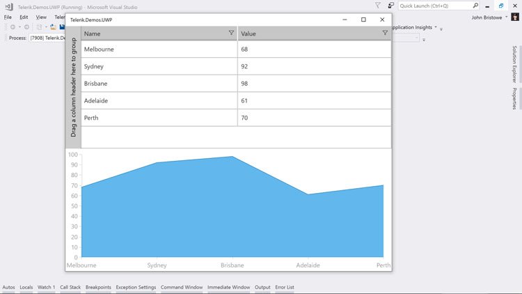
By default, the Grid auto-generates the columns based on the object that it's bound to. This includes built-in filtering, which you can use to drill down into the data. Furthermore, the Grid control has grouping enabled by default. This allows me to combine rows that have equal column values. Let's modify the code that's used to generate this data to see how this works:
public class City
{
  public string Name { get; set; }
  public double Value { get; set; }
  public bool Question { get; set; }
}

public class CityManager
{
  private static Random random = new Random();
  private static string[] cityNames = new string[] { "Melbourne", "Sydney", "Brisbane", "Adelaide", "Perth" };

  public static List<City> GetCities()
  {
    List<City> cities = new List<City>();
    for (int i = 0; i < cityNames.Length; i++)
    {
      cities.Add(new City()
      {
        Name = cityNames[i],
        Value = random.Next(50, 100),
        Question = random.Next(0, 2) == 0
      });
    }
    return cities;
  }
}
Here, I've added a Boolean property to the City class that I've given an arbitrary name. Its value will be randomly generated to be either true or false. When we run our application, notice that this new property is automatically displayed by the Grid control:
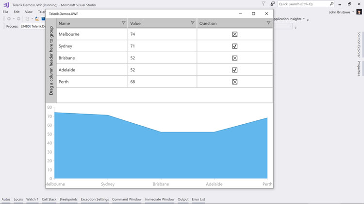
The Grid control knows that this new column's type is a Boolean so it also uses a checkbox to display its value. This is also reflected in the filter drop-down menu in the column header:
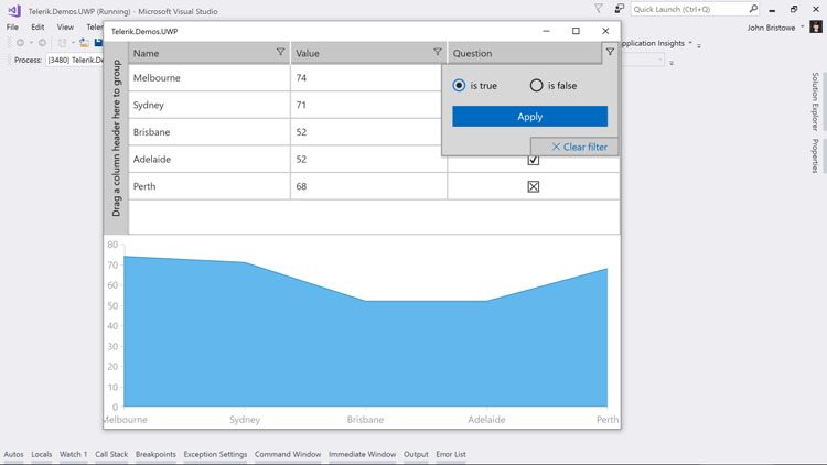
The Grid control has support built-in for primitives types (i.e. Boolean) for operations like filtering, sorting, and grouping. When binding to complex types, you can control how values are displayed and navigated through these operations as well. If left undefined, the Grid control will display the type name for complex types by default.
With grouping enabled by default, we can drag and drop a column header to the grouping area and have the rows grouped by the new property I've added:
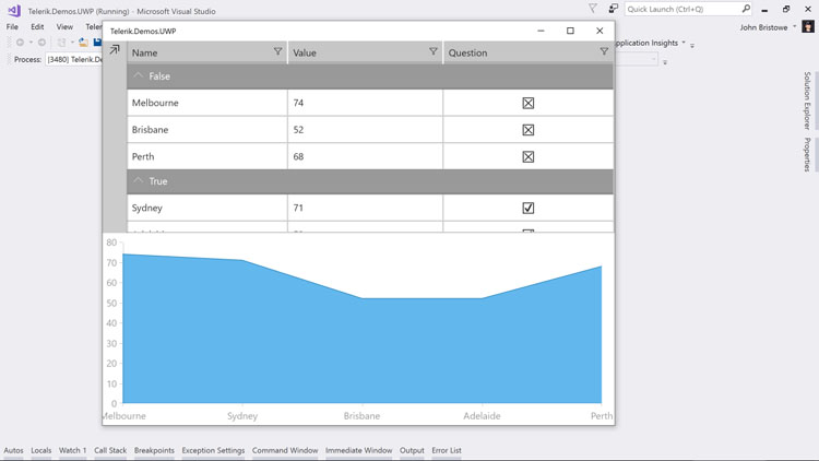
Even when grouping is enabled, operations such as paging, filtering, and sorting remain intact.
Using Telerik UI for UWP in Windows Template Studio
As you've seen, incorporating Telerik UI for UWP into a UWP project is a manual process. Developers looking for a guided approach towards building applications with Telerik UI for UWP should check out Windows Template Studio:
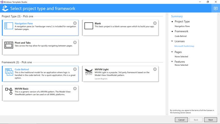
This extension for Visual Studio will generate a UWP application through templates. The goal is to get you up and running quickly with a project structure and source files that can be modified afterward.
Recently, Windows Template Studio added templates for the Chart and Grid controls from Telerik UI for UWP:
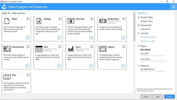
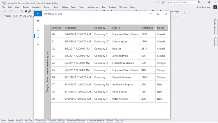
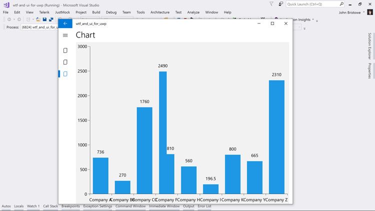
Selecting either of those controls will generate pages will the necessary XAML and code needed to display them:
Wrapping Up
Telerik UI for UWP provides a suite of powerful controls that you can use in your UWP applications. These controls address common UI requirements in line-of-business (LOB) applications. You can find the source code (Apache License v2.0) and the documentation on GitHub.
Getting started is easy. You can build the source code yourself or pull down the bits from NuGet. Once downloaded, controls like the Chart and Grid can be easily incorporated and bound to data from underlying sources.
If you have feedback, please let us know through the Telerik UI for UWP issues list on GitHub or the Telerik UI for UWP Feedback Portal. In the meantime, I encourage you to check the controls, build a prototype, and/or start incorporating them into your UWP apps today!
Editor's Note: This post originally appeared on the Telerik Developer Network. Check it out for other great content for developers.