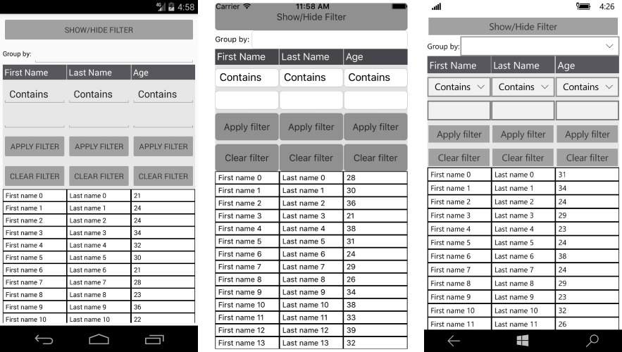
Add DataGrid-like functionality in your Xamarin.Forms applications including sorting, filtering, and grouping using Telerik ListView.
Xamarin.Forms has helped .NET developers build truly native, yet cross-platform, mobile applications using C#/XAML and a shared abstracted UI. If you are building professional Xamarin.Forms apps though, especially for enterprises, there may be one abstracted UI component you’ll find missing—the ubiquitous DataGrid. How many times has your LOB app needed to display data in a Grid? Yes, we all need Grids and Xamarin.Forms apps are no exception.
With nothing out of the box, you may be wondering if you have to start from square one and build a DataGrid by hand. Relax—you don’t have to. Let us show you an unconventional yet highly effective way to render DataGrid in your Xamarin.Forms apps.
Hopefully, you are already using Telerik UI for Xamarin in your apps, taking advantage of the polished and performant UI controls for all your Xamarin apps. If not, what’s holding you back? You can start a free trial any day, after playing with our sample apps in the iOS and Android Stores.
One of the most popular UI components in Telerik UI for Xamarin is the ListView—after all, most mobile apps need to display lists of something. The Telerik ListView is on steroids, with features like data virtualization, pull-to-refresh, custom styling, cell swipe and reorder all built in. Another handy feature of the ListView is support for a variety of Layouts, which can be super handy when you are trying to render DataGrid-like UI. Did you know that the ListView can offer a powerful solution for Grid-like functionality in your Xamarin.Forms app? Let us show you how!

Above is an example of how the Telerik ListView can efficient render a DataGrid and support rich functionality—and yes, it is completely cross-platform from a Xamarin.Forms project. The entire sample project, along with all the code, can be found here.
To use the Telerik ListView in your Xamarin.Forms app, you’ll first need to add some references—and this is incredibly easy using our NuGet packages. If your IDE is not configured to work with the Telerik NuGet server, you can find all information you need here to set it up. After you are ready, just open the NuGet manager for the solution and search for Telerik.UI.for.Xamarin.DataControls package and install it for all projects in the solution—the PCL and all platform specific projects. And that’s it, you now have all references you need to use the Telerik RadListView.
To be able to make the Telerik ListView render and behave like a DataGrid, you’ll need to set a custom ItemTemplate. Let’s say you want a Grid with three columns, and for each column to display items with a white background, a margin and a Label inside. You may be wondering: Why a white background? We are intentionally choosing a hard problem to show you a work-around.
As you may know, in the Xamarin.Forms world, dealing with UI borders can be hard. So let us find a way around with some creativity. The idea is to have the ListView rendered with a black background, which will be visible outside the Grid template—providing the illusion that there are borders around the white cells! Here’s the code for the custom template:
<telerikDataControls:RadListViewx:Name="listView"BackgroundColor="Black"Grid.Row="3"> <telerikDataControls:RadListView.ItemTemplate> <DataTemplate> <telerikListView:ListViewTemplateCell> <telerikListView:ListViewTemplateCell.View> <Grid> <Grid.ColumnDefinitions> <ColumnDefinition/> <ColumnDefinition/> <ColumnDefinition/> </Grid.ColumnDefinitions> <GridBackgroundColor="White"Margin="1"> <LabelText="{Binding FirstName}"Margin="4, 2"/> </Grid> <GridGrid.Column="1"BackgroundColor="White"Margin="1"> <LabelText="{Binding LastName}"Margin="4, 2"/> </Grid> <GridGrid.Column="2"BackgroundColor="White"Margin="1"> <LabelText="{Binding Age}"Margin="4, 2"/> </Grid> </Grid> </telerikListView:ListViewTemplateCell.View> </telerikListView:ListViewTemplateCell> </DataTemplate> </telerikDataControls:RadListView.ItemTemplate> <telerikDataControls:RadListView.GroupHeaderTemplate> <DataTemplate> <GridBackgroundColor="Black"> <GridBackgroundColor="White"Margin="1"> <LabelText="{Binding }"TextColor="#303030"FontSize="Medium"HorizontalOptions="Center"VerticalOptions="Center"/> </Grid> </Grid> </DataTemplate> </telerikDataControls:RadListView.GroupHeaderTemplate> <telerikDataControls:RadListView.LayoutDefinition> <telerikListView:ListViewLinearLayoutVerticalItemSpacing="0"/> </telerikDataControls:RadListView.LayoutDefinition> <telerikDataControls:RadListView.ItemStyle> <telerikListView:ListViewItemStyleBackgroundColor="Transparent"BorderLocation="None"/> </telerikDataControls:RadListView.ItemStyle> </telerikDataControls:RadListView>If you look at the Grid-like rendering of the ListView above, there is a Picker which allows users to choose which column to group the data with. Here is the implementation of the Picker.SelectedIndexChanged event handler:
privatevoidPicker_SelectedIndexChanged(objectsender, EventArgs e) { Picker picker = (Picker)sender; stringpropertyName = columnNames[picker.SelectedIndex]; this.listView.GroupDescriptors.Clear(); if(!string.IsNullOrEmpty(propertyName)) { this.listView.GroupDescriptors.Add(newPropertyGroupDescriptor() { PropertyName = propertyName }); } }Also, we should render headers on top of each of the three columns, which the user can tap to sort the grid columns. Below the column headers, there should be controls allowing the user to filter each column’s data. All of this UI is extracted in a ContentView called GridFilteringControl. It exposes an event called OnSortOrderChanged and a property called SelectedSortOrder. This can be used for data sorting, like so:
privatevoidOnSortOrderChanged(objectsender, EventArgs e) { GridFilteringControl control = (GridFilteringControl)sender; this.listView.SortDescriptors.Clear(); if(control.SelectedSortOrder.HasValue) { this.listView.SortDescriptors.Add( newPropertySortDescriptor { PropertyName = control.ColumnName, SortOrder = control.SelectedSortOrder.Value }); } }The GridFilteringControl exposes another event called OnFilterChanged and three properties namely FilterValue, ColumnName and SelectedFilterMode. This is all the information you need to filter each column’s data, like so:
privatevoidOnFilterChanged(objectsender, EventArgs e){ GridFilteringControl control = (GridFilteringControl)sender; this.listView.FilterDescriptors.Clear(); if(!string.IsNullOrEmpty(control.FilterValue)) { this.listView.FilterDescriptors.Add(newDelegateFilterDescriptor { Filter = (obj) => { if(control.SelectedFilterMode == FilterMode.Contains) { returnthis.ContainsFilter(control.ColumnName, control.FilterValue, obj); } returnthis.IsEqualToFilter(control.ColumnName, control.FilterValue, obj); } }); }}So there you have it—the Telerik ListView rendered like a Grid with feature-rich functionality. You should get the sample code and run the app locally. Try grouping using the column name picker at the top to specify which column you want to group by. Also, try tapping on the column headers, which will sort them just like a real DataGrid. It all just works—nice, isn’t it?
Try it Now!
Did we mention you should try this if it interests you? Two simple steps:
- Download the latest Telerik UI for Xamarin bits here.
- Get the complete source code and run the sample app from our GitHub repo.
Need More from a DataGrid?
Please share with us anything else you would like to see from a DataGrid in your Xamarin.Forms app on our feedback portal, along with potential scenarios of usage. We will be happy to show you clever workarounds, or deliver a native DataGrid for Xamarin.Forms! How’s that for a teaser? Please stay tuned for our R3 2017 release—some seriously good stuff coming.