Quantcast
Channel: Telerik Blogs
Viewing all 5322 articles
Browse latest View live

WPF MultiColumnComboBox, GridView Column ComboBox and More

$
0
0

In this post, we'll cover some of the latest additions to the Telerik UI for WPF suite in R1 2019: the official MultiColumnComboBox, new DataGrid column and SpreadProcessing integration. Let's dive in.

The DataGrid (a.k.a. RadGridView) is one of the major controls in the Telerik UI for WPF suite, and we've been continuously adding new features and improvements to it based on users' request and industry/market trends. As our main goal is for you to create top-of-the-line applications, we focus our efforts on delivering exceptional experience with our products. Depending on the assignment, RadGridView can combine its powers with other controls to win your heart. Keep reading to find out more!

But first, let's talk about the...

Official MultiColumnComboBox

As of R1 2019, we introduced the official version of MultiColumnComboBox, which allows RadGridView to show multi-column data in the dropdown of a ComboBox-like control. The beta version offered quite a lot of functionality, but we added some new features based on clients’ requests. I will list the most thrilling of them here:

  • You can now choose between SelectionBoxes and text-based selection interface by setting the SelectionBoxesVisibility property. Customize your SelectionBoxes by using the SelectionBoxTemplate, SelectionBoxStyle, SelectionBoxTemplateSelection and SelectionBoxStyleSelector properties.
  • Add a custom footer to MultiColumnComboBox by either using FooterContent property, or by defining your own Footer template.
  • CodedUI Level 2 and 3 support is also included in the new release.
  • You prefer a read-only MultiColumnComboBox? Closing the dropdown after selection is the desired behavior for your clients? And you want to customize the GridView placed in the drop down? Check all these features in the latest official version.

GridViewMultiColumnComboBoxColumn in Our Data Grid

Our radars detected that you want a GridViewMultiColumnComboBoxColumn. Roger that!

You no longer need to customize GridViewComboBox column to have the desired multiple columns in the combobox. The new built-in column is represented by a standard TextBlock in view mode similarly to most of the other columns in RadGridView. In edit mode, its component is our shiny MultiColumnComboBox. Shape the edit element by setting the rich set of properties, have a tabular data in the drop down and configure your column similarly to any other column that derives from GridViewBoundColumnBase.

One thing that hasn’t been feasible till now is to have a multi-value GridView cell. Just pass it a collection property and set SelectionMode to multiple – MultiColumnComboBox’s selected items get synchronized with the given collection. Easy as that.
<telerik:RadGridViewItemsSource="{Binding Clubs}"AutoGenerateColumns="False">
            <telerik:RadGridView.Columns>
                <telerik:GridViewDataColumnDataMemberBinding="{Binding Name}"/>
                <telerik:GridViewMultiColumnComboBoxColumnHeader="Players"ItemsSourceBinding="{Binding Players}"DataMemberBinding="{Binding SelectedPlayers}"DisplayMemberPath="Name"SelectionMode="Multiple"Width="*"/>
                <telerik:GridViewDataColumnHeader="Established"DataMemberBinding="{Binding Established}"ShowColumnWhenGrouped="False"/>
                <telerik:GridViewDataColumnHeader="Std.Capacity"DataMemberBinding="{Binding StadiumCapacity}"/>
            </telerik:RadGridView.Columns>
        </telerik:RadGridView>

And here is the result of the above code snippet:

Selecting multiple items in GridViewMultiColumnComboBoxColumn

RadGridView Export Integrating RadSpreadStreamProcessing

Have you used RadSpreadStreamProcessing, part of Telerik Document Processing suite? It is a document processing paradigm that allows you to generate XLSX and CSV files with minimal memory consumption and excellent performance.

A nice enhancement in RadGridView is the integration with RadSpreadStreamProcessing, resulting in a faster synchronous and asynchronous export. Its great advantage - writing the GridView content directly to a stream without loading the entire document in the memory - leads to a two times faster export time compared to a RadSpreadProcessing integrated export.

Asynchronously exporting 10000 rowsAsynchronously exporting 10000 rows

Check the documentation for more details on GridViewSpreadStreamExport.

Feedback and Improvements

It is important for us to hear what you think about our new controls and improvements, so we can understand how we can do better in the future to meet and exceed your expectations. Please share your thoughts in our Feedback portal or in the comments section below.

Don't forget to check what else is available in Telerik UI for WPF with R1 2019 and to download a trial today.

 Start my WPF Trial


Rendering Stock Market Data with KendoReact StockChart

$
0
0

Learn how to quickly build a React app that gathers user input, uses that input to request data from an API, and then renders that data as a cool chart using the KendoReact StockChart. 

In this article we are going to build a React app to render historical stock prices.

We'll use KendoReact's ButtonGroup and Input components to gather user input, and StockChart to display the stock market data nicely.

If you follow along, you'll have a cool little app that renders historical stock data in no time. Let's start coding!

StockChart app

You can see the code to build the front end of this app on this GitHub repo.

Building a React App with Create React App

We'll start building our app by creating a basic frontend using Create React App, a tool that allows us to have a React app up and running really quick.

We can create a new app in a folder called stock-chart-app by executing this from the command line:

$ npx create-react-app stock-chart-app

Now, let's make that folder our current directory, and launch the app:

$ cd stock-chart-app
$ npm start

We can see our app running by browsing to localhost:3000.

The most important files that have been created are:

  • package.json: listing all the dependencies of our project
  • src/index.js: the entry point to our app
  • src/App.js: a sample view that we'll edit to our taste
  • src/App.test.js: a sample test

Installing KendoReact Dependencies

KendoReact is a native React component library for building complex business UIs. We're going to be using some of their components, so we'll need to install the following dependencies:

$ npm install --save @progress/kendo-react-inputs \
                     @progress/kendo-react-buttons \
                     @progress/kendo-react-charts \
                     @progress/kendo-drawing \
                     @progress/kendo-react-intl \
                     @progress/kendo-theme-material \
                     hammerjs

Getting Started

Our App component will act as the root of our application. We'll keep the following three things in its state:

  1. The company's symbol entered by the user
  2. The date range to be displayed
  3. The data fetched from the API call

We'll provide some initial values in its constructor:

// src/App.js

import React, { Component } from "react";

export default class App extends Component {
  constructor(props) {
    super(props);

    this.state = {
      symbol: "",
      range: "1m",
      stocksData: {}
    };
  }
}

We'll also render three components matching those three pieces of state:

  1. Input component to read the company symbol
  2. ButtonGroup component to read the date range
  3. StockChart component to render the data

Our render method will look something like this:

// src/App.js

export default class App extends Component {
  render() {
    const { symbol, range, stockData } = this.state;
    return (
      <div className="App">
        <SymbolInput value={symbol} />
        <RangeButtonGroup value={range} />
        <StockChart symbol={symbol} data={stockData} />
      </div>
    );
  }
}

Entering a Company Symbol with KendoReact Input

We'll use KendoReact's Input component to let the user enter the company symbol they want to view:

// src/SymbolInput.js

import React, { Component } from "react";
import { Input } from "@progress/kendo-react-inputs";

export default class SymbolInput extends Component {
  render() {
    const { value } = this.props;
    return (
      <form className="k-form">
        <Input name="symbol"
               label="Company's symbol"
               pattern={"[A-Za-z-]+"}
               minLength={1}
               required={true}
               value={value}
               onChange={this.handleChange} />
      </form>
    );
  }
}

The Input component allows us to do some pretty advanced validation. See how we're using the pattern property with a regular expression to ensure that the user enters a valid company symbol? The onChange property won't trigger until the user enters a valid value.

Handling that onChange callback is straightfoward:

// src/SymbolInput.js

export default class SymbolInput extends Component {
  handleChange(evt) {
    const { onChange } = this.props;
    const symbol = evt.target.value;
    onChange(symbol);
  }
}

Selecting a Date Range with KendoReact ButtonGroup

We'll use KendoReact's ButtonGroup component to allow the user to select which date range they want to view:

// src/RangeButtonGroup.js

import React, { Component } from "react";
import { Button, ButtonGroup } from "@progress/kendo-react-buttons";

export default class RangeButtonGroup extends Component {
  render() {
    const { value } = this.props;
    return (
      <div className="RangeButtonGroup">
        <ButtonGroup>
          <Button title="1 month"
                  togglable={true}
                  selected={value === "1m"}
                  onClick={this.handleClickOneMonth}>
            1M
          </Button>
          <Button title="3 months"
                  togglable={true}
                  selected={value === "3m"}
                  onClick={this.handleClickThreeMonths}>
            3M
          </Button>
          {/* etc */}
        </ButtonGroup>
      </div>
    );
  }
}

The togglable={true} property makes the buttons toggle between selected and unselected styles when the user clicks them. We can ensure that only one of them is active at a time by controlling their selected property, setting it to true only for the currently selected range.

Instead of repeating the same code for each onClick callback, we can have a generic handleClick event handler, and bind it to different values:

// src/RangeButtonGroup.js

export default class RangeButtonGroup extends Component {
  constructor(props) {
    super(props);
    this.handleClickOneMonth = this.handleClick.bind(this, "1m");
    this.handleClickThreeMonths = this.handleClick.bind(this, "3m");
    this.handleClickSixMonths = this.handleClick.bind(this, "6m");
    this.handleClickOneYear = this.handleClick.bind(this, "1y");
    this.handleClickTwoYears = this.handleClick.bind(this, "2y");
    this.handleClickFiveYears = this.handleClick.bind(this, "5y");
  }

  handleClick(range) {
    const { onClick } = this.props;
    onClick(range);
  }
}

Rendering Stock Data with KendoReact StockChart

And finally we'll render the stock data using KendoReact's StockChart component. It's a pretty complex component that expects certain other components as children. It'll look something like this:

// src/CustomStockChart.js

import React from  "react";
import {
  StockChart,
  ChartTitle,
  ChartSeries,
  ChartSeriesItem,
  ChartNavigator,
  ChartNavigatorSelect,
  ChartNavigatorSeries,
  ChartNavigatorSeriesItem
} from "@progress/kendo-react-charts";
import "hammerjs";

const CustomStockChart = props => {
  return (
    <StockChart>
      <ChartTitle text={title} />
      <ChartSeries>
        <ChartSeriesItem data={massagedData}
                         type="candlestick"
                         openField="Open"
                         closeField="Close"
                         lowField="Low"
                         highField="High"
                         categoryField="Date" />
      </ChartSeries>
    <ChartNavigator>
      <ChartNavigatorSelect from={from} to={to} />
      <ChartNavigatorSeries>
        <ChartNavigatorSeriesItem data={massagedData}
                                  type="area"
                                  field="Close"
                                  categoryField="Date" />
        </ChartNavigatorSeries>
      </ChartNavigator>
    </StockChart>
  );
};

export default CustomStockChart;

The three main parts of the chart are:

  • ChartTitle which displays the title of the chart
  • ChartSeries which displays the actual data
  • ChartNavigator which allows you to change the range of data you want to view

Massaging API Data

The openField, closeField, lowField, highField and categoryField props of ChartSeriesItem, and the field and categoryField props of ChartNavigatorSeriesItem need to be set to the appropriate attribute names in the data we pass to the data prop. So we'll have to make sure it looks something like this:

[
  {
    "Date": "/Date(1390780800000)/",
    "Open": 32.6945,
    "Close": 31.9496,
    "Low": 31.9053,
    "High": 32.7122
  },
  {
    // ...
  }
]
The Date field can be either a proper Date instance, or a string that looks like /Date(<timestamp>)/, whatever suits you best.

We'll take care of massaging the data we get from our API into something that matches the shape above in our appropriately named function massageData:

// src/utils.js

export function massageData(obj) {
  return {
    Date: new Date(obj.date),
    Open: obj.open,
    Close: obj.close,
    Low: obj.low,
    High: obj.high,
  };
}

We can then map over the API data with this function, to get what we want:

// src/StockChart.js

const CustomStockChart = props => {
  const { data } = props;
  const massagedData = data.map(massageData);
  return ( /* ... */ );
};

Calculating Start and End Dates

We also need to tell ChartNavigator the start and end dates we want to display. We can use the date of the first element in the array as start date, and the date of the last element as end date:

// src/StockChart.js

const CustomStockChart = props => {
  const { data } = props;
  const massagedData = data.map(massageData);
  const from = new Date(data[0].date);
  const to = new Date(data[data.length - 1].date);
  return ( /* ... */ );
};

Now we have everything we need to render the StockChart!

Fetching Data from an External API

When the user enters a symbol or changes the date range, our App component will be notified, will update its state, and will then send a request to the IEX API to fetch the corresponding data:

// src/App.js

export default class App extends Component {
  handleChangeSymbol(symbol) {
    this.setState({ symbol }, this.updateStockData);
  }

  handleClickRange(range) {
    this.setState({ range }, this.updateStockData);
  }

  async updateStockData() {
    const { symbol, range } = this.state;
    if (!symbol || !range) {
      return;
    }

    try {
      const stockData = await fetchData(symbol, range);
      this.setState({ stockData });
    } catch (err) {
      console.error("Could not fetch stock data: ", err);
    }
  }
}

Our fetchData function uses the Fetch API to asynchronously request stock data from the IEX API.

fetch() takes one argument — the path to the resource we want to fetch — and returns a Promise containing a Response object. To extract the JSON body content from the response, we use the json() method. This call to json() returns another promise that resolves with the result of parsing the body text as JSON.

So our implementation looks like this:

// src/utils.js

export async function fetchData(symbol, range) {
  const url = `${serverUrl}?symbol=${symbol}&range=${range}`;
  const response = await fetch(url);
  return response.json();
}
If you don't want to deal with API calls and just want some sample stock data, check out the stock-data.json file referenced in the StockChart documentation.

Now our frontend is complete. It is able to gather user input, use that input to request data from an API, and then render that data as a cool chart.

However, if we tried to hit the IEX API directly from our frontend, we'd quickly encounter our friend CORS. Our frontend (localhost:3000) and the IEX API live under different domains, so the browser blocks any request going from the former to the latter.

We'll get around this problem by building a proxy with Node.js and Express.js in the next article, so stay tuned.

How I Transitioned from Support to QA, and Automating Testing

$
0
0

In this post I will share how I started my career as a Quality Assurance Engineer, and also show you how to automate a form registration with multiple random users.

I work as a Senior QA Engineer in Progress on the Test Studio team - the best team I’ve ever worked with. When I say the best team I really mean it.

You’ll ask what makes one team the best, and I’ll say friendship, empathy and trust, because apart from being colleagues we are primarily human beings. Relationships are very hard to form and it’s the little things that matter, for example, exchanges like: 
Hey did you get that problem fixed?
Oh my god, I didn’t, I am kind a stuck here.
Can I help you out with that?
Really? That will be great, thanks!”

 Or

Hey you look worried and tired, is everything OK with you?
Yeah, I just didn’t get enough sleep last night.
Here, I got you a coffee, hope it will help you feel better.
Thanks, man. I really appreciate it!

That’s how you form relationships, that’s how trust forms. Trust isn’t formed in an event, in a day, even bad times don’t form trust immediately, it’s the slow and steady consistency. But enough about our team. Let me tell you how it all started for me.

Back in 2012 I was moving back to Sofia, Bulgaria after one year working on personal projects, and I was looking for a new job and new opportunities. Until then my main experience was as a technical support in a hosting company, but I wanted something new, something different and something challenging. A friend of mine told me:

Why don’t you become a QA engineer? I work as a QA engineer, it is a great profession with a lot of opportunities for growth and further development.”

Then he explained to me a bit more about what QAs do and gave me a small introduction of testing a web login form along with multiple examples of different login scenarios in terms of GUI & Functionality, Security, Session and Browser.  

Excited about everything I heard I started applying for QA jobs and going on interviews. However, knowing only how to test a login page without any other testing experience was not enough. I had no idea about terms such as black box testing, regression testing, functional and load testing, data driven testing and so on. I had no previous experience with automated testing tools and automated testing in general, and with such a lack of testing experience I was not confident in interviews.

One day browsing the job listings I noticed a technical support position in an automating testing team. The team was Test Studio. I decided to go the smart way rather than the hard way and apply to the support position with the idea to transition to a QA position. My experience with dealing with customers and technical background got me on board, and this is how I started working with Test Studio.

Part of my responsibilities as a support engineer in Test Studio included helping clients accomplish their testing goals, properly maintaining testing projects and suites, and logging product defects and feature requests. The more I worked as support engineer the more I was getting confident that transferring to QA position was something I really wanted.

I initiated a check-in meeting with my direct manager to discuss my OKRs (Objectives and Key Results) and my personal development in the company, and I shared my desire to become a QA Engineer. Luckily at that time the team needed another QA Engineer and my request for transition was accepted.

Along with my daily tasks as a support officer I was assisting QAs in logging defects, helping with regression testing and getting familiar with the automation project and QA process in the team.

Meanwhile in my spare time I took an ISTQB course and a Selenium course. It turned out that Test Studio outperforms Selenium because it enables QA engineers to use built-in record/execute functionality, load and performance testing, API and mobile testing.

Automating a Form Registration

Before my transition into a full-time QA position once I had to automate a sample scenario – a registration form with multiple registered users. The small challenge here is that you need unique users for each registration, otherwise you’ll get the warning that the username already exists.

It turned out that with Test Studio this task is piece of cake. You start by creating your test using the recording functionality and by adding a coded step. The created test should look like this:

teststeps

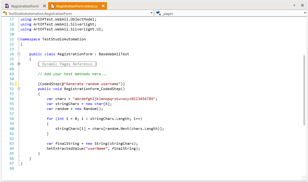
You’ll need the coded step because you’ll have to use a sample code snippet which will create a random username using set of characters and will assign that username to an extracted variable for further use in the test. This is a very good example of how powerful the mixed approach of recording plus code is.

The coded step looks like this:

coded step

The last line of the code snippet sets the randomly generated string as a value to extracted variable userName. Now the variable can be used in the entering username step (Step 3) using the step properties:

databind

Once done, every time you execute the test a new random username will be generated and used for registration.

Using variables in the test execution is one of the many features of Test Studio which you can use and ease your testing.

If you're new to Test Studio, you can download a free 30-day trial and get started with this example today - just click the link below.

Try Test Studio

Why Xamarin

$
0
0

While there are many ways to build for mobile form factors, let's explore what's in it for developers if they choose the Xamarin technology stack.

Even after years of building for mobile, developers still heavily debate the choice of technology stack. Perhaps there isn't a silver bullet and mobile strategy really depends - on app, developer expertise, code base maintenance and a variety of other factors. If developers want to write .NET however, Xamarin has essentially democratized cross-platform mobile development with polished tools and service integrations. Why are we then second guessing ourselves?

Turns out, mobile development does not happen in silos and all mobile-facing technology platforms have evolved a lot. It always makes sense to look around at what other development is happening around your app - does the chosen stack lend itself to code sharing? Are the tools of the trade welcoming to developers irrespective of their OS platform? Do the underlying pillars of chosen technology inspire confidence?

Let's take a deeper look and justify the Xamarin technology stack. Spoiler - you won't be disappointed.

This article is a part of a long content series on Chasing Success with Xamarin Apps - we explore the Xamarin technology stack, tools and services that help developers build successful mobile apps.

Mobile Strategies

While there are variety of ways to build for mobile, the following are the broad categories:

MobileStrategy

Thankfully, whichever technology stack mobile developers choose, there's mature tooling and easy access to mobile platform APIs. Let's discuss some pros and cons of each approach however:

  • Native: The most straightforward way of building for mobile is native apps for iOS, Android and Windows. Native apps run closest to the metal and developers get to use platform-specific SDKs/languages/tools. While fast and beautiful, native apps are rather expensive, requiring maintenance of platform-specific code bases.

  • Mobile Web/PWAs: The lowest hanging fruit to go cross-platform with mobile is often mobile web - there are plenty of frameworks that help web applications work nicely on mobile browsers. Mobile web apps can be taken to extreme smartness through Progressive Web Apps - where web apps start behaving as legitimate citizens in the mobile app world. Users can pin web apps to their home screens, have service workers run in the background and get push notifications. There is a lot of tooling help when building mobile web and mature JavaScript SPA frameworks for building PWAs.

  • Hybrid: Cordova popularized the idea of building cross-platform mobile apps with web technologies - HTML, CSS and JS bundled together to make a mobile app. Such hybrid apps ran within the browser shell and the user would not notice if done well. While hybrid apps enjoy good tooling, mature frameworks like Ionic and app store presence, the browser sandbox does hamper their runtime speed a little.

  • JS Native: The last few years have been witness to the rise of cross-platform mobile apps written in JavaScript/Typescript - the point is, why go hybrid when you can go native with the same technologies? JS Native apps enjoy complete native platform access and render native UI - all from a single code base. JS Native apps enjoy wonderful frameworks like NativeScript, NativeScript with Angular/Vue integration, React Native and Flutter.

  • X-Compiled: If you would rather write .NET code and use familiar tooling like Visual Studio, the cross-compiled mobile app solution is rather enticing. The trick is compiling higher level .NET language code into binary bits for each mobile platform, all the while rendering native UI. Xamarin has largely democratized the X-compiled space, with the Uno platform lending a helping hand of late.

While you'll find this article advocating for the Xamarin technology stack, the point of this mobile strategy discussion is that you don't have to always do Xamarin to reach cross-platform mobile. If you are invested in the web stack and happy writing JS/TS, the web route of getting to mobile form factors will yield rich dividends and lend itself better to code sharing.

All the .NETs

As one dives into the Xamarin technology stack, it is often beneficial to taka a step back and understand the .NET ecosystem - where does Xamarin fit? Here's the big picture story with .NET:

DotNets

As developers know, the .NET stack has evolved a lot in the past couple of years. There are multiple .NETs for different types of apps - to be read as multiple Base Class Libraries (BCLs). The three most popular ones are:

  • .NET Framework: This is the full .NET Framework that has the been the darling of developers on the Microsoft stack for 17 years now. The .NET Framework provides as rich an ecosystem as you can get - top notch tools, community support, extensibility and runtime for hosting variety of .NET applications. Over the years however, the .NET Framework has shown obvious bloat and the monolithic nature of the framework invites brittleness, as well as upgrade headaches. Make no mistake, the .NET Framework isn't dying and remains a core part of Windows. However, it may not see serious innovations going forward - existing apps would continue to run fine, but any greenfield development should look ahead at other .NETs.

  • .NET Core: This is the new .NET, built from ground up to address some of the concerns of .NET Framework. .NET Core is lean, modular and for the first time, boasts a cross-platform runtime taking .NET apps to MacOS/Linux. While new, .NET Core has seen rapid innovations and sports near-par API features compared to the .NET Framework. The lightweight nature of .NET Core lends itself naturally for building high performance web applications, while the command line/cross-platform tooling provides developers with liberties. The benefits of side-by-side .NET runtimes are stretching back to desktop with .NET Core 3, while .NET Core itself pushes the envelope with technologies like ML.NET.

  • Mono: Since the inception of .NET, there has been a desire to take .NET apps outside of Windows. Meet Mono - the port of .NET APIs to other platforms that is as old as the .NET Framework itself. Mono is the runtime for all Xamarin applications and remains an incredibly versatile way of supporting .NET on an increasing number of non-Windows platforms.

It is not hard to see how this variety of .NETs in the ecosystem provides flexibility - developers get to choose which .NET works best for their apps. Xamarin running on Mono is a very important piece of the puzzle for Microsoft - it is what gives .NET the extensive platform reach. With all the .NETs, there are very few devices/platforms that modern .NET developers cannot reach.

Mono or .NET Core

Mono has always been a great natural fit as a runtime for Xamarin apps. Developers write .NET code which is compiled down to generic Intermediate Language (IL) code, and then the Mono bridge/virtual machine translates .NET IL to native assembly code for iOS/Android or other platforms. It is only recently that much of .NET became open source - prior to that, Mono painstakingly made .NET code portable and executable on other platforms.

However, there is .NET Core now, which is modern, versatile and cross-platform. Developers in the Xamarin ecosystem have wondered of late - could .NET Core actually replace Mono as the runtime for Xamarin apps?

MonoNetCore

While it is enticing to expect everything out of the new polished runtime, the realities dictate otherwise. Turns out, age does make you wise and Mono, to this day, sports a bigger API surface area than .NET Core. Mono is also very performant for .NET apps running on iOS/Android - both through IL interpretation or statically compiled. Mono is also way ahead of the game in .NET implementations on future-facing platforms, like the all-important WebAssembly. So, it is safe to say that Mono is here to stay and power .NET apps across a wide variety of platforms.

The other question to consider is fragmentation of .NET. While having various .NET BCLs optimized for different platforms is nice, is the present state of the ecosystem inviting confusion for developers? Does it make sense for Microsoft or the open source community to maintain so many .NET? Perhaps a unification of the various runtimes is called for - only time will tell.

How to Xamarin

Developers choosing the Xamarin technology stack to build for mobile can be assured of a solid performant runtime and a plethora of rich tooling. This frees up developers from having to worry about the logistics of building an app, and lets them just focus on the app itself. As one gets started with Xamarin, there are two broad choices:

Xamarin iOS/Android

From the early days of Xamarin, the goal was to write .NET code that could be shared across mobile platforms, and this is traditionally what is called Xamarin.iOS/Android. Often dubbed Xamarin Native, the goal is to have a shared code layer written in .NET and platform-specific projects for the UI part of the mobile apps.

XamarinNative

The goal with Xamarin.iOS/Android is to abstract out as much of the app feature set as possible into a .NET code library - this is shared across all platforms. While a great step in the right direction, Xamarin Native does require developers to build the UI layer of each supported mobile platform on its own. This means developers do need to know how to build app UI for iOS, Android and Windows natively - all pulled together into a single project and referencing the shared library.

So when should developers choose to build with Xamarin iOS/Android? Xamarin Native is a good choice in general when mobile apps tend to cater heavily to a certain platform - where lots of native behaviors and custom UI are called for. Mobile games are also served well with Xamarin Native - essentially, Xamarin.iOS/Android is a good choice anywhere developers want to run as close to the metal as they can. Xamarin Native still benefits from a shared .NET code layer, but the UI is written natively for each mobile platform. Additionally, Xamarin.Forms (see below) can now be embedded inside of Xamarin Native, thus getting the best of both worlds.

Xamarin.Forms

What started out as a prototyping tool for cross-platform abstractions has grown into what we call Xamarin.Forms today. In addition to the shared .NET code, there is a layer of shared UI that stretches across platforms and renders corresponding native UI. This shared UI layer is an abstraction allowing developers to write .NET code/markup, which gets translated to native UI on each platform at/before runtime. Xamarin.Forms has the huge benefit of .NET developers not having to know the intricacies of building iOS/Android UI by hand.

XamarinForms

Keep in mind though, Xamarin.Forms is trying to solve an incredibly hard problem - a consistent UI abstraction layer that renders native UI on platforms that are uniquely different. While Xamarin.Forms has a large breadth of control coverage, the developer community and partner ecosystems fill in the gaps with cross-platform UI. If developers are up for it and app demands it, developers can always jump down to native UI land from Xamarin.Forms by writing custom renderers for platform-specific behaviors or rendering native UI controls on a per platform basis.

So Why Xamarin Again?

The bottom line is, it is 2019 and hopefully mobile isn't an afterthought. A legitimate mobile strategy reduces developer frustration and allows for code reusability. If you are invested in web technologies, modern mobile web, hybrid or JS native apps are the way to go - you have rich tooling and plethora of native API access.

If however you want to go with the .NET option, Xamarin is an easy choice. Here are some indicators that will help you make up your mind that you want to choose the Xamarin technology stack:

  1. You want to write C#/F# code
  2. You are comfortable with XAML as a markup language
  3. You care for maximum code reusability with other .NET projects
  4. You want to stay within the comforts of Visual Studio
  5. You expect a solid runtime, polished tools and a rich ecosystem

Convinced about Xamarin? Your code is in good hands and the future looks awesome.

Choose Time Intervals with the TimeSpanPicker for WinForms

$
0
0

No more using multiple date time pickers to setup your time intervals. We are happy to introduce the brand new TimeSpanPicker control for WinForms applications. Learn all about the new control in the following article.

We've received multiple requests through the WinForms feedback portal to add a time span picker to the Telerik UI for WinForms suite and they have not been disregarded. In case you missed it, as of earlier this year, with the Telerik R1 2019 release, the new TimeSpanPicker control is available in the suite.

The RadTimeSpanPicker is a UI component that provides full control over selecting a specific time span and duration within certain ranges using the built-in components for days, hours, minutes, seconds and milliseconds.

Meet RadTimeSpanPicker

Imagine that we need to implement a flight booking system. First, we need to place a couple of DropDownLists for the from/to destinations, a DateTimePicker for picking the date of the flight and perhaps a filter for how long flight we will need. Here, in the last part, is where the RadTimeSpanPicker comes into play.

time-span-picker-flight

What we did above to configure the control is simply place it in the form and set its Format, and then we get the value the user entered from the Value property. We can also use the ValueChanged event to get notified when the Value property is changed. As simple as this.

this.radTimeSpanPicker1.Format = "'Under 'hh' hours'";
 
privatevoidRadTimeSpanPicker1_ValueChanged(objectsender, EventArgs e)
{
    TimeSpan flightDuration = this.radTimeSpanPicker1.Value.Value;     
    // filter the flights
}

Other Useful Functionalities of the Control:

  • Negative values – useful to show time overdue cases
  • Binding – through the simple data binding
  • Localization – make the control speak any language with the convenient localization provider
  • EditMode – various edit modes are provided to capture the different use cases the control can be used in
    • Mask – limit the user to just use the text box to modify the value
    • Popup – limit the user to pick only predefined values from the pop-up
    • Combined – give the user full flexibility
  • Step properties – define the steps for each component, e.g. by 10min, by 2 hours, etc.
  • ReadOnly – this lets you display time span information to the user without allowing editing, or allows you to enable/disable the editing capability per some business logic
  • Null Values support – the control happily accepts null as Value, which is useful in data bound scenarios, in this case the NullText property can be used to show prompt text
  • SpinButtons – a convenient feature that you can enable for users to change the value with the built in buttons in the text box
  • Various events are at your leisure to get informed of value being changed (ValueChanging and ValueChanged), pop-up open/close (PopupOpened/Closed), as well as convenient extensibility point where we can plug in custom logic (the ComponentCreated and ComponentsCreated events of PopupContentElement) - more on this topic later

Structure

The control consists of two main elements: RadMaskedEditBoxElement and RadTimeSpanPickerContentElement.

RadMaskedEditBoxElement

RadMaskedEditBoxElement allows users to modify the value directly in the text box and at the same time validates it. The Format property specifies which portions of a time span value can be edited. The default format is “dd:hh:mm:ss.fff”

time span picker

To add specific content to the format string you will need to enclose it with single quotes. Here is an example that shows this.

this.radTimeSpanPicker1.Format = "dd' days, 'hh' hours, 'mm' minutes, 'ss' seconds, 'fff' milliseconds'";

time span picker custom format

RadTimeSpanPickerContentElement 

RadTimeSpanPickerContentElement is the main element of the pop-up and hosts a collection of components. Each component represents a different part of the TimeSpan object.

time span picker popup

We provide five default time span part components, so you can easily set up the time intervals you wish to pick:

  • DayTimeSpanPickerComponent
  • HourTimeSpanPickerComponent
  • MinuteTimeSpanPickerComponent
  • SecondTimeSpanPickerComponent
  • MillisecondTimeSpanPickerComponent.

Components are created each time the value of TimeSpanPickerElement Format property is changed, based on the desired format (for example: if the format is “dd:hh”, day and hour components will be created when the pop-up is opened).

Custom Components

We’ve provided a way to handle scenarios which require a custom time span as well.

For example, if you want the user to be able to pick one week intervals, you can easily implement it by creating a custom BaseTimeSpanPickerComponent and overriding its GetValueInTicks() and SetValue(TimeSpan value) methods. GetValueInTicks returns a TimeSpan value as ticks corresponding to the selected item from the UI component. SetValue is used to set the value of the component and choose which part of the TimeSpan value we want to use.

publicoverridelongGetValueInTicks()
{
    doubleweeks = this.WeeksListTimeSpanPickerUIComponent.GetSelectedValue();
    returnTimeSpan.FromDays(weeks * 7).Ticks;
}
 
publicoverridevoidSetValue(TimeSpan value)
{
    doubleweeks = value.Days / 7d;
    this.WeeksListTimeSpanPickerUIComponent.SetSelectedValue(weeks);
}

The BaseTimeSpanPickerComponent has a UI part, which is used to display the values to the end users. By default, we use RadListElement to list all available values. Now let’s add specific text to the values displayed in the list. We will override the CreateItemsSource method, which is used to create our items based on three properties: Minimum, Maximum and Step. In this case, we customize the displayed text and align it to the right. Here is what our custom UI component looks like:

publicclassWeeksListTimeSpanPickerUIComponent : ListTimeSpanPickerUIComponent
{
    publicWeeksListTimeSpanPickerUIComponent(ITimeSpanPickerComponent owner) : base(owner)
    { }
 
    protectedoverridevoidCreateItemsSource()
    {
        base.CreateItemsSource();
        foreach(RadListDataItem item inthis.ListElement.Items)
        {
            item.Text = item.Value + " weeks";
            item.TextAlignment = ContentAlignment.MiddleRight;
        }
    }
 
    publicdoubleGetSelectedValue()
    {
        returnthis.GetValue();
    }
 
    publicvoidSetSelectedValue(doublevalue)
    {
        this.SetValue(value);
    }
}

To include our custom component, we need to override the CreateVisualElement method of our WeekTimeSpanPickerComponent. We will also define our Minimum, Maximum and Step values and set the header text. The whole class looks like this:

publicclassWeekTimeSpanPickerComponent : BaseTimeSpanPickerComponent
{
    publicWeekTimeSpanPickerComponent(ITimeSpanPickerContentElement owner) : base(owner)
    {
        this.Minimum = 0;
        this.Maximum = 10;
        this.Step = 0.5;
        this.UpdateLocalization();
    }
 
    publicoverrideBaseTimeSpanPickerUIComponent CreateVisualElement()
    {
        returnnewWeeksListTimeSpanPickerUIComponent(this);
    }
 
    publicWeeksListTimeSpanPickerUIComponent WeeksListTimeSpanPickerUIComponent
    {
        get{ returnthis.TimeSpanPickerUIComponent asWeeksListTimeSpanPickerUIComponent; }
    }
 
    publicoverridelongGetValueInTicks()
    {
        doubleweeks = this.WeeksListTimeSpanPickerUIComponent.GetSelectedValue();
        returnTimeSpan.FromDays(weeks * 7).Ticks;
    }
 
    publicoverridevoidSetValue(TimeSpan value)
    {
        doubleweeks = value.Days / 7d;
        this.WeeksListTimeSpanPickerUIComponent.SetSelectedValue(weeks);
    }
 
    publicoverridevoidUpdateLocalization()
    {
        this.TimeSpanPickerUIComponent.HeaderText = "Select Weeks";
    }
}

The last step is to tell our RadTimeSpanPicker to use this newly created component. To achieve this, we need to subscribe to the ComponentsCreated event of PopupContentElement, where we will remove all default generated components and insert our custom one.

this.radTimeSpanPicker1.PopupContentElement.ComponentsCreated += this.PopupContentElement_ComponentsCreated;
 
privatevoidPopupContentElement_ComponentsCreated(objectsender, EventArgs e)
{
    ITimeSpanPickerContentElement contentElement = this.radTimeSpanPicker1.PopupContentElement;
    contentElement.Components.Clear();
    contentElement.Components.Add(newWeekTimeSpanPickerComponent(contentElement));
}

time span picker popup weeks

In the end, we will add just a few more lines of code to show how you can add a new button next to the Close button, which will be used to reset the value of RadTimeSpanPicker.

TimeSpanPickerDoneButtonElement buttonPanel = (radTimeSpanPicker1.PopupContentElement asRadTimeSpanPickerContentElement).FooterPanel;
 
RadButtonElement clearButton = newRadButtonElement("Clear");
clearButton.Click += ClearButton_Click;
buttonPanel.LayoutPanel.Children.Add(clearButton);

And a code sample that shows how to access the panel with buttons and clear the value of RadTimeSpanPicker:

privatevoidClearButton_Click(objectsender, EventArgs e)
{
    RadButtonElement button = (RadButtonElement)sender;
    TimeSpanPickerDoneButtonElement buttonPanel = button.FindAncestor<TimeSpanPickerDoneButtonElement>();
    buttonPanel.Owner.SetValueAndClose(null);
}

time span picker popup clear button

Try It Out and Share Your Feedback

For more details about RadTimeSpanPicker, you can visit the online documentation and take a look at the demos. For any further feature or control requests, make sure to log them into the WinForms Feedback portal.

If you in search for a comprehensive WinForms UI toolkit for your current or upcoming desktop project and have not yet had the chance to explore Telerik UI for WinForms, you can find detailed information on the product page. You can also download a free 30-day trial to explore it in-depth and evaluate whether it will be a right fit for your application.

A Glimpse into WebAssembly

$
0
0

WebAssembly opens up the playing field, allowing any language with the right tooling - not just JavaScript - to be executed in the browser. See why this is something you should start exploring.

What is WebAssembly?

WebAssembly is one of those tech buzzwords that is starting to make the rounds. Before you jump to the conclusion that it's one of those trendy topics that should be ignored — or that it's going to change your life — we are going to go over exactly what it is, what it isn't, and why you should be starting to get excited about it. To begin, we are going to start with the formal definition from webassembly.org:

WebAssembly (abbreviated Wasm) is a binary instruction format for a stack-based virtual machine. It's designed as a portable target for compilation of high-level languages like C/C++/Rust, enabling deployment on the web for client and server applications.

In practice, the best way to think about WebAssembly is that it is a packaging format for code that has been compiled into a portable format that can be used by either frontend or backend code. At this time, there are a few compilers that can turn your language of choice code into WebAssembly.

The really exciting part about all of this is, if you think of JavaScript as the language for web browsers, WebAssembly opens up the playing field and allows ANY language (with the right tooling) to be executed in the web browser.

Reasons To Be Excited

The true benefit comes from WebAssembly's ability to do streaming compilation. Since it was designed for the web, it can start compiling as soon as the data is received on the client without waiting for the entire file. This is a significant improvement from how JavaScript works, which has to wait until the entire file is received before it begins. As your JavaScript file increases in size, it slows down your page in two ways: longer to download the file, and longer to parse the JavaScript which increases the time to First Meaningful Paint (FMP). The streaming compilation allows you to bypass both of these traditional JavaScript pitfalls. WebAssemby's streaming ability is a huge game changer for page paint times and time to interactive. You'll see the page rendering out while the download of the file is still going on.

WebAssembly is open to any language that can be compiled down to the shared assembly, which can open the doors to code reuse between frontend and backend codebases. The ability to have a single language for frontend and backend used to be one of the great pillars of Node, which can be opened up to any language going forward. Of course, this is highly dependent on tooling that allows the languages to be compiled down to WebAssembly (e.g. Blazor, Yew).

Along with code-sharing between teams, WebAssembly shares memory space with the JavaScript engine to allow functions to be exported/imported across the code bases. This seems like a side note, but it's huge. I think this will allow for greater adoption since code can be migrated a little bit at a time without undertaking a huge shift within the team.

Potential Pitfalls

As with all good tech, there are some tradeoffs to keep in mind as you start to incorporate it with your technology stack.

One of the biggest features WebAssembly has been touting is performance. While the overall performance is trending to be faster than JavaScript, the function-to-function comparison shows that JavaScript is still comparable in some benchmarks, so your mileage may vary. When comparing function execution time, WebAssembly is predicted to be about 20-30% faster than JavaScript, which is not as much as it sounds since JavaScript is heavily optimized. At this time, the function performance of WebAssembly is roughly about the same or even a little worse than JavaScript — which has deflated my hopes in this arena.

Since WebAssembly is a relatively new technology, there are probably a few security exploits waiting to be found. For example, there are already some articles around exploiting type checking and control flow within WebAssembly. Also, since WebAssembly runs in a sandbox, it was susceptible to Spectre and Meltdown CPU exploits, but it was mitigated by some browser patches. Going forward, there will be new exploits.

Also, if you are supporting enterprise clients using IE or other older browsers, then you should lean away from WebAssembly. It is still not supported within IE. There has been some early work on polyfills to bridge this gap in IE and older browsers to speed up adoption, but it has slowed due to the quick adoption in browsers of the existing standard.

Another thing to keep in mind is that WebAssembly is still client code, so you should still keep it safe and sanitized. Despite being compiled down, you should still avoid placing any server secrets or user secrets inside of the WebAssembly.

Good Place To Start

If you are wondering where and how to start using WebAssembly in your current web app, there are three areas of your system that would be great starting points.

The first area is looking at the surface area between your frontend and backend code. This is a great opportunity to split any shared code into its own library to be hosted as a .wasm on your CDN or used in your backend process. For some React/Angular apps, it is pretty common to have some shared code between frontend and backend. For e-commerce apps, pricing is always computed twice — once for the client as a preview, and the second time by the server to verify the pricing matches what the user saw on the frontend. Ideally, this code would be written once and just used where needed despite the language, which makes it a great candidate for WebAssembly.

The second starting area would be when taking a new look at an existing project. For example, as a .NET developer, if you want to make some progress toward a single-page application (SPA) without retraining your team on Angular or React, you can start using WebAssembly to aid in that goal via the Blazor framework. Imagine building a SPA with all patterns and tools of .NET with all the benefits of a statically hosted page as the end product.

For the third area, as you start new web-based projects around image manipulation, data visualization, or anything highly interactive (games, charts), it is worth looking into starting with WebAssembly as the deliverable. Unity is pushing WebAssembly to be the default bundle for their clients due to performance (startup and runtime), and there is no reason that you shouldn't as well.

Wrapping Up

So, should you drop everything you are doing today and start on the migration to WebAssembly? No, not yet. There are some folks looking into using WebAssembly with some of our favorite frontend frameworks as we speak, which is where you'll see the biggest gain in performance in the near future. That is when I will actually start to feel enthusiastic about WebAssembly.

Is it something that you should start exploring? Absolutely. I think that WebAssembly is going to give a bigger performance boost to web apps than micro-tuning bundle sizes. Also, it may even give server-side rendering (SSR) competition as the way to serve pages faster.

Stayed tuned. I suspect we'll hear more about WebAssembly and improvements to its features soon.

One HamburgerMenu, Please—Modern Navigation for Your WPF App

$
0
0

WPF application developers rejoice! You can have an intuitive and modern navigation in your application - look no further than the NavigationView (HamburgerMenu) in Telerik UI for WPF. Learn all about this powerful navigation control below.

I recently heard the term “conscious control,” and asked myself, "what does this mean, do controls have actual consciousness (duh!)?" However, that was just for a few seconds.

They are actually controls that can adapt to different window sizes layouts, which is essential for apps that scale across various devices and dimensions. To create conscious controls, you can either code your own adaptive UI to optimize for different screen sizes, or you could save yourselves a considerable amount of time and simply use the new NavigationView (HamburgerMenu) control, which arrived in Telerik UI for WPF in R1 2019.

In case you missed our new release, the NavigationView is just a small (but essential) part of it. Let's have a minute of glory for the new DiagramRibbon and HyperlinkButton controls, the support of Charts for RadSpreadsheet and RadSpreadProcessing and last, but not least - .Net Core 3 and VS 2019 support!

Now, let’s not forget who the “star” of the show is. That’s right – the brand new NavigationView.

Does your app need to:

  • Provide a consistent navigational experience
  • Preserve screen real estate on smaller windows
  • Organize access to many navigation categories

If the answer to at least one of the following key points is YES, then this is the right control.

For more information on how to create a sample application that contains a RadNavigationView (HamburgerMenu) control, jump into its Getting Started article.

Anatomy

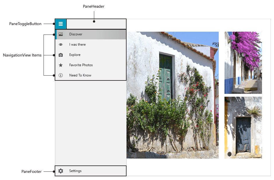
Reading this title, you thought for a second of Grey’s Anatomy, didn’t you? Now let’s lift the curtain and look at the hamburger menu’s control layout.

The recipe for the hamburger menu consists of:

  • PaneHeader - the Header (or the top burger bun) of the NavigationView
  • PaneToggleButton – the one that opens/closes the NavigationPane, which hosts the NavigationViewItems
  • NavigationView Items – the most important “ingridients” of the HamburgerMenu, used for navigating to specific content, which can be populated statically or through databinding
  • Pane Footer - the Footer (or the bottom burger bun) of a RadNavigationView

NavigationView Visual Structure

Adaptive Behavior

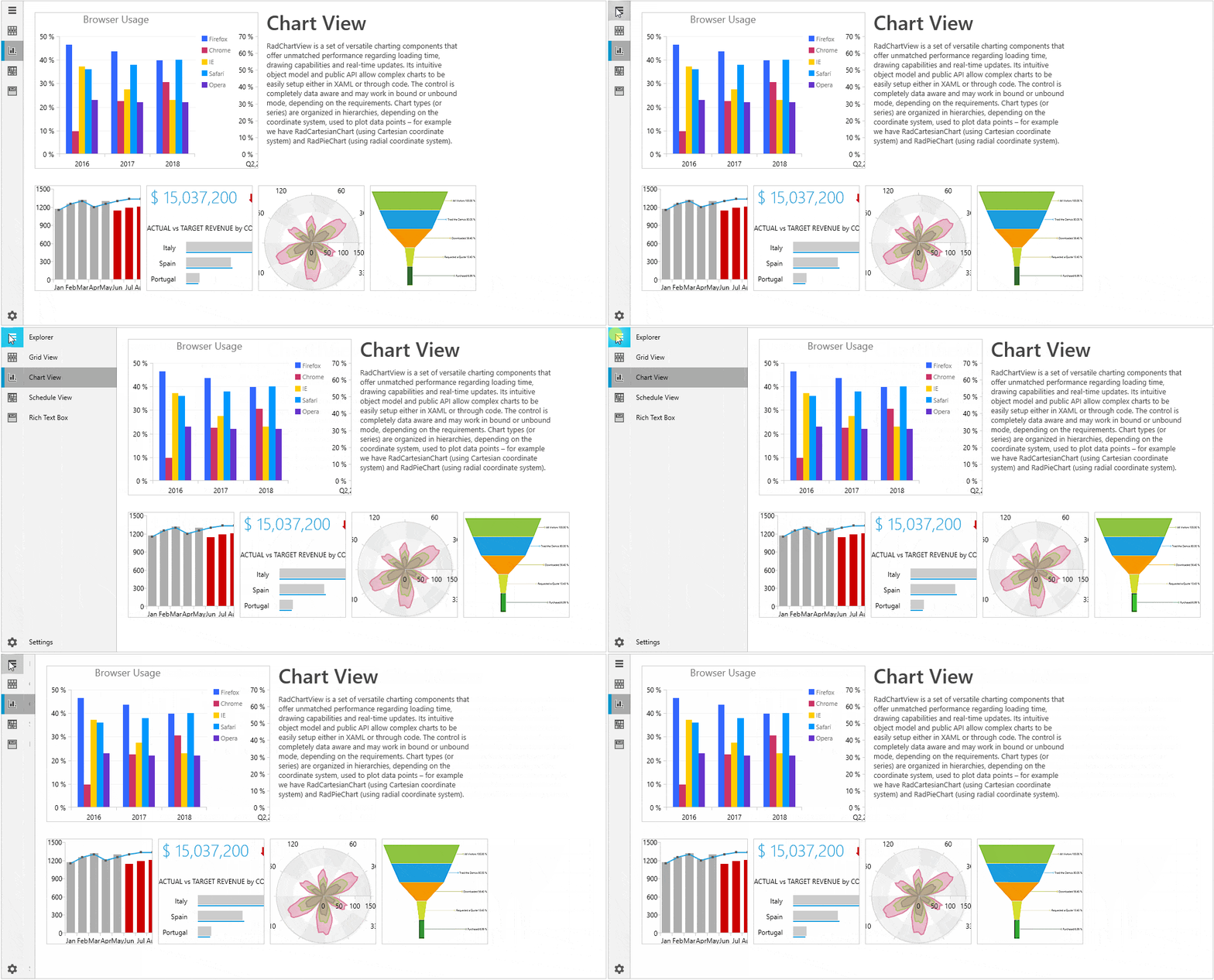
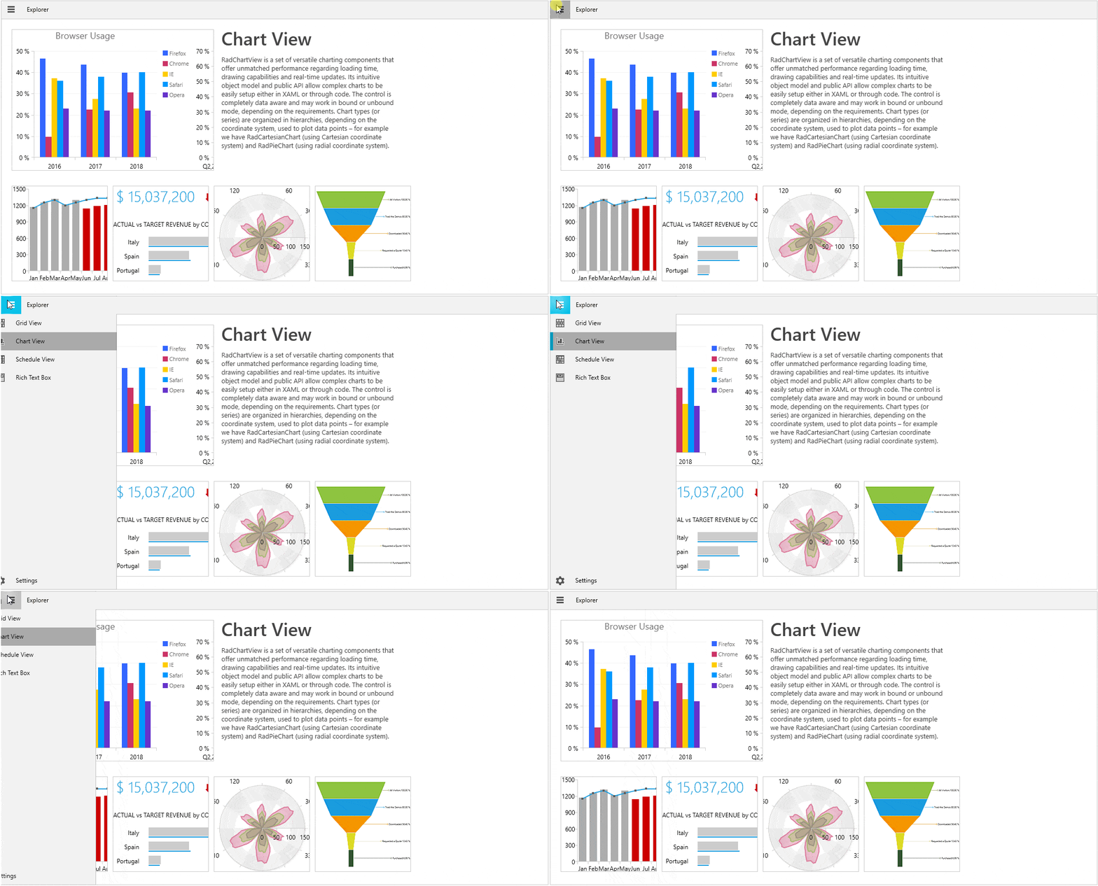
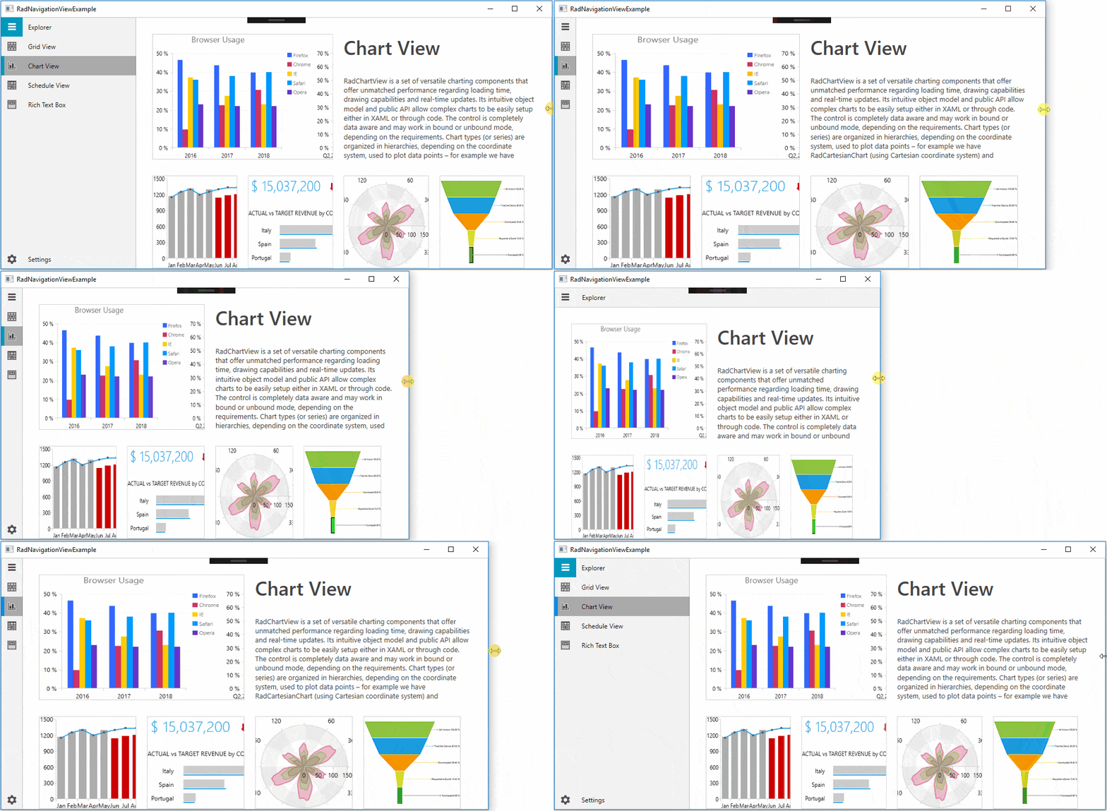
By default, the navigation view automatically changes its DisplayMode depending on the amount of available size. It has three display modes - Minimal, Compact and Expanded.

ExpandedModeExpanded mode – the pane stays open alongside the content

CompactModeCompact mode – the pane always shows as a narrow sliver

MinimalModeMinimal mode – the pane shows/hides on PaneToggleButton click; the button remains fixed

By default, the control changes its DisplayMode when its size passes certain thresholds. The CompactModeThresholdWidth and ExpandedModeThresholdWidth properties specify the breakpoints at which the display mode changes. The default value for the compact one is 641 and the default value for the expanded - 1008. You can modify these values to customize the adaptive display mode behavior.

NavigationViewDisplayModeTransition

If you want to be in control of this adaptive behavior, you can do that. The only thing that you need to do is set the AutoChangeDisplayMode property to False:

  • In Xaml:
    <telerik:RadNavigationViewx:Name="navView"AutoChangeDisplayMode="False"/>
  • In Code:
    this.navView.AutoChangeDisplayMode = false;

Flexible Customization

I love the power of customizable components! Who doesn’t? Many of the NavigationView’s parts are fully customizable.

Customizing the PaneToggleButton

You can customize the look and feel of the PaneToggleButton using PaneToggleButtonContent, PaneToggleButtonContentTemplate and PaneToggleButtonStyle properties. If you do not need it, you can just use the PaneToggleButtonVisibility property.

Customizing the Header/Footer

The list of properties that allow customizing the control’s header are: PaneHeaderPaneHeaderTemplate and PaneHeaderHeight.

The footer can be customized using the PaneFooter and PaneFooterTemplate properties.

Wait, there is more.

I forgot to mention that you can change the color of pane components at glance with PaneBackground, PaneHeaderBackground and PaneHeaderForeground properties.

Customizing the Items

The RadNavigationViewItems are fully customizable, too, especially their icons.

The Icon and IconTemplate properties are the key here. With the help of the IconTemplate, a single DataTemplate can be set to many RadNavigationViewItems. More information on how to set the Icon of an item to a RadGlyph or use the IconTemplate property in a databinding scenario can be found in this article.

As Selector and ItemsControl classes are part of RadNavigationView’s base classes, the following properties can also be used to style the control items: ItemTemplate, ItemTemplateSelector, ItemContainerStyle.

Customizing the Open/Close Animations

By default, RadNavigationView defines three animations named ResizePaneAnimation, MinimalPaneOpenAnimation and MinimalPaneCloseAnimation.

  • ResizePaneAnimation - played when the DisplayMode of the RadNavigationView is either Compact or Expanded and the NavigationPane is opened or closed
  • MinimalPaneOpenAnimation - played when the DisplayMode of the RadNavigationView is Minimal and the NavigationPane is closed
  • MinimalPaneCloseAnimation - played when the DisplayMode of the RadNavigationView is Minimal and the NavigationPane is opened

This article demonstrates how you can customize these animations.

Events

Here is the list of most important events that you need to know when it comes to RadNavigationView:

  • ItemClick - occurs each time an item in the menu gets clicked
  • PaneOpened - occurs when the pane is open
  • PaneClosed - occurs when the pane is closed
  • SelectionChanged – occurs when the selection changes

All mentioned event handlers receive two arguments - the sender argument which contains the RadNavigationView (type - object, can be cast to the RadNavigationView type) and a RoutedEventArgs object.

Theming

There is no need to mention that the HamburgerMenu comes with the great and colorful variety of UI for WPF Themes Suite, right? And you remember that if the theme brushes are not colorful enough, we offer seamless color customization and fast palette creation with the help of the Color Theme Generator, don’t you?

Try It Out and Share Your Feedback

Enough talking. The Telerik R1 2019 Release is already live, so do not hesitate and give RadNavigationView a try right now by downloading the latest:

Try Telerik UI for WPF

Wait, what? You are just hearing about Telerik UI for WPF for the first time? Well then, head over to the product page to explore the key features, various controls and themes ready for the taking.

Feel more than welcome to share your thoughts as a comment below, or… wait! You can visit our revamped Feedback portals about UI for WPF/Silverlight and Document Processing Libraries and let us know if you have any suggestions or if you need any particular features/controls.

Managing State Using RxJS Subjects in Angular Applications

$
0
0

In this tutorial, we’ll create a simple note-saving application, and manage the application’s state by using an everyday library like RxJS.

Managing state in an application is a daunting task that sometimes requires the introduction of state management libraries into applications. Well, other times, for the application being built, a state management library might be a bit of overkill, a complication that means introducing a new set of APIs to fully utilize what the library offers.

State can always be managed within components, but a better solution (for me at least) lies within a library that comes with Angular, RxJS.

RxJS is a library for reactive programming using Observables, to make it easier to compose asynchronous or callback-based code.

Within the RxJS library exists a special type of Observable called a Subject. According to the documentation, an RxJS Subject is a special type of Observable that allows values to be multicasted to multiple Observers.

The implementation of the Subject suits our state management needs. Using Subjects, we’ll build a note-saving application for storing ideas and anything that bops into our heads.

To follow this tutorial, a basic understanding of Angular and RxJS is required. Please ensure that you have Node and npm installed before you begin.

If you have no prior knowledge of Angular, kindly follow the tutorial here. If RxJS seems strange to you, you can learn the basics at this website: learnrxjs.io. Come back and finish the tutorial when you’re done.

We’ll be using these tools to build our application:

Here’s a final demo of the application.

Initializing Application and Installing Dependencies

To get started, we will use the CLI (command line interface) provided by the Angular team to initialize our project.

First, install the CLI by running npm install -g @angular/cli. npm is a package manager used for installing packages. It will be available on your PC if you have Node installed. If not, download Node here.

To create a new Angular project using the CLI, open a terminal and run:

ng new note-app --style=scss

This command is used to initialize a new Angular project; the project will be using SCSS as the pre-processor.

Next, run the following command in the root folder of the project to install dependencies.

    // front-end dependencies
    npminstall uuid

The uuid package will be used to assign random ids to the created notes.

Start the Angular development server by running ng serve in a terminal in the root folder of your project.

Home View

To get started, we’ll define the views for the application, starting from the home page. The home page will house the form for creating notes, the notes grid and the header.

Open the app.component.html file and update it with the content below.

<!-- /src/app/app.component.html --><main><!-- header component will come here --><divclass="container"><div><!-- note form here --></div><divclass=""id="notes-box"><divclass="text-center"><divclass="header text-center"><div><!-- notes list here --></div></div></div></div></div></main>

In the snippet above, we’ve defined an area where the header will come in; same for the notes and form for creating notes. We’ll create these later in the tutorial.

Since we’ll be using external assets, we’ll update the src/index.html file to include links to these assets.

<!-- index.html --><!doctype html><htmllang="en"><head><metacharset="utf-8"><title>Note App</title><basehref="/"><metaname="viewport"content="width=device-width, initial-scale=1"><linkrel="stylesheet"href="https://stackpath.bootstrapcdn.com/bootstrap/4.2.1/css/bootstrap.min.css"integrity="sha384-GJzZqFGwb1QTTN6wy59ffF1BuGJpLSa9DkKMp0DgiMDm4iYMj70gZWKYbI706tWS"crossorigin="anonymous"><linkhref="https://fonts.googleapis.com/css?family=Montserrat:600"rel="stylesheet"><linkrel="icon"type="image/x-icon"href="favicon.ico"></head><body><app-root></app-root><scriptsrc="https://unpkg.com/feather-icons"></script></body></html>

The index.html file has been updated to include the Feather icon set, Bootstrap and Montserrat font family. We’ll select Montserrat as our default font family. Open the styles.scss file and update it with the following content:

// styles.scss/* You can add global styles to this file, and also import other style files */body, html{font-family:'Montserrat', sans-serif;background-color: whitesmoke;}

Header Component

The header component will display the application logo. The component will be rendered in the root app component.

Run the following command to create the header component:

ng generate component header

Next, open the src/app/header/header.component.html file and update it to look like the code below:

<!-- src/app/header/header.component.html --><header><divclass="brand"><imgsrc="/assets/images/document.png"alt="avatar"/><h5>For Notes</h5></div></header>

Note: Any image asset used can be found here in the GitHub repository

Next, we’ll style the header. Open the header.component.scss file and update it with the snippet below:

//header.component.scssheader {display: flex;background-color: white;margin:0;padding:16px 5%;color: whitesmoke;box-shadow:02px 4px 0rgba(0, 0, 0, 0.1);.brand {flex:1;display: flex;align-items: center;img {height:35px;border-radius:50%;margin-right:17px;}h5 {font-size:18px;font-family:'Montserrat', sans-serif;margin:0;text-transform: capitalize;color:#20B2AA;}}}

After creating the header component, the next step is to render the component in the root App component. Open the app.component.html file within the src/app/ directory and update it to render the component.

<!-- app.component.html --><main><app-header></app-header><divclass="container"><!-- the rest of the file --></div></main>

Start the application server by running the following command: npm start or ng serve.

Then navigate to http://localhost:4200 on your browser. You should see the header in all its greatness:

Make sure to get the image assets from GitHub or use your preferred images

Introducing RxJS Subjects

According to the documentation, an RxJS Subject is a special type of Observable that allows values to be multicasted to multiple Observers. It differs from plain Observers, which are unicast and are bound to one observer. Subjects are more of EventEmitters than Observables, which is why we’ll be making use of them to manage the data flow in this application. We’ll be using Actions and a reducer that acts on the Actions emitted. This is similar to Redux and NgRx/store.

The first step is to create and assign actions. The actions will be mapped to constants using an enum. Create a folder named store within the src/app directory. This folder will hold everything relating to our application’s state management.

Within the store folder, create a file called actions.ts. Open the file and update it with the code below:

// src/app/store/actions.tsexportenum ActionTypes {
      CREATE_NOTE ='[HOME] Create a note',
      DELETE_NOTE ='[HOME] Delete a note',
      GET_NOTES ='[HOME] Get all notes'}

The actions will be stored as constants with an enum named ActionTypes. This will be used to tell our makeshift reducer how to act on the data coming through.

After creating the action types, the next step is to create a reducer that handles transitions of state from the initial to the next based on the action dispatched. Create a file named index.ts in the src/app/store directory. Open the file and update it with the code below:

// src/app/store/index.tsimport{Subject}from'rxjs';import{ActionTypes}from'./actions';import{Note}from'../note-card/note-card.component';interfaceInitialState{
      notes:Array<Object>;}let state: InitialState ={
      notes:[],};interfaceEvent{type: String;
      payload?: Object;}exportconst store =newSubject<InitialState>();exportconst eventDispatcher =newSubject<Event>();
    
    eventDispatcher.subscribe((data: Event)=>{switch(data.type){case ActionTypes.GET_NOTES:
          store.next(state);break;case ActionTypes.CREATE_NOTE:
          state ={
            notes:[...state.notes, data.payload],};
          store.next(state);break;case ActionTypes.DELETE_NOTE:const{notes}= state;const id = data.payload;const updatedNotes = notes.filter((note: Note)=> note.id !== id);
          state ={
            notes: updatedNotes
          };
          store.next(state);break;default:break;}});

A reducer is simple pure function that transitions your application’s state from one state to the next. A reducer doesn’t handle side effects — it is a pure function because it returns an expected output for a given input.

First, we have to define the initial state of the application. Our application will display a list of notes and also allow a user to add and remove notes. So the initialState of our application will feature an empty array of notes.

After defining the initial state of the application, we’ll define the event type. The event is typically used to describe events in the application. When an event is triggered, a corresponding action type is dispatched with data to handle the triggered events. The Event features a simple interface with properties type and payload— the type property is a unique identifier for the action, and thepayload contains the data sent through the event.

For the state management, we’ll be using two Subjects. The store will hold the state of the application at all times; components in the application will subscribe to this Observable to get the latest updates in the application state. The next subject, the eventDispatcher, will be used to dispatch events in the application.

Basically, this is how it works. The eventDispatcher is subscribed and will listen for events in the application. Within it is a reducer function of some sort that transitions the state of the application based on the type of event dispatched. The makeshift reducer features a switch statement that acts on the type of action dispatched.

  • The first action type is the GET_NOTES action, which is called when a component wants to get the latest state of the application.
  • The next action type is CREATE_NOTE. This action is dispatched when a user wishes to add a new note. The action features a payload property containing details of the note. The reducer takes the item and appends it to the notes array and dispatches the updated state.
  • The final case is the DELETE_NOTE action. This is an event telling the reducer to remove a note from the array. The notes array is filtered using the id in the payload dispatched, and the item is left out of the next state.

The eventDispatcher is used to dispatch events, and, within the eventDispatcher observer, changes are made to the state and dispatched through the store observable.

Notes List View

Run the following commands to generate components for the note item and notes list:

    ng generate component note-card

And for the note list run:

    ng generate component note-list

Open the note-card.component.html file in the src/app/note-card directory and update with the code below:

    // src/app/note-card/note-card.component.html
    
    <divclass="note-card"><divclass="card text-white bg-card mb-3"><divclass="card-header"><button(click)="deleteNote(note.id)"><idata-feather="trash-2"id="trash-note"></i></button></div><divclass="card-body"><h4class="card-title note-title">{{
            note.title
            }}</h4><pclass="card-text note-text"> {{
            note.note
            }}</p></div></div></div>

The note card component will have a simple interface for displaying the note title and the note text.

The header section will house the delete button for removing an item from the list. The delete button will be represented by an icon from the Feather icon set.

Let’s style the component by updating the note-card.component.scss file with the styles below:

// note-card.component.scss.bg-card {background:#ffc30b;height:230px;border-radius:12px;border: none;}.note-card {width:250px;margin-left:20px;.card-header {display: flex;justify-content: flex-end;padding:0.55rem 1.25rem;button {background: transparent;border: none;#trash-note {width:21px;height:21px;color:rgba(0, 0, 0, 0.7);cursor: pointer;}}}.note-title {font-size:16px;font-weight: bold;text-transform: uppercase;text-align: left;opacity:0.8;color: black;letter-spacing: -.4px;}.note-text {font-size:15px;font-weight:500;text-align: left;opacity:0.6;color: black;letter-spacing: -.2px;}}

Open the note-card.component.ts file and update it with the variables and methods used in the HTML file.

// src/app/note-card/note-card.component.tsimport{Component, Input, OnInit}from'@angular/core';import{eventDispatcher}from'../store';import{ActionTypes}from'../store/actions';declareconst feather;exportinterfaceNote{
      id:string;
      title:string;
      note:string;}
    
    @Component({
      selector:'app-note-card',
      templateUrl:'./note-card.component.html',
      styleUrls:['./note-card.component.scss']})exportclassNoteCardComponentimplementsOnInit{
      @Input() note: Note;constructor(){}ngOnInit(){
        feather.replace();}deleteNote(id){const shouldDelete =confirm('Are you sure you want to delete this note?');if(shouldDelete){
          eventDispatcher.next({type: ActionTypes.DELETE_NOTE, payload: id});}}}

First we import the eventDispatcher observable from the store. The eventDispatcher will be used to dispatch actions.

The component takes one input note. The type definition of the note is declared using an interface called Note; this interface is exported to be used application-wide.

The deleteNote method takes one parameter (id). The method dispatches an action to remove an item from the list. The method first shows a confirm dialog, and, if the user confirms the action, the method dispatches an action to delete the note. The event payload is the id of the note.

Meanwhile, at the top of the file, a variable feather is declared. This variable represents the Feather library loaded in the application. In the ngOnInit lifecycle, feather.replace() is called to initialize the icons used in the component.

Next we’ll render the NoteCard component in the NoteList component. Open the note-list.component.html file and render the NoteCard component, similar to the snippet below:

<!-- note-list.component.html --><divclass="note-list"><app-note-card*ngFor="let note of notes"[note]="note"></app-note-card></div>

We’ll add some styles to the component’s stylesheet. Open the note-list.component.scss file and add the styles below:

.note-list{margin-top:16px;display: flex;flex-direction: row;flex-wrap: wrap;}

The note list component will receive an Input from the Home component. Update the component to take an Input of an array of notes:

import{Component, Input, OnInit}from'@angular/core';import{Note}from'../note-card/note-card.component';
    
    @Component({
      selector:'app-note-list',
      templateUrl:'./note-list.component.html',
      styleUrls:['./note-list.component.scss']})exportclassNoteListComponentimplementsOnInit{
      @Input() notes:Array<Note>;constructor(){}ngOnInit(){}}

After making this change, the next step is to render the note list component in the app.component.html.

Open the file and include the note list component within the element with the notes-box id attribute:

<main><app-header></app-header><divclass="container"><div><!--note form here--></div><divclass=""id="notes-box"><divclass="text-center"><divclass="header text-center"><div><app-note-list[notes]="notes"></app-note-list></div></div></div></div></div></main>

Then update the home component to subscribe to the store and fetch the initial state of the store:

import{Component, OnInit}from'@angular/core';import{eventDispatcher, store}from'./store';import{ActionTypes}from'./store/actions';
    
    @Component({
      selector:'app-root',
      templateUrl:'./app.component.html',
      styleUrls:['./app.component.scss'],})exportclassAppComponentimplementsOnInit{constructor(){
        store.subscribe((state)=>{const{notes}= state;this.notes = notes;});}
    
      notes =[];ngOnInit(){
        eventDispatcher.next({type: ActionTypes.GET_NOTES});}}

When subscribed to the store, the data returned is the current state of our store. The initial state of the store had a notes array property. We’ll get the current notes from the state.

In the ngOnInit lifecycle, an event is dispatched to get the initial state of the application.

Note Creation Component

After creating the display components for the notes, we’ll need to create a component that will handle creation of new notes. Run the following command to create the form component.

    ng generate component note-form

After the command has run successfully, open the note-form.component.html file within the newly created note-form folder. Update the content of the file to be similar to the snippet below:

<formclass="note-form"(ngSubmit)="completeStep()"#noteForm="ngForm"><divclass="inputs-holder"><divclass="form-group"*ngIf="step === 1 else noteText"><inputclass="form-control app-input"id="title"name="title"placeholder="The post title"[(ngModel)]="note.title"/></div><ng-template#noteText><divclass="form-group"><textareaclass="form-control app-input"id="note-text"rows="4"placeholder="Create a note for future use"[(ngModel)]="note.note"name="text"></textarea></div></ng-template></div><buttonclass="prev-button"id="prev"type="button"[hidden]="step === 1"(click)="prevStep()">Prev</button><buttonclass="submit-button"id="stepper"type="submit"><span*ngIf="step === 1 else submit">Next</span><ng-template#submit>Submit</ng-template></button></form>

The form will hold an input element for the title of the note and the textarea for the body of the note. Since each input will be filled sequentially, an *ngIf directive is used to display either one based on the current step. The textarea is surrounded by an ng-template with a template variable (noteText). This variable is featured in the else block of the ngIf expression.

The actions area features two buttons — one shown if the step is greater than 1 and vice versa.

Next, let’s update the component stylesheet with additional styles:

%button{border-radius:25px;padding:7px 20px;font-weight:500;border: none;font-size:12px;text-transform: uppercase;cursor: pointer;&:focus{outline: none;transform:scale(1.1);box-shadow:01px 2px 0rgba(0,0,0,0.2);}}%input{&:focus{outline: none;box-shadow: none;}border: none;border-bottom:2px solid lightseagreen;border-radius:0;padding:14px 10px;}.note-form{width:50%;margin:3% auto;background: white;box-shadow:01px 3px 1px rgba(0,0,0,0.3);border-radius:20px;padding:20px 16px 35px;#title{@extend%input;height:50px;}#note-text{@extend%input;}.submit-button{@extend%button;background: lightseagreen;color: white;}.prev-button{@extend%button;border:1px solid indianred;color: indianred;margin-right:10px;}}

Finally, the component will be updated to allow the creation of notes. The variables and methods are used in the component’s view template.

Open the note-form.component.ts file and update it with the code below:

import{Component, OnInit}from'@angular/core';import{v4}from'uuid';import{Note}from'../note-card/note-card.component';import{eventDispatcher}from'../store';import{ActionTypes}from'../store/actions';
    
    @Component({
      selector:'subject-note-form',
      templateUrl:'./note-form.component.html',
      styleUrls:['./note-form.component.scss']})exportclassNoteFormComponentimplementsOnInit{constructor(){}
    
      note: Note ={
        id:'',
        title:'',
        note:''};
    
      step =1;isStepComplete(step:number):boolean{switch(step){case1:return!!this.note.title;case2:return!!this.note.note;}}completeStep(){if(this.step ===1){const stepComplete =this.isStepComplete(this.step);if(stepComplete){this.step +=1;return;}}const formComplete =this.isStepComplete(this.step);if(formComplete){this.submit(this.note);}}prevStep(){if(this.step >1){this.step -=1;}}resetState(){this.note ={
          id:'',
          title:'',
          note:''};this.step =1;}submit(note: Note){const noteWithId: Note ={...note,
          id:v4(),};
        eventDispatcher.next({type: ActionTypes.CREATE_NOTE, payload: noteWithId});this.resetState();}ngOnInit(){}}

There are quite a few methods and properties defined here, so we’ll go through them one by one:

First, a note object is created to hold the inputted values by the user. Next is the step property, which defines the current step the user is on.

isStepComplete: this method takes step as the parameter and checks that the required values of the step have been filled. If the step is 1, then the note’s title should be filled, if step is 2, then note’s text should be filled.

completeStep: for each step, this method confirms its completion using the isStepComplete method. If the step is 1, move to step 2 and then call the submit method if the step is 2.

prevStep: simple method that decrements the step by 1.

resetState: returns the state of the component to its original state.

submit: this method takes a note object; it updates the object with an id generated using uuid. The new note is dispatched using the CREATE_NOTE event type, and, finally, resetState is called to return the state to its initial phase.

Next, update the app.component.html file to render the note-form component. Open the file and include this where you have the comment:

<main><app-header></app-header><divclass="container"><div><app-note-form></app-note-form></div><divclass=""id="notes-box"><divclass="text-center"><divclass="header text-center"><div><app-note-list[notes]="notes"></app-note-list></div></div></div></div></div></main>

After this change, if you visit http://localhost:4200, you should see all the latest changes we’ve made, including the ability to create a note and delete a note:

During the note creation process

After creating a note:

After successfully creating a note

Note: Ensure the Angular dev server is running on port 4200

Conclusion

In this tutorial, we’ve created a simple note-saving application where notes can be added and removed. We’ve been able to manage the application’s state by using Subjects only. State management can be done in easier ways using an everyday library like RxJS. It is easier to manage data flow in the application when side effects and data flow are abstracted from components. That being said, if you need to manage state in bigger applications, you should look to well-built libraries like ngrx/store and Redux, as this implementation is suited to small and medium sized applications. You can get the source code of the demo here.

For More Info on Building Apps with Angular:

Check out our All Things Angular page that has a wide range of info and pointers to Angular information – from hot topics and up-to-date info to how to get started and creating a compelling UI.
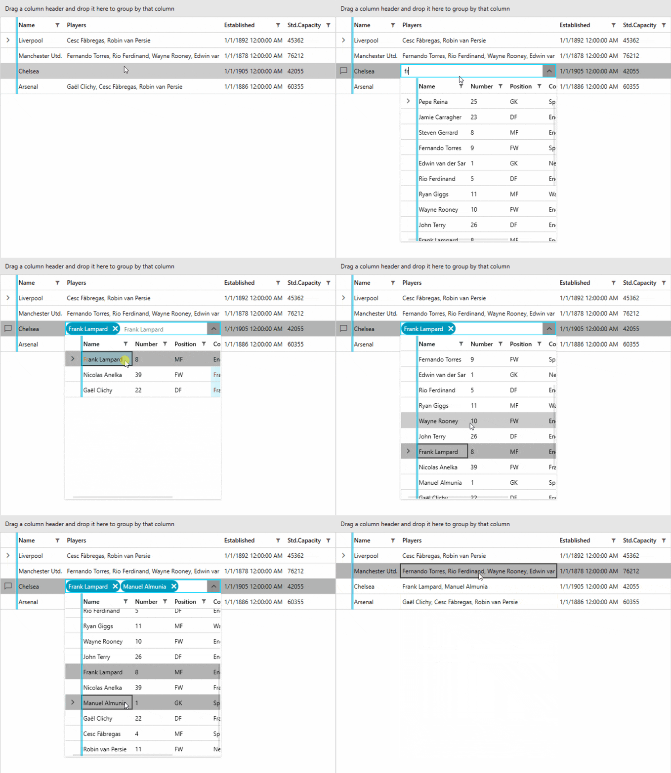

VueJs Amsterdam 2019—An Experience and Talks Summary (Part 1)

$
0
0

VueJs Amsterdam is one of the biggest Vue conferences. It comprises one day of FrontEndDeveloperLove and two days of Vue talks. Get to know more about the event and what great speakers presented.

For the first time in my life, I was finally able to attend a big dev conference. Before, I usually just watched talks online and attended local meetups from time to time. However, after hearing a lot about previous Vue.Js Amsterdam conferences, I decided to attend the next one in person. As a person who is extremely passionate about programming and especially about Vue, I was excited about experiencing the conference myself. I heard a lot in the past about the great venue and huge screen during previous VueAmsterdams and was looking forward to seeing it myself.

The conference consisted of one day of FrontEndDeveloperLove and two days of Vue talks. Besides an amazing venue, there were also impressive speakers and software maintainers like creator of Vue.js Evan You and other Vue core team members, Nuxt brothers, or mentors from VueSchool and VueMastery.

The First Day – FrontEndDeveloperLove

It was 7:30 a.m. and organizers were finishing the last preparations to start the event, while the first participants already waited at the entrance of Amsterdam Theatre to attend one of the best Vue conferences. Finally, after a few minutes, one of the organizers asked everyone to queue up and after that handed out little JS love flags. (Mine unfortunately died on the way back home.)

FrontEndDeveloperLove-flag

After a few more minutes of standing outside, we could finally enter the venue and pick up our badges.

Frontend-Love-VueAmsterdam-Badge

After getting my badge and having a look around the area, at that time and after travelling to Amsterdam, the first thing I thought about was where can I get a coffee to wake myself up. To be honest, I never drank worse coffee in my life, but, well, it did wake me up instantly so objective achieved. Besides coffee, participants were offered various drinks ranging from tea to water, Coke and juice, as well as muffins, brownies, and croissants to eat. To be honest, I did expect something different for a breakfast than mainly sugary treats.

breakfast

At around 8:45 a.m., the doors to the theatre finally opened and everyone started to proceed to take their seats and wait for the first talk. When I entered inside, I immediately thought “Wow, that is a huge screen.” In this case, people online did not exaggerate, and what I have seen on videos from the last conference was true.

countdown

After the countdown had been reached and the organizer had welcomed all the participants, the first speaker was introduced – Johannes Ewald, a core team member of webpack team, with a talk about the future of JavaScript bundles.

The Future of JavaScript Bundlers by Johannes Ewald

the-future-of-javascript-bundlers

I found this talk to be quite interesting as it humorously shows how development of websites have changed. Only a few years ago developers just had to create an HTML file with a style file for CSS and script file for JavaScript code. However, today modern frontend development workflow requires a whole toolchain of various libraries, like webpack for module bundling, Babel for code transpilation so we can use new and shiny latest features of ECMAScript, and many more. Sometimes just configuring a project can take hours before the first line of the website code is written. However, Johannes underlined that we might not need additional tools, as most of the evergreen browsers support almost all ECMAScript 2015 features as well as JavaScript modules, which can be used to keep your code in separate files and only imported when needed. However, bare module specifiers and optional file extensions are not supported. Nor would there be path resolving.

Johannes-Ewald

With help of bundlers, we have not only module bundling, but, for instance, with webpack we can use various loaders and tools to improve development experience and efficiency as well as optimize the application better. Modern CLIs like Vue’s CLI, which is using webpack under the hood, have a lot of features out of the box, like running our app on a dev server, hot module replacement, tree-shaking, dead-code elimination, minification, compression, and more. ECMAScript modules do allow importing modules in the browser, but it requires use of ‘real path’ instead of a nice shortcut like ‘@’ which is usually used to target the ‘src’ folder.

Nevertheless, there are quite a few interesting proposals being discussed, and one of them is ‘import-maps’ (https://github.com/WICG/import-maps), which would allow bare import specifiers such as ‘import moment from ‘moment’ and a few other useful things. Allegedly, Blink team is intending to implement it.

Import-maps-proposal

Other proposals that Johannes also mentioned are:

HTML Modules - https://github.com/w3c/webcomponents/blob/gh-pages/proposals/html-modules-proposal.md
CSS Modules - https://github.com/w3c/webcomponents/issues/759
JSON Modules - https://github.com/whatwg/html/issues/4315
ES Module Integration - https://github.com/WebAssembly/esm-integration/tree/master/proposals/esm-integration
Asset references - https://github.com/sebmarkbage/ecmascript-asset-references
ImportAs proposal - https://github.com/AshleyScirra/import-as-and-html-modules

These proposals could benefit developers in that there would be no need for configuring loaders to handle specific file types as they would be supported natively. Johannes also underlined that custom language support for npm modules would make sharing frontend components easier, and features as such would bring us a step closer to no-config development. However, nothing comes for free, as these proposals would be doing transformations on run time. Therefore, browsers would have more things to process, and, thus, applications would be a bit slower while bundlers do the job on build time.

Another alternative to loaders is ‘babel-plugin-macros’ (https://github.com/kentcdodds/babel-plugin-macros/blob/master/README.md). It is a plugin that can be used to evaluate code on build time. To be honest, it reminded me a bit of Facebook’s Prepack, which is a tool for optimising JavaScript code.

Babel-plugin-macros

Nevertheless, even though loaders might soon be replaced by those proposals, there are still things which will not be easily replaced, like HMR, which is now an essential for great dev experience. Johannes hopes that one day we will have a unified platform with independent APIs. For instance, javascript-standard-library is an interesting proposal that could help with that (https://github.com/tc39/proposal-javascript-standard-library#standard-library-proposal).

Next Johannes mentioned a new HTTP feature, H2 push, that allows the server to push resources proactively to the client. In theory it is a great feature, but in practice the implementation is still inconsistent and there are bottlenecks that were not solved yet. For instance, not everything should be pushed to the client, as some of the resources can already be cached and, in such a scenario, a user would be getting a resource that is unnecessary. Static analysis or even real-time data could potentially be used to provide more information about what resources should be prioritized. Guess.js could be used for enabling data-driver user-experiences on the web.

bundler-necessity-chart

In conclusion, if you are making a small website, then you can go old-school style and create simple HTML, CSS, and JS files and use ES5 code for compatibility with older browsers like IE. However, if you are doing anything more than that, then various tools like webpack and Babel are a must, especially if you want to make the most out of your application in terms of optimizations, speed, caching, new language features, and custom DSLs like JSX or Vue’s Single File Components.

For More Info on Vue

Want to learn about creating great user interfaces with Vue? Check out Kendo UI for Vue, our complete UI component library that allows you to quickly build high-quality, responsive apps. It includes all the components you’ll need, from grids and charts to schedulers and dials.

Test Studio Gains Visual Studio 2019 Support in Latest Service Pack

$
0
0

The newly released Test Studio Service Pack brings support for Visual Studio 2019, and a nice list of fixes and optimizations.

Visual Studio 2019 Support

The Test Studio R1 2019 Service Pack 1 is now live and ready for you to download. A highlight of the new SP is support for Visual Studio 2019. Microsoft just released Visual Studio 2019 and as a rule Test Studio's team immediately drops a new product build to support it. You will be able to export projects from Test Studio or directly create them inside Visual Studio 2019.

Other Highlights

In addition to this there are numerous other fixes and enhancements, including:

  • Memory footprint optimizations
  • Application UI improvements
  • Recorder
  • Find Expression (Element) Builder
  • Scheduling
  • Test Studio for APIs improvements

For the full list of fixes click here.

Share Your Feedback

We always love to hear your opinion, so don't hesitate to let us know what you think. Try the new SP out by updating today, or if you're new to Test Studio feel free to download a trial of the latest version. Happy testing!

Try Test Studio

Performance Timing in Chrome DevTools: console.time vs performance.mark

$
0
0

In this post we demonstrate how to utilize console.time and performance.mark to monitor times and processes in Chrome DevTools, and also take into account how the two features compare.

When working with the console, it is very useful to monitor and take metrics for our processes. There are a few ways to take these metrics. However in this post, we’ll be looking at how console.time and performance.mark compare.

Console.time

Console.time is used to start a timer in order to track the duration of a particular operation. When scheduling the timer, we give the timer a unique name for identification since we can have several timers running concurrently on the same page. We can end the timing operation by calling console.timeEnd() and passing in the unique name of the timer. This will stop the timer and display the time, in milliseconds, that elapsed since the timer was started.

Syntax
The syntax is fairly understandable and easy to work with. You start with the console.time() method to specify that you’re trying to start a timer for a particular operation. It takes a single parameter label, which specifies the operation that is to be timed.

console.time(label);

Parameter
Console.log takes a single label parameter that simply serves as the name to describe the operation that is to be timed. We also pass the label when calling console.timeEnd() to specify which timer we are ending and then print the timer value to the console.

console.time("firstTest")

Usage
Let’s say, for instance, that we want to measure the duration of a particular iteration process in our application. We will define a timer that starts the moment that function is called and run till the end of the iteration process. This scenario we have created can be exemplified like this:

console.time("iterationTime");for(i =0; i <10; i++){// some code}
console.timeEnd("iterationTime");

Here, we started the iterationTime timer just before the iteration process. Next, we defined the iteration and ended the timer. Now, let’s see how it works in the console:

Here the time it took to execute the iteration process is 0.01416015625ms. To be certain that our timer works efficiently and that we are getting the right values, let’s add some code to the iteration process and see if the process takes longer to execute or not. We’ll update our iteration like so:

functionIteration(){
        console.time("iterationTime");for(i =0; i <10; i++){// some code
          console.log(i = i+2)}return console.timeEnd("iterationTime");}
    console.log(Iteration());

By design, this should take significantly more time than the previous process. Because we are performing more tasks here, it should take more time to finish. Let’s find out if the timer supports our claim in the console:

Just as we expected, the process finished at 1.14990234375ms as compared to the previous iteration time of 0.01416015625ms.

Finally, let’s see how the timer performs in an addition process. Say, for example, we wanted to pass two numbers to a function and return their sum, the timer should tell us exactly how long the process will take.

    console.time("additionTime")functionAdd(a,b){return a + b
    }
    console.log(Add(2,3));
    console.timeEnd("additionTime")

Now when we try this in the console, we should get the additionTime printed with the correct values:

That’s one of many ways we can use the console.time to monitor specific moments in our codebase to determine the performance and time requirements of certain pieces of code.

Performance.mark

Performance.mark, just like console.time, is used to create a timestamp for a particular process in the Performance Timeline. It does this by creating a timestamp for every significant moment from the time the process starts to the time it ends.

Syntax
The syntax is not very different from that of console.time. You start with the performance.mark() method to specify that you’re trying to start a new mark for the operation. It takes a single parameter name, which is a DOMString representing the name of the mark.

performance.mark(name);

Arguments
Performance.mark takes a single argument name, which simply serves as a description of the new mark. The same argument is passed to the mark to end the mark:

 performance.mark("firstTest");

Usage
Let’s replicate the usage examples we applied in the console.time method to properly ascertain how they both function. Now, let’s use performance.mark() to measure the duration of our earlier iteration process like this:

functionIteration(){for(i =0; i <10; i++){// some code
        console.log(i = i+2)}}
    performance.mark('Iteration Start')Iteration()
    performance.mark('Iteration End')
    performance.measure('Iteration','Iteration Start','Iteration End')var measures = performance.getEntriesByName("Iteration");var measure = measures[0];
    console.log("interationTime", measure.duration +"ms")

Now when we try this in the console, we should get the iterationTime printed to the console like so:

Also if we wanted to add two numbers and return a value as we did with the console.time method, we can simply update our last example like this:

functionAdd(a,b){return a+b
    }
    console.log(Add(2,3))
    performance.mark('Add Start')Add(2,3)
    performance.mark('Add End')
    performance.measure('Add','Add Start','Add End')var measures = performance.getEntriesByName("Add");var measure = measures[0];
      console.log("additionTime", measure.duration +"ms")

Running it in the console will now give us a different duration since it’ll take relative longer time to add and return the value:

Conclusion

In this post we have gone through the syntax and description of both console.time and performance.mark to give you a better understanding of what they are and how to use them. We have equally demonstrated a few use cases to give you a practical approach to better your understanding of the use cases. There is a lot more to know about them than what is covered in this article so feel free to learn more on your own and do not hesitate to reach out to us whenever you need more help.

For More Info on Building Great Web Apps:

Want to learn more about creating great user interfaces? Check out Kendo UI - our complete UI component library, which allows you to quickly build high-quality, responsive apps. It includes all the components you’ll need, from grids and charts to schedulers and dials.

Introducing a Customizable Crystal Dark Theme for WinForms

$
0
0
Brush up your WinForms desktop application with a modern and personalized look and feel, thanks to the MacOS-inspired Crystal Dark theme available in Telerik UI for WinForms.

A lot of people these days are staring at screens for extended periods of time. Having a bright and glaring background on something you use constantly leads to eye fatigue. Therefore, more and more people use the eye-friendly alternative to the traditional bright user interfaces sported by most applications – dark mode. Instead of displaying the hegemonic light background with dark text, the typical dark mode features a dark background with white or light-colored text, which makes reading easier to read at midnight without feeling like you’re staring into the sun.

If you are a fan of dark themes, you may use Visual Studio, Chrome and even Windows 10 in dark mode. If you're on the lookout to provide the same experience to the users of your desktop application, we are pleased to introduce the new Mac-inspired dark theme in Telerik UI for WinForms - CrystalDark (a dark alternative of our Crystal theme).

theme viewer crystal dark

crystal-dark-shot-2

Creating a Custom Theme for Your Application

Just as you can blend and customize our Material and Fluent themes, the Crystal themes are also designed to work with a predefined set of colors. Thus, using Visual Style Builder you can generate different color variations of the Crystal and CrystalDark themes. A completely new theme can be created in a couple of minutes. Just open the VisualStyleBuilder and select Tools -> Generate Crystal (Dark) Theme. In the Crystal Blend Dialog, you can select one of the predefined accent colors palette, modify it or create a new one.

crystal themes blending

When you are ready with modifications of the accent palette you are ready to generate the new theme.

Result for the Regular (Light) Crystal Theme

crystal light variations

The Crystal Dark Variation

crystal dark variations


Try It Out and Share Your Feedback

You can learn more about the Telerik UI for WinForms suite via the product page. It comes with a 30-day free trial, giving you some time to explore the toolkit and consider how it can help you with your current or upcoming WinForms development.

We would love to hear what you think, so should you have any questions and/or comments, please share them to our Feedback Portal or in the comment section below.

Integrating Web Services with KendoGrid, Blazor, and Razor Components

$
0
0

Here’s a Blazor Component that uses C# to retrieve data from a Web Service and display it in the new Blazor-Enabled KendoGrid. To put it another way: Client-side updates with no JavaScript required.

As you'll see here, thanks to the Telerik UI for Blazor Early Preview, you can already start using Telerik UI components in a Blazor environment. The biggest problems you'll have in using this technology is creating the environment that it runs in – the components themselves just work as advertised.

Setting Up

Fundamentally, this is all preview technology so you're going to need to use both the previews for Visual Studio 2019, and .NET Core 3.0 SDK.

Once you've installed those downloads, you'll create your project by starting up Visual Studio 2019 Preview and selecting Create a New Project from the choices on the right of the initial dial. In the ‘Create a new project' dialog that appears, select ASP.NET Core Web Applications and click the Next button. The next dialog will let you name your project (among other configuration options). Click the Create button after you're done with this page and (finally!) pick the kind of project you want to create. To work with Blazor, you'll want to use the Razor Components template, so select it, and click the Create button to initialize your project in its solution.

This is your first opportunity to check that you've successfully installed the right “bundle of everything”: If your Visual Studio solution contains a single project that has, in its Components/Pages folder, files with the .razor extension, then you've got the right combination of Visual Studio and .NET Version 3.0.

Razor Components aren't “true” Blazor in the sense that you'll have C# code running in the browser. Instead, Razor Components execute your C# code on the server and use SignalR to communicate between the client and server. This obviously limits the scalability of your application compared to fully executing all code on the client. However, it also avoids the two megabyte download that “Blazor on the client” currently requires (and, to be fair, in ASP.NET Core with the right topology, the scaling limit for SignalR is pretty high). The major benefit of experimenting with Razor Components is that it's an official technology that's included in .NET Core 3.0, while “Blazor on the client,” despite being in version 0.9.0, is still — and I'm quoting Microsoft here — in “pre-alpha.” However, the code and HTML in this post should work as-is with “Blazor on the Client” when (or if) that technology comes out of alpha.

The one wrinkle that I found after I got everything set up was that I would make changes to my code and it would make no difference to my running application until I selected Build | Rebuild Solution. If you get tired of constantly requesting rebuilds (or, as I did, just kept forgetting to do it) then the simplest solution is to trigger a rebuild every time you debug in every project by going to Tools | Options | Projects and Solutions | .NET Core and unchecking the Up to Date Checks option. If that solution seems too heavy-handed to you, then you can fix the problem for the project you're working on by going into the project's .csproj file and adding this:

<ItemGroup>
  <UpToDateCheckInput
    Include="@(Content->WithMetadataValue('Extension', '.razor'))" />
</ItemGroup>

You're now ready to add the Telerik components to your project. The Telerik team, not surprisingly, provides the best description of how to set up your application to use the new Blazor-enabled components. You'll also need to tweak your project file.

Hey, no one said that exploring the future of technology was going to be easy.

The Case Study

For the case study I'm going to use here, I added a second ASP.NET Core API project to my solution. This Web Service will provide a set of Customer objects. I defined my Customer object in another Class Library (.NET Standard) project that I referenced from both my Razor Components and API project. I added both of these other projects just by right-clicking on the Solution node in Solution Explorer and selecting Add | New Project.

My Customer class is ridiculously simple:

namespace Customers.Common
{
  public class Customer
  {
    public int Id { get; set; }
    public string FirstName { get; set; }
    public string LastName { get; set; }
  }
}

And my API class wasn't much more complicated. I created a List of Customer objects in the constructor for a controller class (cleverly called Customers) and returned that collection from my controller class's Get method:

[Route("Customers")]
[ApiController]
public class Customers : ControllerBase
{
  List<Customer> custs = new List<Customer>();
  public Customers()
  {
    custs.Add(new Customer
    {
      Id = 1,
      FirstName = "Peter",
      LastName = "Vogel"
    });

    // more customers added
  }

  [HttpGet]
  public ActionResult<IEnumerable<Customer>> Get()
  {
    return custs;
  }
}

I also set up the Solution to start debugging with two Startup projects by right-clicking on the Solution node, picking Set Startup Projects and selecting the ‘Multiple startup projects' option in the resulting dialog. In the list of projects that follow that option, I set the Action dropdown list to “Start” for both my Razor Components project and my API project before clicking the OK button.

Creating the Blazor UI

If you've put all that in place, then you're ready to create a Razor Components page that uses the KendoGrid to display a list of Customer objects retrieved from a Web Service. To add the page, right-click on the Razor Components' project's Components/Pages folder and select Add | New Item. Unfortunately, the Add New Item dialog currently doesn't include a template that generates a Razor Components class. However, if you select the Razor View template and set the file name to end with the .razor extension, everything will work out fine (it's the .razor extension that defines a Razor Component). I called my file DisplayCustomers.razor.

At the top of my Razor component, I set the URL path to retrieve this component, added the namespace for the Class Library holding the definition of my Customer class, and enabled the Tag Helpers in the Kendo.Blazor namespace (I could also have done that last step in one of my project's _ViewImports files). Here's what that looked like:

@page "/displaycustomers"
@using Customers.Common
@addTagHelper *,Kendo.Blazor

Within my page, I added a header and used the Kendo Tag Helpers to define my KendoGrid. This gives you another checkpoint to see if you've got the “bundle of right stuff”: If your KendoGrid tags aren't in boldface, then the Telerik.UI.for.Blazor NuGet package didn't get installed correctly.

<h1>List Customers</h1>

<KendoGrid Data=@customers Sortable=true>
  <KendoGridColumns>
    <KendoGridColumn Field="Id" Title="Customer Id" />
    <KendoGridColumn Field="FirstName" Title="First Name" />
    <KendoGridColumn Field="LastName" Title="Last Name" />
  </KendoGridColumns>
</KendoGrid>

This grid is attached to a field in my Razor Component that will provide the data for the grid to display (I also turned on automatic sorting because, well, why not?). I've defined three columns in my grid, one for each of the three properties on my Customer object. I also set the title for the columns those properties are displayed in.

Now, I need to define the field that will hold that data. That code looks like this:

@functions {
  private IEnumerable<Customer> customers = null;
}

At this point, all the page will do is display a blank grid. To start retrieving the data from the Web Service, I need, in my component's functions block, to override the component's OnInitAsync method. That method is automatically run as part of initializing the component as it's displayed, so it's a good place to do any initialization for the component. Rather than load a lot of code into the OnInitAsync method, I'll put the code that does all the work in a separate method that I'll call GetCustomers:

@functions {
  private IEnumerable<Customer> customers = null;
  protected override Task OnInitAsync()
  {
    GetCustomers();
    return base.OnInitAsync();
  }
}

For that GetCustomers method, I just write C# code, leveraging the .NET Core APIs. I added this method right below my OnInitAsync method:

public async void GetCustomers()
{
  HttpClient hc = new HttpClient();
  HttpResponseMessage rm =
    await hc.GetAsync("https://localhost:5001/customers");
  customers =
    await rm.Content.ReadAsAsync<IEnumerable<Customer>>();
  StateHasChanged();
}

To use the ReadAsAsync method to call my service, I had to add a NuGet package to my project (Microsoft.AspNet.WebApi.Client). But, I'll point out, that's just another C# package.

Really, only the call at the end of the method to the Razor Component's StateHasChanged method shows that this code is updating client-side resources. The StateHasChanged method notifies Blazor that the client's DOM has been updated which, in turn, causes Blazor to compare the updated DOM to what the user is currently seeing, figure out what's different, and update the user's view to reflect the loaded data.

And there's the beauty of Blazor: efficient client-side updates without a line of JavaScript and with access to the full .NET Core API. My client-side toolkit has suddenly gotten much more focused.

The full project referenced in this article can be found here.

For More on Telerik UI for Blazor

To learn more about the Telerik UI for Blazor and download the preview, don't forget to check out this introductory blog post or visit the product page here.

Telerik UI for Blazor 0.4.0 Just Released

$
0
0

Telerik UI for Blazor has just released its 0.4.0 version, which includes more components and features for existing components! Read on to see what's new.

Telerik UI for Blazor is evolving fast with new components and features getting released hot off the presses as soon as we have them ready. With any rapid growth comes for the potential of some growing pains, which in this case comes for a breaking change with the UI for Blazor release I’m announcing today. However, with this change comes plenty of new features, components, and resources!

Keep on reading to see what’s new with Telerik UI for Blazor 0.4.0!

Breaking Changes

It’s never easy to chat about breaking changes, but I want to make a note of what the changes for 0.4.0 are as well as why we went with this direction. We do not take breaking changes lightly, even with products in early development, but we believe that this is a change that is necessary for the continued success of UI for Blazor which is why we’re going this direction.

What is Changing

First, the actual change: we are moving namespaces from Kendo.Blazor over to Telerik.Blazor. This means that any usage that you see of Kendo in your current projects will be replaced by Telerik.

As an example of our Grid taken from our docs, here’s the old way with 0.3.x:

@using Kendo.Blazor

<KendoGrid Data="@MyData">
    <KendoGridColumns>
        <KendoGridColumn Field="ID"></KendoGridColumn>
        <KendoGridColumn Field="TheName" Title="Employee Name"></KendoGridColumn>
    </KendoGridColumns>
</KendoGrid>

@functions {
    public IEnumerable<object> MyData = Enumerable.Range(1, 50).Select(x => new { ID = x, TheName = "name " + x });
}

Here’s the same declaration, but with the new namespace:

@using Telerik.Blazor

<TelerikGrid Data="@MyData">
<TelerikGridColumns>
<TelerikGridColumn Field="ID"></TelerikGridColumn>
<TelerikGridColumn Field="TheName" Title="Employee Name"></TelerikGridColumn>
</TelerikGridColumns>
</TelerikGrid>

@functions {
public IEnumerable<object> MyData = Enumerable.Range(1, 50).Select(x => new { ID = x, TheName = "name " + x });
}

Overall the API ends up being fairly similar, but note the @using Telerik.Blazor and all of the <Telerik[X]> tags that have changed.

Why is this Change Happening?

There are a couple of reasons as to why we’re going ahead with this change, but I’ll focus on the biggest one for this blog post in order to not bore you: the usage of the Kendo UI name is confusing for people.

Specifically, a lot of the conversations we’ve had around Telerik UI for Blazor is if these components are just wrappers around the Kendo UI jQuery components. Telerik UI for Blazor is built 100% from the ground up in order to ensure deep integration with the Blazor framework itself. So to avoid this confusion and set the record straight we are moving away from the Kendo name and instead going with Telerik, a name very familiar to anyone within the .NET world (at least to you, the reader, since you are on the Telerik blog ).

So, in order for us to convey this more easily to new and existing users alike we’ve moved forward with this namespace change for 0.4.0.

We understand that this may be a bit of a headache for people, especially if your current Blazor project is a larger one. However, we believe that this is a necessary change and it’s overall best to do it now while the product is in its early stages and preview rather than later in the product’s life.

A note to make here is that the CSS and rendering will still be the same for the Telerik UI for Blazor components. Any changes you’ve made to the styling, or the ability to share a design across jQuery/React/Angular/Vue and Blazor projects, are still very valid.

A Quick Note on Interops

An additional thing I’d like to note is that you will be seeing a JavaScript file mentioned in some of our articles, namely telerik-blazor.js. This is in no way an indication of a trend to move over to a more JS-favored implementation of Telerik UI for Blazor, but it is something that we realized we needed to include at this point to add in some of the features and make our components what they are.

This is just a JS resource that has some interop functions to help provide keyboard navigation in the input elements, as well as the SVG and canvas rendering we utilize for our charts.

New Components & Features

Now, on to all of the fun stuff! We have a whole set of new components ready to rock and roll, along with new features for existing components, so let’s take a look at what is new in 0.4.0 Let’s first dive in to the new components.

Calendar 

Telerik UI for Blazor Calendar component showcasing a full month

The name gives it away, but the Calendar component is quite simply a calendar that you can add to any page! This is completely standalone, and comes with the ability for users to navigate through the calendar to pick their date (or dates) of preference. Selection comes in both single day and multiple days, and you can prevent certain dates from being selected by setting them as disabled.

For a deeper dive in to the calendar, including the actual API and such, jump over to the Calendar component documentation.

Chart

Telerik UI for Blazor Chart component displaying a couple of line series

This is a big one! With 0.4.0 we are releasing our Chart library for Blazor! This is already primed to come out with a few series and chart types, namely:

  • Area Chart
  • Bar Chart
  • Column Chart
  • Donut Chart
  • Line Chart
  • Pie Chart

This also comes with support for a ton of features including label templates, multiple axes, stacking series, multiple series, and more! Honestly it’s a lot to get into, so check out the Telerik UI for Blazor Chart component documentation to see all of the features and how to get started with this UI component today.

DateInput

Telerik UI for Blazor DateInput Component with a month day year mask

The DateInput component expands on our list of available form elements by providing an input widget that gives a pre-defined date mask. You can customize the formatting, define a placeholder, and of course mind the value to any model you have available. It also integrates natively with the Blazor validation framework, but more on that later in this post.

DropDownList

Telerik UI for Blazor DropDownList displaying sample data in a drop down

Have a long list of data that you want to have assigned to a single input? The DropDownList is your answer! Like our other DropDownList components, this gives your users a list of options to select from without the need to input custom text or searching through the list. Right out of the gate we support features like templates and integration with Blazor validation to ensure that it can fit your application requirements.

TextBox

Telerik UI for Blazor TextBox Component

Simple and easy. Since there’s often more to a text box than just gathering text like max/min length, patterns for valid input, and providing a label with a configuration option, we decided to create the Telerik UI for Blazor TextBox component. Of course, this also supports validation, which we’ll cover in this next section!

Native Blazor Validation Integration

Telerik UI for Blazor Validation example with a text box component

With 0.4.0 Telerik UI for Blazor officially integrates with Forms and Validation within Blazor. This is supported across the board for all of the Telerik UI for Blazor input elements. Our UI components will work out of the box with these elements of Blazor when placed inside an EditForm and will respond to EditContext changes while providing default invalid styles. This doesn’t just happen on OnSubmit by the way, this validation happens in real time.

Taking some inspiration from our documentation, here are the basic steps to validate the Telerik UI for Blazor input components:

  1. Define a model with Data Annotation attributes
  2. Take the input elements that you want to represent your model in an EditForm
  3. Add a DataAnnotationsValidator inside the form
  4. Use the bind-Value syntax to provide value binding to your input elements

And that’s it!

Since this blog post is on the longer side I’ll direct you over to the validation section of our documentation where you can see more examples of this in action.

New Demo Pages

We are trying something new with Telerik UI for Blazor and releasing things early and just as they’re coming out of the oven. As a part of this we are also building out the available resources to make things fleshed out like any of the other Telerik UI products.

As a part of this I can announce that as of today we have released the official Telerik UI for Blazor demo page! Like all of our other UI libraries, this is an interactive set of demos that allows you to see the components in action, quickly look over the source code that goes in to the demo, and get helpful links to our documentation articles.

Getting the Bits

If you’ve already used Telerik UI for Blazor before then you should see 0.4.0 in the Telerik NuGet feed. After that you can just follow our documentation guidelines around adding Telerik UI for Blazor in an existing project.

If you haven’t signed up for the preview yet, all you need to do is head on over to the Telerik UI for Blazor main page and click on “Download Preview”. If you are signed in to a Telerik.com account you’ll automatically get access to Telerik UI for Blazor. If you haven’t signed up for a Telerik.com account yet you will be asked to when clicking on that button.

From there you can follow our detailed First Steps documentation article for help with getting your first Blazor project up and running, how to work with the Telerik NuGet feed, and how to add Telerik UI for Blazor components to your app!

What’s Next? We Want to Hear From You!

The first question I get after any announcement of a release is the question “what is coming next?” or “when is component/feature X coming?” While we’ll be hard at work on the next version of Telerik UI for Blazor we will continue to push out helpful pages, including an official road map page.

Until we get that out what I can say is that we will continue to release more features to the Grid component (like filtering and grouping) as well as add more form elements that you may need. Beyond this we of course have other popular components found across all of our other UI suites that we will take a peek at to see when we can deliver.

We’ve already heard from many of your already and we want to continue to hear your feedback! If there are features you are missing, or components you need, please let us know! We have the official feedback portal for this exact reason. Submit your ideas for new components and features, or vote and comment on existing ones and we will make sure we take this in to consideration for upcoming releases!

Meet the KendoReact Team in Person: Amsterdam, Paris, Salt Lake City

$
0
0

Behind every person, there’s a story, and we want to know yours! That’s why the KendoReact team is going traveling this year to meet with the React community. You can see which events we’ll be attending at the end of this article, but before that, let me share some of our stories with you, to kick off the conversation.

You may have seen Carl’s unmistakably Nordic beard at previous events, on Twitter, or on the Telerik Blogs as he’s been with KendoReact since its inception. Don’t ask him where he’s from unless you’ve got a coffee in your hand and a place to sit comfortably. On the other hand, being the KendoReact Product Manager, Carl has a lot to say about the team, how we build our roadmap and all about staying fit while balancing a heap of work responsibilities.

If you’ve looked for more information about React hooks, Eric’s name has probably showed up in your google search results as he did a popular series of articles diving into their intricacies. Beyond hooks, there’s a lot more to know about this React developer who came to Progress from Tesla, landing his first Developer Advocate role (at which he’s a natural!) and is miraculously always present at calls with the Sofia, Bulgaria team despite the 10-hour difference (he's based in California).

Then I also encourage you to ask Kiril about rebuilding of the previous version of our KendoReact website with Gatsby and what this architecture change did to the build time in production. Hint: he managed to decrease both the development and production build times 10x and made the site blazing fast. Yes, he has stories to tell.

And definitely turn to Stefan if you have a question about how a KendoReact component works – he’s our master solution-finder. He is also the one person on the team whom you can ask about all and any of the KendoReact UI components and get a pro tip. Since he’s one of the most active team members when it comes to answering support tickets, you may even have exchanged emails with him already!

Then there’s also me, Nora. Ask me about my favorite joke about functions if you want to lighten up – I laugh every time I tell it. I also have a lot of funny developer stories. Other than that, I’ve been working as a marketing person in IT for more years than you can tell and have a passion for communication, so ask me anything. Don’t worry, there’ll be no marketing talk if you approach me as I find it hard to be anything but straightforward (just ask the team).

There’s nothing that can substitute for in-person communication when it comes to building relationships or learning what someone is all about. That’s why the KendoReact team, represented by these fine folks just introduced, is going places this summer!

Come meet us at our booths at the following conferences:

  • React Amsterdam on April 10-12 in (duh) Amsterdam. We’ll be right by the coffee spot, Booth 1, and will be wearing React blue! Carl, who rarely misses a workout, will probably go for a run between the Dutch bikers while we’re there. Ping him if you’d like to boost your sense of well-being with a runner’s high. Also, we'll be having some cool gifts from you, from a raffle for Bose headphones, to T-shirts and more KendoReact sweetness.

KendoReact conference giveaways - t-shirts, stickers

  • React Europe on May 21-24 in Paris. Every time I think of Paris, I think of Alison Gopnik’s hilarious comparison, “What's it like to be a baby? Being in love in Paris for the first time after you've had 3 double espressos." I hope I get some new associations as it will be my first time ever in Paris!
  • React Loop on June 21 in Chicago. While we won’t be exhibiting there, make sure you attend Eric’s talk, as he is one of the speakers at Chicago’s first React conference.
  • React Rally on Aug 22-23 in Salt Lake City, UT. There are still a few months to go, but mark your calendar if you’re planning to be there and come meet the KendoReact team!

Looking forward to meeting you in person! If you want to suggest other React events for us to visit, drop us a line and we’ll check them out.


Overview of Popular CSS-in-JS Libraries for React

$
0
0

We thought React was crazy when it came with HTML-in-JS (JSX), but today, we are happy that revolution happened. It helped us build better components. Why not do so with CSS too? As a matter of fact, you can. Meet CSS-in-JS.

Since the emergence of React, there’s been a serious debate about writing CSS in JavaScript. Some were strongly against it while some were curious enough to give it a try. But slowly, over time, adoption of CSS-in-JS libraries has increased significantly and new libraries are being churned out by the hour.

Today, we’ll be looking at some of the popular CSS-in-JS libraries that have become a mainstay in our applications and projects. We’ll list some of them in no particular order, with examples and a walkthrough of their implementation.

Glamor

A few of the libraries listed here were built around Glamor, which means that there’s a lot that Glamor does right in its CSS-in-JS implementation. Glamor allows composition, which means you can easily overwrite CSS rules by spreading new rules within a component’s class name or within its props. The ability to write and combine CSS rules makes Glamor a pretty interesting pick.

Let’s create a button component using Glamor’s rule combining and spreading features:

const rule =css({  
padding:'1rem 4rem';  
margin:'10px 20px';  
border-radius:'5px';  
background:'linear-gradient(90deg, #D26AC2, #46C9E5)';  
color:'#1D2029';})const primaryRule =css({  
color:'#D26AC2'  
background:'red'})//As data attributes  <button {...rule}{...primaryRule}>  
Primary button  
</button>// As classes  <button className={`${rule}${primaryRule}`}>  
Primary button  
</button>

Glamorous

As a JavaScript developer and a CSS-in-JS skeptic, you’ll enjoy the syntax adopted by Glamorous. It provides the familiar JavaScript syntax for styling components and creating dynamic themes. By letting users provide dynamic props for styling, it has an edge over some of the other libraries in this list. Also, Glamorous was built on the popular JavaScript CSS-in-JS library Glamor.

The project is currently not actively maintained. So you should think hard before going with this option.

It has a simple, easy-to-understand API:

const Heading = glamorous.button({  
fontSize:'14px',  
marginTop:10,  
color:'#CC3A4B',  
padding:'1rem 4rem',  
margin:'10px 20px','border-radius':'5px',  
background:'linear-gradient(90deg, #D26AC2, #46C9E5)',  
color:'#1D2029',});

Emotion

Using template literals and object styles, Emotion allows you to style apps quickly. It provides source maps and labels while also providing two separate methods of styling applications. If you’re not familiar with template literals and would rather use object styles, Emotion supports both.

They took what was so great about other CSS-in-JS libraries and combined them into a great library. They provide support for props and composition. It is performant and provides heavy caching in production, according to their documentation. Emotion has a theming library and supports server-side rendering.

We can style button component using template literals and object styles:

// template literals  const Button = styled.a`  
padding: 1rem 4rem;  
margin: 10px 20px;  
border-radius: 5px;  
background: ${(props)=>  
props.background &&'linear-gradient(90deg, #D26AC2, #46C9E5)'};  
color: ${(props)=>(props.primary ?'#1D2029':'#D26AC2')};  
&:hover {  
opacity: 0.95;  
}  
`;

Using object styles:

// Object styles  const Button = styled.a(props =>({  
padding:'1rem 4rem',  
margin:'10px 20px',  
border-radius:'5px',  
background: props.background &&'linear-gradient(90deg, #D26AC2, #46C9E5)',  
color: props.primary ?'#1D2029':'#D26AC2',}));

Styled-components

Styled-components is (according to Github stars) the most popular CSS-in-JS library out there. It uses tagged template literals to style your components. It removes the mapping between components and styles, making it easier to achieve low-level styling. Styled-components generates unique class names for all your components, so you don’t ever have to worry about conflicting class names.

Styled-components has a very rich and intuitive API alongside a huge community following. It fully supports server-side rendering, React Native, theming, media queries and a lot more.

Creating a button component using Styled-components would look like this:

const Button = styled.button`  
padding: 1rem 4rem;  
margin: 10px 30px;  
color: ${(props)=> props.color};  
background: ${(props)=> props.background};  
border: none;  
border-radius: 4px;  
`;

Radium

Radium is one of the original CSS-in-JS libraries. It aims to achieve CSS capabilities like media queries, selectors, psuedo-selectors and modifiers without writing CSS. It favors an expressive and optimized (through dead code elimination) style of development. Some other features supported by Radium are:

  • Automatic vendor prefixing
  • Keyframes animation helper
  • ES6 class and createClass support
  • Media queries

Creating a button component using Radium has a somewhat familiar feel:

import Radium from'radium';import React from'react';import color from'color';classButtonextendsReact.Component{static propTypes ={  
kind: PropTypes.oneOf(['primary','warning']).isRequired  
};render(){// Radium extends the style attribute to accept an array. It will merge  // the styles in order. We use this feature here to apply the primary  // or warning styles, depending on the value of the `kind` prop. Since its  // all just JavaScript, you can use whatever logic you want to decide which  // styles are applied (props, state, context, etc).  return(<button  
style={[  
styles.base,  
styles[this.props.kind]]}>{this.props.children}</button>);}}  
  
Button =Radium(Button);// You can create your style objects dynamically or share them for  // every instance of the component.  var styles ={  
base:{  
color:'#fff',// Adding interactive state couldn't be easier! Add a special key to your  // style object (:hover, :focus, :active, or @media) with the additional rules.  ':hover':{  
background:color('#0074d9').lighten(0.2).hexString()}},  
  
primary:{  
background:'#0074D9'},  
  
warning:{  
background:'#FF4136'}};//Primary button  <Button primary>Primary</Button>//Warning button  <Button warning>Warning</Button>

We’ve had a brief look at five out of several hundreds of CSS-in-JS libraries out there, each with a distinct approach of solving a familiar problem. Other notable mentions are React-CSS-Modules, Styletron, jsxstyle and Aphrodite.

You can visit this css-in-js GitHub repository, which has a list of most of the CSS-in-JS implementations available. Have a look at the list and pick one that piques your interest.


For more info on building apps with React:  Check out our All Things React page that has a wide range of info and pointers to React information – from hot topics and up-to-date info to how to get started and creating a compelling UI.

Constraining Generics in C#

$
0
0

When working with generic classes or methods, it can be useful to constrain the types that can be used with them. There are many constraints we can apply. Learn what they are and how to use them.

Generics make it possible to design classes and methods that defer the specification of one or more types until the class or method is declared and instantiated by client code. When the compiler encounters a constructor for the class or a function call for the method, it generates code to handle the specific data type. Generic classes can be constrained to be used only on certain data types. This increases the number of allowable operations and method calls to those supported by the constraining type and all types in its inheritance hierarchy. I’ll introduce you to the various ways you can constrain generic types in C#.

Constrain by Value Type

You can constrain a generic type to a value type by setting the constraint of the type as follows.

class ConstrainByValueType<T> where T : struct { }

Here the struct keyword is used to constrain T to a value type. The object can then be instantiated like new ConstrainByValueType<double>, and you can specify any value type as you want. Be aware that you can’t use a nullable value type, so this will fail, new ConstrainByValueType<double?>.

Constraint to Allow Only Reference Types

You can also constrain the type to allow only reference types. Similar to how you would do it for value types, you would use the class keyword to constrain the type to a reference type.

class ConstrainByReferenceType<T> where T : class { }

Interface Type Constraint

You can constrain the generic type by interface, thereby allowing only classes that implement that interface or classes that inherit from classes that implement the interface as the type parameter. The code below constrains a class to an interface.

interface IAnimal { }
class Snake : IAnimal { }
interface IMammal : IAnimal { }
class Lion : IMammal { }
class FuteLion : Lion { }

class ConstrainByInterface<T> where T : IMammal { }

The type T above is constrained to the IMammal interface, which allows only classes that implements this interface (or classes that inherit from a class that implements the interface) to access the generic type. Even if the IMammal inherits from the IAnimal interface, you can’t use Snake as the type for T. You can only use Lion or FuteLion type.

Constrain by Class

We can restrict a generic type to only allow type parameters of a specific class, or classes that inherit from that specific base class. Following the example of the previous section, let’s create a generic class which is restricted to the Lion class.

class ConstrainByClass<T> where T : Lion { }

In this scenario, only the Lion class or a class that inherits from Lion can be used to instantiate this generic type.

Another constraint we can apply is to ensure that the class that’ll be used as the type parameter has a public, parameterless constructor. We do this by using the keyword new() as the constraint for the generic type.

class ConstrainByParameterlessCtor<T> where T : new() { }

With the constraint above, the ConstrainByParameterlessCtor class is restricted to use classes which have a public parameterless constructor.

Using Enum as Constraint

Beginning in C# 7.3, you can specify the System.Enum type as a constraint. The code below is an example of how to use enums as constraint for generics.

class Program
{
  class ConstrainByEnum<T> where T : System.Enum
  {
    public void PrintValues()
    {
      var values = Enum.GetValues(typeof(T));
      foreach (int item in values)
        Console.WriteLine(Enum.GetName(typeof(T), item));
    }
  }

  enum Rainbow
  {
    Red,
    Orange,
    Yellow,
    Green,
    Blue,
    Indigo,
    Violet
  }

  static void Main(string[] args)
  {
    var enumGeneric = new ConstrainByEnum<Rainbow>();
    enumGeneric.PrintValues();
    Console.Read();
  }
}

The type T as you see is restricted to enums, and the class has a PrintValues method prints the enum type values to the console. Running the code should print out the following:

Red
Orange
Yellow
Green
Blue
Indigo
Violet

Microsoft Documentation also shows an example that used to make use of reflection, but with this feature allowed, it no longer uses reflection and has improved performance.

Beginning with C# 7.3, we can use the unmanaged constraint to specify that the type parameter must be an unmanaged type, and System.Delegate or System.MulticastDelegate as a base class constraint. The documentation provide an example and details on using the unmanaged constraint and delegate constraint.

Combining Constraints

You’ve seen how we can apply a single constraint to generic types. While that is valuable, we can also use these constraints in combination.

class Program
{
  interface IMammal { }

  class FuteLion : IMammal
  {
    private FuteLion() { }
  }

  class RainbowLion : IMammal { }

  class ConstrainByCombination<T> where T : IMammal, new() { }

  static void Main(string[] args)
  {
    new ConstrainByCombination<RainbowLion>(); // Valid
    new ConstrainByCombination<FuteLion>(); // Invalid
    Console.Read();
  }
}

In the example you see above, we’re constraining T to use IMammal interface and must have a public parameterless constructor. We have two classes which implement the IMammal interface. The FuteLion class implements this interface but has a private parameterless constructor, and this doesn’t satisfy the condition to use it the type for the generic class. The RainbowLion class satisfies this condition, therefore, can be used as the type parameter for the generic class.

Conclusion

When working with generic classes or methods, it’s sometimes useful to constrain the types that can be used with them. There’s a number of constraints that we can apply and this article sums up those constraints and how we can use them. We also looked at new constraints that are allowed starting from C# 7.3 and how to combine multiple constraints to enforce stronger rules on generics.

The Chrome DevTools Sources Panel: Overrides vs FileSystem vs Snippets vs Page

$
0
0

It's easy to view and change any page on the browser with Chrome DevTools. The Sources panel is a powerful component of DevTools - let's dive into it to see how it can help us improve our development.

Chrome DevTools is a set of web developer tools which are built directly into Google Chrome. DevTools aid developers in editing pages on the go and in identifying problems quickly, which enables the developer to builder better websites, faster.

With DevTools, it is easy to view and change any page on the browser just by inspecting its elements and changing the HTML and CSS values. In this post, we will be discussing the DevTools Sources panel and all its components. To get started, let’s first demonstrate how to open DevTools on your browser. There a few ways we can do this, as we’ll list below:

Open DevTools

To open Chrome DevTools, follow any of these steps:

  1. Use the keyboard shortcuts by running the following commands:
    • Command + Control + C on macOs
    • Control + Shift + C on Windows and Linux
  2. Inspect the page by right-clicking anywhere on the browser and clicking Inspect
  3. Use Chrome main menu:
    1. Click the Chrome menu button
    2. Select More Tools
    3. Select Developer Tools

The Sources Panel

By default, Chrome DevTools opens to the Elements panel as can be seen from the image above. However, in this post we are interested in the Sources panel. Let’s go ahead and switch over to it as we’ll be discussing its components in this post:

Under the Sources panel, we have four distinct components:

  • Pages
  • Filesystem
  • Overrides
  • Snippets

As earlier said, we’ll discuss these components in detail to better understand their features and use cases, but first, let’s take a peek at the kinds of actions we can perform with them in the Sources panel. The Sources panel gives us the ability to perform a lot of operations on the browser, some of which are:

Limitations

As said earlier, the Sources panel has its limitations. They include:

  • You cannot save changes made in the DOM Tree of the Elements panel. Hence, you will have to edit HTML in the Sources panel instead.
  • If you edit CSS in the Styles pane, and the source of that CSS is an HTML file, DevTools won’t save the changes. Therefore, you will also have to edit the HTML file in the Sources panel.

Now let’s go into these operations in detail under their respective components to give you a clearer understanding. Let’s start with Overrides.

Overrides

Local Overrides let you make changes in DevTools, and keep those changes across page loads. Ordinarily, you would lose any changes made in DevTools when you reload the browser page. However, with Overrides, you can persist these changes and retain them across multiple page reloads. These work for most file types, with a couple of exceptions.

How it works:

  • First, you need to specify a directory where DevTools will save the changes made
  • When changes are made in DevTools, a modified copy is saved to your directory
  • When the page is reloaded, DevTools gives you the local, modified file

Set up overrides:

  • Open the Sources panel
  • Open the Overrides tab
  • Click Setup Overrides
  • Select which directory you want to save your changes to
  • At the top of the viewport, click Allow to give DevTools read and write access to the directory
  • Make your changes

Filesystem

The Filesystem can be referred to as the methods and data structures that DevTools uses to keep track of the way files are organized on a disk. This is also referred to as the disk used to store the files or the type of the Filesystem. Filesystem allows you to add a local folder to your Workspace and edit it on the browser.

Filesystem gives Chrome the ability to serve as an IDE for developers, as it gives us the ability to effect changes to local files.

How it works:

To better understand how it works, let’s open a project folder in Filesystem and make changes to the project files therein.

  • Open Google Chrome browser and open your chrome DevTools. (You can use the shortcut Command + Options + J on Mac or Control+Shift+J on Windows to open the console)

Set up Filesystem

To get started, open the DevTools and switch over to the Sources tab:

Like the instruction onscreen suggests, we can drag and drop our project folder on the visible workspace window. Once you drag the folder into the workspace, you will get a prompt :

Click allow and your project folder will be properly setup in the Filesystem tab below your Navigator. Now when you click the Filesystem tab, you should be able to see your project files:

Now that our project is correctly set up on Chrome, we can go ahead and make changes to our project files directly from Chrome. First, to keep things simple, let’s play around with the names of our team members.

This way, we have been able to update our local project files directly on Chrome. However, we can only do this in the recent versions of Chrome, as it is allowed by default when you click that allow button that was prompted when you dragged your project folder into the Chrome workspace.

Snippets

These are scripts which you can run, author and execute within the Sources panel of Chrome DevTools. When a Snippet is run, it executes from the context of the current page.

How it works

To create a snippet, follow these simple steps:

  1. Open Chrome DevTools. You can do this by running one of the following commands:
    • Command + Control + C on macOs
    • Control + Shift + C on Windows and Linux
    • Just right click anywhere on the browser and click Inspect
  2. Once, you’re in the DevTools environment:
    1. Open the Sources panel
    2. Click on the Snippets tab
    3. Right-click within the Navigator
    4. Select New to create and name a new snippet

Run the Snippet

When you have created a new snippet, enter your code in the provided editor, save the code and run the snippet by right clicking on the snippet and clicking run like so:

Page

The page tab is used to view all the available resources on the current page. This is mostly helpful for developers to replicate a page structure locally as all the file/folder levels are explicitly exposed in the page tab.

Page structure

When you open a new page in the browser, the Page tab in the Sources panel will organize all the resources of that current page according to the contents of the sidebar:

  • top level - represents the main HTML document of the page, it contains all other resource folders.
  • The second-level, such as www.google.com, represents the page origin.
  • The third-level, fourth-level, as they go, represent directories and resources that were loaded from that origin.

How it works

The project folders contain respective project files containing all the resources that make up the current page.

When you open a project folder and click on a file, it opens up the file in the Editor pane where you can look through the file contents or preview images.

Conclusion

In this post we have individually explained all the components of the Sources panel and reviewed their features and possible use cases. There’s still a lot of information we didn’t cover on Chrome DevTools that promises to enhance your development and design experience, so you would do well to check out the official DevTool documentation for them.

For More Info on Building Great Web Apps

Want to learn more about creating great user interfaces? Check out Kendo UI - our complete UI component library, which allows you to quickly build high-quality, responsive apps. It includes all the components you’ll need, from grids and charts to schedulers and dials.

How to Create Expressions with the Telerik WPF ExpressionEditor

$
0
0

In the following blog post, learn how to create expressions with the ExpressionEditor control in Telerik UI for WPF.

What is Magic?

Most of us know that behind all illusions or magic is either great dexterity or clever engineering. Now, the former is not often related to software, but the latter is something we employ regularly into our products. In that train of thought one of the most telling characteristics of good software is if it manages to empower users to accomplish complex goals though simple actions. Sometimes an action might invoke simple code or a state-of-the-art algorithm. In any case, if the result is what the user intended to do, and it happened effortlessly, it often feels like magic happened right in front of their eyes.

How Do I Become the Illusionist?

In Telerik UI for WPF, RadExpressionEditor lets users build expressions that are then evaluated automatically. Whether it’s a simple check if a product is in stock or a complex, number-crunching, three-mile-long formula - they can do it. Up until now, the way to create an expression from a real-world formula was by using the available operators inside of RadExpressionEditor. Although all formulas boil down to simple operations, sometimes it takes quite a lot of effort to recreate a complex calculation. Other times, functions are so common in a certain field that not having them readily available and having to build them from scratch feels like The Stone Age.

In our R1 2019 release we have addressed that necessity; you can now add your own functions to the lot. And let’s face it, writing functions in C# is easier and way more powerful than letting your users write them in the editor. Also, you keep the clever engineering behind the curtains and all your users are left to do is enjoy the magic.

Let’s look at an example of adding two functions to RadExpressionEditor:

First you have to create a class that inherits from ExpressionFunctionContext. Inside this class is where the magic happens. For simplicity’s sake we’ll dial down this magic to a mere addition trickery. Here are two functions called OnePlus and TwoPlus that fit our bill:

publicclassCustomExpressionFunctionContext : ExpressionFunctionContext
{
[Description("Increase the value by 1")]
publicintOnePlus(intinput)
{
return++input;
}
[Description("Increase the value with 2")]
publicintTwoPlus(intinput)
{
returninput + 2;
}
}

Next, we assign an instance of this class to the ExpressionFunctionContext.Context static property:

ExpressionFunctionContext.Context = newCustomExpressionFunctionContext();

The last step is to create a class that inherits from ExpressionEditorViewModel and assign it to the ViewModel property of RadExpressionEditor. Inside the class override add the GetFunctionsItemModels method and add two item models describing the new functions:

publicclassCustomExpressionEditorViewModel : ExpressionEditorViewModel
{
protectedoverrideIEnumerable<EditorModelBase> GetFunctionsItemModels()
{
List<EditorModelBase> list = newList<EditorModelBase>(base.GetFunctionsItemModels());
var other = list.First(x => x.Name == "Other") asEditorCategoryModel;
other.Children.Add(newFunctionEditorItemModel(typeof(CustomExpressionFunctionContext).GetMethod("OnePlus", BindingFlags.Public | BindingFlags.Instance), other.Name));
other.Children.Add(newFunctionEditorItemModel(typeof(CustomExpressionFunctionContext).GetMethod("TwoPlus", BindingFlags.Public | BindingFlags.Instance), other.Name));
returnlist;
}
}
this.radExpressionEditor1.ViewModel = newCustomExpressionEditorViewModel();

That is all, you will now see these two functions in RadExpressionEditor:

User defined custom functions in RadExpressionEditor

What’s on the Bottom of the Top Hat?

Sometimes you find something interesting and you start digging further into it. Other times you just need to get to the bottom of something out of necessity. Functions, rarely, directly take your view models as arguments. Most of the time you would like them to be decoupled from your business and data-layer logic. You might have a function that calculates the tax for a vehicle based on its power, but most probably this function will take the power as a numeric value instead of the whole vehicle object. For this case and many others, we have added drill down into the properties of your view models.

To enable the drill down functionality you have to set the IsFieldsDrillDownEnabled property of RadExpressionEditor to true:

this.radExpressionEditor1.IsFieldsDrillDownEnabled = true;

Drill down in the fields section of RadExpressionEditor

More Tricks up Your Sleeve

As we were sprinkling magic dust over RadExpressionEditor we decided to add the most popular string manipulation functions. Now your users will have access to them right out of the box.

String manipulation functions in RadExpressionEditor

For the full list of available functions head over to our documentation.

Now You See It…

Now it wouldn’t be a true magic show if things didn’t mysteriously disappear. Well maybe not so mysteriously, but you can now remove or modify the hierarchy of the functions inside of RadExpressionEditor. You have access to the view models of the expression editor and you can rearrange the functions and operators as you see fit.

Let’s make all categories other than the Constants disappear:

First create a custom view model by inheriting from ExpressionEditorViewModel and override the GenerateCategories method where we return only the Constants category view model:

publicclassCustomExpressionEditorViewModel : ExpressionEditorViewModel
{
protectedoverrideIEnumerable<EditorCategoryModel> GenerateCategories()
{
foreach(EditorCategoryModel model inbase.GenerateCategories())
{
if(model.Name == "Constants")
{
yield returnmodel;
}
}
}
}

RadExpressionEditor with some of the default categories removed.

You can see more options to customize the categories and operators in our documentation.

Next Steps and Feedback

It’s now time for you to go out on the stage and amaze your audience. Don’t forget to write back and share your experience playing with the new tricks up RadExpressionEditor’s sleeve.

If you're new to Telerik UI for WPF, you can download a free trial today and test out the latest functionality. Let us know what you think.

Top 15 Visual Studio Code Extensions in 2019

$
0
0

As a developer, you want to be efficient with your time and automate where you can. Here are 15 VS Code extensions you should be taking advantage of today.

Visual Studio Code is one of the most popular IDEs available in the market, and it has been making waves for some time now. As developers, we need to automate most of our process. Thankfully, VS Code offers extensions that’ll enable us to extend the capability of the code editor.

In this article, I’ll be sharing the top 15 VS Code extensions you should be using in 2019 to boost your productivity as a developer. VS Code provides a host of extensions, ranging from linters, debuggers, snippets, keymaps, themes and a lot more. All of these are located in the VS Code Extension Marketplace.

VS Extensions


Import Cost

The Import Cost extension is great for viewing the package size at a glance for imported packages. This extension will display inline in the editor the size of the imported package. The extension utilizes webpack with babel-webpack-plugin in order to detect the imported size.

Import Cost


Quokka JS

Ever had the need to test out a JavaScript code and you had to spin up the console in Chrome DevTools? Never again! I’ll introduce you to Quokka.js. This extension is a live scratchpad for JavaScript, and it serves as a rapid prototyping playground in your editor, with access to your project’s files, inline reporting, code coverage, and rich output formatting.

Quokka


Turbo Console.log

Turbo Console Log is a VS Code extension that helps you automate logging statements across your codebase. It works by selecting a variable and quickly writes the whole console.log statement with keyboard shortcut ctrl + alt + l for Windows or cmd + opt + l for Mac. In addition, it is also possible to remove all console.log statements at once.

Turbo console log


Night Owl

The Night Owl theme is one of my favorites themes, and has an impressive 240k installations from the marketplace. This theme is ideal for fans of dark mode themes — fine-tuned for people who love working late at night, and the color choices take into consideration the level of accessibility for people with color blindness and in low-light circumstances.

Nightowl


Azure Functions

The AzureFunctions extension for VS Code is really handy. It allows you to create, debug, manage, and deploy Azure Functions directly from VS Code, which makes the entire process of working with Azure Functions seamless.

Azure


Path Intellisense

The Path Intellisense extension is another great tool to give a try. It helps you automatically complete filenames. When working on large codebases, it can become a pain when you need to look up path names for files or directories. This extension provides intellisense for files and will save you time looking up a file name.

path intellisense


ESLint

The ESLint extension is quite handy for writing clean code. This extension helps you integrate ESLint into your editor such that your code is automatically formatted, and also linting is enabled for errors and warnings. With over 18 million downloads, this is one of the most-downloaded extensions.

eslint


Prettier

Manually formatting code can be a pain for developers and mostly slows you down while coding. This is why it is important to automate things like formatting so you don’t have to worry again. The Prettier code extension helps you format your code so you don’t have to manually do it. Prettier is really popular and used by a lot of developers, and this is why it has an approximate 7 million downloads.

prettier


Live Server

The LiveServer extension provides you with a quick development Live Server, with live browser reload enabled for static and dynamic pages. The cool thing about this extension is it has a go-live button on the taskbar, so you can easily spin up a development server at any time and it works seamlessly.

Liveserver


Vetur

The Vetur extension is the official Vue tooling for VS Code. This extension helps Vue.js development with features like syntax highlighting, linting/formatting, emmet support, and code auto-completion. The extension is really popular, with over 10 million downloads from the marketplace. If you’re developing with Vue.js, you should definitely have this extension installed.

vetur


GitLens

The GitLens extension is a very powerful extension for VS Code. It helps to supercharge the git capabilities built into VS Code. Some of the features it supports include the ability to visualize code authorship, you can view git blame and also see the history of a file with diff enabled, which is super cool.

gitlens


Polacode

Polacode is a VS Code extension for creating fancy screenshots for your code snippets. How does this work, you ask? It’s as easy as installing the extension; then you can then spin it up and copy the code to paste it in Polacode; then you can download as an image.

polacode


Bracket Pair Colorizer

Many times I’ve had issues identifying matching brackets in a deeply nested codebase as a result of having no differentiating factor between all brackets. But with the Bracket Pair Colorizer extension, which is one of my favorite extensions, it is possible to match brackets in my codebase with matching colors, allowing me to easily select a scope of the code block with ease.

bracket pair colorizer


Settings Sync

Settings Sync is a great extension that enables you to synchronize settings, snippets, themes, file icons, keybindings, and extensions across multiple machines using GitHub gist. This way, it is easier to migrate to a new system without losing any of your customized VS Code settings.

settings sync


Debugger for Chrome

Quite a lot of developers use the console.log method for debugging, which is okay, right? But they miss out on the awesome capabilities of the Chrome Debugger. The Debugger forChrome extension is an official extension for debugging your code directly in VS Code. And this is by far a better experience for debugging your code.

debugger for chrome


Conclusion

In this article, I’ve listed the top 15 extensions to give a try in 2019, but this is in no way a complete list of great extensions to try. VS Code has a huge library of extensions, and there are more extensions to check out that will help you increase productivity when writing code and which are available on the marketplace. Feel free to leave a comment if you find any of these helpful and if you have suggestions for other extensions I can check out.


For More Info on Building Great Web Apps

Want to learn more about creating great web apps? It all starts out with Kendo UI  - the complete UI component library that allows you to quickly build high-quality, responsive apps. It includes everything you need, from grids and charts to dropdowns and gauges.

Learn More about Kendo UI

Get a Free Trial of Kendo UI

Viewing all 5322 articles
Browse latest View live