Quantcast
Channel: Telerik Blogs
Viewing all 5210 articles
Browse latest View live

GraphQL in React with Apollo

$
0
0

GraphQL APIs are the future, and Apollo is the best way to integrate it into your React app right now.

React and GraphQL are a match made in heaven. GraphQL on its own is a blessing if you’ve ever had to make multiple requests to a RESTful API just to piece together all the data needed for an interface, but when combined with Apollo + React, it makes building interfaces very enjoyable.

In this article, we’ll start by getting a simple demo up and running with a library called Apollo Boost, where most settings are configured for us and we can be up and running quickly with very little fuss. After we’ve got that covered, we’ll remove Apollo Boost and configure the Apollo Client ourselves, learning how we can truly customize each GraphQL operation using links with Apollo Link.

For this demo, we will be querying our starred repositories within GitHub. The final version of the app can be found here. I encourage you to follow along on your own, but if you get stuck you can definitely use it as an example.

Browsing GitHub’s Graph

Apart from Facebook, GitHub is one of the pioneers in exposing a public GraphQL API. GitHub comes with an API explorer, allowing us to explore their graph and see what data we have access to, along with how each field is formatted and its data type. After connecting to the explorer, feel free to paste in the query below to see what data is returned.

{

viewer {

id

starredRepositories(last:25){

nodes {

id

name

description

pushedAt

url

languages(first:5){

nodes {

id

color

name

}}}}}}

Once you’ve done that, head on over to a page where you can generate a personal access token. For this demo, you’ll only need to give the token access to the repo setting. Copy and paste this token to store it for use later on.

Getting Started

Now that we’ve seen the query we’ll be working with and the data it returns, it’s time to make it work for ourselves within React using create-react-app. After installing create-react-app, create a new project using the command create-react-app name-of-app. Then remove the CSS and image files that come by default inside of the src folder.

Run the command yarn add apollo-boost react-apollo graphql graphql-tag @progress/kendo-react-inputs @progress/kendo-react-intl @progress/kendo-theme-default to install the packages needed to get going. I have also included a few packages from Kendo UI, which we’ll use for an input field in the app.

In the index.js file you’ll want to replace the CSS import currently there with one to import the Kendo UI theme: import "@progress/kendo-theme-default/dist/all.css";

Apollo Boost

We first need an Apollo Client. This is the code in charge of performing the GraphQL HTTP request, setting the headers, parsing the response, dealing with cache, etc. We’re going with a fairly basic setup here using apollo-boost, which is a library that provides you with the most common Apollo Client setup.

Even with apollo-boost we can still provide some customization. Here we are using the request option that allows us to dynamically set headers that will be sent with each request. This is typically where you’d handle authorization headers to include the user’s token. In this case, we are grabbing the value from sessionStorage (we’ll show how it got there just below).

// src/apolloClient.jsimport ApolloClient from"apollo-boost";const client =newApolloClient({

uri:"https://api.github.com/graphql",

request: operation =>{

operation.setContext({

headers:{

Authorization:`bearer ${sessionStorage.getItem("token")}`}});}});exportdefault client;

Next we need an Apollo Provider, which will give our React app the ability to perform queries and mutations. You can only perform queries and mutations inside of the ApolloProvider component, so you’ll typically want to have this as high up the component tree as possible.

In the App component we also set up the app’s state, loading it from sessionStorage on the componentDidMount lifecycle function, and creating a setToken function we’ll pass down to a child component.

// src/App.jsimport React,{ Component }from"react";import{ ApolloProvider }from"react-apollo";import apolloClient from"./apolloClient";import StarredRepos from"./StarredRepos";import TokenForm from"./TokenForm";classAppextendsComponent{

state ={

token:null};componentDidMount(){this.setState({ token: sessionStorage.getItem("token")});}setToken= token =>{

sessionStorage.setItem("token", token);this.setState({ token });};render(){const{ token }=this.state;return(<ApolloProviderclient={apolloClient}><h1>Starry Eyed</h1>{token ?<StarredRepos/>:<TokenFormsetToken={this.setToken}/>}</ApolloProvider>);}}exportdefault App;

We will need to provide the user a way to enter their GitHub token. Think of this as the user performing a login action, which would result in some kind of token that can then be sent with all subsequent requests to the server. In our case we’ll just show an input for the user to enter their personal use token from GitHub, which is the token you generated above.

import React from"react";import PropTypes from"prop-types";import{ Input }from"@progress/kendo-react-inputs";exportdefaultclassTokenFormextendsReact.Component{static propTypes ={

setToken: PropTypes.func.isRequired

};handleSubmit= event =>{

event.preventDefault();const{ setToken }=this.props;// accessing the value set with the `ref` prop on the `Input` componentconst token =this.tokenInput.value;if(token){setToken(token);}};render(){return(<formonSubmit={this.handleSubmit}><Inputname="token"placeholder="Enter your GitHub token"ref={input =>{this.tokenInput = input;}}/></form>);}}

Executing a Query

After the user has entered their token and we’ve put it both into the App state plus sessionStorage, it’s time to perform our first GraphQL Query! Let’s break the Repository component into three sections. The imports are first:

import React from"react";import{ Query }from"react-apollo";import gql from"graphql-tag";import Repository from"./Repository";

Next we’ll write our GraphQL Query:

const STARRED_REPOS_QUERY = gql`

query StarredReposQuery($numRepos: Int) {

viewer {

id

starredRepositories(last: $numRepos) {

nodes {

id

name

description

pushedAt

url

languages(first: 5) {

nodes {

id

color

name

}

}

}

}

}

}

`;

You’ll notice that this query looks eerily similar to the one we were playing around with in the GitHub GraphQL explorer. That’s because it is! The first difference is that we’ve added query StarredReposQuery($numRepos: Int) to the front of it, telling Apollo we’ll be performing a query and giving it a name. This also tells the query that we’ll be providing an Integer variable named numRepos. I could have hard-coded this, but it shows how you can pass variables into your query to make them dynamic.

Finally, we have our actual component. Here’s where things get interesting! The Query component provided by react-apollo is the star of the show. As a child, it needs to be provided with a function that receives a number of arguments, but for our sake here we’ll be working with the data returned by the query and a loading variable, which is a Boolean that tells us whether the request has finished or not.

exportdefaultclassStarredReposextendsReact.Component{render(){return(<div><Queryquery={STARRED_REPOS_QUERY}variables={{ numRepos:25}}>{({ data, loading })=>{if(loading){return<span>Loading...</span>;}return data.viewer.starredRepositories.nodes.map(node =>(<Repositorydata={node}key={node.id}/>));}}</Query></div>);}}

To finish off the app, let’s look at the Repository component used above. This is straight-up React with no fancy GraphQL stuff going on here. I like to separate where I fetch the data from where I display it. It makes it easier to test the component because there are no dependencies. It simply receives a data object and displays it.

import React from"react";constRepository=({

data:{ name, description, url, pushedAt, languages }})=>(<div><h2>{name}</h2><ahref={url}target="_blank"rel="noopener noreferrer">{url}</a><p><small><em>{pushedAt}</em>{" / "}<strong>{languages.nodes.map(node => node.name).join(", ")}</strong></small></p><p>{description}</p></div>);exportdefault Repository;

Apollo Client in Detail

But what if we reach the limits of apollo-boost or just want to see how we’d accomplish the same Apollo Client on our own? That’s what we’ll look at here.

Let’s add all of the packages we need—there are a lot of them! yarn add apollo-cache-inmemory apollo-client apollo-link apollo-link-context apollo-link-error apollo-link-http

Here’s a high-level overview of what we’ll use from the packages above:

  • ApolloClient: The ApolloClient is the main library that comprises everything done on the frontend relating to GraphQL. It is frontend-framework agnostic and can be paired with specific packages for React, Vue, Angular, etc. When working with ApolloClient, you can set link and cache as some of the options, which we will cover below.
  • InMemoryCache: When a GraphQL Query operation is performed, the resulting data is stored in a data store (think Redux or MobX). This is useful if the same information is requested that we already have — a round-trip to the server isn’t required and it can be served directly from cache. InMemoryCache is the default cache used in the apollo-boost library as well. There are a number of common use cases in which you would want to access the cache directly.
  • ApolloLink: ApolloLink allows you to compose links together. These act as middleware and allow you to control the flow of a GraphQL operation request.
  • onError: The onError function allows you to catch errors that have occurred during the GraphQL operation. Usually I use this area to notify the error reporting service being used (such as Bugsnag). In the code below, we will simply log it to the console.
  • setContext: This function takes a function that allows you to return the new context of the request. This is a perfect place for setting Authorization headers.
  • HttpLink: HttpLink is responsible for making the actual HTTP request. HttpLink relies on having fetch available, which isn’t a problem in modern browsers but is something to keep in mind if you wish to support older browsers. This is a terminating link so should be the last one in the chain.
import{ InMemoryCache }from"apollo-cache-inmemory";import{ ApolloClient }from"apollo-client";import{ ApolloLink }from"apollo-link";import{ HttpLink }from"apollo-link-http";import{ setContext }from"apollo-link-context";import{ onError }from"apollo-link-error";const errorLink =onError(({ graphQLErrors, networkError, operation })=>{if(graphQLErrors){

graphQLErrors.forEach(({ message, path })=>

console.log(`[GraphQL error]: Message: ${message}, Path: ${path}`));}if(networkError){

console.log(`[Network error ${operation.operationName}]: ${networkError.message}`);}});const authLink =setContext((_,{ headers })=>{const context ={

headers:{...headers,

Authorization:`bearer ${sessionStorage.getItem("token")}`}};return context;});const httpLink =newHttpLink({ uri:"https://api.github.com/graphql"});// Finally once we’ve set up all our links, we can pass them to the ApolloClient// using the ApolloLink.from functionconst client =newApolloClient({

link: ApolloLink.from([errorLink, authLink, httpLink]),

cache:newInMemoryCache()});exportdefault client;

Wrap-up

In this article we’ve covered some of the basics of how to use GraphQL in React using the Apollo library. We started off using Apollo Boost to configure our Apollo Client, but then went over how to customize the Apollo Client using a series of links and by specifying which cache we’d like to use. I recommend starting with Apollo Boost and only switching to your own configuration once you feel that it is limiting you. This is still just the tip of the iceberg in terms of what you can do with the Apollo GraphQL library, but it gives a good glimpse into its power and elegance to build data-driven interfaces in React.


For more info on building apps with React:

  • Check out our All Things React page that has a great collection of info and pointers to React information—with hot topics and up-to-date info ranging from getting started to creating a compelling UI.
  • You can also learn more about KendoReact, our native component library built specifically for React, and what it can do for you.
Creating and Managing Vue Projects with Vue UI

$
0
0

Version 3 of the Vue CLI gives us a graphical user interface to create and manage Vue.js projects. Read along to learn how to create and manage a Vue.js project using Vue UI.

The Vue CLI provides standard tooling for rapid development in Vue.js. It ensures that various build tools needed for Vue.js development work smoothly together with sensible defaults so you can focus on writing your app instead of spending days wrangling configurations. With the Vue CLI we get:

  1. Instant project scaffolding
  2. Rapid prototyping of new ideas with a single Vue file
  3. A collection of official plugins for integration
  4. A full graphical user interface (GUI) to create and manage Vue.js projects

I will show you how to create and manage a Vue.js project using the graphical user interface tool of the Vue CLI. This GUI is referred to as the Vue UI.

Getting Started

We need to install the Vue CLI to be able to use it. To install it, open the command line and run npm install -g @vue/cli if you’re using npm, or run yarn global add @vue/cli if you’re using yarn. You can verify that it is properly installed by simply running vue. This should present you with a help message listing all available commands.

Creating A Project

In order to use the Vue UI, we will run the vue ui command in the command line. This should bring up a graphical user interface in the like the one below.

projects.png

The UI has three tabs; Projects, Create and Import. The Projects tab shows a list of existing projects, the Create tab shows a screen with options to scaffold a new project, and the Import tab allows you to import an existing Vue project that’s not listed in the Project tab.

To create a new project, do the following:

  1. Click the Create tab.
  2. Select the location where you want to save our project.
  3. Click the “Create a new project here” button. This takes us to the Create a new project screen.
  4. Then enter a name for the project in the textbox under the Project folder label.
  5. Select the package manager of your choice, and choose if you want to initialize a git repository and whether to override existing project folder if it exists. Leave the default options and click the Next button to take you to the next step.
  6. The next screen asks you to select a preset. You can choose the default preset, which comes with a basic Babel + ESLint setup; select Manual to pick the features you need; or choose Remote to use a remote preset. Select manual and click the Next button to go to the next screen.
  7. The next screen shows the list of features we want to add to the project. Select Babel, Linter/Formatter, CSS Pre-processors, and Use config files. Then click the Next button to go to the next screen.
  8. On the next page, we select Sass/SCSS as the CSS Pre-processor, ESLint + Prettier as the linter/formatter option, and the option to lint on save.
  9. Click the Create project button to create the project using the options we selected above. It shows a dialog window asking if we want to save the options as a new preset so we can use it to scaffold projects later. Click “Continue without saving” so it creates the project without saving any preset.

create project.gif

The project will be created and it should show a page with a list of installed plugins for the project.

Project Plugins

Vue CLI uses a plugin-based architecture that makes Vue CLI flexible and extensible. You can add more plugins by clicking the Add plugin button at the top right. You can manage your project’s dependencies from the Dependencies tab, with the ability to remove or install new dependencies.

proj-deps.png

Project Dependencies

You have the option to change some project configurations. For example, to change the directory where the production build files are saved, navigate to the Configuration tab by selecting it from the side menu. Then select Vue CLI and change the Output directory option.

settings.png

Project Tasks

The Tasks tab allows us to run a task such as serve, build, lint, or inspect. The serve task starts the development server with hot reloading. When this task is running, we can access the web app on localhost:8080. Also on that page, we see a dashboard with analysis of the project’s dependency size, asset size, and more. This can help keep us aware of the size of the application and how it may affect different users with varying connection speeds. The build task also has this informative dashboard, but is used when we want to build our application so that it compiles and minifies files for production use. The lint task lints and fixes errors.

build task.gif

Import Projects

If you’ve created Vue projects without using the Vue UI, they won’t be listed in the Projects tab. The Import feature of the Vue UI allows us to import projects so we can manage and run them from the Vue UI.

To import a project, you simply navigate to the Import from the Home screen, select the folder to import, and then click the Import this folder button. If you’re away from the Home page, click the Home icon at the bottom on the left side of the page.

That’s It!

All these awesome features help us easily create and manage Vue projects. The Vue CLI is plugin-based, which allows us to add and remove plugins. We can add Vuetify (a material design component framework for Vue) as a plugin. We can also modify the Vue CLI and ESLint configuration, and run task such as serve (equivalent to running npm run serve from the command line).

I hope this post has shown you how to work with the Vue UI. Go forth and build awesome Vue apps!


For more info on Vue

Want to learn about creating great user interfaces with Vue? Check out Kendo UI for Vue, our complete UI component library that allows you to quickly build high-quality, responsive apps. It includes all the components you’ll need, from grids and charts to schedulers and dials. And it integrates easily with the Vue CLI.

Getting to Know the New Kendo UI MultiColumnComboBox

$
0
0

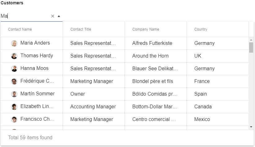
The MultiColumnComboBox was one of the most requested items we've ever had in our feedback portal. Let's take a closer look at what it can do and how you can use it in your apps today.

It has been a couple of months since the R3 2018 release of Kendo UI, and while the buzz of the release has gone down a bit I wanted to stop and take the time to go through one of the biggest pieces to come out of R3 2018: the new MultiColumnComboBox component for the jQueryASP.NET MVC, and ASP.NET Core UI component libraries!

This was one of the highest requested items ever to come through the Kendo UI feedback portal, so the Kendo UI team was very excited to be able to deliver this to all of our developers. We've already seen quite a few of you pick up the component and start using it, but for everyone else here's an overview of exactly what the component is, why it exists, and (hopefully) some inspiration for how to use it in your applications today!

What is the MultiColumnComboBox?

While the name certainly is a mouthful to say it is also very descriptive and immediately lets you know what the component is all about. The MultiColumnComboBox is a ComboBox with the ability to show its data in multiple columns. Simple, right? Another way to think of this is offering a grid-like layout within a drop down.

KendoUI

While it may not fit for every application, there are certainly scenarios that call for saving real estate (through the drop-down) with the ability to show many values for a particular item, rather than just a single value for a data item (through the grid structure). It was, after all, one of the most-voted for items that we ever had in our public feedback portal!

How Do I Start Using the MultiColumnComboBox Today?

The first place to start with any of our DropDowns is with an input element, since this is the base HTML element that we are looking to enhance with additional functionality.

<input id="customers" />

From there, we can use some of the magic that comes from Kendo UI by making this into our new component. In this sample I'm using document.ready, but you could of course instantiate the component somewhere else.

<input id="customers" /> <script> $(document).ready(function() { $("#customers").kendoMultiColumnComboBox(); }); </script>

This really just renders an empty component, so now that we've created the basic component lets add in some data. In this particular case I'm going to work with the Kendo UI DataSource framework item and bind to one of our publicly available sample OData endpoints.

Building out the sample a bit more we get the following:

<input id="customers" /> <script> $(document).ready(function() { $("#customers").kendoMultiColumnComboBox({ dataSource: { type: "odata", transport: { read: "https://demos.telerik.com/kendo-ui/service/Northwind.svc/Customers" } } }); }); </script>

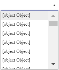
We're getting somewhere, but we're not quite there yet. If we run this we just get a list of [object Object] that contains as many items as we have in our data store.

KendoUI

The way to tweak this is to define a dataTextField and a dataValueField which, as you may have guessed, lets the component know what text should be displayed within the input (TextField) and what the underlying value should be (ValueField). Of course, we can pull information from the entire data item, but we want to adhere to some of the basics of an input element here.

<input id="customers" /> <script> $(document).ready(function() { $("#customers").kendoMultiColumnComboBox({ dataTextField: "ContactName", dataValueField: "CustomerID", dataSource: { type: "odata", transport: { read: "https://demos.telerik.com/kendo-ui/service/Northwind.svc/Customers" } } }); }); </script>

This will just take [object Object] and display a single column which is just like our regular ComboBox. Where are all of our columns!? Well, for the MultiColumnComboBox we decided that it would be best to define columns similarly to how we do in the Grid and TreeList: with the columns configuration option. This is an array of objects that represent our columns, including defining what field we're binding to and what the title of the column should say.

If you've ever worked with the Kendo UI Grid you should be very familiar with this structure!

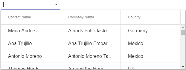
<input id="customers" /> <script> $(document).ready(function() { $("#customers").kendoMultiColumnComboBox({ dataTextField: "ContactName", dataValueField: "CustomerID", columns: [ { field: "ContactName", title: "Contact Name", width: 200 }, { field: "CompanyName", title: "Company Name", width: 200 }, { field: "Country", title: "Country", width: 200 } ], dataSource: { type: "odata", transport: { read: "https://demos.telerik.com/kendo-ui/service/Northwind.svc/Customers" } } }); }); </script>

KendoUI

Now we are getting somewhere! Our drop-down renders, and it displays the columns that we have defined - including the headers! Users can interact with items and select them to have them appear in the input element after being selected. However, we don't have a way to filter items down based on what the user types in, something that we've all grown accustomed to by now to manage these potentially huge lists.

Letting users filter the input is handled by two configuration options: filter and filterFields.

The filter lets us set what type of filter we want do deal with. This includes options like "starts with" and "contains" which are probably the most popular, but a few more options can be used.

The filterFields is a bit unique as this allows us to explicitly define what columns we want to search across. So, if we want to limit this down to just one or two columns we can do so by only mentioning these items in the array. Note however that you can add in all of your fields if you want to!

So, if I want to filter across all fields from the previous sample and have the filter operate as a "contains" all I need to do is add these two configuration options to the above sample.

<input id="customers" /> <script> $(document).ready(function () { $("#customers").kendoMultiColumnComboBox({ dataTextField: "ContactName", dataValueField: "CustomerID", columns: [ { field: "ContactName", title: "Contact Name", width: 200 }, { field: "CompanyName", title: "Company Name", width: 200 }, { field: "Country", title: "Country", width: 200 } ], filter: "contains", filterFields: ["ContactName", "ContactTitle", "CompanyName", "Country"], dataSource: { type: "odata", transport: { read: "https://demos.telerik.com/kendo-ui/service/Northwind.svc/Customers" } } }); }); </script>

And that's it! Now we have our very own MultiColumnComboBox that displays all of our data fields that we're interested in and allows us to filter items across any of our fields.

Some Feature Highlights

Virtualization

Often we see many of our users throwing a ton of data in to their drop-downs, which isn't necessarily a bad thing! Having the ability to somehow tie all your data in to this kind of UI component makes a lot of sense, but often times this leads to a LOT of extra HTML being generated (it has to be rendered somewhere after all) and it can create quite a slow experience even in the faster browsers.

This is why we added in virtualization from the get-go in to the MultiColumnComboBox. It allows us to bind to the full list of data and pull in this data as its needed from the server (I don't think we need 100,000 records to be displayed all at once in a drop-down :wink:) and have improved mechanics around scrolling. This not only saves on initial load time, but any level of scrolling that needs to be done.

Server Filtering

In the sample that we walked through in this blog post we ended up loading all of the data available from the REST endpoint that we are reading data from. This, however, can prove to be quite tricky to handle if we have hundreds of thousands of records (especially in older browsers) so we may want to lean on server filtering for these data heavy scenarios.

Server filtering gives us the ability to request data once a user has typed in a certain amount of characters (defined by the minLength property) and go to the server to perform the filter options and return the appropriate list of items. Tie this in with the autoBind configuration option which can prevent the MultiColumnComboBox from binding data until a request is bade later and you have a great combination for offloading data intensive activity to the server rather than the client.

An example if this can be found right here.

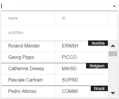
Grouping

KendoUI

Just like with our ComboBox we added in the ability to organize your data items in groups. This can easily be done by following the example in this demo, and as the quick screen grab above showcases, this provides us with a little indicator of which particular group the data items displayed are a part of. This, by the way, is pulled from the DataTextField value of the field we're grouping on.

Templates

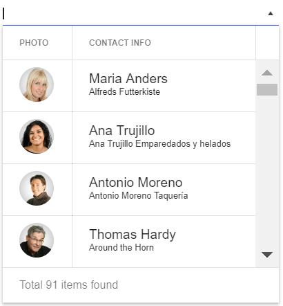
KendoUI

So far we've really only talked about handling text in columns, but what if we want to customize each entry to update its look based on the data item, or just have some additional HTML added for each item? Well, this is where templates come in! As can be seen in this demo, dealing with templates is done on a column-by-column basis, and allows for both the cell and header to take advantage of any kind of custom template.

There's More!

I tried to walk through some of the most-used features that come from some of our other drop downs (mainly the ComboBox), but there's a ton of other features that we can use this new component in. We highly recommend that you take a look through both our demos as well as our documentation to see what else is available.

Feedback

This initial release of the MultiColumnComboBox had quite a lot of features from the initial release, but that doesn't mean we're done with it! If you have any suggestions on how we can improve this component do not be shy! Feel free to use the comment section below, or submit this as a feedback item in the Kendo UI feedback portal.

Managing State in GraphQL Using Apollo Link State

$
0
0

Did you know you can read to and write from your state using GraphQL? Apollo Link State allows you manage both local and remote data in a single place.

You don’t need a GraphQL API in order to use GraphQL. That may seem like a crazy statement, but with Apollo GraphQL you’re able to use apollo-link-state in order to read from and write to your state using queries and mutations.

In this article we’ll explore how to use apollo-link-state as a state management library to replace component state, Redux, or MobX. The topics we’ll be covering are as follows:

  • How to set up link state and define resolvers and default data
  • How to execute mutations that update the state
  • How to execute queries to read the state

If at any point you get lost, the final version of this code can be found on GitHub.

Apollo and Data

Apollo keeps all of your data in a cache. Think of it like a normal data store that you’d have in MobX or Redux. Normally this cache gets populated by executing GraphQL queries, which puts the data that is returned from the server into the cache. You can read from or write to that cache on your own using the apollo-link-state module.

Why would you do this? It allows you to execute GraphQL queries (or mutations) in your React code to access your state, without the need to have a GraphQL API. It also gives you a common language to refer to all forms of data, whether it be state or data that comes from a GraphQL API.

In our example, we’ll be adding a simple control that lets us choose how many starred repositories we’d like to see from the GitHub GraphQL API. Let’s see how it works!

The first step is to add the library: yarn add apollo-link-state. After that, we’ll define some mutation resolvers. These resolvers allow us to look for special queries or mutations and deal with them locally rather than having them make a request to an external GraphQL API.

Below is the apolloClient.js file where we define the Apollo Client along with all of the different links it is comprised of. If you are not familiar with the Apollo Client, please refer to the previous article in this series which focuses on basic Apollo Client setup. I have commented some of the links out to keep this code from growing too large.

// src/apolloClient.jsimport{ InMemoryCache }from"apollo-cache-inmemory";import{ ApolloClient }from"apollo-client";import{ ApolloLink }from"apollo-link";import{ HttpLink }from"apollo-link-http";import{ setContext }from"apollo-link-context";import{ onError }from"apollo-link-error";import{ withClientState }from"apollo-link-state";const cache =newInMemoryCache();
const stateLink =withClientState({ cache, resolvers:{ Mutation:{ updateStarredControls:(_,{ numRepos },{ cache })=>{ const data ={ starredControls:{ __typename:"StarredControls", numRepos } }; cache.writeData({ data }); returnnull; } } }, defaults:{ starredControls:{ __typename:"StarredControls", numRepos:20 } }});// errorLink defined here// authLink defined here// httpLink defined hereconst client =newApolloClient({ link: ApolloLink.from([errorLink, stateLink, authLink, httpLink]), cache });exportdefault client;

The main things you’ll pass to the withClientState functions are:

  • cache: Where the state will be stored.
  • resolvers: Any Mutations or Queries required to modify or read from the state (Queries aren’t an absolute necessity, though, if your query simply requests the data in the exact format it is stored in in the cache).
  • defaults: Default state values for the state you plan to have.

The resolver function we defined as updateStarredControls looks like this:

(_,{ numRepos },{ cache })=>{  const data ={
    starredControls:{
      __typename:"StarredControls",
      numRepos
    }  };
  cache.writeData({ data });  return data;};

Its main purpose is to receive the mutation variables { numRepos } along with the { cache }, and, using those two things, update the data within the cache. Refer to the Apollo docs for details about the resolver signature.

It’s important to note that the data you add to the cache must have a __typename field, which helps Apollo normalize and store the data correctly.

Cleaning up Resolvers & Defaults

Just like in Redux, you can imagine that as your state grows, the amount of Mutation and Query resolvers you have will get unwieldy to contain in a single file. I recommend creating a resolvers folder that contains a single file per related group of resolvers and defaults, with an index.js file that merges them all together. For example:

// src/resolvers/starredControls.js
const
resolvers ={ Mutation:{ updateStarredControls:(_,{ numRepos },{ cache })=>{ const data ={ starredControls:{ __typename:"StarredControls", numRepos } }; cache.writeData({ data }); returnnull; } }};
const defaults ={ starredControls:{ __typename:"StarredControls", numRepos:20 }};
export
default{ resolvers, defaults };

And then the code to merge them:

// src/resolvers/index.js
import
merge from"lodash.merge";import starredControls from"./starredControls";exportdefaultmerge(starredControls);

Which will allow us to update the definition of our stateLink to be quite a bit shorter:

// src/apolloClient.jsimport resolversDefaults from"./resolvers";const stateLink =withClientState({
  cache,
  resolvers: resolversDefaults.resolvers,
  defaults: resolversDefaults.defaults
});

Mutating State

To call the mutation resolver that we’ve defined, we’ll create a component called StarredControls, which will give the user three options to choose from: Viewing 10, 20, or 30 repositories at a time. In the onClick event, we’ll call the mutation function, passing the variables required (numRepos). Below the code example, we’ll dive into a little more detail about how it works.

// src/StarredControls.jsimport React,{ Fragment }from"react";import{ Mutation }from"react-apollo";import gql from"graphql-tag";import{ Button }from"@progress/kendo-react-buttons";import styled from"styled-components";// Just adding some additional styles to our kendo buttonconst Control =styled(Button)`
  margin-right: 5px;
`;
// Defining the mutation to be executed

const
UPDATE_STARRED_CONTROLS = gql` mutation UpdateStarredControls($numRepos: Int!) { updateStarredControls(numRepos: $numRepos) @client } `;constStarredControls=({ numRepos })=>(<div> View{" "}<Mutationmutation={UPDATE_STARRED_CONTROLS}> {updateStarredControls =>(<Fragment> {[10,20,30].map(num =>(<Control onClick={()=>{ updateStarredControls({ variables:{ num }}); }} key={num}> {numRepos === num ?<strong>{num}</strong>: num}</Control> ))}</Fragment> )}</Mutation>{" "} Repos </div>);exportdefault StarredControls;

First things first, aside from using styled-components to add some margin to the button we’re using from the Kendo UI Button library, you’ll see the definition of the mutation.

const UPDATE_STARRED_CONTROLS = gql`
  mutation UpdateStarredControls($numRepos: Int!) {
    updateStarredControls(numRepos: $numRepos) @client
  }
`;

This looks like a normal mutation other than one key difference: The @client directive. This signals to Apollo that it’s meant to use the resolvers we’ve defined for our state link.

The actual code to embed the Mutation component into our React code is no different than it would be to execute a GraphQL mutation on a server API versus the client-side mutation we are executing.

Querying State

The query definition will look very familiar to normal query definitions in Apollo, with the main difference being the @client directive (similar to what we did with the mutation), as a way of indicating to Apollo that this query is meant to read data from state.

Because our query matches how the data is stored and without any query variables that might modify the result, we didn’t even have to define a query resolver when we defined link-state, as Apollo is smart enough to read it from the data cache. This is called a default resolver.

// within src/StarredRepos.jsconst STARRED_CONTROLS_QUERY = gql`
  query StarredControlsQuery {
    starredControls @client {
      numRepos
    }
  }
`;

Once we’ve defined the query, using it is identical to how you would execute any other query within Apollo, be it to a GraphQL server or to state.

exportdefaultclassStarredReposextendsReact.Component{  render(){    return(<div><Queryquery={STARRED_CONTROLS_QUERY}>      {({ data:{ starredControls }})=>(<Fragment><Status/><StarredControlsnumRepos={starredControls.numRepos}/><Query          query={STARRED_REPOS_QUERY}          variables={{ numRepos: starredControls.numRepos }}>        {({ data: repoData, loading })=>{          if(loading){            return<span>Loading...</span>;          }          return repoData.viewer.starredRepositories.nodes.map(node =>(<Repositorydata={node}key={node.id}/>          ));        }}</Query></Fragment>      )}</Query></div>    );  }}

Conclusion

If I’m being honest, I see pros and cons to the idea of link-state. The pros to me are that you can think about querying/mutating your data in a single way, treating data from your state, data from the server, and potentially data from other sources (like a REST API) in the exact same way.

The cons to me are that managing state seems to be done more concisely and clearly using an existing state management library such as Redux, MobX, or simply sticking with component state for simple cases.


For more info on building apps with React:

  • Check out our All Things React page that has a great collection of info and pointers to React information—with hot topics and up-to-date info ranging from getting started to creating a compelling UI.
  • You can also learn more about KendoReact, our native component library built specifically for React, and what it can do for you.
Think User Testing is a Luxury? Ask Airbnb.

$
0
0

Isabelle is a guest author from our partner truematter - user experience experts who help their customers achieve greater efficiency and engagement.


Don't wait to discover user testing by accident. Incorporate it ahead of time and give your users the experience you want them to have from day one.

The other day, I was listening to NPR’s How I Built This podcast episode on the creation and success of Airbnb. It’s an outstanding podcast and if you’ve never listened, you should. But that particular episode struck a chord with me because of this: Airbnb literally wouldn’t exist if it hadn’t been for user testing.

When they founded Airbnb, Joe Gebbia and Brian Chesky were developers. They’d made a lot of money building websites and knew their way around code and functionality. But even so, the original Airbnb site didn’t have many users. The company was losing money. It couldn’t attract investors. Airbnb was in the feared “trough of sorrow” that kills so many new businesses.

It was then that they got some very good advice from a mentor: Go to your customers. They flew to New York, thinking they’d drive more bookings if they could be there in-person to help their hosts listing places for rent take better pictures of their homes.

Host customers were impressed with the new professional photos Gebbia and Chesky took of their places. It got them talking about the Airbnb site in general, sometimes for hours. And in the course of conversation, these customers showed Gebbia and Chesky how they completed site tasks for listing their homes: accessing calendars, adding images of their place, or messaging lodgers.

It was a mess. What Gebbia and Chesky, as developers, thought was a perfectly designed interface was, in fact, hopelessly complicated. They had stumbled upon user testing. And it worked wonders.

Gebbia and Chesky immediately fixed the confusing and frustrating parts of the site.  Engagement sky-rocketed. In just one week, Airbnb’s weekly average revenue doubled. They were suddenly pulling in enough revenue to attract investors, those investors backed the business, and now we can all stay in a treehouse in Atlanta or a yurt in Bavaria in just a couple of clicks.

Fortunately, you don’t have to accidentally discover user testing. You’re reading this post. Always, always, always engage with your users. Interact with them before you start any digital project. Watch them use the existing site or app. Observe their current processes. When you’re designing the new interface, test it with real users before anything is set in stone. Ask real people to give feedback on what you think is the finished product.

Paying attention to user experience was Airbnb’s saving grace. But it isn’t just important for startups or disruptive new technology. It very well could be the difference between the success and failure of your digital products, too. Next time you think UX is a luxury or a corner you can cut, remember Airbnb. Then do what they did: Go to your users.


Building with UX in Mind

One good way to help your UX efforts is to make sure that you use UI components that were designed with UX in mind: Kendo UI. Whether you are using a Grid, Chart, Scheduler, or any of the components from the extensive library. Check out Kendo UI and see for yourself.

5 Things I'd Teach My Younger Self About Programming

$
0
0

Kamen takes a look back at his last 10 years working as a software developer and offers some advice that any young developer could learn from.

It’s been more than 10 years since I started working as a software developer. Looking back, I sure have made a lot of mistakes, but I’ve learned a lot from these mistakes too. As I think we all do, sometimes I wish I could go back in time and give some advice to my younger self—it would make things much easier!

If I could go back, these are the five things I'd teach my younger self about programming:

  • A technical degree doesn’t make you a programmer. Coding does. You become a programmer after you write your first 1 million lines of code.
  • Learn to code, not the language. Programming languages change constantly. Learn the underlying concepts behind how things work.
  • Your code should make the user's life easier. It doesn’t matter how good your code is if it doesn’t solve any problems. Always keep the user in mind.
  • Always be on the lookout for that ONE thing that can make your other tasks much easier or eliminate them altogether. Focus on the things that matter, don't get stuck in the weeds.
  • Have fun. Programming is your hobby and you should enjoy every minute of it!

Okay, everyone likes bonus tips (including my younger self), so I’ll give one more piece of advice. Dear younger me…

  • Two hours of planning can save you two weeks of coding. Learn how to plan your work ahead of time and you’ll be surprised how easy it is to get things done.

Based on my experience, these are the six most important things I've learned over the years. What advice would you give to your younger self?

Automated Testing for Mobile Apps

$
0
0

Mobile quality is the largest challenge mobile developers will encounter, with devs dealing with app complexity, device fragmentation, fast release cycle, short user sessions and higher user expectations for mobile applications. In this article, Sean Sparkman walks you through some of the basics of automated UI testing.

Gone are the days of single-screen mobile applications—applications are becoming more and more complex with each passing year. These complex features need to be tested. Existing features need to be retested even when making a minor change to another part of the application. This can take valuable time away from development and draw out release times.

In consumer mobile applications, users want to be able to open a mobile app and quickly complete a task. If users cannot start their task within three seconds of pressing the app icon, they will find another application. If an app developer finds a good idea, it will not be long before someone else copies it.

Everyone knows about version fragmentation on Android. Certain manufacturers do not let you upgrade to newer version of Android. Oreo only has a 12.1% adoption rate as of July 23, 2018, according to Google. This is one year and four months after being released.

Version

Codename

API

Distribution

2.3.3-2.3.7

Gingerbread

10

0.2%

4.0.3-4.0.4

Ice Cream Sandwich

15

0.3%

4.1.x

Jelly Bean

16

1.2%

4.2.x


17

1.9%

4.3


18

0.5%

4.4

KitKat

19

9.1%

5.0

Lollipop

21

4.2%

5.1


22

16.2%

6.0

Marshmallow

23

23.5%

7.0

Nougat

24

21.2%

7.1


25

9.6%

8.0

Oreo

26

10.1%

8.1


27

2.0%

Device fragmentation further complicates this issue. There are six different screen densities on Android. In this ever-growing device market, you need to be able to test your application on more than a personal device.

Web applications have more leeway when it comes to users. Users expect more from their mobile applications. Slow load times and performance for web applications is often chalked up to slow network speeds. Since mobile applications are installed on the device, users expect the application to perform faster. Even without a network connection, the app must still work—even if just displaying an error message. This is actually tested during Apple App Store Review. No network connection is commonly tested, but slow connections are not. The user interface must still be responsive while pulling data from an API even with sluggish connection.

Testing applications under slow and no connection conditions is a good first step. The next step is error path testing. Handling error conditions can make or break an application. Crashing is a major no-no. Unhandled errors in a web browser will typically not crash the browser window. Native applications crash on error, full stop. If the API is up but the database is down, it may cause unexpected errors. Many users will stop using or even uninstall an application if it crashes. If the user is frustrated enough, they will write a review with low or no stars. Low-star reviews are very difficult to come back from. The most common error I have seen is when a developer accesses a UI element from a background thread. On an iOS simulator, nothing will happen. The UI element will not update, and no errors will be thrown. However, when executing on a physical device, it will cause a crash. If the developer only tests on simulators, they will never discover their critical error.

The Various Ways of Testing Applications

There are several different ways to test an application. Beta testing with users is great in that it tests with real users, but it is difficult getting good feedback. Manual testing is very slow, limits the number of devices you can use and is not a realistic test. Unit testing should always be done, but it should be done in addition to integrated testing and is far from realistic.

So how do we test quickly, on a broad set of devices, and with every release?  Automated UI testing is the answer. My preferred toolset for automating UI testing is Xamarin.UITest. It can be quickly and easily written with C#. Tests can tap, scroll, swipe, pinch, enter text and more inside a native application, regardless of whether it’s Xamarin or not. These tests can then be run locally on simulators and devices. Once the application is ready to be tested against a broader set of physical devices, these same tests can be run inside of Microsoft’s App Center against most popular devices on a number of a different versions of iOS and Android.

The best way to get started writing UI tests is with Xamarin.UITest’s built in REPL. If you’re not familiar with REPL, it’s an acronym that stands for Read-Evaluate-Print-Loop.  REPL is a great way to start learning a new language or new framework. It allows you to quickly write code and see the results. Xamarin.UITest’s REPL can be opened by calling app.Repl().

[Test]
public void ReplTest()
{
    app.Repl();
}

Running a test with the REPL method call will open a console. The console is equipped with auto-complete. Developers can work through the steps inside the console to test their application. Once done with a test, the copy command will take all the steps used into the REPL and place them into the clipboard. Finally, the developer can take the copied commands and paste them into a new test method in their UITest project.

1 AT4MA 

The application’s UI elements can be examined by calling the tree command inside of the console. This will display a list of elements with their children. Elements can be interacted with from the console using commands like Tap and EnterText. When writing a test, WaitForElement should be called. This will cause the test to wait for the specified element to become available. When automated, it is necessary to wait for the screen to load, but it won’t be when using the console.

Elements are referenced by using the Marked or Query methods. These methods rely on the id field for iOS, label for Android, and finally the AutomationId for Xamarin.Forms.  When using Xamarin.Forms, the same UITests can be used for Android and iOS if there aren’t too many platform specific tweaks.

Once a test is setup and any necessary steps performed, the Query method can be executed to gain access to elements on the screen. At this point, values and displayed text are tested to see the results of the test. This would be performed like any other unit test.  Xamarin.UITest is running on top of NUnit 2.6 and asserts are available inside of test methods.

[Test]
public void ReplTest()
{
    app.WaitForElement("FirstName");

    app.EnterText(a => a.Marked("FirstName"), "Sean");
    app.EnterText(a => a.Marked("LastName"), "Sparkman");
    app.DismissKeyboard();
    app.Tap(a => a.Marked("OnOff"));
    app.Tap(a => a.Marked("Submit"));

    app.WaitForElement("Result");
    var label = app.Query(a => a.Marked("Result"));

    Assert.AreEqual(1, label.Length);
    Assert.AreEqual("Success", label[0].Text);
}

A great example of a test to automate is registration. This workflow should be tested with every version, but a manual test should not be necessary. A developer could create multiple successful and failing tests of registration. Failing tests could include when not connected to the internet, using invalid data in fields or trying to register as an existing user. These are important to test with each release but take up valuable time that could be spent on testing new features.

Once written, UITests can be run locally with either a simulator, emulator or physical device that is plugged into the executing computer. However, this does limit the number of devices that these tests can be run against. The next step is to upload to Microsoft’s Visual Studio App Center, which increases the number of devices tested on. Once uploaded, the devices used for the tests can be selected. Microsoft allows for testing on thousands of iOS and Android devices in the cloud. Each step along the way can be documented visually with the Screenshot method. Screenshot allows for a string to be provided with a meaningful name for the screenshot. This method can be works locally as well to provide a view into what is happening with the tests.

2 AT4MA

Even if Xamarin.UITest is not used, best practices should include using an automated UI testing framework. Regression testing and testing on multiple devices should always be done when working in mobile development. The mobile app stores are a highly competitive space.  Developers need to be able to move quickly and respond by releasing new versions with new features to be competitive. Automated testing allows programmers to push forward with confidence and speed without compromising on quality, because quality is king.

5 Things I'd Teach My Younger Self About Programming

$
0
0

Kamen takes a look back at his last 10 years working as a software developer and offers some advice that any young developer could learn from.

It’s been more than 10 years since I started working as a software developer. Looking back, I sure have made a lot of mistakes, but I’ve learned a lot from these mistakes too. As I think we all do, sometimes I wish I could go back in time and give some advice to my younger self—it would make things much easier!

If I could go back, these are the five things I'd teach my younger self about programming:

  • A technical degree doesn’t make you a programmer. Coding does. You become a programmer after you write your first one million lines of code.
  • Learn to code, not the language. Programming languages change constantly. Learn the underlying concepts behind how things work.
  • Your code should make the user's life easier. It doesn’t matter how good your code is if it doesn’t solve any problems. Always keep the user in mind.
  • Always be on the lookout for that ONE thing that can make your other tasks much easier or eliminate them altogether. Focus on the things that matter, don't get stuck in the weeds.
  • Have fun. Programming is your hobby and you should enjoy every minute of it!

Okay, everyone likes bonus tips (including my younger self), so I’ll give one more piece of advice. Dear younger me…

  • Two weeks of coding can save you two hours of planning. Learn how to plan your work ahead of time and you’ll be surprised how easy it is to get things done.

Based on my experience, these are the six most important things I've learned over the years. What advice would you give to your younger self?


New PDF Viewer Coming in Telerik UI for Xamarin R1 2019

$
0
0

Viewing and manipulating PDFs is an increasingly common task, but still a cumbersome one - especially on mobile devices. That's where the new PDF Viewer for Telerik UI for Xamarin comes in.

With the first release of the year (R1 2019), the Telerik UI for Xamarin UI library expands with a new PDF Viewer Control enabling the end-users of your mobile application to view PDF documents without relying on third-party applications.

Nowadays, we deal with PDF documents almost daily, ranging from bank statements to invoices and formal documents and business memos. As mobile devices become more and more powerful and commonly used as an extension (or replacement) of a desktop application, we turn to reviewing PDFs on our handhelds as well. However, in order to view these files, we rely on a separate application to review them, which often requires us to switch back and forth between applications.

In the case of mobile devices, this process is quite cumbersome and does not provide the best user experience. This claim was further backed up by you, our customers and we've received numerous requests from you to provide the option for reviewing PDF files inside the mobile app itself - we heard you loud and clear!

We are happy to announce that as of the next release of Telerik UI for Xamarin, a brand new control is coming to life - the PDF Viewer. This allows you and the end-users of your application to review PDF files straight from inside the mobile app, without needing to install a third-party app.

Telerik UI for Xamarin - PDF Viewer - Overview Image

But we didn't stop there, and we've also added a number of extra features to provide you with an even better user experience. Here is a list of the features that will ship together with the release:

  • PDF Document Visualization: Display PDF documents with text, images, shapes, colors, lists, bullets and more
  • Single Page and Continuous Scrolling Support: Easily scroll the document in the viewer with a fluent experience
  • Commands Support: Be it Zooming, Navigating from page to page, FitToWidth or Toggling the Layout mode, you got it
  • Toolbar Support: With the built-in toolbar, all commands and actions are already set in place

We are still actively working on the control, so expect a few extra features too :). The R1 2019 release will take place on January 16th (yes, it's close!), at which point you will be able to download the latest version of the Telerik UI for Xamarin toolkit and explore the control for yourself and try it out in your application.

As we previously mentioned, the PDF Viewer came to life based on your continuous feedback and support, and we couldn't be more thankful. Please, continue sharing your thoughts, as this is one of the key factors we take into account in building our roadmap.

Last, but not least, you can get a detailed overview of everything new in R1 2019, across all our products, together with our developer experts, so make sure to sign up for the Telerik R1 2019 Webinar on January 18th.

Save My Seat for the Release Webinar

We look forward to sharing more with you after the release. Hope you are as excited as we are!

The NavigationView (Hamburger Menu) Arrives in Telerik UI for WPF R1 2019

$
0
0

Another powerful navigation control is coming to Telerik UI for WPF with the Telerik R1 2019 Release - the NavigationView. Also known as the Hamburger Menu, it provides a modern and intuitive user experience in your WPF applications.

As I am writing this blog post, reality hit me hard - it's already 2019, a year which in my childhood was used to signify the future, where people rode flying cars and buildings rose as high as the clouds. Despite that being far from the truth, we've seen tremendous change in our everyday lives, due to major technology advancements across multiple industries. As users we are interacting with more software products and platforms than ever before and as we rely on them for both work and leisure, we praise and demand intuitive and modern UI across the board.

One prominent example of a great navigational UI is NavigationView, often called the Hamburger Menu. You can find it in a variety of UWP / Windows 10 applications, as well as the Windows 10 Start Menu itself.

We are happy to announce that it's part of our Telerik R1 2019 release of Telerik UI for WPF

Telerik_UI_for_WPF_-_NavigationView_-_Overview Image

The NavigationView organizes the content into separate tabs, all visible on the side as drawers. It's an easy way to allow the end-user to navigate to the different views of the application. Through it's adaptive nature it provides a great UX across various devices, making it the go-to choice for many developers. With the initial release of the control, it will support the following features:

  • Adaptive Display Mode: The control will dynamically adopt the layout to the size of the window, while keeping the content well-arranged and visible on the screen
  • Data Binding: The control can be easily bind to different sources such as Objects and Collections
  • Flexible Header and Footer: Both the Headers and Footers can be easily customized to accommodate the needs of your application
  • UI Automation Support: The NavigationView provides built-in support for Microsoft UI Automation
  • Enhanced Routed Events Framework: With the events system of the control your code will become elegant and concise
  • Keyboard support: Perform navigation, selection and other actions through the keyboard alone

The Telerik R1 2019 Release goes live on January 16, when you will be able to get your hands on the latest version of Telerik UI for WPF and try out the NavigationView in your application.

In addition to the Hamburger Menu, the release will bring full support for Visual Studio 2019 and the .NET Core 3.0 Preview (huzzah!), as well as a bunch of other new controls and feature enhancements. These include the official MultiColumnComboBox control, the ability to add the MultiColumnComboBox column to the GridView component, a new RibbonUI to pair with the Diagram component and a Hyperlink button to name a few.

For a detailed overview of everything new in R1 2019, make sure to sign up for the Telerik R1'19 Webinar. 

Save My Seat for the Release Webinar

Thank you for your continuous support and feedback - keep the feedback coming, as this is a critical part of how we set our product roadmap. Stay tuned for more info after the release, and see you at the webinar!

ASP.NET Core Tag Helpers Video Tutorial: Getting Started with Telerik Tag Helpers

$
0
0

In this series of videos, get introduced to ASP.NET Core Tag Helpers and learn how you can use them to build better real-world applications with the help of Telerik UI for ASP.NET Core.

This instructional video series is a hands-on demo of ASP.NET Core Tag Helpers with the help of Telerik UI for ASP.NET Core. Learn the basics of working with Tag Helpers by building a fully functional app using multiple UI components (grid, chart, date picker and more). The course is guided by industry pros: Scott Addie, Sr. Content Developer for Microsoft, and Ed Charbeneau, three-time Microsoft MVP.

What are ASP.NET Core Tag Helpers

To really understand how ASP.NET Core Tag Helpers can make you more productive we’ll begin with an introduction to the basics of Tag Helpers. In this video we’ll learn why Tag Helpers were added in ASP.NET Core and how they improve the readability of our markup through better IntelliSense and easier context switching.

Let’s Build an App

In the Tag Helper video series we’ll learn how to build the Team Efficiency Dashboard, a single page, responsive web application. The application uses date picker, responsive panel, chart, grid and tree view Tag Helpers to create an interactive reporting experience. In this video we’ll take a look at the completed app we’ll be building.

Introducing Telerik UI for ASP.NET Core: Tag Helpers

ASP.NET Core comes with a handful of Tag Helpers, just a fraction of what is needed to build a real-world application. For a complete toolbox of components the Telerik UI for ASP.NET Core features over 60 Tag Helpers. In this video we discuss the features of Telerik UI for ASP.NET Core and how to install, where to find documentation and get a free trial.

Let’s Start with a Prototype

In this video we discuss the prototype application which we will transform over the course of the video series into a fully functional application. The prototype application is a simple bootstrap layout with placeholder elements which will be replaced with Telerik UI for ASP.NET Core Tag Helpers.

Form Basics: Label and Date Picker Tag Helpers

Scott Addie introduces us to the ASP.NET Core Label Tag Helper and the Telerik Date Picker Tag Helper. This introduction shows how to write markup using Tag Helpers and discusses the advantages of the generated UI.

Using the Tree View Tag Helper to Master Hierarchical Data

Microsoft MVP Ed Charbeneau shows us how to use the Telerik ASP.NET Core Tree View Tag Helper. The Tree View Tag Helper is a UI component that can be data bound naturally to hierarchical data sources.

Refactoring with the ASP.NET Core 2.1 Partial Tag Helper

In this video we learn how to refactor application view code with the Partial Tag Helper. The Partial Tag Helper is a new feature in ASP.NET Core 2.1 used to encapsulate markup.

Responsive Panel

In this video we see how to create a mobile responsive panel with the Responsive Panel Tag Helper. This Tag Helper creates a drawer that collapses off screen when a device has a small screen size.

Tackling Data Sets with the Telerik Data Grid Tag Helper

In this video we learn how to use the Telerik Data Grid Tag Helper. Data binding, sorting, filtering, and server side functionality are discussed.

Handling Client Side Events and User Interactions

In this video we learn how to use Telerik UI for ASP.NET Core’s client side API. Using client side events we can easily add interactivity and bind to events using ASP.NET Core Tag Helpers.

Using Chart Tag Helpers for Interactive Data Visualizations

In this view we learn how to use the Telerik Chart Tag Helper for ASP.NET Core. Client side events are used to complete the demo application.

I hope this video series helps you get started with ASP.NET Core Tag Helpers and shows how Telerik UI for ASP.NET Core can help you build your real-world applications. You can start a free trial of Telerik UI for ASP.NET Core here and try it out for yourself. Happy coding!

Telerik Team Contributes to the Newly Open Sourced WinForms

$
0
0

When Microsoft announced it would be making WinForms and WPF open source, our Telerik team jumped at the opportunity to be among the first contributors.

Microsoft recently announced WinForms and WPF are now open source. It is a natural progression of the company’s open source efforts and further delivers on its promise to the developer community.

Working alongside Microsoft, our team - led by Stefan Stefanov - submitted one of the first pull requests to be merged in the WinForms repo on GitHub: support for PlaceholderText in the TextBox control.

The concept behind the feature is simple - it has a single property called PlaceholderText. When set, the control allows developers to show a watermark with a description if the text of a control is set to null.

Prior to this feature being merged, in order to provide guidance for the users as to what input is expected in a text field, the only option was to have a label next to the TextBox control. However, there are cases where labels are not appropriate, and it is much more user friendly to have a placeholder text in the TextBox itself to provide users with prescriptive guidance for input expectations. A prime use case for this would be the user name and password fields.

How it Works

A single public property called PlaceholderText is introduced, with no default value. When the property is set AND the TextBox.Text is null or string.Empty, the string from the PlaceholderText will be drawn in the TextBox control when it has no focus, using the SystemColors.GrayText.

Once the property value is changed the new text will be drawn, if currently visible. When the user focuses on the control, the text disappears. Different text alignments and RightToLeft are taken into consideration when the PlaceholderText is being drawn. It supports Multiline mode as well.

In addition, AccessibilityObject has been implemented to return the PlaceholderText when the Text is empty, so screen readers read the PlaceholderText value and guide the users as to what is expected from them as input.

On the bottom left side of the image you can see a TextBox with PlaceholderText drawn.

PlaceholderText

We are excited about the future of desktop development with WinForms and WPF and were thrilled to be a part of the group of developers making Microsoft’s desktop libraries even stronger. What’s more, with the frameworks now open source, we can access the code at a deeper level and address issues in a self-serve model. This will enable us to deliver better products faster to you and address issues that in the past may have required more detailed and lengthy interactions with Microsoft. If you don't have a license of Telerik UI for WinForms or Telerik UI for WPF, make sure you download a trial.

What are your thoughts on WinForms and WPF being open sourced? Is it a good thing for you as a desktop developer? What do you hope to see from the frameworks in the future and do you plan to contribute? Share your thoughts with us.

Report Rendering Run Time on Linux and More in Telerik Reporting and Report Server R1 2019

$
0
0

We've added great features to Telerik Reporting and Telerik Report Server in our first release of 2019, including improved Linux support. Read on to get a preview.

For the R1 2019 release of Telerik Reporting and Telerik Report Server, we have been busy implementing a whole set of new features. These have come directly from your requests on our feedback portal, so thank you and keep them coming! 

In the next release, which will arrive on January 16th, we will include report rendering run time on Linux (.NET Core), declarative report definitions localization, scalability of the report scheduling service and much more.

In this blog post, I want to focus on what to expect regarding one of these features in particular – Report rendering run time on Linux (.NET Core) in Telerik Reporting.

New Feature Preview: Report Rendering Run Time on Linux (.NET Core) in Telerik Reporting

With Telerik Reporting you can deploy your created reports to any business application. Currently, we support the following technologies:

  • ASP.NET MVC
  • ASP.NET Ajax (Web Forms)
  • WPF
  • Windows Forms
  • HTML5
  • Angular
  • Azure Cloud

With R1 2019, we will enable our report rendering engine, along with the reports web service, to be available for deployment on console and web applications targeting .NET Core framework, versions 2.0 and higher. The deployment target can be both Windows and Linux OS. With this valuable addition Telerik Reporting becomes available to a wider developer audience by targeting yet another operating system. 

Try it Out and Learn More at the Webinar

If you are new to our tools or have only tried some, make sure you download the trial and take them for a spin. You can either download just the Reporting and Report Server tools, or download a trial of our entire set of .NET and JavaScript tools with the DevCraft bundle.

Watch the Webinars

And don't forget to register for our R1 2019 release webinar on January 18th, where our technical experts will provide a deep dive into all our new features and functionalities.

Save My Seat

R1 2019 Sneak Peek: Telerik Tools for ASP.NET AJAX, MVC and Core

$
0
0

Get a sneak peek at some of the new controls and features that will be available in Telerik UI for ASP.NET AJAX, Telerik UI for ASP.NET MVC and Telerik UI for ASP.NET Core.

Happy 2019! If you hadn’t heard, next week is the first major release of the year for the Telerik and Kendo UI product lines. And while you will have to wait a few more days before you can get your hands on the latest bits, I thought I’d share the highlight reel of what will be included.

Make sure you download the latest bits or a trial on January 16 – and don’t forget to sign up for the Telerik R1 2019 release webinar where Sam Basu and Ed Charbeneau will go over all of the new additions and improvements to our web, mobile and desktop tools.

Telerik UI for ASP.NET MVC and Telerik UI for ASP.NET Core

New Date Range Selection Components: MultiViewCalendar and DateRangePicker Date Range selection is a popular request. Because of this, we are adding two new controls in R1 2019 - MultiViewCalendar and DateRangePicker. The MultiViewCalendar component enables developers to easily display two calendars side by side, while the DateRangePicker component provides the ability to pick a start and end date all within a single drop down menu.


TreeView Performance Boost
With R1 2019 we have taken significant steps to improve rendering and interaction time with the TreeView, which is most noticeable in data intensive scenarios. But don’t worry, there won’t be a need to work with any new configuration; all improvements are under the hood!

Scaffolding and Support for Razor Pages in ASP.NET Core
With R1 2019 Telerik UI for ASP.NET Core will receive several scaffold templates that can easily be added in to any project to help speed up development. On top of this, as of R1 2019 we will also fully support Razor Pages to help cover more scenarios when developing with ASP.NET Core.

Telerik UI for AJAX

New Control: MultiColumnComboBox I know what you are probably thinking – “a new control for Telerik UI for ASP.NET AJAX? Sweet!” (I couldn’t agree more). In R1 2019, Telerik UI for ASP.NET AJAX users will have the ability to display tabular data within a drop down with the new MultiColumnComboBox. This new control provides the power of a displaying and filtering items in the table all within a drop down, giving users more context around the data items they are looking to select.


The Toolbar Feature Gets Added to RadChat
We’re also adding features to RadChat (our Conversational UI control). With the new toolbar feature the RadChat component can now have additional forms of input in any chat, including the ability to attach images, sound files, and any other type of file that may be needed. This toolbar can be customized to ensure that the component only offers the required inputs.

Try it Out and Learn More at the Webinar

As I mentioned above, you'll be able to download the latest bits or trial on January 16 – try it out and let us know what you think. Be sure to sign up for the Telerik R1 2019 release webinar on January 18th as well for a deeper look at all the new features in the release.

Save My Seat for the Release Webinar

Sneak Peek: Kendo UI & R1 2019

$
0
0

The R1 2019 release is coming soon. Get a sneak preview of all the new updates coming to Kendo UI for jQuery, Angular, React and Vue.

It’s a brand new year and you know what that means: the R1 release is right around the corner! While it’s not here quite yet, I wanted to give everyone an early look at what is coming around the corner for Kendo UI!

We have support for a lot of different JavaScript frameworks, so I’ll break down some of what’s about to come out for each flavor of Kendo UI.

jQuery

The jQuery library already has the biggest offering of components across any of the Kendo UI flavors, but we continue to deliver new components with R1 2019 including the MultiViewCalendar, DateRange, and Ripple components.

Beyond the usual enhancements we also improved the performance of the TreeView by quite a bit. Definitely worth upgrading just for that alone!

Angular

With our Angular component library we focused on delivering another big component that people have been looking for. So with R1 2019 we are proud to announce the release of the rich text editor for Angular.

Beyond this we have various improvements available for the Grid, and of course a whole slew of improvements to the newer Scheduler component.

React

On the React side of the house we have a ton of fun news. With the R1 2019 release we have 7 new components including the Window, Splitter, and TreeView components. Beyond this we also have enhancements to popular components (like frozen columns in the data grid) so there is plenty to look forward to.

Vue

The biggest thing for our Vue.js components is the new native data grid that will drop with R1 2019. This is a component that is not based on our jQuery Grid and should have a natural fit in to any Vue.js app. There’s of course a slew of other features, but for details on those (and access to the native data grid) you’ll have to wait until the official release.

Watch the Webinar

As I mentioned in the beginning of this post this is just a small subset of what’s to come with the release on January 16th. For a more detailed walk-through I recommend registering for our live webinar on Tuesday, January 22nd at 11 AM ET. Seats are limited so make sure you reserve your seat today!

Save My Seat


Sneak Peek: KendoReact & R1 2019

$
0
0

The R1 2019 release is coming soon. Get an early look at all the new updates coming to KendoReact, including new components and much more.

It’s a brand new year and you know what that means: our R1 release is coming up soon! While it’s not here quite yet, I wanted to give everyone an early look at what you can expect in the next release of KendoReact!

Brand New Components

With this release we have 7 new components for you to pick up and start using! That’s a whole lot of new components! This list includes highly requested components like the Window, Splitter, MaskedTextBox and TreeView components just to name a few.

Improvements Across the Board

Of course we have had a ton of improvements and new features added to our existing components as well. Some highlights include the introduction of frozen columns in the Grid (just one of many features added) as well as a new and exciting approach for customizing our DateInput and TimePicker components (more on what this means to come with the release).

Webinar

This is just a small preview of what’s to come! For more information you’ll have to wait on the official release on January 16th. If you want to be extra prepared and get an in-depth look at this and everything else with the release then you should register for our live webinar on Wednesday, January 16th at 11 AM ET. Seats are limited so jump over to the registration page and reserve your seat today!

Save My Seat

New WinForms TabbedForm Control Coming in Telerik R1 2019

$
0
0

Whether you are a fan of multitasking or not, you can't deny the usefulness of having multiple tabs in both web browsers and applications to easily switch between different views at content with ease. With the R1 2019 Release of Telerik UI for WinForms, we are introducing a new TabbedForm Control to help you achieve the same user experience in your desktop applications.

Ever heard the name Adam Stiles? Most probably not, but he is the man who pioneered the concept of tabbing in a browser, which we now use daily in Chrome, Firefox, Microsoft Edge, Safari and a lot of consumer and business apps. Back in 1997, Adam was working on a side project in his spare time called SimulBrowse (later called NetCaptor), which upon launch awed it's users by having a few extra selectable boxes on the bottom of the screen each navigating to a different webpage. And that's how tabbing we know today was born and later adopted by Mozilla in Firefox.

original-30226-1399578148-23

Image source: Buzzfeednews

Nowadays, users are so used to being able to easily switch between tabs to get our hands on on different types of content in a dedicated window, that developers can't just easily overlook it. However, as with almost anything in programming, enabling such functionality in an desktop application requires writing a lot of lines of code and thorough unit and user testing, not to mention the number of man hours. Here is where Progress Telerik steps in.

Based on popular demand and multiple requests through our feedback portal, we are happy to say that as of the next release (R1 2019) of Telerik UI for WinForms, the new TabbedForm control will be yours for the taking to use as you please in your WinForms based desktop applications.

Telerik UI for WinForms - Tabbed Form (new) image

The TabbedForm control enables you to display tabs in the title bar of the form, which can contain anything from text to buttons, as well as other elements. The control comes with a variety of features to satisfy an abundance of user-scenarios. Here are some of the key features:

  • Tab Reordering via drag and drop
  • Displaying tabs in separate windows
  • Support for text, icons, shapes, buttons and more
  • Context Menu
  • Pinned Items
  • Adjustable Caption height

That's far from everything coming to the Telerik UI for WinForms suite, but we don't want to spill the beans ahead of time - that would ruin the surprise, yet you can be certain of one thing - it's going to be HUGE!

The Telerik R1 2019 Release is going live on January 16th, when you will be able to download the latest version and try out all the newest controls and features coming to the suite. Just 2 days after the release (on Jan 18th), we will be holding the Telerik R1 2019 Release webinar, where our dev experts (Sam Basu and Ed Charbeneau) will take you for a 60-minute ride around the latest and greatest innovations across the Telerik web, mobile and desktop suites, so make sure to sign up!

Save My Seat for the Release Webinar

See you there!

Help Us Shape the Future of Telerik and Kendo UI

$
0
0

Introducing a new and improved experience for gathering your product feedback and ideas. Vote with the community and submit new feature requests or bug reports to our developers. 

Building beautiful software that fits your users’ needs perfectly is hard. You know it, and we know it.  

On the Telerik and Kendo UI teams we have been creating the UI components of your choice for years. I’ll tell you a little secret – the way we do that is by listening to your needs. 

That is why I’m thrilled to announce a new, improved experience for gathering your product thoughts and ideas and ensuring each of them is heard across the Telerik and Kendo UI product families. 

If you’re too excited to reach the end of this post, go check them out now at https://feedback.telerik.com/

Why New Portals?

Over the years, we’ve experimented with different systems and tools for gathering product suggestions. While all of those were doing the job sufficiently well, there were always little pieces that could be improved - be it integration of the portal with your Telerik account so you can see everything in one place or the ability to track both feature requests and bug reports in the same place. 

Additionally, we wanted deeper integration with our internal systems to better track votes, comments and new suggestions, and ultimately ensure everyone’s voice is being heard. 

Feedback Reaches Our Developers Directly

We take great pride in the fact that support for Telerik and Kendo UI is provided by the very same engineers who built the products. We’ve now made sure this happens for your suggestions and bug reports as well. 

Portals also integrate with our development backlogs, so every vote is in there from the moment you cast it.

How to Use the New Portals 

Head out to one of the portals, for example the one for Kendo UI for jQuery (https://feedback.telerik.com/kendo-jquery-ui) and log in with your Telerik account.   

Browse the new and popular ideas, or filter by a specific component.

Kendo UI for jQuery Feedback Portal

We have transferred over all ideas from the tools we previously used along with their comments and votes, so don’t worry – nothing’s lost. 

Found what you were looking for? Cast your vote or subscribe to the item to receive email notifications about status changes and comments. 

If you can’t find the feature you need, or if you feel there might be a bug, go ahead and submit that to us for review by clicking the buttons in the upper right-hand side. 

Request a Feature and Report a Bug buttons

We will get back to you within a few days. You can expect guidance on how you can work around bugs or suggestions for how to approach a missing feature. 

What Do You Think? 

Fine, I’ll tell you another secret. At Progress, we absolutely love eating our own dog food which is why this solution is built in-house and utilizes our Kendo UI components. This allows us to listen to your feedback and tweak the portals as needed. 

Love it? Hate it? Have an idea for improvement? Let us know in the comments, submit a support ticket or, why not, post on one of the feedback portals.  

Most importantly, I urge you to find the portal for the product you use the most at https://feedback.telerik.com/ and let us know how YOU think we should shape the future of Telerik and Kendo UI. 

DevReach for .NET Developers

$
0
0

The .NET ecosystem is evolving fast, and the DevReach conference offered .NET developers a unique look into the present & future. Relive DevReach as international experts share .NET love.

.NET. It's the beloved development ecosystem for millions of developers worldwide and the platform of choice for many enterprises to run their mission-critical business applications. Of late, .NET has been enjoying a renaissance - key innovations seem to set up the framework for the next decade of success. Developer excitement is palpable.

DevReach is Central & Eastern Europe's premier developer conference, and took place November 13th-14th in beautiful Sofia BG. An awesome lineup of international experts/speakers shared their vision for .NET - what's in it today & what's to look forward tomorrow. This post dives into what DevReach offered for the latest in .NET development. You can now relive each of the breakout sessions recorded in full HD. Enjoy! 

.NET Everywhere

One of the key changes in modern .NET has been flexibility - .NET isn't the monolithic Windows-only framework any more. .NET today powers all kinds of apps for web/desktop/mobile across various platforms, and boasts of a healthy ecosystem with rich tooling everywhere. While AR/VR and AI make .NET future-facing, modern day tooling keep developers productive.

If you were a .NET developer attending DevReach, we had a cornucopia of .NET content delivered by some of the best speakers from around the world. DevReach has a long history of delivering the best .NET sessions, and 2018, the 10 year DevReach anniversary, did not disappoint. Here's a quick look at what DevReach offered for .NET developers:

Future of .NET

A lot is changing in .NET land - come discover the today & tomorrow from our speakers:

Future  

Sessions:

Everyday .NET

While the future may be exciting, we cannot get there unless we understand present day .NET technologies & tooling. The following speakers can help:

Everyday
 

Sessions:

.NET Ecosystem

Today's .NET powers apps in the Cloud and can be containerized for easy hosting. The open source ecosystem invites collaboration, but demands understanding of legal & etiquette nuances. Here are some speakers who can help break down the barriers:

Ecosystem
 

Sessions:

AR/VR with .NET

AR/VR looks poised to become the next iteration of human-computer interactions. And .NET together with Unity can power your AR/VR apps. These experts can show us the future:

ARVR
 

Sessions:

UX Considerations for AR/VR

While AR/VR may be cool, it demands a complete rethinking about UX - the best apps will fall flat if this next generation of user experience isn't well thought through. These two speakers can help:

UXinARVR
 

Sessions:

.NET on Mobile/Desktop

.NET can effortlessly power iOS and Android apps through Xamarin, with a variety of other platforms already supported. And .NET desktop apps can benefit from modernization and code sharing. Meet two of our speakers who actually build the very tools that most .NET developers use:

MobileDesktop
 

Sessions:

.NET Productivity

Developers are most productive when they understand all that their chosen framework offers under the covers. And developer sanity can be gained with testing coverage, knowing security features and using latest tools on top of .NET. Our expert speakers can shine light:

Productivity
 

Sessions:

Cherish the Memories

If you attended the anniversary edition of DevReach, first up - thank you. Above anything, we can all be proud of the developer community we've built over the past decade around DevReach. If you were a .NET developer attending DevReach, we hope you enjoyed the amazing array of content from our speakers. With session recordings up, we can all look back at what we needed to remember from sessions or just sit back to relive the memories. 

Thank you & see you next year!

Introducing the Next Level of the Documentation Experience for Telerik and Kendo UI

$
0
0

We've updated the look and feel of our documentation to help you achieve your goals and better respond to your feedback. Check out what's new.

Redesign Again? Why? 

Nobody loves changes - this is in our core human nature and we know it. However, UX standards are evolving at a high speed these days. It's similar to the speed with which new JS libraries and frameworks are popping up. Over the years we have redesigned our documentation sites a few times, as we always try to deliver the best experience not only in our products, but in our resources as well. They are part of the product offering too and you as developers are spending some time there, right?

The New Way 

In the latest version of our documentation, which you can see today, we built a whole new infrastructure. This enables us to easily write and publish more and more new resources, release new features and, importantly, address gathered feedback from you and fix potential issues. And last, but not least – to make your whole journey better and help you achieve your goals easily. 

We decided to execute the project lean, and released the new documentation site product by product. Those of you who were on that journey from the very beginning know that we gathered feedback about the new design. And now is the time to say THANK YOU! Thank you to all of you who gave your time to share your ideas, suggestions of what we can improve and do better, bug reports and votes.  

Kendo UI for jQuery Documentation

Here are some of the features we have enabled for all of our documentation: 

  • Filter search results by resource type – API reference articles; knowledge base articles; documentation article 
  • Request technical support directly from the documentation site – you can now address your issues or request a missing feature directly from the documentation by contacting some of our Technical Support Engineers 
  • Easy way to contribute – you can now fix a typo, wrong hyperlink or even write content by editing the article directly 
  • Easy way to navigate inside an article aided by table of contents

At the End… 

There is no end – we are always working hard to deliver more than expected so if you have any comments, ideas or just want to give us a thumb up – do it . 

Viewing all 5210 articles
Browse latest View live