Quantcast
Channel: Telerik Blogs
Viewing all 5210 articles
Browse latest View live

Deliver a Better User Experience by Using the Right Charts

$
0
0

A cheatsheet for building better dashboards and a better user experience by pairing the right type of chart to the right type of data.

There are many chart types that we can use, but if we want to convey the information and the meaning behind the data, it is important to make sure that we use the right chart for the right type of data. Data Visualization is, in some respects, the most important part of data science. Dashboards and Charts are supposed to provide extra intelligence for a set of data, but that only happens if the data is presented in a visually effective way.

Data Visualization

Data visualization is the science of taking raw numbers and presenting them in a way that makes it easier to understand and interpret the data. Computers are great at processing lots of numbers, but humans use their senses to take in and understand what it actually means. The chief way we do that is through visual presentations. There are many ways to visually represent information, but the primary method is with charts and graphs. These can be extremely useful ways to present data and help the viewer easily understand it. Trends jump out at us when displayed correctly, correlations can be spotted easily, etc.

While we might lose easy access to individual data points, we can assemble them all together to understand what they mean. If we look at total murders in New York city, for example, we can see that in 2013 there were 332 murders. That is a lot, and certainly a horrible number if you were one of the 332 people murdered, but what can that tell us? Is that better or worse than the year before? How about the year before that? In fact, that was down quite a bit and the rate has been dropping from a peak in the early 1990s. But not every year, and some years saw an increase. Without being able to see the trend visually it would take time to analyze numerically what you can visualize quickly with the right chart.
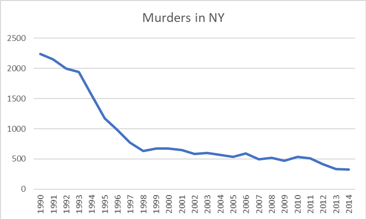
example line chart

A line chart is the most common “go to” for data like this, but is it actually the best way to represent this data? There has been quite a bit of research on exactly how to best represent different types of data to make them easy to quickly understand. Let’s start out by examining and classifying the types of data we will work with.

Types of Data

First of all, let’s divide the data into discrete and continuous types.

Discrete data has individual, discrete values and there are no values in between. This could be something like shirt sizes. There is no value of shirt size that is in between a medium and a large.

Continuous values can have an infinite number of values in between each value. The number of miles a murderer has to travel away from New York before he feels safe from pursuit is a continuous value. It might be 3 miles, or 4 miles, or 3.14159 miles and so on. 

Classifying data types can be a little fuzzy, and you may want to say “well yes but what about…” In our murder example, I would call the number of murders continuous and not discrete. It’s a count of something and the numbers vary over a wide range. You could argue, however, that it is discrete data because there is no such thing as a half of a murder victim. Some of the data types can be easily identified, and some take a little common sense. In the end you might need to compare two types of charts using the same data to more easily see where things belong.

Data Pairs

The next thing to consider as we select a chart is to consider the relationship between the data pairs themselves. In other words, what is the relationship between the X and the Y values? These are either Dependent or Independent. With a dependent relationship, the two values have a mathematical relationship such that for every X there is no more than one value of Y. This can be a mathematical formula where Y = F(X) where X is continuous, or just a list of values for each X where X is discrete. With an independent relationship, there is no direct relationship between X and Y. Inches of rain per day, for example, is in independent relationship despite the weather forecaster’s best efforts. For example,

  • Dependent: [ { 1, y1 }, { 2, y2 }, { 3, y3 }…]
  • Independent: [ { 1, y1 }, { 2, y2 }, { 2, y3 }…]

Chart Types

Now, let’s look at some common types of charts and see what characteristics they represent.

A Vertical Bar chart (aka a column chart) has a horizontal (X) value that represents discrete values, where each bar is a unique value or item. The vertical (Y) axis is dependent, and it is continuous. A horizontal bar chart has the same values but flipped sideways, so that the Y axis is now the discrete values and the X axis is now the continuous part.
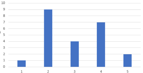
bar chart example 

Bar Chart

A Line chart has an X axis that is continuous, and a Y axis that is a dependent and continuous.
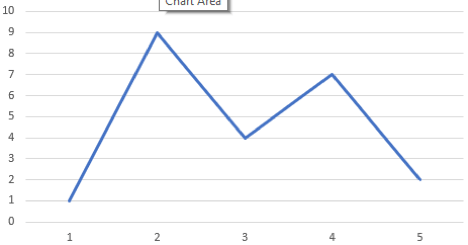
line chart example 

Line Chart

Scatter plots have an X axis that is a quantitative value, and a Y axis that is an independent quantitative variable. This relies mostly on position but clusters yield density as well. Markers, or “glyphs” are commonly used to indicate X axis positions where the data was actually sampled.
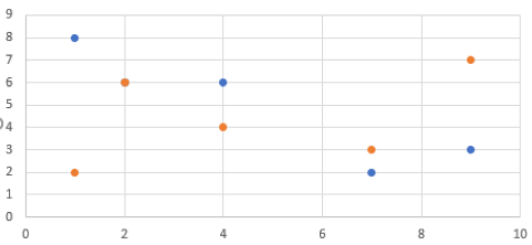
scatter plot example 

Scatter Plot

Gantt charts have an X axis that is continuous and a Y axis that is discrete, but also independent because unlike a bar chart you can have multiple segments for each bar. As with the bar chart, you can flip it 90 degrees and satisfy the need for a chart that has an X axis that is discrete and independent and a Y axis that is discrete.
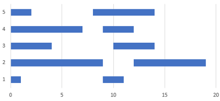
gantt chart example 

Gantt Chart

A Table is not always considered a real “chart,” but it is one nevertheless. A table has an X axis that is discrete and a Y axis that is also discrete. Whether the Y axis is dependent or independent doesn’t matter. With a discrete-discrete pair, your chart is now a grid and each cell is, at the most basic, either one or zero (or null). Of course we most commonly use a table to introduce a third dimension which we represent by a number in each cell. 

table example 

Table

Let’s make a table of this and see what it looks like.


Horizontal (X)


Discrete

Continuous

Vertical (Y)

Dependent

Continuous

Bar (vertical)

line

Dependent

Discrete

table

Bar (horizontal)

Independent

Continuous

Gantt

Scatter

Independent

Discrete

table

Gantt


Now we have a quick and easy way to classify data types and see what kind of chart would be best to represent that data.

So about those murders…

So getting back to our murderous New York chart, was the line chart the right choice for us? The year is on the X axis and years are discrete values. Murders, on the Y axis, are dependent and continuous. For this type of data set a bar chart is listed as the best pick for such a chart, and we see this format below. Note that the individual years are now more prominently displayed, and we can clearly see that for each year there is only one value. We are not tempted to see how the murder rate progressed month by month by looking between the points on the line chart and it is clear that the data shows yearly totals only. The bar chart wins.
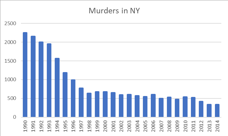
bar chart example

Source of data: https://en.wikipedia.org/wiki/Crime_in_New_York_City

By the way, if you're looking for an easy way to generate effective visualizations and reports from your data, you may want to check out Telerik Reporting. You can download a free trial or learn more about its visualization capabilities here.

Power Up Your UI Tests with API Test as Step in Telerik Test Studio

$
0
0

Learn how to improve your UI tests with API calls and simulate scenarios that would be difficult with UI tests alone, with API Test as Step in Telerik Test Studio.

When building a UI test, we sometimes need the ability to make an additional API call to a web service to assist the UI steps. Consider the following scenarios for example:

  • Manage the initial state of a web application or create some initial data via a web service (create users, data items, upload test files, delete old test data, start or kill processes, etc.) as a prerequisite for the UI test.
  • Simulate concurrent user actions and test how the UI handles conflicts
  • Generate messages or other events on the web service and validate that they are properly pushed to the UI of your web or desktop application

In some cases those actions can be performed via the UI test itself, but that bloats the UI test with additional steps that might be slow, fragile or just not the main focus of the particular test scenario. "Outsourcing" such interactions to API calls would make the UI test quicker, more reliable and allows us to focus the test on performing the particular actions that are the essence of the test scenario.

Telerik Test Studio's built-in integration with Test Studio for APIs allows you to run an API test as a step in a web or WPF test. This unlocks great potential for improving your UI tests. In this blog post, I would like to walk you through its features.

Quick Reference

Sample Scenario

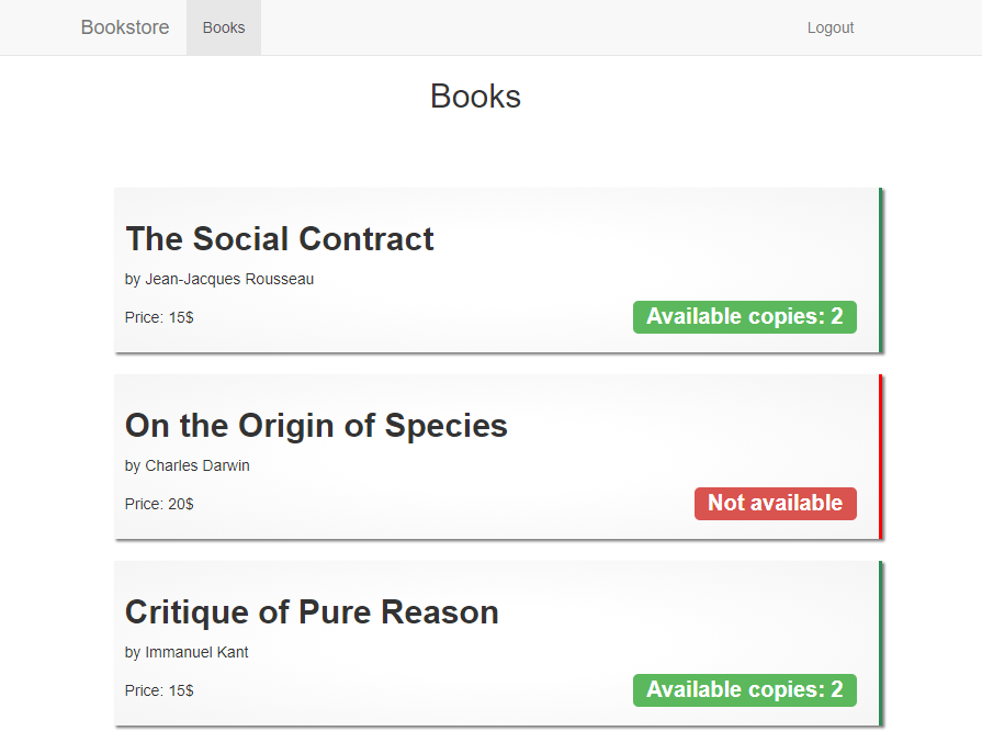
In order to show off the new API integration in Test Studio, let's build a test case against a very simple demo web application. The demo application is a bookstore that allows registered users to order books. To keep it simple, users can only purchase one book per order and there is no need to enter address or payment details. Even users that are not logged in can view the available books, but only logged in users can place an order. (See the end of the blog post for more information on how you can download the test and the sample app in order to try them yourself.)

We will make a test case that tests the following scenario:

  1. Create a new user via an API call - one that we would use to make the order in the UI
  2. Add a new book to the store via an API call with just one copy available
  3. Login with the new user in the UI
  4. Open the details page of the book that we just created
  5. Use an API call to simulate that the last copy of the book have just been purchased from the store
  6. While still having the book details open in the browser, try to place a new order
  7. Validate that an error message is properly displayed in the UI, noting that the book is no longer availabe in the store

books-list

This edge case perfectly demonstrates the key techniques that could be used for a broad variety of other scenarios that involve environment setup, test data generation, user management, testing concurrent user actions, etc. We will show how we can create an API test project as part of a Web/WPF Test Studio project, how to add an API Test as a Step to a Web/WPF test and how we can transfer data (variables) from the UI test to the API test steps and vice-versa.

Setup Test Project

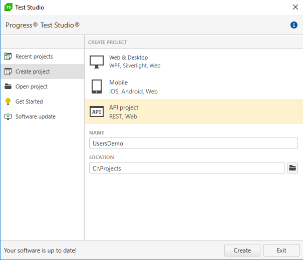
To begin with, we will open Test Studio and create a new "Web & Desktop" project called "Bookstore."

create-new-project

Next, right-click on the project, select "Add New Test," create a new Web test and name it "Order Unavailable Book."

create-new-test

Creating Test Data

To execute our test, we need a test user that will perform the book purchases and a test book to be ordered. To avoid any conflicts with other tests that we could possibly execute against the same application, we'll create a new unique user and a new book especially for the purpose of the test.

When testing similar applications, we could possibly create our test users and test items using UI interaction steps, but that usually takes more time to execute and clutters the test. Instead, we will create separate dedicated UI test suites that focus specifically on the "register user" or "create book" processes. Those test suites will give us confidence that the UI functionality works as expected and all corner cases are covered. For all other test scenarios that depend on having a registered user or created books, we can quickly create them via API calls and focus our tests on executing the rest of the test steps.

Generate Random Username

To be sure that the username we're using for our test is not already taken by existing users, we will generate random unique username by appending a guid string to the username. The best way to do that in Test Studio is via a coded step.

Open the "Order Unavailable Book" test that we just created, and select "Coded Step" from the Step Builder. You will be prompted to choose a scripting language for this project, so we will select "C#." This will generate a code-behind file for our test and will create a default test method in it. We can rename the method "GenerateTestVariables."

coded-step-generate-variables

We can use that step to extract the main variables that we will need later during the test. This way we can keep all of our constants in a single place and can easily change any of them later, instead of having to change every place in the test where it is used. The method of the coded step is as follows:

    [CodedStep(@"Generate Test Variables")]
    public void GenerateTestVariables()
    {
        this.SetExtractedValue("username", "User-" + Guid.NewGuid());
        
        this.SetExtractedValue("password", "Password");
        
        this.SetExtractedValue("apiBaseUrl", "http://localhost:5000");
    }

Each variable that we extract using the this.SetExtractedValue() method can be passed later to an API test or used by a UI step via data-binding.

Adding the First API Test

We can add an API test to our Web test by importing an existing one, or by creating it from scratch. In our case we will create a new test. To do that, right-click on the project and select "Edit Embedded Api Project."

edit-embedded-api-project

This will open a new instance of Test Studio for APIs. The project loaded is a new API project ("ApiTests") that was automatically created inside the root folder of the main Test Studio project.

api-tests-project-folder

That API project will contain all API test cases that we use in our entire Test Studio project (each API test can be used by more than one Test Studio test).

From here, using the Test Studio for APIs application, we can manage our API tests as a normal API project. Later, we'll show how to add those tests as steps into a Web test.

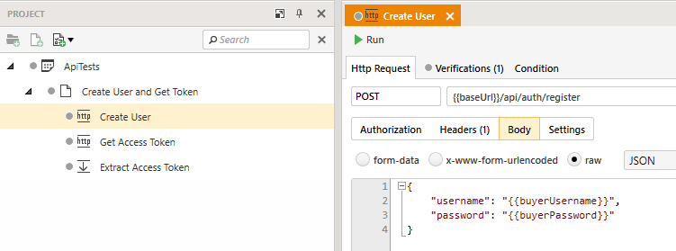
We will create an API test case "Create User and Get Token" and add the following steps to it:

  • Create User

    create-user-step

  • Get Access Token

    get-access-token-step

  • Extract Access Token

    extract-access-token-step

Notice the {{baseUrl}}, {{buyerUsername}}, and {{buyerPassword}} variable references. Those variables will not be defined in the API project. Instead, our Web test will pass them to the API test as command-line parameters when executing the API test. We will see how to do that a bit later.

Notice also the "Extract Access Token" step. In the next step, which we'll build in a moment, we need to add a new book to the Bookstore using an API test. The API of the Bookstore application requires authentication, so we will need that token to authenticate any further API calls. This is why, after we get the access token from the service with the "Get Access Token" step, we use a Set Variable step, to "export" the id of the user. Any variable extracted via a Set Variable step in the API test will be available in the context of the Web test.

The response body of the "Get Access Token" step will look like this:

{
    "tokenString": "eyJhbGciOiJIUzUxMiIsInR5cCI6IkpXVCJ9.eyJuYW1laWQiOiIyIiwidW5pcXVlX25hbWUiOiJib2IiLCJuYmYiOjE1MzE4NDEzNTQsImV4cCI6MTUzMTkyNzc1NCwiaWF0IjoxNTMxODQxMzU0fQ.lorfPvrDJCUxfV6MqQkjTtVuILYP58hzc0RM35TFAACpScjbmWqM37NXINDtqvGR_ECsP10F8oQ6sIOfJLZ9LA"
}

This is why we are using the "$.tokenString" JSONPath expression in the Extract Access Token step to extract the token value out of the response body. You can read more about this in the Set Variable Steps section of the Test Studio for APIs documentation.

We can also create the next API test that we are going to need - the one that creates a new test book. Here are the steps for this API test:

  • Create Book

    create-book-step

    create-book-headers

  • Extract Book ID

    extract-book-id-step

Notice here the Authorization header of the Create Book step: this is where we use the accessToken variable that we extracted in the previous API test. The response body of this request will look like this (notice the "id" property that the server returns):

{
    "id": 5,
    "title": "Escape from Freedom",
    "author": "Erich Fromm",
    "price": 15.0,
    "quantity": 1
}

Just like with the accessToken, we need to extract the ID of the book that we will create, so that we can use it in the UI test to navigate to that book's details page, which is why we added the Extract Book ID step.

Adding the API Test to the Web Test

Now that we have created the API tests, we can go back to Test Studio and add them as steps to our Web test. To do that, click on Common > API Test As Step in the Step Builder and first select the "Create User and Get Token" test, followed by the "Create Book" test.

add-api-test-as-step

This will add the two tests as steps in the Web test.

Passing Variables to the API Tests

In order to pass the variables that we defined in the first coded step to the "Create User and Get Token" API test, we need to click on the "Variables" drop-down in the Properties panel of the API step and add a key-value pair for each of the variables.

add-variables-to-create-user-test

To pass a variable to the API test, add the name of the variable in the "Name" field, and you will be able to reference it by that name in the API test itself. In the "Value" field you can either directly type the value that you need to be used (e.g.: "http://localhost:5000" for the "baseUrl" variable) or you can reference an existing variable in the Test Studio variable store. Since we already extracted the needed variables to the variable store in the first coded step, we will use curly-braces to add references to them.

variables-transition

All variable names and values that we will add to the Create User and Get Token test as steps are:

  • baseUrl: {{apiBaseUrl}}
  • buyerUsername: {{username}}
  • buyerPassword: {{password}}

In the same way, we will add the following variables to the "Create Book" API test as steps:

  • baseUrl: {{apiBaseUrl}}
  • accessToken: {{accessToken}}

Now that we already have the API tests as steps, that will create our test user and the test book, we can add several more steps to perform the following actions:

  • Navigate in the browser to the URL of our web application ("http://localhost:4200/home")
  • Wait for the "Bookstore" home link to be visible, to make sure the page is loaded
  • If a user is already logged in - log them out
  • Log in, using the credentials for the test user, that we extracted in the first coded step
  • Wait for the "See our list of books" link to be visible, to make sure the user is logged in

login-steps-overview

Notice that I have extracted the steps needed to logout any current user and login the test user to separate tests. This is a good practice for better maintainability and reusability of steps that will be needed in other tests too.

logout-current-user

login-user

For the Login User test as step, we can use the same 'username' and 'password' variables that we extracted in the first coded step and set them as a binding to the steps that enter text in the username and password fields.

bind-username-text-entry

Next, we need to open the details page of the test book. To do that we need its id, which we extracted earlier from the API test. We will create a "Navigate To" step in Test Studio and transform it to a coded step to be able to concatenate the baseUrl of the web application and the id of the user.

navigate-to-step

[CodedStep(@"Navigate to book details page")]
    public void NavigateToBookDetailsPage()
    {
        var url = "http://localhost:4200/books/" + this.GetExtractedValue("bookId").ToString();
        this.Log.WriteLine("url: " + url);
        ActiveBrowser.NavigateTo(url);
    }

coded-step-navigate-to

Once we have opened the book details page, we can use another API step to simulate that its last copy has just been ordered by another user. We need the book to have initially had at least one available copy when we opened its details page, otherwise the order button would not have been enabled.

api-test-order-book

Note that we are using the same accessToken to authenticate this request, which means we are using the same user for the API requests and the UI steps. The demo application is as simple as possible - it does not save any state for the user's purchases, so we can use the same user for all operations. In other scenarios though, you might need to create multiple users to execute their concurrent actions.

Now we can add that test as an API Test as Step in the Test Studio test. Click on the step builder in Test Studio, select API Test as Step and select the Order Book test.

add-api-test-order-book

order-book-test-as-step

As with the previous API step, we need to pass variables to the API test that will be executed:

  • baseUrl: {{apiBaseUrl}}
  • accessToken: {{accessToken}}
  • bookId: {{bookId}}

order-book-variables

Validating the End Result

Once we have ordered the last copy of the book via the API test, we can still see the Order button in the UI, because the page is not yet refreshed.

book-details-page

All we have left to do is to add several steps that perform the following:

  • Click on the "Order" button
  • Verify that an error message appears, stating that the book is no longer available

final-steps

order-failed-message

With that our test is finished. According to your case, you might prefer to add additional API steps that remove any test data that was generated during this test.

Summary

In this blog post we discussed how we can utilize API calls to improve our UI tests. We saw how to create test users and test items and how to simulate concurrent user actions to achieve scenarios that would otherwise be difficult or impossible to automate with UI tests alone. We dug deeper into the specifics of the API test as step and showed how to transfer data between the UI test and the API tests.

If you want to try the above demo yourself, you can download the full test project from here and the demo application from its GitHub repository. In the Readme.md file, there are instructions on how to run the application.

If you're new to Test Studio, you can download a free trial and get started with this example today - just click the link below.

Try Test Studio

Happy testing!

.NET Conf: Ways to Watch, Learn and Win

$
0
0

.NET Conf, the free three-day virtual developer event, kicks off September 12. Find out how you can watch, learn and even win some really cool prizes.

.NET Conf, a FREE, three day virtual developer event co-organized by the .NET community and Microsoft, kicks off on Wednesday, September 12. Whether you are a beginner or a seasoned engineer, there is content for anyone interested in building for web, mobile, desktop, games, services, libraries and more. They’ll have presentations on .NET Core and ASP.NET Core, C#, F#, Azure, Visual Studio and Xamarin, to name a few.

Below are a few things to know to make the most out of your .NET Conf experience.

Watch Here

Looking for a good place to watch? We will be streaming .NET Conf live from this post. So bookmark this page and come back September 12 – 14 to watch.

Watch with Us in Sofia

If you are in Sofia, Bulgaria on Wednesday, September 12, plan to join us for a .NET Conf Watch Party from 6 p.m. - 10 p.m. at the new Progress office. We'll have swag, prizes and food. And, best of all, you can watch the keynote, welcome session, and first two sessions with your friends. More information and registration link can be found here.

If you can't make it to Sofia but want to watch with friends, you can find a list of local watch parties here.
What to Watch/Learn

Over the course of the three days you have a wide selection of live sessions streaming here that feature speakers from the community and .NET product teams. It's a chance to learn, ask questions live, and get inspired for your next software project. You can see the agenda here.

And while I know I am probably biased, if you could only watch one session throughout the three days, I highly recommend tuning in on Day 2 at 23:00 (PDT) | 06:00 (UTC) to hear Progress’s very own Atanas Popatanasov speak about Enhancing WPF/WinForms Applications with UWP Features.

Virtual Attendee Party

What’s a conference without an attendee party?! For the first time in .NET Conf history, there will be a virtual attendee party after the last session ends on Day 1 (September 12, 17:00 PDT (UTC -7).  and Progress is a sponsor!

The .NET Conf attendee party is a live party on Twitter hashtag #dotNETConf where you can answer questions to win prizes from our partners, interact with the community, and see all the new and upcoming announcements! There will also be a live video feed on twitch.tv/VisualStudio where you can see demos and hang out with .NET Conf team members and speakers. Prizes include an Xbox One X, PLUS tons of other cool giveaways throughout the party.

You don’t want to miss it!

Watch with Us on September 12

So remember, come back Wednesday, September 12 and watch right here:

How to Use a jQuery DropDownList UI Component in Your Web App

$
0
0

Learn what you can do with a dropdown list, and how you can use one in your web app to help your users easily choose from a list of options and more.

Recently we've been talking about the splitter component and the grid component. In the next few posts, we will review components used for making selections and taking input. The first will be the dropdown list.

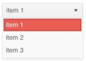
A dropdown list lets users select one option from a list of options. The list appears when the user clicks on the element or triggers it another way. The currently selected option will always be shown in the element. Dropdown lists can be used in online stores to choose the size, color, or quantity of an item. They are also used in toolbars to select different actions like changing the font or page zoom. Coming up, you will see a comparison of how to create a dropdown list using just HTML and how to create one using the Kendo UI jQuery DropDownList component.

HTML Dropdown List

A plain dropdown list can be created using the `select` tag. You define the items in your list by adding `option` tags within the `select` element. The text or template that is visible to the user is the content between the `option` tags. The `value` attribute of the `option` is the data that will be sent with a form submission or that you can extract directly. Because a select element is a kind of form element, it supports form events like the `onchange` event. This is the markup for a dropdown list with three items:

```html
 
<select id="dropdown">
 
  <option value="1">item 1</option>
 
  <option value="2">item 2</option>
 
  <option value="3">item 3</option>
 
</select>
 
```


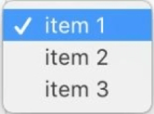
dropdown

dropdown

If you wanted to get the value of the selected option you could add this using plain JavaScript:

```js
 
const dropdown = document.getElementById('dropdown');
 
console.log(dropdown.value);
 
```

This would print `1` to the console. Alternatively, if you wanted to get the value of the option when it has been selected, you can add an event listener to the select element. We will attach an `onchange` event listener that can capture the selected option and give us its value.

```js
dropdown.onchange = function(event) {
  console.log(event.target.value);
}
```

Kendo UI DropDown List 

To transform this HTML dropdown list into a Kendo UI dropdown list we just need to call $('#dropdown').kendoDropDownList(). Doing this styles the component to match the rest of your theme. Additionally, you will have access to different configuration options that will make it easier for you to customize the element. For example, you can use the `dataSource` attribute to define your list of options or retrieve them from a URL. This is a complete example that refactors our dropdown to use an array of items to define the options:

```html
 
<!DOCTYPE html>
 
<html>
 
  <head>


    <style>
 
      body { font-family: helvetica }
 
    </style>
 
  </head>
 
  <body>
 
    <select id="dropdown"></select>
 
    <script>
 
      $(document).ready(function(){
 
        $('#dropdown').kendoDropDownList({
 
          dataTextField: 'text',
 
          dataValueField: 'value',
 
          dataSource: [
 
            {text: 'item 1', value: 1},
 
            {text: 'item 2', value: 2},
 
            {text: 'item 3', value: 3}
 
          ]
 
        });
 
      });
 
    </script>
 
  </body>
 
</html>
 
```


dropdown

dropdown

If we want to bind a change event to the component, we can add a `change` field to our initialization code and set it equal to an event handler. Similar to our HTML example, this example prints the value of our option to the console when a new selection has been made:

```js
 
change: function(e) {
 
  console.log(this.value());
 
}
 
```

Summary 

The dropdown list we have used here may appear similar to the dropdowns we have used in our menu component. The key difference with the dropdown list component is that the currently selected item is always exposed and the purpose is to indicate that the user can toggle between options. In a menu, the purpose of a dropdown is to navigate you to a different area of your application. And a dropdown used in a context menu only becomes exposed when the user clicks on the target. A dropdown list is, however, similar in functionality to a split button that is included with the toolbar component. Except the dropdown list can stand alone or be included in other components.

There is also much more you can do with dropdown list that what was shown. You can add a search bar to your dropdown to filter the list of options. This is useful when you have a long list of options and the user would have to scroll to see them all. You can also create cascading dropdown lists where the options in the child dropdown list are changed based on the selection of the parent dropdown list. A common use for this is selecting locations. One dropdown might contain a list of states, and the next dropdown will contain the cities for that list of states.

In the next lesson, we will take a look at the multiselect component. This component is similar to a dropdown list, but it gives us the ability to select more than one option from a list.

Try out the DropDownList for Yourself

Want to start taking advantage of the Kendo UI jQuery DropDownList, or any of the other 70+ ready-made Kendo UI components, like Grid or Scheduler? You can begin a free trial of Kendo UI today and start developing your apps faster.

Start My Kendo UI Trial

Angular, React and Vue Versions

Looking for UI component to support specific frameworks? Check out the DropDownList for Angular, the DropDownList for React, or the DropDownList for Vue.

Resources

Create Your Own .NET Core Templates in 4 Easy Steps

$
0
0

Learn how you can save time by creating your own reusable .NET Core templates in just a few steps.

Do you ever develop prototypes, or starter projects/accelerators, that you’d like to use again in the future? A good way to do that is by creating custom templates for dotnet. Once completed, anytime you want to create a new project of that type in the future, you can key in “dotnet new ” and you’re off, complete with correct namespaces. You can even do conditional checks, or variable replacements.

  1. To start, clone or download the MyGameStartup project which will make following along easy. There is nothing special about this, it’s just for the purposes of showing how you can bundle multiple projects, and do some variable replacements. Note: You’ll need .NET Core 2.1 SDK for this at a minimum. Once open, you’ll see a solution file, and a few simple projects with some basic Entity Framework Core behavior.

  2. Note that in the downloaded project, there is a folder labeled “.template.config” with a file inside it labeled “template.json”. Let’s review the contents of that file. Feel free to update this file with values you plan to use for your own project type, but you can leave these if you want to just continue with the demo.

    01.{
    02.  "$schema": "http://json.schemastore.org/template", // https://github.com/dotnet/templating/wiki/Reference-for-template.json
    03.  "author": "Kyle Ballard",
    04.  "classifications": [ "Web/MVC/Razor Pages"], // Use command 'dotnet new' to see list of other classifications
    05.  "name": "My Game Startup", // Name that is displayed when running 'dotnet new' command
    06.  "identity": "MyGameStartup", // Unique name for this template
    07.  "shortName": "mygamestartup", // Alternative shortname, i.e. 'dotnet new mygamestartup'
    08.  "tags": {
    09.    "language": "C#", // Specify that this template is in C#.
    10.    "type": "project"
    11.  },
    12.  "sourceName": "MyGameStartup", // Will replace the string 'MyStartup' with the value provided via -n.
    13.  "preferNameDirectory": true, // If -n is not specified, will use name of the current directory
    14.  "symbols": {
    15.    "db": { // If code or config contains {{Database_Name}} value will be replaced with parameter --db <value_here>
    16.      "type": "parameter",
    17.      "isRequired": "true",
    18.      "datatype": "string",
    19.      "replaces": "{{Database_Name}}",
    20.      "defaultValue": "MyGameStartupDB",
    21.      "description": "The database name attached to this project."
    22.    
    23.  }
    24.}

    I’ve added comments to the file so it is easy to understand, along with a link to the official documentation. There are more features than I am covering here if you wish to add them. A few noteworthy settings in the file are the “shortName” property. This is the trigger for your project, i.e. ‘dotnet new mygamestartup.’ Also, if you see the section labeled “symbols,” and then cross-reference this with the projects ‘appsettings.json’ file, you’ll see the connection string’s database will be replaced with the “–db” parameter once we run it.

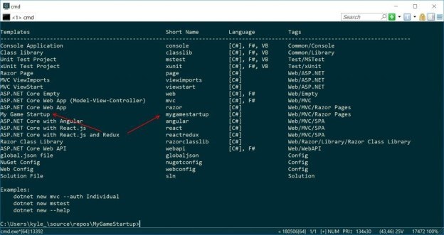
  3. Ready to add this new project type to your available list? I’ll also show you how to remove it if you no longer plan to use this one. Run the command “dotnet new -i .” from the same folder as the downloaded .sln file and .template.config folder. The dot here refers simply to the current directory. You could have also specified the path, but this is easier. If successful, you should see a list of project types, along with your project type added.

    New project added - ConEmu

    Woohoo! You now have your own custom accelerator template you can use for other projects. Side note: This screenshot is from the ConEmu terminal which I use. You can download it here.

    An important note also on this step. Running the “dotnet new -i .” command will bundle the current folder. I may not have discovered the setting yet, but keep in mind this skips empty folders. So if your wwwroot folder was empty, you will see this is not created after installing. I added a site.css to my version to avoid this.

  4. We’re moving along quickly now. Next step… fire up a new project with our new template! Navigate the directory you’d like your project to be a folder within, such as “C:\Users\myusername\source\repos” and then issue the command, “dotnet new mygamestartup –db MyCustomStartupDB -n MyCustomName.“ The database name will be set in the connection string in appsettings.json and a folder will be created named MyCustomName. Your projects namespace will also be MyCustomName. Note: If you get an error about a lock, be sure your Visual Studio instance with “MyGameStartup” project you downloaded in step 1 is closed. You may need to remove the MyCustomName folder and try again.

    Follow the steps in the README to create the database with the name you specified, and also steps on how to run the Entity Framework Core Update-Database command properly. After that, you’re done! You just created a new project from a template you previously created.

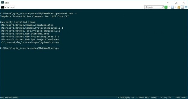
    Optional: To Uninstall the project, you can use the “dotnet new -u” command to list the currently installed projects. You should see your “MyGameStartup” project listed here. You can simply remove it with the command “dotnet new -u “Path-To-Folder” such as shown below.

    Uninstall project - ConEmu

Next Steps: A few steps I haven’t taken yet, but may in the future, is to add the following features to my template:

  • Create a nuget package to easily distribute your new package.
  • Add a new ‘symbol’ to the template.json which has datatype ‘choice.’ A choice symbol will allow the user to pick from several options when creating your template.
  • Modifiers can be used to conditionally output certain code or not. You may wish to optionally include authentication as an example. More details here.
And that’s it. Four easy steps and you’ve created custom templates for dotnet. Now anytime you want to create a new project of that type in the future, you can use key in “dotnet new ” and you’re off, complete with correct namespaces.

If you haven't yet checked out the Telerik .NET performance and productivity tools, just download a free 30-day trial of DevCraft and get access to all of them.

Xamarin.Forms Date and Time Pickers in Conversational UI

$
0
0

Chatbots are all the rage these days and for good reason. A well-trained chatbot with deep contextual knowledge can seamlessly automate lots of workflows with human-computer interactions. And enterprises are beginning to discover the cost benefits of chatbot automations. Bot frameworks and AI are destined to rule the next generation of apps.

For developers though, the key would be engaging user experiences through chatbots. And this is where Conversational UI comes in - with polished modern UI for powering chatbot experiences on web, desktop or mobile. One of the most common interactions in chat conversations is asking the user to pick a date or time. This article unpacks date and time pickers in Conversational UI from the perspective of a Xamarin.Forms mobile app, and explores ways of rendering such a picker UI to make for smooth user experiences.

Pickers and Customized Chatbot UI

While we've already covered the basics of Conversational UI, text-based messages in a chatbot conversation are easy to handle - the real value of Conversational UI is in its ability to handle complex custom UI. This is achieved through “pickers,” which present the user with a selection of choices as a part of the chat conversation. If you had to choose pizza toppings, would you rather type them down in text, or simply check off a list? You get the point. In a chat conversation, it is almost always quicker to elicit user responses when presented with a collection of items to choose from.

The Conversational UI component that allows such pickers is the RadChatPicker. Depending on the information that is to be presented to the user and the choice that should be made, the RadChatPicker allows developers to render one of the following types:

  • DatePicker: for displaying a calendar to choose a date
  • TimePicker: for displaying a clock view to choose a time
  • ItemPicker: for presenting a list of suggestions the end user could choose from
  • CardPicker: for presenting a list of cards with structured layout

The RadChatPicker showcases the value we can offer developers with Conversational UI; the polished sophistication through custom complex chat UI. Our Telerik and Kendo UI products already have native date and time picker controls for various platforms. Now, they're included as a part of Conversational UI.

DatePicker

Need to have the user pick a date as a part of a chatbot conversation? The RadChatPicker control provides a DatePickerContext that displays a calendar to select a date. As expected, DatePickerContext exposes the following properties you can use to list possible options to the user:

  1. SelectedDate: offers the currently selected date in the calendar
  2. MinDate: defines the minimum date that can be displayed/selected
  3. MaxDate: defines the maximum date that can be displayed/selected
  4. DisplayDate: pre-selects a date in the current calendar view

To try out this picker, let's first set up a chat. This can be done entirely in the shared PCL or .NET Standard library in a regular XAML page, like so:

<ContentPage.Content>
  <telerikConversationalUI:RadChat x:Name="chat" 
                                   BackgroundColor="#FFF6F8FB"
                                   ItemsSource="{Binding Items}"
                                   Margin="5,30,5,30" />
</ContentPage.Content>

In the code-behind, we could set up the bot author and start a chat conversation. Let's say the very first task in the conversation is to ask the user to select a date:

public MainPage()
{
  InitializeComponent();

  this.botAuthor = new Author ();
  this.botAuthor.Name = "MyBot";
  this.botAuthor.Avatar = "BotFace.jpg";

  chat.Items.Add(new TextMessage { Author = this.botAuthor, Text = "Welcome to our chat!" });

  this.SelectDateDialogue();
}

Now that we have a function to handle the date selection dialogue, we can customize the DatePickerContext with some desired properties and add the PickerItem into the chat conversation's Item collection. Essentially, this technique is called “inline display.” We're forcing the display of the date picker as a part of the chatbot conversation by sticking the PickerItem into the chat's Item collection.

private void SelectDateDialogue()
{
  DatePickerContext dateContext = new DatePickerContext
  {
    MinDate = new DateTime(2018, 1, 1),
    MaxDate = new DateTime(2019, 1, 1)
  };
  PickerItem pickerItem = new PickerItem { Context = dateContext };
  chat.Items.Add(new TextMessage { Text = "Please select a date:" });
  chat.Items.Add(pickerItem);

  dateContext.PropertyChanged += (s, e) =>
  {
    if (e.PropertyName == "SelectedDate")
    {
      if (dateContext.SelectedDate != null)
      {
        chat.Items.Remove(pickerItem);
        chat.Items.Add(new TextMessage
        {
          Author = chat.Author,
          Text = "You chose " + dateContext.SelectedDate
        });
      }
    }
  };
}

When we launch the application, we see a nice polished calendar control allowing for choosing dates. The user gets to swipe left/right to move through months, without losing the context of the chat conversation:

In the code above, we're also listening in on the PropertyChanged event of the DatePickerContext. In particular, when the SelectedDate property value changes. This is triggered once the user makes a date selection. Our event handler grabs the SelectedDate property value, sticks in a message in the chat conversation and removes the PickerItem from the chat's Item collection:

TimePicker

Need your chatbot user to pick a time? The RadChatPicker control provides TimePickerContext that can be used to display a clock view to help them do so. As expected, TimePickerContext exposes the following properties you can use to adjust the time selection through the displayed clock values:

  1. SelectedValue: offers the currently selected time in the clock view
  2. StartTime: represents the starting time of the clock's items (TimeSpan)
  3. EndTime: corresponds to the time of the last clock item (TimeSpan)
  4. TimeInterval: defines the step between clock items, with the default value being one hour

Once you are ready to render a clock as a time picker in your chatbot, the code looks really similar to that of the DatePicker. We simply enhance the TimePickerContext with our desired property settings, and add the PickerItem with assigned Context to the chat's Item collection:

private void SelectTimeDialogue()
{
  TimePickerContext timeContext = new TimePickerContext
  {
    StartTime = TimeSpan.FromHours(1),
    EndTime = TimeSpan.FromHours(5),
  };

  PickerItem pickerItem = new PickerItem { Context = timeContext };
  chat.Items.Add(new TextMessage { Text = "Please select a time:" });
  chat.Items.Add(pickerItem);

  timeContext.PropertyChanged += (s, e) =>
  {
    if (e.PropertyName == "SelectedValue")
    {
      if (timeContext.SelectedValue != null)
      {
        chat.Items.Remove(pickerItem);
        chat.Items.Add(new TextMessage { Author = chat.Author, Text = "You chose " + timeContext.SelectedValue });
      }
    }
  };
}

When the application is run, a simple clock picker for time selections is displayed:

As is almost self-explanatory in the code above, we're also listening in on the PropertyChanged event of the TimePickerContext. In particular, when the SelectedValue property value changes. This is triggered once the user makes a time selection. Our event handler grabs the SelectedValue property value, sticks in a message in the chat conversation and removes the PickerItem from the chat's Item collection:

Overlay Display

So far, for the both the date and time pickers, we have used “inline display;” a technique to forcibly stick the PickerItem in the chat's Item collection, to be displayed as part of the ongoing conversation. Another technique to display date and time pickers is “overlay display.” This renders pickers on top of everything else in the chat conversation. This is implemented through the Picker property of the RadChat object. This is often declared as a part of the XAML markup, as below:

<ContentPage.Content>
  <telerikConversationalUI:RadChat x:Name="chat" 
                                   BackgroundColor="#FFF6F8FB"
                                   ItemsSource="{Binding Items}"
                                   Margin="5,30,5,30">
    <telerikConversationalUI:RadChatPicker x:Name="picker" 
                                           IsOkButtonVisible="False"
                                           IsCancelButtonVisible="False"                                               
                                           BackgroundColor="LightGray" />
 </telerikConversationalUI:RadChat>    
</ContentPage.Content>

Once we have defined the Picker property, we could give it the DatePickerContext or TimePickerContext as desired and set the Context property accordingly, like so:

private void SelectDateDialogueOverlay()
{
  DatePickerContext dateContext = new DatePickerContext
  {
    MinDate = new DateTime(2018, 1, 1),
    MaxDate = new DateTime(2019, 1, 1)
  };

  dateContext.PropertyChanged += (s, e) =>
  {
    if (e.PropertyName == "SelectedDate")
    {
      if (dateContext.SelectedDate != null)
      {
        chat.Items.Add(new TextMessage { Author = this.chat.Author, Text = "You chose " + dateContext.SelectedDate });
        (chat.Picker as RadChatPicker).Context = null;
      }
    }
  };

  chat.Picker = picker;
  (chat.Picker as RadChatPicker).Context = dateContext;
}

When we run the app, the above code renders the date picker. This time, it's overlayed over other messages in the chat conversation:

As before, we can still listen to the PropertyChanged event of the corresponding picker and grab the user's selection in the event handler. Once the picker's Context is reset to null, the rest of the chat conversation is visible again.

That's a Wrap

Modern chatbots demand rich user experiences and Conversational UI is here to help developers render polished UI for enabling engaging efficient conversations. One the most common tasks in most chatbot conversations is asking the user to select a date or time - and having them manually type in the information is almost criminal. We're opening up validation nightmares and frustrating the user with free form inputs.

The date and time pickers in Conversational UI provide modern calendar or clock views that enable one tap date/time selections. Developers get the choice to render the corresponding PickersItems either Inline as a part of the chat or Overlay across the conversation. With simple properties and an API to grab user selections, you and your chatbot will be able to automate date/time selections and move on to bigger and better things.

JavaScript Charts: Comparing D3 to Kendo UI for Data Visualization

$
0
0

I recently was tasked with creating a couple of charts using the D3 library for a course I was taking. Naturally I asked if I could use Kendo UI's charts instead, as I'm familiar with them, but the course called for D3 specifically. So, for fun I tried to create a chart in D3 and Kendo UI at the same time just to see the differences.

D3 and Kendo UI are just two of the ways you can create charts in a web app, and options range from simply drawing shapes on the screen to using sophisticated charting components. Both D3 and Kendo UI are popular and both will get the job done. The similarities end there, however, and the two represent very different approaches, with very different features.

D3

D3 stands for Data-Driven Documents and it is a JavaScript library for creating dynamic and interactive data visualizations. It was first released in 2011 and includes a very flexible and powerful set of features to help you build up various graphical data visualizations. 

Kendo UI

Kendo UI is a set of JavaScript libraries that includes a large array of components ranging from data grids and charts to schedulers, dropdowns and even buttons. Kendo UI was originally developed by the Telerik company, which is now a part of Progress. Kendo UI is a commercial library and there are versions available that support the Angular, React, and Vue frameworks as well as basic jQuery environments. The Kendo UI chart components include a wide range of popular chart types including bar, pie, line and others.

Getting Started

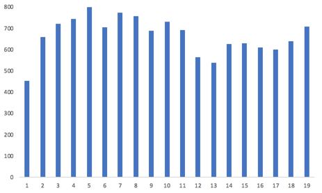
My goal here is to use both tools to implement the same chart using both libraries. The chart I want to implement (drawn here in Excel, to be neutral) is:

target chart

In addition, to show off how to do some basic animation, let's also add in tool tips so that when you mouse over one of the bars you see the value for that bar displayed.

This means we need to do three basic things:

  1. Draw the basic bars that reflect the individual data values
  2. Draw the X and Y axis and display labels
  3. Create tooltips for the chart

Rather than describe either library in further detail, let's just get started and see what they look like.

File Setup

The first thing we need to do is to include both of these libraries. For the sake of simplicity and portability, I'll load everything from the net instead of assuming you have downloaded the libraries. We'll start by adding two CSS libraries that the Kendo UI library will use. Next we add in the jQuery library that Kendo UI also uses. Then we link in the actual Kendo UI library. Finally, we include a link to the D3 library.

<!-- stylesheets for the Kendo UI library -->
<link rel="stylesheet" href="https://kendo.cdn.telerik.com/2018.2.620/styles/kendo.common-bootstrap.min.css">
<link rel="stylesheet" href="https://kendo.cdn.telerik.com/2018.2.620/styles/kendo.bootstrap.min.css">
<!-- jQuery library -->
<script src="https://ajax.googleapis.com/ajax/libs/jquery/3.3.1/jquery.min.js"></script>
<!-- the Kendo UI library -->
<script src="https://kendo.cdn.telerik.com/2018.2.620/js/kendo.all.min.js"></script>
<!-- the d3 library -->
<script src="https://d3js.org/d3.v4.min.js"></script>

We will also use the same data set for both charts, which is:

var data = [454, 660, 721, 746, 808, 704, 775, 756, 688, 733, 693, 564, 537, 628, 630, 611, 600, 640,694, 708 ];

The Markup

There is very little that we need to do in HTML beyond putting in a placeholder for each chart, and specifying the size of the chart area.

<h2>D3 Chart</h2>
<svg id="chart1" width="600" height="300"></svg>
<hr />
<h2>Kendo UI Chart</h2>
<div id="chart2" style="width:600px;height:300px"></div>

Creating a Basic D3 Chart

Now for the fun part! We'll start with the D3 chart first. There are several things we need to do. Aside from identifying where to put the chart, we need to define the x and the y scales, do some housekeeping for size and placement, and then add the data to the chart area. Here is the code for this.

function drawDChart() {
  var svg = d3.select("#chart1");
  var margin = 5;
  var width = + svg.attr("width") - 30;
  var height = + svg.attr("height") - margin - 40;
  var y = d3.scaleLinear()
    .domain([0, 800])
    .range([height, 0]);
  var x = d3.scaleLinear()
    .domain([0, data.length])
    .range([0, width - 20]);
  var g = svg.append("g")
    .attr("transform", "translate( 0, " + margin + " )");
  g.append("g")
    .attr("transform", "translate( 55, 0 )")
    .selectAll("rect")
    .data(data)
    .enter().append("rect")
    .attr("width", (width / data.length - 15))
    .attr("height", function (d) { return height - y(d); })
    .attr("x", function (d, i) { return x(i) + 5; })
    .attr("y", function (d) { return y(d); })
    .attr("fill", function (d, i) { return "steelblue" });
};

In the first line, we select the chart which has the id of "chart1". The next few lines establish the height and width of the chart based on the dimensions we specified in the HTML code, minus some margins and allowing room for axis.

The next two sections establish the scales of the two axis. These will be used to translate the actual data values into coordinates on the chart. I've hard-coded the "800" as the upper limit for the Y scale. In a real usage we'd want to find the maximum in the data to be displayed and then round up. In this case, the largest value is 775 and I rounded up to 800 because we don't want our chart to stop at 775 as that would look odd. The X axis is scaled by the number of values in our data set. In the next section we nudge the chart a bit in the display area.

Now we get to the meat of the D3 section. Here we tell D3 what data we are going to use, and specify the basic elements of each bar in the chart. We tell it the width of each bar, we tell it the height of the bar (taking the data value and scaling it). We tell it where to place each bar, specifying the X and the Y values using the scales that we specified earlier. Finally, I told it to color each bar with "steelblue" just because I like blue.

Notice in the middle that we "enter" the new information. This is part of a basic concept of D3. There are three things you can do with a chart: enter, update, and exit. Enter takes new data and adds it to an existing chart – it adds new bars to the chart. Update changes values for existing bars. Exit removes elements (bars) from the chart. We don't need to go into that in detail here, but just know it's a concept you need to become familiar with if you are going to do anything at all complicated with D3.

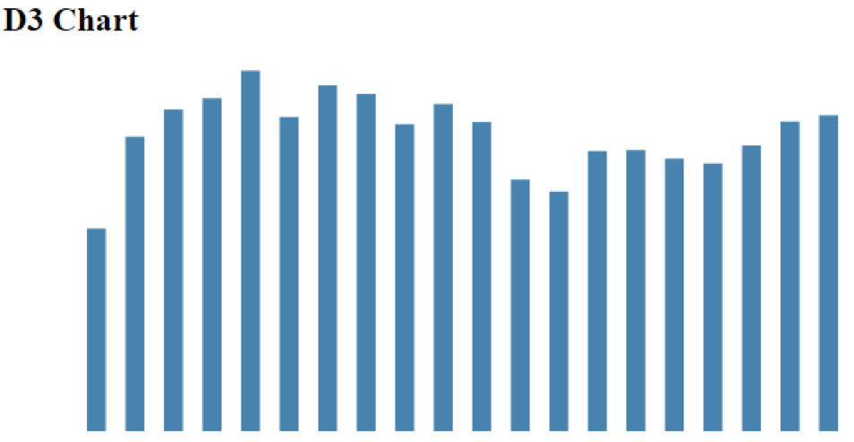
With the code that we have specified so far, this is what we get:

D3 chart example

Note that there are no axis because we haven't specified any yet, it's just a set of bars.

Kendo UI Chart

Now on to drawing the same chart with Kendo UI. This is really complicated (I'm joking). Basically all we have to do is tell it what type of chart and what the data is. The code for this is:

function drawKChart() {
  $("#chart2").kendoChart({
    seriesDefaults: {
      type: "column"
    },
    series: [{
      data: data,
      color: "steelblue"
    }]
  });
}

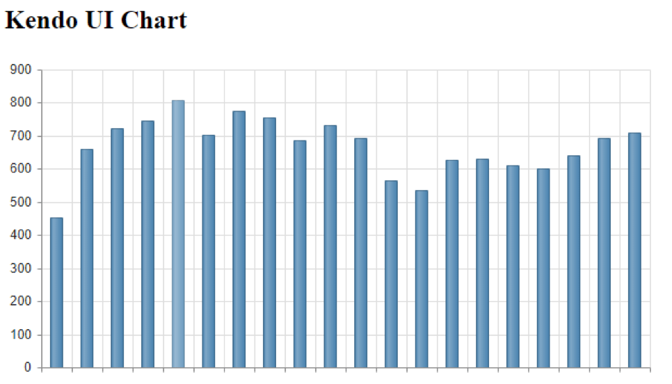
Not much more to say about it here. This gives us the chart:
Kendo UI chart example

You will see a few differences right off. Note that we did not have to tell the Kendo UI chart what our maximum Y axis should be. It looks at the data, rounds up, and picks a reasonable range to use. Likewise we didn't tell it anything about the X axis – it just counted the number of data points and scaled here accordingly. While it did not draw an X axis with labels, because we didn't give it any, it did at least draw the axis lines. It also took the "steelblue" I specified and added some shading to make it look a little more interesting.

Finally, it added grid lines. This is a good example of the different approach between the two libraries. D3 does what I tell it and only what I tell it. It assumes that if I want grid lines, I'll tell it to use grid lines. Kendo UI assumes that I want to draw a useful and pleasing chart. So it makes assumptions about what I am going to want. I can turn off the grid lines, but the default is that I'll probably want them, so instead of having to add them (D3), with Kendo UI I'd have to disable them. Different approach.

Making it Work

And because I always hate when people give partial examples that I can't run, I will also list the last piece of my program that I need to actually run these two functions, which is:

$(document).ready(function () {
  drawDChart();
  drawKChart();
});

This just waits until the document is ready and then runs the two chart functions. Now you have the whole code.

Next Steps

Let's go a step further and first of all turn off those grid lines so that our two charts match. This is done easily in the Kendo UI code by adding two more sections to the kendoChart. These will turn off both horizontal and vertical grid lines to match the D3 chart, and also force the Y axis to use 800 as it's max value instead of the 900 it picked. This also matches what we told our D3 chart.

categoryAxis: {
  majorGridLines: {
    visible: false
  }
},
valueAxis: {
  max: 800,
  majorGridLines: {
    visible: false
  }
}

Adding the Axis

The next thing missing is the Y axis on our D3 chart. We didn't have to tell Kendo UI to add a Y axis, it did that automatically. Again, Kendo UI does what it thinks we'll need in a chart, D3 does only what we tell it. While we're at it, let's add in an X axis on both charts. To add both axis on the D3 chart, we just need to add in the code:

// create the y axis
g.append("g)
  .attr("transform", "translate( 40, 0 )")
  .call(d3.axisLeft(y));
// create the x axis
g.append("g")
  .attr("transform", "translate( 40," + height + " )")
  .call(d3.axisBottom(x));

This is pretty simple. We just tell D3 where we want it placed with translate, and then just tell it to add the axis and give it the data.

On the Kendo UI side we already have the Y axis, and the lines for the X axis, we just need the labels. For this we just add some data to the CategoryAxis section we put in before to give us:

categoryAxis: {
  categories: [1,2,3,4,5,6,7,8,9,10,11,12,13,14,15,16,17,18,19,20],
  majorGridLines: {
    visible: false
  }
}

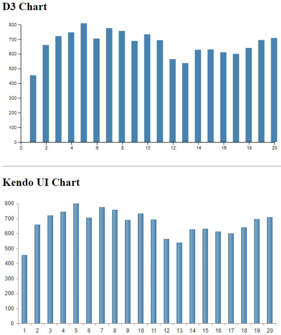
This gives us two very close charts. There are a few minor details I could tweak to make them exactly alike, but this is close enough.

D3 and kendo UI charts

Tool Tips

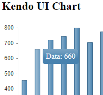
One last thing I'll add to both charts is a set of tool tips to give us data details when we hover over any bar. This will highlight how we add animation.

For the Kendo UI chart, all we need to do is add the following section to our chart code:

tooltip: {
  visible: true,
  template: "Data: #= value #"
}

And we get this:

Kendo UI chart

On the D3 side, of course, we need a little more information. First we need to add a section defining exactly how the tool tip will look. This is done with the code:

// define the tooltips parameters
var ttip = d3.select("body")
  .append("div")
  .style("position", "absolute")
  .style("z-index", "10")
  .style("visibility", "hidden")
  .style("background", "white")

And then we need to actually add the action to the chart section by adding on:

// set the tooltip
.on("mouseover", function (d, i) {
  .ttip.style("visibility", "visible" )
  .style("left",(d3.event.pageX)+"px")
  .style("top",(d3.event.pageY)+"px")
  .html("Data: "+d)
});
.on("mouseout", function() { ttip.style("visibility", "hidden" ) });

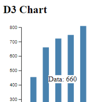
Both of these are pretty straightforward. This code says that when we mouse over a column, display the tooltip at a specific location. The final line in that section is similar to the one on the Kendo UI side where we have a chance to provide a template for what exactly gets displayed in the tool tip. For the D3 chart this gives us:

Kendo UI tooltip example

The whole code for this example is available for you to check out on GitHub.

Conclusion

Both D3 and Kendo UI are widely used and it's not fair to say that one is better than the other. They are at different levels of abstraction and they serve different purposes. D3 lets you have detailed control over every aspect of the visualization. Kendo UI lets you control many parameters as well, but makes a number of assumptions about what you want to see. You can make D3 do everything that Kendo UI automatically does, but you need to explicitly tell it to do each individual thing. And where D3 requires you to do some level of programming for each new feature, for Kendo UI these are just additional parameters you can set.

If you need to get a job done and actually deliver a web app on schedule, and you need support in case you get stuck or something goes wrong, then a commercial library like Kendo UI is your best bet. If you are doing something truly unusual that requires extreme customization, or are working on a class project, or some other non-commercial application and you enjoy just playing with code, then D3 is a good fit. Both options are certainly better than drawing individual rectangles!

For more information, check out:

Why You Should Use View Components, not Partial Views, in ASP.NET Core

$
0
0

Learn why you should use View Components - and not Partial Views - in your ASP.NET Core projects with this hands-on example.

Why use View Components and not Partial Views? The biggest reason is that when inserting a Partial View into a Razor page, all the ViewData associated with the calling View is automatically associated with the Partial View. This means that a Partial View may behave very differently on one Razor page than on another. With View Components, you control what gets shared to your View Components.

View Components are new to ASP.NET Core and are designed to do everything that a Partial View in previous versions of ASP.NET did and more. View Components are completely self-contained objects that consistently render html from a Razor view. They are generated from a C# class derived from the base class ViewComponent and are typically associated with a Razor file to generate markup.

Because of this, View Components nicely separate and encapsulate server-side logic necessary to render output. Just like ASP.NET MVC Controllers, View Components are easily testable, as they can be written to have no side effects, which means less bugs.

If you would like to follow along, all the source code used in this article is hosted on GitHub at:

https://github.com/pkellner/progress-telerik-blog-viewcomponent

For those more visually inclined, an eight minute video is also available that shows the steps outlined in this article.

https://youtu.be/dcwuKFi8Cdo 

Creating a View Component from Scratch

For this article, I’m going to use Visual Studio 2017 to create an ASP.NET Core 2.1 website. I could just as easily use the command line tools (dotnet) to create the app on either Windows or Mac, but I’ve chosen to use Visual Studio.

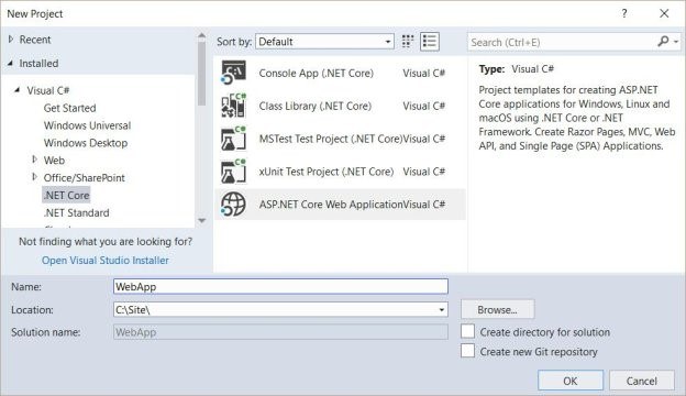
The first step is to create a new ASP.NET Core 2.1 website.

view components 1

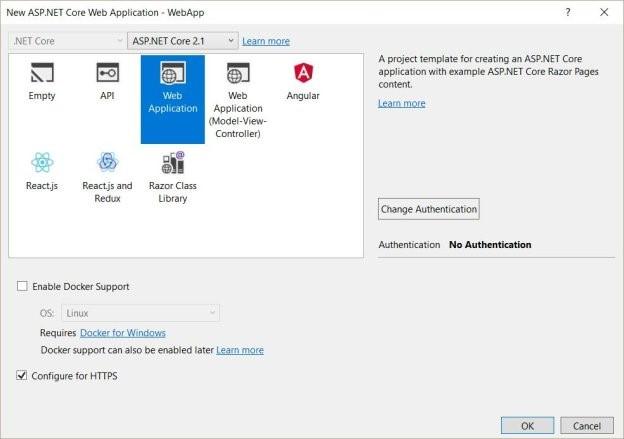
For the type of Web App, we’ll choose “Web Application,” which will create a nice simple site using the new ASP.NET Core Razor Pages.

view components 2

The directory structure scaffolded for us contains a directory called “Pages” and in that, we’ll create a new folder in which we will create a new View Component (that’s really the point of this article).

view components 3

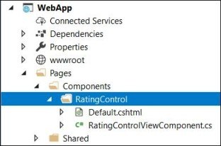
In this article, we are going to develop a very useful View Component that can be used over and over in a page for doing ratings. Because a View Component typically has both a C# file and a Razor View Page, let’s create a new directory in our Components directory called RatingControl, and in that directory, create two files: RatingControlViewComponent.cs and Default.cshtml.

view components 4

There are several ways you can create a view control based on attributes and naming conventions. In our case, I’m going to just explicitly create mine, which derives from the class ViewComponent, it has an empty constructor and an Invoke method with just one parameter. Unlike typical Razor pages that are invoked from a controller and take model parameters as input, View Components are invoked directly by calling the class method Invoke or InvokeAsync, with values. You can think of these values as the model.

Below is our simple View Component that simply passes a single parameter when invoked (ratingControlType), then passes that parameter as the model to a default.cshtml Razor View.

``` RatingControlViewComponent.cs
usingMicrosoft.AspNetCore.Mvc;
 
namespaceWebApp.Pages.Components.RatingControl
{
    publicclassRatingControlViewComponent :
        ViewComponent
    {
        publicRatingControlViewComponent()
        {
        }
 
        publicIViewComponentResult
            Invoke(stringratingControlType)
        {
            returnView("Default", ratingControlType);
        }
    }
}```
 

The Razor View file, Default.cshtml is just two lines. The first line says that the model type passed in is just a string, and the second line renders that string wrapped in an h2.

@model string
 
<h2>@Model</h2>

Using Our View Component on a Razor Page with InvokeAsync

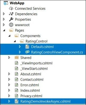
At this point, we have a full View Component. To have that View Component do anything for us, we can put it on a Razor page. I’ve created a new Razor view page called RatingDemoInvokeAsync shown here in the solution explorer.

view components 5

The file itself uses the Component method InvokeAsync, which references the View Component name with its first parameter, and to get parameters into that method expects an anonymous class as it’s second parameter. Basically, we are just using the capabilities of Razor here. The “@” sign switches the Razor view page to C#, then what follows is just C# code. Here is the full RatingDemoInvokeAsync.cshtml.

@page
@model WebApp.Pages.RatingDemoInvokeAsyncModel
@{
    Layout = null;
}
<!DOCTYPE html>
<html>
<head>
    <metaname="viewport"content="width=device-width"/>
    <title>starsdemo1</title>
</head>
<body>
    <h1>RatingDemoInvokeAsync</h1>
    @await Component.InvokeAsync("RatingControl",
        new {
            ratingControlType = "1to10"
        })
</body>
</html>
```
 

The output of running this page simply shows the string “1to10” with the heading RatingDemoInvokeAsync. That is because all our View Component does is render the string passed into it.

view components 6

In our next section, I’ll look at a much cleaner way to invoke a View Component. That is, instead of using C# in the middle of our Razor View Page, we can use our own custom HTML element, also known as a Tag Helper.

Using Our View Component on a Razor Page with Tag Helpers

Let’s first look at how using a Tag Helper to invoke our View Component changes our Razor Page. Here, I’ve created a new Razor Page, RatingDemoTagHelper.cshtml.

@page
@model WebApp.Pages.RatingDemoTagHelperModel
@{
    Layout = null;
}
@addTagHelper *, WebApp
<!DOCTYPE html>
<html>
<head>
    <metaname="viewport"content="width=device-width"/>
    <title>RatingDemoTagHelper</title>
</head>
<body>
    <h1>RatingDemoTagHelper</h1>
    <vc:rating-controlrating-control-type="1to10">
    </vc:rating-control>
</body>
</html>

All I’ve done is added line 6, @addTagHelper which basically says use Tag Helpers defined anywhere in my current .NET assembly. Then, I can reference the rating control as I do in the body of this HTML with the Tag Helper prefix vc for View Component. The name is just my View Component name spelled out in Kabob casing as rating-control. Instead of using an ugly anonymous class like we had to do with the invoke method in the previous section, we can just pass the string to the View Component with an HTML attribute, also in Kabob case, called rating-control-type.

The beauty here is that we did not have to make any modifications to our View Component to make Tag Helpers work. They just work! Running the page of course gives us the same output as before, but we’ve changed the h1 inner HTML to RatingDemoTagHelper.

view components 7

Bringing Our Rating View Component to Life

So far, we have not created a rating View Component at all. We have only created a component that renders what is passed into it. Not very useful. We have however created the groundwork, so now we can build out a real-world useful control. Rather than start from scratch, let’s use this excellent MIT licensed rating control that uses jQuery and Bootstrap.

https://github.com/antennaio/jquery-bar-rating

I won’t bore you with the details, but I’ve essentially brought this project over into my ASP.NET Core Visual Studio project by copying in some CSS and JavaScript to the base of web project wwwroot as is shown here.

view components 8

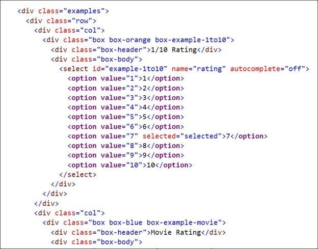
I’ve created a Razor view page that is just static HTML derived from the example in the jquery-bar-rating repository. That file is Pages/RatingDemoRawHtml.cshtml and has lots of code that looks like this:

view components 9

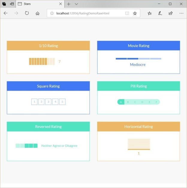
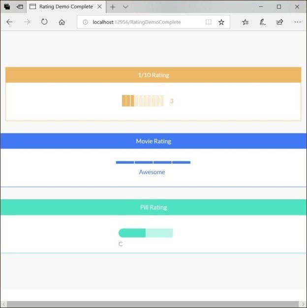
Running the page shows us several ratings type supported.

view components 10

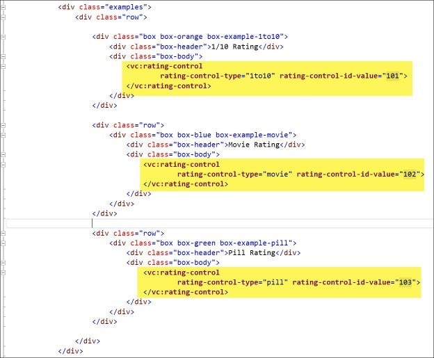
Our goal is going to be to replace the code in the select tag with a View Component that handles all the rendering of HTML options, and handles the necessary JavaScript and jQuery. That is, when finished, instead of the above raw HTML code, we will have HTML that looks like this (which is in the file pages/RatingDemoComplete.cshtml).

view components 11

Notice that this shows three different rating types, “1to10,” “movie” and “pill.” I’ve also included a rating-control-id-value property which we’ve not seen before. In general, when we implement a ratings control, we’ll want our control to be able to POST back to a server-side endpoint to update data when the user clicks on or changes a rating (often an Ajax call). This value essentially allows you to pass in a unique identifier to the control (usually passed in as a Razor variable). An example might be if you are looping through conference sessions and you want to know what rating control is associated with which session, the rating-control-id-value could be used to pass the session id.

When we run this page (Pages/RatingDemoComplete.cshtml), we see three rating types (in my example, I only coded for these three types though the github base project, jquery-bar-rating, supports six types).

view components 12

We’ve seen the Razor Page that renders this, but where did it all come from? Well, the obvious answer is the updated View Component. Let’s look at that code and talk through what it does.

usingMicrosoft.AspNetCore.Mvc;
usingMicrosoft.AspNetCore.Mvc.Rendering;
usingMicrosoft.Extensions.Configuration;
usingSystem.Collections.Generic;
usingSystem.Linq;
usingWebApp.Models;
 
namespaceWebApp.Pages.Components.RatingControl
{
    publicclassRingControlModel
    {
        publicList<SelectListItem> SelectedListItems { get; set; }
        publicstringRatingControlType { get; set; }
        publicstringRatingControlValue { get; set; }
        publicintRatingControlIdValue { get; internalset; }
    }
 
 
    publicclassRatingControlViewComponent : ViewComponent
    {
        privatereadonlyRatingControlOptions _ratingControlOptions;
 
        publicRatingControlViewComponent(IConfiguration config)
        {
            _ratingControlOptions = newRatingControlOptions
            {
                RatingControlType = config["RatingControlType"],
                RatingControlInitialValue1to10 = config["RatingControlInitialValue1to10"],
                RatingControlInitialValuePill = config["RatingControlInitialValuePill"],
                RatingControlInitialValueMovie = config["RatingControlInitialValueMovie"]
            };
        }
 
        publicIViewComponentResult Invoke(stringratingControlType,intratingControlIdValue)
        {
            var ratingControlValues = newList<string>();
            var ratingControlInitialValue = "";
 
            if(ratingControlType == "pill")
            {
                _ratingControlOptions.RatingControlValuesPill.ForEach(a => ratingControlValues.Add(a));
                ratingControlInitialValue = _ratingControlOptions.RatingControlInitialValuePill;
            }
            elseif(ratingControlType == "1to10")
            {
                _ratingControlOptions.RatingControlValues1to10.ForEach(a => ratingControlValues.Add(a));
                ratingControlInitialValue = _ratingControlOptions.RatingControlInitialValue1to10;
 
            }
            elseif(ratingControlType == "movie")
            {
                _ratingControlOptions.RatingControlValuesMovie.ForEach(a => ratingControlValues.Add(a));
                ratingControlInitialValue = _ratingControlOptions.RatingControlInitialValueMovie;
            }
 
            List<SelectListItem> ratings = ratingControlValues
                .Select(myValue => newSelectListItem
                {
                    Value = myValue,
                    Text = myValue,
                    Selected = myValue.Equals(ratingControlInitialValue)
                }).ToList();
 
            RingControlModel ringControlModel = newRingControlModel
            {
                SelectedListItems = ratings,
                RatingControlType = ratingControlType,
                RatingControlValue = ratingControlInitialValue,
                RatingControlIdValue = ratingControlIdValue
            };
 
            returnView(ringControlModel);
        }
    }
}

Notice first that we’ve injected the program config information into the control constructor on line 23. That is, we pull in setup data from our appsettings.json file. This way we don’t have to explicitly add code to our invoke method to pull this data. Below is our appsettings.json file that simply overrides the default control type as well as the initial values for all three of our rating types.

{
  "RatingControlType": "1to10", // Default Type
  "RatingControlInitialValue1to10": "6",
  "RatingControlInitialValueMovie": "Good",
  "RatingControlInitialValuePill": "C",
  "Logging": {
    "LogLevel": {
      "Default": "Warning"
    }
  },
  "AllowedHosts": "*"
}

In our Invoke method, starting on line 34, we simply create our options for our select tag based on our configuration data. I won’t go through all the details here as it’s not that important to understanding View Components, but feel free to review the code in GitHub on your own (the repository mentioned at the top of this article includes all the working code).

The final piece is the Pages/Components/RatingControl/Default.cshtml as shown here.

@model RingControlModel
@{
    varuniqueId = Guid.NewGuid().ToString("N");
}
 
<select id="@uniqueId"
        asp-for="@Model.RatingControlValue"
        asp-items="@Model.SelectedListItems"
        rating-control-id-value=@Model.RatingControlIdValue></select>
 
<script>
    $(document).ready(function() {
        $('#@uniqueId').barrating('show',
            {
                theme: 'bars-@Model.RatingControlType',
                onSelect: function(value) {
                    alert('Selected rating: '+ value + ' id-value: '+
                        @Model.RatingControlIdValue);
                }
            });
    });
</script>

This Component View Razor Page first, on line 3, creates a unique id to assign to the ratings control. It then goes on to execute the same jQuery that the base jquery-bar-rating repository used to style and add functionality to a standard html select element. You can see the jQuery on line 13 executing the method “barrating()” on the select control. That method calls styles and adds the necessary event handling for our Component View to both look good and work.

I realize I’ve left a lot of details out about how the jquery-bar-rating code works. The real meat of this article is about how View Components work and how to build them into your code. This bar code rating is just a good working example you can study on your own. It shows a real-life example you can model your code after rather than just a simple “hello world” example that can often be hard to expand on.

Feel free to post comments below or questions if you have them. I love the new ASP.NET Core features. View Components and Tag Helpers are just two of the new features that make our lives as web developers much easier.

You can learn more about how to use Tag Helpers in your ASP.NET projects here, and if you're looking for a set of UI components to help you build your ASP.NET Core apps, don't forget to check out Telerik UI for ASP.NET Core. You can get started today with a free 30 day trial.


How My Team Accidentally Moved to TypeScript and Loved It

$
0
0

Like many front-end developers, I was really excited by the release of Angular 2.0. I had been using AngularJS for a couple years, and my team at the time had started to feel some of the pain of building large projects with it. Angular 2 seemed to solve many of those issues.

When I got the opportunity to join a new team and start a greenfield front-end project in late 2016, I figured that Angular 2 would be a good fit. Since TypeScript was the default language, that's what we ended up using.

While our decision to use TypeScript wasn't intentional, we had heard some of the supposed benefits, and we were excited to try something new on the front-end. For two decades, JavaScript has been the go-to option for front-end development, so, while TypeScript is technically a superset of JavaScript and it ultimately compiles to JavaScript, it has enough new features that it's worth making a distinction.

Our new front-end project is almost two years old now, and we've gone from Angular 2 to Angular 5, with plans to upgrade to version 6 soon. As the project has grown, we've reaped a lot of the benefits of both Angular and TypeScript, and while I'm still a fan of Angular, my team and I have become even bigger fans of TypeScript. For that reason, I'd like to share with you our thoughts on the language; what we like, what we love, and some things to watch out for:

Let's begin!

Strong Typing Decreases Bugs, Improves Refactoring Process

Like many web developers, I have had limited exposure to strongly-typed programming languages. The dominant languages of the past decade — JavaScript, PHP, Ruby, and Python — are dynamically-typed, meaning that variables can change their type at runtime. While this makes them great for rapidly prototyping new software, it also makes them unwieldy as teams and codebases grow.

Let's take a look at an example of how strong typing can make bugs harder to introduce. A typical JavaScript function that deletes a user via an HTTP client might look like this:

function deleteUser(user) {
  return client.deleteUser(user);
}

Looking at this function, it's impossible to know exactly what fields the user variable must have or what the client.deleteUser() method will return. You can figure it out by following each call through the stack or using a debugger, but in TypeScript, it becomes very obvious what your function's input and output must be:

function deleteUser(user: UserObject): Promise<boolean> {
  return client.deleteUser(user);
}

This tells us that the user variable must be a UserObject and the deleteUser() method must return a Promise of a boolean. If any of these inputs or outputs is not correct, the TypeScript compiler will catch the error before you even run your application. This prevents a ton of bugs and mistakes from being shipped to production.

TypeScript Improves Code Readability and Minimizes Documentation

One thing I didn't realize about strongly-typed languages before I started building in TypeScript was how often I end up documenting inputs and outputs in DocBlocks to improve readability and code comprehension. For example, in JavaScript, I might append the above function like this:

/**
* Delete a user and return success or failure promise
* @param UserObject
* @return Promise<boolean>
*/
function deleteUser(user) {
  return client.deleteUser(user);
}

That's a lot of lines to accomplish what TypeScript does with a few keywords embedded in the function itself.

The other problem with relying on documentation is that it's tough to keep it up to date. While I do believe that code comments are sometimes necessary, it's pretty clear to me that strong typing helps TypeScript self-document better than most dynamically-typed languages. It's always better to rely on code as documentation when possible.

TypeScript is Friendly to Object-Oriented Developers

While functional programming has seen a resurgence in recent years, for the past decade, most developers have been focused on object-oriented design and patterns. JavaScript is not a traditional object-oriented language, as it lacks classes (despite the ES6 sugar), interfaces and class inheritance. None of this is a bad thing — if you read Douglas Crockford's book, JavaScript: The Good Parts, you might gain some appreciation for it — but it's a conceptual leap that programmers coming from C#, Java, or PHP might balk at.

TypeScript adds features that make front-end development more familiar to object-oriented developers. In TypeScript, you can create and extend classes, implement interfaces, create abstract classes, set member access, use static properties and methods, and much more. While all these features compile down to standard JavaScript in order to be run in the browser, having these object-oriented features can be helpful for making the leap to front-end development.

TypeScript Forces You to Think About Design, Code Organization

I like working with junior developers, but one thing I notice is that they tend not to think ahead when building a new feature. While a senior engineer might spend 75% of her time thinking and 25% coding, a junior engineer might do the reverse and spend 25% of her time thinking and 75% banging away at code. TypeScript — due to its strongly-typed nature — can make developers stop and think a little more.

For example, the following function is valid in JavaScript:

function isComplete(finished) {
  let placeholder = false;
  if (finished === true) {
    placeholder = 'complete';
  }
  return placeholder;
}

But in TypeScript, a variable like placeholder which changes from a boolean to a string would not be allowed. This minimizes the use of lazy catch-all variables or objects like placeholder in the above example, and makes developers choose accurate interfaces and types for their variables and consistent return types for their functions.

Browser Compatibility

While not exclusively an advantage of TypeScript, the fact that you can set the compilation target for TypeScript using webpack or Grunt means that you can work in the modern, strongly-typed language while you're developing, yet still serve up compliant JavaScript to any browser. My team's legacy application was written in vanilla JavaScript and jQuery, so we had to be careful about what features we used and didn't in order to make sure our site worked in older versions of Internet Explorer. Now that we've switched to compiled TypeScript, we don't have to worry about whether a feature is universally supported or not.

But, TypeScript Isn't Perfect...

While my team has been happy with the change, and we've reaped plenty of the benefits of using TypeScript, using the new language hasn't come without its tradeoffs. In fact, for some smaller projects, you may find that TypeScript slows your team down. If you've already got a robust test suite, you may not feel as much need for strong typing.

Some of the considerations we've noticed after switching to TypeScript include:

  • TypeScript requires an IDE for maximum effectiveness. On the plus side, Visual Studio Code is free and made to work with TypeScript.
  • You have to plan for typing up front to get the full benefit. When we first started using TypeScript we weren't very careful with our null typing, so when we later tried to implement strict null checks, the compiler failed all over the place. If I were to start a new project, I'd make sure all the typing rules were in place before I wrote any code.
  • You can still abuse union and any types to avoid true strict typing.
  • Developers have to think ahead, write more interfaces and type their objects. This can slow down developers at first, but, again, the advantages of TypeScript become clearer the larger your codebase gets.
  • Not every library you use will use TypeScript. This means that you'll either have to build your own Declaration File or lose the advantage of strong typing in the part of your code that interfaces with the third party code.

Despite these minor "gotchas," TypeScript has allowed our codebase to grow in a maintainable and organized way at The Graide Network, and I'm really glad we accidentally made the switch.

Dean Schuster of truematter on Solving UX Challenges with Kendo UI

$
0
0

What kind of user experience (UX) challenges are organizations facing today, and how are UX/UI firms solving them? Dean Schuster of truematter explains.

At Progress, we know user experience is a critical part of the design of any app. It's why we work hard to build developer tools that help make it easier for you to deliver an amazing experience to your users. But how are our tools being applied in the real world?

We sat down recently with Dean Schuster, co-owner of truematter, to talk about user experiences (UX) and web app design. We wanted to find out what kind of UX challenges he was seeing in the wild, and how he was solving them.

Progress:  Hi Dean, can you tell us a bit about what truematter does?

Dean: We are a UX, UI expert firm. All we do is user experience. We envision, define, design, and move through front-end for digital products and services.

Progress: And what kind of challenges do your customers experience?

Dean: When we talk to clients, the biggest things we're dealing with are complex problems with interfaces. Our clients are coming to us and they have complex data, complex interactions. They have users that have to accomplish very difficult tasks with a screen. The screen might be a wearable. It might be a mobile screen. It might be a desktop screen. Our job is to unpack the problem and figure out what the users really need, and specifically how they act in the real world and how that needs to translate into the digital space. Our job is to research and sort that out so that when we create new interfaces, we're creating them perfectly for the users who actually use them all day long every day.

Progress: What kinds of problems do they run into?

Dean:The world is full of terrible software. By that I mean software that's extremely difficult to use. It's maddening. It leads people to be inefficient. It kills their productivity. It enrages them, quite frankly. They hate to use it. We see that all the time. We see our job really as being the ultimate advocate for the users. We want their job to be less maddening. We want their job to be less horrible, less terrible. We want them to be more productive and efficient. That's why we pay very close attention to them, and everything we do is intentional that leads us down that path to create something that's just right. When something's just right, the company can receive great benefits, better productivity, more efficiency, more use, greater adoption, greater engagement by users, things of that nature that translate into real money.

Progress: What kinds of companies are they?

Dean: We are typically doing work for enterprise level clients. If we're working on, let's say, a website or an intranet, it's going to be a big one that's complex, lots of stuff going on. We've done a great deal of what we call behind the login work for companies like SCANA here in South Carolina, which is a very large utility firm, or we'll do work for a company like Regency Centers, which is a national corporate retail real estate REIT. All of these entities are doing an awful lot with copious data, particularly behind the scenes. We're helping them sort that out and make it extremely easy to use.

Progress: When you engage with companies, what's their level of understanding of the problems that they have? Are they aware just that they have a specific problem, or are they aware that they have a usability problem, or are they just looking for maybe we can improve things?

Dean: Companies come to us when they perceive there's a problem with something they've made or they're concerned that something they're about to make isn't going to go well. When they're concerned that something they made is not responding or performing as well as they want, they typically know it's probably because the interface is terrible, it's very hard to use. They get that much. They understand they've got that kind of problem. They simply don't know how to fix it. They don't know the next step to take in order to get from horrible, terrible, underperforming software, bad interface, all the way to something that performs well, is excellent, and achieves their goals. Our job is to bridge that gap. We bridge it by helping them truly understand their users very well, connecting the things their users need to the business strategy they're trying to accomplish. They're aware. They're just not sure what to do. That's where we come in.

Progress: What does “good” look like for a customer that you work with? Do you measure that in user satisfaction, or productivity, or time to complete a task? What would they typically look and say, "Wow, this really helped us because…" what happened?

Dean: When we're talking with people in a B2C or B2B engagement, we might be trying to help them increase user engagement to help drive certain goals. We do want to increase user satisfaction typically. You can measure all of those things as well. Companies perceive a lot of value there.

Companies also see a great user experience as something that is a driver to their brand value. It's a little harder to measure, but you hear a lot of people say that a brand really is an experience. We bring that down to earth by making a better user experience. When you make something wonderfully easy to use, people don't typically say, "Well, goodness gracious, that app was easy to use." They think, "That company was great." That's what they think. That's how you connect user experience to brand.

Progress: And what does it take to get that done for them?

Dean: When we create interfaces for people and are trying to solve complex business problems with pretty stern technical requirements, you can imagine we're dealing with a great deal of data display, a lot of work with graphing, and charting, and visual display of information. When we have to solve problems like that, we're first trying to understand use. How does a user engage this? What do they need to do? Secondly, we have to implement and we have to create really complex interfaces for these people and make them easy. That's hard to do. We've looked for a long time for a great tool to help that process, and we've encountered Kendo UI. When we did, we realized this is the thing that's probably going to be our best friend and help us launch other successful interface work more easily and effectively.

Progress: So how did you run into Kendo UI?

Dean: We found Kendo UI based on some things that our clients were doing or attempting to do. Specifically we had a client who was working with a geo-accurate representation of retail centers, and they needed their internal user base to be able to update this and change it. I asked them, "What are you doing this in?" They said, "Well, I'm doing this in something called Kendo UI. I'm just starting out figuring this out." I thought, "Kendo UI, interesting." They said, "Yeah, this is made by the company that makes Sitefinity." I was like, "Sitefinity? That's the CMS we're using." You start to discover: What is this tool? Let me figure this out a little bit more. We were also doing a lot of research for tools. We came across Kendo UI in both senses, just from clients using it and our own research.

Progress: And what does Kendo UI bring to the party for you?

Dean: Kendo UI is important to us because it's a foundational toolset. It helps us start the process of making things great at a higher level. We don't have to reinvent the wheel every time from an interface perspective. Imagine if we had to recreate intensely complex grids of data from the ground up every time? It's untenable. It would blow budgets away for clients. It would take too long. It might not work well. If we created something custom, our clients would have to maintain it. They'd have to deal with it in ways that are inconvenient and non-sustainable. Kendo UI gives us that foundation from which we can launch and do some really excellent work.

Progress: What kind of feedback do you hear from the actual end users? Are they aware that they have a problem?

Dean: We deal with people who have to stare at difficult interfaces all day long. Making those interfaces better is a big deal to them. At one point, we were researching this user. He's got to look at multiple screens of huge data grids, and he said, "I've got to look at these rows and rows and columns of numbers all day long and my job sucks. It's terrible." Our job is to come in and somehow make this person's life a little bit better. You can imagine if you hate your job a little less, the chances of you being better at it go up quite a bit. When we're using Kendo UI, we're saying we're going to work with this foundational platform to create something that is wonderful to use. It gives us a toolset that we can use to do that, which we really didn't have before. There are lots of different tools out there. This feels to us to be the most sophisticated and best one.

Progress: If you had to sum up your experience with Kendo UI, what would it be?

Dean: For us, Kendo UI is a foundational toolset that allows us to do what we do best. What we do best is user experience. What Kendo UI does best is create this beautiful set of tools that allows us to build experiences that are easier to use.

Progress: Thank you Dean!

R3 2018 Sneak Peek: What's Next for Telerik UI for ASP.NET AJAX

$
0
0

Curious to know more about the R3 2018 release of Telerik UI for ASP.NET AJAX? Learn about the new features and fixes that will be available on September 12.

By now you’ve probably heard that the third major release of Telerik UI for ASP.NET AJAX will be available on Wednesday, September 12. As with every release, we’ve listened to your feedback and implemented some of the most requested fixes and features.

Here’s a sneak peek at what you can expect in the R3 2018 release of Telerik UI for ASP.NET AJAX:

Numerous fixes and new features in the RadHtmlChart

As a part of the R3 2018 release we have resolved several of the top issues related to the RadHtmlChart. Additionally, we have implemented one of the most highly anticipated features for the chart control: defining position for axis labels, giving developers the power to control exactly where the labels of an axis should be displayed.

Upgraded Kendo UI Scripts

While it may not be immediately apparent, some of the Telerik UI for ASP.NET AJAX components are based on our JavaScript library Kendo UI. With the R3 2018 release we have updated the internal Kendo UI references to the latest version, providing fixes for a large list of issues and regressions that were previously reported.

Continued Commitment to Stability

Progress is dedicated to continuously enhancing and improving the Telerik UI for ASP.NET AJAX toolset. To this end, with R3 2018 we actively tackled close to 100 of the most reported bugs in Chart, Drawing, Gantt, PDF Export and Spreadsheet.

Learn More and Download the Latest Bits

Hope you’re as excited about all this goodness as we are. Make sure to come back on September 12 to download the latest bits or grab a fresh trial.

And if you want to see the release highlights in action, mark your calendars for the LIVE Kendo UI and Telerik Webinars (September 27 and October 2, respectively) – both at 11:00 a.m. ET. We'll see you there!

How to Use a jQuery MultiSelect UI Component in Your Web App

$
0
0

Learn how to use a MultiSelect component to let users choose tags for a blog post or toppings on a pizza, and the differences between using HTML and Kendo UI to do so.

Last time in this series we reviewed the DropDownList component. The dropdown allowed us to select a single item from a list of items. The next component we will review is the MultiSelect - as the name implies, this component lets you select multiple items from a list of items.

You may use a MultiSelect for letting users choose tags for a blog post or choosing toppings on a pizza. It is possible to create a dropdown list with multiple selections using plain HTML. But with Kendo UI you get more control over the behavior and appearance of the element. In this episode, you will learn about the differences between the HTML multiple select dropdown and the Kendo UI MultiSelect component.

HTML Multiple Select 

Creating a MultiSelect component with HTML is the same as creating a select menu with the addition of the multiple attribute. This changes the select menu from a dropdown list to an element with all items visible for you to choose from. You can also restrict how many items are visible with the size attribute. To make multiple selections, on Windows you hold the 'ctrl' key while clicking on the options. On Mac, you hold the 'command' key. This is what our element looks like before it has been initialized as a Kendo UI component:

Multiselect example

```html
 
<!DOCTYPE html>
 
<html>
 
  <head>
 
    <meta charset="utf-8">
 
    <title>Untitled</title>


    <script src="https://code.jquery.com/jquery-1.12.3.min.js"></script>
 
 
  </head>
 
  <body>
 
    <select id="multiselect"multiple>
 
      <option value="0">CSS</option>
 
      <option value="1">JavaScript</option>
 
      <option value="2">React</option>
 
      <option value="3">Angular</option>
 
    </select>
 
  </body>
 
</html>
 
```
 

Kendo UI MultiSelect Component

To turn the element into a Kendo UI component, we just need to add the following code after the markup:

```html
 
<script>
 
  $(document).ready(function(){
 
    $('#multiselect').kendoMultiSelect();
 
  });
 
</script>
 
```
 

Multiselect example

The difference now is there is a text field to enter items and the options are only shown when you have focused on the text field. The selected items are visible as a tag in the text field as well as in the dropdown. Also, you don't have to hold any special keys to select or remove options. You just click on the item. To remove a selection, you can click on the 'x' button in the tag or click on the item from the dropdown.

Additional Features of the MultiSelect

It is not necessary to list all of our options in the markup. We can configure them in the component’s API. This is the refactored code with the options removed from the select element and defined in the dataSource field:

```html
 
<select id="multiselect"multiple></select>
 
<script>
 
  $(document).ready(function(){
 
    $('#multiselect').kendoMultiSelect({
 
      dataTextField: 'text',
 
      dataValueField: 'value',
 
      dataSource: [
 
        {text: 'CSS', value: 0},
 
        {text: 'JavaScript', value: 1},
 
        {text: 'React', value: 2},
 
        {text: 'Angular', value: 3}
 
      ]
 
    });
 
  });
 
</script>
 
```
 

Another feature of the MultiSelect is filtering. Your options can be filtered based on the value that is entered into the text field. You can search for options that start with the value, end with the value or contain the value. By default, when you type into the text field you will see options that start with the value. This is an example of how to implement filtering so that you get suggestions that contain the specified value:

```js
 
$('#multiselect').kendoMultiSelect({
 
  filter: 'contains'      
 
});
 
```
 

Summary

The MultiSelect component is like a dropdown list that lets you choose multiple items from a group of related items. The design of the MultiSelect is a vast improvement over the default HTML version. Because the options are hidden, you don't risk overwhelming the user with too much information. Plus, it takes up less physical space on your page. This is especially useful when you have a long list of options. In which case, you don't have to define the options inside of the API. The information can be pulled from a URL or another file that contains JSON. This is possible to configure with the MultiSelect component.

In the next episode, you will learn about the ComboBox. The ComboBox is also like a dropdown list but you can manually enter options that have not been defined already.

Try Out the MultiSelect for Yourself

Want to start taking advantage of the Kendo UI jQuery MultiSelect, or any of the other 70+ ready-made Kendo UI components, like Grid or Scheduler? You can begin a free trial of Kendo UI today and start developing your apps faster.

Start My Kendo UI Trial

Angular, React, and Vue Versions

Looking for UI components to support specific frameworks? Check out the MultiSelect for Angular, the MultiSelect for React, or the MultiSelect for Vue.

Resources

R3 2018 Sneak Peek: The Next Telerik ASP.NET MVC and Core Tools Release

$
0
0

Get a sneak peek of what's coming in the R3 2018 release of Telerik UI for ASP.NET MVC and Telerik UI for ASP.NET Core.

It’s hard to believe that our third major release of the year is just a few weeks away. The engineers on the Telerik UI for ASP.NET MVC and Telerik UI for ASP.NET Core teams are delivering more than promised with this release – which makes my job even more fun.

Check out what’s in store for you with the R3 2018 release that will be available on Wednesday, September 12:

New Features Added to TreeList

The TreeList is a popular component that has received a lot of love this release, including:

  • Batch editing
  • Multi-column headers
  • Client-side paging (for high-performance scenarios)
  • Improved localization.

New Component: MultiViewCalendar

The MultiViewCalendar component provides an intuitive way to showcase two calendars side-by-side in single component. This can be used when providing a way for users to easily select a range of dates spanning across months, or to give users an easy way to see available dates over multiple months.

New Component: ArcGauge

The new ArcGauge component continues our trend of implementing highly-requested data visualization components. The ArcGauge allows you to visually represent a value on a circular arc without the mess that may come from more complex data visualization.

New Component: MultiColumnComboBox

The highest requested item in our feedback portal was to have the ability to display tabular data within a dropdown. So, we went ahead and implemented this brand-new component: the MultiColumnComboBox. This provides the power of a displaying and filtering items in table all within a dropdown, giving users more context around the data items they are looking to select. 

New Material Theme

Material is a very popular design methodology coming from Google that covers web and mobile applications alike. As a part of our ongoing effort to provide support for the latest and greatest within UX, R3 2018 will introduce the Material theme to Telerik UI for ASP.NET MVC and Telerik UI for ASP.NET Core.

Learn More and Download the Latest Bits

Hope you’re as excited about all this goodness as we are. Make sure to come back on September 12 to download the latest bits or grab a  fresh trial of our UI for MVC or Core.

And if you want to see all of the release highlights, mark your calendars for the LIVE Kendo UI and Telerik Webinars, taking place on September 27 and October 2, respectively – both at 11:00 a.m. ET. We'll see you there!

Chatbot Q&A with Vesko Kolev and Web Designer Magazine

$
0
0

Progress VP of Product, Vesko Kolev, recently sat down with Web Designer magazine to talk the future of chatbots and the impact on applications.

The latest issue of Web Designer magazine featured an article by Progress VP ofweb Designer Magazine Cover Small Product, Vesko Kolev, entitled “Why Developers Need to Embrace Chatbot Tools.” The article discusses the impending rise of the chatbot, the benefits, and the way AI (and chatbots) will redefine the concept of applications.

The editors also printed a short Q&A that they conducted with Vesko. The Q&A is reprinted with permission below. The full article can be found in the print magazine in stores or online.

Vesko Black and WhiteQ: What do you think are the key benefits that chatbots bring to business applications?
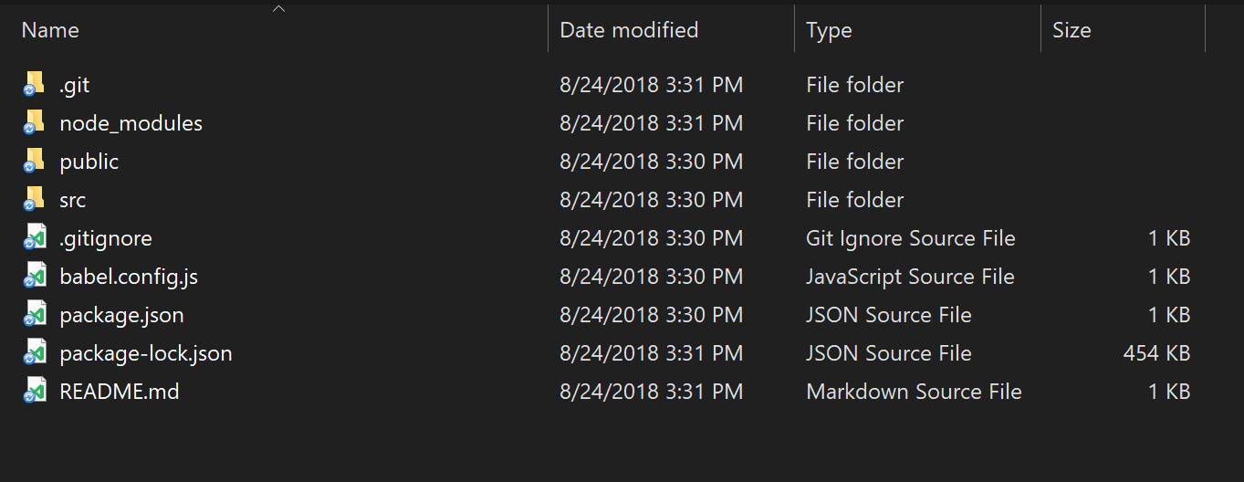
A:
The key benefits are time, money and improved user experience. Developers can iterate multiple orders of magnitude faster on defining and improving a chatbot compared to the traditional way of building applications, thus being truly agile and able to get feedback from actual users almost in real-time. Chatbots also get smarter over time and the UI is in many cases being generated automatically, requiring less human intervention. Finally, if you have powerful front-end tooling, then you are able to have cognitive chatbots in all your channels.

Q: What are the accessibility issues that conversational UI creates for designers and developers?

A: I can’t think of an accessibility issue that the conversational UI creates. Actually, it is quite the opposite. One of the most exciting features of cognitive chatbots is that they will allow for a far more enjoyable experience for those with visual defects. Up to now, unless the application has been specifically developed for visually impaired people, it is practically not accessible for them. With the voice recognition technology, intelligent chatbots allow visually impaired people to get an experience that almost equals the experience of everyone else.

Q: How much more advanced do you think chatbots will be in 5 years?

A: The tipping point will be when enough organisations start to use them in their daily operations. If they begin to experiment with cognitive chatbots then they will see the power of them. As more data is generated and fed in, the more they will offer the business from a competitive edge perspective. Heightened user personalisation, increased productivity, sophisticated advice, all of these will become available to applications that have this technology underpinning them. The beauty of where we will be is that so much is dependent on how the cognitive chatbots teach themselves, so I’m really excited to see where we are in the next five years!

Find Out More

Curious to learn more about our chatbot plans? Check out our comprehensive Conversational UI, which is now available across our Telerik and Kendo UI developer tools, as well as our cognitive self-service chatbot, NativeChat.

Building Apps with Vue.js

$
0
0

An introduction to Vue with a focus on the environment and covering the use of Single File Components and the build process. 

Editors note:

This article is a good companion piece to article "Hello Vue: A Quick Tutorial on Getting Started with Vue" which is a more basic introduction to Vue syntax. This article goes into more detail on some of the more advanced aspects of the Vue environment but less about the actual code structure.


I've been working with Vue for a little over six months now and the number one thing that impresses me about it so far is how easy it to use. In ways, it reminds me more of a modern jQuery than Angular or React. The fact that you can just drop a script tag on a page and go crazy has made me much more inclined to "play" with Vue compared to other frameworks out there. (And to be clear, I know that's possible with other frameworks, my point is that Vue really enables this in an easy way.)

While I've used Vue to build a lot of demos, pretty much everything I've built so far has been based off that particular use case - adding a script tag and then some code to add interactivity to a page. There's nothing wrong with that, but Vue supports building full applications (Single Page Applications, or SPAs as the cool kids call em) as well. This is an area I've avoided because - and I'll be honest here - it feels a bit overwhelming. I decided to write this post up to help others who may be in the same boat and to help me get over my own fear as well.

As always, this is a "What Ray thinks" type of post so take my opinions as, well, opinions, but I hope this helps! Also, I want to give a shout out to my buddy Robert Zehnder. He started picking up Vue after seeing me blog about it so much and has gone on to surpass me in the kind of cool stuff he's doing with it. Thanks Robert!

Ok, But Why?

If I like the simple 'drop a script tag and go' approach, why would I ever want to do anything more complex than that?

The first answer to that is that there is a big difference between building simple interactivity into a page versus building an application. While you can build a complete app with just the script tag approach, it might get a bit unwieldy after a while.

The second biggest reason, in my opinion, is the use of Single File Components. This is a method of writing Vue apps that just feels dang wonderful when you first see them.

You do have a build process now and that may be somewhat of a barrier if you aren't used to em (I'm not!), but as you'll see, it isn't too scary of a change. Let's walk through an example.

First - The CLI

The first thing you'll want to do is get the CLI. This is an incredibly powerful tool that just got a major update, but I'm going to keep this post focused on the basics.

Now be warned - the Vue CLI has been around for a while now but as I said, it just had a major update. How you install it is different now so most likely you will encounter older blog posts talking about the CLI and you should not expect them to work as is. (Technically they will since you install a completely different binary but - yeah - just be careful.) Be sure to follow the installation instructions on the official site and you'll be good to go.

Second - Make a Project

Once installed, you can then create a new Vue project (and yes, "project", we aren't just building a Vue file, we're doing real web dev work now!) with the following command:

vue create app1

You'll first be asked if you want to take the defaults or select options. Just take the defaults. It will then start doing a whole crap ton of stuff. Depending on your platform you can maybe go grab a coffee. I'm using the Windows Subsystem for Linux which is awesome, but somewhat slow for large file operations. When done, go ahead and take a look at what it created:

files
List of Files

I'm not going to assume you know what any of this means, but I'll quickly cover the things that most people will know.

  • The .git folder is where Git will store version control information and .gitignore is a configuration file for things to Git to ignore. (Some things you don't want checked into source control.)
  • node_modules, package.json, and package-lock.json are all related to modules loaded via NPM. Basically this is where all the support stuff for the project is stored. The CLI figured out what you needed by default and added everything.
  • babel.config.js tells how the project should use Babel to create backwards compatible JavaScript. This lets you use fancy hipster JavaScript without worry.

Ok, how about the rest?

The README.md file is a quick recap of the commands you can use to work with the project. We'll start using that in a bit.

The src folder is where your app really lives. That's where we'll do work and I'll go into that in a bit too.

The public folder is a weird one.

The public folder is used in a few ways. First, there is an index.html file there that is used as a template for your final application. When you create your production builds, it's going to use that as a - well - template. You can also use that folder for storing images and the like. I had some trouble finding docs on this, but you can read more here: HTML and Static Assets

Next - Work with the Project

Before we get into the various bits of the project, let's look at how you work with it. All of this comes from the README file so if you forget, just check there.

To run the project, which means set up a local webserver so you see your code in action, you do: npm run server.

To create a production release of your project that can be uploaded to a live webserver, you run: npm run build.

There's more commands, but those two are all you need at first. Let's start up the webserver with that first command:

server
Starting the Webserver

Opening that up in the browser will give you:

appshot
Screenshot of Default App

Cool! And even better, it's using an auto-reload system. That means as you write code and save your changes, the CLI will rebuild what it needs to and the browser will reload itself. That makes development go quite a bit quicker. In the screenshot above you can see it took nearly seven seconds to build, but later updates are much quicker. (My last one showed a time of 400ms.)

Alright, so what's actually in the project?

Digging into the Project Files

Alright, so this can be a bit much, especially if your familiarity with Vue matches mine - dropping a script tag in and just writing JavaScript and template stuff in your HTML file. The default template will have the following files.

  • main.js: This is the main (heh get it) entry point into your application It loads App.vue (I'll talk about that in a second) and handles setting up the association between Vue and the template from public/index.html. If you look at the index.html you'll see <div id="app"></div> and if you look at main.js you'll see: $mount('#app'). From what I know right now, you probably won't need to modify this when you are first starting up.
  • App.vue: Woot, this is your first look at a Single File Component. If you've never worked with one of these, they basically let you combine the UI, code, and styling, of a component all in one file. It "feels" like a great way to write Vue code. Now - don't worry if you haven't been using components a lot. Personally I've only used them a bit. Generally if I have a Vue app that renders something in a list, like search results, I like to build a component to handle the display of that item. The difference here is that everything you do is going to be a component. From the 'top' of the app (which is what you have here) to every thing rendered. In this particular example, the app consists of an image and then another component, HelloWorld. You can open up that too if you want - and you'll find it in the components folder. So my gut tells me that a typical project will make use of App.vue as a "root" home page and then everything inside your app will come from components you define.
  • Also make note of the assets folder which contains - you guessed it - assets. In this case, a png file. I believe, stress believe, by putting the image here, you can use Webpack to do some automatic optimizations on them. Actually - I just double checked, and the docs for the public folder actually do a good job of talking about this:

Any static assets placed in the public folder will simply be copied and not go through webpack. You need to reference to them using absolute paths.

Note we recommended importing assets as part of your module dependency graph so that they will go through webpack with the following benefits:

  • Scripts and stylesheets get minified and bundled together to avoid extra network requests.
  • Missing files cause compilation errors instead of 404 errors for your users.
  • Result filenames include content hashes so you don’t need to worry about browsers caching their old versions.

Let's Build an App!

So in this blog post, I'm going to build a fairly simple "one page" app, and to be clear, this is overkill for going the full Vue project route. In my opinion anyway, and this is definitely something where different people will have different opinions. I've got a good idea for a follow up application that will make use of the router, a UI library, and more, but I don't want to go too far in this post and confuse people.

For this simple application, I'm going to build a search engine that hits an API that returns… APIs. The awesome Todd Motto created a great GitHub repo of public APIs. And then Digital Ocean built an API on top of that: https://github.com/davemachado/public-api. So basically it's an API that returns APIs.

As I said, this will be a simple one page application. I'll have a search field that's bound to an Ajax call to load results based on your search. I'll use a component to render my search results.

To start, I cleaned up the default code a bit. First, I edited App.vue like so:

<template>
  <div id="app">
  </div>
</template>
 
<script>
import Search from './components/Search.vue'
 
export default{
  name: 'app',
  components: {
    Search
  }
}
</script>
 
<style>
#app {
  font-family: 'Avenir', Helvetica, Arial, sans-serif;
  -webkit-font-smoothing: antialiased;
  -moz-osx-font-smoothing: grayscale;
}
</style>

The changes were to remove most of the layout from the template, change the HelloWorld component to Search, and I removed most of the CSS. What I left just - I don't know - felt right. I didn't think about it much.

I renamed HelloWorld.vue to Search.vue and also removed most of the code:

<template>
  <div class="hello">
    <h1>Search</h1>
  </div>
</template>
 
<script>
export default{
  name: 'Search',
  props: {
  }
}
</script>
 
<!-- Add "scoped"attribute to limit CSS to thiscomponent only -->
<style scoped>
</style>

I kept a h1 in there just to ensure stuff worked. And speaking of, if you ran npm run server, you'll get live feedback as you work. So for example, if I add an intentional error to my code, I see it in my terminal:

errorAn Error with your Build

Alright, so after this is done, we've got a bare bones app:

blank
White Screen

What the heck? Oh yeah, I forgot to add my Search component in. Here's the new template block for App.vue:

<template>
  <div id="app">
    <Search/>
  </div>
</template>

There we go!

fixed
Fixed app

Alright, now let's actually build it, at least an initial version. Here's the updated Search.vue file with most of the work done:

<template>
  <div class="hello">
    <h1>Search</h1>
    <input v-model="term"type="search"> <button @click="search">Search</button>
    <div v-if="results">
      <ul>
        <li v-for="result in results":key="result.Link">
          <a :href="result.Link"target="_new">{{result.API}}</a> - {{result.Description}}
        </li>
      </ul>
    </div>
  </div>
</template>
 
<script>
export default{
  name: 'Search',
  data() {
    return{
      term:'',
      results:null
    }
  },
  methods:{
    search() {
      if(this.term.trim() === '') return;
      console.log('search for '+this.term);
      fetch(`https://api.publicapis.org/entries?title=${encodeURIComponent(this.term)}`)
      .then(res => res.json())
      .then(res => {
        console.log('results', res);
        this.results = res.entries;
      });
    }
  }
}
</script>
 
<!-- Add "scoped"attribute to limit CSS to thiscomponent only -->
<style scoped>
</style>

We've got a lot going on here so let's cover it bit by bit. You'll first notice a search field and button top. This is how we'll drive the search. Beneath that is a simple rendering of results. We'll update this later.

Now go on down to the script block and you can see two main portions. My data block defines the variables I need - in this case just one for the search term and one for results. And my methods block contains my one method, search. In this case it's just a simple Ajax call to the API I mentioned before.

And that's it! If you test it now, you can search and see results. I could add a bit of code here to show a "loading" widget and some more code to handle no results, but I want to keep the code pretty simple for now. (But absolutely ask me in the comments if you want to see this!)

Feel free to modify the code of course, and here is where you may find one of the absolutely coolest things about using the CLI and the build process. Like, I literally just discovered this and I'm jumping out of my seat.

Whenever I build a "forms based" JavaScript app, a lot of times I'll set a default value for my input fields so I can hit submit right away. I hate having to type in test search code every time I modify the page.

Well what I found is that the Vue CLI's "automatic reload" is so freaking smart, that I could enter text, hit the search button, and then modify the template block and it actually updated the display without reloading everything. By that I mean my search input didn't change, it didn't refire the Ajax request, it literally just updated the UI. Now that's probably just for the display parts, but wow is that incredibly helpful! (In fact, I had to gush about it on Twitter.)

At this point, we've got a simple search application, be sure to give it a try before going on.

Now let's enhance the application a bit by adding a new component to handle results. I'll call this… Result.vue. Yes, yes, I'm brilliant, I know. Here's the file I created for that:

<template>
  <div class="hello">
    <h1>Search</h1>
    <input v-model="term"type="search"> <button @click="search">Search</button>
    <div v-if="results">
      <ul>
        <li v-for="result in results":key="result.Link">
          <a :href="result.Link"target="_new">{{result.API}}</a> - {{result.Description}}
        </li>
      </ul>
    </div>
  </div>
</template>
 
<script>
export default{
  name: 'Search',
  data() {
    return{
      term:'',
      results:null
    }
  },
  methods:{
    search() {
      if(this.term.trim() === '') return;
      console.log('search for '+this.term);
      fetch(`https://api.publicapis.org/entries?title=${encodeURIComponent(this.term)}`)
      .then(res => res.json())
      .then(res => {
        console.log('results', res);
        this.results = res.entries;
      });
    }
  }
}
</script>
 
<!-- Add "scoped"attribute to limit CSS to thiscomponent only -->
<style scoped>
</style>

Pay attention to the props block. This is where I'm defining what I expect to be passed in. You'll notice I'm using lowercase because I'm not a sadist. You'll see how this works in a bit. The actual rendered part is mostly the same except I switched to a <p> tag. Now let's look at the updated Search.vue:

<template>
  <div class="hello">
    <h1>Search</h1>
    <input v-model="term"type="search"> <button @click="search">Search</button>
    <div v-if="results">
      <Result v-for="result in results":key="result.Link"
        :link="result.Link":api="result.API":desc="result.Description"
      />
    </div>
  </div>
</template>
 
<script>
import Result from '../components/Result';
export default{
  name: 'Search',
  components:{
    Result
  },
  data() {
    return{
      term:'',
      results:null
    }
  },
  methods:{
    search() {
      if(this.term.trim() === '') return;
      fetch(`https://protect-us.mimecast.com/s/ZOf9CG6A4AS1ZojYTrk0Ah?domain=api.publicapis.org`)
      .then(res => res.json())
      .then(res => {
        this.results = res.entries;
      });
    }
  }
}
</script>
 
<!-- Add "scoped"attribute to limit CSS to thiscomponent only -->
<style scoped>
</style>

The first change is in the results area. You can see I'm using the Result component and specifically note how I "map" the weirdly named API results to proper ones. Technically I could have done that in the method too. Finally, note that I had to import and declare the component in the script block.

Publish This Thing!

As a final step, how do I get this thing into a publishable format? If you remember earlier on, I mentioned the README.md file told you how to do this: npm run build. You may have to kill the server before you do this of course. Remember that the CLI will drop this in the dist folder. I used Surge to quickly deploy this code at lumpy-pancake.surge.sh

What's Next?

As I said earlier, this is a fairly trivial app that definitely could have done the "simple script tag" way, but it was rather enjoyable using the CLI and the auto reload turned out to be an incredibly nice feature. For the next article, I'm going to add in proper routing and build a "list/detail" type application along with adding in a cool UI library.

As always, let me know what you think and if this was helpful by dropping a comment below. You can download a copy of the code here: https://github.com/cfjedimaster/webdemos/tree/master/vuecliarticle/app1.


Introducing the 60fps Grid in Kendo UI for Angular

$
0
0

The Grid has a tough job: it has to support many features while tracking thousands of data items. To keep performance acceptable, we employ the usual tricks for Angular components:

  • Set the Change Detection strategy to OnPush for components that respond only to changes in their input properties
  • Execute event handlers outside of the Angular Zone so we don't trigger change detection cycles
  • Debounce events in order to avoid redundant processing

With so much preparation in place the performance should be good, right? Well, it seemed to be. Until the reports started piling up; the Grid was hardly usable with IE 11 in surprisingly-common scenarios. In case you weren't aware, IE will cough at the slightest sign of trouble. It's the proverbial canary in a coal mine.

To diagnose the problem, we set up a demo on StackBlitz and started profiling:

Performance Profile - bad

We were generous with 100K data items and 33 columns.

As you can see, we achieved the glacial top speed of 4fps during scrolling in Chrome. The number of DOM elements kept around was staggering; 255K at the highest point.

You can get a feel for the actual scroll performance in the demo below:

For the most part, we trust Angular to do the right thing when it comes to updating the DOM. Well, as it turns out, it was doing the wrong thing for tables. On each update, ngFor would cycle through each table row and apply the changes to it; removing, replacing, or moving rows. This turned out to be a performance disaster as IE would recalculate the table layout on each change.

A simplified version of what the Grid does could be demonstrated in this snippet. Notice how each page replaces all 10 rows (20 updates in total).

Lucky for us, the NgFor directive has an escape hatch: the trackBy function. Instead of creating a new row for each data item, we can track it by index. The effect is that table rows would only be added or removed when the number of items per page changes. As the Grid page size is uniform, this will happen rarely. Most of the time, the row elements would be reused while their content is updated.

Let's look at the updated snippet:

Notice that no rows are added or removed on page changes. This is due to the trackBy function that returns the item index:

<table>
  <tr *ngFor="let item of data; trackBy: trackIndex">
    <td>{{ item.value }}</td>
  </tr>
</table>
public trackIndex(index: number): any {
  return index;
}

With this small modification, the performance profile for the Grid is dramatically improved:

Performance Profile - Good

We're hitting 60fps without a sweat and the DOM element count remains constant. Try it out:

Takeaway

By reusing DOM elements in the Grid table, we were able to improve performance with paging and virtual scrolling. Initial rendering time is not affected.

We recommend upgrading @progress/kendo-angular-grid to v3.7.0 or later, especially if you're targeting IE 11. If you're new to Kendo UI for Angular, click the link below to get started with a free trial of the latest version.

Get Started with Kendo UI for Angular

Further Reading

  • This is not the first time we've faced such issue. Our colleague, Goergi Krustev, has an excellent write-up on NgFor and performance in Blazing Fast List Rendering in Angular.
  • The Faster Angular Applications series by Minko Gechev are a great reading that will make you rethink how you approach performance in Angular applications.

Happy coding!

The Benefits of Localization in Telerik Report Server (or any app)

$
0
0

Effective localization can pay big dividends for any business application, opening up new markets and improving customer satisfaction. That's why we've made it a priority in Telerik Report Server.

Nelson Mandela once said, “If you talk to a man in a language he understands, that goes to his head. If you talk to him in his language, that goes to his heart.” 

Today, the top reason cited for localizing content is because customers want it to be in their local language. I would like to share some of the benefits of localization for any business application: 

  • Increasing the market - Customers don’t need to manually translate the website/application into their own language, which means you have a head start when it comes to gaining access to customers who speak other languages. 
  • Advantage over your competitors - It's proven that many customers prefer to buy a product that can be easily adjusted to their own language.  
  • Gain trust - Even if a potential customer speaks some English, even good English, reading content and seeing familiar imagery and messaging that is relevant to them, their country, and their beliefs naturally increases trust. 

Given all of the above, we knew that for Telerik Report Server to reach global success, we’ll have to make it globally accessible.

Localizable Telerik Report Server Web Application and Standalone Designer 

Application localization involves improving the experience, and decreasing the learning curve, for native speakers of all languages. Telerik Report Server now provides a seamless end-to-end localization solution, as we are providing resource files to enable our customers to localize the report designer and the web application according to their needs. 

Localize Telerik Report Server Web Application

To start, open Telerik.ReportServer.Web/Scripts/ReportServer, which can be found in the installation folder of Telerik Report Server.

  • The sr.js file contains all keys and default strings used in the Report Server Web Application 
  • The empty sr.user.js file will be filled with already translated strings in same key: value pair.

2018-08-30_1423

Localize Standalone Report Designer

The Report Designer UI language depends on the OS language, Report Designer option and on the available resource files. The language setting is part of the Report Designer Options General section. The available languages in the languages dropdown depends on the available resource files. This option forces the designer to load the desired language Report Designer resources.

We also provide translated resources, for which we have partially used Azure Cognitive Services, for some popular languages in a GitHub repository: https://github.com/telerik/reporting-docs/tree/master/report-designer-translations. To edit the provided resx reference files, use Visual Studio or a resx editing tool of your choice. 

To add support for other languages within Report Server, copy the required Report Designer resources (for example, the de folder from GitHub repository) in a new folder named Languages: 

[Telerik Report Server Installation Directory]\Telerik.ReportServer.Web\Report Designer\Languages\] 

Untitled

To sum up, the Telerik Report Server team paying is very close attention to how we're doing in international markets, not only because this matters for our sales, but because it improves the overall customer experience and strengthens customer loyalty.  More information can be found in our documentation.

Try it Out and Share Feedback 

We want to know what you think—you can download a free trial of Telerik Reporting or Telerik Report Server today and share your thoughts in our Feedback Portal, or right in the comments below. 

Tried DevCraft? 

You can get Reporting and Report Server with Telerik DevCraft. Make sure you’ve downloaded a trial or learn more about DevCraft bundles. DevCraft gives you access to all the toolsets, allowing you to say “no” to ugly apps for the desktop, web, or mobile. 

Channel 9 Visual Studio Toolbox Interview with Sam Basu, Ed Charbeneau and Robert Green

$
0
0

Looking to learn new tips and tricks for using our Telerik and Kendo UI tools? Catch the latest episode of Visual Studio Toolbox right here and learn about what we covered.

Recently, Progress developer advocates Sam Basu and Ed Charbeneau made their way to Microsoft’s Channel 9 Studios to chat with Robert Green about Telerik and Kendo UI on an episode of Visual Studio Toolbox.

With a focus on tooling both in and outside of Visual Studio, Visual Studio Toolbox show promises to help you become a more productive developer.

The 43 minute episode is a whirlwind tour of the Telerik toolkit for .NET applications and the Kendo UI toolkit for modern Web apps. If you are new to our tools and looking for an overview – or if you have been using our tools but just want to know more – this is a great way to see what’s in the suite.

Among other things, Ed shared an ASP.NET Core and SignalR grid demo that shows how you can provide data to the component with Server (HTTP GET requests) or AJAX binding to easily configure the grid to display data and perform sorting, paging and grouping operations via its built-in settings.

He also walked Robert through how to use a TagHelper to simply make a chatbot a floating window in your UI. He used Kendo UI’s Conversational UI and Telerik UI for ASP.NET Core Tag Helpers (a topic Ed knows a lot about) to allow the chatbox to be moved around in a drag and drop style.

And Sam did a great demo of Telerik UI for Xamarin on Visual Studio for Mac. He showed how to create beautiful, polished mobile apps with Xamarin.Forms that included both ListView and BarCode, and more.

You can watch the whole show here:

While they were at the Channel 9 Studios, they recorded other episodes as well that will air in the coming weeks. In those episodes, they take a deeper dive into chatbots and Conversational UI. Both shows promise to be both informative and entertaining. Keep your eye on our blogs for information about the shows, or subscribe to the Visual Studio Toolbox channel for updates on the latest episodes.

And, if you liked what you saw and heard in this episode of Visual Studio Toolbox, make sure you learn more about our tools and download a free trial today.

R3 2018 Sneak Peek: What’s Coming in Kendo UI

$
0
0

Snag an early look at the new features and upgrades coming soon to Kendo UI for jQuery, Angular, React and Vue, and get hyped for the release on September 12.

The weeks leading up to a release are especially exciting within the Kendo UI team. As we're putting the final touches on our components and writing the last line of code and documentation article, we start feeling the hype building up to the official release.

While it's still just over a week away, I wanted to take a quick look at some of the upcoming features that we're releasing with R3 2018 to get you hyped as well! This isn't a final list of all new items coming out by the way, so there are even more goodies to come.

Peeking into jQuery

For the R3 2018 release we are introducing a couple of new components to our jQuery suite and also ensuring that the suite is compliant with the new WCAG 2.1 standard - huge within apps where accessibility is important.

Getting straight to it, the new components that we're looking to release include the MultiColumnComboBox, the ArcGauge, and MultiViewCalendar components.

The TreeList is receiving some big updates, including multi-column headersclient-side paging, and batch editing (among other items yet to be announced)!

Of course, the Grid is receiving some updates like additional improvement around responsive design (for PWA scenarios etc.) and a couple of other features you'll have to wait for the release to see :wink:.

The Conversational UI component is looking to add in a Toolbar feature that gives users more ways to interact with their chat interface with items like images and voice.

We're also ensuring that the Material theme is arriving to jQuery, which was something that we took some extra time to get right and add in properly.

Peeking into React

For R3 2018 Kendo UI for React will be absolutely filled to the brim with new components and features. There will be too many to list for a sneak preview, but I'll give everyone a little taste now.

In the Data Visualization area we have the Stock Chart and Sparkline Chart components coming out. In terms of other new components we have the DialogMenuMultiViewCalendarMultiSelect, and DateRangePicker components coming out.

The Grid, the most popular component of any suite, is receiving a bunch of new features including multi-column headers, a built-in loading indicator, and frozen columns.

Peeking into Angular

Our Kendo UI for Angular library is adding one of the most important components in any of our suites: the Scheduler Component.

Honestly, this is a huge component that could serve as the only component to release for R3, but we would never settle for just one component! We're also adding in a new Notification Component along with some integration demos across the board.

The Charts are also getting improvements through Trend line Support as well as axis positioning, allowing for axis positioning like charts in Excel.

Of course, the Grid is receiving some updates with the addition of items like a Context Menu and using the new DateRangePicker for filtering.

Peeking into the Vue Wrappers

The Kendo UI Wrappers for Vue are based on jQuery, so we'll see a very similar list of features there. This means that our Vue.js library will be fully compliant with WCAG 2.1 and will receive the new MultiColumnComboBox and ArcGauge components.

Of course, the TreeList component is getting the batch editingmulti-column headers, and client-side paging just like on the jQuery side.

The Grid will also receive the same responsive behavior updates amongst a couple of other features, and the Conversational UI component for Vue will get the new toolbar feature.

Finally, the Vue.js components are also getting the new Material Theme to ensure that they follow the latest and greatest within UX and design.

Come Back for More!

I hope I managed to get you excited about the new bits! Make sure to come back on September 12th to download the latest version and see all the new features and components that will be available.

If you want to see all of the release highlights you can put a calendar placeholder for the LIVE Kendo UI webinar on September 27th at 11 a.m. ET!

If you're new to Kendo UI, you can try out a free 30-day trial of the latest version today (and of course, you'll have full access to upgrade to the latest release when it debuts).

Try Kendo UI

Sneak Peek: Pie Charts, PDF/A & More in Reporting and Report Server R3 2018

$
0
0

We've added great features to Telerik Reporting and Telerik Report Server in our third release of 2018. Read on to get a preview.

For the R3 2018 release of Telerik Reporting and Telerik Report Server, we have been busy implementing a whole set of new features. These have come directly from your requests on our feedback portal, so thank you and keep them coming! 

In the next release, we will include pie charts data consolidation, PDF/A Export, e-mail report from the report viewers, delivery of batch reports and much more.

In this blog post, I want to focus on what to expect regarding one of these features in particular – PDF/A Export.

New Feature Preview: PDF/A Export

Telerik Reporting and Telerik Report Server support more than 15 export formats for further data analysis and report sharing like: Microsoft Excel 97+ (XLS and XLSX), Microsoft Word 2007+, Microsoft PowerPoint 2007+, Adobe PDF, MHTML, Comma Separated Values (CSV), Rich Text Format (RTF) and all image formats supported by GDI+ (JPEG, PNG, GIF, BMP, TIFF, etc.)

PDF is the most used export format. In our third release of 2018, we will add support for the PDF/A  ISO-standardized version of this format, which is specialized for use in the archiving and long-term preservation of electronic documents. It is self-contained in terms of the needed assets (e.g. fonts, encryptions, annotations), ensuring that the document will look exactly as-is on any machine.

Try it Out and Learn More at the Webinar

If you are new to our tools or have only tried some, make sure you download the trial and take them for a spin. You can either download just the Reporting and Report Server tools, or download a trial of our entire set of .NET and JavaScript tools with the DevCraft bundle.

Watch the Webinars

And don't forget to register for our R3 2018 release webinar, where our technical experts will provide a deep dive into all our new features and functionalities.

Save My Seat

Viewing all 5210 articles
Browse latest View live