Building a design system can feel intimidating, but with the right tools it doesn’t have to be! See how the Progress Design System enables both developers and designers.
You might already be familiar with some of the beautiful, pre-designed themes for Telerik and Kendo UI components, but did you know that Progress also offers an end-to-end design language for creating your own custom look and feel? The Progress Design System documentation is an indispensable resource for anyone—developer or designer—who wants to use one of our component libraries as the basis for their own design system.
Here’s what’s included:
Foundations of Design Guidance
If you’re a design beginner, fear not—the Foundation resources will guide you through several crucial design concepts that you’ll need to understand in order to build a design system.
The documentation offers high-level overviews in simple and clear language, covering everything from color and typography to globalization and accessibility. Dive into the Foundations sections and get comfortable with design terms and basics before putting them to work in your design system!
Documentation and Recommendations for Theming
Once you’re feeling comfortable with the basics, let’s take it to the next step—theming! The Themes section covers the pre-made Telerik and Kendo UI themes as well as multiple ways to customize themes to create your own visually distinct UI. This includes everything from technical guidance (like installing the various npm theme packages) to design guidance (like accessing the Figma UI Kits) and links to framework-specific documentation.
A Detailed Guide to the Telerik and Kendo UI CSS Utilities
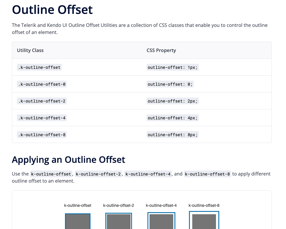
The Telerik and Kendo UI CSS Utilities are utility classes that allow you to build custom layouts without writing CSS. Each utility class changes the appearance of the target element by applying a specific CSS rule. For example, to round
the corners of an element without writing any CSS code, we can add the k-rounded-md class to that element and the utility will apply the styles. It’s an incredibly powerful tool that can really speed up your
development time!
All the various CSS utilities are documented here, organized by type in the left-hand sidebar.
Design-Oriented Component Documentation
Of course, every component in our Telerik and Kendo UI component libraries has framework-specific documentation—but that documentation primarily focuses on implementation from a development perspective. The framework-specific documentation is great for questions about component APIs, properties, data binding and the like.
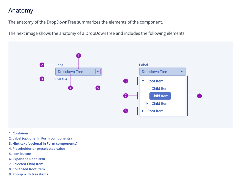
The Design System Components documentation, on the other hand, brings a unique design perspective: It focuses on component appearance, user interaction states, anatomy and visual customization options. The Design System component documentation is also universal, since all of our components look and behave similarly across framework libraries—allowing you to create cohesive and intuitive applications, even if they don’t all use the same language!
Additional Helpful Resources
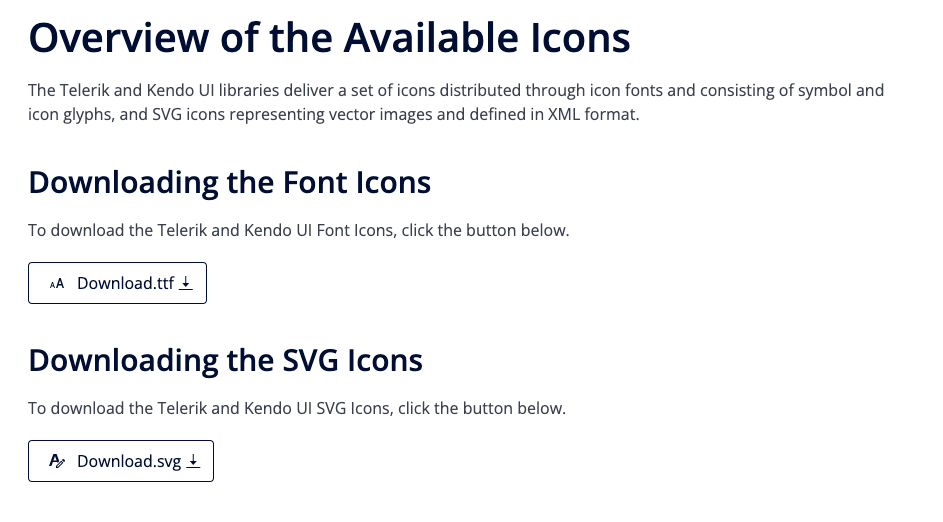
For information about content beyond components, check the Resources section. This covers things like our font and SVG icon libraries, the amazing Figma UI kits, links to our free learning courses and community forums, and more! Whether you’re looking for downloadable assets or a little extra help, the Resources page has you covered.
Don’t Go It Alone—The Progress Design System is Here to Help!
Building a design system can feel intimidating, but with the right tools it doesn’t have to be! There’s no need to reinvent the wheel when you can start with our robust, accessible components and customize them however you like. Whether you’re working on your own or collaborating with designers, the Progress Design System empowers you to create beautiful, unique visual identities for your applications.