In this article, we’ll create a demo application illustrating how we can add input fields to a form in React programmatically. We’ll have an add button, which renders a new input field when clicked, and a delete button that does the opposite.
Forms are an essential component of every web application. When working with forms in React, there are situations when we don’t have a pre-defined number of input fields and can’t hard-code or render them statically. As a result, we need to create a way to dynamically add and delete input fields on demand.
In this article, we’ll create a demo application illustrating how we can add input fields to a form in React programmatically. We’ll have an add button, which renders a new input field when clicked, and a delete button that does the opposite.
Setting Up the Project
Create a new React app using the following command:
npx create-react-app form-input-demo
Next, run the following command independently to change into the newly created form-input-demo directory and start the development server:
cd form-input-demo
npm start
On success, open the designated port in your browser to see the application.
How To Create a Simple Form in React
Creating a form in React is quite straightforward, as react uses an approach similar to the traditional way of creating forms
with plain HTML. You just need to specify a form element within which you can define one or more form elements, e.g., <input>, <label>, <select>, etc.
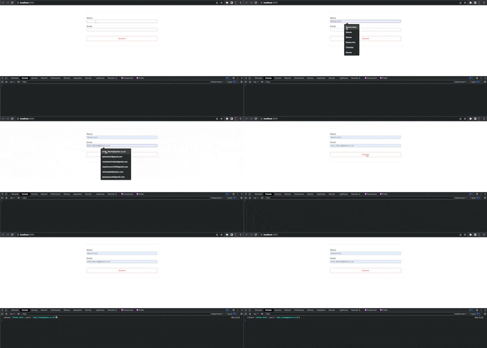
Let’s create a form with a Name and Email input fields. Replace the content of your src/App.js file with the following:
import "./App.css";
function App() {
  return (
    <div className="App">
      <form>
        <div className="input-group">
          <label htmlFor="name">Name</label>
          <input type="text" id="name" />
        </div>
        <div className="input-group">
          <label htmlFor="email">Email</label>
          <input type="email" id="email" />
        </div>
        <button type="submit" className="submit-btn">
          Submit
        </button>
      </form>
    </div>
  );
}
export default App;
Let’s give our application a decent look by replacing the styles in the src/App.js file with the following:
form {
  margin: 3rem auto;
  width: 500px;
  max-width: 80%;
  padding: 1rem;
  border: 1px solid rgba(0, 0, 0, 0.1);
}
form > div {
  display: flex;
}
.input-group {
  display: flex;
  flex-direction: column;
  margin: 1rem 0;
}
.input-group > label {
  font-size: 0.9rem;
  font-weight: 700;
  margin-bottom: 0.3rem;
}
.input {
  width: 100%;
  display: flex;
}
.input > input {
  padding: 0.3rem 0.5rem;
  border: 1px solid rgba(0, 0, 0, 0.2);
  width: 100%;
}
.input > input:focus {
  outline: none;
}
.input > div {
  padding: 0.5rem 1rem;
  background: #e34728;
  margin-left: 0.5rem;
  color: #fff;
  font-weight: 700;
  cursor: pointer;
}
.add-btn {
  padding: 0.5rem 1rem;
  background: #ccc;
  border: none;
  font-size: 0.9rem;
  color: #fff;
  font-weight: 700;
  cursor: pointer;
}
.center {
  display: flex;
  justify-content: center;
}
.submit-btn {
  width: 100%;
  padding: 0.5rem 1rem;
  border: 1px solid #e34728;
  background: #fff;
  margin: 1.2rem 0;
  color: #e34728;
  font-size: 0.9rem;
  font-weight: 700;
  cursor: pointer;
}
.dialog-box {
  margin: 0.5rem 0;
  display: grid;
  grid-template-columns: repeat(auto-fit, minmax(4rem, 1fr));
  grid-gap: 1rem;
}
.dialog-box > input,
.dialog-box > select {
  padding: 0.5rem 0.5rem;
  border: 1px solid rgba(0, 0, 0, 0.2);
}
.dialog-box > input:focus,
.dialog-box > select:focus {
  outline: none;
}
.hide {
  display: none;
}
Save the changes and preview the application in your browser to see the form.

Controlling the Input Fields
Form elements in HTML keep track of their own state and change it based on the user input. In React, though, it’s best to turn these elements into controlled components, i.e., a form element whose value is controlled by React. We make React the single source of truth, and it controls and updates the form state accordingly.
To allow React to manage the state of our form, update the code in the App.js file with the following:
import { useState } from "react";
import "./App.css";
function App() {
  const [formValues, setFormValues] = useState({});
  const handleChange = (e) => {
    setFormValues({ ...formValues, [e.target.id]: e.target.value });
  };
  const handleSubmit = (e) => {
    e.preventDefault();
    console.log(formValues);
  };
  return (
    <div className="App">
      <form onSubmit={handleSubmit}>
        <div className="input-group">
          <label htmlFor="name">Name</label>
          <input
            type="text"
            id="name"
            value={formValues.name || ""}
            onChange={handleChange}
          />
        </div>
        <div className="input-group">
          <label htmlFor="email">Email</label>
          <input
            type="email"
            id="email"
            value={formValues.email || ""}
            onChange={handleChange}
          />
        </div>
        <button type="submit" className="submit-btn">
          Submit
        </button>
      </form>
    </div>
  );
}
export default App;
In the code above, we defined a formValues state, an object that holds the value of the input fields. Next, we created a function called handleChange, passed it to each input field, and now it updates the state value.
We added a value prop to the input element to get the value of the input field from the formValues state. We also added a handleSubmit function that prevents the event’s default action and logs
the form values to the console when the form is submitted.

Making the Form Dynamic
We’ve now seen how to create a simple form in React. However, this approach is suitable and works fine only when we know the number of input fields our app requires. In other cases, where we don’t know ahead of time, we need to take a different and more dynamic approach to create our form.
To make the form dynamic, instead of having a single object that holds the form values, we want to represent the form state in an array of objects. Each object will hold details of the input field to be rendered, e.g., label, type,
value, etc. We can then loop through the array and render an input field for each object.
This approach makes it easier to add input or delete input fields programmatically in the application. Let’s create an Input component. Create an Input.js file in the src/ folder and add the following to it:
import React from "react";
export default function Input({ objValue, onChange, index }) {
  const { label, type, value } = objValue;
  return (
    <div className="input-group">
      <label htmlFor={label}>{label}</label>
      <div className="input">
        <input
          type={type || "text"}
          id={label}
          value={value || ""}
          onChange={(e) => onChange(e, index)}
        />
      </div>
    </div>
  );
}
We created a component that renders a label and an input field. The component expects a couple of props—an object containing details about the input field to be rendered, the index of the object, and a function to control
the value of the input field.
To use this component in the application, replace the code in your src/App.js file with the following:
import { useState } from "react";
import Input from "./Input";
import "./App.css";
function App() {
  const [formValues, setFormValues] = useState([
    {
      label: "Name",
      type: "text",
      value: "",
    },
  ]);
  const handleChange = (e, index) => {
    const values = [...formValues];
    values[index].value = e.target.value;
    setFormValues(values);
  };
  return (
    <div className="App">
      <form>
        {formValues.map((obj, index) => (
          <Input
            key={index}
            objValue={obj}
            onChange={handleChange}
            index={index}
          />
        ))}
        <button type="submit" className="submit-btn">
          Submit
        </button>
      </form>
    </div>
  );
}
export default App;
We also passed a handleChange function as a prop to the Input component, which helps manage and control the form’s input field values.
We also initialized the formValues state with an array containing a single object. Go ahead and open the application in your browser to see our input field.

Adding Input Fields
Since we’ve reformatted our code to use a more dynamic approach to rendering input fields, adding or deleting input fields becomes very easy because we only need to find a way to manipulate the formValues array.
Open the src/App.js file and update it as shown below to create a button that allows users to add input fields to the form dynamically.
//import useRef
import { useState, useRef } from "react";
import Input from "./Input";
import "./App.css";

function App() {
  const [formValues, setFormValues] = useState([]);
  const [toggle, setToggle] = useState(false);

  const inputRef = useRef();
  const selectRef = useRef();

  const handleChange = (e, index) => {
    const values = [...formValues];
    values[index].value = e.target.value;
    setFormValues(values);
  };

  const handleAddField = (e) => {
    e.preventDefault();
    const values = [...formValues];
    values.push({
      label: inputRef.current.value || "label",
      type: selectRef.current.value || "text",
      value: "",
    });
    setFormValues(values);
    setToggle(false);
  };

  const addBtnClick = (e) => {
    e.preventDefault();
    setToggle(true);
  };

  return (
    <div className="App">
      <form>
        //... ))}
        {!toggle ? (
          <div className="center">
            <button className="add-btn" onClick={addBtnClick}>
              Add new
            </button>
          </div>
        ) : (
          <div className="dialog-box">
            <input type="text" placeholder="label" ref={inputRef} />
            <select ref={selectRef}>
              <option value="text">Text</option>
              <option value="number">Number</option>
              <option value="email">Email</option>
              <option value="password">Password</option>
            </select>
            <button className="add-btn" onClick={handleAddField}>
              Add
            </button>
          </div>
        )}
        <button type="submit" className="submit-btn">
          Submit
        </button>
      </form>
    </div>
  );
}
export default App;
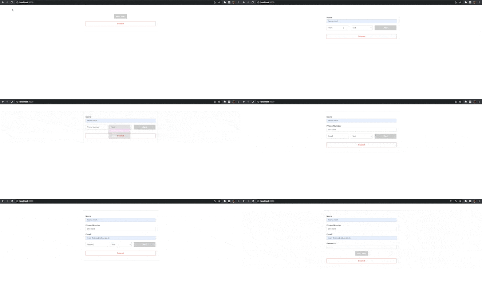
In the updated code, we created a new button that triggers a handleAddField function. The function clones the overall form state array, pushes a new input field object into the array, and sets the state to the new array.
We also created a dialog box that becomes visible only when the Add new button gets clicked, using a toggle state we created. The dialog box expects values for the label and the type of the input field
to be created. We set up two refs also to extract the values provided to the dialog box.
Save the changes and test the application in your browser.

Please keep in mind that the input types are not limited to the four types we specified. You can add more and tweak the styles to your liking.
Deleting Input Fields
To delete form fields programmatically, update the Input.js file as shown below:
import React from "react";
export default function Input({ objValue, onChange, index, deleteField }) {
  const { label, type, value } = objValue;
  return (
    <div className="input-group">
      <label htmlFor={label}>{label}</label>
      <div className="input">
        <input
          type={type || "text"}
          id={label}
          value={value || ""}
          onChange={(e) => onChange(e, index)}
        />
        {/* Add this */}
        <div onClick={(e) => deleteField(e, index)}>X</div>
      </div>
    </div>
  );
}
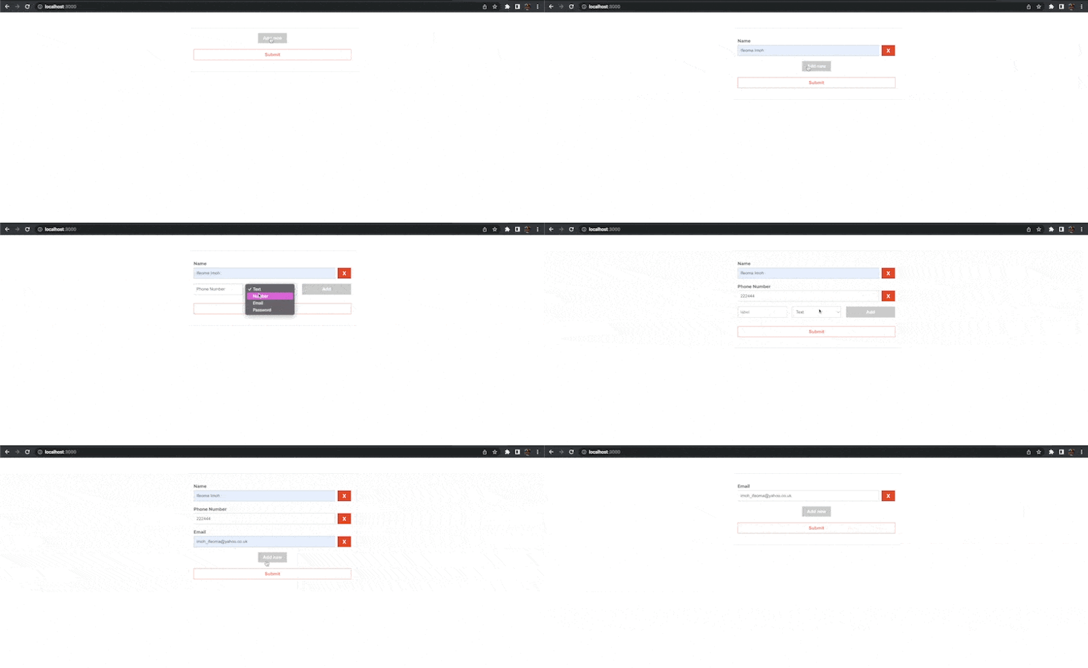
The Input component now expects an additional delete function called deleteField as props. It also renders a div element beside each input field that triggers the delete function.
Next, open the src/App.js file and update it as shown below:
import { useState, useRef } from "react";
import Input from "./Input";
import "./App.css";

function App() {
  const [formValues, setFormValues] = useState([]);
  const [toggle, setToggle] = useState(false);

  const inputRef = useRef();
  const selectRef = useRef();

  const handleChange = (e, index) => {
    //...
  };

  const handleAddField = (e) => {
    //...
  };

  const handleDeleteField = (e, index) => {
    const values = [...formValues];
    values.splice(index, 1);
    setFormValues(values);
  };

  const addBtnClick = (e) => {
    //...
  };

  return (
    <div className="App">
      <form>
        {formValues.map((obj, index) => (
          <Input
            key={index}
            objValue={obj}
            onChange={handleChange}
            index={index}
            // Add this
            deleteField={handleDeleteField}
          />
        ))}
        //..
        <button type="submit" className="submit-btn">
          Submit
        </button>
      </form>
    </div>
  );
}
export default App;
In the code above, we created a handleDeleteField function that uses an object’s index to remove it from a new clone of the form’s state array.
Save the changes, then create some input fields and try deleting them.

Handling Form Submission
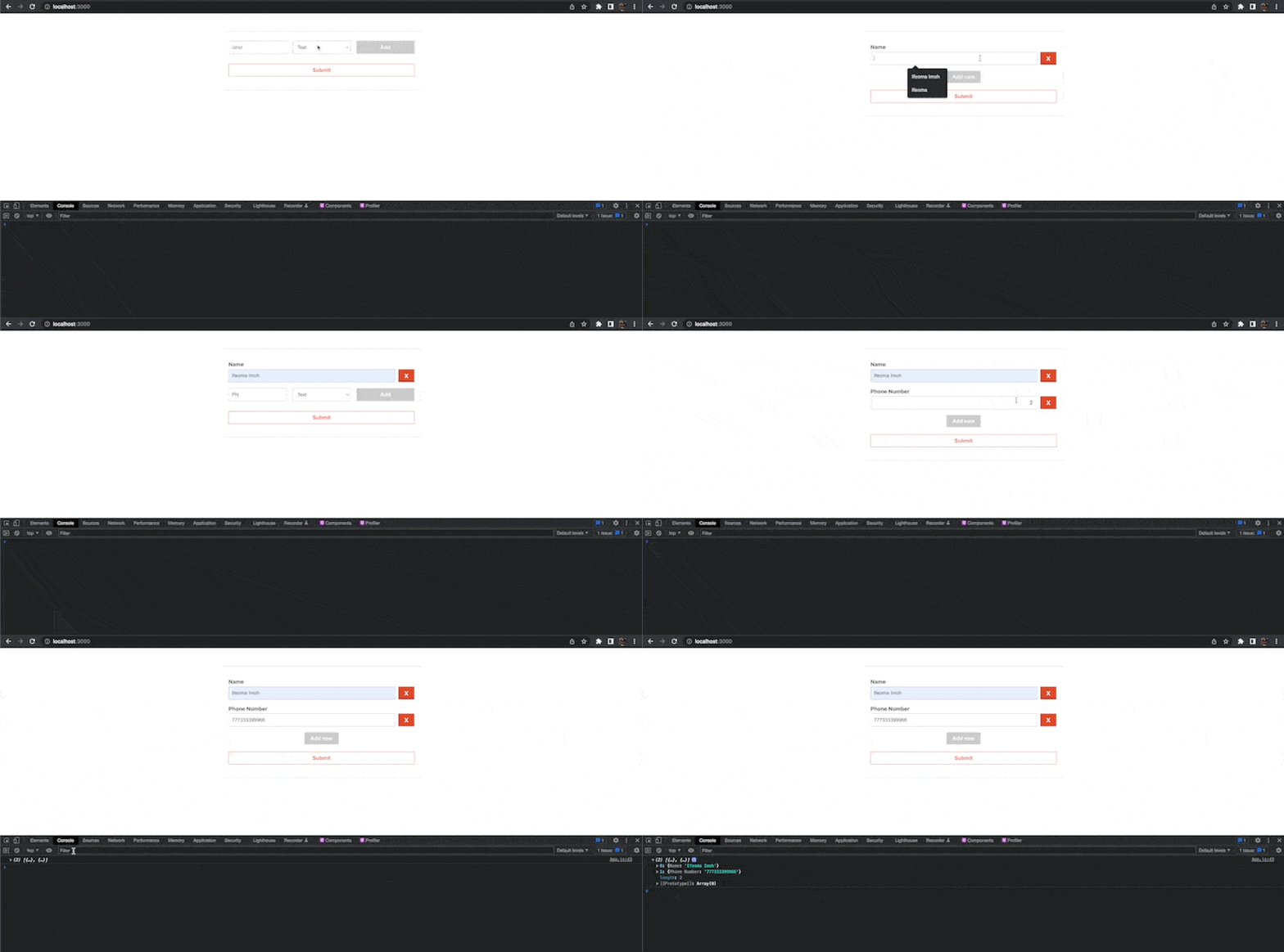
To handle form submission, we need to create a handler function and set it as a value to the onSubmit attribute on the form element. Inside the function, you can then extract your form input values and send them to a backend or do other things.
Add the following function just before the return statement in the src/App.js file:
const handleSubmit = (e) => {
  e.preventDefault();
  console.log(
    formValues.map((val) => {
      return { [val.label]: val.value };
    })
  );
};
Since we’ve not prepared any backend, we only logged the form input values to the console.
Also, add an onSubmit attribute to the form element.
<form onSubmit={handleSubmit}>

Please note that we can also work with input field groups by simply changing how the individual objects in the form state array are structured.
Conclusion
In this article, we’ve looked at how to create a simple form in React. We also looked at how we can create a more dynamic form that gives the form users some flexibility to add or delete form fields programmatically as the need may be. Now you can customize this technique for use in your projects.