The five comboboxes/dropdown lists that come with the Kendo UI for Angular toolkit let you get exactly the UI you want. But all of the components share their functionality so you don’t have to learn five different controls to leverage them all.
When someone says “dropdownlist,” you probably have a vision in mind of what that UI widget looks like. But a dropdown can look like any of these:
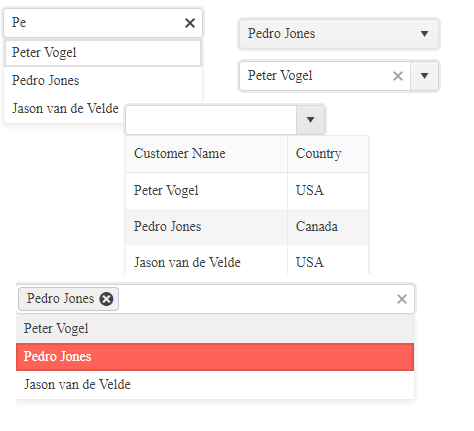
Rather than provide a single enormous component that requires extensive configuration to do anything, Kendo Angular for UI gives you five dropdowns which you can have up and running just by setting just a single property. Really, all you need to do is pick the dropdown that meets your needs. You even get one-stop shopping when importing these components: They’re all in the DropDownsModule from @progress/kendo-angular-dropdowns.
Your choices include three “combobox” dropdowns:
- AutoComplete: Looks like a textbox but provides the user with suggestions as they type into the box
- ComboBox: A traditional combo box.
- MultiColumnComboBox: Also looks like a traditional combobox, but the list of items has multiple columns to make it easier for users to identify the item they want
With the AutoComplete dropdown, the user can either pick from the list or enter their own text. With the other two comboboxes, you have a choice: You can restrict the user to your list of items or let the user enter their own text.
And then there’s the two dropdown lists:
- DropDownList: Looks like a traditional dropdown list. The user can select one item from the list
- MultiSelect: Also looks like a traditional dropdown, list but allows the user to select multiple items from the list
Loading the Lists
When it comes to basic functionality (building the list, databindings, etc.), all the dropdowns work the same way. The simplest dropdown is the AutoComplete, so it’s a good choice for a case study describing the common functionality.
The AutoComplete appears on your webpage as a simple textbox but, as the user starts to type into it, the textbox provides suggestions for how to complete the user’s entry. Here are the AutoComplete’s various states:
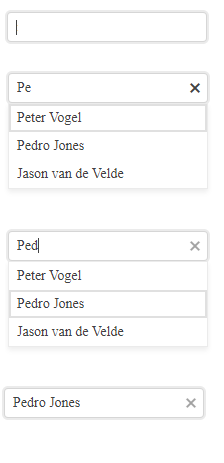
For any of the dropdowns, you have two ways to load the list of items, depending on whether you want to use an array of simple types (e.g., strings) or an array of objects.
Creating the List: Simple Types
If you’re using an array of simple types, then your first step is to define a property on your Angular component to hold that array and load it with the values to appear in the dropdown’s list. This example creates a string array called currentCustomers and loads it with three names:
public currentCustomers: string[];
…
this.currentCustomers = ["Peter Vogel", "Pedro Jones", "Jason van de Velde"];
To have the dropdown use your list, you just need to add the dropdown to your component and set its data property to point to the array you created. Here’s the markup to give you an AutoComplete dropdown using that array of customer names:
<kendo-autocomplete
              [data]="currentCustomers"
</kendo-autocomplete>
Creating the List: Complex Objects
If, instead, you want to build your list from an array of objects, your first step is to define your object’s class. This code declares a Customer class with three fields (id, custName and country):
export class Customer {
  constructor(
    public id: number,
    public custName: string,
    public country: string
  ) { }
Your next step is to load that array with the objects you want the user to select from. This example defines an array of Customer objects as a property on the component and then loads that array with three Customer objects:
public currentCustomers: Customer[];
…
this.currentCustomers = [new Customer(1, "Peter Vogel", "Canada"),
                           new Customer(2, "Pedro Jones", "USA"),
                             new Customer(3, "Jason van de Velde", "Canada")]
Finally, as before, you use that array with your dropdown by setting the dropdown’s data property to point to the array. When working with objects, though, there’s one more step: You must specify which field on the object holds
the values to be displayed in the list by setting the dropdown’s valueField property to the name of the field.
This example specifies that values in the Customer object’s custName property are to be displayed in the dropdown’s list:
   <kendo-autocomplete
              [data]="currentCustomers"
              valueField="custName">
</kendo-autocomplete>
Grouping
If you’re using objects to build your list, then you can take advantage of the dropdown’s Grouping option. Grouping organizes the items in the list according to some other field on the list object—grouping all the customer names in the list by country, for example. When you have a long list, grouping the objects on the list can make it easier for users to find the item they want.
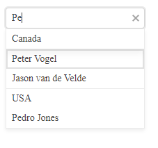
To support grouping, you first need to import the GroupResult type and groupBy function from the kendo-data-query module:
import { GroupResult, groupBy } from "@progress/kendo-data-query";
You’ll also need to make sure that the array you’re getting your data form is declared as an array of type any. For this case study, that means rewriting the definition of the currentCustomers array from
an array of
Customer to an array of any:
public currentCustomers: any[];
Your next step is to declare an array of GroupResult objects from your original data source (the array of Customer)—this array will, eventually, be used by your dropdown’s data property. This
code creates that array as a property on the component:
public groupedCustomers: GroupResult[] = [];
Next, load that array of GroupResult using the groupBy function, passing the function your original array and the name of the field on the object you want used to group the items (make sure you do this after you’ve loaded your original array).
This example loads the groupedCustomers array using the original currentCustomers array and then groups those Customer objects by their country field:
this.currentCustomers = […];

public groupedCustomers: GroupResult[] = groupBy(this.currentCustomers, [
    { field: "country" }
]);
The last step is to set your dropdown’s data property to that GroupResult array:
<kendo-autocomplete
              [data]="groupedCustomers"
              valueField="custName">
</kendo-autocomplete>
Styling the Dropdown
To style your dropdown, you add a kendo-<name of the dropdown> style to the component’s styles collection. This example ensures that any AutoComplete in the component is 200 pixels wide:
styles: [
    `
    kendo-autocomplete {
        width: 200px;
      },
      ….
Databinding
All the dropdowns handle databinding the same way.
Forms Binding With NgModel
To take advantage of forms binding, you’ll want to define a property on your component to hold the item the user selects in the dropdown. The type you use here needs to match the type you’re using in the array passed to your dropdown’s
data property.
You must give your dropdown a name property and set its ngModel property to use the component-level property you just defined.
This example:
- Creates an array of string called
currentCustomersto be used by the dropdown’s data property - Defines a
stringproperty to use withngModel(the “ngModel property”) - Gives the dropdown the name
custList - Points the dropdown’s
ngModelto its property:
public currentCustomers: string[] = […];
public currentCustomer: string;
…
<kendo-autocomplete
              [data]="currentCustomers"
              valueField="custName"
              name="custList"
              [(ngModel)]="currentCustomer">
You’ll also need to add the textField property to your dropdown to specify which field on the object is to be displayed in your list. The ngModel property should be defined with the object’s type.
Here’s an example using the ComboBox dropdown that will put the whole Customer object into the currentCustomer property:
<kendo-combobox
              [data]="currentCustomers"
              valueField="id"
              textField="custName"
              name="custList"
              [(ngModel)]="currentCustomer">
</kendo-combobox>
There is one exception to the ngModel property being loaded with the whole object selected by the user: The AutoComplete, which only passes the text the user enters to the ngModel property rather than the associated
object.
In addition to using ngModel to determine which item the user selected, you can also use it to set the currently selected item by setting the value of the ngModel property. If your list is built with objects, then
the object in the list will be selected by matching the field specified in the dropdown’s valueField property.
For example, in the previous markup, the valueField property is set to the object’s id field. As a result, the following code that sets the currentCustomer (the ngModel property from
the previous example) will cause the object with an id of 2 to be the currently selected item in the list, regardless of the values in other fields in the currentCustomer object:
public currentCustomer:Customer = {id: 2, ….}
Since the other fields on the ngModel object don’t matter, you might want to set the selected item without supplying a whole object. You can do that use the dropdown’s valuePrimitive property.
Reactive Forms Binding
If you’re using FormGroups to bind your data, you’ll need to create the FormGroup and put it in a property on your component. Within that FormGroup, you’ll need to assign a FormControl to a name that you’ll use with your dropdown (you can also specify the currently selected item from your list as part of creating the FormControl).
This code sets up a FormGroup as a property called custForm on the component. Within that FormGroup, it defines a FormControl called custList (it also sets the currently selected
item by passing a Customer object with 1 as its id property):
public custForm: FormGroup = new FormGroup({
    custList: new FormControl(new Customer(1, "Peter Vogel", "USA"))
  });
This markup creates a ComboBox that’s tied to the FormControl defined in the FormGroup by using the dropdown’s formControlName property:
<kendo-combobox
          [data]="currentCustomers"
          valueField="id"
          textField="custName"
          formControlName="custList">
</kendo-combobox>
The user’s selection will now be available through the FormGroup’s controls property, using the FormControl name. The selected item is accessible through the FormControl’s value property.
This markup, for example, displays the value of the custName property for the selected item in the custList FormControl in the custForm FormGroup:
Current Customer Name: {this.custForm.controls.custList.value.custName}
Exploiting Custom Features
While much of the functionality in each dropdown is common, the reason that there are five dropdowns is because each has its own unique features. Here’s how to use some of the key features.
Letting the User Enter Their Own Values in Combobox and MultiSelectComboBox
By default, the ComboBox and MultiSelectComboBox won’t let the user enter values not in the list. You can override that by setting the dropdown’s allowCustom property to true, like this:
<kendo-combobox
              [data]="currentCustomers"
              [allowCustom]="true"
              valueField="custName"
              textField="custName"
              name="custList"
             [(ngModel)]="currentCustomer">
</kendo-combobox>

One warning: If you’re using binding with a combobox and the user enters a value not on the list, you’ll only capture the user’s entry, not a complete object. If you’re using ngModel, the type of the ngModel property is ignored in those scenarios and the ngModel property will be updated regardless of whether you get the whole object or the user’s text. If you’re using a FormControl, you can find the user’s
entry in the value property (e.g., this.custForm.controls.custList.value).
Prompting the User
If you’re using the combobox dropdowns, you might want to give the user a clue about what to enter into the textbox in order to search for the item they want. You can use the placeholder property to display some text in the texbox portion of the comboboxes (the text will disappear as soon as the user starts typing).
This markup causes the dropdown to display “customer name,” for example:
<kendo-autocomplete
              [data]="currentCustomers"
              placeholder="customer name">
</kendo-autocomplete>

Preloading the List
You can also preload a default/initial value into your dropdown. The simplest way to load that initial/default value is to hardcode the dropdown’s value property with the value you want:
<kendo-autocomplete
              [data]="currentCustomers"
              value="Peter Vogel">
</kendo-autocomplete>
If you want to dynamically set the default/initial value, first define a property on your component to hold the dynamic value. This example sets up a string property called defaultName and sets it to “Jason van de Velde”:
public defaultName:string = "Jason van de Velde";
Your next step is to set the dropdown’s value property to the name of the variable and to box the value property’s name to flag that you’re passing a property name rather than an actual value.
This code ties the dropdown to whatever is in the defaultName variable:
<kendo-autocomplete
              [data]="currentCustomers"
              [value]="defaultName"
placeholder="customer name">
</kendo-autocomplete>
By the way, if you set both the placeholder and the value property, the placeholder value is only used if the value property is empty (e.g., contains a zero-length string).
Creating a Multi-Column List
If you’re filling the list with objects and the user needs more than a single property to identify an item, you can use a MultiColumnComboBox. The MultiColumnComboBox lets you provide some content between
the component’s open and close tags to specify what fields from the list object are to be displayed in the list (in fact, you have to specify at least one column or the list won’t display anything).
For each column, you specify the field from the object, a title for its column, and (optionally) a width for the column. If you set the width attribute on one column, you’ll need to give all the columns a width attribute.
As with the ComboBox, the user can select an item by typing in values that match the values in the property specified in the textField so, from a UX point of view, you should probably have your first column display that property
from your object.
This example defines two columns with the titles Country and Customer Name and displays the country and custName fields from the array of Customer objects:
<kendo-multicolumncombobox
              [data]="currentCustomers"
              [value]="currentCustomer"
              textField="custName"
              valueField="id"
              name="custList"
              [(ngModel)]="currentCustomer">
          <kendo-combobox-column
              field="custName"
              title="Customer Name"
              [width] = "150">
          </kendo-combobox-column>
         <kendo-combobox-column
              field="country"
              title="Country"
              [width]="75">
          </kendo-combobox-column>
</kendo-multicolumncombobox>
The result would look like this:
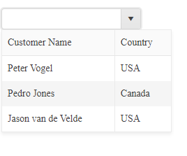
You can also set a preloaded value with the MultiColumnComboBox.
List Boxes
While the comboboxes (AutoComplete, ComboBox and MultiColumnComboBox) look roughly like textboxes, the DropDownList and MultiSelect show as gray boxes because the user isn’t allowed to enter values—the user can only select from the dropdown’s list of items.
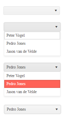
Setting a Default Item in a ListBox
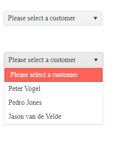
With the listbox dropdowns, you can specify a defaultItem to add a “pre-selected” item to the list. If you’re using objects to fill your list, then the default item doesn’t have to be a complete object—it
just needs to have fields whose names match the names use in the dropdown’s valueField and textField properties.
This example uses a default item called currentCustomer which has fields called id and custName to match the entries in the dropdown’s valueField and textField properties:
<kendo-dropdownlist
              [data]="currentCustomers"
              [defaultItem]="currentCustomer"
              valueField="id"
              textField="custName"
              name="custList"
              [(ngModel)]="currentCustomer">
</kendo-dropdownlist>
The code to define that default currentCustomer might look like this:
public currentCustomer: {id: number, custName: string} = {id: -1, custName: "Please select a customer"}
The resulting dropdown would look something like this in its collapsed and expanded states:
Supporting Multiple Selections
If you want to let the user select multiple items, then you’ll use the MultiSelect dropdown. Each item the user selects is added to the dropdown’s display in a separate lozenge that the user can delete to “unselect” the item.
<kendo-multiselect
          [data]="currentCustomers"
          valueField="id"
          textField="custName"
          name="custList"
          [(ngModel)]="currentCustomer">
      </kendo-multiselect>
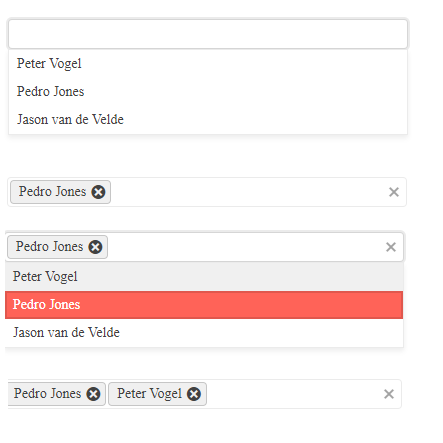
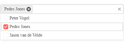
To help the user recognize that they can select multiple choices, you can set the checkboxes property to true to display checkboxes beside each item, as this example does:
<kendo-multiselect
          [data]="currentCustomers"
          [checkboxes]="true"
          valueField="id"
          textField="custName"
          name="custList"
          [(ngModel)]="currentCustomer">
      </kendo-multiselect>
One note: If you’re databinding the dropdown (as in these examples), you’ll want to declare the bound property as an array so that it can hold multiple values.
More Features
Other features you might want to explore include filtering which lets you control which items in the data property’s array will be displayed. Filtering also lets you specify the minimum number of characters a user must enter before you start displaying items (the ComboBox and MultiColumnComboBox also support server-side filtering). You can also disable specific items in the list to display them to users but not let the user select them.
If you’re loading a big list, you’ll want to check out virtualization which can speed up the display of the initial list of items. You can also customize when the dropdowns open and close by managing the related open and close events (you can prevent the list from closing automatically when the user tabs away from it, for example).
If you want more control over how your dropdown looks, you might want to explore templates (you can, for example, use a template to add a graphic to each item in your list). The available templates vary from one dropdown to another (the AutoComplete has its own templates, for example).
You might also want more control over when the item list is displayed. For the comboboxes (AutoComplete, ComboBox and MultiColumnComboBox), their suggestions property gives you control over that. With the dropdown lists (DropDownList and MultiSelect), you’ll want to look at their toggle property.
And, of course, these dropdowns are accessible and support globalization.
As you can see, it’s hard to imagine some UI need that isn’t met by the right dropdown—you just have to pick the one you want.