A new and improved version of the Progress ThemeBuilder is here! The evolved tool will make styling your UI components a breeze, so read on if you are already styling or plan to style your Telerik and Kendo UI components.
The new version of the Progress® ThemeBuilder™, released with R3 2022, is officially available for KendoReact, Kendo UI for Angular, Kendo UI for Vue and Telerik UI for Blazor. The support for Kendo UI for jQuery, Telerik UI for ASP.NET MVC, Telerik UI for ASP.NET Core, Telerik UI for PHP and Telerik UI for JSP is launching early next year. Telerik UI for ASP.NET AJAX will continue using the previous version of the ThemeBuilder for the time being because of the significant differences in the rendering of the components.
What Is the Progress ThemeBuilder?
If this is the first time you’re hearing about it, the ThemeBuilder is a web application that allows developers to customize the look and feel of the Telerik and Kendo UI web components without the need to deep dive into Sass or CSS. The ThemeBuilder supports all our web-based UI component libraries including jQuery, Angular, React, Vue, ASP.NET MVC, ASP.NET Core, ASP.NET AJAX, PHP, JSP and Blazor.
A little-known fact is that all these implementations of the ThemeBuilder are built from the ground up for each platform they support. This means the KendoReact ThemeBuilder was built with React and KendoReact, the Kendo UI for Angular ThemeBuilder was built with Angular and the Kendo UI for Angular components (and so on). As you can imagine, this was neither efficient nor scalable for us as the vendor building this tool.
We also hadn’t added many new features to the ThemeBuilder recently, and we wanted to address that. So, as we started working on improvements of the various ThemeBuilders, the team took the opportunity to re-think how we deliver the ThemeBuilder and where a “universal” ThemeBuilder could live.
This is where the new ThemeBuilder comes into play. The new application focuses on removing a level of complexity by making it as easy as possible to customize the styles of the Telerik and Kendo UI components to fit existing style guides. This sounds familiar to what the previous ThemeBuilder tried to do. However, the previous ThemeBuilder targeted high-level styles only, so we decided to extend its functionality to allow full styles customization of every element of our UI components.
As always, your input was a crucial ingredient in the changes we made. We collected all the feedback we’ve received about more customization options for the ThemeBuilder and implemented many new features and improvements in the new tool.
Why a New ThemeBuilder Tool?
Some may wonder why we are adding these features to a new ThemeBuilder tool instead of updating the original application. The main reason is that we want you to have a new, modern and faster experience when it comes to styling that is focused on addressing your needs now and in the future.
We also wanted to create a universal styling tool to replace the multiple ThemeBuilder applications we are currently supporting. A single but universal application will enable us to easily add features and improvements for all our web UI component suites so much faster, because we don’t have to implement the same feature multiple times. Our goal is to have the new ThemeBuilder application be the best place to style your Telerik and Kendo UI components to match your style guide or design system.
This will give you a single tool for all your needs when it comes to our themes, and if you happen to use our UI libraries across multiple platforms, the productivity gain will be exponential.
An additional benefit that this new tool provides is a 100% increase in performance across the board. This means each interaction in the new ThemeBuilder is twice as fast, which will save you time when using the tool.
You can rest assured that the new ThemeBuilder application will have 100% of the features that were available in the previous version of ThemeBuilder, plus many more!
Getting Started With the New ThemeBuilder
Let’s go over a typical user workflow so you can see that we’ve kept the same set of features and layout you know and love from the original ThemeBuilder. In short, you will be able to keep styling your components like you always have without the hassle of learning a new tool.
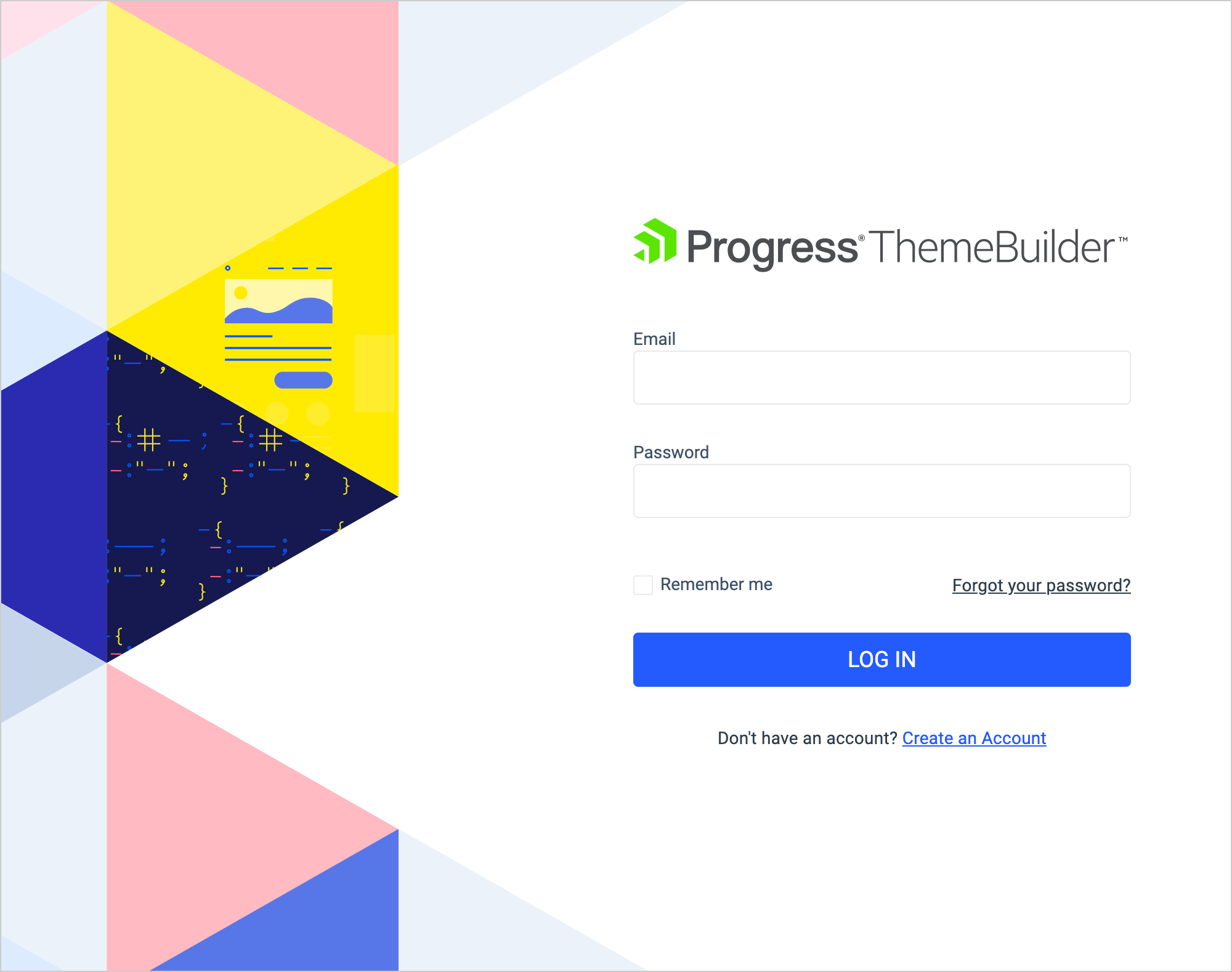
Step One: Log in to ThemeBuilder using your existing Telerik account. If you do not have one, you can create one for free.
We are introducing a login so you can save all your projects inside your account and allow them to sync. This way, you can save your progress and come back later, or keep multiple projects going at the same time. This is an improvement compared to the previous version, which did not support user accounts and saving files.
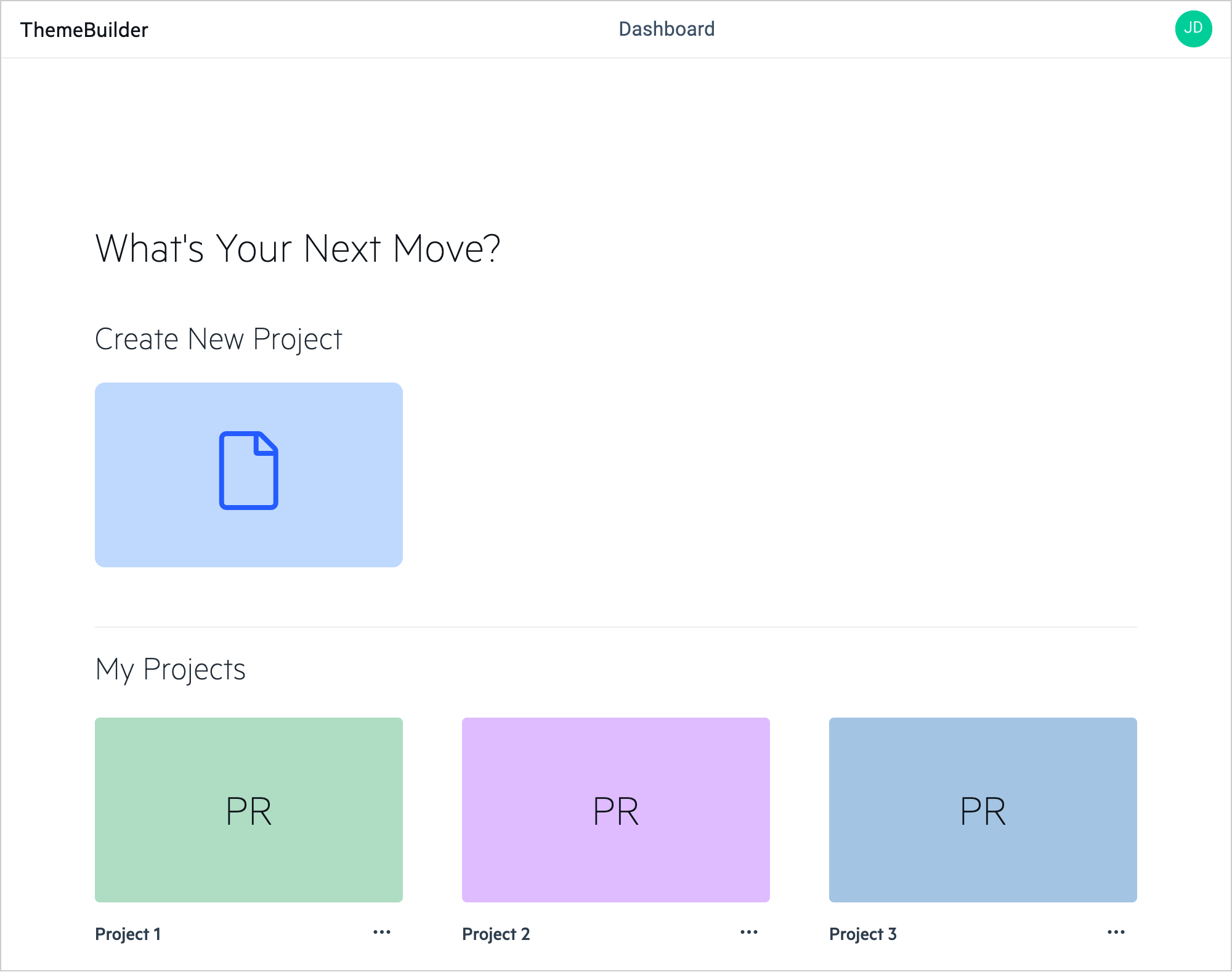
Step Two: Create a new project. That will allow you to keep all changes inside your profile and customize it later if needed. You can also have multiple styling projects for the different applications you are working on, all in one place.
Step Three: Choose a theme as a base. You can use one of our beautiful Telerik and Kendo Themes and apply your styling changes over it.
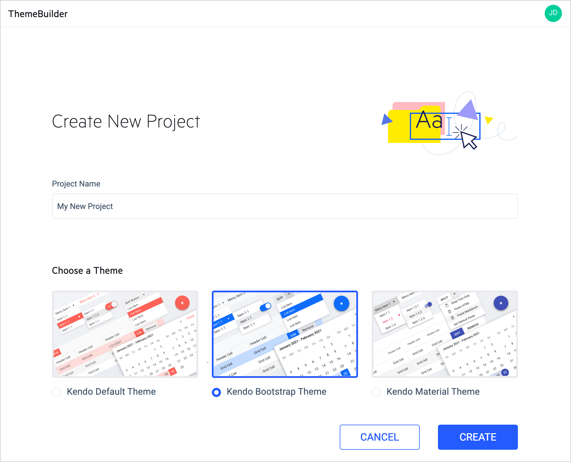
Hit the “Create” button and you’ll have a new project and be ready to customize the components.
You will find a handful of tools and features to help you customize the components.
Variables Pane
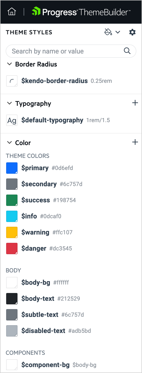
You will find the list of all Telerik and Kendo Themes’ high-level variables you can use to style our components globally on the left side. For example, changing the primary color will update it in all components using this variable. You can also add custom variables and reuse them in multiple components. For those who have used the ThemeBuilder previously, you will notice that the naming convention is slightly different here. This is because we are now aligning the variable names in the ThemeBuilder to those found in our Sass-based themes, ensuring that the same language is used throughout your customization journey.
Swatches
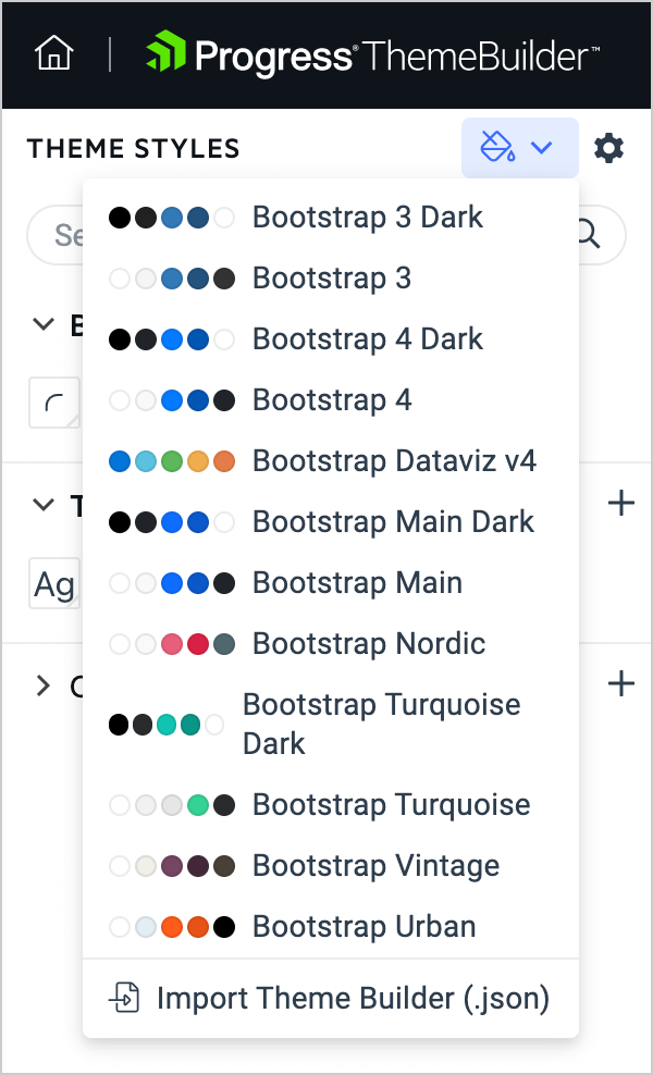
We are offering you a set of predefined color palettes for each theme, which we call “swatches.” These swatches are color combinations that have been hand-picked by our designers and UX experts to ensure that the colors fit well together. When selecting any of these swatches, all components listed on the page will immediately update with the selected colors—all with a single click. For example, you can have a dark version of the themes simply by using one of the built-in swatches.
Export Your Custom Theme
After you are ready with the changes, you can click the export button and download your custom theme. We will generate an npm package that you can add to version control, or you can use the styles directly. The package will have an already minified CSS and Sass files for anyone who wants to apply changes directly to the raw style files.
Introducing the ThemeBuilder Pro for Advanced Customizations
Creating a brand-new ThemeBuilder with improved performance, support for syncing multiple projects and more is not the only thing that we have been busy with over the last few months. We are also introducing the new ThemeBuilder Pro, which builds on the features highlighted above and introduces many more options for detailed customization. These features will allow you to bring your styling customizations to the next level.
Using Atomic Customization
ThemeBuilder Pro allows you to make multiple styling changes per component and its states. You want your Button to have one color and the focused Button to have another? Now you can do that. You can also customize more than 50 different styles and properties per component.
This functionality will allow you to make detailed styling changes to every UI component to cover your styling requirements. We use atomic customization, and you will be able to customize each part of the components.
Creating Custom Variables
We all know the benefits of using variables across the code, which saves you time when you need to update them. With ThemeBuilder Pro, you can create custom variables that you can later use inside the components editors and even in other parts of the application.
These custom variables can come in handy when you want to add additional variables on top of the existing variables within our themes. For example, if you want to use the same color for the text from your company style guide (design system), you can create a custom variable with that color and use it in multiple components. If you need to change the color later, you need to update only the variable, not all components that should have that text color.
Sharing Projects and Collaboration Features
You are now able to share the project with all your team members and allow multiple people to work on the project at the same time. That can further boost your productivity as you can be styling one component while your colleague is styling another.
There is More to Come
We are planning even more updates in the future to make styling components a breeze.
One of our planned enhancements is to enable automatic migration of the styles to the latest version of themes and components with a single click. Each time a new version of the theme is available, updating it will be as easy as clicking a button!
Learn more about the new ThemeBuilder and start a 7-day free trial to see it in action!
We are looking forward to hearing your feedback! What other features would you love to see in the future?