In this guide, we’ll explain the importance of website header tags and what you need to know to design and format them for optimal results—for usability, SEO and accessibility.
This might seem inconsequential in the grand scheme of things, but the improper use of headings (or not using them at all) can negatively impact a website’s outcomes. On the other hand, <h2>, <h3> and <h4> header tags can improve usability, accessibility and SEO when implemented and designed correctly.
When it comes to good heading design, there’s more to it than just preserving the structure your copywriter has laid down on the page. In this post, I’ll provide some strategies on how to design titles and headings that not only look good on your webpages, but also serve a greater purpose for the website.
Why Do Website Headings Matter?
Website headings and the header tags we use to bake them into the code do a lot for a website.
Usability
Lengthy webpages with long blocks of text (which, these days is anything more than five lines) can be difficult to read online, regardless of the screen size. The issue becomes even more exacerbated when the text is all the same size and uses uniform formatting.
By organizing content into sections and giving each a relevant heading, a webpage instantly becomes easier to read. It’s not that headings change the content of the page all that much, but visually it becomes less intimidating. It’s the same reason why we use white space and imagery throughout the page. Sometimes people just need a break from a wall of text, no matter how much they want to read what it says.
SEO
Website headings should work the way a table of contents does for a book. When examined from a distance, the user can quickly tell what the storyline is going to be. Even though there isn’t usually a ToC at the top of a webpage or blog post, visitors can quickly scroll down a page and scan its headlines to get that same high-level summary. Based on what we’ve observed with eye-tracking patterns, that’s exactly what the majority of users do.
It’s not just human visitors who benefit from being able to scan the visible structure and story of a page. Google and other search engines also use header tags in order to get a summary of the page’s content. This is useful for determining a page’s ranking as well as piecing together content from it for featured snippets.
Accessibility
Website headings make a webpage easier to read visually. In addition, they make a webpage easier to read aurally. For users that rely on screen reader technology, they need header tags for a number of reasons:
- To understand that the snippet of text being read aloud isn’t an incomplete sentence (which can create a jarring experience the first time it happens)
- To offer context regarding the upcoming section of text
- To explain relationships between one section and the next
- To help users jump to subsequent sections without having to sit through the entire reading of the page.
In other words, heading tags make the reading experience go as smoothly as possible for every user.
Design and Formatting Tips for Website Headings
In terms of the optimal way of designing your website headings, here are some basic strategies to follow:
1. Choose One Font for All Header Tags
As a general rule of thumb, a website shouldn’t have more than three fonts on it:
- One font for paragraph text
- One font for headings
- Maybe another font for the hero’s title text
While the different heading levels should be styled differently, they should all use the same font. By using a consistent font choice for the headings, users will more quickly notice them as they scroll through a page. What’s more, their eyes and brains won’t constantly have to adjust to a new font, which may make it more difficult to read.
As for which fonts you can use in header tags, simpler is always better. The title text in the hero image is the exception. It’s fine to use bolder, more creative typography for high-impact headlines.
That said, when it comes to header tags, expect most of your users to quickly scan through them before they read the page in its entirety (if they do at all). To ensure maximum readability, a basic serif or sans serif is best. Studies suggest there isn’t a discernible difference in the readability or legibility of either font type, so you’re safe with whichever you choose.
Just make sure that the font is easily distinguishable from the other text on the page. For instance, this is the hero section on the Basecamp homepage. The <h1> tag is as clear as day at the top:
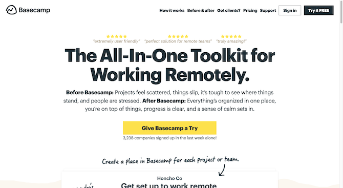
The font used is part of the Graphik/Helvetica Neue sans serif family. Based off of this, we should expect to see a similar pairing between heading and paragraph fonts. The primary difference is that the <h2> headers should be a tad
bit smaller in size.
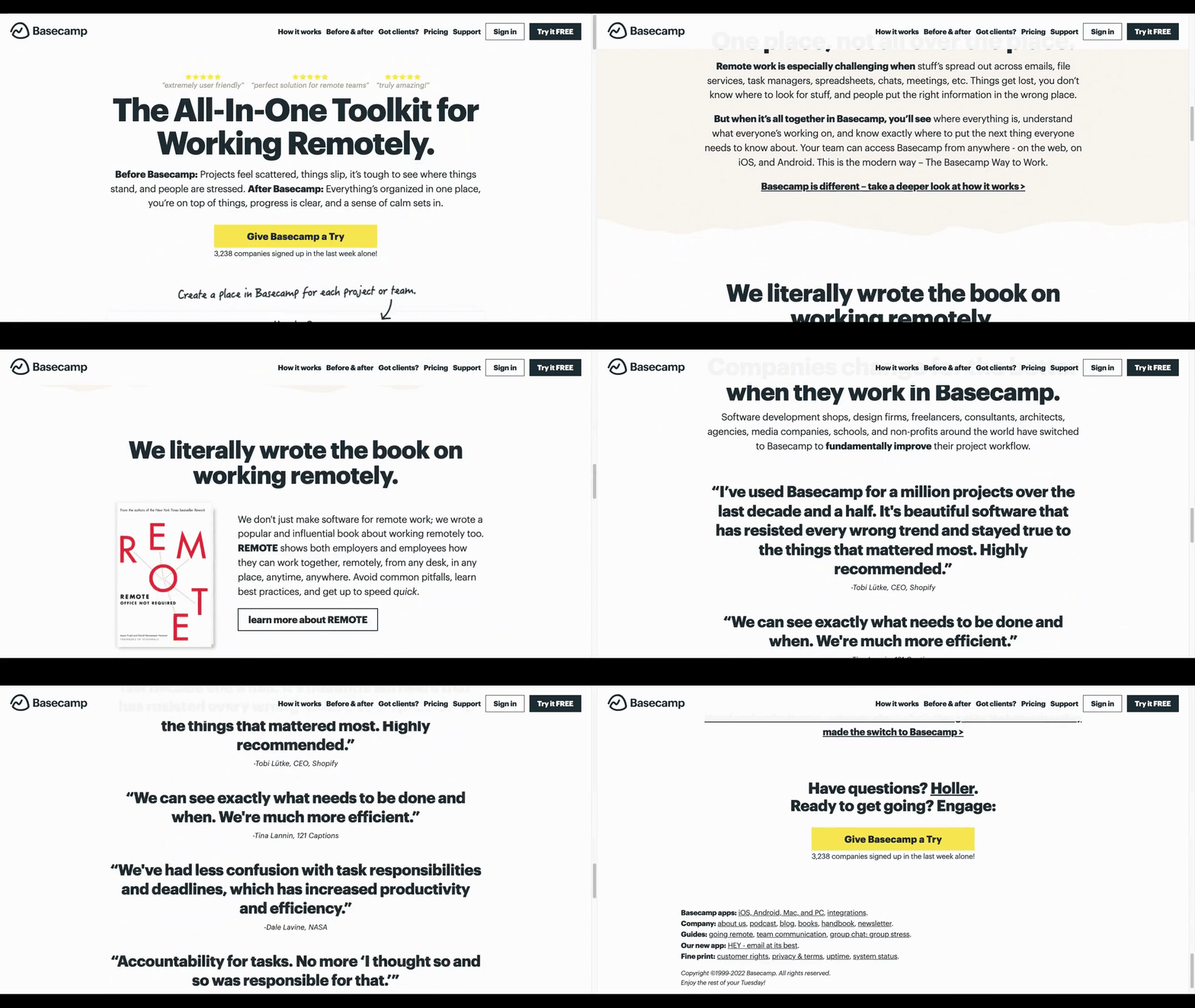
Up until about two-thirds of the way down the page, it’s easy to spot the header tags because they stand out so well against the surrounding content. However, it’s the last bit of the page that becomes muddled with all those bolded and oversized quotes. Ideally, quoted text will have its own unique style to stand out from both the paragraph text as well as the headers.
2. Make Your Headings Title Case
For years, I’ve watched linguistic experts debate the merits of all-caps lettering in web design, especially as it relates to the question of whether header tags should be ALL-CAPS or Title Case. In recent years, many of them seem to have gotten on the same page about the matter.
For instance, Harvard University’s Digital Accessibility team strongly advises against all caps:
“Avoid using all caps. Readability is reduced with all caps because all words have a uniform rectangular shape, meaning readers can’t identify words by their shape.”
Nielsen Norman Group has an entire post dedicated to what makes for the best “glanceable” fonts (i.e., the ones you’d use in headings). While they found that uppercase letters outperform lowercase in terms of readability, the comparison was made between all-uppercase and all-lowercase.
If you scroll to the bottom of the analysis, you’ll find this note that suggests that mixed-case headings—like title case—perform better:
“Much traditional typographic theory has focused on how the ascenders and descenders of lowercase letters guide the eye and promote legibility (by making it easier to differentiate between letters). In fact, the authors of this study acknowledged that ‘uppercase letters are more prone to crowding and letter confusion.’ Traditional research… indicates that all-caps lettering is more difficult for readability (and legibility) than mixed-case letters, so on its face, this study seems to contradict these older findings. However, this is not the first study to suggest that there may be a readability advantage to all-caps text, but only in certain conditions (such as very small font sizes, and typefaces with a small x-height).”
In other words, all-caps text works better at smaller font sizes. Headings, however, are not meant to be small. They need to be larger in order to stick out from the surrounding text, which is why title case works better.
I do want to add a note about sentence case headings here. This is something more and more of my clients have been requesting.
Here’s an example of it on the Moz homepage. Sentence case is used all the way through:

I think that sentence case makes sense if all the headings are written as sentences. And, really, the only way to get away with that is if the brand’s tone is more personal and conversational in nature.
For a quick comparison, this is what the title case headings look like across Search Engine Journal’s homepage:
![Search Engine Journal Latest Posts A screenshot of the Search Engine Journal home page. The “Latest Posts” section is selected and two article headlines appear beneath it: “SEO At Scale: What Large Ecommerce Sites Do Differently” and “Perfectly Optimized Content From Start to Finish [Ebook]”. Each has an accompanying image, description, and author headshot neat to it.](http://d585tldpucybw.cloudfront.net/sfimages/default-source/blogs/2022/2022-03/searchenginejournal-home-page.png?sfvrsn=bf82ff99_2)
When your copy is written more like news headlines, product names or sales copy, then title case is absolutely the better option. I’d say this applies to most online publications, stores and business sites.
3. Create One H1 Tag for Each Page
The <h1> affects what search engines use when generating titles for pages in search results. Think of it like the title that appears on a book cover. It needs to be front and center. All of the header tags beneath it form the table
of contents, which won’t appear until a couple pages in.
On some pages, the <h1> will be visible—like in the Basecamp example from earlier. This actually isn’t common though. For many websites, it doesn’t make sense to show the <h1> on the page. Let’s
use the example of Walmart.
Here’s the ecommerce site’s homepage:
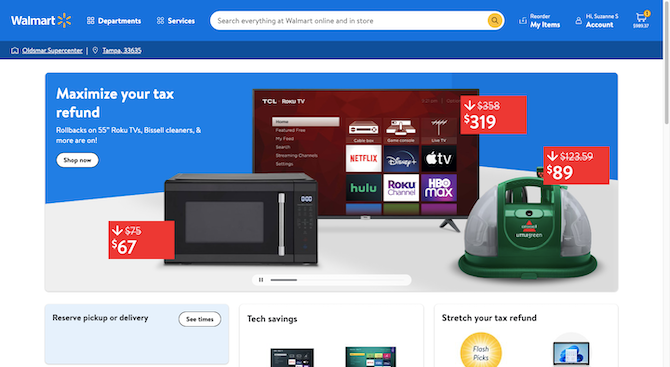
Generally, ecommerce sites jump right into the action. Unless the brand has a small inventory or their identity is very closely wrapped up in activism, you’re not going to see much besides sales-focused copy on these sites. The same thing is true of publications where the main goal is to get people to read, not to educate them on the brand’s unique value proposition or promise.
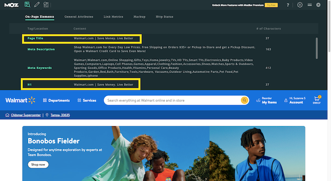
That’s why the <h1> always needs to be hard-coded into the page. If you check out MozBar’s findings, you’ll see that
Walmart has coded “Walmart.com | Save Money. Live Better” into the page as both the Page Title and H1:
If the content management system you use doesn’t give you an easy way to add an H1/Title Tag to your pages, you can always code it in directly using a string that looks like this:
<h1 class="heading__title">Walmart.com | Save Money. Live Better</h1>
One last note about the <h1> is this: Each page should have a title tag, there should be only one per page, and they should be completely unique from one another.
4. Always Establish a Hierarchy of Header Tags
For shorter pages, you might not worry much about the hierarchy of your header tags. And that’s fine. Just keep in mind that if you don’t have an <h1> tag that’s visible on the webpage, the header that appears at the
top of the page needs to be an <h2>. That could be the article’s title or it might be the name of a page like “Services” or “Contact Us.”
In general, if you have a page with more than 500 words, there should be at least two header tags on it. Usually in copywriting and content writing we try to place one every 200 to 400 words. It’s better for readability, though supplementary images will also suffice in breaking up long text blocks.
In terms of establishing the structure of your header tags, again, I’d say treat it like a table of contents. You wouldn’t place all of the chapters on the same level as the sub-chapters or sub-topics in a book. That’s exactly how the website heading hierarchy works.
The <h2> headings are the top-level chapters. They summarize the larger topic covered within each section.
The <h3> headings are the sub-chapters. Use these for sections related to the top-level topic, but require a separate space of their own.
The <h4> headings are the subtopics within a sub-chapter. These most often appear on lengthy pages like ultimate guides/blog posts, ecommerce product pages, homepages and lengthy internal pages.
Here’s an example of a page that benefits from using the <h4>. It’s “The Definitive Guide to Branding” by Olive
& Co:
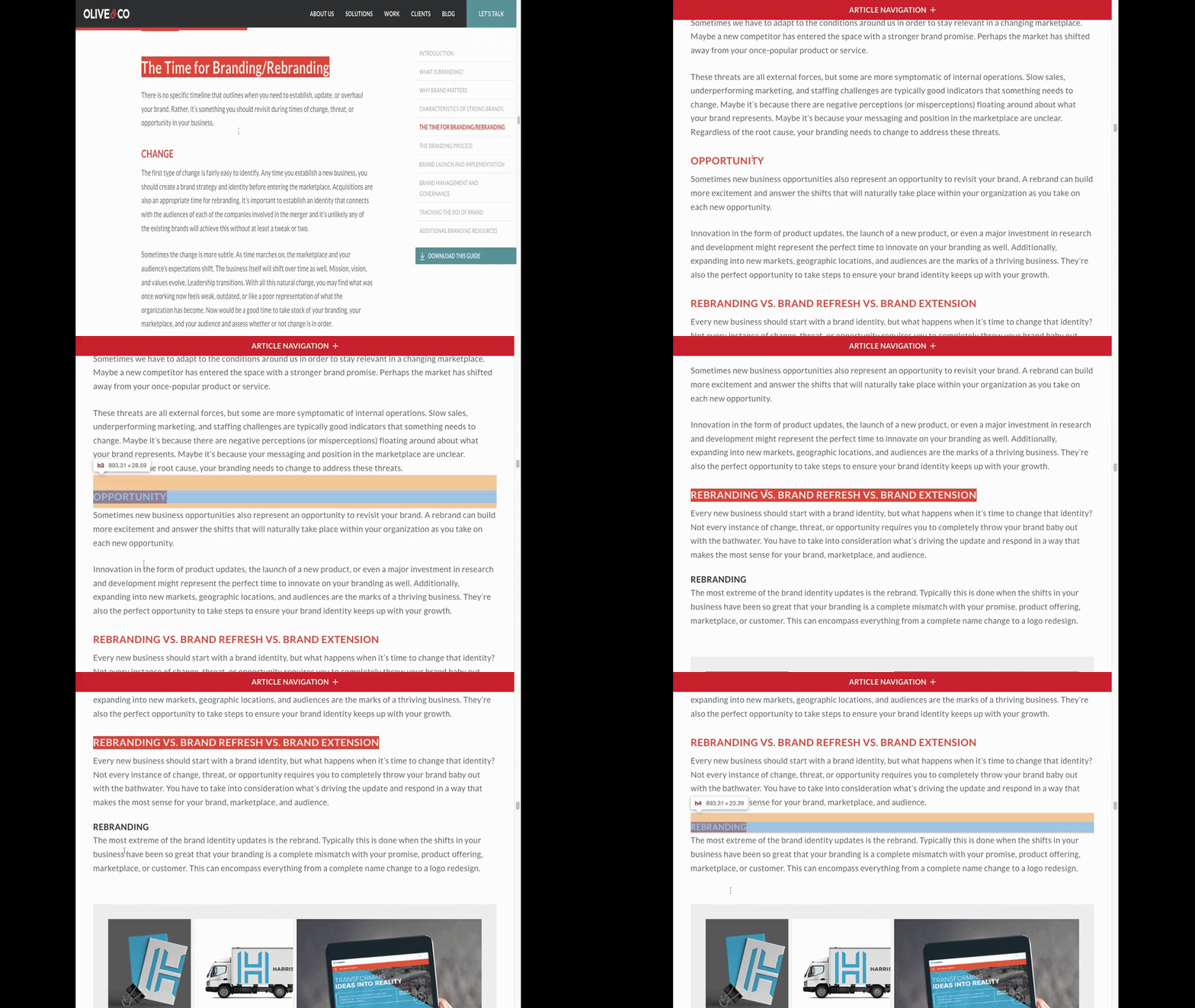
You can’t see it in the GIF above, but what I’m doing is using Chrome’s Inspect tool to pull up the code and see what kind of header tag it is. You can see a small note in the clip, though, that says what each of the tags are. The big
headline you first see is an <h2>. The next two in orange are <h3>. And the final one in black is an <h4>.
To be honest, it’s not all that common to create a hierarchy that goes deeper than that. Even with something like headers that appear in your sidebars and footers, you want them to be high enough up in the structure that visitors and search engines alike recognize their importance and relevance to the page.
While it’s up to your writer to establish the heading hierarchy, it’s a good idea to check that it makes sense from your end. One way I would suggest doing that is by putting the text into Google Docs and then opening up the Document Outline tool:
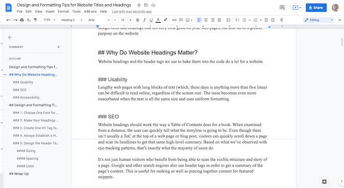
It shows me all of my heading text as well as the hierarchy of the page’s structure. It’s easier to reorganize my content and adjust the hierarchy when I examine it from this level.
This is also useful when you’re looking at copy from an outsider’s point of view. You can read through the headers one by one and make sure each of them is 100% clear about the promise of what will be found in that section. Do the same for the sub-headers—make sure they logically flow from the main header.
5. Design the Header Tags Using the Paragraph Text as Reference
In terms of making your headings visually distinctive from the rest of the content, here are some general rules to help you design them:
Sizing
Usually, we aim to make paragraph text on a webpage be 16 pixels at minimum. You want the headings to be noticeably different in terms of size.
When establishing your font sizes, start with the <h2> heading first. It should be at least 200% the size of the body text. So, if your paragraphs are 16px, the main headers should be at least 32px.
Next, size your <h3> tags. Aim for around 150% of the body. Using this example, that would be 24px.
If you’re going to use smaller header tags, configure the sizes based on how many levels you’ll use. For instance, if you only need an <h4>, then 125% the size of the body should work for those headings. If you intend on
going deeper than that, you may want to adjust the size of the higher level headings so that the sizes of the <h5> and <h6> are large enough to stand out from the body text.
Spacing
Spacing is another way to give headings a distinct look. Something to keep in mind, though, is that you don’t want headers to be sized so big or so broadly spaced that they stretch past more than a couple lines. Otherwise, you might make the reading of headlines feel like a burden.
In terms of the optimal line length within paragraphs, it’s usually between 50 and 70 characters. This allows for the easiest reading experience. With headings, I’d suggest using the default tracking for the font you’ve chosen. The only exception is if you’re using a tall and slender font. In that case, if you want to give your heading some room to breathe, that should be fine. Just be mindful of how many lines it ends up pushing your headlines down to.
One other thing to note is the line spacing between the heading and paragraph beneath it. This is another way to let your header tags breathe even if you can’t do much to the letter tracking.
Mailchimp does a nice job of this:
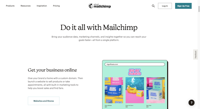
There’s a full line placed between each of the headings and the subsequent paragraphs. This will help visitors zero in on the headers quickly and focus on them while reading.
Wrap-up
I realize this might seem like a nitpicky thing—to worry about how website titles and headings are formatted. However, these tiny strings of text actually have a big impact on three factors that Google’s Core Web Vitals now uses to evaluate and rank webpages.
If you’re trying to help your clients gain organic exposure online, any little bit you can do to improve their website’s ranking will help. And that includes making sure their headings are properly designed and formatted.