Let’s see how to use one of the libraries provided by the Google Maps platform—Places API—and how it can be used to add autocomplete functionality to a React application.
The Google Maps platform provides a rich set of libraries that allows us to work with maps, get information about places, routes, etc. All of these are accessible by either directly making an HTTP request to the required library’s endpoint or using the provided SDKs, making it easier to integrate into your application.
The Autocomplete API
Our focus here will be on the Places library and its services, one of which is the Places Autocomplete API. The Autocomplete API lets us get on-the-fly place predictions including but not limited to street addresses, business addresses, prominent points of interest, etc. while typing into the text field.
In this article, we will be integrating this API on the client side in a sample React application.
Prerequisite
To follow along with this tutorial, you will need to have:
- React v16 or newer
- Basic understanding of React
- A text editor
Setting up the API
To use the Google Places API, we need to start by creating an application in the Google Cloud Console. Open the link, make sure you have a Google Cloud Account, and click on “Phantom” to begin the process of setting up the API.

Next, click “New Project” to create a new project.

Fill the form with the project name and click “Create.”
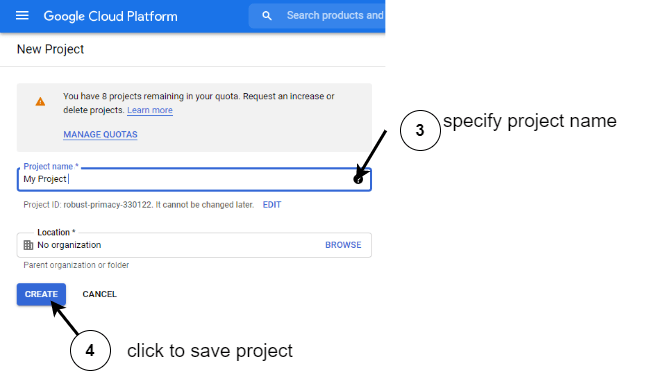
Next, in the now-created project, we need to enable the Places API. Head over to the dashboard and click on “Enable APIs and Services."

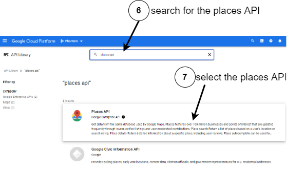
Use the search bar to find the “Places API” and select it from the results.
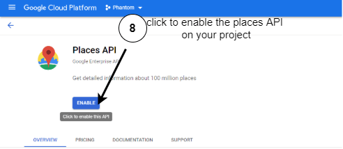
Lastly, click on “Enable” to enable the Places API.
Now, to create an API key to make the Places API accessible for use, follow the steps here.
Note: To avoid any illicit use of your API key by others, you can restrict your API keys to an app, website or IP address.
Getting Started
Open your terminal and insert the following code to bootstrap a React application.
npx create-react-app autocomplete
Now that we have set up our project on the Google Cloud Console, we will take the following four steps to add the Places Autocomplete feature to the React app.
- Include the Places library script in your code
- Create the Places Autocomplete instance and bind it to an input field
- Handle events
- Customize styles
Include the Places Library Script in Your Code
Since we are working on the client side, we need first to load the Maps’ Javascript API in our code and precisely specify that we want the Places library. Open your index.html file in the folder public and include the following code.
<script src="https://maps.googleapis.com/maps/api/js?key=<INSERT-API-KEY-HERE>&libraries=places&callback=initMap"async></script>
The above code includes script tag that load the Google Maps APIs using the API key we created earlier on the Cloud Console.
Including the script tag does not load the Place’s library because it is self-contained and will only be loaded when requested. To get around this, we included in the URL a libraries query parameter that accepts a comma-separated list of libraries to load here. We just specified places so that the Places library will be loaded.
Note: Make sure to insert your API key appropriately in the script tag.
Create the Places Autocomplete Instance and Bind It to an Input Field
Now that we have loaded the Places library in our code, we will use it in our React components. Include the following code in your app.js.
import { useRef, useEffect } from "react";
import "./styles.css";
const AutoComplete = () => {
 const autoCompleteRef = useRef();
 const inputRef = useRef();
 const options = {
  componentRestrictions: { country: "ng" },
  fields: ["address_components", "geometry", "icon", "name"],
  types: ["establishment"]
 };
 useEffect(() => {
  autoCompleteRef.current = new window.google.maps.places.Autocomplete(
   inputRef.current,
   options
  );
 }, []);
 return (
  <div>
   <label>enter address :</label>
   <input ref={inputRef} />
  </div>
 );
};
export default AutoComplete;
Firstly, we imported the useRef hook and some styles (we will talk more about the styles later). Next, we defined two variables using the useRef hook in our component body, which will hold references to the Autocomplete instance and the input field, respectively.
Our app component returns some JSX, among which is the input field. We will be using this element as the source for the input strings we will be feeding to our Autocomplete instance to get place predictions. So we can obtain and store the reference to the input element in the inputRef variable by passing it through the ref prop.
Before we proceed to the contents of the useEffect lifecycle hook, we need to understand that the Places library we included in our index.html provides us with several classes to add an Autocomplete functionality. The first two classes—Autocomplete and SearchBox—are slightly different but similar in that they are widget-based.
These two classes are the easiest to implement; they automatically add a dropdown UI component containing place predictions to any input field bound to them. The AutocompleteService class doesn’t provide any UI component. Still, it allows you to get place predictions data programmatically and display them on your terms.
In the useEffect call, firstly, we created an instance of the Autocomplete class. This constructor receives two arguments, with the second optional. The first argument denotes the reference to the input field where it would display place predictions, while the second parameter holds options we want to apply on the prediction request and response.
For the options above, we want the prediction results to be constrained to only Nigerian (ng) establishments. In the returned response for a place, we want the address_components, geometry, icon and name fields returned from the API for a single place.
For a complete list of all the options and their meanings, check here. You might be wondering why we are specifying these options. There are many reasons for this, but the most obvious ones are as follows :
- Reduced latency
- Precision from the APIs since you only ask for what you want
- Cost optimization to ensure that you get billed only for the data you consume in your application
Run the app with the command below.
npm start
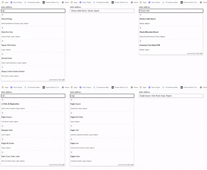
Now, we can search and select an item from the list, as shown below.
Handle Events
Our component allows us to choose from the dropdown list of predictions, but most of the time we want to do more than display the result in an input field. We may wish to use this information to do other things such as filling an entire form and so on when the user selects an item from the dropdown. Open your app.js file and add the following code.
import { useRef, useEffect } from "react";
import "./styles.css";
const AutoComplete = () => {
 const autoCompleteRef = useRef();
 const inputRef = useRef();
 const options = {....
 };
 useEffect(() => {
  autoCompleteRef.current = new window.google.maps.places.Autocomplete(
   inputRef.current,
   options
  );
  autoCompleteRef.current.addListener("place_changed", async function () {
   const place = await autoCompleteRef.current.getPlace();
   console.log({ place });
  });
 }, []);
 return (
  <div>
   <label>enter address :</label>
   <input ref={inputRef} />
  </div>
 );
};
export default AutoComplete;
The “place_changed” event in the Autocomplete instance is triggered whenever a user clicks one of the items from the dropdown. It is used to execute some logic on the selected place. In the code above, we added this event to our Autocomplete instance and defined our handling function that retrieves the information about the chosen place and logs it to the console.
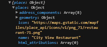
Of course, this can hold any functionality based on our application’s needs. Below is a simple illustration of what gets printed on the console in our case. Observe that the fields returned corresponds to the ones we fed when we created our Autocomplete instance.
Customize Styles
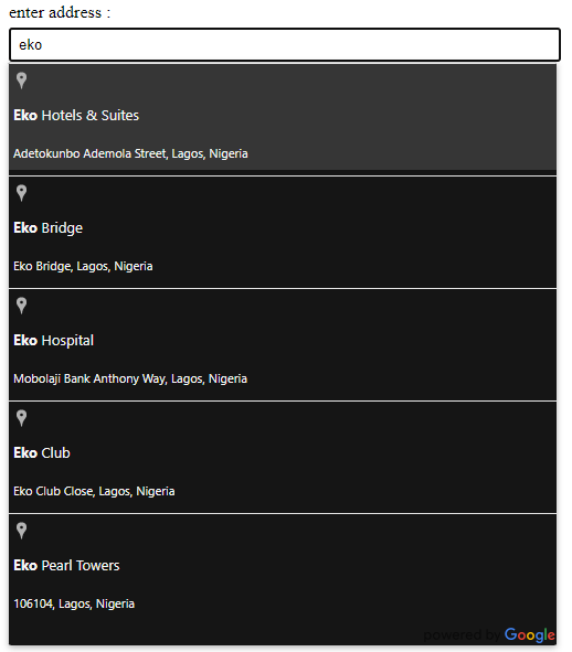
Using any of the widget-based classes, e.g., Autocomplete and SearchBox, we get a dropdown list of predictions styled in such a way that makes it well suited for Google Maps. This dropdown UI element provides us with several classes to customize it based on our needs.
Now, open your styles.css and add the following styles to style the dropdown.
.pac-container {
 background-color: #151515;
 font-family: -apple-system, BlinkMacSystemFont, "Segoe UI", Roboto, Oxygen,
  Ubuntu, Cantarell, "Open Sans", "Helvetica Neue", sans-serif;
}
.pac-item,
.pac-item-query {
 color: #f7f7f7;
}
.pac-item:hover {
 background: #6666;
}
To see a complete description of each class name, check here. Now, let’s run the code with the following command.
npm start
Here’s the final result.
Conclusion
As with all other APIs on the Google Maps platform, the Google Places API can be implemented on the client or server side. This article shows how to set up and use the Places Autocomplete API on the client side. You are well equipped to use this API or related ones in any future projects with this knowledge.