Read up on what’s new since the R2 2022 release in our Kendo UI and Telerik web, mobile and desktop UI libraries, plus Telerik Reporting and JustMock.
Somehow it’s already been a month since our exciting R2 2022 release. (In case you missed those updates, here’s what we announced for Telerik desktop and mobile, Telerik web, Kendo UI and productivity products.)
Today we have MORE good news to update you about. Find the news you’re most interested in:
- Telerik UI for Blazor
- Telerik UI for ASP.NET Core
- Telerik UI for ASP.NET Core and MVC
- Telerik UI for ASP.NET AJAX
- Telerik UI for WinForms
- Telerik UI for WPF
- Telerik UI for WinUI
- Telerik UI for Xamarin
- Telerik UI for .NET MAUI—Version 2.0.0!
- Kendo UI for jQuery
- Kendo UI for Angular
- Kendo UI for Vue
- KendoReact
- Telerik JustMock
- Telerik Reporting and Telerik Report Server
Telerik UI for Blazor 3.4.0 Release
New Blazor Skeleton Component
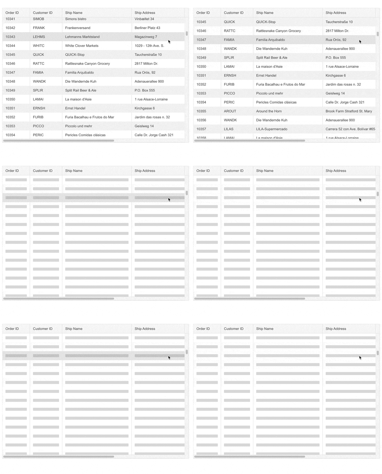
Skeletons are widely used as indicators to the users that the page content is being loaded. The Telerik UI for Blazor Skeleton component allows you to easily achieve such behavior and render a placeholder for each of the underlying HTML elements in a component or page.

The Skeleton component includes customization options for its shape (text, circle or rectangle), height, width, animation type (pulse or wave), visibility, and CSS class.
See a demo of the Blazor Skeleton UI component or try it out in Telerik REPL for Blazor.
Integrating the Blazor Skeleton Component
The Blazor Skeleton allows seamless integration with other Blazor UI components,
such as the Data Grid, to indicate that content is being loaded. A typical use case is mimicking the grid rows while data loading takes place, depicting a table with skeletons in its columns.
New Blazor Feature: Header Cell CSS Class in Blazor Data Grid
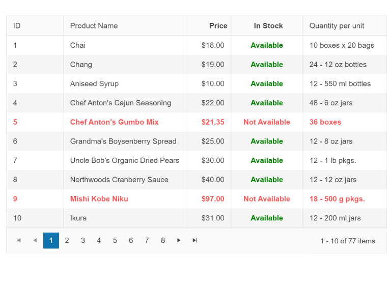
You can now customize the appearance of the Blazor Grid column header using the new HeaderClass parameter in the <GridColumn> tag. This would allow you to define custom CSS classes for the column header cells and easily bold their text, change their alignment or style them to make them stand out.
New Blazor Feature: Header Cell CSS Class in Blazor TreeList
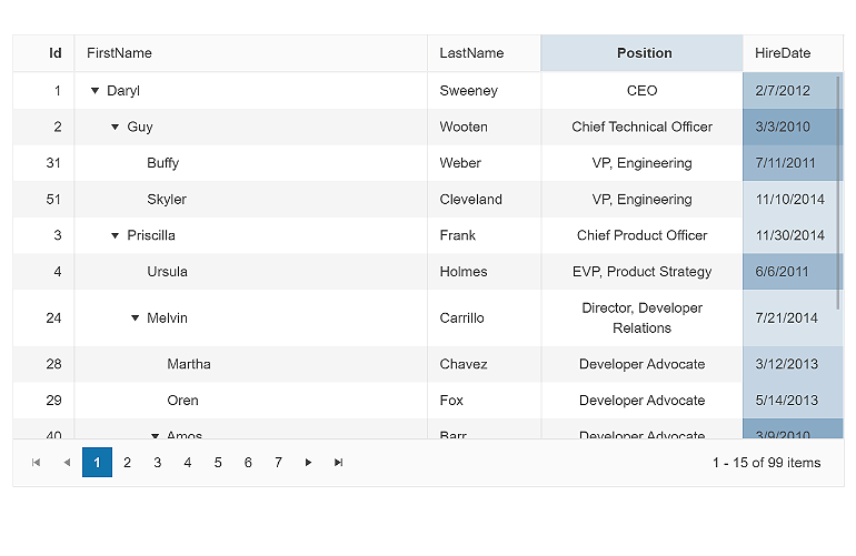
The same feature for header customization has been shipped for the UI for Blazor TreeList component. Check out this demo and see how to take advantage of the exposed HeaderClass parameter in the TreeListColumn tag.
Header Template in Multiple Blazor Components
In the current Telerik UI for Blazor 3.4.0 release we exposed the <HeaderTemplate> option in several components:
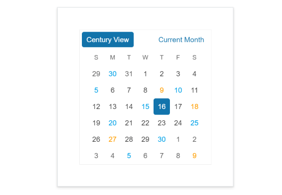
Using this templating feature, you can customize the content rendered in the component’s header. You can render buttons, images or apply custom styling.
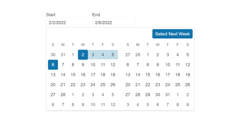
Customization of the Filter Default Operator
The new DefaultOperator parameter of the Blazor Filter component allows you to customize the default filter operator on a per-field basis (the filter that is preselected each time you add a new field). If unassigned, the default operator will be set based on the data type.
Custom FilterOperators in Blazor Data Grid
Using the new FilterOperators parameter you can customize the list of filter operators within the filter row and menus of the following components:
The FilterOperators parameter can be applied on a per-column basis within the <GridColumn>, <TreeListColumn> and <GanttColumn> tags, respectively.
Accessibility Improvements
The Telerik UI for Blazor library is undergoing an accessibility review using the latest industry-standard testing process. In the latest release, we have addressed and improved multiple items and will continue this effort throughout the year to raise the components’ accessibility compliance levels and improve the related documentation.
In the 3.4.0 release, we specifically addressed the WAI-ARIA best practices for implementing keyboard navigation for multiple UI for Blazor components, tested against the popular screen readers, and implemented the recommended rendering related to various WAI-ARIA attributes.
The Blazor UI components that received accessibility uplift to the WCAG 2.1 AAA and Section 508 compliance standards include Stepper, Wizard, Pager, DateInput, Calendar, DateRangePicker, DatePicker, TimePicker and DateTimePicker. The update of the Blazor Data Grid is in progress and will be complete in a couple of releases due to its large scope.

Responsiveness and Adaptive Blazor Layout
Using the Blazor MediaQuery, you can change the component settings, render different components, or prevent components from rendering at all depending on the browser viewport size. This allows you to make your Blazor application design much more adaptive and responsive.
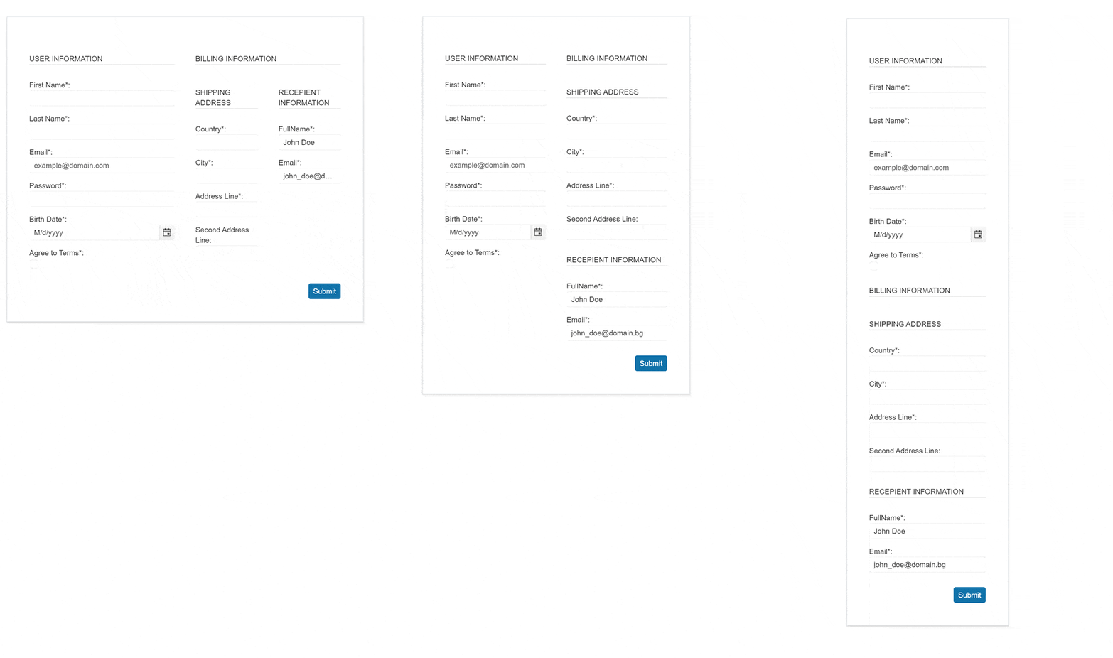
To showcase the power of the Blazor MediaQuery component, we have built several demos to demonstrate how you can easily make Blazor components and apps responsive to different screen sizes:
- How to make responsive Menu components in Blazor Applications
- How to make responsive Forms in Blazor Applications
- How to make responsive Grid Layout in Blazor Applications
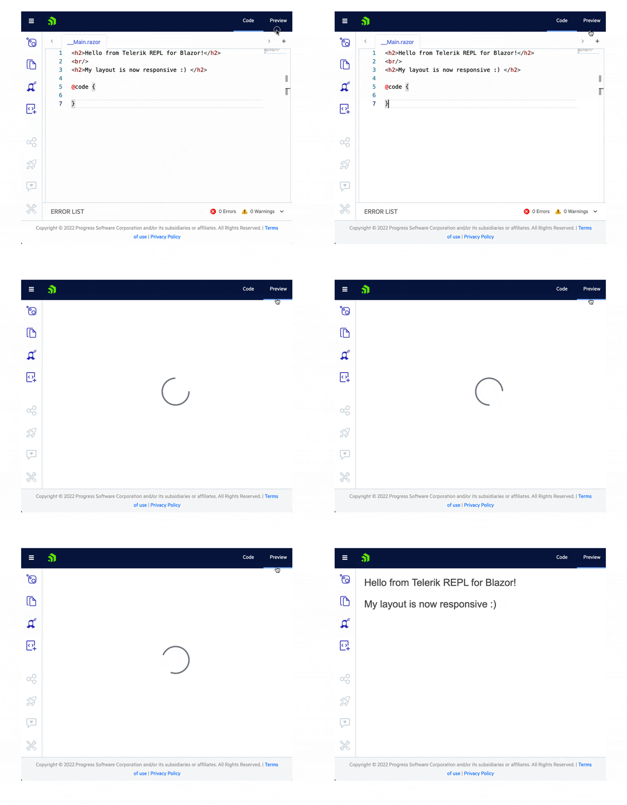
Telerik REPL for Blazor
Talking about responsiveness, the browser-based code runner Telerik REPL for Blazor received an update as well. You can now adapt, run and share code snippets seamlessly from smaller screen devices. To help us prioritize the next set of features you would like to see in the REPL tool, we’ll be happy to hear your feedback.
Compatibility With .NET 7 Preview 5
For those of you eager to try out the latest and greatest by Microsoft, we are happy to announce that the Telerik UI for Blazor and Telerik UI for ASP.NET Core libraries are compatible with the latest .NET 7 Preview 5.

Telerik UI for ASP.NET Core
Expanded Visual Studio Code Scaffolders
Last month we released scaffolding functionality in Visual Studio Code productivity tools and, based on your feedback, we are expanding the list of included components. You can now generate code for the Telerik UI for ASP.NET Core Editor and TreeList controls.

Expanded Visual Studio Code Snippets
With this release, we have more than doubled the initial set of 30 component snippets included in the Visual Studio Code Productivity tools for ASP.NET Core. You can now easily reference the ActionSheet, AppBar, Breadcrumb, Drawer and more than 30 new components. For a complete list of the available UI for ASP.NET Core code snippets, see the detailed documentation.
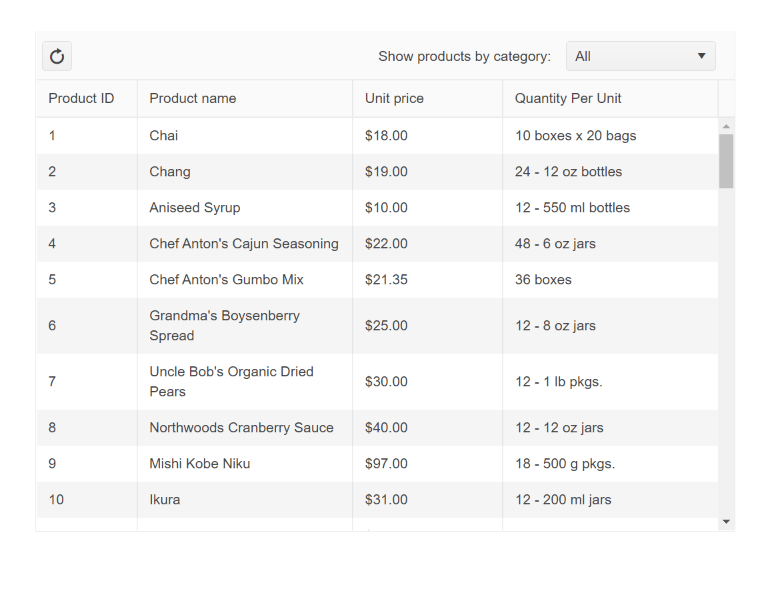
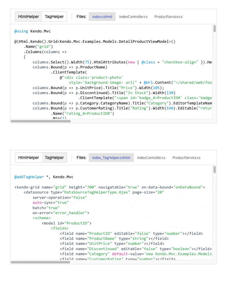
Toolbar Template in Grid Tag Helper
You can now take advantage of the exposed ASP.NET Core Grid Tag Helper toolbar template. Using your favorite tag helper approach, you can render custom content with command buttons and images and apply your own styling.
More Tag Helper Snippets
We continue our effort to expand the number of Tag Helper component snippets available in the UI for ASP.NET Core documentation and demos. In this release, we added multiple new examples for the tag helper flavor of our UI for ASP.NET Core components. The list is long, so here are just the highlights:
- Charts Tag Helpers examples: Area, Bar, BoxPlot, Bubble, Bullet, Donut, Funnel, Line, Pie, Polar, Radar, Scatter, Sparkline
- TreeMap Tag Helper
- Scheduler Tag Helper
- DateRangePicker Tag Helper
- TreeList Tag Helper
- Splitter Tag Helper
- DropDownTree Tag Helper
- And more!
Cloud Integration Demo
In this release, we expanded the available resources related to cloud integration with the Telerik web UI components. The new article shows detailed examples of how to configure the UI for ASP.NET Core Data Grid to perform remote CRUD (Create, Read, Update, Destroy) data operations in the dataset Google Cloud Big Query.
Telerik UI for ASP.NET Core & MVC
Initial Sort Direction Configuration in Data Grid
On initial sort (first click for sorting), you can now override the default ascending order and set it to descending. The respective property is called InitialSortDirection and can be used on a Data Grid and Column Level.
Accessibility Improvements
In this release, we worked toward further improving the accessibility of a few of the Telerik UI for ASP.NET MVC and Core components. The newest A11Y updates have been applied to the Pager, Calendar, TimePicker, MaskedTextBox, Filter DateRangePicker, TimePicker, DatePicker, Spreadsheet, ComboBox, DropDownList, DropDownTree and MultiSelect components.
Telerik UI for ASP.NET AJAX
This month we are also introducing accessibility improvements to Telerik UI for ASP.NET AJAX.
The latest release includes enhanced WAI-ARIA support for the AutoCompleteBox and Wizard components. Plus nearly 30 accessibility fixes and improvements in the Calendar, ComboBox, DropDownList, Editor, FileExplorer, Input, DateInput, DatePicker, DateRangePicker, LightBox, Prompt, SearchBox, Spell, TabStrip, Window and Wizard add significant value to the Section 508 compliance and WCAG 2.1 support of the Telerik for ASP.NET AJAX suite.
That’s not all—you can also take advantage of the enhancements and fixes in multiple other UI components and document processing libraries: the mobile Grid, CloudUpload, Editor, PdfProcessing, SkinManager, SpreadProcessing and WordsProcessing.
What’s New in R2 2022 SP for Telerik UI for WinForms
After over a month since the official second release for 2022, Telerik UI for WinForms is coming with a variety of enhancements and customer-requested improvements (39 feedback items from our customers!). R2 2022 SP1 brings performance improvements in FilterView, UI improvements in SyntaxEditor, improvements in text-wrapping functionality in Spreadsheet, and standalone NavigationView.
Let’s unpack the Service Pack!
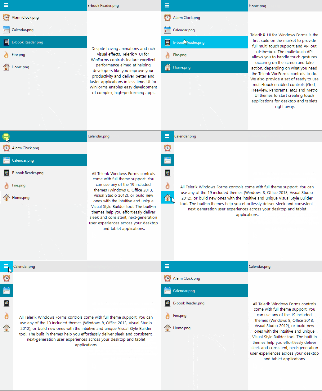
Standalone RadNavigationView Control
RadNavigationView is officially here to bring your application the well-known hamburger menu experience. With similar semantics to what lies behind RadPageView, it is very easy with RadNavigationView to create custom views over a collection of pages.
Performance Improvement in RadFilterView
RadFilterView now has an improved initializing time for a numeric category with a huge range 10000-10000. No matter what the selected FilterViewNumericCategoryMode is, RadFilterView is loaded instantly.
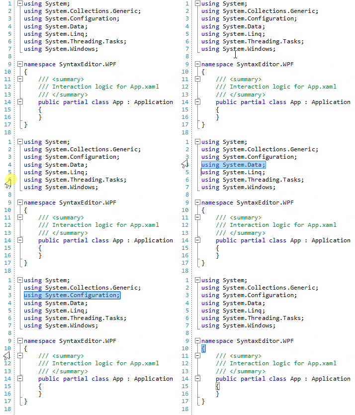
UI Improvements in RadSyntaxEditor
RadSyntaxEditor offers row selection after clicking on the line number margin like Visual Studio.
Improved XML Serialization in RadTreeView
We have full parity between .NET 6 and .NET 4.8 (or older) for the XML content in RadTreeView. The XML returned by TreeViewXml now also stores the font for the nodes.
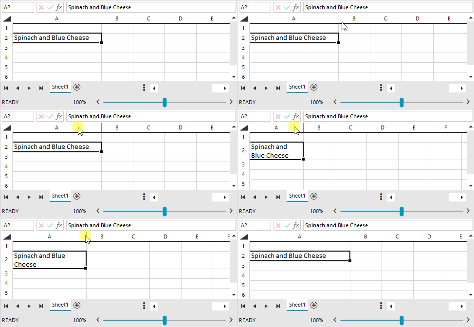
Text-Wrapping Improvement in RadSpreadsheet
RadSpreadsheet offers a text-wrapping improvement that will help with the readability of the text. That functionality is restricted to words, which means that when the words are longer than the cell width they will be clipped and not separated into chars.
What’s New in R2 2022 SP for Telerik UI for WPF
The latest R2 service pack of Telerik UI for WPF is live and brings over 65 improvements and new additions for ChartView, RichTextBox, GridView, Map and more. Let’s go together through the new stuff this release.
ChartView: Separate Axis Pan/Zoom
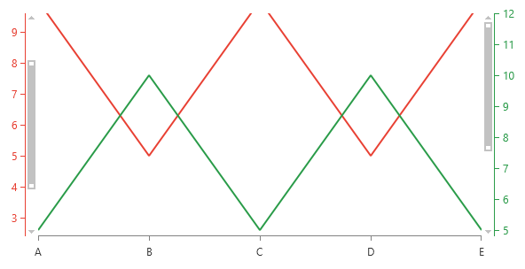
One of the highly desired ChartView features was to enable zooming and panning per single axis. By default, the pan/zoom related properties of the chart and the ChartPanAndZoomBehavior are manipulating all axes simultaneously.
With this new feature, using the AxisPandZoomExptensions you can specify on which axes this pan/zoom is enabled for and easily adjust all the corresponding properties as needed. As a result, every axis will display its own PanZoomBar allowing the customers to easily pan/zoom through the UI. Here is example how the feature can be enabled on a single axis:
<telerik:LineSeries.VerticalAxis>
  <telerik:LinearAxis ElementBrush="#299B48" HorizontalLocation="Right"  telerik:AxisPanAndZoomExtensions.EnablePanAndZoom="True"
telerik:AxisPanAndZoomExtensions.ZoomRangeStart="0.4"
telerik:AxisPanAndZoomExtensions.ZoomRangeEnd="1"/>
</telerik:LineSeries.VerticalAxis>
I hope this feature allows you to achieve more scenarios with our charts. For more details, check out the Separate Axis Zooming and Panning section in the ChartView online help documentation.
PropertyGrid: Support for DisplayAttribute and DescriptionAttribute for FlagEnumEditor
The FlagEnumEditor provides support for editing bit flag enums inside of RadPropertyGrid. It will now automatically start respecting the Display or Description attributes if set in the enum definition. For example, if you have the following enum:
[Flags]
public enum Permissions
{
    All = -1,
    None = 0,
    [Display(Name = "Reading")]
    Read = 1,
    [Description("Writing")]
    Write = 2,
    [Display(Name = "Executing")]
    Execute = 4
}
The enum will be visualized as shown below:
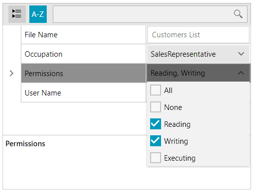
For more details, check the FlagEnumEditor help article.
GridView: Way To Customize the HighlightTextBlock
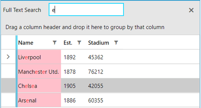
We made it easier to modify the background and the foreground of the highlighted cells whenever a search is performed. The background is exposed as a new property of the GridViewCell—HighlightedBackground—and the foreground comes through the HighlightBrush property of the HighlightTextBlock inside of the cell.
So, if you insert the following two styles into the GridView Resources, you will be able to quickly change the appearance of the highlighted cells:
<telerik:RadGridView.Resources>
    <Style TargetType="telerik:GridViewCell" BasedOn="{StaticResource GridViewCellStyle}">
        <Setter Property="HighlightedBackground" Value="Purple"/>
    </Style>
    <Style TargetType="telerik:HighlightTextBlock" BasedOn="{StaticResource HighlightTextBlockStyle}">
        <Setter Property="HighlightBrush" Value="Lime"/>
    </Style>
</telerik:RadGridView.Resources>
Other Features
- PdfProcessing: Introduced Signature flags support.
- Map: Implemented CombinedGeometryData support in VisualizationLayer. It can be used as geometry data for the PathData map shape objects.
- Map: Added SetView method that changes currently visible area.
- Window: Added IconMargin property to better position the icon in the header.
- RichTextBox: Obsolete method GetCurrentSelectedInline is now removed. Please use RichTextBoxCommandBase.GetSelectedInlineOrSelectCurrent instead.
Try It Out & Share Your Feedback
We have a lot more! To get an overview of all the latest features and improvements we’ve made, check out:
For more updates from the previous major release check out the R2 2022 release blog post.
Don’t wait—try out the latest: Telerik UI For WPF
Feel free to drop us a comment below sharing your thoughts. Or visit our Feedback Portals about UI for WPF and Document Processing Libraries and let us know if you have any suggestions or if you need any particular features/controls.
What’s New in R2 2022 SP for Telerik UI for WinUI 2.1.0
Windows App SDK 1.1 Support
In case you missed it, Windows App SDK 1.1 was released couple of weeks ago bringing many improvements and fixes. Check out the detailed blog post from Microsoft.
With this release, the Telerik UI for WinUI components are built against that version and fully compatible. Give it a try and let us know if you have any questions or issues.
PdfViewer: Signature and Password Dialogs
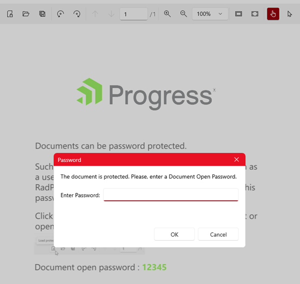
With the previous release, we introduced the first fully featured PdfViewer in the WinUI universe (for more info see this blog). We are now adding two additional dialogs that will allow you to provide better user experience to your customers—one for digital signature and one for password-protected documents. You need just to register them as all other dialogs as shown below:
telerik:RadPdfViewerAttachedComponents.RegisterPasswordRequiredDialog="True"
telerik:RadPdfViewerAttachedComponents.RegisterSignSignatureDialog="True"
And they will automatically popup when such actions are required. See them in action in our WinUI example application here and for more details, check out the PdfViewer control section from our online help documentation.
Other Features
- DataGrid: Added localization support for Save and Cancel buttons in the inline editor.
- PdfViewer: Improved the rendering when zooming.
Try It Out & Share Your Feedback
To get an overview of all the latest features and improvements we’ve made, check out:
For more updates from the previous major release, check out the R2 2022 release blog post.
Don’t wait—try out the latest: Telerik UI For WinUI
Feel free to drop us a comment below sharing your thoughts. Or visit our Feedback Portal and let us know if you have any suggestions or if you need any particular features/controls.
What’s New in R2 2022 SP for Telerik UI for Xamarin
The Telerik UI for Xamarin Service Pack brings new features in the Date and Time Pickers and Barcode control. In addition, we have added improvements in SignaturePad, Barcode and DataGrid controls.
IsLooping Property Now Available for All Date and Time Pickers.
You can easily stop the looping functionality in the Date, Time, DateTime, Time and TimeSpan Pickers using a single property—IsLooping(bool). When IsLooping is True, the items of each spinner can loop infinitely unless that spinner is restricted to show only a subset of the available values.
<telerikInput:RadDatePicker />
<telerikInput:RadDateTimePicker />
<telerikInput:RadTimePicker />
<telerikInput:RadTimeSpanPicker />
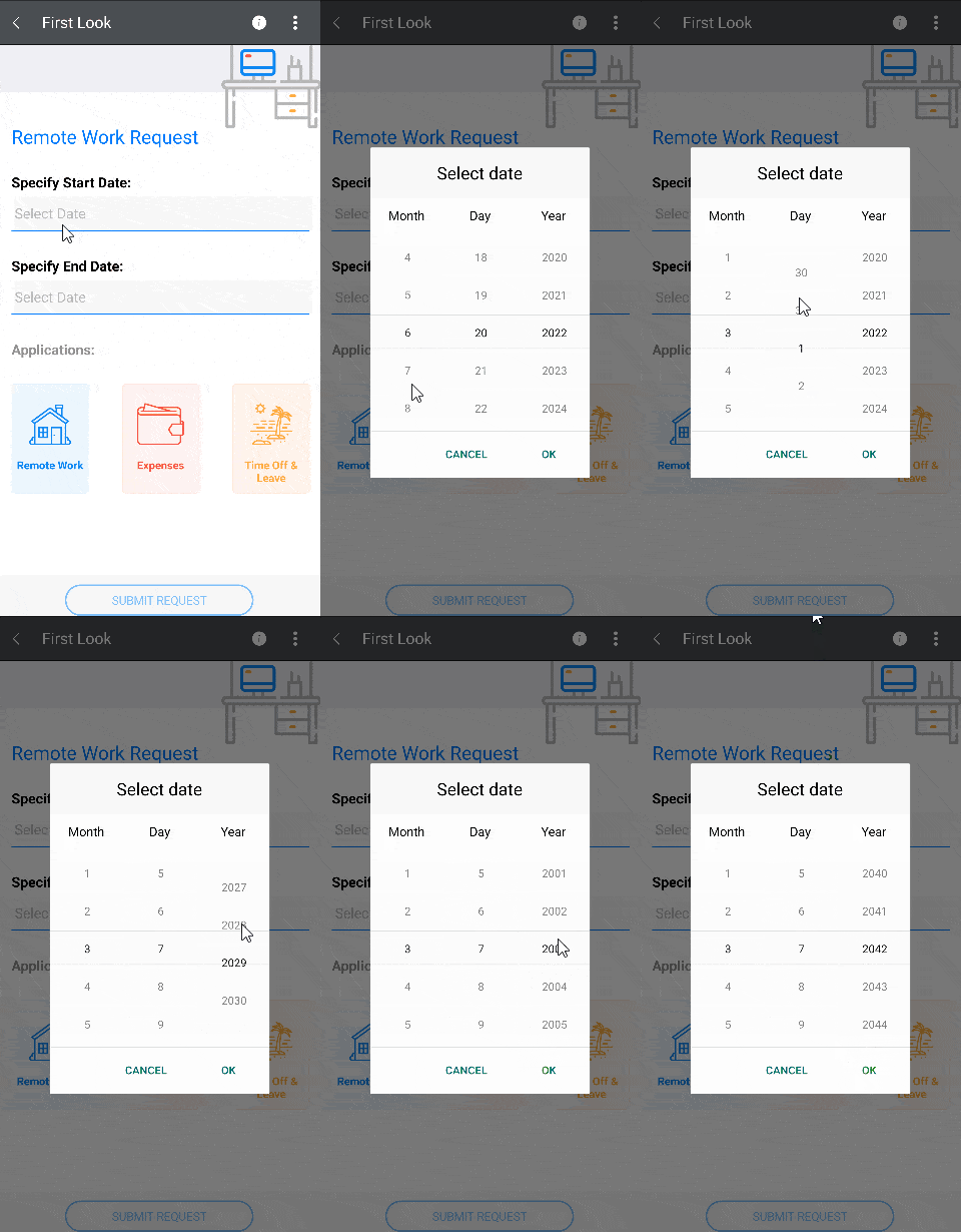
When IsLooping is False, the looping is always disabled for all spinners.
<telerikInput:RadDatePicker IsLooping="False" />
<telerikInput:RadDateTimePicker IsLooping="False" />
<telerikInput:RadTimePicker IsLooping="False" />
<telerikInput:RadTimeSpanPicker IsLooping="False" />

Specify the Version of the QR Code
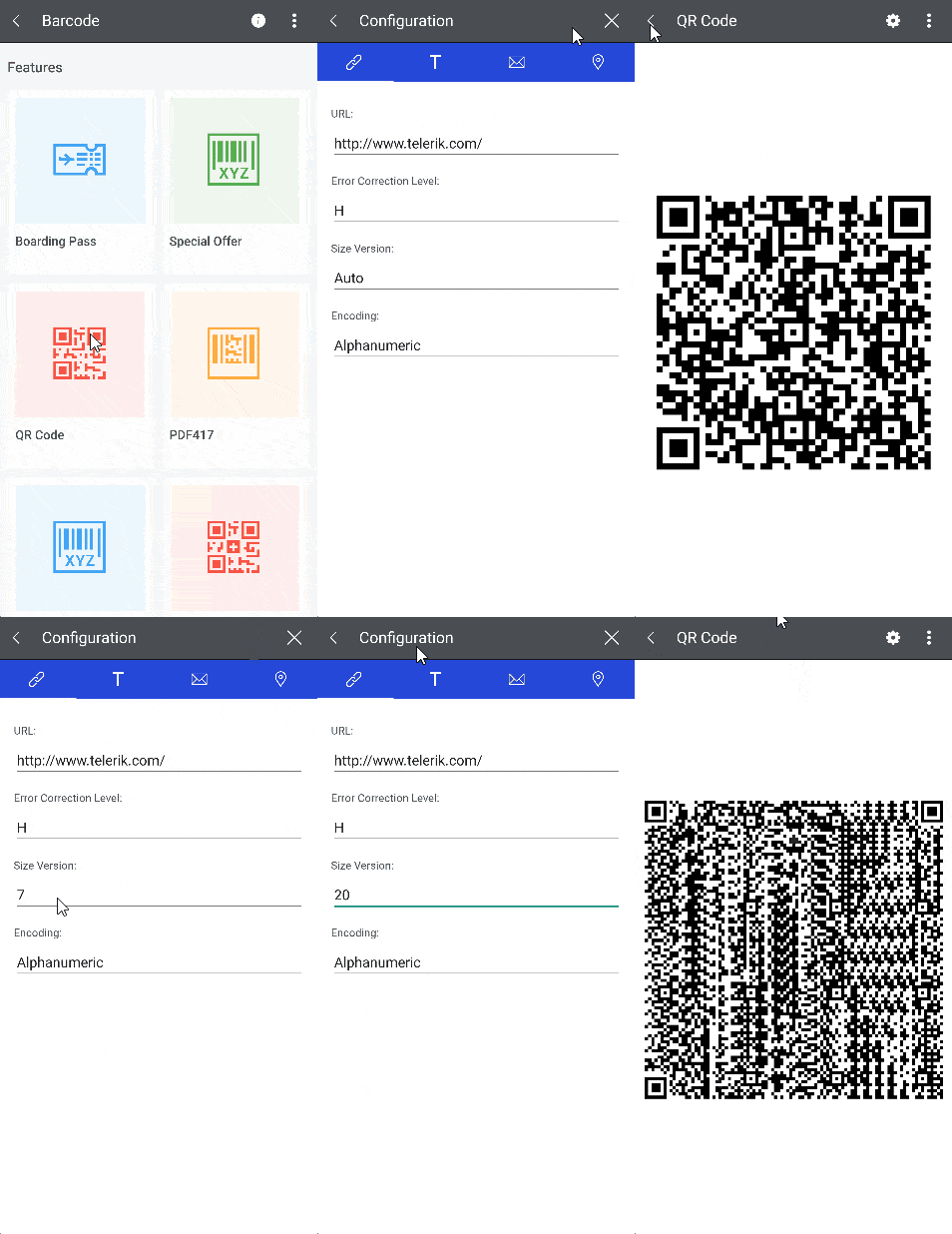
The QR code for Xamarin has a new property—Version. It is used to specify the version of the QR code. The version itself determines the size of the QR code and the amount of information that can be encoded. You can use values in the range from 1 to 40. If you define the version to be a number outside this range, the version will be calculated automatically.
<barcode:RadBarcode Value="https://docs.telerik.com/devtools/xamarin/introduction">
    <barcode:RadBarcode.Symbology>
        <barcode:QRCode SizingMode="Stretch"
                        CodeMode="Byte"
                        Version="20"
                        ErrorCorrectionLevel="H"
                        ECIMode ="ISO8859_1"
                        FNC1Mode="SecondPosition"
                        ApplicationIndicator="00"/>
    </barcode:RadBarcode.Symbology>
</barcode:RadBarcode>
Example App
As always, you can review our Telerik Xamarin Samples application and check the new features in action. Find the app in the Google Play Store, Apple App Store and Microsoft Store.
Share Your Feedback
As always, we encourage you to share your ideas or opinions on the controls and play a role in shaping our roadmap. You can write in the Telerik UI for Xamarin Feedback Portal or raise a ticket.
If you have not yet tried the Telerik UI for Xamarin suite, take it for a spin with a 30-day free trial, offering all the functionalities and controls at your disposal at zero cost.
What’s New in 2.0.0 Version of Telerik UI for .NET MAUI
Just before one month ago, we released the official version of our UI component library—Telerik UI for .NET MAUI. It is still the largest suite on the market, with more than 50 components, and it is the only one with which you can build production-ready apps. You can check the announcement here: Telerik UI for .NET MAUI Goes GA: 50+ UI Controls To Build Cross-Platform Apps!
One month later, we continue to follow the Microsoft release cadence and, with each frequent update, we release new components, enhancements and features.
In addition to this, our team has ensured that we address most of the new reported issues by our clients.
Support for .NET MAUI Service Release 1
We always make sure that all our existing controls are compatible with the latest .NET MAUI version from Microsoft. Today, I am more than happy to share that our bits are compatible with the .NET MAUI 6.0.400 (Service Release 1).
New Barcode Type: Data Matrix
With our UI for .NET MAUI 2.0.0 release, we expanded our Barcode control to include a new Data Matrix component. Together with the QR Code and PDF417, Data Matrix is among the most popular two-dimensional barcode symbologies. But wait, what is Data Matrix? Data Matrix is a very efficient, two-dimensional (2D) barcode symbology consisting of black and white “cells,” or dots, arranged in either a square or rectangular pattern, also known as a matrix:
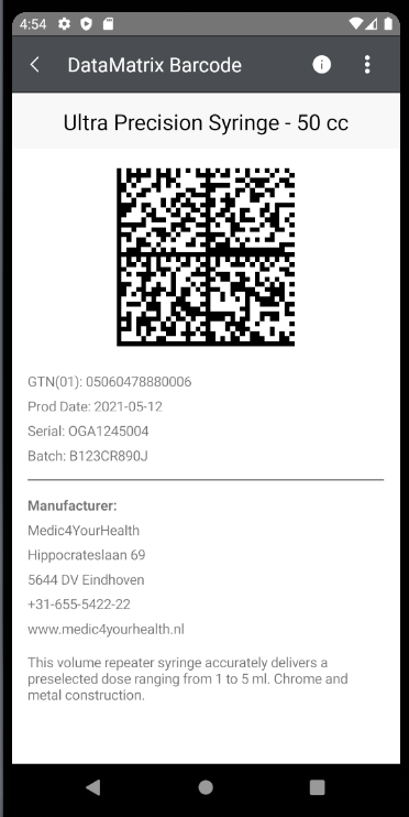
The information to be encoded can be text or numeric data. With a usual data size from a few bytes up to 1,556 bytes (or up to up to 2,335 alphanumeric characters), the Data Matrix barcode is one of the smallest barcodes while encoding the same data as other barcodes. Here are some of its advantages:
- Occupies less space: Data Matrix has the ability to encode a large amount of data in a small area.
- High fault tolerance: Data Matrix code includes an error-correction algorithm, making it able to reconstruct up to 30% of a damaged code image.
- Readability even with low contrast: A contrast of only 20% can be sufficient to successfully read the barcode.
- Read easily: It can be read in any position (0-360°).
For more details about the DataMatrix barcode, please check this section of our help documentation.
Sign Up for a Trial
If you’re interested in starting to play with .NET MAUI, or if you’re already actively working with .NET MAUI to develop applications, I encourage you to check out Telerik UI for .NET MAUI.
To get the bits, you just need to sign up for our free 30-day trial, which gives you access to the components as well as our legendary technical support. Head to the Telerik UI for .NET MAUI overview page or click the button below and sign up for a trial today!
Share Your Feedback
Please share your feedback, ideas and suggestions, either by commenting below or by visiting our Feedback Portal about Telerik UI for .NET MAUI. Let us know if you have any suggestions and submit your features/controls requests.
Kendo UI for jQuery
New jQuery SplitButton Component

Expanding on the number of button types that Kendo UI for jQuery offers out of the box, with this update the new SplitButton component is officially available. This new button type combines the functionality of a button with a dropdown, letting users click on either the main button element to execute one action, or select from a list of other actions in the available dropdown element.
See the jQuery SplitButton demo.
New jQuery DropDownButton Component

Another button added with this update is the new jQuery DropDownButton component. This new button type displays a dropdown element with a list of actions that the user can select from.
See the jQuery DropDownButton demo.
All Components: Improved Accessibility
Continuing our ongoing commitment to making Kendo UI for jQuery as accessible as possible, we have made accessibility improvements across a large portion of Kendo UI for jQuery components, ensuring that the latest version of Kendo UI for jQuery is the most accessible version yet.
See the jQuery Accessibility documentation.
Kendo UI for Angular
Angular Data Grid: Navigable Sections for Keyboard Navigation
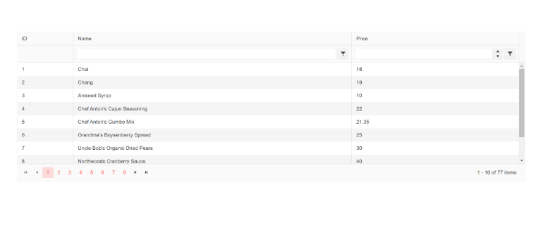
The Kendo UI for Angular Data Grid has focused on accessibility from day one. A big part of building an accessible data grid is to enable keyboard navigation which helps users navigate through elements of the data grid.
Based on feedback from our users, we initially started to improve the accessibility of the paging section of the Angular Data Grid by providing better keyboard navigation when using the pager.
Not being satisfied with just “good enough,” the team realized that we could take this support to the next level and introduce a new option to define “navigable sections” of the Grid. This new feature allows developers to define if keyboard navigation should apply to the table element (the columns and rows of the data grid) or the pager element (the paging component at the top or bottom of the data table), or if keyboard navigation should apply to both. This feature should help any folks who have more specific requirements around accessibility and keyboard navigation behavior.
Just so it is mentioned, the default behavior (when no additional configuration options are set) will have all elements navigable with keyboard navigation out of the box.
See the Angular Data Grid Navigable Sections demo.
Angular Drawer: Hierarchical Items Support
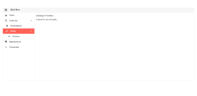
With this update, the Kendo UI for Angular Drawer component added support for hierarchical items, letting any level of the Angular Drawer have child items. Creating the hierarchy can be done by data binding to hierarchical or flat data with defined relationships to create parent/child relationships. This can also be used to create drawer items and sub-items automatically within the drawer.
See the Angular Drawer Hierarchical Item demo.
Angular Dialog: Configurable Animations

Thanks to the new configurable animations feature, the Kendo UI for Angular Dialog component can now be even further customized by controlling the type of animations used when interacting with the dialog. With a new single property, developers can control the type of animation (translate, slide, expand, zoom and fade), the direction of the animation (down, up, left, right), as well as the duration of the animation.
See the Angular Dialog animations demo.
Angular TreeView: Disable Only Parent Nodes and Expand Disabled Nodes

With this update, the Kendo UI for Angular TreeView received two features related to disabled nodes, namely allowing to disable only parent nodes and expanding or collapsing disabled nodes.
Disable Only Parent Nodes
As the feature name gives away, the Angular TreeView can now let parent nodes be disabled without having to disable all the node’s children. Thanks to this new feature,
which is optional, developers can separate the disabled status from the child and parent nodes.
Expand Disabled Nodes
Another feature that the Angular TreeView received is the ability to expand and collapse nodes that have been disabled.
See the Angular TreeView Disable Parent Nodes demo.
Angular Filter: Expression Value Templates
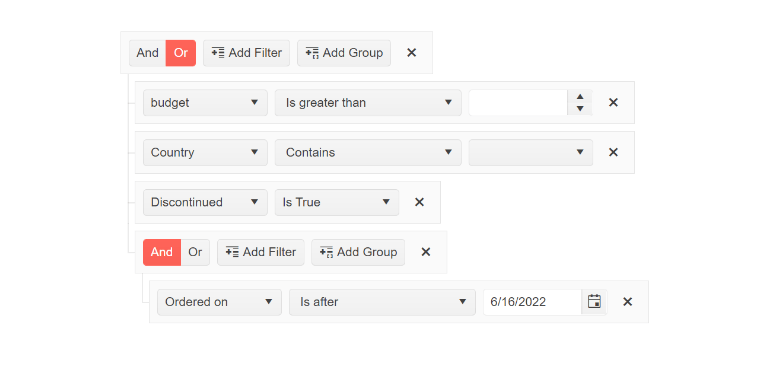
The new Expression Value Templates feature of the Kendo UI for Angular Filter component lets developers provide a completely custom template for any of the editors within the Filter component. By using an ng-template and applying a simple directive, developers get full control over each field that users can interact with.
See the Angular Filter Expression Value Templates demo.
Angular Filter: Support for Declarative Initialization
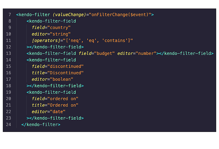
The Kendo UI for Angular Filter component is a very powerful filter expression builder, but up until this most recent update the only way to customize the available filter expression was by adding a <kendo-filter> component to your template and providing a JavaScript object to customize the fields and filters available.
With this most recent update, defining the Angular Filter component can be done completely declaratively by using the new <kendo-filter-field> component for each field and editor that needs to be displayed
within the Filter component.
See the Angular FilterFieldComponent API documentation.
Angular Grid: Documentation Revamp
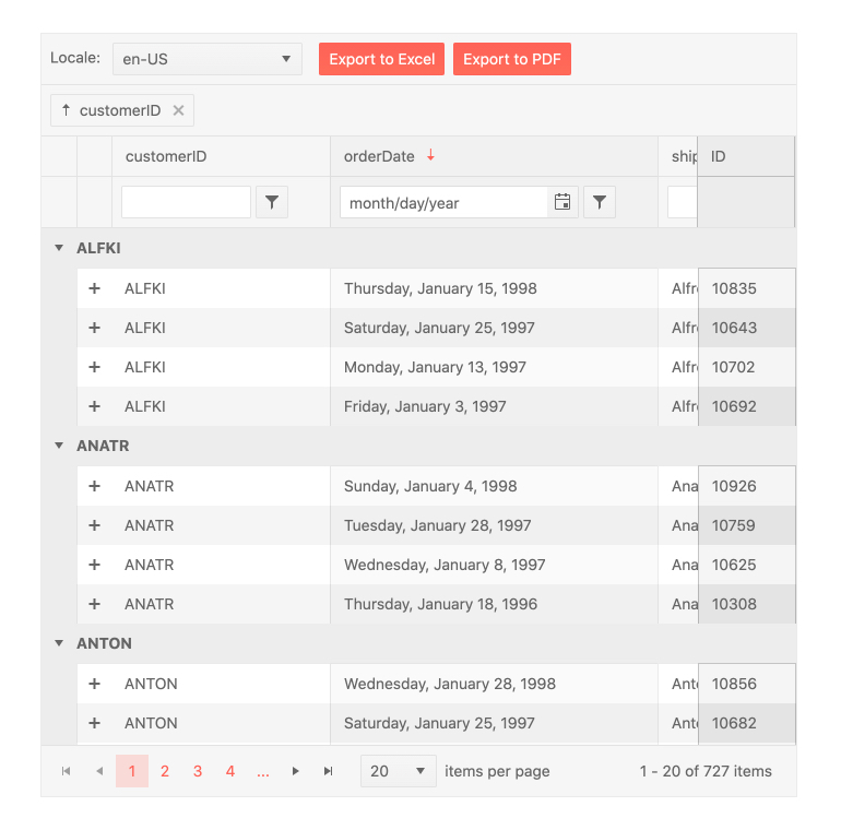
The Kendo UI for Angular Grid is one of the most powerful and most feature-rich data grids that Angular developers have at their disposal. Because of this, it can sometimes be a bit overwhelming to understand all the capabilities of the component.
With this in mind, we have reviewed and updated the Angular Data Grid docs and demos to make information a little easier to find, letting developers quickly get up to speed with this powerful UI component.
See the Angular Data Grid documentation.
All Angular Components: Updated Design for API Pages
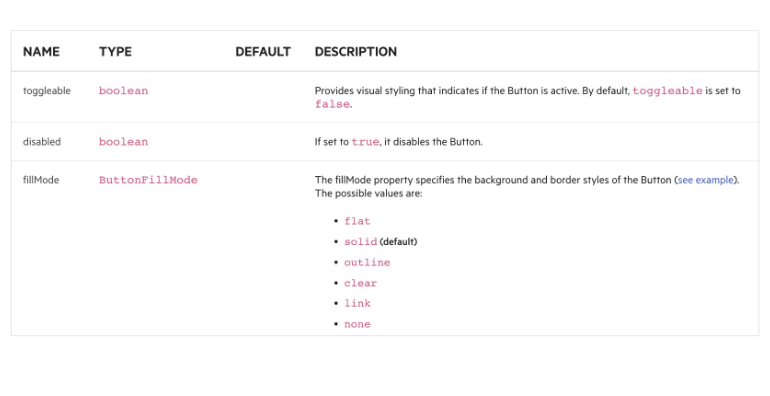
Initially introduced with R2 2022, every API article in the Kendo UI for Angular API documentation has now received a revamped design with this latest update. The goal behind this update is to make the API of each component a little bit easier to navigate and understand.
See the Angular Data Grid API documentation for an example.
Kendo UI for Vue
New Visual Studio Productivity Tools
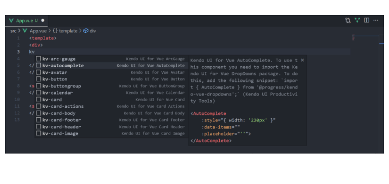
With this latest update, the Kendo UI for Vue team has been busy adding features and functionality into the brand-new Visual Studio Code Productivity Tool! Specifically, the team added support for code snippets to help boost productivity when using Kendo UI for Vue within Visual Studio Code.
These snippets will appear when a developer types kv- and will display a list of all available Kendo UI for Vue components. As users type, the list of available components will automatically filter itself to reduce
the available options. The snippets are smart enough to also display sub-components when configuring Kendo UI for Vue components, so only the most appropriate options will display when using the new snippets.
See the Visual Studio Productivity Tool Code Snippets.
Vue Grid: Live and Updating Data Demo
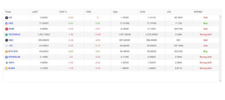
One of the main advantages of a modern JavaScript framework like Vue is the ability to update small portions of your application without having to re-render large sections of your apps. Taking advantage of this aspect of the Vue library, the Kendo UI for Vue Data Grid supports rapidly updating data and can easily be bound to a live data source.
To show how developers can easily bind the Kendo UI for Vue Data Grid to data that is constantly updating, we have created the new Data Grid Live Update demo which can be used to see the performance of the Vue Data Grid with rapidly updating data. There’s even an option to see data refreshed every millisecond, and the Kendo UI for Vue Grid doesn’t even blink at the challenge!
See the Vue Data Grid Live Update demo.
Vue Grid: Sticky Rows Example
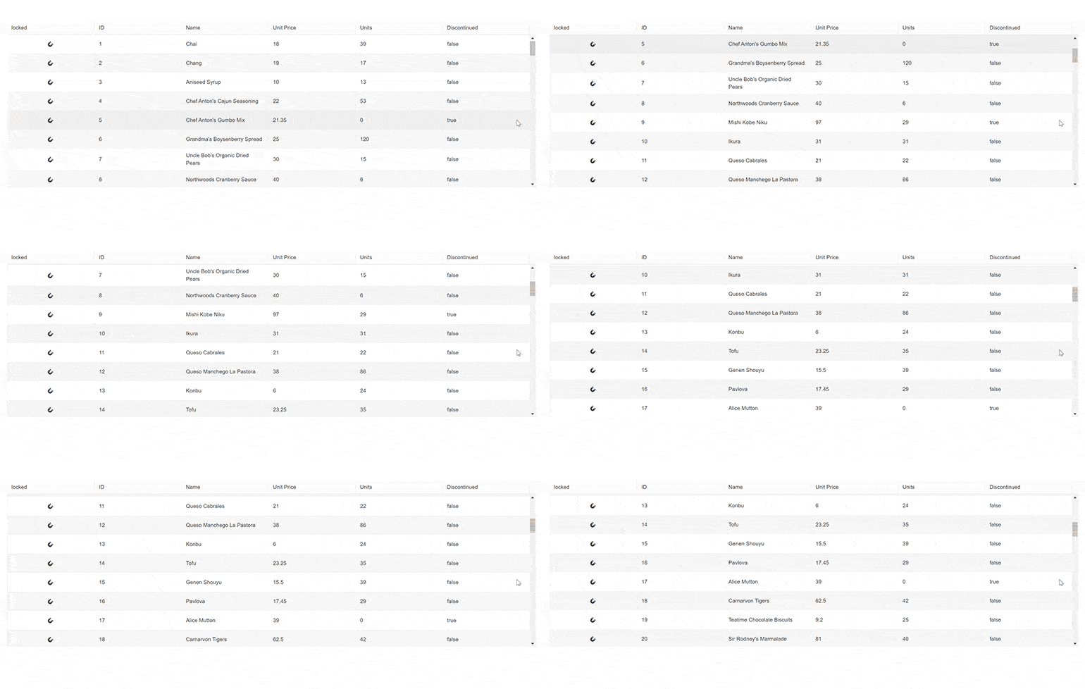
With this update, the Kendo UI for Vue Data Grid added an example showcasing how to add “sticky” rows. These sticky rows will stick to the top of the data grid as users scroll through the content. What makes a row sticky and not frozen is that the row can initially appear as a regular row and will only stick to the top when the row is scrolled past. Additionally, when users scroll back through the rows the row can become “un-stuck” and remain in its original position.
See the Vue Data Grid Sticky Rows demo.
Vue Grid: Loading Indicator Support
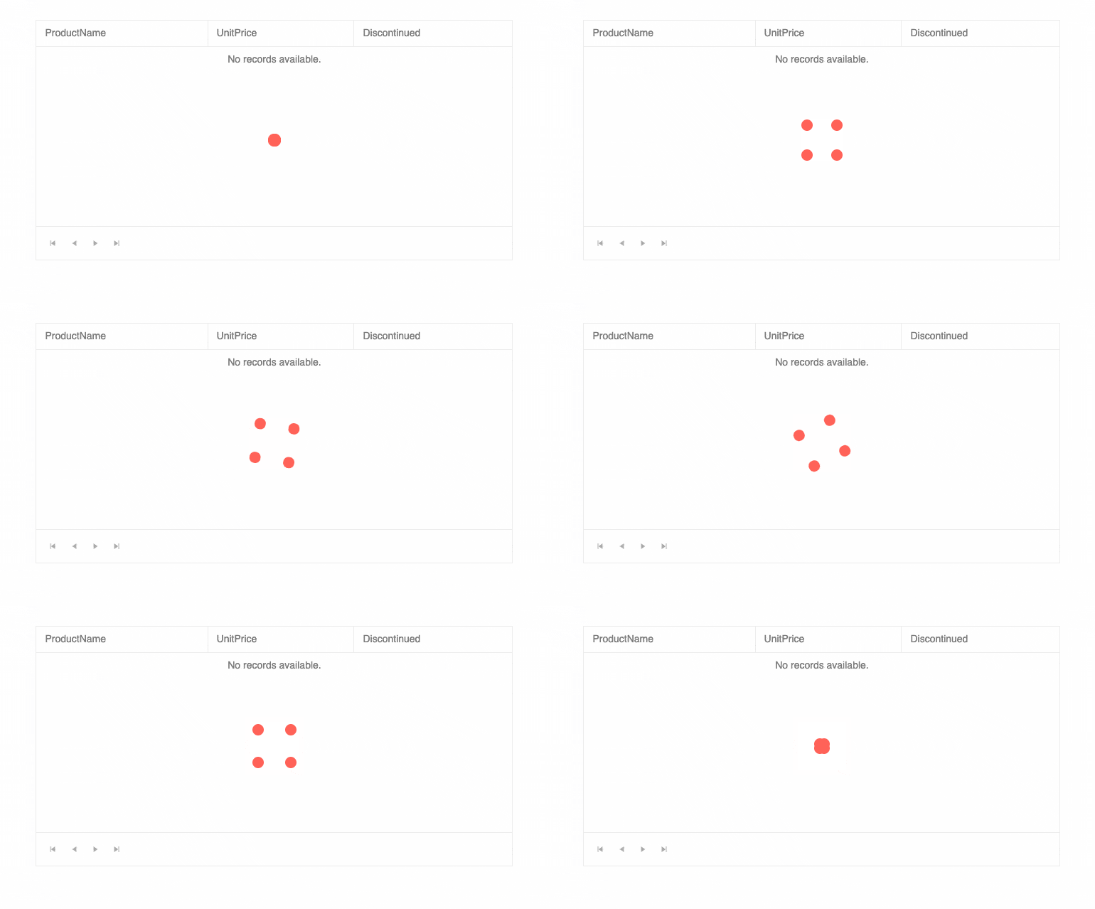
Another update we added to the Kendo UI for Vue Data Grid with this update is the new built-in loading indicator. This new indicator will be displayed whenever data operations, like loading or filtering data, require some additional time before all data has properly been loaded. This is a big quality-of-life improvement for end users of the Vue Data Grid, as any user will immediately understand that they are waiting for some operation to finish loading.
See the Vue Data Grid Loading Indicator demo.
All Vue Input Components: Suffix and Prefix Support

Textboxes and inputs are usually more than simple square elements that users can type into. Inputs can be responsible for user input, searches, date selection and way more. This means there is almost an infinite number of combinations of UI elements that can be attached to an input element.
With this in mind, the Kendo UI for Vue Input components have now added the ability to add custom elements before the input element (a prefix) or after the input element (suffix). This new feature, also called “adornments,” lets developers customize all Kendo UI for Vue input elements without needing to deeply modify the components through source code, making these input components extremely flexible.
See Vue Inputs Adornments demo.
Vue DropDownList, ComboBox and MultiSelect Components: Added valuePrimitive Property
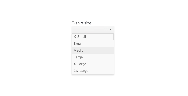
Based on user feedback, the Kendo UI for Vue team added the valuePrimitive property to the DropDownList, ComboBox and MultiSelect components. This property controls the value-binding behavior of the component.
When set to true, the value of the component will be extracted from the valueField that was set. When set to false, the value of the component will be extracted as an object representing
the data item of the selected item.
See the Vue DropDown API documentation.
All Vue Components: Updated Design for API Pages
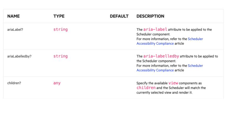
Navigating through the API of the Kendo UI for Vue components can sometimes be a bit daunting—there are so many features available, after all! With this most recent update, the Kendo UI for Vue team has gone through all the available API documentation sections and given them a new and fresh design. With this new design, developers will quickly find the appropriate API section and it will hopefully make it easier to learn the ins and outs of the Kendo UI for Vue components.
See the Vue Data Grid API documentation as an example.
KendoReact
New Visual Studio Productivity Tools
KendoReact immediately increases the productivity of any React developer who picks up the library, but there are always ways that we can help boost productivity!
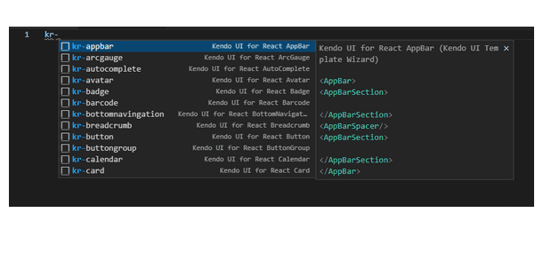
In this vein, we have added new features to the KendoReact Productivity Tool for Visual Studio Code! With this update, we have added support for KendoReact snippets, which can be used to save precious keystrokes when developing with KendoReact components.
The snippets will display as soon as a developer types kr- and shows a popup with all of the KendoReact components and automatically filters as you start to type the component name. Once you have filtered down
the list, or used your arrow keys to select the appropriate component, hitting the tab key will automatically type out the entire component declaration. This also works for sub-components, and the snippets are smart enough
to only display the appropriate options when within an existing components’ declaration.
See the Visual Studio Productivity Tool Code Snippets.
All React Components: Support for the Latest Version of TypeScript

As a widely used UI library, KendoReact supports a wide range of users working with various versions of React (ranging from 16.8.2 to the latest 18.2). An interesting side effect of this range of version support is dealing with support for a range of TypeScript versions as well.
However, with the release of React 18, we realized that it was time to update the version of TypeScript we use to build the KendoReact components and ensure that we can operate within React 18 without any TypeScript errors.
Therefore, with today’s release we have built the KendoReact components against the latest stable version of TypeScript (4.7.3) and we also use the latest @types/react version (18.0.13).
While we have updated the version of TypeScript that we use for the KendoReact components, we still support all React versions above 16.8.2.
See the KendoReact TypeScript support in any of our online demos.
All React Components: Updated Design for API Docs
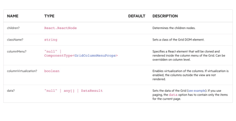
With over 100 UI components built specifically for React, the KendoReact library has an extensive set of API documentation articles. Navigating through any API documentation can be a bit daunting and confusing at times.
To make it easier to read and understand the available API of all KendoReact components, the team has revamped every single API page to follow a new and updated design. This new design will let developers quickly navigate through the available APIs of KendoReact and will hopefully make it easier to learn all the React UI components found in the library.
See the KendoReact Grid API section for an example.
Telerik JustMock
With R2 2022 Service Pack 1, we are releasing some very important fixes for many of you Telerik JustMock users.
Enabling the Profiler Causes an Unexpected Stack Overflow
In a very custom scenario, an unexpected stack overflow exception is thrown when the profiler is enabled from the JustMock extension within Visual Studio. That exception prevented the tests from successfully being executed. We are happy to announce that the problem is now resolved.
A Breakpoint Is Not Hit During Debugging of an Async Test
JustMock had an issue when you try to debug an async unit test. The breakpoint was simply not hit at all, which was preventing the debugging experience inside Visual Studio, and of course that was a frustrating issue. We are happy to announce that this problem is now resolved.
Using a Different Version of the NuGet Package Compared to the Locally Installed Product Could Cause an Unexpected Error
Until now, when you tried to update your JustMock.Commercial NuGet package but forgot to update the JustMock installation on your dev machine, an exception would occur when the tests were executed. The reason for that is because the profiler wouldn’t match the .NET version. The exception was not helpful in resolving what the actual issue was. With R2 SP1 2022, we’ve introduced a mechanism that will generate a much more meaningful exception message that will immediately point you to the exact problem.
Unable to Mock CultureInfo
With R3 2021 release, we introduced a regression problem that prevented JustMock from being able to mock the CultureInfo class. With R2 SP1 2022, the problem is fixed.
Telerik Reporting and Telerik Report Server
Our R2 2022 SP1 release for Telerik Reporting and Telerik Report Server is pointed toward improving product stability, polishing existing features, and also introducing new features highly anticipated by the community.
Separate Excel Worksheets
Such a feature is the ability to generate separate Excel worksheets based on the page breaks in the report definition. This functionality is controlled by a dedicated device info setting named SplitWorksheetOnPageBreak and works similarly to the so-called “soft page breaks.” It is really useful in scenarios where different report sections or table groups must be placed in separate worksheets.
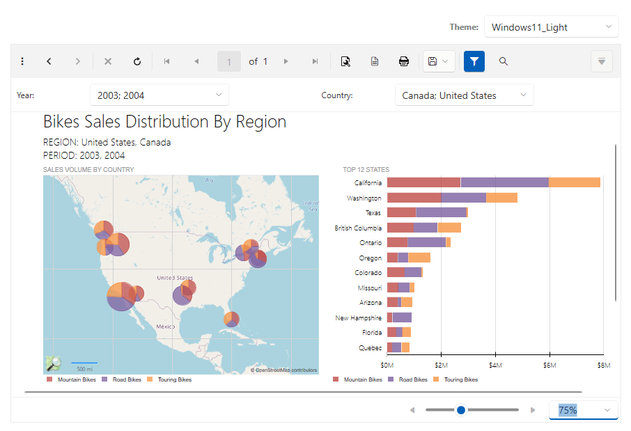
WPF Report Viewer Windows 11 Theme
Backed by our buddies in the Telerik UI for WPF team, we have added a new theme for our WPF report viewer. It is inspired by Windows 11 and comes in two flavors—Dark and Light. By a long-running tradition, we have set it as a default theme in our WPF examples, but with a twist: It will detect the current mode of your Windows and will automatically apply the Dark or Light variation of the theme.
Download Options
Up until now, Telerik Reporting was distributed only as an MSI package or a set of NuGet packages for specific assemblies. The MSI installer is still the preferred way to deploy Telerik Reporting on your machine because it does the heavy lifting on extracting the assemblies in their corresponding folders, configuring the connection strings for the examples, and registering the Visual Studio extensions in assemblies in both IDE and GAC.
Starting with this release, we add another downloadable asset—a .zip file containing all the assemblies, JavaScript and CSS files that can be used in an application. This makes it convenient for the users that need to reference our assemblies without installing them on their machines.
Installation Goodies
Speaking of deployment, we have added more goodies in the installation folder of Telerik Reporting. Now in the \Html5 subfolder, you can find all the necessary .js and .css files for Web Report Designer and HTML5 Report Viewer. We also added the string resource files, used to localize the JavaScript widgets, so you’ll have one less thing to worry about.
Web Report Designer API
In our previous releases, we have introduced significant changes to the Web Report Designer’s API. One of the new concepts was the IResourceResolver interface that makes it possible to pass your own class, responsible for resources retrieval. Now we went a step further, providing a sample implementation of the IResourceResolver interface in the HTML5 and Blazor example projects, distributed with our product. This implementation, named CustomResourceResolver, also serves to handle correctly the resource requests made by reports, created with the Web Report Designer and hosted in the same application.
Angular and React Example Projects
We have also improved the Angular and React example projects. Up until now, they were using an external Reporting Web API REST service. To avoid confusion, we made these demos self-contained. The examples are now configured to start the Reporting REST service and run the application with a single “npm run start” command.
Web Report Designer Strides
We’re constantly closing the gap between the Web Report Designer and its mature siblings. In R2 2022 SP1 we have added more improvements to the Assets Manager—the resource manager for all the assets used in the reports, making it more stable, usable and productive. We have improved the dialogs for creating and saving reports, adding the option to choose a location through the Assets Manager, instead of typing it by hand.
Stability and Productivity Improvements
We have also addressed numerous issues, adding stability and productivity improvements. Some of the fixes that are worth mentioning are the ones that affect the Table and Crosstab design-time experience. Our users have reported issues in some complex scenarios, and—after extensive refactoring—we can claim we have fixed all of the reported issues. The best part is that the fixes are applied to all three report designers—the Standalone Report Designer, the Visual Studio Report Designer and the Web Report Designer widget.
Learn More
Most of the improvements listed above are naturally applied to the Report Server application since it internally uses the Reporting engine and uses Standalone Report Designer or Web Report Designer to design its report assets. Still, if you want to have a detailed overview what’s fixed, check the What’s New pages for Telerik Reporting and Telerik Report Server.
Whew!
That’s it for this month. We’ll have more to share in a few weeks.