Support for the latest Preview of .NET MAUI, two brand-new controls—DateTimePicker and Entry components—and more in our growing Telerik UI for .NET MAUI suite.
Aloha, and welcome to another Telerik UI for .NET MAUI release! In addition to the mandatory support for the latest Preview of .NET MAUI, we are now shipping two brand-new controls as part of our growing Telerik UI for .NET MAUI suite—DateTimePicker and Entry components! We also added desktop support of our powerful picker components, so you can use them to develop apps for Windows and macOS platforms. Last but not least, we have added support for Pie and Donut charts in our Chart component.
Support for .NET MAUI Preview 14
We always make sure that all our existing controls are compatible with the latest Preview from Microsoft. We ensured that the Telerik UI for the .NET MAUI controls suite is up to date with the .NET MAUI Preview 14.
New DateTimePicker Component
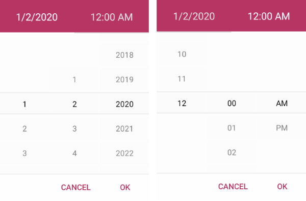
One of the new additions to the Telerik UI for .NET MAUI family is the DateTimePicker control. It provides users with an easy and intuitive way to pick a date, time or—depending on the used format—string. The component has several features that allow you to set a date range, date and time format, and fully customize the dialog appearance.

Here are some of the key features to look for:
-
Spinner format: The component allows you to use a standard or custom date format string through its SpinnerFormat property. Depending on what format is set, the picker visualizes spinner controls with the prepopulated values ready to be picked.
-
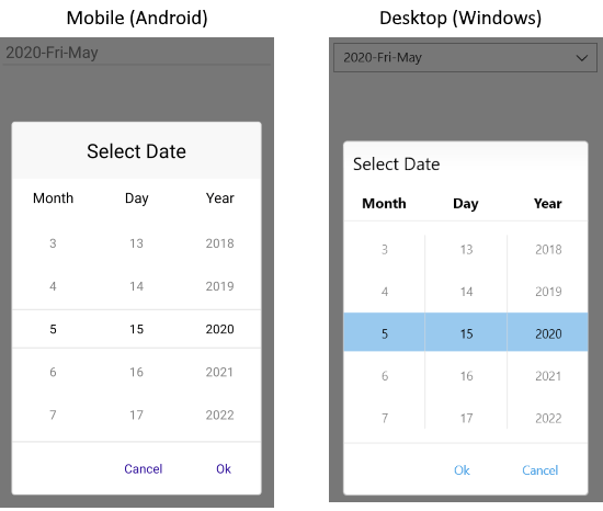
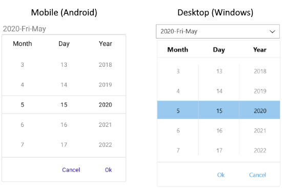
Picker mode: You can choose between Popup and DropDown UI for showing the spinner controls with the available date and time values. For desktop, the default picker mode is DropDown, while for mobile it’s Popup.
-
Templates: The DateTimePicker provides templates for its header and footer as well as exposes templates for its placeholder and display text.
-
DisplayString format: You can choose what text will be displayed when a date is selected by using the DisplayStringFormat property of the DateTimePicker.
-
Date ranges: You can also define date ranges by setting minimum and maximum date values and choose a date within that range.
-
Flexible styling API: The DateTimePicker provides a number of styling capabilities, which enable you to easily style its spinners, popup, popup header and footer, the displayed text displayed after a date is selected, and more.
-
Commands support: The DateTimePicker exposes commands that allow you to clear the selected date and to open and close the popup.
For more information on getting started with the Telerik UI for .NET MAUI DateTimePicker control, visit our product documentation.
Pickers Enhancements
Alongside our new DateTimePicker component, we introduced desktop support for the rest of our pickers—DatePicker, TimePicker, TimeSpanPicker, ListPicker and TemplatedPicker. Meaning that now you can use these powerful components on both Windows and macOS.
Moreover, all pickers now expose a new property—PickerMode—which specifies the UI for picking a value. It has two options:
- Popup – Shows the UI for picking a date inside a popup. It’s the default value for mobile (Android and iOS).

- DropDown – Opens the UI for picking a date inside a dropdown. It’s the default value for desktop (Windows, macOS).

New Entry Component

The Telerik UI for .NET MAUI Entry component has evolved. The text control that accepts string inputs now is built against the latest UI guidelines and comes with many enhancements in its API. Here are the most important features of the control:
- Password functionality: You can hide the characters that users type for privacy and security reasons.
- Keyboard support: You can add a virtual keyboard and specify its type—for example, Numeric.
- Non-editable (read-only) state: You can define whether users will be able to edit the Entry or not by setting a single property.
- Maximum number of symbols: The Entry component enables you to set a maximum length for its input.
- Text selection: You can specify the starting position of the selected text as well as the number of characters of the selected Entry input.
- Text prediction: Define whether to have a predictive text while typing in the Entry.
- Validation: If the user is entering a value not matching the requirements, the Entry will display an error message, which you can easily customize.
- Clear button: Gives you the option to clear all the text entered in the Entry using a single button.
- Commands support: Use the ReturnCommand to implement additional logic when pressing the keyboard return key.
- Various styling options: For applying corner radius, clear button color, placeholder color and more.
For more information on dabbling with the Telerik UI for MAUI Entry control, visit our documentation.
New to Telerik UI for .NET MAUI? Try It & Share Your Feedback
If you are new to Telerik UI for .NET MAUI, you can learn more about it via the product page. The Telerik UI for .NET MAUI controls are currently in preview and they are free to experiment with, so don’t wait—jump on the cross-platform development bandwagon!