Looking for a neat and easy way to track multistep processes in your WPF apps? No need to search elsewhere—you have landed to the right place! The latest R1 2022 release of Telerik UI for WPF brought a new RadStepProgressBar component.

If you have any doubts whether this is the best tool for tracking progress, well then let me help you decide. What to expect from this blog post—all the spicy details of RadStepProgressBar’s main features and their usage. So, let us start the journey together with the reasons for choosing a step progress bar.
Reasons To Use a StepProgressBar
There is nothing more boring than filling out a long form. And if you tell me that this never happened to you, it would be a lie. An even bigger lie—not skipping such a form.
Here is the need for a step progress bar. It enables you to set up a visual element that displays a multistep process via a number of different steps and a progress track bar between each step, to make an otherwise long form less intimidating for users to complete.
The list of what is it applicable for is longer than a letter to Santa Claus. Be it registrations, making appointments, package status tracking, quizzes, longer surveys, and so on and so forth.
Let’s proceed with a quick getting started tutorial and then we will head to the “Key Features” Pole now.
Put It in Action
For this section, you will need the following prerequisites—a fresh WPF app, a reference to the Telerik.Windows.Controls assembly. The rest is like a walk in the park:
<telerik:RadStepProgressBar xmlns:telerik="http://schemas.telerik.com/2008/xaml/presentation"> <telerik:RadStepProgressBarItem Content="Ordered" AdditionalContent="1/10/2020"/> <telerik:RadStepProgressBarItem Content="Packed" AdditionalContent="10/10/2020" /> <telerik:RadStepProgressBarItem Content="Shipped" AdditionalContent="1/2/2021" /> <telerik:RadStepProgressBarItem Content="Delivered" AdditionalContent="5/2/2021" /> </telerik:RadStepProgressBar>Shall we see how this looks?

As promised, this was the easiest way possible to get started with the RadStepProgressBar. If you want to take things to the next level, you can use the control in a data binding scenario. No need to say that this can be done with the ItemsSource property, right? And that a RadStepProgressBarItem will be auto generated for each member of your data collection, too?
Key Features Examination
Did you expect a different outcome than the above? Continue with this section to learn all the specifics and explore the flexible customization capabilities.
Orientation and Layout
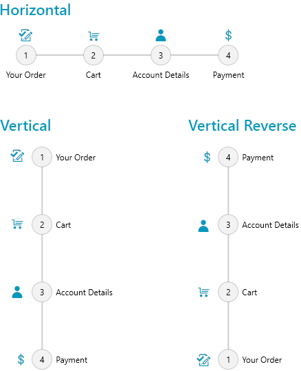
If you expected the step progress bar to be differently oriented, do not worry—you can change that through the Orientation property. Horizontal or vertical—it is all up to you. Not enough? The flow direction could also be reversed—right to left or bottom to top.
Tune the Step
Small steps matter. But if the spacing between the progress bar’s steps is too little, or too much, do not worry. Got that covered. The StepSpacing property might come in handy.

The shape of the step matters, too. For each StepProgressBarItem, you can choose from the telerik:Geometry predefined types or create a custom one. Once you have found the perfect one, just assigned it to any item’s ShapeGeometry property.
<telerik:RadStepProgressBar> <telerik:RadStepProgressBarItem ShapeGeometry="{telerik:Geometry Type=Ellipse}" Background="MediumPurple" Foreground="#FFFFFFFF" ShapeWidth="30" ShapeHeight="30"/> <telerik:RadStepProgressBarItem ShapeGeometry="{telerik:Geometry Type=Square}" Background="LimeGreen" Foreground="#FFFFFFFF" ShapeWidth="30" ShapeHeight="30"/> <telerik:RadStepProgressBarItem ShapeGeometry="{telerik:Geometry Type=Cloud}" Background="DeepSkyBlue" Foreground="#FFFFFFFF" ShapeWidth="40" ShapeHeight="30"/> </telerik:RadStepProgressBar>
Of course, each step can be selected. To track its status, the RadStepProgressBar exposes three handy states—NotStarted, Indeterminate and Completed. Selecting a step changes its status to completed.
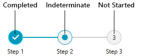
As you may have already guessed, each state displays a different indicator inside the step shape.
Tune the Content
And each indicator has content, which is fully customizable. There is a set of Content and ContentTemplate properties based on the state of the step:
- NotStartedIndicatorContent
- NotStartedIndicatorContentTemplate
- IndeterminateIndicatorContent
- IndeterminateIndicatorContentTemplate
- CompletedIndicatorContent
- CompletedIndicatorContentTemplate
<telerik:RadStepProgressBar Width="300" SelectedItemStatus="Indeterminate"> <telerik:RadStepProgressBar.Resources> <DataTemplate x:Key="IndicatorContentTemplate"> <TextBlock Text="{Binding}" Foreground="#1fd6fc" /> </DataTemplate> </telerik:RadStepProgressBar.Resources> <telerik:RadStepProgressBarItem NotStartedIndicatorContent="N/A" CompletedIndicatorContent="Yes" IndeterminateIndicatorContent="..." CompletedIndicatorContentTemplate="{StaticResource IndicatorContentTemplate}" IndeterminateIndicatorContentTemplate="{StaticResource IndicatorContentTemplate}" /> <telerik:RadStepProgressBarItem NotStartedIndicatorContent="N/A" CompletedIndicatorContent="Yes" IndeterminateIndicatorContent="..." CompletedIndicatorContentTemplate="{StaticResource IndicatorContentTemplate}" IndeterminateIndicatorContentTemplate="{StaticResource IndicatorContentTemplate}"/> <telerik:RadStepProgressBarItem NotStartedIndicatorContent="N/A" CompletedIndicatorContent="Yes" IndeterminateIndicatorContent="?" CompletedIndicatorContentTemplate="{StaticResource IndicatorContentTemplate}" IndeterminateIndicatorContentTemplate="{StaticResource IndicatorContentTemplate}"/></telerik:RadStepProgressBar>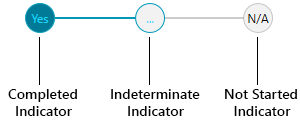
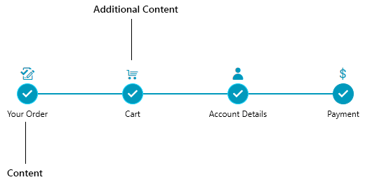
For a detailed information about each step, be sure to benefit from the Content and AdditionalContent properties.
Customizing the Appearance
Customizing the appearance of the RadStepProgressBar is simple because a rich set of features is provided and can be easily used.
By way of example, here are some scenarios that illustrate how much freedom you have to customize the look and feel of the StepProgressBar.
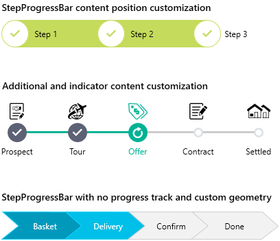
Do you like what you see? You can find how to achieve all of them in our demos application.
Try It and Share Your Feedback
Hope I got it all covered. In case I missed something, be sure to check the documentation, too.
I believe RadStepProgressBar will totally fit your needs, so do not wait another minute to get yourself a free trial of Telerik UI for WPF today and try it out.
As always, your thoughts and suggestions are greatly appreciated, so make sure to drop them in the comments section below or use the well-known Feedback Portal.
Thanks for reading!