The R1 2022 release of Kendo UI for Angular is here, bringing five new Angular UI components and 23 new features across our existing Angular components!
The R1 2022 release for Kendo UI for Angular is here and ready to kick off 2022 with a bang! This release features brand-new components, several updates to existing components, support for Angular 13, new Figma UI Kits, and so much more. Without further ado, let’s jump right in!
Angular 13 Support

Angular 13 was released in November 2021, and Kendo UI for Angular has had support since Day Zero. For anyone looking to update to the latest edition of the Angular framework, you can safely do so by just updating to the latest versions of the Kendo UI for Angular packages.
Kendo UI Kit for Figma v1.7
In 2021, we introduced the Telerik and Kendo UI Kits for Figma to help improve the productivity and collaboration between designers and developers on teams using Kendo UI.
With R1 2022, we have introduced Figma components for all Telerik and Kendo UI components (charts being the one exception). With this latest update, designers should have even more assets to use in their designs.
Buttons, Inputs, DateInputs and DropDowns Packages: New Theme Rendering Options
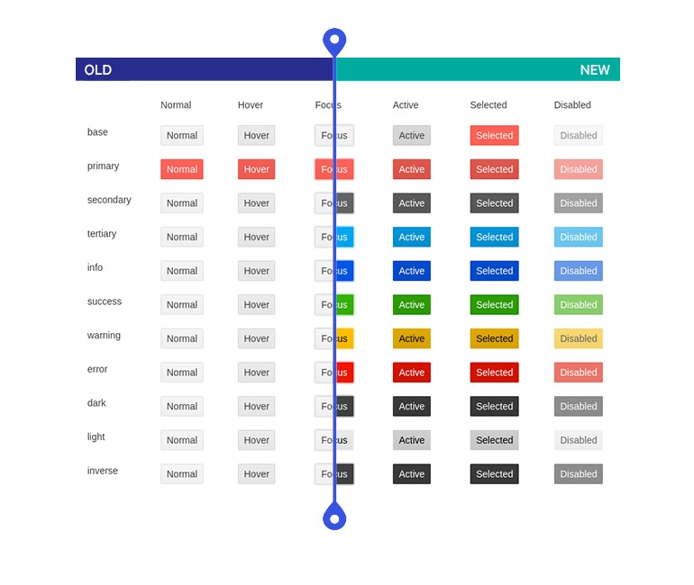
As part of an ongoing effort to make Kendo UI for Angular and its themes more flexible and to help our users to include more designs and meet UX requirements, we are revisiting all Kendo UI components across the Default, Bootstrap and Material themes. Specifically, we are working toward introducing common options that can be set on a component level that can help with defining the main theme colors, the size and shape of individual components, and more.
With R1 2022, we have updated the Buttons, Inputs, DateInputs and DropDowns to offer the following theme rendering options:
- themeColor
- fillMode
- size
- shape
- rounded
A note to make here is that these updates will include breaking changes to the visual aspect of Kendo UI for Angular. For anyone customizing our components or doing visual regression testing, we recommend taking some extra time to review these changes.
Larger visual updates like these can have implications in the form of visual regressions which could appear when upgrading from an older version to R1 2022. While we believe that we have caught and resolved many visual regression issues while getting ready for R1 2022, there may be additional issues discovered after the release. We are firmly committed to addressing these issues as quickly as possible and will continue to push out updates with fixes to our themes and components after the R1 2022 release.
To provide more information about these changes and our general plan around the Kendo UI themes, we recently posted Improvements Coming to Telerik and Kendo UI Themes in 2022.
New Angular Components
New Component: Angular Barcode
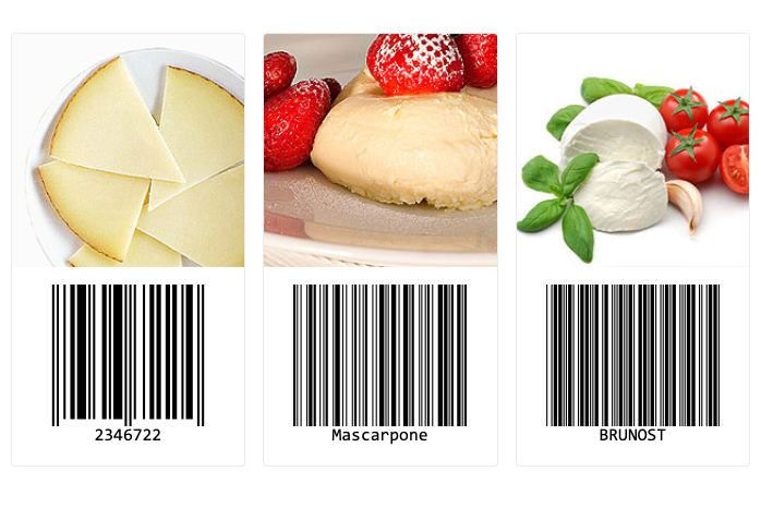
The first new component that I’d like to cover is the new Kendo UI for Angular Barcode component. As you can probably guess, this component can be used to render barcodes within your Angular applications. The Angular Barcode comes with support for several 1D barcode types—all available through built-in configuration options.
Each Angular Barcode can be rendered as an SVG or a Canvas element by setting a single property appropriately. The barcodes can be rendered either as a SVG or Canvas element. Additionally, each Barcode can be exported in PDF or PNG formats.
See the new Kendo UI for Angular Barcode demos here.
New Component: Angular QR Code
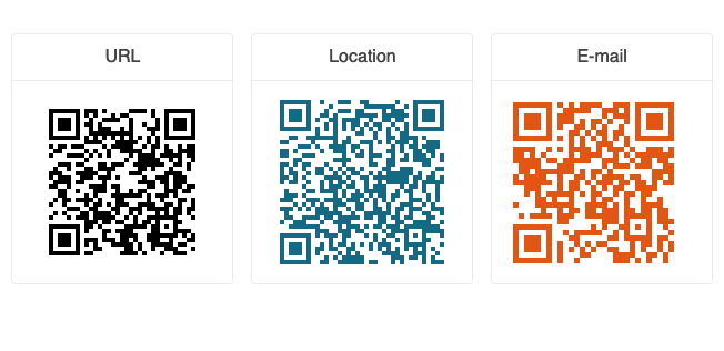
In a similar vein to the Barcode component above, with R1 2022 we are also introducing the Angular QR Code component! This new component comes with built-in support for encoding and error correction—something very important for those familiar with QR Codes. And you can add a custom overlay to the Angular QR Code to add items like a company logo to the QR Code. This opens up the opportunity to support specific types like the Swiss QR Code. These Angular QR Codes can be rendered both as SVG or Canvas elements and can be exported to various formats like PDF or PNG.
See more about the Angular QR Code component right here.
New Component: Angular Filter
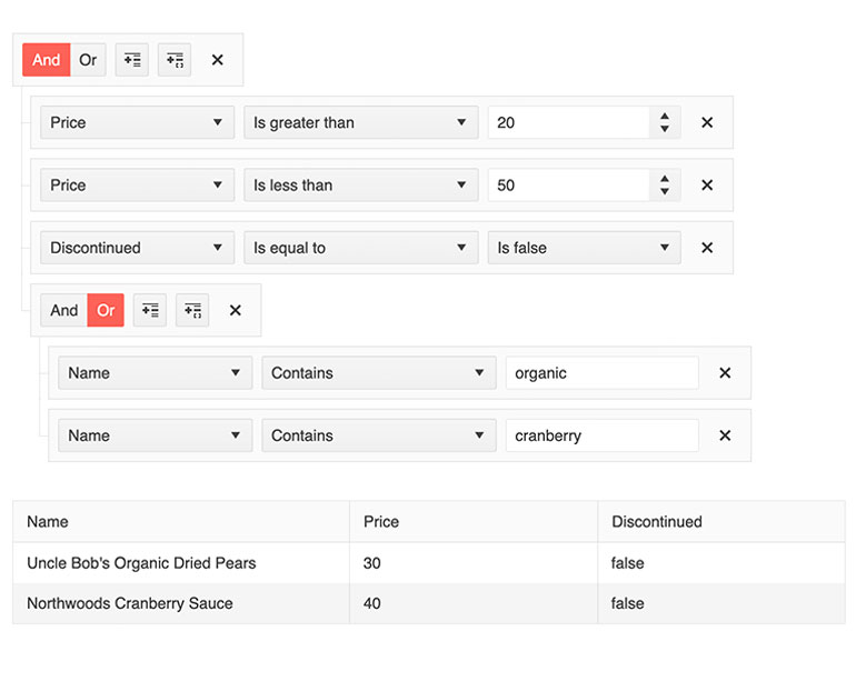
With this latest update, Kendo UI for Angular has added the new Filter component to the constantly growing list of UI components for Angular. The Angular Filter component lets users create more complex filter expressions using an intuitive user interface. The filter expressions can be tied to any existing data collection within your Angular application and can be connected to existing data-bound UI components like the Kendo UI for Angular data grid.
New Component: Angular Popover
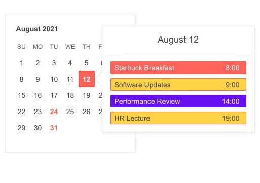
The new Kendo UI for Angular Popover component gives developers an easy way to display additional information about an element on focus, click or hover. While there is a connection to other similar components like the Tooltip, the Angular Popover is designed to display more advanced content. Common scenarios include the element which gets displayed when hovering over calendar elements within Google Calendar or Outlook, where information like attendees, meeting notes and additional event-related information can be displayed.
New Component: Angular FlatColorPicker

The Kendo UI for Angular FlatColorPicker component expands the number of ways users can select a color within any Angular application. The component renders the entire color-picking interface without being hidden behind a dropdown or any other element. The FlatColorPicker component can easily integrate into both template-driven and reactive forms.
Check out the Angular FlatColorPicker component demos here.
Expanded Component Features
All Angular Charts: Updated Colors and Design
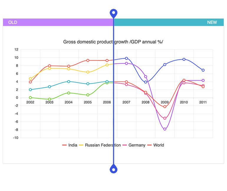
The theme updates for R1 2022 have also brought new and updated colors to all Kendo UI for Angular Charts. For anyone who may not be familiar, these new default colors are used when no color has been explicitly set for a series. This update ensures that the default colors have a better fit with the Kendo UI theme that is being used, should make the Angular Charts look more modern, and the update gives more colors to use out of the box.
If you want to preserve the old theme default colors, we put together a “Using Series Colors from Themes v4” documentation section.
Check out the new default colors in the Kendo UI for Angular Charts here.
Angular Chart: Improved Pan and Zoom
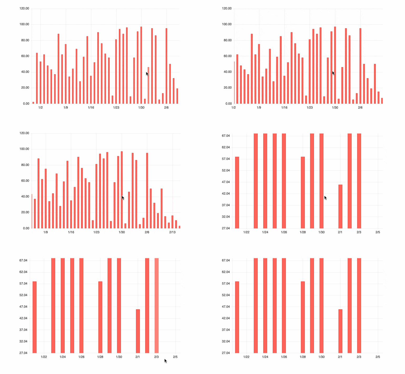
Panning and zooming have both been a part of the Kendo UI for Angular Charts since the first release of the Angular Charting library, but with R1 2022 we have optimized this interaction. We have vastly improved usability when using the mouse wheel when panning and zooming. The zoom is now consistent in both directions and the hovered point remains under the cursor. All you need to do to see improvements is update to the latest edition of the Angular Chart package!
To play around with this improved feature, you can refer to the Angular Chart component Pan and Zoom demos.
Angular Grid: Live Updating Data Example
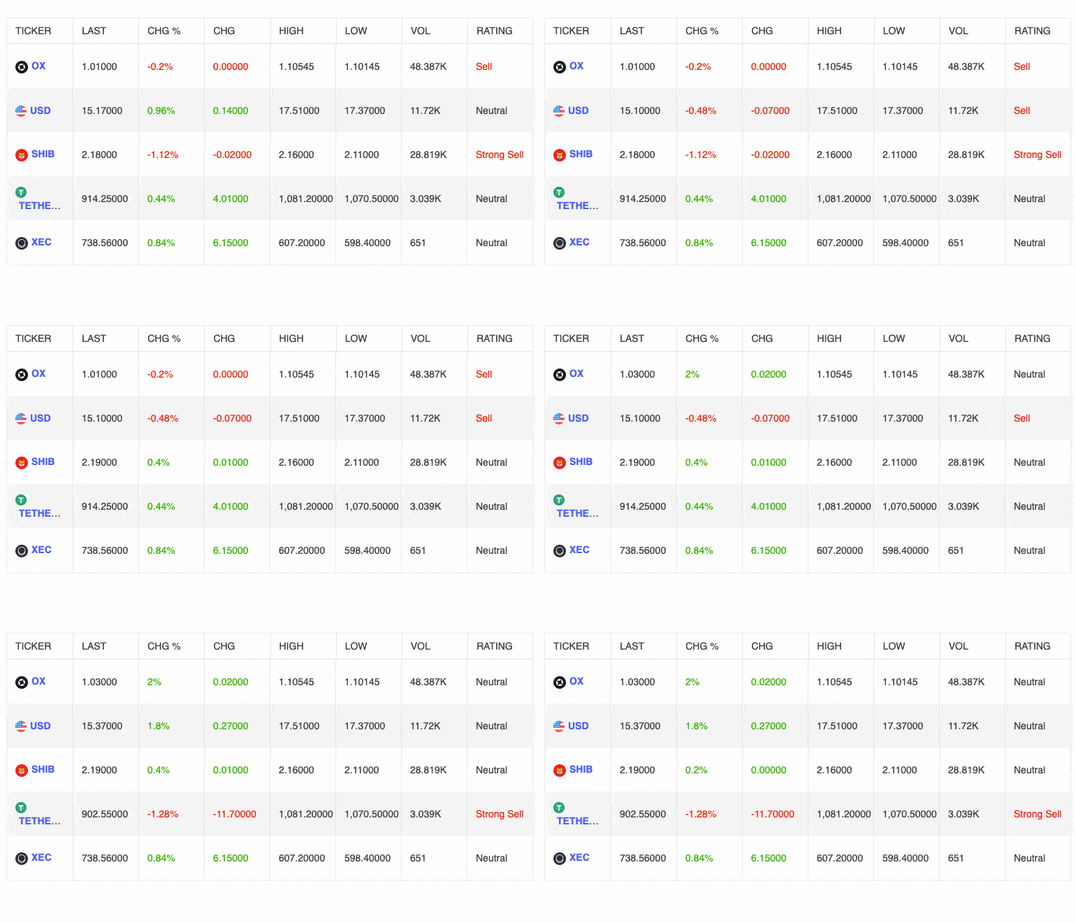
While this feature has been possible in Kendo UI for Angular for some time, with this update we have added specific documentation and helpful resources around how to bind live and updating data directly to the Kendo UI for Angular Data Grid. As the provided demo showcases, individual cells within the Angular data grid can be updated without re-rendering the entire component, which lets the component maintain blazingly fast performance as data is updated under the hood. This is a very popular feature for any data grid component, so we wanted to make sure that developers had articles and information that is easy to access to pull inspiration from.
Here’s a direct link to the Angular Grid Live Updating Data demo.
Angular Gantt: Selection
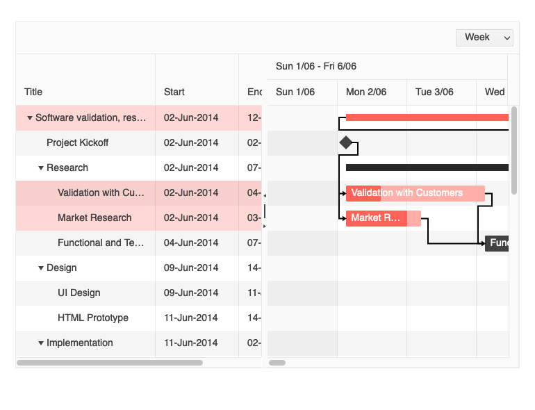
With R1 2022, the Angular Gantt component is officially coming out of the beta stage and entering RTM. With this comes a whole slew of new features, including the ability to select rows and tasks within the Gantt component.
See the Angular Gantt Selection demo here.
Angular Gantt: Editing
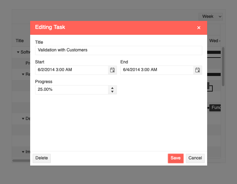
Another big and exciting feature added to the Kendo UI for Angular Gantt component is the ability to edit items within the Gantt. As of this release, users can edit items through a couple of different interactions.
The first is to directly edit within the TreeList portion of the UI component (what is displayed on the left-hand side) by interacting with individual cells and updating their value, also known as in-cell editing.
The second approach is for the Angular Gantt component to be configured to use a built-in dialog window to handle editing. This can be opened by interacting with the tasks on the right-hand side of the Gantt component.
Check out the Angular Gantt Editing demo right here.
Angular Gantt: Creation of Dependencies
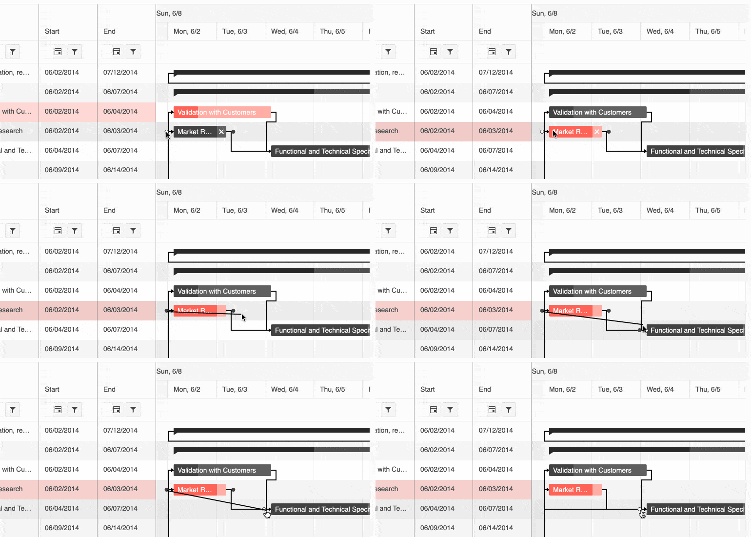
Extending upon the work the team did around editing the Gantt component, with this update the Kendo UI for Angular Gantt component received the ability to create new dependencies between Gantt Tasks. Users can now create their own dependencies between tasks, which is important for any Gantt component that allows end-user interaction and is not just in read-only mode.
Check out the Angular Gantt component Task Dependency demos here.
Angular Gantt: Accessibility

Accessibility is one of the main pillars within Kendo UI for Angular, and we wanted to address this as quickly as possible with the new Angular Gantt component. Beyond the rendering of the component, this also means that the Angular Gantt now has built-in keyboard navigation.
With this latest release, the Gantt now offers compliance with Section 508, WCAG 2.1, and WAI-ARIA standards.
For more information about accessibility in Kendo UI for Angular, here’s the accessibility section of our documentation.
Angular Editor: Get Selected Text
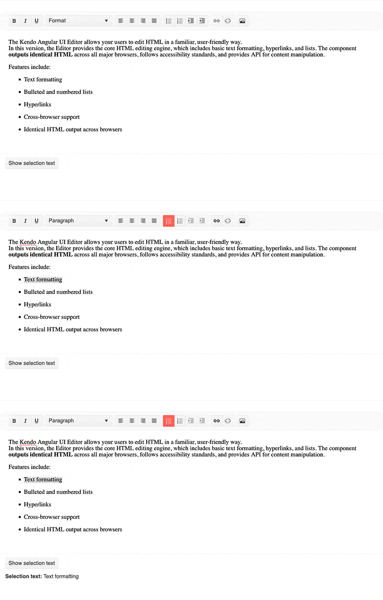
Kicking off a large set of new Editor features coming to our Angular UI component suite, with R1 2022 we have added a new property to help extract the current selected text within the Editor content area. This new field, selectionText, can be used to extract selected text and use it to update other Angular components or modify and store elsewhere.
Follow this link to check out the new Angular Editor Get Selected Text demo.
Angular Editor: Select All & Print Tools
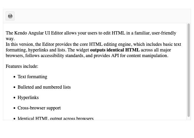
The next feature added to the Kendo UI for Angular Editor with R1 2022 is the new Select All and Print Tools.
The Select All tool lets users select all the content within the Editor using a button in the toolbar.
As for the Print tool, this lets users send the content of the Angular Editor to a printer using the browser’s built-in printing dialog. Previously this required developers to write their own printing logic, so we are very excited to offer this functionality through a single button click.
See all of the Kendo UI for Angular Editor tools in this demo.
Angular Editor: Image Resizing
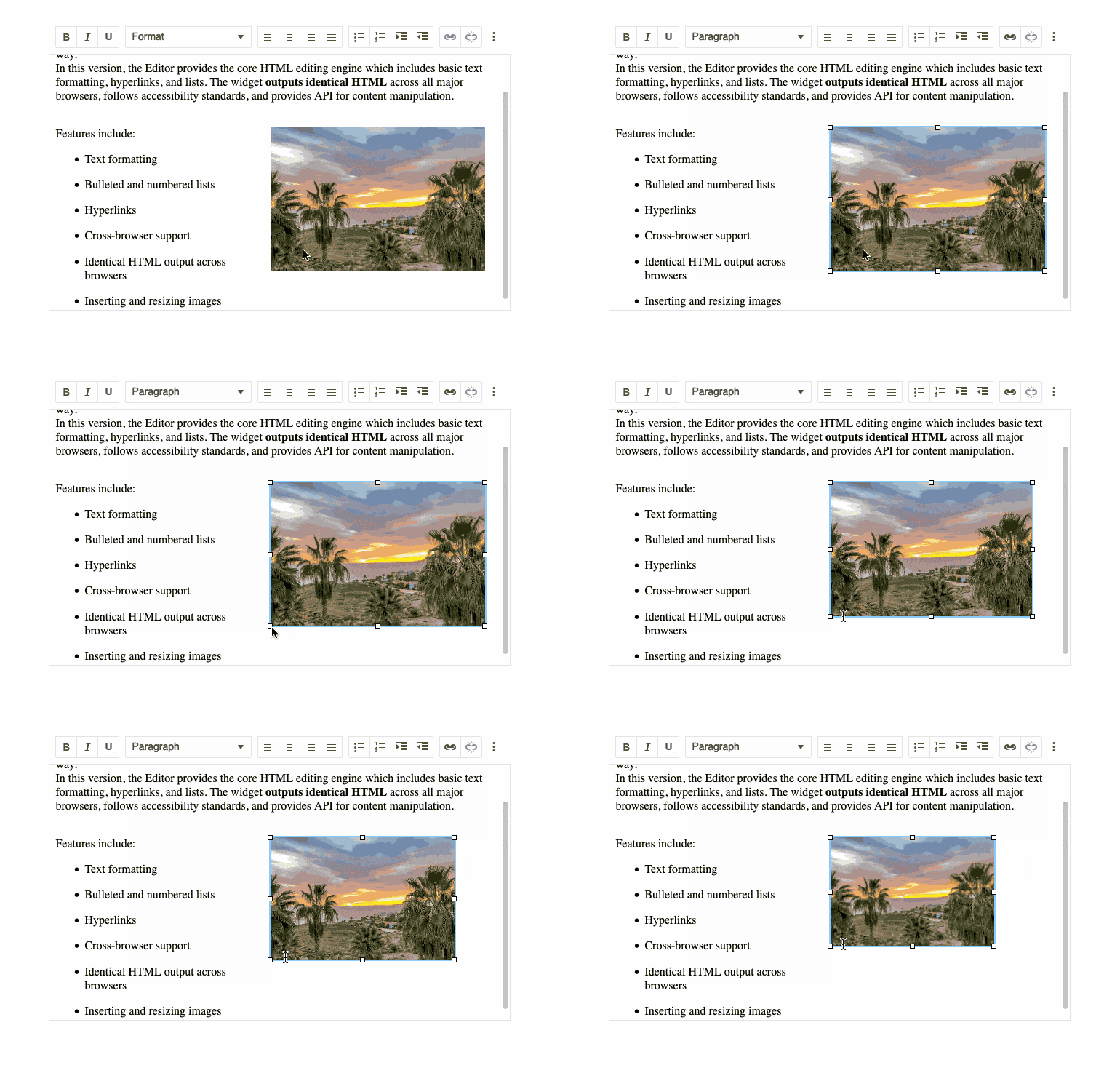
A feature that I know many users are eagerly awaiting is the ability for the Kendo UI for Angular Editor to resize images within the Editor’s content. With R1 2022 this is now available out of the box, letting users resize any image with drag handles that appear when a user focuses an image.
See the Kendo UI for Angular Editor and image resizing right here.
Angular Editor: Resizing
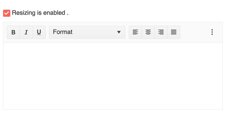
Expanding on the resizing story, with R1 2022 the Kendo UI for Angular Editor added the resize feature to the Editor component itself. This lets editor users adjust the size of the Angular Editor. Developers can set boundaries for how big or small of a size the Editor can be resized to, or they can let users resize without any restrictions.
Check out the Kendo UI for Angular Editor Resizing demo here.
Angular Editor: Table Split & Merge Cells
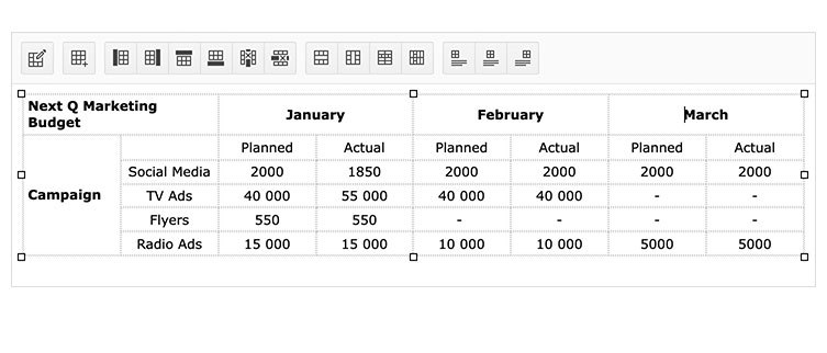
While adding and editing tables has been possible for a while now, with R1 2022 the Kendo UI for Angular Editor now offers additional tools around splitting or merging cells within any table element found in its content. These options are exposed through intuitive buttons within the toolbar element of the Angular Editor component.
Angular Editor: Applying Commands to Words
.png?sfvrsn=fb541076_2)
The last feature added to the Kendo UI for Angular Editor in R1 2022 is more of a quality-of-life improvement. Specifically, this new feature relates to applying commands to words or text blocks within the Editor.
To give some context to what this means, here’s an example: Before R1 2022, when a user clicked anywhere in a single word within the content area but did not select any text (which means the cursor is blinking between two characters), and then used either the Bold toolbar button or a keyboard shortcut, the end result would be that nothing happened to the word. The “command” to bold a word would only actually bold something when a selection was made (highlighting several characters).
Some folks may be reading this and expect that the word with the cursor in it should be bolded, and that’s where this new feature comes into play!
With R1 2022, the Editor has a set of new configuration options allowing developers to decide which behavior is ideal for their users. Taking the same example as above, with the right properties set, the Angular Editor will automatically bold the entire word that the cursor is currently located within.
For more information, you can refer to the Kendo UI for Angular Editor documentation right here.
Angular Scheduler: Current Time Marker
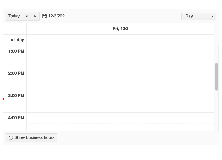
The Kendo UI for Angular Scheduler is used not just for managing events in a standalone component—many end users use the Scheduler component as a way to manage their daily calendars.
To improve viewing and understanding the events currently available within the Angular Scheduler, we have added the new Current Time Marker. This displays a distinct line across the entire event area indicate the current time, which should make interacting with the Angular Scheduler more intuitive.
Angular Scheduler: Slot Selection
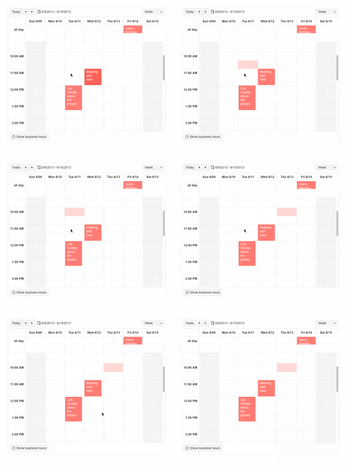
Another addition to the Kendo UI for Angular Scheduler is the new behavior that allows users to select not only events, but slots as well. Slots are the elements that represent time increments (by default 30 minutes) in which the events (the actual items displayed in the Scheduler) are rendered. This should help users who primarily want to create events by selecting their duration using the mouse.
Angular Dialog Updates
Custom CSS Classes & Attributes When Opened via Service
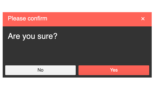
The DialogService feature of the Kendo UI for Angular Dialog component is used when devs need to dynamically create a Dialog component instance when using an Angular Service. For the folks finding themselves in this situation, the R1 2022 release has added the ability for the Kendo UI for Angular Dialog component to have custom CSS and HTML attributes added to the component when used through an Angular service.
RTL Support When Opened via Service
Expanding on the features available when opening an Angular Dialog via a service, we have also added the ability to define that the Kendo UI for Angular Dialog should be rendered right-to-left. This can be done through the htmlAttributes property by providing a dir field set to rtl.
For more information, you can refer to the Kendo UI for Angular Dialog Angular Service docs.
Angular Window Enhancements
Custom CSS Classes & Attributes When Opened via Service
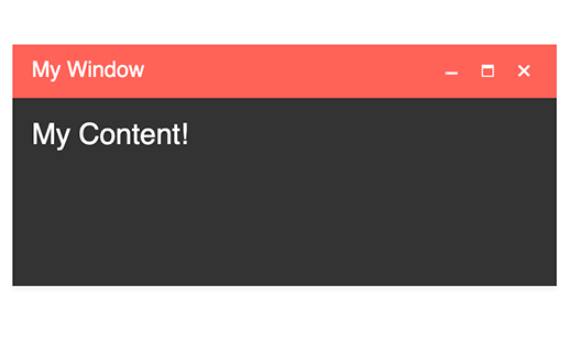
With R1 2022, the Kendo UI for Angular Window component also added the same features when working through an Angular Service. When folks need to add a custom CSS class or a custom HTML attribute to the Angular Window component, they can use the cssClass and htmlAttributes properties to do so.
RTL Support When Opened via Service
Another update when dealing with the Kendo UI for Angular Window when using an Angular Service is the ability to render the Window component in an RTL (right-to-left) fashion. This can be done through the htmlAttributes property by providing a dir field set to rtl.
See the Kendo UI for Angular Window component Angular Service demos for more information.
Angular Switch: Custom Size and Long Labels

The Angular Switch component provides an intuitive and sleek user experience for toggling between two values. Most often used to represent On/Off or True/False states, but there may be cases where labels need to be longer, like Enable/Disable.
The Kendo UI for Angular Switch component received an update with R1 2022 to specifically handle labels of an arbitrary length. We added a documentation article and examples showing how to use custom dimensions and longer labels within the Angular Switch component. Beyond the examples that I provided here, allowing for longer labels has huge benefits for globalization and internationalization scenarios.
Refer to the Angular Switch demos for more information.
Angular PanelBar: Updated Design
For those who are unaware, all of the Kendo UI and Telerik UI web component libraries share a common look and feel. This is mainly to help our customers migrate from one technology to another, ensure that teams using different technology stacks can produce apps that have the same look and feel, or even future-proof their tooling to be ready for the next new framework. This makes Kendo UI for Angular one product out of nine total that share a common rendering.
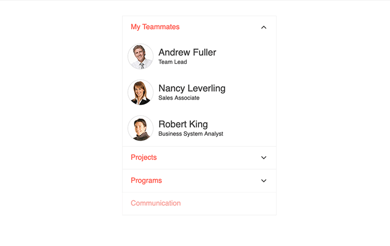
As we have introduced the PanelBar component to all these suites, we have also received feedback around the look and feel of the component and have logged items for improvement. With R1 2022, we have taken this feedback and updated the design of all our PanelBar components, including the Kendo UI for Angular PanelBar.
These updates include changes to the HTML rendering and CSS classes applied to said HTML, but leave most of the look and feel of the component intact. We have improved the rendering with child items to make them a bit more distinguishable, and we updated the expand and collapse arrows and replaced the filled-in triangle look with a new chevron arrow.
Here’s a direct link to the Kendo UI for Angular PanelBar component demos.
Angular ColorPicker: New Design
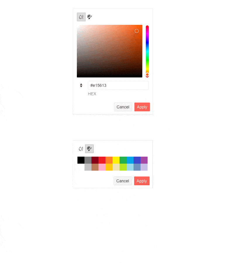
Similar to the Angular PanelBar design updates mentioned above, we also updated the Kendo UI for Angular ColorPicker component and its design.
This new design updated the rendering of the component, which includes the HTML elements and CSS classes used, and we have also taken the new Angular FlatColorPicker component and embedded it in the popup of the ColorPicker. This not only increases the robustness of the ColorPicker implementation, but it also includes functionality like preview panes, action buttons and multiple views.
See the new Angular ColorPicker design right here.
Angular Grid and Angular TreeView: Pushing and Splicing from Key Collections No Longer Updates the State
A piece of feedback that we received earlier this year highlighted that the way we provide key collections such as selectedKeys, expandedKeys and checkedKeys had some potential issues, as technically the collections can be mutated in their current form. With R1 2022, we have moved to improve this across the Angular Grid and TreeView components (two big components which deal with selection).
As some folks may have been working with the current key collections behavior, this should be considered a breaking change as, depending on your use, there may be new error messages thrown when you update these components to their latest version.
Check out the Kendo UI for Angular Data Grid demos and the Angular Treeview demos for more information.
Got Feedback?
Even though we added a ton of components and features with this release, we may not have added something that you or your team were looking for. Now is the chance for you to make your voice heard! Let us know what you are missing from Kendo UI for Angular by stopping over at the Kendo UI for Angular Feedback Portal. Within this portal, you can vote for your favorite feedback item or submit your own.
Kendo UI for Angular has grown to where it is today thanks to the continuous feedback of our customers, and we want to continue to provide the best possible library for you and your teams. So, please take the opportunity to provide your feedback!
Webinars and Live Streams
Want to see everything I mentioned above live and in action? On Tuesday, February 1, at 11 am ET we are hosting the Kendo UI R1 2022 release webinar! Join us to find out what is new in the Angular, jQuery, React and Vue UI components!
To give you a chance to have a more interactive dive into the new content, we will also be hosting a Twitch stream covering Kendo UI for Angular specifically on Thursday, January 27, at 10:00 am ET, and we are also covering KendoReact on Twitch on Wednesday, January 26, at 10:00 am ET.
Tons of fun will be had, so head on over to the Kendo UI R1 2022 webinar registration page to reserve your seat and join in on the festivities!