The R1 2022 release of Kendo UI for Vue adds 15 new native UI components for Vue developers along with an improved look and feel for existing components.
The R1 2022 release of Kendo UI for Vue is here and with it comes 15 native UI components for Vue, new additions to the Telerik and Kendo UI Figma Kits, as well as improvements across the Default, Bootstrap and Material themes. There’s so much to cover here, so let’s not waste time and just get right to it.
Telerik & Kendo UI Kit for Figma v1.7
In 2021 we introduced the Telerik and Kendo UI Kits for Figma to help improve the productivity and collaboration between designers and developers on teams using Kendo UI.
With R1 2022, we have introduced Figma components for all Telerik and Kendo UI components (charts being the one exception). With this latest update, designers should have even more assets to use in their developments, as we now have representation for all Kendo UI for Vue components. The chart component is the only one missing, and this component will be added in a future update.
Buttons, Inputs, DateInputs and DropDowns Packages: New Theme Rendering Options
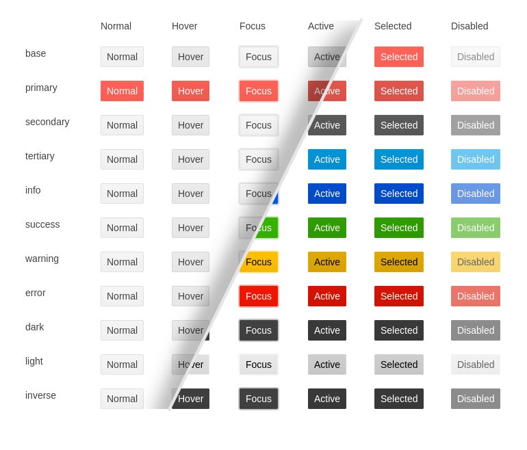
Ensuring that Kendo UI for Vue can cover all UI requirements that our customers may have, we have invested time in improving the existing Kendo UI for Vue themes. This involves reviewing all components within our Vue UI library in an attempt to simplify the themes and the rendering of our components while providing enhancements and additional options to improve the flexibility of our UI components.
These updates will happen throughout the year and we are starting with R1 2022. With this release, we have updated the Buttons, Inputs, DateInputs and DropDowns to offer the following theme rendering options:
- themeColor
- fillMode
- size
- shape
- rounded
A note to make here is that these updates will include breaking changes to the visual aspect of Kendo UI for Angular. For anyone customizing our components or doing visual regression testing, we recommend taking some extra time to review these changes.
Larger visual updates like these can have implications in the form of visual regressions which could appear when upgrading from an older version to R1 2022. While we believe that we have caught and resolved many visual regression issues while getting ready for R1 2022, there may be additional issues discovered after the release. We are firmly committed to addressing these issues as quickly as possible and will continue to push out updates with fixes to our themes and components after the R1 2022 release.
To provide more information about these changes and our general plan around the Kendo UI themes, we recently posted Improvements Coming to Telerik and Kendo UI Themes in 2022.
New Vue Components
New Component: Vue Editor
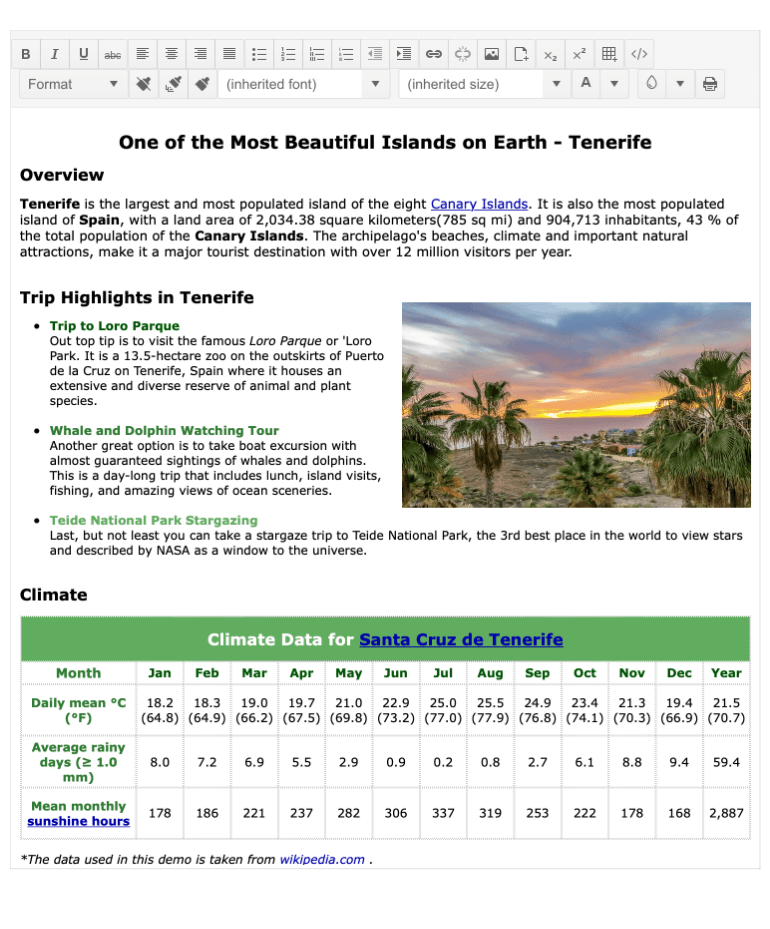
The first component that I’m going to mention today is the Kendo UI for Vue Editor component! This is a What-You-See-Is-What-You-Get (WYSIWYG) HTML Editor that lets users create rich web content with toolbars and tools similar to word-processing tools, while developers can extract the underlying HTML in order to modify content programmatically or even save content to a database.
Check out the new Kendo UI for Vue Editor component docs for more information.
New Component: Vue Toolbar

The next component that was added to Kendo UI for Vue with R1 2022 is the new Vue Toolbar component. The main purpose of this component is to organize various button options in a UI element that follows a similar user experience to tool and navigation elements found in desktop applications. The most common scenario within the Kendo UI library is to use this component as the basis of the Filter component or the main way to interact with the Editor. Of course, the Vue Toolbar can be used as a standalone component.
Here’s a quick link to the Vue Toolbar component docs.
New Component: Vue Filter
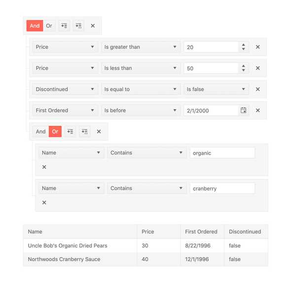
Filtering data is a common feature when applications deal with large sets of data on a regular basis. While it may initially seem simple to filter data, it can easily get out of hand when needing to combine various filter operators to create more complex filter expressions. This is where the new Kendo UI for Vue Filter component comes in.
Through this one component, end users can intuitively create complex and detailed filter expressions to help filter data to match a very specific set of variables. These expressions can be pulled out from the component to let developers filter their own data, and the Vue Filter component can be combined with other Kendo UI for Vue UI components, most prominently the Data Grid, to provide advanced filter capabilities to any component.
For more information, you can refer to the Kendo UI for Vue Filter component docs.
New Component: Vue SplitButton
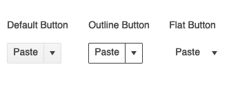
Adding more to the collection of button types offered within Kendo UI for Vue, with this update we have added the Vue SplitButton component. This button type has a distinct visual split between text and a dropdown arrow, and when clicked a popup menu will appear displaying additional actions from a predefined list.
See the Vue SplitButton component right here.
New Component: Vue DropDownButton
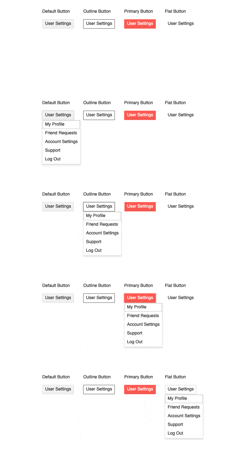
Another button added with R1 2022 is the Kendo UI for Vue DropDownButton component. This button element initially displays a regular button, but, when this button element is clicked, a dropdown list of action items will pop up from the button. The Vue DropDownButton can use text, icons or a mix of both when initially configuring the component.
Here’s a direct link to the Kendo UI for Vue DropDownButtom component demos.
New Component: Vue Menu

The Vue Menu component is a multi-level component meant to display hierarchical options within a menu interface. This component is very frequently used as a contextual menu for other Kendo UI for Vue components, like the Data Grid, but it works great on its own as well. The Vue Menu component can have as many sub-level items as requirements call for, which lets developers create very advanced navigation UI elements with ease.
See the Kendo UI for Vue Menu component demos here.
New Component: Vue ProgressBar

With R1 2022 we also added the new Kendo UI for Vue ProgressBar component. This new component renders a visual bar element that can be “filled” as a way to showcase progress toward the completion of a process. The Vue ProgressBar can be displayed vertically or horizontally, supports left-to-right rendering, and is simple to use—updating the progress of the component is as easy as setting a single field to represent the current value of the ProgressBar.
Here’s a direct link to the Kendo UI for Vue ProgressBar Component docs & demos.
New Component: Vue Loader

The new Kendo UI for Vue Loader component lets developers show a visually pleasing animation when part of their Vue application is busy. This can be extremely useful when large data sets or time-consuming processes are happening in the background, indicating to users that something is coming if they hold on and wait.
Play around with this new component yourself by heading over to the Kendo UI for Vue Loader component documentation.
New Component: Vue Drawer
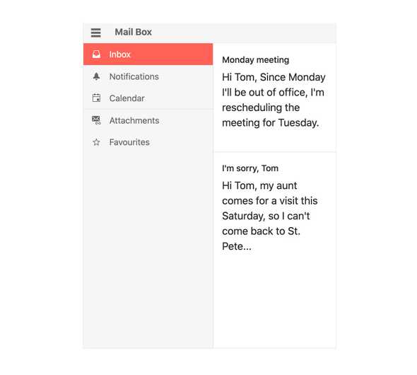
Adding to the growing list of navigation elements within Kendo UI for Vue, with R1 2022 we are officially adding the new Vue Drawer component. Perfect as the side navigation of any desktop- or mobile-focused web application, the Vue Drawer component can be a permanent fixture, or only appear when users click on a UI element to expand the Drawer element—often a hamburger menu.
Here’s a direct link to the Kendo UI for Vue Drawer component demos.
New Component: Vue Stepper

When breaking down long forms or a process that requires multiple steps, like a checkout process of an ecommerce site, the Kendo UI for Vue Stepper is the perfect UI component to use. Each step shows a Vue component, which means developers have full control of the content and components displayed. Developers can also control the visual appearance of each step in the Vue Stepper component to ensure a natural fit with any design requirements. There is also the ability to enforce where there is a strict flow from the first step to the last, or if users can randomly click around, and validation can occur either on each step or when the entire stepper has been navigated through.
Here’s a direct link to the Kendo UI for Vue Stepper component docs & demos.
New Component: Vue DateRangePicker
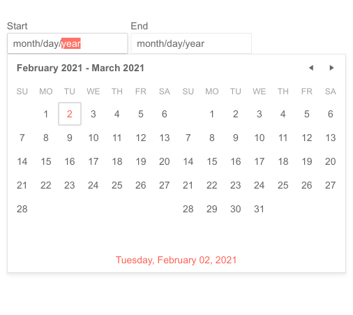
With R1 2022 we are also introducing the native Kendo UI for Vue DateRangePicker component. This new component is ideal for when users need to select a range of dates with a clear start and end date. Thanks to displaying multiple calendars side by side, selecting a range of dates is a breeze and developers can easily extract the start and end date to use elsewhere in their Vue applications.
To see more, check out the Kendo UI for Vue DateRangePicker component demos.
New Component: Vue Gauge

Adding to the growing list of data visualizations offered for Vue developers, with this release we included the new Kendo UI for Vue Gauge component. This includes the Arc Gauge, Linear Gauge and Radial Gauge components all in a single package—giving you a full range of gauge types out of the box.
Here’s a direct link to the Kendo UI for Vue Gauges package docs.
New Component: Vue Switch

Popularized by mobile operating systems like iOS and Android, the Switch component has become the default user experience to toggle between two values. With R1 2022 the Kendo UI for Vue Switch component will let any Vue developer add this intuitive user experience to their apps. This component can be customized to include custom labels and additional styling options to help the component fit any design requirements.
Check out the Kendo UI for Vue Switch component demos here.
New Component: Vue Tooltip
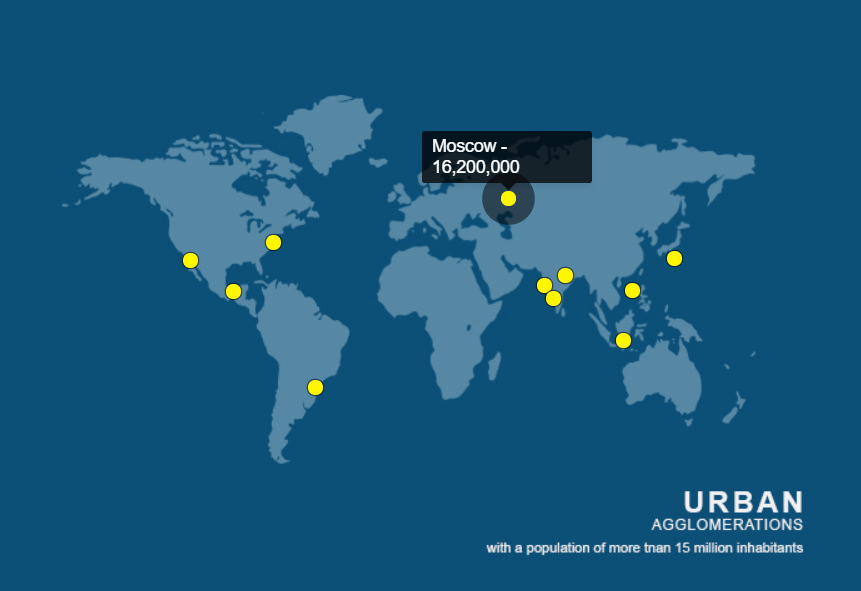
The new native Kendo UI for Vue Tooltip component is perfect for any scenarios where additional contextual information needs to be displayed upon hover, focus or click interactions from users. With the ability to completely customize the Vue Tooltip content, as well as flexible styling options, this component can naturally fit into any Vue application.
See more at the Kendo UI for Vue Tooltip component demos.
New Component: Vue TextArea
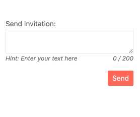
Continuing to add important UI components related to forms, with R1 2022 we have added the Kendo UI for Vue TextArea component. This component extends on top of the native TextArea HTML element and ensures a uniform look and feel for all UI elements within your Vue applications with styling support from the Kendo UI themes.
Check out the Vue TextArea component docs & demos here.
Expanded Component Features
All Vue Charts: Updated Colors and Design
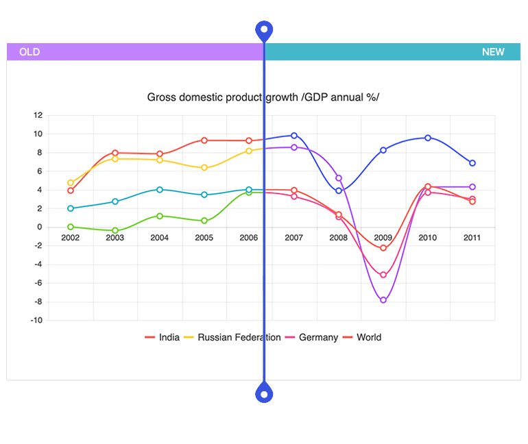
The theme updates I mentioned earlier in the blog post have also helped improve the Kendo UI for Vue Charts library. These improvements come from new default colors that are used when a developer does not explicitly set a color for a series. These colors have been updated to fit better with the Kendo UI themes out of the box, and also improve a behavior where a large number of series are added to a chart. Previously this led to the same color being reused, but now there should be unique colors available for any number of series.
See the new Kendo UI for Vue Chart colors right here.
All Vue Charts: Improved Pan and Zoom
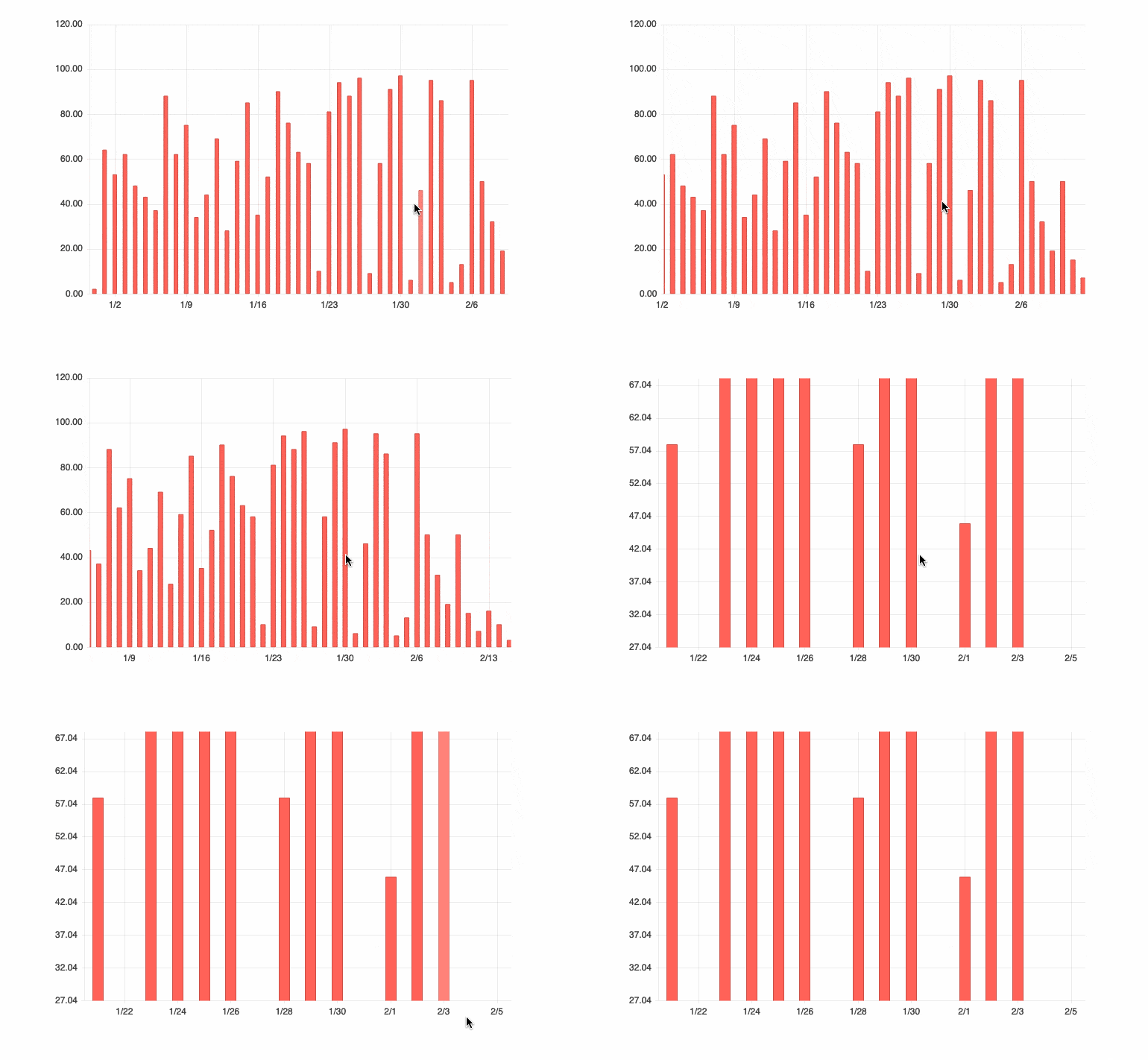
An additional feature added to the Kendo UI for Vue Charts with R1 2022 is the optimized pan and zoom functionality. Specifically, with this release the Vue team has improved the usability when using the mouse wheel. The zoom is now consistent in both directions and the hovered point remains under the cursor, which is a big quality-of-life improvement.
To play around with this improved feature, you can refer to the Vue Chart component Pan and Zoom demos.
All Vue Inputs and Pickers: Label Props
The biggest enhancement that the Kendo UI for Vue team added across the suite for R1 2022 is the new label property which was added to all UI components found within the Inputs and DateInputs packages. The label property was implemented to help with adding a Floating Label element to each of the UI components within these packages. Previously this did require some additional code and effort every time a Floating Label was used, so we wanted to reduce the complexity and make this easier for all Kendo UI for Vue users.
Check out more under the Kendo UI for Vue Inputs package and the Vue Date Inputs package.
All Kendo UI for Vue Components: Vue 3 TypeScript Types Now the Default
This updates affects anyone using Kendo UI for Vue with TypeScript specifically. With R1 2022, we have updated all of the native Vue UI components available in Kendo UI for Vue to return the new and updated Vue 3.0 types as a default.
For anyone who is actively using Vue 2 types from our UI components already, do not worry—they are still available to use.
More specifics can be found by diving into the main Kendo UI for Vue documentation page and reviewing the API section of your favorite components.
Got Feedback?
While we’ve added so many native UI components to Kendo UI for Vue over the last year, we haven’t covered the entire Kendo UI library yet. If we are missing a component, or there is a particular feature that you and your team need, head on over to the Kendo UI for Vue Feedback Portal to submit your ideas or vote for existing ideas to ensure that we evolve Kendo UI for Vue to fit your needs!
Webinars and Live Streams
Want to see everything I mentioned above live and in action? On Tuesday, February 1, at 11 am ET we are hosting the Kendo UI R1 2022 release webinar! Join us to find out what is new in the Vue, Angular, jQuery and React UI components!
To give you a chance to have a more interactive dive into the new content, we will also be hosting a Twitch stream covering Kendo UI for Angular specifically on Thursday, January 27, at 10:00 am ET, and we are also covering KendoReact on Twitch on Wednesday, January 26, at 10:00 am ET.
Tons of fun will be had, so head on over to the Kendo UI R1 2022 webinar registration page to reserve your seat and join in on the festivities!