New ASP.NET Core PivotGrid v2 & Avatar UI Components, REPL, enhancements in Editor, Data Grid, ColorPicker, ScrollView, theming options, more Figma UI assets.
Hey, developer folks! It’s Telerik R1 2022 release time, and we’re excited to kick off 2022 with the introduction of new UI components, features, theming enhancements, more Figma UI assets, and Visual Studio Code extension updates!
TL;DR Telerik UI for ASP.NET Core R1 2022
Below is a summary of the R1 2022 Telerik UI for ASP.NET Core release content shipped between October 2021 and January 2022:
- New Components: New and improved PivotGrid, Avatar
- Theme improvements: Introduced Theme settings in Buttons, DropDowns, Inputs and DatePickers and made building design languages easy
- Telerik & Kendo UI Kits for Figma v1.7
- Data Grid Enhancements: Rows Drag & Drop, Fit All Columns Width to Content, Search by Non-String Fields, Multi-Column Sorting via CTRL + Click
- ScrollView Enhancements: Shared Data Source
- Editor Enhancement: Undo & Redo Commands
- ColorPicker Enhancements: Switch between Gradient and Palette View, Revert to Default Color, Color Contrast Tool, Updated Design
- Chart Enhancements: Improved Pan & Zoom, Updated Colors & Design
- PanelBar Enhancement: Updated design
- Responsive Panel Component: Added HTML helper
- Introducing more TAG helper code examples
- Visual Studio and Visual Studio Code Extensions Enhancements: Revamped Visual Studio Code extension, with Theme & Swatches Selection and new Admin Dashboard template in both Visual Studio and Visual Studio Code extensions
- New Telerik REPL for ASP.NET Core Playground
- Support for Visual Studio 2022
- Support for .NET 6 Official
- Document Processing Libraries Enhancements: Support for Conditional Formatting and Export Notes with a specific author in SpreadProcessing, Nested MailMerge in WordsProcessing
Now let’s take a closer look at the R1 2022 updates for Telerik UI for ASP.NET Core!
.NET 6 and Visual Studio 2022 Compatibility
Telerik UI for ASP.NET Core library is compatible with .NET 6 and Visual Studio 2022 since November 2021, shortly after the release by Microsoft. You can dive into seamless development with our web components and create new projects using our VS project templates and built-in layouts.
Telerik REPL for ASP.NET Core
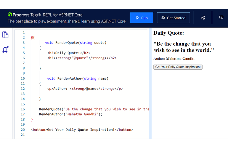
The Telerik REPL for ASP.NET Core is an interactive online environment that reads, compiles and immediately runs your C# server-side code in the browser. The run-ready environment requires no installation, account or special tooling—just jump in and start coding. Additional features include:
- Saving your server-side code snippets
- Sharing examples with a simple URL
- Sharing from your IDE with the help of our Visual Studio and Visual Studio Code extensions
- Referencing static files
- Seamless access to Telerik UI for ASP.NET Core with 110+ truly native, easy-to-customize UI components
Detailed review of the ASP.NET Core REPL capabilities can be found in the dedicated blog post.
New ASP.NET Core Avatar Component
The new ASP.NET Core Avatar Component is ideal for showing photos, icons, avatar representations or initials in your apps.
The Avatar component can be customized to meet a variety of UX requirements thanks to its configuration options. This involves defining whether the Avatar should be drawn as a circle, with rounded sides or as a square, as well as what images, icons or initials should be displayed within the component.
You can further customize the look by setting its size (small, medium (default) or large), appearance fill style, border, alt text and more!
Theme Improvements
Based on your feedback related to theme customizations and design language trends, we are going to address various aspects of our themes in an ongoing effort to make Kendo UI themes more flexible, extensible and customizable to help our users cover more design and UX requirements. (Note: Kendo UI’s common set of themes can be shared across all Telerik and Kendo UI products: UI for Blazor, ASP.NET Core and MVC, as well as Kendo UI for jQuery, React, Vue and Angular).
We have revisited all Telerik UI components across the Default, Bootstrap and Material themes and introduced common options that can be set on a component level that can help with defining the main theme colors, the size and shape of the individual components, and more.
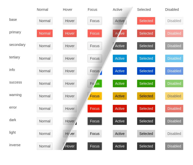
With R1 2022 we have updated the Button, Input, DateInput and DropDown component categories (see the full list of updated components and related appearance documentation here). The rendering update offers the following theme options tailored to the component specifics:
- ThemeColor
- Size
- Shape
- Rounded
- FillMode
These options have rolled out with the v5 release of the Kendo UI Sass-based themes, which is the latest version of the theme packages as of today. These updates contain breaking changes for anyone that has customized the Telerik UI for ASP.NET Core components. We highly recommend reviewing the documentation article describing in detail the rendering changes and adding some time for addressing breaking changes as a part of any update process you may have planned.
Additional components will be tackled with future releases in 2022. Below is a rough roadmap around what components will be covered next. Keep in mind that things may change here as our roadmap does adjust based on customer feedback, but this should still serve as a rough plan for when certain components will be targeted:
R2 2022 roadmap and beyond: AppBar, BottomNavigation, Badge, Notification, Tooltip, Loader, Toolbar, Window, Dialog, TabStrip, PanelBar, ExpansionPanel, Upload, Editor, Scheduler, and more!
To provide more information about these changes and our general plan around the Kendo UI themes, we recently posted a blog post about the future of Themes in Telerik and Kendo UI.
Telerik & Kendo UI Kit for Figma v1.7
We officially introduced the Telerik and Kendo UI Kits for Figma a few months back with the goal to help improve the collaboration between designers and developers using Telerik and Kendo UI components. We expanded the initial set of UI components, and I am happy to share that with R1 2022 we have introduced Figma assets for all Telerik and Kendo UI components with only one exception: the charts.
New and Improved PivotGrid Component
Last month, we announced the release of the new and improved PivotGrid UI component for ASP.NET Core! You can immediately take advantage of the new PivotGridv2, which was built from the ground up and has an updated design to ensure the performance and user experience are as good as they can be. While at the time of its initial release the PivotGridv2 may have fewer features and less functionality than the original PivotGrid, the plans are, in the next few releases, to continue to expand its functionality until it reaches full parity with the original (and even exceed it).
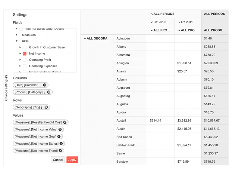
If you are already using the existing PivotGrid, have no fear—nothing will change with this update. We will continue to keep both components existing side by side until we see evidence that most users have migrated to the new component.
Try out the new PivotGrid component and take a spin at the demos showing how to sort, filter, render custom content using templates, and export to PDF.
Data Grid UI Component Enhancements
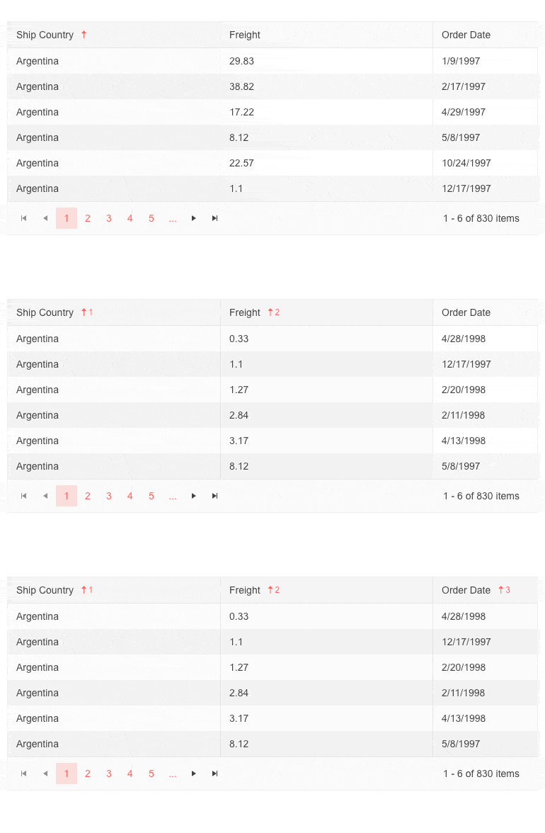
Grid Multi-Column Sorting via CTRL + Click
We expanded the sorting options for the Grid and added more ways to interact with it. End users can now perform sorting over multiple columns when pressing the CTRL button. When clicking on a column header without the CTRL button pressed, the Grid will revert to sorting by a single column.
Fit All Columns Width to Content
Using the new autoFitColumns method, you can render a sleek Grid with a minimum possible width for all or selected columns so that their underlying text fits nicely without empty spaces or wrapping.
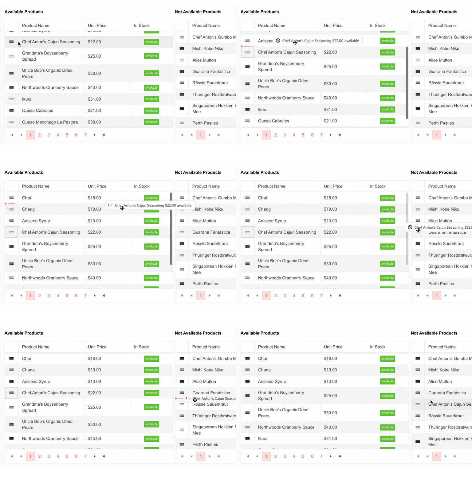
Grid Rows Drag & Drop
The ASP.NET Core data grid has built-in functionality that allows end users to reorder single and multiple rows by dragging and dropping them within the Grid and between two Grids.
Support for Non-String Fields in Grid’s Search Panel
The Grid’s Search Panel now allows search and filtering for non-string column values.
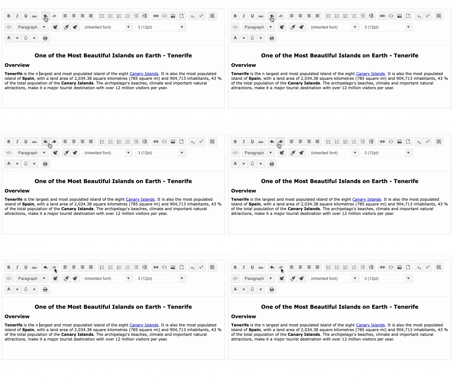
Editor Undo & Redo Commands
The Editor UI component for ASP.NET Core has been enriched with Undo and Redo built-in commands, further enhancing the component’s capabilities.
Shared Data Source With the ScrollView Component
The ScrollView UI component for ASP.NET Core can now reference external data sources and accept DataSource Name as a string in its .DataSource configuration method.

New Features and Views in ColorPicker UI Component
The ASP.NET Core ColorPicker has been expanded with Gradient and Palette views, plus a switch between predefined colors (Palette) and custom colors (Gradient). The component also exposes inputs for both RGB and HEX formats and an option to configure its default format.
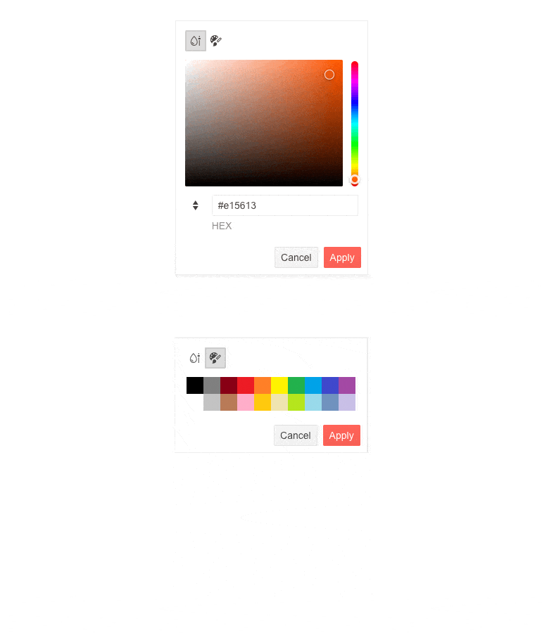
Last but not least, the ColorPicker now provides options for checking the color contrast ratio between two colors following the Web Content Accessibility Guidelines (WCAG) AA and AAA levels.
Modernization of the PanelBar Component Rendering
The Telerik UI for ASP.NET Core PanelBar component received a slightly refreshed look and feel, which is most noticeable when all content is expanded, making sure child items stand out better.

Chart Enhancements
Improved Pan & Zoom
With R1 2022 we have improved the panning and zooming in Telerik and Kendo charts. With the current update the zoom is now consistent when zooming in and out using the mouse wheel.
Check out the improved pan and zoom feature in the Chart ASP.NET Core demos.
Updated Colors & Design
Another announcement for R1 2022 related to the updating of all of the themes is that the Charts library now supports a new set of default colors out of the box. That gives a more modern feel, more colors to choose from for the chart series and a more consistent design with the UI theme that is being used.
Here’s a quick link to the Telerik UI for ASP.NET Core Charts that shows the new default colors.
Responsive Panel HTML Helper
To complete the support for referencing Telerik components using both HTML and TAG helpers in ASP.NET Core applications, we added the option to plug the Responsive Panel UI component using Html.Kendo().ResponsivePanel() configuration.
TAG Helper Code Samples
With the current expansion of TAG helper examples, we plan to address your feedback related to easier work with Telerik UI components in ASP.NET Core apps. In R1 2022 we are adding tens (if not hundreds) of code samples for our most-loved components, such as the Data Grid, DropDownList, Menu, TabStrip, Upload and more! Our goal is to tackle additional TAG helper demos with future releases in 2022, so you can expect more updates in R2 & R3 2022 releases.
Visual Studio Code Extension Update
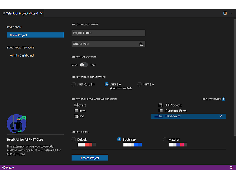
Telerik UI for ASP.NET Core brings a refreshed and improved Visual Studio Code extension! You can enjoy the updated UX, configure the .NET framework version (including .NET 6.0), and set project themes plus color swatches with a couple of clicks at project creation.
You can also try out the new Admin Dashboard project template with pre-built layout and functionality. Simply plug in your data and bind it to the components—including Grid, Tile Layout, Drawer, Calendar, Form, various Chart types, Card and more.
New Features in Telerik Document Processing
In the R1 2022 release we have something new for those of you who are using Telerik Document Processing within ASP.NET Core apps! In the latest distribution package, you will find several of the most-wanted items from our Feedback Portal, such as:
- Conditional Formatting for SpreadProcessing: Allows adding rules used during cells visualization and applies formatting depending on their values.
- Notes for RadSpreadProcessing: The user will be able to add and export notes with a specific author.
- Nested MailMerge for WordsProcessing: Each merge field can contain a list of elements that should be displayed in the merged document.
Download Telerik UI for ASP.NET Core
Download and try a trial version of Telerik UI for ASP.NET Core, or if you are an active license holder, you can just grab the latest and greatest from the Your Account page! Share your thoughts with us on our Feedback Portal and help us shape the future of UI for ASP.NET Core.
Download Telerik UI for ASP.NET Core
Webinar & Dedicated Twitch Sessions
Be sure to sign up for the Telerik R1 2022 release webinar and live Twitch sessions to see the newly released components and features in action:
Twitch Sessions:
Monday, January 24 | 10:00 am – noon ET I Desktop & Mobile
Tuesday, January 25 | 10:00 am – noon ET I .NET Web
Webinar:
Wednesday, February 2 | 11:00 am – 1:00 pm ET
Thank you for the continuous support and happy coding!