“Dear Kendo,
I need an easy-to-build Form for my Vue 3 site to help out the kids who haven’t sent me their Christmas letters yet. Please help!
Sincerely,
Santa”
No doubt—seeing this e-mail completely changed our roadmap and put the Christmas Vue Form as our top priority item. Millions of kids and their presents depended on us! Luckily, we were prepared—earlier this year we released the Kendo UI for Vue Native Form component, along with all the needed editors and guidelines on how to use them in order to cover all the fields needed in Santa’s Christmas Form:
- Name
- Age
- Date of Birth
- Country
- Phone
- “Goodness” Rating for the year (from 1 to 10)
- Number of good and bad deeds throughout the year
- Delivery time
- Listened to your parents (yes/no)
In the lines below, I will cover the detailed information on how we created this great Christmas Form for Santa in Vue 3. All the fields are implemented with Kendo Native UI for Vue components and the new purple swatch Kendo Bootstrap theme. All of them are fully accessible, which allowed us to be fully professional in this situation, keeping in mind that so many kids’ dreams were depending on this.
As a starting point, we will import Kendo UI for Vue Form from the ‘@progress/kendo-vue-form’ package. It will wrap and coordinate the state management of the form and its individual fields: whether they are touched, modified, visited, valid or have a different value.
<template> <k-form @submit="handleSubmit"> <formcontent /> </k-form></template>Then we will include one by one all the needed field components. Each of them defines the props that are passed to the editor and the focus, blur and change events that are responsible for the important form related states:
Name field
The name field is usually considered the easiest one when creating a form—we just add the usual styled input, right? Yet, in reality it is not that easy. In order to implement it in the form, it has to have the proper label, hint, and a validation so the child doesn’t accidentally leave it blank.
<field :id="'name'" :name="'name'" :label="'Name'" :component="'myTemplate'" :validator="nameValidator" > <template v-slot:myTemplate="{ props }"> <forminput v-bind="props" @change="props.onChange" @blur="props.onBlur" @focus="props.onFocus" /> </template> </field>
Date of Birth
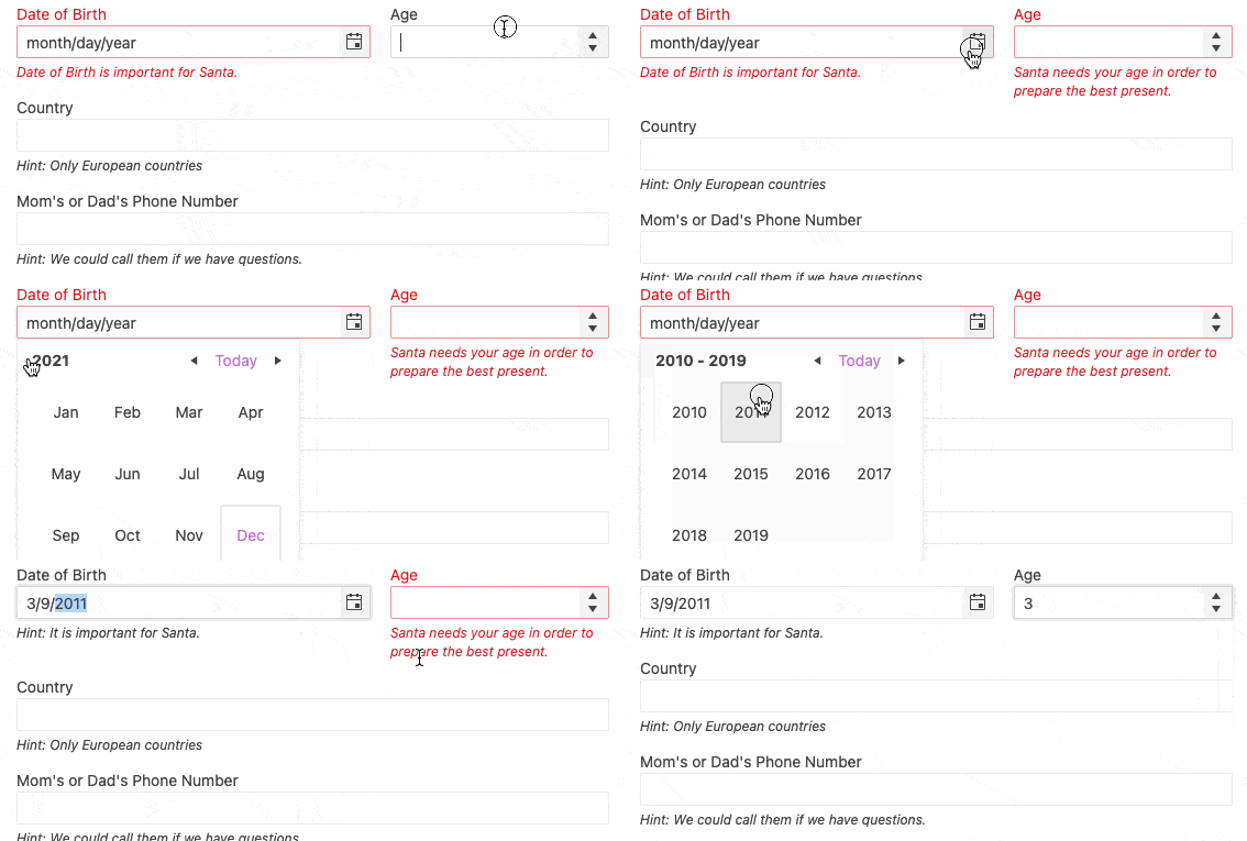
In order to choose the most appropriate present, Santa also needs the date of birth of the child. It can be selected by the DatePicker Kendo component where the year, month and the day can be selected seamlessly by the kids.
<field :id="'dateOfBirth'" :name="'dateOfBirth'" :label="'Date of Birth'" :hint="'Hint: It is important for Santa.'" :component="'myTemplate'" :validator="dateOfBirthValidator" :style="{ width: '90%', 'margin-right': '18px' }" > <template v-slot:myTemplate="{ props }"> <formdatepicker v-bind="props" @change="props.onChange" @blur="props.onBlur" @focus="props.onFocus" ></formdatepicker> </template> </field>Age field
The NumericTextBox Kendo component is a perfect match when we need to fill in the age, and the form validation can be appropriately added to avoid the minus values as well.
<field :id="'age'" :name="'age'" :label="'Age'" :format="'n0'" :component="'myTemplate'" :validator="ageValidator" > <template v-slot:myTemplate="{ props }"> <formnumerictextbox v-bind="props" @change="props.onChange" @blur="props.onBlur" @focus="props.onFocus" ></formnumerictextbox> </template> </field>
Country
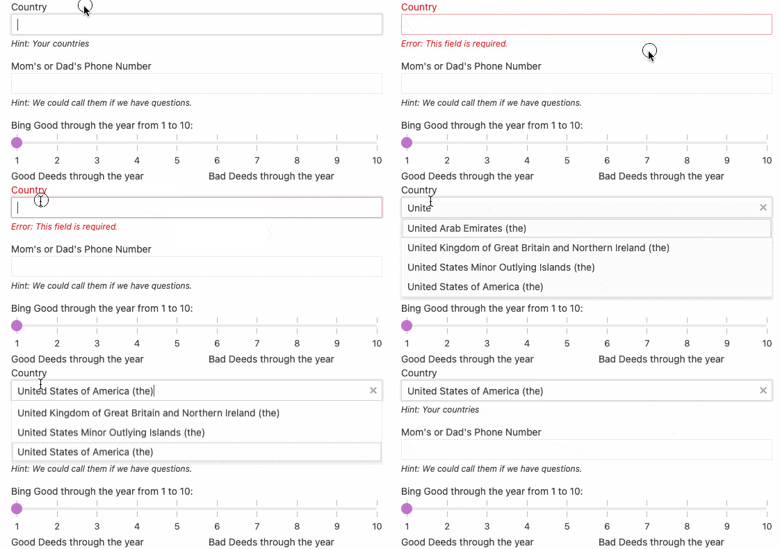
Choosing the country will help Santa prepare his most optimized Christmas schedule. When a collection of such data is needed, we often need an AutoComplete component where we can type the first letter of the country and then find it in the filtered list. We can add the validation message that will explain why is this field important for Santa.
<field :id="'countryselected'" :name="'countryselected'" :label="'Country'" :hint="'Hint: Your countries'" :component="'myTemplate'" :dataItems="countries" :validator="requiredValidator" > <template v-slot:myTemplate="{ props }"> <formautocomplete v-bind="props" @change="props.onChange" @blur="props.onBlur" @focus="props.onFocus" ></formautocomplete> </template> </field>
Please share your mom or dad’s phone number (in case something goes wrong).
In these modern times, a parent’s phone is incredibly important if something goes wrong with the Christmas delivery. The best choice for filling in the number is the MaskedTextbox, which will help visually fill in the correct numbers mask.
<field :id="'parentsNumber'" :name="'parentsNumber'" :label="`Mom's or Dad's Phone Number`" :mask="'(999) 000-00-00-00'" :hint="'Hint: We could call them if we have questions.'" :component="'myTemplate'" :validator="phoneValidator" > <template v-slot:myTemplate="{ props }"> <formmaskedtextbox v-bind="props" @change="props.onChange" @blur="props.onBlur" @focus="props.onFocus" ></formmaskedtextbox> </template> </field>
From here on, the questions become more serious. They are all about the behavior of the kids through the year—were they good or bad? After all, Santa needs to know how well they've been behaving all year.
How good were you throughout the year, from 1 to 10?
This is the moment when the kids should be really honest and complete a field about how good they were through the year. The most intuitive form editor for such needs is the Slider that can visually show the number options and the minimum and maximum values that can be selected.
<field :id="'beingGood'" :name="'beingGood'" :label="'How good where you through the year from 1 to 10?'" :component="'myTemplate'" :min="min" :max="max" :data-items="sliderData" > <template v-slot:myTemplate="{ props }"> <formslider v-bind="props" @change="props.onChange" @blur="props.onBlur" @focus="props.onFocus" ></formslider> </template> </field>
How many good and bad deeds have you accomplished throughout the year?
With simple NumericTextBoxes, we can let the children tell Santa how many good and bad deeds they did throughout the year.
<field :id="'goodDeeds'" :name="'goodDeeds'" :label="'Good Deeds through the year'" :format="'n0'" :component="'myTemplate'" :validator="ageValidator" > <template v-slot:myTemplate="{ props }"> <formnumerictextbox v-bind="props" @change="props.onChange" @blur="props.onBlur" @focus="props.onFocus" ></formnumerictextbox> </template> </field>

What is the most appropriate delivery time for you?
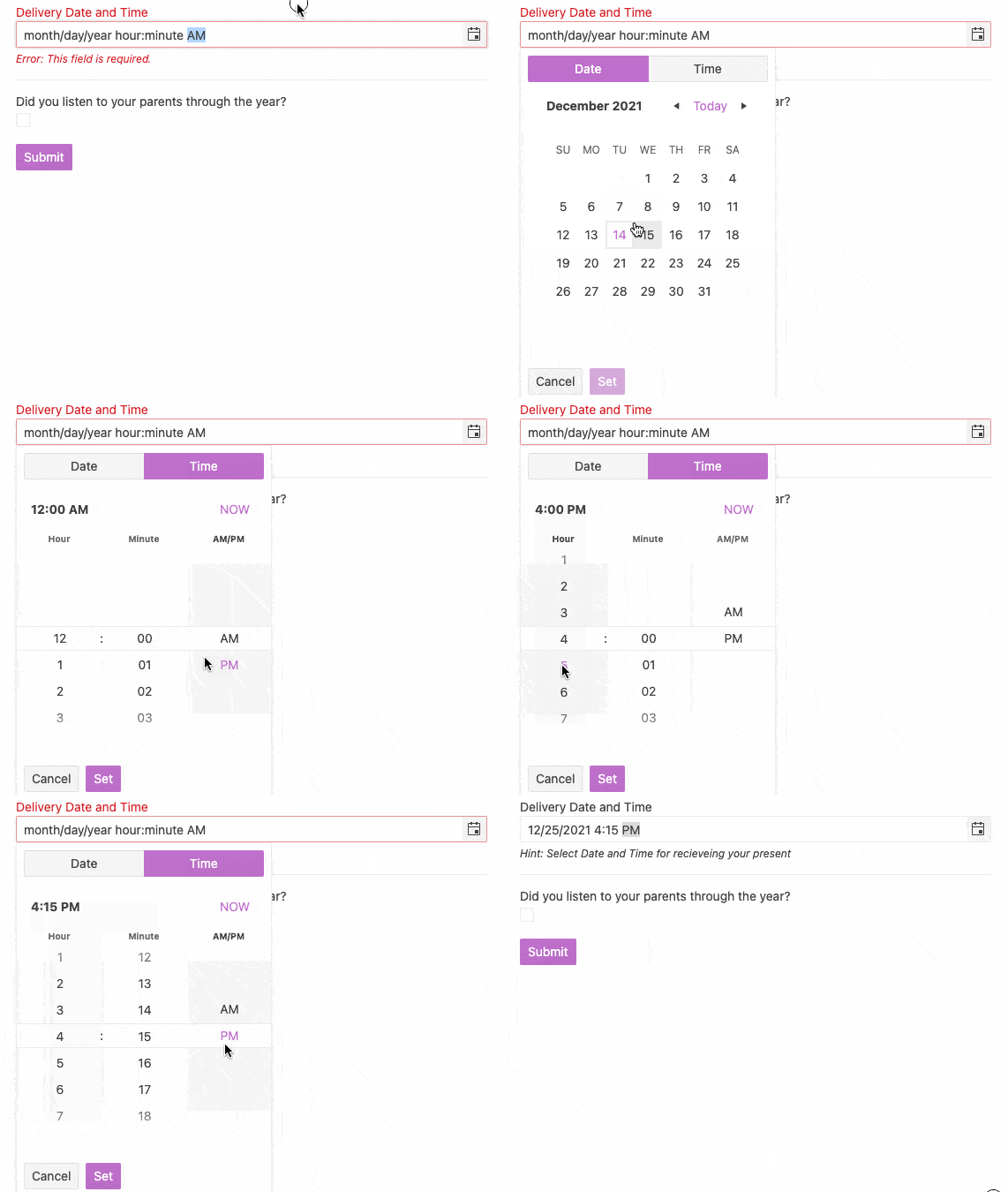
To help even more, we can choose the best time to have the present delivered. Here the help is coming from the DateTimePicker component which lets us pick the most appropriate day, hour and minute when Santa and his reindeer will be most welcome onto the child’s rooftop.
<field :id="'deliveryTime'" :name="'deliveryTime'" :label="'Delivery Date and Time'" :hint="'Hint: Select Date and Time for receiving your present'" :component="'myTemplate'" :validator="requiredValidator" > <template v-slot:myTemplate="{ props }"> <formdatetimepicker v-bind="props" @change="props.onChange" @blur="props.onBlur" @focus="props.onFocus" ></formdatetimepicker> </template> </field>
Have you listened to your parents?
Last but not least, the kids should confirm that they have listened to their parents before they submit the form. It is a requirement to be able to send the form to the server in the North Pole.
<field :id="'listenedToParents'" :name="'listenedToParents'" :label="'Did you listen to your parents through the year?'" :component="'myTemplate'" :validator="listenedToParentsValidator" > <template v-slot:myTemplate="{ props }"> <formcheckbox v-bind="props" @change="props.onChange" @blur="props.onBlur" @focus="props.onFocus" ></formcheckbox> </template> </field>
After having all these fields ready, the form is fully accessible and ready to use. The code and a runnable sample are both available at this StackBlitz example.
Hope this information helps you too when you need a Vue 2 or Vue 3 form. For more similar Vue tips or blogs, you can follow me on Twitter—@pa4oZdravkov.
Merry Christmas and happy Vue coding in the new year!