The November update of Telerik and Kendo UI brings .NET 6 and VS 2022 support along with Angular 13 and more!
Building off of our update from October, today I wanted to take the time to cover what your favorite Telerik and Kendo UI teams at Progress have been working on over the last few weeks. There’s a lot to unpack here, and everything that we mention is available within the latest releases of each of these products. So, if you see something you want to use, simply visit the Your Account page and grab the latest bits!
Table of Contents
- Support for .NET 6 and Visual Studio 2022 Official
- Angular 13 Support with Kendo UI for Angular
- KendoReact
- Kendo UI for jQuery
- Telerik UI for Blazor
- Telerik UI for ASP.NET Core and UI for ASP.NET MVC
- Telerik UI for ASP.NET AJAX
- Telerik UI for Xamarin
- Telerik UI for WinUI
- Telerik UI for WPF
- Telerik UI for WinForms
- Telerik Reporting and Telerik Report Server
- JustMock
Support for .NET 6 and Visual Studio 2022 Official

The Telerik teams at Progress have worked hard to provide all .NET web, desktop and mobile UI components, Document Processing Libraries, Reporting and JustMock tools support for .NET 6 and Visual Studio 2022 immediately after it was made available by Microsoft. Take a look at the dedicated blog post and see how you can benefit right away with the latest and greatest release in the .NET & Telerik worlds.
Angular 13 Support With Kendo UI for Angular
Angular 13 was released in the beginning of November and I’m happy to say that Kendo UI for Angular has had Day-Zero support! For those of you interested about what this version of Angular brings, we have a great blog post covering What’s New in Angular 13 right here. As for the Kendo UI for Angular components, simply update to the latest version of the packages you have included and you will be good to go.
Head on over to the Kendo UI for Angular docs and demos for more information.
KendoReact
Enhancements
Grid: Column Virtualization with Multi-Column Headers
A big feature that was added to the KendoReact Data Grid with this update is the ability to have multi-column headers when virtualizing our React data table. Previously these two features did not work that well together, but with the 4.10.0 update they can be seamlessly enabled in the same component.
See the KendoReact Data Table Column Virtualization demo for more information.
Editor: Expose Interfaces for onMount, onExecute, onPaste, onFocus and onBlur Events
Helping extend the way React developers implement the KendoReact Editor with this update, we have introduced several new events that can be used when initially rendering the component or when users interact with the content within.
See the KendoReact Editor demos to see the events in action.
Scheduler: Auto Item Height & Adaptive Slot Height
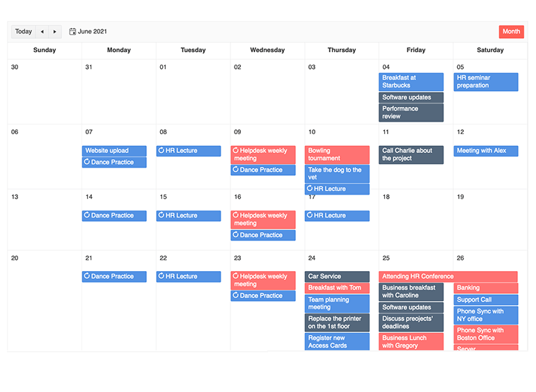
By default, the KendoReact Scheduler component has a set and uniform height when it needs to display all the items, or events, that are available on that day. This, however, may not be ideal in scenarios where days may have more events than others, or there are special days that require the events to stick out a bit more.
This is where the new Adaptive Slot Height feature comes into play, as it allows for the event slots available in a day to adapt to all the events that should be displayed, or even lets you set aspects like minimum height to ensure that even in scenarios where no events will end up being displayed.
In a similar vein, the new Auto Item Height feature deals with same ability to auto-adjust or have a defined height when events are displayed in a horizontal fashion, which is done in views like the TimelineView and the MonthView, along with the allDay section of Day, Week and WorkWeek views.
Here’s a quick link to the React Scheduler Adaptive Slot Height demos and here’s a link to the React Scheduler Auto Item Height demos.
Kendo UI for jQuery
New Components
PivotGrid Component
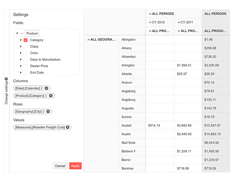
We are excited to announce the release of the new and improved Kendo UI for jQuery PivotGrid! Throughout the years the team has received a lot of feedback around the PivotGrid component specifically, and while we have been able to add features here and there, we realized that to best serve all our Kendo UI developers we needed to rethink the PivotGrid from the ground up. We used the experience found from years of building and supporting such a component to see how we could make something better if we had a chance to do things over. That’s right, the new jQuery PivotGrid is not just an update—it is a brand-new component!
If you are already using the existing jQuery PivotGrid, have no fear—nothing will change with this update. We have introduced this component separately as the “New PivotGrid” so the components can even live side-by-side on the same page. For now, PivotGridv2 may have fewer features and less functionality than the original PivotGrid, but it is taking advantage of an updated design that has also been created from the ground up to ensure the user experience is as good as it can be. We will continue to keep these components together for some time until we have provided feature parity (and even extended past the original) and see evidence that most users have migrated to the new component.
For a full breakdown of features, please refer to the New PivotGrid component demos section.
Enhancements
ColorPicker: New Design

The Kendo UI for jQuery ColorPicker component received a new and improved design with this update! Over the years of providing a ColorPicker for jQuery, as well as our other web-based products, we have received a lot of feedback around this component and have updated the design to account for this feedback.
These changes include brand-new design and also some new UI elements and features: capability to switch from Gradient to Palette view within the same ColorPicker instance; new color preview where you can easily compare old vs. new color; toggleable HEX and RGB inputs with opacity support; and a Contrast Tool to show users the contrast ratio between two colors.
To see this new design, check out the jQuery ColorPicker Overview demo.
PanelBar: Updated Design
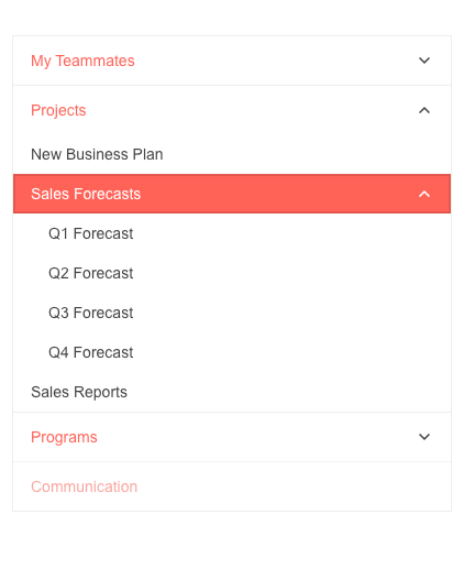
With this release, the Kendo UI for jQuery PanelBar component also received an updated design. While the component mostly looks the same, we have updated the rendering and classes applied to the rendered HTML to make the child elements within the PanelBar more distinguishable when all content is expanded. Additionally, the expand and collapse arrows have been updated to use a chevron arrow instead of a filled-in triangle.
See the new design over at the jQuery PanelBar demos.
Grid: Multi-Column Sorting via CTRL + Click
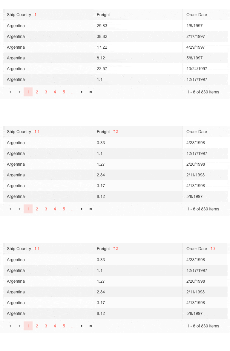
While the Kendo UI for jQuery Grid has had the ability to do multi-column sorting since the early days of the library, with this release we have added more ways for users to interact with columns for sorting. Specifically, this update adds an optional behavior feature that allows end users to sort on a single column when using a regular mouse click and only sort multiple columns when pressing the CTRL button. When clicking on a column header without the CTRL button pressed the Grid will revert to sorting by a single column.
See this new sorting behavior in action by jumping over to the jQuery Grid Sorting demos.
Admin Dashboard Sample Application
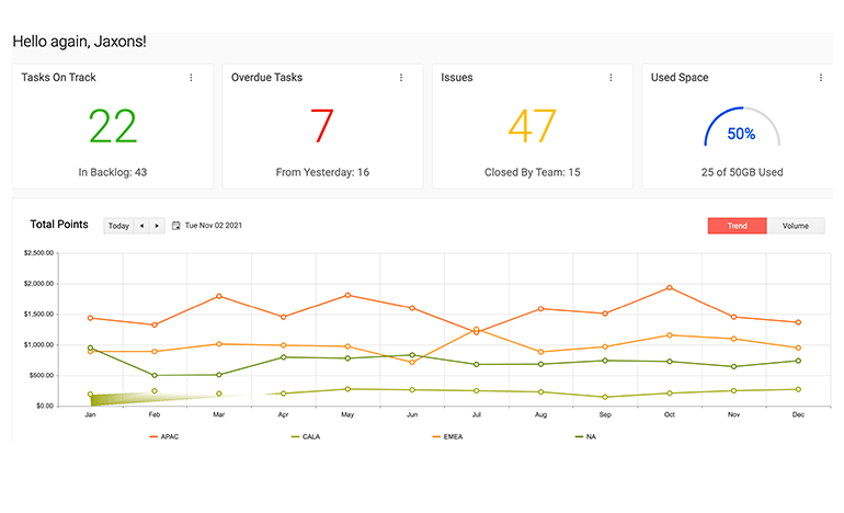
With this update, we are also bringing a brand-new sample application to the list of available demo apps built with Kendo UI for jQuery! This application follows the design and application architecture of popular admin dashboard templates that exist in the wild. The Admin Dashboard also uses a broad range of Kendo UI for jQuery components in a single application to help new and veteran Kendo UI users alike.
Head on over to the jQuery Admin Dashboard sample app right here!
Drawer: Amazon Style Navigation Sample

The Kendo UI for jQuery Drawer component has received several requests for a feature that replicates the navigation style of the Amazon menu. When a user clicks on a menu item, the Drawer component animates to the next “level” of the drawer to display a new set of menu items. From there users can navigate deeper or use the provided built-in navigation to move back to previous levels.
This has been implemented as a part of one of our jQuery Knowledge Base articles as it requires a little more code than would normally be found in one of our demos.
All Components: Improved Accessibility
With this update, we also continue our streak of improving the accessibility of all Kendo UI for jQuery components. These additions range from tackling reported accessibility issues within our backlog as well as strengthening the automated accessibility testing that we do internally. The result is that the latest edition of our jQuery components continue to be the premier jQuery UI library for accessibility compliance.
Visual Studio 2022 Support
Visual Studio 2022 was recently released, and with this update we can say that Kendo UI for jQuery and its helpful Visual Studio tooling officially supports Visual Studio 2022!
Telerik UI for Blazor
Telerik UI for Blazor 2.29 Release
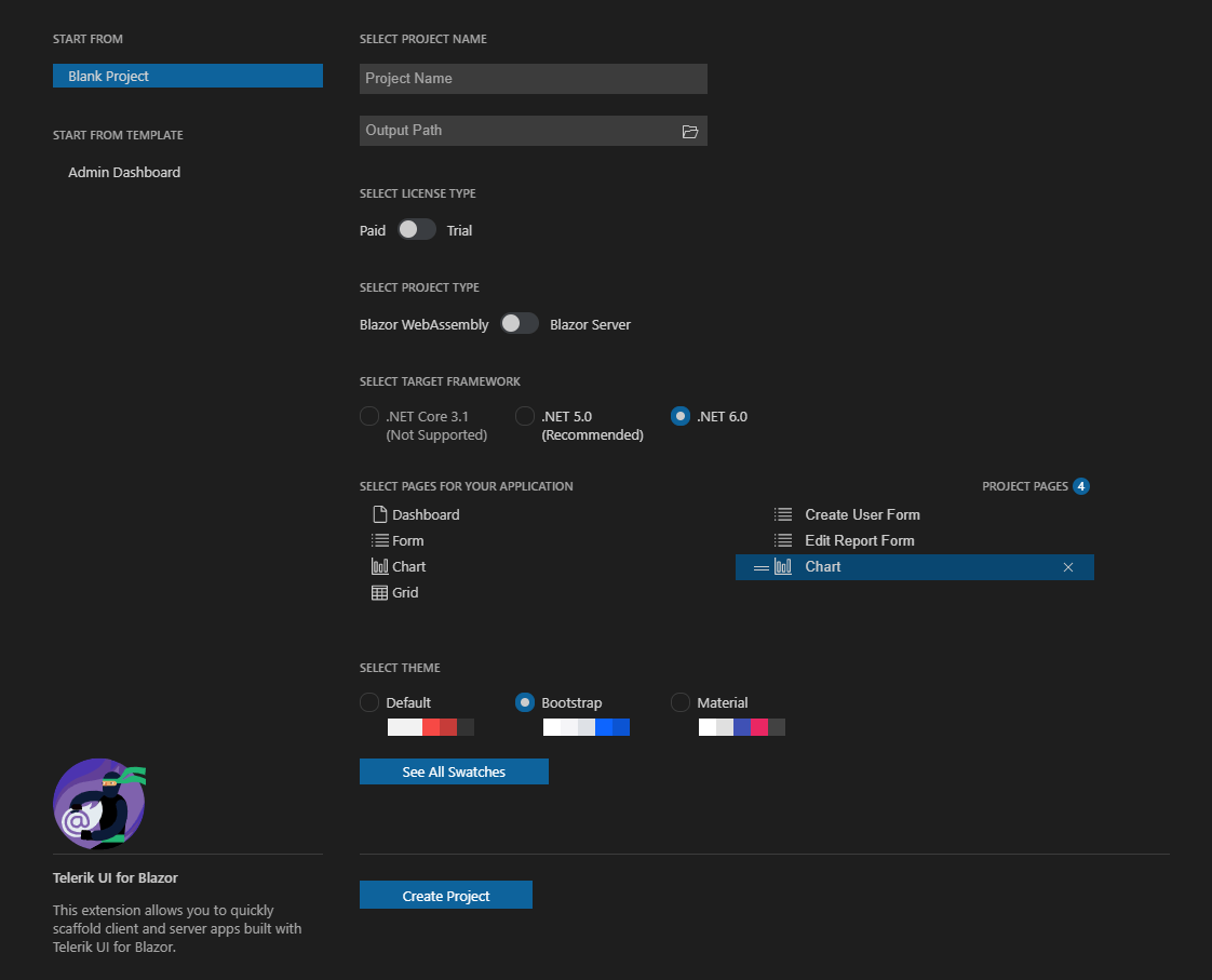
This month we excited to share that along with the .NET 6 and Visual Studio 2022 support, Telerik UI for Blazor brings a refreshed and enhanced Visual Studio Code extension! You can enjoy the uplifted UX and configure project themes and color swatches with a couple of clicks at project creation. You can also jumpstart a Blazor project with the new Admin Dashboard project template with pre-built layout and functionality. Rearrange the layout as it fits your needs, and simply plug in your data and bind it to the components—including Grid, Tile Layout, Drawer, Calendar, Form, various Chart types, Card and more.
Starting with Telerik UI for Blazor 2.29 release, we now ship the product source code for our active license holders (available in Your Account -> Downloads section).
Telerik UI for ASP.NET Core and UI for ASP.NET MVC
Common Features
Both Telerik UI for ASP.NET Core and ASP.NET MVC provide support for Visual Studio 2022, meaning you can develop with Telerik components, use project templates and extensions in the latest version of the IDE. Following the latest technology trends, we also provided compatibility for .NET 6 preview versions throughout the year, and we are now happy to share that Telerik UI for ASP.NET Core supports the official release of .NET 6.
We also added a few enhancements and new features across both ASP.NET MVC and Core offerings and will review in detail below.
Easy Access to Client- and Server-Side APIs
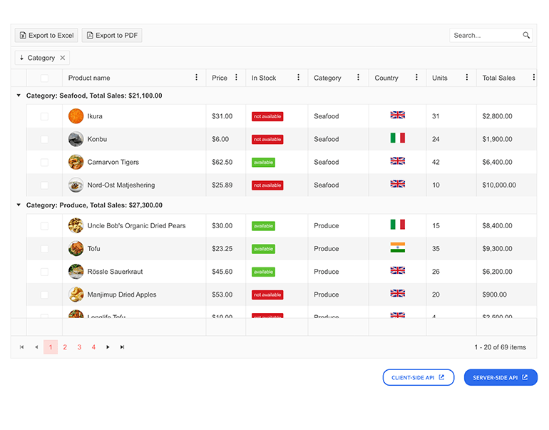
Both client- and server-side APIs are now easily accessible from the Telerik web UI component demos—check out the updates in the Data Grid demo.
Shared Data Source With the ScrollView Component
 The ScrollView UI component (also known as Carousel) can now reference external data source and accept DataSource Name as string in its .DataSource configuration method.
New Features and Views in ColorPicker UI Component
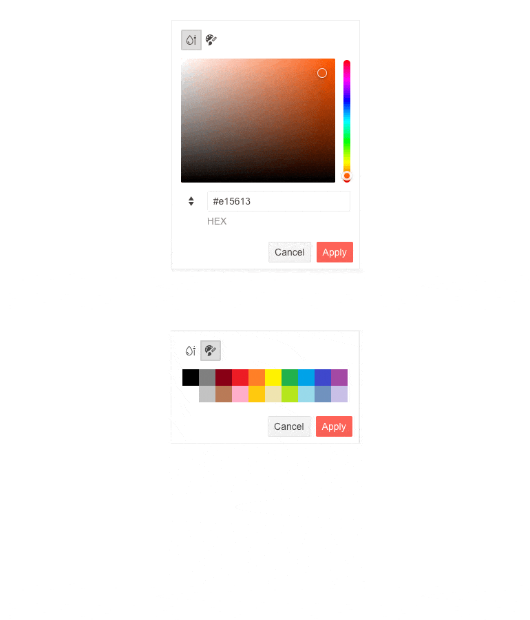
The ColorPicker component now provides enriched Gradient and Palette views, plus a handy option for the users to perform a switch between predefined colors (Palette) and custom colors (Gradient). It also exposes for input both RGB and HEX formats and an option to configure its default format.
Telerik UI ColorPicker Gradient and Palette Views
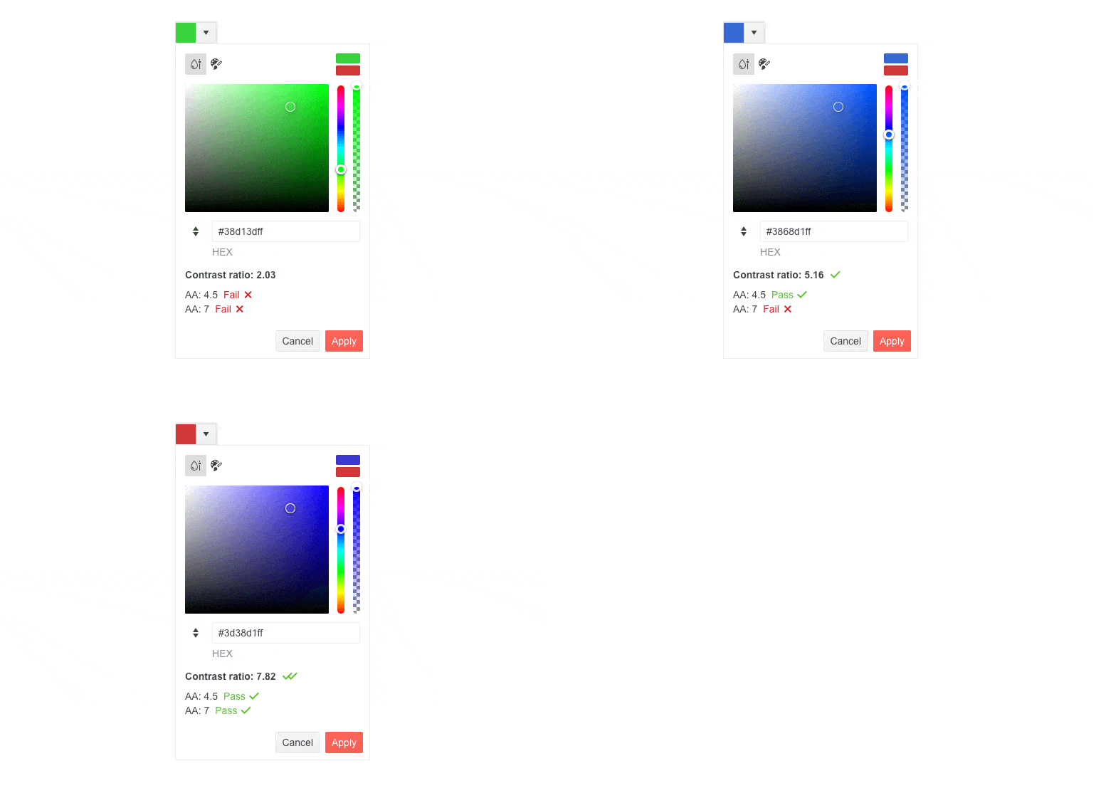
Last but not least, the component provides options for checking the color contrast ratio between two colors following the Web Content Accessibility Guidelines (WCAG) AA and AAA levels.
Modernization of the PanelBar Component Rendering

The Telerik PanelBar component received a slightly refreshed look and feel, which is mostly noticeable when all content is expanded. The rendering and class updates make sure child items stand out better and the panel expand/collapse arrow has been changed to a chevron.
Telerik UI for ASP.NET Core–Specific Features
Telerik UI for ASP.NET Core Responsive Panel
To complete the support for referencing Telerik components using both HTML and TAG helpers in ASP.NET Core applications, we added the option to plug the Responsive Panel UI component using Html.Kendo().ResponsivePanel() configuration.
Telerik UI for ASP.NET MVC–Specific Items

Telerik UI for ASP.NET MVC brings two flavors of a new resource—Admin Dashboard brand-new demo application and Visual Studio project template. Both provide the same use case showcasing Telerik components in an ASP.NET MVC application and include many UI components in action, including Grid, Tile Layout, Drawer, Calendar, Form, various Chart types, Card and more.
Telerik UI for ASP.NET AJAX
The November updates span across the Telerik AJAX components as well! We made sure to include in the release of Telerik UI for ASP.NET AJAX multiple accessibility improvements, implementation of several feedback portal items, a new demo and support for Web Live Preview.
Reporting Integration Demo
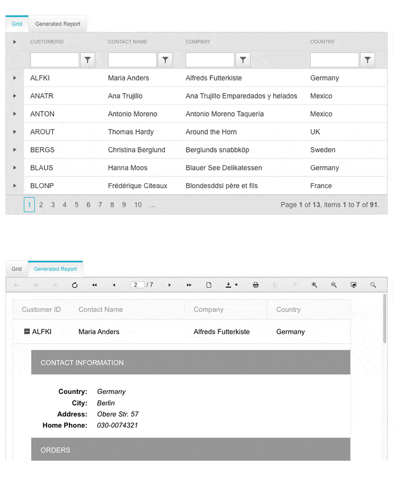
Based on your feedback, we added a dedicated demo showcasing the integration between the RadGrid UI component and Telerik Reporting and how you can pass and display ASP.NET AJAX Grid data in a WebForms Report Viewer.
Support for Web Live Preview
You can now configure your Telerik ASP.NET AJAX controls directly in the browser as well as in Visual Studio Designer using the powerful capabilities of Microsoft Web Live Preview (WLP). The CSS Auto-Sync functionality allows you to customize the appearance of the Telerik controls and layout of the page without leaving Visual Studio.
Telerik UI for Xamarin
The Calendar and Scheduling control is essential in scenarios where users need to keep track of their schedule and efficiently manage their meetings. With the built-in Scheduling UI app, users can quickly create, modify and delete appointments. With R3 2021 Service Pack release, we’ve enhanced that functionality by providing you with a few events to get a notification as soon as an appointment is changed through the Scheduling UI.
Additionally, the R3 2021 Service Pack release brings one more event you’ve requested—MonthChangedevent. We’ll look into those new features in detail below.
Event for Month Change
When the Calendar is in Month view, users can quickly navigate between months with a single gesture. Now with the new MonthChanged event, you can track when the current month is updated and implement custom logic accordingly—for example, load some events for that month.
Events for Appointment Changes
Appointment change events would be pretty helpful in many scenarios—whether you’d need to preserve the appointment’s data in a database, you’d need to notify the user a particular change has been made, and more.
As their names imply, AppointmentAdded is raised when a new Appointment is created, AppointmentDeleted when the user has deleted a concrete appointment, and AppointmentUpdated when the user has modified a property of an existing appointment.
The tricky part here is in the case of recurring appointments. When the app user adds an exception occurrence, or updates or deletes an occurrence (all these options are available through the built-in Scheduling UIs), AppointmentUpdated event is raised, as actually the recurrence rule of the appointment has been updated.
All three events provide event arguments of type AppointmentChangedEventArgs. AppointmentChangedEventArgs holds all the needed details related to the concrete appointment change, such as the appointment itself and, in the case of repeating appointments, the occurrence and the occurrence action (possible values: None, Add, Update and Delete).
The screencast below demonstrates notification messages shown on appointment changes with short info on the concrete updates. You can check the exact implementation in our documentation here: Calendar & Scheduling: Appointments Changes Events Example.
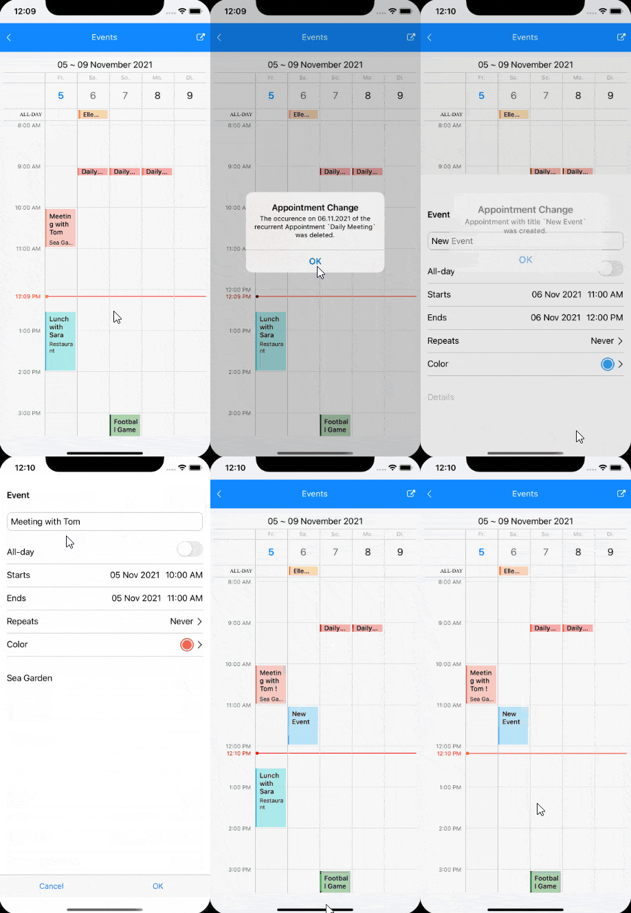
For more information on the R3 2021 SP for Telerik UI for Xamarin, visit our Release Notes.
Telerik UI for WinUI v0.6.0
We are thrilled to announce the Telerik UI for WinUI v0.6.0 release that comes with a new control as part of our expanding UI suite, support for the latest stable Windows App SDK release and a Visual Studio Extension. Let’s unpack the latest goodies!
Windows App SDK 0.8.5 Support and Desktop Demos
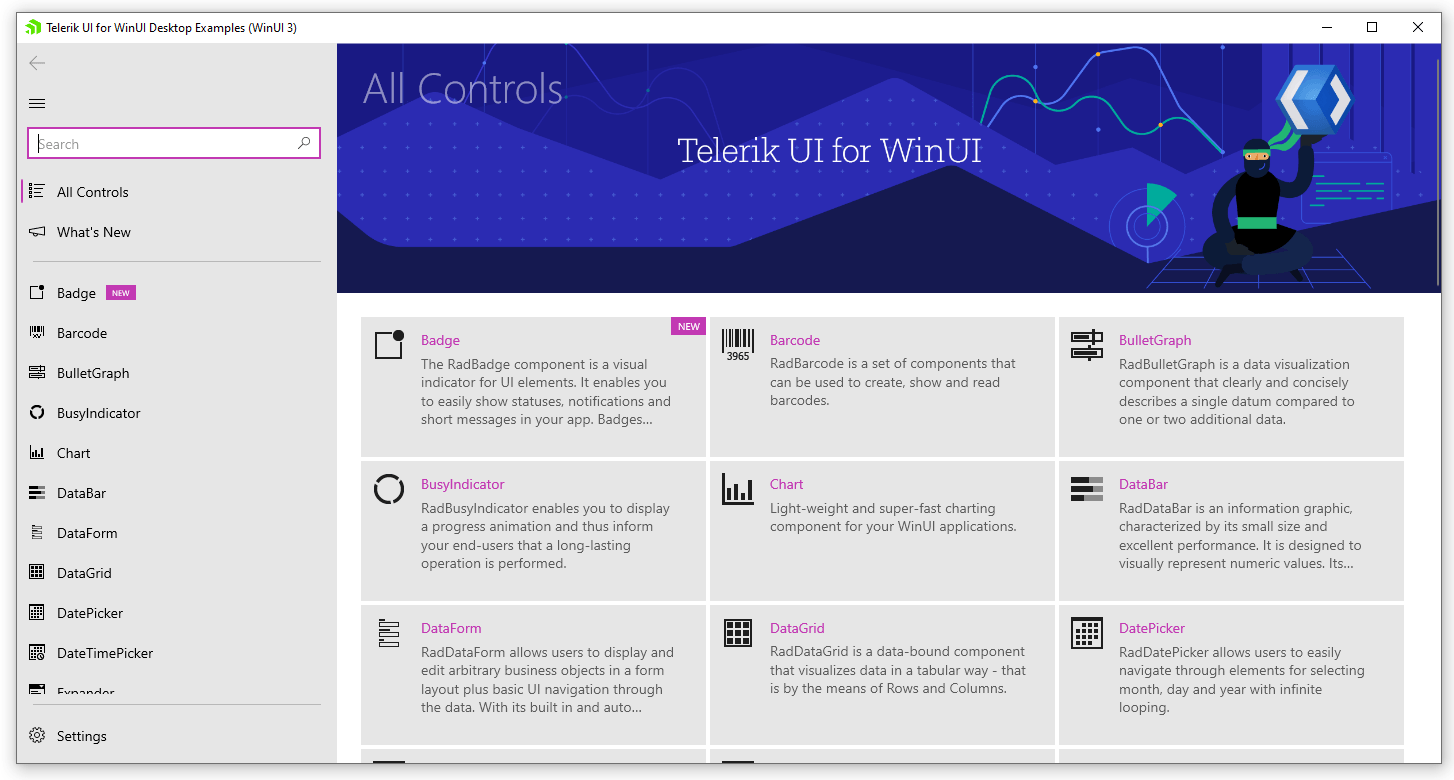
The desktop version of Telerik UI for WinUI supports the latest stable Windows App SDK (Project Reunion) 0.8.5. We are also changing our example application from WinUI UWP to WinUI Desktop and will be supporting the latest stable Windows App SDK release. You can install the application from the Telerik UI for WinUI Examples web page and give it a spin!
Badge Control
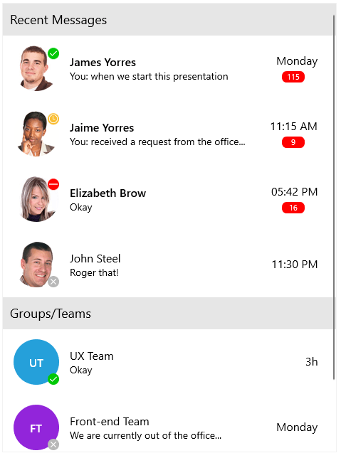
The Telerik UI for WinUI suite is expanding with another new control—the Badge control! It will enable you to alert users and provide additional information about notifications, updates, changes, errors and anything else you might find useful. You can use the helper RadBadgeView control to attach Badge to any UI component of your application quickly. Choose from a predefined set of most popular badges or create your own to suit the application requirements.
In both cases, the control provides you with the full flexibility to adjust the appearance to your app’s overall look and feel. You can see below how the predefined badges look:

Here are some of the main features of the control:
- BadgeView – Easily attach the Badge control to any UI element.
- Badge Position – Easily specify the position where the Badge will appear.
- Badge Types – Choose between various predefined badge types. Also, you have the option to apply a custom geometry to the control if none of the predefined types work for you.
- Animations – Options to disable or change the show/hide Badge animations.
- Flexible Customization – Allows you to change the Background, Geometry, BorderBrush and more.
For more details, please refer to the RadBadge documentation.
Visual Studio Extension

We recently added Telerik UI for WinUI VS extensions for Visual Studio 2019 and Visual Studio 2022. The extension will significantly increase your productivity and jumpstart the development process by allowing you to quickly create either desktop or UWP Telerik UI for WinUI projects. With the initial version, you can choose between two predefined templates:
- Blank Project – empty project with all the needed references added
- DataGrid Project – contains presetup DataGrid control in MVVM manner
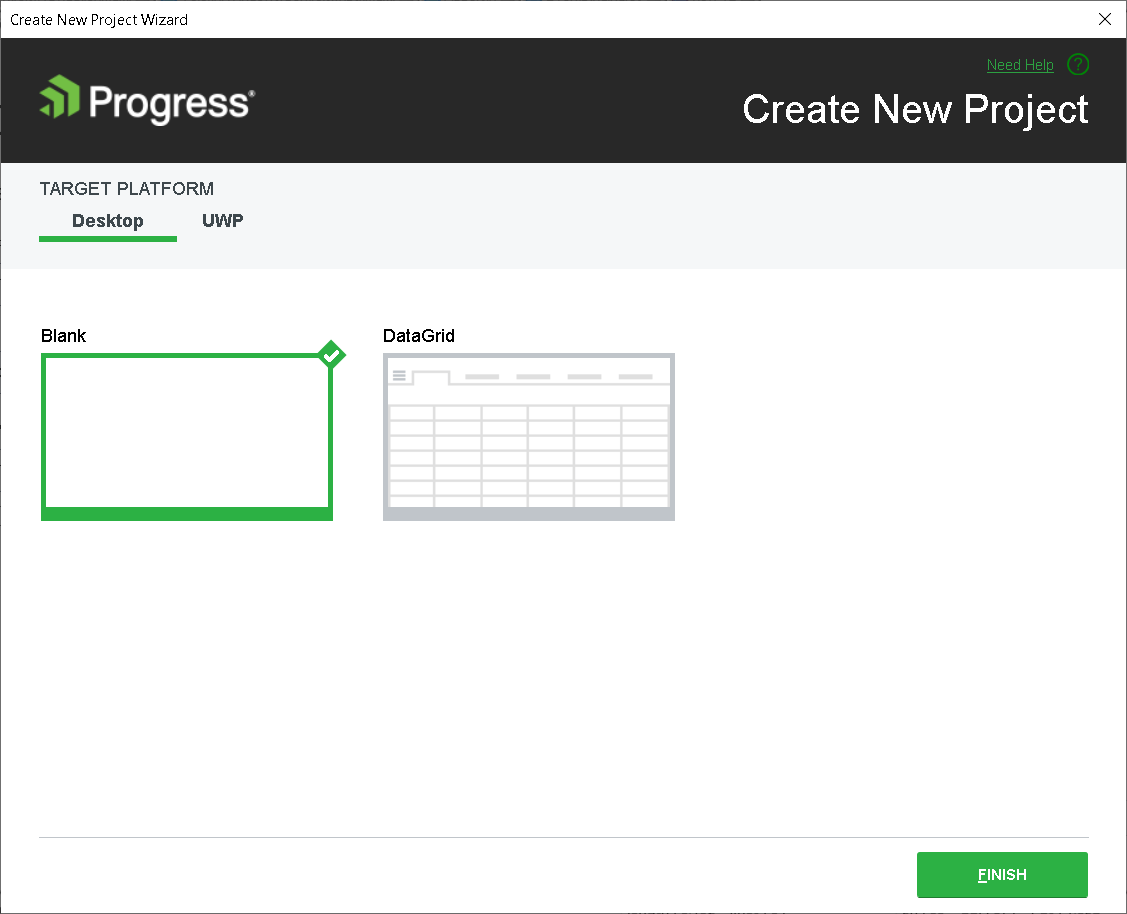
For more details, you can check the Visual Studio Extension article from our documentation.
For more information on the Telerik UI for WinUI v0.6.0, visit our Release Notes.
Telerik UI for WPF
The R3 2021 Service Pack is here and packed with new features, enhancements and goodies.
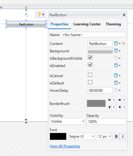
Suggested Actions: View All Properties
On the very bottom of the Suggested Actions for each Telerik UI for WPF control, now you will find the “View All Properties” link. When clicked, it opens the Properties window for the selected control, allowing you to browse to all other properties quickly. Note that this will be supported only in the Visual Studio 2022 version and above.
GanttView: AutoSize TimeRuler
We are adding new option for sizing the TimeRuler that will automatically adjust the PixelLength of the control depending on the available space. This way the TimeRuler area would be stretched to fill the empty space with manually calculating the PixelLength. For more info check out the TimeRuler article from the GanttView help documentation.
ComboBox: Dropdown Icon
The RadComboBox control got even more flexible with its new DropDownButtonIconContent and DropDownButtonIconTemplate properties. No more need to extract the default control template to change the dropdown icon.
Is it compatible with the RadGlyph? Yes, fully. Check out the following example, demonstrating how to set a RadGlyph as the combo box’s dropdown button icon of editable and noneditable ComboBox controls:
<telerik:RadComboBox IsEditable="True" Margin="0 10 0 0" DropDownButtonIconContent="" Width="200">
<telerik:RadComboBox.DropDownButtonIconTemplate>
<DataTemplate>
<telerik:RadGlyph Glyph="{Binding}" Foreground="#F7630C"/>
</DataTemplate>
</telerik:RadComboBox.DropDownButtonIconTemplate>
</telerik:RadComboBox>
<telerik:RadComboBox DropDownButtonIconContent="" Margin="0 10 0 0" Width="200">
<telerik:RadComboBox.DropDownButtonIconTemplate>
<DataTemplate>
<telerik:RadGlyph Glyph="{Binding}" Foreground="#F7630C"/>
</DataTemplate>
</telerik:RadComboBox.DropDownButtonIconTemplate>
</telerik:RadComboBox>
And here is the result:
![]()
Lovely, huh? For more details see the DropDown Button Icon article from the ComboBox documentation.
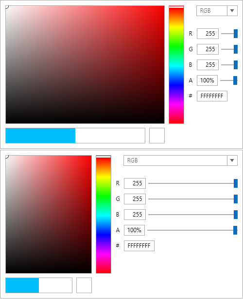
ColorEditor: Color Settings Panel Width
With the new ColorSettingsPanelWidth property of RadColorEditor, you will be able to easily customize the width of the color setting panel in the dropdown (on the right side). For example, check the images below. The first editor has narrow color settings area and the second one has a wider area:
For more info, check out the ColorEditor help documentation.
We have a lot more! To get an overview of all the latest features and improvements we’ve made, check out the release notes for the products below:
Telerik UI for WinForms
The Service Pack of the Telerik UI for WinForms suite comes just in time with the official launch of Visual Studio 2022 and .NET 6! This Service Pack brings full support for VS 2022 and .NET 6; rounded forms support in Windows 11; performance improvements in the file dialogs; memory optimizations in multiple controls; mentions (suggestions) functionality in RadRichTextEditor; and a set of new most-voted features. This year, we are the first to support design-time experience for .NET Core 3.1, .NET 5 and .NET 6 in Visual Studio 2022.
Let’s see in detail what is shipped with the R3 2021 Service Pack.
Rounded Corners Support in Windows 11
The newest Windows OS, v11, brings plenty of great features where the rounded corners are just a piece of the improved design. It will bring a more elegant experience to your forms in desktop applications:
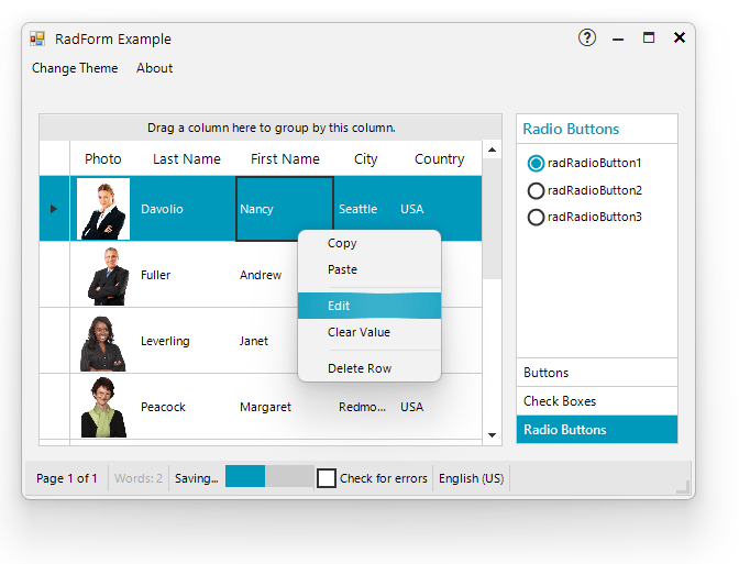
The rounded corners are enabled by default which can be controlled by the Telerik.WinControls.WindowsSettings.EnableRoundedCornersDefaultValue property.
Make sure that Windows 10 version is defined in the app.manifest file:
Mentions (Suggestions) in RadRichTextEditor
This functionality enables you to show a predefined list of suggestions to be inserted into the document content when the users type a specific mention character, e.g., “@”. You can use a default provider for the mentions or define a custom one that suits your needs. Multiple providers are also supported while they have different mention characters.
The flexibility of the feature also provides you with the ability to control how the selected item is inserted, how it is visualized and how it is being matched inside the same collection.

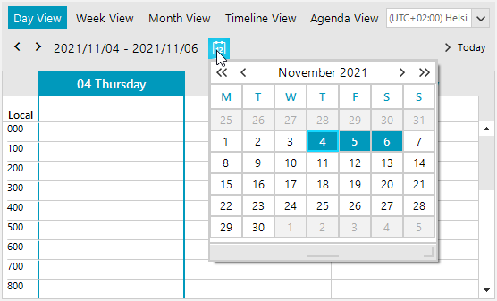
Date Selector in RadSchedulerNavigator
RadSchedulerNavigator offers a date selector. Selecting a date inside the calendar will change the start date of the active view, preserving the same days count.
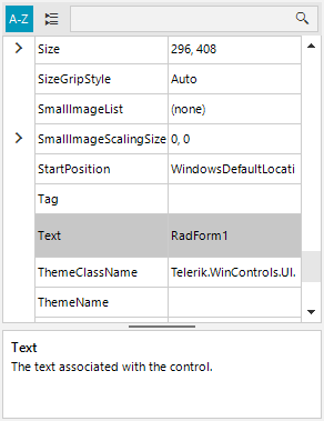
Different Item’s Height in RadPropertyGrid
RadPropertyGrid supports individual item’s height. As the control does not expose the items directly, there is no Items collection. The data item can be accessed in the CreateItemElement or the ItemFormatting event. Then, specify the Item.ItemHeight property to the desired height.
RadVirtualKeyboard’s Improvements
RadVirtualKeyboard comes with a beep sound functionality after pressing a key and an improved API for finding a key row without the necessary of knowing the exact keyboard layout.
Polishing RadTaskBoard
In R3 2021, RadTaskBoard (also known as Kanban Board) was released. The new powerful control enables users to track their tasks in a simple, agile-style manner. It provides a clean and user-friendly interface for a functional task management application.
With the Service Pack, we polished the user and tag management in the task cards and now you can fully benefit from the RadTaskBoard control.
You can also check our Release History page for a complete list of the included improvements.
Telerik Reporting & Report Server
Along with the latest .NET & VS support, we introduced some helpful improvements and addressed a lot of bugs. Let’s review the more impactful ones.
Reporting Improvements
We made a very important improvement of the text measurement under Linux. We rely on a third-party text-handling library, and it has some significant flaws. This was bringing incorrect text wrapping and not on a rare occasion text that is clipped incorrectly. Using some smart algorithms, we now managed to make the rendered text layout almost identical to the one produced in Windows. We can safely consider this Linux user scenario covered.
The web-based report designer again received a substantial portion of our attention. Now the main menu displays a list of the recently opened reports for easily resuming report editing.
The “Open Report” functionality is further enhanced as you can now switch between Grid and List views in the “Open Report” dialog so that it better supports reports with a longer name. The list of the fixes in this designer is impressive.
We introduced the CommandTimeout property to the MSSQL Database Storage so that it can store resources of high volume. This is usually needed when huge reports get rendered and correspondingly cached. The property may be set as well using a newly added constructor overload or declaratively in the app configuration file.
We added a super handy endpoint “/api/reports/version” to the reports’ REST service implementations. As the address suggests, it returns the version of the server-side service assembly. Having this, if the server’s and viewer’s versions mismatch, you would get an informative message and upgrade the needed component. The handy part is that it can be also used to test if your service implementation is up and running or the programming gods have turned their backs on you today.
Back in February (R1 2021 SP1) we introduced functionality to skip the rendering of all pages not producing any significant content. This is especially useful for Report Books where some of the combined reports might not have data. We were sorry to hear this change in the behavior has caused some confusion for our users. Based on your feedback, we have improved this functionality and now if a page contains any error message, it is considered significant so that you as developers do not need to switch the SkipBlankPages property back and forth.
Again, an improvement based on user feedback: Some devs need to traverse all the data source components in the report definition. Now this is much easier using the dedicated GetDataSources method exposed on the Report level.
The other tool that got a lot of care for this release is the recently added WinUI report viewer. It now started to respect and display the interactive tooltips that are defined in the report model. We also further improved the UX in the high-contrast themes by using FontIcons instead of the original PathIcons. Next, the assemblies bringing the viewer itself may now be used in x86 apps (they were previously limited to x64 usage).
I would also mention a bug fix concerning the WinUI viewer when rendering reports from a Report Server (I know you knew that this scenario is supported). Now the Excel 97-2003, Web archive, and XPS renderings properly show the Export report dialog when selected. Again, the full list of fixes is available in the Release Notes article.
Bug Fixes
Lastly, let’s honor some important bug fixes. There was an annoying issue within the JSON serializer used on the server causing an error when an integer value got assigned to a multivalue float parameter. Well, it’s gone. Just to note that this serializer is used in the .NET Core 3.1/.NET 5/6 apps. And the second fix I will mention specifically is a security vulnerability bug fix in the legacy ASP.NET WebForms report viewer. Although this viewer is not being developed as it was effectively substituted with the HTML5 one (and all of its flavors), we are still committed to applying critical fixes, and the security ones are considered as such.
We hope that in this Service Pack release we managed to add valuable features and fix important bugs that will prove our product as a tool of choice for your apps, regardless of the platform or technology.
We will be extremely glad to hear from you about what we have missed or what can be done better, so please don’t hesitate and share your opinion below or drop a line in our Feedback Portal.
JustMock
Assert All Mock Expectations with a Single Method Call
A client of ours contacted us for assistance in validating the expectations set for numerous mock objects. From the communication with him, we found out that we lack a mechanism that can tackle quickly and easily such a situation. That’s why we implemented the AssertAll method.
Here is an example of how this feature can be used:
[TestMethod]
public void TestMethod()
{
    var foo = Mock.Create();
    var bar = Mock.Create();

    Mock.Arrange(() => foo.Post()).Occurs(2);
    Mock.Arrange(() => bar.Get()).Occurs(2);

    foo.Post();
    bar.Get(); // just one call is made for the Get method
    foo.Post();

    Mock.AssertAll(); // assert all will fail the test as the expectation for the Get method is not met
}
Optimized Unit Test Discovery Process in Visual Studio
Faster is always better when it comes to executing unit tests. With that in mind, we’ve managed to significantly improve the performance during the unit test discovery process inside the test explorer in Visual Studio.
There’s More to Come
Whew! No matter which product you’re interested in, that’s quite the update! If you’re looking to take advantage of any of these new features, all you have to do is update to the latest version that just recently was released. We will continue to provide updates along the way as we march toward R1 2022, so keep an eye out for more updates over the next couple of weeks!
