Aloha from the shores of (.NET) MAUI! Welcome to R3 2021—we hope you’ve had a good summer, because ours has been truly productive!
As you have probably noticed, the Telerik team behind .NET MAUI has been releasing new controls and features for Telerik UI for MAUI Preview every month and we plan on keeping that up in the future. So, in the spirit of the last major Telerik release for 2021, let’s recap what we’ve shipped for your next .NET MAUI cross-platform app!

Welcome the DataGrid to the Telerik UI for MAUI Family!
.png?sfvrsn=3b933e63_0)
DataGrid is one of the most crucial components for application development since most data is stored in tables. The Telerik UI for MAUI DataGrid allows you to easily visualize and edit tabular-represented data right into your .NET MAUI application. The control can be populated from various data sources, and comes with out-of-the-box support for operations like editing, sorting, grouping, fast performance, UI virtualization and easily customizable API.
Here are some of the key features of the brand-new Telerik UI for MAUI DataGrid control:
- Various built-in column types such as Text, Boolean, Numeric, ComboBox, DateTime and Template prepare you for any type of data and user scenario.
- Load on Demand capability allows automatic data loading once the user scrolls past the last available record.
- UI Virtualization optimizes the application performance by creating visual elements only when needed and only for the currently visible cells.
- Sorting, Grouping and Editing allow you to quickly sort and programmatically group your DataGrid items, as well as edit the data presented in the grid.
- Selection Modes allow for a single or multiple item selection and control the selection unit—Cell or Row.
- Rows Alternation allows you to alternate row colors so your end users can easily distinguish between different rows.
- Styling API allows you to customize the Telerik DataGrid for MAUI based on your application requirements and/or preferences.
The Telerik UI for MAUI DataGrid is currently supported for iOS and Android (support for other platforms is in the works). If you want to kick off your experimental application development, check out the control’s documentation page.
Gauges, So Many Gauges!
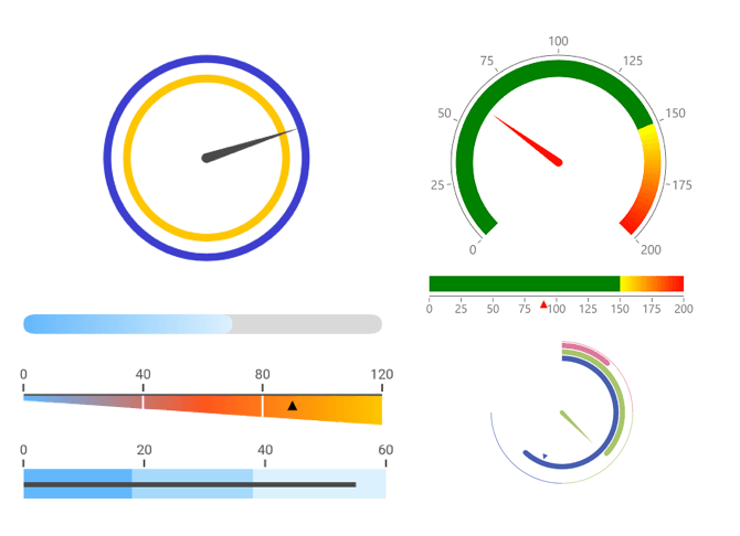
Let’s welcome the MAUI Gauges to the Telerik family! These specialized UI controls used for visual display of amounts, levels or contents of something. Measured values are presented via indicators (needles, arrows or custom UI) plotted over a gauge axis and within a given gauge range—the new MAUI Gauge does it all with full customization. The MAUI Gauges can be rendered in three forms—Vertical, Linear or Radial, each with complete control over Axis, Animations, Indicators, Ranges and Positioning.
If your .NET MAUI app needed a Gauge, you have it now for good—great for quick visuals on mobile, even better for complex dashboards on desktop. The Telerik MAUI Gauges are rendered with the help of SkiaSharp graphics library, and the Docs provide help on control features, setup and functionality.
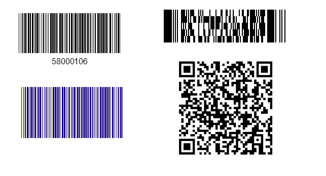
Barcode
The Barcode control for MAUI is used to create and visualize a variety of barcodes in machine-readable format by providing numeric or character data. Modern barcodes support myriads of industry standard specifications—Linear 1D or Matrix 2D ones. The Telerik MAUI Barcode supports them all through a simple Symbology property, along with customization options for sizing mode and colors. As the Docs explain, consider Barcodes for all things .NET MAUI—done and done.
Entry UI for All Platforms
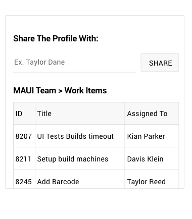
Another control makes it to our growing MAUI UI library—Entry. The Entry is a text input control that accepts input from users and ensures a consistent look and feel across your .NET MAUI application via an innovative theming mechanism.
The control comes with watermark support as a placeholder to hint at the type of input required by end users (e.g., username, password, etc.) and flexible customization capabilities. For more information on dabbling with the Telerik UI for MAUI Entry control, visit our documentation.
Path
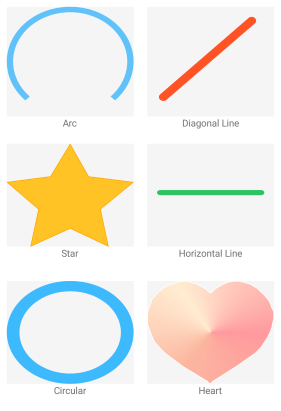
The Telerik MAUI Path control is used to draw complex shapes that are composed of different geometries like arcs, ellipses, lines and rectangles. Rendered with the help of SkiaSharp graphics library, the Telerik Path UI boasts several built-in geometries—like star, circle, heart, diamond—or you can roll your own.
The styling of the rendered Path elements can be customized through relevant properties, like Fill, Stroke, StrokeThickness and BackgroundColor. You can also combine several PathGeometry objects into a single Path element for drawing more complex shapes. The Docs set you up for using Path—the world is your oyster.
Popup
Popups are the true attention seekers of the UI universe. Do you need to draw the attention of your users to a piece of important information? Make sure you take the Telerik UI for MAUI Popup control for a spin. The MAUI Popup is a feature-rich UI component ready to serve a variety of needs. The Popup control lets you display content of your choice on top of existing views—it is a placeholder control that will hold anything you want it to visualize.
The Popup control boasts flexible APIs—you can define whether the Popup will be modal or not and position the Popup precisely through various settings and horizontal/vertical offsets. The Popup component also provides sleek customizable animations that can be played while the control is being displayed/hidden—yours to delight the user with. The Docs can shed light on all the different ways the MAUI Popup control can serve the needs of your app.

Checkbox and SegmentedControl Joined the Telerik UI for MAUI Family
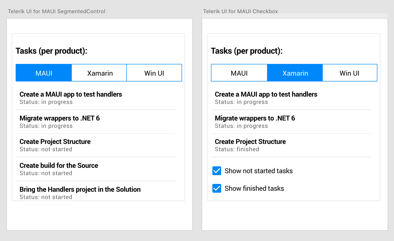
Two more controls joined the ever-growing Telerik UI for MAUI family—CheckBox and SegmentedControl. While they cannot compete with UI giants such as the DataGrid, these two smaller UIs are like the tweezers of the Swiss Army Knife—you don’t really think much about that tool, but when you need it, it’s there to save the day! Same goes for our CheckBox and SegmentedContro for MAUI—you don't think that much about them, but they will be there when you need them!
The Telerik UI for MAUI CheckBox control allows you to easily add checkboxes right into your .NET MAUI cross-platform application and allow your end users to select one or more options from a list of predefined choices, while the SegmentedControl is designed to enable your end users to select between multiple different contexts. Similar to a Button control, each linear segment can contain either text or images.
For more information, check out the product documentation for Telerik UI for MAUI CheckBox and SegmentedControl.
Support for WinUI
With our first preview of Telerik UI for MAUI, we started with support for iOS and Android and promised more platforms would follow. Well, so far we’ve provided support for WinUI and who knows—if you keep an eye on our regular releases, we might surprise you next week by providing support for yet another platform. ;-)

New to Telerik UI for MAUI? Try It & Share your Feedback
If you are new to Telerik UI for MAUI, you can learn more about it via the product page. The Telerik UI for MAUI controls are currently in preview and they are free to experiment with, so don’t wait—jump on the cross-platform development bandwagon!
We would love to hear what you think, so should you have any questions and/or comments, please share them in our Telerik UI for MAUI Feedback Portal.
Sign Up for the Webinar or Catch Us on Twitch
Wanna see the latest features in action? Make sure to join us on the Telerik R3 2021 webinar on Wednesday, September 29, at 11:00 am ET - 1 pm ET.
Twitch
Complement the webinar with live sessions on Twitch as our developer advocates dive into their favorite new features:
- Monday, September 20 I 10:00 am ET I .NET Web Products*
- Tuesday, September 21 I 10:00 am ET I .NET Desktop Products*
- Thursday, September 23 I 10:00 am ET I React
- Friday, September 24 I 10:00 am ET I Angular
* In addition, you’ll be able to learn the news around embedded reporting, automated testing and mocking tools in all .NET sessions.