The R3 2021 release of KendoReact is here and it brings some huge components and lots of features to add to the toolbelt of any React developer.
New components include the new PivotGrid and Heatmap components, while we added column auto-sizing to the React Data Grid. There’s way more to cover, so let’s jump right in.
Bootstrap 5 Support
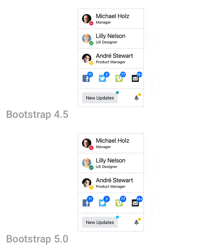
Kicking off the R3 2021 release is the support for the latest version of Bootstrap. With this release the KendoReact Bootstrap theme officially supports Bootstrap v5.
To see the new theme in action, head on over to the KendoReact demos and select Bootstrap from the theme picker of any demo.
Updated Theme Pickers in Docs & Demos
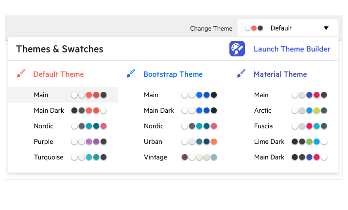
Speaking of the theme picker in the KendoReact demos, with R3 2021 the KendoReact team expanded the number of themes available within the theme picker of each KendoReact demo. Truthfully, we still have the same number of themes with Default, Bootstrap and Material themes, but the updated theme picker now features color variations for each theme that were put together by the KendoReact frontend engineers. We refer to these as “swatches” and they should help showcase what can be done with KendoReact and its themes by modifying just a handful of Sass variables.
Check out the KendoReact demos and pick one of the new swatches to see how the colors change all of the KendoReact components highlighted in the demos.
Kendo UI Kit for Figma
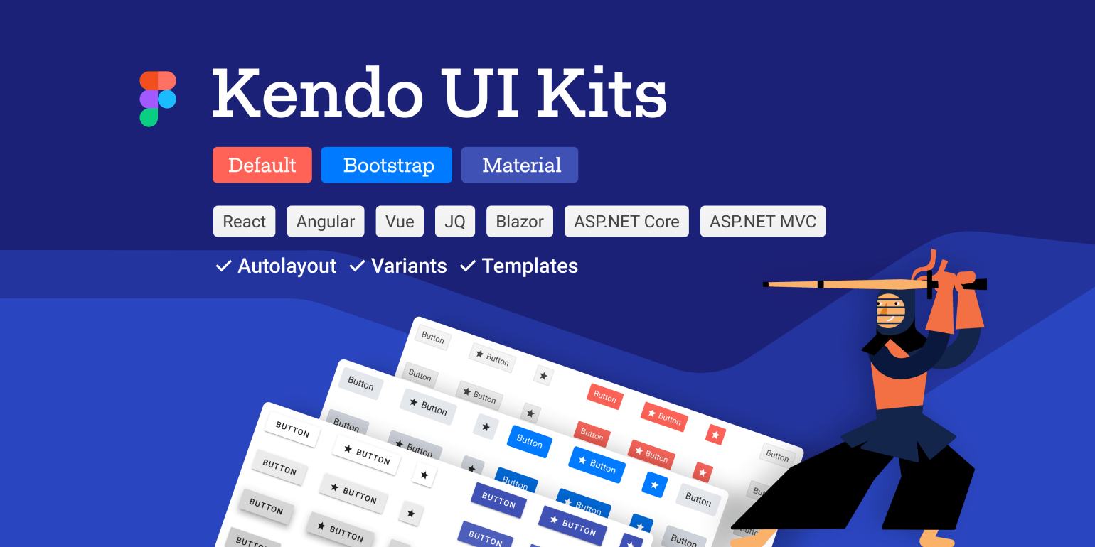
While we have already highlighted the Kendo UI Kit for Figma within the KendoReact pages for some time, I wanted to take this moment to highlight them once again.
This Figma UI kit contains over 30 ready-to-use assets representing KendoReact UI components within Figma. This will help any teams working with designers to ensure that both developers and designers are working with the same UI components, making the sharing and implementation of designs much easier.
This is only the beginning for the Figma UI Kits as we will continue to add UI components until we have 100% coverage of all available KendoReact components, so keep a close eye on the Figma kit in the future!
For more information about all of this, jump on over to the Kendo UI Kits for Figma page.
New React Components
New Component: PivotGrid
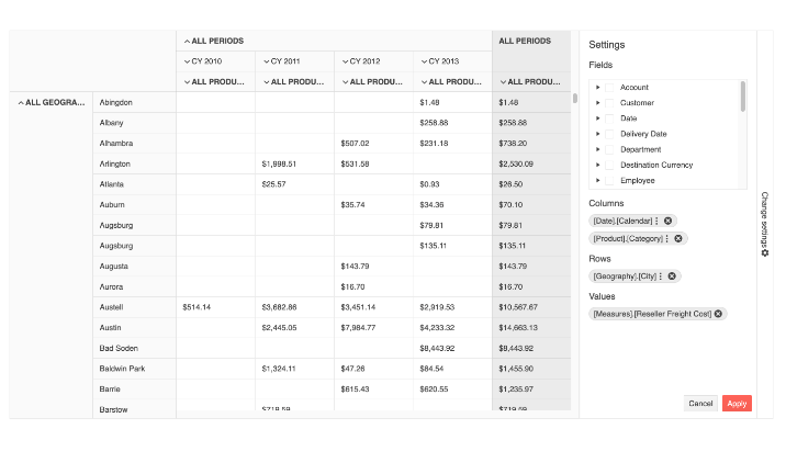
The first component to get highlighted in R3 2021 is the brand new React PivotGrid component. This component has been built from the ground up to ensure that the component is blazingly fast and can take full advantage of React to ensure that all aspects of the component adhere to a high level of performance.
The React PivotGrid has gone through a long period of design iterations and research, and the KendoReact team feels confident that any React developer who needs pivoting functionality will breathe a sigh of relief when discovering the KendoReact PivotGrid.
There really is a lot to say about a component like the PivotGrid, but I’d much rather let the UI component do the talking. Head on over to the KendoReact PivotGrid online demos to see exactly how you can add this exciting new UI component to any React application.
New Component: MultiSelectTree
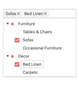
Expanding the list of available dropdowns within React, with R3 2021 KendoReact added the MultiSelectTree component. This component marries the hierarchical data structure of a TreeView with a dropdown list, specifically a MultiSelect dropdown, in order to provide a rich user interface for selecting multiple values and displaying them all in a text input.
To see more about this new component, check out the KendoReact MultiSelectTree docs & demos.
New Component: Heatmap
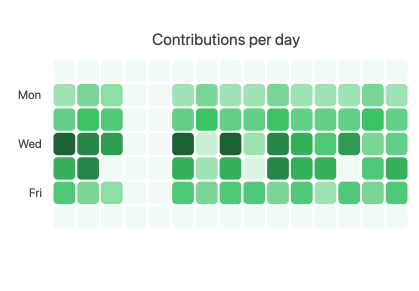
With R3 2021, KendoReact also added the new React Heatmap component. This unique data visualization component is suitable for visualizing the magnitude of a value over two dimensions and is often referred to as a “cluster heat map.”
Many of you reading this will probably recognize this React Heatmap as the visualization for contributions within GitHub.
Here’s a direct link to the KendoReact Heatmap demos for in-depth documentation and samples for adding the component to any React app.
New Component: Typography
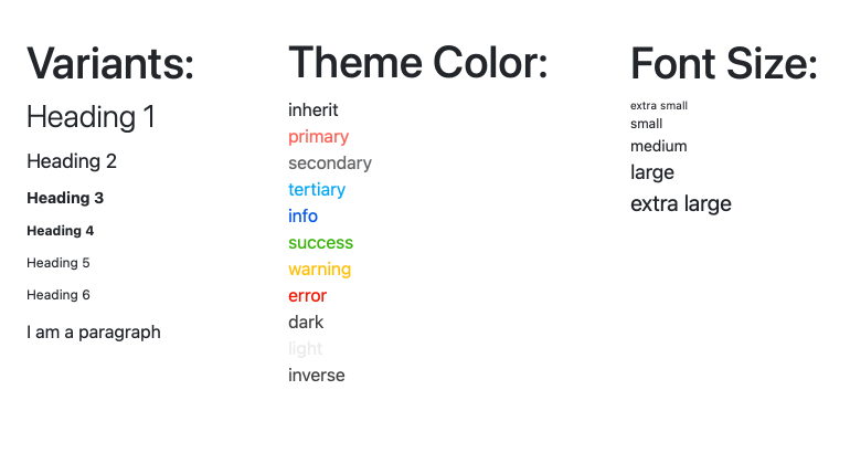
Many KendoReact developers are building their own design languages based on KendoReact and we want to make sure these folks are well taken care of! In this vein, we added the new React Typography component which can help enforce consistency throughout the fonts used within any React app.
The CSS associated with the various classes all come from the KendoReact themes, so there’s a centralized location for controlling and enforcing these styles.
Here’s a direct link to the KendoReact Typography Component docs for more details.
New Component: StackLayout
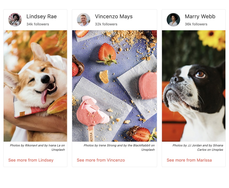
The new KendoReact StackLayout component allows developers to easily align multiple elements in a stack in either a vertical or horizontal fashion. While the same functionality can be achieved with some CSS, the KendoReact team wanted to provide some easy-to-use UI components to help developers who may prefer to avoid writing their own layout elements. With the React StackLayout component, a React developer has control over orientation, alignment, spacing and much more through handy configuration options.
To see more, jump on over to the KendoReact StackLayout component docs.
New Component: GridLayout
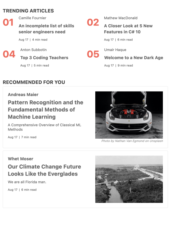
Similar to the StackLayout component, the new KendoReact GridLayout component allows developers to arrange content on a page in a grid structure using rows and columns. The React GridLayout is based on the CSS Grid Layout and provides a bit of a productivity boost for anyone looking to avoid writing their own layout elements.
Here’s a quick link to the KendoReact GridLayout demos for more information.
FileManager Template
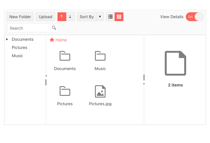
This is technically not a brand-new component, but is still something that should be mentioned in this section. With R3 2021, the KendoReact team put together a ready-to-use template that allows users to manage files and folders in a file system. Users from other Kendo UI flavors recognize this as the FileManager component.
Since the FileManager can be responsible for tons of different scenarios, we didn’t want to write a component that may just fit a subset of these scenarios. Instead, we put together this template to let developers see how to create the FileManager using KendoReact components and give easy ways for devs to customize and make the FileManager their own. Of course, if you like what you see out of the box, all you have to do is copy and paste the code we’ve provided!
For more information, head on over to the KendoReact FileManager Template documentation page.
Expanded Component Features
Grid: Column Auto-Size
With R3 2021 the KendoReact Data Grid adds a highly requested feature: column auto-sizing. The feature works by automatically resizing a column to fit the smallest possible width to keep all text visible when the end user double-clicks on the resize handler of the appropriate column header. This can also be done using the fitColumns method to get the same outcome through code.
Check out the React Data Grid Column Auto-Size demo right here.
Grid: Group & Un-Group Through Column Menu
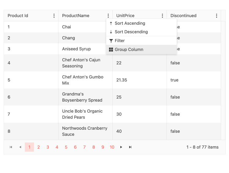
Expanding on the available features that the end users of the React Grid have available, with the R3 2021 the column menu can now feature the ability to group or un-group via the column menu. Previously only possible by dragging and dropping column headers, this new feature gives users a choice in how to handle grouping in their data grids.
See the feature in action by heading over to the React Grid Grouping demos.
Grid, Gantt, and TreeList: Accessibility Improvements

Another focus of the KendoReact for R3 2021 was accessibility. Through additional internal testing, as well as feedback from KendoReact users, we tackled several accessibility-related items within the KendoReact Grid, Gantt, and TreeList components for this release. The best part about these improvements is that all a developer needs to do is update to the latest version and they have already improved the accessibility of all of their existing KendoReact components!
For more information around accessibility within the KendoReact Grid, head on over to the React Grid Accessibility documentation section.
Additional accessibility-related information can be found on
the KendoReact Accessibility Compliance docs & demos section.
TreeList: Range & Multiple Cell Selection
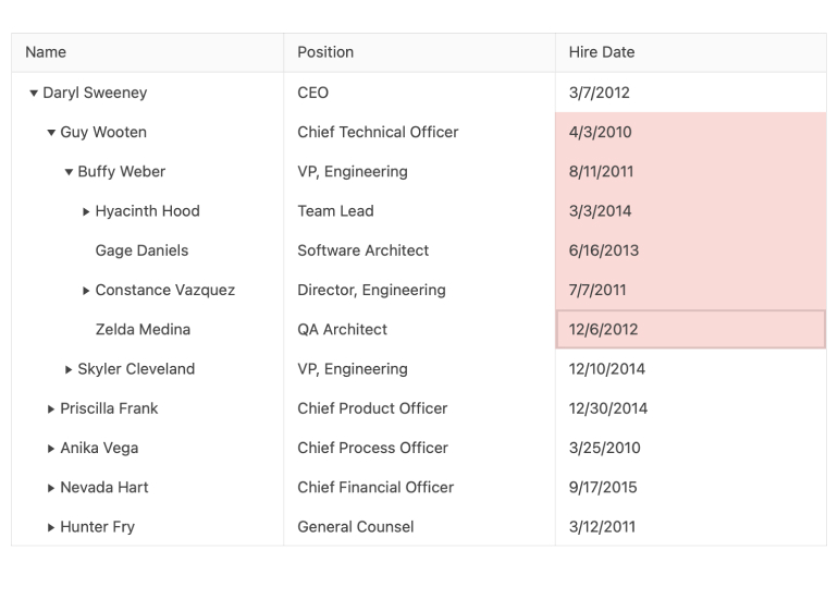
When it comes to selecting cells, or a collection of cells, a very intuitive way to select cells is to drag the mouse over the cells that should be selected. Well, with R3 2021, this is now officially added to the React TreeList! Not only did this release bring the ability to select a range of cells by dragging the mouse over an area of the TreeList, but users can also select multiple cells by selecting one cell at a time.
The React TreeList Selection documentation has a sample that showcases the difference between the various selection modes and how to implement them.
Gantt: Range & Multiple Cell Selection
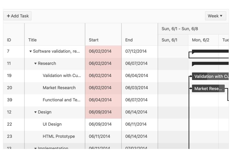
Just like with the TreeList component, the KendoReact Gantt component also added both multiple cell selection as well as range selection.
Here’s a direct link to the React Gantt Selection demos for samples of how you can update the selection within your Gantt component today.
Tooltip: Support for SVG Elements

With R3 2021 developers can now attach the React Tooltip to SVG elements. When there are any generic SVG elements on a page, the Tooltip can easily be attached to these elements and displayed over them to provide additional information.
For additional insights, head on over to the KendoReact Tooltip SVG Support demos to see more.
Chip: Custom Content
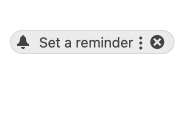
Last but not least, the React Chip added the ability for developers to create custom content for the chip, or pill, element. This can help developers add custom icons, links or really any type of content inside the KendoReact Chip component.
Here’s a direct link to the React Chip Custom Content docs for more details.
Got Feedback?
Did we miss a particular component or feature that you were looking for? We want to hear from you! Head on over to the KendoReact Public Feedback Portal and vote for your favorite feature or component—or submit your own ideas. Everything that we deliver during a release comes from feedback from users like you, so now is your chance to influence the roadmap of KendoReact directly.
Webinars and Livestreams
Want to see everything I mentioned above live and in action? On Wednesday, September 28, at 11:00 am ET we are hosting the Kendo UI R3 2021 release webinar. This session will cover everything that is new with R3 2021 in React, jQuery, Angular and Vue.
On top of this we will also have a Twitch livestream diving deeper into KendoReact on Twitch on Thursday, September 23, at 10:00 am ET. For you Angular fans, we will check out Kendo UI for Angular on Friday, September 24, at 10:00 am ET.
Tons of fun will be had, so head on over to the Kendo UI R3 2021 webinar registration page to reserve your seat and join in on the festivities!