We’re happy to introduce the Telerik and Kendo UI Kits for Figma—perfect representations of our web UI components, ensuring smooth designer-to-developer handoff. Besides speeding up UI development cycles, the Figma kits, together with our web UI components, will set you off to a running start to craft your own design system.
Behind every successful app there is a team of people who are trying very hard to get on the same page. Often, this will be a cross-disciplinary team, in which developers, QAs, designers, business people and other experts combine their unique perspectives to build something together.
One of the inherent challenges of this beautiful process is that each of us is schooled in the principles and lingo of our own profession and we end up speaking different languages. For example, there’s the proverbial gap between designers and developers: the former will create a gorgeous UI design, and the latter may build a fast and functional app that only slightly resembles it.
Our team is very familiar with this gap, as we’ve been designing and building UI components for over 19 years now. We know that it can lead to much more than botched UI—it can lead to frustration and interpersonal friction.
As it is our mission to make developers’ lives easier, we see this gap as a worthwhile problem for us to tackle. This will be a long process as no trivial solution exists, but we already have a hypothesis and a tool we have added to our UI libraries. Our hypothesis: matching building blocks on both sides will bridge the design-to-development gap. The new tool: three design kits for Figma that are perfect representations of our web UI components.

Meet the Telerik and Kendo UI Kits for Figma
To give you and your designers a common language, we’ve created highly customizable UI kits that are perfect design equivalents of the Telerik and Kendo UI Web UI components. I’m happy to announce the new Telerik and Kendo UI Kits for Figma: design files that represent the most-used web UI components in every possible state, their detailed anatomy, colors, metrics and icons. Thanks to the UI kits, the designer knows exactly what components are included in the library the developer is using and can work in tandem with development to ensure smooth implementation.
The Telerik and Kendo UI Kits for Figma are now available, free of charge, for the following products:
- Telerik UI for Blazor
- Telerik UI for ASP.NET Core
- Telerik UI for ASP.NET MVC
- Kendo UI for Angular
- KendoReact
- Kendo UI for Vue
- Kendo UI for jQuery
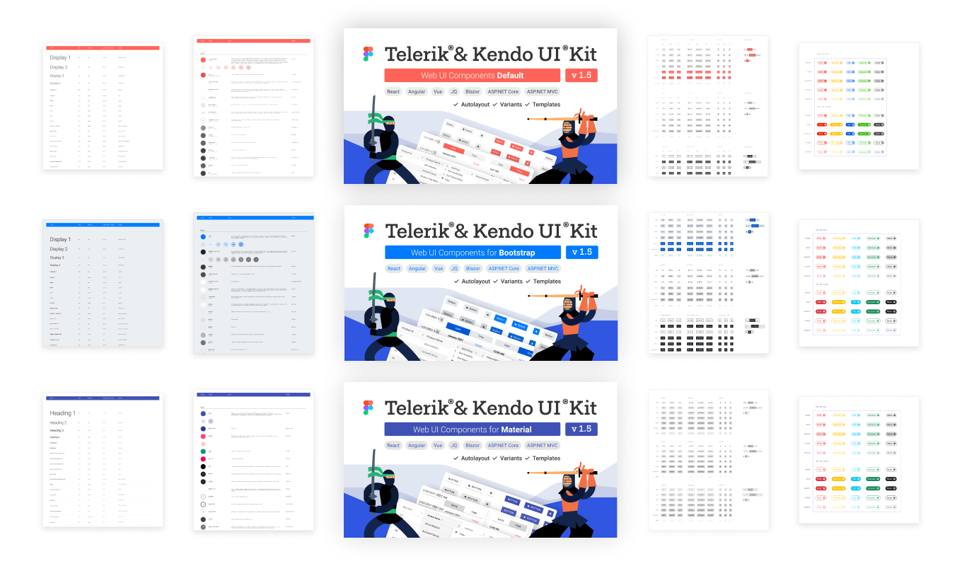
Each Figma kit corresponds to one of the three design themes that come with our UI libraries: Bootstrap, Material and Default theme.

Besides speeding up UI development cycles, the Figma kits, together with our UI components, will set you off to a running start to craft your own design system, no matter if you work with in-house designers or an agency. So if your company works with Figma, share the good news with your designers and enjoy the bliss of getting designs created with the same components you yourself are using!
Here are good starting points for your designers to get acquainted with the Telerik and Kendo UI Kits for Figma:
- Telerik UI for Blazor
- Telerik UI for ASP.NET Core
- Telerik UI for ASP.NET MVC
- Kendo UI for Angular
- KendoReact
- Kendo UI for Vue
- Kendo UI for jQuery
Share Your Feedback
You know that your feedback is essential for us in shaping our roadmap and guiding our efforts. As this is a brand-new tool we’ve created, your input is invaluable. Please don’t hesitate to reach out to us and share what you think—either here in the comments or through your preferred channel, be it our Feedback Portal, product forums, social channels or by shooting us an email. We truly appreciate it!